IMPULSE #1 – A Book

The past two months have honestly felt like a creative fog. After spending two semesters researching mental-health apps, accessibility, calming UX elements, and the role of AI in emotional support, I hit a wall. I wasn’t excited about pushing that topic any further, even though I still care about it. It just didn’t feel like the direction I wanted to take for my Master’s thesis.

So I started looking for something new.
For a short while, I explored AI in education: AI tutors, learning tools, digital classrooms. I listened to podcasts, skimmed articles, tried to “feel it”… but it didn’t grab me. It felt interesting, yes, but not like “my” topic. And because nothing lit that spark, I kept delaying these Impulse blogs. There simply wasn’t anything I could honestly call an impulse, until I picked up Keep Going by Austin Kleon.

Reading this book didn’t suddenly give me the perfect thesis idea, but it gave me something I really needed: a sense of movement again.

What Keep Going Gave Me

One of the big ideas in the book is that creativity isn’t a dramatic, once-in-a-while moment. It’s more like a daily rhythm. Kleon compares it to waking up in Groundhog Day – every day you start again. That made me feel a bit calmer about not knowing my direction yet. Maybe not having “the” idea right now is normal, not a failure.

His idea of a “bliss station” stayed with me too. Basically, a little mental or physical space where you disconnect from the noise and let your thoughts breathe. Lately, I’ve been drowning myself in information about what my thesis could be: podcasts, articles, trends, AI debates. Constant noise. Kleon reminded me that creativity sometimes comes from doing less, not more. From quiet, boredom, or even a messy desk.

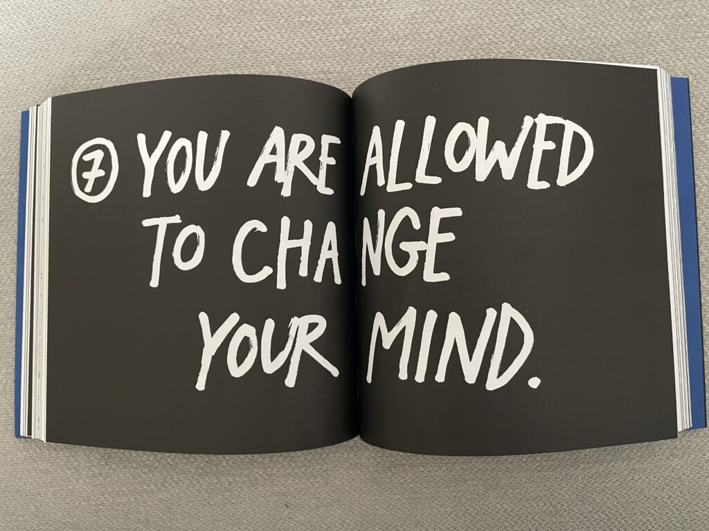
Another chapter that hit home was “You Are Allowed to Change Your Mind.” This felt almost like permission I didn’t know I needed. I had convinced myself that because I had spent so much time on my previous topic, I must continue with it. Changing direction felt wrong, like giving up. But Kleon says it’s completely normal to shift, to rethink, to explore something new. That idea made me feel less guilty about stepping away from mental health apps and not fully clicking with AI in education. Maybe changing my mind is just part of the creative process.

He also talks a lot about focusing on the verb rather than the noun. Not “being a student looking for a topic,” but actually researching, playing, trying things out. That mindset feels much lighter and more fun.

And finally, one line keeps repeating in my head:
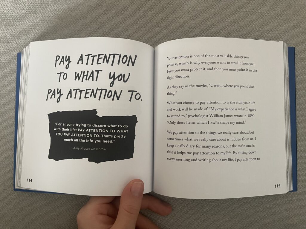
“Pay attention to what you pay attention to.”
Maybe the things that naturally grab my curiosity in the next weeks, small things, random things, might slowly point me toward my thesis direction.

How This Helps Me Moving Forward

I still don’t know my final topic. But after reading Keep Going, I don’t feel stuck anymore. I feel more open, more patient with myself, and more willing to explore without pressure. My thesis will come from what I genuinely care about next, not from panic or noise.

For now, this book was exactly the impulse I needed to… well, keep going.

Stuff Worth Clicking A.K.A. Accompanying Links

Disclaimer: This blog post was written with the help of AI for better grammar and correct spelling.

Impulse #1 – CoSA

Last week I visited CoSA – Center of Science Activites in Graz. CoSA offers twelve different areas, where visitors can explore technical and scientific relations and phenomena in a hands-on way. Instead of a strict and typical ‘do not touch’ they follow the rule of ‘please touch’, encouraging a playful discovery. I visited three of the areas: The Experimentarium, The MedLab and Technology.

The Experimentarium is a playful, curiosity-driven space full of scientific phenomena and hands-on surprises. Introductions and exhibits were hidden, and you needed to find the tiny drawers and covered elements spread throughout the room. The space felt like a playground and as a visitor you got invited to poke around, test things, explore and discover at your own pace.

In the MedLab you could discover the world of medical research. You could slip into the shoe of a medical professional, either as a doctor or a lab technician. There were three patients that needed to be examined, and you could even take a blood sample with real liquid in the syringe. The blood sample needed to be analyzed in the lab to find out the correct diagnosis, which made the experiment surprisingly realistic.

In the Technology Area focused engineering and mobility. You could build your own vehicle by selecting the different components needed for a car. For each component there were even different options to use, like a diesel engine, gasoline engine or electric motor. Once the car was assembled, you can test it in a racing simulation and fine-tune it based on the performance. It was a fun and very interactive way to learn about something complex as a vehicle.

I completely lost track of time during my visit and felt totally immersed in the exhibition. I was genuinely fun. When I reflected on why I enjoyed the exhibition so much, I realized it gives visitor a place to experiment, explore, and play. I felt a bit like a curious kid again.

And that feeling connects to what I want to research about in my master thesis: how interaction design can foster playful, imperfect and low-pressure creativity. We live in a world which pushes us towards productivity, efficiency and optimization and I think we all forgot how it feels to simply just mess around and play without expecting a result. As children playing was our way of learning, discovering new things and processing our environment and I think unfortunately we lost that as adults.

And maybe that is what we should bring that back in our lives. Play more, experiment more and just try things, without judgment and without pressure. This is where the idea for my project is coming from: I want to create an interactive web playground for creatives. A digital space where the goal is not to produce something ‘useful’, but to create something without pressure, where we can set our perfectionism aside and simply create something for the joy of creating.

So, I think this is a reminder for myself, that play isn’t a distraction of creative work, maybe it is a form of creative work; and the kind that brings back energy, curiosity, and inspiration.

AI was used to check spelling and grammar and better clarity.

3.4 IMPULSE #4

On November 6th, I visited CoSA as part of the Project Work 3 gamification lectures. We explored “FLiP”, an exhibition about financial literacy. A topic that doesn’t naturally interest me, but still, I thought that seeing it through an interactive format might make it easier to understand and maybe even enjoyable. But even though the exhibition was interactive, I found it hard to stay engaged.

The exhibition used a lot of quizzes, screens, and points to keep visitors engaged. In theory, that sounds fun, but for me, it didn’t really work. Every time I answered a quiz, I earned points, but that didn’t make me feel more curious or motivated. There was just too much information on each screen. Sometimes I clicked random answers just to move on, not because I wanted to, but because I was overwhelmed. The same thing happened with the exhibit featuring a rotating screen, where you had to answer yes-or-no questions. This alternative screen made me feel dizzy after a while, so I couldn’t stay until the end. The interaction was simple, but the information behind it was again too much and hard to follow.

This experience made me think more about accessibility in interactive exhibitions. What happens when someone gets dizzy or tired, or just feels overloaded by too much information? What about kids or people with dyslexia or ADHD who might find all the text and flashing visuals too much? And what about visitors with visual impairments? I didn’t notice any tactile elements that could help them experience the exhibition in a different way.

Even though the exhibition didn’t fully capture me, there were still parts I really liked. I enjoyed the overall layout and the color coding of the different finance topics. One exhibit asked you to manage the expenses of an average Austrian family. That one was quite fun and easy to understand. I liked how you could see the results of your decisions immediately, visualized in a balance scale that showed expenses and savings in real time. It made the topic feel more concrete and relatable. Another moment I remember was the bicycle exhibit. I don’t remember exactly what it was about, but you had to use a bicycle pedal with your arms for the experience to continue. It was tiring but also fun and one of the few moments that felt truly interactive in a physical way, and that helped me connect more to what I was doing.

Looking back, I realized how important it is for exhibitions to make learning feel light and approachable. Just adding interactivity isn’t enough if the experience still feels heavy or confusing. Interaction should make you feel part of something, not just like you’re completing tasks. Clear visuals and thinking about different kinds of visitors can make all the difference.

AI was used for corrections, better wording, and enhancements.

3.3 IMPULSE #3

Growing up as a shy kid, I often wished that people, whether peers, teachers, or other adults, would just let me process things in my own way and on my own time, but that rarely happened. Because of this, I’ve become interested in exploring topics for my thesis, like anxiety and social anxiety, which feel closely connected to who I am and how I move through the world. It also makes me wonder: how might playful interactive experiences help ease feelings of anxiety or make social situations feel safer?

For this blog post, I wanted to expand on the previous impulse about inclusivity. So I listened to three episodes of the podcast Speaking of Psychology, which broadly explore the topic of anxiety.

Here are my thoughts:

Episode: “Why are some kids shy? with Dr. Koraly Pérez-Edgar”
In the episode, Koraly Pérez‑Edgar explains that shyness is a natural temperament that shows up early in life and affects how kids interact with the world. Shyness isn’t something that needs to be fixed; it’s just a different way of engaging with people and activities.

Episode: “Anxiety and Teen Girls with Dr. Lisa Damour”
In the episode, the conversation questions the way society frames anxiety: as something abnormal or in need of fixing. Dr. Damour emphasizes that anxiety is a natural part of being human, yet the growing expectations placed on girls today can turn it into something harmful. Many feel pressured to excel academically, maintain a perfect appearance, and stay kind and composed, while social media intensifies those expectations.

Episode: “How to help with math anxiety, with Dr. Molly Jameson”
In this episode, Dr. Molly Jameson talks about math anxiety, a common fear that affects how people feel and perform when doing math. It often begins with negative school experiences or strict teaching methods that make students associate math with embarrassment or failure. Over time, this fear can block people from accessing knowledge they already have, and it’s sometimes reinforced by cultural stereotypes like “boys are better at math.

My Reflection
Listening to these episodes made me think about how deeply anxiety connects to the environments we grow up and learn in. It isn’t always about the person themselves, but often about how expectations, pressure, or fear of judgment shape how we act and feel. That makes me wonder: if anxiety is such a natural part of being human, what would it mean to design for it rather than against it? Could design create spaces that accept anxiety instead of trying to remove it?

For my thesis, I’m curious about how play might offer a way to do that. What if playful experiences could make social or learning situations feel safer: less about performing and more about exploring? How could interaction design give people permission to engage at their own pace, to choose how visible they want to be, or to participate quietly without pressure? Maybe play can become a tool for inclusion, helping people connect and express themselves in ways that feel natural to them.

AI was used for corrections, better wording, and enhancements.

Impulse #1 Designing for Neurodiversity: Alipe von Bernhaupt’s Talk at the Usability Congress in Graz

At the Usability Congress in Graz, I attended a talk by Alipe von Bernhaupt about accessible usability for neurodivergent people. It really changed the way I think about inclusion and design — not only as something nice to do, but as something essential for both people and business.

Understanding Neurodiversity

Up to one in five people is neurodivergent. That means about 20% of users experience the world and our designs in very different ways. If we don’t design with them in mind, we lose around 20% of potential users — and that’s a big part of the market.

Alipe also mentioned that at least half of adults are undiagnosed. So even if we think we’re not designing for neurodivergent people, we probably are — we just don’t know it. Another important point was how women with ADHD are treated worse than men. Men are often seen as just “energetic” or “a bit different,” while women are more likely to be judged or ignored.

What It Means for Design

Neurodivergence can look very different from person to person. Two people with ADHD, for example, can have completely different challenges. Neurodiversity is really about people whose brain structures work differently — there isn’t one single way to describe it.

The digital world can be especially hard for neurodivergent users. Changing layouts, flashing images, or strong colors can make using websites and apps stressful or confusing. And there’s another layer to this: energy. Many neurodivergent people experience very different energy levels from day to day. That means it’s harder to plan long-term or follow strict routines. When design expects constant focus and consistency, it can quickly become overwhelming.

What Really Stuck with Me

My biggest takeaway from the talk was a bit uncomfortable but very true: if we want companies and stakeholders to care, we have to speak their language. Talking about inclusion and empathy is important, but talking about losing 20% of market share gets their attention. Sometimes, it’s not the human argument that makes change happen — it’s the business one.

Conclusion

Designing for neurodiversity is not just about accessibility checklists. It’s about understanding that people experience the world differently — and that this difference is normal. When we include those needs in our design, we make better products for everyone. It’s not only the right thing to do, it’s also smart business.

3.2 IMPULSE #2

This year, on 15th October, I attended the World Usability Congress in Graz and listened to a talk titled “How to accessible usability for neurodivergent people?” by Alide von Bornhaupt. Her presentation focused on how neurodivergent individuals are often overlooked or excluded when designing digital experiences. She shared 3 practical tips for creating more inclusive systems, but it wasn’t the tips that stayed with me. What stuck with me was the underlying idea: how important it is to include people the system was never designed for in the first place. That thought made me pause and reflect on who I could design for in my thesis.

At the beginning of her talk, Alide showed a slide called “Dimensions of Inclusion”, which grouped people based on different traits and abilities. Seeing it made me realize how easily design can fall into the trap of serving only an “average” user, even though such a person doesn’t really exist. It also made me consider neurodivergent individuals, or people who think, learn, and process the world differently, as a meaningful focus for my work. Although I’m not diagnosed as neurodivergent, I recognized parts of myself in what she described. That realization led me to look back on my own experiences and how they shaped my sense of comfort, participation, and expression.

Growing up, I often felt uneasy in social situations. Being surrounded by strangers, answering a question in class when I was the only one who hadn’t raised my hand, or even saying a simple hello to a cashier, all of it felt much bigger than it probably was. I remember watching others interact so easily and wondering why it didn’t come naturally to me. Over time, I noticed that I often withdrew before anyone could exclude me, almost as if I wanted to protect myself from doing something wrong. I wasn’t the loudest or most talkative person, but deep down I knew that this quiet version of me wasn’t all that I was. When I felt safe and comfortable, I could open up, be playful, and connect freely.

Thinking back on this made me more aware of how much our surroundings, whether physical, social, or digital, shape the way we take part in things. Sometimes all it takes is a small detail: the tone of a message, the layout of a space, or a word choice to make someone feel either welcome or invisible. Listening to Alide helped me see that by designing with neurodivergent people in mind, I could also create something that speaks to people like me, those who sometimes feel out of place or unsure how to belong. I want to design experiences where those feelings don’t become obstacles, where participation feels gentle, natural, and safe.

AI was used for corrections, better wording, and enhancements.

3.1 Reflection & IMPULSE #1

Reflection on the last two semesters
This semester, my focus in Design & Research will be on the pre-research phase of my master’s thesis. During the first semester, I identified the broader research area as the combination of analog and digital technologies. In the second semester, I explored microcontrollers and hands-on prototyping more deeply.

For this semester, I am still interested in the fusion of analog and digital elements, as well as prototyping with microcontrollers. However, there is still one key factor that is missing: a purpose. For this reason, I will roughly use the framework “5Ws and 1H” (What, Who, Why, Where, When, How) as a loose structure to help me define the direction of my thesis more precisely.

Some of the topics I want to explore include:

  • Play & Playfulness, sense of adventure,
  • Gamification, serious games, video games, board games, toys or toy-like
  • Education, learning, inclusivity
  • Memory, nostalgia, archiving, pop culture
  • Tangibility, systems, collections,
  • Microcontrollers, Building, Prototyping

For each impulse, I will use the 5Ws and 1H framework to organize my thoughts and clarify what kind of design direction or insight it offers.

So, for my first impulse, I watched 3 talks about Play, and here are my thoughts about them:

Talk #1: The Role of Play in the Development of Social and Emotional Competence by Peter Gray
In his talk, Peter Gray argues that free, self-directed play is essential for children’s emotional and social development. Drawing from research on hunter-gatherer societies, he shows how children in these communities were trusted and allowed to explore freely, learning vital skills such as empathy, cooperation, and self-regulation through play. In contrast, modern societies often limit children’s autonomy through structured activities and constant supervision, reducing opportunities for natural learning and independence.

My Reflection:
This makes me think about how I could use ideas from hunter-gatherer play, like freedom, choice, cooperation, and learning through challenge, in design. For example, when creating games, interactive experiences, or educational tools, one could consider how users can make their own choices, how activities can encourage working together instead of competing, and how challenges can help people learn and grow in a safe way. Rather than dictating a single path or outcome, the design could invite open-ended exploration where discovery happens naturally through action. That sense of self-direction becomes a key principle for how I want to design, shaping interactions that give users autonomy, space to experiment, and the freedom to define their own experiences, much like the unstructured play of hunter-gatherer communities.

Talk #2: Creating Inclusive Environments with Play by Gary Ware
In this talk, Gary Ware explores how play can build safe, authentic, and inclusive environments in workplaces and collaborative groups. He began his talk with a playful exercise, showing how shared experiences can quickly create connection and trust. Ware emphasized that people often divide their “home self” and “work self,” which prevents genuine belonging: trying to fit in is not the same as belonging. He highlighted how play encourages vulnerability, creativity, and collaboration, ultimately fostering psychological safety and empathy.

My Reflection:
This made me think about how play could inspire designs that foster inclusion and trust. Could an interactive system help people feel accepted and comfortable being themselves? Activities like improv, drawing, or dancing already create natural connections, and I wonder how technology might extend that same sense of shared joy and safety into everyday interactions.Thinking this way helps me see where playful design could have real impact: in shared spaces like classrooms, workplaces, or public areas. These could become places of playful connection, where design cultivates belonging through interaction.

Talk #3: The Power of Play to Heal and Connect by Amy Work
Amy Work explains that play is a child’s natural language, a way to express feelings before words are available. While adults communicate through conversation, children process their inner world through play. Quoting Gary Landreth, “Play is the language of children, and toys are their words,” she highlights how play helps children express emotions, face fears, and make sense of their experiences in a safe, symbolic way. Parents who join in that play build stronger emotional bonds and open lines of communication. Work encourages adults to observe and name emotions during play, helping children develop emotional literacy, while letting them lead and set the pace.

My Reflection:
This talk reminded me that play isn’t just about learning, but also a form of emotional communication. It made me wonder how interaction design might support non-verbal expression, how people could externalize feelings or memories through playful, tangible engagement. Seen this way, play becomes a bridge between inner and outer worlds. That perspective also hints at who my designs might serve: people who communicate or process emotions differently like children, neurodivergent users, or anyone drawn to expression beyond words.

AI was used for corrections, better wording, and enhancements.

Alexander’s Travel Guide for the Dead — A Journey Beyond Life

What happens after we die? It’s one of humanity’s oldest and most haunting questions. Phillipp Alexander’s “Reiseführer für Tote” (Travel Guide for the Dead) takes this universal fear and curiosity and turns it into something unexpected — a travel guide for the afterlife.

At first glance, the concept sounds absurdly fascinating: a Lonely Planet–style guide that helps you navigate heaven, hell, or reincarnation. But beneath the quirky premise lies a deeper intention — to make people reflect on death, religion, and what might await us after our final journey.

Exploring Death Through Design

Alexander’s goal is simple yet ambitious: to make people think more openly about the afterlife and perhaps ease the fear of dying. Rather than preaching or philosophizing, he invites readers to explore the topic — like travelers flipping through a guidebook before an adventure.

It’s an unusual approach, blending two very different worlds:

  • Religion, with its strict rules, moral frameworks, and promises of eternal destinations.
  • Travel guides, which celebrate freedom, curiosity, and self-directed discovery.

By merging these opposites, Alexander creates a tension that’s both intriguing and thought-provoking — though not without its flaws.

The project unfolds in two main parts:

  1. An overview of different religions and their interpretations of the afterlife — from heaven and hell to reincarnation and spiritual rebirth.
  2. A more subjective “expert analysis” of travel guides, where the author himself becomes the self-declared guide through these spiritual landscapes.

While the first section is well-researched and informative, the second feels more like a personal reflection than a structured analysis. There’s no clear conclusion — instead, it reads as an open-ended exploration rather than a destination reached.

Aesthetic and Presentation

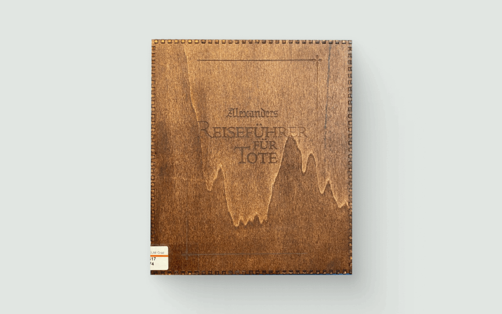
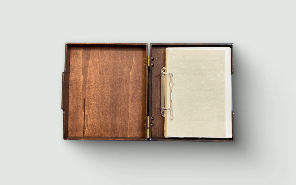
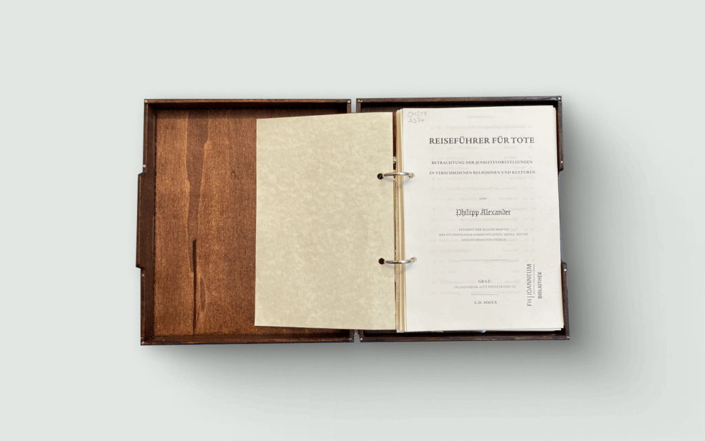
If there’s one thing that immediately captivates, it’s the presentation. The work comes encased in a beautiful wooden box, filled with bone-white paper — an eerily fitting design choice for a guide to the afterlife. The craftsmanship feels intentional and authentic, setting the right tone from the moment you open it.

However, the physical design, while visually striking, makes it somewhat uncomfortable to handle and read. The box, though conceptually clever, turns into a clumsy reading experience — a reminder that sometimes, aesthetics and usability don’t always align.

Originality and Design Relevance

Conceptually, “Alexander’s Travel Guide for the Dead” is fun, unique, and original. It stands out as a playful yet critical commentary on how we think about death and belief.

That said, the connection to design as a discipline feels weak. The piece is more of a philosophical or cultural exploration than a true contribution to design research or methodology. It’s a creative idea, executed beautifully, but it doesn’t quite push the boundaries of design thinking.

Final Thoughts

Overall, I’d rate the project a 3 out of 5. It’s a professional, well-executed piece with strong visuals and a memorable concept. However, the topic itself feels relatively easy, and the design implications are limited.

The biggest issue? The metaphor doesn’t entirely hold up. A travel guide suggests freedom, options, and agency — things that the afterlife, especially through religious frameworks, doesn’t really offer. In that sense, the piece feels more like a “religion guide for the living” than a genuine travel guide for the dead.

Still, it’s a creative and thought-provoking exploration — one that might not give you answers, but will definitely make you think twice about what lies beyond.

#Task III: Masterarbeit Evaluation

Titel: Development and Evaluation of a User Interface Concept for an Industrial Wind Turbine Diagnosis Application
Studiengang: Software Engineering and Management, TU Graz
Umfang: ca. 145 Seiten + Anhang
Artefakt: Interaktiver UI/UX-Prototyp für ein modellbasiertes Diagnosesystem im Bereich Windturbinenwartung

1. Einleitung und Überblick

Die Masterarbeit befasst sich mit der Entwicklung und Evaluierung eines User-Interface-Konzepts für ein industrielles Diagnosesystem auf Basis modellbasierter Fehlererkennung. Die Arbeit vereint theoretische Grundlagen zu Model-Based Diagnosis (MBD) mit einem nutzerzentrierten Designprozess und abschließender Usability-Evaluation. Als Artefakt wurde ein klickbarer Prototyp erstellt, der in ein reales Industrieumfeld (Uptime Engineering GmbH) eingebettet ist.

Die Arbeit ist klar strukturiert, professionell gesetzt (offensichtlich in LaTeX erstellt), mit sauberem Inhaltsverzeichnis, aktiven PDF-Verlinkungen und formal korrekter Quellenangabe. Der Aufbau folgt einem nachvollziehbaren Schema (Theorie, Related Work, Methodik, Artefakt, Evaluation, Fazit).

2. Bewertung nach CMS-Kriterien

Overall Presentation Quality

Die Arbeit wirkt insgesamt sehr professionell aufbereitet: einheitliche Typografie, konsequente Kapitelstruktur, klare Tabellen- und Abbildungsbeschriftungen. Die grafische Qualität der eingebetteten Abbildungen ist jedoch uneinheitlich – einige Screenshots wirken unscharf oder ohne klares visuelles Raster. Stellenweise wirken Kapitel sehr textlastig, ohne grafische Auflockerung oder Zwischenfazits, was es etwas anstrengend zu Lesen macht.

Degree of Innovation

Das Thema ist solide gewählt, jedoch nicht mega innovativ. Die Forschungslücke („Usability im Kontext von MBD-Systemen“) wird erkannt und adressiert, allerdings basiert der Beitrag auf der Anwendung bekannter Methoden (Usability-Testing, Iterative UX-Designprozesse). Daraus schließe ich, dass man garnicht das Rad neu erfinden muss für ein Masterarbeit.

Independence

Die Arbeit zeigt erkennbar Eigenleistung, insbesondere im Bereich der Nutzerstudien, Prototypentwicklung und Ableitung von Anforderungen. Gleichzeitig ist jedoch die enge Bindung an den Industriepartner sichtbar. Teilweise wirkt der Text wie ein Projektbericht über ein Firmentool, weniger wie eine freie wissenschaftliche Untersuchung. Darauf schließe ich, dass die Masterarbeit im Rahmen eine Anstellung gemacht worden sein könnte.

Organization and Structure

Sehr klare Gliederung, logisch aufgebaut. Einige Kapitel sind jedoch krass umfangreich – z. B. enthält Related Work fast 30 Seiten, während Conclusions and Future Work vergleichsweise knapp ausfallen. Es wirkt als wäre Related Work für sehr ausgereizt worden, um den Gesamtumfang zu erweitern, weil es in meiner Ansicht einfacher ist über bestehendes zu schreiben als eigene innovative Gedanken für z.B. Conclusions zu finden.

Communication (Stil, Lesbarkeit, Sprache)

Der Schreibstil ist präzise und gut lesbar, ohne unnötige Komplexität. Fachbegriffe werden korrekt eingeführt. Allerdings enthält der Text einige wiederholende Passagen, die Inhalte aus früheren Kapiteln nochmals zusammenfassen. Auch wird an mehreren Stellen Grundlagenwissen ausführlicher erklärt als für eine Masterarbeit im Software-Engineering notwendig wäre – insbesondere im Abschnitt über AI-Methoden.

Scope

Der Umfang der Arbeit ist angemessen. Die praktische Komponente (der Prototyp) wird ausführlich beschrieben und evaluiert. Allerdings liegt der Schwerpunkt deutlich stärker auf UX als auf UI oder systemtechnischen Aspekten. Themen wie visuelle Gestaltung, Farbsysteme, Typografie oder Accessibility werden kaum wissenschaftlich reflektiert, obwohl sie für ein UI-Projekt relevant wären.

Accuracy and Attention to Detail

Formale Qualität ist hoch: ich konnte kein Tippfehler erkennen, konsistente Formatierung, umfangreiche Abbildungsbeschriftungen. Auffällig ist jedoch, dass methodische Details teilweise nur oberflächlich erläutert werden, etwa:

  • keine genaue Beschreibung des Usability-Test-Designs
  • Ergebnisse werden gut erzählt, aber kaum im Projekt ausgeführt.

Literature

Das Literaturverzeichnis ist umfangreich und wirkt für mich formal korrekt. Auffällig ist aber der hohe Anteil älterer Publikationen (>10 Jahre), besonders zu UX und UI, besonders weil diese Felder schnelllebig sind. Moderne Arbeiten zu Design Patterns, HCI-Guidelines oder aktuellen UI-Frameworks fehlen. Eine stärkere Einbindung aktueller Quellen (z. B. Nielsen-Norman, Material Design, usw) hätte die theoretische Basis gestärkt.

3. Bewertung des Artefakts

Der Prototyp erfüllt seinen funktionalen Zweck und ist nachvollziehbar dokumentiert. Die UX-Methodik ist klar beschrieben, der iterative Designprozess gut begründet und mit Usability-Evaluation abgesichert. Ich finde auch die klare Trennung von „General Interface“ und „Wind Turbine Interface“ ganz gut.

Kritisch fällt jedoch die visuelle und gestalterische Qualität des Prototyps auf:

Das Interface wirkt optisch veraltet und erfüllt moderne UI-Gestaltungsstandards (Typografie, visuelle Hierarchie, Farbkonzept) nur eingeschränkt – auch unter Berücksichtigung, dass die Arbeit 2018 publiziert wurde. Die Gestaltung erinnert eher an technische Tools der 2000er als an zeitgemäße Industrial UI/UX. Designentscheidungen werden funktional begründet, aber nicht gestalterisch reflektiert (keine Design Guidelines oder Style Systems). Ich finde zu einer runden Masterarbeit hätte UI schon auch noch dazu gehört.

4. Gesamtbewertung – Stärken & Schwächen

Stärken der Masterarbeit

  • Klare und logisch nachvollziehbare Struktur, wirkt professionell
  • Formal hochwertig gestaltet (LaTeX, sauber verlinkte Quellen, einheitliche Formatierung)
  • Solide methodische Vorgehensweise im UX-Prozess (iterativ, testbasiert, mit Stakeholder-Einbindung)
  • Reale Anwendungssituation mit Industriepartner, Praxisrelevanz
  • Gute und verständliche Sprache
  • Umfangreiche Literaturbasis, konsequent und formal zitiert
  • Detaillierte Dokumentation des Prototypings und der Usability-Evaluation
  • Nachvollziehbarer Forschungsbezug

Schwächen der Masterarbeit

  • Visuelles bzw. gestalterisches Niveau des UI-Artefakts eher schwach und nicht zeitgemäß
  • Nicht super innovativ: Keine neue Theorie oder Methode, eher Anwenden von UX Prinzipien 
  • Enge Bindung an Industriepartner, kann auch einschränkend wirken
  • Unbalancierter Textumfang: Related Work sehr lang, Conclusion vergleichsweise kurz
  • Teilweise Wiederholungen im Text und zu ausführliche Darstellung bekannter Grundlagen
  • Literaturquellen überwiegend älter, moderne UX/UI-Forschung kaum berücksichtigt

Fazit

Die Arbeit ist meiner Ansicht nach insgesamt eine gut strukturierte, wissenschaftlich sauber ausgeführte Masterarbeit mit hohem praktischem Anteil. Sie zeigt besonders im Bereich UX-Methodik und Usability-Evaluation ihre Stärke. Schwächen liegen vor allem in der gestalterischen Qualität des Artefakts sowie der fehlenden Auseinandersetzung mit Innovationen im UX/UI Bereich vor. Der wissenschaftliche Beitrag liegt weniger in einer theoretischen Neuerung, sondern in der systematischen Anwendung bestehender UX-Methoden. Ich hatte immer die Befürchtung, dass eine Masterarbeit eine super innovative Leistung sein muss. Eigentlich finde ich das sehr beruhigend.

Link: https://repository.tugraz.at/publications/9ybyz-xjd17
Task III: Proseminar Master’s Thesis

Creating the Photographic Film Look:
Intricacies and Misconceptions of Film vs Digital

Author: Niklas Maximillian Dostal
Year: 2024

Overall presentation quality 9/10

The presentation quality of this thesis has surprised me by how much the author researched about the industry of cinematography and tried to look through every crevice to find material that supported his theory and practice, which resulted in a meticulous and astounding presentation of every perspective cited and all the contentions that has been written.

Degree of innovation 8/10

Coming from a photography and filmmaking enthusiasts as myself, I can testify that this thesis is a collection of perspectives and technicalities both from the digital and film realms that were collected attentively, although, the author explored and delved into the eternal question of Digital vs Film which is a subject that is explored and talked about by many people around the globe and still to this day sparks differences of narratives and opinions that sometimes lead to heated debates, however, the thesis still has a significant contribution to the field.

Independence 9/10

There is a unique aspect to this thesis which is that one of the main challenges of the topic that was discussed and detailed in the theory and narratives part was converted into practice in the later stage, which gives an originality to the overall work.

Organization and structure 9/10

The thesis was clear and concise and gave an inside look of the technological shifts in Cinema as well as the perspectives on Film vs Digital, even a beginner can get a decent idea about the subject given the simplicity of how the author presented everything, he presented the narratives logically from both ends inserting screenshots from different films along with citations from well respected cinematographers and filmmakers, finalized by his on the field work, incorporating both technics using the digital to shoot and Davinci Resolve to create the film look in post-production.

Communication 9/10

The human factor in writing and presenting every chapter gave the thesis an organic and realistic approach to the subject, which goes hand in hand with the whole ethos of the work which made the delivery effective to both professionals, connoisseurs and beginners.

Scope 9/10

I believe that the length of the thesis is balanced, not too short to make it shallow and not too long to make it redundant. In terms of depth, it has enough depth both theoretically and practically and when the author delved deep into understanding film explaining all the nuances of Grain, Colours, Halations etc.. he kept it relevant and summarized it well at the end.

Accuracy and attention to detail 8/10

The linguistic and vocabulary aspects of the thesis are above average and were used correctly in accordance with the content of every chapter.

Literature 10/10

The quality of materials used was good enough, from screenshots to illustrations and they were always relevant to what it discussed and cited along with the appropriate description and all the sources at the end.