IMPULSE #2

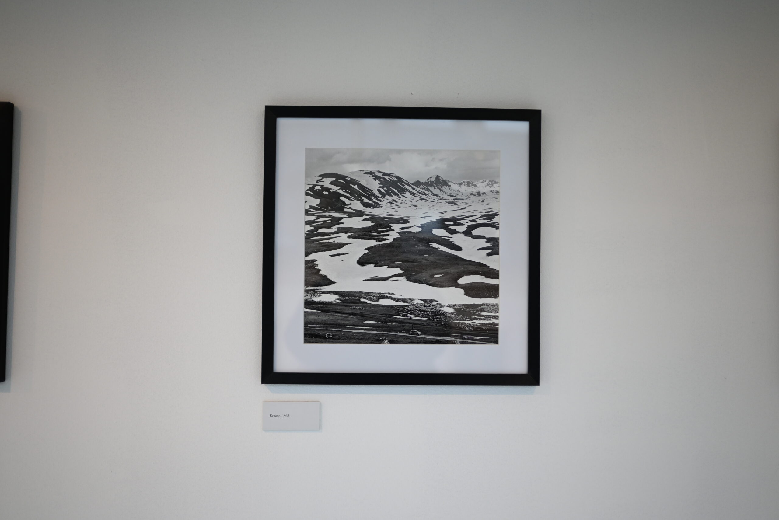
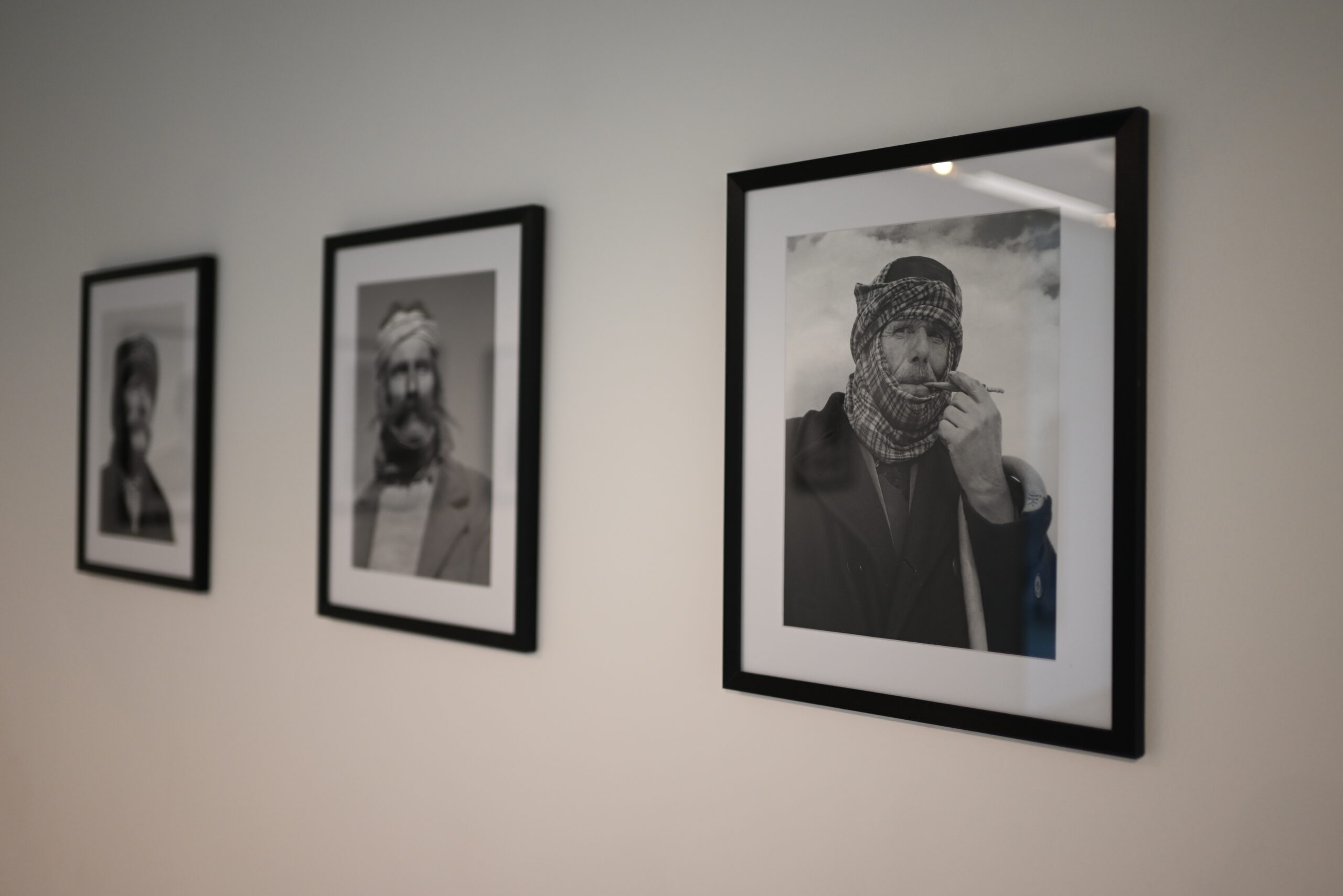
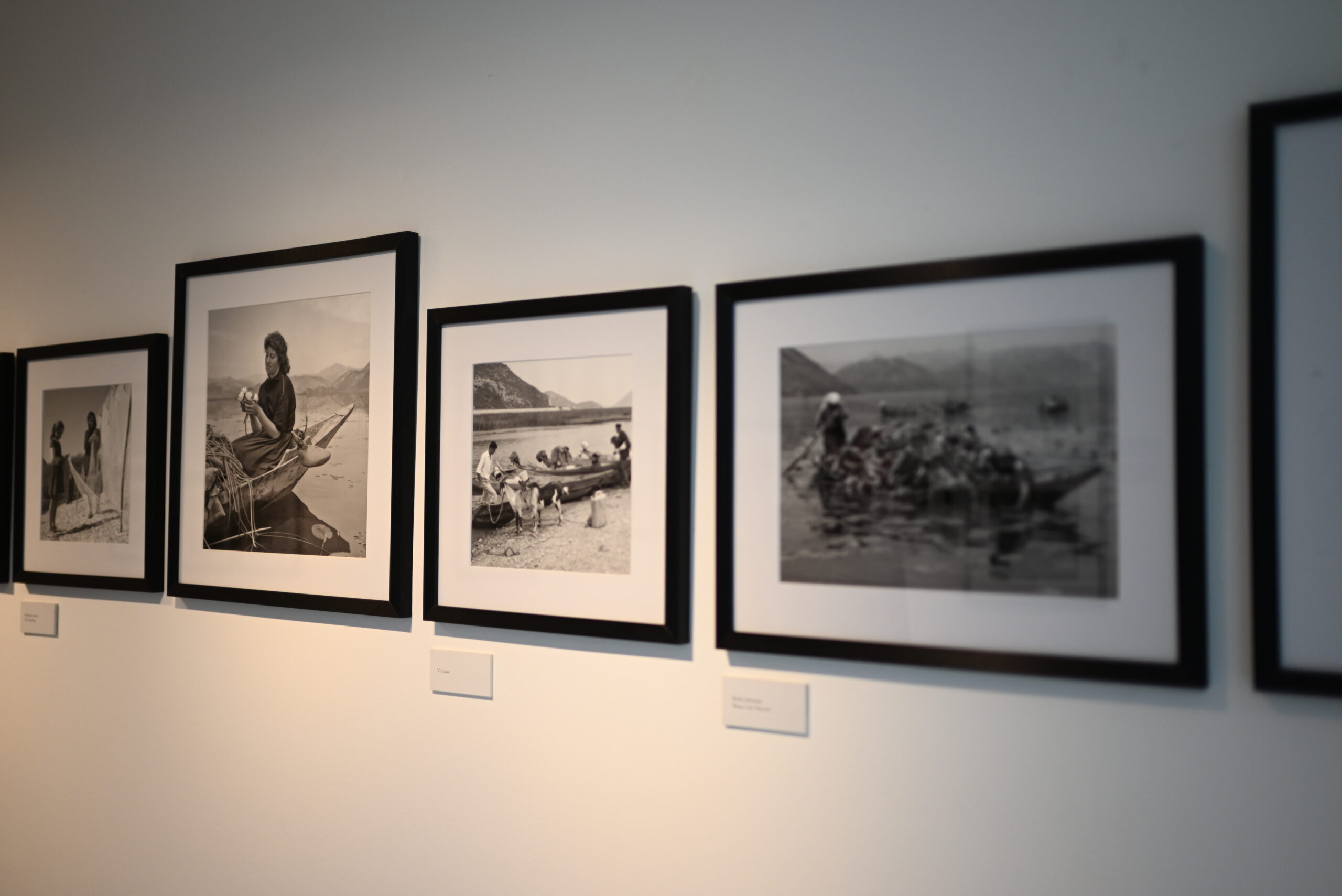
Visiting the photography exhibition of Milorad (Milan) Pešić in Cetinje felt less like attending a cultural event and more like stepping into a collective family album. As a girl born and raised in Montenegro, I did not walk into that space as a neutral observer. I walked in carrying memories, inherited stories, and a deep emotional connection to the landscapes and faces that Pešić captured through his camera.

Cetinje itself already carries a special weight for me. Old royal capital has a quiet dignity, a sense of endurance that mirrors the Montenegrin spirit. Seeing Pešić’s photographs displayed there felt right — as if the city and the images were speaking the same language. From the very first photograph, I felt recognition. Not just recognition of places, but of emotions. These were not distant historical documents. These were scenes I felt I had lived, even when they belonged to a time before I was born.

What moved me most was how familiar everything felt. The faces in Pešić’s portraits reminded me of my grandparents, my neighbors. The men — strong, reserved, shaped by the land — carried expressions I have seen my entire life. There is something uniquely Montenegrin in the way people stand, look, and exist in space, and Pešić captured that without exaggeration or romanticism.

As a woman, I found myself paying special attention to the images of women in the photographs. They are rarely posed or idealized. Instead, they appear real — working, waiting, carrying burdens both physical and emotional. Their strength is quiet, almost understated, yet undeniable. Looking at them, I felt a deep respect and a sense of continuity. These women are the reason our traditions survived. They held families together, preserved customs, and endured silence when words were not allowed.

The landscapes, too, stirred something deeply personal. Montenegro is a country of extremes — harsh mountains, calm seas, isolated villages, and narrow streets filled with history. Pešić’s photographs do not simply show these places; they remember them. The mountains feel heavy with time, the villages feel intimate and vulnerable, as if they could disappear if not preserved through images like these. Standing in front of those photographs, I felt gratitude that someone cared enough to document our world before it changed forever.

What makes this exhibition especially powerful is its honesty. Pešić did not try to beautify poverty or dramatize hardship. He simply observed. And in doing so, he allowed dignity to emerge naturally. His work reminded me that our history is not only written in books or political events, but in ordinary lives — in daily routines, in work, in silence, in perseverance.

Leaving the exhibition, I felt both proud and emotional. Proud of where I come from, and emotional because so much of what I saw belongs to a Montenegro that is slowly fading. Yet thanks to photographers like Pešić, it is not lost. It lives on — not as nostalgia, but as testimony.

This exhibition was not just about photography. For me, it was about identity. About seeing ourselves clearly, without filters, and accepting both the beauty and the hardship that shaped us. As a Montenegrin woman, I left with a renewed sense of connection — to my past, my people, and my place in this long, quiet story we call home.
IMPULSE #1 – Klanglicht Graz

Klanglicht 2026 war für mich ein richtig angenehmer Startpunkt für meine Recherche. Es war zwar erst mein zweites Klanglicht, aber diesmal bin ich ganz anders hineingegangen. Ich habe mir bewusst Zeit genommen und versucht, nicht nur zu konsumieren oder „schön zu finden“, sondern genauer zu beobachten, wie Licht, Sound und Raum eigentlich Emotionen erzeugen. Genau das ist ja auch der Kern meiner Arbeit: Erinnerungen spürbar machen – nicht nur zeigen oder erklären, sondern fühlbar werden lassen.

Was mich bei Klanglicht besonders fasziniert hat, war diese Mischung aus Staunen, Ruhe und gleichzeitig einem totalen Überwältigtsein. Man bewegt sich durch die Stadt, die man eigentlich gut kennt, und plötzlich wirken Straßen, Plätze und Gebäude komplett anders. Vertraute Orte verlieren kurz ihre Alltäglichkeit und bekommen etwas Fremdes, fast Zeitloses. Das hat mich stark daran erinnert, dass Erinnerungen nie fix oder abgeschlossen sind. Sie verändern sich ständig – je nachdem, aus welchem Blickwinkel man schaut, in welcher Stimmung man ist oder welche Atmosphäre gerade entsteht.

Viele Installationen haben genau dieses Gefühl verstärkt. Sie haben nichts „erzählt“ im klassischen Sinn, sondern eher Räume geöffnet, in denen man selbst etwas gespürt hat. Ich hatte oft das Gefühl, dass nicht das einzelne Werk im Vordergrund stand, sondern das Zusammenspiel aus Licht, Klang, Architektur und den Menschen, die sich darin bewegen. Dadurch wurde mir klar, wie sehr Erinnerung auch etwas Situatives ist – etwas, das im Moment entsteht und nicht einfach abrufbar ist wie eine Datei.

Ein Moment, der mir besonders hängen geblieben ist, war eine Projektion, die wie schwebende Lichtpartikel gewirkt hat, begleitet von einem extrem minimalistischen Sound. Es war nichts Lautes, nichts Dramatisches. Viele Leute standen einfach still da, teilweise minutenlang. Niemand hat geredet, niemand hat gefilmt. Das Ganze hatte etwas sehr Intimes, obwohl man von fremden Menschen umgeben war. Es war fast wie ein kollektives „In-sich-Hineinhorchen“. Genau solche Zustände finde ich extrem spannend, wenn es um neue Formen der Erinnerung an Verstorbene geht: Situationen, die automatisch entschleunigen, ohne dabei traurig oder kitschig zu wirken.

Mir wurde bei Klanglicht auch sehr bewusst, wie stark multisensorische Gestaltung Emotionen beeinflussen kann. Licht kann warm oder kühl wirken, Geborgenheit erzeugen oder Distanz schaffen. Klang kann Nähe herstellen oder einen Raum aufspannen, der fast leer wirkt. Und zusammen können Licht und Sound eine Stimmung erzeugen, die ganz ohne Worte auskommt. Das ist für mein Thema besonders relevant, weil klassische Trauer- und Erinnerungskommunikation oft sehr sprach- und bildlastig ist. Man erklärt, beschreibt, zeigt Fotos. Vielleicht müsste man Erinnerungen viel stärker erleben lassen, statt sie zu erklären oder zu archivieren.

Das Festival hat mir außerdem gezeigt, dass Emotionen nicht nur im Inneren einer Person entstehen, sondern stark vom Raum und von anderen Menschen beeinflusst werden. Die Stimmung zwischen den Besucher*innen, das gemeinsame Schweigen, das langsame Gehen – all das trägt zur Erfahrung bei. Erinnerung ist damit nichts rein Privates, sondern etwas, das auch kollektiv entstehen kann, ohne laut oder aufdringlich zu sein.

Was ich vom Festival konkret mitnehme:
-Erinnern kann interaktiv sein, ohne dass man aktiv etwas bedienen oder steuern muss – manchmal reicht schon Bewegung, Licht und Atmosphäre.
-Emotionen entstehen oft im Raum zwischen Menschen, nicht nur in ihnen selbst.
-Erinnerungsdesign könnte viel stärker mit Raum, Stimmung und Zeit arbeiten, statt sich nur auf Objekte, Texte oder Bilder zu konzentrieren.

Klanglicht war für mich damit weniger ein Event und mehr eine Art Denkraum – und ein sehr stimmiger Einstieg in meine weitere Recherche.

Links:
https://www.klanglicht.at
Analysing the Multi‑sensory Elements of Immersive Experience for Art Exhibitions (PDF)
https://www.mdpi.com/2075-5309/15/8/1393?utm_source=chatgpt.com

#16 Creating an AI Video Illustration

AI is no longer limited to creating images. Today, it is also possible to animate illustrations. Short videos, subtle motion, and atmospheric loops can be generated from a image or prombt. Since I had never animated illustrations with AI before, I decided to try it out and see how it works in practice. i knew that its possible to create illustrateded animation videosfrom the scratch, but I am intrested in using already existing illustrations and animating them. I heared it works best for minimalistic, subtle animations. That’s why I chose my illustration, which I’ve used once before. I think it has the potential to be pretty good. This blog post is an exploration and an experiment with AI and based on the previous post.

Why I Wanted to Try AI Animation

As an illustrator, animation has always felt like a separate skill set. Traditional animation takes time, planning, and technical knowledge. AI promises a faster and more accessible way to bring illustrations to life, even without animation experience. Sometimes even small animations enhance an illustrations more, especially for soocial media.

Over all I was curious to find out:

  • how much control I actually have
  • how natural the movements look
  • whether AI animation feels like a useful tool or just a visual effect
  • which Generator is the best

How AI Animation Works (as a user)

Most AI animation tools work with an image-to-video approach. You upload a finished illustration and describe how it should move. The AI then creates a short animated clip based on your image and text prompt. Typical movements include flowing smoke, water, light, or subtle object motion. These animations are usually short and loopable, making them suitable for social media, websites, or mood visuals.

Let’s Start Animating

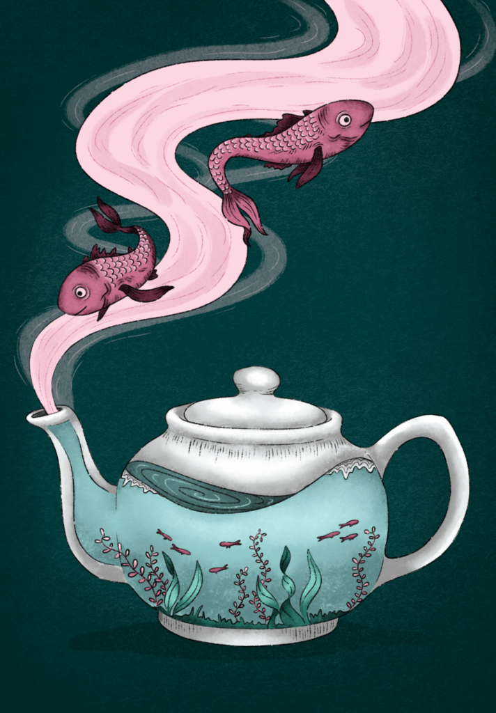
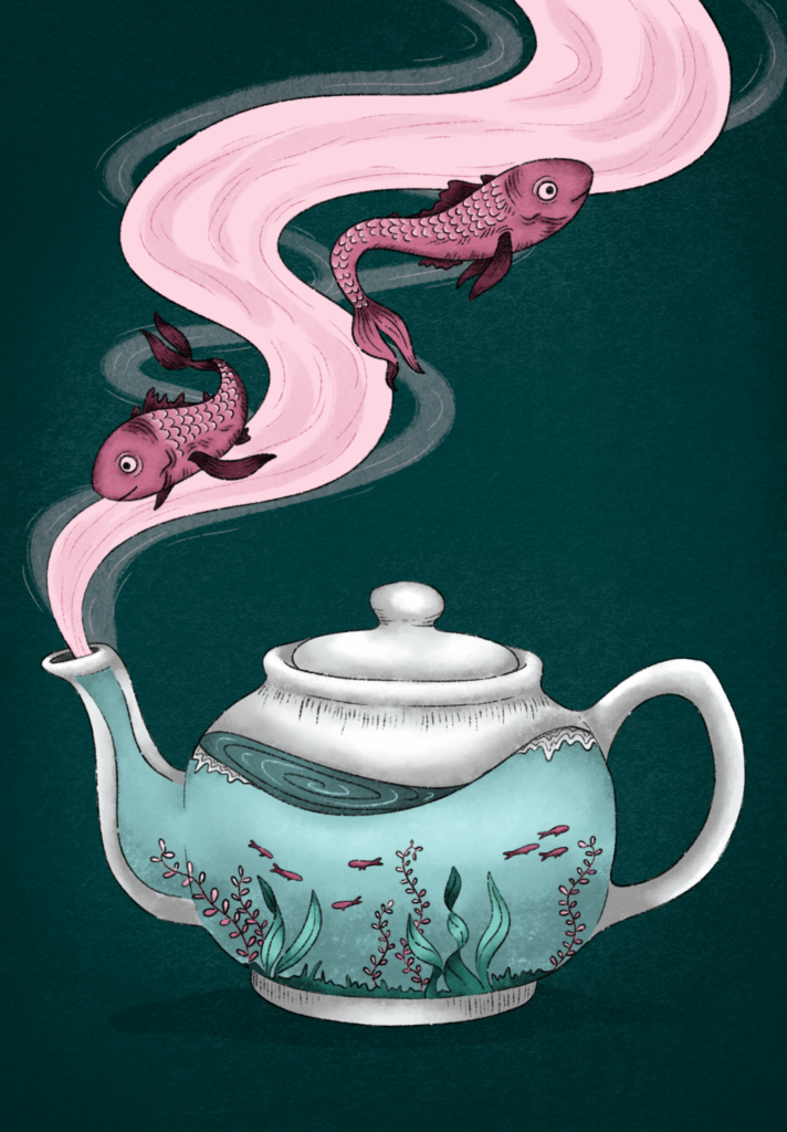
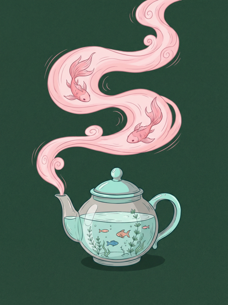
For my first tests, I decided to focus on tools that are commonly used (and free) for image-to-video animations. I let Chat GPT write the prombt for my imagined animation. Here how it turned out and the picture an want to use, which you may already know from my previous article:

Soft, slow animation. The pink smoke gently flows out of the teapot spout and moves upward in a smooth curve. The fish inside the smoke slowly swim forward. Calm, dreamy motion, no camera movement, subtle loop.

It was not easy to find Generators that are completly free. I just can just Firefly because I have an Adobe Subscription but there exclusive material as well. The good thing on Firefly is, that you can choose between a lof of diffrent models. Most websites require you to purchase credits, but there are some models where you have a few credits available in the free plan as Leonardo Ai or Stable Diffusion. However, I assume that you will achieve the best results with paid models.

  • Firefly Veo 2: You just can create 9:16 or 16:9 which is very limiting, just the fishes are moving, even though one of the fishi sis turning weird, I like the flowy and slow motions
  • Stable Diffusion: I tried Stable Diffusion for the first time and I have to admit I am very happy with this result, the movements of the fish are really realistic and I like how the smoke is slightly moving in the background, it looks very magical
  • Firefly Ray 3 HDR: I like how the smoke is slowly moving upwards and how the fish are floating around it, I dont get why the camera is mocing upwards cause there is no information about it in the prombt but I kinda like it, what’s really strange are the colors and how gray and dark they’ve become.
  • Firefly Pika 2.2: Really dont know whats going on there
  • Leonardo AI: I had high hopes on that generator but it turned out a bit weird, i like how the smoke is flowing, but everything is moving way too fast
Firefly Veo 2
Stable Diffusion
Firefly Ray 3 HDR
Firefly Pika 2.2
Leonardo AI

I think the best result so far came from Stable Diffusion. That’s why I wanted to refine the prompt and make it more precise, to see if I could achieve an even better result, even though I already really like how it turned out. Here’s what I got.

Unfortunately, I couldn’t manage to keep the fish inside the frame. Aside from that, I really like the movements inside the teapot, especially the gentle water motion and the way the small fish swim. If it were possible to combine these movements with the version shown above, that would be my ideal result.

Final Thoughts

Animating static illustrations with AI is something I find really interesting. Compared to fully creating illustrations with AI, I like this approach because it lets you add motion to existing artwork and create cool results very quickly. You don’t need any After Effects skills, and traditional animation usually takes a lot of time.

Especially for social media or small animated pieces, AI animation is a great option. You can get something moving without a complex workflow. It could also be interesting to animate individual layers separately and then combine them, which might lead to even better and more controlled results. Prompting is still challenging, especially when you have a very specific idea in mind, but overall it’s an exciting and accessible way to experiment with animation.

#15 Experiments with AI and Illustration

Artificial Intelligence is currently one of the most discussed and controversial topics in the creative industry. Especially for illustrators, AI raises many questions, fears, and also curiosity. Some see it as a threat, others as a useful tool. Instead of taking a clear position right away, I decided to test AI illustration tools myself and see what they can (and cannot) do. The goal of this article is to explore it through a practical experiment and see what models are the best for illustrations.

Between Fear and Opportunity

I have already written a blogpost on this topic. However, for the purpose of completeness, I would like to reiterate the most important points here. AI in illustration comes with many concerns, and these concerns are valid.

On the negative side, many AI tools are trained on artworks without the consent of the original artists, which raises ethical concerns. Many illustrators fear job loss or that their work will lose value. AI also tends to copy existing styles without truly understanding their meaning.

On the positive side, AI can be useful when used carefully. It allows fast idea generation, quick experiments, and can support inspiration and composition during the creative process.

This mix of risks and possibilities is why AI remains such a challenging topic in illustration.

The Experiment: Recreating My Illustration with AI

For this experiment, I used one of my own illustrations, which I created manually in Procreate. This illustration served as the reference and starting point. The idea was to see:

  • how close the AI results come to my original illustration
  • how well the style, colors, and mood are translated
  • where AI performs well and where it clearly fails

From my experiences using AI Genereators, its easier to let AI write the Prombt for the gererated picture instead of write it by myself. So I gave Chat GPT my Illustration and asked him to describe this illustration in form, color an style for an AI Generator Prombt.

This is how it turned out:

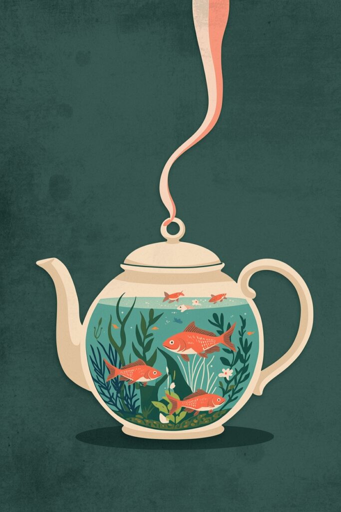
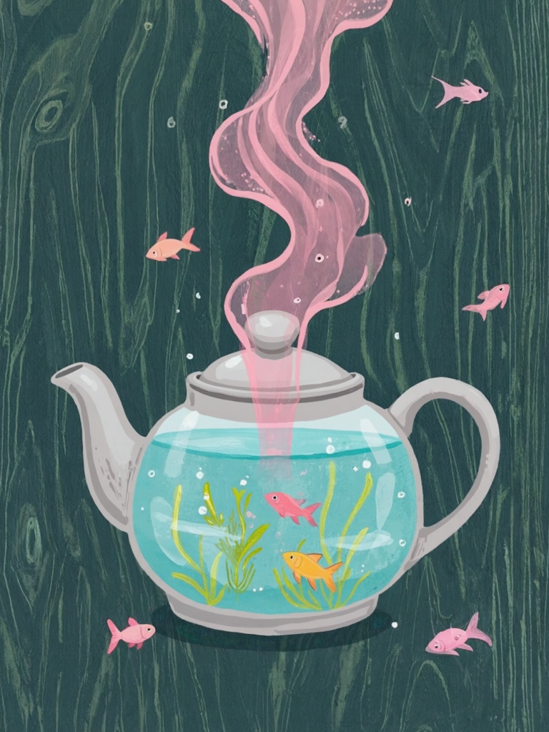
A surreal hand-drawn illustration of a ceramic teapot filled with water like a small aquarium. Inside the teapot, tiny fish and aquatic plants are floating gently. From the spout of the teapot, a soft pink stream flows into the air, and two larger pink fish are swimming within this flowing stream. Dark green textured background, soft pastel color palette with turquoise, pink, and muted grey tones. Whimsical, poetic atmosphere, clean linework, subtle grain texture, storybook illustration style, calm and dreamy mood.

Let’s start the AI Competition

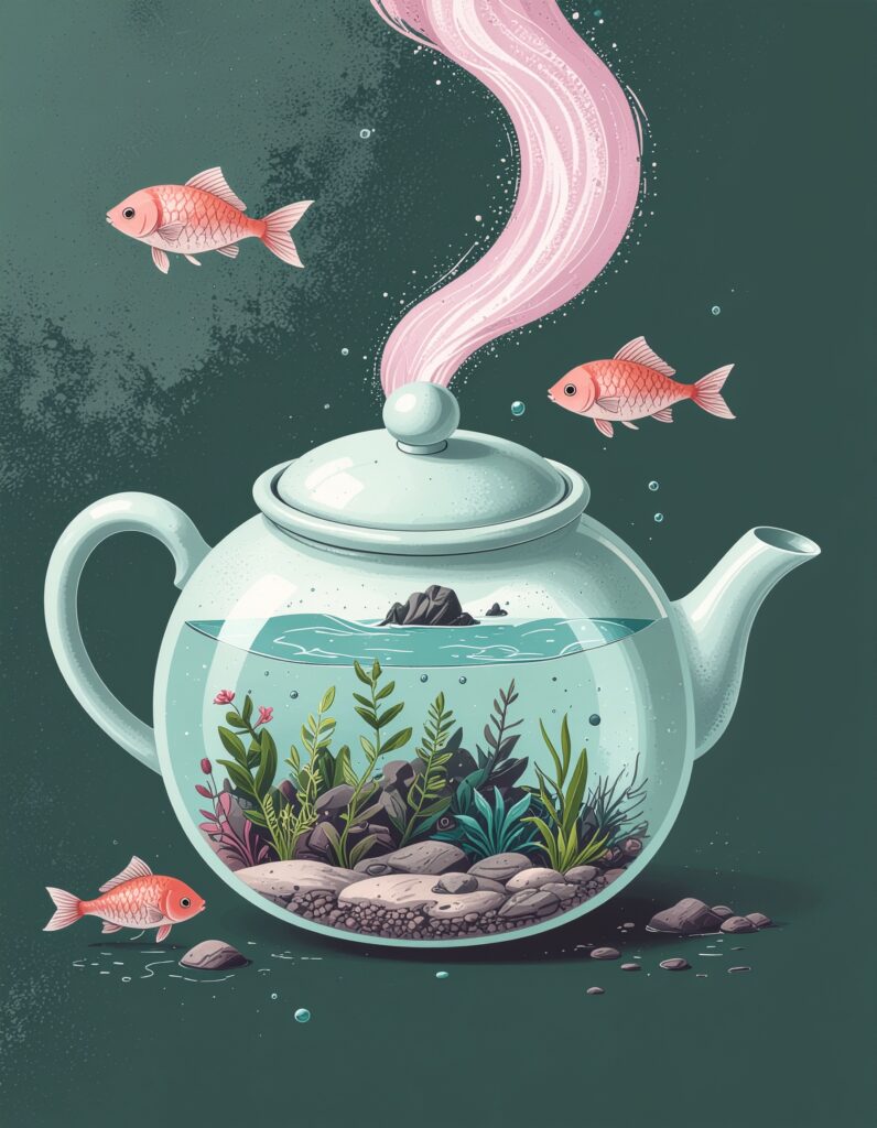
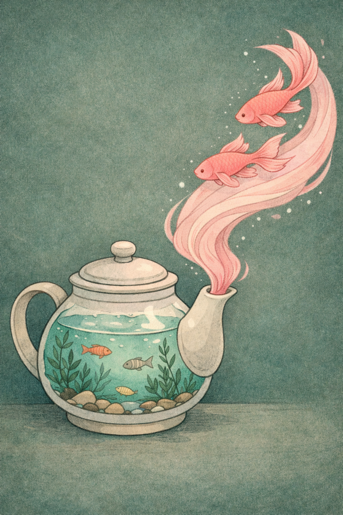
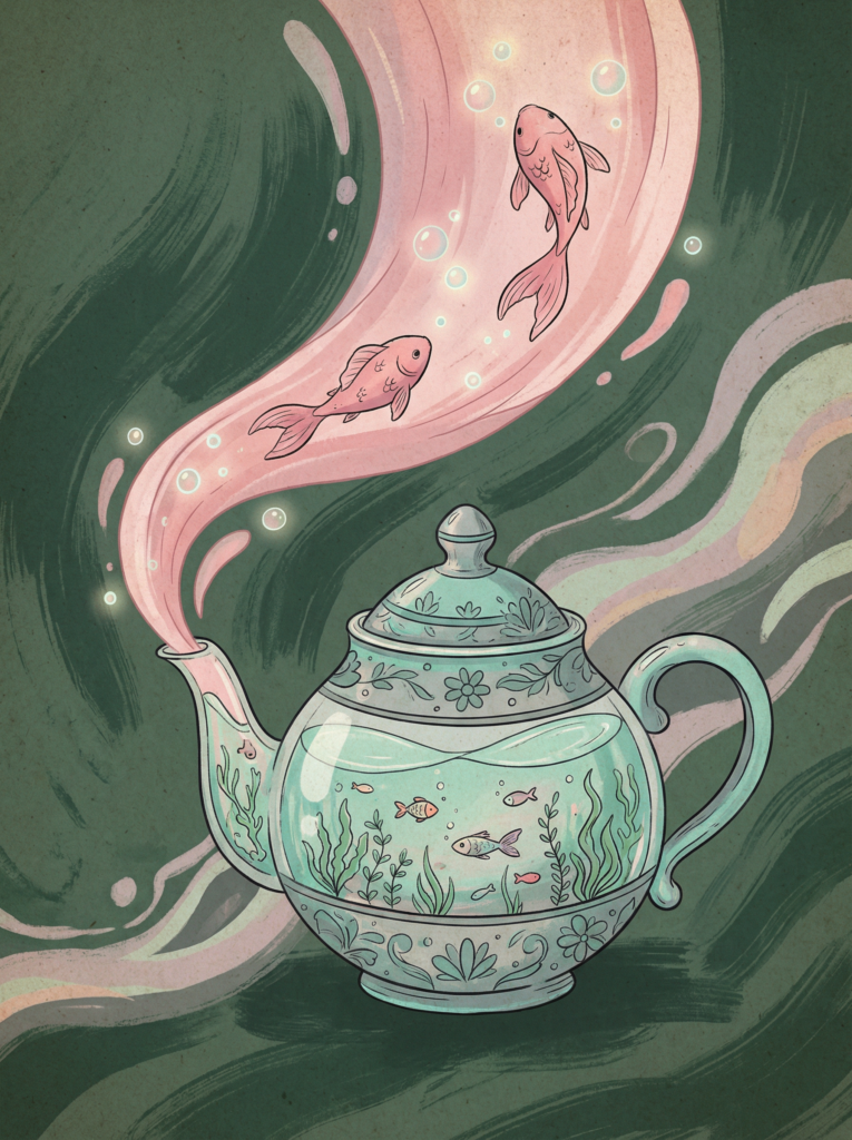
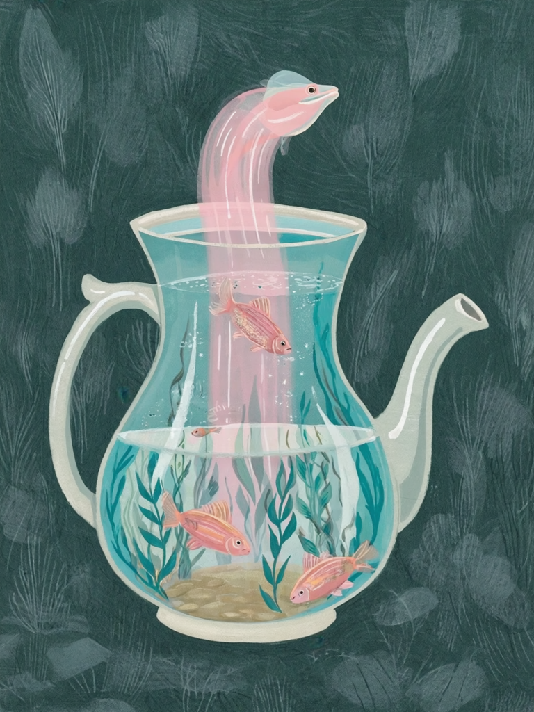
For this experiment, I tested several popular AI image generator models mainly from Firefly. Here are the results and my opinion on it:

  • Firefly Image 4 Ultra: it dosen’t make sense at all, the style is quite mixed up (3d and 2d elements), don’t understand the stain in the backgorund, at least the teapot looks quite nice with the aquarium in it
  • Chat GPT Iamge 1.5: I think thats one of the best results when it comes to similarity, the style is illustrative and handmade, it actually make sense, but I don’t like the layout it seems kind of lost and random, the fishis are nice
  • Gemini 3 with Nano Banana Pro: This modell is usually one of my favorites, I like the artsy style, I think its the best result in gerneral which you could actually use for something (or work further on that), It’s all kind of random and not exactly like the prombt but the style fits pretty well
  • Flux 1.1 Ultra Raw: The only thing I like here is the bold and graphic style, without the fish in the air and the tiny smoke-thingy it could look nice
  • Runway Gen-4 Image: What the hell is happing here?! But to be honest if there were no weird eel-ghost there, I would choose that as the winner picture. I really like the style, it looks very editoral-ish and artsy, even though its the most diffrent compared to the original one
  • Leonardo AI: I tried this website for the first time as I read it should work well for illustrations, turns out: not really. I think its together with the Firefly Ultra its my least favorite, the style is kind of nice (maybe for posters) but it dosen’t make sense
Firefly Image 4 Ultra
Chat GPT Image 1.5
Gemini 3 with Nano Banana Pro
Flux 1.1 Ultra Raw
Runway Gen-4 Image
Leonardo AI

I thought this experimetn was really fun, but I am not completley happy with it at this point. So I decided to take my favorite model and work on the gererated picture until I am happy with the result. Since I really liked the Style of the Runway Gen-4 Image Generator I chose to go with that one, even though the compostions is hilarious. But I see the most potentiol here to get a nice and artsy result.

But after half an hour promting by myself and chat gpt, the picture below was the best result I could get. So I gave Runway up again and switch to my usual favorite Nano Banana again.

Runway
Nano Banana

I tried hard to create a nice result, but the one from Nano Banana was the best I could get. Its kinda nice, but the artsy and handdrawn style is totally missing. It always seems easier than it is to prombt something nice, but actually its pretty hard and time consuming. Probably I could get a better result than this, but I dont wanted to waste so much time (and of course energy) to create those images. And I think thats the whole point: It’s kind of fun to prombt something until it doesn’t work out the way we want or it dosen’t match our expectations. It was interesting and fun to create these images and see how differently each generator works, but it was not as enjoyable as painting the illustration myself. In the end all the created images are looking like AI images. I can’t say exactly why – maybe the too clean lines, the over perfectionsim or the plain textures – but you can see it in all of them. They have no soul and no personality. I don’t want to be an AI-hater, because I am sure that we all have to use it in the future, but with real art at least for me it can’t compete and won’t ever.

I am sure that for some tasks or areas, it makes sense, especially if it doesn’t matter much which illustrations are used. It can save a lot of time and produce beautiful results. Perhaps there are also ways to combine analog illustration and AI, which would certainly be interesting to test. But all in all, I believe and hope that human illustration and art will always remain an important and irreplaceable part of our lives.

Because Art without soul is like a book without words.

#14 Originality and AI

Following on from my thoughts in my previous blog post on “Sketchbook,” I looked into the topic of AI and illustration in more detail and came across Eileen Isagon Skyers’ TED Talk. I found her ideas very interesting and similar to my own, which is why I would like to share them here.

What does originality mean when machines can generate images?

That’s the question she is asking the audience. Eileen Isagon Skyers explores how AI is changing art and creativity. Her key points are:

  • Originality may now be collaborative, layered, and concept-driven rather than purely hand-drawn.
  • AI produces images that are both familiar and uncanny, blurring lines between human and machine creativity.
  • Artists working with AI often act as curators, shaping output by selecting, refining, and guiding the machine.
  • Questions arise around authorship, emotion, representation, and bias: who defines originality, and whose stories are told?

Why this matters for Illustrators

Originality in art is changing. It is not just about drawing perfectly but about showing your own voice, making choices, and putting intention into your work. Illustrators today often guide ideas and improve the results instead of creating every detail by hand. What really matters is emotion and story. AI can make pictures, but it cannot capture real experiences or true feelings. It is also very important to think about representation, to consider whose stories are shown, which visual traditions are included, and which are left out.

AI aka creative thief

When talking about the originality of AI artworks, one must of course also ask where AI gets its references from. That’s right – from all of us. Caught up in the AI and art bubble, I came across two more TED Talks that deal with precisely this topic. One by Ed Newton‑Rex on how AI “steals” creative work and another by Melody Liu on the ethics of AI art. Both show that AI can create impressive images, but it raises serious questions about originality, authorship, and fairness.

AI learns from existing artworks, often without permission. This means that styles, images, and ideas created by real human artists are used to train machines that can then produce new work. On one hand, this can inspire new creativity and speed up the illustration process. On the other, it risks taking away recognition, income, and the personal voice of artists.

Another issue is emotion and story. AI can combine shapes and colors perfectly, but it cannot capture lived experience, personal feelings, or the soul an artist puts into their work. Without that human element, art can feel empty. Finally, representation is also a concern: AI reflects the biases of its training data, so some voices and cultural traditions are left out, while others dominate.

How to protect your art

Ed Newton‑Rex also talks about how artists can protect their work from being used by AI without permission. One important step is to be aware of where and how you share your art online. Artists can use copyrights and licenses to make clear how their work can be used. Another idea is to add signatures or branding so people can see which work is original. Newton‑Rex says it’s important for artists to have a say in how their art is shared online, so they can protect both their voice and their income.

My take away

Of course, everyone knows by now that AI steals from real artists, but it’s easy to ignore and these talks really made me realize that I need to keep it in mind before posting anything online, especially on Instagram or Pinterest. My opinion on AI hasn’t really changed since my last blog post, it feels like most people talking about AI in a good way as “art” aren’t really illustrators or working artists. Still, I’m sure there are positive ways to use AI creatively without losing the soul of art, and I probably need to explore that side more. All three TED Talks I watched were really interesting and raised a lot of important questions. There are definitely many more talks out there on this topic for anyone who’s interested. I’m not sure if I want to explore this topic more deeply at this point, but maybe it could be part of a research.

#13 Color and and Form in Editorial Design

How Color and Form Shape Emotion in Editorial Illustration

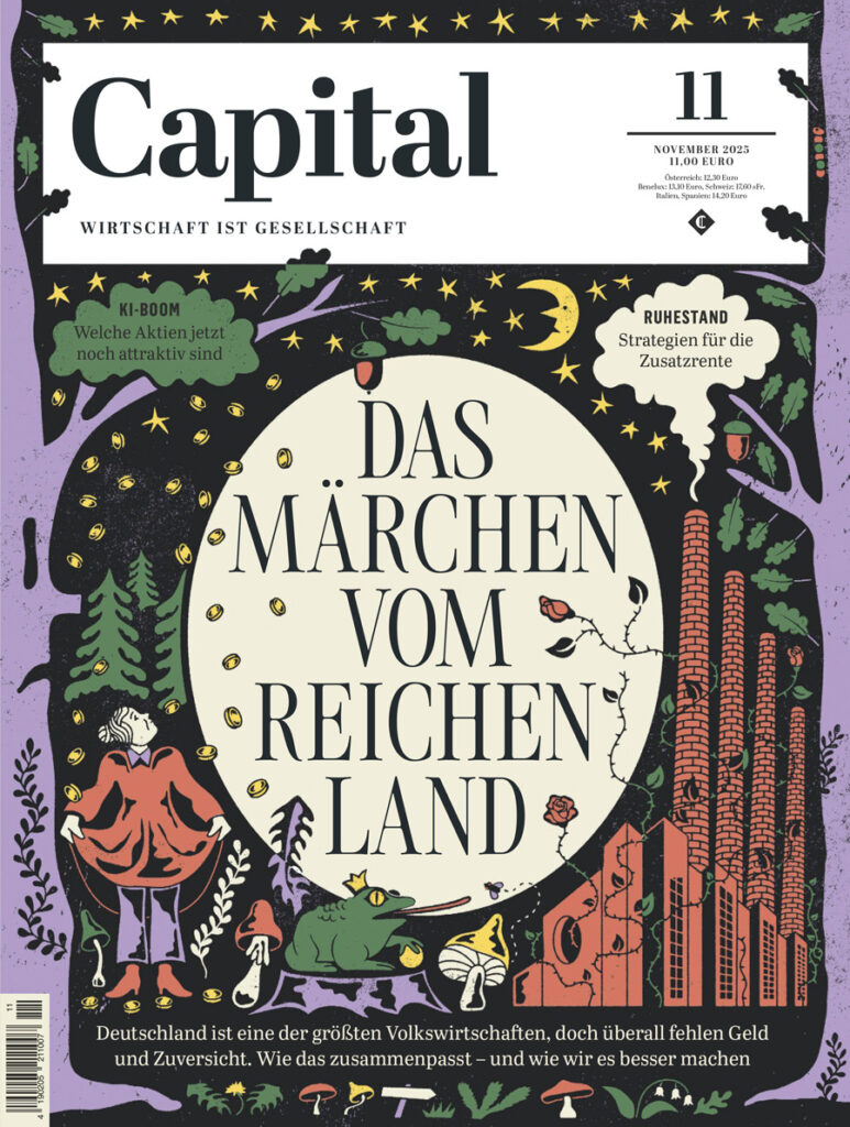
Editorial illustrations are pictures that go with articles in magazines, books or online. They help people feel the story, not just read it. The way an illustrator uses colors and shapes can change how the viewer feels about the idea before they even read the words. As I want to do something with Editorial Illustration or Design in my Master Thesis, I decided to dive a bit deeper in this topic again.

Why Color Matters

Color is one of the first things we notice in an image. Colors can change our mood and make us feel something without thinking too hard. For example:

  • Red can make an illustration feel energetic, urgent, or strong.
  • Blue can feel calm, quiet, or thoughtful.
  • Yellow feels happy, bright, and full of energy.

This works because our brains connect colors with feelings, often without us planning it. A red element might make a viewer feel alert immediately, while a blue background can make a story feel peaceful. Illustrators use these color feelings on purpose. For example, an editorial illustration about climate change might use mostly blues and greens to make the reader feel calm and connected to nature. A political cartoon about protest might use bold reds and blacks to show intensity and movement. In this picture you see the typical color meanings. It significant to consider this while creaitng something for a certain information and emotion.

How Shapes and Forms Affect Mood

Color isn’t the whole story. The shapes and forms the illustrator uses also give the viewer emotional clues.

  • Soft, round shapes often feel friendly and gentle.
  • Sharp, pointed shapes feel tense or active.
  • Large open spaces can feel calm or lonely, while crowded shapes can feel busy or chaotic.

The way elements are arranged on the page (called composition) also matters. A centered figure can feel stable or important, while a tilted composition can create tension or movement.

Golden Cosmos: Colorful, Playful, and Thoughtful

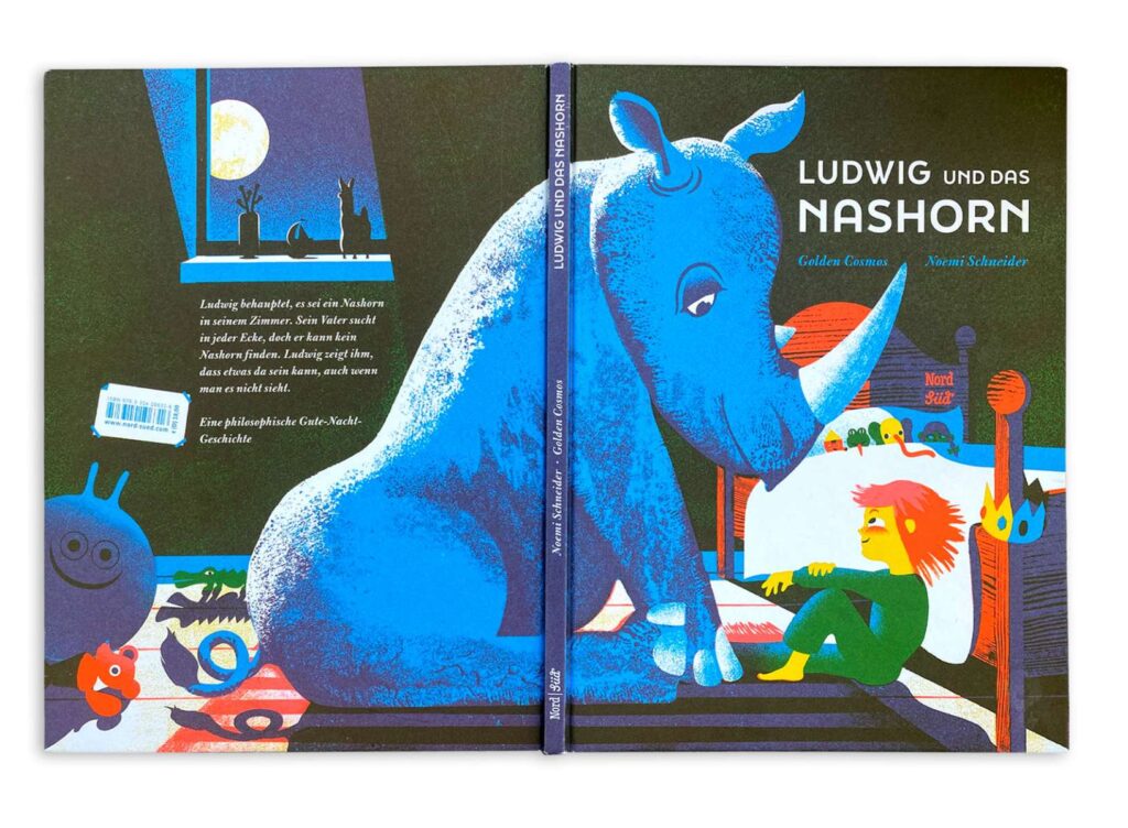
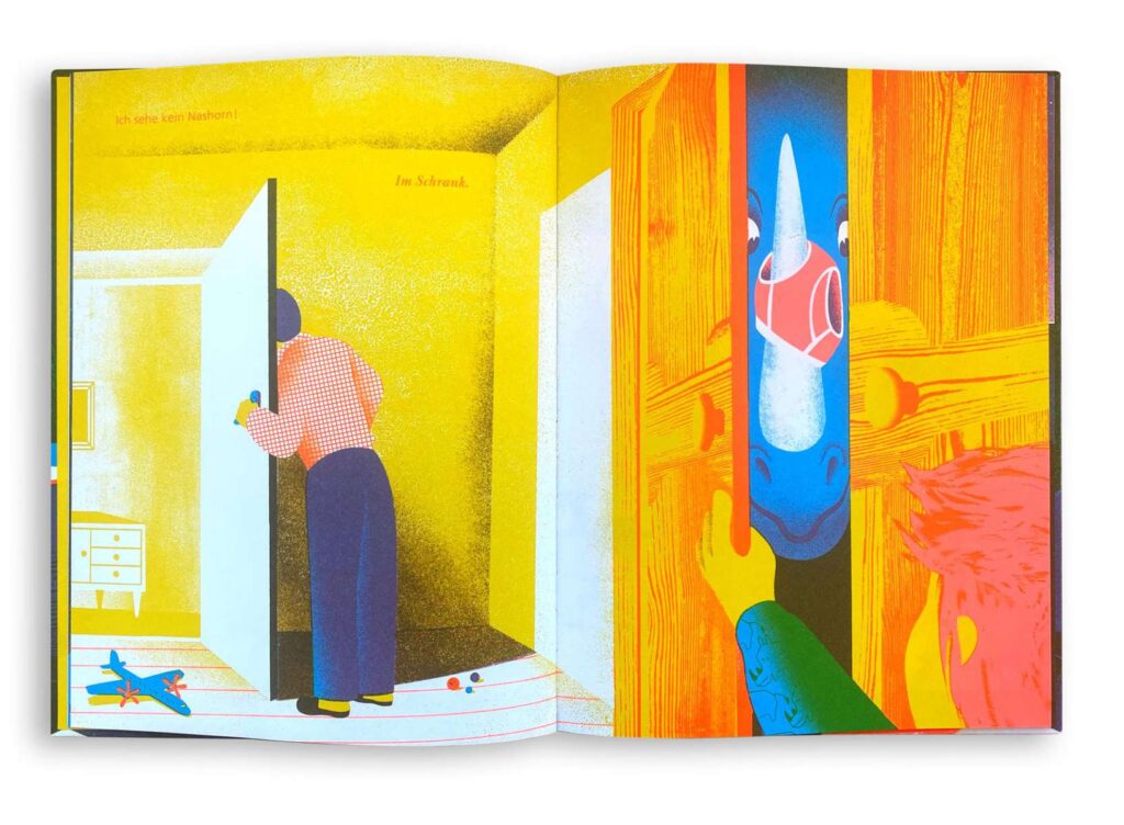
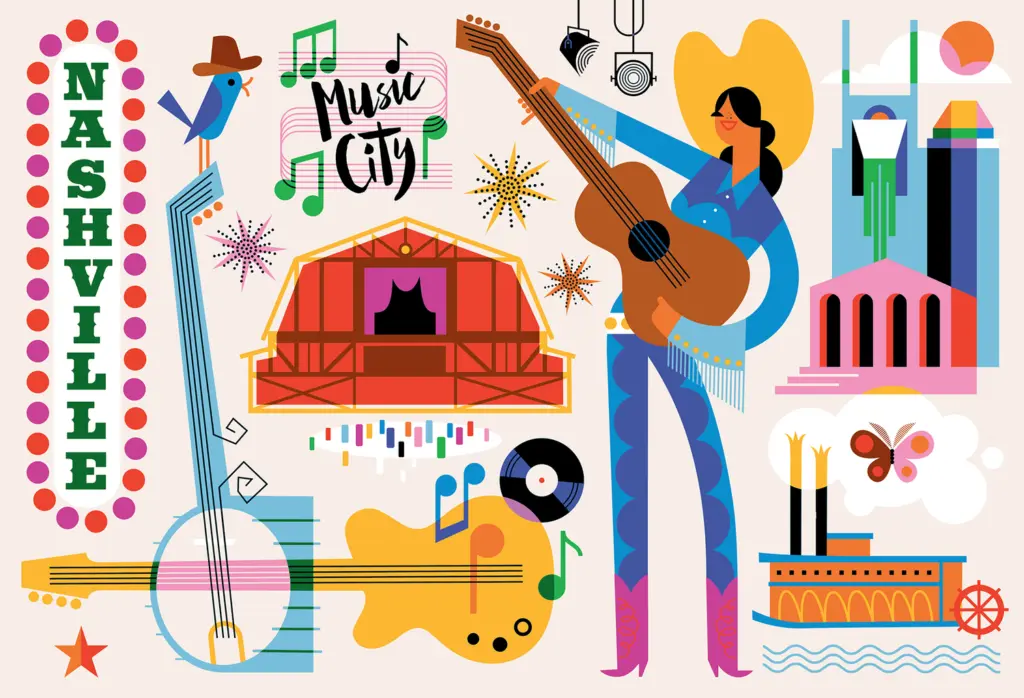
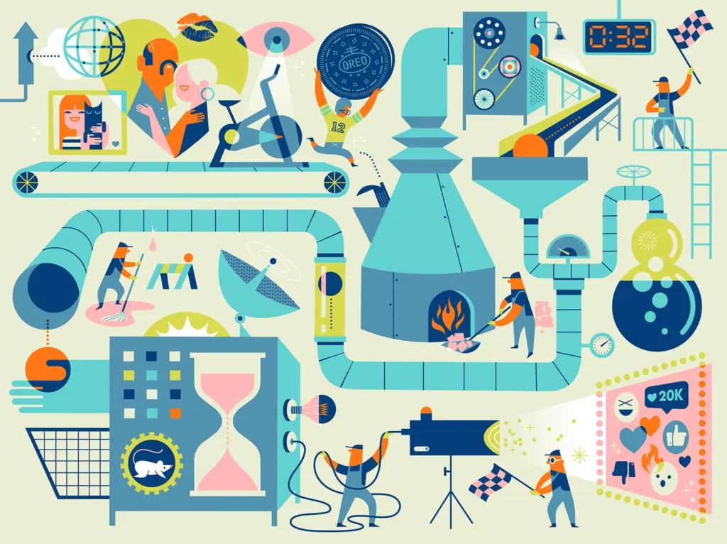
One of the best real-world examples of how color and form influence emotion in editorial illustration is the Berlin-based duo Golden Cosmos (illustrators Doris Freigofas and Daniel Dolz). I saw their website and thougt they are doing really really nice work. They are working for major international publications like The New York Times, The New Yorker, Die Zeit, and Bloomberg. Their style is instantly recognizable because they use bright, contrasting spot colors, simple shapes, and a screen-print-like aesthetic that feels both bold and warm.

How Their Work Uses Color and Shape

  • Bold palettes: Golden Cosmos often limits their illustrations to a few strong colors which create a feeling of energy and focus. In editorial contexts, this helps draw readers in and gives a visual intensity that matches serious topics.
  • Simple but expressive forms: Their people and objects are usually drawn in flattened shapes with playful proportions. This makes spaces feel open and engaging, not heavy or literal, and lets readers connect emotionally before reading the text.
  • Narrative scenes: Instead of just illustrating a literal idea from the article, they often build scenes with small stories inside them which makes the illustrations feel like visual essays themselves.

In their picture book work (like Ludwig and the Rhinoceros) the duo gained awards for color and spatial design, showing that color and composition are central to their emotional storytelling whether in editorial work or book illustration. I thought comapred to usual childrenbooks, it is really diffrent in how they using colors and shapes.

Another Example: Kirsten Ulve

A second great example of emotional editorial illustration comes from Kirsten Ulve, an American graphic artist known for her vibrant editorial and caricature work. Ulve’s illustrations appear in publications such as The New York Times, Vogue Japan, Los Angeles Times and Entertainment Weekly.

What Makes Ulve’s Work Emotionally Effective

  • Expressive color: Ulve often chooses bold and saturated colors that draw attention and give a lively energy to the topics. For example, using strong reds and blues in political caricatures gives urgency and emotional punch to commentary about public figures.
  • Character and exaggeration: Her caricatures use shapes and proportions that exaggerate personality traits, making the emotional impact of the subject immediately clear. A reader can sense mood (whether satire, tension, or humour) before reading a word.
  • Collage and texture elements: In addition to flat color, Ulve sometimes combines visual textures and patterns that heighten emotional contrast, like rough patterns behind calm figures to show underlying conflict.

Ulve’s strong and confident use of form helps editorial stories about politics, culture, and society feel alive and very human, which keeps readers visually engaged and emotionally connected.

Why Color and Form Matter in Editorial Illustration

Whether it’s Golden Cosmos’ bright screen-print shapes or Kirsten Ulve’s expressive caricatures or editorial illustration uses visual language to communicate emotion. Here’s why it matters:

Color Sets the Mood

Color creates emotional cues instantly. Bright, high-contrast colors can feel urgent or joyful, while muted or limited palettes can feel calm, serious, or reflective. Color can signal the right emotional tone even before someone starts reading.

Shape and Composition Guide Understanding

Shapes and layout help guide the reader’s eye. Organic, flowing shapes can feel natural and warm. Straight lines or geometric forms can feel structured and formal. How space is organized around figures or objects shapes the viewer’s emotional response to the idea being illustrated.

Emotion First, Narrative Second

Illustrations that influence emotion don’t just show facts, they embody a feeling. This is especially effective in editorial contexts where the illustration sets the tone for the article and stays in the reader’s memory long after they’ve moved on.

Conclusion

Color and form are more than stylistic tools, they are emotional languages in illustration. When illustrators choose color palettes thoughtfully and shape forms with intentional emotional impact, they give editorial stories a deeper voice and connection. Golden Cosmos and Kirsten Ulve are great examples of how strong visual design can turn words into feeling. For me personally its very helpful and inpirational to compare such examples as Golden Cosmos or Kirsten Ulve and just look at their work.

Sources

https://www.golden-cosmos.com/

https://www.kirstenulve.com

https://www.itsnicethat.com/articles/golden-cosmos

https://www.numberanalytics.com/blog/the-power-of-color-theory-in-editorial-illustration

https://kreafolk.com/blogs/inspirations/art-of-editorial-illustration

IMPULSE #1

Animation has never been just for children.

As a kid, I saw the world through colors that only existed in Disney movies. Everything felt brighter, softer, and more hopeful. Movement flowed the way it does in Studio Ghibli films—alive, intentional, full of quiet emotion. Those stories didn’t just entertain me; they shaped how I understood kindness, courage, and what it meant to see others as more than what they appeared to be.

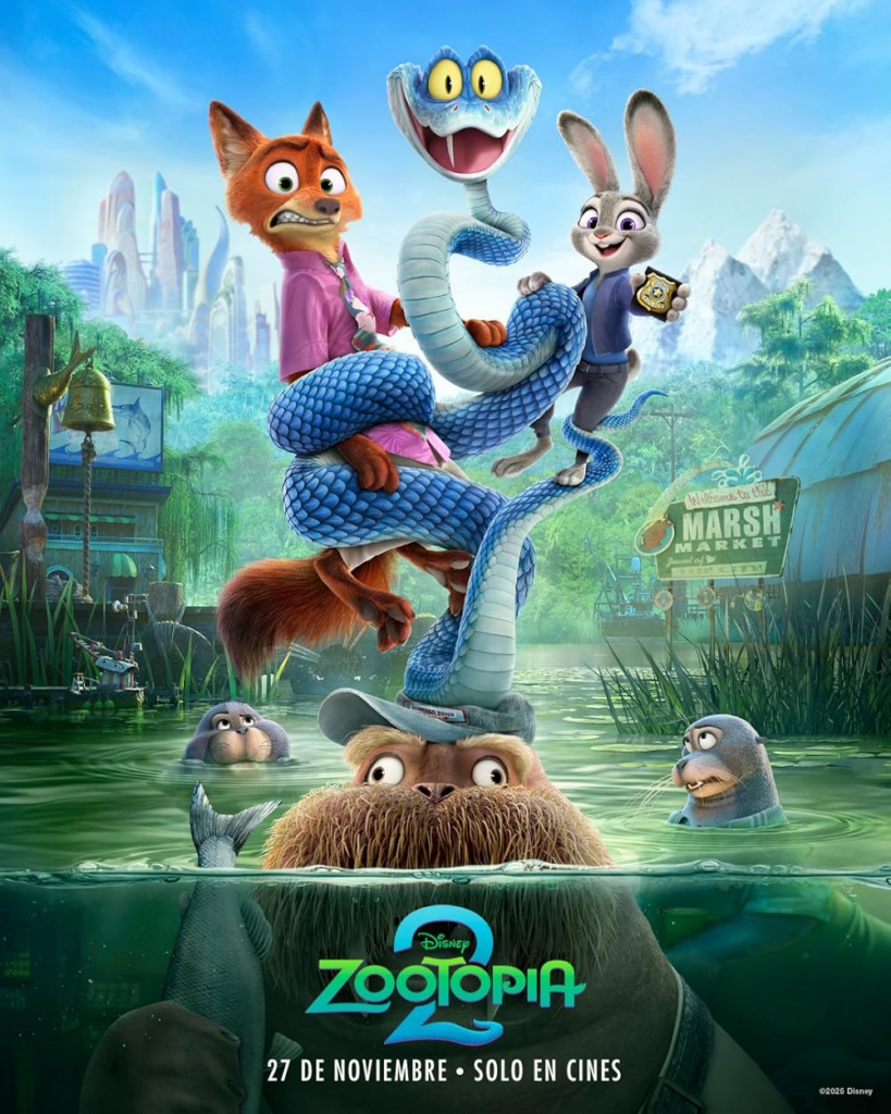
One animated film that sparked that feeling again this year was Zootopia 2, directed by Jared Bush and Byron Howard. As a sequel to Zootopia, it carries forward a world that was never afraid to talk about uncomfortable truths.

When Zootopia was first released, it stood out because it dared to explain racism and prejudice in a way children could understand and adults could reflect on. Predators and prey weren’t just animals—they were symbols of how fear is created, how stereotypes are formed, and how entire groups are judged based on the actions of a few. The film sent a powerful message: bias is learned, and unlearning it requires empathy, self-awareness, and courage.

That message was important when the film first came out, and it feels even more urgent today.

Zootopia 2 builds on this foundation by exploring themes that resonate deeply with the world we currently live in—division, inherited fear, and the cycles of conflict that pass from one generation to the next. Without naming real-world events directly, the film reflects the reality of modern global tensions, where communities are shaped by long histories of trauma and misunderstanding.

What makes animation so powerful is its ability to hold these heavy ideas without overwhelming its audience. Through animals, color, and movement, it creates space for reflection rather than confrontation. Children absorb lessons about empathy and fairness, while adults recognize the uncomfortable truths hiding beneath the surface.

Maybe that’s why we keep coming back to these stories—not because we want to escape reality, but because we want to remember who we were before the world told us to stop caring.

https://www.thepersistent.com/the-secret-feminist-message-hidden-in-zootopia-2


TR #1 Master of what exactly?

For me, the decision was relatively simple. I wasn’t done with the knowledge I had gained during my bachelor’s studies. Several of the projects I was working on felt unfinished, and I believed they had a future beyond the university context.

The research I was most deeply involved in focused on Yugoslavia and the Balkan region. Coming from the Balkans is not just a geographical fact for me—it shapes how I think, work, and create. It carries a complex history of fragmentation, and resilience, but also a strong sense of shared culture, shared contradictions, and collective memory. This background influences the questions I ask and the themes I repeatedly return to in my work.

My bachelor’s thesis is closely connected to LGBTQ+ identities and rights, and to how these are understood and lived in the Balkans and then Yugoslavia. I was interested in the tension between visibility and safety, progress and backlash, and in how legal rights, social acceptance, and everyday realities often do not move at the same pace. Looking at the Yugoslav past alongside the current political and cultural climate helped me understand how ideas of freedom, community, and solidarity have shifted over time.

Continuing with a master’s degree felt like a natural next step to deepen this research. It offered the space to further explore questions of identity, belonging, and resistance, and to critically examine how personal experience can become a political and artistic position. For me, staying in academia was not about postponing “real life,” but about giving these topics the time, care, and complexity they require.

IMPULSE #2 — Museum CoSA Graz

(Museum Visit – High-Fidelity / Interactive Learning)

If the Schlossberg Museum and Graz Museum showed me how visible framing can still communicate, then the CoSA (Center of Science Activities) showed me something completely different:
What happens when the frame doesn’t just present the content, but replaces it?

CoSA is not a museum in any traditional sense. It’s more like a playground disguised as an exhibition. A high-fidelity, immersive environment designed for kids, teens, and curious adults who want to touch, play, try, fail, experiment. Everything is screaming interaction. Lights, buttons, projections, puzzles, sounds, even the architecture itself feels like part of the performance. And somehow, in the middle of all this spectacle, I found myself thinking about my thesis again. Especially the question of whether art needs a frame to communicate or whether, in spaces like CoSA, the frame becomes so thick that the content becomes secondary.

The Superpower of High-Fidelity Framing

Everything is polished, exaggerated, designed for engagement. There’s no moment of “Is this intentional?” it obviously is. Even the walls communicate. Even the floor feels curated. In some rooms, you’re invited to look at a dead cat and a movie plays in front of it. In others, you’re challenged to be the doctor to an ill man or child, build a car yourself, drive with your very own car, force, sound, perspective. It’s all very game-like. And because it’s game-like, it also shifts how people behave. At Schlossberg Museum, people slowed down, read text, observed.
At CoSA, people jump in. There’s no hesitation, because the space gives permission. It guides you. It demands participation. And that’s exactly where it becomes relevant for my research:

High-fidelity framing dictates behaviour.

When people know the rules, they relax. When people know they are supposed to interact, they interact. When people know the space will guide them, they let go. This is almost the opposite of my everyday installations, where uncertainty is the whole point.

The Contrast: What My Research Isn’t About (but Helps Clarify)

One thing I noticed at CoSa: nothing here could ever be mistaken for an everyday installation. The framing is too strong, too theatrical. There’s no ambiguity. The frame is not just present  it’s hyper-present. And that helps me understand my thesis by contrast. If I want to explore how art communicates without a frame – then CoSA shows me the extremity of what happens with a frame. Here the meaning comes from the design, not from the object. The space tells you what to do, how to behave, and how to interpret what you see.

My photos of accidental compositions function in the opposite way. They rely on your curiosity, your willingness to look, your active interpretation. CoSA relies on instructions. So a strange question formed in my head:

Can art without a frame only function if people are trained by spaces like CoSA to trust their instincts or does it make them too dependent on explanation?

I don’t know the answer yet.
But I love that this place forces me to ask the question.

How Children React vs. Adults

Children don’t need frames the way adults do. Kids immediately start touching, playing, pushing, exploring. They don’t care what things “mean,” only what they “do.” They don’t ask for permission they assume everything is meant to be interacted with. Adults, however, hesitate. They wait for someone else to engage first. They need the frame to feel safe. This ties directly back to my earlier experiments with staging reactions to the celery stalk. Maybe adults look for social proof because they learned it in high-fidelity contexts like CoSA, museums, galleries, spaces that tell them what is allowed. Kids, meanwhile, operate naturally in low-fidelity environments. They accept randomness without fear. Maybe art without a frame communicates more easily with children than with adults. Maybe adults have to unlearn framing before they can perceive openly again.

What CoSA Taught Me About My MA Question

My thesis question still feels fresh, shifting, not quite ready. But this visit helped me refine something important:

For art to communicate without a frame, the viewer must bring their own interpretive tools. High-fidelity spaces, like CoSA, give you the tools but they also take away the freedom.

CoSA is wonderful. It’s smart, engaging, well-designed. But it also shows what happens when context becomes so strong that the content becomes inseparable from it. If everyday installations are the whisper, CoSA is the megaphone. And somewhere between whisper and megaphone lies the answer to my thesis.

Links

https://www.museum-joanneum.at/cosa-graz/unser-programm/ausstellungen/event/flip-im-cosa
https://www.museum-joanneum.at/cosa-graz/unser-programm/ausstellungen/event/der-schein-truegt
https://www.museum-joanneum.at/cosa-graz

AI Disclaimer

This blog post was written with the assistance of AI.

IMPULSE #1 Schlossberg Museum / Graz Museum (Museum Visit)

When I walked into the Schlossberg Museum, I wasn’t expecting anything. It´s just a part of a course. I assumed it would be a classic museum visit: walking through rooms, reading plaques, observing objects arranged in rehearsed formations. But the longer I stayed, the more I realized that this museum, in its own quiet way, is a fascinating study of how staged environments communicate and how they sometimes don’t.
My master thesis still circles around the question:
“What does it take for art to communicate without a frame?”
And oddly enough, this museum (a highly framed environment) helped me understand the opposite: What happens when the frame is visibly present, and how that visible framing sometimes works, sometimes fails, and sometimes becomes the entire message.

Staged Installations Without Pretending Not to Be Staged
What I realized was how intentionally “set up” everything looked. The Schlossberg Museum uses low-fidelity installations, meaning the staging is visible, almost transparent. You’re never tricked into believing that you entered an immersive world. You know that things are placed here for you.
And yet, people interact with these low-fidelity setups in surprisingly attentive ways.
Why?
Because the museum doesn’t try to hide its own construction. There’s a kind of honesty in that. It reminded me of my celery experiments, the difference between placing something deliberately yet pretending it’s accidental versus owning the arrangement. The Schlossberg Museum doesn’t pretend. The frame is obvious. The stage is visible. And weirdly enough, that visibility communicates.

How People Behave Around Framed Meaning
One of the most interesting things during my visit wasn’t the exhibition itself but the people inside it. I observed how visitors (including my friends being visitors as well) behaved:
• They slowed down near installations that had lighting around them.
• They spent more time near objects that had a certain spatial importance (center of the room, elevated platform, glass vitrtrine).
• They trusted anything behind a glass box more than anything placed openly.
• And they ignored objects that lacked a clear contextual cue, even when those objects were historically interesting.

So what does that say about meaning?
People read context faster than they read content.
They decide something is important before they understand why it is important.
This fits perfectly into my MA question.
Maybe art communicates without a frame only when people are trained to trust their own perception more than the environment around them. But museums do the opposite, they reinforce the frame as the reliable source of truth.

Low-Fidelity ≠ Low Communication
What stayed with me most were the humble, almost simple arrangements. Placed with intention, but without spectacle.
It reminded me of my everyday installations, accidental compositions I find on the street, a banana peel on a pizza carton, a toy scooter locked among adult bikes. Those moments also communicate something, despite lacking a label, despite lacking institutional permission.
At the Graz Museum, the objects have permission, yet they feel almost as unassuming as the found installations I’ve been documenting.
This made me wonder:
• Does an object need a high-fidelity frame to speak clearly?
• Or is a minimal frame enough, as long as viewers trust the context?
• And crucially: what happens when you take away the frame entirely?
The museum helped me see that “communicating without a frame” isn’t just about removing borders, it’s about cultivating perception.


Links
https://www.grazmuseum.at/graz-museum-schlossberg/
https://www.grazmuseum.at/ausstellung/demokratie-heast/
https://www.grazmuseum.at

AI Disclaimer
This blog post was polished with the assistance of AI.