IMPULSE #2 – GrazMuseum „Demokratie, heast!“

Dieser Ausstellungsbesuch war auf den ersten Blick nicht gerade ein klassisches „Trauer-Thema“, aber eigentlich war er für meine Recherche super relevant. „Demokratie, heast!“ beschäftigt sich stark mit Partizipation, Perspektivenvielfalt und Zuhören – und genau diese Aspekte lassen sich überraschend gut auf Erinnerungskultur und den Umgang mit Erinnerungen an Verstorbene übertragen. Gerade weil die Ausstellung nicht explizit über Trauer spricht, eröffnet sie einen anderen, vielleicht sogar freieren Blick auf das Thema.

Was mich gleich zu Beginn angesprochen hat, war die Offenheit der Ausstellung. Sie gibt keine klare Richtung vor und zwingt einem keine Haltung auf, sondern lädt eher dazu ein, mitzudenken, stehen zu bleiben und eigene Positionen zu hinterfragen. Es gibt Stationen, bei denen man eigene Gedanken teilen kann, Fragen beantworten oder einfach anderen Stimmen zuhören. Dadurch entsteht kein festes Narrativ, sondern ein vielschichtiger Raum aus Meinungen, Erfahrungen und Fragmenten. Mir ist dabei klar geworden: Erinnerungen funktionieren ganz ähnlich wie Demokratie – sie sind vielstimmig. Jeder Mensch erinnert anders, jeder bringt seine eigene Geschichte, seine eigene emotionale Färbung und seinen eigenen Zugang mit.

Diese Vielstimmigkeit ist etwas, das in klassischer Erinnerungskultur oft zu kurz kommt. Häufig gibt es dominante Erzählungen, offizielle Formen des Gedenkens oder „richtige“ Arten, zu trauern. Die Ausstellung zeigt dagegen, wie wertvoll es sein kann, Widersprüche auszuhalten und unterschiedliche Perspektiven nebeneinander stehen zu lassen. Für mein Projekt bedeutet das: Erinnerungsdesign sollte nicht versuchen, Erinnerungen zu vereinheitlichen oder zu ordnen, sondern Räume schaffen, in denen Unterschiedlichkeit Platz hat.

Besonders stark fand ich den Fokus aufs Zuhören. In der Ausstellung wurde Zuhören als demokratische Grundkompetenz dargestellt – nicht nur reden, nicht nur Meinung äußern, sondern auch Raum geben, um andere Stimmen wahrzunehmen. Für mein Projekt heißt das: Vielleicht braucht Erinnerungsdesign nicht nur Tools zum Erzählen, sondern auch Tools zum Gehörtwerden. Es geht nicht nur darum, Erinnerungen zu speichern oder sichtbar zu machen, sondern Resonanz zu ermöglichen. Also Situationen zu schaffen, in denen jemand das Gefühl hat: Meine Erinnerung wird wahrgenommen, auch wenn sie leise, fragmentarisch oder unvollständig ist.

Mir hat außerdem gefallen, dass die Ausstellung insgesamt nicht laut oder überfordernd war, sondern ruhig und einladend. Es gab keine grellen Effekte, keinen moralischen Zeigefinger, keinen Zwang zur Interaktion. Man konnte mitmachen, musste aber nicht. Genau das ist für Trauer extrem wichtig: Menschen brauchen Raum, aber keinen Druck. Sie brauchen Angebote, keine Aufforderungen. Vieles war niedrigschwellig gestaltet – visuell, sprachlich und interaktiv. Diese Zurückhaltung wirkt respektvoll und würdevoll, ohne distanziert zu sein.

Das ist für Erinnerungsdesign ein zentraler Punkt. Würdige Erinnerung braucht keine großen Gesten oder Pathos. Sie braucht Offenheit, Zeit und die Möglichkeit, sich auf eigene Weise einzubringen. Die Ausstellung hat mir gezeigt, dass gute Gestaltung Beteiligung schaffen kann, auch ohne komplexe Technologie oder spektakuläre Inszenierung. Oft reicht eine klare Haltung, eine gute Frage oder ein Raum, der Sicherheit vermittelt.

Was ich aus diesem Ausstellungsbesuch mitnehme, geht über den konkreten Inhalt hinaus. Er hat mir gezeigt, dass Erinnerung nicht etwas rein Individuelles ist, sondern immer sozial entsteht. Sie entsteht im Austausch, im Zuhören, im Nebeneinander verschiedener Stimmen. Und genau dort liegt für mich großes Potenzial für neue Formen der Erinnerungskultur.

Was ich mitnehme:

  • Erinnerung ist sozial, nicht nur individuell.
  • Gute Gestaltung schafft Beteiligung, auch ohne Technologie.
  • Zuhören sollte im Erinnerungsdesign eine viel größere Rolle spielen.
Links:
https://museum-joanneum.at/demokratie-heast

#18 Editorial Illustration and Type

When you open a magazine or read a long online article, you rarely think about it consciously, but illustration and typography are constantly having an impact on eachother. Sometimes text clearly takes the lead, sometimes an illustration. That made me wonder: in editorial design, who is actually leading: illustration or type? And does one really have to follow the other and how can they be combined perfectly?

Typography

Typography is often one of those things you only notice when something feels off. When it works, it stays in the background and lets you focus on the content. But without you realizing it, typography decides how you move through a text where your eyes slow down, where they jump ahead, and whether reading feels easy or exhausting.

In editorial design, type is like a quiet guide. Headlines pull you in, subheadings help you orient yourself, and body text carries you through the story. Spacing, line length, and alignment create natural pauses, almost like breathing spaces between thoughts. When typography is done well, it doesn’t ask for attention. It simply works. And even though it feels functional, it’s never neutral, every typeface has a mood and carry emotions. Its job is to support the content and make reading feel natural. Because of that, it often ends up leading the experience without ever feeling dominant.

How Typography Shapes the Reading Flow

You can really feel the impact of typography when you compare two texts with the same content but different layouts. Imagine a long article set in a very small font, with tight line spacing and long line lengths. Even if the writing is good, reading it feels tiring. Your eyes struggle to find the next line, and you lose focus quickly.

Now imagine the same text with more generous spacing, a slightly larger font, and clear breaks between paragraphs. Suddenly, the article feels lighter. You move through it more slowly and comfortably. You’re more likely to keep reading, not because the text changed, but because the typography respects your attention.

This means typography can encourage readers to slow down, to stay longer with a thought, or to skim when that makes sense. And that rhythm strongly influences how illustrations are perceived, too. An illustration placed in a well-paced layout feels like a moment of rest, not a distraction.

Illustration

Compared to typography Illustration is rarely invisible. Even when it’s subtle, it adds emotion, personality and interpretation. An editorial illustration doesn’t just show something, it comments on the text and is able to change the context.

Especially in essays, cultural topics or opinion pieces, illustration can open the door emotionally. It can simplify complex ideas, add irony, or create a mood that words alone struggle to convey. In that sense, illustration often leads on a more emotional level, even if typography still structures the page. Unlike photography, illustration allows for abstraction. It doesn’t need to explain everything. Sometimes it just sets a feeling and that feeling stays with the reader longer than the text itself.

When Typography Clearly Leads

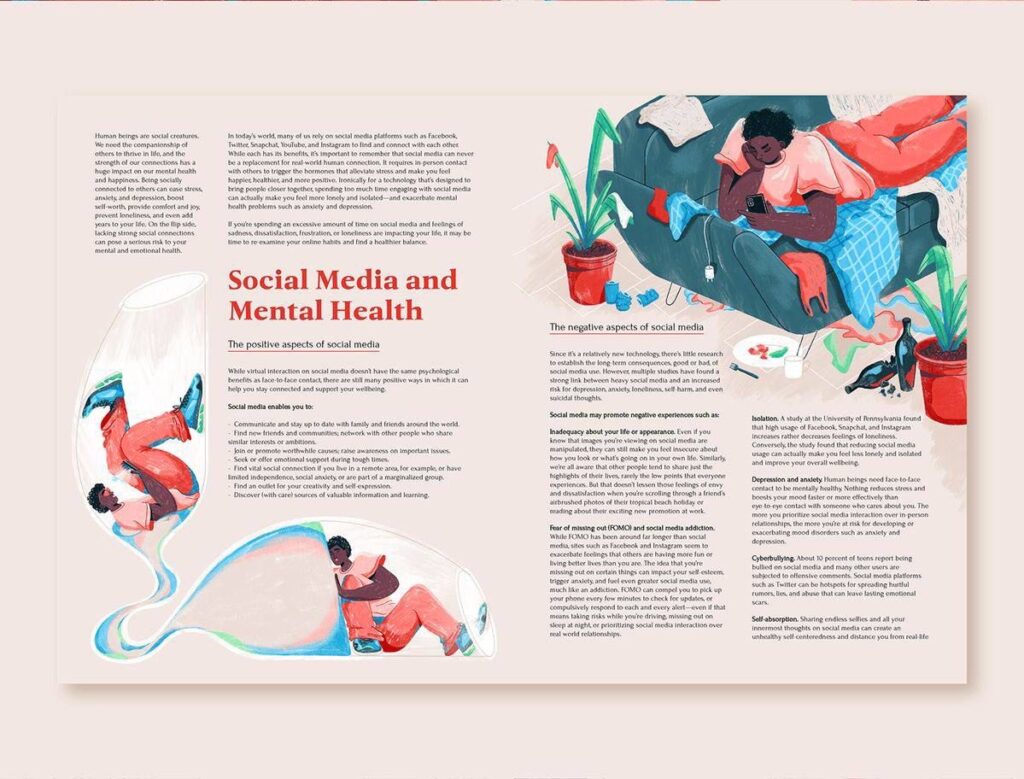
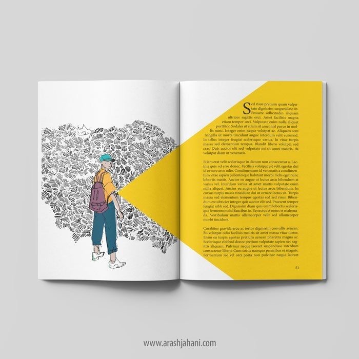
There are many situations where typography should be in charge. Long reads, investigative articles, academic or journalistic content all heavily on clarity and readability. In these cases, illustration usually plays a supporting role.

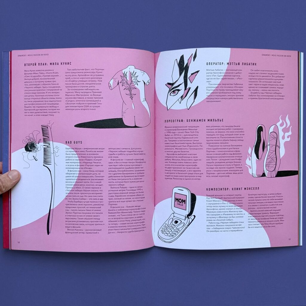
The image might appear at the beginning or between sections, offering a pause or a visual metaphor, but it doesn’t interrupt the flow. Here, illustration follows typography, not because it’s less important, but because the text needs space to breathe. Here you see a few examples where typography is leading clearly:

When Illustration Takes the Lead

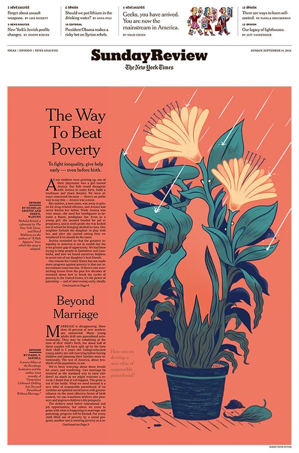
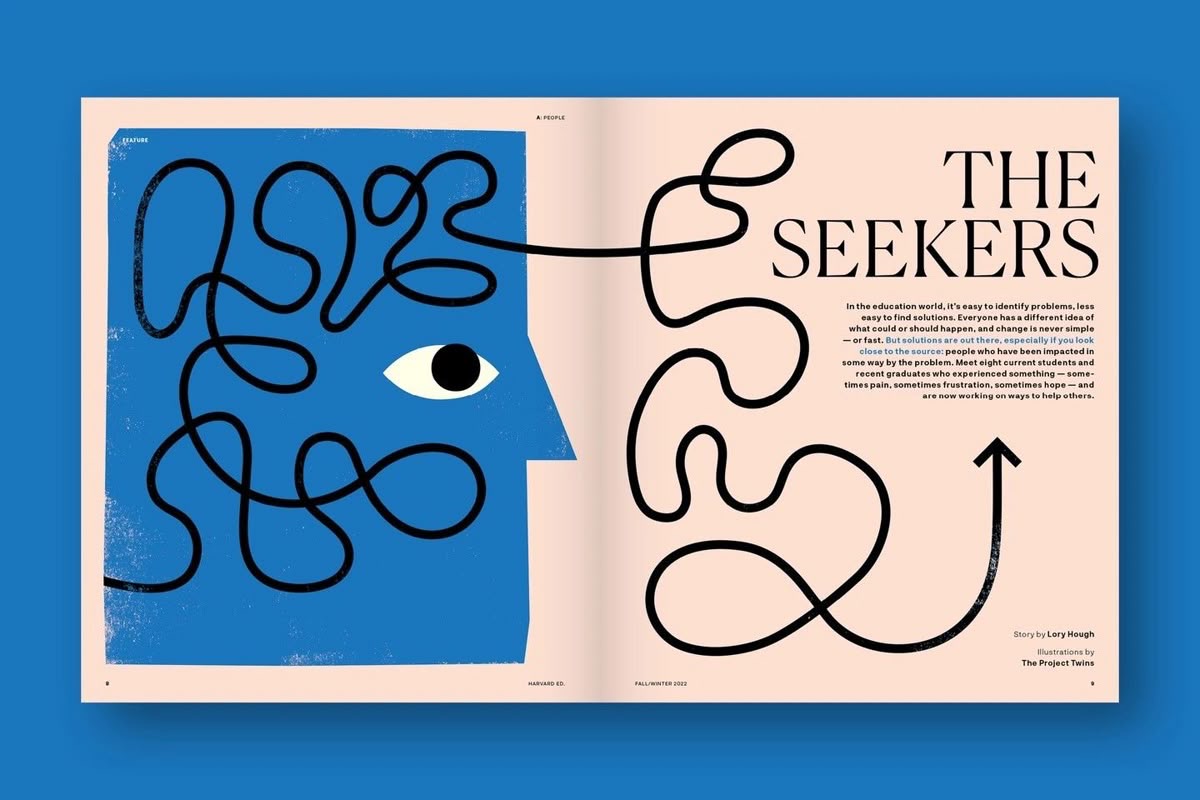
Then there are moments when illustration is the main entry point. Think of magazine covers, opening spreads, or essays built around a strong idea or mood. In those cases, illustration often pulls the reader in first, while typography steps back and becomes quieter. Type becomes simpler, calmer, sometimes even neutral just enough to support the image without competing with it. When done well, this kind of layout feels generous. It gives the illustration room to speak and trusts the reader to slow down. Here are a few examples for this:

It’s All About The Balance

The most interesting editorial design doesn’t feel like a hierarchy at all. It feels like a dialogue. Illustration and typography react to each other. One leads for a moment, then steps back. The other responds. Problems usually appear when both try to dominate at the same time like loud type paired with expressive illustration. Or when neither has a clear role, leaving the layout flat and forgettable.

What We Can Learn From This

For illustrators, it helps to think beyond the single image. How does the illustration live on the page? What does the typography already say and what doesn’t it say yet?

For designers, illustration shouldn’t be treated as decoration added at the end. It’s part of the storytelling. When illustration and type are developed with mutual respect, the result feels intentional, calm, and confident.

Final Thoughts

So who leads, and who follows? The honest answer is: it changes and depends. The best editorial layouts don’t force a winner. They create space for collaboration. When illustration and typography trust each other, the reader feels it and it feels natural.

Sources

https://fiveable.me/editorial-design/unit-4

https://www.numberanalytics.com/blog/impact-of-typography-in-editorial-design

https://page-online.de/typografie/fonts-im-editorial-design-die-besten-tipps-und-trends/

https://www.abbycook.co.uk/blog/what-is-an-editorial-illustrator?srsltid=AfmBOooJNcO_xj8mkirvqoQ2twpDKeqNYRG4AumZIDsbPptKVIx4pIce

Impuls 05 Klanglichter Graz 2025

Mein fünfter Impuls für Design & Research 3 ist mein Besuch des Festivals Klanglicht Ende Oktober in Graz. Klanglicht ist kein klassischer Ausstellungsbesuch, sondern ein nächtlicher Parcours durch den Stadtraum, in dem Licht, Klang und Bewegung temporär neue Wahrnehmungssituationen schaffen. Gerade diese Verlagerung von Kunst in den öffentlichen Raum hat für mich einen starken gestalterischen Impuls ausgelöst, da Gestaltung hier nicht isoliert funktioniert, sondern immer im Zusammenspiel mit Umgebung, Körper und Zeit.

Besonders angesprochen haben mich Installationen, die nicht auf visuelle Überforderung setzen, sondern auf Wahrnehmung, Atmosphäre und Reduktion. Zwei Arbeiten sind mir dabei nachhaltig im Gedächtnis geblieben: The Weather Project von Olafur Eliasson sowie AFTEREAL von Yasuhiro Chida.

Die Arbeit The Weather Project war in der Orangerie im Burggarten installiert und hat mich sofort in ihren Bann gezogen. Der Raum war von Licht, Nebel und Klang erfüllt und erzeugte eine künstliche Wetterlage, die sich nur schwer rational greifen ließ. Das Licht erinnerte an eine abstrahierte Sonne, die sich im Nebel ausbreitete und den gesamten Raum in eine diffuse, fast zeitlose Atmosphäre tauchte. Man hatte nicht das Gefühl, vor einem Kunstwerk zu stehen, sondern sich innerhalb eines Zustands zu befinden. Mich hat diese Installation so stark angezogen, dass ich das Gefühl hatte, nicht mehr gehen zu wollen. Zeit spielte plötzlich keine Rolle mehr. Der Nebel ließ Konturen verschwimmen, Bewegungen wurden langsamer, das eigene Sehen unsicherer. The Weather Project machte mir sehr deutlich, wie stark Wahrnehmung konstruiert ist und wie Gestaltung nicht nur visuell, sondern körperlich und emotional wirkt. Eliassons Arbeit zeigt, dass Licht kein Effekt ist, sondern ein Material, das Raum, Stimmung und Verhalten formt.

Einen ganz anderen, aber ebenso intensiven Zugang zur Wahrnehmung bot AFTEREAL von Yasuhiro Chida im Burggarten. Die Installation erinnerte an den magischen Effekt von Wunderkerzen, an das Zeichnen mit Licht in der Luft. Hunderte elastische, sich bewegende Drähte wurden durch UV Licht zum Leuchten gebracht. Ihre wellenförmigen Bewegungen erzeugten ein Bild, das physisch eigentlich gar nicht existiert. Stattdessen entsteht es im Gehirn der Betrachtenden durch das schnelle Aneinanderreihen einzelner Lichtmomente.

Was mich an AFTEREAL besonders fasziniert hat, war die Einfachheit der Mittel im Verhältnis zur emotionalen Wirkung. Trotz der Reduktion entstand ein tief berührendes Erlebnis. Das leuchtende Bild bleibt im Gedächtnis, obwohl es materiell nie wirklich da war. Chidas Arbeit macht deutlich, dass das, was wir als Realität wahrnehmen, ein Konstrukt unserer Augen und unseres Gehirns ist. Diese Erkenntnis hat mich stark beschäftigt, da sie den Fokus weg vom Objekt hin zur Wahrnehmung selbst lenkt.

Für meine Design und Research Arbeit ist genau dieser Gedanke zentral. Gestaltung erzeugt nicht nur sichtbare Formen, sondern beeinflusst, wie Menschen Realität wahrnehmen, erinnern und emotional einordnen. Klanglicht hat mir gezeigt, dass Wirkung oft zeitlich verzögert entsteht und dass Gestaltung im Nachhall weiterarbeitet. Besonders im Vergleich zu klassischen grafischen Arbeiten wurde mir bewusst, dass auch dort Wahrnehmung kein statischer Zustand ist.

Ein weiterer Aspekt, der mich nachhaltig inspiriert hat, ist die Rolle des Körpers im Raum. Beide Installationen funktionieren nur durch Bewegung, durch Annäherung, Verweilen und Perspektivwechsel. Je nachdem, wie man sich positioniert, verändert sich das Erlebte. Diese Abhängigkeit von Zeit und Position lässt sich auch auf Grafikdesign übertragen. Wahrnehmung ist nie neutral und nie unabhängig vom Kontext.

Der Besuch von Klanglicht war für mich damit mehr als ein ästhetisches Erlebnis. Er hat meinen Blick dafür geschärft, wie stark Gestaltung Wahrnehmung formt und wie wirkungsvoll Reduktion, Atmosphäre und Zeitlichkeit sein können. Besonders The Weather Project und AFTEREAL haben mir gezeigt, dass Gestaltung dann am stärksten ist, wenn sie nicht alles erklärt, sondern Raum für eigenes Erleben lässt. Diese Erkenntnisse möchte ich in meiner weiteren Forschung bewusst weiterdenken und auf grafische und räumliche Fragestellungen übertragen.

https://klanglicht.buehnen-graz.com/installation/8-eye-see-you/
https://olafureliasson.net/

https://lightart-collection.com/artworks/aftereal
https://yasuhirochida.com/

IMPULSE #3

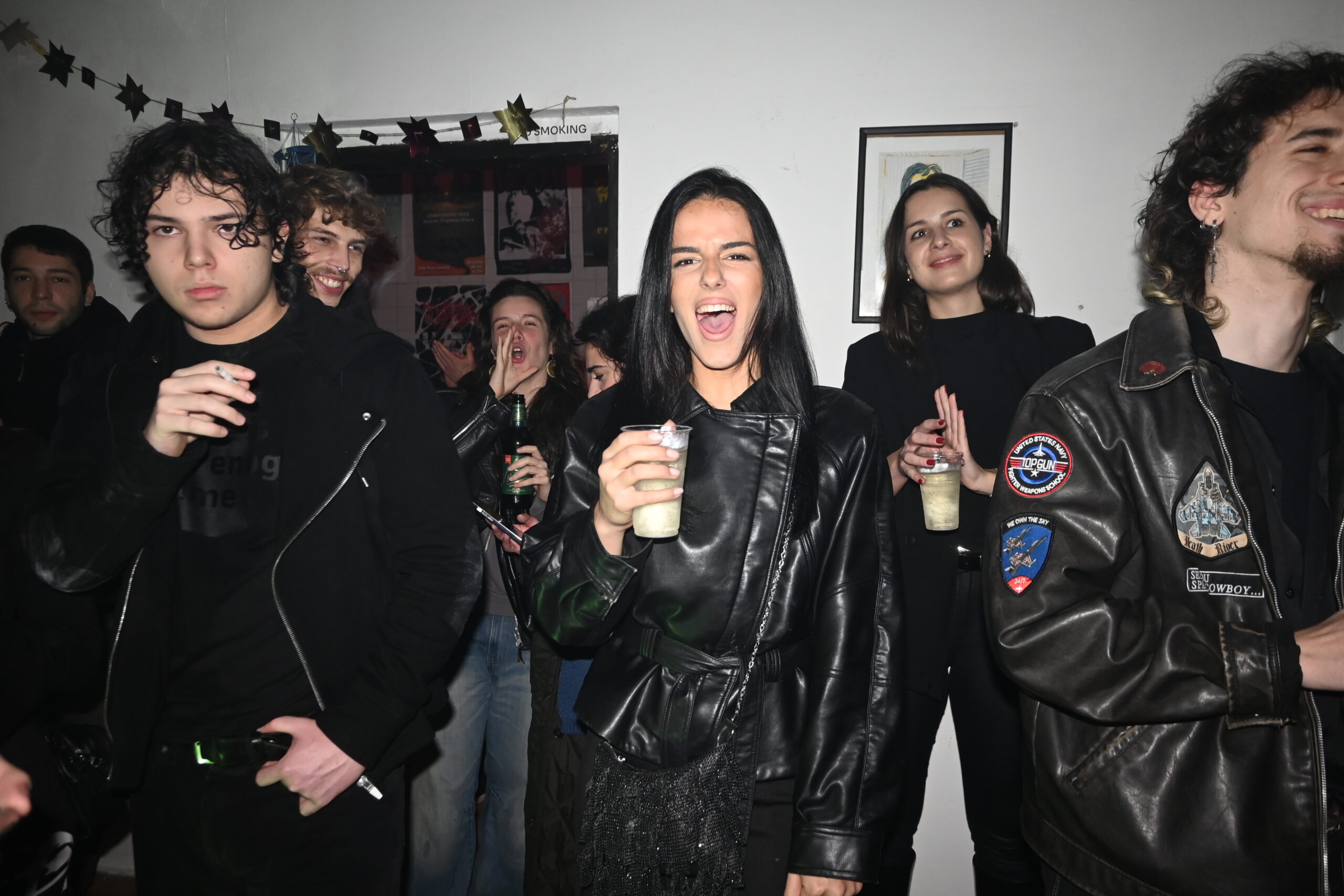
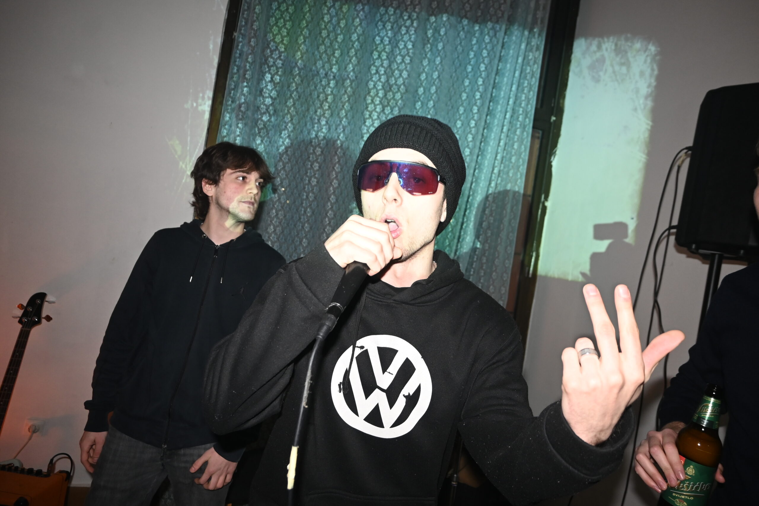
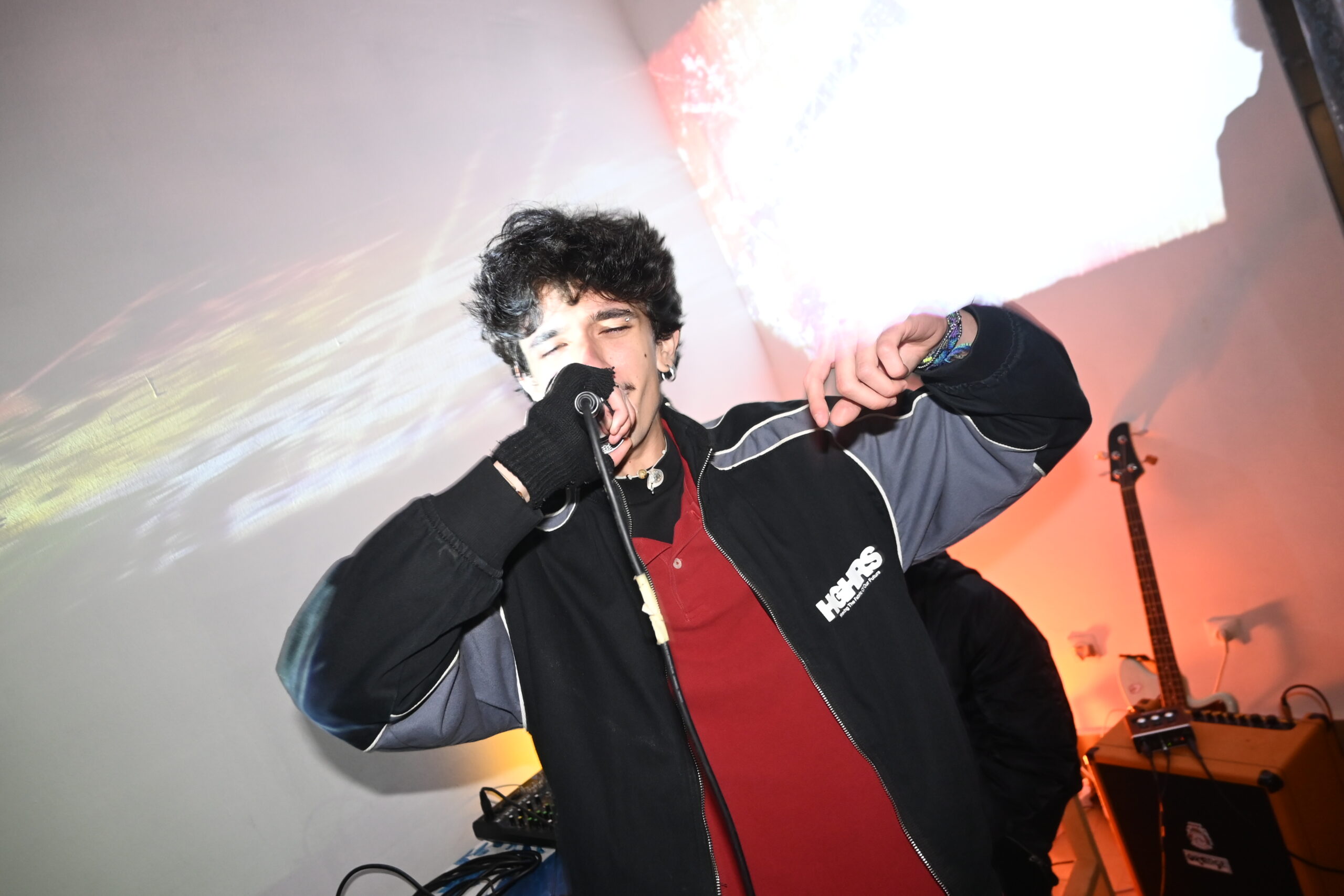
Some events stay with you not because of spectacle, but because they remind you of something essential. The rap concert at Pomorandža in Podgorica Center, led by my friend Mijat Bojović – Majdžet, was one of those moments. It wasn’t just a concert. It was a reminder of how much courage it takes to create, and how deeply culture depends on community.

Pomorandža is not a polished institution or a distant cultural monument. It is a space built and maintained by people who believe that culture should be lived, not just consumed. Those of us who run it together know how fragile such spaces are — how easily they can disappear if no one is willing to take responsibility. That night, Pomorandža felt full in every sense: full of sound, movement, tension, support, and mutual recognition.

Watching Mijat on stage was inspiring not because of performance alone, but because of what it represented. Standing in front of people and claiming space for your work takes courage, especially in an environment where alternative culture is often overlooked or undervalued. There is a particular kind of bravery in continuing to create even when visibility is limited and support is inconsistent. That courage was tangible in the room.

But the real strength of the night didn’t come from one person alone. It came from the collective effort behind it. Friends organizing, setting up equipment, handling logistics, welcoming people, staying until the very end. This is how culture survives here — not through large budgets or institutional guarantees, but through trust, commitment, and people willing to show up for each other. Community is not an abstract idea; it is practical, demanding, and often exhausting. And yet, it is the most reliable foundation we have.

What stood out most was the sense of shared ownership. The audience wasn’t passive. People weren’t there just to watch something happen; they were part of it. There was an unspoken understanding that this space exists because everyone present contributes to it simply by being there, by caring, by respecting the effort behind it. That kind of atmosphere doesn’t happen by accident. It grows slowly, through consistency and mutual support.

Courage, in this context, isn’t loud or dramatic. It’s the decision to keep going. To keep organizing events even when turnout is uncertain. To keep creating even when recognition is slow. To keep opening doors and inviting people in, knowing that not every night will succeed. The concert at Pomorandža was a quiet but powerful example of that kind of courage — the kind rooted in persistence rather than confidence.

In a city like Podgorica, where cultural initiatives often rely on personal energy rather than systemic support, spaces like Pomorandža are vital. They allow experimentation, honesty, and growth. They offer a platform for voices that don’t fit neatly into mainstream expectations. And perhaps most importantly, they create a sense of belonging — a reminder that no one is building alone.

By the end of the night, there was a feeling of exhaustion mixed with clarity. Not the kind that drains you, but the kind that confirms why the effort matters. Events like this don’t just fill an evening; they strengthen the invisible network that keeps a cultural scene alive. They remind us that courage is contagious, and that community, once built, becomes a source of momentum.

The concert ended, the lights went up, and people slowly left the space. But what remained was something more lasting than sound — a renewed belief in the value of showing up, supporting each other, and continuing to build, even when it’s difficult. In that sense, the night at Pomorandža wasn’t just an event. It was proof that community, when held together by courage, can create something meaningful — again and again

Impuls 04 Klang Raum Spannung

Konzert von Wallners im PPC in Graz

Mein vierter Impuls für Design & Research ist der Besuch eines Konzerts der Band Wallners aus Wien, im PPC in Graz. Im Vergleich zu meinen bisherigen Impulsen war dieses Event stark über Atmosphäre, Klang und visuelle Zurückhaltung definiert. Gerade diese bewusste Gestaltung von Stimmung hat für mich einen klaren gestalterischen Reiz erzeugt.

Besonders eindrucksvoll war für mich das Opening des Konzerts. Zu Beginn war der Raum nahezu vollständig dunkel und stark vernebelt. Man hörte bereits den Gesang, konnte die Band jedoch noch nicht sehen. Diese Trennung von Stimme und Sichtbarkeit empfand ich als sehr starkes Gestaltungselement. Die Reduktion auf Klang erzeugte eine hohe Spannung und lenkte die Aufmerksamkeit vollständig auf das Hören. Erst nach und nach wurde die Bühne sichtbar, wodurch sich der Raum langsam öffnete. Dieser Moment hat mir gezeigt, wie wirkungsvoll zeitliche Verzögerung und kontrolliertes Sichtbarmachen sein können.

Auch im weiteren Verlauf des Konzerts spielte das Zusammenspiel von Musik, Licht und Raum eine große Rolle. Die Lichtstimmung war reduziert, aber sehr gezielt eingesetzt und unterstützte die emotionale Wirkung der Songs, ohne sich in den Vordergrund zu drängen. Die Bühne lebte dabei fast ausschließlich von einem konstant leichten Nebel, der je nach Song und Album in unterschiedliche Farbstimmungen getaucht wurde. So wurden einzelne Alben durch spezifische Farbwelten visuell markiert etwa Blau in Kombination mit Lila oder Pink oder verblasste Blau Weiß Töne.

Dadurch entstand nicht nur ein akustischer Wiedererkennungswert durch die Musik, sondern zusätzlich eine visuelle Codierung über Farbe. Die Songs waren somit auch farblich eindeutig zuordenbar. Diese bewusste Verknüpfung von Klang und Farbgestaltung empfand ich als besonders starkes Gestaltungsmittel. Es entstand ein geschlossenes Gesamtbild, in dem jedes Element eine klare Funktion hatte. Gestaltung funktionierte hier nicht über Überinszenierung, sondern über Präzision und Wiedererkennbarkeit.

Die Musik von Wallners ist ruhig, emotional und klar strukturiert. Es geht weniger um Lautstärke oder große Gesten, sondern um Feinheit, Wiederholung und subtile Veränderungen. Diese Zurückhaltung prägte auch die Atmosphäre im Raum. Das Publikum war aufmerksam und konzentriert, was das gemeinsame Erleben zusätzlich verstärkte.

Besonders inspiriert hat mich die Präsenz der Band auf der Bühne. Sie wirkte ruhig und fokussiert, ohne dominantes Auftreten. Diese Form von Präsenz hat mir gezeigt, dass Ausdruck nicht laut sein muss, um wirksam zu sein. Auch im Design können leise Entscheidungen eine starke Wirkung entfalten, wenn sie bewusst und klar gesetzt sind.

Für meine eigene Designpraxis nehme ich aus diesem Konzert vor allem das Prinzip der Reduktion und der zeitlichen Steuerung von Wahrnehmung mit. Inhalte müssen nicht sofort vollständig sichtbar sein, um zu funktionieren. Spannung kann entstehen, wenn Information bewusst zurückgehalten wird. Gerade im Umgang mit Layout, Typografie und Rhythmus sehe ich darin eine wertvolle gestalterische Strategie.

Das Konzert war für mich damit nicht nur ein musikalisches Erlebnis, sondern ein klarer Impuls, Gestaltung stärker über Atmosphäre, Timing und Zurückhaltung zu denken.

Abschließend hat mir das Konzert noch einmal sehr deutlich gezeigt, wie nah sich Musik und Gestaltung insbesondere Grafikdesign und Typografie eigentlich sind. In beiden Bereichen erfordert Gestaltung ein hohes Maß an Feingefühl. Es geht darum, welcher Ton welche Stimmung auslöst, genauso wie darum, welche Typografie welche Wirkung erzeugt. In beiden Fällen entsteht Gestaltung in einem ständigen Wechselspiel zwischen Störung und Balance. Genau dieses Spannungsverhältnis ist sowohl in der Musik als auch im Grafikdesign essenziell.

Durch dieses Konzert habe ich zudem noch einmal verstanden, dass Inspiration für meine grafische Arbeit nicht ausschließlich aus visuellen Eindrücken entstehen muss. Inspiration bedeutet nicht zwangsläufig, etwas zu sehen, sondern kann genauso stark aus dem Akustischen kommen. Klang, Rhythmus und Atmosphäre können neue visuelle Ideen auslösen und gestalterische Prozesse anstoßen. Diese Erkenntnis hat meinen Blick auf Inspiration erweitert und mir gezeigt, wie wertvoll interdisziplinäre Wahrnehmung für meine gestalterische Praxis ist.

Links
https://www.youtube.com/watch?v=81toZio7qqM&list=RD81toZio7qqM&start_radio=1

https://open.spotify.com/artist/3EdHRW9KganBlpKU12OQos

https://www.youtube.com/shorts/OGZrvTvU0yc

https://www.youtube.com/shorts/xau4D7J57i4

Impuls 03 Bühne als gestalteter Bewegungsraum

On the Town von Leonard Bernstein mit Texten von Betty Comden und Adolph Green in der Oper Graz besucht am 04.01.26

Mein dritter Impuls für Design & Research ist der Besuch des Musicals On the Town in der Oper Graz. Besonders angesprochen hat mich während des Auftritts das Bühnenbild und die Art, wie der Raum der Bühne genutzt wurde. Der Bühnenraum fungiert nicht als bloßer Hintergrund, sondern als aktiver Gestaltungsträger. Er wird laufend neu organisiert, geöffnet und verdichtet und erzeugt dadurch eine starke räumliche Dynamik.Der Bühnenraum fungiert nicht als bloßer Hintergrund, sondern als aktiver Gestaltungsträger. Er wird laufend neu organisiert, geöffnet und verdichtet und erzeugt dadurch eine starke räumliche Dynamik. Diese Herangehensweise hat mich auch aus gestalterischer Sicht besonders angesprochen. Das ständige Neuorganisieren, Öffnen und anschließende Verdichten des Raums empfinde ich als inspirierendes Prinzip für Gestaltung. Es hat mich dazu angeregt, dieses Denken auf meine eigene Arbeit zu übertragen, insbesondere auf den Umgang mit Typografie. Auch dort lassen sich Inhalte immer wieder neu strukturieren, auflösen und verdichten, um Spannung, Rhythmus und Lesbarkeit zu erzeugen.

Auffällig war für mich die intensive Farbigkeit. Bühne und Kostüme arbeiten mit klaren, selbstbewussten Farben, die bewusst kombiniert sind. Trotz dieser visuellen Fülle wirkt das Gesamtbild strukturiert und kontrolliert. Farbe übernimmt hier eine ordnende Funktion und unterstützt die Orientierung im Raum. Für meine eigene gestalterische Arbeit war das ein starkes Beispiel dafür, das Farbe eben nicht nur ästhetisch, sondern auch systematisch eingesetzt werden sollte.

Ein Moment, der mir besonders im Gedächtnis geblieben ist, ist das Zusammenspiel von Bewegung, Raum und Musik. Die Choreografien reagieren direkt auf die Architektur der Bühne. Tänzerinnen und Tänzer nutzen Ebenen, Übergänge und Kanten aktiv mit. Raum wird dadurch nicht nur sichtbar, sondern rhythmisch erfahrbar. Die Musik verstärkt diesen Eindruck und macht Timing zu einem zentralen Gestaltungselement.

Überraschend war für mich, wie klar strukturiert die Inszenierung trotz ihrer Lebendigkeit bleibt. Es passiert viel gleichzeitig, aber nichts wirkt zufällig. Diese Klarheit zeigt, wie wichtig eine starke räumliche Grundidee ist, um Komplexität lesbar zu machen. Gestaltung funktioniert hier über Zeit und Bewegung, nicht über einzelne statische Bilder.

Für meine weitere Design und Research Arbeit nehme ich aus diesem Besuch vor allem den bewussten Umgang mit Raum, Farbe und Rhythmus mit. On the Town hat mir gezeigt, dass Gestaltung als Zusammenspiel von Elementen gedacht werden kann, die sich im zeitlichen Verlauf entfalten. Der Opernbesuch war für mich damit nicht nur ein kulturelles Ereignis, sondern ein klarer gestalterischer Impuls.

Links
https://www.youtube.com/watch?v=SZuJPWr-aZs&t=1s
https://oper-graz.buehnen-graz.com/produktion/on-the-town/
https://www.mphil.de/ueber-uns/musikerinnen-und-musiker/details/leonard-bernstein

Impuls 02 Malerei als körperlicher Gestaltungsprozess

Ausstellung von Wolfgang Hollegah in Graz

Mein zweiter Impuls für Design & Research 3 ist der Besuch der Ausstellung von Wolfgang Hollegah in Graz. Die Begegnung mit seinen Arbeiten war für mich ein starkes visuelles und körperliches Erlebnis. Anders als bei digitalen oder kleinformatigen Arbeiten wird man hier unmittelbar mit der Größe der Gemälde konfrontiert. Die riesigen Formate wirken selbstbewusst und fordernd und lassen keinen distanzierten Blick zu. Ich stand vor ihnen und hatte den Eindruck, ich werde Teil der Malerei.

Was mich besonders fasziniert hat, ist der Umgang mit Farbe. Hollegahs Arbeiten sind farbenfroh, aber nie beliebig. Die Farbkompositionen wirken sehr bewusst gesetzt und gleichzeitig lebendig. Durch die Anwendung unterschiedlicher Acrylfarben entstehen spannende Verläufe, Überlagerungen und Tiefen. Man sieht den Prozess, das Auftragen, das Reagieren der Farben miteinander. Die Bilder wirken nicht statisch, sondern wie eingefrorene Bewegungen.

Ein zentraler Aspekt für mich war die sogenannte Gemäldearchitektur. Damit meine ich die Art, wie Hollegah mit der Farbe auf der großen Leinwand agiert. Es geht nicht nur um Farbe an sich, sondern um Balance. Trotz der Größe und der intensiven Farbigkeit wirken die Kompositionen nie überladen. Er schafft es, eine sehr präzise Spannung zwischen Dichte und Offenheit zu halten. Diese Balance empfinde ich als große Inspiration für meine eigene gestalterische Arbeit, vor allem im Umgang mit großen Flächen und Mut zum Weißraum. Besonders spannend fand ich, dass Hollegah in manchen Gemälden bewusst Weißraum stehen lässt. Diese leeren Flächen wirken nicht unfertig, sondern notwendig. Sie geben den Farben Raum zu wirken und schaffen Ruhe innerhalb der Komposition. Als Grafikerin hat mich das sehr angesprochen, da Weißraum auch im Grafikdesign eine zentrale Rolle spielt.

Ein Zitat von Hollegah hat meine Wahrnehmung seiner Arbeiten zusätzlich vertieft
„Wenn der Schwung der richtige ist, dann erst kann ich das Bild malen.“
Dieses Zitat verbindet für mich viele der Eindrücke aus der Ausstellung. Es beschreibt Malerei als körperlichen und zeitlichen Prozess. Der richtige Schwung steht für Bewegung, Intuition und den Moment, in dem alles zusammenkommt. Genau das spiegelt sich in seinen Bildern wider.

Für meine weitere Design und Research Arbeit nehme ich aus dieser Ausstellung mit, dass Gestaltung nicht nur im Kopf entsteht, sondern auch im Körper. Rhythmus, Bewegung und Mut zur Leere sind Aspekte, die ich stärker in meine eigene Praxis integrieren möchte.Hollegahs Arbeiten verdeutlichen, dass großformatige gestische Setzungen und präzise kompositorische Balance keine Gegensätze darstellen, sondern sich strukturell gegenseitig bedingen.

Links
https://www.museum-joanneum.at/neue-galerie-graz/unser-programm/ausstellungen/event/wolfgang-hollegha

https://wolfganghollegha.com/

https://open.spotify.com/episode/4RC9zx0l2eBGBJzZwxcDB4


Impuls 01 Podcast Hotel Matze als Denkraum der Differenz

Hotel Matze Gespräch mit Benjamin von Stuckrad-Barre veröffentlicht am 31.12.2025

Mein erster Impulse Eintrag für Design & Research 3 basiert auf einer medialen Aktivität dem Podcast „Hotel Matze“. Konkret beziehe ich mich auf die am 31. Dezember 2025 erschienene Folge mit Benjamin von Stuckrad Barre. Das Gespräch dauert über drei Stunden und hat mich über einen längeren Zeitraum begleitet. Anders als viele kurze digitale Formate erlaubt diese Länge ein Abschweifen ein Zurückkommen und ein Aushalten von Unsicherheiten. Genau das hat für mich den Reiz dieser Episode ausgemacht.

Im Gespräch geht es um Schreiben Angst Rückfälle Erfolg Humor und um die Frage was Kunst eigentlich leisten muss. Besonders hängen geblieben ist mir ein Satz von Stuckrad Barre der für mich wie ein Schlüssel funktioniert hat: „Die Differenz ist das Normale. Da entsteht das Ich in der Differenz.“

Dieser Gedanke hat mich persönlich sehr angesprochen weil er ein Verständnis von Identität beschreibt das nicht auf Stabilität oder Klarheit basiert. Stattdessen wird das Ich als etwas verstanden das sich erst durch Unterschiede Widersprüche und Brüche formt. Ich habe gemerkt dass mich genau diese Vorstellung auch in meiner gestalterischen Arbeit begleitet. Oft entstehen meine Ideen nicht aus klaren Konzepten sondern aus Unsicherheiten aus Reibung oder aus Momenten in denen etwas nicht aufgeht.

Der Podcast funktioniert für mich als Event weil er nicht nur Information vermittelt sondern einen Denkraum öffnet. Ohne Bilder ohne visuelle Reize zwingt er dazu zuzuhören und eigene innere Bilder zu entwickeln. Diese Form des Zuhörens ist für mich eng mit Designprozessen verbunden. Auch dort entsteht Bedeutung nicht sofort sondern entwickelt sich über Zeit durch Nachdenken Verwerfen und Neuordnen.

Besonders interessant fand ich die Offenheit mit der Stuckrad Barre über seine Brüche spricht. Es entsteht kein geschlossenes Selbstbild sondern etwas Fragmentiertes Unfertiges. Das hat mir gezeigt dass Unvollständigkeit kein Mangel sein muss sondern eine Qualität haben kann. Für meine weitere Design und Research Arbeit nehme ich daraus mit dass Gestaltung nicht immer auf Eindeutigkeit abzielen muss. Ambivalenz Mehrdeutigkeit und Irritation können produktiv sein.

Auch die Aussage dass Künstlerinnen und Künstler ihrem Publikum nichts schulden hat meine Sicht auf Gestaltung verändert. Sie stellt gängige nutzerorientierte Denkweisen infrage und öffnet Raum für eine stärkere Autorenschaft. Für mich ergibt sich daraus die Frage wie viel Zumutung Design aushalten darf und ob Gestaltung nicht auch ein Angebot sein kann statt eine Lösung.

Diese Podcastfolge war für mich kein beiläufiger Medienkonsum sondern ein persönlicher Impuls. Sie hat meine Aufmerksamkeit auf Differenz als Ausgangspunkt gelenkt und mich darin bestärkt Unklarheit und Brüche als Teil meines Forschungs und Gestaltungsprozesses zu akzeptieren. Damit bildet sie einen wichtigen Ausgangspunkt für meine weiteren Impulse im Rahmen von Design & Research.

Links
https://open.spotify.com/episode/5EA9GeucaEfxngKwY5Ywjc
https://stuckradbarre.de/?utm_source=chatgpt.com

#17 Rights to Illustration

What Illustrators Need to Know About Copyright, Usage, and Licensing

Since I spent a lot of time working with AI in my last articles, I felt the urge to dive into the topic of usage rights, licensing, and copyright for my own illustrations. I think this subject is really important, but I know very little about it. That’s also why I’ve been hesitant to share my art online. I’m afraid of my work being copied or used without my permission.

So I decided to finally get more into the topic properly. As an Illustrator or Designer you care a lot about your style and ideas. But when it comes to the legal side of work, I often feel unsure. Copyright and licenses have always felt confusing, and I’ve heard stories about artists getting into trouble because they didn’t set clear rules. That’s why I want to understand the basics of copyright, licensing, and how I can protect my work.

Who owns an illustration?

In Germany, illustrations are protected by copyright as soon as they are created. You don’t need to register your work somewhere. The law states that the person who creates the illustration is the author and therefore the copyright holder. This applies even if the illustration was made for a client, unless a specific agreement says otherwise. The relevant legal basis is Section 7 of the German Copyright Act (Urheberrechtsgesetz, UrhG), which defines the author as the creator of the work.

This automatic protection is one of the reasons copyright is so important for illustrators. It means that your work already has value the moment it exists.

Copyright vs. usage rights

A common misunderstanding is that selling an illustration means giving up all rights. This is not true.

Important distinction:

• Copyright stays with the illustrator

• Usage rights (licenses) can be granted to others

Even if an illustration is paid for, the client does not automatically own the rights to use it freely. Copyright remains with the illustrator, while usage rights can be granted to others. Usage rights define how an illustration can be used, where it can be used, and for how long. If the agreement is unclear, the client might assume they can use the illustration in many ways, while the illustrator never intended that.

This is why it is so important to separate the payment for creating the illustration from the payment for the usage rights.

What usage rights include

Usage rights are basically a license. They define:

  • the type of use (editorial, advertising, social media, print, etc.)
  • the duration (one year, five years, unlimited)
  • the territory (Germany, Europe, worldwide)
  • exclusivity (exclusive or non-exclusive)

If these points are not defined, misunderstandings are almost guaranteed. For example, an illustration made for a magazine article does not automatically include the right to use the same illustration for advertising or merchandise.

Commissioned work: who may use the illustration?

Commissioned work is a common situation where things get messy. Even when a client pays for an illustration, they do not automatically get full rights. If no agreement exists, the client can only use the illustration for the purpose it was created for.

If the client wants additional usage (for example, social media, advertising, or merchandise), the illustrator should grant a separate license or update the contract. That is why written agreements are so important.

What About Copyright Notice and Attribution?

Illustrators have the right to be named as the author of their work.

This means:

  • The illustrator’s name should be mentioned when the work is use
  • Credit should be given unless explicitly waived

Online Use and Social Media (Lucky us)

Publishing illustrations online does not mean giving up rights. (But: Illustrators and Designers should always check platform terms and conditions carefully.)

Important points:

  • Uploading work does not make it public domain
  • Social media platforms receive limited platform licenses only
  • Third parties may not reuse illustrations without permission

And finally: How Can We Protect Our Work?

Although copyright exists automatically, illustrators should actively protect their work.

Practical measures include:

  • Written contracts and license agreements
  • Clear communication about usage
  • Keeping original files and sketches
  • Watermarks or low-resolution previews (when appropriate)
  • Documenting creation dates


In case of misuse, the illustrator can claim:

  • Removal of the work
  • Compensation
  • Credit as the author

Licensing Modells

There are different licensing models that you can use depending on the project.

  • Buyout licenses: extensive usage rights are granted for a higher fee (copyright usually remains with the illustrator unless explicitly transferred).
  • Exclusive licenses: only one client can use the illustration.
  • Non-exclusive licenses: you can license the same illustration to multiple clients.
  • Time-limited licenses: the license is valid only for a specific period.


Sources
https://www.gesetze-im-internet.de/index.html

https://grandmatter.com/work/usage-licenses-explained

https://illustratoren-organisation.de/fuer-mitglieder/rechte-kennen/

Impuls #4 Concept Art: Der Hobbit

Tolkien in Triest

I recently had the opportunity to visit the Tolkien exhibition in Trieste. The exhibition was dedicated to the life and work of J. R. R. Tolkien and showcased not only his literary world, but also the huge cultural impact his stories have had to this day. I was particularly impressed by three large walls that were completely covered with bookshelves. They contained numerous editions of The Lord of the Rings and The Hobbit from all over the world in a wide variety of formats and designs. (It would be interesting to look at the book covers from different countries and analyze the background and cultural influences on the illustrations.)

At the end of the exhibition, there were also many illustrations by artists and fans who were inspired by Tolkien’s stories. These works ranged from classic drawings to modern interpretations and impressively showed how differently the same world can be visualized.

And again Books

All of this reminded me of a bookshelf at my parents house. For years, it has held several illustrated books dealing with conceptual art and illustrations for the Lord of the Rings and Hobbit films (of course Harry Potter as well). Now, during the Christmas holidays, while I am back at my parents’ house, I went to this shelf and took another look at the books.

One book in particular caught my attention: “The Hobbit: The Desolation of Smaug Chronicles – Concept Art and Design,” published by Hobbit Press. The first edition was published in London in 2013. The main author is Daniel Falconer, supplemented by forewords and texts by other authors and contributors who were directly involved in the film production.

Concept Art at Middle-earth

Conceptual art plays a central role, especially in film adaptations of books. As already mentioned in the blog post about the Harry Potter exhibition in London, conceptual art forms the visual bridge between text and film and helps to translate abstract descriptions, moods, and places into specific images. This work is particularly sensitive and challenging when it comes to a literary source such as The Hobbit, which many readers already associate with their own inner images.

In the case of The Hobbit films, the screenwriters provided numerous ideas that were strongly based on the book. At the same time, The Lord of the Rings already provided existing locations, characters, and visual rules that had to be followed. This made it all the more important to develop the new locations that play a major role in The Hobbit for the first time including Mirkwood (Düsterwald), Esgaroth the lake-town (Seestadt), and Erebor, the Lonely Mountain.

Weta Workshop, which also co-published this book, played a central role in this process. Weta Workshop is a New Zealand special effects company founded in 1987 and based in Wellington. It provides services for film productions, including design drafts, makeup effects, props, creatures, puppets, miniatures, models, and large sculptures. The company also produces merchandising items. For The Hobbit trilogy, Weta Workshop was instrumental in the visual development of characters, costumes, environments, and fantastical creatures, working closely with the director, screenwriters, and other creative departments.

Back to the Book

The illustrated book is structured along the sections of the film and shows the concept art for specific scenes, locations, characters, costumes, and mythical creatures. At the time of publication, many of the artists involved had already been working on The Hobbit trilogy for four to five years. Every day brought new challenges, as concept designer Alan Lee describes in the book’s introduction.

“The book shows only a relatively small part of the enormous amount of work that went into the visualization and production of The Hobbit: The Desolation of Smaug,” says Lee.

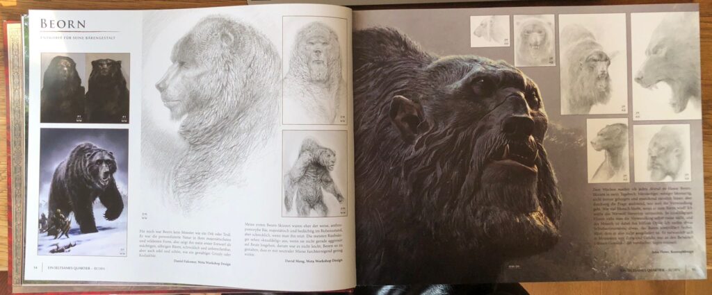
The creation of Beorn

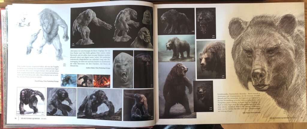
The first section of the book is about Beorn’s house. Beorn is a man who can transform himself into a bear. According to the author, this character posed a particular challenge, as he had to be portrayed convincingly in both human and animal form, visually credible but at the same time consistent with Tolkien’s description and the existing imagery of Middle-earth.

I am particulary interested in how artists create fantasy characters, especially those with an ambiguous or hard-to-define personality. Having read the book as well, I can imagine that Boern was one of the most difficult figures to design, because its never entirly clear wheater he is good or bad. His bear form in particular needed to appear frightening and monstrous.

The many pictures in the book are showing how difficult is was, and how many attempts they needed to finding a clear direction. I think its always really calming when you see that talanted artist like the one who contributed here in the films are also struggeling sometimes. Its interesting to see how it works on big sets like this. Many artists work on the same subject at once, each starting with a different vision, and then gradually discussing, refining, and combining these ideas.

John Howe mentoined that for two weeks he made a scribble of boern on his diary every evening. Each day he tried a new approach. Some of these drawings can be seen on the right side of the upper image. For me, this highlights how important it is to keep going, to think differently, and to have the courage to experiment and try things out.

After large number of artworks had been created and presented to the Weta Workshop, the team began developing 3D Modells and exploring anatomical possibilities. Their aim was to push the design in a bit more brutal and extreme direction, which can be seen on the left page of the lower image. In the end, all these ideas come together, resulting in the creation of a truly unforgettable character.

The Elevnking’s Hall

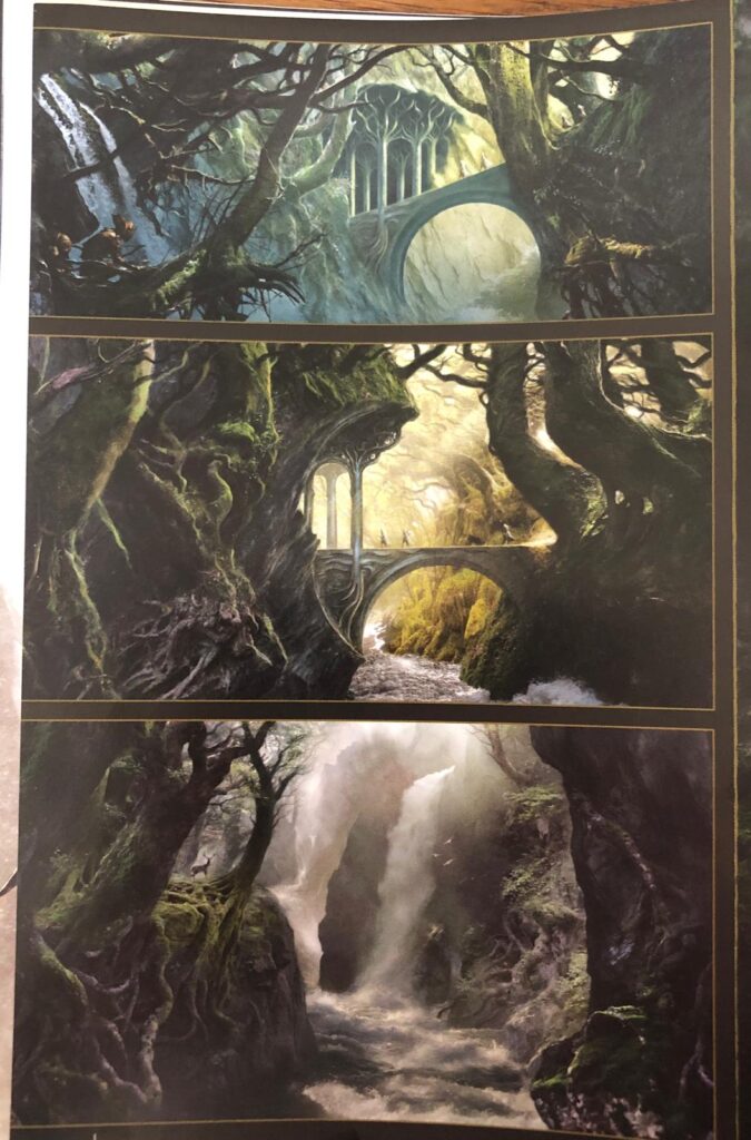
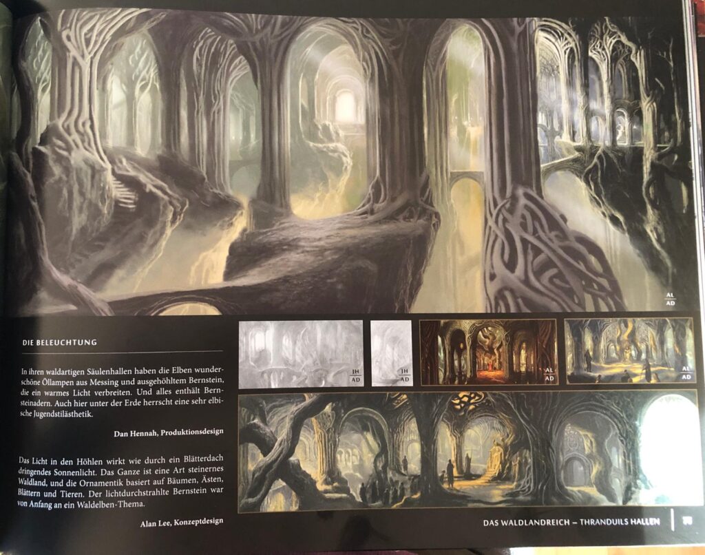
Besides character design, I can imagine designing settings almost as difficult, maybe even more so. Because, as mentioned in the book, you have to think about so many things like light setting, perspective and the story behind it. Across eleven pages, the book shows how the Elvenkings Hall and the Throne room were created. These are two of my favorite locations in the movie because they combine a sense of magic with a darker atmosphere. According to the Conceptartists, one one the Challanges was to continue the Mirkwood but in a more magic way. They wanted to build an entire cave system out of trees that looks very natural.

In the images above you can see a few of the artworks they did. Another important thing in the creation was the deepth the rooms should have. Gus Hunter, one of the designers at Weta Workshop, worked with many columns, trees, and roots to shape the space. When thinking about the lighting of the hall, he came up with the idea of using stalactites in which the elves could place oil lamps. In addition, he used water reflections to help illuminate the entire setting.

To come to an End

Overall, it is incredibly interesting to see how these different departments and artists work together to bring such complex worlds to life. What I have written about here is only a very small glimpse into the book, which itself is just one part of a much larger series documenting the creative process behind The Hobbit. Once again, it highlights how essential concept art and strong visual storytelling are for building believable and immersive worlds. This topic is especially important for my future academic work, as it directly connects to my interest in the visualization of storytelling and in creative development processes more broadly both of which I eventually plan to explore further in my master’s thesis.

Sources:

https://www.wetanz.com

Falconer, Daniel (Hrsg.): Der Hobbit: Smaugs Einöde – Chroniken. Kunst und Gestaltung. Hobbit Presse, London, 2013