How Color and Form Shape Emotion in Editorial Illustration
Editorial illustrations are pictures that go with articles in magazines, books or online. They help people feel the story, not just read it. The way an illustrator uses colors and shapes can change how the viewer feels about the idea before they even read the words. As I want to do something with Editorial Illustration or Design in my Master Thesis, I decided to dive a bit deeper in this topic again.
Why Color Matters
Color is one of the first things we notice in an image. Colors can change our mood and make us feel something without thinking too hard. For example:
- Red can make an illustration feel energetic, urgent, or strong.
- Blue can feel calm, quiet, or thoughtful.
- Yellow feels happy, bright, and full of energy.
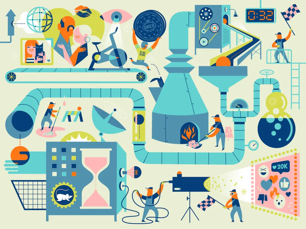
This works because our brains connect colors with feelings, often without us planning it. A red element might make a viewer feel alert immediately, while a blue background can make a story feel peaceful. Illustrators use these color feelings on purpose. For example, an editorial illustration about climate change might use mostly blues and greens to make the reader feel calm and connected to nature. A political cartoon about protest might use bold reds and blacks to show intensity and movement. In this picture you see the typical color meanings. It significant to consider this while creaitng something for a certain information and emotion.

How Shapes and Forms Affect Mood
Color isn’t the whole story. The shapes and forms the illustrator uses also give the viewer emotional clues.
- Soft, round shapes often feel friendly and gentle.
- Sharp, pointed shapes feel tense or active.
- Large open spaces can feel calm or lonely, while crowded shapes can feel busy or chaotic.
The way elements are arranged on the page (called composition) also matters. A centered figure can feel stable or important, while a tilted composition can create tension or movement.
Golden Cosmos: Colorful, Playful, and Thoughtful
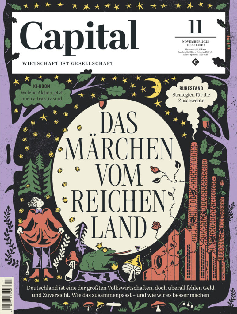
One of the best real-world examples of how color and form influence emotion in editorial illustration is the Berlin-based duo Golden Cosmos (illustrators Doris Freigofas and Daniel Dolz). I saw their website and thougt they are doing really really nice work. They are working for major international publications like The New York Times, The New Yorker, Die Zeit, and Bloomberg. Their style is instantly recognizable because they use bright, contrasting spot colors, simple shapes, and a screen-print-like aesthetic that feels both bold and warm.


How Their Work Uses Color and Shape
- Bold palettes: Golden Cosmos often limits their illustrations to a few strong colors which create a feeling of energy and focus. In editorial contexts, this helps draw readers in and gives a visual intensity that matches serious topics.
- Simple but expressive forms: Their people and objects are usually drawn in flattened shapes with playful proportions. This makes spaces feel open and engaging, not heavy or literal, and lets readers connect emotionally before reading the text.
- Narrative scenes: Instead of just illustrating a literal idea from the article, they often build scenes with small stories inside them which makes the illustrations feel like visual essays themselves.
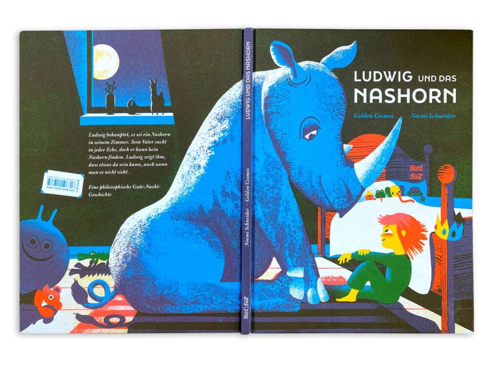
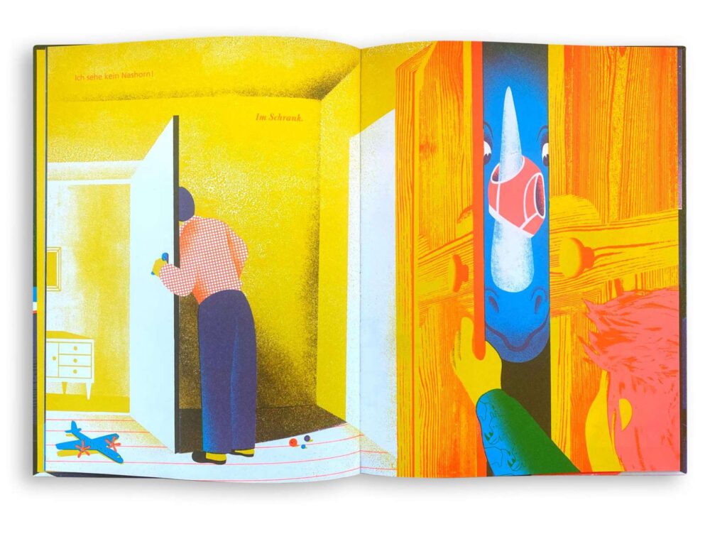
In their picture book work (like Ludwig and the Rhinoceros) the duo gained awards for color and spatial design, showing that color and composition are central to their emotional storytelling whether in editorial work or book illustration. I thought comapred to usual childrenbooks, it is really diffrent in how they using colors and shapes.
Another Example: Kirsten Ulve
A second great example of emotional editorial illustration comes from Kirsten Ulve, an American graphic artist known for her vibrant editorial and caricature work. Ulve’s illustrations appear in publications such as The New York Times, Vogue Japan, Los Angeles Times and Entertainment Weekly.
What Makes Ulve’s Work Emotionally Effective
- Expressive color: Ulve often chooses bold and saturated colors that draw attention and give a lively energy to the topics. For example, using strong reds and blues in political caricatures gives urgency and emotional punch to commentary about public figures.
- Character and exaggeration: Her caricatures use shapes and proportions that exaggerate personality traits, making the emotional impact of the subject immediately clear. A reader can sense mood (whether satire, tension, or humour) before reading a word.
- Collage and texture elements: In addition to flat color, Ulve sometimes combines visual textures and patterns that heighten emotional contrast, like rough patterns behind calm figures to show underlying conflict.
Ulve’s strong and confident use of form helps editorial stories about politics, culture, and society feel alive and very human, which keeps readers visually engaged and emotionally connected.
Why Color and Form Matter in Editorial Illustration
Whether it’s Golden Cosmos’ bright screen-print shapes or Kirsten Ulve’s expressive caricatures or editorial illustration uses visual language to communicate emotion. Here’s why it matters:
Color Sets the Mood
Color creates emotional cues instantly. Bright, high-contrast colors can feel urgent or joyful, while muted or limited palettes can feel calm, serious, or reflective. Color can signal the right emotional tone even before someone starts reading.
Shape and Composition Guide Understanding
Shapes and layout help guide the reader’s eye. Organic, flowing shapes can feel natural and warm. Straight lines or geometric forms can feel structured and formal. How space is organized around figures or objects shapes the viewer’s emotional response to the idea being illustrated.
Emotion First, Narrative Second
Illustrations that influence emotion don’t just show facts, they embody a feeling. This is especially effective in editorial contexts where the illustration sets the tone for the article and stays in the reader’s memory long after they’ve moved on.
Conclusion
Color and form are more than stylistic tools, they are emotional languages in illustration. When illustrators choose color palettes thoughtfully and shape forms with intentional emotional impact, they give editorial stories a deeper voice and connection. Golden Cosmos and Kirsten Ulve are great examples of how strong visual design can turn words into feeling. For me personally its very helpful and inpirational to compare such examples as Golden Cosmos or Kirsten Ulve and just look at their work.
Sources
https://www.golden-cosmos.com/
https://www.itsnicethat.com/articles/golden-cosmos
https://www.numberanalytics.com/blog/the-power-of-color-theory-in-editorial-illustration
https://kreafolk.com/blogs/inspirations/art-of-editorial-illustration