WebExpo Conference: Data Visualisation

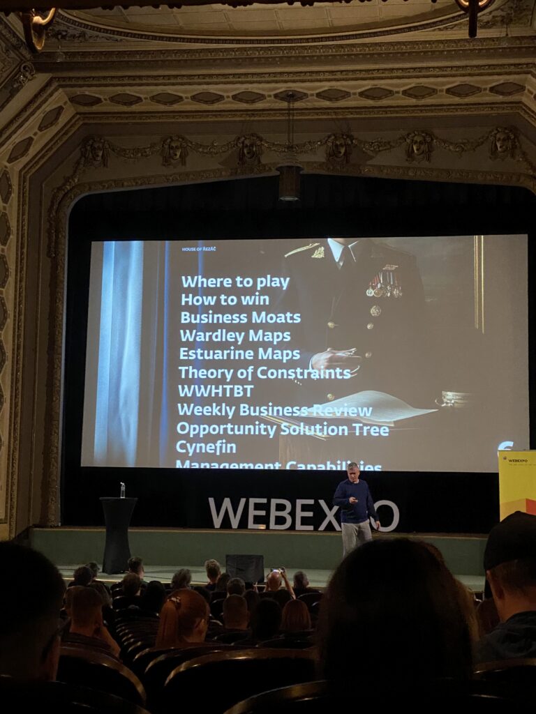
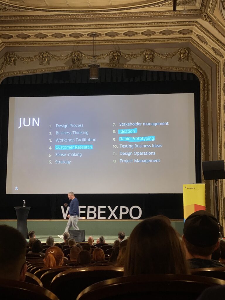
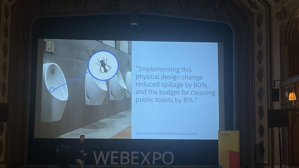
One of my favorite sessions on the first day was the workshop “Creating an Effective & Beautiful Data Visualisation from Scratch” by Nadie Bremer. She’s well-known profesionall, that created data visualizations for organizations like Google News Lab, UNICEF, and The New York Times

What really surprised me about this workshop was how hands-on it was, Nadie started with a completely blank screen and gradually built a stunning chart using d3.js (a JavaScript library for data visualization). Watching her go from scratch to a fully developed visual step by step was really engaging.

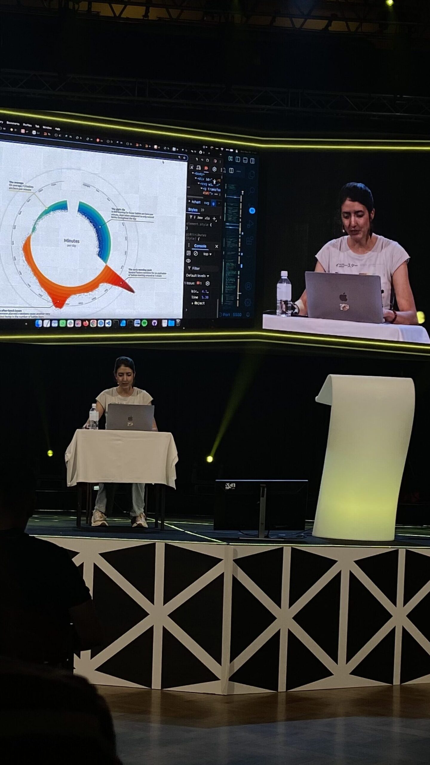
To be honest, I didn’t understand every part of the code she used, especially when she went into more technical things like indexes, cosine, and sine functions. But I could follow the general concept and the logic behind how she built the structure and visual elements. Even without knowing all the technical details, it was exciting to see how math and design came together in such a creative way.

What made this especially interesting to me was how relevant it felt to what I want to do. I’ve been thinking a lot about how to make dashboards more appealing. Most of them use the same types of basic charts, which get the job done but aren’t very exciting. Nadie’s approach showed how much more engaging and beautiful charts can be, without losing clarity.

She also shared some helpful tips about design decisions, like choosing the right color palette, how to simplify complex data, and how to guide the viewer’s attention with layout and motion. These small things make a big difference when it comes to making information easy to understand.

Even though I don’t remember coding very well, I’ve always been interested in it, and this workshop really made me want to dive back in and learn more. It made coding feel less intimidating and reminded me that there’s a creative side to it, especially when it’s used to tell a story through data.

Overall, I left the session feeling inspired. It was a great example of how technical skills and artistic thinking can come together. I’d definitely recommend checking out Nadie Bremer’s work if you’re curious about creative data visualization.

“Digital intimacy: Feeling human in an artificial world” WebExpo Conference Talk

One of the most surprising and emotional talks I attended at WebExpo was “Digital Intimacy: Feeling Human in an Artificial World” by Lutz Schmitt. It opened my eyes to how technology—especially artificial intelligence—is changing the way we connect with others, both in good and dangerous ways.

Lutz started by talking about intimacy—something we usually connect with people who are physically close to us: partners, friends, family. He showed how, in long-distance relationships, people use tech to keep that closeness alive. He gave the example of a product called Pillow Talk, which lets people feel their partner’s heartbeat even when they are far away. It sounds romantic, but it also made me think: what happens when machines start replacing real people in these connections?

One of the biggest ideas in the talk was that privacy is the basis of true intimacy. But online, our privacy is often not protected. Lutz pointed out that digital spaces are full of systems that track us, watch us, and try to influence how we feel. This makes it harder to build real trust—and trust is key for intimacy.

At the same time, Lutz showed that meaningful digital connections are possible. Many of us stay close with friends and family through social media or video calls. But he warned us about something growing even faster: AI companions and parasocial relationships. In the future, more people might become “friends” with AI agents. These relationships can feel real—but they are one-sided, and the AI is controlled by someone else.

He shared one shocking example: some men, after breakups, trained an AI using their ex-girlfriend’s messages, voice notes, and chats. They created an AI “clone” of their ex to continue the relationship. This raised serious questions about ethics, consent, and emotional health.

Lutz also spoke about AI counselors, which are already helping people with mental health support. He made an interesting point: people are often afraid of how their real friends will react to their problems. With an AI, there’s no fear of judgment. This makes it easier for some to open up. But again, it raises the question—who is behind the AI, and what is their goal?

One disturbing example he mentioned was an AI that told a young boy to kill his parents to get more screen time. This showed how dangerous it can be when we don’t fully understand or control what AI might say.

What I really appreciated about Lutz’s talk was how honest and thought-provoking it was. He didn’t try to scare people, but he didn’t avoid uncomfortable topics either. He showed both the beautiful and the dark sides of AI in relationships, and how important it is to ask questions now, before it’s too late.

For me, this talk was one of the highlights of WebExpo. It made me see AI not just as a tool, but as something that could shape our deepest emotions and relationships—for better or worse.

“12 Core Design Skills” at WebExpo Conference Talk

One of the talks that really made me think differently at this year’s WebExpo was Jan Řezáč’s presentation: 12 Core Design Skills. It wasn’t about shiny tools or the newest design trends. Instead, it focused on the skills that actually help designers succeed in the real world.

A big idea from the talk was this: Figma is not where design starts. Jan said that Figma is simply a place to document our design decisions, not where the design thinking happens. This hit me hard. Many of us spend so much time in design tools, but the real work starts much earlier—with ideas, research, and understanding problems.

He also warned about falling into what he called the “second diamond trap.” This means focusing only on the final stages of the design process—like making screens and prototypes—while ignoring the important early phases like research and problem definition. Skipping those steps can lead to pretty designs that don’t solve real issues.

One of my favorite takeaways was how important it is to design with intention. Every step we take should have a clear reason behind it. Jan talked about design as a form of creative problem-solving—not just making things beautiful, but making them work better.

Another important skill Jan talked about was facilitation. As designers grow in their careers, it’s not enough to do good design work alone. We also need to bring people together, lead workshops, and help teams think clearly. That means using techniques that create structure and trust in group settings.

But maybe the strongest point of the talk was this: stakeholder management is the most important skill a designer can have. You’re not just designing for users—you’re also working with managers, developers, and other teams. Jan said something that stuck with me: “Your real designer is your manager.” If they don’t support your work, it’s very hard to make an impact.

Jan also gave some advice on research. He said that during the research phase, designers should talk less and listen more. The goal is to make sense of what users and teams are saying. This skill—making sense of data and feedback—is something we should use all the time, not just during big research moments.

He also reminded us that most products—around 95%—fail. That’s a huge number. To avoid being part of that statistic, designers need to test ideas often and be open to learning, not just polishing.

Finally, Jan recommended watching a great video by John Cleese about creativity. I watched it after the talk—it really helped me see creative work in a new way.

This session made me reflect on my own work. Am I just moving shapes on a screen? Or am I solving the right problems in smart, intentional ways? Thanks to Jan’s talk, I feel more focused on what truly matters in design.

LS EX #5 Design to Provoke?

How do you design a poster that provokes in a subtle yet effective way? Rather abstract, direct, zoomed in, with bold taglines or just the photo itself?

The drafts above are a few examples of how I tried different ways of designing one of the posters. I knew that I wanted to leave the focus on the photo and mainly letting it speak for itself.

Generally, I think it’s really about balancing what you show and what you hold back, how much clarity you give and how much you leave open. There are so many ways to go about it.

You could use abstract visuals like shapes, colors, lines that hint at something without spelling it out, and therefore leaving space for people to interpret. Though, for this project I wanted to go bold and direct, with the striking photo that makes people stop and look. Zoomed-in details are super interesting too, focusing on textures, gestures, or small moments that pull you in closer.

Then there is Typography which can always make a huge difference in how posters are perceived. A strong tagline or bold text treatment can really push the vibe, adding something sharp, funny, or unexpected to the visual. Also, playing with scale, contrast, and negative space helps guide the eye and keeps things intentional, not messy. Colors matter too: muted tones can create a quiet tension, while bright contrasts make everything pop louder.

In my own work, I tried out a mix of these approaches. I also played with framing and composition, sometimes centering the subject, sometimes hiding parts, sometimes making it a bit awkward or staged on purpose.

At the end of the day, designing something provocative isn’t just about shocking people. It’s about creating a feeling, using design choices to challenge the viewer and make them react; maybe without even knowing why.

-> And I will maybe see that once I put the posters outside.

2.6 OFFF case study – Expectations vs. Reality

After weeks of researching OFFF’s visual identity, building a moodboard, and imagining how the event would unfold in physical space, it’s time to reflect — and compare research vs. reality.


What the Research Suggested:

Online, OFFF presents itself as a bold, experimental, and playful event brand. There’s no traditional logo system — instead, each edition is characterized by strong 3D visuals, vibrant color palettes, and heavy typography. The branding feels loud, energetic, and unmistakably creative.
I expected to see this identity echoed across the full event experience:

  • A strong presence in the city
  • Clear and expressive signage systems
  • Consistent use of typography, color, icons
  • Immersive on-site branding that matches their digital appearance
  • A clear visual narrative guiding the visitor through the city from street to stage


What I Actually Found:

The reality was quite different. While the talks and atmosphere inside were inspiring, the event design itself was surprisingly minimal — more or less invisible.

  • No public awareness: Locals hadn’t heard of OFFF, and there was no visible promotion in public transport, at newsstands, or around the city.
  • Venue branding was weak: No banners, no pictograms, and very little signage—just a few arrows with no visual identity.
  • No immersive experience: Outside the venue, there was nothing indicating a design event of this scale was happening.
  • Only one touchpoint: The OFFF tote bag was the only clear design element made visible to attendees.


Key Takeaways:

The gap between digital expectation and physical execution couldn’t have been wider. The boldness of OFFF’s online identity did not carry over into the real world. For a festival that positions itself as a leader in creative direction and contemporary design, the lack of physical consistency was shocking.

#10 EXPERIMENT: Thermo-reactive paper designs

Conceptual Framework

Thermal paper is a paradox—designed to be instant, cheap, and disposable, yet it holds the traces of our most habitual activities: purchases, travel, appointments. This experiment turns thermal paper into a reflective surface for memory, authorship, and decay—writing with heat, not ink.

By scaling up receipts and inviting physical interaction (via heat), this work makes the invisible visible, and explores themes of data, consumption, and agency.

Thermal paper can mainly be found in receipts in our every day life.

Moodboard:

As I collected a pile of receipts I wanted to make them a larger format which is why i sewed them together to a >A2 poster. This “fabric of consumption” became my base canvas with the intent to turn throwaway records into an artifact worthy of scale and attention.

To make the experience interactive I brought my hair straightener to the FH and let our classmates interact and mess with my poster and this is how it turned out:

Documentation / Final Format

  • I should photograph or scan the heat-marked surfaces before and after interaction.
  • Mount the receipt poster behind a glass or frame
  • Alternatively, film a time-lapse of the interaction: viewers burning, revealing, erasing.

For further research with this material I wanna loo into thermal labels next. I have lots of paper for my label printer which I would like to inlcude in one of my experiments.

WebExpo Conference: Rethinking Gamification Beyond Points and Badges

Zoltan Kollin’s talk on gamification was not just insightful, it completely shifted how I think about what gamification really means. Before this talk, I mostly thought of gamification as collecting points, completing levels, or earning badges. But Zoltan showed us that gamification can be so much more, even playful, analog, and emotional. It’s not just about digital tricks. It’s about turning everyday actions into meaningful experiences.

He began by showing how gamified training can boost engagement and productivity. One study from the University of Colorado, shown in the first image, revealed that gamified training led to a 48% increase in employee engagement and a 34% increase in productivity. That alone already proves how powerful gamification can be when it’s applied well.

One part that really stuck with me was when Zoltan talked about the “IKEA effect”, people tend to value things more when they’ve put effort into creating them. This idea was connected to customization, like on reddit, where users can customize their avatar. This emotional investment creates stronger engagement, because people feel a sense of ownership. (See image 2)

But then Zoltan really opened my mind when he showed a picture of a kid vacuuming (image 3). It wasn’t just a regular vacuum, it had a laser light at the front, making it feel like a toy or a game. Suddenly, a boring task became fun. That’s when I realized: gamification doesn’t need to be digital at all. It can be tactile, visual, playful—even a product design choice. He called this “unexpected gamification,” and it’s a brilliant way to change behavior, especially for tasks peopl usually avoid.

Another interesting example was the use of small steps, like adding musical steps to a staircase to encourage people to take the stairs instead of the escalator. Or painting a fly in a urinal in Amsterdam to improve aim. These examples prove that gamification can be subtle, simple, and still very effective.

Zoltan also talked about how gamification taps into our psychology. For instance, Duolingo uses streaks to keep people coming back. Progress bars (like the LinkedIn profile completeness) push us to finish what we started, this is known as the Zeigarnik Effect. And daily goals or eco-driving scores in cars are more examples of behavioral motivation through simple game mechanics.

This talk made me think more about my own research topic, EV charging stations. What if i could apply this kind of gamification to the charging experience? Right now, waiting while your car charges can feel boring. But what if there were small interactions, progress bars or playful moments that make it more engaging? Maybe a kid-friendly “eco mission” on screen, or a streak for smart, energy-efficient charging habits. These aren’t just fun ideas, they’re ways to design more user-centered, enjoyable experiences.

Gamification is not about making everything feel like a game, it’s about motivation, emotion, and experience. Thanks to this talk, I’ll definitely keep looking at ways to bring meaningful, playful interaction into my design projects.

LS EX #4 Inspiration at OFFF

A little side excursion about a very interesting talk I heard at the OFFF Festival in Barcelona.

Anna Ginsburg – a motion/graphic designer who inspired me through her approach of innovative and artsy aesthetics combined with important topics and insightful ideas.
This is what the internet says about her: Anna Ginsburg is a British director and animator known for her distinctive, hand-crafted style and her ability to combine bold visuals with powerful social messages. Her work often explores themes like gender, identity, and body image, using a mix of traditional animation, live action, and illustration. Ginsburg is especially celebrated for projects like Private Parts and Ugly, where she collaborates with other artists to create honest, thought-provoking stories that challenge stereotypes and open up conversations around complex topics.

Her Insta:
https://www.instagram.com/annaginsburg/?hl=de

Why was this talk so inspiring for me:

Anna Ginsburg’s talk was really inspiring to me, especially in the context of this semester, which is all about exploring. I often struggle with starting a project from scratch as I want to explore something meaningful and also stay true to my own style. Sometimes I’m unsure whether my way of working fits with serious or important topics. I often ask myself: is this too artsy to be taken seriously? Can something that looks a certain way still carry real meaning? Anna showed that it absolutely can. She talked about how her projects often deal with themes like gender, identity, and body image. And she does it not because someone asked her to, but because these topics are genuinely important to her. That really resonated with me. It reminded me that media and communication design don’t have to be distant or purely functional to fit a wish of clients who do not know anything about design anyways; they can be emotional, personal and driven by values.

I sometimes question the meaningfulness of this field, but her work showed me that creating awareness, encouraging conversation, and making space for underrepresented topics is incredibly relevant. It also made me think about collaboration in a new way — how working with others who share your beliefs and want to make a difference through creative work can be just as meaningful as the end result itself.

LS EX #3 Acting it out

After choosing a few scenes that would portray the topic in a good way and get the message across, I lent a camera of a friend, asked Fiona and Angelo if they could model for me, and met up in the city. (Thank you !)

In this blogpost I would like to reflect on the process of taking the pictures as it is the perfect mirror of how you feel as a woman taking up the space in ways you normally don’t. For me, being the photographer it was probably not the same as being in front of the camera, but even I felt the slight discomfort of taking up this much space in public combined with the attention anxiety you get anyways when being outside with a camera.

This discomfort obviously speaks to something deeper: the internalized expectation that women should be small, quiet and unobtrusive in public spaces. Taking up space, whether physically by posing or creatively by directing a shoot, challenges that conditioning. The act of being visibly intentional in a space and claiming it without apology can feel transgressive, even when it’s something as simple as holding a camera or standing still for a portrait. It’s not just about the gaze of others but also about unlearning the instinct to minimize ourselves.

When I asked Fiona how she reflects on the photoshoot, she told me that it was definitely out of her comfort zone because the body language she had to show wasn’t usually hers, and ” it felt uncomfortable knowing people were watching. At first, I thought doing it in a public space like the main square might look cooler, but when it actually came to it, I realized how exposed and nervous I felt. We ended up doing it more hidden, and the photographer was really considerate throughout. Some poses, like in the tram, felt natural, but others like near the falafel shop or when I had to lower my pants made me feel embarrassed because it’s just not how I would normally behave in public. Overall, it really pushed me beyond what I’m usually comfortable with”.

Doing projects like this is really valuable for me and maybe others because they let us try out new ways of being seen and taking up space. It’s a chance to step outside of what feels normal or comfortable and see how that changes how we feel. I’m really curious to see what it will be like once the posters are hanging in public — how people might react, but also how I will feel seeing them there. Even now, the process has already made me think and feel differently, and I’m excited to see what happens next.

Web Expo Conference: Creating meaningful gamified experiences

Gamification is something we’ve all heard a couple of times before. Nonetheless a recent talk helped put common techniques into context and show how very simple elements are being used in company settings.
At its core, gamification means adding game-like elements to non-game environments. It’s not necessarily about turning work into play but about designing experiences that feel more rewarding, more motivating, and sometimes more fun.

Here are some of the key concepts and cognitive biases that the man on stage talked about:

1. Streaks: Consistency is Addictive

We’ve all felt the pull of keeping a streak alive, whether it’s a daily language lesson on duolingo or hitting your steps goal. Streaks tap into your desire not to break the chain, making us show up even when motivation dips. This is being used at the speakers workplace to encourage consistent participation in trainings, check-ins, or routines.

2. Progress Indicators: Finish What You Started

A simple progress bar can have a surprisingly strong effect. Seeing visual proof that you’re “almost there” nudges people to contemplate tasks they might otherwise abandon. Think online learning platforms, onboarding processes, or long forms – adding progress indicators can reduce drop-offs significantly.

3. Badges: The Endowment Effect in Action

People overvalue what they feel they own. That’s why badges, even digital ones, work. Once someone earns a badge it becomes more than just a symbol; it’s a personal achievement. This taps into the Endowment Effect and turns abstract accomplishments into something tangible.

4. Achievements: Smart Framing Keeps Us Going

Achievement systems frame progress in a away that keeps motivation high. Breaking a long-term goal into smaller, recognizable steps helps people feel capable and successful throughout the journey, not just at the end.

5. Default Values: People Are Lazy

Most users won’t change a default setting, which makes defaults a powerful way to guide behavior. Whether it’s opting into updates or selecting a team goal, setting thoughtful defaults can shape choices without limiting autonomy.

6. Customization: The IKEA Effect

People value things more when they’ve put effort into making them. Giving users the ability to personalize their experience, like customizing a profile or building their own dashboard, build emotional investment and a stronger sense of ownership.

7. Peak-End-Rule: End on a High Note

We remember experiences mostly based on their emotional peak and how they ended. This is critical for designing experiences like workshops or app flows. Ensuring that the ending is clear, satisfying and ideally positive will create a more pleasant and memorable experience.

8. Leaderboards: the Spotlight Effect

People often think others notice them more than they actually do. Leaderboards use this to motivate by creating a sense of visibility, even if it’s low-stakes. It can drive performance, but should be implemented carefully to avoid unhealthy competition.

In the end what made this talk resonate with me was that it provided real life examples from a corporate setting. Gamification didn’t seem like it was fluff, it was designing around human behavior. And when done well it can make even mundane tasks a little better.