IMPULSE #3 — Active Walk Through Graz

(1-hour walk, everyday installations)

For this impulse, I simply walked. One hour. Just my phone, my eyes and an open mind.

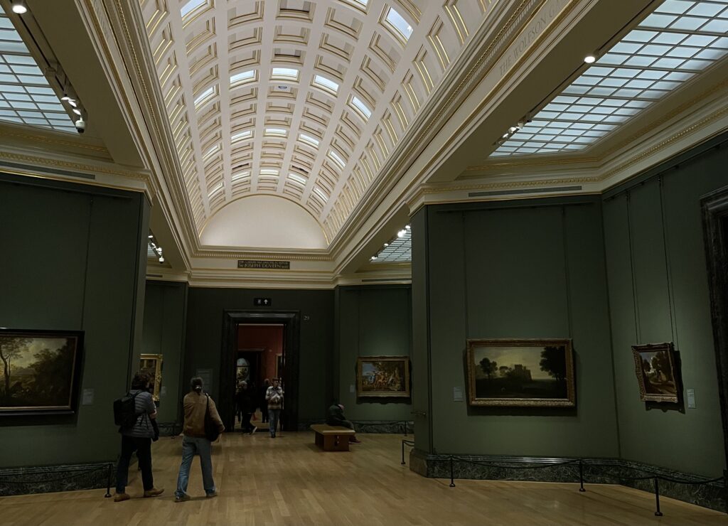
If CoSA showed me how exaggerated framing works, and the Schlossberg Museum showed me how subtle framing still guides behaviour, then this walk through Graz showed me to be present.

The Walk (Duration: 1 hour and 15 minutes)

I started on Mariahilferstraße, wandered across the Murinsel, continued toward Lendplatz, went into side streets, crossed Annenstraße and slowly moved toward Grieskai. 

It’s strange: when you intentionally look for accidental meaning, the world starts to reveal tiny compositions everywhere. Some poetic, some funny, some tragic, some boring, some confusing.

Here are a few moments I captured:

1) The Fallen Cone

Near Lendplatz a single orange traffic cone lay sideways, slightly dented. It looked almost theatrical.

If this were in a museum, it would be part of an installation about urban chaos.
Outside, it’s just a cone.

But what changed?
Only the frame.

This made me think: maybe objects communicate consistently, it’s just our interpretive mode that switches.

2) The Empty Coffee Cup on a Windowsill

Not a trash bin. Not a table. A windowsill.
Someone had placed it there deliberately or absentmindedly.

And suddenly it became a story.

  • Was someone waiting for a friend?
  • Did they forget it?
  • Did they mark the spot like some urban ritual?

The funniest part: if I placed a cup there myself, it would be “an intervention.”
But because someone else did it accidentally, it becomes “everyday installation.”

The line between art and non-art grows thinner the more I walk.

3) The Three Cigarette Butts Forming a Triangle

This one wasn’t poetic but a bit bizarre.
Three cigarette butts arranged almost perfectly into a triangle like some secret smoker geometry.

I didn’t touch anything. I didn’t rearrange them. But the order was uncanny.

Is it art?
Is it coincidence?
Does it matter?

Maybe communication happens the moment the viewer cares enough to interpret.

What This Walk Taught Me About My Thesis

My question “What does it take for art to communicate without a frame?” felt different after this walk.
More layered.
More complicated.
But in a good way.

Here’s what I realized:

1. The frame isn’t always physical — sometimes it’s mental.

If I walk with the mindset of “I’m looking for art,” the world becomes an exhibition.

If I walk without that mindset, everything becomes background noise.

Which means:
Maybe art communicates without a frame only when the viewer is aware enough to see it.

2. Everyday installations rely on the viewer, not the maker.

In museums, meaning is served to you.
On the street, meaning must be harvested.

That difference is huge.

Street installations don’t explain themselves.
They don’t try.
They don’t guide you.
They don’t ask to be understood.

Meaning only appears when someone stops, looks, interprets.

3. Art without a frame might require more effort

A frame protects.
A frame contextualizes.
A frame tells you:
“Look here, this matters.”

Without that, all you have is noise unless you tune yourself to see the signal.

Walking through Graz felt like tuning myself.

And maybe that’s the heart of my MA:
To understand not only how art communicates without a frame, but how people learn to see without being told to.

Why This Walk was important

This walk felt like practicing perception.

And perception might be the key to answering my thesis question.
If I want to understand how to communicate without a frame, I need to understand the conditions that make a viewer receptive.

This walk was the first step in that direction.

Links
https://www.graz.at
https://www.murinsel.at
https://www.graztourismus.at

AI Disclaimer

This blog post was written with the assistance of AI.

Thesis Research 08: Zwischen Emotion, Funktion und Haltung

Nach meinen Überlegungen zur Wut als möglichem Thema meiner Masterarbeit merke ich, dass sich mein Fokus weiter verschiebt. Der Gedanke, Wut als Ausgangspunkt zu wählen, bleibt interessant. Gleichzeitig taucht immer wieder die Frage auf, welche Rolle Gestaltung dabei eigentlich einnimmt. Soll sie verstärken. Übersetzen. Strukturieren. Oder zurücktreten.

Beim Lesen des Artikels „Typografie: die Macht von ausgezeichneten Lettern“ auf red-dot.org wurde mir noch einmal deutlich, wie stark Typografie traditionell als vermittelndes Werkzeug verstanden wird. Dort wird betont, dass Schrift nicht nur Information transportiert, sondern Wahrnehmung unterbewusst beeinflusst. Gleichzeitig formuliert Akira Kobayashi sehr klar: „Das ultimative Ziel von Typedesign ist ganz simpel: zu helfen, den Lesern eine Botschaft zu vermitteln.“ Und weiter heißt es, Schrift könne ausdrucksstark sein, solle aber nicht vom Inhalt ablenken.

Auch Kurt Weidemanns Satz wird zitiert: „Gute Typografie erklärt den Inhalt. Nicht den Gestalter.“

Diese Aussagen sind nachvollziehbar. Typografie als Dienstleistung für den Inhalt. Als präzises, funktionales Werkzeug. Als Vermittlerin. Gerade im öffentlichen Raum, bei Leitsystemen oder Markenidentitäten, regelt und kontrolliert sie soziale Aktivitäten. Sie strukturiert Orientierung. Sie hilft beim Verstehen. Sie hilft beim Handeln.

Wenn ich diese Perspektive neben meine Überlegungen zur Wut stelle, entsteht eine Spannung. In Thesis Research 06 habe ich mich gefragt, wie Schrift laut sein darf, drängend, unruhig, vielleicht sogar fragmentiert. Doch wenn Typografie in erster Linie vermitteln soll, wenn sie nicht vom Inhalt ablenken soll, wo bleibt dann Raum für Emotion als eigenständige Kraft.

An dieser Stelle ist mir der Titel einer Ausstellung begegnet: „Aus Wut wird Gestaltung“. Dieser Satz beschäftigt mich besonders, weil er den Fokus verschiebt. Nicht wütende Gestaltung, sondern Gestaltung, die aus Wut entsteht. In der Beschreibung zur Ausstellung wird erläutert, wie der Erste Weltkrieg und seine traumatischen Auswirkungen das Sehen der Künstler veränderten. In den frühen Jahren der Weimarer Republik kam es zu einem künstlerischen Aufbegehren jener Generation, die den Krieg überlebt hatte. Es entstanden experimentelle Bilder, losgelöst von bisherigen Konventionen, eine bewusste Provokation des Publikums.

In den Jahren 1919 und 1920 zeigte der Mannheimer Kunstverein Ausstellungen der Gruppe „Rih“ aus Karlsruhe sowie der Berliner „Novembergruppe“. Über 240 Arbeiten ließen das Publikum die expressionistische Wucht der vom Krieg traumatisierten Künstler spüren. Zwei Ausstellungen auf dem Weg vom Expressionismus zur Neuen Sachlichkeit, beschrieben als Situationsbericht aus der Perspektive des Mannheimer Kunstvereins in einem Vortrag von Dr. Friedrich W. Kasten und Dr. Martin Stather.

Hier wird deutlich, dass Gestaltung nicht aus einem ästhetischen Spieltrieb entstand, sondern aus einer existenziellen Erfahrung. Aus Erschütterung. Aus Trauma. Möglicherweise auch aus Wut. Die Form war Konsequenz, nicht Dekoration. Aus einem inneren Zustand wurde Gestaltung.

Dieser Gedanke verbindet sich mit Friedrich von Borries’ Verständnis von Design als Intervention. „Alles, was gestaltet ist, entwirft und unterwirft“ (vgl. von Borries, Weltentwerfen. Eine politische Designtheorie, S. 9f.). Gestaltung ist nie neutral. Sie greift ein und positioniert sich zur bestehenden Ordnung (vgl. ebd., S. 30). Wenn aus Wut Gestaltung wird, dann ist diese Gestaltung nicht bloß Ausdruck, sondern Eingriff. Sie widerspricht. Sie bricht mit Gewohntem. Sie entwirft eine andere Sicht auf die Welt.

Vielleicht liegt mein Thema deshalb weniger in der Frage, wie Wut formal aussieht, sondern darin, wann aus einer inneren Haltung Gestaltung wird. Wann Emotion zur gestalterischen Notwendigkeit wird. Und wann Gestaltung lediglich Oberfläche bleibt.

Auch der Gedanke aus „Was man von hier aus sehen kann“ von Mariana Leky begleitet mich weiterhin. Jede Gestaltung entsteht aus einem bestimmten Hier. Wut ist perspektivisch. Sie ist gebunden an Erfahrung. Vielleicht geht es weniger darum, Wut darzustellen, als vielmehr darum, sichtbar zu machen, aus welcher Position heraus Gestaltung entsteht.

Im Moment formt sich mein Thema nicht als eindeutige Entscheidung, sondern als Spannungsfeld. Zwischen Emotion und Struktur. Zwischen Vermittlung und Intervention. Zwischen funktionaler Typografie und einer Gestaltung, die aus einer Haltung heraus entsteht.

Vielleicht ist genau dieses Dazwischen mein eigentlicher Forschungsraum.

Links:
https://www.red-dot.org/de/magazine/typografie-die-macht-von-ausgezeichneten-lettern
https://res.cloudinary.com/suhrkamp/images/q_auto/v1742120777/38677/weltentwerfen_9783518127346_leseprobe.pdf
https://www.kuma.art/de/node/12985

Thesis Research 07: Wut gestalten? Übersetzung, Perspektive und Anwesenheit

Im letzten Research ist der Gedanke aufgekommen, Wut als möglichen Ausgangspunkt meiner Masterarbeit zu denken. Es war zunächst eine Idee, die mich intuitiv angesprochen hat. Gerade deshalb möchte ich sie weiterdenken und kritisch prüfen.

Eine der zentralen Fragen, die sich mir stellt, ist, wie man Wut überhaupt übersetzen kann. Und vielleicht noch grundlegender, ob man das sollte.

Wenn ich an wütende Typografie denke, entstehen sofort Bilder im Kopf. Verzerrte Buchstaben, gebrochene Formen, starke Kontraste, Unruhe im Satzbild. Doch genau hier beginnt mein Unbehagen. Ist das nicht eine ästhetische Verkürzung. Eine visuelle Zuschreibung. Eine Entscheidung darüber, wie Wut auszusehen hat.

In Thesis Research 06 habe ich formuliert, dass mich interessiert, wie Gestaltung Wut „nicht illustriert, sondern erfahrbar macht“. Aber was bedeutet das konkret. Sobald ich beginne, eine wütende Schrift zu gestalten, greife ich ein. Ich definiere. Ich lege fest. Ich übersetze eine Emotion in eine Formensprache. Und genau hier wird der Gedanke aus Weltentwerfen. Eine politische Designtheorie von Friedrich von Borries relevant.

Von Borries schreibt: „Alles, was gestaltet ist, entwirft und unterwirft“ (vgl. von Borries, Weltentwerfen, S. 9f.). Und weiter: „Design ist politisch, weil es in die Welt interveniert“ (vgl. ebd., S. 30). Wenn ich also Wut gestalte, entwerfe ich nicht nur eine Form, sondern ich interveniere. Ich greife in die Wahrnehmung dieser Emotion ein. Ich bestimme, wie sie sichtbar wird. Und damit bewege ich mich im Spannungsfeld zwischen entwerfendem und unterwerfendem Design, das von Borries beschreibt (vgl. ebd., S. 36).

Die Frage ist also, ob eine wütende Typografie ein entwerfender Akt ist, der Wut Raum gibt, oder ein unterwerfender Akt, der sie in eine ästhetische Kategorie zwingt.

In diesem Zusammenhang ist mir das Buch „Was man von hier aus sehen kann“ von Mariana Leky begegnet. Schon der Titel beschäftigt mich. „Was man von hier aus sehen kann“ verweist auf Perspektive. Man sieht nie alles. Man sieht nur das, was vom eigenen Standpunkt aus sichtbar ist.

Übertrage ich diesen Gedanken auf Wut, wird klar, dass auch Wut perspektivisch ist. Sie entsteht aus einem bestimmten Hier. Aus einer individuellen Erfahrung, einer Verletzung, einer Grenzüberschreitung. Wenn ich Wut gestalte, gestalte ich immer nur das, was ich von hier aus sehen kann. Meine Wut. Oder eine bestimmte, ausgewählte Wut.

Das relativiert den Anspruch, Wut darzustellen. Vielleicht geht es weniger darum zu zeigen, wie Wut aussieht, sondern darum sichtbar zu machen, von wo aus sie entsteht.

Auf dem Buchrücken von „Was man von hier aus sehen kann“ steht der Satz „von der unbedingten Anwesenheitspflicht im eigenen Leben.“ Dieser Gedanke lässt sich weiterführen. Vielleicht kann man auch von einer unbedingten Anwesenheitspflicht der Wut sprechen.

Wut verschwindet nicht, nur weil man sie nicht gestaltet. Sie ist da. Sie wirkt. Sie interveniert. Und wenn Design, wie von Borries schreibt, immer in die Welt interveniert (vgl. von Borries, Weltentwerfen, S. 30), dann stellt sich die Frage, ob Gestaltung Wut beruhigt oder ob sie ihre Anwesenheit ernst nimmt.

Von Borries fordert eine politische Haltung des Designs (vgl. ebd., S. 30). Eine solche Haltung könnte im Kontext von Wut bedeuten, nicht vorschnell eine Form zu definieren, sondern zunächst anzuerkennen, dass diese Emotion anwesend ist und aus einer bestimmten Perspektive spricht.

Im Moment verschiebt sich mein Thema weiter. Weg von der Frage, wie wütende Gestaltung aussieht, hin zu der Frage, wie Gestaltung mit einer anwesenden, perspektivischen Emotion umgehen kann, ohne sie zu unterwerfen. Vielleicht liegt genau in diesem Spannungsfeld zwischen Eingriff und Offenlassen, zwischen Entwerfen und Unterwerfen, der eigentliche Kern meiner Auseinandersetzung.

Links:
https://www.book2look.de/book/9783832198398&refererpath=www.dumont-buchverlag.de
https://www.youtube.com/watch?v=_zbqX7USL9g
https://res.cloudinary.com/suhrkamp/images/q_auto/v1742120777/38677/weltentwerfen_9783518127346_leseprobe.pdf


Research #8 From fast to sophisticated

If you look at 99% of motorsport branding, the typography follows a very predictable recipe: italicized, bold, and sans-serif. It’s a visual shorthand for fast. The slant mimics the wind, the weight mimics the power. It’s fine, but it’s also a bit of a cliché. In the world of high-end lifestyle branding, typography isn’t just about speed but more about voice.

Impulse #3 – National Gallery London: On Seeing Too Much

I recently went to the National Gallery and wanted to write about my visit. At first, I didn’t really know how to connect it to my master’s thesis, or even what exactly I had learned from it. This time, I simply started writing down my thoughts and by the end, I realised that it’s possible to make a connection between almost everything.

One of the first things that still amazes me is that the National Gallery like so many important museums in London is free. You can just walk in, no ticket, no obligation, and suddenly you’re standing in front of some of the most famous paintings in the world. That alone already says something about access, value, and who art is for. There’s no barrier or expectation. You’re allowed to wander, to stay five minutes or five hours.

And five hours might actually be too much.

The gallery has so many rooms that after a while all the paintings started to blur together. This feels almost wrong to admit, because these are obviously some of the most important and celebrated artworks in history. Each painting, when looked at individually, carries such rich stories, political contexts, personal tragedies and fascinating details. Knowing the story behind a painting completely changes how you see it and how much it moves you.

I noticed this especially when I was looking for The Execution of Lady Jane Grey. I already knew her story, and I had been deeply moved by it before even seeing the painting in real life. Standing in front of it felt almost like meeting a celebrity you’ve admired for a long time. In that moment, the painting didn’t feel like “just another artwork on the wall.”

But those moments became rarer the longer I stayed.

After a while, the quantity of paintings started to work against them. Room after room everything slowly flowed into everything else. I started wondering if “too much” can actually make things lose their value. Not because they aren’t valuable, but because we, as viewers, reach a limit. It reminded me of how after scrolling on TikTok for two hours, everything starts to feel the same and not because the content is identical, but because our capacity to truly engage gets exhausted. And maybe this doesn’t only happen with digital media, maybe it happens in museums too.

There was also something about the way the paintings were displayed that made this feeling stronger. The lighting, for example. This might be controversial, but I really didn’t like how Van Gogh’s Sunflowers looked. The colours felt lifeless and I hate saying that, because it’s Van Gogh. But it made me realise how much context, presentation, and atmosphere shape our experience of art. Even the most powerful work can feel distant if the conditions around it don’t support it.

Walking through the gallery, I kept thinking about attention and how fragile it is, how easily it slips away. And maybe this is where the connection to my master’s thesis begins to form. I’m becoming more interested in how meaning is created, sustained, or lost depending on scale, quantity, and context. How can we design (physical or conceptual) to allow for slower and deeper engagement?

Links:
https://www.nationalgallery.org.uk/
https://www.hrp.org.uk/tower-of-london/history-and-stories/lady-jane-grey/
https://www.nationalgallery.org.uk/visiting/virtual-tours/google-virtual-tour

Impulse #2 – Lecture: Design Future Practices @Kingston University

For this Impulse blog entry, I wanted to share my insights from my lectures at Kingston University. After my first lecture, I felt so inspired that I went straight to the library and started doing research that would eventually lead me toward my master’s thesis topic.

On our first day, we got to hear about the career path of our lecturer, Cathy. She talked about moving through different creative and political spaces, from being part of a rebel music group to convincing students to create an alternative art school as a form of protest against London’s high tuition fees. The way she told these stories was incredibly engaging. With her comedic timing and honesty, it felt much more like sitting in the audience of a stand-up show than attending a university lecture. Of course, because it was my very first lecture in London and I was already buzzing with excitement about learning new things, I was probably way more impressed than everyone else. For the other students, it was likely just another rainy Thursday morning.

What I appreciated most about this lecture and the course in general is how seriously the university prepares students for their dissertation. This entire semester is dedicated to finding and shaping a topic, and they really take the time to guide us through that process. All the research we do is meant to lead toward a final project, supported by workshops that help us along the way. We work in groups, talk openly about our ideas, and constantly reflect on where we are and where we want to go.

One piece of advice Cathy keeps repeating really stuck with me: “Start with something small, you can always go bigger.” It’s exactly what I’ve been struggling with. I have a tendency to aim straight for big, complex problems that realistically require way more power, time, or resources than I currently have. Cathy explained that it’s often much more effective to start with something small and specific, and then slowly build on it. Over time, that small idea can grow, expand, and take on more layers. That’s what I’m trying to focus on now: collecting smaller ideas, letting them develop naturally, and then gradually adding more literature, references, and sources.

To help us through this process, Cathy divided us into three groups: Making Public, Making Situated Knowledge, and Making Meaning. Within these groups, we wrote down all of our interests and started mapping them together with the others. This simple exercise turned out to be surprisingly powerful. Seeing my thoughts laid out visually and alongside the ideas of others helped bring some structure to the chaos that had been floating around in my head. It made everything feel a little more tangible and manageable.

Links:
DE7608 intro Graphic Design – Future Practices Slides
https://docs.google.com/presentation/d/1SvQrDOy-4GwHipNV4sZ7klFm0ZUWH4DDy84T-SGMcjQ/edit?slide=id.p#slide=id.
Our Mindmaps:
https://padlet.com/qr-code/lhh5tuq2qwomtmav?source=image

Impulse #1 – Directors Roundtable

For my first Impulse blog entry, I wanted to start with something that has always been a big part of how I see and understand the world: film. Even though I study design, I’ve always felt drawn to cinema. Not just as entertainment, but as a way of thinking. Film is a combination of so many different disciplines: image, sound, timing, emotion, storytelling, and decision-making. Watching films, and especially listening to directors talk about their process, reminds me that creative direction exists everywhere, not just in design. It makes me realise how important it is to learn from other fields, because the questions are often the same. How do you create meaning? How do you guide attention? How do you stay true to an idea while navigating uncertainty?

I recently watched a Directors Roundtable with Todd Phillips, Martin Scorsese, Greta Gerwig, Noah Baumbach, Lulu Wang, Fernando Meirelles and it gave me a lot to think about. Not only about filmmaking, but about creative work in general.

One moment that stayed with me was when Martin Scorsese talked about The King of Comedy, which was called “flop of the year” when it was released. Today Scorsese is seen as one of the most important filmmakers of all time. It made me realise how success reshapes the way we look at people’s work. When someone becomes successful, we often forget the the failures and the moments where their work wasn’t understood. We see their career as something linear, even though it never was.

A story shared by the Brazilian director Fernando Meirelles stuck with me the most. When he was asked if he would consider moving to the US, he said: “I like to direct in Portuguese. I understand English, but I don’t feel English. If you say ‘mango tree’ in English, it’s just a tree. If you say ‘mangueira,’ it’s my mother, its scent, it’s so much.” This made me think about how language, context, and personal experience shape meaning. The same object can carry completely different emotional weight depending on how and where you encounter it. As someone interested in creative direction, this makes me reflect on how meaning is never fixed, it is always somehow shaped by cultural context.

Another idea that resonated with me was when they described production as an act of faith. Every day on set, you show up without knowing exactly what will happen. It might rain. Something might not work. The circumstances are rarely what you expected. You have to adapt constantly and make the best out of what is there. This feels very familiar to the creative process in general. You can prepare, research, and plan, but there will always be uncertainty. Instead of trying to control everything, you learn to respond, adjust, and trust the process.

Watching this conversation reminded me that creative direction is not about having complete control or certainty. It’s about observing closely and trusting that meaning will develop over time. It also reminded me that research is not always linear. Sometimes it starts with curiosity, with watching, listening, and collecting fragments. And only later do those fragments begin to connect.

In that sense, watching films and listening to the people who make them has become part of my research process. Not because it gives me clear answers, but because it helps me understand what it means to create something with intention.

Links:
https://www.youtube.com/watch?v=4iLtjMwkOlg&t=2471s
https://www.ebsco.com/research-starters/biography/fernando-meirelles
https://www.indiewire.com/news/general-news/martin-scorsese-audiences-hated-king-of-comedy-1234913652/

IMPULSE #8—Data Visualisation

For the next part of my research, I chose to watch the Google talk ‘Storytelling with Data’ by Cole Nussbaumer Knaflic. I picked this specifically because, while David McCandless focuses on the beauty and ‘eye candy’ of data, Cole focuses on the clutter and the psychology of how we see. Since my project is all about ‘visual overload’ and how to use it strategically, I wanted to learn from someone who is an expert in the exact opposite: cleaning up the mess to make a clear point. I wanted to understand the rules of ‘perfection’ in data storytelling so that I can know exactly how and when to break them in my own maximalist designs.

In her talk, Cole explains that we aren’t naturally good at storytelling with data because we usually just ‘show’ the data instead of ‘explaining’ it. She talks a lot about Gestalt Principles of Visual Perception—how our brains look for order and try to group things together. One of her main points is about clutter. She says that every single element you add to a design takes up ‘cognitive load’ (which connects back to what I read in Steve Krug’s book). If you add too much, the user’s brain just shuts down because it’s too much work to process. Her goal is to strip everything away until only the most important ‘aha!’ moment is left.

What I found really useful was her advice on preattentive attributes. These are things like color, size, and position that our eyes notice before we even realize we are looking at them. Cole shows how you can use a single pop of color to lead the audience’s eye exactly where you want it. This made me think about my own posters for the ‘Growth of Consumerism’ project. While I want my posters to feel crowded and ‘loud’ to represent the mess of consumerism, I still need to use Cole’s logic to make sure the key message doesn’t get lost in the noise.

My conclusion after watching this is that storytelling is just as important as the data itself. If I just throw facts at people about how much waste the fashion industry creates, they might ignore it. But if I use Cole’s ‘storytelling’ structure—starting with a problem, building tension, and ending with a call to action—I can make a much stronger impression. Her approach is very ‘clean’ and corporate, which is a great contrast to the Maximalism I am exploring.

This talk is incredibly relevant to my master’s thesis because it taught me about the ethics of visual communication. Cole warns that we can easily mislead people with how we scale our graphs or use colors. In my work, I want to use ‘Strategic Friction’ to slow people down, but I have to be careful not to use ‘Dark Patterns’ or deceptive tactics that Cole and Harry Brignull warn about. My plan is to take her rules for clarity and focus and apply them to my maximalist layouts. I want to create a design that looks like a ‘conspiracy’ or a mess at first glance, but once the user starts ‘deciphering’ it, they find a very clear, data-driven story hidden inside. It’s about finding the balance between her ‘less is more’ and my ‘more is more’ to see which one actually changes consumer behavior in Croatia.

Disclaimer: AI was used in making this blog.