IMPULSE.02 // How to design services that work

When think about how often we interact with services it really is shocking how poorly designed a lot of them are. Good service design, a book by Lou Downe, the former Director of Design for the UK Government. She was involved with the design https://www.gov.uk/. In her book, Downe gives a guideline of 15 points of what to look out for when designing a service.

What is a service?

Short answer: A service helps us do something we want to do

A service can range from something as tiny as buying a bottle of water to something huge like registering to get married. What makes a service a service is that it combines multiple organizations into one (hopefully) seamless experience for the user to get to their desired goal.

The 15 principles for good service design

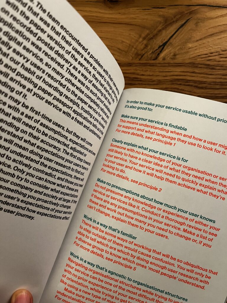
  1. They have to be easy to find
  2. Clearly explain its purpose
  3. Set a user’s expectations of the service
  4. Enable each user to complete the outcome they set out to do
  5. Work in a way thats familiar
  6. Require no prior knowledge to use
  7. Be agnostic of organizational structures
  8. Require the minimum possible steps to complete
  9. Be consistent throughout
  10. Have no dead ends
  11. Be usable by everyone, equally
  12. Encourage the right behaviours from users and service providers
  13. Quickly respond to chage
  14. Clearly explain why a descision is made
  15. Make it easy to get human assistance

I haven’t read the entire book yet but I would like to point out what really stuck with me and that I want to focus on in my thesis.

In chapter 7 Be agnostic of organizational structures, Downe mentions that it is vital to a service must not show the hidden structures of the organizations it’s combining. She uses the term “siloed” a lot, which basically means that parts of organistations are isolated so much and don’t share data efficiently between each other. It’s less collaboration and more work for the user. I think this is extremely true for health care in Austria because the transfer of data and knowledge relies on so many different tools that it’s confusing and overwhelming to deal with.

Downe believes that the sub-organizations need to agree on a common goal in order to work together seamlessly. Once this foundation is set it can help to create a permissive environment for collaboration.

I really enjoy how effectively this book conveys the most important aspects of service design and I’m sure it will provide lots of guidance when writing my thesis.

Random side note: Even though the overall design of this book is really pleasing I was extremely irritated by the bold font they used for the body text. This is not relevant to the content but it’s something that bothered and reminded me of the importance of visual hierarchy once again.

Link to the book: https://good.services/home

No AI was used to write this blog post

Impulse #4 – another museum!

This impulse is a continuation (or part 2) of my first post about my visit to the Children’s museum FRida & FreD. For the Gamification Course this semester we visited CoSA and looked at different parts of their exhibition. I talked to a staff member there and was able to find out that they actually work together with the Children’s museum FRida & FreD but have a slightly older target group. It was interesting to see how they approached the same concept of making complex topics tangible through interactive installations for different age groups. This exhibition gave me further insights into tangible information and learning. What was great is that I was able to see and test examples from many different subject areas such as finance, medicine, microbiology, tech (specifically the automotive industry) and STEM topics in general. Especially the STEM topics were something that really peaked my interest. Last semester I made a small prototype about tangible chemistry experiments without needing the actual laboratory.

Looking into more exhibitions was equally inspiring and insightful as I was also able to discover some approaches I didn’t enjoy so much, or thought weren’t conceptually great. The entire finance section for example I found quite boring and upon talking to some of my colleagues I discovered that they felt the same way. While some principles and ideas might have seemed nice on paper and were technically interactive, I felt that the way the content itself was displayed was not very creative or clever. The topics were still not always easy to understand and most „storylines“/games/stations took way too long. This was a helpful reminder that its not just the form that matters but its also the content itself that has to be adjusted. Simply placing it into a new medium, making it interactive by adding screens, buttons, voice control or an avatar does not make a topic easier to grasp or more fun. This highlighted for me that designing for engagement requires an alignment of content, format, and interaction method, not just “gamification”.

This was something the other part of the exhibition did much better. The stations were way more digestible in terms of length and information structure. An approach I found really great was the medical area that allowed kids to use actual operation and laboratory tools on fake scenarios and substances. I know this would have been something I would have loved as a child (and still really enjoyed now to be honest). From what I could see the kids there also enjoyed this immensely and stayed engaged throughout the whole process. Additionally what was executed nicely here, I think, was the storytelling. Apart from the cool interactions and real tools, the lengthy process never got boring. Diagnosing a patient and building a race-car were the two areas that did this best because there were constantly new steps and aspects to discover.

Both museum visits really reinforced my interest in tangible learning environments. However what I am still wondering is whether I can really find a new angle or topic that hasn’t been done yet. The setting of a museum is really interesting and it might also be fun to look into other target groups. Another interactive museum space I enjoyed was the exhibition on democracy in the Graz Museum. I feel like with these three I have a broad spectrum of target groups and topics to draw inspiration from and it might be worth looking into more.

CoSA: https://www.museum-joanneum.at/cosa-graz

Impulse #3 – a book!

This impulse comes from a book I was reading: “Beschleunigung und Entfremdung” by Hartmut Rosa, a German sociologist whose work revolves around the concept of social acceleration. According to Rosa, advancements in communication, transport, and production have made things increasingly fast, creating expectations of efficiency and speed in almost every area of life. This ongoing acceleration, he argues, ultimately leads to alienation, distancing us from the world rather than connecting us to it.
In the book, he raises two key questions: What constitutes a good life? And why is it that we so often fail to lead one? Since the first is almost impossible to answer universally, he focuses on the second. Rosa says that both our individual and collective ways of living are in need of reform. He identifies time as the central issue, claiming that modern society is governed, coordinated, and controlled by an “intense and rigid regime of time.”

This phenomenon isn’t entirely new. Others have written about similar concerns (James Gleick, Peter Conrad, Douglas Coupland), but Rosa examines the idea more structurally. He asks whether we should talk about “social acceleration” (singular) or rather a sequence of accelerations occurring across various areas: sports, fashion cycles, video editing speeds, transportation, job markets, and so on. Fast food, speed dating, power naps, drive-through culture all show how speed has become a central part of every day activities and aspects of life.

Rosa categorises acceleration into three types:


Technological acceleration: the intentional increase of speed in transport, communication, and production processes, reinforced by new types of organisation and administration. Our perception of space and time has been reshaped. With space and time, space used to take precedence (due to our senses like sight, gravitation, etc.) this has now switched with „shapeless“ places like the internet taking over, shrinking space down or eliminating it entirely. For example the distance between London and New York, has shrunk to a fraction within the timespan of sailboats to the invention of planes, reinforcing the sense that time conquers space.


Acceleration of social change: not just the processes, but society itself speeds up: values, lifestyles, relationships, group dynamics, habits, even our social language. In the past, sons followed their fathers professions across multiple generations. Later, choosing their own career path for life became the norm. Now, it’s common for people to change professions several times within a single lifetime.


Acceleration of the pace of life: this one is paradoxical. Technical acceleration should, in theory, free up time. Yet people in western cultures increasingly report the feeling that time is slipping away. Time is perceived as a resource. What actually happens is that the quantity of tasks and experiences per unit of time rises. Instead of using speed and technological advance to create space, we fill the newly freed time with more activity.

All in all, this is a really complex topic and definitely too broad to tackle in its entirety. From a design perspective, I think it becomes important to set a small framework and pick one very specific aspect to focus on, whether that’s something like food, relationships, mobility, or another everyday field. I’ve briefly looked into Slow Design before, and I feel like it could offer an interesting approach to this idea of acceleration. Not in the sense of rejecting technology altogether, but more as a way of rethinking how we work with it (considering timing, intention and presence as design qualities). I think that could be an exciting angle to explore further.


Book: https://books.google.de/books?hl=de&lr=&id=QLY7CgAAQBAJ&oi=fnd&pg=PT4&dq=hartmut+rosa+theorie&ots=PVM4doUUVA&sig=A1RGw7OgClYj0LTPHh_Jais49ew&redir_esc=y#v=onepage&q=hartmut%20rosa%20theorie&f=false

Disclaimer: I used AI to translate this since the book and my notes on it are in german.

Impulse #1 – a museum!

For my first Impulse-Post I have chosen my visit to the Children’s Museum FRida & FreD in Graz. One of the topics I am considering for my masters thesis is tangible interfaces and embodied interaction. I already looked into this topic last semester and have considered children and the setting of learning and (STEM Education) as an interesting target group and subject. Tangible Interfaces allows for a many different approaches, angles which I have been finding hard to narrow down. I visited the museum with two friends of mine that had come to visit. Both of them worked on the exhibition as interaction and graphic designers so it was really interesting to get their perspective on the production and development of such an installation. The Exhibition was about Data Security and designed in a medieval aesthetic. This setting created many fun metaphors for otherwise abstract and (especially for children) hard-to-grasp topics. Choosing a medieval theme for a modern issue is a really interesting approach in my opinion but although I was skeptical at first and wasn’t sure if it would translate well, I really liked the outcome. I found the analogies surprisingly clear, the only thing I can’t say for sure is that kids fully understood the meaning, as I wasn’t able to talk to any (we went just before closing hours). I was however able to ask the staff and they had mostly positive feedback!

I think „play“, learning through making and exploration/curiosity are additional interesting keywords here, and have prompted me to look into this a bit further. What I will say is that in some parts the exhibition did rely on screens, which is something I would consider removing, if possible as I felt this sometimes took away from the immersive „magical“ feeling that was created. Another interesting part that sparked my interest was the storytelling. While the different stations alone were interesting I really liked the fact that there was an overall „quest“ and a companion that appeared at every station. This gave the whole experience a slightly more structured and guided feeling.

The biggest take-away for me (apart from the inspiring and creative interactions I got to try out), is that I have two options on how to approach this topic. I either need to pin down a very specific topic to explore in this thesis or I could go in a more general direction with an explorative thesis-approach where I ask a research question that is something along the lines of „how can interactive installations be designed to be more tangible for children?“. From there I could experiment with creating design guidelines or principles that can be generally applied to tangible interfaces/interaction. With the other option would have to pick a really specific topic and focus on making this tangible through existing methods. So I could either focus on the system and methods themselves or on the topic (like Data Security in the case of the exhibition).


Exhibition PDF: https://fridaundfred.at/wp-content/uploads/Ff_Damals-1410_Paedagogisches-Handbuch.pdf

tangible interfaces (a cool example): https://dl.acm.org/doi/pdf/10.1145/3490149.3502252

learning through making: https://link.springer.com/article/10.1007/s11528-017-0172-6

IMPULSE №1

Welcome to my first Impulse post 🙂
In this blog series, I will explore different topics connected to my master’s thesis project. At the moment, I’m considering two completely opposite directions for my thesis. One focuses on UX/UI interfaces in complex fields, while the other is rooted in creativity and expressive design. So don’t be surprised if the themes of the upcoming posts vary a lot, this variety is fully intentional and part of my exploration process.

For this first post, I want to talk about the Klanglicht Festival, because it was one of the most memorable events of October and a project that my classmates and I invested a lot of effort into.

What I Learned

Before the summer holidays, my teammates (Sara, Vefa, Alina, and Jessi) had already settled on our concept called “Wasser Rausch.” When the semester began, and Alina finished composing the soundtrack, we immediately started developing the visual elements.

To be honest, the process was challenging for me. Animation is not one of my strongest skills, and translating sound into visuals beyond the obvious choices, like circles and bubbles (our main theme), felt extremely demanding. Still, we managed to overcome that barrier.

1. Inspiration Matters

One of my first steps was searching for inspiration, and I found it in the creative works of Oscar Fischinger ( which were shown by our teachers before the summer), where shapes were simple but still impressive.


The other inspiration I found was in the opening titles of films. Title sequences helped me understand how animation can communicate the rhythm of a story, emotional tone, and even a character’s personality.


2. Teamwork Changes Everything

Dividing the workload turned out to be incredibly effective. I was genuinely lucky to work with such motivated and hardworking girls. One head is good, but five are amazing. None of us were experts in After Effects, yet everyone invested maximum effort into mastering their tasks. We also gave each other creative freedom, which made the final outcome unique.

3. Preparation Saves Time

This may seem obvious, but it’s difficult to follow when juggling multiple projects. At the beginning of the summer, I started learning After Effects just to get familiar with the basics. This early preparation helped a lot and reduced the amount of time I needed for learning during the production phase, although it definitely didn’t eliminate them entirely. Still, having those foundations made the whole process much smoother.

Connection to My Thesis

My second thesis idea was deeply inspired by small animated design details that feel almost magical. So my ultimate goal is to create a product where the interaction itself becomes enchanting. To achieve this, I plan to research motion effects, analyze which ones could enhance usability and emotional engagement, and eventually integrate the best ones into my project

I used ChatGPT to check the spelling and grammar of this text

Impulse #4 Learning from Emily Campbell – AI UX Podcast Episode (Dive Club)

Lately I listened to the Dive Club episode with Emily Campbell. Emily is known for Shape of AI, a collection of design patterns for AI products, and her experience gave me a clearer understanding of what makes AI UX both exciting and challenging. While I am really against writing my Thesis about anything involving AI as I am sick and tired of it, this episode helped me reflect on what skills matter in the future of design. Some key insights that stayed with me in no particular order.

Trust as a design goal
Emily talks about how AI systems often behave in an “agentic” way – meaning they make decisions, give suggestions, or perform tasks on their own. Because of this, users can feel uncertain or even anxious. She explains that trust becomes a central design element.
Designers need to focus on transparency: showing what the AI is doing, why it is doing it, and how users can stay in control. I found this helpful because it connects with classic interaction design, but adds a new layer of responsibility.

The rise of AI UX patterns
One of the parts I enjoyed most was the discussion about AI pattern libraries. Emily explains how patterns can support designers who work with unpredictable systems. These patterns help structure prompts, guide outputs, and define how the system communicates.
Creating or analysing AI UX patterns could help designers build safer, clearer interfaces. It suggests that AI UX is becoming mature enough to have shared vocabulary and best practices.

What strong AI UX designers look like
Emily also describes the qualities she looks for in people joining AI design teams. Beyond visual design skills, she values curiosity, comfort with uncertainty, and strong empathy. Good AI designers should understand how systems behave and anticipate user worries or confusion.
I found this inspiring because it shows how the role is evolving. AI UX is not only about screens; it is also about system thinking and ethics.

Whats in it for me

This episode helped me to rethink areas of my research. I now see the importance of studying the relationship between trust, transparency, and pattern-based design. AI systems challenge traditional usability rules, but they also create opportunities to design new interaction models.
This could support safer and more predictable experiences – and while I don’t really want to have my thesis ai related, It helped me broaden my field of Idas and open up my mind.

Listening to Emily Campbell made me realise that AI UX is not a small branch of design – it is probably becoming a core part of how digital products work. The future of interaction design will require us to understand machine behaviour as much as human behaviour.

Link to the Podcast Episode

IMPULSE.01 // Neurodiversity and Design

For this blog post I would like to share some thoughts about a talk about accessibility and neurodiversity and add some personal observations I made spending time with my sister.

Side info: My sister (25) is neurodivergent and struggles to use digital interfaces. Because they are part of every day life she has learnt to deal with the difficulties in her own way but often requires help by my parents, me or my brother.

In October we visited the World Usability Congress (WUC) where I attended the talk by Alide von Bornhaupt about designing for neurodivergent people.

In my experience the term “accessibility” the context of digital design is a highly relevant topic in Design Conferences (as it should be). But the talks usually focus more on physical restrictions or disabilities and less on psychological accessibility. Thankfully, in recent years neurodivergence is talked about more openly and resources are more widely spread.

This is why Alide’s talk stood out to me in the agenda of WUC. She started out her talk with telling her audience why keeping neurodivergent people in mind when designing with some numbers:

  • every 5th person is neurodivergent
  • 300 000 inhabitants in Graz –> 61 000 people in Graz are neurodivergent

A tram ticket in Graz is 3,50 €. If buying a tram ticket is not possible / challenging for this group of people this could mean more than 213 000 € loss in revenue for the tram company.

I’m aware that Alide used this example to put the whole topic into a business perspective, especially for people that need to convince stakeholders to shine a light on neurodiverse people. Nevertheless I found this example kind of hilarious because buying tickets for public transport is something my sister struggles with a lot. Taking the train to visit me in Graz and going on the tram to my appartement has been challenging every time she visited me in the last year. But because she she has no other option than to buy the ticket, nobody is losing money.

Neurodiversity can be many different things like ADHD, autism, dyslexia. Neurodivergent people often struggle with energy because they mask certain behavioral patterns to not seem different. My sister particularly struggles with reading and comprehending patterns that seem straight forward to allistic patterns. She gets overwhelmed with the “simple” task of buying a ticket and has to seek help from her family. This makes her less independent of her own life and reliant on help from others.

Of course the ideal solution would be to have testing pool of neurodiverse people to evaluate their struggles and needs. But this can be challenging because half of neurodivergent adults are not diagnosed and neurodiversity is so individual. This is why Alide emphasises to test digital products with lots of people. Because the more people you test with, the more neurodiverse people you test with.

https://goodwinliving.org/embracing-neurodivergence-understanding-and-celebrating-different-minds/

As mentioned in previous blog posts, my research topic (nationwide eHealth tool) needs to be something that is designed for everyone. In my thesis I really want to focus on the aspect of designing for neurodiversity. Because technology is evolving so rapidly and even allistic (neurotypical) people are struggling to keep up I really hope to meet the needs of people like my sister when designing tools to make everyday life simpler to navigate through.

No AI was used to create this blog post.

IMPULSE #3: Interesting read from the chapter “The Need for Ethics in Design” from The Ethical Design Handbook and how we can effectively implement ethics in our work

I started reading “The Ethical Design Handbook” by Trine Falbe, Martin Michael Frederiksen, and Kim Andersen (it was one of the very first resources I discovered and noted down in the initial gathering process that led to the choice of my thesis topic) and now, I treat it as an ongoing, dip-in resource rather than a straight-through textbook. It is framed as a practical guide for leaving dark patterns behind and making ethical design part of everyday digital product work, not just a side note. For my thesis on helping people manage their digital footprints, this book feels like a toolkit I can slowly mine: I can pick the chapters that match my current questions, use them, and then come back later when a new angle opens up.

Right now, I’m really chewing alot on the second chapter “The Need for Ethics in Design”, because it sets up why ethical design has to be more than simple legal compliance. The authors walk through consequences of unethical design and show how dark patterns, aggressive tracking, and manipulative interfaces damage trust and harm users. They also introduce ethical principles like non-instrumentalism, self-determination, responsibility, and fairness, and connect them to familiar frameworks such as Privacy by Design. Reading this as a preparatory part of my future thesis work, is really helping me sharpen the language to better describe what bothers me about many current products and services: which currently treat people purely as data sources or conversion targets, this very action breaks those core principles and undermines users’ ability to effectively understand and shape their digital footprints.

What feels especially useful is how concrete the book tries to be. It is not just “be nice to users” as an abstract value statement; it tries to build an actual working framework, including tools like the Ethical Design Scorecard and “ethical blueprints” for real design processes. The scorecard is meant to assess how a product performs on different ethical dimensions, with weighted criteria. For my thesis, this sparks a very practical idea: I could adapt or extend such a scorecard specifically around footprint-related questions like what data is collected, how transparent the flows are, how easy it is to revoke or change consent, and whether users can see or manage their historical data in meaningful ways.

This chapter also acknowledges that change has to happen inside teams and businesses, not just in individual designers’ heads. Later parts of the book (which I plan to read next) focus on “creating positive change” and “the business of ethical design”, arguing that ethical practices can be aligned with sustainable business models instead of being framed as a cost. That connects well with my thesis constraint of balancing business needs with user autonomy: if I can borrow some of the arguments and models from these chapters, I can show how ethical digital footprint management is not just “good for users” but also part of a long-term, trust-based product strategy.

As an ongoing read, I see myself using this book in two ways. First, as a language and framework source: the principles and scorecard approach help me structure the “ethical requirements” part of my thesis more clearly. Second, as a bridge to practice: the blueprints and case-studies can inform how I generally approach projects/work in my career to more genuinely support user agency instead of nudging people into over-sharing and not giving them effective ways to manage what has been overshared. ​

Here is the official site for The Ethical Design Handbook, which includes the table of contents, the ethical design scorecard, and downloadable blueprints that expand on the tools discussed in the book:
https://ethicaldesignhandbook.com

Smashing Magazine’s book page gives a good high-level overview of the book’s goals, including how it aims to help teams replace dark patterns with honest patterns while still supporting business KPIs:
https://www.smashingmagazine.com/printed-books/ethical-design-handbook/

Finally, this Smashing Magazine article announcing the handbook’s release explains why the book was written and emphasizes the need for practical, long-lasting solutions to move companies away from manipulative design and towards sustainable, ethical digital footprints:
https://www.smashingmagazine.com/2020/03/ethical-design-handbook-release/

Disclaimer: This blog post was developed with AI assistance (Perplexity) to help with structuring and phrasing my reflections.

Impulse #2: Computer Vision in UI/UX

After diving into Picard’s vision of emotionally intelligent systems, I now found a more technical and practical perspective on how computer vision is already reshaping UI testing. The research paper Computer Vision for UI Testing: Leveraging Image Recognition and AI to Validate Elements and Layouts explores automated detection of UI problems using image recognition techniques, something highly relevant for improving UX/UI workflows today.

Img: Unveiling the Impat of Computer Vision on UI Testing. Pathak, Kapoor

Using Computer Vision to validate Visual UI Quality

The authors explain that traditional UI testing still relies heavily on manual inspection or DOM-based element identification, which can be slow, brittle and prone to human error. In contrast, computer vision can directly analyze rendered screens: detecting missing buttons, misaligned text, broken layouts, or unwanted shifts across different devices and screen sizes. This makes visual testing more reliable and scalable, especially for modern responsive interfaces where designs constantly change during development.

One key contribution from the paper is the use of deep learning models such as YOLO, Faster R-CNN, and MobileNet SSD for object detection of UI elements. These models not only recognize what is displayed on the screen but verify whether the UI looks as intended, something code-based tools often miss when designs shift or UI elements become temporarily hidden under overlays. By incorporating techniques like OCR for text validation and structural similarity (SSIM) for layout comparison, the testing process becomes more precise in catching subtle visual inconsistencies that affect the user experience.

Conclusion

This opens a potential master thesis direction where computer vision not only checks whether UI elements are visually correct but also evaluates user affect during interaction, identifying frustration, confusion, or cognitive overload as measurable usability friction. Such a thesis could bridge technical UI defect detection with affective UX evaluation, moving beyond “does the UI render correctly?” toward “does the UI emotionally support its users?”. By combining emotion recognition models with CV-based layout analysis, you could develop an adaptive UX testing system that highlights not only where usability issues occur but also why they matter to the user.

Source: https://www.techrxiv.org/users/898550/articles/1282199-computer-vision-for-ui-testing-leveraging-image-recognition-and-ai-to-validate-elements-and-layouts