IMPULSE #8: World Usability Congress | Graz 24 & 25

Attending the World Usability Congress two times was one of those experiences that leaves your brain pleasantly stimulated. It was a gathering of people who genuinely care about how technology fits into real human lives.

What intrigued me first was the strong emphasis on context. Again and again, speakers reminded us that usability doesn’t live in wireframes or prototypes—it lives in messy, unpredictable, real-world situations. Whether it was designing for high-stress environments like healthcare or for everyday tools we barely notice, the message was clear: if you don’t understand the user’s context, you don’t understand the problem. I also gained a deeper appreciation for the maturity of the UX field. There was a noticeable shift away from “best practices” as rigid rules and toward informed decision-making.

Design systems are like LEGO kits; they contain reusable components and instructions, they can be assembled in a variety of ways, and instructions are for both creation and use.

Accessibility was another major takeaway. Not as a checkbox, but as a mindset. Several sessions showed how inclusive design leads to better products for everyone, not just users with specific needs.

I was also reminded that usability is as much about ethics as it is about efficiency. Talks about dark patterns, persuasive design, and user trust highlighted the responsibility we have as practitioners. Just because something can be optimized doesn’t mean it should be. Designing with empathy and integrity is becoming just as important as designing for speed or conversion.

One of my favorite insights was about innovation built by great teams. Great usability doesn’t happen in isolation. Researchers, designers, developers, product managers, and stakeholders all shape the outcome, whether intentionally or not.

Reflections

I left the World Usability Congress 2024 and 2025 genuinely inspired. It reinforced why I care about usability in the first place and why I chose my thesis to be rooted in product UI UX design, because good design respects people’s time, attention, and limitations. And that’s a standard worth continually striving for.

Disclaimer: AI was used to fix any grammatical mistakes and for better phrasing.

IMPULSE: How to leverage AR in the new retail revolution

Reflections Inspired by a Zappar Talk

The YouTube video about “How to leverage AR in the new retail revolution” is zoom call based presentation about how augmented reality (AR) can be used in modern retail environments — how it can be applied in stores and customer experiences to influence shopping behavior and engagement. 

applications of AR in retail and how companies can use AR as a tool in the retail revolution.

One example discussed was a retail AR experience developed for Motorola. In this case, AR was used to explain product features and functionality through animated visual content. By scanning the product or its packaging with a smartphone, users could access AR explanations that went beyond static text or printed manuals.

What made this example particularly interesting to me is that the AR experience was not limited to the store. Customers could take the product home and still access the AR content later. This shifts AR from a one-time in-store interaction to a take-home support tool, allowing users to explore information at their own pace, without pressure.

Another point emphasized in the talk was the use of animation as a way to explain information. Instead of relying on long descriptions, AR animations visually demonstrate how a product works. In some cases, these animations are inspired by the brand’s logo or visual identity, which makes the experience feel familiar and playful rather than technical or overwhelming.

This combination of animation, branding, and explanation shows that AR can be both informative and enjoyable, helping users understand products while keeping the experience light.

Smartphone-first AR and everyday usability

All examples presented in the talk were based on smartphone AR, not headsets. This choice felt intentional and realistic. Smartphones are already part of everyday shopping behavior, and using them for AR does not require special preparation, waiting time, or staff assistance.

This reinforced my growing understanding that AR in retail does not need to be deeply immersive to be effective. Instead, it needs to be easy to access, easy to stop, and socially acceptable. In this sense, AR works best when it blends into the shopping process rather than standing out as a spectacle.

Why this talk motivated further research

What motivated me most about this talk is how rare this perspective still is. Despite the growing interest in AR, there are surprisingly few talks and examples that focus on practical AR in retail, explained through real use cases rather than marketing promises.

Seeing examples like the Motorola case made me realize how much potential AR still has as a quiet design intervention—one that reduces uncertainty, supports understanding, and lowers cognitive and emotional load during shopping.

This talk gave me a strong impulse to continue researching AR in retail from a user experience and emotional comfort perspective, especially because there is still limited accessible material that critically reflects on AR as a supportive, human-centered tool rather than a novelty.

Hands-on exploration: testing Zappar’s tools myself

After watching the talk, I decided to explore Zappar’s platform myself to better understand how their approach translates into practice. I visited their website and explored the examples and tools they provide, which led me to an actual working AR build environment. I tested several of their live AR experiences directly on my phone, and the overall performance was noticeably smooth and stable in use.

To gain deeper insight, I also tested the platform more extensively through a paid plan. The professional membership is relatively affordable (around 11 EUR per month), which made it accessible for experimentation and research purposes. I deliberately focused on some of the more challenging AR interactions for this type of tool, particularly face recognition–based try-on experiences and text-based AR interactions.

I tested several variations of these features, and the results were surprisingly reliable. Face tracking worked accurately, the try-on interaction felt responsive, and the text interactions were clear and easy to control. What impressed me most was not only the technical performance, but also the quality of the interface. The design felt intuitive, well-structured, and approachable, even when testing more complex AR actions.

This hands-on testing strengthened my impression that Zappar’s tools are not only conceptually interesting, but also practically usable for rapid prototyping and user experience research. Experiencing the platform directly helped me better understand how AR can be implemented in a way that feels smooth, accessible, and user-friendly—qualities that are essential for meaningful AR use in retail contexts.

It instantly generates a QR code, and you can test it on your phone quickly and easily. It works perfectly.

Reflection for my thesis

The Zappar examples strengthened my conviction that meaningful AR in retail does not require complex hardware or fully immersive environments. Instead, it requires thoughtful design, clear purpose, and respect for the user’s time, attention, and emotional state.

This impulse directly feeds into my Master’s thesis, where I explore how AR can support more comfortable and inclusive retail experiences—particularly for users who experience shopping as stressful or overwhelming. The talk confirmed that AR’s real value in retail lies not in replacing reality, but in quietly supporting it.

Leveraging Augmented Reality in Retail – Zappar Talk
https://www.youtube.com/watch?v=grnDgOHY9Tc

In the development of this blogpost, AI (ChatGPT) was used as a supportive writing and structuring tool. I provided the conceptual content, research direction, theoretical preferences, and methodological decisions, while the AI assisted in translating it to English, refining the wording, organising the material and generating coherent academic formulations based on my input. The AI did not produce research or arguments but helped transform my ideas into a clear and well-structured text draft.

3.8 IMPULSE #8

So, this is the last blog post I’m writing for this semester and, essentially, for my studies here at FH. In this post, I want to reflect on the pre-research phase I’ve been working through over the past three months: what I kept, what I changed, what new directions emerged, and what I will do next.

Throughout these posts, you might notice some gaps in how I describe my progress and decisions. I treated this series more like a space to think out loud than a clean research documentation. Still, it shows my process in a raw and honest way.

My writing has been heavily focused on Play. Before even naming social anxiety as a core research pillar, I already knew I wanted to explore play and closely related topics like gamification, board games, and video games. In the end, I did not directly include those formats in my topic. However, play remained central. I now treat it as a design perspective rather than as something tied to traditional definitions of play. I am especially interested in social play, since social anxiety is deeply connected to relationships between people and to how we experience ourselves in social spaces.

Social Anxiety, which I dedicated post #2 to, is what has shaped my theoretical frame so far. I am no longer trying to “represent” social anxiety as a state or a label. Instead, I am moving toward designing for social comfort and emotional safety through interaction. To do this responsibly, I still need to research its characteristics and emotional qualities more deeply through literature, as well as through interviews with therapists or practitioners. This will allow me to ground my design decisions in real experiences rather than assumptions.

From the beginning, I imagined Tangibility, or Tangible Interaction, as the main way people would engage with my artefact. Lately, I’ve realised that tangibility alone may not automatically serve what I want to achieve. What has started to matter more to me now is not just what people touch, but how their body is involved in the interaction. This is where Embodied Interaction comes in for me.

Instead of thinking only about screens, objects, or interfaces, Embodied Interaction looks at how meaning is shaped through the body. Through posture, movement, distance to others, breathing, and the way we physically respond to situations. That feels very close to social anxiety, because anxiety is not only something you “think.” It shows up in the body: in tightness, in hesitation, in avoiding eye contact, in staying still when you want to move, or moving when you want to disappear.

Working with the body allows me to explore these qualities in a more direct and experiential way, instead of only talking about them.

This is also where Soma Design fits into my thinking. It builds on Embodied Interaction but focuses even more on awareness, sensation, and subtle bodily shifts. It helps me pay attention to what is felt, not just what is seen or understood. RtD gives me a structure to think through making, Soma Design gives me a sensitivity to lived experience, and prototyping becomes the way I actually think, not just the way I produce outcomes.

I am also beginning to explore empathy not just as understanding, but as something that can be felt through the body. My goal is not to explain social anxiety, but to create conditions where people can sense what it is like to navigate difficult emotions in social situations. Playful, gentle, and subtle interactions can act as entry points into these experiences without forcing people into exposure.

Wearables are a possible direction here, not as gadgets, but as tools for private, intimate interaction that combine the analog and digital by directly involving the body. They can support embodied, somatic experiences that remain personal rather than performative.

How my way of thinking has changed:
At the beginning, I focused mostly on the outcome: what technology to use, how things might look, what form the artefact could take. Now I understand that this comes after the conceptual work, which is shaped by the theoretical framework and the methods. I am learning to let meaning lead form, not the other way around.

So far, this is the theoretical base I’ve ended up with:

  • Social Anxiety: characteristics & emotional qualities
  • Embodied Interaction
  • (Social) Play
  • Soma Design – Kristina Höök
  • Research through Design (RtD)
  • Prototyping
  • Analog-Digital
  • (Empathy)
  • (Wearables)

Over the next few months of developing the thesis, I want to continue working in this way, moving from reading and reflecting into small material experiments.

AI was used for corrections, better wording, and enhancements.

IMPULSE #8 – A Meeting & Websites

This impulse began with a meeting with my thesis supervisor, Mr. Baumann, where we discussed my topic in a more focused and structured way. Beyond talking about the concept itself, we spoke about how to approach the research phase and how to translate inspiration into something usable for a master’s thesis. One key takeaway from this meeting was his suggestion to start systematically collecting websites that function as strong examples of web storytelling. The focus was not only on visual quality, but on how these websites guide users through information, create meaning through interaction, and build narratives across structure, content, and interface.

I realized that I had already been doing this informally for a while. Whenever I came across a website that made me think “this is good web storytelling”, I saved it to my notes. After this conversation, however, I turned that habit into a more structured process by creating a spreadsheet where I collect examples, categorize them, and add notes about their narrative strategies, interaction patterns, and thematic focus. This spreadsheet will definitely continue to expand over the next weeks as my thesis research progresses. Below, I present a small selection of websites that tell stories in different ways.

AI Takes Over

This website uses humor and interaction to make a complex and often intimidating topic feel approachable. The opening line “AI Takes Over” followed by “Okay, just kidding :)”, immediately sets a playful tone and signals that the site aims to guide rather than overwhelm the user. The visual design supports this narrative approach through a futuristic color palette that gradually shifts from red to purple as the user scrolls. The story moves from past to present to future, combining short explanations, statistics, and myth-busting sections. This creates a clear narrative arc that educates while keeping the experience light. Overall, the website frames AI as a tool rather than a threat, showing how storytelling and interface design can influence perception and understanding.

The Silly Bunny

The Silly Bunny website is a strong example of how immersive technology can be used as a storytelling tool rather than a visual gimmick. Through motion, 2D and 3D illustrations, and interactive elements, the site transforms navigation into exploration. Instead of simply consuming information, users actively move through the brand’s story, discovering elements as they interact with the interface. This playful and experimental approach creates a sense of curiosity and engagement, while reinforcing the brand’s creative identity. The storytelling here happens through interaction itself, making the experience memorable and distinct.

The Message to Ukraine

This is a powerful example of emotional and cultural storytelling on the web. The website unfolds as one continuous narrative, combining poetry, animation, typography, and interaction to celebrate Ukrainian identity and history. Gestalt principles play an important role throughout the experience: images break down into dots and lines and reassemble into recognizable forms as the user scrolls. Content layers overlap like pages in a book, supported by a custom typeface and carefully crafted animations. The result is an experience that feels deeply human and intentional, using interaction and visual language to turn national memory and emotion into a digital story.

Unifiers of Japan

The Unifiers of Japan website presents historical storytelling in a playful and accessible way. Inspired by samurai history and Ukiyo-e art, it reimagines 1600s Japan through modern illustration and interaction. Each historical figure is introduced through interactive cards that highlight key moments and strategies, allowing users to explore the story at their own pace. Rather than overwhelming the user with historical facts, the site focuses on character, contrast, and curiosity. This approach shows how storytelling on the web can simplify complex topics while still encouraging deeper engagement.

And of course, THE Lando Norris Website

This website is a strong example of brand storytelling driven by motion and performance. Speed-inspired animations, sharp transitions, and cinematic scrolling mirror the intensity of Formula 1, making the interface itself part of the narrative. The design balances McLaren’s racing heritage with Lando Norris’s personal identity, using bold typography, color, and interaction to communicate who he is beyond the track. Storytelling here is not delivered primarily through text, but through rhythm, responsiveness, and flow. The result is a digital experience that feels energetic, personal, and closely tied to its subject.

This growing collection of websites already plays an important role in shaping how I understand narrative UX and interactive storytelling. By analyzing different approaches, from educational and cultural narratives to brand-driven and immersive experiences, I am building a foundation that will inform both the research and design phases of my master’s thesis.

Disclaimer: This blog post was written with the help of AI for better grammar and correct spelling.

Using Blippar Builder for AR Prototyping

One of the platforms I tested is Blippar, specifically Blippar Builder, which is promoted as a no-code AR creation tool.

This blogpost clarifies what Blippar Builder can actually do, what it cannot do, and how it fits into my overall prototyping workflow.

What is Blippar Builder?

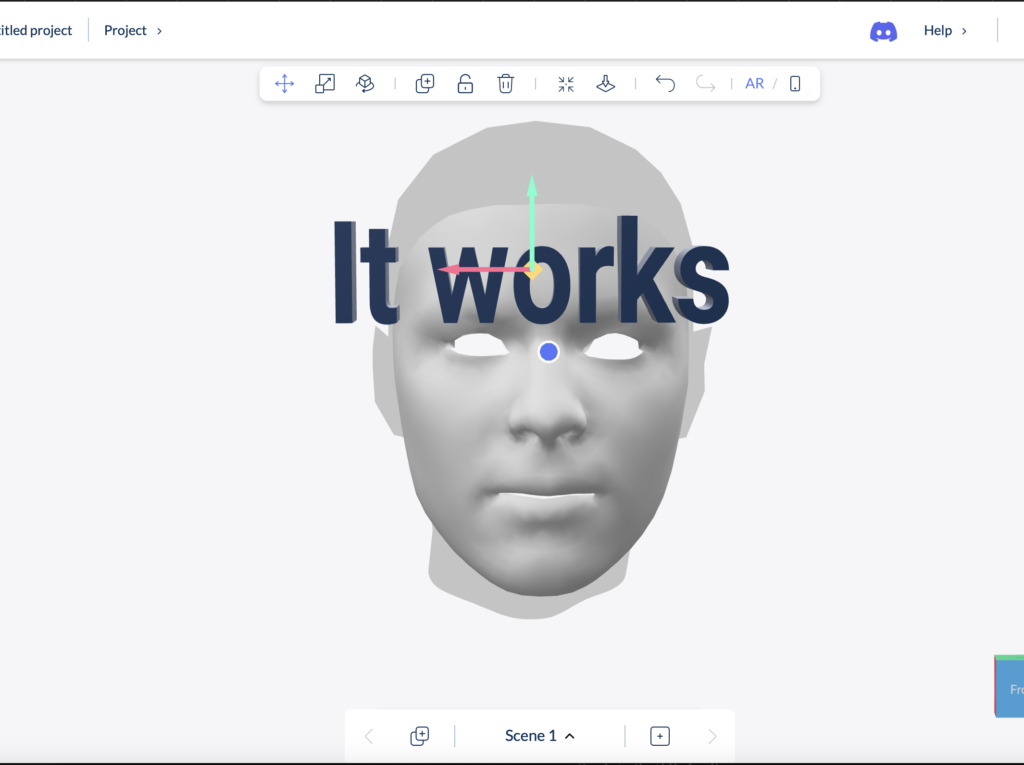
Blippar Builder is a web-based AR authoring platform that allows users to create AR experiences without programming. Content such as 3D models, images, videos, and text can be placed into an AR scene and triggered through QR codes or image recognition. The experience then runs on smartphones, either via WebAR or the Blippar app.

Official platform information:
https://www.blippar.com/builder

The tool is mainly designed for marketing and branded AR experiences, but it can also be used in design research contexts.

What Blippar Builder is good at

Blippar Builder works well for early-stage AR prototyping. It allows me to quickly visualize ideas and test how AR content appears in real physical environments. This includes checking scale, placement, readability, and overall visual clarity.

For my thesis, this distinction is actually helpful. Blippar Builder can function as an early-stage tool to test visual comfort, scale, clarity, and first emotional reactions to AR content. These are key aspects of my research, which focuses on reducing sensory overload and improving emotional comfort in retail settings.

Because the tool requires no coding, it keeps the focus on design decisions rather than technical implementation.

What Blippar Builder cannot do

Blippar Builder has clear limitations when it comes to interaction depth. It does not support complex user flows, adaptive behavior, or logic that changes based on user state. Interaction options are mostly predefined and linear.

Blippar offers both a visual Builder and a Unity plug-in, but they are used in different ways. Projects made in the Builder cannot be moved into Unity. The Unity plug-in is for building AR experiences directly in Unity, while the Builder is mainly for quick visual prototypes and testing ideas.

Blippar Builder vs Unity: how they connect

Blippar Builder and Unity serve different roles in the design process.

Blippar Builder → early visual / comfort / perception testing

Unity + Blippar SDK → advanced AR development (if needed)

Unity without Blippar SDK → alternative AR pipeline

When a company like Blippar offers an AR SDK, it means: developers can build AR experiences inside their own app or in Unity

SDK- A Software Development Kit (SDK) is a collection of tools and code libraries that allows developers to build and customize applications by directly programming functionality, such as AR tracking or interaction logic.

Why this tool choice makes sense for my thesis

Using Blippar Builder at an early stage allows me to:

  • test visual comfort and clarity quickly
  • observe first user reactions
  • refine design direction before technical development
  • free for the first steps

Later, moving to Unity (with more experience and money) allows for more complex experimentation with interaction, pacing, and user behavior. This separation demonstrates a structured and methodologically sound design process, rather than a limitation.

Scope and Limitations of the Prototype Testing

The prototype was not designed to evaluate long-term usage patterns, complex interaction flows, or adaptive and personalized system behavior. These aspects were intentionally excluded from the testing process. The focus of the research lies on first impressions, visual clarity, sensory comfort, and initial emotional responses to AR-supported retail interactions, rather than on system performance, prolonged engagement, or behavioral optimization over time.

My feedback on the User-experience aspect of it while trying it out a bit.

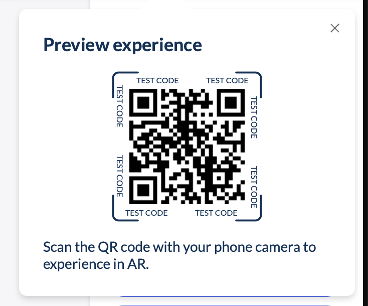
One issue I noticed early on is that the instant readiness of the tool can be misleading. The previews and renderings inside the Builder often give a more polished impression than the final AR experience after publishing. In practice, this means that what looks good during setup does not always translate exactly the same way in the live AR environment.

As a result, publishing can sometimes lead to disappointment, especially when expectations are set too high by the in-editor preview. This made it clear that multiple rounds of testing, proofreading, and correction are necessary to achieve the desired quality. In that sense, the tool encourages fast creation, but still requires careful refinement to avoid false assumptions about the final outcome.

I also encountered some features that were not immediately intuitive and were harder to understand or apply within my project context. Certain functions require trial and error before their behavior becomes clear, which can slow down the workflow at times.

That said, aside from these limitations, my first interaction with Blippar Builder was mostly smooth. The platform allowed me to create the type of AR content I had in mind without needing coding knowledge, which is a significant advantage. This accessibility is a key reason why such tools attract attention at trade shows and events and can contribute to increased engagement and sales. By lowering the technical barrier, Blippar Builder opens up AR creation to a wider audience and enables brands to differentiate themselves through interactive marketing experiences.

Conclusion

Blippar Builder is capable of producing AR prototypes, but primarily at a conceptual and visual level. It is best suited for early-stage design exploration and communication of ideas. For more complex interaction and behavioral research, it needs to be combined with more flexible development tools such as Unity.

In my thesis workflow, Blippar Builder therefore functions as a valuable early-stage prototyping tool, supporting design exploration before moving into deeper technical development.


Source links you can include in your blogpost:


In the development of this blogpost, AI (ChatGPT) was used as a supportive writing and structuring tool. I provided the conceptual content, research direction, theoretical preferences, and methodological decisions, while the AI assisted in translating it to English, refining the wording, organising the material and generating coherent academic formulations based on my input. The AI did not produce research or arguments but helped transform my ideas into a clear and well-structured text draft

Impulse #7: Contemporary Art and Religious Experience

I visited the exhibition “DU SOLLST DIR EIN BILD MACHEN – Contemporary Art and the Religious Experience” at the Künstlerhaus in Vienna with a certain expectation: to encounter contemporary artistic positions that critically engage with religion without falling into pure provocation. What I found was a carefully curated exhibition that neither defends nor attacks religion outright, but instead opens up a complex space for reflection, ambiguity, humor, and critique.

The exhibition brings together works by 42 contemporary artists who approach Christian iconography from different perspectives—critical, loving, feminist, ironic, and deeply personal. Rather than aiming for scandal or shock, the exhibition focuses on dialogue: between past and present, faith and doubt, institution and individual experience. This approach resonated strongly with my own research interests, which revolve around distance, reflection, and the role of mediation in religious experience.

The exhibition is structured into seven thematic chapters—Icon, (False) Holiness, Cross, Resurrection, Divinity, Madonna, and The Last Supper—each framing how traditional religious motifs are reinterpreted today. What becomes immediately clear is that religious imagery still holds immense imaginative power, even in a largely secularized context. Art, much like religion, deals with fundamental questions of existence, meaning, and uncertainty. While religion often seeks to make the unfamiliar familiar, contemporary art does the opposite: it destabilizes what we think we know.

I was actually visited it on the recommendation of Martin Kaltenbrunner with whom I talked about my Master Thesis. One work I was particularly interested in seeing was Deus in Machina (2024/2025) by Philipp Haslbauer, Marco Schmid, and Aljosa Smolic—an AI-based installation that invites visitors to engage in a dialogue with a digital Jesus. Unfortunately, the installation was out of order during my visit. Still, its conceptual framing alone is highly relevant to my research. The work raises the question of whether artificial intelligence can become a spiritual interlocutor—not as a gimmick, but as a serious conversational partner. This idea sits uncomfortably between curiosity and unease, echoing many of my concerns about digital mediation of spirituality: Where does support end and simulation begin?

Seeing Himmelsleiter again—originally created for St. Stephen’s Cathedral—reinforced my sense of how strongly site, context, and memory shape religious experience. Removed from its original location, the work still carried symbolic weight, but its meaning shifted. This highlighted how religious and spiritual experiences are not fixed, but deeply relational and contextual.

Perhaps the most striking moment of the exhibition was encountering Martin Kippenberger’s Fred the Frog Rings the Bell (1990), the infamous crucified frog. Knowing its history—the public outrage, accusations of blasphemy, political pressure, and even papal commentary—added another layer to the experience. What fascinated me was not the provocation itself, but the failure of mediation. The scandal revealed less about the artwork and more about the inability of institutions to foster dialogue. Instead of enabling theological or cultural discussion, the work was hidden, relocated, and silenced. This reaction mirrors many of the mechanisms that contribute to people distancing themselves from the Church: defensiveness, lack of dialogue, and fear of ambiguity.

Other works, such as Deborah Sengl’s Of Sheep and Wolves, critically examine hierarchy, power, and institutional structures within the Church. These pieces do not reject faith outright but question authority and obedience—issues that are central to contemporary critiques of organized religion.

Markus Wilfling’s minimalist sculpture O.T. (God Does Not Play Dice) offered a quieter, more contemplative counterpoint. Referencing Albert Einstein, the work balances order and randomness, belief and doubt. The dice-cross simultaneously suggests structure and mystery, reminding viewers that faith is not about certainty, but about navigating the unknown.

This exhibition was a powerful impulse for my master’s research. It demonstrated how religious themes can be addressed critically without cynicism, and how distance itself can become a productive space for reflection. Most importantly, it showed that engagement with religion does not require affirmation or rejection—it can exist in between. As an interaction designer, this reinforces my interest in creating spaces that allow for ambiguity, critique, and personal interpretation, rather than clear answers or prescribed meanings.


Links:
https://www.nitsch-foundation.com/exhibition/du-sollst-dir-ein-bild-machen
https://religion.orf.at/stories/3232748

Dissclaimer: AI was used here for a better wording and structuring

3.7 IMPULSE #7

On 30/1/2026, I had another coaching session, but this time with Martin Kaltenbrunner. I shared my thesis topic again, but after my last conversation with Hort Hörstner, I had refined it a little. This time, I was asking new questions and exploring my updated path. It felt like I was slowly discovering a clearer direction for my research.

During our conversation, a term came up that really caught my attention: Soma Design, developed by Kristina Höök.

To understand it better, I watched a seminar from Stanford University (you can watch it here: https://www.youtube.com/watch?v=IwBTNAq8Qy8).

Here’s what I learned:

Soma design is a design approach that puts the felt, living body at the center of the process. It comes from somaesthetics, a philosophy that connects our sensing, moving body (soma) with the idea of paying attention to our sensory experiences (aesthetics). In design, this means focusing on how people feel, move, sense, and interact with the world, rather than only what they think or say. It’s a way of designing that listens to the body.

Höök explains that aesthetics here is not about beauty, but about a skill: the ability to notice and attend to the world through all your senses. By doing this, you can feel more pleasure, interest, and awareness in everyday life. I found this idea inspiring, and it connects closely to my topic. Social anxiety is something we experience through the body. So I started asking myself: What if design could help people become more aware of their own bodies?

She shared two examples that really made the idea clear. One was Breathing Light, a lamp that changes brightness with a person’s breathing. The other was Soma Mat, a heated mat that reacts to touch. Both are simple, but they create an immediate connection between the body and the environment.

This gave me an idea for my thesis. Instead of only showing social anxiety visually or conceptually, I could measure bodily responses, like breathing or heart rate, to help people understand how the body reacts in uneasy social situations. By letting the body “speak,” design could create experiences that help people explore, reflect, and become aware without forcing them to explain or perform.

Soma design changed the way I think about my research. It is less about controlling or representing a problem and more about creating a space where people can feel, sense, and explore. I’m excited to see how I can bring these ideas into my prototypes, letting the body guide the design and helping people connect with their own experiences in a gentle, human-centered way.

AI was used for corrections, better wording, and enhancements.

Impulse #8: Architecture of an Idea

After a few weeks of intensive learning and a complete rethink of my project direction, I realized that having a good idea is only half the battle. The real challenge lies in the execution, specifically, how to structure a complex project so it doesn’t collapse under its own weight. To get my head around this, I’ve spent the last few days diving into The System Design Primer, an open-source repository that has become an essential resource for anyone trying to build something a working system.

Thinking in Trade-offs

The most striking thing about the System Design Primer is its objectivity. It doesn’t tell you there is one right way to build a system. Instead, it teaches you that every technical decision is a trade-off. This was a very interesting perspective for me.

The documentation introduces the CAP Theorem (Consistency, Availability, and Partition Tolerance), which forces you to realize that you can’t have everything. You have to choose what matters most for your specific use case. Applying this logic to my own work has been a game-changer. It’s moved me away from trying to build a perfect project and toward building a logical one based on specific constraints.

The Power of High-Level Mapping

One of the most helpful sections of the Primer is the focus on requirement clarification. Before diving into code or hardware, the documentation insists on defining the scope:

  • User Personas: Who is this for?
  • Scale: How much data are we moving?
  • Performance: How fast does it need to be?

Mapping these out feels like a relief. It turns an abstract, overwhelming goal into a series of technical requirements. The Primer provides visual templates for high-level designs—showing how load balancers, web servers, and databases interact—which has helped me visualize my thesis as a functional architecture rather than just a collection of ideas.

From Confusion to Structure

There’s a quiet satisfaction in seeing a complex problem broken down into its component parts. The past few weeks have been fairly high-pressure, and the fog of choosing a new direction was real. But spending time with the System Design Primer has provided a much-needed sense of order. It’s one thing to have an interest in a global problem, but it’s another thing entirely to understand how to build a system that can actually address it. This documentation doesn’t just provide a technical library, it provides a way of thinking. It has taught me to look for the bottlenecks in my logic and to design my project with a focus on reliability and scalability.

I’m still refining the specifics of my research, but I feel much better equipped now. This systematic approach ensures that the final direction is not just an area of interest, but a calculated contribution to a complex, real-world environment.

Source: https://systemdesignschool.io/primer

Is Open Source entirely good? – Impulse #8

In my last post, I ended with a question: Is open source an entirely good thing? What are negative sides? It felt like a blindspot in my own thinking, which I uncovered while talking to Ursula Lagger. After doing some quick research, the answer is more complicated than I thought.

From a purely economic standpoint, open source is great. A Harvard-backed study estimated its value at a staggering $8.8 trillion. It is the critical, often invisible, infrastructure upon which modern society runs. Companies and economies depend on it.

But there is another side to that coin: the human cost. The system thrives on volunteer effort, but it’s a system that is exhausting the people who create it. While the benefits of working on open source projects are great, like accelerated skill development, best practices in code architecture, testing and collaboration, maintainer burnout is an existential risk to the ecosystem. In a recent survey, approximately 60% of open-source maintainers had considered quitting. Maintainers face a constant flood of demands from users with limited resources, insufficient (or no) compensation, and an unfortunate amount of interaction with toxic communities.

And what about us, the designers? For us this is a largely invisible opportunity. While our skills are needed, poor user experience and interface design are common barriers to open-source adoption, designers are almost entirely absent from these communities. Only about 1-3% of contributors are designers. This is likely due to structural barriers: the lack of designer-friendly tools, unfamiliar version control systems, and a developer-centric culture that often undervalues design contributions. A blindspot for the ecosystem, missing out on crucial expertise that could make open-source tools more accessible and user-friendly for everyone.

So, where does this leave me? This exploration hasn’t diminished my desire to contribute, but it has profoundly reshaped my understanding of the world I’m trying to enter. My goal to create a “Designer’s Guide to Open Source” now feels more important than ever. It’s not just about showing designers how to change a button or improve a workflow. It’s about preparing them to enter a complex ecosystem with their eyes open. It’s about encouraging contribution, but also advocating for a future where open source is as sustainable for its people as it is for the economies that depend on it.

Accompanying Links

Harvard Business School: Revealing the Economic Power of Open Source Software: https://d3.harvard.edu/revealing-value-the-economic-power-of-open-source-software/
A report on Open Source Maintainer Burnout: https://mirandaheath.website/static/oss_burnout_report_mh_25.pdf

Burnout in Open Source: A Structural Problem: https://opensourcepledge.com/blog/burnout-in-open-source-a-structural-problem-we-can-fix-together
The Internet Is Being Protected By Two Guys Named Steve (The Atlantic): https://www.theatlantic.com/technology/archive/2014/04/the-internet-is-being-protected-by-two-guys-named-steve/360766/

Ai was used to formulate this blogpost (Gemini + WisprFlow) an support with Research (Perplexity)

IMPULSE #8: Thesis Discussions

This impulse came from three separate mentoring conversations about my master’s thesis: first with Ursula Lagger, then with Horst Hörtner, and finally with Martin Kaltenbrunner. All three liked the core idea of using AR and IoT to enhance retail experiences, but each of them pushed me in a different direction. Together, these talks turned my project from a vague vision into something that needs concrete methods, business relevance and technical depth.

Focusing The Thesis With Ursula Lagger

My first conversation was with Ursula Lagger about my master’s expose. It was less about judging the idea and more about shaping it into a strong research plan. She encouraged me to keep the main concept, but to put much more emphasis on how I am going to test it with users. That meant not just saying “I will do user studies”, but being specific. Who are the participants, what scenarios will I test, which tasks will they perform, and how exactly will I collect and evaluate their feedback.

She also stressed that the written proposal should already show this depth. Instead of broad, generic goals, she wants to see clearly defined outcomes and methods. That feedback was very practical. It pushed me to rewrite sections of the proposal from high level ambition into detailed steps. For example, instead of “evaluate AR navigation in a store”, I now think in terms of concrete studies like “observe how long users take to find an item with and without AR guidance” or “measure perceived stress in crowded environments”.

Business And Social Perspective With Horst Hörtner

The conversation with Horst Hörtner brought in a different layer. He was positive about the topic and said it fits well with current technological developments, but he also pointed out that some of my scenarios are ahead of what is easily deployable today. Rather than seeing that as a problem, he framed it as a chance to think strategically.

From a business perspective, he recommended focusing on locations where the investment in AR and IoT can realistically pay off. That means contexts with higher margins or clear efficiency gains, where companies can justify installing such systems and maintaining them. Further mentioning trying to make something that will benefit not businesses but humanity. I now try to frame each concept both in terms of value for businesses and in terms of concrete benefits for humanity, not just for “tech fans”.

Technical And Methodological Depth With Martin Kaltenbrunner

With Martin Kaltenbrunner the discussion went into the technical and methodological details. He also liked the idea, but he was skeptical mentioning how trends come and go. He mentioned to look for already existing products that we might have in our phone. Additionally, his main question was: how exactly will this research play out in practice. Are there going to be physical prototypes, how will people interact with them, which tools and environments will I use.

He asked for more depth in the user research plan. Which classes or groups could participate in early tests, what kind of app or prototype will I build first, in which settings will the studies take place, and how many iterations I am planning. This made me realise that I need a clearer roadmap from first low fidelity mockups to more realistic prototypes. He also suggested concrete technical options, like building simple interactive shelves or objects with Arduino and available hardware, instead of keeping everything purely conceptual. That was encouraging, because it connected my ideas to components that are actually available in our labs.

AI Disclaimer
This blog post was polished with the assistance of AI.