#06 Kinesthetic Design and Embodiment

In the realm of data visualisation, understanding complex relationships often requires more than just seeing or hearing the data. Kinesthetic design—grounded in physical interaction and body movement—offers a compelling way to connect with information. By engaging the body, this approach transforms abstract datasets into tangible, interactive experiences, fostering deeper understanding, creativity, and even emotional resonance.

What Is Kinesthetic Design?

Kinesthetic design focuses on using physical movements and gestures to explore and interpret data. This interaction creates a loop between the user’s actions and the feedback they receive, making the experience both intuitive and memorable.

For instance, imagine interacting with a 3D map where moving your hand across a surface changes the terrain display or simulates wind patterns. By physically engaging with the data, you can better grasp its spatial and temporal dimensions—concepts that are often difficult to capture in static visualisations.


The Power of Embodiment

Embodied interaction, a cornerstone of kinesthetic design, bridges the gap between abstract data and physical experience. As researchers like Dourish have pointed out, interacting with physical objects enhances cognition by embedding data into the world being manipulated. This principle applies across various contexts, from tangible interfaces to immersive virtual environments.

Key benefits of embodied interaction include:

Enhanced Comprehension: Physical movement aligns with natural learning processes, helping users better understand spatial relationships.

Reflective Practice: Physical interactions encourage experimentation and exploration, often leading to insights that might be missed in purely visual or auditory systems.

Emotional Engagement: The tactile nature of kinesthetic design fosters a stronger connection to the data, making the experience more meaningful.


Applications of Kinesthetic Design

1. Interactive Data Sculptures:

Physical objects that represent data, such as 3D-printed models, allow users to “feel” the peaks, troughs, and connections within datasets. For example, a sculpture representing temperature fluctuations over time might use varying textures to highlight extreme weather events.

2. Sports and Motion Simulators:

In sports training, simulators that replicate real-world actions—like swinging a golf club or rowing—merge physical motion with data feedback. These systems use real-time haptic and auditory cues to refine movements and improve performance.

3. Collaborative Platforms:

Tools like the Campfire platform allow teams to interact with data through 3D projections. Participants can move around the environment, using gestures to manipulate variables and explore relationships from multiple angles.


Designing for Kinesthetic Interaction

Creating effective kinesthetic experiences requires careful attention to user behavior and sensory feedback.

Physical Intuition: Design interactions that align with natural movements, such as rotating, pushing, or pulling.

Sensory Feedback: Integrate tactile cues (e.g. vibration, pressure) or auditory signals to reinforce actions and provide guidance.

Collaborative Dynamics: In group settings, ensure interactions encourage communication and shared decision-making.


References

M. N. Folkmann, “The Aesthetics of Digital Objects,” in Design and Semantics of Form and Movement, final published version, 2015.

P. Search, “Multisensory Physical Environments for Data Representation,” in Design, User Experience, and Usability: Technological Contexts. DUXU 2016. Lecture Notes in Computer Science, vol. 9748, A. Marcus, Ed. Cham, Switzerland: Springer, 2016, doi: 10.1007/978-3-319-40406-6_19.
https://link.springer.com/chapter/10.1007/978-3-319-40406-6_19

https://instructionaldesign.com.au/different-strokes-for-different-folks-learning-styles
What are Fourth Spaces?

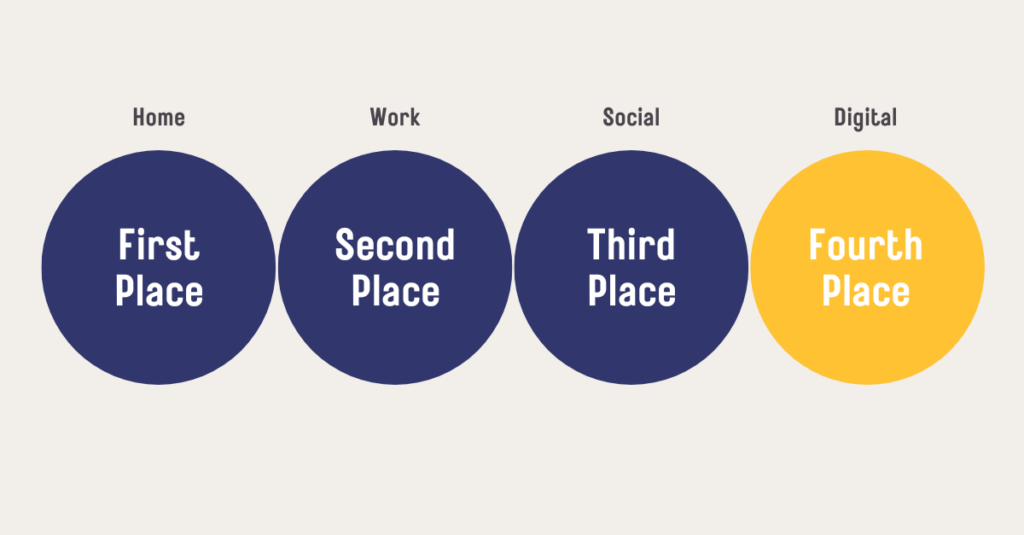
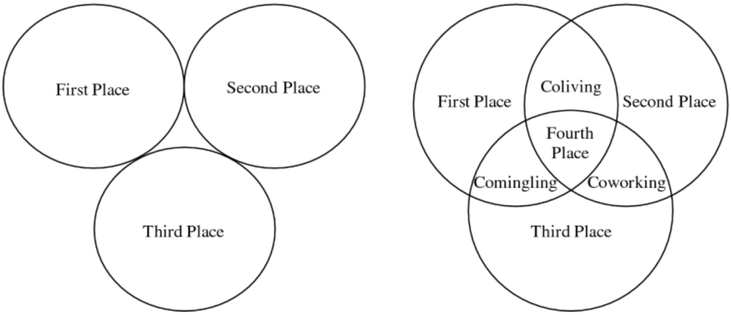
After discussing the concept of third places (informal gathering spots like cafes, libraries, and parks) I would now like to shine light on a relatively new idea that has emerged in the recent years: fourth spaces. While third places serve as a “home away from home,” fourth spaces are (depending on the definition) a response to the increasing blurring of physical and digital boundaries in our lives. They go beyond the physicality of third places, incorporating hybrid, inclusive, and adaptive elements to address the evolving ways people connect and build community today. But what exactly are fourth spaces, and how can they shape a sense of belonging?

Definition
Like with loneliness and Third Places there isn’t one single definition for fourth spaces. Some interpretations focus on the physical world and informal interactions in places that are undefined, similar to third places, while others place more emphasis on the digital world [3] and how it interacts with physical spaces. Fourth spaces can be seen as in-between places, blending traditional environments with digital layers. Not all definitions consider the digital aspect in the same way, but all highlight the role of these spaces in fostering spontaneous, casual connections that contribute to shared public life. [1, 2]

Fouth Places as the “in-between” [3]

Fourth Spaces as the digital realm [5]

Fourth spaces can counteract the impersonal aspects of “non-places” by embracing in-betweenness and publicness in their design. These spaces often include open, diverse layouts that are intentionally flexible, allowing people to adapt them for various uses that encourage spontaneous interactions.

Novel typologies – new forms of spatial design

Fourth space frameworks blend elements from traditional public spaces with modern innovations, such as integrating green spaces into urban environments or combining digital and physical interactions. In the context of fourth spaces, typology focuses on creating new forms of environments that encourage interaction, creativity, and adaptability to meet modern societal needs. These strategies ensure inclusivity and dynamic social interactions, creating environments where diverse individuals can connect and feel a sense of shared experience. By doing so, fourth spaces move beyond sterile functionality, fostering creativity, community, and belonging. [3]

An example approach to actively creating a fourth space is a project called „The Commons“. It is described as: „A modern-day town square for communal meaning-making, personal discovery, and self-expression in the heart of San Francisco.“ This concept focuses mostly on creating a place that is versatile and open in its functionality and can become whatever it needs to be at any given time. So in reference to the earlier definition, this is less an approach of combining digital and real world places, and follows more the idea of in-between places and meaning-making. They themselves define Fourth spaces as follows: „A physical space that facilitates meaning-making through intentional programming and pluralistic discussion, where individuals explore questions of ultimate concern without seeking conclusive answers. It honors the authenticity and uniqueness of each person’s path while fostering deeper bonds through consistent encounters in a supportive holding environment.“ [4]

Designing Fourth spaces is not an easy task, since it is quite hard to grasp what exactly fourth places are and how they fit into our lives. In terms of digital Fourth spaces the concept is just now emerging and changing constantly. It is important to clearly define the Fourth space in order to utilize it for designing in the context of loneliness. Is a fourth space an in-between place with unlimited potential that needs to be programmed and directed? Or is it the digital world that has emerged in the past few years? And if so, do we integrate it into the real world and try to find ways to combine the two? Or is it maybe even those places where the two meet?


Sources

  1. P. S. Aelbrecht, “‘Fourth places’: the contemporary public settings for informal social interaction among strangers,” Journal of Urban Design, vol. 21, no. 1, pp. 124–152, Jan. 2016, doi: 10.1080/13574809.2015.1106920.
  2. “The fourth place and re-imagining the city | Urbanarium.” https://urbanarium.org/journal/fourth-place-and-re-imagining-city
  3. D. Hardegger, “A First Holistic ‘4th Space’ Concept,” Mdpi, p. 72, Mar. 2022, doi: 10.3390/proceedings2022081072.
  4. “The Commons” https://www.thesfcommons.com/
  5. T. Masuku, “The fourth place,” Showit Blog, Jun. 15, 2024. https://ticamasuku.com/the-fourth-place/

04. On the ethics of the virtual emulation of our daily lives.

The ethics of tamagotchi was the last thing I thought I would ever read. But, after reading the full article – “Caring-About Virtual Pets: An Ethical Interpretation of Tamagotchi” by Annie O’Rourke — the parallel that can be drawn between the virtual world of the pets and the virtual world we live in today, both inside of the media vortex as well as through the as mentioned in the previous blog-post mobile games is a very interesting one.

Annie O’Rourke is concerned with the ethical aspect of the game: What does it mean to give conceptual life to a material object – a jumble of code in a double digit system encased in a plastic cocoon? And what does it mean when you care for that object as if it matters if it is hale and healthy until you grow bored of it and in the end discard it?

Much like Dormehl (writer for digitaltrends.com) posits, O’Rourke also states that the initial universal popularity with the toy was due to a certain digital ennui (my words) — a generation of people living in a “digitized” world with “broken-up” time and a “ feeling of individualized ineffectiveness” (original words). What better generation of consumers to spring this toy onto, but one comprised of people with little opportunity for agency and self-actualization who, when given the chance, jump at the first opportunity to get a simulacrum of the experience of caring for another being. For a certain period of time. Attached only until the novelty wears off, and to be discarded and forgotten the moment the dreaded drudgery of domestic routine rears its ugly head.

The ‘text’ of the game, O’Rourke states, is predicated on the fact that the perceived experience of nurturing is so startlingly simple it can be broken down into an algorithm which can be fit inside of a 1×1 screen. Feed, play with, punish, provide medical care. All an easily replicable cycle. The only reason the game succeeded from the onset, was because the “background” of its creation was an easily comprehensible and known one.

It is this familiarity and the willingness to “believe” that creates that attachment to the virtual pet. You have to buy the idea wholesale that this is a creature you care about and that you don’t want to die in order to engage with it and its “text”.

“Virtual Pets mean very little in themselves (as figures on a screeen), it is their narrativisation (primarily in the head of the user) which makes them become a ‘pet’ and forces a particular kind of behaviour.” (p.5)

She warns against taking the word of the marketing team advertising the game at face value, however — the same way that the connection with the game, the emotional one, which really believes in it, is forged, so is our perception of the world which can be manipulated by marketing forces: “It is worth staying with the marketed image of Tamagotchi for a while, for it is here that the connections to the ‘real’ world are most explicitly being forged. We have to be careful however, for marketing itself works in a similar way to the virtual. It creates and fixes the very market it is seeking to sell its product to. Like the virtual, it does not simply represent (and then satisfy) a consumer’s previously unfulfilled desires. These images actively shape and mediate how the object or text is received and experienced.” (p. 13)

It is thus to follow that the draw of the game and its infinitely spawn-able characters is predicated on the player playing along with and engaging with it and its text on the game’s turns. It helps if the behaviour and connections it is trying to foster are virtualizations of real world experiences, which can be recreated to a degree to which the appeal is in its realism, and but not so realistic as to lose that same appeal. The reason people grew bored was because the game became too realistic – the novelty wore off and it could not sustain the boring routine which already predisposed people to get rid of their actual pets.

As for the ethics? We are already living in a proto-virtual world, one in which we recreate simulated experiences of our daily lives: we meet up with our friends to play in virtual spaces, we roleplay characters who shoot down enemy forces on battlefields, and play out romances which follow the same structured destiny on each play-through. Anything which simulates the real world without examining it or challenging it is going to play on established harmful cliches, thereby rooting them even deeper into our cultural psyche.

In the case of the tamagotchi, O’Rourke states that we are learning new examples of care – ones in which that which is nurtured exists perpetually without agency or ability to change; in which it can be easily disposed of as soon as it becomes inconvenient: “In the mean-time our idea of what ‘care’, ‘response’ and ultimately ‘ethics’ are have been transformed, and it is a world which we all now inherit.” (p.20)

O’Rourke, Anne (1998). Caring about virtual perts: an ethical interpretation of Tamagotchi. University of Wollongong. Journal contribution. https://hdl.handle.net/10779/uow.27825507.v1

AI in Emotional and Visual Exploration

By leveraging digital tools, museums can create personalized, immersive, and reflective experiences that deepen our emotional and intellectual connection with existing artworks. Two given projects exemplify how technology can transform art perception: Sensitive Pictures and SMKExplore. Both initiatives demonstrate how technologies such as Affective Computing, machine learning, and interactive design can redefine visitor engagement.

Emotional Journeys with Sensitive Pictures

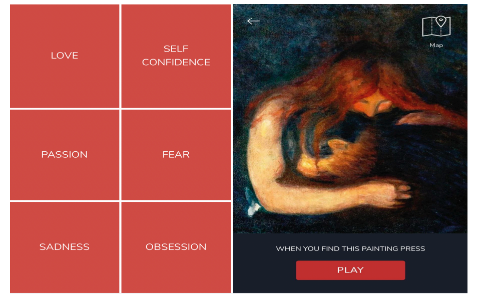
Sensitive Pictures, a collaboration with the Munch Museum, uses Affective Computing to explore the emotional dimensions of art. Visitors begin their journey by selecting an emotion from options such as love, self-confidence, fear, sadness, obsession, and passion. A mobile app then guides them to paintings associated with their chosen emotion, enriching the viewing experience with layered narratives that combine emotional storytelling, factual insights, and reflective prompts.

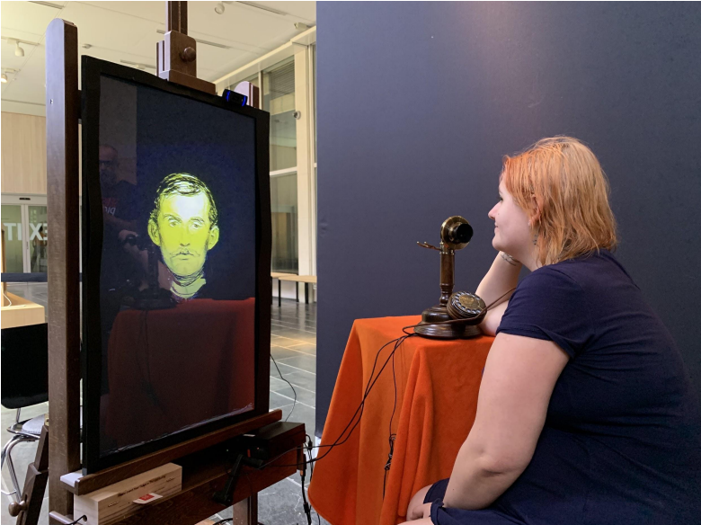
Afterward, visitors participate in a simulated conversation with a fictionalized Edvard Munch. The voice on the phone then talked to the visitor about their experience and emotions. Drawing on the data from the web app, “Munch” talked about the painting that the visitor had reported the strongest emotional reaction to as measured by their self-reported values of arousal.

This approach integrates subjective and objective elements, combining self-reported emotions with facial expression analysis. Visitors are presented with a postcard summarizing their emotional data as a keepsake. The result is an experience that not only fosters deep personal reflection but also highlights the interplay between technology and human interpretation.

While most participants described the experience as emotionally impactful and meaningful, challenges emerged in capturing emotions. Both self-reporting and computer vision methods were limited by the complexities of human feelings and the contextual constraints of a museum environment. Nevertheless, Sensitive Pictures succeeded in encouraging visitors to connect emotionally with the art and reflect on their inner states.

Visual Exploration with SMKExplore

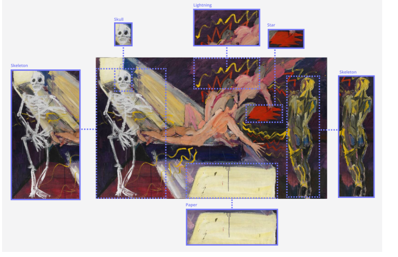
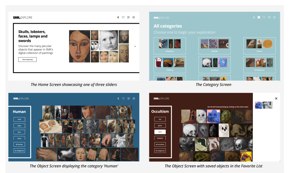
SMKExplore focuses on using machine learning for interactive art exploration. This web application employs object detection to allow visitors to browse a museum’s digital collection through specific objects depicted in paintings. By enabling users to navigate from details (e.g., a flower or chair) to the full artwork, SMKExplore offers a bottom-up, open-ended exploration experience.

Participants found this approach intuitive and engaging, often discovering patterns and recurring motifs across different artworks and styles. By isolating objects from their original contexts, the application encouraged users to notice details they might otherwise overlook. Many reported that this method inspired them to think more deeply about the complexity and craftsmanship behind each painting.

Moreover, SMKExplore highlighted the potential of machine learning to enhance art appreciation by revealing connections across large collections. This approach not only provides a fresh perspective on familiar works but also invites visitors to reflect on their personal interests and preferences when engaging with art.

The Broader Implications

Both Sensitive Pictures and SMKExplore illustrate the transformative potential of technology in museums. By incorporating emotional narratives, interactive interfaces, and data-driven insights, these projects create multidimensional experiences that challenge traditional modes of art interpretation. Visitors are no longer passive observers but active participants, engaging with art on intellectual and emotional levels.

These innovations also raise important questions about the role of technology in shaping our relationship with art. How do algorithmic interpretations influence our emotional responses? Can technology truly capture the depth of human experience? While these questions remain open, one thing is clear: the integration of technology into museum practices is unlocking new possibilities for art perception, making it more accessible, personal, and reflective.

As museums continue to experiment with digital tools, they have the opportunity to reimagine how we experience and connect with art. Whether through emotional storytelling or interactive exploration, technology is helping to create museum visits that resonate long after we’ve left the gallery.

References:

https://arxiv.org/pdf/2403.19174

https://arxiv.org/pdf/2203.01041

Tieferer technischer Einblick in LED vs HMI vs Halogen Lichter

Dieser Blogpost soll einen noch genaueren und technischeren Einblick hinter Beleuchtungstechnik geben. Hier werden die 3 Hauptbeleuchtungsarten nochmal analysiert


1. Einführung in LED-, Halogen- und HMI-Beleuchtung

Halogenlampen

Halogenlampen arbeiten, indem sie einen Wolframfaden erhitzen, der in einem Inertgas eingeschlossen ist, wodurch ein helles Licht mit kontinuierlichem Spektrum erzeugt wird. Diese Technologie wird für ihre hervorragende Farbwiedergabe geschätzt, mit einem Farbwiedergabeindex (CRI) von 100. Halogenlampen sind jedoch energieineffizient und wandeln bis zu 80 % ihrer Energie in Wärme um, wodurch Sets unangenehm warm werden und zusätzliche Kühlung erforderlich ist.

LED-Beleuchtung

Leuchtdioden (LEDs) basieren auf Halbleitertechnologie und werden als “Festkörperbeleuchtung” eingestuft. LEDs sind deutlich energieeffizienter als Halogenlampen und bieten bis zu 132 Lumen pro Watt im Vergleich zu 25 Lumen pro Watt bei Halogenlampen. Darüber hinaus sind LEDs langlebiger. Allerdings haben sie Herausforderungen bei der konsistenten Farbqualität, insbesondere bei Hauttönen, aufgrund ihres diskontinuierlichen Spektraloutputs.

HMI-Lampen

HMI (Hydrargyrum Medium-Arc Iodide)-Lampen sind gasgefüllte Entladungslampen, die durch einen Lichtbogen zwischen zwei Elektroden ein intensives, tageslichtähnliches Licht erzeugen. Sie zeichnen sich durch eine hohe Lichtausbeute und Farbtreue aus, was sie ideal für Außenaufnahmen und große Sets macht. Beispielsweise kann ein einzelnes ARRI M18 HMI-Licht eine Lichtleistung liefern, die der von zehn LED-Panels entspricht. HMI-Lampen sind jedoch groß, benötigen Ballastgeräte und erzeugen erhebliche Wärme, was sie weniger energieeffizient macht.


2. Vergleich der Leistungsmetriken

Energieeffizienz und Wärmemanagement

  • LEDs: Sehr energieeffizient und produzieren minimale Wärme, was den Bedarf an Kühlung am Set reduziert.
  • Halogenlampen: Hoher Energieverbrauch mit erheblicher Wärmeabgabe, was die Betriebskosten erhöht.
  • HMI-Lampen: Höhere Lichtausbeute als Halogenlampen, jedoch mit ähnlich hoher Wärmeentwicklung und Energieverbrauch.

Farbwiedergabe

  • Halogenlampen: Bieten eine unvergleichliche Farbgenauigkeit mit einem CRI von 100, was sie ideal für die Darstellung natürlicher Hauttöne macht.
  • LEDs: CRI liegt typischerweise bei etwa 80. Während Fortschritte wie die Remote-Phosphor-Technologie die Farbkonstanz verbessern, haben LEDs weiterhin Schwierigkeiten bei der genauen Darstellung von Hauttönen.
  • HMI-Lampen: Haben typischerweise einen CRI von 90 bis 95 und liefern eine hervorragende Farbwiedergabe, insbesondere bei Tageslichtanwendungen.

Lichtqualität und Konsistenz

  • Halogenlampen: Erzeugen ein kontinuierliches Spektrum, das dem natürlichen Sonnenlicht ähnelt und die Arbeit am Filmset erleichtert.
  • LEDs: Mit ihren schmalen Spektralspitzen erfordern sie fortschrittliche Farbkorrekturwerkzeuge und zusätzliche Zubehörteile wie Sync-Boxen, um Flimmern und Grünstiche zu reduzieren.
  • HMI-Lampen: Bieten eine intensive Lichtausgabe mit einer großen Reichweite, sind jedoch aufgrund ihrer Größe und Wärmeentwicklung weniger flexibel als LEDs.

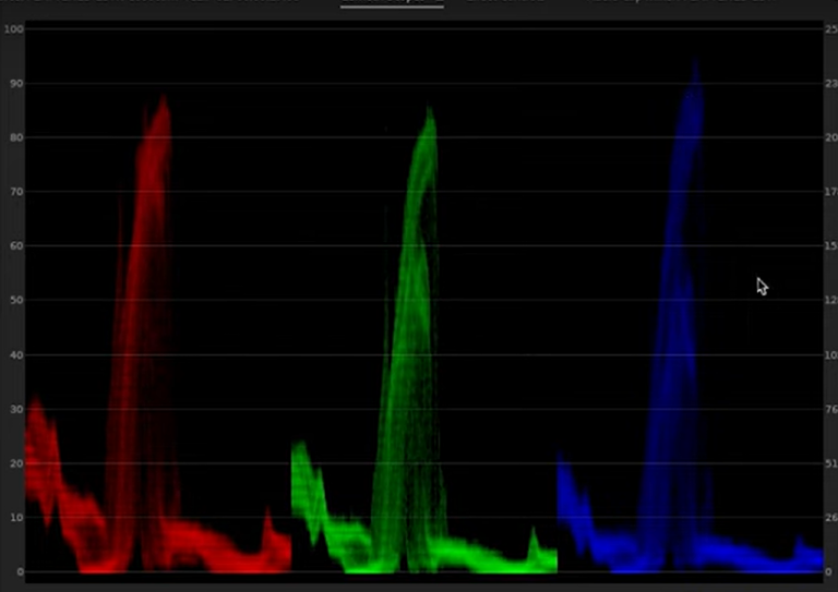
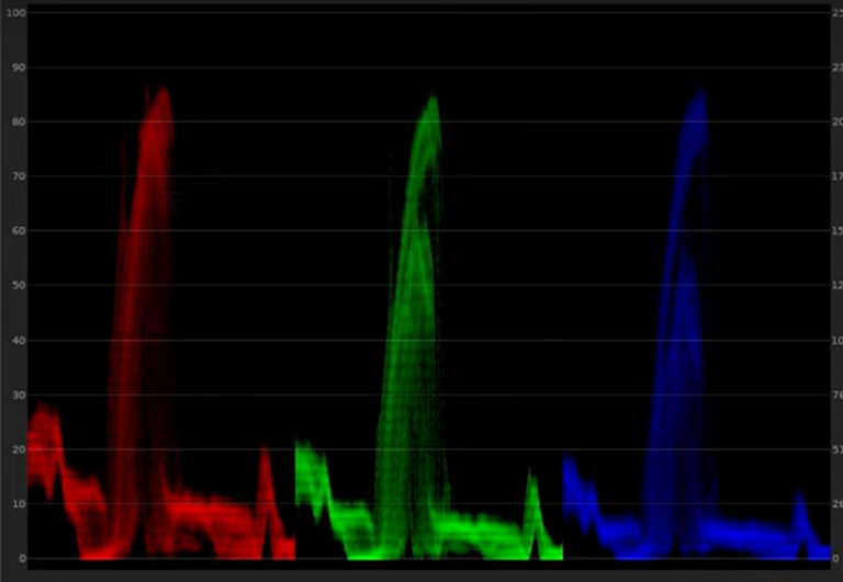
Im Folgenden Video wird ein Vergleich von HMI und LED Lichter auf der menschlichen Haut gezeigt. Wie in der Abbildung zu sehen ist wirkt das LED Licht (Godox) grüner und ein bisschen wärmer im Gegensatz zum HMI Licht.

Das ist die Paradendarstellung des HMI Lichts. Wie zu sehen ist, ist ein bisschen mehr Blau im Bild als Rot und Grün.

Das LED ist sehr Ausgeglichen, außer in den Mitteltönen ist ein bisschen mehr Grün.
Dies ist alles mit simplen Farbkorrekturen zu korrigieren und ist kein großes Problem. Es ändert im Grunde nur den Look am Set. Dies kann zum Problem werden wenn Kunde oder Regisseur sich nicht gut mit Post Produktion auskennen und bereits ein perfektes Bild am Set brauchen.


3. Fortschritte in der LED-Technologie

Remote-Phosphor-Technologie

Die Remote-Phosphor-Technologie verbessert die Farbkonstanz von LEDs, indem die Phosphorschicht von der LED-Lichtquelle entfernt wird. Dies erzeugt eine glattere, gleichmäßigere Lichtausgabe, obwohl das Spektrum weiterhin diskontinuierlich bleibt, was Herausforderungen mit Farbkorrekturfiltern mit sich bringt.

Moderne Kamerasensoren

Fortschritte in der Kamerasensortechnologie, wie der 14-Blenden-Dynamikbereich der ARRI Alexa, ermöglichen es Kameraleuten, unter schlechten Lichtbedingungen zu arbeiten. Dies hat die begrenzte Lichtausbreitung von LEDs im Vergleich zu größeren Halogen- und HMI-Lampen teilweise gemildert.


4. Herausforderungen und Zukunftsaussichten

Herausforderungen bei LEDs

  • Inkonsistente Farbausgabe zwischen Herstellern.
  • Schwierigkeiten, die “Wärme” und den natürlichen Effekt von Halogen- und HMI-Licht zu replizieren.
  • Flimmerprobleme durch Verzögerungen in leistungsstarken LEDs.

Branchentrends

  • LEDs dominieren den Low-Budget-Filmmarkt aufgrund ihrer Portabilität und Energieeffizienz. Hochkarätige Filme wie Birdman und Fury haben LEDs für bestimmte Anwendungen genutzt.
  • HMI-Lampen bleiben aufgrund ihrer intensiven Lichtausgabe und ihrer Fähigkeit, Tageslicht zu imitieren, in der High-End-Produktion unverzichtbar.
  • In High-End-Produktionen bleiben Halogenlampen aufgrund ihrer besseren Lichtqualität und Konsistenz unersetzlich.

Der Bedarf an großen Beleuchtungskörpern

Trotz Verbesserungen bei LEDs sind sich Branchenexperten einig, dass große Leuchten wie 24K Fresnel oder HMI-Lampen weiterhin für High-End-Produktionen erforderlich sind. LEDs bieten derzeit nicht die notwendige “Leuchtkraft” für umfangreiche Beleuchtungsaufbauten.


5. Fazit

Halogenlampen, HMI-Lampen und LEDs haben jeweils ihre Stärken und Schwächen. Während Halogenlampen eine überragende Farbgenauigkeit und eine vertraute Lichtqualität bieten, überzeugen HMI-Lampen mit ihrer intensiven Lichtausbeute für große Sets. LEDs bringen Energieeffizienz, Vielseitigkeit und schnelle technologische Fortschritte mit sich. Die Zukunft wird wahrscheinlich eine Kombination aller Technologien umfassen, wobei LEDs zunehmend dominieren werden, da ihre Leistung weiter verbessert wird.


Diese kontinuierliche Entwicklung der Beleuchtungstechnologie unterstreicht die Bedeutung, ästhetische Anforderungen mit praktischen Überlegungen in Einklang zu bringen. Sobald LEDs ihre verbleibenden Herausforderungen bewältigen, könnten sie die visuelle Sprache des Kinos neu definieren.

Weiter Video Empfehlungen:

Quellen:

Takhar, A. (2015). Will LED lights displace Tungsten Halogen lights as the dominant technology for both high-end and low-end filmmaking? Birmingham City University. BSc (Hons) Film Production & Technology, Media Technology Project UG3.

Wu, R. (n.d.). LED vs. HMI: ARRI lighting with Rubidium Wu. AbelCine. Retrieved January 23, 2025, from https://www.abelcine.com/articles/blog-and-knowledge/tutorials-and-guides/led-vs-hmi-arri-lighting-with-rubidium-wu

Communication of Complex Climate Data 

Climate change is one of the greatest challenges of our time, but communicating its urgency remains a significant hurdle. While data exists in abundance, the gap between understanding and action persists. This is where data visualization comes into play—transforming complex climate data into clear, engaging, and actionable insights that inspire individuals, communities, and policymakers to act. 

Why Visualizing Climate Data Matters 

Climate data is inherently complex, involving abstract concepts like carbon footprints, global temperature rise, and ocean acidification. For many, these numbers are intimidating or even incomprehensible. Studies show that visual communication can reduce disbelief by 50% and significantly enhance public engagement with climate science. By presenting data visually, we bridge the gap between abstract information and tangible understanding. 

Graphics, charts, and maps don’t just present facts—they tell stories. Design can help foster trust and build a sense of community. When people see the impact of climate change visualized in ways that resonate with them—such as rising sea levels in their region or local temperature anomalies—they are more likely to take action. 

The Role of Designers in Climate Communication 

As designers, we have the unique ability to translate data into compelling visuals that resonate emotionally and intellectually. Our role extends beyond aesthetics to encompass storytelling, empathy, and action-oriented design. A study on graphic design and climate communication emphasizes that effective visuals should promote risk perception, attract attention, and motivate action. 

However, designing for climate communication isn’t just about creating eye-catching visuals. It’s about crafting narratives that address psychological barriers like fear or denial. Positive imagery, for instance, has been shown to encourage pro-environmental behavior more effectively than fear-inducing visuals. 

Examples of Effective Climate Data Visualizations 

Two standout examples illustrate the power of effective climate communication: 

1. NASA’s Climate Time Machine 

This interactive visualization tool allows users to explore changes in key climate indicators, such as CO₂ levels, global temperatures, and Arctic sea ice, over time. By presenting both historical data and projections, the Climate Time Machine underscores the urgency of action while helping users see the long-term effects of climate change. 

2. “Show Your Stripes” Climate Graphics by Ed Hawkins 

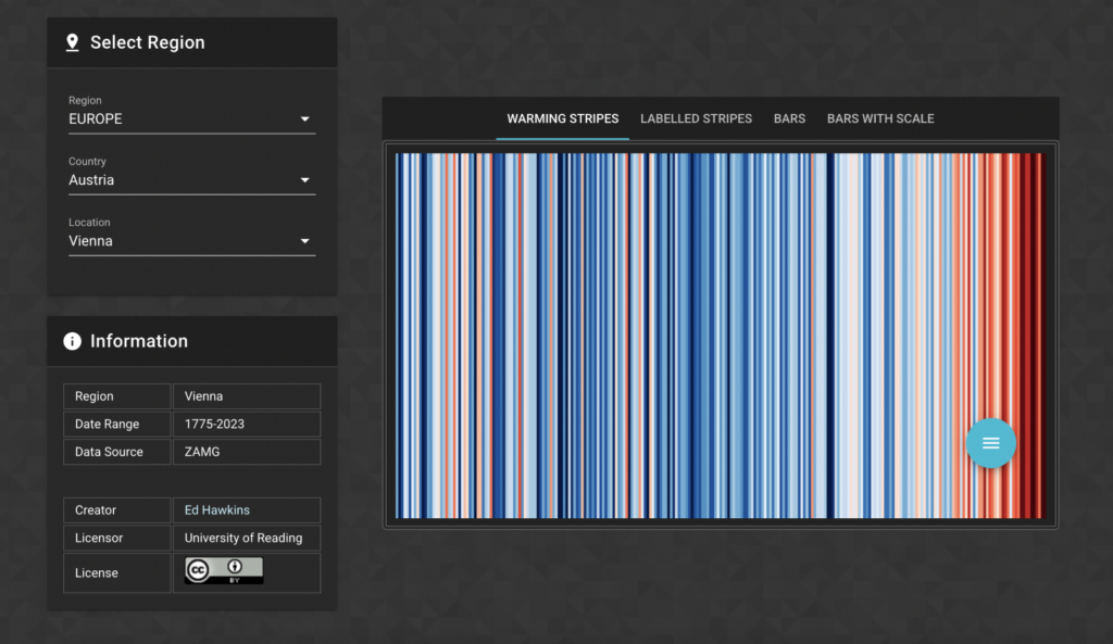
These minimalist visuals use colored stripes to represent changes in global temperature over the decades, with blue for cooler years and red for warmer years. The simplicity of the graphics makes them accessible to all audiences while visually reinforcing the undeniable warming trend. 

Challenges in Climate Data Visualization 

Despite its potential, visualizing climate data comes with challenges. Designers must navigate cognitive biases, misinformation, and the emotional burden of climate change. The abstract nature of the topic makes it harder for people to relate to or prioritize. Additionally, balancing scientific accuracy with simplicity requires careful consideration to avoid oversimplifying key messages. 

From Understanding to Action 

Visuals alone cannot solve the climate crisis, but they can catalyze action. They inspire conversations, inform decisions, and empower communities. Tools like the Ideation Booster Board, which integrates communication objectives with visual strategies, show how structured design processes can enhance the effectiveness of climate communication materials. 

Rapping it up: Data visualization is not just a tool—it’s a bridge between knowledge and action. By designing for clarity, empathy, and engagement, we can help individuals and policymakers see the urgency of climate action and take meaningful steps toward a sustainable future.


Reference

Maia, Manuela: A study with graphic in designers about climate change communication, Centro TGRAF ISEC Lisboa,14.10.2024 

https://ucrisportal.univie.ac.at/en/publications/being-simple-on-complex-issues-an-expert-view-on-visual-data-comm 23.01.2025, 07:36

https://www.restack.io/p/ai-for-climate-change-answer-best-practices-climate-data-communication-cat-ai 23.01.2025, 07:32

https://www.unsw.edu.au/newsroom/news/2021/10/graphic-design-can-build-trust-and-community-in-climate-conversa 23.01.2025, 08:21

https://www.linkedin.com/advice/1/heres-how-you-can-utilize-data-research-bolster-xst1c 23.01.2025, 07:52

https://www.researchgate.net/publication/292679121_Designing_futures_Inquiry_in_climate_change_communication 23.01.2025, 07:34

https://www.weforum.org/videos/nasa-s-climate-time-machine-shows-the-how-the-planet-is-heating-up/ 23.01.2025, 18:30 

https://www.weforum.org/videos/nasa-s-climate-time-machine-shows-the-how-the-planet-is-heating-up 23.01.2025, 18:32 

The Psychology of Perception in HUD Design

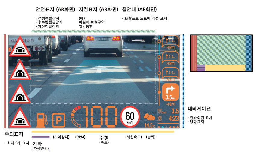
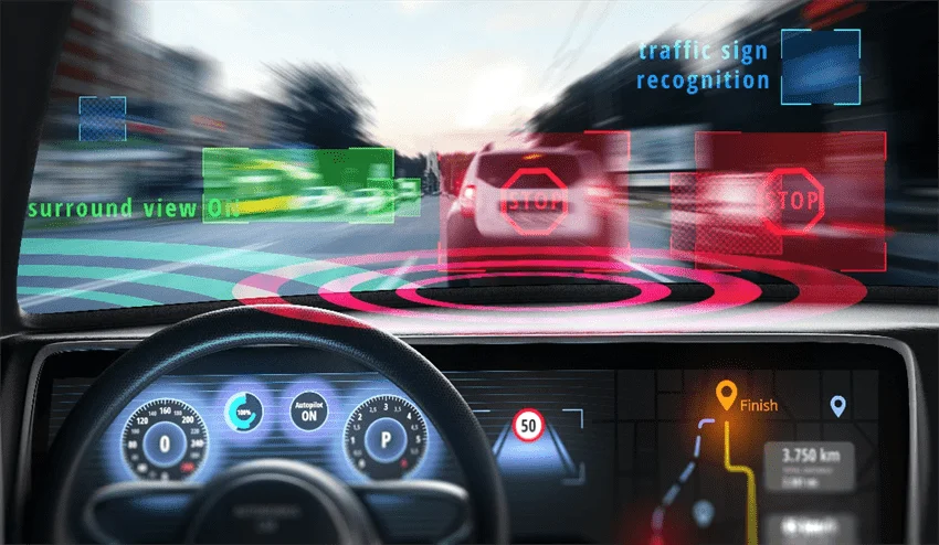
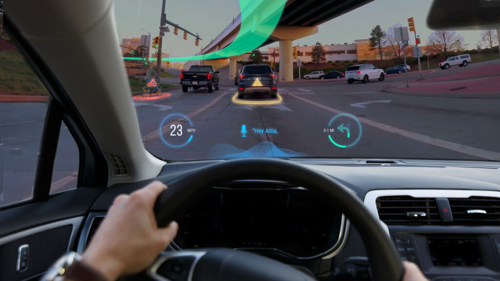
Head-Up Display (HUD) design requires a deep understanding of human perception in order to create interfaces that are intuitive, easy to see, and minimally distracting. This blog post explores key human factors – visibility, colour psychology and motion dynamics – that influence effective HUD design.

Visibility: Reducing cognitive load

The ability of a driver to quickly and effortlessly take in information from a display is referred to as ‘viewability’. As prolonged focus on HUDs can increase the risk of accidents, designers need to ensure that vital information such as speed, navigation and warnings are readable at a glance. Strategies to improve readability include

Minimalist design: Avoiding clutter by displaying only the most important information.

Consistent layouts: Using predictable positioning for recurring elements to increase familiarity and speed recognition.

(source: https://www.researchgate.net/publication/324803628_Augmented_RealityAR_Head-Up_DisplayHUD_Design_Study_for_Prevention_of_Car_Accident_Based_on_Graphical_Design_Sensitivity_and_Conveyance_of_Meaning)

Colour Psychology: Effectively communicating meaning

Colours have a significant impact on how information is perceived and processed. Designers should use colour psychology to communicate meaning effectively:

Red for warnings: Red is universally associated with danger or urgency, making it ideal for critical warnings.

Green for safe conditions: Green is calming and associated with safety, suitable for indicators such as cruise control.

Avoid Overuse: Overloading the display with too many colours can confuse the driver; a limited palette improves clarity.

(source: https://x3.xbimmers.com/forums/showthread.php?t=1676121)

Motion dynamics: Capturing attention without distraction

Motion can draw attention to important information, but it must be used judiciously to avoid distraction. Best practices include:

Subtle animations: Using smooth transitions and subtle animations to focus the driver’s attention without overwhelming them.

Directional cues: Using motion to highlight changes, such as an approaching curve or an impending collision warning.

(source: https://www.azooptics.com/Article.aspx?ArticleID=1878)

Real world applications

Leading car manufacturers have incorporated human factors into their HUD designs. For example, some manufacturers use simple layouts and colour-coded warnings to ensure visibility, while others use smooth animations to guide the driver’s attention without distracting.

Understanding human cognitive and perceptual limitations is critical to designing effective HUDs. By focusing on visibility, using colour psychology, and thoughtfully incorporating motion dynamics, designers can create interfaces that enhance safety and usability. As HUD technology evolves, the application of these psychological principles will remain key to minimising driver distraction.

(source: https://altia.com/de/2021/06/01/the-future-of-head-up-displays/)

References:

https://www.azooptics.com/Article.aspx?ArticleID=1878

https://wedesignmotion.com/blog/design/the-psychology-of-color-in-motion-design/

https://www.faa.gov/sites/faa.gov/files/data_research/research/med_humanfacs/oamtechreports/0117.pdf

https://www.tandfonline.com/doi/full/10.1080/00140139.2020.1758348

https://www.researchgate.net/publication/278008185_Human_factors_aspects_of_using_head_up_displays_in_automobiles_a_review_of_the_literature

Startpunkte zur kunsthistorischen Forschung

Kernfrage: Wie finde ich eine unterrepräsentierte Persönlichkeit als Protagonist:in für meine Webseite?

Die Auswahl einer Protagonistin oder eines Protagonisten, die unterrepräsentiert ist und dennoch eine interessante Geschichte erzählt, ist eine Herausforderung. In diesem Blogpost untersuche ich Ansätze und Ressourcen, die helfen können, eine geeignete Persönlichkeit zu finden.

1. Recherche in spezialisierten Kunstarchiven und Datenbanken

Viele Kunstarchive und Datenbanken widmen sich bewusst der Aufgabe, unterrepräsentierte Künstler:innen sichtbar zu machen. Hier einige Quellen, die bei der Recherche hilfreich sein können:

AWARE: Archives of Women Artists, Research and Exhibitions:

Diese Plattform hat sich auf Künstlerinnen spezialisiert, die im Laufe der Kunstgeschichte wenig Beachtung gefunden haben. AWARE bietet Artikel, Biografien und Forschungsergebnisse über Frauen in der Kunst.

Lost Women Art:

Diese deutsche Initiative beleuchtet Künstlerinnen, deren Werke und Geschichten zu Unrecht in den Hintergrund gerückt sind. Da diese (ca. 10) Persönlichkeiten aber schon eine Plattform haben, dient die Seite eher als Inspiration, bzw. kann ich denen möglicherweise Schreiben, um weitere Hinweise zu bekommen.

Getty Research Institute:

Das Institut bietet umfangreiche Sammlungen und Forschungsdokumente zur Kunstgeschichte, darunter auch Themen zu marginalisierten Gruppen.

Google Arts & Culture:

Digitale Sammlungen, die oft auch weniger bekannte Künstler:innen oder Projekte thematisieren.

2. Suche nach Experten und Netzwerken in der Kunstforschung

Kunsthistoriker:innen und Forscher:innen, die sich auf Diversität und Inklusion spezialisiert haben, könnten wertvolle Kontakte und Tipps geben. Hier einige Möglichkeiten:

Universitätsfakultäten für Kunstgeschichte

Webseiten von Kunstgeschichtsinstituten, um Professor:innen oder Forschende zu finden, die über Minderheiten in der Kunst forschen. Themen wie feministische Kunstgeschichte, queere Kunst oder Postkolonialismus wären spannend. Möglicherweise jemand an der Grazer Hauptuni anschreiben?

Bekannte Forscher:innen

Linda Nochlin: Eine Pionierin der feministischen Kunstgeschichte (z. B. mit ihrem Essay “Why Have There Been No Great Women Artists?”). Leider verstorben, aber vielleicht trotzdem inspirierend.

Griselda Pollock: Ihre Arbeiten über feministische und queere Kunstgeschichte könnten relevante Ansätze bieten.

Netzwerke:

ICOM (International Council of Museums): Vernetzung mit Museumsforscher:innen, die oft Zugang zu wenig bekannten Werken und Biografien haben.

College Art Association (CAA): Ein Netzwerk, das sich auch mit Themen der Diversität und Inklusion in der Kunst beschäftigt.

3. Durchforsten von wissenschaftlichen Publikationen

Datenbanken wie JSTOR, Google Scholar oder ResearchGate bieten wissenschaftliche Paper, die speziell unterrepräsentierte Künstler:innen beleuchten. Suche mit Stichwörtern wie:

“Feminist art history”

“Queer art representation”

“Postcolonial art studies”

“Forgotten women artists”

Herausfinden, welche Forschenden immer wieder zu diesem Thema publizieren. Diese Expert:innen könnte ich eventuell kontaktieren.

4. Museen und Ausstellungen besuchen

Museen und Ausstellungen, die sich auf Diversität und Inklusion konzentrieren, könnten Inspiration liefern:

Victoria & Albert Museum (London): Das V&A arbeitet oft an Projekten, die sich mit Minderheiten und neuen Perspektiven in der Kunst beschäftigen.

• Ich bin im September in Japan auf der Weltausstellung, vielleicht gibt es hier auch noch andere inspirierende Inputs.

5. Kontaktaufnahme mit Expert:innen und Institutionen

Aktiv auf Fachleute oder Organisationen zugehen:

Kunsthistoriker:innen anschreiben: Hoffentlich antworten Wissenschaftler:innen auf spezifische Anfragen, wenn sie mein Forschungsvorhaben spannend finden.

Netzwerke nutzen: Plattformen wie LinkedIn könnten helfen, Expert:innen zu identifizieren und zu kontaktieren.

Kunst- und Kulturinstitute: Vielleicht gibt es feministische Initiativen der Stadt Graz, die spannende Kontakte haben.

6. Inspiration durch Literatur und Filme

Manchmal finden sich interessante Persönlichkeiten in Büchern, Biografien oder Filmen. Jedoch würde ich ungern etwas über eine Person machen, zu der es bereits einen Blockbuster gibt.

Fazit

Die Suche nach einer unterrepräsentierten Persönlichkeit erfordert Geduld, kann aber hoffentlich durch Recherche, Netzwerke und den Austausch mit Expert:innen gelingen.

Nachhaltigkeit und digitale Kunstprojekte

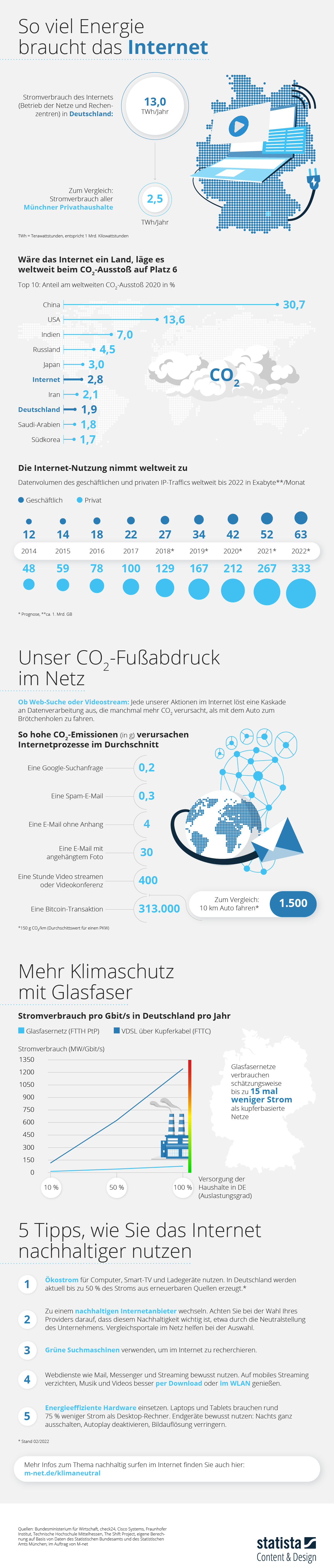
Die Integration von Nachhaltigkeit in digitale Kunstprojekte gewinnt zunehmend an Bedeutung, da der ökologische Fußabdruck digitaler Medien nicht zu unterschätzen ist. Insbesondere ressourcenintensive Technologien wie WebGL und Three.js, die für interaktive 3D-Grafiken im Web eingesetzt werden, können erhebliche Energiemengen verbrauchen. Es ist daher wichtig, sich darüber Gedanken zu machen, wie digitale Kunst umweltfreundlicher gestaltet werden kann.

Meine Motivation

Mir ist es ein persönliches Anliegen, ressourcenschonend mit meiner Umwelt umzugehen und auch im Großen und Ganzen mit meiner Arbeit mehr positiven als negativen Einfluss auf Umwelt und Gesellschaft zu haben. Tatsächlich finde ich, sollte es aber kein persönliches Anliegen mehr sein, sondern im Internet besonders an Großkonzernen (Meta, ChatGPT, usw.) Regulierungen geben, die einerseits Transparenz fordern und auch einen verantwortungsvollen Umgang mit den benötigten Energiemengen.

Energieverbrauch von WebGL und Three.js

WebGL ist eine JavaScript-API, die es ermöglicht, 3D-Grafiken direkt im Browser darzustellen, indem sie die GPU des Nutzers nutzt. Three.js hingegen ist eine auf WebGL aufbauende Bibliothek, die die Erstellung von 3D-Inhalten vereinfacht. Obwohl Three.js die Entwicklung erleichtert, kann die Abstraktionsebene zu zusätzlichem Ressourcenverbrauch führen. Ein Vergleich zwischen WebGL und WebGPU zeigt, dass die Wahl der Technologie Einfluss auf die Performance und somit auf den Energieverbrauch hat.

Strategien zur Reduzierung des Energieverbrauchs

1. Optimierung der Performance: Durch Techniken wie Frustum Culling, Instancing und Level of Detail (LOD) kann die Anzahl der zu rendernden Objekte reduziert werden, was die Effizienz steigert.

2. Code-Minimierung: Schlanker und effizienter Code kann die Ladezeiten verkürzen und den Energieverbrauch senken.

3. Nutzung effizienter Bibliotheken: Der bewusste Einsatz von Bibliotheken, die für ihre Performance bekannt sind, kann den Ressourcenverbrauch minimieren.

Nachhaltige Hosting-Lösungen

Die Wahl des Hosting-Anbieters beeinflusst ebenfalls die Umweltbilanz digitaler Kunstprojekte. Anbieter, die erneuerbare Energien nutzen oder CO₂-Kompensationsprogramme anbieten, tragen zur Reduzierung des ökologischen Fußabdrucks bei.

Bewusstsein und Bildung

Künstler und Entwickler sollten für die ökologischen Auswirkungen ihrer digitalen Werke sensibilisiert werden. Initiativen wie “Zero – Klimaneutrale Kunst- und Kulturprojekte” ermutigen dazu, klimaneutrale Produktionen zu realisieren und nachhaltige Praktiken zu etablieren.

Fazit

Nachhaltigkeit in digitalen Kunstprojekten erfordert ein Bewusstsein für den Energieverbrauch verwendeter Technologien und die Implementierung gezielter Optimierungsstrategien. Durch Performance-Optimierungen, bewusste Technologieauswahl und nachhaltige Hosting-Lösungen kann man einen Beitrag zum Umweltschutz leisten, ohne die kreative Freiheit einzuschränken.

10 The Future of Ethical Design: Creating a Privacy-First Culture

Introduction

We’ve come to the final post in this series, but the journey toward ethical design and better privacy practices is far from over. Throughout these posts, we’ve explored the challenges, strategies, and opportunities involved in helping users manage their digital footprints. Now, it’s time to reflect on the lessons learned and outline a vision for building a privacy-first culture—one where ethical design becomes the standard, not the exception.

Building a Privacy-First Culture

Creating a privacy-first culture requires effort from both users and companies. For users, education and tools are key to reclaiming control. For companies, ethical design and compliance must be woven into every interaction. The goal is to align user empowerment with business practices, ensuring trust is a central feature of every platform.

Key Principles for the Future of Privacy Design

  1. Transparency: Companies must clearly communicate how and why data is collected. Example: Platforms that display real-time data usage dashboards, as discussed in earlier posts, make data practices visible and actionable.
  2. Simplicity: Privacy controls should be easy to find and use, especially for vulnerable populations. Example: Large, well-labeled toggles for key permissions, like tracking or sharing.
  3. User Empowerment: Tools that simplify complex privacy tasks are essential. Example: The proposed scrubbing tool could automate data removal, making it easier for users to reduce their digital footprint.

The Role of the Proposed Solutions

Whether it’s a framework that guides companies toward ethical practices or a tool that helps individuals scrub their data from the internet, the real power of these solutions lies in their ability to make privacy accessible. These ideas aren’t about adding extra steps—they’re about creating thoughtful designs that integrate privacy into the user experience seamlessly.

Challenges and Opportunities Ahead

  1. Balancing Business and Privacy: Companies may hesitate to adopt privacy-first practices if they feel it conflicts with profit. However, studies show users are more loyal to brands they trust.
  2. Technological Complexity: Emerging tools like AI and blockchain offer solutions but also bring steep learning curves for developers and users.
  3. Global Alignment: With privacy laws differing across regions, creating solutions that work globally will require careful planning.

Why This Journey Matters

For me, this project has been about more than privacy settings or policies—it’s been about empowering people and aiming to solve a problem I have personally encountered. In a digital world where users often feel powerless, ethical design can restore agency and rebuild trust. It’s not just a technical challenge; it’s a moral responsibility for designers, developers, and companies.

A Call to Action

To companies: Commit to transparency and respect for user data. To users: Stay informed and advocate for your rights. And to designers like myself: Keep pushing for solutions that prioritize people over profits. Together, we can make privacy-first a global standard.

Closing Thoughts

This series has been an exploration of how we can design tools and systems that respect and protect digital footprints. From the history of data privacy to actionable strategies and emerging trends, the path forward is clear: ethical design must guide the future of digital interactions. Thank you for following along on this journey. Let’s continue building a world where privacy isn’t a luxury but a fundamental right.

Its been utterly enjoyable working on thiss!