Was ist dieses „gewisse Etwas“?

Ist es nun endlich soweit? Nach neun intensiven Blogposts, in denen ich mich – oder wir uns – mit den verschiedensten Aspekten der Animation beschäftigt haben – von den ersten, wichtigen Grundlagen wie Gestaltungs- und Animationsprinzipien, über Sounddesign, Morphing, Timing, Rhythmus bis hin zu Mikrobewegungen und visueller Überladung – ist es nun an der Zeit, all das zusammenzuführen. 

Die zentrale Frage, die uns in diesem abschließendem Post jetzt beschäftigt ist nämlich: Was ist dieses „gewisse Etwas“, von dem alle zu sprechen scheinen? Was lässt eine Animation gut und eine Bewegung perfekt und natürlich aussehen?

Nun ist diese Frage natürlich nicht einfach zu beantworten – sonst wäre der Blog wohl nur halb so lang – denn die Anwort berührt viele, vielleicht sogar alle, eben dieser Themen, die wir bereits behandelt haben. Aber versuchen wir mit einem zusammenfassenden Blick auf all diese Erkenntnisse, die Essenz herauszukristallisieren um der Antwort zumindest ein kleines bisschen näher zu kommen

1. Das Fundament muss passen: Die Animationsprinzipien, auch wenn wir’s nicht mehr hören können.

    Zum wohl siebzigsten mal in dieser Blogposts muss ich die Animationsprinzipien erwähnen, denn man kommt nicht darum herum zu sagen, dass die 12 Animationsprinzipien von Frank Thomas und Ollie Johnston das Herzstück fast jeder gelungenen Animation sind – ob bewusst oder unbewusst (meistens bewusst, wenn’s wirklich gut ist!)
    Sie sind bestimmt ein Teil von eben diesem „gewisse Etwas“, das wir suchen, denn es ist zumindest das, was einer Figur oder einem Objekt Leben einhaucht.
    Ob „Squash and Stretch, „Anticipation“, „Follow Through“, „Timing“ und „Exaggeration“, das sind jene Dinge die Bewegungen nicht nur realistisch, sondern auch ausdrucksstark und emotional wirken lassen. Das zählt für Character-Animation, aber auch Motion Graphics!

    Um das ganze mit einem Beispiel in unseren Köpfen zu festigen:
    Wenn eine Figur springt, ist es nicht nur die auf und ab Bewegung selbst, die den Sprung glaubwürdig macht, sondern auch die Vorbereitung (Anticipation), das Strecken und Verzerren während des Sprungs (Squash and Stretch + Motion Blur?) und das Mitbewegen der Haare oder Kleidung (Follow Through).
    Die Prinzipien sind also das Rückgrat in der Animation und lassen Bewegungen richtig aussehen.

    2. Timing, Rhythmus und das Sounddesign

    Timing ist alles. – zählt wohl nicht nur im wahren Leben, sondern auch in der Umsetzung deiner Animation. Timing bestimmt, wie schnell oder langsam eine Bewegung abläuft, und beeinflusst damit direkt, wie natürlich sie für Betrachter:innen wirkt. 

    „Ease In und Ease Out“ ist da wohl ein guter Ansatzpunkt, denn Bewegungen beginnen meist langsam, beschleunigen und verlangsamen sich wieder, genau wie in der realen Welt. 

    Im Beispiel: Ein Ball, der auf den Boden fällt, benötigt Zeit, um zu beschleunigen und wieder abzubremsen. Ohne diese subtilen Timing-Anpassungen wirkt die Bewegung mechanisch und unnatürlich. Das heißt aber nicht „Easy Ease“ auf alle Keyframes in Aftereffects zu kopieren – wobei es oft besser ist als nichts – vielmehr soll man sich den Speed Graph etwas genauer anschauen, denn die Kurven können den Look und Adas Gefühl maßgeblich beeinflussen.

    Rhythmus spielt in deinen Videos ebenfalls eine große Rolle, besonders in Verbindung mit der Musik und deinem Sounddesign. Jene Bewegungen, die synchron zur Musik oder zu Soundeffekten verlaufen, wirken harmonisch und fließend.

    Das Sounddesign ist wohl die unsichtbare Kraft hinter der Bewegung und unsere unterschätzte Heldin in einer gelungenen Animation. Damit bekommen die Bewegung Tiefe, Sinn und Realismus. Das bezieht sich auf Dinge wie ein Schritt, der ohne passenden Sound hohl wirkt, oder einen Schlag ohne Impact-Geräsch, der kraftlos wirkt, aber auch auf den „Swoosh“ sound oder das Bounce Geräusch von Typo. Soundeffekte und Musik sorgen dafür, dass die animierten Bewegung nicht nur visuell, sondern auch auditiv wahrgenommen und unterstrichen werden! (Schau dir als beispiel deine Lieblingsanimation ohne die beatlastige Musik im Hintergrund an – schon bisschen komisch, und plötzlich achtet man ganz anders auf die Bewegungen als davor!)

    3. Mikrobewegungen

    Kleine, subtile Bewegungen sind oft ein wichtiger Schritt, um eine Animation natürlich wirken zu lassen. Sei es ein leichtes Zucken der Mundwinkel, das Heben einer Augenbraue oder das sanfte Schwingen von Haaren im Wind – die Figur bekommt Persönlichkeit, Authentizität und Echtheit. Diese Details werden zwar oft unbewusst wahrgenommen – außer geschulte Augen wie unsere achten darauf und denken sich „Ach, clever, wie die Nase immer zuckt“ – aber sie machen den Unterschied zwischen einer steifen und einer lebendigen Animation!

    Also: Wenn eine Figur spricht, bewegt sich nicht nur der Mund, sondern auch die Wangen, die Augenbrauen und manchmal sogar die Nasenflügel.

    4. Weniger ist (meistens) mehr: Visuelle Überladung vermeiden:

    Ein häufiger Fehler in der Animation ist die Überladung mit zu vielen visuellen Elementen oder Bewegungen, denn hat man den dreh erst raus verliert man sich manchmal in den Details!
    Over-Animating kann dazu führen, dass die Szene unübersichtlich und anstrengend für die Betrachter:innen werden und wie im Blogposts genauer ausgeführt lehrt uns die Cognitive Load Theory, dass unser Gehirn nur eine begrenzte Menge an Informationen gleichzeitig verarbeiten kann! Wenn eine Animation also zu viele Details oder Bewegungen enthält, die alle wahrgenommen, gelesen und verstanden werden müssen, wird die kognitive Belastung zu hoch, und die Betrachter:innen verlieren den Fokus. Durch die Reduktion auf das Wesentliche wird die Geschichte klarer und die Animation wirkt natürlicher.

    ––––––– ––––––– –––––––

    Magdas-„Mach deine Animation besser“-Liste

    Was würde ich für mich nun als Punkte zusammenfassen, auf die ich in Zukunft speziell achten werde um dem „gewissen Etwas“ näher zu kommen? Während dem schreiben der Artikel hab ich immer wieder für mich persönlich notiert, worauf ich speziell achten muss und was mir als häufige Fehler in meiner Animation aufgefallen ist. Die Liste ist vielleicht etwas subjektiv, aber der eine oder andere Hinweis ist bestimmt auch für Fellow-Animators interessant.

    „Boa das ist noch richtig kacke gerade“ – Häufige Fehlerchen und Tippsssss:

    • FEEDBACK EINHOLEN, von Leuten die sich auskennen aber nicht schon 7h das selbe video in Dauerschleife sehen.
    • Referenzmaterial nutzen: 
      Egal, ob es sich um reale Videos, Fotos oder sogar eigene Aufnahmen handelt – Referenzen helfen dabei die Bewegungen realistischer zu gestalten. Man kann sich selbst filmen um das Timing und die Physik von Bewegungen besser zu verstehen oder sich Beispiele holen um sich am Timing deren zu orientieren.
    • Bewegungsbögen (Arcs) beachten: Fast alle natürlichen Bewegungen folgen einem Bogen
    • Sounddesign als integralen Bestandteil sehen: Soundeffekte, Foley und Musik sollten nicht nachträglich hinzugefügt, sondern von Anfang an in den Animationsprozess integriert werden. Gutes Sounddesign verstärkt die Emotionen und die Glaubwürdigkeit der Bewegung
    • Schlechtes Timing: Easy-Ease is not enough. Schau dir bewusst den Graphen an. Denk BEWUSST drüber nach wie das funktioniert und setz BEWUSST Beschleunigung oder Abbremsen ein. Timing ist entscheidend, um Gewicht, Emotionen und Dynamik zu vermitteln.
    • Unnatürliche Pausen: Bewegungen, die abrupt enden oder ohne Übergang pausieren, wirken oft unfertig. Wenn Pause, dann richtig und bemerkbar.
    • Unausgeglichene Komposition: Eine schlechte Bildkomposition kann die Wirkung einer Animation beeinträchtigen. Elemente sollten so angeordnet sein, dass sie den Blick der Betrachter:innen natürlich führen. >> Eye Tracing
    • Eye-Tracing: Eye-Tracing (die gezielte Lenkung des Blicks der Betrachter:innen ) ist ebenfalls wichtig, um die Aufmerksamkeit auf die richtigen Elemente zu lenken. Schau dir bewusst an, ob der Blick zu wild hin- und her- springt
    • Negative Räume nutzen: Nicht jede Bewegung muss spektakulär sein. Pausen und Ruhephasen sind genauso wichtig, um Spannung und Dynamik zu erzeugen.
    • Gewicht und Masse: Oft wird vergessen, dass Objekte und Charaktere Gewicht haben. Ein schwerer Gegenstand sollte sich langsamer bewegen als ein leichter, und die Animation sollte dies widerspiegeln.
    • Fehlende Details im Hintergrund: Oft konzentriert man sich so sehr auf die Hauptaktion, dass der Hintergrund statisch und langweilig wirkt. Subtile Bewegungen im Hintergrund  können die Szene lebendiger machen. (Aber Achtung, kein Over-Animating)
    • Überanimation (Over-Animating): Es muss sich nicht immer alles drehen, herumrutschen und sich bewegen. Manchmal reicht es dinge auszufaden. Du kannst einen SCHNITT setzen und zur nächsten Szene wandern, das muss nicht alles morphen und herumfliegen. Chill.
    • Bewegungen Vergessen:
      Fehlendes Follow-Through und Overlapping Action:
       Lass die Bewegungen nicht zu abrupt enden und denk nach ob es sekundäre Elemente gibt die natürlich nachschwingen. Mikrobewegungen: Kleine, subtile Bewegungen fehlen oft, was dazu führt, dass Charaktere roboterhaft wirken. Deine Figur muss zb auch ATMEN!

    ––––––– ––––––– –––––––

    Das „gewisse Etwas“: Die Summe aller Teile

    Beim Lesen der Überschrift denken sich wohl einige „ok wow, das ist mir schon klar, aber das ist wirklich keine wirklich hilfreich Aussage“ 

    Aber was soll man sagen, letztendlich ist das „gewisse Etwas“, das eine Animation gut und eine Bewegung perfekt aussehen lässt, eben diese Summe aller Elemente, Tipps und Tricks!

     
    Es ist die Kombination aus soliden Animationsprinzipien, präzisem Timing, gutem Sounddesign, subtilen Mikrobewegungen, einer klaren visuellen Komposition und all den anderen Dingen, die wir im Blog bearbeitet haben. Wenn all das zusammenwirkt, entsteht eine Animation, die nicht nur technisch korrekt, sondern auch emotional ansprechend und lebendig ist!

    Die Kunst der Animation liegt, schön formuliert, darin „die Illusion des Lebens zu schaffen“.
    Es geht nicht nur darum, Bewegungen technisch korrekt darzustellen, sondern auch darum, Emotionen zu vermitteln und eine Geschichte zu erzählen. Die Fähigkeit, all diese Elemente – von den grundlegenden Animationsprinzipien bis hin zu den subtilen Details einzusetzen und zu vereinen ist „das gewisse Etwas“ – und da gibt es auch kein konkretes richtig oder falsch. Technische Perfektion allein reicht nicht aus – die Animation muss das Publikum berühren. Das „gewisse Etwas“ ist die Fähigkeit, eine Geschichte zu erzählen, die die Betrachter:innen emotional abholt. Ob es sich um eine subtile Geste, einen intensiven Blick oder eine dramatische Bewegung handelt – es sind die emotionalen Momente, die eine Animation unvergesslich machen.

    Am Ende des Tages ist es eine Art von Harmonie, die eine Animation gut und eine Bewegung perfekt und natürlich aussehen lässt (harmonisch nicht im friedlichen Sinn, Harmonie kann auch im chaos sein). Gute Animation ist irgendwie ja doch harte Arbeit, sorgfältige Planung und ein tiefes Verständnis dafür, wie wir die Welt um uns herum wahrnehmen!

    [ABER
    HEY

    Mit all den Informationen und dem Willen zu lernen wird das bestimmt super cool.
    YOU ROCK. Learning by doing!]

    Tschüss und danke für’s Lesen!

    Quellen: 
    Thomas, Frank/Johnston, Ollie: *The Illusion of Life: Disney Animation*. New York: Abbeville Press, 1981.

    Williams, Richard: The Animator’s Survival Kit. New York: Faber & Faber, 2009.

    Dupre, Gwénaëlle: Sound Design in Animation: Definition, Process & Challenges*. CG Wire, 2023.

    Yablonski, Jon: Design Principles for Reducing Cognitive Load (2015).

    Business of Animation: 6 Ways to Avoid Over-Animating Scenes.

    Hooks, Ed: Acting for Animators.

    Adobe: Die 12 Prinzipien der Animation. Adobe/Animation/Discover, o.D.

    Sokolov, Paul: Wie Timing und Pacing den Rhythmus der Montage im professionellen Filmschnitt bestimmen. Filmpuls.info, 2024.
    wahrnehmungspsychologische Ansätze bei Video Mapping

    Im Folgenden möchte ich zusammenfassen, welche wahrnehmungspsychologischen Ansätze beim Video Mapping eine zentrale Rolle spielen. Dabei liegt der Fokus darauf, wie durch diese Kunstform bestehende Architektur, öffentliche Räume oder auch natürliche Umgebungen in ihrer Wahrnehmung verändert, ergänzt und erweitert werden können.

    1. Gestaltpsychologie: Wahrnehmung von Formen und Mustern

    • Die Gestaltgesetze (wie Gesetz der Nähe, Gesetz der Ähnlichkeit, Gesetz der Geschlossenheit) erklären, wie Menschen Muster und Strukturen in visuellen Reizen erkennen.
    • Beim Video Mapping werden diese Prinzipien oft genutzt, um die Projektionen als harmonische Ergänzung zur Architektur wahrzunehmen. Beispiel: Wenn Projektionen die Linien und Formen eines Gebäudes betonen, nimmt der Betrachter sie als Teil des Ganzen wahr.

    2. Figur-Grund-Trennung

    • Dieses Konzept beschreibt die Fähigkeit, zwischen Vordergrund (Figur) und Hintergrund zu unterscheiden.
    • Im Mapping kann die Architektur den „Hintergrund“ bilden, während die Projektionen zur „Figur“ werden. Durch geschicktes Zusammenspiel wird jedoch häufig diese Grenze aufgehoben, sodass der Betrachter beide Elemente als Einheit wahrnimmt.

    3. Multisensorische Integration

    • Video Mapping geht oft über rein visuelle Reize hinaus und kann mit akustischen oder sogar haptischen Elementen kombiniert werden.
    • Die Wahrnehmung wird verstärkt, wenn mehrere Sinne angesprochen werden. Zum Beispiel kann eine Projektion in Verbindung mit Soundeffekten oder Musik den emotionalen Eindruck der Architektur intensivieren.

    4. Kulturelle und emotionale Wahrnehmung

    • Architektur hat oft eine starke kulturelle Bedeutung. Das Mapping kann diesen kulturellen Kontext durch die Projektionen entweder verstärken oder verfremden.
    • Emotionen spielen eine zentrale Rolle in der Wahrnehmung. Projektionen, die mit Licht und Farben arbeiten, können spezifische emotionale Reaktionen hervorrufen (z. B. warme Farben für Geborgenheit oder kühle Farben für Distanz).

    5. Embodiment: Verkörperte Wahrnehmung

    • Wahrnehmung ist oft mit der Bewegung des Körpers im Raum verbunden. Beim Video Mapping beeinflusst die Perspektive des Betrachters die Art und Weise, wie die Projektionen wahrgenommen werden.
    • Dynamische Projektionen, die sich mit der Position oder Bewegung des Betrachters verändern, können diese verkörperte Wahrnehmung verstärken und den Raum „aktiv“ erfahrbar machen.

    6. Perceptual Set Theory (Erwartungshaltung)

    • Menschen nehmen Dinge oft so wahr, wie sie sie erwarten. Beim Mapping kann durch überraschende Projektionen die Erwartungshaltung durchbrochen werden, was zu einem „Wow-Effekt“ führt.
    • Beispiel: Wenn ein traditionelles Gebäude durch abstrakte oder futuristische Projektionen ergänzt wird, verändert dies den kulturellen Kontext und fordert die Betrachter heraus, ihre Sichtweise zu überdenken.

    7. Synästhetische Wahrnehmung

    • Manche Mapping-Projekte zielen darauf ab, eine Art Synästhesie zu erzeugen, bei der visuelle Reize als „musikalisch“ oder „haptisch“ empfunden werden. Dies kann durch die Abstimmung von Farben, Formen und Klängen erreicht werden.

    Fazit

    Durch die geziehlte Anwendung von wahrnehmungspsychologischen Ansätzen wird Video Mapping zu mehr als nur einer visuellen Erweiterung der Architektur. Es schafft eine transformative Erfahrung, bei der Raum, Licht und kultureller Kontext miteinander verschmelzen. Das Mapping wird dadurch nicht nur als dekorative Kunst, sondern als intensiver, emotionaler und kognitiver Prozess wahrgenommen.

    In meinem Fall wäre es also spannend zu untersuchen, wie das Mapping von verschiedenen Inhalten auf eine Umgebung wirkt, die in einem starken kulturellen/religiösen Kontext stehen, wie z.B einer Kirche/Kapelle. Aber auch wie Objekte in der Natur ihre Umgebung beeinflussen, wenn sie mit virtuellen Inhalten bespielt werden. Ein gutes Beispiel ist hier Phillip Frank, den ich ja schon in früheren Artikeln erwähnte.

    Die Kombination mit eigenem Sound Design wird hier ebenfalls eine wichtige Rolle spielen und interessante Ergebnisse liefern. Spannend wären unterschiedliche Tests mit verschiedenen Sound- und Projektionsarbeiten, um zu untersuchen wie sich die Wahrnehmung des Betrachters beeinflussen lässt.

    Gedanklicher Exkurs:
            Verschiedene Experimente oder auch “Usability Test”:
            • Minimalen Veränderungen in der Musik und im Bild.
            • Wie wirken synthetische Sounds und 3D Animationen im Gegensatz zu natürlichen Instrumenten und echten Filmaufnahmen?
            • Wann wird das Mapping zuviel, dass wir dem Raum nicht mehr genügend wahrnehmen/Beachtung schenken?

    In Hamburg  findet zur Zeit die Licht- und Klanginstallation “Enlightenment” in der Kulturkirche statt.

    In dieser 30-minütigen Show werden Vivaldis “Vier Jahreszeiten” mit beeindruckenden 360°-Projektionen kombiniert, die perfekt auf die Architektur der Kirche abgestimmt sind.

    Relevanz für meine Masterarbeit:

    Die Show nutzt die Prinzipien der Gestaltpsychologie, indem sie Muster und Strukturen schafft, die mit der bestehenden Architektur harmonieren. Die Projektionen betonen die Linien und Formen des Kircheninneren, wodurch ein kohärentes visuelles Erlebnis entsteht.

    Durch die Projektionen wird die traditionelle Trennung zwischen Figur (Projektion) und Grund (Architektur) aufgehoben. Die visuellen Effekte verschmelzen mit der Struktur der Kirche, sodass Betrachter beide Elemente als Einheit wahrnehmen.

    Die Kombination aus Musik und visuellen Effekten spricht mehrere Sinne gleichzeitig an. Dies verstärkt die immersive Erfahrung und bietet ein Beispiel dafür, wie multisensorische Integration in der Praxis umgesetzt wird.

    Die Wahl der Kulturkirche Altona als Veranstaltungsort fügt eine kulturelle Dimension hinzu. Die Projektionen respektieren und verstärken den sakralen Raum, was zu einer tiefgehenden emotionalen Resonanz beim Publikum führt.

    Die immersive Natur der Show fordert die Besucher auf, sich im Raum zu bewegen und verschiedene Perspektiven einzunehmen. Dies ermöglicht es, die verkörperte Wahrnehmung des Raumes zu erforschen und zu verstehen, wie Bewegung die Wahrnehmung beeinflusst.

    Der Besuch von “Enlightenment” könnte wertvolle praktische Einblicke in die Anwendung von Video Mapping in historischen und kulturellen Kontexten bieten und die theoretischen Aspekte meiner Masterarbeit mit realen Erfahrungen verknüpfen.

    LINKS:

    https://eonariumexperiences.com/hamburg/enlightenment

    #11 Finding the research question

    Conclusion

    Over the course of the semester, I gained a comprehensive overview of the topic of ‘illustration’, which includes many areas within the design industry. Illustrations are essential today, not only in editorial design, but also in branding and brand development. Icons and symbols are also part of illustration, often in a simplified form. Flat design plays a particularly important role in web design and user experience.

    The various techniques and tools, both digital and analogue, offer artists plenty of freedom to implement creative ideas. Illustration styles are diverse and are influenced by art movements and historical events. Illustrations vary in different countries and cultures because they are characterised by local influences and perceptions. Colours also have different meanings depending on the culture and influence the effect of illustrations.

    I found it particularly fascinating how illustrations can represent the values of a brand and effectively appeal to the target audience. This understanding inspired me to focus my research question on this dynamic relationship between illustration, brand identity and audience engagement. Specifically, I want to investigate how illustrations can be designed to emphasise brand values while appealing to the desired target audience.

    My research question will therefore tentatively be:

    “How can illustrations in brand identity design be created to authentically communicate brand values and effectively engage the target audience?”

    Why is this topic relevant for designers?

    This topic is of great importance to designers, as illustrations are an essential tool for creating memorable and effective brand identities. When designers understand how illustrations can communicate brand values and appeal to the needs of the target audience, they can develop more effective solutions. Furthermore, in a globalised world, brands often target different audiences from different cultural backgrounds. Designers need to address these complexities in order to create illustrations that are universally understandable while still reflecting the brand’s own values. This approach not only increases brand recognition, but also fosters consumer trust and loyalty.

    What challenges arise regarding this question?

    • Authenticity vs. general appeal: It can be a challenge to ensure that illustrations authentically represent a brand’s values while still appealing to a broad audience.
    • Cultural nuances: The meaning of colours, symbols and styles can differ from culture to culture, which can affect the perception of illustrations.
    • Avoiding stereotypes: Designers must strike a balance between cultural fit and avoiding clichés or stereotypes that may alienate or offend audiences.
    • Dynamic preferences: Audiences’ aesthetic preferences change over time, so brands need to stay relevant while maintaining consistency.
    • Brand strategy integration: Illustrations need to fit seamlessly into the overall brand strategy, including messaging, tonality and other design elements.

    Example: A designer creates a set of playful and vibrant illustrations to convey a brand’s youthful and energetic values. However, without understanding the target audience’s preferences, the illustrations might fail to connect with them, potentially diminishing the effectiveness of the brand’s communication strategy.

    What motivates me to pursue this topic?

    Illustration is my personal focus in design, and I am passionate about exploring how visual elements can shape perception and drive engagement. I’m particularly interested in the intersection of creativity and strategy: how artistic expression can be used to convey powerful messages while achieving specific goals. This topic is particularly relevant for brands that want to build a strong connection with their audience through visual storytelling. Understanding the role of illustration in this process is not only intellectually inspiring, but also practically valuable for my future career as a designer.

    What might the next steps be?

    In the next phase of my research, I will:

    1. Look at examples of successful brand identities where illustrations play a key role.
    2. Find studies and theories about brand communication, visual storytelling, and audience engagement.
    3. Explore the work of illustrators and designers who focus on branding to see current trends and good practices.
    4. Develop simple guidelines for creating illustrations that reflect brand values and connect with audiences.
    5. Create a project, like a handbook or design example, to show how illustrations can be used to support brand identity and appeal to target groups.

    By combining research and practical work, I hope to provide useful insights and tools for designers working in branding.

    10. Summary and Conclusion

    Preventing health problems before they happen is one of the best ways to stay healthy. However, many people don’t know much about preventive healthcare, which can help avoid serious diseases like heart attacks and strokes. The good news is that technology and design can help make preventive healthcare easier and more interesting for everyone.

    In my blog posts, I explored how adding fun and engaging features, like gamification, can encourage people to take better care of their health. Gamification uses things like rewards, challenges, and progress tracking to keep people motivated. For example, fitness apps that give points for daily steps or health platforms that offer badges for completing check-ups.

    One of the most important things we need to consider is how to make sure people’s personal health information stays safe. If we want people to trust and use healthcare apps, we must protect their data with strong security measures and clear privacy policies.

    We also need to find the best ways to use gamification to promote healthy habits. Simple features like goal tracking and reminders can be very effective, while more complex systems might include personalized health challenges and rewards that fit each person’s lifestyle.

    Building a healthcare platform that works for both doctors and patients can be challenging. It requires a balance between providing useful medical advice and keeping users engaged without overwhelming them. Some of the benefits of such a system include better communication with doctors, improved health tracking, and easier access to preventive care information. However, challenges include making the system easy to use and ensuring that it meets medical standards.

    1. What gamification strategies can make preventive healthcare more popular?

    Strategies like setting achievable goals, offering rewards, using progress tracking, and providing social support can make preventive healthcare more engaging and encourage long-term commitment.

    2. How can we ensure that people’s health data stays private and secure?

    By implementing strong encryption methods, secure user authentication, clear privacy policies, and regular security audits, we can protect user data and build trust.

    3. What are the benefits and challenges of creating a healthcare system that works for both patients and doctors?

    The benefits include better communication, personalized health recommendations, and improved health monitoring. However, challenges involve ensuring ease of use, maintaining data security, and aligning with healthcare regulations.

    Preventive healthcare has the power to save lives and improve well-being, but it needs to be more accessible and engaging for people. By using gamification and smart design, we can encourage healthy habits and make healthcare more enjoyable. The journey towards better preventive healthcare is ongoing, and with the right tools and strategies, we can create a healthier future for everyone.

    A different approach – designing for loneliness

    While traditional approaches to tackling loneliness often focus on creating opportunities for social interactions, there’s another, more surprising strategy gaining attention: designing public spaces that actively embrace and even encourage solitude. A paradoxical approach recognizes that many people experiencing loneliness don’t necessarily want to be surrounded by others but instead need environments that allow them to feel comfortable being alone. Being comfortable with being alone and even feeling lonely is important. Sometimes the feeling is inevitable and a vital part to identifying and overcoming loneliness is connecting with ones own emotional needs as it is connecting with others. Places that make this possible in a positive, comfortable and nonjudgmental way can therefore also play an important role in wellbeing, reflection and dealing with an at first uncomfortable feeling [3].

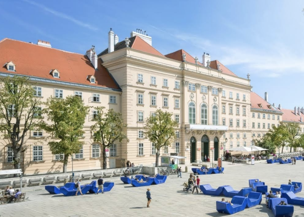
    Often, urban spaces prioritize group interactions, leaving little room for those who prefer solitude. This can unintentionally send the message that being alone in public is unusual or even undesirable. However, small design tweaks can challenge that stigma. Take seating arrangements, for example. Public furniture designed for individuals – like single chairs rather than long communal benches – can make it feel normal and even inviting to spend time alone in public. The MuseumsQuartier in Vienna does this with its modular seating options that work just as well for one person as they do for a group, creating a more inclusive and flexible experience.
    It’s not just about where you sit, it’s also about the atmosphere. Public spaces can be designed to provide opportunities for quiet moments, which are essential for helping people process their feelings of loneliness. Parks are a natural fit for this kind of design. Whether someone wants a solitary walk or a peaceful corner to sit and reflect, these kinds of environments offer options for both privacy and connection. Nature itself can also play a big role. Green spaces, dense vegetation, and the presence of birds or other wildlife add a sense of life and calm to a city. These features don’t just make urban spaces – they provide a way for people to connect with something larger than themselves. Studies have shown that access to green spaces is linked to lower feelings of loneliness, likely because they help clear the mind and create moments of quiet, personal connection with nature.
    This idea of “paradoxical intervention” in design doesn’t just apply to solitude. It’s about embracing contradictions to create better experiences. By designing spaces that support both solitude and social interaction, we can serve different emotional and social needs in the same environment. It’s a shift away from rigid design concepts and toward more flexible, human-centered thinking.
    Interaction design, too, has a critical role in this conversation. Thoughtfully designed technology can help foster meaningful connections in ways that feel organic and comfortable. For example, the concept of “cozy tech” has emerged as a way to create products that offer a sense of companionship. Devices designed with warmth and simplicity in mind, for instance, can provide emotional support in subtle ways. These tools aren’t about replacing human relationships but complementing them, making it easier for people to feel connected in their own way.
    Ultimately, combating loneliness in cities requires a holistic approach – including rethinking public spaces, embracing solitude as a valid experience, and designing products that help people feel less alone. By integrating interventions and innovative interaction design into urban life, environments can be created that feel welcoming, inclusive, and human. And in doing so, we can take meaningful steps toward not just reducing loneliness, but reshaping how we think about connection and belonging in the first place [1,2].

    Modular seating vienna

    Sources

    1. L. Heu and T. Brennecke, “Making Space For Loneliness In Our Cities,” Next City, Oct. 21, 2022. https://nextcity.org/urbanist-news/making-space-for-loneliness-in-our-cities-design-research
    2. L. C. Heu and T. Brennecke, “By yourself, yet not alone: Making space for loneliness,” Urban Studies, vol. 60, no. 16, pp. 3187–3197, May 2023, doi: 10.1177/00420980231169669.
    3. “Knowledge on Loneliness — The Loneliness Lab | Loneliness in urban spaces,” The Loneliness Lab, Dec. 29, 2020. https://www.lonelinesslab.org/knowledge-hub

    Designing for connection – Part 2

    DESIGNING INTERACTION

    In the previous post I have discussed what is important when designing the public space itself. Now it is also important to look at what aspects to consider and incorporate when designing interaction and human connection. To build successful products like installations or experiences that are meant to bring people together and create or nurture connection we must understand key elements that create connections between people.

    Human connection comes from a mix of emotional, physical, and psychological factors, all of which can guide how we design interactions that bring people closer together. Physical touch is an important aspect – it releases hormones like oxytocin, reduces stress, and builds trust. Designs can for example use haptic feedback, like vibrations or warmth, to mimic touch or encourage real-life gestures and touch like handshakes or hugs [1]. Physical proximity also plays a big role – being near others naturally makes connection easier. Spaces that bring people closer, like small gathering spots can create more chances for spontaneous interaction. Similarly, eye contact creates intimacy and trust.
    Shared experiences are also something that bring people together by creating a sense of belonging and togetherness. Things like group activities, team challenges, or even shared virtual spaces can help foster these bonds [2]. Another aspect that gives people a sense of identity and connection are rituals and traditions. This could mean designing recurring events or encourage and help the development of little rituals specific to an experience [3].
    Active listening makes people feel heard and valued, and Emotional sharing deepens relationships when people feel safe enough to open up. Design ideas could include anonymous spaces for sharing or lighthearted prompts that encourage people to talk about their feelings [4].

    WHAT DO WELL DESIGNED PLACES AND INTERACTIONS LOOK LIKE?
    The Loneliness Lab is a „global collective of people and organizations on a mission to design connection in to the places where we live, work and play.“ They for example made a toolkit for tackling loneliness in areas for people involved in urban planning and helped create several projects and concepts addressing the issue.

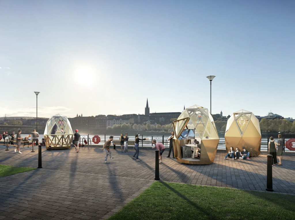
Designing public spaces that are inclusive, welcoming, and engaging can significantly impact social interactions and well-being. Accessible wayfinding, paths, and facilities ensure these spaces are available to everyone, especially those with disabilities or those who may feel excluded. Community-generated art empowers locals to reclaim and transform neglected spaces into safer, more inviting areas. Features like lighting, street furniture, and creative installations bring life to underused spaces, as seen in Derry’s pop-up meeting pods paired with mental health training, fostering connection and well-being. Temporary or “meanwhile use” spaces, such as Story Garden in London, allow communities to actively shape their environment while policymakers learn about long-term needs. Programs like this build creative skills and tackle local issues through collaborative projects. Lighting also plays a crucial role, it can help create a feeling of safety and encourage positive behaviors, as seen in Phillips’ LED installations, which extended children’s outdoor playtime and reduced device usage. A sense of place and identity strengthens connections between residents, businesses, and organizations. For example, “Elephant Says Hi!” unites over 30 groups in Elephant and Castle to create a welcoming environment for all. Thoughtful design, such as flexible seating, human-scale areas and elements, and moveable furniture, enhances the comfort of large spaces for both individuals and groups. Long-term administration is vital for sustainability, as demonstrated by the Gillett Square Partnership, which fosters ongoing collaboration to transform a once-deprived area into a vibrant community hub [5].
    Further approaches from these ideas could also go more in the direction of installations and artistic displays, that follow a specific goal or have a specific message, for example creating awareness about the topic or making a statement.

    Pods in Derry
    Collaborative Creative Spaces in London

    Source

    1. A. H. Tejada, R. I. M. Dunbar, and M. Montero, “Physical contact and loneliness: Being touched reduces perceptions of loneliness,” Adaptive Human Behavior and Physiology, vol. 6, no. 3, pp. 292–306, May 2020, doi: 10.1007/s40750-020-00138-0.
    2. V. Chung, R. Mennella, E. Pacherie, and J. Grezes, “Social bonding through shared experiences: the role of emotional intensity,” Royal Society Open Science, vol. 11, no. 10, Oct. 2024, doi: 10.1098/rsos.240048.
    3. D. Robson, “The secret to long-lasting connection? Shared rituals,” Dec. 30, 2024. https://www.bbc.com/future/article/20241218-michael-nortons-rituals-key-to-connection-family
    4. S. Myers, “Empathic Listening: Reports on the Experience of being Heard,” Journal of Humanistic Psychology, vol. 40, no. 2, pp. 148–173, Apr. 2000, doi: 10.1177/0022167800402004.
    5. “Knowledge on Loneliness — The Loneliness Lab | Loneliness in urban spaces,” The Loneliness Lab, Dec. 29, 2020. https://www.lonelinesslab.org/knowledge-hub

    Designing for connection – Part 1

    In the last blogposts I have established, that public spaces offer a great opportunity for design to combat loneliness. Concepts like Third Places provide and ideal starting point for designers to tackle the loneliness issue ans shape social networks.
    Based on my current research I would say that designing against loneliness means designing for connection. But what is important when designing public spaces with the purpose of community building in mind? How do we design spaces to nurture connection? In the following I will take a closer look at design principles, guidelines and important aspects for spaces, installations and interactions and maybe even seemingly counterintuitive design approaches addressing the problem.

    DESIGNING PLACES
    Designing places to combat loneliness and foster connection requires thoughtful consideration of how we interact with our environment. Accessibility is the foundation, ensuring that spaces are inclusive, safe, and easy to navigate for everyone, such as parks, libraries, or pocket spaces (a micro space serving a function different to the room or area it’s located in) seamlessly integrated into neighborhoods. Creating spaces that feel welcoming also starts with comfort – designing environments that invite people to stay. Incorporating nature boosts mental health and also fosters sociability. Adding elements of activation, like strategically placed seating, amenities, and refreshments, brings energy and encourages interaction.
    It’s also important to offer choice and flexibility. People have different needs – sometimes we crave stimulation, and other times we just want a quiet spot to rest. Spaces that adapt to these preferences are more likely to feel inclusive. Designing at a human scale (the proportion of space in relation to human dimension, eg. not making spaces too large or small) adds to this sense of comfort that naturally invite connection. A strong sense of place is equally essential. Spaces that reflect local culture and shared values signal belonging and create identity. Purposeful programming (placemaking), or giving a space a specific focus – like catering to a particular group with shared needs or interests – can lower barriers to connection. For example, a park designed with community gardening in mind brings people together over a shared activity, making it easier to strike up conversations and build connections [1,2,4]. The project “the loneliness lab” uses a metaphor to define the essential elements of place making. The physical environment is considered the „hardware“ (buildings, parks), the programming of these spaces is the „software“ (activities, events, services) and the policies and standards that bring people together and prevent loneliness are the „code“ [3].
    Thoughtful integration of technology can also enhance these spaces, make them more accessible and extend the sense of community beyond the physical world. But technology should always support the space, not take over, and it needs to be used carefully so it doesn’t get in the way of the real human connections these spaces are meant to create. [2]

    In practice this means understanding the unique needs of a community. Conducting a needs assessment helps identify gaps in existing spaces and uncovers the types of activities people value most. Collaboration is equally vital – partnering with local businesses, organizations, and community groups builds a support network that strengthens the foundation of these spaces. Securing funding through grants, sponsorships, and partnerships ensures their creation and long-term sustainability [2].
    Third places are more than just physical spaces, they play a crucial role in reducing social isolation by encouraging meaningful connections and interactions. They also act as places for civic engagement, giving people opportunities to participate in and contribute to their communities. Beyond this, third places support well-being by providing spaces where people can relax, connect with others, and share experiences. They promote a sense of belonging, strengthen social bonds, and cultivate vibrant, inclusive communities [2].

    SUCCESSFUL EXAMPLES

    “Gathering place” in Tulsa is a concept of a park that offers a diverse amount of activities from learning and education to events and culinary experiences: „Gathering Place aims to serve as a cornerstone for our vibrant community while improving social, economic, and environmental sustainability in Tulsa.“
https://www.gatheringplace.org/


    “The High Line” in New York used to be an old elevated abandoned railroad track and was transformed into a park and community space in the middle of the city. Ideas for dEsigns were created through contests by anyone who wanted to participate and much of it is therefore created by public participation. Most of it is supported by funding and it offers many activities from food, art, performance and nature: „The High Line is both a nonprofit organization and a public park on the West Side of Manhattan. Through our work with communities on and off the High Line, we’re devoted to reimagining the role public spaces have in creating connected, healthy neighborhoods and cities.“
    
https://www.thehighline.org/

    The implications for interaction design projects could be developing design guidelines, such as workshops or a framework, to guide the creation of third spaces for urban planners, architects, community leaders or involved citizens. Another approach could be to create a platform that fosters the development of communities dedicated to designing third places tailored to their needs, thereby encouraging active citizen participation in urban planning.


    Sources

    1. HKS Architects, “Healing Loneliness: Six Ways to design for Social Connection and Community | HKS Architects,” HKS Architects, Jun. 24, 2024. https://www.hksinc.com/our-news/articles/healing-loneliness-six-ways-to-design-for-social-connection-and-community/
    2. M. Abdelhamid, “Third place theory: creating community spaces,” Urban Design lab, Oct. 20, 2024. https://urbandesignlab.in/third-place-theory-creating-community-spaces/
    3. “Knowledge on Loneliness — The Loneliness Lab | Loneliness in urban spaces,” The Loneliness Lab, Dec. 29, 2020. https://www.lonelinesslab.org/knowledge-hub
    4. “Eleven Principles for Creating Great Community Places.” https://www.pps.org/article/11steps

    01. #10 “W” like wrapping up and “L” like looking ahead

    After an extensive journey through the multifaceted world of early reading development, it’s time to reflect on the key insights gathered and consider where to go from here. From understanding how children learn to read to analyzing fonts, illustrations, and global teaching practices, this research has deepened my understanding of what helps young learners thrive. But there is also so much more to research.

    Key Findings So Far
    Children progress through distinct stages—logographic, alphabetic, and orthographic—when learning to read. Each phase requires tailored support to build foundational literacy skills. Skills like phonological awareness and decoding are essential. Memory systems, such as phonological and visual memory, play significant roles in facilitating reading fluency and comprehension.

    A variety of approaches, such as the Whole Word Method, Phonemic-Synthetic Method, and Syllable Method, cater to diverse learning needs. Reader-friendly fonts, like Grundschrift and Schulbuchschrift, can significantly enhance readability and motivation for young learners. Factors like x-height, spacing, and stroke width are crucial.

    Also, Illustrations are powerful tools for comprehension, engagement, and vocabulary building. They support the interplay between text and images, making reading accessible and enjoyable for beginners.

    An outlook on my next steps
    The Role of Multisensory Learning
    Exploring how visual, auditory, and tactile elements can be combined to support reading development as well as analyzing the impact of digital tools and apps on early reading skills and how they can complement traditional methods.

    The Psychology of Reading Motivation
    Investigating what drives children to read and how to sustain their interest through engaging materials and activities.

    Inclusive Reading Materials
    Developing strategies for creating resources that cater to children with learning disabilities, such as dyslexia, or those learning to read in a second language.

    To enrich my research, I plan to conduct interviews and do little experiments with:

    • Teachers: To gather insights on effective methods and challenges in teaching literacy.
    • Parents: To understand how children engage with books and reading activities at home.
    • Children: To capture their preferences and experiences with learning to read.

    Potential research questions
    What are the key design principles for creating child-friendly reading-learning-materials that enhance engagement and intrinsic motivation?

    How does the overall design of educational materials affect early literacy development?

    What is the ideal balance between text and visuals in early reading materials to ensure both are effective and not distracting?

    01. #09 The power of pictures

    Illustrations have always been a central feature of children’s books. For young readers, pictures do more than just decorate the pages—they play an essential role in fostering literacy and comprehension. Illustrations serve multiple functions in children’s books, making them a powerful tool in early literacy development.

    The function and importance of illustrations in children’s books
    Encouraging Imagination
    Illustrations spark creativity and imagination, allowing children to visualize characters, settings, and events. This helps develop their ability to think beyond the text. For educational materials, illustrations can include interactive features such as hidden objects, labels, or patterns that encourage exploration and discussion.

    Supporting Comprehension
    Pictures help children understand the narrative by providing visual cues. For young readers who are still decoding words, illustrations act as a guide, allowing them to piece together the story. Illustrations should be clear and not overly detailed, as too much complexity can overwhelm young readers.

    Engaging Attention
    Bright, colorful, and dynamic illustrations capture children’s attention and make reading a more enjoyable experience. This engagement is critical for fostering a love of reading from an early age. The artistic style should resonate with the target age group. For preschoolers, bold lines and primary colors are ideal, while slightly more detailed illustrations may suit older children.

    Building Vocabulary
    By connecting words to images, children can expand their vocabulary. For example, a picture of a cat next to the word “cat” reinforces the association between the word and the object. Pictures should complement the text rather than distract from it. They should be positioned strategically to reinforce the words on the page.

    The interaction between image and text in reading comprehension
    The relationship between illustrations and text is vital for developing reading comprehension. Here are some ways they work together:

    • Bridging the Gap: For early readers, images can fill in gaps when they encounter unfamiliar words. A picture of a dog wagging its tail next to the sentence, “The dog is happy,” reinforces understanding.
    • Encouraging Prediction: Illustrations invite children to predict what might happen next, enhancing their engagement and critical thinking skills. For example, a picture of storm clouds might prompt a child to anticipate rain in the story.
    • Reinforcing Memory: Visuals make stories more memorable. Children often recall pictures more vividly than text, helping them retain information and recount stories later.
    • Supporting Emotional Understanding: Facial expressions, body language, and color choices in illustrations help children grasp the emotional tone of the story, deepening their connection to the text.

    Illustrations are far more than decorative elements in children’s books; they are a cornerstone of early literacy development. By supporting comprehension, building vocabulary, and fostering a love of reading, pictures play a vital role in helping children become confident readers. Thoughtfully designed illustrations, when combined with engaging text, create an immersive learning experience that enriches both the mind and imagination of young readers.

    Eine vergessene Perspektive der Stummfilmzeit: Frauen hinter der Kamera

    Die Geschichte der Frauen in der Stummfilmzeit zeigt, dass sie nicht nur als Schauspielerinnen, Drehbuchautorinnen oder Produzentinnen tätig waren, sondern auch technische Rollen übernahmen – darunter die Bedienung von Filmkameras. Doch diese Leistungen wurden lange übersehen oder gar bestritten. Obwohl es in der Filmindustrie einige Frauen gab, die als Kamerafrauen arbeiteten, blieben sie weitgehend unsichtbar. Dies lag zum einen an den Geschlechterrollen der Zeit, zum anderen an der Skepsis gegenüber der technischen Kompetenz von Frauen. Der folgende Abschnitt beleuchtet die seltene, aber bedeutende Rolle von Frauen als Kamerafrauen.

    Das Fehlen einer Debatte: Unsichtbare Kamerafrauen

    Während der Stummfilmzeit wurde kaum ernsthaft darüber nachgedacht, warum es so wenige Frauen in der Rolle von Kameraleuten gab. In der Branche schien die Vorstellung zu herrschen, dass Frauen in dieser technisch anspruchsvollen Position schlicht nicht existierten. Selbst einflussreiche Frauen wie die Drehbuchautorin und Produzentin June Mathis konnten sich 1925 nicht an ein Beispiel einer Frau erinnern, die als Kamerafrau tätig war. Doch es gab sie – einige wenige Frauen, die trotz der Vorurteile und der körperlichen Herausforderungen des Kamerabetriebs mit 35-mm-Filmkameras arbeiteten.

    Frauen mit Kameras vs. Kamerafrauen

    In der Öffentlichkeit wurden Frauen mit Kameras oft als Neuheit dargestellt, doch diese Darstellungen unterschieden selten zwischen Frauen, die tatsächlich als professionelle Kamerafrauen arbeiteten, und solchen, die Kameras nur symbolisch als Requisiten für Fotos nutzten. Schauspielerinnen wie Marie Doro oder Alla Nazimova wurden oft mit Filmkameras abgebildet, um ihre Vielseitigkeit zu betonen, jedoch nicht, weil sie tatsächlich Kamerafrauen waren. Der Unterschied zwischen der Position „neben“ und „hinter“ der Kamera ist dabei entscheidend: Frauen, die tatsächlich hinter der Kamera arbeiteten, waren eine seltene, aber bemerkenswerte Ausnahme.

    Beispiele für professionelle Kamerafrauen

    Grace Davison: Eine Pionierin hinter der Kamera

    Grace Davison, eine der wenigen bekannten Kamerafrauen, wurde in einem Artikel der Picture Play Magazine aus dem Jahr 1916 vorgestellt. Der Artikel versucht, die Annahmen über die technische Inkompetenz von Frauen zu widerlegen, indem er Davisons Fähigkeiten hervorhebt. Sie begann ihre Karriere mit einer stillen Graflax-Kamera, bevor sie sich der komplexeren Filmkamera zuwandte. Davison experimentierte mit fortschrittlichen Techniken wie Doppel- und Dreifachbelichtungen und schuf beeindruckende Aufnahmen, die selbst erfahrene Kameramänner wie Harry Fischbeck beeindruckten. Trotz ihres Talents wechselte Davison später wieder zur Schauspielerei und gründete sogar ihre eigene Produktionsfirma.

    Francelia Billington: Von der Schauspielerin zur Kamerafrau

    Ein weiteres bemerkenswertes Beispiel ist Francelia Billington, die 1914 in einem Artikel der Photoplay als „Kameraoperatorin“ vorgestellt wurde. Sie begann ihre Karriere als Schauspielerin, entdeckte jedoch ihre Leidenschaft für die Kameratechnik und arbeitete zeitweise als Kamerafrau am Set. Billington beschrieb ihre Faszination für die Mechanik der Kamera und die Herausforderung, Szenen visuell umzusetzen. Ihre Arbeit als Kamerafrau war jedoch kurzlebig, da die Studios bald keine Frauen mehr in dieser Rolle akzeptierten. Billington kehrte zur Schauspielerei zurück und erreichte ihren Karrierehöhepunkt in Erich von Stroheims Film Blind Husbands (1919).

    Die Darstellung von Kamerafrauen in den Medien

    Die wenigen Frauen, die als Kamerafrauen arbeiteten, wurden in den Medien oft auf ihre äußerliche Erscheinung reduziert. Artikel beschrieben detailliert ihre Kleidung, wie z. B. Margery Ordways „kamerataugliches“ Outfit, das aus einem karierten Anzug und passender Mütze bestand. Diese Fokussierung auf das Äußere verstärkte die Wahrnehmung, dass Frauen in technischen Rollen eine Kuriosität waren. Gleichzeitig wurden Begriffe wie „grinding“ oder „cranking“ (für das Bedienen der Kamera) in den Artikeln humorvoll verwendet, um die ungewöhnliche Vorstellung einer Frau hinter der Kamera zu betonen.

    Spätere Anerkennung und Forschung

    Die Leistungen dieser Pionierinnen gerieten über Jahrzehnte in Vergessenheit. Erst in den 1970er Jahren begannen Historiker wie Anthony Slide, sich mit den Frauen hinter der Kamera zu beschäftigen. Slide entdeckte Namen wie Grace Davison, Margery Ordway und Dorothy Dunn, die als Kamerafrau beim Universal Animated Weekly tätig war. Später wurden auch Frauen wie Katherine R. Bleecker als frühe Filmpionierinnen anerkannt, die dokumentarische Szenarien mit realen Personen inszenierten und filmten.

    Dokumentarische und unabhängige Arbeiten

    Während die Filmstudios Frauen zunehmend aus technischen Positionen verdrängten, fanden einige von ihnen außerhalb Hollywoods Möglichkeiten, ihre kreative Vision umzusetzen. Katherine R. Bleecker drehte Szenen in New Yorker Gefängnissen, während Angela Murray Gibson ihre eigene Produktionsfirma gründete, um Kurzfilme mit bildungspolitischem Hintergrund zu realisieren. Diese Frauen nutzten den dokumentarischen Stil, um soziale Themen zu beleuchten und ihre eigene Perspektive einzubringen.

    Fazit: Eine vergessene Errungenschaft

    Die Arbeit von Frauen als Kamerafrauen in der Stummfilmzeit war ein seltenes, aber bedeutendes Phänomen. Trotz kultureller und struktureller Barrieren bewiesen diese Frauen technische Kompetenz und Kreativität in einem Bereich, der traditionell Männern vorbehalten war. Ihre Leistungen sind ein wichtiger Teil der Filmgeschichte und zeugen von der Vielfalt der Rollen, die Frauen in der frühen Filmindustrie einnahmen. Die späte Anerkennung ihrer Arbeit durch Filmhistoriker zeigt, wie entscheidend es ist, die Beiträge von Frauen in der Filmgeschichte neu zu bewerten und zu würdigen.

    Quelle: https://wfpp.columbia.edu/essay/women-as-camera-operators-or-cranks/