Exploring Tim Zaman’s Revolutionary 3D Scanning of Paintings
In 2013, Tim Zaman embarked on a groundbreaking project that bridged the worlds of technology and art, developing a super-high-resolution, large-format 3D scanner tailored to capturing the intricate topography of paintings. This remarkable innovation brought new insights into the materiality of art and how we perceive it, focusing on iconic works by masters such as Rembrandt and Van Gogh.
The Vision Behind the Technology
Paintings, often treated as two-dimensional artworks, are deeply influenced by the physical properties of paint. Late Rembrandt self-portraits, for instance, achieve their dramatic effects through the interplay of light and shadow on textured surfaces. Similarly, Van Gogh’s bold, impasto strokes create a tangible depth. Tim Zaman’s work highlights how paint’s texture, glossiness, and transparency significantly shape a painting’s aesthetic—aspects often overlooked or underappreciated.
The 3D Scanning Process
To capture these details, Zaman’s 3D scanner used a hybrid system combining stereo vision (dual cameras) and fringe projection (a projector). This setup allowed for ultra-high-resolution imaging, capturing 40 million XYZ (3D space) and RGB (color) data points per scan. For large works like The Jewish Bride by Rembrandt, spanning 160×120 cm, the system gathered over a billion data points by merging multiple scans. This unparalleled level of detail was essential for faithfully documenting the subtle undulations and surface features of the paintings.
Scanning Equipment
“The scanning equipment is actually very straightforward, and only consists out of these parts. The rest of the parts is just cables and stuff to make the camera move in X and Y”.
Optoma PK301 Pico-Projector fitted with a crossed polarisation filter
Zaman’s project also delved into the realm of reproduction. Collaborating with Océ (a Canon Group company), the scanned data was used to create high-fidelity 3D prints of paintings. These reproductions—complete with textured surfaces—represented a significant leap beyond traditional flat posters. While impressive, they underscored the complexity of accurately replicating the originals, particularly when it came to glossiness and transparency—elements that remain elusive even with advanced technology.
Future Directions
Zaman’s work set the stage for ongoing research into the physicality of paintings. While the 3D prints captured the texture and color of the originals, they lacked the dynamic qualities imparted by brushstrokes and the interaction of light with varying paint properties. This gap highlighted the multifaceted nature of paintings, where factors like material reflectivity and translucency play critical roles in their visual impact. Current efforts aim to model glossiness, transparency, and other overlooked elements. By combining cutting-edge technology with a deep respect for artistic heritage, Zaman’s project serves as a powerful reminder of the endless possibilities at the intersection of science and art.
Tim Zaman’s innovative approach continues to inspire researchers and art enthusiasts alike, showcasing how technology can uncover new dimensions of creativity and history.
In the upcoming blog, I will explore the advancements in newer technologies aimed at addressing the missing elements like glossiness and transparency, building upon the foundation of Zaman’s work.
It can be shown that if a person sees tracked information about his behaviour in numbers, it can influence his following behaviour to a certain point. You can’t Manage what you can’t Measure.
This is also applicable, for example, if you track the use of different apps on your phone or computer. A person can’t accurately estimate how long he watched Tiktok videos for example, but when he looks at the statistics on his phone and sees he spent 8 hours on that app, he’ll try to reduce his use of that app by at least a little in the next few weeks.
This system of App interventions can also be linked to the issue of the size of the energy footprint from the use of digital and online space.
Types of existing screentime interventions Apps
It’s important for all of us to reflect on our relationship with technology, particularly when it starts leaning toward an unhealthy dependence. Using an app usage tracker to monitor the time you spend on various digital activities is a crucial step toward developing greater digital self-awareness. By gaining a clearer understanding of how you engage with your devices, you can make more deliberate choices about how you want—or don’t want—to use them.
Screen Time – iOS
It tracks exactly how you use your device, providing a high-level evaluation of the time you spend on it in a single day, as well as a more detailed look at time spent in certain categories or apps.[1]
AntiSocial is designed to not only help you understand what ‘normal usage’ looks like, but to give you the tools to manage, block and control your cell phone usage so that you can unplug, minimize distractions and focus on the things that matter. While there are other apps available that are designed to restrict phone usage, AntiSocial feels strongly about empowering the user by giving them the information they need to take necessary action. This is done through the clearest and most simple interface available and is the only app to deliver detailed reports full of all the information you need to make an informed decision.[3]
A recent study from Delft University of Technology, Netherlands looked at apps designed to help people spend less time on their phones and avoid unhealthy habits like overuse. The research reviewed various apps and how effective they are at helping users change their behavior.
Here’s what they found:
Helpful Features: Apps that include tools like grayscale mode (making your screen less colorful), app limits, and mixed approaches worked well for reducing phone use.
Top Apps: Screen Time (iOS) and AntiSocial were the most effective apps, while Forest and Screen Time (Android) had weaker results. However, Forest stood out for its fun gamification feature and had the highest user satisfaction score (86/100).
What Users Like: The most popular features were tracking usage and setting goals. Gamification (like turning tasks into games) and tools for self-assessment were less commonly used but still appreciated.
Positive Feedback: Most users liked these apps, with overall sentiment scores ranging from 61 to 86 out of 100.[5]
The study underscores the increasing public interest in apps that promote healthier phone habits and highlights the need for collaboration among researchers, developers, phone manufacturers, and policymakers to design and evaluate more effective interventions.
By shedding light on which app features work best, this research provides valuable insights for those seeking to make meaningful changes in their digital habits.
Augmented reality (AR) in car windscreens is transforming the driving experience through advanced heads-up displays (HUDs). Rather than simply projecting basic information such as speed and fuel level, AR HUDs overlay real-time information in the driver’s field of vision, improving both safety and user experience. For example, navigation information such as lane guidance arrows, hazard warnings or even pedestrian and obstacle detection appear seamlessly on the windscreen, keeping the driver’s eyes on the road and reducing distractions.
One of the primary goals of AR HUDs is safety. By projecting critical information directly into the driver’s line of sight, they reduce the need to look away from traditional dashboard displays. For example, real-time alerts about speed limits, traffic congestion and potential collisions can help improve reaction times. AR HUDs can also improve driving in poor visibility by highlighting lane markings or obstacles like other vehicles.
Personalisation features are also becoming more common, allowing drivers to customise the information displayed on their windscreen. This could include navigation routes, weather updates or nearby points of interest, creating a more tailored and interactive experience.
Despite their potential, AR HUDs face challenges such as high production costs, complex calibration requirements and display clarity in varying lighting conditions. In addition, regulatory hurdles and driver distraction concerns remain significant barriers to adoption.
The future view
The future of AR HUDs looks promising as advances in AI, connectivity (such as 5G) and projection technology accelerate. Car manufacturers are already incorporating AR HUDs into premium models, with brands such as Mercedes-Benz and BMW leading the way. As costs come down and consumer demand for smarter, connected cars grows, AR HUDs could become standard across all vehicle segments within the next decade.
Chatgpt has become a major help to students over the past two years. This technology invention has completely changed the way information searching is done. It often helps us and saves time in various assignments. But have think about the question if we could find the answer ourselves, was it necessary to use chatgpt at any cost?
Energy usage during operation of ChatGPT
Inference Costs: Each time a user interacts with ChatGPT, the AI model must process the prompt and generate a response. This is called “inference” and requires computational power proportional to the complexity of the query and the response length.
Aggregate Usage: With millions of users globally, the cumulative energy required to serve these queries daily adds up significantly, especially when users submit unnecessary or overly frequent prompts.
ChatGPT User Growth Timeline (Release to May 2024)
After its launch, ChatGPT set a world record as the fastest platform to reach 1 million users, achieving this milestone in less than five days. This unprecedented growth was fueled by the recent hype surrounding AI and the ease of accessing ChatGPT for everyday tasks. Such rapid adoption highlights both its potential and the need to use it wisely [1].
There are various ways in which chatgpt is proving crucial. It can be an ideal tool for performing various tasks. Some of the ways people are using chatgpt are:
There is no information on OpenAI’s official website about ChatGPT’s energy consumption or what steps the company would like to take to improve its impact on energy consumption. “According to ChatGTP, OpenAI is committed to reducing its carbon footprint and promoting sustainability initiatives, such as investing in renewable energy sources (produced, for example, through solar panels or wind turbines), improving its data centres and energy efficiency, and reducing waste and water use [2].” However, there is no data on what ChatGPT does to improve its environmental and social impact.
How to Use ChatGPT Sustainably
Here are a few principles to ensure we use ChatGPT thoughtfully:
Pause Before Prompting: Ask yourself if you really need ChatGPT for a particular task. Could you find the answer yourself through research, reflection, or discussion? Reserve ChatGPT for questions that require nuanced insights or efficiency.
Set Clear Goals: Define what you want to achieve before using ChatGPT. Vague prompts can lead to multiple iterations, increasing both time spent and energy use.
Use for Learning, Not Substitution: Use ChatGPT as a complementary learning tool rather than a replacement. For example, if you’re stuck on a problem, ask for guidance rather than a direct solution. This encourages you to engage with the material.
Collaborate With Others: Instead of immediately consulting AI, consider brainstorming with peers or mentors. Human collaboration not only strengthens understanding but also fosters interpersonal skills.
Limit Usage: Designate specific times or purposes for using ChatGPT, such as for brainstorming or refining ideas, to avoid habitual overuse.
Final Thoughts
As we use AI tools like ChatGPT more often, it’s important to build healthy habits. ChatGPT should help us, not replace our own thinking. By setting limits and using it responsibly, we can make the most of its benefits while continuing to grow as independent thinkers. Next time you’re about to type a question, stop and ask: Can I figure this out myself? If the answer is yes, give it a try. You might be surprised by how much you already know.
The rise of autonomous vehicles (AVs) has had a profound impact on modern UX/UI design, laying the foundations for new user expectations, interfaces and interactions. Even though fully autonomous cars are still in development, their concepts are actively influencing current automotive design trends.
Shift from driver-centric to passenger-centric UX
Traditional car UX focused on the driver managing controls, but AV concepts prioritise the passenger experience. As the responsibility of driving reduces, designers are rethinking interiors to support new activities such as working, relaxing or entertaining. This shift calls for adaptable interfaces that balance functionality and simplicity, while accommodating a range of user needs, such as personal control over lighting, seating or infotainment systems.
A critical design challenge in autonomous vehicles is building trust. AVs need to clearly communicate their intentions and status to help users feel safe. For example, interface systems now display the vehicle’s awareness of its surroundings, such as identifying pedestrians or road conditions. By showing this “cognitive awareness” in real time, car manufacturers aim to reduce fears about safety and control.
Autonomous car concepts are increasingly using AI to predict user preferences and streamline the journey. Features such as adaptive climate control, route suggestions or personalised entertainment systems increase comfort. These innovations are now influencing current vehicles, even in advanced driver assistance systems (ADAS), where predictive feedback improves the user experience.
AV interiors often emphasise minimalism, reflecting an intuitive approach to reducing cognitive load. Touchscreens, voice commands and haptic feedback replace traditional controls, simplifying navigation and vehicle interaction. As designers test AVs, these principles are being incorporated into current models, with large screens, clean dashboards, and advanced voice assistants such as Apple CarPlay or Android Auto.
Even as automation advances, user-centred design remains essential. For example, partial autonomy (such as Tesla’s Autopilot) requires intuitive systems that allow for seamless driver interaction. Modern UIs already address this balance, ensuring clarity in mode switching and responsibilities between human and machine.
The Power of Micro-Interactions in Mental Health Apps
Small, seemingly simple design elements, known as micro-interactions, play a big role in creating a soothing experience in mental health apps. These tiny details, like animations, transitions, and feedback mechanisms, are often overlooked but are essential for user engagement and comfort. They guide users, provide feedback, and create emotional connections, making apps not only functional but also enjoyable and calming.
Imagine opening an app for a guided meditation and seeing a soft animation of waves that mirrors your breathing. This visual feedback reassures you, helps you stay focused, and enhances your sense of relaxation. This is the power of micro-interactions, they turn mundane actions into meaningful moments.
Guided Breathing and Calming Feedback
Breathing exercises are a staple of mental health apps, and micro-interactions make these experiences more immersive. Apps like Calm and Mental Health use animations to visualize the rhythm of breathing, helping users match their pace. These animations are not just aesthetically pleasing but also serve as functional tools to focus attention and reduce anxiety.
Video: Breathing Exercise in Calm
Video: Breathing Exercise in Mental Health
Intuitive Transitions and Engagement
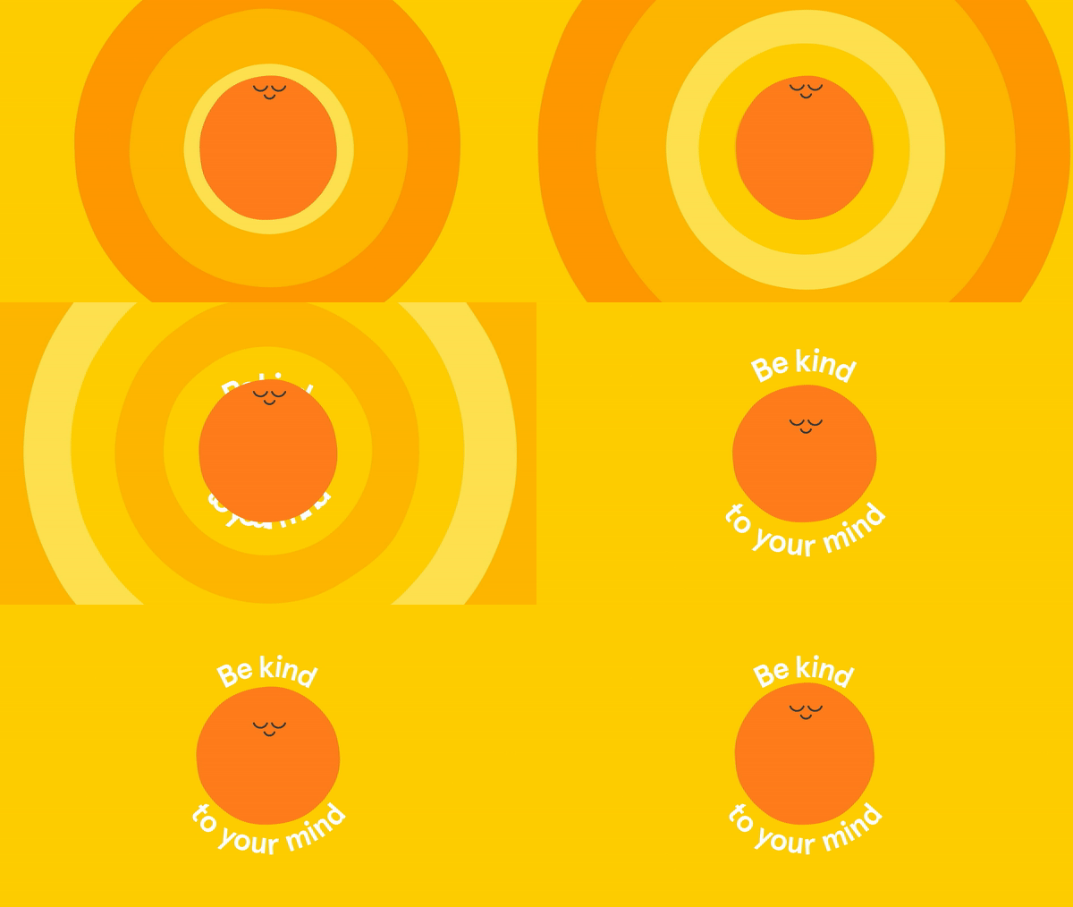
Transitions between app features can be designed to feel seamless, reducing cognitive load and promoting calm. For instance, Calm’s meditation introduction uses soft fades and subtle animations that guide users into their practice without abrupt changes. These smooth transitions create a sense of flow, essential for keeping users engaged and stress-free.
Video: Micro-interactions in Calm
Playful Animations in Headspace
Headspace stands out with its playful cartoonish animations that make mindfulness approachable and fun. Cheerful characters guide users through breathing exercises or meditation sessions, offering encouragement in a lighthearted yet calming way. These animations help demystify mindfulness for beginners while keeping the app engaging and supportive.
Micro-interactions can also reinforce positive emotions, as seen in Mental Health, which uses sound wave animations for daily affirmations. These subtle visuals, paired with soothing audio feedback, make affirmations feel more immersive and personal, helping users connect with the app on an emotional level. Similarly, these features create a calming rhythm that can draw users back daily.
Video: Sound Waves Animation in Mental Health
Sources
A. Antal. (2022). Micro-Interactions and Animations in UX Design for Mobile Applications. Politehnica Graduate Student Journal of Communication, Vol. 7, No. 1.
D. Saffer, Microinteractions: Designing with Details. Sebastopol, CA, USA: O’Reilly Media, Inc., 2013.
M. Jergović, N. Stanić Loknar, T. Koren Ivančević & A. Agić Cmrk. (2024). Micro-Interactions Within User Interfaces. Presented at International Symposium on Graphic Engineering and Design. [Online]. Available: 10.24867/GRID-2024-p23
As most of you know, Austria is always kind of slow with optimizing processes and digitizing traditional burocratic systems. In this blog post I would like to sum up the technology / touchpoints with the main digital health systems you might have come across.
As I’m insured at SVS my experience might differ to yours. My plan is to analyze the differences there are between the different insurances.
Meine SV
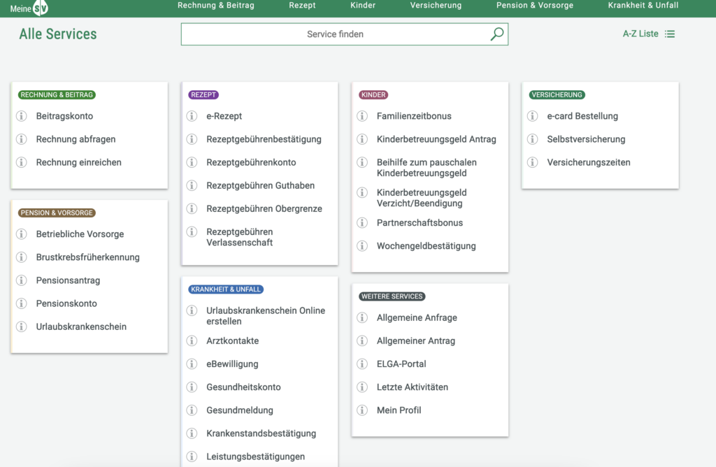
A digital service platform in Austria that serves as a personal online portal for citizens to manage their social security and health insurance matters efficiently. Launched to simplify access to important services and information, MeineSV allows users to handle various administrative tasks related to their social security in a user-friendly manner.
Key features of MeineSV include:
Personalized Access: Users can log in to the platform using their secure electronic identification (e-ID), providing a personalized experience tailored to their individual social security needs.
Comprehensive Services: Through MeineSV, users can access a range of services, such as checking their insurance status, viewing payroll information, and managing health insurance details. This centralization streamlines the process of handling social security matters.
Online Applications: The platform enables users to submit applications for various social security benefits, including pensions, unemployment benefits, and family allowances, all through an online interface.
Document Management: MeineSV allows users to upload and manage relevant documents, facilitating easier communication with social security authorities and reducing the need for physical paperwork.
Information Access: The platform provides users with access to vital information regarding their rights and obligations under the social security system, helping them stay informed about changes and updates.
App
The MeineSV App offers an App for easier access on-the-go.
Elga
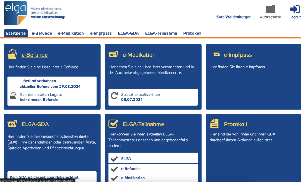
ELGA, or the “Elektronische Gesundheitsakte,” is Austria’s electronic health record system designed to improve the management and accessibility of patient health information.
Key features of ELGA include:
Centralized Health Records: ELGA allows for the storage and sharing of patient health data, including medical history, medications, allergies, and treatment plans, ensuring that healthcare providers have access to up-to-date information.
Vaccination documentation: A digital overview of vaccinations.
Patient Control: Patients have the ability to manage their own health records, granting or revoking access to healthcare professionals as needed. This empowers individuals to take an active role in their healthcare.
Interoperability: The system is designed to ensure that different healthcare providers can easily share information, improving coordination of care and reducing duplication of tests and procedures.
Enhanced Continuity of Care: By providing healthcare professionals with immediate access to a patient’s medical history, ELGA supports better decision-making and continuity of care, especially during emergencies.
Data Security and Privacy: ELGA places a strong emphasis on protecting patient data, implementing strict security measures to ensure the confidentiality and integrity of health information.
Currently there is no mobile application of Elga.
What is missing?
Both online portals have significant benefits that should be combined into one system in my opinion. One significant feature that is missing is that there is no possibility of contacting the healthcare professional directly via the platform. Also there is no possibility of setting reminders for future checkups or vaccinations which I would find extremely helpful.
Next Steps
For my next post I would like to create a small informal questionnaire (as mentioned in my first post) and also find out if anybody uses the two mentioned platforms and what they like/ dislike about them.
As promised, I would like to first dive a little bit into behavior of visitors in museums. To do so, I will review the article called “Art Perception in the Museum: How We Spend Time and Space in Art Exhibitions”, the present study aimed to replicate and expand on the study of Smith and Smith (2001).The main aim was to analyse museum visitors’ behaviour in terms of viewing duration and distance, how often people returned to a painting and how behaviour changed throughout such reassessments.
Keypoints of the “Smith and Smith” study
In their 2001 study, Smith and Smith provided foundational research into the impact of factors like age, gender, and group size on viewing times in museums. They discovered that museumgoers typically spend significantly more time observing artworks—27.2 seconds longer on average—than in controlled lab experiments, where viewing times are often under three seconds.
The study also brought attention to the role of viewing distance, noting that visitors intuitively adjust their proximity to artworks based on personal preferences, unlike the fixed distances common in lab studies. These insights underline the importance of replicating natural museum behavior in experimental settings to better understand art perception.
Lastly, Smith and Smith emphasized the social dynamics of museum visits, observing that a substantial portion of visitors attended in groups. Roughly 19.3% came with one other person, and 3.3% were in groups of three, transforming art observation into a collective social event. This group interaction was noted to influence the overall art experience, highlighting how social contexts can shift perception from individual to shared engagement.
Methods of the “Art Perception in the Museum” study
They tested a total of 225 visitors (126 female, M(age) = 43.3 years) attending the special exhibition on Gerhard Richter by unobtrusively observing them from a balcony above, which was barely detectable by typical visitors; 104 people visited the paintings on their own (category single), 100 visited them with one other person (category pair), 11 in a group (category group) of two or more, and 10 with their children (category family—here the children were not observed further, but a focus was set to the person who first attended the respective artwork). A total of four persons attended the exhibition with a wheelchair, two with a folding chair, and one with a walking stick; no other accessories in this respect were recorded. None of the participants detected the observers and so were naïve to the purpose of the study.
The six paintings which were utilized for the study were all positioned side by side on one wall of the only hall in the entire exhibition; the two observers assessing visitor behaviour were situated on a balcony above the hall overseeing the entire scene of interest. On the floor, the tile sizes were exactly 50 × 50 cm, allowing the easy assessment of viewing distance between visitor and painting with a resolution of 50 cm accordingly.
To record visitor behavior, the researchers used a custom Android app on Sony tablet PCs. This app enabled quick and precise data collection, such as viewing distance in 0.5-meter increments (aligned with the floor tiles), timing of observations, and demographic details like gender, age, and whether visitors were accompanied or used mobility aids. Observers could track individuals revisiting paintings, building a comprehensive history of their interactions. This method ensured accurate, intuitive data logging while maintaining naturalistic observations.
Two observers were located on the balcony, with Observer 2 assisting the experimenter Observer 1, who entered the data. This was done first of all to ensure objective data entry and was also used for tracing visitors who might potentially come back. The observers tried to focus on single visitors to capture their entire viewing behaviour with regard to the paintings under observation. This made it necessary to test single, randomly chosen persons in depth, so the duration of the total testing was considerably long as many visitors take quite a while to wander through the whole exhibition.
Results
Viewing Time of Artworks
People were found to spend very different amounts of time in front of different artworks, here between 25.7 s and 41.0 s on average—note: although the exact durations differed from the Smith and Smith study, they also documented such a various viewing behaviour with a range of viewing duration from 13.2 s to 44.6 s.
Visitors viewed the artworks quite selectively, omitting 2.5 out of the given range of six pictures—a clear sign of selective viewing behaviour even in a special art exhibition showing a very limited number of paintings.
In contrast to Smith and Smith, they did not find any substantial differences among group sizes. Category single visitors showed a mean viewing duration at first attendance of 35.6 s, category pair showed 31.4 s, group showed 36.5 s, and family showed 36.4 s. In accordance with the Smith and Smith study, we could not find any significant difference between female (M = 34.6 s) and male visitors (M = 32.7 s).
Given this total viewing time perspective, visitors spent 50.5 s on one artwork. In fact, visitors who viewed an artwork at least once showed a 51% probability of returning to it at least once more.
Viewing Distance From Artworks
Regarding the different viewing distances at which visitors choose to inspect the paintings, we again observed that conditions were very different to the typical ones employed in lab research. On average, the visitors in the present study distanced themselves from a painting M = 1.72 m across all viewings, which was not substantially different from the distance they used when only initial viewings were analysed (M = 1.75 m). First of all, the essential difference between a museum and a lab context is mainly that a museum offers enough space for visitors to choose their personal distance from an artwork. On what basis visitors choose their distance remains unclear, but it is seemingly done by intuition without any deeper rationale behind it. This intuition seems to have a basis in the extension of the artwork, here the canvas size: The larger the artwork the more viewing space is chosen.
Sociality factor
One great difference between a museum context and a lab setting is the typical presence of many people in the same hall, the sociality factor. We indeed detected an effect of group which was very compatible with the obtained effect of the Smith and Smith study: Pairs of visitors took longer viewing times, often because they debated on the painting, but more than two persons attending a painting together even outperformed pairs. The additional categorization of family showed the shortest viewing times—probably due to ongoing caretaking issues, especially for parents with small children.
Conclusion
Once again, the present study made clear that viewing artworks in a museum context is very different to a typical lab setting: First of all, visitors of art museums invest money, time, and intellectual effort beforehand to get to the exhibition hall, they show more skills and motivation to deeply process artworks, and, screening the demographics of typical visitors, they are mostly older and possess more knowledge of art and so also show different heuristics in assessing the quality of art. Second, the whole social setting is very different with people walking around in a relatively silent and focused—but still communicative and interactive—way. Third, the viewing distances from paintings is very different, typically larger. Fourth, the viewing duration is also self-chosen and fundamentally (much) longer than in typical lab settings.
Colors play a significant role in shaping how we feel and interact with the world. They influence emotions, guide decisions, and even impact mental well-being, making them a powerful tool in designing mental health apps. The right colors can create an environment that feels calming, inviting, and supportive – essential qualities for apps aimed at improving mental health.
Research shows that cool colors, like blues and greens, are strongly associated with calmness, relaxation, and trust. These shades are often used in mental health apps to create a sense of serenity and support. On the other hand, warm colors, such as yellows and oranges, can evoke energy and optimism but must be used sparingly to avoid overstimulation.
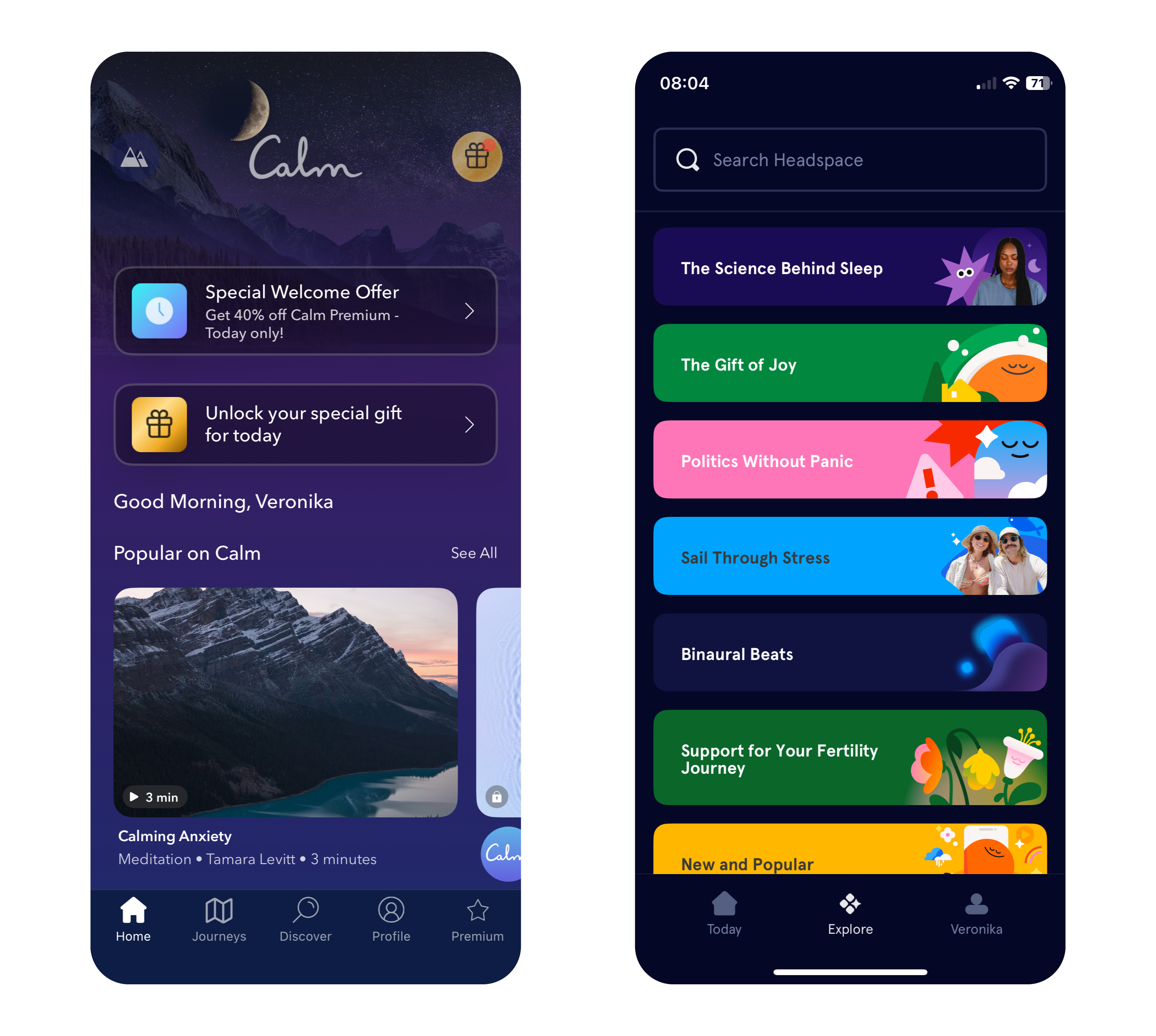
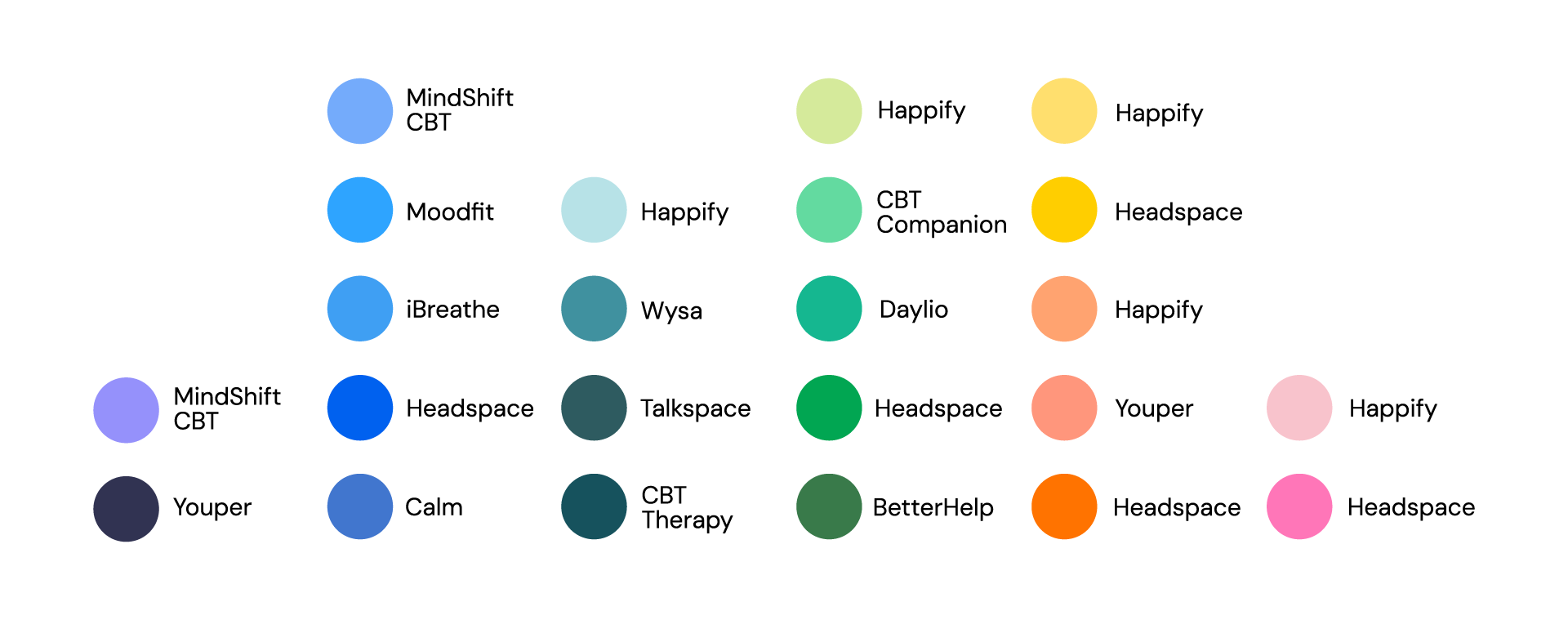
Apps like Calm and Headspace use color in very different ways to great effect. Calm primarily employs soothing shades of blue and purple to evoke tranquility, while Headspace takes a bold approach with its vibrant and varied palette. This variety helps make meditation and mindfulness more approachable, particularly for younger users who may be new to these practices.
Why Color Choices Matter in Mental Health Apps
The connection between color and emotion is deeply rooted in psychology. Blue and green tones, often linked to nature and open spaces, can subconsciously reduce stress and promote relaxation. In contrast, red, while energizing in small doses, may heighten anxiety if overused, making it less suitable for calming designs.
The neurological effects of color also play a key role. Studies show that exposure to blue tones can lower heart rates, while green shades improve focus and concentration – both valuable qualities for mindfulness and mental health practices. By leveraging these responses, designers can craft apps that not only look appealing but also enhance users’ mental states.
Insights from Research: Colors for Personalities and App Types
Personality traits influence color preferences. Extroverts tend to favor vivid, warm colors like red, orange, and yellow, while introverts prefer cooler, softer shades like blue, green, and pastel tones. Gender can also play a role, with women often gravitating toward softer hues like purple and light blue, while men tend to prefer bold primary colors like strong blues and greens.
Dynamic color schemes, where apps adjust their hues based on the user’s mood or time of day, are gaining popularity. For example, an app might use vibrant tones in the morning to energize users and shift to muted blues in the evening to promote relaxation. This adaptability can create a more personalized and supportive experience for users.
Balancing Color with Function in Mental Health Apps
Color choices should enhance an app’s purpose rather than detract from it. While greens and blues are staples in mental health app design, designers must carefully balance them with accents to maintain engagement without overstimulating users.
Headspace’s vibrant palette provides an excellent example of balance. By pairing warm hues like orange and yellow with cool tones, it creates a playful yet calming environment. This blend ensures the app remains visually engaging while maintaining its focus on mindfulness and relaxation. In contrast, Calm leans into simplicity, using gradients and minimalistic design to immerse users in tranquility.
Consistency in color use is equally important. Abrupt changes in tone can confuse users or create unease, especially for those managing anxiety or mood disorders. A seamless visual flow across an app reassures users and enhances their experience, encouraging them to engage more regularly with the app’s features.
Image: Primary Colors in Popular Mental Health Apps
Sources
A. Volkova & H. Cho. (2024). Warm for fun, cool for work: the effect of color temperature on users’ attitudes and behaviors toward hedonic vs. utilitarian mobile apps. Journal of Research in Interactive Marketing, Vol. ahead-of-print, No. ahead-of-print.https://doi.org/10.1108/JRIM-03-2024-0149
„Calm – The #1 App for Meditation and Sleep.“ Calm. Accessed: Dec. 9, 2024. [Online.] Available: https://www.calm.com/
„Headspace: Meditation and Sleep Made Simple.“ Headspace. Accessed: Dec. 9, 2024. [Online.] Available: https://www.headspace.com/
R. M. Romeh, D. M. Elhawary, T. M. Maghraby, A. E. Elhag & A. G. Hassabo. (2024). Psychology of the color of advertising in marketing and consumer psychology. Journal of Textiles, Coloration and Polymer Science, Vol. 23, No. 2. doi: 10.21608/jtcps.2024.259025.1272
S. Garrido, B. Doran, E. Olliver & K. Boydell. (2024). Desirable design: What aesthetics are important to young people when designing a mental health app? Health Informatics Journal, Vol. 30, No. 4. https://doi.org/10.1177/14604582241295948
In a world saturated with information, visualization and gamification have emerged as powerful tools to simplify complex ideas, improve learning, and influence behavior. When it comes to sustainability, presenting data visually—through tools like infographics, interactive apps, or gamified experiences—can significantly boost awareness and motivate eco-conscious actions or promoting digital sustainability.
The Power of Data Visualization
Data visualization transforms abstract numbers into meaningful insights. Studies show that:
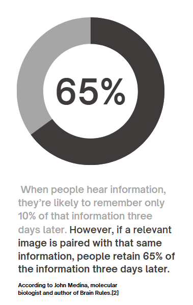
90% of information transmitted to the brain is visual, and people process visuals 60,000 times faster than text. Infographics, charts, and other visual tools increase the likelihood of remembering information , this means that carbon emissions, energy usage, or waste statistics—often hidden in dense reports—become instantly understandable when visualized. For example, seeing a pie chart that breaks down carbon emissions by activity makes it easier to grasp where one’s biggest impacts lie.
Gamification Makes Learning Stick
Gamification—adding game-like elements such as goals, rewards, or challenges—enhances engagement and motivates users to take action.
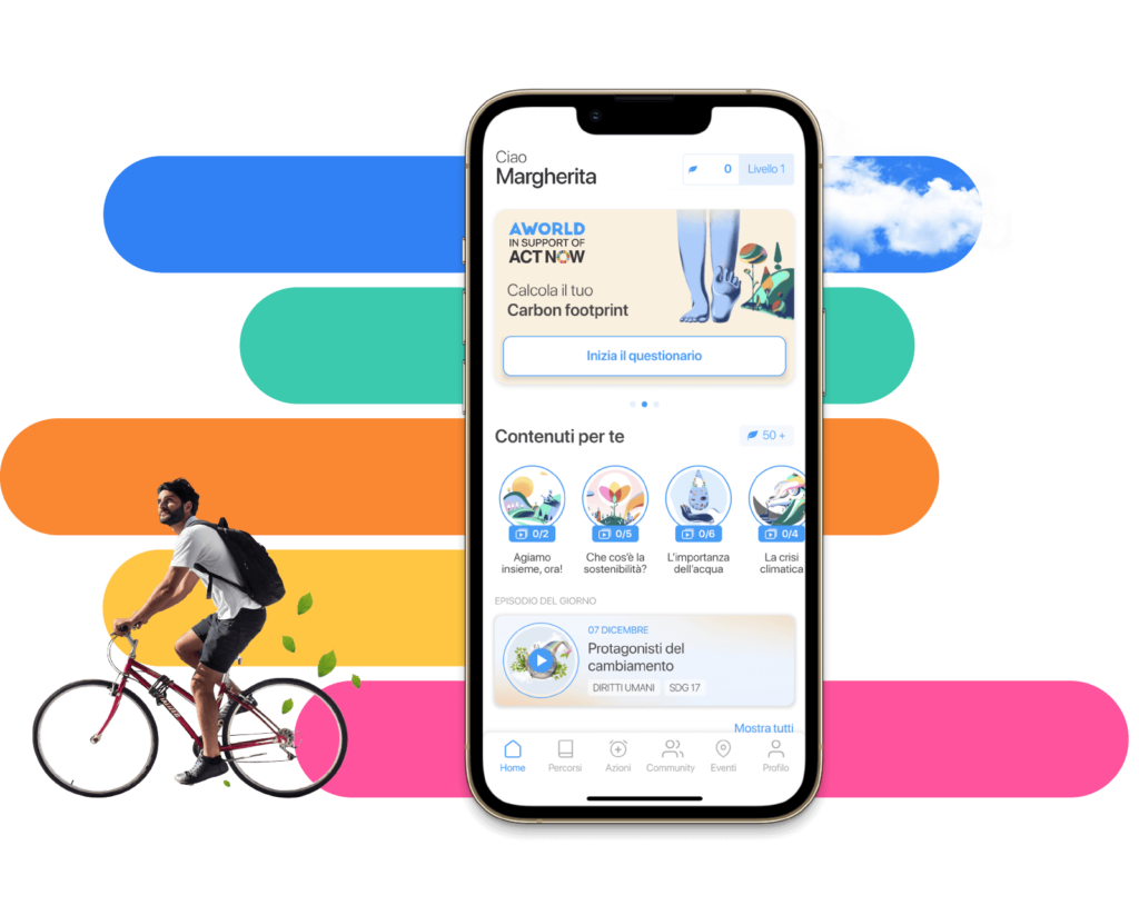
Gamified apps like eco2log, which track and reward users for reducing their carbon footprint, turn data into a journey of self-improvement.
Users are more likely to retain information and build habits when feedback is interactive and rewarding.
For example, an app might visualize a user’s digital energy use (like GB streamed) as a tree. The tree thrives when they make sustainable choices, such as streaming in lower resolutions or reducing data usage.
Successful Examples of Visualization in Action
UN’s Carbon Footprint Calculator The United Nations’ online tool uses interactive sliders and graphs to show how choices in transport, food, and housing affect emissions. It’s an excellent example of visualizing complex data in an engaging, accessible way.
Chasing Ice Documentary This film used stunning time-lapse visuals of melting glaciers to drive awareness of climate change. The emotional impact of visuals was a key factor in its success.
Piktochart Campaigns Infographics created with platforms like Piktochart have simplified sustainability statistics, making them widely shareable on social media and accessible to non-expert audiences .
Visualization has the potential to transform how we understand and act on sustainability. When data is clear, engaging, and actionable, it sticks with us—and motivates change.