The Importance of Early Warning Systems

Early warning systems are critical tools for identifying and analyzing weather and climate-related risks. These systems aim to protect lives, livelihoods, and assets by enabling early actions in response to potential hazards. With climate change intensifying the frequency and severity of natural disasters, EWS are more necessary than ever. 

Issuing warnings within 24 hours can significantly reduce the damage caused by extreme events. (30%) Despite the growing number of disasters, only half of the world’s countries currently have access to multi-hazard early warning systems. 

Warning systems are composed of four essential elements:
– disaster risk knowledge
– detection and forecasting
– communication of warnings
-preparedness and response capabilities.

These components must work together, involving communities and organizations at risk, to effectively minimize the impacts of extreme weather and non-weather-related hazards, such as earthquakes and disease outbreaks. 

By advancing early warning systems, we can better prepare for the challenges posed by climate change, reducing harm and enhancing resilience. 

To get a better overlook which kind of early warning systems there are i started my research on that.

Swiss: WSL-Institut für Schnee-und Lawinenforschung SLF

The page on the Swiss Institute for Snow and Avalanche Research (SLF) website provides information about their research and services related to snow, avalanches, and mountain ecosystems. Visitors can find insights on current avalanche warnings, snow conditions, ongoing projects, and publications. The site also offers educational resources and tools for professionals and the public to enhance safety and understanding of mountainous environments.
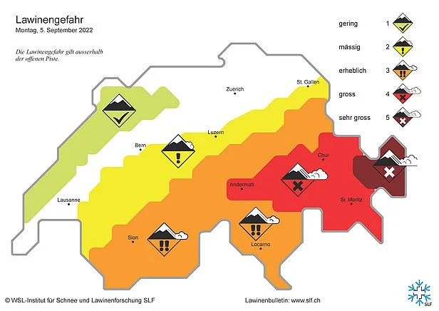
The website from Swiss Institute for Snow and Avalanche Research appears updated and clean but finding the right path seems tricky sometimes.

Link: https://www.slf.ch/de/naturgefahren/lawinen/

New Zealand: NEMA 

The National Emergency Management Agency website provides comprehensive resources on disaster preparedness and management in New Zealand. Visitors can find information on emergency alerts, guidelines, like video tutorials, for responding to various natural hazards like earthquakes and tsunamis, and resources for community engagement and education. The site also details strategies for disaster resilience, emergency response planning, and legislative frameworks. Additionally, it offers insights into civil defense sector operations, public education programs, and training opportunities. 

You can search if your location is in a Tsunami evacuation zones but doesn’t provide information about current tsunami warnings.   
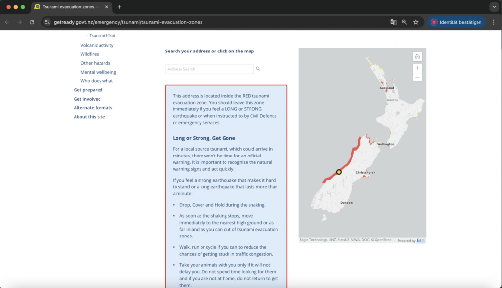
The design of the National Emergency Management Agency’s website is definitely not the newest one. But it is user-friendly and straightforward, focusing on easy navigation and accessibility.  

Link: https://www.civildefence.govt.nz/ 

Canada: the National Public Alerting System  

Public Safety Canada’s website provides information about the National Public Alerting System (NPAS), known as Alert Ready. It explains how the system works to deliver emergency alerts to Canadians through various channels, including TV, radio, and mobile devices, during life-threatening situations. The page also includes details on the types of emergencies covered, how the alerts are issued, and guidance on receiving them. 
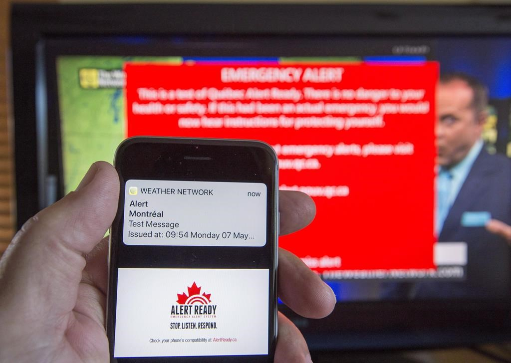
Although the website of the Public Safety Canada’s National Public Alerting System is being updated regularly, the design appears somewhat outdated. It lacks modern design elements such as responsive layouts, dynamic visuals, and interactive features that are now standard in contemporary web design. The visual hierarchy is minimal, and the aesthetic could benefit from an update to improve user engagement and accessibility. While functional, the site’s design might not fully meet current user expectations for an intuitive and visually appealing experience. 

Link: https://www.publicsafety.gc.ca/index-en.aspx 

The search for warning systems turned out to be tedious. There are a few websites that offer some information but are not very exciting from a design perspective. Basically, it can be said that acoustic signals (sirens) or visual warning lights are usually used in emergency situations. In order to reach people directly, such systems rely on contact via direct messages.


Research
https://wmo.int/topics/early-warning-system#:~:text=All%20early%20warning%20systems%20aim,assets%20of%20people%20at%20risk.&text=The%20damage%20caused%20by%20a,is%20issued%20within%2024%20hours.&text=About%2030%25%20of%20the%20global,covered%20by%20early%20warning%20systems.

https://www.civildefence.govt.nz/ 

https://www.publicsafety.gc.ca/index-en.aspx 

https://www.slf.ch/de/naturgefahren/lawinen/

What is Risk Communication?

Understanding the basics of risk communication is essential for my master’s thesis because it provides the foundational knowledge necessary to explore more complex aspects. By grasping the core principles, methods, and challenges, i can delve deeper into how risk communication interacts with UX design. It’s important to identify gaps in order for me to make innovative solutions, and contribute meaningfully to the field, especially in addressing critical global issues like climate change and disaster management.

For me it’s easier to understand new subjects with short video explanations. This one took COVID-19 an example to demonstrate some dilemmas and practical issues.

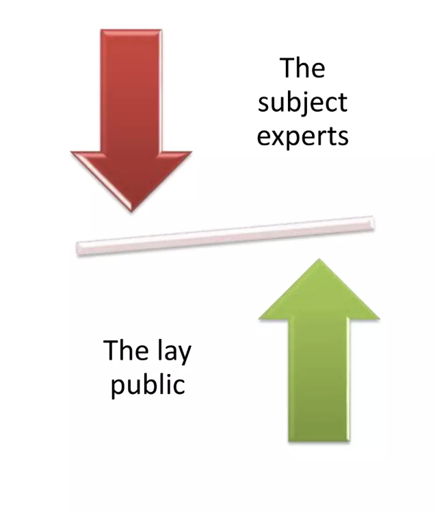
So risk communication is the real-time exchange of information, advice, and opinions between experts and individuals facing threats to their well-being. Its purpose is to help people make informed decisions to mitigate the effects of hazards, such as disease outbreaks, and to adopt protective measures.

The Role of Community Engagement

Community engagement is about developing relationships and structures that involve communities as equal partners in creating emergency response solutions. It empowers communities to take an active role in planning and implementing health emergency responses. Lessons learned from past emergencies show that integrating risk communication with community engagement leads to more effective, equitable, and inclusive preparedness and response efforts. 
Risk communication and community engagement works alongside other technical areas to ensure that accurate information is delivered to communities in ways that are acceptable and workable for them. nse efforts.

The Process of Risk Communication

Risk communication involves explaining critical information in ways that enable people to make informed decisions about risks to their health, safety, and or environment. It is not merely a one-way transfer of information but a dynamic, multi-directional process involving ongoing engagement among stakeholders. This is crucial, especially when risks are uncertain or rapidly changing.

Goals and Challenges

The goals of risk communication vary. For users, it helps understand risks and benefits, while for institutions, it minimizes disputes and prevents communication breakdowns. However, firms often struggle to create communications that are both legally compliant and beneficial for users. Effective risk communication should aim to build trust, foster consensus, and support risk management decisions.

Making It Work

Effective risk communication requires identifying and understanding the audience, crafting clear messages, and selecting appropriate communication methods. While it may not guarantee consensus on risk management approaches, it enhances community involvement, raises awareness of public perceptions, and clarifies how risk assessments inform decision-making.

Conclusion

Risk communication is essential for empowering communities to make informed decisions during emergencies. By fostering trust and ongoing engagement, it contributes to more effective and inclusive risk management strategies, ultimately enhancing community resilience.

1.2. How Interactive Technologies Shape Visitor Experiences

Technology is redefining the museum experience, turning static exhibitions into engaging, immersive journeys. By integrating tools such as augmented and virtual reality (AR/VR), interactive tables, projection mapping, and motion-sensing installations, museums offer visitors innovative ways to engage with their collections. These advancements not only entertain but also enhance learning, accessibility, and emotional connection.

Interactive spaces/Projection Mapping

Interactive spaces and projection mapping are transforming traditional museum visits into dynamic, multi-sensory experiences, engaging visitors through immersive storytelling and tactile exploration. At the Experimentarium in Copenhagen, the Interactive Film Theatre [1] combines live-action sequences and projection mapping to create a participatory cinematic experience. Visitors influence the story’s direction by interacting with physical objects in the space, blending narrative and interactivity seamlessly.

Similarly, the Exploratorium’s Tactile Dome [2] in San Francisco invites guests to navigate a completely dark, hands-on environment, emphasizing touch as the primary sense. These spaces demonstrate how interactive design and innovative technologies deepen engagement, making museum experiences more memorable and accessible.

Interactive Tables/ Touchscreens

Interactive tables and touchscreens offer hands-on learning, allowing visitors to explore exhibits through intuitive gestures. At Tokyo’s Miraikan, the Geo-Cosmos Geo-Scope [3] connects a touch-sensitive table to a global display, enabling users to navigate real-time data on climate, disasters, and human activity. These tools simplify complex topics, making museum visits both engaging and memorable.

Similarly, the ARTLENS Wall [4] at the Cleveland Museum of Art features a massive touchscreen where visitors can explore the entire collection, learn about artworks in depth, and curate personalized tours. These tools make complex information accessible, blending education and engagement seamlessly.

Augmented Reality (AR) and Virtual Reality (VR)

AR enriches exhibits by overlaying digital content onto physical artifacts, offering interactive and educational experiences. Visitors can access additional information, animations, and reconstructions, making learning more dynamic and accessible. For instance, The Science Museum Group’s Wonderlab AR [5] app encourages students to explore scientific concepts interactively, even outside of the museums. It helps them connect with the real world and understand the scientific innovations that shape everyday objects and our lives.

VR provides immersive, interactive exhibits that allow exploration of historical sites, distant cultures, and intricate details of artifacts that might be inaccessible in physical form. The CoSA – Center of Science Activities in Graz features “ARdventure,” [6] a VR and AR experience where visitors solve puzzles and interact with a digital world to learn about science and technology in an engaging and innovative way.

Benefits and Drawbacks [7], [8]

Benefits

  1. Accessibility: Digital collections, virtual tours, and mobile apps expand access, especially for remote audiences or those with disabilities.
  2. Immersive Learning: AR, VR, and interactive exhibits offer deeper engagement, making learning interactive and fun. VR enhances experiences with first-person, immersive perspectives.
  3. Enhanced Experience: AI personalizes visits, while citizen science and crowdsourcing foster community involvement.
  4. Sustainability: Museums are adopting eco-friendly practices, such as energy-efficient lighting and sustainability-focused exhibits.
  5. Wider Reach: Social media and online events keep museums connected with global audiences, promoting engagement and participation.

Drawbacks

  1. High Costs: AR, VR, and 3D technologies are costly to implement and maintain, with significant expenses for hardware, software, and content creation.
  2. Access and Usability Issues: Not all visitors have the technology or skills for digital experiences, and VR may be difficult for older adults or those with disabilities due to motion sickness or discomfort.
  3. Technical and Hygiene Problems: Museums face equipment malfunctions and hygiene concerns with shared VR gear, requiring frequent cleaning and the use of disposable masks.
  4. Distraction from Core Content: VR can overshadow physical exhibits, diverting attention away from the museum’s educational offerings.
  5. Health and Social Impact: Prolonged VR use may cause discomfort like eye strain or headaches, and virtual experiences can reduce social interaction and engagement typically found in physical visits.

A Vision for the Future

As technology continues to evolve, the possibilities for museums are endless. Interactive technologies in museums are likely to evolve toward more immersive, personalized, and accessible experiences. AR, VR, and AI will enhance engagement, offering tailored content and real-time interactions. As these technologies become more affordable, they will seamlessly integrate with physical exhibits, creating mixed-reality experiences. The focus will also be on sustainability and inclusivity, ensuring that all visitors can benefit. In conclusion, the future will blend digital and physical experiences, transforming how we engage with cultural content, though challenges like cost and accessibility will need careful attention.

Sources

  1. Experimentarium, “The Interactive Film Theatre.” [Online]. Available: https://www.experimentarium.dk/the-interactive-film-theatre/. 
  2. Exploratorium, “Tactile Dome.” [Online]. Available: https://www.exploratorium.edu/exhibits/tactile-dome.
  3. Miraikan, “Geo-Cosmos: The World in Real-Time,” National Museum of Emerging Science and Innovation. [Online]. Available: https://www.miraikan.jst.go.jp/en/exhibitions/tsunagari/geo-scope/. 
  4. Cleveland Museum of Art, “ARTLENS Wall,” ARTLENS Gallery. [Online]. Available: https://www.clevelandart.org/artlens-gallery/artlens-wall.
  5. Science Museum Group, “Wonderlab AR,” Learning Resources. [Online]. Available: https://learning.sciencemuseumgroup.org.uk/resources/wonderlab-ar/
  6. CoSA Graz, “ARdventure.” [Online]. Available: https://www.museum-joanneum.at/cosa-graz/ardventure.
  7. MuseumNext, “The Disadvantages of Using Virtual Reality in Museums,” MuseumNext. [Online]. Available: https://www.museumnext.com/article/the-disadvantages-of-using-virtual-reality-in-museums/.
  8. MuseumNext, “What Are the Innovations of Museums?” MuseumNext. [Online]. Available: https://www.museumnext.com/article/what-are-the-innovations-of-museums/.

Small Details, Big Impact: How Microinteractions Keep Users Engaged

Those small, subtle animations or responses embedded in user interfaces are quietly revolutionizing digital design. These seemingly minor details can make or break an experience by holding user focus and adding delight, particularly when catering to short attention spans.

Let’s take a look into what microinteractions are, their role in maintaining user engagement, and how to implement them effectively.

What Are Microinteractions?

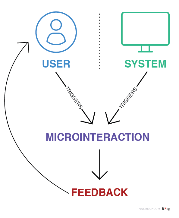
Microinteractions are small, contained product moments designed to accomplish a single task or provide feedback. Think of the “like” button on Instagram, the loading animation on YouTube, or the vibration your phone makes when toggling between modes.

They might seem insignificant, but their power lies in their ability to provide feedback, enhance usability, and inject personality into digital products.

Role in UX Design:

  • Feedback: Inform users that an action has been completed successfully (a checkmark when a form is submitted)
  • Guidance: Show users what to do next or highlight key features (animated tooltips)
  • Engagement: Create moments of delight to keep users intrigued

How Microinteractions Hold User Focus

Microinteractions work particularly well for short attention spans because they provide:

  1. Instant Feedback: Users are reassured their action has been registered. For example, a thumbs-up animation confirms a “like”
  2. Seamless Transitions: Animations such as loading skeleton screens (which mimic the layout of the actual content) make waiting feel shorter than traditional spinners
  3. Engagement Through Playfulness: A well-placed animation can surprise and delight users, creating positive reinforcement to keep interacting

Best Practices for Microinteractions in Short Attention Spans

  1. Keep It Subtle: Avoid overloading the interface with animations, they should enhance, not distract.
  2. Prioritize Speed: Ensure microinteractions are fast and efficient, aligning with the limited patience of today’s users
  3. Make Them Functional: Delightful design is essential, but utility should remain the priority.
  4. Test and Iterate: Regularly test microinteractions to ensure they’re intuitive and effective for your audience


Literature:

https://medium.com/@aemd2donchev/enhancing-user-engagement-with-advanced-micro-interactions-a-deep-dive-into-an-essential-web-d9040772f235

https://ruttl.com/blog/enhancing-user-engagement-and-satisfaction

https://uxdesign.cc/micro-interactions-why-when-and-how-to-use-them-to-boost-the-ux-17094b3baaa0

https://www.interaction-design.org/literature/article/micro-interactions-ux?srsltid=AfmBOoqKKY1EVplgrHsOAcIs2V444EiTtmizTwvCjw6biE0720ujLp3i

https://www.nngroup.com/articles/microinteractions

1.6 How AI Is Reshaping Mental Health Support

Artificial intelligence is revolutionizing mental health care by breaking down barriers like cost, stigma, and accessibility. With features like chatbots, biofeedback, and voice analysis, AI offers innovative solutions for mental health support. While AI can’t replace human therapists, its ability to complement traditional care makes it a valuable tool.

Venture capital reports reveal that mental health is the fastest-growing marketplace category, with a growth rate exceeding 200% in 2023. This surge reflects a rising demand for accessible mental health solutions as AI continues to play a critical role in meeting that need.

How AI Powers Mental Health Apps

AI-Driven Chatbots

AI chatbots provide immediate, tailored support for users in need:

  • Wysa offers CBT-based exercises and mindfulness prompts, creating a safe space for users to manage stress and anxiety.
  • Woebot adapts its conversations to users’ emotions, providing tools for real-time mental health management.
  • Cass combines emotional support and psychoeducation, offering adaptive responses that cater to individual needs.

In May 2024, Inflection AI launched Pi, a bot designed for emotional support and conversational companionship. Unlike other chatbots, Pi openly acknowledges its limitations, avoiding the pretense of being human while focusing on honest and straightforward interactions.

Wearables and Biofeedback

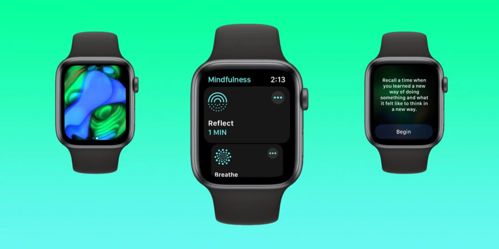
Wearable devices enhance AI’s ability to provide real-time insights into users’ mental states:

  • Moodfit and Spring Health use wearable data, like heart rate and stress levels, to deliver personalized mental health strategies.
  • Kintsugi analyzes vocal biomarkers to detect signs of anxiety or depression, offering users actionable insights based on their voice patterns.
Image Source: 9to5Mac

These integrations bridge the gap between physical and emotional health, empowering users to take control of their well-being.

Opportunities in AI Mental Health Care

AI’s advantages lie in its ability to make mental health support more accessible, personalized, and inclusive:

  • Immediate and affordable: tools like Headspace’s Ebb and Wysa provide around-the-clock support at a fraction of the cost of traditional therapy.
  • Engagement and effectiveness: a 2022 review found that AI tools could improve engagement and reduce symptoms of anxiety and depression. However, experts emphasize that AI works best as a supplement, not a substitute, for traditional therapy. As Dr. Chris Mosunic of Calm explains, “Having a human in the driver’s seat with improved therapy AI tools might be just the right blend to maximize engagement, efficacy, and safety.”
  • Personalized support: apps like Woebot and Youper adapt their recommendations to the user’s changing emotional needs, creating a more tailored experience.
Image Source: Business Wire

Challenges and Ethical Considerations

While AI offers promising solutions, it also presents challenges:

  • Limited empathy: AI tools often lack the emotional depth of human therapists, which can leave users feeling unsupported in complex situations.
  • Bias and inclusivity: non-diverse training data can lead to biased responses, potentially failing marginalized communities that rely more heavily on these tools due to systemic barriers.
  • Privacy concerns: AI tools require access to sensitive data. Apps like Talkspace use encryption to protect user information, but trust in data security remains a significant hurdle.

As these tools evolve, balancing innovation with ethical responsibility will be critical – a topic that will be explored further in upcoming articles.

Sources

  1. A. Fiske, P. Henningsen, & A. Buyx. (2019). Your robot therapist will see you now: Ethical implications of embodied artificial intelligence in psychiatry, psychology, and psychotherapy. Journal of Medical Internet Research, 21(5), e13216. https://doi.org/10.2196/13216
  2. A. Thakkar, A. Gupta, & A. De Sousa. (2024). Artificial intelligence in positive mental health: A narrative review. Frontiers in Digital Health, 6. https://doi.org/10.3389/fdgth.2024.1280235
  3. “Can AI help with mental health? Here’s what you need to know.” Calm. Accessed: Jan. 4, 2025. [Online.] Available: https://www.calm.com/blog/ai-mental-health
  4. “Meet Ebb | AI Mental Health Companion.” Headspace. Accessed: Jan. 4, 2025. [Online.] Available: https://www.headspace.com/ai-mental-health-companion
  5. P. Gual-Montolio, I. Jaén, V. Martínez-Borba, D. Castilla, & C. Suso-Ribera. (2022). Using artificial intelligence to enhance ongoing psychological interventions for emotional problems in real- or close to real-time: A systematic review. International Journal of Environmental Research and Public Health, 19(13), 7737. https://doi.org/10.3390/ijerph19137737
  6. “Rise of AI therapists.” VML. Accessed: Jan. 4, 2025. [Online.] Available: https://www.vml.com/insight/rise-of-ai-therapists

Importance of (UX-) Design in Risk communication  

Introduction 

Last September, Austria experienced a devastating flood event, highlighting the growing impact of simultaneous and systemic crises like climate change, armed conflicts, and pandemics. These events cause massive damage and disrupt lives, yet understanding and utilizing technical data to prepare for such crises often remains a significant challenge. 

To address this, the “RiskLIM” project, spearheaded by the Safety and Disaster Studies working group at Montanuniversität Leoben, aims to optimize cross-border climate services. By collaborating with organizations such as GeoSphere Austria, the German Weather Service, and the Avalanche Warning Centre, this EU-funded initiative focuses on creating actionable risk impact assessments, particularly for avalanches and snow loads. The project emphasizes bridging the gap between technical data and effective communication to better equip society for short-term hazards and long-term climate adaptation. 


Personal motivation 

As a graphic designer and content creator at the Montanuniversität Leoben, I’ve had the privilege of exploring diverse research fields, gaining valuable insights into how visual communication can simplify complex concepts. My interest in safety and disaster studies was piqued early on, particularly through discussions with the program coordinator. These conversations opened the door to integrating design into risk communication, shaping the idea of developing a master’s thesis around this critical topic. 

This intersection of research and design is incredibly compelling to me. Visual communication isn’t just about aesthetics; it’s a tool to make technical information understandable and actionable, especially in high-stress situations where clarity and usability can save lives. 


Design relevance  

Effective risk communication is more than just disseminating information; it’s about ensuring the right message reaches the right audience in a manner they can understand and act upon. Interaction design offers powerful tools to achieve this goal by simplifying interfaces, prioritizing critical information, and addressing the user’s state of mind during crises. 

For example, interactive maps can visualize real-time risk data, helping individuals and organizations make informed decisions. By employing principles of user experience (UX) design—such as clarity, accessibility, and user-centered design—these tools can transform how communities respond to emergencies. This approach aligns seamlessly with the objectives of the RiskLIM project, providing a unique opportunity to enhance risk communication through design. 


Possible Research Questions 

Since I haven’t yet gained much insight into the project and don’t know exactly in which direction it is developing, it is difficult to formulate a precise research question. That’s why I thought very generally and asked myself the following questions: 

  • How can visual design improve the accessibility and comprehension of technical data in risk communication? 
  • What role does interactive design play in facilitating community preparedness for natural hazards? 
  • How can user experience principles be adapted to meet the challenges of high-stress scenarios in risk communication? 

Expected Challenges 

Working with scientific experts: Collaboration with experts from technical fields who may not fully understand the potential of design could pose challenges. Bridging this gap will require careful communication and showcasing how design complements their expertise. Additionally, gathering feedback from diverse user groups to create universally accessible tools might demand extensive testing and iteration. 

Knowledge Gap: Gaining in-depth understanding of risk communication and technical aspects of the project may require extensive self-study. 


Next steps  

My plan to move forward: 

  1. Deepen my understanding of risk communication and its existing methodologies. 
  1. Engage with the RiskLIM project team to identify key areas where design can add value. 
  1. Develop prototypes, such as interactive maps, to demonstrate how UX design can enhance risk communication. 

Links 

The project: https://www.sds-unileoben.at/risklim-2/ 

A. Cleaveland, G. Gordon, J. Newman and S. Weber, “Designing Risk Communications,” University of California, Berkeley, Dec. 2020, doi: https://cltc.berkeley.edu/wp-content/uploads/2020/12/Designing_Risk_Communications.pdf 

Demographic Differences: Crafting Engagment for Diverse Users with Short Attention Spans

The way users engage with digital interfaces isn’t just shaped by their fleeting focus – it’s also influenced by demographic factors such as age, gender, income, education, and cultural background. Designing for short attention spans requires not only an understanding of cognitive psychology but also a keen awareness of the diverse needs and preferences of different user groups.

This blog explores the impact of demographics on UI/UX design, offering strategies for creating inclusive and effective digital experiences tailored to varied audiences.

1. Age: Designing for Generational Differences

Young Users (Gen Z and Millennials):
These groups are digital natives accustomed to fast interactions, intuitive designs, and visually engaging content. Platforms like TikTok and Instagram exemplify their preference for micro-content and gamified elements.

  • Key Strategy: Use dynamic visuals, animations, and bite-sized content. Gamification features such as badges and rewards can extend engagement without overwhelming users.

Older Adults (Baby Boomers and Seniors):
Older users often require simpler interfaces with clear navigation and larger touch targets. They value functionality over novelty and are less likely to experiment with unfamiliar features.

  • Key Strategy: Prioritize readability with larger fonts, high contrast, and intuitive design patterns. Avoid clutter, and include guided onboarding for new users.

2. Gender: Preferences in Visual and Functional Design

Gender differences can subtly influence design preferences. For example, studies show that women often prefer clean, visually appealing layouts, while men may lean toward functionality and performance-driven interfaces.

  • Key Strategy: Conduct gender-inclusive research and testing. Avoid stereotypical design choices (color-coding pink and blue), and focus on accessibility and usability for all genders.

3. Income Level: Accessibility and Aspirational Design

Users from different income brackets approach digital products with varied expectations and constraints. Lower-income users may prioritize functionality and affordability, while higher-income users might seek premium aesthetics and advanced features.

  • Key Strategy: For budget-conscious users, focus on essential features and avoid unnecessary complexity. For higher-income audiences, invest in polished visuals and personalized experiences.

4. Education: Designing for Diverse Knowledge Levels

Education shapes how users interact with interfaces, especially in terms of content comprehension and task complexity. Highly educated users may appreciate advanced tools and in-depth information, while less educated users benefit from straightforward language and guided interactions.

  • Key Strategy: Incorporate progressive disclosure, where advanced options are hidden until needed. Use plain language and visual aids to ensure clarity across all education levels.

5. Cultural Background: Localization and Cross-Cultural Design

Culture significantly influences how users process information and engage with digital products. Western users often favor minimalist aesthetics and fast-paced interactions, while Eastern users may appreciate rich, information-dense layouts.

  • Key Strategy: Localize your design for different regions by adapting color schemes, typography, and information density to match cultural expectations.

Literature:

Cross Cultural Design by Senongo Akpem

Cross Cultural Design – Nielsen Norman Group:
https://www.nngroup.com/articles/crosscultural-design

https://digital.gov/topics/usability

Age Groups:

Cognitive Load and the Hook Model by Nir Eyal

What is Cognitive Load?

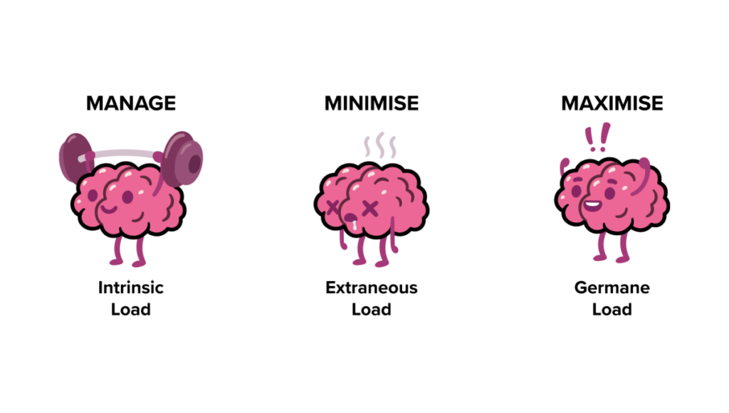
Cognitive load refers to the amount of mental effort required to process and interact with information. It’s rooted in cognitive psychology and is often categorized into three types:

  1. Intrinsic Load: The inherent complexity of the task itself. For example, learning advanced physics naturally requires more effort than reading a children’s book.
  2. Extraneous Load: Unnecessary complexity introduced by poor design, such as cluttered layouts or unclear instructions. This is where designers have the most control.
  3. Germane Load: The effort devoted to learning or understanding something meaningful, which is essential for building knowledge and skills.

In UI/UX design, minimizing extraneous load while optimizing germane load is key to creating intuitive and enjoyable experiences.

The Psychological Foundation of Cognitive Load

The concept is deeply tied to working memory, a limited resource that processes and holds information temporarily. According to Miller’s Law, humans can hold about 7 (plus or minus 2) items in their working memory at a time. When users are presented with overly complex interfaces, their working memory becomes overwhelmed, leading to frustration and disengagement.

Strategies to Reduce Cognitive Load in Design
Designers can make tasks easier by focusing on these principles:

  1. Simplify Navigation
    • Using clear pathways and avoid hidden menus
    • Example: Amazon’s one-click purchasing reduces decision fatigue
  2. Employ Progressive Disclosure
    • Show information only when users need it. For instance, a sign-up form that breaks into multiple steps feels less overwhelming than one with all fields displayed at once
  3. Leverage Visual Hierarchy
    • Use size, color, and spacing to guide focus. Bold headings, contrasting buttons, and whitespace can help users prioritize key actions
  4. Chunking Information
    • Break content into digestible pieces, similar to paragraphs in a book
    • Example: Spotify organizes songs into playlists, making it easier for users to find their favorites


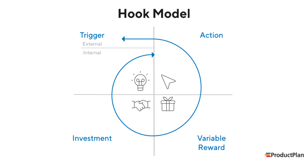
The Hook Model: Turning Attention into Habits

Once cognitive load is minimized, designers can focus on engaging users more deeply through Nir Eyal’s Hook Model. This four-step process transforms interactions into habits:

  1. Trigger
    • External: Notifications, reminders, or prompts (e.g., a Duolingo streak notification).
    • Internal: Emotional cues like boredom or loneliness, which lead users to open an app instinctively.
  2. Action
    • Simplify actions to reduce friction. A swipe on Tinder or a tap on Instagram’s heart icon feels effortless.
  3. Variable Reward
    • Unpredictability enhances engagement. For example, social media likes or gaming loot boxes keep users coming back.
  4. Investment
    • Encourage users to invest time or effort, making them more likely to return. Examples include creating Pinterest boards or uploading photos to Google Photos.

Literature:

Cogitive Load:
https://www.barefootteflteacher.com/p/what-is-cognitive-load-theory

https://www.interaction-design.org/literature/topics/cognitive-load?srsltid=AfmBOorxdSOspYzd9iiUNoqJMX98LoCbl-tSMbZI7iAFoIc9BH2h2D69

Hooked: How to Build Habit-Forming Products by Nir Eyal

Miller’s Law:
https://medium.com/design-bootcamp/simplifying-complexity-demystifying-millers-law-in-ux-design-7-2-49db4fa8346a#:~:text=Miller’s%20law%20states%20that%20the,human%20memory%20and%20cognitive%20processing.

Hook:
https://inappstory.com/blog/mobile-native-hooks-and-triggers

The Power of Visual Hierarchy in Capturing Attention

In a world of fleeting attention spans, visual design is not just a supporting player – it’s the lead actor in guiding user focus. Whether it’s a landing page, an app interface or an online form, the way information is visually presented can make or break user engagement. Let’s explore how visual hierarchy helps capture attention and simplify user interaction.

Why Visual Hierarchy Matters

Visual hierarchy is the arrangement of elements in a way that suggests importance and guides the viewer’s eye. Steve Krug, in his book “Don’t Make Me Think“, emphasizes that users scan web pages, they don’t read them. This means designers must make the most crucial elements stand out immediately, leading users seamlessly through a page or app.

For short attention spans, clarity is key. A cluttered or confusing interface demands too much cognitive load, causing users to disengage. By establishing a clear hierarchy, you can reduce mental effort and keep users focused on what matters.

Techniques for Effective Visual Design

Here are actionable techniques to create visual designs that capture and hold attention:

  1. Typography: Use font sizes and weights to differentiate headings, subheadings, and body text. A bold headline grabs attention, while smaller, lighter text provides supporting details.
  2. Color Contrast: Colors are powerful cues. High contrast between text and background improves readability, while accent colors draw attention to CTAs.
  3. Spacing: Adequate whitespace (or negative space) helps declutter layouts, giving users visual breathing room.
  4. Iconography and Imagery: Icons and images act as visual shortcuts, instantly conveying meaning. However, ensure they align with the context and don’t overwhelm the design.
  5. Consistent Alignment: Align elements cleanly to establish order and predictability, making navigation intuitive.

Examples: Good vs. Bad Visual Hierarchy

Good Example: Apple’s website showcases excellent visual hierarchy, using bold headlines, simple imagery, and plenty of whitespace to guide attention to its products.

Bad Example: Overloaded landing pages with flashing banners, competing colors, and tiny fonts (think early 2000s design) overwhelm users and make key information hard to find.

A Human-Centered Approach
Ultimately, good visual design isn’t just about aesthetics – it’s about empathy. Understanding how users perceive and process information ensures that your designs meet their needs while respecting their attention.

Literature:

“Don’t Make Me Think” by Steve Krug

Dark Patterns in Attention Design

Is grabbing user attention always ethical?

In the race to capture user attention, some designs cross a critical ethical line. These manipulative tactics, often referred to as dark patterns, exploit human psychology to benefit businesses at the expense of users. Let’s dive into examples where engagement becomes exploitation and why designers must tread carefully when wielding the power of attention design.

The Netflix Gamification Experiment

Netflix once tested a feature that gamified TV watching for kids. By introducing “patches” as rewards for every show or movie watched, they encouraged children to binge content. The more they watched, the more patches they earned—a clever yet ethically questionable move. Critics argued this design preyed on children’s psychology, fostering addictive behavior under the guise of fun. After backlash, Netflix scrapped the idea.

Why It Matters:
This is a clear example of using gamification not to enhance experiences, but to trap users into spending more time on the platform.

Social Media’s Infinite Scroll

Social media platforms like Instagram and TikTok use the infinite scroll feature to keep users endlessly consuming content. This design taps into a psychological phenomenon known as the “novelty-seeking” bias – the constant pursuit of something new. As a result, users often spend hours scrolling without realizing it.

Why It Matters:
While it boosts engagement metrics, infinite scroll often leaves users feeling drained and unproductive, raising questions about its long-term impact on mental health.

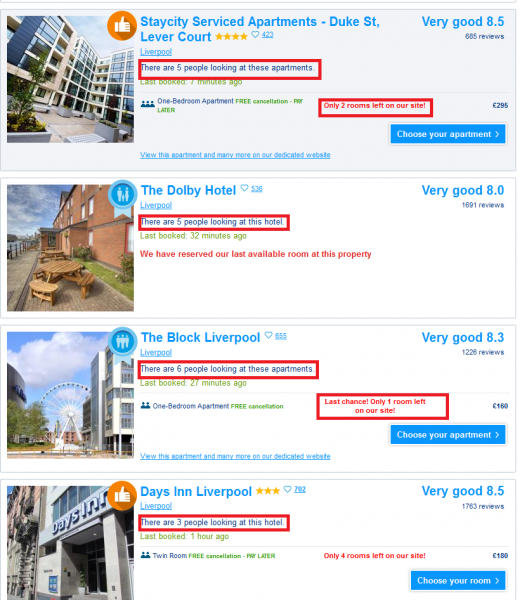
E-Commerce and Fake Scarcity

Online retailers frequently use fake scarcity tactics like “Only 2 items left in stock!” or countdown timers during sales. These practices create a sense of urgency, manipulating users into making impulsive purchases out of fear of missing out.

Why It Matters:
While effective for increasing sales, such tactics can lead to buyer’s remorse and erode trust in the platform.

Mobile Game Microtransactions

Many mobile games use dark patterns to encourage spending. For instance, games often use loot boxes – randomized rewards players pay for without knowing what they’ll get. This taps into the psychology of gambling, exploiting players desires for rare or valuable items.

Why It Matters:
Loot boxes have been criticized for targeting vulnerable groups, particularly children, and leading to financial exploitation.

Positive Examples: Ethical Attention Design

Not all attention-focused designs are manipulative. Companies like Nintendo and Apple are taking steps to address attention ethics:

Nintendo: The company included built-in reminders in its consoles to encourage players to take breaks, especially in family-oriented games like Animal Crossing. (don’t know if they’re still doing it)

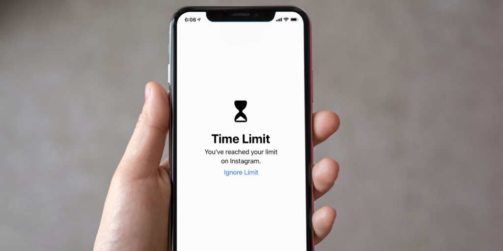
Apple Screen Time: iPhone’s Screen Time feature provides detailed insights into how users spend their time, empowering them to set limits and make informed decisions about their digital habits.

These examples show how design can promote healthier interactions with technology, respecting user autonomy while fostering engagement.

As designers, we hold significant influence over how people interact with technology. Let’s use it responsibly.

Literature:

Talk by Victor Yocco (UX Burlington 2019)
https://www.youtube.com/watch?v=6WBS6YYMAcE

Infinite Scroll:
https://uxdesign.cc/why-the-infinite-scroll-is-so-addictive-9928367019c5

Netflix Patch:
https://www.digitaltrends.com/movies/netflix-tests-patches-for-kids/

Good source about types of scarcity:
https://uxdesign.cc/5-types-of-scarcity-how-to-influence-anyone-using-these-7f309d328dbb

can also recommend “the social Dilemma” on Netflix