Reading the Signs: An Analysis of the SLF Early Warning System

In alpine regions, where snow and avalanche hazards can pose significant risks to both residents and visitors, early warning systems are indispensable. The WSL-Institut für Schnee- und Lawinenforschung (SLF) has developed an early warning system designed to inform and protect those in high-risk areas. Today, I want to dive into this system, exploring its design, functionality, and overall effectiveness in communicating risk.

Why Early Warning Systems Matter
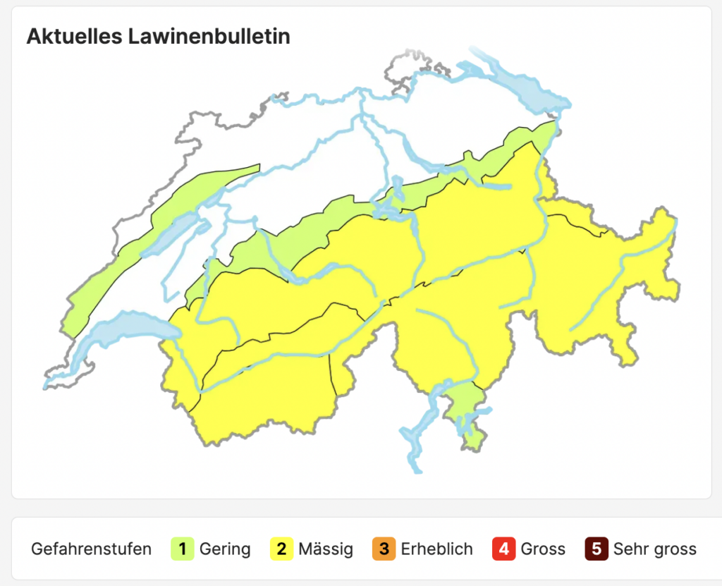
In mountain regions, conditions can change in a matter of minutes. With avalanches and heavy snowfall posing serious threats, timely and accurate information is critical. Early warning systems aim to provide real-time updates on weather and hazard conditions so that individuals and communities can take proactive steps to safeguard lives and property. The SLF system, available at whiterisk.ch/de/conditions, is a prime example of how technology and design converge to make these life-saving communications possible.

Overview of the SLF Early Warning System

The SLF early warning system is dedicated to monitoring and reporting conditions related to snow and avalanches. Upon visiting the site, users are greeted with clear information about current conditions. The interface is designed to provide essential details at a glance—weather forecasts, risk levels, and recent changes in avalanche conditions. The system categorizes risk levels in an accessible manner, often using color-coding and icons that immediately convey the severity of the situation.

The website’s design focuses on simplicity and clarity. The information is structured so that even non-experts can quickly understand the current risk and decide on necessary actions. By providing regular updates, the system ensures that users remain informed as conditions evolve.

Design and Usability: Strengths and Opportunities

One of the SLF system’s standout features is its user-centered design. The layout is intuitive, and the color schemes used to indicate different risk levels are both aesthetically pleasing and functionally effective. This design choice not only helps capture users’ attention but also makes the data easily digestible. For instance, a red icon immediately signals a high-risk condition, while milder colors suggest more stable conditions.

The site also employs responsive design principles, ensuring that users can access critical information on various devices—whether they’re checking conditions on a smartphone while on a mountain or at home on a desktop. This flexibility is essential in emergency situations, where quick access to information can be life-saving.

However, there are areas where the system could further enhance its impact. While the information is clear, integrating interactive elements—such as dynamic maps or customizable alerts—could empower users to engage more deeply with the data. Imagine a feature where you could input your location to receive personalized risk assessments or projections for your specific area. This level of customization could further bridge the gap between raw data and actionable insights.

Connecting SLF to the Broader Landscape of Risk Communication

The SLF early warning system fits into a broader trend of leveraging data visualization and interactive design for risk communication. Similar to NASA’s Climate Time Machine or Ed Hawkins’ “Show Your Stripes” visualization, the SLF system demonstrates how well-designed data presentations can make complex information accessible and compelling. By turning technical data into clear visual cues, the SLF system not only informs but also prepares communities to respond appropriately to imminent hazards.

Moreover, by emphasizing clarity and immediacy, the SLF system aligns with the goals of projects like RiskLIM, which focus on making climate risk information both understandable and actionable. The lessons learned from SLF’s design—such as the importance of simplicity, responsive design, and the potential for interactive features—can serve as valuable insights for any project aiming to enhance risk communication.

The Future of Early Warning Systems

The SLF early warning system is a powerful tool in the ongoing effort to protect communities in alpine regions from snow and avalanche hazards. Its clear, user-friendly design exemplifies how data visualization can transform complex scientific data into actionable, life-saving information. While there is always room for improvement—particularly in the realm of interactivity and personalization—the SLF system sets a high standard for early warning tools.

As we continue to face the challenges posed by climate change, the integration of effective risk communication and innovative design will be crucial. Systems like SLF remind us that when data is presented in an accessible, engaging way, it can not only inform but also inspire action. For designers and researchers alike, these systems offer a roadmap to creating even more impactful tools that make the invisible dangers of our world visible and, ultimately, manageable.


Research
https://whiterisk.ch/de/conditions

https://www.slf.ch/de

UVP as the Foundation for Meaningful Design

A Unique Value Proposition (UVP) is a critical element in UI/UX design because it defines what makes a product stand out in a competitive marketplace. It communicates why users should choose your product over others and addresses a specific need or pain point in a way that no other competitor does. When properly integrated into UI/UX design, a strong UVP can significantly enhance the user experience, build trust, and drive engagement. Here’s how UVP plays a crucial role in UI/UX design:

1. Clear Communication of Benefits

The UVP helps clarify the key benefits of a product, guiding the design team to create experiences that directly highlight these benefits for users.

  • UI/UX Role: A good UI/UX design ensures that the core benefits of the product are front and center. This is reflected in design elements such as calls to action (CTAs), navigation, and content hierarchy. By making the UVP the focal point of the design, users quickly understand what the product offers and why it matters to them. The design should minimize confusion and guide users toward the value that differentiates your product.Example: On Dropbox’s website, their UVP is clearly communicated with the statement “Simplify your workflow.” This message is immediately visible and supported by simple, intuitive UI elements, making it clear what Dropbox’s core benefit is. The user flow is designed to highlight this value at each step (e.g., the simple process of uploading and sharing files).

2. Guiding Product Features and Functionality

The UVP directly influences the product’s features, helping ensure that the features designed and developed are aligned with user needs. This alignment creates a product experience that resonates more deeply with users.

  • UI/UX Role: In UI/UX design, focusing on the UVP means emphasizing the key features that support the value proposition. This could be done through design choices like user onboarding, feature prioritization, and ensuring features are easy to find and use. The interface should not be overloaded with features that don’t contribute to the UVP.Example: Evernote’s UVP focuses on helping users “Remember Everything.” This is reflected in its design, where all features—note-taking, organization, search, and syncing across devices—are designed with this core purpose in mind. The UI is simple, with clearly defined sections for creating, searching, and organizing notes, ensuring users can quickly find the value in the product.

3. Differentiation in a Competitive Market

A well-articulated UVP helps a product stand out in a crowded market. It conveys the unique advantages your product has over competitors, whether it’s ease of use, advanced features, customization, or cost-efficiency.

  • UI/UX Role: Design can emphasize differentiation by using unique visual elements, interactive features, or personalized experiences that support the UVP. For example, custom animations, bold color choices, or a particular design language can reflect the brand’s unique positioning. The UI and UX should consistently reinforce how your product is different from others in a way that’s meaningful to users.Example: Slack’s UVP is to make team communication faster, simpler, and more organized. The design supports this by providing an intuitive, chat-like interface, allowing users to quickly access channels, direct messages, and integrations—all while keeping the interface clean and easy to navigate. The distinct visual design (e.g., colorful and playful elements) helps it stand out from more traditional, business-focused tools like email.

4. Trust Building and User Confidence

A UVP is closely tied to the credibility and trustworthiness of a product. If the UVP is clear, realistic, and promises real value, users are more likely to feel confident in using the product.

  • UI/UX Role: The design can enhance this trust by making the user interface clean, reliable, and predictable. Offering clear feedback, intuitive interactions, and a smooth flow from one step to the next ensures that the user feels comfortable and confident in their actions. Trust-building elements such as testimonials, secure payment gateways, or clear privacy policies should also be visually incorporated into the design.Example: Airbnb’s UVP focuses on “Belong Anywhere,” offering unique and local travel experiences. Their design builds trust through user reviews, secure booking interfaces, and clear policies about safety. This reassures users that they can rely on Airbnb for both quality and safety during their travels.

5. Consistency Across Touchpoints

A strong UVP ensures coherence across all user touchpoints, including mobile apps, websites, customer support, and marketing materials. Consistency in how the UVP is represented in design creates a seamless experience and reinforces the product’s promise.

  • UI/UX Role: UI/UX design ensures that the UVP is consistently communicated across all screens and platforms. Whether users are interacting with a product via a mobile app or desktop website, the design should make sure the UVP is present in every interaction and aligned with the user’s journey.Example: Apple’s UVP is centered around the premium, seamless experience of their devices. The design of Apple products—whether on an iPhone, MacBook, or in-store—always reflects this message with minimalist design, smooth transitions, and intuitive interactions that emphasize the premium user experience.

6. Simplifying the Decision-Making Process

A strong UVP helps users make decisions more quickly by showing them the most relevant information right away, which speeds up their journey to conversion (e.g., sign-up, purchase, or other key actions).

  • UI/UX Role: In UI/UX design, this is achieved through clarity and simplicity. A good UVP should be showcased prominently in the hero section of a webpage or first screen of an app, so users immediately understand why they should continue exploring the product. Additionally, design elements such as progress indicators or easy-to-understand CTAs help users make decisions without feeling overwhelmed.Example: Dropbox’s sign-up page showcases the UVP (“Simplify your workflow”) with a minimalist design and clear CTAs. The design eliminates distractions, making the path to sign-up very straightforward.

7. Enhanced User Retention and Engagement

A UVP that is deeply ingrained in the UI/UX design not only attracts users but also keeps them engaged by continually reminding them of the value they’re receiving. A strong UVP encourages users to return to the product because it consistently addresses their needs in a way that’s unique and impactful.

  • UI/UX Role: Good design ensures that the UVP is consistently reinforced through visual feedback, personalization, and easy navigation. Whether through notifications, reminders, or a personalized dashboard, the UI keeps reinforcing the core value of the product.Example: Spotify’s UVP revolves around personalized music recommendations and easy access to music. Their design focuses on creating a personalized listening experience, with features like Discover Weekly and Daily Mixes that keep users coming back, as the app constantly delivers new and tailored content based on their preferences.

8. Emotional Connection

A UVP is not just about features and benefits—it’s also about the emotional connection the product establishes with the user. When a product speaks to users’ emotions or aspirations, the design can further enhance that connection.

  • UI/UX Role: In UI/UX design, creating an emotional experience is about making the interface appealing, engaging, and delightful. The choice of colors, animations, and overall aesthetic can help users connect emotionally with the product and its value proposition.Example: Headspace, the meditation app, has a UVP centered around mental well-being and mindfulness. The design uses soothing colors, simple animations, and a calming aesthetic that reinforces the product’s promise of relaxation and mental clarity.

Conclusion: UVP as the Foundation for Meaningful Design

The Unique Value Proposition is integral to UI/UX design because it directly influences how a product is perceived, interacted with, and utilized by users. A UVP ensures that design decisions are focused on highlighting and delivering the core benefits users expect, which leads to better user engagement, trust, and retention. When a UVP is well integrated into UI/UX, the product becomes not just a tool, but a solution that clearly communicates its value to users at every touchpoint.

References

Unique Value Proposition by Dodonut, Justyna Weronika Łabądź

Product Strategy and Business Strategy as Two Sides of The Same Coin

Product strategy and business strategy are closely intertwined, especially when it comes to product design. Both strategies must align to ensure that a product not only solves a user problem but also drives the company’s broader goals, growth, and long-term success. Here’s a breakdown of how these two strategies work hand in hand in shaping product design:

1. Defining Market Positioning and User Needs

  • Business Strategy: The business strategy outlines the company’s overarching goals, including target markets, competitive advantages, revenue streams, and brand positioning. It sets the direction for where the business wants to go and how it plans to compete.
  • Product Strategy: The product strategy defines how the product will support and align with the business goals, emphasizing how it will meet specific user needs and stand out in the marketplace. This strategy determines the product’s key features, design principles, and positioning within the market.
  • How They Work Together: The business strategy identifies the target audience, customer segments, and market positioning. The product strategy takes this information and translates it into actionable design decisions, ensuring the product resonates with the identified market. For instance, if the business strategy aims to enter a new market, the product strategy will adapt the design to cater to that specific user base, creating features and interfaces that appeal to their preferences.Example: If a company’s business strategy is to position itself as a premium brand in the tech industry, the product strategy will focus on creating a high-quality, sophisticated user experience, with design elements that reinforce that premium positioning (e.g., sleek interfaces, high-end materials, or unique features that stand out from competitors).

2. User-Centric Design Aligned with Business Goals

  • Business Strategy: A strong business strategy will focus on growth, profitability, market share, and brand reputation. It identifies key business metrics, customer pain points, and competitive factors that drive the company’s financial success.
  • Product Strategy: The product strategy aims to ensure that the product solves real user problems or improves their experience while also driving revenue and customer satisfaction. This is where product design becomes crucial: the user experience should align with business objectives, such as increasing conversions, improving engagement, or driving brand loyalty.
  • How They Work Together: Business strategy provides the company with overarching goals, while product strategy turns these goals into user-focused features. In product design, this means creating a product that’s both useful and profitable. If the business strategy prioritizes scaling quickly in a particular market, the product design will focus on creating a simple, scalable interface that can easily be adopted by a wide range of users, encouraging rapid adoption.Example: If the business strategy focuses on customer retention, the product strategy might emphasize user-friendly designs that keep users engaged (like gamification features, personalization, or subscription models). A well-designed product that’s intuitive and rewarding to use helps reinforce business goals like loyalty and lifetime value.

3. Innovation and Differentiation

  • Business Strategy: For a company to be successful, its business strategy should include innovation as a competitive advantage. This could involve entering new markets, offering unique features, or creating new product categories. Business strategy drives the decision-making process regarding which areas of innovation to prioritize.
  • Product Strategy: The product strategy then focuses on how to incorporate innovative features into the product’s design. This involves balancing cutting-edge technology with user needs and ensuring that new features are both usable and desirable to the target audience.
  • How They Work Together: The business strategy guides the direction of innovation (e.g., AI integration, sustainability, or customizability), while product strategy ensures that those innovations are translated into seamless user experiences. Disruptive product designs often emerge from a deep alignment between both strategies, where a business identifies a unique opportunity and the product design brings that opportunity to life in a way that is easy to use and value-driven.Example: Tesla’s business strategy includes disruption in the automotive industry with electric vehicles. Their product strategy focused on creating an intuitive and innovative design (e.g., touch interface in cars, self-driving features) that supports the brand’s vision. The product design wasn’t just about aesthetics; it was about integrating cutting-edge technology in a way that would appeal to both eco-conscious users and tech enthusiasts, reinforcing the company’s position as an innovator.

4. Market and Competitive Analysis

  • Business Strategy: A key element of business strategy is performing market and competitive analysis. This involves understanding competitors, customer needs, and market trends to identify opportunities and threats in the business landscape.
  • Product Strategy: The product strategy uses this market research to identify gaps or opportunities in the current market. This helps define the product’s unique value proposition and differentiators, directly influencing the design choices (e.g., a unique feature or design aspect that sets the product apart from competitors).
  • How They Work Together: The business strategy informs the design team about market trends, customer preferences, and competitive advantages, while the product strategy leverages these insights to design products that fill market gaps and offer something unique to consumers. Product design must continuously adapt to market shifts to maintain competitive advantage.Example: Apple’s business strategy focused on premium consumer electronics, with a strong emphasis on design and innovation. In the smartphone market, Apple’s product strategy created a sleek, minimalist design that distinguished the iPhone from competitors. By analyzing consumer behavior and competitive offerings, Apple made sure the design of the iPhone stood out as a high-quality, premium device that offered unmatched ease of use.

5. Brand Identity and Cohesion

  • Business Strategy: A company’s brand identity is an important pillar of its business strategy. The business strategy will define the brand’s core values, mission, and how it wants to be perceived in the market.
  • Product Strategy: The product strategy ensures that the product design reflects this brand identity. It creates designs that align with the company’s mission, tone, and values while providing users with an experience that is consistent with the brand’s promise.
  • How They Work Together: When a product is designed with the business strategy’s brand goals in mind, it reinforces the company’s identity and creates stronger connections with customers. The aesthetic design, user experience, and features must align with the brand’s core message and create an emotional connection with users.Example: Nike’s business strategy revolves around empowerment, performance, and innovation. The product strategy ensures that every design element—from the ergonomic design of sportswear to the sleek interfaces of their fitness apps—reinforces these values. The cohesive design across products builds brand loyalty, contributing to the business strategy of being a top premium athletic brand.

6. Metrics and KPIs (Key Performance Indicators)

  • Business Strategy: The business strategy defines the KPIs that the company will measure to track success, such as revenue growth, customer retention, and market penetration.
  • Product Strategy: The product strategy, in turn, ensures that the product’s design aligns with achieving these KPIs. Design decisions are made with these metrics in mind, ensuring the product not only looks good but also performs well in terms of user acquisition, retention, and engagement.
  • How They Work Together: Business strategy defines the goals to measure, while the product strategy focuses on designing products that are optimized to meet those goals. The product design must ensure that features are designed to encourage repeat usage (e.g., subscription models, personalized recommendations) or conversion optimization (e.g., streamlined checkout, intuitive UI).Example: Amazon has a business strategy centered around customer obsession, with KPIs focusing on customer satisfaction and repeat purchases. The product design of Amazon’s website and app is continuously optimized to simplify the purchasing process, encourage reviews, and create personalized shopping experiences, all designed to boost customer loyalty and increase revenue.

Conclusion:

The relationship between product strategy and business strategy is symbiotic. While the business strategy sets the big picture direction and overarching goals (e.g., market share, revenue), the product strategy ensures that these goals are realized through well-designed products that meet user needs, create value, and drive the company’s success. Product design serves as the bridge between these strategies, translating business vision into a tangible user experience. When both strategies are aligned, companies are better equipped to deliver products that not only delight users but also contribute to the long-term success of the business.

References

Paradigm Shift: Report on the New Role of Design in Business and Society By Gjoko Muratovski

Designing for Business Value: How Understanding Strategy Unlocks Success By Pragmatic Editorial Team

Product Strategy as the Backbone of Disruptive Product Design

Product strategy plays a crucial role in shaping disruptive product design because it drives how a product evolves, responds to market needs, and differentiates itself from competitors. The alignment between product strategy and design thinking determines whether a product will truly disrupt an industry, solve problems in novel ways, and provide a better experience for users than existing solutions. Here’s how product strategy can influence disruptive design:

1. Understanding and Identifying Unmet Needs

Disruptive products often emerge from identifying unmet or overlooked needs in the market. Product strategy involves conducting thorough market research, gathering user feedback, and spotting gaps in the current offerings.

  • Disruptive Design Impact: A deep understanding of these needs allows designers to create solutions that radically rethink existing products or services. For instance, Spotify’s disruption of the music industry wasn’t just about offering a music player; it was about addressing user desires for ease of access to a vast library without the need for ownership. The design of Spotify’s product was driven by the strategy to offer streaming as a frictionless, user-friendly experience, which was disruptive in comparison to traditional music download models.

2. Focus on Simplicity and Accessibility

Disruption often involves simplifying complex processes or technologies, making them more accessible to a broader audience. Product strategies that emphasize user-centric design and ease of use can help make complex products approachable for non-experts.

  • Disruptive Design Impact: Consider Airbnb—its product strategy was to make travel accommodation as simple as possible for both hosts and guests. The design of the platform focused on a clean, easy-to-navigate interface, making it intuitive for anyone to list their home or book a stay. The disruptive element was the democratization of the lodging experience, allowing everyday people to monetize their spaces, while the product design made it accessible to anyone with a smartphone.

3. Scalability and Flexibility

Disruptive products often need to be scalable, catering to a rapidly growing user base. A product strategy focused on scalability will prioritize designs that can handle increased complexity without sacrificing the user experience.

  • Disruptive Design Impact: For example, Amazon started as a simple online bookstore but its strategy to scale quickly and diversify led to designing a robust platform that could handle millions of products and users. The UX/UI design was constantly updated to ensure the platform could accommodate diverse product categories, customer preferences, and growing logistical needs, from recommendations to inventory tracking. This scalability was essential in enabling Amazon’s disruption of the retail industry.

4. Iteration and Continuous Improvement

Disruptive product design is rarely a one-time achievement. A good product strategy will place a strong emphasis on iteration, meaning that products evolve based on user feedback and market demands.

  • Disruptive Design Impact: Facebook is a great example—its product strategy was centered on constantly iterating the design based on the needs of its users, expanding from a social platform for college students to a global network. Through user research and testing, Facebook’s design evolved to include features like the news feed, friend suggestions, and marketplace, gradually becoming an essential part of daily life. Each design iteration was directly tied to its product strategy of expanding its user base and increasing engagement.

5. Innovation as a Core Competitive Advantage

A disruptive product is often one that redefines a market, offering something new that competitors can’t easily replicate. In this case, the product strategy will prioritize innovation in design and technology, making sure the product introduces new capabilities or transforms existing ones.

  • Disruptive Design Impact: Tesla’s electric vehicles disrupted the automotive industry, but Tesla’s product strategy wasn’t just about creating an electric car—it was about designing innovative technology that would lead to greater energy efficiency, autonomy, and aesthetics. Their UI/UX design for the vehicle itself, especially the intuitive touchscreen interface, became a key differentiator, combining cutting-edge technology with an easily accessible user experience that was radically different from traditional car controls.

6. Democratizing Technology

Disruptive product designs often make advanced technology or services available to the mass market, often lowering barriers to access. A product strategy that focuses on affordability, accessibility, and user-friendliness can open up new opportunities for users who previously wouldn’t have been able to access such technology.

  • Disruptive Design Impact: Take Google Search—its product strategy was aimed at creating the most powerful yet simple search engine. It took the complex world of information retrieval and streamlined it, allowing even novice users to easily search for anything on the internet. The design was minimalistic, focusing on delivering fast results without overwhelming users with unnecessary features. This made the internet more accessible, thereby changing how people interact with information.

7. Technology Integration and Ecosystem Development

Disruptive products often involve integrating technologies or creating ecosystems that extend their functionality. A product strategy that incorporates integrations with other services or products can be a key factor in creating a compelling and disruptive user experience.

  • Disruptive Design Impact: Apple disrupted multiple industries, from personal computing to music, with a strategy that revolved around integrating hardware, software, and services into a seamless ecosystem. The iPhone’s design was not only about being a phone; it was about integrating apps, media, communication, and business tools into one unified device. This cohesive ecosystem was supported by a strong design philosophy that ensured a consistent, high-quality user experience across all Apple devices and services, providing disruption to how people thought about computing and media consumption.

8. Brand Identity and Emotional Design

A disruptive product doesn’t just solve problems; it often creates emotional connections with its users. Product strategy involves defining a brand identity that resonates with users, which can lead to loyalty and advocacy.

  • Disruptive Design Impact: Nike is an example of a brand that disrupted the sportswear market by designing products that went beyond function and became part of an emotional experience for consumers. The Nike+ ecosystem (integrating products with fitness tracking apps and devices) was designed with the strategy of turning athleticism into an identity. This emotional connection was reflected in the design of their digital products and apps, which kept users engaged in their fitness journey, creating a strong user community.

9. Ethical and Sustainable Design

Sustainability and ethics are increasingly becoming important factors in disruptive product strategies. A product strategy focused on ethical considerations or sustainability can disrupt industries that have traditionally been wasteful or harmful to the environment.

  • Disruptive Design Impact: Patagonia, for example, integrated sustainability into its product strategy, which drove its design choices—from using eco-friendly materials to creating designs meant to last longer and reduce waste. The company’s product design was disruptive to the fashion industry, which traditionally emphasized fast fashion and disposable products. By focusing on eco-conscious design and making it a key part of the brand identity, Patagonia disrupted consumer perceptions around clothing and sustainability.

Conclusion: Product Strategy as the Backbone of Disruptive Design

The core of disruptive product design lies in a strategic vision that places user needs, technological innovation, and simplicity at the forefront. Product strategy impacts how a product is conceptualized, how it evolves, and how it aligns with market demands and user expectations. Disruptive designs are usually not born out of isolated design decisions but emerge from a comprehensive strategy that blends vision, usability, and technology to solve significant problems in ways that are scalable, accessible, and emotionally engaging. Whether through simplicity, iteration, innovation, or ecosystem building, product strategy is the foundation for designing products that shake up industries and change user behavior.

References

Designing for Product Strategy by O’Reilly Media, Inc.

From Invisible to Unmissable: How Atlas of the Invisible and 100 Karten Inspire Risk Communication

In my previous blog posts, I explored risk communication, data visualization, and the RiskLIM project, all centered around one essential question: How can we communicate climate risks in a way that is clear, accessible, and action-driven?

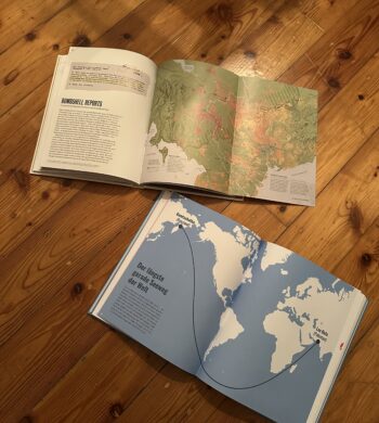
Scientific reports and raw data alone are not enough. The way we visualize and present climate risks determines whether people ignore the information or act upon it. While researching this topic, I came across two fascinating books: Atlas of the Invisible by James Cheshire & Oliver Uberti and 100 Karten, die deine Sicht auf die Welt verändern by Hoffmann & Campe. Both books illustrate how maps and data visualization can reshape our understanding of the world, revealing hidden patterns and making abstract issues tangible.

Their core message is also at the heart of RiskLIM: climate risks are not always visible, but that doesn’t mean they aren’t real. The challenge is to make them undeniable—so clear, so well-visualized, and so engaging that people feel compelled to act.

Why Visualizing Climate Risks Matters

One of the biggest challenges in climate communication is that risks often feel distant and abstract. Rising temperatures, melting glaciers, or shifting wind patterns don’t necessarily seem like urgent problems when they unfold over decades. Data alone doesn’t create urgency—visuals do.

Both Atlas of the Invisible and 100 Karten showcase how maps, diagrams, and interactive tools can help people see the connections they might otherwise overlook. These books are filled with visualizations that turn hidden global patterns into something concrete, localized, and understandable.

A striking example from Atlas of the Invisible is a map showing how global wind patterns have shifted due to climate change. Wind is invisible to the human eye, but the visualization makes it clear, urgent, and real. In 100 Karten, a similar approach is taken to show unexpected global connections—such as mapping food supply chains or the true size of countries when projections are corrected. Both books reveal that how we map the world influences how we perceive it.

This is precisely what risk communication needs to do—transform invisible environmental changes into something tangible that demands attention.

Risk Communication in Action: Lessons for RiskLIM

The RiskLIM project focuses on improving how climate risks—such as avalanches and snow loads—are communicated. But what can it learn from these books and other powerful visualizations?

NASA’s Climate Time Machine is a great example of how data can be made engaging and exploratory. This interactive tool allows users to see how sea levels, CO₂ levels, and temperatures have changed over time, making climate change undeniable. RiskLIM could apply a similar strategy by developing an interactive risk map that illustrates how avalanche or flood risks evolve over time, helping communities prepare for potential dangers before they happen.

Another example is Ed Hawkins’ “Show Your Stripes”, a simple yet powerful visual representation of global temperature trends. Instead of overwhelming people with complex graphs and numbers, this design reduces climate change to a sequence of colored stripes, moving from blue to red as the world gets warmer. The simplicity of this design makes it universally understandable. RiskLIM could take inspiration from this approach and create a visual early warning system that instantly communicates climate threats in a way that everyone can grasp at a glance.

Risk communication also needs to be personal and localized. Maps that show global trends are informative, but they often fail to create a sense of urgency. People need to see how their own homes, towns, or regions are affected to feel compelled to act. A customized local risk indicator—where users enter their location and immediately see how their area is impacted by climate risks—would make the information far more relevant and actionable.

Beyond just making climate risks visible, risk communication must also create an emotional connection. The way information is presented can mean the difference between awareness and inaction. Atlas of the Invisible and 100 Karten show that visual storytelling is just as important as the data itself. A map, when designed effectively, does more than just inform—it engages, persuades, and motivates.

From Understanding to Action: A Call for Smarter Risk Design

Climate data alone won’t change the world. But how we visualize and communicate that data can. If RiskLIM could develop an interactive map like NASA’s Climate Time Machine, or a risk indicator as intuitive as “Show Your Stripes”, it could bridge the gap between scientific prediction and public action.

Both Atlas of the Invisible and 100 Karten demonstrate that maps can challenge perceptions and change how people see global risks. They remind us that what we see—how data is presented—shapes what we believe and how we react.

The future of risk communication is not just about displaying climate data—it’s about designing it for action. By making the invisible visible, we ensure that the consequences of climate change are no longer distant or abstract, but urgent and real. The world of risk communication is evolving, and designers have a unique opportunity to shape how people see—and respond to—these challenges. Now is the time to use design as a tool for awareness, engagement, and most importantly, action.


Reference

Cheshire, James; Uberti, Oliver: Atlas of the Invisible – Maps & Graphics That Will Change How You See the World, Dublin, 2021

100 Karten, die deine Sicht auf die Welt verändern, Hoffmann und Campe Verlage, Hamburg, 2019

#10 Information Aesthetics – Designing Data for Meaning and Emotion

Listen, Hear, Feel the Data

Data is more than numbers and patterns—it holds meaning, tells stories, and can evoke emotions. The concept of information aesthetics explores how data can be visually, sonically, and physically designed to stimulate perception, enhance comprehension, and create emotional engagement.

When we experience information through multiple senses, its impact extends beyond cognition into intuition, memory, and even decision-making. Whether through color, sound, movement, or tactile feedback, aesthetically designed data fosters deeper interaction and stronger connections between people and information.


The Art of Seeing, Hearing, and Feeling Data

We often judge visualizations based on their clarity and efficiency, but aesthetics play a crucial role in guiding what we focus on, how we interpret relationships, and how long we stay engaged. A well-designed data experience is not just informative—it is compelling. Consider how:

  • Color Theory Influences Interpretation: A thoughtful color palette can enhance clarity, while poor color contrast can distort perception.
  • Rhythmic Sonification Structures Attention: Sounds designed with natural rhythm and progression help listeners identify anomalies and trends.
  • Spatial Composition Guides the Eye: The placement of elements determines where users look first, how they navigate data, and what insights they extract.

Just as visual artists and musicians use balance, contrast, and movement to evoke responses, information designers must think beyond efficiency to craft experiences that engage both the analytical and emotional mind.


Aesthetic Principles in Multisensory Data Design

  1. Minimalism vs. Expressiveness – Some data benefits from minimalist clarity, while other datasets gain meaning through rich, expressive representation. Over-simplification can strip data of nuance, while overly complex displays risk overwhelming users.
  2. Flow and Rhythm – In interactive data experiences, transitions and animations should mirror the natural way we process information—progressively revealing insights rather than dumping data all at once.
  3. Contrast as a Communication Tool – Just as bold colors or sharp sound changes draw attention to key insights, subtle variations add layers of meaning without overpowering the primary narrative.

A well-balanced information aesthetic does not compete with understanding—it enhances it.


Multisensory Aesthetics in Action

  • Sound-Responsive Data Sculptures: Transforming datasets into physical, auditory installations allows users to walk through and experience information in space.
  • Generative Music from Climate Data: Environmental conditions translated into dynamic, evolving compositions make shifting weather patterns tangible.
  • Interactive Narrative Dashboards: Rather than static charts, users navigate data as a story unfolding in time, with smooth transitions and layered insights.

Data, when designed aesthetically, is not just understood—it is felt, remembered, and lived.

#09 Multisensory Accessibility: Expanding Inclusive Design Through Sensory Substitution

As digital environments become increasingly immersive, multisensory design is transforming the way we interact with data, technology, and the world around us. However, ensuring these experiences are accessible to all remains a challenge. Traditional accessibility efforts have largely focused on visual-centric approaches, often excluding those who rely more on auditory, tactile, or cross-modal interactions.

A promising solution lies in sensory substitution techniques, which translate one sensory input into another. These techniques, often used in assistive technologies, have the potential to move beyond niche applications and become mainstream tools that enhance accessibility for everyone.


Beyond Visual-First Interfaces: Rethinking Multisensory Accessibility

Most digital interfaces prioritise visual information—charts, text, and images dominate how we consume data. However, not everyone experiences the world through sight. A more inclusive design approach considers:

  • Sonification for Blind and Visually Impaired Users: Mapping data trends to sound (pitch rising for higher values) enables auditory pattern recognition.
  • Haptic Feedback for Deaf and Hard-of-Hearing Users: Vibrations and force feedback provide real-time alerts and spatial awareness.
  • Multisensory Adaptation for Neurodivergent Users: Some individuals process information better when it’s presented in multiple overlapping modalities, such as visual cues paired with subtle audio reinforcement.

Rather than designing separate assistive solutions, multisensory experiences should be natively inclusive, allowing users to select the sensory mode that best suits them.


Sensory Substitution: A Bridge to Universal Access

Sensory substitution devices (SSDs) replace information from one sensory modality with another, making data accessible in novel ways. For example:

  • Visual-to-Auditory Substitution: Devices like The vOICe convert camera images into real-time soundscapes, allowing users to “hear” shapes and motion.
  • Visual-to-Tactile Interfaces: Systems like BrainPort translate images into electrical pulses felt on the tongue, enabling spatial navigation for the visually impaired.
  • Cross-Modal Mapping in Mainstream Design: Everyday interfaces can integrate these concepts—imagine a navigation app that offers both vibration-based and sound-based guidance, allowing all users to choose their preferred sensory format.

Despite their proven effectiveness, SSDs have not yet seen widespread adoption. A key challenge is that they are often designed only as assistive devices, rather than as features that could benefit all users in various contexts.


Real-World Applications of Inclusive Multisensory Design

By embedding sensory substitution and multisensory feedback into mainstream products, we unlock new ways of engaging with technology:

  • Tactile Data Exploration: Raised surfaces, interactive touchpads, or vibration-based data encoding allow users to physically experience data trends.
  • Multisensory VR & AR Experiences: Augmented and virtual reality environments can become more accessible by incorporating soundscapes, haptic responses, and cross-modal cues that extend beyond sight.
  • Flexible Accessibility in Public Spaces: Interactive kiosks and wayfinding systems should support dynamic mode-switching, allowing users to receive information through visual, auditory, or tactile outputs based on their needs.

Designing for Multisensory Accessibility

To create truly inclusive multisensory experiences, designers must:

  1. Prioritize Sensory Adaptability – Allow users to customize how they receive information (toggling between visual, auditory, and tactile cues).
  2. Focus on Cross-Modal Integration – Ensure sensory inputs reinforce each other rather than competing (subtle haptic cues guiding users toward an audio source).
  3. Adopt a Universal Design Perspective – Move away from “assistive add-ons” and instead create mainstream products that naturally support diverse sensory abilities.

By making multisensory design accessible to all, we enhance usability for disabled users while also creating richer, more engaging experiences for everyone. Instead of viewing accessibility as an afterthought, it should be the foundation of future technology.

References

T. Lloyd-Esenkaya, V. Lloyd-Esenkaya, E. O’Neill, et al., “Multisensory inclusive design with sensory substitution,” Cognitive Research, vol. 5, no. 37, 2020, doi: 10.1186/s41235-020-00240-7.

M. Leung, “A look toward the future: The power of creating accessible multisensory experiences,” Accessibility.com, Feb. 19, 2024. [Online]. Available: https://www.accessibility.com/blog/a-look-toward-the-future-the-power-of-creating-accessible-multisensory-experiences. [Accessed: Jan. 31, 2025].

#08 The Role of Ambient Displays in Multisensory Data Representation

As digital interfaces evolve, ambient displays are becoming a critical tool for integrating multisensory data into everyday environments. Unlike traditional visualisations that demand direct attention, ambient displays operate at the periphery of perception, using light, sound, temperature, or movement to subtly communicate information. However, as these displays evolve, so does the need to understand their relationship with data and the context in which they exist.

Beyond Peripheral Awareness: Understanding Context in Ambient Displays

Historically, ambient displays have been discussed in terms of peripheral awareness—providing information in a non-intrusive manner. However, research by Vande Moere & Offenhuber (Beyond Ambient Display) suggests that ambient displays should not only be classified based on how they present data but also on the context in which they exist. Their model proposes three categories:

  1. Visualisation as Translation – Data is presented in an abstract form, independent of its environment (an ambient color-changing orb that visualises air quality).
  2. Visualisation as Augmentation – The display integrates into an existing object, enhancing its natural affordances (a lamp that glows brighter based on energy consumption).
  3. Visualisation as Embodiment – The display itself is the context, shaping meaning through its physical presence (large-scale urban installations that respond to public data).

By categorising displays in this way, designers can better align the modality, environment, and function of ambient displays to create more intuitive and meaningful interactions.

Designing for Subtlety and Context

The effectiveness of ambient displays lies in their ability to convey meaning without overwhelming users.

  • Selecting the Right Modality – Light, sound, or haptics should be chosen based on how users engage with their environment. A museum exhibit might use soft pulses of sound to indicate visitor density, while a wearable device could use gentle temperature shifts.
  • Context Sensitivity – Displays should align with their physical and social context. A public installationvisualising air pollution might use smoke-like visuals, reinforcing an intuitive connection between representation and data.
  • Balancing Functionality and Presence – An ambient display should enhance awareness without becoming the focal point. If too dominant, it shifts from being “ambient” to demanding attention, which can disrupt the user experience.

The Future of Ambient Displays in Multisensory Data Design

By rethinking ambient displays as context-sensitive interfaces rather than just passive visualisations, designers can integrate seamless, non-disruptive data experiences into everyday life. Whether through urban-scale data sculptures, responsive architectural spaces, or adaptive environmental displays, the next wave of ambient visualisation will focus on how context shapes perception—blurring the line between information and environment.

Reference

D. Offenhuber, “Beyond Ambient Display,” International Journal of Ambient Computing and Intelligence, 2009.

Designing and Evaluating Ambient Information Systems: Workshop at Pervasive 2007, The 5th International Conference on Pervasive Computing, Toronto, ON, Canada, May 13, 2007.

10 Bias Recap

After one semester of bias research, I want to do a short recap, on everything I came across. So here is a condensed version, of all things, I found out:

What is a Bias?

Bias refers to a tendency to favor or oppose something based on personal opinions rather than objective reasoning. While biases can be explicit (conscious and intentional) or implicit (unconscious and automatic), they often stem from cognitive shortcuts known as heuristics. These shortcuts help our brains process information efficiently but can also lead to misinterpretations and irrational decisions. Cognitive biases, in particular, shape how we perceive reality, causing individuals to interpret the same facts differently. They develop early in life through personal experiences, societal influences, and media exposure, reinforcing both positive and negative associations.

Bias subtly affects decision-making in various aspects of life, from personal interactions to professional settings. Research shows that even trained professionals, such as scientists and hiring managers, exhibit unconscious biases, leading to disparities in employment opportunities. Implicit biases influence perceptions of competence, trustworthiness, and fairness, often without individuals realizing it. Acknowledging these biases is essential for reducing their impact and fostering more objective and equitable decision-making.

The Cognitive Bias Codex

The Cognitive Bias Codex by Buster Benson provides a comprehensive overview of over 200 cognitive biases, grouped into four categories to help us understand how our brains process information. One bias worth highlighting is the Bias Blind Spot, which refers to our tendency to think we’re less biased than others. This is especially relevant for UX design, where designers might overlook their own biases and assume their design decisions are universally valid. Other biases like Confirmation Bias, which makes us favor information that supports our existing beliefs, and Availability Heuristic, which makes us judge the likelihood of events based on what comes to mind most easily, can also influence how users engage with design elements.

In addition to these, biases such as the Mere-Exposure Effect, where familiarity breeds preference, and Anchoring, where initial information anchors subsequent judgments, can significantly shape how users make decisions. These mental shortcuts help us navigate the world more efficiently, but they can also distort our thinking. By understanding these biases, we can better design user experiences that acknowledge these cognitive filters, creating interfaces that allow for more informed, balanced decision-making. Ultimately, the Codex is a reminder that recognizing our biases is the first step towards making better choices—both in design and in life.

Common Biases in (UX) Design

Biases in UX design can subtly influence how designers create, research, and test products. Common biases include Confirmation Bias (seeking data that aligns with assumptions), False-Consensus Effect (assuming users think like designers), and Recency Bias (overweighting recent feedback). Anchoring Bias occurs when initial information overly influences decisions, while Social Desirability Bias can distort user research, and Sunk Cost Fallacy keeps designers committed to failing ideas.

To spot biases, review your assumptions and ensure decisions are based on data, not personal opinion. Involve diverse perspectives and conduct usability tests with varied users to uncover blind spots. Documenting your reasoning can also help identify biases. By recognizing and addressing these biases, designers can create more inclusive, user-centered designs.

Advantages of Biases

Biases are often seen as negative, but they serve important cognitive functions. They help us make quick decisions by filtering information efficiently, improving focus, and enhancing productivity in work and learning. Biases also support social connections by fostering trust and teamwork, aid in pattern recognition for faster learning, and boost motivation by reinforcing commitment to long-term goals. Additionally, they play a key role in survival, helping individuals assess risks and stay cautious in uncertain situations.

While biases can lead to errors, they also provide valuable benefits. By enabling efficient decision-making, strengthening social bonds, enhancing learning, and ensuring safety, they function as essential mental shortcuts. Recognizing their advantages allows for a more balanced perspective on their role in daily life.

Bias in Ai

AI is transforming industries, including UX design, by automating processes, analyzing user data, and enhancing efficiency. However, AI is only as unbiased as the data it learns from. If datasets contain historical biases, AI models can perpetuate them, influencing critical decisions in areas such as healthcare, hiring, and search engine results. For example, algorithms have been found to favor certain demographics in medical treatment recommendations, reinforce gender stereotypes in search results, and discriminate against female job applicants. These biases stem from underrepresentation in training data, flawed problem framing, and algorithmic design choices that prioritize overall accuracy over subgroup fairness.

Addressing AI bias requires proactive governance, ethical oversight, and diverse, representative training data. Organizations must implement fairness-focused frameworks, employ transparency practices, and incorporate human oversight to refine AI-generated outputs. Ethical considerations should also be integrated into science and technology education, ensuring interdisciplinary collaboration and regulatory measures to promote accountability. While technical solutions can mitigate bias, broader societal discussions are necessary to address the ethical implications of AI-driven decision-making.

Examples of Bias in Design

“Life can only be understood backwards, but it must be lived forwards.” ~ Soren Kierkegaard. This applies to biases in design—often, they’re only recognized after decisions are made. Here are a few examples:

  1. Spotify Shuffle Button: A Reddit user pointed out that the shuffle button was hard for colorblind users to distinguish. About 8% of men have red-green color blindness, and a simple design tweak could improve accessibility.
  2. Cars and Seat Belts: In the 1960s, crash tests used male-bodied dummies, neglecting the safety of women and children. This is sampling bias, where the sample didn’t represent the full population.
  3. Facebook’s “Year in Review”: Facebook’s 2014 feature, which showcased popular posts, sometimes included painful memories for users, due to optimism bias—assuming all top moments are joyful.

These examples show how majority bias—focusing on the majority and neglecting minorities—can shape designs that overlook important user needs.

How to combat Bias

The first step in addressing unconscious bias is recognizing it exists. Tools like the Designing for Worldview Framework by Emi Kolawole or Harvard’s Project Implicit tests can help identify biases. Understanding your biases is key to overcoming them and making design more inclusive. Once biases are spotted, the next step is to take action. Consciously designing with diverse users in mind and using tools like Perspective Cards can guide you to consider various experiences. Listening to clients and users, while letting go of assumptions, is essential to create designs that truly meet everyone’s needs.

Building diverse teams is critical to fostering inclusive design. Teams with varied backgrounds bring fresh perspectives, which are essential in a profession that thrives on challenging existing ideas. Overcoming bias is a lifelong commitment, so keep learning and remain open to feedback. Reflect on who might be left out and seek ways to make your designs more inclusive. Additionally, don’t just focus on the “happy path” in design; consider unhappy paths to address potential issues early on. Finally, when creating personas, challenge assumptions by focusing on real user experiences rather than demographic stereotypes. Designing for a global audience requires understanding diverse cultural insights, ensuring that inclusion is integrated into every step of the design process.

09 Advantages of Biases

This may seem counterintuitive, since biases always have a negative reputation, but they can have some advantages as well. Before I end this line of blogposts, with a short recap, I want to go another way, to highlight some positive sides of biases.

Biases also have many benefits. Our brains use biases to make decisions quickly, focus on important information, and even stay safe. Let’s explore some of the advantages of biases and how they help us in daily life.

01 Biases Help Us Make Quick Decisions

In a world full of information, our brains cannot process everything at once. Biases help us filter information so we can focus on what matters. For example, the brain ranks and prioritizes information to help us act fast. This ability is essential when making quick decisions in everyday life, such as crossing a busy street or choosing what to eat. Without biases, decision-making would be slow and overwhelming (LinkedIn).

02 They Improve Our Focus and Efficiency

Biases allow us to focus on relevant details while ignoring distractions. This is especially useful in work and learning environments. For example, when searching for an object in a cluttered room, our brains use bias to guide our attention toward what is most likely to help us. Similarly, biases help professionals make better decisions by focusing on key information instead of getting lost in unnecessary details (Airswift).

03 Biases Support Social Connection

Humans naturally form groups based on shared interests, beliefs, or backgrounds. This is known as ingroup bias. While this can sometimes lead to discrimination, it also has benefits. Ingroup bias helps build trust and cooperation within communities. It fosters teamwork, strengthens social bonds, and encourages people to support one another. These social connections are essential for emotional well-being and personal growth (Harvard Business School).

04 They Enhance Learning and Adaptability

Biases help us learn new things by making patterns easier to recognize. For instance, our brains naturally categorize information to make sense of the world. This ability helps us identify risks, recognize familiar faces, and understand new concepts more quickly. Even in education, biases help students focus on the most relevant material and remember information more effectively (LinkedIn).

05 Biases Can Increase Motivation

Some biases, like confirmation bias, can motivate people to pursue their goals. Confirmation bias makes us focus on information that supports our beliefs. While this can sometimes lead to mistakes, it also helps people stay committed to long-term goals. For example, entrepreneurs often rely on positive feedback to keep going, even when facing challenges. This kind of bias can drive innovation, persistence, and personal success (Airswift).

06 They Enhance Survival and Safety

From an evolutionary perspective, biases have helped humans survive by guiding quick and instinctive reactions. For example, people are naturally more alert to potential dangers because of negativity bias, which makes us pay more attention to risks. This bias helps us stay cautious and avoid harm. Similarly, biases like familiarity bias encourage people to stick with what they know, which can be useful in uncertain situations (Harvard Business School).

Conclusion

While biases can sometimes lead to errors, they also provide many benefits. They help us make fast decisions, focus on important details, connect with others, learn efficiently, stay motivated, and protect ourselves. Understanding the positive side of biases can help us use them wisely while being aware of their limitations. Rather than seeing biases as flaws, we should recognize them as essential tools for navigating the world more effectively.