14. From WhatsApp to Web Chatbot: Adapting Plans with n8n

Sometimes, the most interesting part of a project is when things don’t go as planned.

I originally set out to build a simple booking system via WhatsApp, using a chatbot to help users schedule appointments. I explored various platforms, including Twilio, Zapier, and specialized tools like Libromi, which offer multi-agent support, payment integrations, and booking systems via WhatsApp. My plan was to test a single hypothesis, so I decided to build the core logic calendar booking myself.

However, to use the WhatsApp Business API, I needed a Facebook Business account. That’s where things took an unexpected turn: my Facebook account was suddenly blocked, and with it, the API access was gone. I have written an email to the customer support but they didn’t reply(

Pivoting to a New Stack

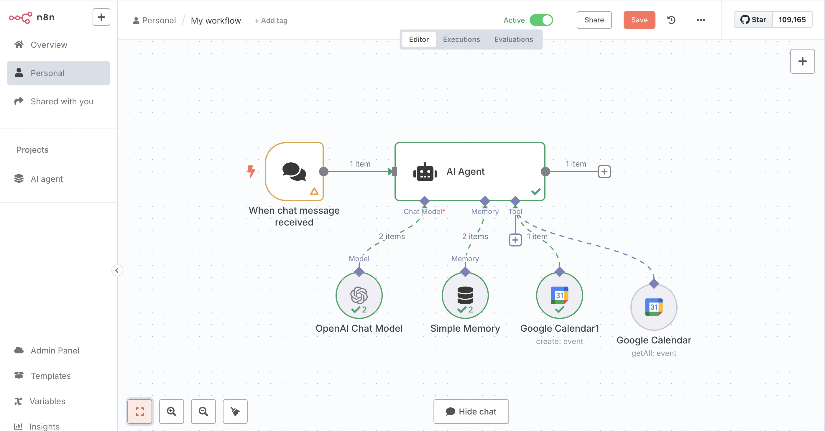
So, I started exploring alternatives. That’s when I discovered n8n, an open-source automation platform that provides visual workflow creation, powerful integrations, and complete ownership over the process.

Instead of relying on WhatsApp, I decided to embed the chatbot directly inside a website. Since many doctors in Austria have websites, it’s still a working hypothesis. Here’s what my updated setup looks like:

  • n8n: To control and visualize the conversation and booking flow.
  • ChatGPT API: For natural, conversational responses.
  • Google Calendar API: To check availability and schedule appointments.
  • Embedded web widget: So users can interact with the chatbot on a website, without needing to go through WhatsApp or Facebook.

What’s Next?

This new approach is actually more flexible than what I originally planned. I don’t need third-party approval, and I have full control over the chatbot’s tone, interface, and features.

Next steps include programming the chatbot to respond to particular responses, testing a real-time booking, and possibly adding reminders or email confirmations. Even though the platform shifted, the goal remains the same: to build a smart, lightweight, and user-friendly appointment system

Blog Post 5: Early User Tests of My EV Charging Interface

Over the past week, I ran two quick paper-prototype tests to see how real people would navigate my simple, button-based EV charger interface. I recruited Sophie (23, student) and Kathi (22, student), both had tried charging an EV before and shared the frustrations I’ve heard from others. Here’s what happened, what I learned, and what I’ll change next.

Test Setup

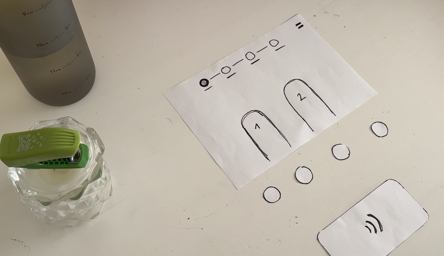
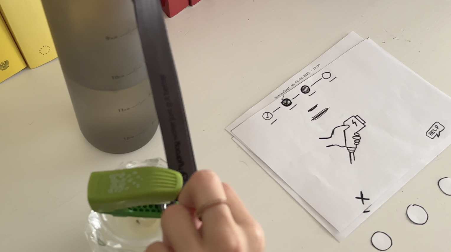
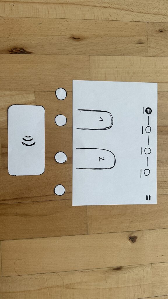
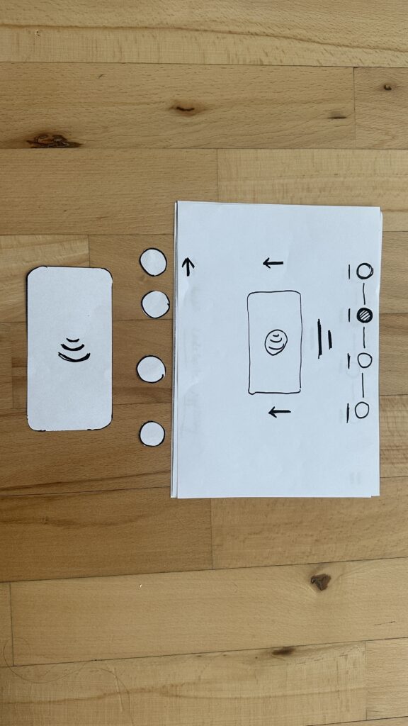
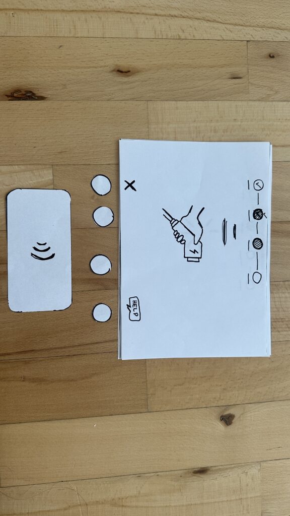
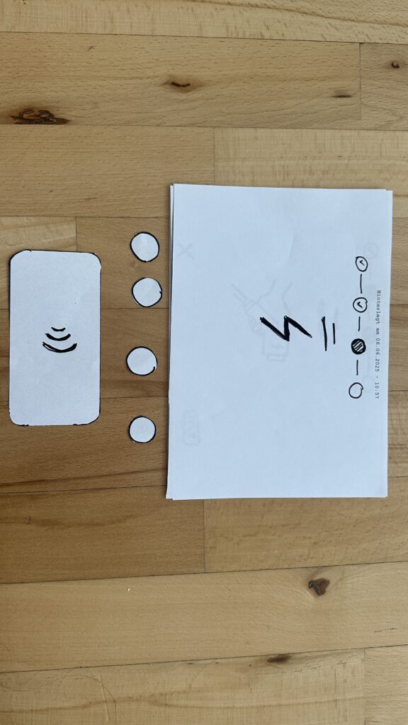
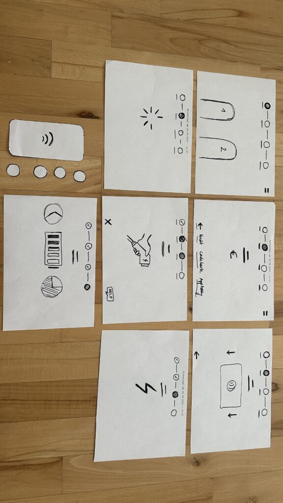
I handed each person a series of 7 low-fidelity sketches in the correct order. Next to the paper “station” was a bottle (the charger) and a taker (the EV). Below each screen sketch sat four real buttons. I asked them to imagine they’d just pulled up to a public charger and needed to top off their battery.

User Test 1: Sophie

  1. Choose Charger
    Sophie thought the paper screen itself was the touchscreen. She tried tapping the display until she noticed the real buttons below. Because the screen elements were so faint, she assumed she was already in the payment step and held her credit card to the empty reader.
  2. Verify Payment
    Once she realized the three payment buttons lived below, she quickly picked “Credit Card” and instantly understood she needed to tap her card.
  3. Plug In
    The cable illustration on screen made sense immediately. When I “lit” the screen green for success, she smiled and said, “Great—now it’s actually charging.”
  4. Charging Overview
    Sophie grasped the countdown timer and energy bar at once. She even joked she’d never mind waiting with such clear feedback.

Key takeaway: Sophie’s background with touchscreens made her expect the whole area to be tappable. I need stronger visual cues, bolder borders or shadows, so she spots the physical buttons first.

User Test 2: Kathi

  1. Choose Charger
    Kathi also tapped the screen, then grew impatient and pressed every button in turn, her usual “I don’t know what to do” tactic. After a few presses, she landed on “RFID Charge-Card” and paused.
  2. Verify Payment
    She tried to tap her card again before any prompt appeared. When nothing happened, she read more closely and picked her button first, then held her card when prompted.
  3. Plug In
    She confused the static “Charging” screen, thinking the top progress bar might also be buttons, until I introduced the cable illustration. Then it clicked.
  4. Charging Overview
    Once the final screen lit up with time remaining and a moving bar, Kathi relaxed and said, “Okay, I get it.”

Key takeaway: Kathi needed clearer icons on the first screen to recognize the charger slots. She also misread the progress bar as interactive.

Charging the EV

What I Learned

  • Visual Clarity Matters: Make charger-slot outlines, icons, and buttons bold.
  • Step Prompts: Add a short text label—“Step 1: Pick Charger” instead of just a number.
  • Non-Touch Expectations: Users often expect the whole screen to be tappable. I’ll accentuate the physical buttons with shadows or color bands.

Next Iteration

  1. Bold Icons & Labels: Draw clear charger shapes and label each step in large text.
  2. Highlight Active Buttons: Only light up the relevant payment button when it’s time.
  3. Test with Accessibility in Mind: Invite a visually impaired or wheelchair-using participant to see how the interface holds up.
  4. Prototype On-Station Mock-Up: Build a cardboard station with real cables at the right height and angle—so I can check reach, screen glare, and button feel.

My next post will share those refined sketches and fresh user-test results. Until then, I’ll keep iterating and learning from each tap, click, and cable plug. Stay tuned!

#13 Which direction?

To come up with good ideas for a master thesis was a bit difficult for me. I found myself wanting to do everything and nothing at the same time. The previous researching I had done was about sustainable living, biodiversity loss, area neutrality, and all the problems and solutions regarding these.

Recently, I have gotten more and more into community living. This is still a huge topic under all the previous topics, but I found it to be very interesting, and something I believe can be part of the solution to the many problems we face. But what is community living? For me it encapsules a lot of different aspects:

  • something that makes people interact more, which can create stronger bonds and love between people
  • a way of living that lessens your footprint on this planet
  • a way of living that fights the loneliness epidemic
  • a way of living that provides help for the different life stages people go through

to mention some. I am also at the point where I am interested in trying this lifestyle myself – in one way or another. So perhaps this is the direction for me to go with my thesis as well.

A current thought provoker for me is a book I read called “All about love” by Bell Hooks. This book is a visionary essay about the topic of love. This book discusses the interconnectivity of race, class, and gender and their ability to produce and perpetuate systems of oppression and domination – and how these are the opposite of love. Even though the author often makes powerful, decisive statements that left little room open for argument, I agree on the notion that love can be a transformative power that heals individuals, communities, and even public policies and institutions if prioritized over greed. This realisation, left me with a desire to deep further into how to enable more love in this world.

By introducing lovelessness, as Bell Hooks called it, as the fundamental problem that humanity faces together today, I can steer my topic in the direction of working against it. Maybe even community living could be looked at as a solution for this, by creating a living space that fosters love and care for each other, help for your neighbours, and offers an escape from the world we are struggling in right now.

I see this post as my foundation for what ever direction I will go in. What is most important for me is to do something that actually can create change.

#11 Lofi Prototyping and Speed Dates

Introduction

At the start of the semester I was at a state where I was in desperate need of scoping down my project. And for this course we were to use prototyping as a tool to make our research project more tangible – perfect for me! So… how to make a prototype for my problem statement: “how to save the world”?

The Prototype

For Birgits speed date session, we were to create a lo-fi prototype of something random or something regarding our thesis. Since I did not know which of the 1000 problems regarding mye current topic to attack, I chose to prototype something random.

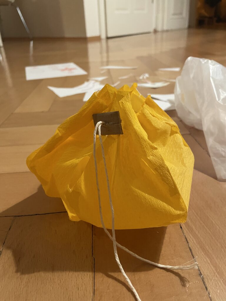
In my case, I wanted to make something physical that I could actually have use for. Something that would solve a very tangible problem. Thats why I prototyped a lampshade.

The Process

The problem I have, is that the lamp in my room is very, very bright, and very, very white. Nothing I did with this room could make it cozy – I always felt like I was sleeping in a hospital room. So how to make a quick and cheap solution to this?

My vision was to use something partly seethrough, with a warm colour, to cover the bright white lightbulb with. It could be fabric, paper or anything with these attributions. I found inspiration in chinese paper lanterns, which always gives a warm and cozy vibe.


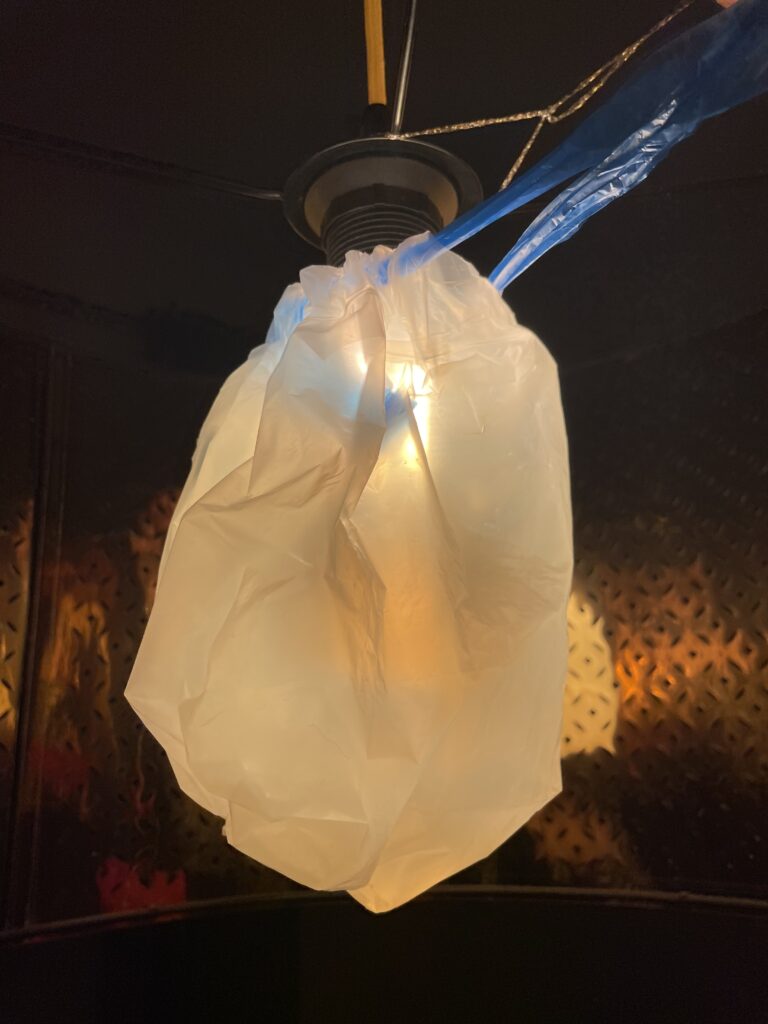
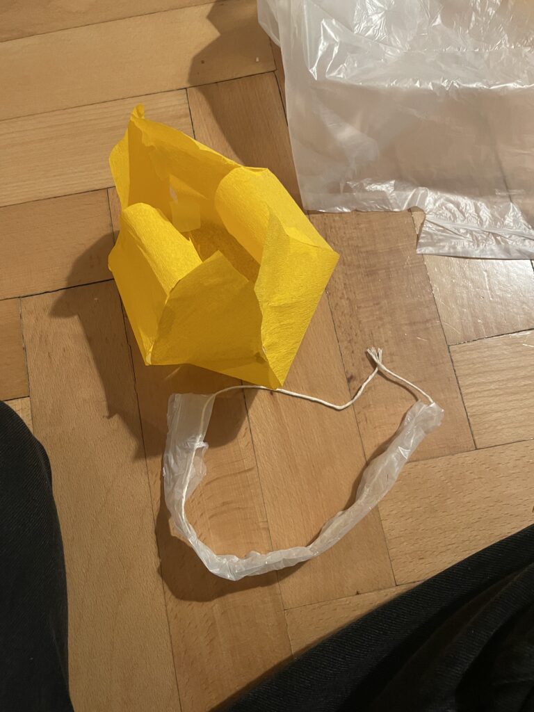
My first prototype was made of a trashbag and tape, and was made in 2 minutes. This was to test functionality of the tightening mechanics.

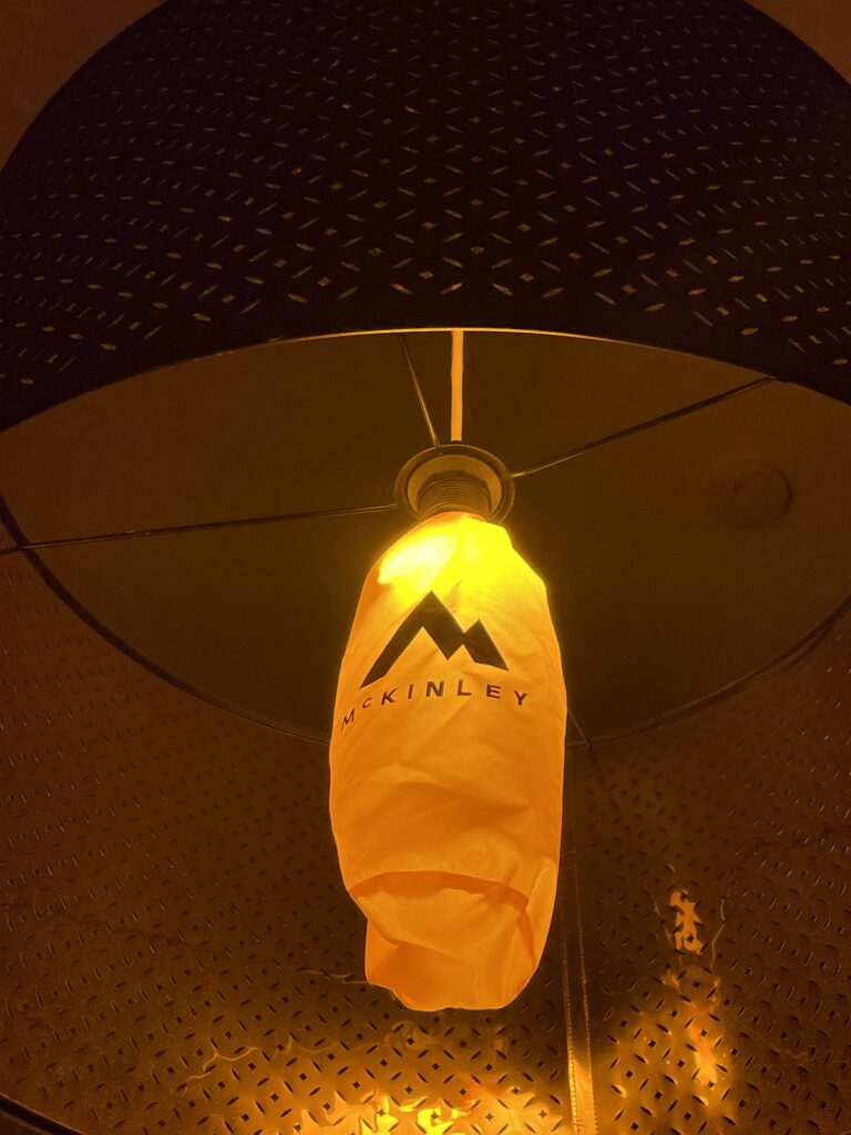
I also tested the color and tightening mechanics of my sleeping mat bag. This worked surprisingly good!

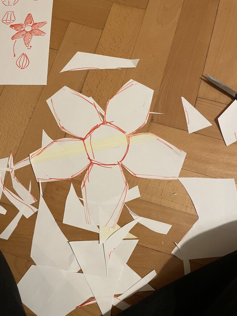
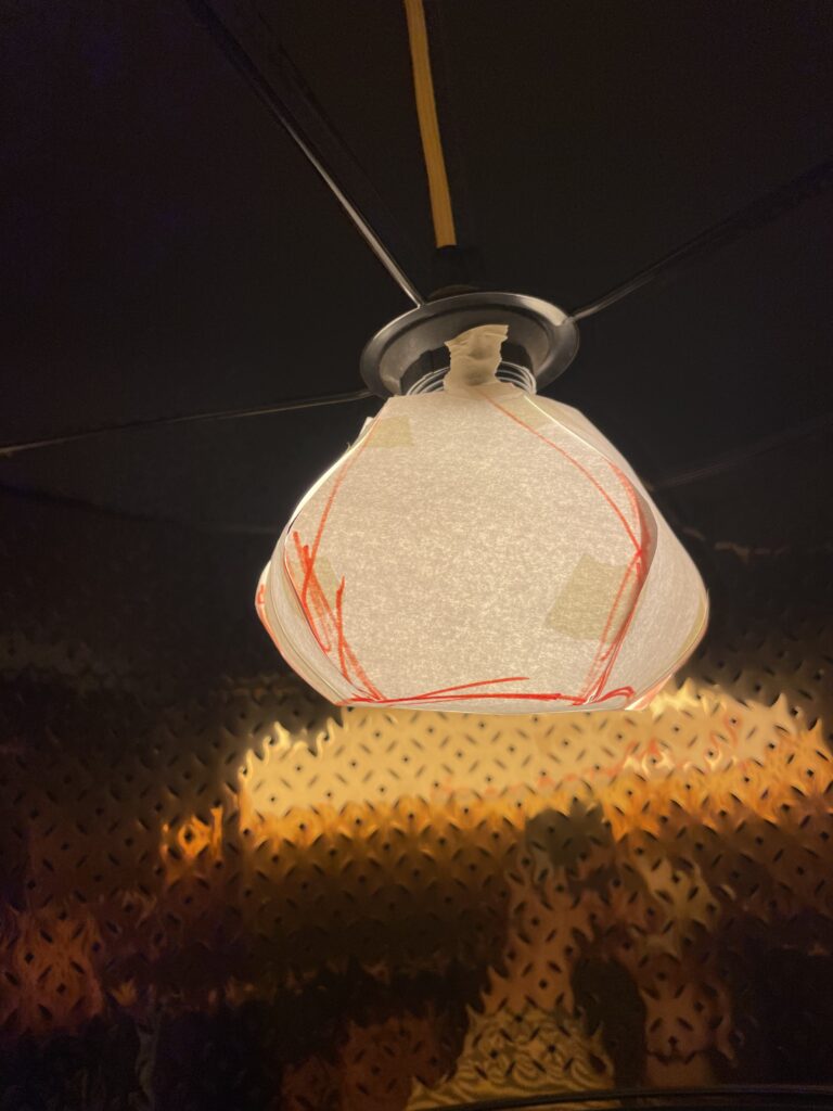
Further on I made a prototype of regular paper and tape, to try and figure out a shape that could work but also look ok.

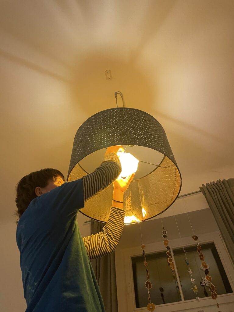
Then I finally made the final prototype, using thin silk paper, as the chinese lamps would have. This prototype ended up working pretty well, and looking decent.

The end product. Is still used on my big light until this very moment.

The Speed Dating

Through the speed dating session, we let our classmates test and review each others prototypes. From this, we were able to get a lot of feedback in a short period of time. Something I will take with me for my final thesis. Speed testing is a valuable tool, especially in the startfase, where you really just want to test the basics of your idea.

Even though I will not continue prototyping my lamp, I am happy for this experience, and hope to find my topic ASAP.

Blog 4: Sketching an Intuitive EV Charging Interface

After my first wild prototype about a 1,000‑floor elevator, I realized I really want to stick with mobility. EV charging stations are such a timely, real‑world challenge plus, I’ve experienced the pain myself! My girlfriend’s dad owns an EV, and I’ve helped him charge it only to run into confusing screens and awkward cables. Others I chatted with have plenty of frustrating stories, too. So I decided: let’s start by sketching a super‑simple, button‑based interface and see how two real users feel about it. (User Testing Informationen available in the next Post)

Four Clear Steps

On paper, I drew these low‑fidelity screens, focusing on clarity over bells and whistles:

  1. Choose Your Charger
    • A simple map shows two plugs at a station.
    • Green plug: available. Red plug: occupied.
    • A progress bar at the top displays “Step 1 of 4”, so you always know where you are.
    • Why? Users often fumble for which port is free. Clear colors and a step indicator keep anxiety low.
  2. Verify Payment
    • Three big buttons let you pick Credit Card, RFID Charge‑Card, or App‑QR Code.
    • A Back button (which lights red if you tap it) lets you switch methods at any time.
    • Once you choose, a screen prompts you to hold your card or show the QR code.
    • Why? Real stations offer multiple payment options. Lumping them into three buttons matches user expectations and avoids tiny menu lists.
  3. Plug In Cable
  • An animated cable slides out of the station.
  • A simple diagram shows “Cable → Car Port.”
  • If it clicks in correctly, the station glows green. If it fails, it glows red. A gentle blue pulse means “charging.”
  • Why? Physical actions need instant feedback. Color and motion reassure the user that they plugged in correctly.

    4. Charging Overview
  • Time Remaining: Counts down so you know when you’re done.
  • Battery Icon + Bar: State‑of‑charge advances in real time.
  • Power Delivered (kW): Shows exactly how fast you’re charging.
  • Big buttons: “End Session,” “Help,” “Info,” and “Language.”
  • Why? These are the four most‑asked questions: How long? How full? How fast? And what if I need help or another language?

Design Choices & Future Accessibility

  • Physical Buttons vs. Full Touchscreen: Early users can look, press, and go (no searching menus)
  • Progress Bar: Keeps people calm by showing exactly where they are in the flow.
  • Language Toggle: Always visible in case you need English, German, or any other option.
  • Text‑to‑Speech Future: With a long press on a touchscreen button, an image‑to‑speech API could read the label aloud for visually impaired users.

I’ll soon interview blind or wheelchair‑using drivers to see what adaptations they need. In a world of self‑driving cars, everyone should be able to charge their own vehicle of course.

Next: Real‑World User Tests

As a next step, I’ll ask some volunteers to walk through these sketches:

  • Where do they pause?
  • Which buttons feel unclear?
  • Do they spot the back arrow or language switch easily?
  • How do they react to red/green/blue feedback?

I’ll refine the flow based on their comments, then build clickable wireframes or maybe a cardboard prototype with LEGO. Iteration will tell me what works best.

Early References & Inspiration

  • Intuitive UI example: technagon.de/intuitive-user-interface-laden-kann-so-einfach-sein/
  • EV station UX tips: altia.com/2023/08/16/enhancing-ev-charging-station-ux-and-why-it-matters/
  • Payment variety today: ekoenergetyka.com/blog/how-do-ev-charging-stations-work/
  • Kempower design guide: kempower.com/user-experience-ev-charger-design/

These resources helped me understand real pain points and best practices. I’ll keep updating this blog as I refine the design and test with real users because the journey from sketch to screen is just beginning.

#3 Nächste Schritte

Warum?
Ich gehe im nächsten Schritt mal mit der Forschungsfrage:
“Welche visuellen und narrativen Gestaltungsmuster eignen sich besonders, um marginalisierte Biografien in einem digitalen Medium überzeugend und respektvoll zu vermitteln?”

Mir gefällt die Frage, weil ich mich hier um die Dinge kümmern kann, um denen es mir eigentlich im designen geht: wie gestalte ich das am besten, dass es zu dem passt, was ich sagen will. Oftmals geht es bei den Forschungsfragen so um “viel Aufmerksamkeit generieren” usw, oder Leute davon zu überzeugen, dass mein Medium das beste ist und lesen keiner mehr tut. Ich bin der Ansicht, dass es gern Leute geben darf, die lieber ein Buch lesen und auch welche, die sich lieber eine interaktive, digitale Darstellung ansehen.

Vorgehensweise

  • Laufende User Testings bzw. Insights von Testpersonen machen und einarbeiten in meine Arbeit.
  • Erst mal eingehende Einarbeitung in Literatur zu Digital Storytelling, narrativen Strukturen und Visualisierungsmethoden
  • Analyse bestehender Projekte um wiederkehrende Gestaltungsmuster zu identifizieren
  • Auflisten visueller Elemente (Parallax-Scrolling, interaktive Zeitleisten) und narrativer Techniken (First-Person-Voice-Over oder ähnliches)
  • Prototypische Umsetzung: Auswahl von ein paar Mustern, Implementierung in Web-Prototypen (React & D3.js) mit Biografien aus „Beklaute Frauen“
  • Evaluation mittels leitfadengestützter Interviews und kurzen Fragebögen, um Glaubwürdigkeit, Respekt und Empathie zu erfassen
  • Kombinierte Auswertung: Qualitative und quantitative Analyse zur Bewertung vom Nutzererlebnis

Originalität

  • Bislang eher wenig erforschten Schnittstelle zwischen Gender Studies, Digital Humanities und UX-Design
  • Fokus auf die Wahrnehmung respektvoller und authentischer Gestaltungsansätze, nicht nur auf technische Umsetzung
  • Übertragbarkeit der Muster auf weitere Medienformate als digitales Exponat z.B. auf Ausstellungen

#2 New Idea!

Oke ich hatte eben eine neue Idee.
Darum erst nochmal kurz zusammengefasst, was mein bisheriges Thema was (Blogpost #1 diesen Semesters kann man vergessen):

Recap
Die Arbeit handelt über die mangelnden Sichtbarkeit unterrepräsentierter Künstlerinnen – insbesondere Frauen und queerer Personen – in der Kunstgeschichte. Die zentrale Forschungsfrage lautet: Wie kann man die Geschichten dieser Künstlerinnen digital zugänglich und emotional erfahrbar machen? Ziel ist es, durch digitales Storytelling und interaktive Gestaltung ihre Werke und Biografien in einem zeitgemäßen Format zu präsentieren.

Herausforderung/Problem
Eine Challenge, die bei der aktuellen Projektidee besteht, ist für mich das auffinden und recherchieren von qualitativ hochwertigen Informationen zu unterrepräsentierten Kunstler:innen, die auch damit an die Öffentlichkeit gehen wollen. Das würde ev. sogar in den investigativen Journalismus fallen und damit nicht meiner Expertise entsprechen.

Lösungsvorschlag
Um dieses Thema zu umgehen, wäre aktuell meine Idee, sich mit der Visualisierung auf ein bereits bestehendes literarisches Werk zu beziehen. Aktuell lese ist das Buch “Beklaute Frauen. Denkerinnen, Forscherinnen, Pionierinnen: Die unsichtbaren Heldinnen der Geschicht” und finde es suuper spannend und ehrlich viel besser aufbereitet, als ich mir das selber zutrauen würde. Naja logisch, die Autorin Leonie Schöler (nicht viel älter als ich) ist auch deutsche Journalistin, Historikerin und Literaturwissenschaftlerin. In ihrem Buch schreibt sie zwar nicht nur über bildende Künstlerinnen sondern auch über Wissenschaftlerinnen und Autorinnen usw., aber die finde ich auch nicht weniger relevant.

Das heißt meine aktuelle Idee wäre das Buch “Beklaute Frauen” digital erlebbar zu machen.
Ziel wäre zu erforschen, wie digitale Storytelling-Formate (immersive Webseite) die Wahrnehmung und das Erinnern von marginalisierten Biografien verändern.

Ideen für Forschungsfrage dazu:

  • Welche visuellen und narrativen Gestaltungsmuster eignen sich besonders, um marginalisierte Biografien in einem digitalen Medium überzeugend und respektvoll zu vermitteln?
  • Wie beeinflusst ein interaktives, multimediales Storytelling-Format die emotionale Bindung der Nutzer*innen an die Biografien unterrepräsentierter Frauen im Vergleich zu einem klassischen Textformat?

Was halten wir davon?

Infos zur Authorin: https://de.wikipedia.org/wiki/Leonie_Sch%C3%B6ler

What I learned as the Best Practices For Designing an Intuitive Mobile Dashboard

A mobile dashboard may not offer the full functionality of its desktop counterpart, but it can still provide users with a scannable view of top-line data and statistics to let them make informed decisions. It can also give managers and executives the necessary tooling to quickly approve orders, contracts, and procedure and policy documents.

I drew from experience and other proficient UX Designers some of the best practices and key aspects that designers can use to design better mobile dashboards:

Smooth Navigation

Let’s start with navigation as this is how users will get acquainted with your dashboard and find the information they’re looking for. If the navigation for your mobile dashboard is clumsy or disjointed, or your search bar or navigation menu isn’t well suited to touch-based interactions, you are likely to turn off users.

Visual prioritization is key. Responsive mobile dashboards should communicate information quickly and prioritize it in a clear visual hierarchy. Another dashboard design best practice is using the principle of progressive disclosure to reveal information only when the user needs it.

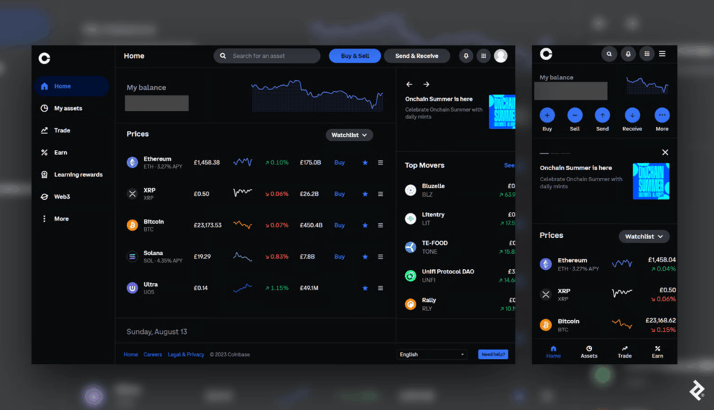
Consider space, button styles, and the user’s first impression when converting a desktop design into its mobile counterpart. (Coinbase)

This mobile dashboard effectively uses space to prioritize the most essential options. Crucial buttons from the left-hand panel on desktop become the bottom navigation bar on mobile, a standard for mobile menus as the position falls into the “Z” page scanning pattern where users’ attention tends to land.

Responsive Tables and Charts

Designing responsive mobile tables and charts can be a challenge, but in my experience, the customer satisfaction it provides is worth it.

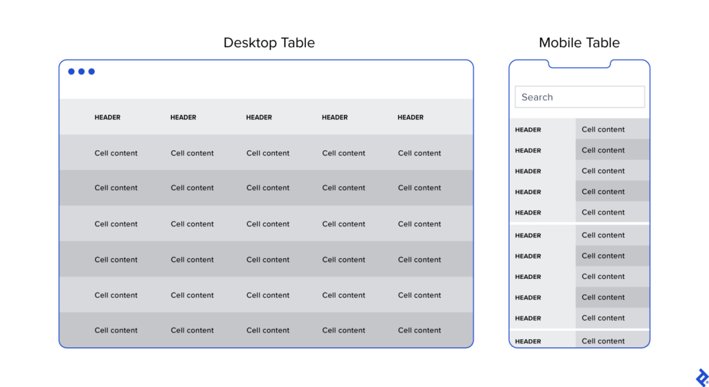
Generally, I advocate for responsive web designs that send a single code set to all devices but use fluid grids and media queries to change the appearance of elements based on a device’s size and orientation. This common and effective method is used in mobile dashboards to collapse table row headers into column headers in a set of stacked, standalone cards that can be scrolled through vertically. The approach offers an elegant mobile presentation that avoids squishing cells, while allowing the user to quickly peruse large amounts of data.

Button Design

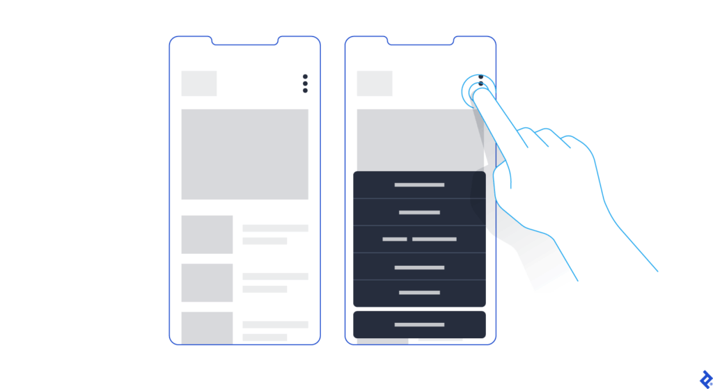
Arguably, one of the biggest challenges in creating a responsive mobile dashboard is sizing and arranging buttons. Why? Because, unlike on desktop, you touch them, rather than select them with a cursor or keyboard command. They need to be big enough and spaced out enough to be tapped comfortably, and, due to the limited screen space, some will have to be collapsed into sub-menus or even hidden.

Kebab menus save space on mobile screens by enabling users to access hidden buttons.

Standard button design principles should apply to your mobile designs. I tend to divide button design into two main principles: You should present buttons in a range of styles (sizes, colors, and shapes) that denote their relative importance through visual cues; and the text label or icon associated with a button should connote its semantic meaning and intended function—for instance, whether the button affirms an action, selects a tool, navigates to a new page, or cancels an action.

But you may have important buttons that can’t be hidden. As an alternative to the kebab menu, you could simply increase the button size to meet the mobile guidelines and then stack them vertically. Another alternative would be to leave the most crucial buttons at full size and make secondary buttons smaller by replacing the text label with an icon. When considering which technique to use, decide which buttons are most essential on each page.

Conclusion

When the project scope and budget allow, it’s most efficient to consider how a responsive mobile dashboard will look and function as you’re building out the desktop version. This will save time and development costs later in the product life cycle, and it will also help ensure brand consistency across devices. It’s also paramount to recruit a skilled developer to assess the feasibility of various design approaches, and, where needed, define CSS rules for reconfiguring tables and charts. Above all, try to faithfully recreate as much of the desktop experience as you can: You may have to eliminate some features and functionality, but it’s important not to dumb down the design and to follow the UX design process.

Mobile dashboard UI shouldn’t be an afterthought. If designed with care and foresight, mobile dashboards can provide significant value to users.

13. Exploring tools: Connecting WhatsApp and Google Calendar

It all started with a simple idea of booking appointments just by chatting on WhatsApp. I wanted to test this hypothesis without diving into complex paid tools right away. So I rolled up my sleeves and began researching how to connect WhatsApp with a calendar system in the most efficient, hands-on way possible.

As I combed through forums, websites, and YouTube videos, I came across platforms like Libromi. This company specializes in implementing chatbots for messaging apps. Their tool stood out because it offered something I wasn’t even looking for at first: a multi-agent chat system. This means multiple people can manage customer support and sales conversations using a single WhatsApp number, while keeping performance and access control in check. It was impressive.

Libromi also offered neat perks: integration with Google Sheets, payment gateways, automation for Facebook/Instagram lead ads, and most importantly, a ready-made booking system. Tempting? Very. But I decided not to use it. Since my focus was testing just one specific idea, I challenged myself to build the booking feature on my own instead. + Why pay 50$ per month for functions that might not be used 🙃

Before diving into development, I needed to make a key decision: Should I use the WhatsApp Business App or go for the WhatsApp Business API? Here’s what I learned:

The WhatsApp Business API is where the real power lies. With no device limits, full automation, integration support, and no broadcast caps, it’s made for businesses that want to scale. Naturally, this was the right choice for what I had in mind.

The WhatsApp Business App is great for small businesses. You can connect up to 5 devices, but it’s not designed for automation or integration. There’s also a limit on broadcasts (256 contacts), which can quickly become a bottleneck.

From Idea to Execution

Next, I needed to bridge WhatsApp and Google Calendar using the API. After evaluating several tools, I found that platforms like Zapier and Twilio could help make the connection smoother. They allow you to set up triggers and automate workflows, like creating calendar events based on user messages.

But here’s where I hit a roadblock: I couldn’t connect a chatbot to just any WhatsApp account. It has to be a verified business account through Facebook. So I created a Facebook Business Account, which is a must-have if you want to access the WhatsApp API and integrate it with any external tools.

What’s Next?

At this point, I’ve laid the groundwork: I understand the tools, I’ve set up the business account, and I’ve mapped out the data flow. The next step is to actually build the interaction where a user can chat with the bot, choose a time slot, and get a confirmation automatically logged into a calendar.

#2.02 Designing for Focus in an Age of Distraction

When I sit down to do work, I often only find myself deep in a rabbit hole of Reels or TikToks or reorganizing my phone, only after 30 minutes into the task. And to be honest even while working on this blog post I got distracted several times by my phone. This is why I decided to explore the topic of distraction in a digital life but I think it is also broadly relevant, since I feel like a lot of people struggle with getting distracted easily these days.

Are we living in an attention crisis?

There is a rising discourse around attention crisis, brain rot and digital burnout, since our days are increasingly fragmented by notifications, being constantly online and temptation of endless scrolls. In his book Stolen Focus, Johann Hari, talks about the effects of this crisis such as reduced productivity, heightened stress levels and even a weakening of our capacity to build deep and meaningful relationships. [1] A study from Microsoft says that our attention span shrank from 12 seconds in 2000 to 8 seconds nowadays, leading to humans having a shorter attention span than a goldfish. [2]

On average, people spend 4.5 hours a day on their phones [3], with 2.5 of those hours dedicated to social media. [4] Big tech companies like Meta and Google generate revenue by maximizing user engagement, turning out attention into a profitable business model. As a result, we get bombarded with dopamine-driven feedback loops that make it extremely hard to put the phone away to concentrate on a single task. [5]

Spending so much time on social media and doom scrolling for hours also affects people. In October 2024 “Brain Rot” was chosen for the Oxford Word of the Year. Brain Rot refers to the cognitive decline and mental exhaustion experienced by individuals, particularly adolescents and young adults, due to excessive exposure to low-quality online materials, especially on social media.“ [6]

Brain rot is an emerging concern among adolescents and young adults navigating today’s tech-saturated word. Marked by symptoms such as brain fog and reduced concentration, this condition seems to worsen with excessive screen time and constant exposure to trivial online content, ultimately contributing to a decline in cognitive function. [6]

Creative professionals like designers, writers, artists, musicians need uninterrupted time to enter a state of flow, where ideas can surface and evolve without constant context-switching. But even with productivity tools, focus apps, and “Do Not Disturb” settings, our smartphones still act like behavioral magnets. They promise us connection, innovation, and escape and they’re designed to be hard to ignore. Notifications, dopamine loops, and habit-forming UX patterns pull us away from the present moment, often without us realizing it.

So, the central question guiding my prototype this semester is:
How might a tangible interface reduce smartphone-related distractions for creative professionals?

The Concept: A Lamp That Helps You Focus

Rather than building yet another app to solve the problem, I want to explore a physical, ambient object that supports intention and presence in a gentle, non-coercive way. My prototype will be a lamp/phone dock – a small, aesthetically calming object that lives on your desk and invites you to temporarily “put the phone away” without demanding rigid rules or screen-time shaming.

The lamp will produce a gentle, ambient light when the phone is in the dock; it may change color gradually to show how much time was spent in focused mode. The lamp may respond softly by changing its color temperature, dimming slightly, or providing a quite auditory cue if the phone is taken out too often. These feedback loops are intended to raise awareness, encourage behavior, and support the user’s initial goal of remaining focused on their job rather than to punish.

Why a Tangible Interface?

I’m interested in how tangible interaction, physically placing the phone somewhere, seeing a change in your environment, can help ritualize focus in a way that’s more embodied and emotionally resonant than tapping a digital button.

What’s next?

In my next blogpost I want to look at some theories and frameworks such as:

  • Theory of Flow
  • Calm Technology
  • Persuasive Design

After getting into those theories and frameworks I am going to start with the first simple prototype.


My goal isn’t to eliminate distractions entirely, that’s unrealistic and probably undesirable. Instead, I’m curious about how design can create moments of pause. How can we introduce friction in a respectful, aesthetic, and emotionally intelligent way? How might we design tools that gently invite reflection, rather than enforce rules?

Literature

[1] Johann Hari, Stolen Focus: Why You Can’t Pay Attention – and How to Think Deeply Again (New York: Crown Publishing, 2022)

[2] Microsoft Canada Consumer Insights Team. Attention Spans: Consumer Insights. Spring 2015. Toronto: Microsoft Canada.

[3] Fabio Duarte, “Time Spent Using Smartphones (2025 Statistics),” Exploding Topics (blog), June 5, 2025, https://explodingtopics.com/blog/smartphone-usage-stats.

[4] Josh Howarth, “Worldwide Daily Social Media Usage (New 2025 Data),” Exploding Topics (blog), June 5, 2025, https://explodingtopics.com/blog/social-media-usage.

[5] Shehzad Batliwala Do Mgm, “The Attention Crisis: A Visionary’s Perspective on the Stolen Focus Epidemic,” Medium, September 10, 2023, https://medium.com/@visionarydoc/the-attention-crisis-a-visionarys-perspective-on-the-stolen-focus-epidemic-eff6692abbf9.

[6] Ahmed Mohamed Fahmy Yousef et al., “Demystifying the New Dilemma of Brain Rot in the Digital Era: A Review,” Brain Sciences 15, no. 3 (March 7, 2025): 283, https://doi.org/10.3390/brainsci15030283.