2.2. Returning to where I began

Reframing My Focus: Designing Phygital Interactions for Cultural Spaces

In my first post, I shared the process behind three pencil holder prototypes I designed. While that exercise helped me develop hands-on design skills, I’ve realized that the topic didn’t truly excite me. What does drive my curiosity is how phygital interactions, those that blend the physical and digital, can reshape the way we experience museums and cultural spaces.

Last semester, I began exploring this direction and outlined some guiding categories for my research:

  • Define the audience
  • Select an area of content interest
  • Explore physical + tangible interactions in depth

While these categories helped structure my thinking early on, I now find the idea of defining a target audience too limiting, especially for museum contexts, where visitors come from a wide range of backgrounds and ages. So, I’ve decided to narrow my focus to content, interaction methods, technology, and prototyping.

My New Direction

For this course, my goal is to develop a physical prototype that investigates how phygital approaches can make themes like history and cultural heritage more engaging, playful, and emotionally resonant. I’m especially interested in designing interactions that draw in people who might not typically connect with traditional exhibits.

To inform my design process, I’ve been researching successful case studies of museum installations focusing particularly on phygital projects. Each of these case studies provides valuable insights into how various interaction modes influence the visitor experience.

Phygital Experiences related to history and cultural heritage

“Longbow & Quarterstaff” (Tangible Interaction)

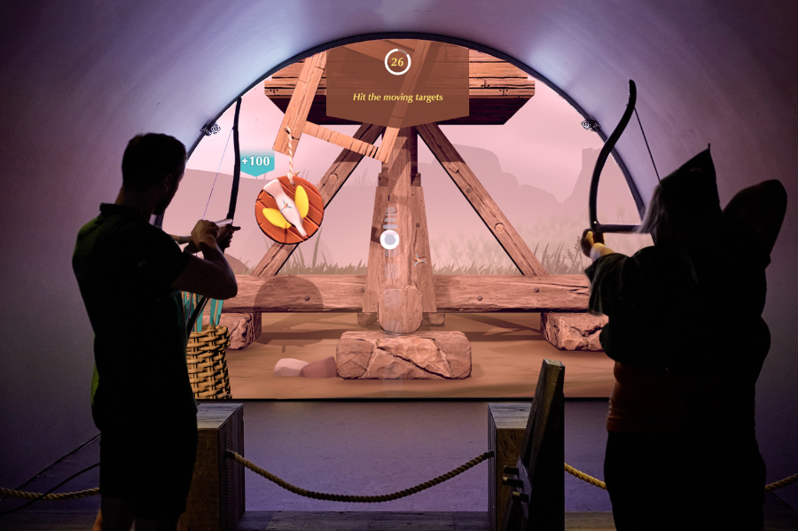
The Longbow & Quarterstaff [1],[2] experience is a phygital, motion-tracked exhibit that blends physical play with digital storytelling to bring Nottingham Castle’s Robin Hood legends to life. It’s a full-body interactive game where visitors use real medieval-style weapons, safely reimagined, to trigger digital reactions on-screen, learning skills and stories as they go.

Key Characteristics

  • Visitors physically draw a longbow or wield a quarterstaff, mimicking medieval training exercises.
  • Responds in real time. Sensors track movement and trigger animated, story-driven challenges like dueling Little John or mastering archery.
  • Teaches by doing. Combines fun with history. No reading panels, just action-based learning.
  • Inclusive and intuitive. Designed for all ages and abilities, no prior gaming experience needed.
  • Blends heritage and innovation. Reframes historical content through immersive, hands-on play.
  • Keeps visitors engaged longer, encouraging exploration and return visits.
  • Makes memories. Creates moments of laughter, achievement, and embodied storytelling.
  • Durable hardware and responsive tech withstand high traffic without compromising experience quality.
“Sen” (Virtural Reality)

Sen [3], [4] is an immersive virtual reality experience that reimagines the Japanese tea ceremony through the perspective of a tea spirit. Created by Japanese VR artist Keisuke Itoh and produced by Cinemaleap, the 15-minute experience invites participants to embody “Sen,” a tiny lifeform born from within a handcrafted Raku tea bowl. As the spirit, the viewer observes and drifts through a poetic world, experiencing cycles of life, death, and rebirth—symbolizing the transience of existence and the meditative essence of Chado (the Way of Tea).

Key characteristics:

  • Meditative tone inspired by the Japanese tea ceremony and Zen philosophy
  • Non-verbal storytelling that emphasizes emotion, atmosphere, and symbolism
  • Themes of reincarnation, impermanence, and spiritual connection to nature
  • Handcrafted visual style, blending traditional Japanese aesthetics with digital craftsmanship
  • Technology: High-resolution Virtual Reality using a VR headset and spatial audio for full sensory immersion
  • Viewers hold a physical replica of the tea bowl while in VR, which becomes the central object in the experience triggering Sen’s journey and deepening tactile connection without buttons or controllers

A Forest Where Gods Live (Projection Mapping)

teamLab’s A Forest Where Gods Live [5] is an immersive digital art exhibition set in Mifuneyama Rakuen, an ancient Japanese forest and garden with deep spiritual significance. The project blends interactive technology with cultural heritage and nature, creating a respectful dialogue between the past and the present.

Key Characteristics

  • Digital artworks are projected onto real trees, rocks, and ruins, transforming the natural environment without altering it. The forest becomes the canvas.
  • The experience changes based on where you walk, how you move, and even the time of day. Flowers bloom, animals appear, and lights shift in real time.
  • The project honors Shinto beliefs that spirits inhabit nature. Instead of overwhelming the site, the art quietly coexists with its sacred atmosphere.
  • The visuals evolve with weather, seasons, and time, offering a different experience with every visit, echoing the Japanese idea of impermanence (wabi-sabi).
  • Carefully placed soundscapes and ambient lighting deepen the sense of wonder and connection with the natural surroundings.

“Experience Guide” (Environmental Sensing + Feedback)

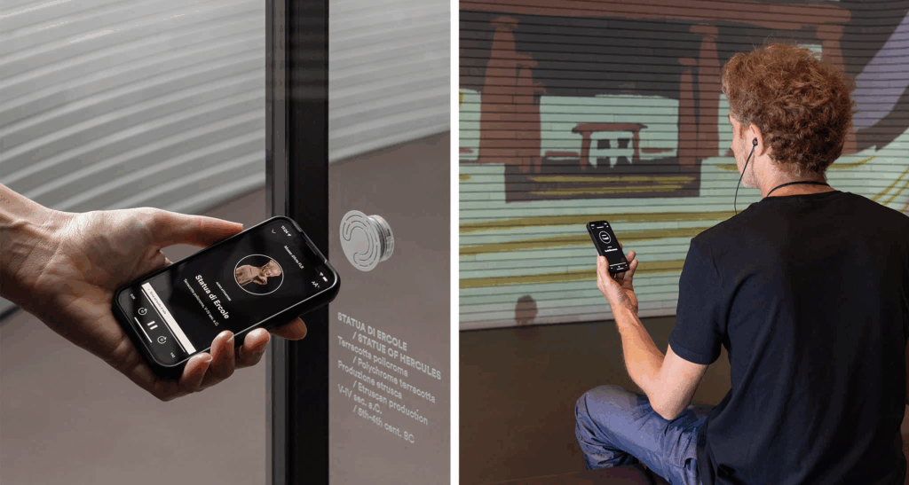
The Experience Guide [6] is a fully integrated digital system designed to enhance both visitor engagement and museum operations. It’s a smart platform that uses indoor positioning technology to deliver personalized, real-time content to visitors’ smartphones as they move through a museum. It also helps museum staff manage and analyze visitor behavior and exhibit conditions from a single system.

Key Characteristics

  • Acts like a smart, invisible guide. Delivers personalized, location-based audio-visual content to visitors’ smartphones.
  • Automatically plays relevant audio and visual content based on where you are in the museum.
  • Replaces the need for QR codes, physical guides, or borrowed devices.
  • Includes features like ticketing, real-time updates, and accessibility support.
  • Continues the experience post-visit with summaries or reports.
  • Centralizes data on visitor flow, exhibit usage, and system performance.
  • Integrates with CRM, ticketing, and content management.
  • Supports staff in planning, maintaining, and improving the visitor journey.
“Botanical Atlas” (Digital)

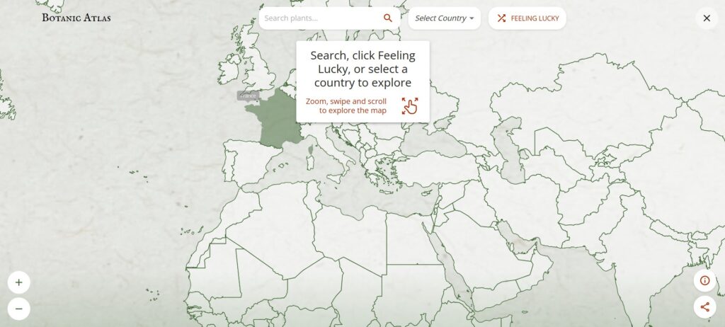
The Botanic Atlas [7] is an interactive online platform developed by Google Arts & Culture in collaboration with institutions like the Botanical Research Institute of Texas, CRIA in Brazil, and the University Herbarium of Cambridge. It showcases over 30,000 plant species through a dynamic world map powered by Google AI, allowing users to explore botanical specimens from various regions.

Key Characteristics

  • Purely Digital Platform: Accessible online via Google Arts & Culture, with no physical component—fully immersive and interactive.
  • Uses Google AI to showcase over 30,000 plant species from around the world on a dynamic map.
  • Combines scientific research (botanical specimens, taxonomy) with cultural heritage (historical and artistic stories).
  • Users can select different perspectives like Woodland Explorer, Botanical Scientist, Forest Activist, or Tree Historian to customize their experience.
  • Highlights the cultural significance of plants, botanical art history, and regional forest stories.
  • Designed to educate a global audience through immersive storytelling, interactive exploration, and rich multimedia content.
  • Covers diverse ecosystems and plants from many countries, emphasizing the global importance of botanical knowledge.
Common Aspects of Interaction Methods and Technology

  • Emotion-driven storytelling: Focus on playful, memorable learning rather than info delivery.
  • Seamless physical-digital integration: Tangible actions directly trigger digital responses.
  • Real-time responsiveness: Sensors and tracking enable immediate, dynamic feedback.
  • Multisensory engagement: Combines touch, visuals, and sound for immersive experiences.
  • Context-aware design: Respects and enhances cultural and physical settings.
  • Inclusive and intuitive: Easy to use for all ages and abilities, minimizing barriers.
  • Personalized content: Adapts to visitor location, interests, or pace via smart tech.
  • Robust technology: Durable hardware/software for consistent, high-quality use.

What’s Next

This framework can help guide me in developing my prototype by emphasizing the following key areas:

  • Creating physical touchpoints that trigger rich digital responses.
  • Ensuring interactions feel natural and immediate.
  • Designing for diverse visitors with simple, engaging interfaces.
  • Embedding experiences meaningfully within a cultural context

The upcoming blog post will focus on selecting a topic related to history and cultural heritage, as well as researching technology and making choices for my prototype.

Sources

[1] PRELOADED, “Longbow & Quarterstaff – Nottingham Castle,” PRELOADED, 2025. [Online]. Available: https://preloaded.com/work/longbow-quarterstaff/

[2] K. A. Oliver, “Nottingham Castle,” kaioliver.co.uk, Portfolio. [Online]. Available: https://kaioliver.co.uk/?portfolio=nottingham-castle.

[3] ArtScience Museum, “SEN,” Marina Bay Sands, ArtScience Museum Exhibitions. [Online]. Available: https://www.marinabaysands.com/museum/exhibitions/sen.html.

[4] MuseumNext, “SEN: A transcendent virtual tea ceremony exploring reincarnation,” MuseumNext. [Online]. Available: https://www.museumnext.com/article/sen-a-transcendent-virtual-tea-ceremony-exploring-reincarnation/.

[5] teamLab, “teamLab: A Forest Where Gods Live,” teamLab Exhibitions. [Online]. Available: https://www.teamlab.art/e/mifuneyamarakuen/.

[6] Dotdotdot_it, “The first fully integrated digital system customised to visitor and museum needs,” Medium, Oct. 27, 2022. [Online]. Available: https://dotdotdot-it.medium.com/the-first-fully-integrated-digital-system-customised-to-visitor-and-museum-needs-a2661079dfce

[7] Google Arts & Culture, “Botanic Atlas,” 2025. [Online]. Available: https://artsandculture.google.com/experiment/botanic-atlas/xwFwFQ2goojMUw.
Blog Post 5: Creating Information Architecture for the prototype

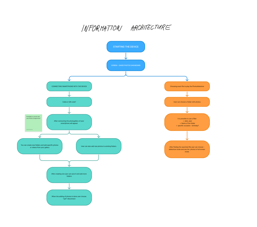
As my project continues to take shape, this phase focused on defining the Information Architecture (IA)a crucial step in turning research insights into a functional prototype. Building on earlier blog posts about how people relate to digital photo memories, the IA sets the foundation for a smooth and emotionally engaging user experience.

Structuring the Experience

The goal was to design a flow that feels intuitive, while supporting two key user goals:

  • Organizing and uploading photos
  • Viewing memories through slideshows

The process starts with turning on the device, which takes users to the Saved Photos Dashboard. From there, they can either connect their smartphone to manage photos or choose a folder to start a slideshow.

Connecting and Managing Photos

Users can connect their smartphone using a cable or QR code, with potential for cloud storage integration in the future. Once connected, the phone’s photo gallery appears, and users can:

  • Create new folders
  • Add selected photos or videos
  • Add content to existing folders

After organizing, users can disconnect and return to the dashboard. This structure was designed to support personal storytelling, allowing users to curate moments by events, people, or emotions.

Viewing the Slideshow

For those wanting to revisit memories, the right path of the IA focuses on playing photo slideshows. Users select a folder and can apply filters by:

  • Date
  • Year
  • Folder name
  • Occasion (e.g. birthday)

Once the content is selected, the slideshow mode displays the images full screen—creating space for reflection and emotional connection.

From Research to Design

This IA was informed by insights from earlier stages, particularly the need for emotional accessibility and ease of use. People want to interact with their photos without feeling overwhelmed or lost in complicated interfaces. The flow reflects that: it’s linear, visual, and customizable.

Next, I began translating these flows into wireframes, designing each screen with clarity and emotion in mind. In my next post, I’ll dive into those wireframes and early feedback from users.

Blogpost 6: How to measure trust in UX

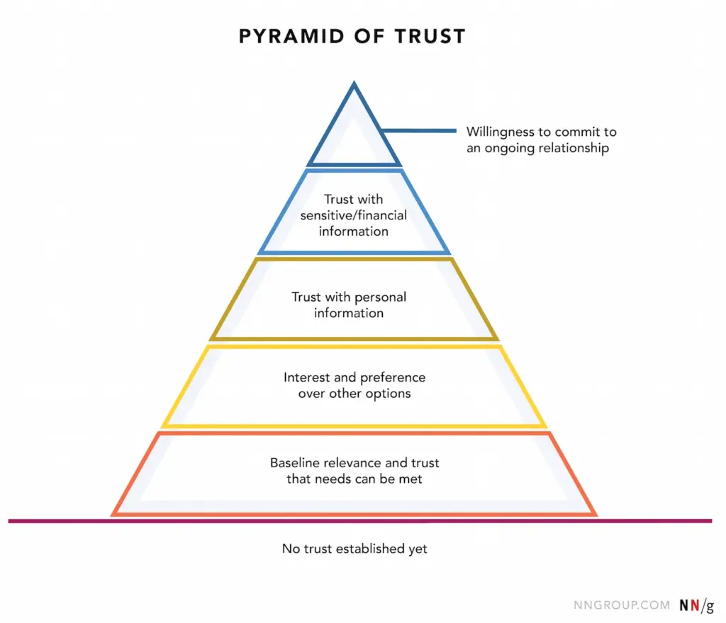
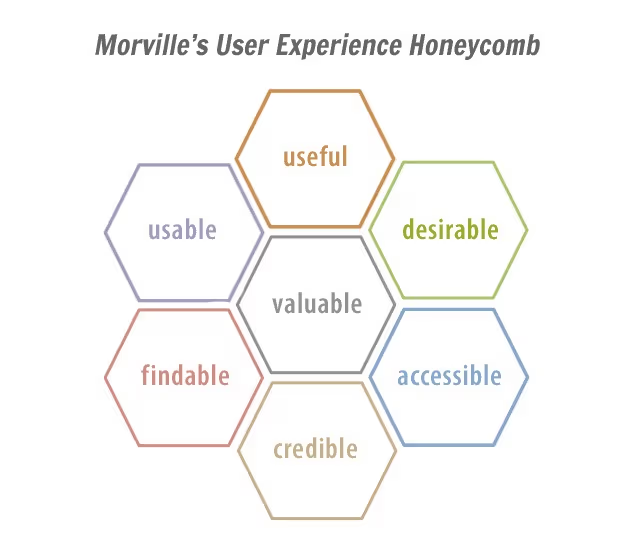
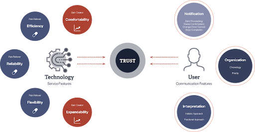
Trust is a cornerstone of user experience, influencing how users interact with digital products and services. However, unlike metrics such as load time or click-through rates, trust is intangible and multifaceted, making it challenging to quantify. Yet, understanding and measuring trust is essential for creating user-centric designs that foster loyalty and satisfaction. In UX design, trust refers to a user’s confidence in a product’s reliability, integrity, and ability to meet their needs. It’s built over time through consistent, transparent, and user-friendly interactions. Factors influencing trust include usability, visual design, content clarity, and perceived security.

(Source: http://hyunah-kim.com/project/designing-trust-into-ux)

To effectively measure trust, a combination of qualitative and quantitative methods is recommended:

1. Surveys and Questionnaires

Structured surveys can capture users’ perceptions of trust. Tools like the System Usability Scale (SUS) or custom Likert-scale questions assess aspects such as reliability and credibility. For instance, the SUPR-Q (Standardized User Experience Percentile Rank Questionnaire) includes trust-related items to evaluate website credibility. 

2. User Interviews and Feedback

Conducting interviews allows for in-depth exploration of users’ trust-related experiences. Open-ended questions can uncover specific design elements that enhance or hinder trust. This qualitative data provides context to quantitative findings.

3. Behavioral Analytics

Analyzing user behavior offers indirect insights into trust levels. Metrics such as bounce rates, session durations, and return visits can indicate trustworthiness. For example, a high bounce rate may suggest users don’t find the site credible or relevant.

4. Usability Testing

Observing users as they interact with a product can reveal trust issues. Hesitations, errors, or reliance on help features may indicate areas where trust is lacking. Usability tests help identify and rectify these pain points.

5. Physiological Measurements

Advanced methods like eye-tracking or facial expression analysis can detect unconscious reactions to design elements.These insights help understand users’ emotional responses, which are closely tied to trust.

Implementing Trust Measurements in Design

  • Incorporating trust measurement into the design process involves:
  • Setting clear objectives: Defining what aspects of trust are most relevant to the product.
  • Choosing appropriate methods: Selecting measurement techniques that align with the objectives and resources
  • Iterative testing: Regularly assessing trust throughout the design lifecycle to identify and address issues promptly.
  • Stakeholder collaboration: Sharing findings with stakeholders to inform design decisions and prioritise trust-building features.

Final Video Prototype

Source:

https://www.uxstudioteam.com/ux-blog/increase-trust-through-ux-design

https://www.youtube.com/watch?v=BWqTuNO4Epk

https://medium.com/@thefinchdesignagency/building-user-trust-in-ux-design-proven-strategies-for-better-engagement-c975aa381516

https://articles.ux-primer.com/the-hidden-power-of-emotion-and-trust-in-ux-design-5ae3d286d57e?gi=a9243f2f3c4b

https://www.stan.vision/journal/building-trust-in-saas-ux-ui-design

Blogpost 5: Designing for Both Sides of the Experience

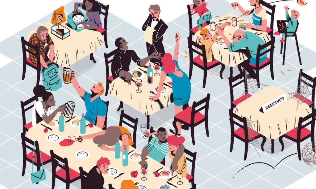
In the landscape of UX design, we often prioritise the end user = the customer tapping on the app, making a reservation, or reading a restaurant review. But in service contexts like dining, the experience is co-created. Behind every safe and satisfying gluten-free meal is a team of restaurant staff managing food prep, communication, and customer care.

For individuals with celiac disease, eating out is a high-stress situation. The stakes are medical, not just personal. Users rely heavily on restaurant staff to understand and accommodate their needs. But the staff, in turn, must navigate complex orders, time pressure, and varying levels of knowledge – all while delivering consistent, empathetic service.

So, how can UX design empower both groups?

By designing systems that are intuitive, informative, and motivating, we can bridge this empathy gap and create experiences that feel safe, human, and trustworthy – for everyone involved.

Dual empathy in UX

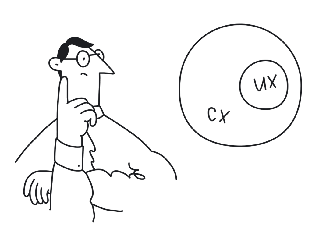
Human-centered design isn’t just about the end user, it’s about every person who interacts with the system.

In a restaurant context, that includes:

  • Kitchen staff interpreting special orders
  • Waiters translating customer needs
  • Customers navigating digital menus and allergy filters

This shared ecosystem requires tools that are mutually supportive, rather than one-sided.

(Source: https://medium.com/@mis9385/ux-design-research-part-2-week-9-restaurant-design-function-af5407866d5b)

Empowering staff through UX features

Designers have an opportunity to reduce friction and boost trust by building restaurant-facing features that support communication and clarity.

  • Live dietary alerts and preferences: for example a tablet in the kitchen or at the waiter station that instantly shows: “Table 4: Gluten-Free. Cross-contamination alert enabled.”
  • Customer preference profiles: Frequent diners could have optional saved settings that flag dietary needs early in the booking or ordering process.
  • Smart checklists for order confirmation: A visual checklist (“Separate cutting board used? Dedicated fryer confirmed?”) reinforces habits without slowing the workflow.

These features don’t just protect the user. They lighten the cognitive load for staff and create a system of shared responsibility.

(Source: https://www.eleken.co/blog-posts/14-impressive-ux-statistics-to-prove-the-value-of-great-design)

Designing the interface between two humans

At its core, this is about facilitating human connection through design. The app is the medium, but the real exchange happens between diner and staff.

  • If the app provides transparency, both sides feel informed.
  • If the system feels empathic, both sides feel heard.
  • If the training is engaging, both sides benefit from better service and reduced anxiety.

This kind of design (dual-perspective UX) is where real inclusivity happens.

Creating safe, enjoyable restaurant experiences for celiac diners doesn’t stop at user interfaces. It extends to the tools, training, and touchpoints that staff rely on to deliver those experiences. When designers design for both diners and providers, they reinforce trust, reduce risk, and elevate hospitality from a transaction to a shared act of care. Good design doesn’t just protect the user, it equips the provider. And when both feel supported, the result is an experience that’s not just functional, but truly human.

Source:

https://uxdesign.cc/what-is-service-design-and-why-it-matters-e1ed3fc86e7b

https://www.broworks.net/blog/design-for-business-designing-for-a-real-users

https://uxdesign.cc/a-guide-to-business-driven-ux-connecting-business-strategy-with-user-needs-19b74e2cba42

https://www.kioskbuddy.app/blog/human-centered-design

https://codenomad.net/blog/how-to-design-a-user-friendly-restaurant-app-interface/

Blogpost 4: UX Designing for Trust

For individuals living with celiac disease, everyday activities such as dining out or traveling often involve many decisions. Choosing a restaurant isn’t just a matter of taste or location – it’s a high-stakes choice where a single mistake could trigger a serious autoimmune response. The fear of gluten cross-contamination, inaccurate labeling, or staff miscommunication creates anxiety and can lead to avoidance behaviors.

In these emotionally charged contexts, trust becomes the most critical design currency. It’s not enough for an app or website to simply “work.” The interface must communicate safety, offer reassurance, and build confidence. The tools that help accomplish this come from emotional design, a UX approach that creates positive emotional responses while addressing users’ deep-seated fears and needs.

(Source: https://uxplanet.org/the-design-of-trust-13d68df6e52f)

Key trust-building strategies in UX/UI Design

Warm, Human-Centered UI

Trust begins at first glance. Visual design plays a subtle yet powerful role in signaling safety. Warm colour palettes (like soft greens and blues), rounded shapes, and friendly typography (e.g., sans-serif fonts with balanced kerning) make interfaces feel approachable and calm. It is important to avoid stark, sterile layouts – these may seem clinical and uninviting.

Images that reflect diverse, real-world diners with dietary needs, or inclusive illustrations, can build emotional rapport.

Community-driven verification

Trust is social. Many users rely on others’ experiences before making their own decisions, especially when safety is involved. User-submitted reviews, gluten-free ratings, or crowdsourced verification tools (e.g., “5 celiac users confirmed this restaurant”) can add layers of trust that go beyond the brand.

This also makes the interface emotionally participatory. Users don’t feel like passive consumers. They feel like contributors to a shared mission of safety.

Clear and calming messaging

When alerts or warnings are necessary, how they are phrased and delivered matters greatly. Alarming, fear-based messages (“Warning: You might get sick here!”) can overwhelm users and create distrust in the platform.

Instead, using calm, empowering messages is a better solution:
“We couldn’t verify gluten-free practices at this location. Consider choosing a nearby verified spot.”
“This restaurant has a dedicated gluten-free menu, confirmed by multiple users.”

Tone of voice should be empathetic, not mechanical. Speaking like a friend who understands the user’s needs.

Transparent data and certifications

Showing how the data was gathered is the key. If a restaurant is marked gluten-free, it is good to clarify if the information came from the restaurant itself, a third-party certification, or user verification. Transparency in labeling reduces guesswork and helps users feel in control.

A good example: “Verified by Gluten-Free Food Program (GFFP), last updated May 2025.”

(Source: https://www.uxstudioteam.com/ux-blog/increase-trust-through-ux-design)

Emotional trust as a UX metric

Traditional UX metrics like time-on-task or conversion rates don’t capture the full picture in emotionally sensitive situations. In these contexts, trust, reassurance, and confidence become key success indicators.

It could be measured through:

In-app feedback surveys after bookings (“Did you feel confident in your choice?”)

Emotional sentiment analysis of reviews

User return rate for safety-verified features

For users with celiac disease, digital trust isn’t a luxury, it’s a necessity. Interfaces must go beyond usability and tap into empathy, comfort, and shared values. Emotional design is the bridge between fear and freedom.

Designers have the power to transform digital platforms into safe, emotionally intelligent spaces, where users don’t just complete tasks, but feel heard, protected, and empowered.

Sources:

https://www.interaction-design.org/literature/article/trust-building-the-bridge-to-our-users?srsltid=AfmBOoqwQbSdcqbM2LcoZvx0fZRmBXgi1mKs0qCGJF9w9YppYST-oT6T

https://www.codebridge.tech/articles/emotional-design-in-ui-ux-creating-memorable-user-experiences

https://www.uxdesigninstitute.com/blog/role-of-emotion-in-ux-design/

(Source: https://www.interaction-design.org/literature/article/trust-building-the-bridge-to-our-users)

Blogpost 3: The Power of Emotional Decision Points in UX

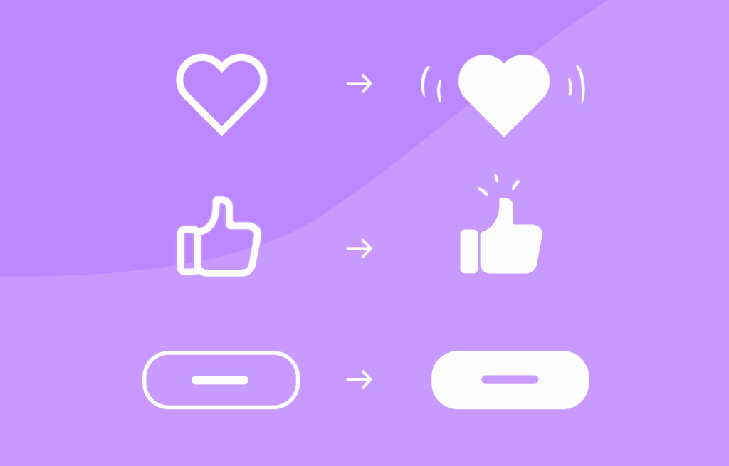
Micro-interactions are those tiny, often subconscious moments of feedback. It is a play of a surprisingly large role in shaping how users feel when engaging with a digital product. Whether it’s a small animation after clicking a button, a soft vibration after completing a form, or a sound that signals success, these interactions offer reassurance, guidance, and delight.

But what happens when the user’s experience is layered with heightened emotional stakes, such as when managing a medical condition like celiac disease while traveling?

For many celiac travelers, the simple act of choosing a restaurant becomes a complex, emotionally charged decision. The fear of gluten cross-contamination, misunderstandings with staff, and lack of reliable information can lead to anxiety and hesitation. In these scenarios, micro-interactions must evolve beyond aesthetics and usability – they must become emotional decision points that build trust and provide comfort.

Micro-Interactions as emotional anchors

Micro-interactions are traditionally used to provide feedback or indicate progress, but when reframed as emotional decision points, they take on a deeper role. These are the moments when users need reassurance, not just that a button was clicked, but that a decision they’re making is safe, validated, and understood.

For example a user booking a table at a restaurant labeled gluten-free. A simple message saying “Reservation confirmed” is informative, but emotionally neutral. Comparing this to: “You’re all set! This place is 100% gluten-free certified—dine with confidence!“.

That message acknowledges the user’s concerns and offers emotional validation as a small, powerful shift in tone and intent that can ease anxiety and enhance trust.

(Source: https://www.uxdesigninstitute.com/blog/microinteractions-in-ui-design/)

Emotional design and empathy in UX

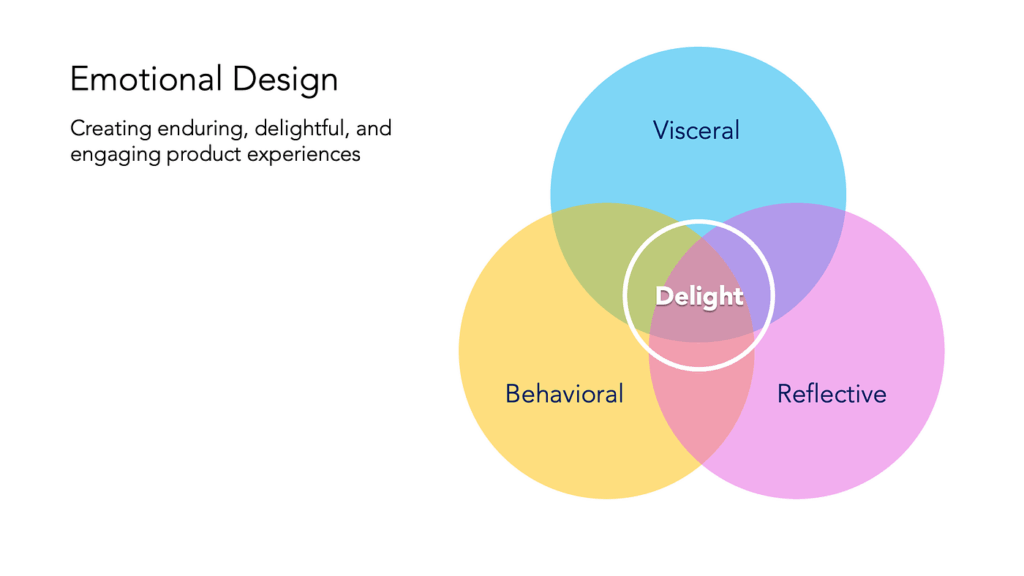
The concept of Emotional Design, introduced by Donald Norman, outlines how products evoke emotions through three levels of experience:

Visceral: What we see and feel instantly. For example, clean visual design and friendly icons that suggest safety.

Behavioral: How well the product works. Is the app intuitive, and does it answer the user’s needs – like finding gluten-free restaurants nearby?

Reflective: How the product aligns with our values and identity. For celiac users, a product that respects their condition and supports their lifestyle reflects empathy and shared understanding.

In practice, this means designing with:

Clear feedback: Messages like “This meal is prepared in a dedicated gluten-free kitchen” reduce doubt and increase user confidence.

Calming UX language: Words matter. Using reassuring phrases like “You’re in safe hands” or “We’ve got your back” adds a human tone that speaks to the user’s emotional state.

Affirmative confirmations: Simple, positive reinforcements “You’ve successfully reserved a celiac-safe meal” turn transactions into trust-building moments.

Consistency across touchpoints: Whether it’s during onboarding, navigation, or checkout, emotional design should remain present. Repeated positive interactions reinforce the app’s reliability.

(Source: https://medium.muz.li/the-art-of-emotion-normans-3-levels-of-emotional-design-88a1fb495b1d)

Designing for high-stress use cases

The empathy gap – the disconnect between what designers assume and what users actually feel can be especially wide in health-related or stress-inducing use cases. Closing this gap requires more than good visuals or flawless functionality. It means designing for how users feel in critical moments.

For instance, if a user is traveling in a foreign country, unsure of the local language or food labeling laws, they need an interface that goes beyond “working” – they need one that soothes, educates, and protects.

Examples of emotional UX features for celiac users could be:

Verified restaurant badges with explanations and visual indicators.

A “safe zone” color palette (greens and blues) used during confirmation steps.

Optional peer reviews specifically from other celiac travelers.

Emergency cards with translated gluten-free phrases that can be generated and saved.

(Source: https://www.justinmind.com/web-design/micro-interactions)

When designing UX for high-sensitivity scenarios like celiac travel, every micro-interaction becomes a chance to support the user emotionally. By turning these moments into emotional decision points, infused with clarity, empathy, and trust, designers can create not only functional products but emotionally intelligent ones. In a world full of decisions, it is important to help the users feel that every choice they make is the right one.

Sources:

Norman, D. A. (2004). Emotional Design: Why We Love (or Hate) Everyday Things. Basic Books.

https://medium.muz.li/the-art-of-emotion-normans-3-levels-of-emotional-design-88a1fb495b1d

https://medium.com/uxcentury/the-three-levels-of-emotional-design-0f7ff723af04

https://medium.com/swlh/three-levels-of-design-donald-a-norman-4f36a8db82d6

https://www.veroke.com/micro-interactions-in-ui-ux-small-details-big-user-impact/

Blogpost 2: Designing for Empathy

Understanding the empathy gap

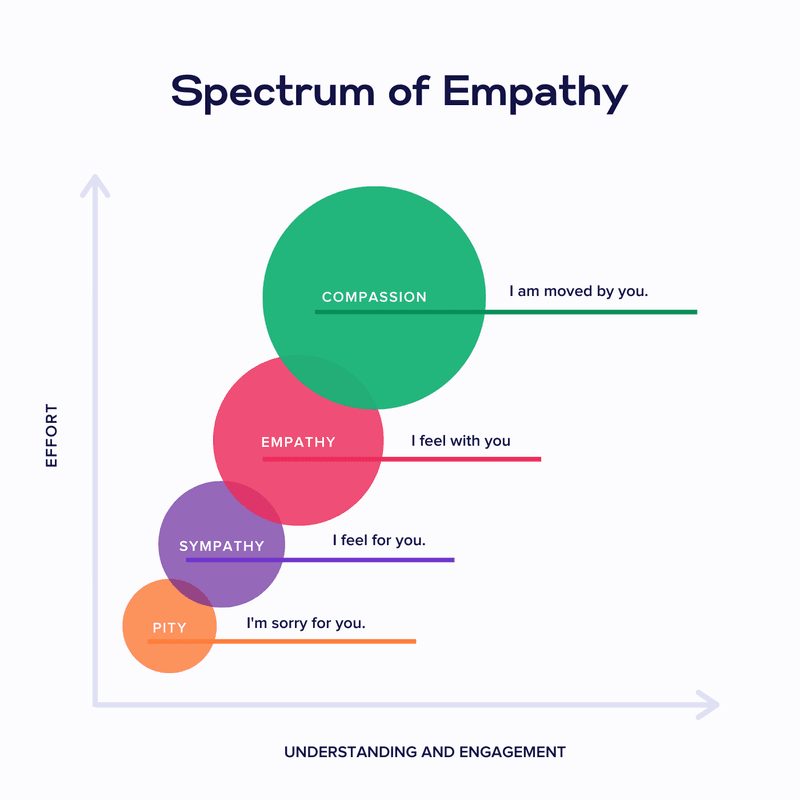
Designers often aim to create inclusive, human-centered products, but there’s a subtle challenge that’s harder to overcome than accessibility or UI polish: the empathy gap. This term refers to the cognitive and emotional distance between people who have direct experience with a problem and those who don’t.

In UX design, the empathy gap becomes especially problematic when building products for people with disabilities, like for example celiac disease. While a user without celiac might casually browse for places to eat, someone with celiac approaches every food decision with caution, emotional tension, and risk assessment. Unfortunately, many restaurant apps and travel platforms fail to reflect this difference in urgency and vulnerability.

Storytelling and personas as empathy tools

Personas are more than just user archetypes. They act as bridges to lived experiences. When backed by emotional storytelling, personas help designers and stakeholders temporarily “step into someone else’s shoes,” fostering a deeper understanding of motivations, fears, and mental models. According to Cooper et al. (2014), personas are “a powerful design tool for communication and empathy-building” when they reflect real emotional contexts and not just demographics or goals.

Storytelling in UX amplifies this effect. Stories engage the emotional centers of our brains, making information more memorable and decisions more thoughtful (Norman, 2004). When personas are introduced within narrative frameworks, such as onboarding sequences that follow their journey, designers can simulate real-life decision-making environments. This helps foster emotional alignment with users, especially those whose needs are often overlooked.

For travelers with celiac disease, this emotional alignment is important. It’s not just about finding gluten-free options – it’s about feeling safe and understood in a world where a simple breadcrumb can cause days of illness.

Sources:

Norman, D. A. (2004). Emotional Design: Why We Love (or Hate) Everyday Things

Cooper, A., Reimann, R., Cronin, D., & Noessel, C. (2014). About Face: The Essentials of Interaction Design

Persona & User journey

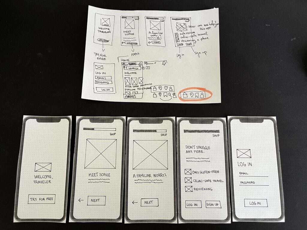
For this prototype, my goal is to create a low-fidelity paper app to help travellers with gluten intolerance find safe places to eat and enjoy local cuisine.

To help me achieve this, I created a persona and user journey.

Anne – Celiac solo traveler

Name: Anne Bauer
Age: 29
Occupation: Freelance photographer
Location: Berlin, currently traveling through Italy
Health Context: Diagnosed with celiac disease 5 years ago
Tech Use: Heavy smartphone user, relies on travel and food apps
Personality: Curious, independent, sometimes anxious about eating out


Goals:

  • Find places to eat safely while traveling abroad
  • Avoid cross-contamination and gluten exposure
  • Feel confident and supported in unfamiliar food cultures

Pain Points:

  • Unclear menus and gluten-free claims
  • Language barriers when asking staff about food safety
  • Anxiety when eating in new places
  • Lack of trust in unfamiliar restaurants

Emotional Triggers:

  • Relief and happiness when finding verified safe spots
  • Frustration when apps show “gluten-free” without proof
  • Appreciation when her needs are clearly understood

User journey: Anne arrives in Bologna and needs dinner

  1. Trigger: Anne arrives in Bologna and feels hungry.
  2. Goal: She wants to find a celiac-safe restaurant nearby.
  3. Problem: She’s unsure which places are safe and trustworthy.
  4. Action: Opens the app and starts onboarding → begins search → filters results → reads restaurant details → picks a trusted place.
  5. Success: Finds a restaurant with verified reviews and clear allergen info.

The first part of my work on the paper prototype involved creating an onboarding process for the application:

Blogpost 1: Prototyping-Speed-Dating-Session

Having my prototype shared as part of a speed date was a great way to get quick and varied feedback. Presenting the ideas in a short amount of time forced me to focus on the core functionality of each prototype, which helped me clarify my design decisions. It was interesting to see how different people interpreted my creations – some saw new possibilities that I hadn’t considered – like using a paper roll as a kaleidoscope.

One of the most valuable insights was realising how simple materials can lead to innovative solutions if approached creatively. The projection device helped me think about possible improvements, especially in terms of usability.

All in all, this session highlighted the importance of developing ideas, open discussion and looking at designs from multiple perspectives, key aspects of a strong prototyping process.

Here are my all three prototypes:

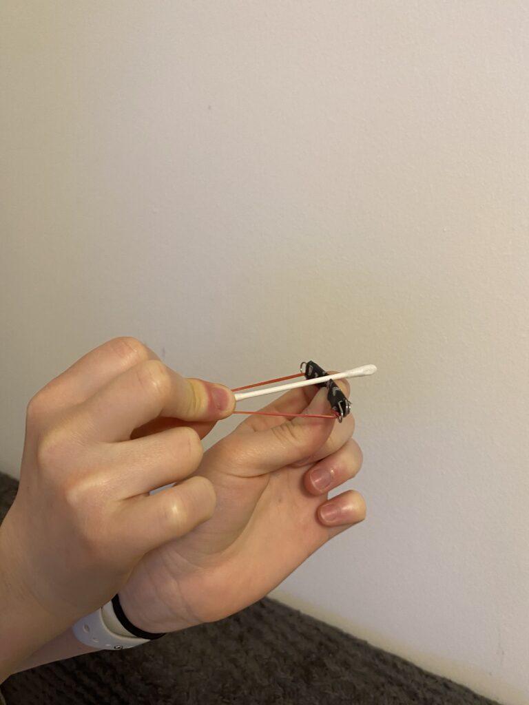
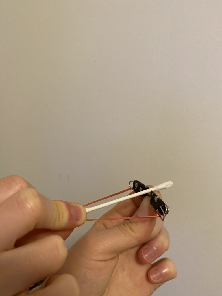
Crossbow from a paper clip

The first prototype I created is a tiny but functional crossbow, made primarily from a paper clip, a rubber band, and a small piece of paper or a toothpick as an arrow. I bent the paper clip into a crossbow shape and secured a rubber band to provide the necessary tension for launching the projectile.

This small crossbow demonstrates basic mechanical principles, particularly elasticity and tension. The rubber band stores energy, and when I release it, the projectile shoots forward. It was a fun experiment in leveraging small-scale mechanics to achieve movement and functionality.

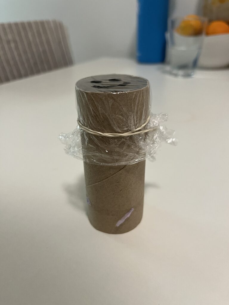
Projection from a paper roll

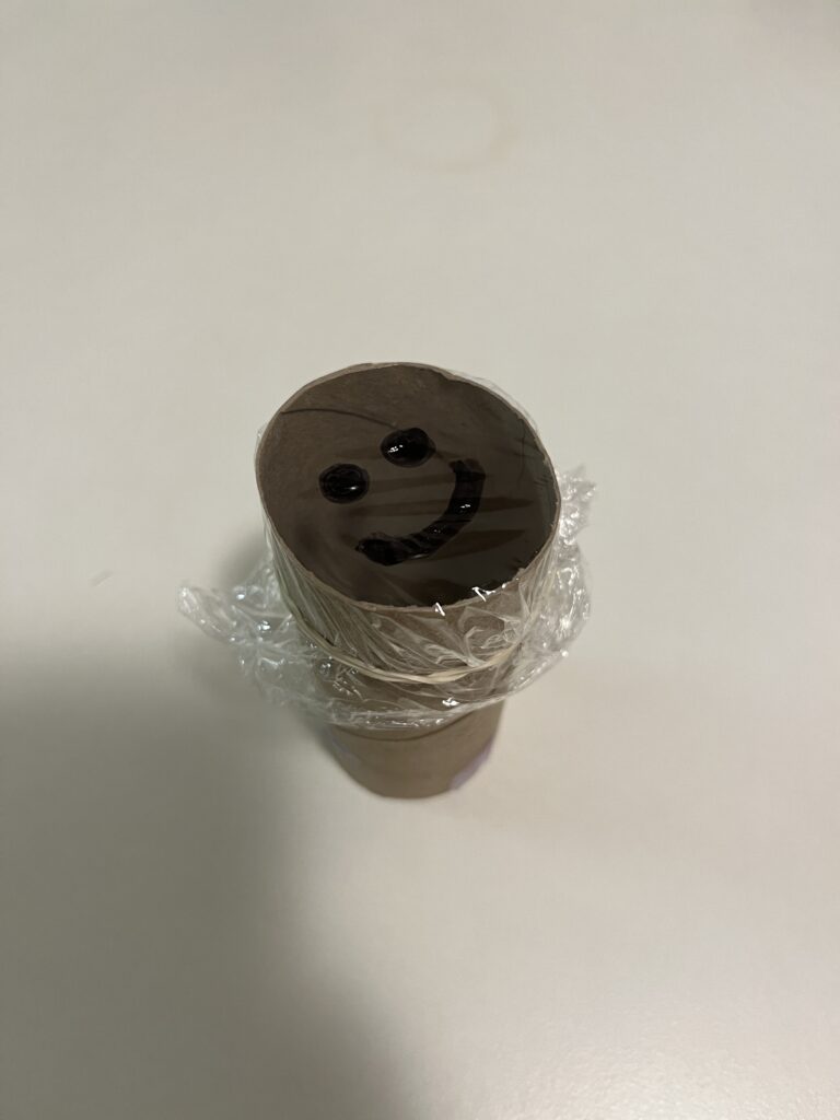
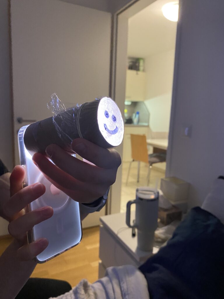
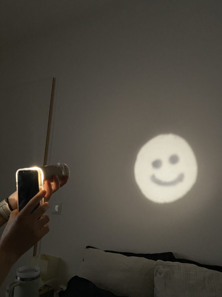
For my second prototype, I explored light and shadow projection using a paper roll. I drew specific shapes into the roll and placed a light source behind it to create simple projections on a surface. The concept is similar to shadow puppetry or projectors, relying on light diffusion and obstruction to form visible patterns.

This experiment helped me better understand basic optical principles, like how light travels in straight lines and how different materials can block or diffuse it. By playing with shapes, angles, and distances, I was able to adjust the clarity and size of the projection. This could even be a starting point for interactive light installations or custom lamp designs.

Phone stand from a paper roll

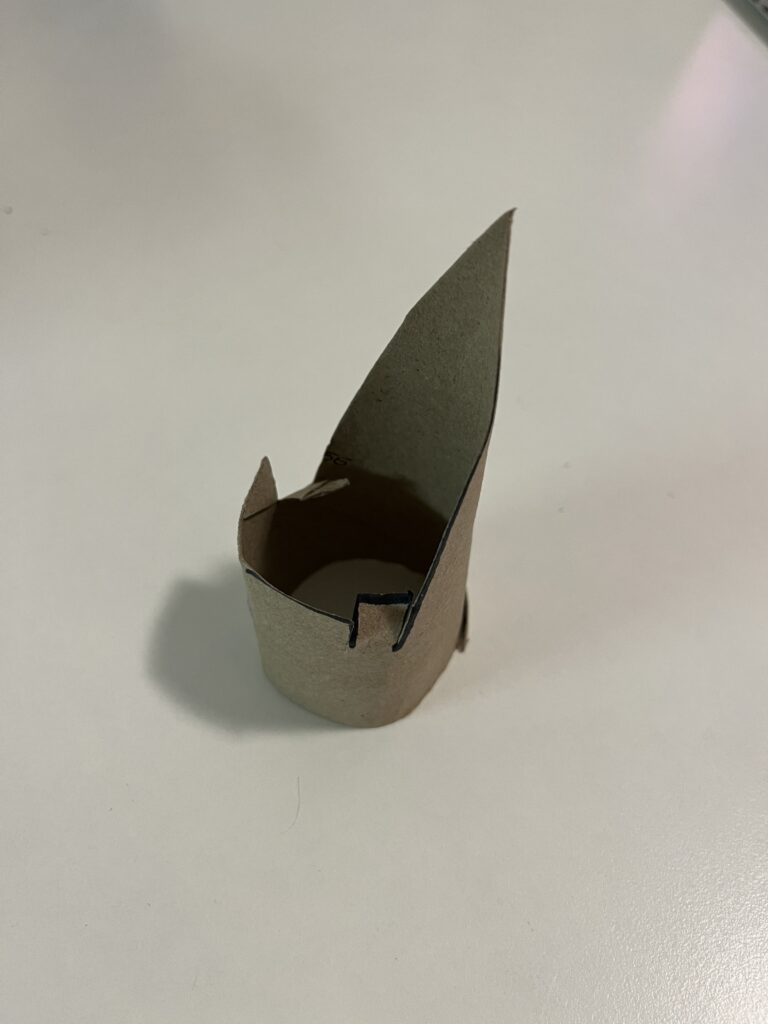
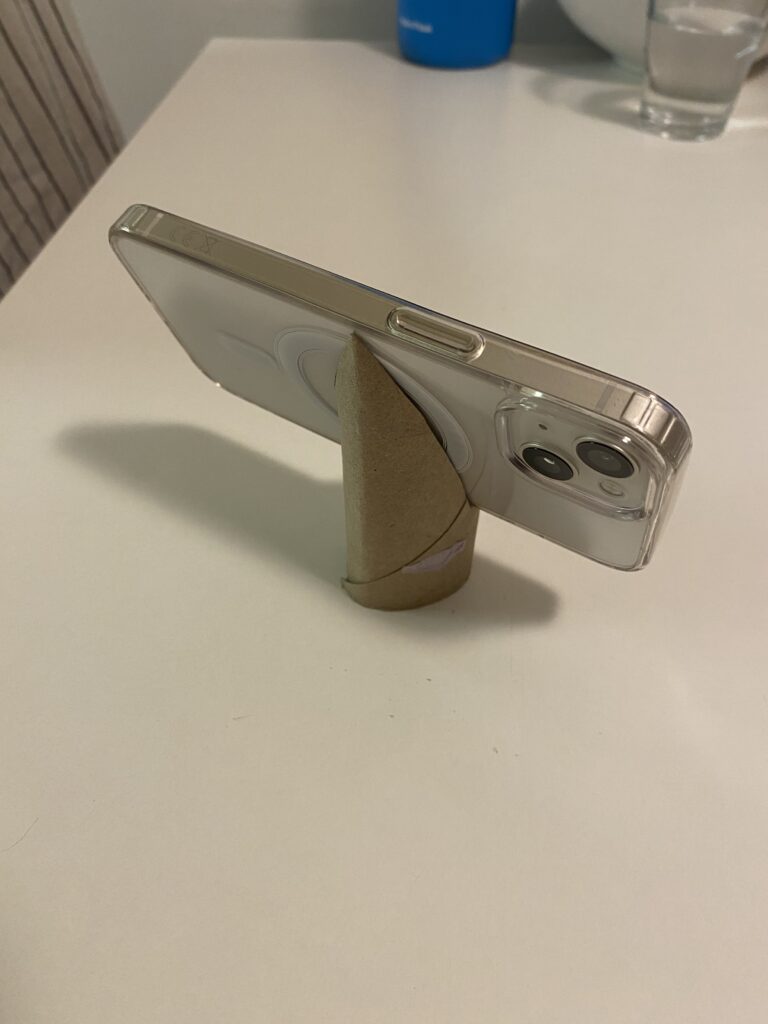
For my third prototype, I wanted to make something practical, a DIY phone stand using a paper roll. By cutting slots into the roll, I created a stand that holds my phone at the perfect viewing angle.

I like this prototype because it’s both eco-friendly and functional. Instead of buying a phone stand, I repurposed a simple household item into something useful. This small project made me think about ergonomics and accessibility, as well as how design can make everyday tasks more convenient.

These three prototypes showed me how creativity and problem-solving can lead to functional designs using basic materials. Each one shows different aspects of design – from mechanics (crossbow) and optics (projection) to usability and ergonomics (phone stand). Prototyping with limited resources pushed me to reuse materials and find innovative solutions.

Blog 3: Current problems in EV Charging (Focus on User Experience and Accessibility)

On my current research and hands on experience with Chargers, I noticed that public charging infrastructure hasn’t caught up in terms of user experience and inclusivity. In this post i just want to dive little bit deeper and for that I did a small desk research. Here’s what’s going wrong:

Inconsistent User Interfaces & Unclear Feedback

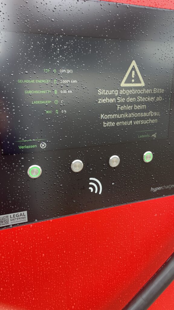
  • Every station looks and acts differently. Menus vary wildly, icons are confusing and messaging like “Error 47” doesn’t explain much. Users often struggle to initiate charging or interpret unclear statuses
  • No real-time clarity. Displays frequently fail to show clear information like charging progress or estimated time remaining—making users feel uncertain and anxious

Accessibility Design Gaps

  • Physical barriers: No ramps or extra-wide spaces for wheelchair users. Many stations have high-mounted screens and stiff, heavy cables that require extra strength to operate .
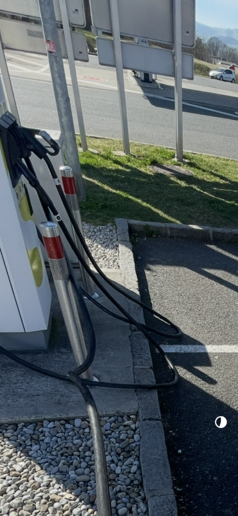
  • Cable issues: CCS and other fast-charging cables are weighty and inflexible due to cooling needs. They’re often too short or too long making them hard to plug in for many users.
Own Image Documentation

Environmental & Spatial Constraints

  • Tight, unprotected spaces: Narrow bays, poor lighting, lack of shelter, all uncomfortable design choices, especially in bad weather or for vulnerable users
  • No tactile or audio support: Stations rarely include braille, haptic feedback, or voice prompts, ignoring users with visual or dexterity issues

Technical Unreliability & App Dependency

  • High failure rates: About 27% of public fast chargers are out of commission at any given time -> broken screens, failed connectors, or payment system glitches
  • App-only access: Many chargers demand app use for payment or activation, making usability dependent on the quality of the app and user connectivity
  • Multiple apps, multiple frustrations: Switching between brand-specific apps for each station is a constant headache for EV drivers

So why it is important to think of

  1. Creates anxiety & frustration
    Unpredictable errors and poor guidance lead to “range anxiety” and erode trust in the EV charging system.
  2. Excludes vulnerable users
    People with disabilities, seniors, or those less tech-savvy often find stations unusable, limiting EV adoption.
  3. Undermines wider EV adoption
    If charging remains cumbersome, many potential EV drivers will stick to fossil fuels, slowing sustainable transport progress.

What needs to Change

To make EV charging intuitive and inclusive there are some steps to consider:

  • Standardized UI elements: Clear steps like “Plug in, Tap to Start, Charging…” with robust feedback via visual, auditory, and haptic cues.
  • Inclusive hardware design: Adjustable screen heights, lighter cables (or cable reels), tactile buttons, braille labels, and wide, ramp-equipped bays.
  • Safety & comfort enhancements: Covered, well-lit stations with seats or resting areas especially important for longer charging waits.
  • Reliable offline access: Card readers plus app options, chargers that work even without mobile signal
  • Unified interfaces across networks: Consistent flows and minimal apps, drivers shouldn’t have to learn a new system at every station

Next Step: Rapid Prototyping

With these insights, my next step is to build or sketch something quick and to test it and iterate of course. With this i mean low-cost prototypes, sketches, cardboard interfaces, or simple physical models to validate ideas, also thinking about lego prototype:

  • trying out a height-adjustable screen mock-up with clear call-to-action buttons.
  • maybe simulating cable-handling ergonomics with also light feedback threw makey makey
  • Test feedback designs (LED, sound, or haptics).
  • Role-play station use in cramped or wheelchair-accessible scenarios.

These hands-on prototypes will reveal what truly makes charging intuitive and comfortable giving valuable, user-driven data before moving to high-fidelity design.

Clifford, J., Savargaonkar, M., Rumsey, P., Quinn, C., Varghese, B., & Smart, J. (2024). Understanding EV Charging Pain Points through Deep Learning Analysis. Idaho National Laboratory. SSRN. https://ssrn.com/abstract=5031126

https://www.evaglobal.com/news/accessible-charging-for-all-a-solutions-approach#:~:text=In%20a%20public%20charging%20environment,critical%20for%20public%20charging%20infrastructure

https://kempower.com/user-experience-ev-charger-design

Blog Post 4: Learning from CEWE Photo Kiosks – Bridging UX, Tech & Memory Design

What Happens Inside a Photo Kiosk?

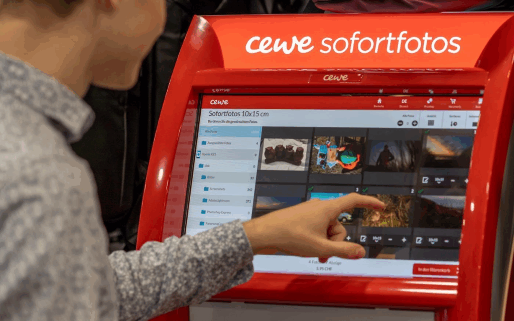
These kiosks allow users to connect their phone or USB stick, select photos, and print them instantly. Technically, they run on Windows operating systems in kiosk mode, and the interface is custom software, likely built on Qt or similar cross-platform UI frameworks. Connections are supported via:

  • USB-A / USB-C
  • SD cards
  • Bluetooth, AirPrint, Huawei Share
  • QR code upload via CEWE mobile app

Once connected, the user’s gallery is displayed in a grid of thumbnails, ready to scroll and select.

UX Analysis: What Works, What’s Missing

From a user experience point of view, CEWE kiosks are highly optimized for speed and simplicity:

  • Large touchable thumbnails
  • Minimalistic, icon-driven steps
  • Clear path from selection to printing

However, in the context of memory and emotional engagement:

  • Photos are shown without metadata (no date, no location, no description)
  • There’s no storytelling layer, you select images, but don’t reflect on them
  • Entire galleries are exposed raising privacy concerns

This stripped-down interface is efficient for printing but misses opportunities for personal connection, reflection, or control which are central to my thesis.

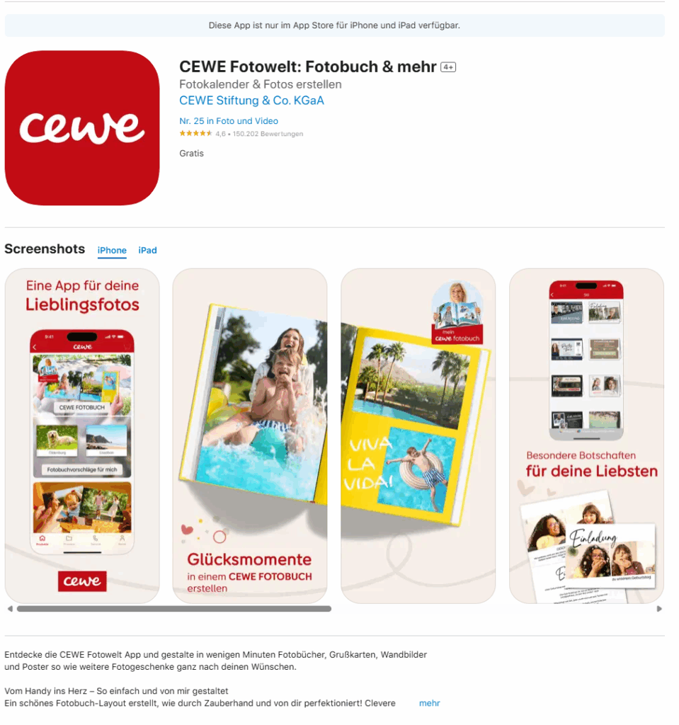
The Cewe company also created an App where you can design your photobook layout and then print it.

https://apps.apple.com/de/app/cewe-fotowelt-fotobuch-mehr/id583713833

How This Inspires My Prototype Design

These kiosks give me a technical and experiential foundation for what my memory device prototype might be. I want to create something that feels as physical and intuitive as a kiosk, but is emotionally aware and curated, rather than just functional.

Instead of printing, my app and device would allow users to store, browse, and re-experience their photos in a more meaningful way. Here’s what that could look like:

A Custom Photo Archive App: UX Meets Memory

Imagine connecting your phone or SD card to a device, not to print photos, but to curate and store them intentionally. The app would function like a mix between Finder / File Explorer, Photo slideshow, and a memory journal.

Key Features for the App:

  • Photo Dashboard: A clean, visual overview where your photos are sorted by year, event, or theme (e.g. “Graduation”, “Summer 2023”, “Family”).
  • Filter & Organize: Tag and group memories manually or through AI suggestions (e.g. by faces, dates, or locations).
  • Slideshow Mode: Select folders or themes and activate a full-screen, ambient slideshow experience, ideal for reflection or sharing.
  • Simple Storage: All files live in a readable system (e.g. SD card or internal storage) so it’s not a locked-in app, but still has an elegant visual layer on top.
  • Selective Sync: Inspired by the kiosk, but instead of exposing your whole gallery, only selected folders or albums are shown on screen.

“Minimal surface, deep meaning” like a kiosk, it should be easy to use in public or private settings, but with a sense of control.

Connecting It Back to the Thesis

The CEWE kiosk taught me that:

  • People are comfortable interacting with touchscreens and device syncing in physical spaces
  • There’s value in ritualizing the photo-selection process
  • But there’s a lack of contextual memory architecture

For my thesis project, I aim to build a prototype that bridges technical familiarity (USB, QR code, SD cards) with UX depth (filters, tagging, curated playback). It’s not just about decluttering photos, it’s about transforming them into accessible, emotional archives.