Blog Post 4: From Blueprint to Visuals: Wireframing and Designing the UI

After defining the complex architecture and data flows in my previous posts, it was time to shift focus from the backend logic to the user’s reality. I needed to answer the most important question: What will this experience actually look and feellike for Alex, our shopper? This is where the design process begins. It’s a journey of translating abstract ideas into tangible, interactive screens. For this project, I followed a three-stage methodology, moving from low-commitment sketches to a fully realized high-fidelity vision.

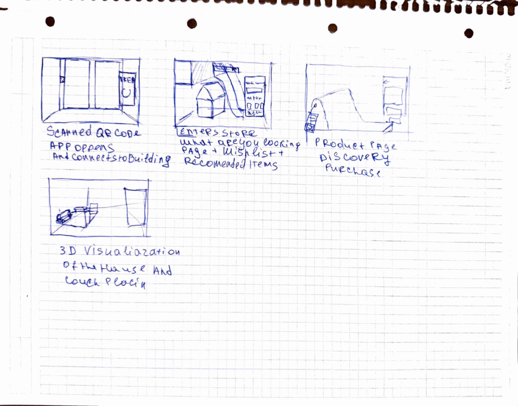
Stage 1: The Spark of an Idea – Paper Wireframes Every complex digital product begins with the simplest of tools: a pen and paper. Before getting down to pixels and software, I sketched out the core user flow. This stage is all about speed and ideation—capturing the main steps of the journey without worrying about details.As you can see from my initial drawings, I focused on the key moments: entering the store, viewing a product, and the “wow” moment of 3D visualization in the user’s own home. This raw format allowed me to establish the foundational structure of the application.
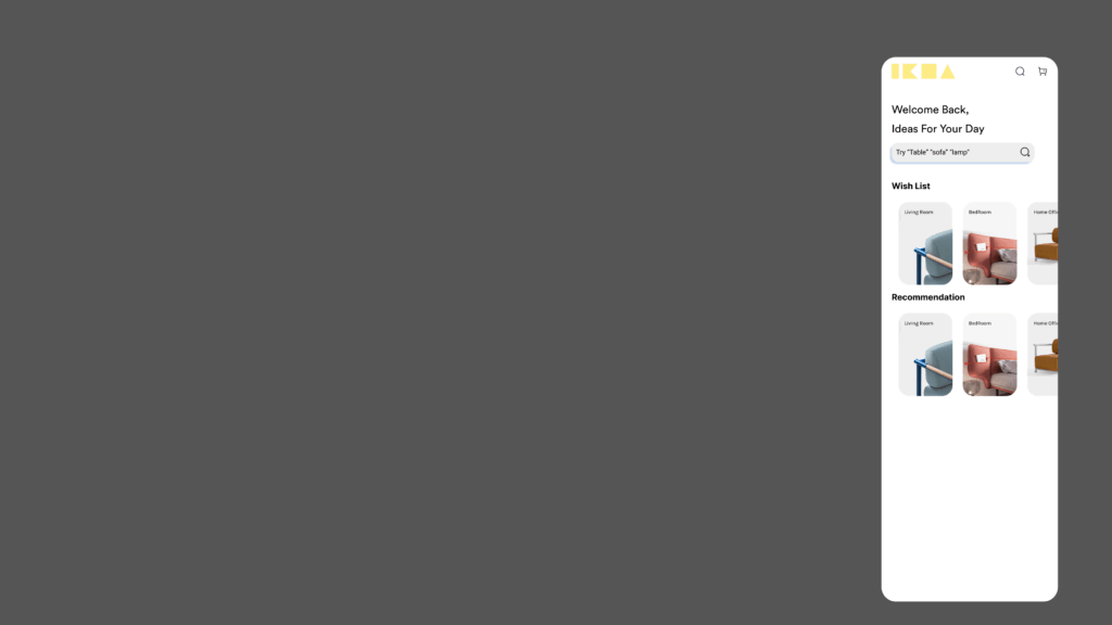
Stage 2: Building the Blueprint – Low-Fidelity (Lo-Fi) Digital Wireframes With the basic flow mapped out, the next step was to give it a more formal structure. I created low-fidelity digital wireframes. The goal here is not beauty; it’s clarity. By using simple grayscale boxes, placeholder images, and basic text, I could focus entirely on information hierarchy and layout. These Lo-Fi designs helped me answer critical questions: Where should the search bar go ? How should a product’s details be organized? What does the checkout process look like? At this stage, I focused on a mobile form factor to solidify the core components in a familiar layout before adapting them for a more complex AR view.

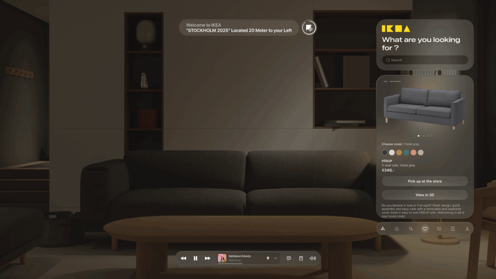
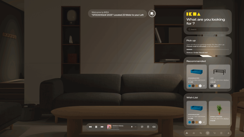
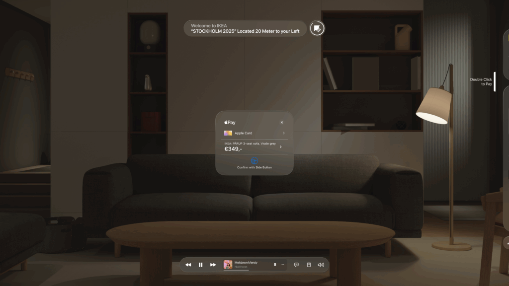
Stage 3: Bringing the Vision to Life – High-Fidelity (Hi-Fi) AR Mockups This is the leap from a 2D blueprint into a 3D, immersive world. Designing for Augmented Reality, especially for the main target of smart glasses, required a complete shift in thinking. The user interface can’t just be a flat screen; it needs to live within the user’s space, providing information without obstructing their view.Here are some of the key design principles I implemented in the high-fidelity mockups:

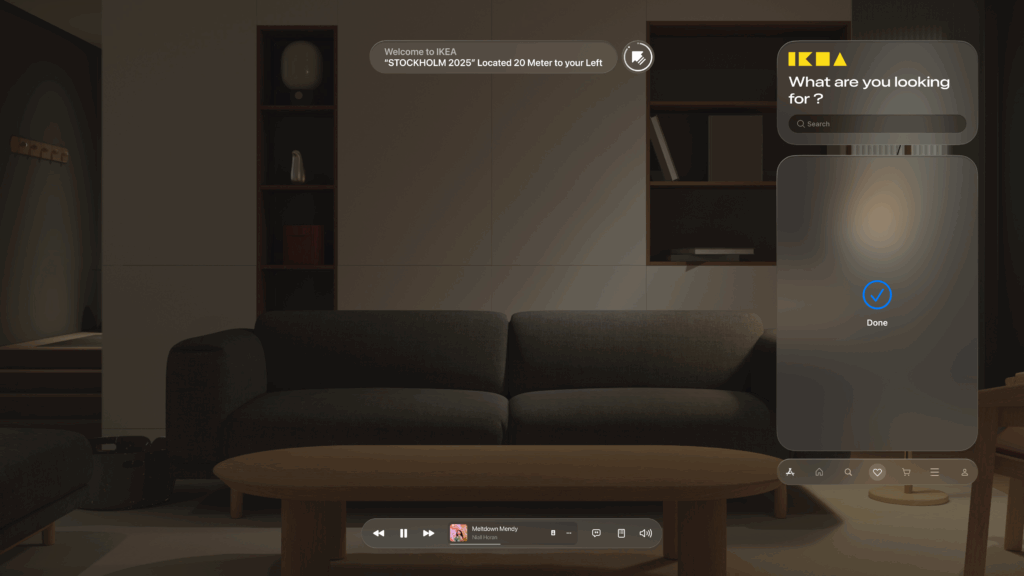
Spatial & Contextual UI: The interface appears as a series of floating panels, or “holograms.” A navigation prompt appears at the top left, while the main interactive panel is on the right, keeping the central field of view clear. This UI is also contextual—it changes based on what the user is doing, whether they are navigating, inspecting an item, or making a purchase.
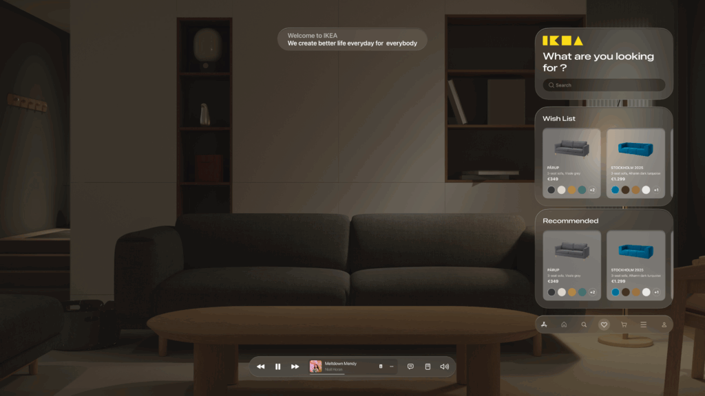
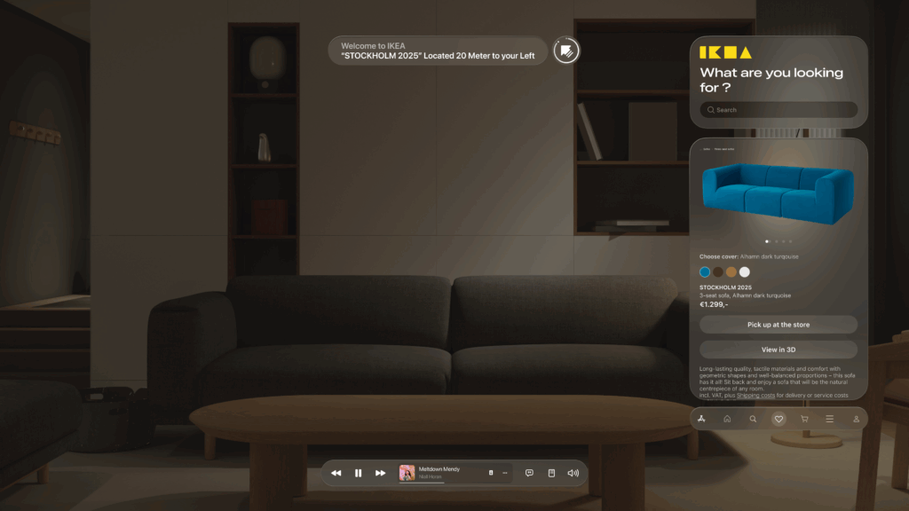
  • Glassmorphism: I used a translucent, blurred background effect for the UI panels. This modern aesthetic, known as glassmorphism, allows the user to maintain a sense of the environment behind the interface, making it feel integrated and less obtrusive.

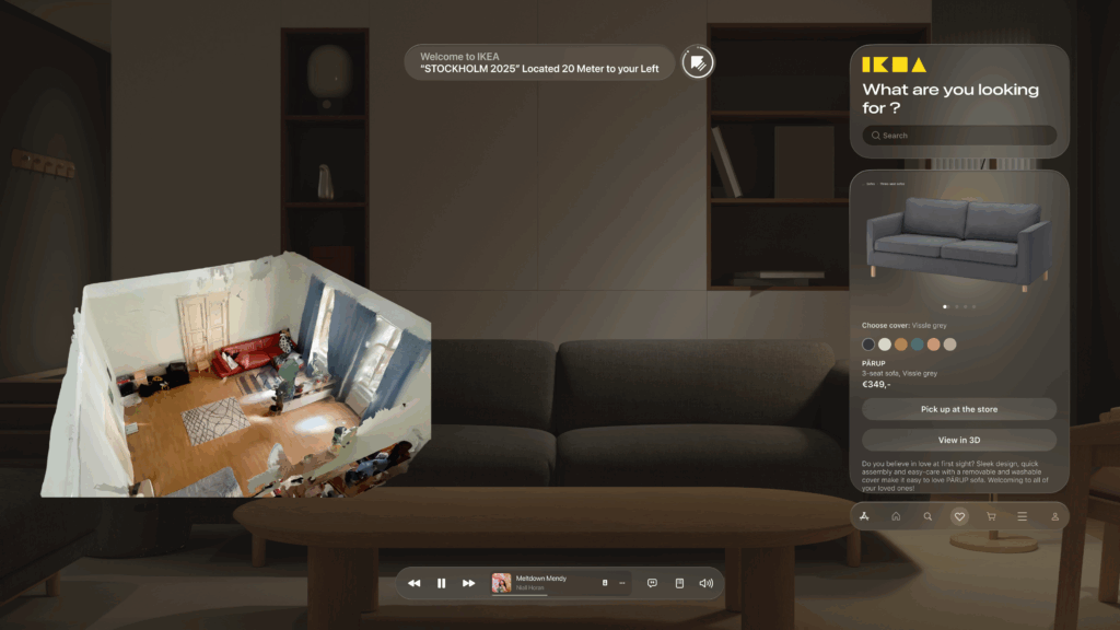
  • Seamless AR Integration: The core feature—visualizing furniture—is seamlessly integrated. As seen below, when Alex wants to check how a sofa looks in his apartment, the app displays the 3D scan of his room directly within the interface. This feature provides immediate, powerful value and solves a key customer pain point.
    • An End-to-End Flow: From Browse the wishlist to making a secure payment with Apple Pay and seeing the order status, the entire purchase journey is designed to be fluid and intuitive, requiring minimal interaction from the user this. This actually concludes my idea of the technology us human moving from interacting with the objects by typing or other means now we have our devices to do so.
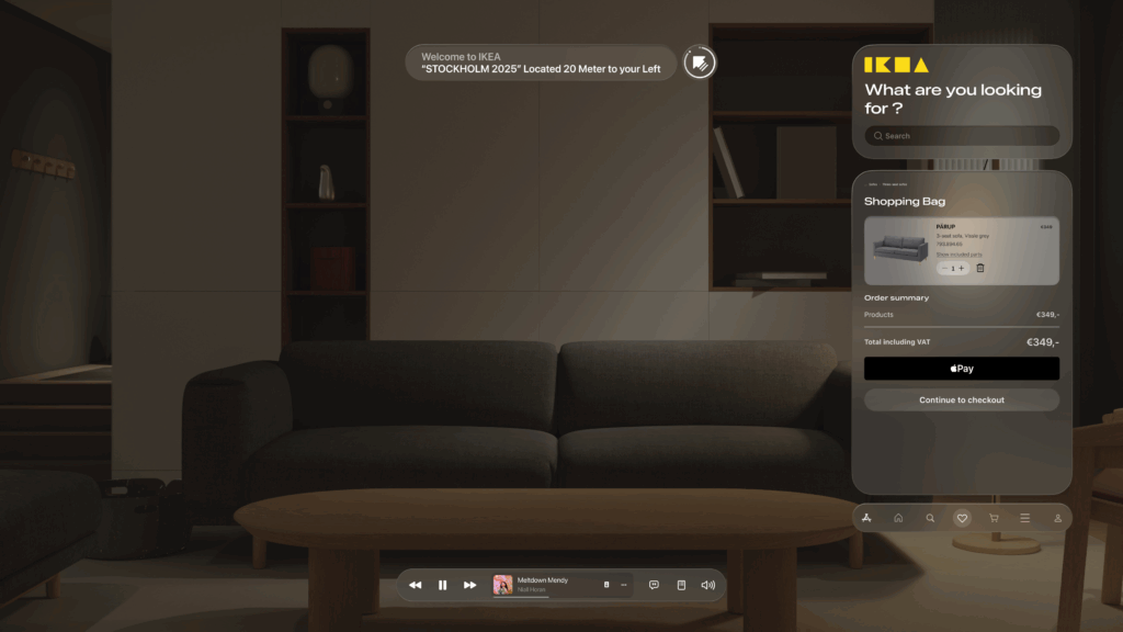
    This iterative journey from a simple sketch to a polished AR interface was crucial for refining the concept and ensuring the final design is not only beautiful but also intuitive and genuinely useful.

    With the architecture defined and the user interface designed, the final step is to merge them. In my next post, I’ll discuss the technical prototyping process—bringing these designs to life with code and seeing them work on a real device.
    Blog Post 3: Decluttering by Design – A UX/UI Benchmark of Modern Photo Management Apps

    My idea for master’s thesis explores how design can support the preservation of meaningful digital memories. In this blog post, I explore existing decluttering Apps and how could this knowledge help me with my next research.

    I benchmarked several modern photo decluttering apps, including:

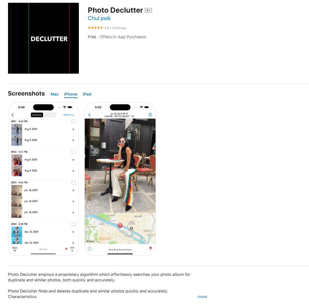
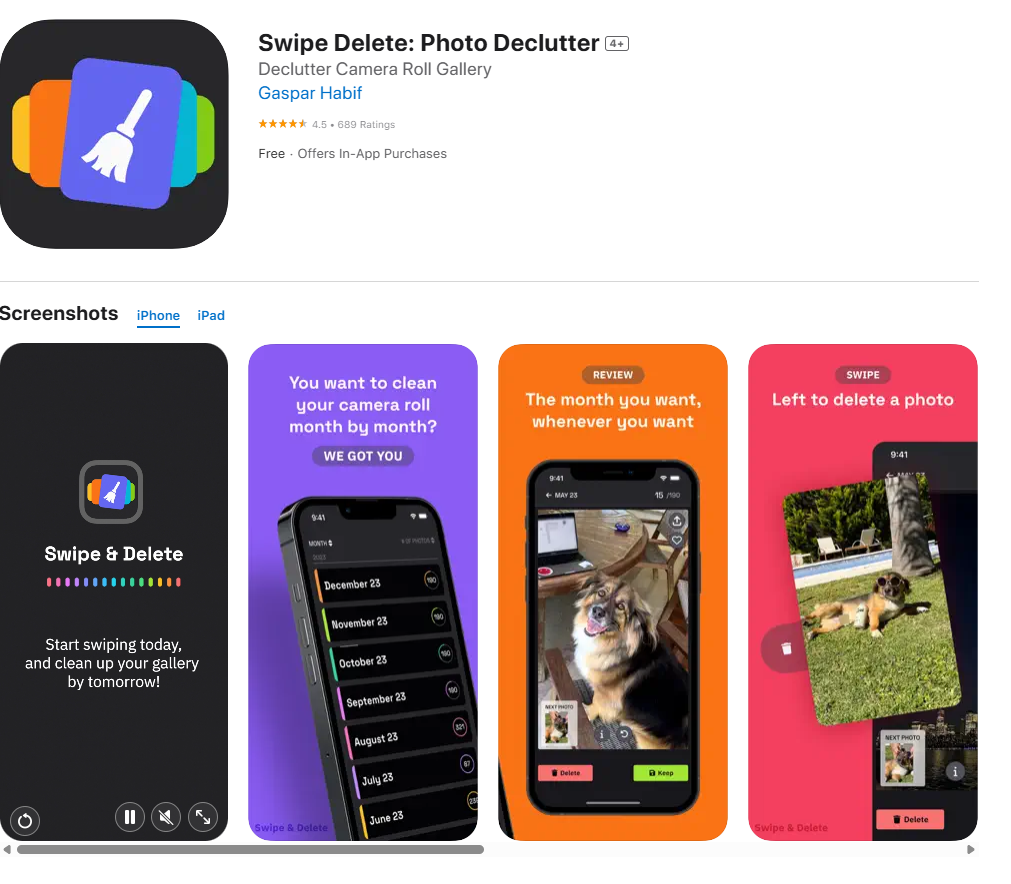
    Swipe Delete: Photo Declutter

    https://apps.apple.com/us/app/swipe-delete-photo-declutter/id6477321134

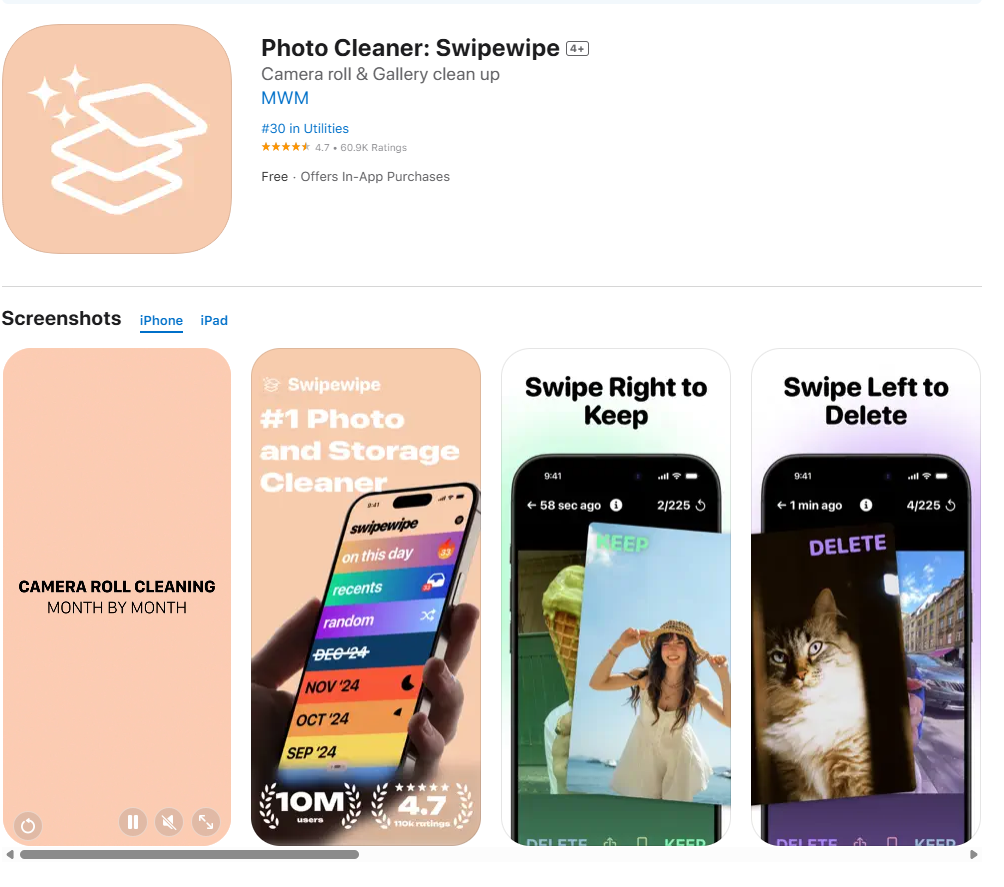
    Swipewipe Photo Cleaner

    https://apps.apple.com/us/app/photo-cleaner-swipewipe/id1583884012

    Slidebox: Photo Cleaner App

    https://apps.apple.com/us/app/slidebox-photo-cleaner-app/id984305203

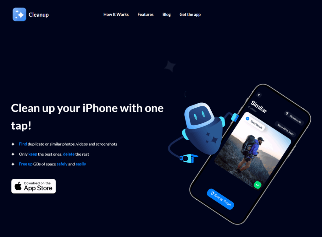
    Cleanup: Clean Storage Space

    https://www.cleanupapp.co

    Photo Declutter (AI-powered)

    https://apps.apple.com/us/app/photo-declutter/id1469956763?platform=iphone

    The Rise of the Swipe

    One thing that immediately stood out was how many of these apps use swiping gestures to manage photo deletion. This “Tinder-style” interface, where you swipe left to delete and right to keep, is fast, intuitive, and clearly designed with a younger, tech-savvy audience in mind. Apps like Slidebox and Swipewipe make the process feel almost fun, turning a boring task into something more engaging.

    While this interaction style is efficient, it also raises questions. What about older users who might find swipe-based design less familiar? And more importantly, do these fast decisions respect the emotional weight that some photos carry?

    Emotional and Digital Safety

    Most of the apps prioritize speed and simplicity, often at the expense of emotional context. Only Swipe Delete includes a moment to pause and reflect after mass deletions. On the other hand, Photo Declutter uses AI to identify duplicate photos, which feels less emotionally risky. You are not deciding whether a photo has meaning, just whether it’s a copy. Its interface is clean and easy to understand, making it feel approachable for more cautious users.

    Another concern that came up during testing is data privacy. Sharing your entire photo gallery with a third-party app can feel risky. Who owns your images? Where are they stored? This kind of safety issue is often overlooked, but it is a very real concern for users.

    Rethinking the Experience

    While working through this benchmark, I started asking a bigger design question. Should the photo decluttering happen directly inside your gallery, fully integrated with your device? Or should it function more like an external memory system, where you sort photos manually, similar to storing them on a hard drive?

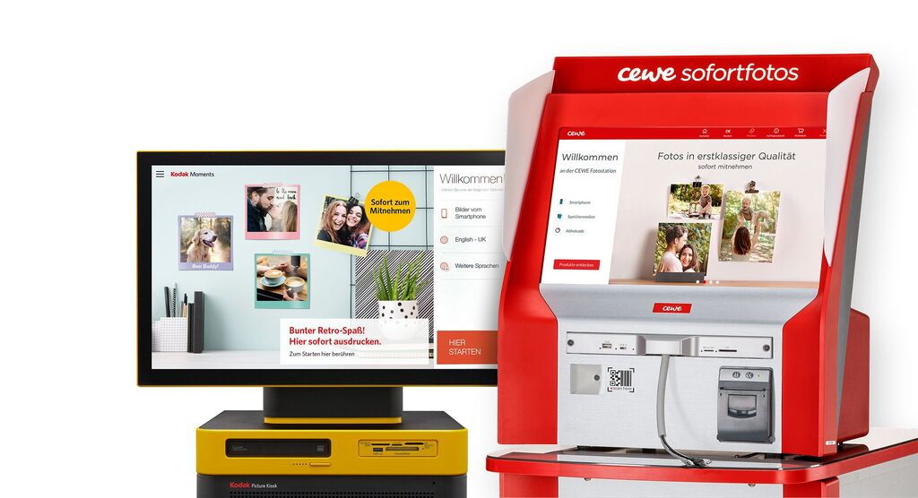
    This reminded me of photo printing kiosks, like the ones at DM drogerie stores. When you connect your phone, the photo gallery is immediately accessible on the screen, and selecting pictures feels simple and clear. Maybe I should also explore and benchmark this kind of interface, where physical interaction connects directly with digital memory.

    Final Thoughts

    Decluttering digital photos is not only about creating more space. It is about deciding what is worth keeping. Most of today’s apps focus on speed and efficiency, but often overlook emotional value and safety. There is a big opportunity to design tools that are not only smart and fast but also sensitive, reflective, and secure.

    Grind Down or Wind Down: Why Slowing Down Might be a Smarter Design Philosophy

    In today’s “always on” design culture, productivity is king. We strive to fill every moment. Jam-packed sprints, brainstorming marathons, synchronous ideation sessions. If you don’t grind, you’re behind.
    But what if this relentless pace is not fueling creativity, but smothering it?

    Hustle Culture: a Creativity Crisis

    Hustle Culture thrives on the belief that relentless striving equals success. In this mindset, being busy comes a virtue. But some research shows that this might be backfiring.
    For instance, a Deloitte report (215) found that 77% of employees had experiences burnout at their current job. And research in cognititve psychology shows that chronic stress impairs key cognitive functions such as memory, decision-making, and creative thinking (McEwen & Sapoisky, 1995). Under pressure, the brain reverts to routine and risk-averse solutions. recisely the opposite of what creative work demands.

    There is an apparent paradox at play: the harder we push for ideas, the less room we give them to surface.

    Even in innovation-heavy workplaces, this reality is sinking in. Google’s “Search Inside Yourself” program incorporates mindfulness and reflection breaks into employee schedules. Arianna Huffington, who famously collapsed from exhaustion, founded and entire platform, Thrive Global, to advocate for well-being and balance. Why? Because rest isn’t the enemy of creativity. It’s often the source of it.

    Creativity isn’t Constant. It Has a Rhythm

    Creative output doesn’t follow a linear or constant trajectory. One well-supported theory in psychology is that creativity emerges from the interplay between focus and defocus, the so-called “dual-process model” of creative cognition (Sowden, Pringle, & Gabora, 2015).

    Neuroscientist Marcus Raichle and colleagues discovered that the brain’s default mode network, which is active during idle moments, plays a significant role in ideation and problem-solving (Raichle et al., 2011). In other words: the brain doesn’t shut down during downtime. It reconfigures.

    This is echoed by the classic four-stage model of creativity proposed by Wallas (1926):
    1. Preparation: Immersion in the problem
    2. Incubation: Stepping back or taking a break
    3. Illumination: Sudden insight or “aha!” moment
    4. Verification: refining and testing the idea
    That quiet moment during a walk, in the shower, or while zoning out can become the birthplace of powerful ideas. It’s not laziness, it’s neurological efficiency.

    Alternating Creative Current

    IF we accept that the creative sweet spot lies in the tension between focus and reflection, how can we implement it into a design process?

    1. Alternate Focus and Pause
      Pretty simple, yet important to mention because often overlooked: incorporate regular 10-15minute low stimulation breaks. Not for scrolling but for the mind to rest.
    2. Ritualize Rest
      Normalize quiet moments. A “blank block” at the beginning of a meeting could prime the brain for originality, not just efficiency
    3. Mindful Transitions
      Deliberate shifts away from focus (by journaling, walking, breathing exercises, or similar) could help move from convergent to divergent thinking.

    No matter how it will be implemented in the final design, we need to rethink what “productive time” looks like. The pause is not a distraction from the creative process but a necessary part of it. And it needs reiteration.

    Is Busyness a Creative Delusion?

    In my opinion, one of the most harmful assumptions in contemporary creative culture is that busyness equals progress. Corporate Design Agencies over-schedule, over-plan, and over-communicate, mistaking motion for meaning. But the cognitive processes on which creative thinking rests (associative processing, divergent thinking, insight, etc.) require something that busyness inherently denies: mental slack.

    I already mentioned this in a previous blog post but I think it relevant to repeat that according to research by Baird et al. (2012), participants who were denied a chance to daydream were significantly outperformed by participants who did when it comes to creative problem-solving-challenges. The authors of that study concluded that mind wandering facilitates creative incubation, especially when daydreaming was done during a cognitively light task like washing dishes or copying a text.

    This aligns with psychologist Mihaly Cyikszentmihalyi’s concept of psychic entropy, which posits that our minds need time to meander to restructure ideas and find novel assocaiations (Cyikszentmihalyi, 1996). When we’re constantly responding to emails, deadlines, or Slack notifications, there’s no room for that restructuring.

    Towards a Balanced Design Ethos

    If we want to deign to just with speed but with depth, we need a philosophical shift in how we understand our time. Instead of viewing reflective or idle moments as inefficiencies, they can be reframes as integral parts of the creative process.

    This isn’t a romantization of laziness. It’s an invitation to reclaim cognitive space. Just as we respect physical ergonomics in design work, we should start advocating for mental ergonomics: structured time for wandering thought, non-goal-oriented exploration, and emotional detachment from constant outcomes.

    Imagine a design team where unstructured time is built into the sprint cycle, or where “creative sabbaticals” of even just an afternoon are embedded into deadlines. These aren’t indulgences. They could be an essential practice grounded in cognitive science and supported by a growing body of research. And just like bodybuilders who schedule rests to gain optimal results it is time for creatives to do the same and to recognize the importance of mental offloading.

    References:
    Deloitte. (2015). Burnout survey: 77% of employees have experienced burnout at their current job. Retrieved from https://www2.deloitte.com/

    Sowden, P. T., Pringle, A., & Gabora, L. (2015). The shifting sands of creative thinking: Connections to dual-process theory. Thinking & Reasoning, 21(1), 40–60. https://doi.org/10.1080/13546783.2014.885464

    Wallas, G. (1926). The art of thought. New York: Harcourt, Brace.

    Baird, B., Smallwood, J., Mrazek, M. D., Kam, J. W. Y., Franklin, M. S., & Schooler, J. W. (2012). Inspired by distraction: Mind wandering facilitates creative incubation. Psychological Science, 23(10), 1117–1122. https://doi.org/10.1177/0956797612446024

    14 Adding encryption to Morse Arduino

    After getting the Arduino to encode Morse messages and send them to a connected Max patch (see the last blogpost), I took the next step. So far, I built a way to create messages, and a way to transmit them, but not everyone was able to simply read and understand morse code, so the next step was obvious: build a way the messages could be read in clear text. The idea was simple: after every message got “sent”, the Arduino would take the Morse code string and convert it into readable text.

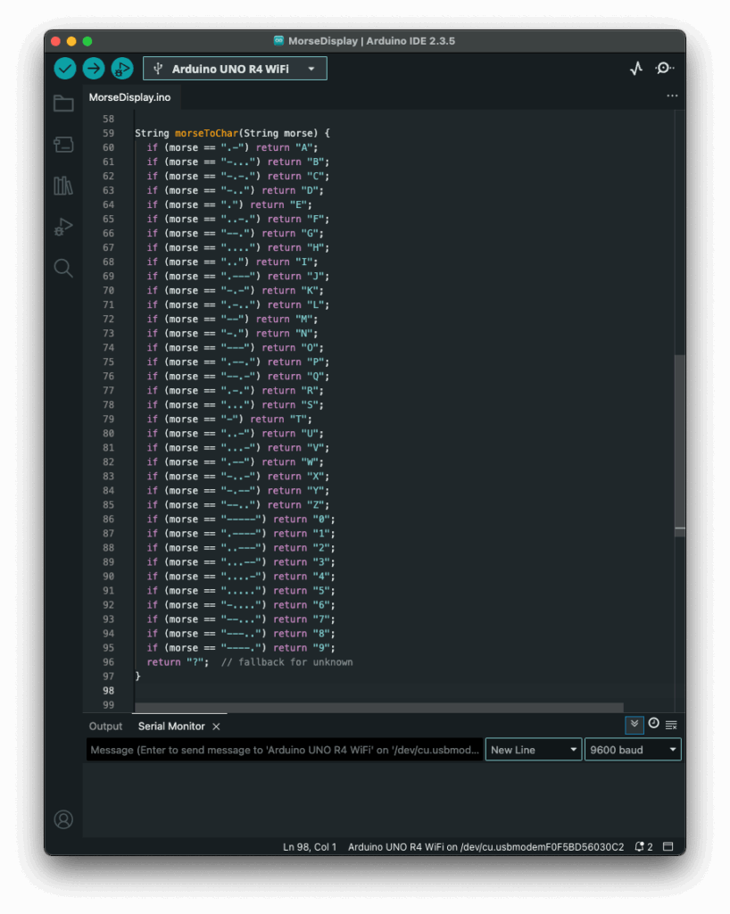
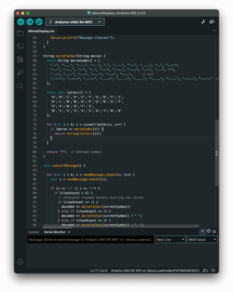
    My first attempt was a long list of if statements, which worked, but I had hoped for an easier way to add and administrate different dot & dash combinations. Next I thought of using a switch statement to iterate through the combinations, but Arduino doesn’t support those, so I had to come up with a new idea. After searching on the internet, I came across a different solution, using arrays. So I rewrote it using arrays that mapped Morse code strings to letters. That gave me something that felt like a switch statement. It was now much cleaner, and easier to add custom combinations later.

    Before:

    After:

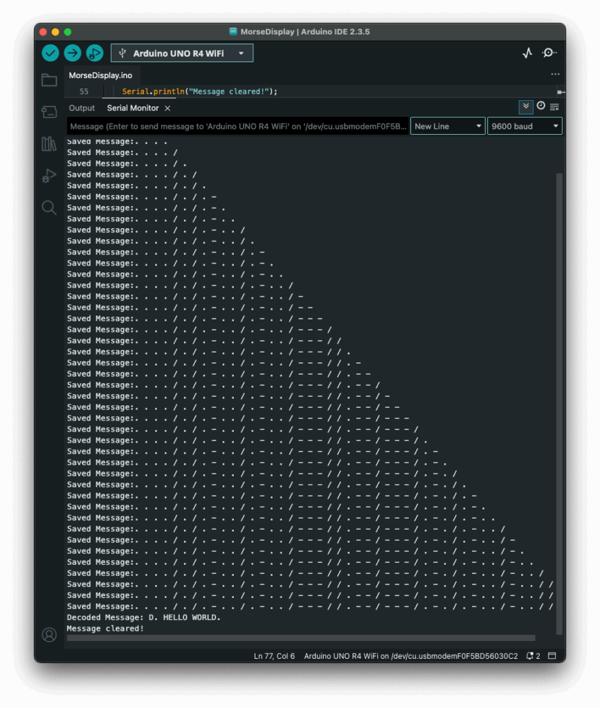
    The decoding worked like this: one array was filled with all the Morse code symbols, and one with the matching letters. The code then iterated through the Morse message character by character, building a temporary substring that represented a single Morse symbol (like “.-” or “–“). Whenever it hit a slash (/), the program knew it had reached the end of one symbol. It then compared the collected substring to all entries in the Morse array. When it found a match, it took the corresponding index in the letter array to find the translation. That translated letter got added to the final decoded message string.

    To figure out how many slashes were pressed, the code counted how many consecutive / characters appeared in the string. Each time it found a slash, it increased a counter. When a non-slash character came next (or the message ended), it used the number of counted slashes to determine the type of break:

    • One slash (/) meant a new letter started.
    • Two slashes (//) meant a new word started.
    • Three slashes (///) meant the start of a new sentence.
    • Four slashes (////) marked the end of the message. 

    This system worked surprisingly well and gave me more control over formatting the final message. By using these simple separators, I could organise the output clearly and logically. Here is how the full print would look like with the translation.

    The result? A very basic but fully functional Morse communication device: input, output, transmission, and now decoding. Currently it is just displaying the message in the serial monitor, but I plan to make the message be displayed on the LED Matrix, on the Arduino, that way the message is readable to the user immediately. I also read online, that an Arduino can be connected to a web server, so I will probably test that out, since this way I could create smart devices for my room on my own.

    Instructions

    If you wanted to try it out yourself, here was what you needed:

    • An Arduino (compatible with Modulinos)
    • The three button Modulino
    • The latest sketch with decoding logic (I could share this if you were interested)

    Not a lot to do, except plugging in the three button Modulino and uploading this sketch:

    Blog Post 3: A Shopper’s Journey: Tracing the Data Flow Step-by-Step

    In my last post, I unveiled the blueprint for my smart retail system—the three core pillars of the AR Application, the Cloud Platform, and the In-Store IoT Network. Today, I’m putting that blueprint into motion. I’ll follow my case study shopper, Alex, through the IKEA store and analyze the precise sequence of data “handshakes” that make his journey possible. Additionally this blog post is super technical due to my personal interest and it’s help to be able to further develop the technology

    While this experience is designed to be accessible on any modern smartphone, it is primarily envisioned for the next generation of consumer Smart AR Glasses. The goal is a truly heads-up, hands-free experience where digital information is seamlessly woven into the user’s field of view.

    Let’s dive into the technical specifics that happen on Alex’s chosen AR device.

    1. The Task: High-Precision In-Store Navigation

    The Scenario: Alex arrives at the store, puts on his smart glasses, and wants to find the “BILLY bookshelf.” He needs a clear, stable AR path to appear in front of him.

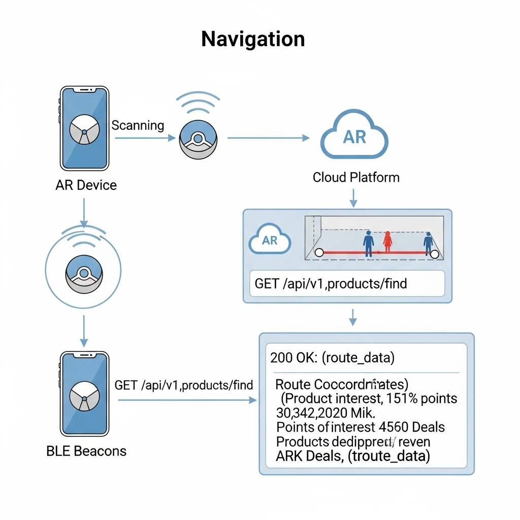
    The Data Flow: The immediate challenge is knowing Alex’s precise location, as GPS is notoriously unreliable indoors. To solve this, I’ve designed a hybrid indoor positioning system:

    • Bluetooth Low Energy (BLE) Beacons: These are placed throughout the store. The AR device detects the signal strength (RSSI) from multiple beacons to triangulate a coarse position—getting Alex into the correct aisle.
    • Visual Positioning System (VPS): This provides the critical high-precision lock. A pre-built 3D “feature map” of the store is hosted on my cloud platform. The software on the AR device matches what its camera sees in real-time against this map. By recognizing unique features—the corner of a shelf, a specific sign—it can determine its position and orientation with centimeter-level accuracy.

    Here’s how they work together:

    1. The AR device uses BLE Beacons to get a general location.
    2. This coarse location is used to efficiently load the relevant section of the VPS feature map from the cloud.
    3. The device’s computer vision module then gets a high-precision coordinate from the VPS.
    4. Now, the application makes its API call: a GET request to /api/v1/products/find. The request payloadincludes the high-precision VPS data, like {"productName": "BILLY", "location": {"x": 22.4, "y": 45.1, "orientation": {...}}}.
    5. Backend calculates a route and returns a JSON response with the path coordinates.
    6. The application parses this response and, using the continuous stream of data from the VPS, anchors the AR navigation path firmly onto the real-world floor, making it appear as a stable hologram in Alex’s field of view.

    2. The Task: Real-Time Inventory Check

    The Scenario: Alex arrives at the BILLY bookshelf. A subtle icon hovers over the shelf in his vision, indicating he can get more information.

    The Data Flow:

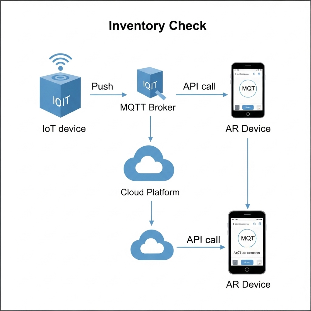
    1. The IoT Push: A smart shelf maintains a persistent connection to my cloud’s MQTT broker. When stock changes, it publishes a data packet to an MQTT topic with a payload like {"stock": 2}.
    2. The App Pull: When Alex’s device confirms he is looking at the shelf (via VPS and object recognition), the app makes a GET request to /api/v1/inventory/shelf_B3.
    3. My Cloud backend retrieves the latest stock value from its Redis cache.
    4. The app receives the JSON response and displays “2 In Stock” as a clean, non-intrusive overlay in Alex’s glasses.

    3. The Task: AR Product Visualization in Alex’s Room

    The Scenario: Alex sees a POÄNG armchair he likes. With a simple gesture or voice command, he wants to see if it will fit in his living room at home.

    The Data Flow:

    1. Alex looks at the armchair’s tag. The device recognizes the product ID and calls the GET /api/v1/products/poang_armchair endpoint.
    2. My Cloud Platform responds with metadata, including a URL to its 3D model hosted on a CDN (Content Delivery Network).
    3. The AR device asynchronously downloads the 3D model (.glb or .usdz format) and loads Alex’s saved 3D room scan.
    4. Using the device’s specialized hardware, the application renders the 3D armchair model as a stable, full-scale hologram in his physical space, allowing him to walk around it as if it were really there.

    This intricate dance of data is what enables a truly seamless and futuristic retail experience.

    In my next post, I will finally move from the backend blueprint to the user-facing design. I’ll explore the prototyping and UI/UX Design and the design process for the interface that Alex would see and interact with through his AR device.

    Measuring Creativity: Can We Quantify It?

    An immediate big issue that presents itself when thinking about how boredom affects creativity is: “how do we measure creativity??”. After some research I can present you some approaches that seem sensible.

    1. Divergent Thinking Tests

    The most widely used creativity assessments are divergent thinking tasks.
    Divergent thinking tasks are designed to push your brain beyond the obvious, encouraging you to come up with as many different ideas, uses, or solutions as possible. They’re the opposite of convergent thinking, which focuses on finding a single correct answer.

    Torrance Test of Creative Thinking (TTCT)
    In TTCT, participants might be asked to list uses for an ordinary object (fluency), switch categories (flexibility), come up with unusual ideas (originality), and flesh out details (elaboration). These scores have been shown to predict creative achievements decades later, with reliability ratings between .87 – .97 across diverse cultures.
    Guildford’s Alternate Uses Task (AUT) is a classic measure which covers all these scores. Simply: given an everyday object, how many different uses can users think of? This one test scores on fluency, originality, flexibility and elaboration.

    2. Convergent Thinking Tests

    Creativity isn’t only about generating many ideas. It’s also about finding the right idea.
    The Remote Associates Test (RAT) measures convergent thinking by asking participants to find a single word linking three unrelated cues (e.g. “Room-Blood-Salt” -> “Bath”). This captures associative and insight-based creativity.

    3. Semantic-Distance & Novel AI Measures

    Modern testing like the Divergent Association Task (DAT) and its AI-enhanced variant, S-DAT, ask for unrelated words or ideas and measure their semantic distance via algorithms. These tools offer scalability and objective measuring beyond manual scoring.

    4. Process & Product Based Assessments

    The Consensual Assessment Technique (CAT) involves expert judges evaluating creative products (stories, designs, etc.). Similarly domain specific tools like the Engineering Creativity Assessment Tool (ECAT) assess fluency, originality, flexibility, and technical depth in engineering contexts.

    Useful Sources:
    What do educators need to know about the Torrance Tests of Creative Thinking: A comprehensive review
    Torrance Tests of Creative Thinking
    The Convergent Validity of the Torrance Tests of Creative Thinking and Creativity Interest Inventories
    What We Measure Matters

    How Long to Be Bored? Timing & Incubation

    Once we can measure creativity, we face more nuanced questions about practical timing:

    • How long should boredom last for optimal creative priming?
      Most lab studies (like Mann & Cadman from the previous blog post) used 15 minutes of boredom inducing tasks and find improved divergent output afterwards. Would shorter or longer periods produce stronger gains? We don’t know yet. It seems to be yet untested in real-world creative scenarios.
    • How long does the creativity boost last?
      I couldn’t find any good answers for this question. Controlled studies are still necessary to see how long ideation remains elevated after a boredom bout.
    • How frequently should boredom pauses occur in heavy ideation sessions?
      In the absence of precise guidelines, a plausible starting point is alternating focused ideation blocks (25-30min) with short boredom breaks (5-10min) where participants engage in minimal stimulation. A similar structure to a classic Pomodoro.

    For the Reader

    If you’re curious about how boredom might boost your creativity, here are a few small experiments that you can try at home:

    1. Schedule a Boredom Break
      Set aside 10-15 minutes during your workday to deliberately do nothing stimulating.
      No phone, no music, no reading, just stare out of the window, take a walk without headphones, or sit with a pen and blank paper. Then try a creative task (like brainstorming ideas or sketching concepts) and note any difference in how your ideas flow.
    2. Swap Scrollign fro Staring
      Next time you’re in a queue or on public transport and feel the urge to check your phone, resist it. Just be. Let your thoughts wander. You might be surprised what floats to the surface when you’re not trying to be entertained.
    3. Keep a Post-Boredom Journal
      After intentionally boring moments, note down how you felt and whether any interesting thoughts or ideas came to you. Over time, this could become a valuable creativity tracker and personal insight tool.
    4. Read something
      More specifically one of these:
      – The Upside of Downtime by Sandi Mann
      – Bored and Brilliant by Manoush Zomorodi

    #12 DataVis Workshop

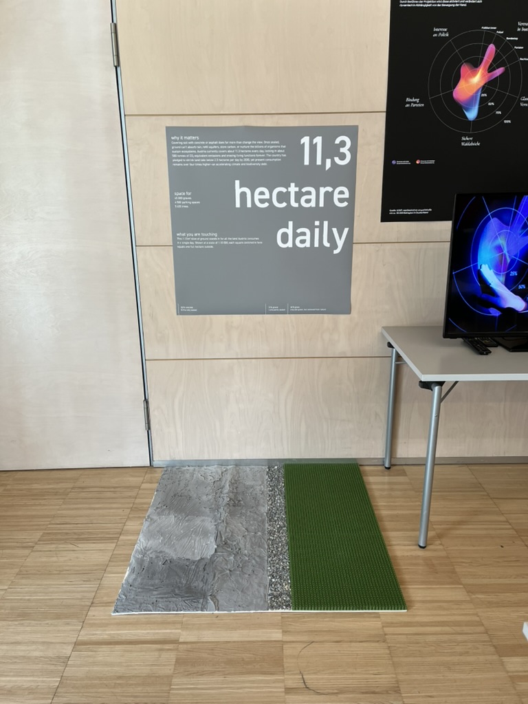
    The workshop WS#6 Eva-Maria Heinrich / Bringing the Abstract to Life – Beyond Data Visualisation at the International Design Week was all about pushing my prototype beyond pixels and printouts. Instead of presenting Austria’s daily land consumption as another chart, I set out to build a physical prototype – a 1.13 m² “slice” of ground that stands in for every hectare consumed in a single day. Here’s a rundown of my process, why a hands-on prototype matters, and the production hurdles I encountered along the way.


    Why Prototype Matters in Multi-Sensory Data Visualization

    Many of my previous posts have explored the theory behind multi-sensory data visualization – how tactile textures, sounds, or spatial arrangements can make numbers resonate more deeply. This time, I wanted to prototype those ideas in a tangible form. By crafting a small landscape that viewers can actually touch, I could test whether the physicality adds insight that a static infographic simply can’t. In other words, this wasn’t a polished art piece – it was a work-in-progress prototype intended to reveal both the strengths and limitations of turning data into material.


    Concept: A 1.13 m² “Plot” of Daily Land Use

    At a scale of 1:10 000, 1 cm² on my board represents 1 hectare in the real world. To capture Austria’s daily land conversion, the board measures 1.13 m² total, divided into:

    • 52 % concrete (fully sealed surfaces like roads and buildings)
    • 12 % gravel (partially sealed areas such as construction zones)
    • 36 % grass (green spaces cut off from natural ecosystems)

    When laid out side by side, these materials form a unified plane that still reveals stark textural differences up close. Walking viewers through each zone gets them thinking: “That gray slab isn’t just a shape – it’s every driveway and parking lot paved over today.”


    From Sketch to First Prototype

    Mapping Out the Layout

    I began by sketching on paper, dividing a 1 m × 1.13 m rectangle into proportional zones. Once I had rough percentages, I exported the grid to Illustrator to generate precise outlines. Printing a full-scale template and taping it to plywood helped me trace clean boundaries for concrete, gravel, and grass sections.

    Gathering & Testing Materials

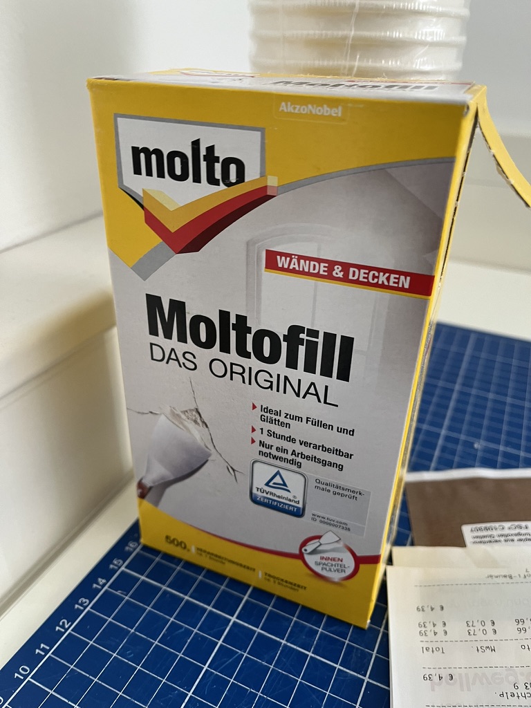
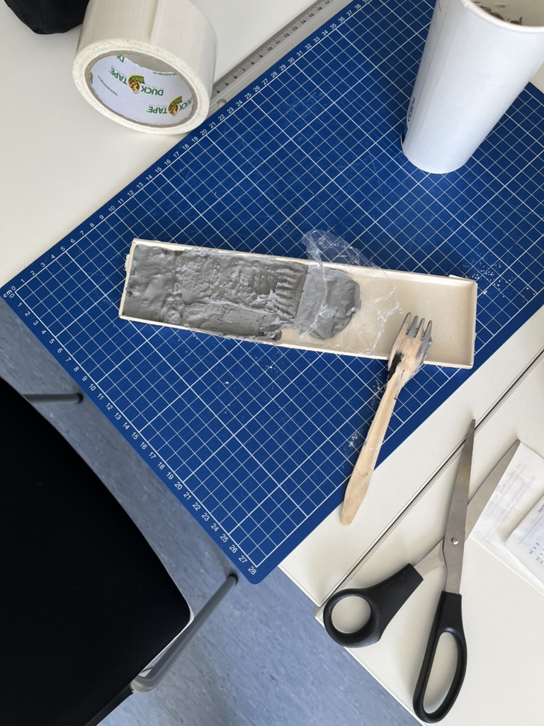
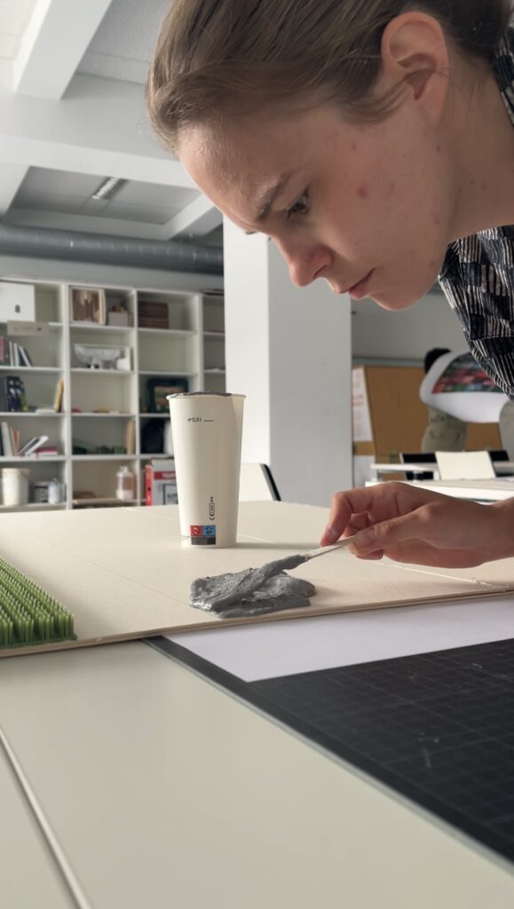
    • Concrete mix: I bought a small bag of ready-to-mix putty. My first batch was too smooth, so I added extra pebbles I got on the street to add some texture.
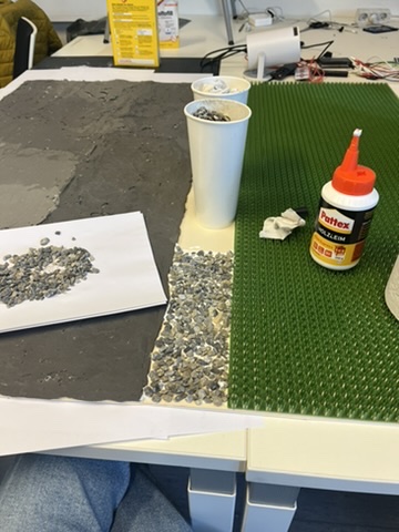
    • Gravel: I grabbed some gravel from a construction site. Putting it basically one by one on the surface, I glued them down with normal glue.
    • Grass: I had a few ideas for grass but because of time constraint I settled on a doormat I found at the hardware store, knowing I could swap in live grass later.

    Building the First Iteration

    1. Base Preparation: I glued two sheets of thin carton together (hoping for the best).
    2. Concrete Section: Mixing putty and gravel, I poured it cup by cup each time mixing it again and again.
    3. Gravel Section: I sprinkled gravel by hand, and gently pressed it in place.
    4. Grass Section: Cutting the doormat to form was very easy and I just glued it down.

    What I learned in the process

    Prototyping isn’t a linear path, and my first iteration had plenty of hiccups.

    Mainly finding the right material and then finding good substitutes because of the time frame. Then of course finding the right mix for the putty and putting it on the surface.

    By the end of the week, the prototype still had a few chips of gravel out of place and some cracks and color difference in the putty, but those imperfections felt authentic – almost like the real world, where land-use boundaries aren’t always neat and tidy.


    Why This Prototype Matters

    • Tactile Immersion: Viewers can kneel down and feel the roughness of gravel next to the coldness of the putty. That sensorial contrast sparks a more intuitive understanding of how land is consumed.
    • Immediate Comparisons: Instead of reading “52 %” on a slide, people see the massive concrete patch in context – ranking it against gravel and grass sizes without needing numbers to guide their eyes.
    • Hands-On Research: As a prototype, it’s a learning tool more than a final exhibit. The bumps in production taught me about material properties – knowledge I’ll carry into my next prototype. Each mis-cut or adhesive spill revealed potential adjustments for future iterations.

    Final Thoughts

    Prototyping this 1.13 m² piece of ground forced me to embrace trial and error. Every spilled drop of glue and cracked chunk of putty helped me understand how to translate data into material form. The end result isn’t a museum-ready installation – it’s a functional prototype that still has rough edges. But those imperfections are part of its story: they remind me (and future viewers) that real-world data isn’t always clean, and neither is the crafting process that brings it to life. Already, this initial version has sparked new ideas for my thesis – especially around combining tactile and auditory layers.

    Blog Post 2: The Blueprint: Architecting the Smart IKEA Experience

    In my last post, I introduced the concept of transforming the retail journey using Augmented Reality and the Internet of Things. To move from a concept to a reality, however, we need more than just a good idea. We need a blueprint.

    Remember Alex, our first-time homeowner navigating the vast IKEA maze? His journey from feeling overwhelmed to confidently furnishing his space is powered by a seamless blend of technologies. But for that “magic” to work, a robust and well-thought-out system must operate behind the scenes. Before we design a single button or write a line of code, we first have to design the architecture.

    Think of it like building a house. You wouldn’t start laying bricks without a detailed blueprint. Our system architecture is exactly that: a master plan that defines all the moving parts and how they communicate with each other.

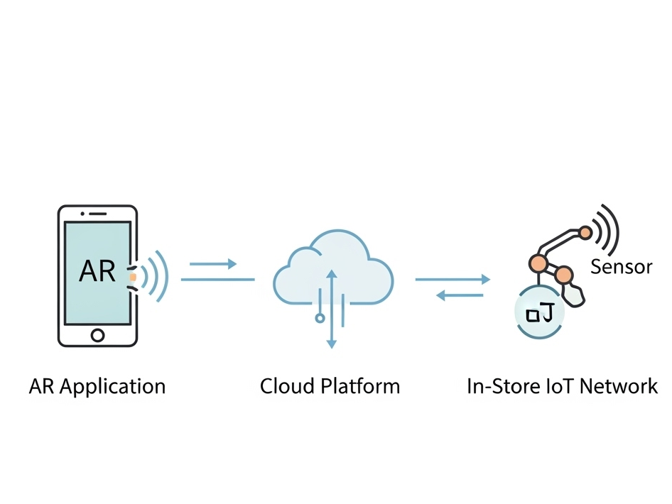
    For our smart retail experience, the system is built on three core pillars:

    1. The AR Application (The Guide)

    This is the component Alex interacts with directly on his smartphone/Smart Glasses. It’s his window into this enhanced version of the store. It’s not just an app; it’s his personal guide, interior designer, and shopping assistant all in one.

    Key Responsibilities:

    • Reading the QR code to understand the location and connect to correct server
    • Rendering the AR navigation path that guides Alex through the store.
    • Displaying interactive information cards for products.
    • Capturing the 3D scan of Alex’s room and allowing him to virtually place furniture.

    2. The Cloud Platform (The Central Brain)

    If the app is the guide, the cloud is the all-knowing brain that directs it. This powerful backend system is where all the critical information is stored, processed, and managed in real-time. It’s the single source of truth that ensures the information Alex sees is always accurate and up-to-date.

    Key Responsibilities:

    • Storing the entire IKEA product catalog, including 3D models, dimensions, and prices.
    • Managing the digital map of the store.
    • Processing real-time inventory data and user account information (like Alex’s saved room scan).

    3. The In-Store IoT Network (The Nervous System)

    This is the network of smart devices embedded within the physical store. These devices act as the store’s nervous system, sensing the environment and sending crucial updates to the central brain. This is what connects the digital world of the app to the physical reality of the store.

    Key Responsibilities:

    • Using smart shelves or sensors to monitor stock levels for products like the BILLY bookshelf.
    • Using beacons to help the app pinpoint Alex’s precise location for accurate navigation.
    • Triggering location-based offers or suggestions.

    How It All Connects

    So, how do these three pillars work together? They are in constant communication, passing information back and forth to create the seamless experience Alex enjoys. This diagram shows a high-level view of our architecture:

    As you can see, the AR Application on Alex’s device is constantly talking to the Cloud Platform, requesting data like product locations and sending data like user requests. Simultaneously, the In-Store IoT Network is feeding live data to the Cloud, ensuring the entire system is synchronized with the real world.

    With this blueprint in place, It creates a clear path forward for development.

    WebExpo Conference Day 2: Designing for Security in Crypto – Markéta’s Winning Formula

    On Day 2, I listened to a really interesting session by Markéta Kaizlerová called “High Stakes Flows: Designing for Security and Crypto’s Unique Challenges.” The talk focused on how to help people protect their crypto using better onboarding, especially when it comes to something as important as setting up a passphrase.

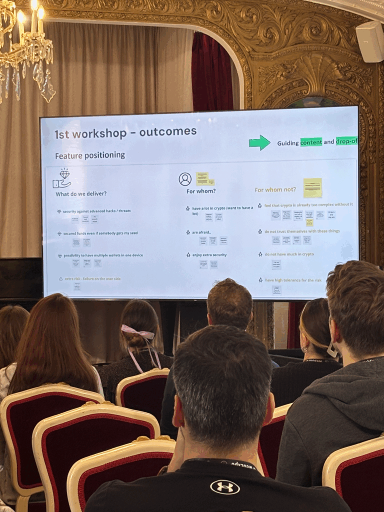
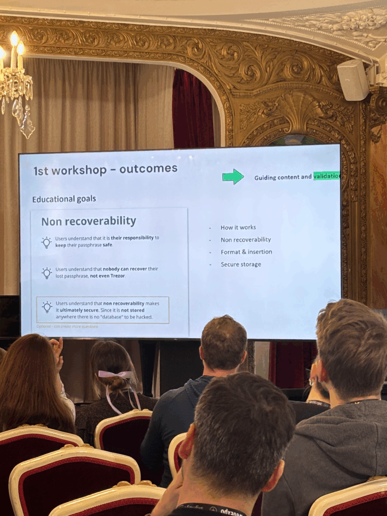
    Her team’s main idea was to build an onboarding process that teaches users how serious and important their passphrase is. They started by using clear content and simple words to explain why it matters, then added visuals later to make things feel smoother and more friendly.

    While that approach helped them communicate the message, I personally think it could be a problem for users who have low vision or struggle with reading. Depending mostly on written content might leave some people behind, especially when visual support comes too late in the process.

    Another thing they ran into was confusion around the terms they used. In the crypto space, a lot of words already sound complicated, and trying to explain them during onboarding made things even more confusing. It also didn’t help that the team was trying to do too many things at once. They had to simplify their goals and guide people step by step, like a wizard-style flow.

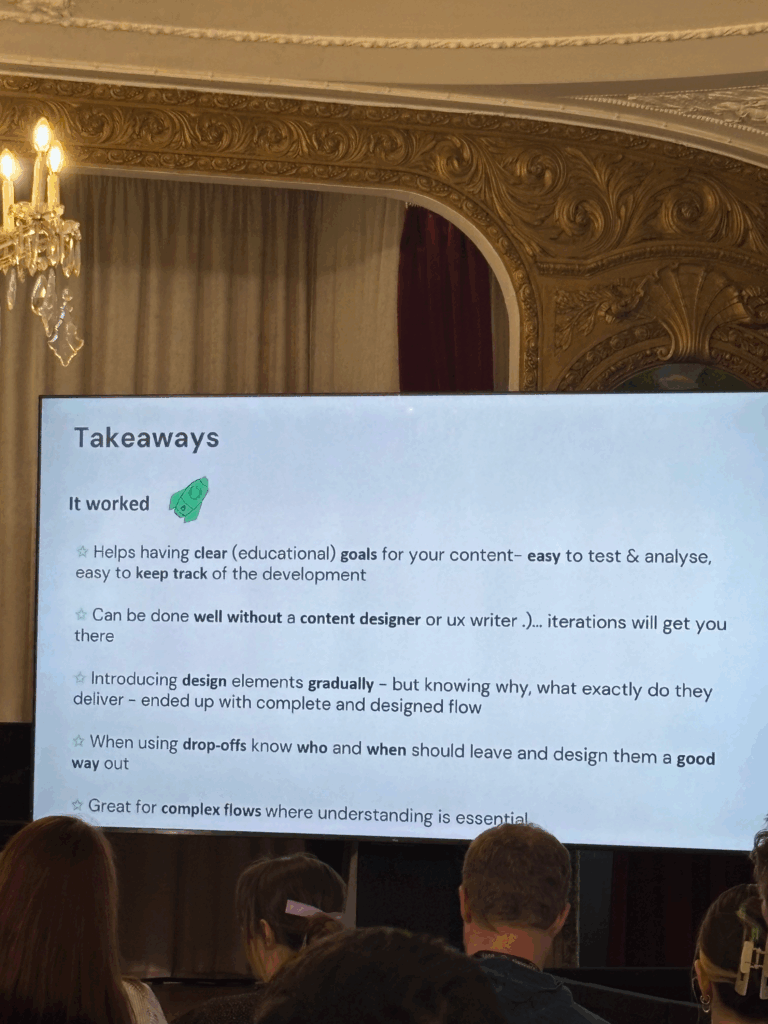
    One lesson I found really useful was how they set clear educational goals. They knew exactly what they wanted users to learn at each stage, which made the whole process easier to test and improve. It also helped them stay focused during development. Kaizlerová even said that you don’t always need a dedicated content writer if you keep your goals simple and test your designs regularly.

    She also talked about how not everyone will finish the onboarding flow. That’s totally normal, and instead of seeing it as a failure, they planned for it. They designed clear ways for people to exit the flow if they weren’t ready to go through with it. I liked that idea a lot because it shows respect for users and avoids pushing them too hard.

    The biggest takeaway for me was how they tried to balance two important things: making the experience easy to use while still being secure. In crypto, that’s a real challenge. You want to teach users without overwhelming them, and you want to build trust without making it all feel too technical.

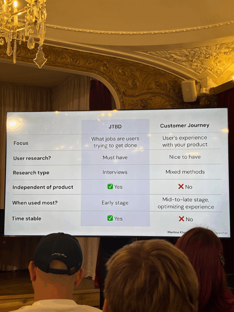
    WebExpo Conference Day 1 – Understanding Users Through the Jobs to Be Done Framework by Martina Klimešová

    On Day 1 I attended the session by Martina Klimešová, and it focused on the Jobs to Be Done (JTBD) framework. This session was a solid introduction to a tool that helps designers and product teams understand what users are really trying to achieve when they use a product.

    The key idea behind JTBD is pretty straightforward: people don’t care that much about the tool itself. What they care about is getting something done. In other words, people “hire” products to complete specific jobs in their lives. If the product does the job well, they keep using it. If it doesn’t, they “fire” it and move on to something else.

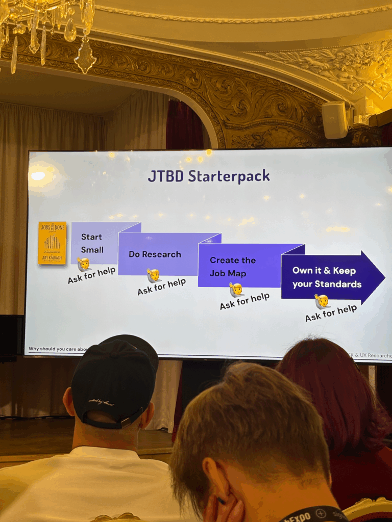
    She walked us through the process of using JTBD in a real design workflow. It usually starts by defining a clear focus. After that, you conduct interviews with users to find out what jobs they’re trying to get done. From there, you analyze the interviews, cluster the insights, define the jobs clearly, and then create a final “Job Map.”

    Job Maps were one of the most interesting parts of the talk for me. A Job Map shows all the steps a user goes through to complete a task. This helps designers figure out where features are actually needed, instead of guessing. It’s also a great way to build empathy with users because it shows you how they really think and feel while trying to get something done.

    One thing she also pointed out was how Job Maps often work better than personas. She explained that personas are not always based on real people. Sometimes, teams spend time designing for a “user” that doesn’t actually exist. You can build a great product for a made-up person, but that doesn’t help real users. Job Maps avoid this problem by focusing on real tasks and real pain points.

    Some other strengths of Job Maps she mentioned:

    • They are more flexible than personas.
    • They are based on real behavior, not guesses or stereotypes.
    • They don’t depend on specific tools or platforms.
    • They stay relevant over time, even if technology changes.

    Overall, this talk gave me a better way to think about user needs. Instead of just asking who the user is, JTBD asks what the user is trying to achieve. That small shift in thinking can change everything — from the way we design features to how we test and prioritize them.

    If you’re working on a product and want to make sure you’re solving real problems, not just designing for made-up characters, the Jobs to Be Done framework is a great place to start. This was a great session that reminded me why listening to users and focusing on their goals is always the right move.