02. #15 Experiment 2: Unreadable Story

In my second experiment I wanted to find out how font size and typeface affect reading speed and the reading flow.

The setup:

  • I set the story “The ugly duckling” in different fonts and sizes
  • I then cut the different paper parts apart and gave them to my test people. Because it is too difficult for first readers, I tried it out on adults, who are already proficient readers
  • I then observed the time it took to read the individual stories out loud

My observations throughout the experiment:

  • Small font sizes (e.g. 8–10 pt) immediately made readability more difficult because letters were closer together and word images became harder to recognize
  • Decorative fonts made letter recognition difficult, especially for frequently confused letters like b/d, p/q
  • Generous font sizes (14–16 pt) with clear, sans-serif typefaces ensured smooth legibility and a consistent reading rhythm
  • Justified text with narrow line spacing led to rapid fatigue, while ragged text with sufficient line spacing supported the flow of reading
  • Long blocks of text without paragraphs were intimidating and overwhelming, even for adults

My key take-aways:

  • Reader-friendly design is essential for reading motivation and flow, especially for beginning readers
  • Font size, line spacing, and the choice of font directly influence visual fatigue and text accessibility
  • The aesthetic choice of a “pretty” font can hinder the reading process if it is too complex or playful
  • Paragraphs and visual rest areas in the text make it easier to follow the story and support reading skills

02. #14 Experiment 1: Unreadable Font

For my first design experiment, I explored how similar-looking letters and font choices affect readability for first readers by intentionally making text harder to decipher.

The setup:

  • I selected letters that are often confused by early readers (e.g., b/d, p/q, i/l, c/e)
  • I tested these in different fonts, focusing on those with low differentiation between similar letterforms
  • I added a blur overlay to simulate how children with developing visual discrimination or attention might perceive unclear text

My observations throughout the experiment:

  • Even as an adult, letters with low differentiation became nearly unrecognizable under blur (e.g., b/d, p/q merged visually)
  • Fonts with small x-heights and tight spacing became unreadable faster than those with larger x-heights and generous spacing
  • Decorative or playful fonts often used in children’s materials became difficult to read quickly, suggesting aesthetic choices can clash with functional readability
  • Blurring amplified these issues, simulating the challenges first readers may face when text is visually too similar or dense

My key take-aways:

  • Letterform clarity is essential
  • Spacing matters
  • Decorative ≠ child-friendly

02. #13 How do parents experience the process of learning to read as a companion to their child

I talked to Dana, mother of six year old Ella, who is learning to read. She gave me a lot of insight into what kind of hardships, challenges and joys her daughter is facing.

How old is Ella and in what kind of phase of learning to read would you place her right now?
Ella is six years old and attends the first grade of a primary school. She knows the individual letters and can write down words if you spell them individually for her. She can also sound out shorter words. Longer, more complicated words and full sentences are still too challenging.

What motivates Ella to read?
She loves books with a lot of pictures. When she can kind of see where the story is going, she is a lot more confident to try sounding out the words. Especially if the story is fun. She loves the Amelia Bedelia books and is obsessed with everything about animals right now.

What are the biggest challenges you are facing with a beginner learner right now?
Well, obviously it is patience. She gets frustrated easily if she cannot figure out a word immediately. She switches around letters like “b” and “d” a lot. It really depends on the way the book is designed.

How important are illustrations in the books Ella reads?
Oh very important! The pictures help immensely with comprehension even if she doesn’t understand all the words. Sometimes she “reads” the picture and can guess the word.

Do you look for specific design parameters when buying new books?
Honestly no. I don´t specifically look for something but I can definitely see that some books are easier for her than others. Really small letters are challenging or pages where the text disappears into an illustration.

Do you as a parent have any wishes for designers that work on children’s books?
Yes, I want to invest more in books that truly support her progress. Filled with fun adventures and illustrations that support what we are reading without overpowering it.

What does your child learning to read mean to you personally?
It is a big step toward her independence. I still get surprised when she suddenly starts reading random word on our walks like for example the STOP sign. I just want to keep encouraging her this way and I think reading is so important for her future so I am happy that she makes it easy for me.

02. #12 A reading learning artifact

While looking into this topic, I also got into a conversation with my mother on how I learned to read as a little girl. She pulled out this artifact from our basement that she kept for 20 years (and probably will until I might have kids some day).

It is a battery-powered computer that you can carry around. It is fully plastic and kind of heavy for a smaller child. Once you open it up, there is a small screen and you are greeted by some happy, colorful illustrations. You are able to learn numbers and letters with it.

It has different modes. For example: Learning letters (Sounds), Finding letters (Shape recognition), Learn the ABC, Recognizing starting letter sounds, Numbers etc.

On the keyboard you see the letters with small illustrations next to them and a whole word with the beginning letter underneath.

Unfortunately it does not work anymore, but it actually follows very similar learning steps to the ones I researched last semester.
You can start with Setting 1: Learning the letter. For that you click the buttons and a friendly voice sounds it out over the speakers. “A wie Affe”, “B wie Bus” etc. The pictures help with connecting the letter to an object or animal (like the logographic phase”).
Setting 2: Finding letters. On the screen a letter shows up and you have to press the according button. This furthers letter recognition and learning the shapes.

These different learning stages build up one after another. In my case, once I got the basic letters down (and my mother had to listen to all the letters about a billion times), I started asking how certain words are written. So while my mum was cooking dinner I kept asking for new words to type out.
“Mum, how do you write BALL?”
“B wie Bus, A wie Affe, L wie Lampe und nochmal L wie Lampe”

Interactive and digital equipment like this can keep kids entertained and motivated through its playful character. Of course, since then technology has vastly advanced and there is many more opportunities, but I will keep this approach in the back of my head.

02. #11 Next stop: Reading

I have looked at the different phases of learning to read: from the logographic phase (recognize words as pictures), to the alphabetical phase (letter-sound-recognition) and orthographic phase (automatic word recognition). Especially relevant for kids, who are wanting to learn how to read, are phonological awareness, decoding and fluidity in reading. I researched which typefaces could be more suitable than others, e.g. Grundschrift or Comic Sans. I also found out that illustrations are not only decorative but help kids understand the storyline better, train vocabulary and help motivate the kids. Additionally I tried to look beyond the type systems that are common in my daily life and made a pit-stop on how to read in other systems like Chinese or Arabic and e.g. what role reading directions could have.

Experiments I planned:

  1. Unreadable Fonts: Different letters that could look alike in fonts are tested in different typefaces and distorted with a blur to test letter recognition in these typefaces
  2. Unreadable Stories: An ongoing story is being told in different typefaces and sizes.
  3. Spacing: The same sentence is written in different Kerning and Spacing.
  4. Storytelling through pictures: Disconnecting a story from its illustrations could show how important an illustration could be.
  5. Storytelling through the words itself: Taking the story out of the context of the finished book could also show flaws in the storyline if it cannot be reconstructed.

Let´s see how these experiments turned out throughout the weeks 🙂

#6 Curating the Chaos

In my last blog post, I talked about visual noise and the overwhelming overload of signs, ads, posts, and designs we take in every single day. But lately, I’ve been thinking less about how we experience this as viewers and more about how we contribute to it as designers.

It feels strange: we’re trained to create, to fill space, to communicate. But at what point does that contribution start to become part of the problem?

Instead of fighting the clutter, what if we curated it? As designers, we have the tools to make sense of noise and not by erasing it, but by reframing it. We live in a world where design is everywhere. Good design, even. But instead of inspiring, it’s starting to exhaust. As a designer, I’ve found myself stuck between two questions: Why does everything look the same? and Why does it feel like too much?

I want to take this frustration and explore it further:
How do we design in a time where everything is designed?

Here are a few directions I’m thinking about:

1. Designing for Subtraction, not Addition
What if instead of adding new visuals, we removed something? Could communication design be about making space instead of filling it? For example, creating posters or publications that invite people to erase, cut out, cover, or reuse parts leaving the final outcome unfinished, open, and collaborative.

2. Designing with Found Visuals
What if the design process began not with a blank canvas but with what’s already out there? I’ve been photographing torn posters, scuffed signs, scribbles on paper, things that are already “designed” by the city, time, and people. A project could emerge from these materials. A collage zine, a typography experiment, or even a visual system built from existing fragments rather than new creations.

3. Creating Visual Silence
In a world that shouts, maybe the most powerful thing a designer can do is say nothing. Could we explore formats that use white space, emptiness, or subtle cues to communicate? A type experiment where the type nearly disappears. A print project that works with fading ink, wear and tear. Design that invites rest.

4. Slow and Delayed Design
What if design didn’t have to be instant? What if the reader had to wait, or interact slowly, to fully understand it? We could explore this through delayed-reveal formats like risograph prints that change with layering, or digital zines where parts of the interface become visible over time.

These are not finished ideas. But they are responses. Not to solve the problem of design fatigue, but to live with it differently. Instead of asking how we stand out in a loud world, maybe we can ask: How can design help us breathe in it?

#20

Writing these blogposts this semester was unexpectedly fun.
Way more fun than last semester, if I’m honest.

I loved the freedom of it. That I could run with an idea, no matter how weird it seemed at first. All I had to do was document, observe, and reflect and that opened up a space for me to really experiment, both in content and in tone.

This time around, I let myself loosen up. I stepped out of my usual corporate-sounding language and leaned into something more poetic. (Sometimes pathetic. But you get it.)

And I honestly enjoyed it. So thank you to everyone who actually read these blogposts and didn’t cringe.

If you want to keep following along, you know where to find me:
@notsosureifart
(feeling like a real influencer hihi)

Bussi BabaFiona

#19

After spending the semester observing, experimenting, and occasionally placing celery around cities, it’s time for the next logical step: talking to people.

I already conducted a handful of interviews last semester, conversations with outsiders, insiders, and fellow students about how they perceive art. But I want to expand that dialogue.
Over the summer and into the coming months, I plan to carry out a more extensive series of interviews: around 10 to 15 people, spanning different age groups, professions, and backgrounds. Some of them will be from creative fields, some won’t. Some will be my age, others much older. The goal is to create a broad, loosely representative set of perspectives, and see how the concept of “art” shifts across generations and cultures.

The Plan

My interviews will follow two main threads:

1. General Questions About Art

Simple, open-ended questions like:

  • What is art to you?
  • What makes something “worthy” of being called art?
  • Have you ever been moved by something unexpected?
  • Do you think art needs to be intentional?

The goal here is not to find the “right” answers, but to map different assumptions, values, and emotional reactions. I want to understand how people’s personal experiences shape their sense of what art is and isn’t.

2. Image-Based Reactions

Here’s where it gets really interesting: I plan to show each person a selection of my everyday installation photos the ones I plan to share on Instagram. I’ll ask them to interpret the image freely, without knowing anything about it.

Then, I’ll show them the explanation I wrote. And I’ll ask:

  • Did your opinion change?
  • Do you see something different now?
  • Does a title influence your reading?
  • What happens when there’s no label at all?

And finally I’ll throw in a few completely random images. Photos I took without any deeper meaning. Just banal, normal street scenes. Things I didn’t consider “artistic” at all.

I want to see if people still assign meaning to those too.
Will they interpret anything if I ask the right question?
Can we create significance just by suggesting there might be some?

The Placebo of Interpretation

This experiment touches something I’ve been circling all semester:
How much of art is about the work and how much is about the context we give it? If I tell someone, “This is art,” will they start seeing it that way even if it’s just a photo of a trash can? And if someone finds meaning in something I didn’t plan, is that less valid? Or is that the whole point? These are the questions I want to explore not just in my own reflections, but by borrowing other people’s eyes for a while.

If I’m lucky, I’ll manage to interview 1 or 2 known artists, too.
I’d especially love to speak to Paulus Goerden, whose work has inspired so much of my thinking. It honestly feels like a dream goal, but who knows? Maybe I’ll manifest it.

#18

As I continue documenting these small scenes, these frozen moments of unplanned composition, I’m realizing how much they mirror the act of photography itself: a moment held in place, briefly meaningful, before it disappears. Some installations I find are funny. Some feel tragic. Some are just confusing. But all of them whisper something, even if I don’t always know what.

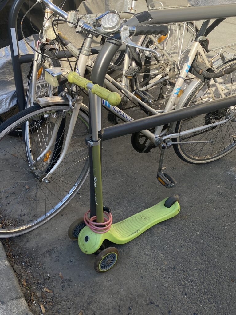
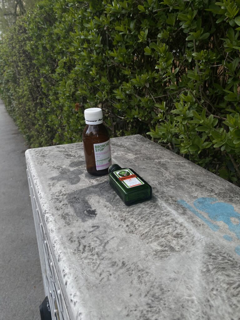
Here are two recent finds. Both from the same day in Graz, one in the morning on my way to university, and one in the evening, just outside my apartment.

Observation 1:

Graz – near university

A small child’s scooter, lime green, plastic, low to the ground. It’s locked with a heavy-duty adult bike lock to a thick black metal railing, surrounded by full-sized bicycles. At first glance, it’s funny. Almost absurd. Who’s going to steal a toddler’s scooter? Is it really necessary to protect it like a prized vehicle? But then I paused, and the image changed.

There’s a tension here. Between play and control.
The scooter is a symbol of freedom, of chaotic childhood energy. Something designed to move, to glide, to roll fast and fall hard. But here, it’s immobilized, chained to the structure of grown-up life surrounded by gears, spokes, regulations. It’s being treated like a real object, forced into the system of locks and fears. On one hand, the lock says “I care about this.” But on the other, it says “You can’t go anywhere.” Is this about safety or control? It’s like the scooter knows it was meant to move, and now it waits. A toy, arrested in motion. Childhood, on hold. Or maybe I’m projecting. Maybe it’s just locked up so a kid doesn’t scream about their missing scooter. That’s the thing about these moments: they leave just enough room for you to wonder.

Observation 2:

Graz – evening, outside my apartment

Two bottles on a scratched-up electricity box on a sidewalk. One Bronchostop, a cough syrup. The other Jägermeister, a dark herbal liqueur that’s usually anything but medicinal. The arrangement is almost too good. So perfectly misplaced that it feels staged. Was it a coincidence? Or a statement?

It’s one of my favorite finds so far because it’s so loaded with contradiction and yet it’s silent. It doesn’t explain itself. But the metaphors are loud. There’s something incredibly human about these two bottles standing next to each other. One is meant to heal, the other to numb. One comes from the pharmacy, the other from the bar. But both get poured into your body when something doesn’t feel right.

It made me wonder:
Was this someone trying to take care of themselves, but giving up halfway through the effort?
Or someone who mixed both on purpose, convinced that health and hedonism don’t have to cancel each other out?

Maybe the Jäger came after the Bronchostop. Maybe it came before. Maybe they belonged to two different people, and this is just the city making art while no one’s watching. But there’s also a strange sense of sadness here. Like someone meant to fix something, but didn’t get there. The bottles feel abandoned, like forgotten decisions.

#17

In my last blogpost, I reflected on authorship and the fine line between staging something and simply witnessing it. I came to the conclusion that maybe it doesn’t really matter whether something is planned or found what matters is whether we see it. Whether we stop long enough to ask: what is this doing here?

With that in mind, I’ve been thinking more and more about the things I don’t stage. The ones I don’t plant, but stumble across. For almost a year now, I’ve been documenting these accidental arrangements, small moments of unintentional beauty, absurdity or tension in public space.

I wasn’t planning on doing anything with them. But lately, the thought of making them visible of sharing my lens kept resurfacing. So I created an Instagram account. @notsosureifart

It was the first name that came to my mind, I didn’t overthink it. But after I sent the first few follow requests to friends, one of them texted me and said:

“Wait… does that say Not so sure I fart?”

Oopsie, I maybe should’ve thought about it more. If you read it too quickly or without spacing it, it becomes an entirely different kind of expression.

Not so sure I fart.

Honestly, quite funny. The more I thought about it, the more I started to love it. The accidental comedy, the embarrassing randomness of it all, it fits. It’s exactly what everyday installations are.
They’re moments that aren’t quite right, but also kind of perfect. So I’m keeping the name. And I’m starting to post.

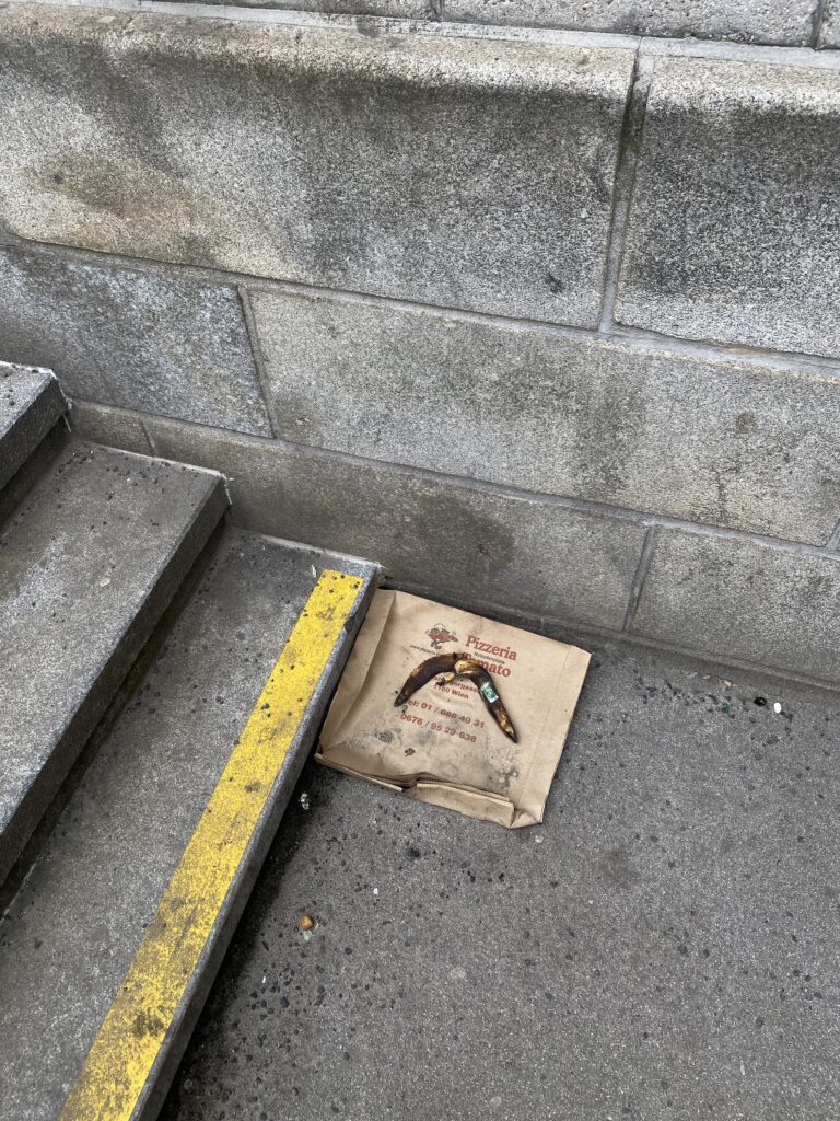
First Observation: Pizza Meets Banana

Let’s start with one I captured in Vienna’s 10th district, at the base of a long, grey staircase. The space itself is cold, textured, structured. Concrete blocks. Worn yellow line. Functional. Urban. But then there’s the placement: A pizza carton flattened out. And on top of it, almost centered: A dark, wrinkled banana peel. I didn’t touch it. I didn’t adjust it. I didn’t even pause for long. I just saw it, lifted my phone, and walked on. But even in that moment, something clicked. There’s a kind of accidental balance here between nourishment and neglect, fast food and fruit, indulgence and decay. Between the printed, branded flatness of the pizza carton, and the organic curve of the banana skin. One is processed. The other is natural. One has color, text, identity. The other is just… a leftover. But together, they feel like a quiet comment on how we consume, discard, and overlap things in the city. There’s also a weird kind of irony in how the banana, typically seen as the “healthy option,” looks so much more dead than the pizza bag does. And the placement right next to the last step of a descending staircase adds an unspoken tension. It’s not centered, not theatrical, but it has just enough presence to stop you if you’re paying attention.

This is what I love about these kinds of moments:
They aren’t trying to say anything.
But if you choose to listen, there’s often something to hear.

By documenting them, I’m not claiming authorship. I’m just noticing.
And now, I’m sharing, on the web.