#9 Looking Back, Seeing Differently

This semester wasn’t about following a straight path. It was about collecting fragments like ideas, images, words, impressions and trying to understand what they might be pointing toward.

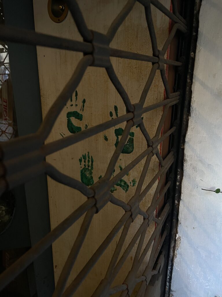
When I started, I wasn’t even sure what I was looking for. I knew only that something felt off. Design felt tired. Too polished. Too predictable. Too disconnected from real life. So I started paying closer attention to the things that don’t scream to be noticed: a scribbled message on a wall, a broken tile, a flyer stapled over a hundred others. Somewhere in that visual noise, I found honesty.

Through writing, collecting, and reflecting, a theme kept returning: the value of the in-between. The things we pass by. The messy, random, imperfect traces that make spaces and media feel alive. I began to see randomness not as a lack of structure, but as a kind of truth-telling. The uncurated becomes a mirror and the overlooked becomes material.

I also began to look more critically at visual culture. Not just what we’re making, but why. Do we need more posters or do we need to read the ones that already exist more closely? Do we need to add to the noise or help people make sense of it?

This project became something of an experiment in slowing down. In resisting the pressure to produce finished, polished things and instead sit with the progress. Let randomness exist. Let fragments be fragments. Let the design be about presence, not performance.

Maybe what I’ve been doing all semester isn’t building a project, but developing a perspective. A way of seeing that values what doesn’t demand attention. And that might be the most valuable tool a designer can have.

#8 Assembling

Throughout this process, I’ve been circling the same question: What makes something feel meaningful, even when it’s messy, unfinished, or random? I’ve looked at the world through fragments like found textures, broken signage, screenshots of everyday oddities but now I want to take a step back and ask what this way of seeing actually is.

In her book On Longing, Susan Stewart writes about “the souvenir”, a small object torn from its original context that somehow holds emotional weight. I realize my photo archive functions in a similar way. These images aren’t “designed” but they become markers of time, place, and feeling. They’re emotionally charged, not because of their composition, but because of the act of noticing and collecting them.

This kind of collecting the quiet, emotional, inconsistent has nothing to do with curation in the classical sense. It’s not about matching colors or building a “perfect” grid. It’s about feeling something when you look at a corner of a torn sticker on a pole. Or a forgotten note in a public place. These fragments of everyday life don’t scream for attention, and maybe that’s exactly why they speak to me. They don’t try to be art, they just are.

I think this way of seeing is deeply tied to slowness and presence. Noticing is an act of resistance in a fast world. But it’s also creative, it’s not passive. When I collect and document these fragments, I am quietly shaping my own way of designing. Not starting from zero, but starting from what’s already around me.

It also made me wonder: what if this is the material? What if randomness and leftovers are not a starting point for inspiration, but the work itself? I don’t want to just use these images as references for more polished designs. I want to let them remain raw. To find a format where they can exist as they are, where I can add just enough to let them speak.

This process has changed how I think about authorship too. When I put together fragments I didn’t create, am I still the designer? Maybe I’m not designing in the traditional sense, maybe I’m just assembling or paying attention.

#7 Framing the Mess – Notes for a Randomness Manifesto

In my last blog entry, I asked: How do we make sense of all this noise without losing the character of the city? This question has followed me into the next phase of my research. Instead of trying to clean up the clutter, I started observing what it actually is, how we experience it, and what it might be trying to tell us.

My goal is not creating a polished design outcome, it is about building a process or a system, maybe even a mindset.

Step 1: Building an Archive

I began with what I already had in my camera roll. Years of random photos: broken signs, wall textures, forgotten objects, public scribbles, strange alignments, and accidental compositions.

I didn’t take these pictures intentionally for a project, they just happened. So I started categorizing them:

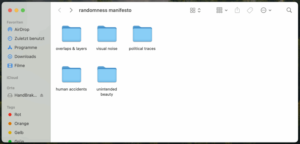
  • Overlaps & Layers
  • Visual Noise
  • Political Traces
  • Human Accidents
  • Unintended Beauty

I created a folder structure on my laptop that now serves as the base for a collection of real-world randomness.

Step 2: Researching the Vibe

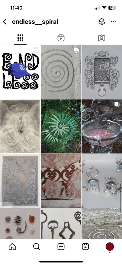
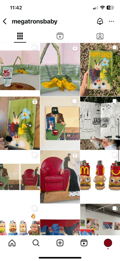
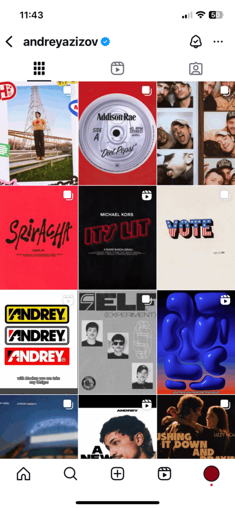
At first glance, all these things like paint spills, torn stickers, blurry text seem unrelated. But the more I looked at them, the more I realized: they feel connected. I began to study creators who lean into randomness. From zine-makers layering textures and clashing type to Instagram artists who post found objects without context, it all feels chaotic, but somehow intentional.

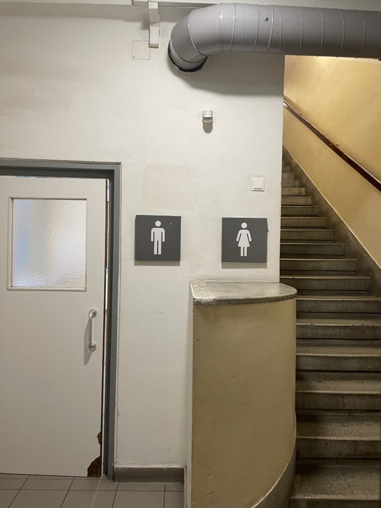
I think if you look at it closely, everything can be political. Not just billboards or protest posters, but even the unnoticed details in everyday spaces. A restroom that makes women take the stairs while men walk straight in is a powerful message in itself without even meaning to. Or a wall where “Free Palestine” was painted over, but still faintly shines through. These things are visual proofs of how systems speak through architecture, erasure, and layers of public expression. Sometimes the most powerful statements are the ones no one planned, but no one managed to fully silence either.

Step 3: Understanding “The Dump”

I also revisited photo dumps. Not just as a trend, but as a storytelling form. The randomness isn’t random at all—it’s about rhythm, contrast, atmosphere. A picture of a half-eaten sandwich next to a blurry selfie and a screenshot of a note. It tells you who someone is without saying anything directly. That’s the kind of narrative I’m interested in.

What’s exciting is that this also applies to design. Layouts that feel spontaneous. Posters that aren’t begging for attention but make you stop anyway. Formats that don’t tell you what to think, but make you feel like you’ve stumbled into something.

A Visual Protest in the Making

All of this is slowly leading toward my “Randomness Manifesto”, a zine or digital page that reads and feels like a visual protest against overdesigned perfection. It will be layered, broken, imperfect. It won’t follow a fixed structure. Maybe it will look like a poster that’s been weathered by the street. Or a desktop folder that became a publication.

Whatever it turns into, it taught me that the beauty isn’t in controlling the chaos, it’s in curating it.

02. #21 10 Design Guidelines for reading-learning materials

  1. Prioritize clarity over decoration
    • Use clear, sans-serif or simplified serif typefaces (e.g., Grundschrift) with large x-height
    • Avoid overly decorative or playful fonts that may look child-friendly but reduce legibility
    • Ensure clear differentiation of commonly confused letters (b/d, p/q, i/l)
  2. Use adequate font size
    • Opt for larger font sizes (14–16 pt) for beginner readers
    • Avoid small fonts that strain children’s eyes and slow reading speed
  3. Mind your spacing
    • Ensure sufficient letter, word, and line spacing
    • Slightly increased word spacing helps word recognition
    • Maintain consistent line spacing for clear eye guidance.
    • Avoid overly wide letter spacing, as it disrupts word shape recognition (avoid tight tracking; allow letters to “breathe”)
  4. Use illustrations purposefully
    • Illustrations should support and clarify the text
    • Avoid overloaded or chaotic visuals
    • Maintain a clear visual hierarchy to guide children’s focus
    • Use illustrations to aid comprehension, showing key actions or emotions in the story
  5. Maintain consistency between reading and writing
    • Use typefaces that resemble the forms children will use when writing (e.g., Grundschrift)
    • Avoid abrupt differences between printed and handwritten forms to ease transfer between reading and writing
  6. Support multisensory learning
    • Where possible, integrate visual, auditory, and tactile elements (e.g., tracing letters, interactive pointing while reading aloud)
    • Use colors consciously to highlight structures (e.g., syllables) but avoid random color overload
  7. Provide Visual Structure
    • Break down text into short, manageable chunks with paragraphs
    • Use headings and visual cues to structure content clearly
    • Avoid large, dense text blocks that overwhelm beginner readers
  8. Optimize contrast and background
    • Ensure high contrast between text and background (e.g., black on white)
    • Avoid busy or colorful backgrounds that reduce readability
    • Use calm, child-friendly color palettes
  9. Foster Motivation
    • Create visually engaging, but not overwhelming, materials
    • Use illustrations and color to spark curiosity and emotional connection to the content
    • Support the child’s success experience with materials that are neither too easy nor too hard
  10. Test, reflect, iterate
    • Even if tests with children aren’t immediately possible
    • Use simulated blurring and letter confusion tests on your materials.
    • Self-test or test with peers for readability and emotional response.
    • Be prepared to refine layouts and type choices based on feedback and observation.

02. #20 Die Grundschrift – specifically designed typeface

In my research on how design and typography can support children in learning to read, I came across “Die Grundschrift”, a typeface specifically developed for use in German primary schools.

What is “Die Grundschrift”?

“Die Grundschrift” (translated: the basic script) is a simplified, clear typeface developed by the German Grundschulverband to help children learn to read and write with fewer obstacles.

Unlike traditional cursive scripts taught in schools, Grundschrift:

  • Is print-like and clear, making it easier for children to recognize and differentiate letters
  • Uses consistent, simple letter shapes that resemble printed text, reducing the confusion caused by complex letterforms
  • Encourages fluid writing movements without forcing strict connections between letters, allowing children to develop their own handwriting style gradually

Why is “Grundschrift” easier for beginners?

  • Clear Letterforms: Letters are designed to be visually distinct, helping children avoid common mix-ups (like b/d or p/q)
  • Transition-Friendly: Since Grundschrift looks similar to printed text in books, children can transfer their reading skills more easily to writing
  • Less Cognitive Load: Simplified forms reduce distractions, helping children focus on learning to decode and write simultaneously
  • Supports Individual Writing Style: By not enforcing strict cursive connections, children develop confidence in writing at their own pace

Why is this relevant?

It’s easy to assume playful or decorative fonts are “child-friendly,” but for learning to read, clarity and structure are more important than decoration.

Using Grundschrift in learning materials:

  • Supports readability for first readers.
  • Ensures consistency between what children read and write.
  • Builds confidence in reading and writing simultaneously.

02. #19 Glossary – Words you should also know by now

Reading Didactics
The science and practice of teaching reading, including methods, materials, and strategies to effectively guide children through the reading acquisition process.

Phonological Awareness
The ability to recognize and manipulate the sound structure of spoken language (e.g., identifying rhymes, clapping syllables, isolating sounds), which is a key prerequisite for learning to read.

Decoding
The process of translating written words into their corresponding sounds in order to read and understand them.

Reading fluency
The ability to read texts accurately, smoothly, and with appropriate expression, which is crucial for text comprehension.

Reading Motivation
The inner willingness and joy children have in engaging with texts and reading, influenced by design, content, and early reading experiences.

Syllable Method
An approach in the reading acquisition process in which words are broken down into syllables to simplify reading, particularly helpful for children with reading difficulties.

Orthographic Phase
A phase in the reading acquisition process where children automatically recognize words as whole units and can read them quickly without decoding letter by letter.

Whole-Word Method
A method of learning to read in which children recognize and store entire words as visual units without sounding them out.

Visual Perception
The ability to recognize and process visual stimuli, such as letters or illustrations, which is essential for letter recognition during reading acquisition.

Educational Typography
The targeted use of typography in educational contexts to improve readability and facilitate children’s learning.

02. #18 Experiment 5: Storytelling through pictures Nr.2

Illustrations are powerful tools in children’s books. They guide understanding, support text, and make stories come alive. But what happens when illustrations are not clearly structured?

While analyzing children’s books for my research, I tried an experiment:I took single sentences out of context from illustrated pages to see if I could reconstruct the storyline using only the illustration. Result: It was surprisingly confusing.

Why did it become confusing?

  • Illustrations without clear sequencing: Many pictures are rich in detail but do not guide the eye clearly. Without the text, it is hard to know what happens first or what the focus of the scene is
  • Too many simultaneous actions: Some illustrations show multiple characters doing different things at once. For a beginner reader, this is overwhelming without visual hierarchy
  • Missing visual cues: If characters or actions are not clearly distinguished, it is easy to lose track of who is speaking or what the central event is on the page
  • Text and image are too interdependent: Sometimes, the image only makes sense together with the text. When separated, the meaning collapses

What I learned

  • Illustrations should support the narrative independently where possible, providing visual anchors that help reconstruct the storyline even if the text is unclear or skipped
  • Clear visual hierarchy (size, color contrast, character focus) helps direct the reader’s eye and narrative understanding
  • Illustrations should not overload the scene with unrelated details that distract from the core storyline, especially for first readers

02. #17 Experiment 4: Storytelling through pictures Nr.1

I looked at two different books for my research to analyze the visual elements more. Storytelling is not just the text but also the illustrations, which are very important for children.

On the left:

  • Style: It is a bright, airy illustration style with soft watercolor textures and delicate, detailed linework. It encourages exploration and point out context clues for the story
  • Color palette: Pastel greens, blues and generally more cool-toned colors, but they are still creating a light, inviting tone
  • Layout: Full double-page scenes with characters integrated into large nature environments
  • Text placement: Typically left-aligned blocks on white space within the scene. It has a clear but subtle presence and is still easily readable.

On the right:

  • Style: It is a bold, very cartoonish illustrations made up of simplified shapes and heavier outlines. The characters and their facial expressions are central in this style, making emotional interactions clear and readable
  • Color palette: Warmer, saturated tones with prominent reds, browns, and yellows, giving a cozy, direct feel
  • Layout: Focus on characters in the foreground, with minimal background elements, emphasizing interaction and expression
  • Text placement: Larger, bolder fonts with clear speech bubbles or separated lines for dialogue, placed prominently within the visual flow

Both these styles are what kids gravitate towards for different reasons. But when looking at the illustrations isolated, the illustrations on the left underline the story better in the sense that they tell the story more forwardly, while the ones on the right are rather supporting.

02. #16 Experiment 3: Spacing is important

In my third experiment, I wanted to find out how much the spacing between letters and words affects reading, especially for early readers.

The setup:

  • I wrote the same sentence in various versions to analyze the impact of different spacings and tracking settings:
    – Normal tracking and line breaks
    – Slightly increased word spacing
    – Paragraph-separated structure
    – No spacing at all (letters and words merged)
    – Very large spaces between letters and words

My observations throughout the experiment:

  • Normal spacing version: Easy to read, smooth reading flow, recognizable word shapes
  • Increased word spacing: Supported reading, as words were visually clearer without disrupting the reading rhythm
  • Paragraph structure: Increased clarity, reduced the overwhelming effect of text blocks, and helped with content chunking
  • Merged text: Extremely difficult to read, words blended into each other, word shapes were unrecognizable, requiring high cognitive effort
  • Very large letter and word spacing: Letters were recognizable, but word shapes were destroyed, slowing down reading and making it tedious

My key take-aways:

  • Reader-friendly spacing is essential for keeping word shapes clear and supporting eye tracking
  • Text that is too tight not only makes reading harder but can also lower motivation to continue reading
  • Spacing that is too wide destroys the reading flow, as children cannot perceive words as whole units
  • Structure through paragraphs can serve as a helpful orientation for beginner readers