The AIDS crisis shaped queer communities globally, but in the Balkans it overlapped with war, sanctions, and political chaos.
Healthcare systems were collapsing. Information was limited. Stigma was intense.
Photography from this period sometimes carries that weight. You see fragility. Hospital visits. Activist posters. Intimate portraits that feel almost like quiet memorials.
But you also see solidarity.
Friends caring for each other. Community meetings. Protest signs demanding visibility and support.
The camera becomes both witness and activist.
AIDS photography isn’t just about illness. It’s about care networks. About refusing to let people disappear quietly.
In a region already overwhelmed by conflict, queer suffering could easily be ignored. But these images insist on attention.
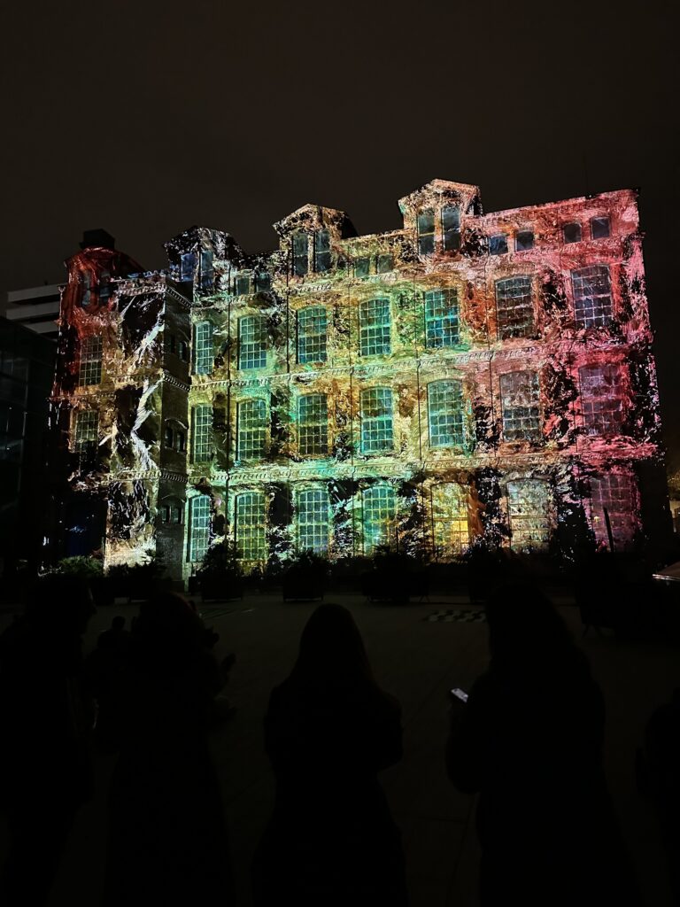
I traveled to Barcelona to see the Llum Festival (among other things). I was curious about it and the art. Even though the festival is mainly focused on media art and light installations, I still found a lot of inspiration there. It showed me new ways of thinking about space, atmosphere, and how art can change the feeling of a city at night.
The Llum Festival is an annual light and media art festival that takes place in Barcelona, mainly in the Poblenou area. For a few nights, streets, buildings, and public spaces are transformed by light installations, projections, and digital artworks created by artists, designers, and architecture schools. Many of the works play with technology, movement, sound, and interaction. It’s very similar to Klanglicht in Graz.
In this article, I want to capture the moments and installations that stayed with me the most. These were the pieces that caught my attention, sparked ideas, or simply made me stop and look for a little longer.
The Rhythmen of the Ocean
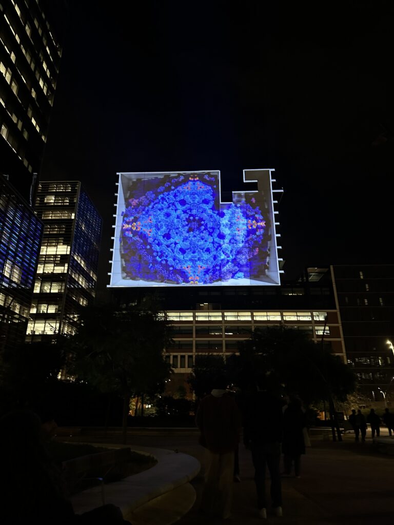
One of my absolute favorite installations at the Llum Festival was “The Rhythm of the Ocean” by the visual studio Desilence, paired with music by composer Suzanne Ciani. This piece stood out immediately because it used a big open space in a powerful way, making the message feel immersive and meaningful. I really liked the flowing visuals and sound that moved like waves around you, it was very magical. It felt like you were inside the ocean and reminded me of Atlantis.
What I liked most was that the installation wasn’t only visually impressive, but also meaningful. Toward the end, text was projected that explained how much waste ends up in the ocean every day and how this pollution affects our environment. By using such a big surface and clear text at the end, the artists made sure the message couldn’t be ignored. For me, this combination of scale, movement, and environmental awareness is what made this installation one of my favorites at the festival.
Mantra Intervention
Another installation I really enjoyed was “Mantra Intervention” by the creative duo STUDIO MO:YA (designers Roland Mariacher and Werner Huber) presented as part of the Llum Festival’s main programme. And you might remember their names, because Moya is based in Graz and also participated at Klanglicht. And to be honest, they were definitely one of the best installations at the festival.
It was an interactive and generative piece that immediately drew me in because it let visitors participate with the art. At one screen, people could change the colours themselves, and brightly rectangles would pulse and lighten up to the rhythm of the music. What made it especially fascinating was watching how the piece constantly recalculated and evolved in real time, so no two moments looked the same, it was always shifting. This mix of interaction, generative visuals, and live rhythm made Mantra Intervention one of the most memorable parts of my visit.
Bulla
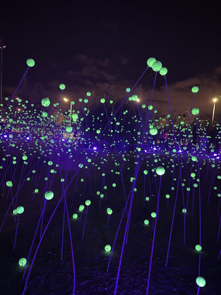
Another installation that I really liked was “Bulla” by Lola Solanilla. This piece was set up in the Àgora Berta Cáceres in Parc de les Glòries (next to Off- Area if you remember). Walking into it felt almost like stepping into a mystical, magical world. The work was made up of almost 4,000 luminous spheres (Golfballs on rods) suspended over a large area, creating a soft, dreamlike landscape of light that you could walk around.
What I liked most about “Bulla” was the vibe it had this unreal, almost enchanted atmosphere that made the space feel a bit mysterious. The play of light and shadows, and how the spheres floated above the ground, made it feel like you were in some kind of glowing cosmic field.
The whispering Mountains
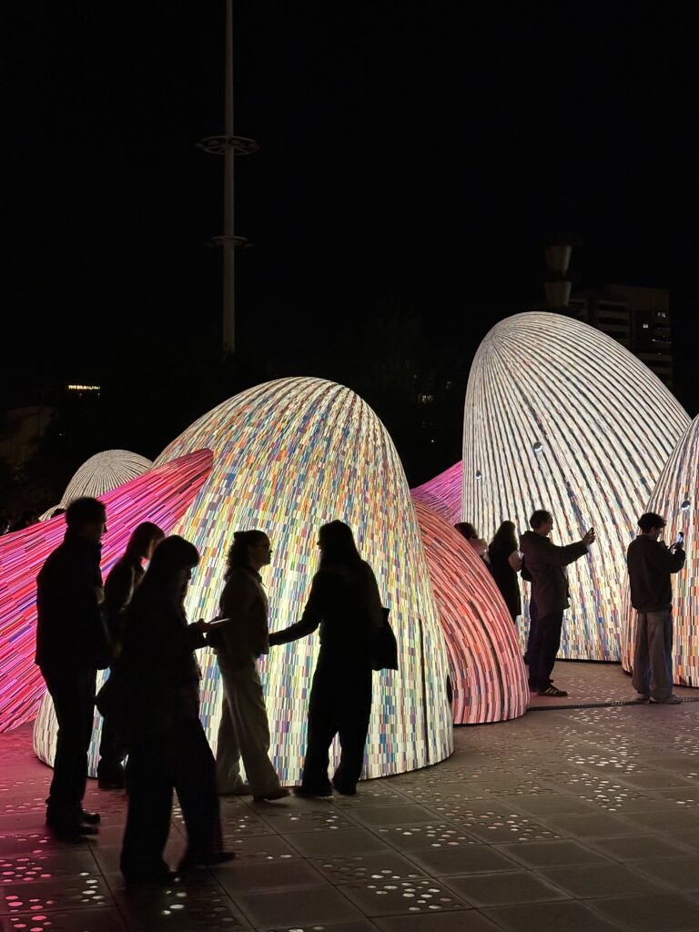
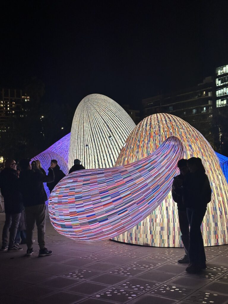
Another piece I really liked at the Llum Festival was “The Whispering Mountains” by ENESS. This installation used inflatable sculptures spread out in the Parc del Centre del Poblenou, and the whole vibe felt really cool and magical. Walking among and through these soft, glowing shapes gave the space a kind of playful, other‑worldly feeling.
I especially enjoyed this installation because it felt alive, the shapes and light looked almost like friendly creatures with eyes blinking and subtle movements that gave them emotion. This cute, expressive quality made the artwork feel personal and engaging, not just a static display of light. For me, that artistic approach was one of the reasons “The Whispering Mountains” stood out as one of the best installations at the festival.
Final Thoughts
Overall, I found the Llum Festival very beautiful and interesting. Even as a Communication Designer, it was a great source of input and inspiration. The professional installations were impressive and really cool. But to be honest, compared with Klanglicht, I had expected a bit more from Barcelona. (After all, it’s a huge city with a strong design background). While there were some truly amazing pieces, there were also many installations by students that sometimes felt rushed or not fully thought out (not just student installation felt like this). I also noticed that some works might have been even more striking if it had been darker overall, but the city itself is already quite brightly lit at night, which limited the effect in some areas.
Still, despite these small points, I’m really glad I went. All in all, it was a very beautiful and inspiring experience, and it gave me plenty to think about and reflect on creatively.
Lesbian representation often gets erased — especially in post-socialist contexts. Gay male imagery was sometimes more visible, even if still marginalized. But lesbians? Even more hidden.
So when we find photographs of lesbian couples, friends, activists — they feel precious.
Many images are subtle. Two women sitting close. Hands almost touching. A look that lingers a bit too long. There’s often ambiguity.
And maybe that ambiguity was intentional.
In a hostile environment, subtlety can be protective. You don’t always need spectacle to be queer. Sometimes queerness lives in small gestures.
But invisibility also hurts. When there are fewer images, it becomes harder to build historical narratives. That’s why these photographs matter so much. They fill gaps.
They remind us that lesbian lives existed, loved, organized, created.
Post-socialist masculinity in the Balkans was intense. Nationalist propaganda glorified soldiers, strength, aggression. The ideal man was tough, patriotic, heterosexual. So where did that leave gay men?
Queer photography complicates this image. You see men who are soft, intimate, playful. Men holding each other. Men posing in ways that challenge militarized masculinity.
That contrast is powerful.
Some photographs feel almost tender in a political way. Two men touching gently in a society obsessed with hardness? That’s radical.
At the same time, not all queer men rejected masculinity. Some played with it. Leather aesthetics. Hyper-masculine poses. It wasn’t always about softness — sometimes it was about reclaiming masculinity on different terms.
Photography becomes a space to experiment.
In a time when the state was defining what a “real man” should be, queer images said: actually, masculinity can look like this too.
A lot of queer photography from this period doesn’t happen in public squares. It happens in basements. In small clubs. In dimly lit apartments.
Safe spaces weren’t trendy buzzwords back then. They were necessary.
Nightclubs became temporary utopias. For a few hours, you could dance, flirt, perform, experiment. Outside, the city might be tense, nationalist, violent. Inside, there was music and sweat and freedom.
The camera loved these spaces.
Flash photography in dark rooms creates dramatic contrasts. Glitter reflects light. Faces glow in the darkness. There’s something almost cinematic about it.
These spaces weren’t perfect. They were fragile. Raids could happen. Gossip could spread. But they allowed queer communities to exist physically together.
And photography turned those moments into memory.
When you look at those images today, you’re not just seeing people dancing. You’re seeing survival. You’re seeing community being built in real time.
Those basements were more than party spots. They were laboratories of identity. And the camera was always there, quietly documenting.
Visibility sounds like a good thing, right? We always say representation matters. But in the 1990s Balkans, being visible as queer could be dangerous.
So what does it mean to pose for a photograph in that context?
Every image carries risk. If a photo circulates publicly, it could expose someone to violence, rejection, or job loss. But at the same time, invisibility erases you completely.
That tension — visibility versus vulnerability — lives inside these photographs.
Some images feel bold. Direct eye contact. Strong posture. Almost confrontational. Others feel softer, more hesitant. You can sometimes sense the awareness of danger.
But that’s what makes them powerful.
The queer body becomes both fragile and defiant at the same time. And photography amplifies that duality. The body is framed, lit, frozen — but it also looks back.
There’s something deeply intimate about being photographed by someone who understands you. Many of these images were taken within the community. That changes the dynamic completely. It’s not voyeurism. It’s collaboration.
Visibility in post-socialist Yugoslavia wasn’t just about pride. It was about negotiating safety. Deciding when to appear. When to hide. When to trust the lens.
And somehow, those photographs still radiate courage.
Susan Sontag once wrote that to photograph is to appropriate. And honestly? That line hits differently when you think about queer bodies in post-socialist Yugoslavia.
Photography isn’t neutral. It never was.
Who gets photographed? Who is visible? Who controls the image? Those questions matter, especially in societies where queer people were pushed to the margins. In the 1990s Balkans, mainstream media rarely showed queer life — unless it was framed as scandal or deviance.
So when queer photographers documented their own communities, something shifted.
Sontag talks about how photographs shape reality rather than just reflect it. That’s exactly what happened here. The act of photographing queer people in nightclubs, apartments, protests — it wasn’t passive documentation. It was political.
The camera became a tool of survival.
But Sontag also warns us: looking can be a form of power. So we have to ask — who is behind the camera? Is it a queer insider? Or an outsider exoticizing?
In post-socialist contexts, this tension becomes even sharper. Western media often portrayed the Balkans as violent, backward, hyper-masculine. Queer photography disrupts that narrative. It complicates it. It says: yes, there is nationalism and war — but there is also softness, intimacy, glitter, and chosen family.
Photography doesn’t just show reality. It builds archives. And archives shape history.
Sontag helps us see that every image of a queer body in that time wasn’t accidental. It was loaded.
Looking is political. Being seen is political. And choosing how to be seen? That might be the most radical act of all.
When people think about drag culture, they usually imagine glitter, RuPaul, big stages, maybe New York or Berlin. But what about Belgrade in the 1990s? Or Zagreb? Or Ljubljana right after socialism collapsed?
Drag in post-socialist Yugoslavia wasn’t just about performance. It wasn’t just about entertainment. It was survival. It was rebellion. And honestly? It was art in its rawest form.
The 1990s in the Balkans were chaotic. Yugoslavia dissolved. Wars broke out. Nationalism intensified. Public spaces became hyper-masculine, militarized, and deeply conservative. The idea of “proper” gender roles became even stricter. Men were supposed to be soldiers. Women were supposed to be mothers. And anyone outside that binary? Invisible — or worse.
So imagine doing drag in that environment.
Photography becomes incredibly important here. Because even when performances were underground — happening in clubs, private apartments, hidden parties — the camera captured proof. Not just proof that it happened, but proof that queer joy existed in the middle of violence and political collapse.
There’s something powerful about seeing a drag queen posing confidently in a space that politically didn’t want her to exist. The photograph freezes that moment. It says: “We were here.”
And what I find fascinating is how these photos often mix vulnerability and strength. You’ll see exaggerated femininity — wigs, dramatic makeup, heels — but also tension. Sometimes the background reveals peeling walls, dim lighting, makeshift stages. These weren’t polished Western drag scenes. They were improvised, local, specific.
Drag became a way to exaggerate gender so much that it exposed how fake gender already is. In a society obsessed with “real men” and “real women,” drag said: okay, let’s push that to the extreme. Let’s make it theatrical. Let’s make it absurd.
And photography amplified that message.
Because once something is photographed, it becomes harder to erase. Even if mainstream media ignored queer lives, these images circulated — sometimes privately, sometimes in alternative magazines, sometimes later in exhibitions. They created a visual memory.
What also strikes me is the intimacy of some of these photos. Not all drag photography from that era is about spectacle. Some images show performers backstage, removing makeup, smoking, laughing, looking tired. Those photos feel almost more radical. They show the human behind the persona.
In post-socialist societies, where identity was already being renegotiated (national identity, political identity, cultural identity), drag added another layer. It questioned gender at the exact moment when everything else was also unstable.
And maybe that’s why it feels so powerful.
Drag in post-socialist Yugoslavia wasn’t imported culture. It wasn’t imitation. It grew from local conditions — war, censorship, underground art scenes, economic crisis. It carried that tension in its aesthetics.
The camera didn’t just document drag. It collaborated with it.
The pose, the gaze, the defiance — they were all intensified by knowing the image might survive longer than the night itself.
Looking at these photographs today feels emotional. They’re not just pretty or edgy. They’re historical documents. They show that queerness didn’t suddenly “arrive” in the Balkans in the 2000s. It was always there. It was just pushed to the margins.
And honestly? That makes those glittery, defiant faces even more iconic.
I wasn’t sure at first if this experience would fit into my Design & Research impulses, but in the end it turned out to be one of the most memorable and emotionally intense cultural experiences I’ve had in a long time: the theatre performance Die Odyssee at Thalia Theater Hamburg. Honestly, I would recommend it to anyone, insane!
Ah and if you want to go, maybe don’t read this impulse now – spoiler alert 😊
The play reinterprets Homer’s Odyssey, but instead of retelling the heroic journey of Odysseus himself, it focuses on the people left behind aka his two sons Telemachos and Telegonos, who have never really known their father. Both wait for the return of a man who exists mostly as a myth, a story or a projection. Odysseus becomes less a person and more an unreliable narrative that the play uses as a red threat.
The performance begins with an almost empty coffin, probably Odysseus’, which already hints at absence rather than presence. At one point, a white balloon rises out of it like a soul escaping, only to be immediately shot down. Instead of epic heroism, we are confronted with absurdity, grief and irony. Throughout the play, the actors constantly switch roles, bodies, and identities. They become brothers, monsters, wrestlers, vampires, Odysseus himself, and at some point even storm through the audience with chainsaws. The stage design keeps transforming, nothing feels stable or fixed.
What makes the whole experience even stranger: most of the spoken language is a kind of fictional Nordic/Scandinavian-sounding mix. I didn’t literally understand much of it and still, somehow, I understood everything. Meaning was not transported through words alone but through rhythm, gesture, movement and atmosphere.
It was chaotic, absurd, funny, dark, and emotional all at once. I laughed a lot, but I also felt uncomfortable or even slightly scared at moments. It constantly shifted between comedy and tragedy. It felt like the play refused to settle into one tone or one clear interpretation.
What does this have to do with communication design?
Afterwards, I kept thinking about how strongly this performance worked without relying on rational clarity. In design, we often assume that communication has to be precise, readable, and immediately understandable. This play did the opposite: it embraced confusion, lost storylines and emotional intuition. And still it somehow communicated incredibly well.
The stage functioned almost like a spatial design system. Light, costumes, props, and bodies created meaning visually and physically. The actors’ movements replaced explanation. Language became sound and rhythm rather than information. It reminded me that communication is not only cognitive but also sensory and emotional.
In a way, the performance felt similar to some of the ideas I’m exploring in my own practice: breaking linear narratives, creating immersive environments, and allowing interpretation rather than controlling it. It also connects to my interest in public space and interaction. The moment the actors entered the audience dissolved the boundary between stage and viewer, turning spectators into participants.
Relevance for my Master’s thesis
This impulse is particularly interesting for my current research around rhythm, rhyme, and perception in design. The play showed me that structure can work beyond literal meaning. Even without understanding the language, I could follow emotional patterns, repetitions, and contrasts almost like a visual or bodily form of rhyme.
For a potential Master’s project that deals with visual systems, visual rhymes, and alternative forms of communication, this feels very relevant. Die Odyssee reminded me that sometimes understanding doesn’t come from clarity but from immersion from trusting emotion and intuition.
Einer der Gründe, warum ich mich jetzt auf Reime im visuellen Design fokussiere, ist, dass ich oft den Humoraspekt in verschiedenen Design Medien vermisse. Und mit Reimen kann man da schnell mal ein bisschen Witz in etwas reinbringen, ohne den Inhalt dabei zu vergessen. Außerdem ist es ja auch klar, dass einem witzige Dinge bzw. Designs länger im Kopf bleiben als Neutrale (King, 2016). Daher gehts jetzt in diesem Post mal um Humor und Witz im Kommunikationsdesign.
Ich habe dazu eine sehr spannende Masterarbeit von 2025 gefunden (Also wirklich cool, ich hatte auf einmal Lust, die ganze Arbeit zu lesen? Hä?): A Case for Humour-Centred Design: Malentanglement, and (Mis)Understanding Humour and Laughter as Responses to Design and Design Innovation.
Hier wird nämlich erklärt, dass es basierend auf Humor im Design noch einige Forschungslücken gibt. Sie besagt, dass „Designer zwar ein klares Verständnis von Humor aufweisen, dieses Verständnis jedoch meist relativ eng gefasst ist. Damit ist gemeint, dass sich ihre Auffassung vor allem auf die Materialisierung von Witzen für rein kommerzielle Zwecke konzentriert, […] anstatt aus der Einsicht heraus zu entstehen, dass Humor ein bedeutsames und einflussreiches menschliches Phänomen ist, das Design und Designer auf subtile und komplexe Weise prägt“ (Humphries, 2025).
Die Forschungsfrage How might humour and laughter, as responses to design and design innovation, be better understood by design?, welche dann nochmal in drei simple Unterfragen aufgelöst sind: How is design understood? / how has design been understood?; How is humour understood? / how has humour been understood?; Why is this important? / How might understandings of humour benefit design? Schaffen eine klare Operationalisierung für das Thema und lassen gleichzeitig Spielraum für Antworten.
In der Arbeit werden dann verschieden Beispiele für Humor im Design vorgestellt und gleichzeitig eine klare Linie zwischen „laughed at“ und „laughed with“ Designs gezogen – Finding Funny Things and Finding Things Funny.
Beispiel Laughed At:
Ein bekanntes Beispiel ist ein Bleistift aus den späten 1990er-Jahren vom ‚Bureau for At-Risk Youth‘ in New York. Er sollte mit dem Anti-Drogen-Slogan ‚Too cool to do drugs‘ werben. Durch das Anspitzen verkürzt sich der Text jedoch schrittweise zu ‚Cool to do drugs‘, dann ‚Do drugs‘ und schließlich nur noch ‚drugs‘ – wodurch die eigentliche Botschaft unbeabsichtigt ins Gegenteil verkehrt wird.
Beispiel Laughed With:
Shrigleys ‚Heroin and Cocaine‘ Salz/ Pfeffer Streuer sind als bewusster, absurder Wortwitz konzipiert. Der Humor richtet sich gegen niemanden, sondern entsteht aus der spielerischen Irritation. Man lacht mit dem Design, nicht über etwas.
Die Ergebnisse?
Die Ergebnisse der Thesis zeigen, dass Humor und Lachen im Design häufig missverstanden werden. Statt sie als Zeichen von Scheitern oder Lächerlichkeit zu deuten, können sie als Hinweise auf Irritation, Brüche oder ungewohnte Verknüpfungen gelesen werden – also genau dort, wo Innovation entsteht. Mit dem Konzept der ‚malentanglement‘ beschreibt der Autor, dass Designs dann Lachen auslösen, wenn sie nicht ganz ‚passen‘ oder Erwartungen bewusst unterlaufen. Dieses Unbehagen oder diese Inkongruenz wird jedoch nicht als Problem, sondern als produktives Signal verstanden. Humor wird damit zu einer legitimen Gestaltungsstrategie und Lachen zu einem Indikator dafür, dass Design Aufmerksamkeit erzeugt, Denkweisen verschiebt und neue Perspektiven eröffnet (Humphries, 2025).
Kritik an Humor im Design
Humor in Design zu verwenden ist natürlich nicht immer eine gute Idee. Bei manchen Themen die z.B. politisch oder gesellschaftlich relevant sind, ist es manchmal schwierig, die Grenze zu finden und darauf zu achten, dass keine Verharmlosung ernster Themen, Oberflächlichkeit oder mangelnde Ernsthaftigkeit geschaffen wird. Gerade bei Satire oder Provokation ist die Linie sehr schwammig und teils subjektiv, ob Grenzen überschritten werden oder nicht.
Literaturverzeichnis
Humphries, T. (2025). A Case for Humour-Centred Design: Malentanglement, and (Mis)Understanding Humour and Laughter as Responses to Design and Design Innovation. (Version 1). Cardiff Metropolitan University. https://doi.org/10.25401/cardiffmet.28302338.v1
King, L. (2016, April 6). How wit and humour make for strong graphic design ideas. It’s Nice That. https://www.itsnicethat.com/articles/the-graphic-design-ideas-book-wit-and-humour-060416
Wiese, M. (2021). Satire als Methode im Kontext des spekulativen Designs. SpecLog. https://speclog.xyz/posts/satire-als-methode