#9 Looking Back, Seeing Differently

This semester wasn’t about following a straight path. It was about collecting fragments like ideas, images, words, impressions and trying to understand what they might be pointing toward.

When I started, I wasn’t even sure what I was looking for. I knew only that something felt off. Design felt tired. Too polished. Too predictable. Too disconnected from real life. So I started paying closer attention to the things that don’t scream to be noticed: a scribbled message on a wall, a broken tile, a flyer stapled over a hundred others. Somewhere in that visual noise, I found honesty.

Through writing, collecting, and reflecting, a theme kept returning: the value of the in-between. The things we pass by. The messy, random, imperfect traces that make spaces and media feel alive. I began to see randomness not as a lack of structure, but as a kind of truth-telling. The uncurated becomes a mirror and the overlooked becomes material.

I also began to look more critically at visual culture. Not just what we’re making, but why. Do we need more posters or do we need to read the ones that already exist more closely? Do we need to add to the noise or help people make sense of it?

This project became something of an experiment in slowing down. In resisting the pressure to produce finished, polished things and instead sit with the progress. Let randomness exist. Let fragments be fragments. Let the design be about presence, not performance.

Maybe what I’ve been doing all semester isn’t building a project, but developing a perspective. A way of seeing that values what doesn’t demand attention. And that might be the most valuable tool a designer can have.

#8 Assembling

Throughout this process, I’ve been circling the same question: What makes something feel meaningful, even when it’s messy, unfinished, or random? I’ve looked at the world through fragments like found textures, broken signage, screenshots of everyday oddities but now I want to take a step back and ask what this way of seeing actually is.

In her book On Longing, Susan Stewart writes about “the souvenir”, a small object torn from its original context that somehow holds emotional weight. I realize my photo archive functions in a similar way. These images aren’t “designed” but they become markers of time, place, and feeling. They’re emotionally charged, not because of their composition, but because of the act of noticing and collecting them.

This kind of collecting the quiet, emotional, inconsistent has nothing to do with curation in the classical sense. It’s not about matching colors or building a “perfect” grid. It’s about feeling something when you look at a corner of a torn sticker on a pole. Or a forgotten note in a public place. These fragments of everyday life don’t scream for attention, and maybe that’s exactly why they speak to me. They don’t try to be art, they just are.

I think this way of seeing is deeply tied to slowness and presence. Noticing is an act of resistance in a fast world. But it’s also creative, it’s not passive. When I collect and document these fragments, I am quietly shaping my own way of designing. Not starting from zero, but starting from what’s already around me.

It also made me wonder: what if this is the material? What if randomness and leftovers are not a starting point for inspiration, but the work itself? I don’t want to just use these images as references for more polished designs. I want to let them remain raw. To find a format where they can exist as they are, where I can add just enough to let them speak.

This process has changed how I think about authorship too. When I put together fragments I didn’t create, am I still the designer? Maybe I’m not designing in the traditional sense, maybe I’m just assembling or paying attention.

#7 Framing the Mess – Notes for a Randomness Manifesto

In my last blog entry, I asked: How do we make sense of all this noise without losing the character of the city? This question has followed me into the next phase of my research. Instead of trying to clean up the clutter, I started observing what it actually is, how we experience it, and what it might be trying to tell us.

My goal is not creating a polished design outcome, it is about building a process or a system, maybe even a mindset.

Step 1: Building an Archive

I began with what I already had in my camera roll. Years of random photos: broken signs, wall textures, forgotten objects, public scribbles, strange alignments, and accidental compositions.

I didn’t take these pictures intentionally for a project, they just happened. So I started categorizing them:

  • Overlaps & Layers
  • Visual Noise
  • Political Traces
  • Human Accidents
  • Unintended Beauty

I created a folder structure on my laptop that now serves as the base for a collection of real-world randomness.

Step 2: Researching the Vibe

At first glance, all these things like paint spills, torn stickers, blurry text seem unrelated. But the more I looked at them, the more I realized: they feel connected. I began to study creators who lean into randomness. From zine-makers layering textures and clashing type to Instagram artists who post found objects without context, it all feels chaotic, but somehow intentional.

I think if you look at it closely, everything can be political. Not just billboards or protest posters, but even the unnoticed details in everyday spaces. A restroom that makes women take the stairs while men walk straight in is a powerful message in itself without even meaning to. Or a wall where “Free Palestine” was painted over, but still faintly shines through. These things are visual proofs of how systems speak through architecture, erasure, and layers of public expression. Sometimes the most powerful statements are the ones no one planned, but no one managed to fully silence either.

Step 3: Understanding “The Dump”

I also revisited photo dumps. Not just as a trend, but as a storytelling form. The randomness isn’t random at all—it’s about rhythm, contrast, atmosphere. A picture of a half-eaten sandwich next to a blurry selfie and a screenshot of a note. It tells you who someone is without saying anything directly. That’s the kind of narrative I’m interested in.

What’s exciting is that this also applies to design. Layouts that feel spontaneous. Posters that aren’t begging for attention but make you stop anyway. Formats that don’t tell you what to think, but make you feel like you’ve stumbled into something.

A Visual Protest in the Making

All of this is slowly leading toward my “Randomness Manifesto”, a zine or digital page that reads and feels like a visual protest against overdesigned perfection. It will be layered, broken, imperfect. It won’t follow a fixed structure. Maybe it will look like a poster that’s been weathered by the street. Or a desktop folder that became a publication.

Whatever it turns into, it taught me that the beauty isn’t in controlling the chaos, it’s in curating it.

#6 Curating the Chaos

In my last blog post, I talked about visual noise and the overwhelming overload of signs, ads, posts, and designs we take in every single day. But lately, I’ve been thinking less about how we experience this as viewers and more about how we contribute to it as designers.

It feels strange: we’re trained to create, to fill space, to communicate. But at what point does that contribution start to become part of the problem?

Instead of fighting the clutter, what if we curated it? As designers, we have the tools to make sense of noise and not by erasing it, but by reframing it. We live in a world where design is everywhere. Good design, even. But instead of inspiring, it’s starting to exhaust. As a designer, I’ve found myself stuck between two questions: Why does everything look the same? and Why does it feel like too much?

I want to take this frustration and explore it further:
How do we design in a time where everything is designed?

Here are a few directions I’m thinking about:

1. Designing for Subtraction, not Addition
What if instead of adding new visuals, we removed something? Could communication design be about making space instead of filling it? For example, creating posters or publications that invite people to erase, cut out, cover, or reuse parts leaving the final outcome unfinished, open, and collaborative.

2. Designing with Found Visuals
What if the design process began not with a blank canvas but with what’s already out there? I’ve been photographing torn posters, scuffed signs, scribbles on paper, things that are already “designed” by the city, time, and people. A project could emerge from these materials. A collage zine, a typography experiment, or even a visual system built from existing fragments rather than new creations.

3. Creating Visual Silence
In a world that shouts, maybe the most powerful thing a designer can do is say nothing. Could we explore formats that use white space, emptiness, or subtle cues to communicate? A type experiment where the type nearly disappears. A print project that works with fading ink, wear and tear. Design that invites rest.

4. Slow and Delayed Design
What if design didn’t have to be instant? What if the reader had to wait, or interact slowly, to fully understand it? We could explore this through delayed-reveal formats like risograph prints that change with layering, or digital zines where parts of the interface become visible over time.

These are not finished ideas. But they are responses. Not to solve the problem of design fatigue, but to live with it differently. Instead of asking how we stand out in a loud world, maybe we can ask: How can design help us breathe in it?

#5 Design Fatigue

In my last blog entries, I celebrated visual chaos like torn posters, urban layering, random textures. I looked at how imperfection and noise can make design feel alive. But this week, I’ve started to look at that same “noise” from another angle. One that’s been bothering me quietly for a while.

Because honestly, I’m overwhelmed. Not just by design, but by everything designed. On my phone, in the streets, in shops, online because it feels like the world is constantly trying to get my attention. Ads, slogans, campaigns, UIs, trends, interfaces. It’s like my brain is scrolling even when I’m not.

I’ve started noticing the mental fatigue that comes with all this. Not from doing too much but from seeing too much. And it makes me wonder: how much visual input is too much? And as designers, are we just adding to the noise?

I noticed how tired I felt after scrolling. Not tired from doing something just from looking because it feels like design is everywhere and everything wants to be seen. At the same time, I walk through the city and feel the same overstimulation. Menus, street signs, neon, scaffolding ads, more layers. It’s a different kind of noise, but it’s all adding up. Not just around me, but inside me too. Like my brain doesn’t know where to look anymore.

And here comes the conflict: I’m a designer. I’m supposed to add to this world, right? Another visual, another poster, another aesthetic. But I keep asking myself: Do we need more? Or do we need to make better use of what’s already here?

I started fantasizing about a kind of mental and urban cleaning project, not minimalism, not another beige lifestyle rebrand but something that clears space without erasing character. How can we clean up the noise without wiping away the stories? How do we preserve the messy beauty of the city without being swallowed by clutter?

I’m not sure what the answer is, but I know it’s not just about subtracting things until everything looks like another minimalist café. That’s erasure, I’m more interested in editing than deleting. Like a graphic designer curating a messy layout, but leaving the good chaos in.

What if the next phase of design isn’t about making new things but about filtering what’s already there? Not with an algorithm, but with human intention. Choosing what to highlight and what not to touch.

I think I’m learning that design doesn’t always mean producing. Sometimes it means observing, organizing, even pausing. Maybe the most radical thing we can do is to “not design” at least not until we’ve really looked at what’s already existing.

#4 Can Design Fail on Purpose?

Sometimes I scroll past something like a blurry flyer, a crooked layout, a typo on a poster and instead of seeing it as a mistake, I pause. Not because it’s “good” design, but because it feels real. I keep coming back to this question: can a design fail on purpose? And even more what if that failure is what makes it memorable? Text misaligned, color combinations that clash, images pixelated beyond recognition. But somehow, it sticks.

We’re taught that good design should be functional and clean. But in the wild, in cities, on street corners, and walls layered with years of posters, we see something else. We see communication that’s chaotic, emotional, confusing but also honest. It doesn’t always follow the rules. And maybe that’s exactly why it sticks with us.

There’s a term in music called “perfect mistake”, when something technically wrong sounds better than what was planned. Maybe design works the same way. Maybe a clashing color combination or awkward composition leaves a stronger impression than the perfectly aligned, grid-locked poster.
When design tries to be too perfect, it often blends into everything else.

I started thinking about this as “visual noise”, a layer of design pollution that feels out of place in clean visual systems. But what if that noise is actually part of the city’s memory? What if that sticker someone made at home on Word and slapped onto a pole at Südtirolerplatz is part of the design culture here, even if no designer approved it?

So what does it mean to intentionally design something that’s not “right”? Can failure be a method? Some artists and graphic designers already work this way, playing with bad spacing, clashing type, broken printing processes. The point isn’t to be anti-design, it’s to reframe our idea of what visual communication can be.

Reading “The Shape of Things” by Vilém Flusser, I came across this:

“Design is a trick — a way to make function appear as form, and form as intention.”
Flusser argues that design is always somewhat misleading. It guides us while pretending to be neutral. But once you notice the trick, the illusion breaks. That’s where broken design or “anti-design” becomes interesting. When it refuses to play by the rules, it draws attention.

That’s also what Brückner explores in “Rough: Anti-Design”. How glitch aesthetics, misprints, raw textures, or visual overload became part of a new graphic language. Especially in an age where everything is optimised and polished, this type of chaos feels honest. These “failures” remind us that a person was there and not a content strategy.

What happens when design stops performing efficiency and instead creates space for emotion? What if “bad” design is a more accurate reflection of our overstimulated world?

#3 Things That Weren’t Meant to Stay

This week I started noticing how many things in public spaces feel temporary. Not in a poetic way, just… actually temporary. A handwritten sign taped to a bakery window that says “Komme gleich zurück :)”, an empty coffee cup balanced on a railing like it’s been placed there intentionally, a pair of gloves tucked into a fence near Jakominiplatz.

You can’t really design these things, but they still speak. They carry small stories, even if we don’t know what they are. They’re not meant to be part of the city, yet somehow they are and maybe they say more about the people living here than any campaign or billboard ever could. These objects and gestures weren’t made to last, but they still communicate something. A kind of honesty that polished design often loses. No branding, no grid system, no aesthetic filter. Just real people leaving traces, often without even knowing it. In design, we’re often told to think long-term and build clarity or make things clean and usable. But a lot of the things I actually remember are the ones that were sloppy, quick, emotional. A missing cat flyer with a smiley face. A badly photocopied note on a lamp post. A weird sticker that just says “mehr lasagne.”

I’m starting to wonder: what if we stopped measuring the value of design by how long it lasts, or how “good” it looks? What if we made more room for short-lived communication, for things that are meant to disappear, but still leave an impression? Not everything has to be permanent to be meaningful. And no, I don’t mean this as just another side effect of our throwaway culture. We already live in a world obsessed with speed, we scroll past images before we even process them, trends change weekly, and content disappears in 24 hours. But the kind of temporary design I’m thinking about is not the same as fast design. It’s not about producing more or doing things quickly just to keep up.

Fast content often feels empty because it’s created to fill space, to keep the algorithm running. But the temporary moments I’m drawn to are different, they happen slowly, or by accident, they’re personal and don’t ask for attention. A note someone wrote in a rush and left behind. A message taped to a broken mailbox. A protest sticker fading in the sun. These things aren’t chasing virality. They exist in the background, but they speak to us on a human level, precisely because they’re not trying too hard.

So when I talk about designing the temporary or embracing what isn’t made to last, I don’t mean more noise. I mean less pressure, less control. I mean making room for slowness, for mess, for the unnoticed things that carry meaning in a different way. Not by shouting, but by simply being there for a moment and then fading.

#2 The Art of Noticing

Lately, I’ve realized that I’m always collecting. Not with intention or purpose, but with a quiet pull toward the things no one else seems to care about. My camera roll is full of crumpled posters, broken signs, strange textures on walls or spilled paint. I never really questioned it. I just took the pictures.
But now, as I think about my semester of experimentation, I’m starting to see it as a tool to be more present and maybe even as my own way of creating designs that don’t follow.

We live in a culture of overstimulation, where everything is trying to grab our attention like ads, feeds, headlines, polished portfolios. But there’s a different kind of awareness that lives in the cracks. It’s quieter. Slower. More personal.

This week, I’ve been thinking about how noticing could be a form of resistance. A refusal to only look at what’s designed to be looked at. A refusal to be impressed only by what’s been curated, filtered, finished. Noticing is not about finding beauty. It’s about being present enough to see what’s already there. And that’s something design often forgets. We’re trained to create impact. To control the narrative. To arrange every element with intention. But what happens when we just observe? When we gather fragments, traces, leftovers and let them lead us somewhere? I’ve started going on walks with no destination during covid and it kind of became my version of therapy. Just me, my headphones, and an openness to what I might find.

A bent fence, casting a perfect accidental grid on the pavement. A half-painted wall where the tape lines remain like scars. A sticker with only one letter left. Things no one made, but that somehow say something. I’m thinking of this as a kind of visual journal. Not even a moodboard or inspiration source yet. Just proof that the world is already designing without us.

These images might become the texture of a future poster. Or a layout experiment. Or maybe nothing at all. But the act of noticing itself feels valuable. It’s a practice in being present. It’s also a way to challenge the perfectionism I keep wrestling with. Because when I notice things that are broken or unfinished or random and still feel drawn to them, it reminds me that I don’t always have to fix or perfect everything I create.

This project might be about randomness but at the moment, it’s really about paying attention.
Noticing things that don’t scream for it. Stuff that exists on the edges. Messy details. Accidents. Layered posters. Things that feel like they have a story even if I don’t know what it is yet.

I like that I’m not trying to make anything final right now. There’s no pressure to solve anything. I’m just observing. Letting things unfold a bit. Saving images, making notes, trying to figure out what all this could turn into.

#1 Designed to Break

There’s something about the broken that feels alive.
This week, I kept noticing the city peeling. A sticker half-removed. Posters fighting for space on a crumbling wall. A screen glitching in the tram. I started to wonder: what if this is the real visual language of now? Not the polished but the layered, interrupted, half-finished?

I’ve been thinking about how design disciplines often work against chaos. We clean things up. We retouch. We organize. But the world doesn’t follow those rules. Meaning emerges in noise, identity reveals itself through mess.

So this semester, I want to work with mess. I want to make space for things to go wrong and I want to create systems that welcome interruption, layering, and decay. Maybe that means printing something over and over until it becomes unreadable or maybe it means designing posters meant to be torn or overwritten. I don’t have a roadmap yet. But I know I’m tired of things that try to be perfect. Let’s see what happens when design begins to fall apart.

I’m interested in what randomness reveals and what emerges when we step back. How does it look like when systems slip, or when time and weather and humans intervene. I’m thinking about how urban spaces speak through their textures, graffiti half-washed away, signs layered on signs, windows reflecting windows. These are not mistakes. They are living surfaces. I’m thinking about how software glitches and compression artifacts create their own strange beauty. Not despite their errors but because of them. I’m even thinking about my own process. How often do I delete something before it has the chance to surprise me?

As someone who struggles with perfectionism in my design work, maybe the most important thing I can do is let go of control and see what happens. I’m so used to polishing every detail, aligning every element, making sure everything feels intentional. But what if the most honest, exciting parts of our work happen after we stop trying to perfect it? What if allowing for mess, interruption, or even failure opens the door to something more human and more meaningful? This semester, I want to challenge my instinct to over-edit and instead trust the process, even when it feels uncomfortable.

I’ve always been drawn to the unnoticed, the random, the imperfect. I take more photos of peeling paint, crooked signs, or strange coincidences on the street than I do of sunsets or famous landmarks. This semester, I want to lean into that instinct. I want to start collecting randomness, not just as inspiration, but as material. Scrolling through my camera roll, it’s clear I’ve been unconsciously collecting randomness for years, fleeting textures, strange compositions, unnoticed corners of daily life and now, those quiet observations are becoming the raw material for a more intentional design experiment.

The goal is to create a zine or digital page that reads and feels like a visual protest against overdesigned perfection. A messy, layered, expressive response to a world that often values control over authenticity. I’m interested in what happens when I break design rules on purpose, in typography, layout, composition, and print and how that affects the way we read, feel, and interpret visual information. I also want to experiment with AI-generated randomness and compare it to my own analog or spontaneous processes. While AI can mimic randomness, it lacks the intuitive, emotional, and visual judgment that humans bring to chaos. I want to test that gap.

This isn’t a fully fixed concept it’s more of a manifesto in the making. Something I will build through experimentation, reflection, and collecting overlooked moments of randomness in the world around me.

Between What Is and What Could Be

When I started this research, I wasn’t looking for a specific topic, I was chasing a feeling. Something felt missing in design, in media, in the way we experience the world. I was drawn to the in-between, the fleeting, unnoticed, overlooked moments that shape us without us even realizing.

I explored the simple concept of waiting, non-places, liminal spaces, randomness, imperfection trying to understand why certain moments feel soulless and disconnected while others feel deeply human. I found myself coming back to the same question:

“How can design capture these in-between moments and use them to create meaning?”

Designing for What We Don’t See

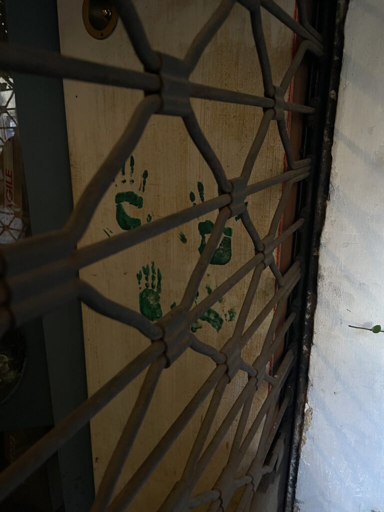
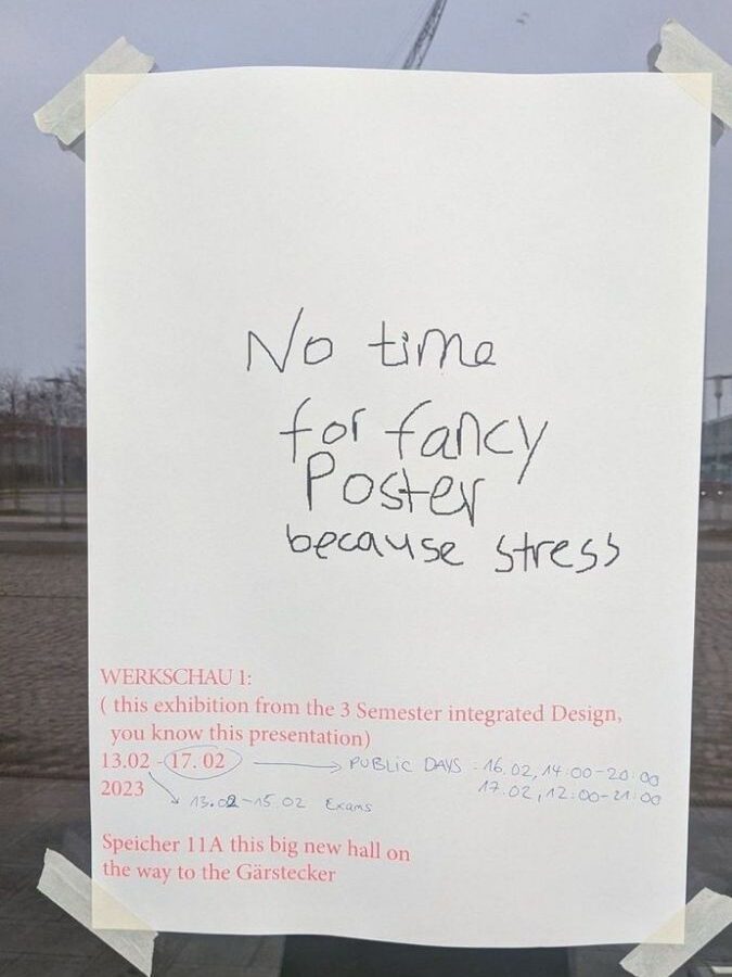
Most design focuses on what’s visible like logos, posters, polished branding. But what about what’s not seen? What about the things we pass by every day, the torn posters, the scribbled notes, the things left behind? What if design didn’t just fill space, but instead highlighted what was already there?

Some of the most powerful design projects aren’t the ones that impose meaning, but the ones that reveal it. Candy Chang’s “Before I Die” walls, where people publicly write their hopes and regrets, aren’t about permanence, they’re about capturing a fleeting moment of honesty. Krzysztof Wodiczko’s projections on public buildings, giving marginalized voices a platform, use impermanence as a tool to make people stop and pay attention.

Maybe good design isn’t about creating something new, but about amplifying what already exists.

The Imperfect, the Unfinished, the Fleeting

Throughout this research, I realized that the most human experiences are imperfect, unfinished, and fleeting. Whether it’s the randomness of a photo dump, the nostalgia for something we can’t quite place, or the quiet intimacy of a shared waiting space, these moments matter.

But we rarely design for them. We design for function, efficiency, longevity. Maybe it’s time to rethink that. What if design embraced imperfection, transience, and randomness? What if, instead of creating perfect spaces, we designed for serendipity, interaction, and human presence?

Designing for the In-Between

At its core, design is about shaping experiences, not just through what is seen, but also through what is felt, passed by, and sometimes even ignored. The challenge isn’t just to create something visually appealing, but to design in a way that acknowledges human presence, interaction, and imperfection. We see this in branding shifting toward raw, unpolished aesthetics, in urban spaces that encourage spontaneous participation, and in digital design that prioritizes authenticity over perfection. The in-between moments whether in public spaces, media, or digital interfaces are where connection happens. Instead of filling every gap with content, design has the power to highlight what already exists, giving meaning to what was once overlooked. The question is: how can we, as designers, create spaces, both physical and digital that make people pause, notice, and feel something real?

What Comes Next?

I don’t have all the answers yet, and that’s the point. This research wasn’t about finding a conclusion, it was about opening a conversation. Maybe the most meaningful design isn’t the loudest, the biggest, or the most perfectly curated. Maybe it’s the quietest the thing that makes you stop for a second, notice what’s been there all along, and feel connected, even if just for a moment. Because sometimes, meaning isn’t in the final design. It’s in the spaces in between.