#10 Creative Thinking

Creativity doesn’t always come from hours of research, long deadlines, or perfectly written briefs. Sometimes, all it takes is a silly idea, a strange prompt and a timer. In a field where creative work is often associated with efficiency, target groups, and polished outcomes, it can be incredibly refreshing to intentionally do something pointless for a change. Not in spite of the silliness but because of it.

A Real-Life Example: Silly Design Sprint

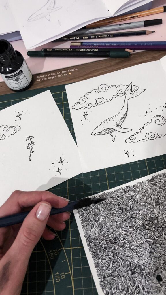
At a recent event called the Silly Design Sprint (organized by a freinds of Communication Designer  Christina Lamprecht), I experienced this firsthand. Each participant received an absurd prompt  and weh ad the evening to create something creative. I created illustrations. No goal, no pressure just following the idea. And surprisingly, some of the results were genuinely good. But more importantly, it felt creatively refreshing.

That event inspired me for this blogpost and to deal more with this topic. You can see me outcomes here.
Why Absurd Tasks Unlock Creative Thinking

When we allow ourselves to dive into deliberately nonsensical or humorous challenges, we bypass one of the biggest blockers in creative work: the inner critic. That voice asking, „Does this make sense? Is this professional enough? Can I show this to someone?” goes quiet once it’s clear that this isn’t about results.

And that brings real benefits:

  • Less pressure, more curiosity:

Without expectations, we open up to playful exploration and unexpected directions.

  • Time limits spark momentum:

When you only have 30 to 90 minutes, there’s no room for overthinking. You just create.

  • Absurdity disrupts pattern:

 A weird prompt like „design the packaging for a pizza brand aimed at penguins” breaks mental routines. That’s where fresh ideas live.

Like any skill, creativity improves with training. And small, silly, time-boxed exercises are the perfect workout. They help you:

  • generate ideas faster
  •  think in concepts, not just details
  • rediscover the joy of creating (outside of pressure or purpose)

This isn’t about abandoning structure entirely. It’s about regularly creating space for creative freedom.

Conclusion: Less Sense, More Ideas

Being silly isn’t the opposite of being creative,  it’s often the shortcut to getting there. Short, absurd exercises train the creative brain and bring lightness into the process. In a world that often takes design too seriously, a little nonsense can lead to surprisingly meaningful ideas. This project really inspired me to make more stuff like this.
#9 Creating My Own Procreate Brushes

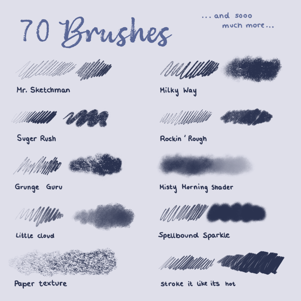
As an illustrator working digitally on my iPad, I quickly realized that the brushes you use can make or break your workflow and final style. While there are countless amazing brushes available, I wanted tools that felt truly personal and matched exactly how I like to work. So I took the plunge and started creating my own Procreate brushes from scratch, including all the textures, brush shapes, and settings.

Why Create Custom Brushes?

Using ready-made brushes is great, but sometimes they don’t capture the unique look or feel you’re aiming for. By making my own brushes, I can control every detail and develop tools that fit my drawing style perfectly. For me, the focus was on three main brush types:

Watercolor Brushes: To mimic the organic flow, blending, and subtle textures of real watercolor paints.

Colored Pencil Brushes: For soft, grainy strokes that vary with pressure and capture the tactile feeling of traditional colored pencils.

Ink Brushes: Crisp, fluid lines with just the right amount of texture and sharpness, sometimes mimicking a real ink pen or brush.

The Creation Process

I started traditionally by working with real media: painting with watercolors, drawing with pencils, and inking on paper. Then I scanned these textures and brush marks to create the texture maps and brush shapes needed in Procreate. This base made the brushes feel much more authentic and lively.

In Procreate’s brush studio, I experimented extensively with:

  • Texture behavior: Balancing randomness and stability so the brush strokes don’t feel repetitive or “stamped.”
  •  Pressure and tilt sensitivity: To allow natural variation in stroke weight and texture.
  • Blending and wetness: Especially important for watercolor brushes to simulate how paint bleeds and mixes.
  •  Spacing and jitter: To add organic feel and irregularity to strokes.

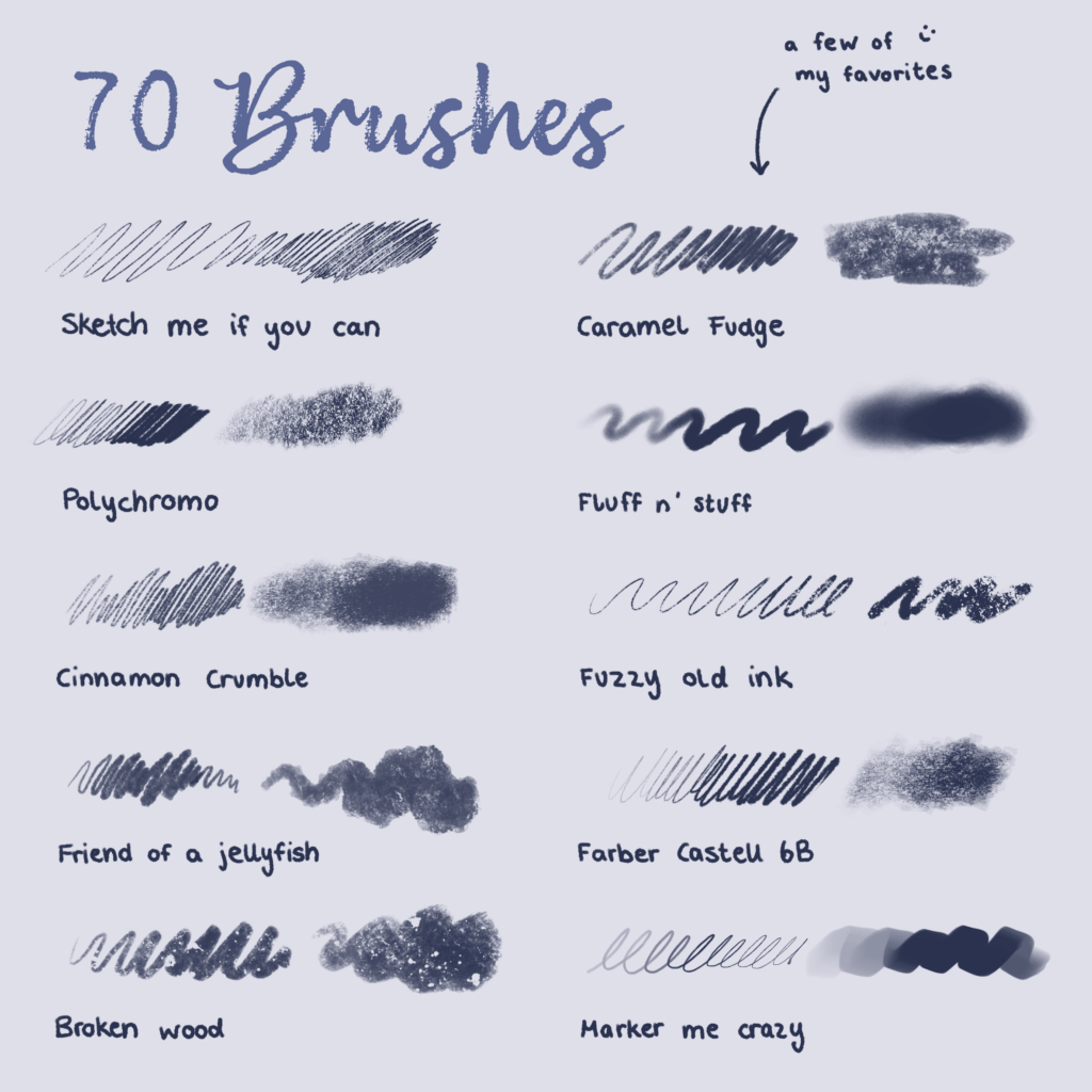
(here you can see a few examples from the pencils I created)

Putting Them Into Practice

Once my brushes were ready, I began using them exclusively in my illustrations. It’s incredibly satisfying to paint soft watercolor washes that flow naturally, add textured colored pencil details, or draw sharp ink lines that still feel hand-drawn.

This level of control lets me explore my style more deeply and brings my artwork closer to my vision.

Final Thoughts

Creating your own Procreate brushes is a rewarding journey that helps you understand the nuances of digital painting tools and develop a personal artistic voice. It can be a bit time-consuming, but the payoff is huge, both creatively and technically.

I’m happy to share my experience and use my brushes in my illustration (as you can see here).

#8 Creative Experiments: Developing Animal Characters

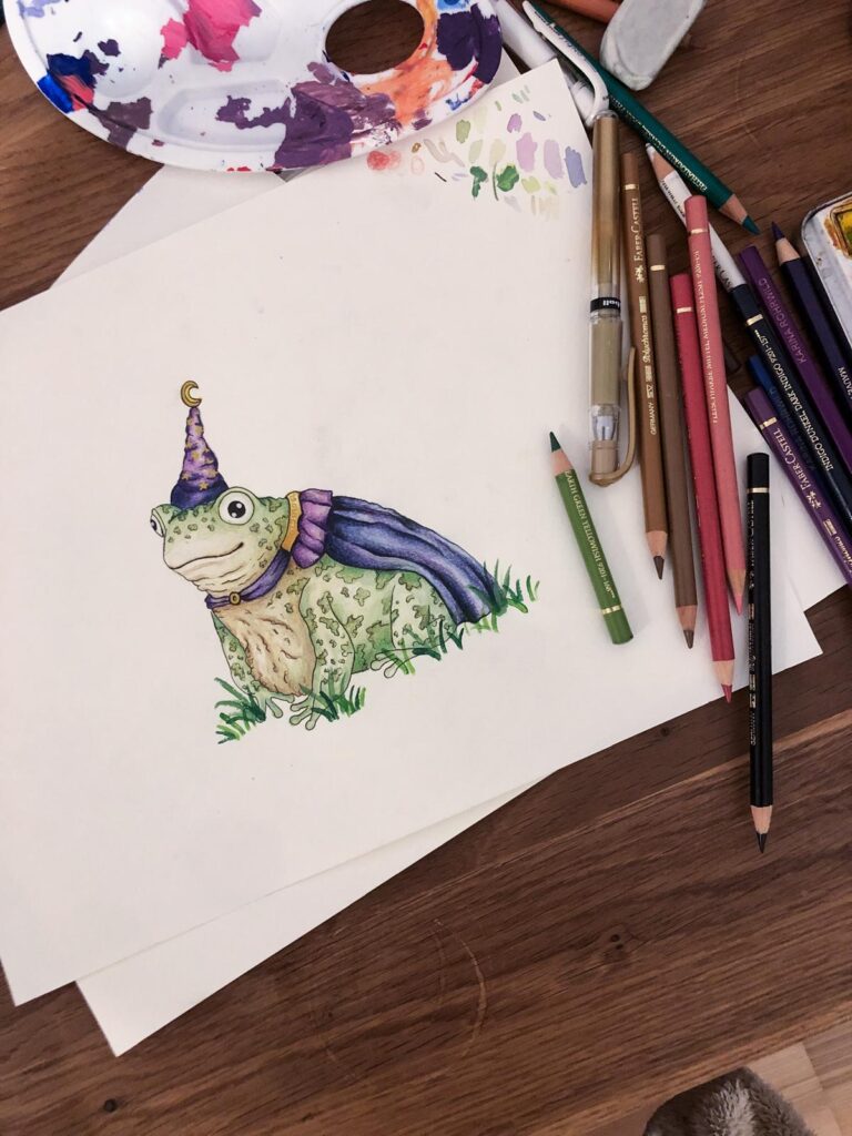
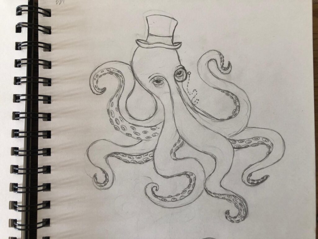
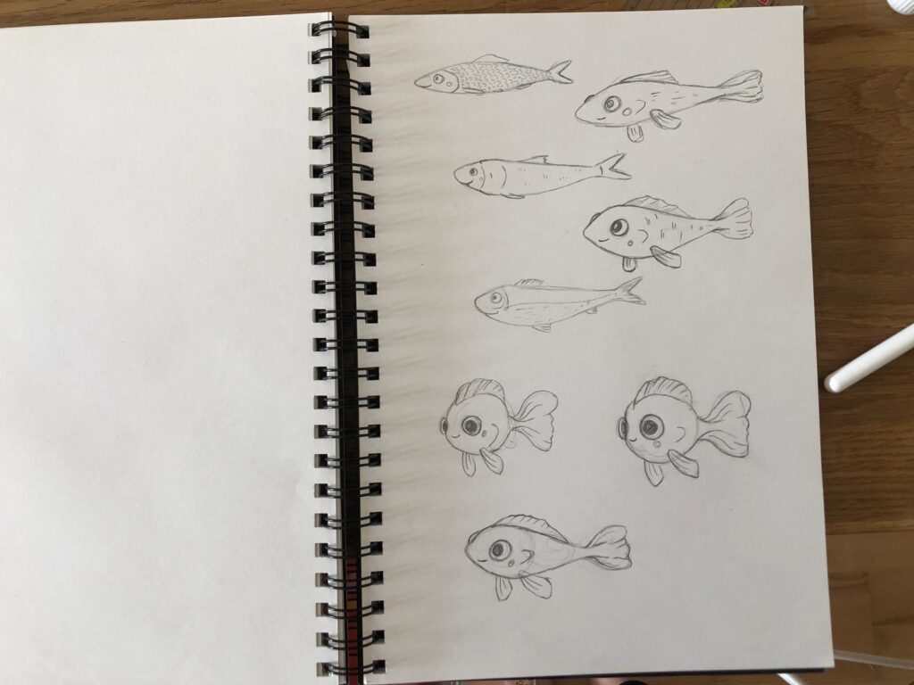
Whether in picture books, animated films, or comics: animal characters have always had a special place in illustration. Personally, I’ve started exploring this topic more deeply because I want to improve my skills in character design. Since illustrating stories is something I’m passionate about, learning how to develop compelling and expressive characters (especially animals ) feels like an essential step for me. Animal characters can be cute, funny, majestic, or intimidating – and that’s exactly what makes them so exciting to experiment with.

Why Animals?

Animal characters serve as projections. They allow us to express human traits in exaggerated or symbolic ways, often with more emotional distance than human figures. A fox can be clever, a bear cozy, a cat proud. These associations are culturally shaped and can be used intentionally or subverted creatively.

Experiment: Make a list of ten random animals and combine them with ten unusual personality traits or professions. What comes out of it? A shy shark, a philosophical hedgehog, a dancing seagull?

Sometimes the story comes first, sometimes the animal. When experimenting creatively, it can be fun to flip the process: Start with an animal (maybe even an unusual one) and ask yourself how it would behave in a particular role. What would a melancholic armadillo look like? Or a hyperactive snail?

Body, Shape and Silhouette

In illustration, the first impression counts. A strong silhouette tells us a lot about a character – posture, proportions, energy. With animal characters, exaggeration is your friend: A large head can seem childish and cute, long limbs can appear goofy or graceful, a round body suggests comfort.

Experiment: Sketch a range of silhouettes of the same animal with drastically different proportions. How does the personality change? Which variations spark your imagination the most?

Expression and Emotion

Animals don’t have the same facial features as humans, but to make them emotionally readable, some anthropomorphism is often necessary. The trick is finding the right balance: How much “human” does your animal character need? Big eyes? Eyebrows? A wide grin?

Tip: Observe animals in motion or watch videos. What does a suspicious dog really look like? How does a nervous rabbit move its ears?

Clothing, Accessories & Setting

Depending on the setting, an animal character may not need any clothes – or it might wear a full tuxedo. Clothing is not just a stylistic element but also a tool for storytelling. The same goes for environment: Does your character live in a fantasy metropolis? A peaceful forest? A cozy bakery?

Experiment: Take one animal character and redesign it in three different genres: Fantasy, science fiction, and Victorian drama. How does the character evolve?

Final Thoughts

Developing animal characters is a creative playground full of possibilities. There are no fixed rules – only guidelines that you can twist or break as you wish. What matters most is that your character feels alive, with quirks, edges, personality, and charm.

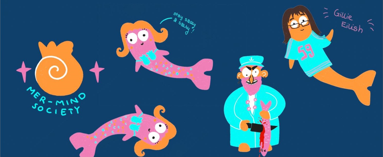
For this Experiment I tried to design my own Charakters and here you can see my outcomes.

#7 Creative Book Experiment

In a world where stories are often digital and fleeting, I wanted to create something that lingers not just in the mind, but in the hands. My project began with a simple but powerful question: How can a story be not only read, but felt?

The Goal: A Tangible Story

The core idea was to create a poetic experience that would stay with the reader through touch, materiality, and craftsmanship. Studies show that we remember things better when we physically interact with them , like turning pages or feeling the texture of paper. I wanted to use this principle to create a story that engages through physical experience.

Concept Development

My first concept was ambitious: a fold-out poster that would reveal more of the story as it unfolded. Movement and storytelling, combined. I planned to use linocut printing to add a textured, handmade quality to the visuals.

But concept met reality. The unfolding mechanism didn’t feel smooth, and the printing process proved too slow and unpredictable. Instead of giving up, I opened the door to a new idea: a foldable book. This format gave me more freedom, to build the story step by step, page by page, and to lean into a more personal and handcrafted approach.

From Idea to Execution

Switching to a book format was a turning point. It allowed me to pace the story naturally and gave structure to the narrative and the illustrations.

Story & Illustrations

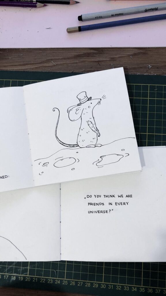
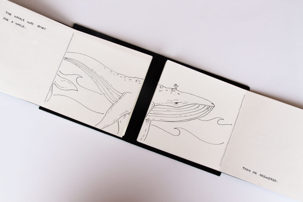
The story began with a long brainstorming session. I knew I wanted something short, poetic, and emotionally resonant. I’ve always had a soft spot for animal stories and small, meaningful anecdotes so the story became a kind of modern fable. For the visuals, I chose ink. It offers soft lines and strong contrasts, perfect for the quiet, emotional tone of the story.

Handcrafting the Book

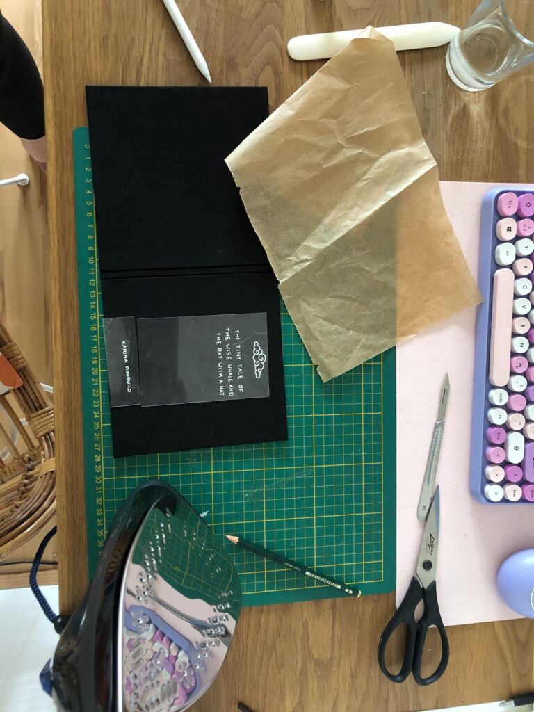
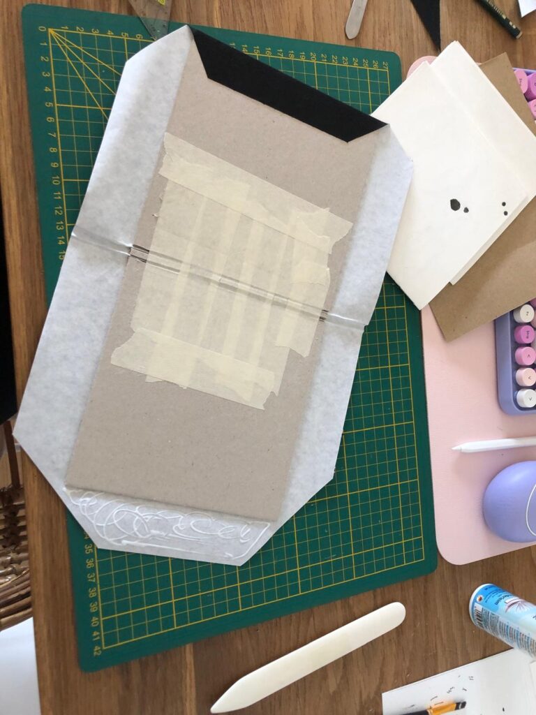
Every part of the book was made by hand: I cut the paper myself, bound the pages using thread binding, and handwrote the text alongside the illustrations. For the cover, I used my bookbinding skills to give the book a clean, professional look. I cut the title using my digital cutting machine.

Reflection

What began as a poster evolved into a sensory storytelling experience. Each page invites the reader not just to read, but to touch, unfold, and feel. This project taught me the power of flexibility in the creative process. Letting go of the original plan allowed me to discover something more fitting and personal. In the end, I didn’t just create a story. A quiet, tactile book that tells its tale through both words and materials. This project has inspired me to focus more on this topic in my master’s thesis and to explore the subject of haptic storytelling further.

#6 Experiment: Error 404

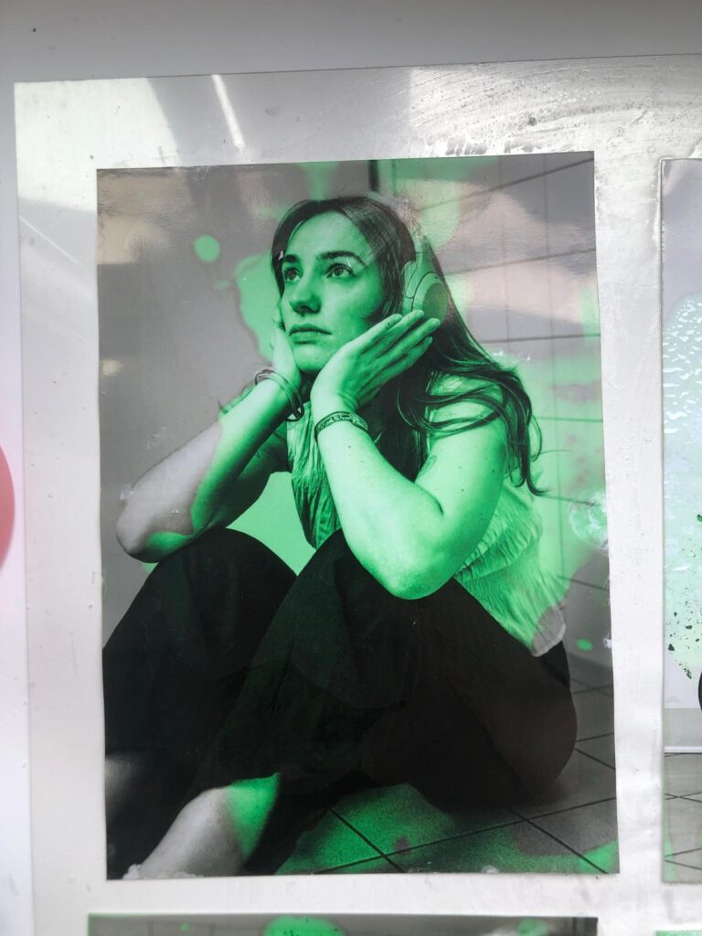
During the International Week, I took part in an exciting workshop on Glitch Art. It wasn’t just about digital errors or distortions, but also about analog glitches, artistic accidents that happen “by mistake” not on the computer, but manually and physically.

Research and Concept

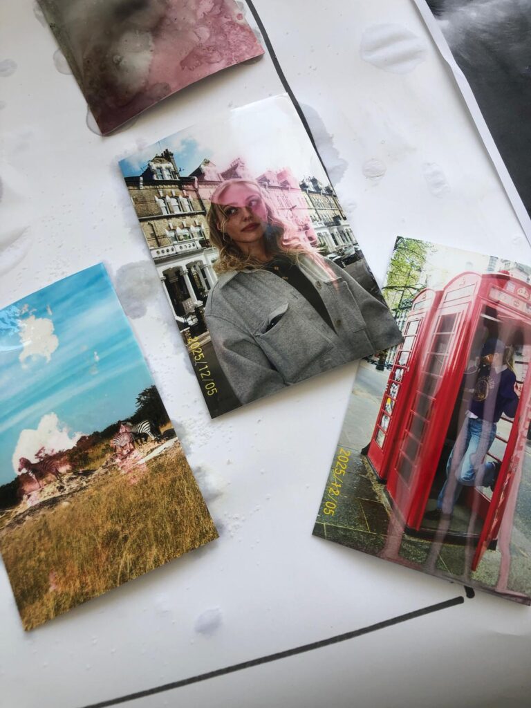
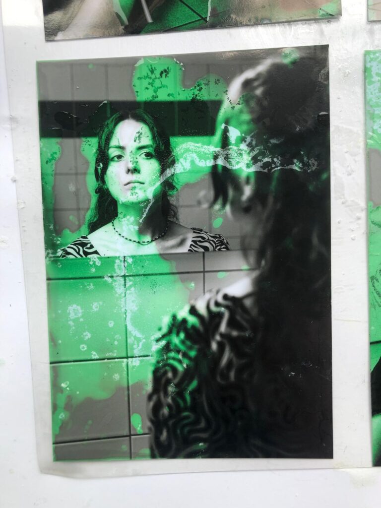
Before starting, I did a lot of research on the topic. For my project, I wanted to deliberately create analog disturbances on photos without controlling the “destruction” itself. My idea was to aesthetically damage photos, while letting chance play its part.

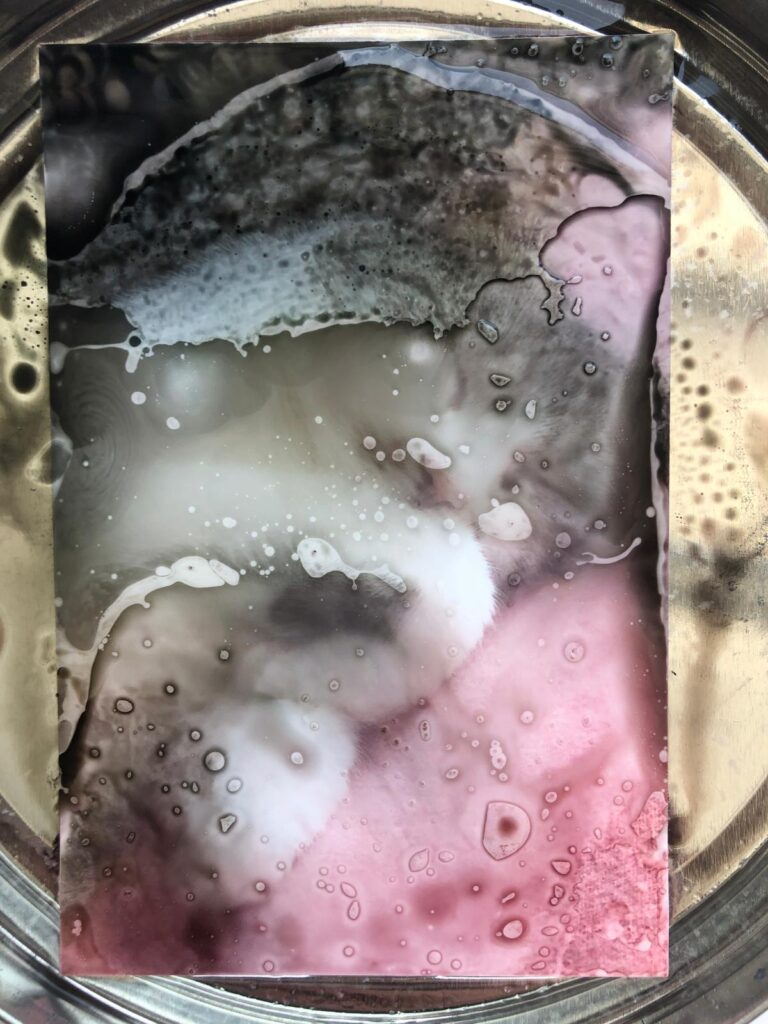
To do this, I gathered plenty of inspiration and experimented with various chemicals like cleaners, bleach, nail polish remover, salt, and more.

The Creative Process

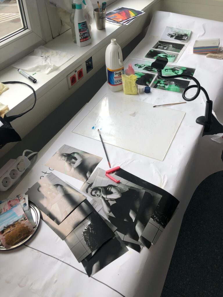
First, I took photos by myself, photographing my friends at university, and then edited them in black and white to create a thoughtful, unsettling mood. This fit well with the theme and the glitch aesthetic.

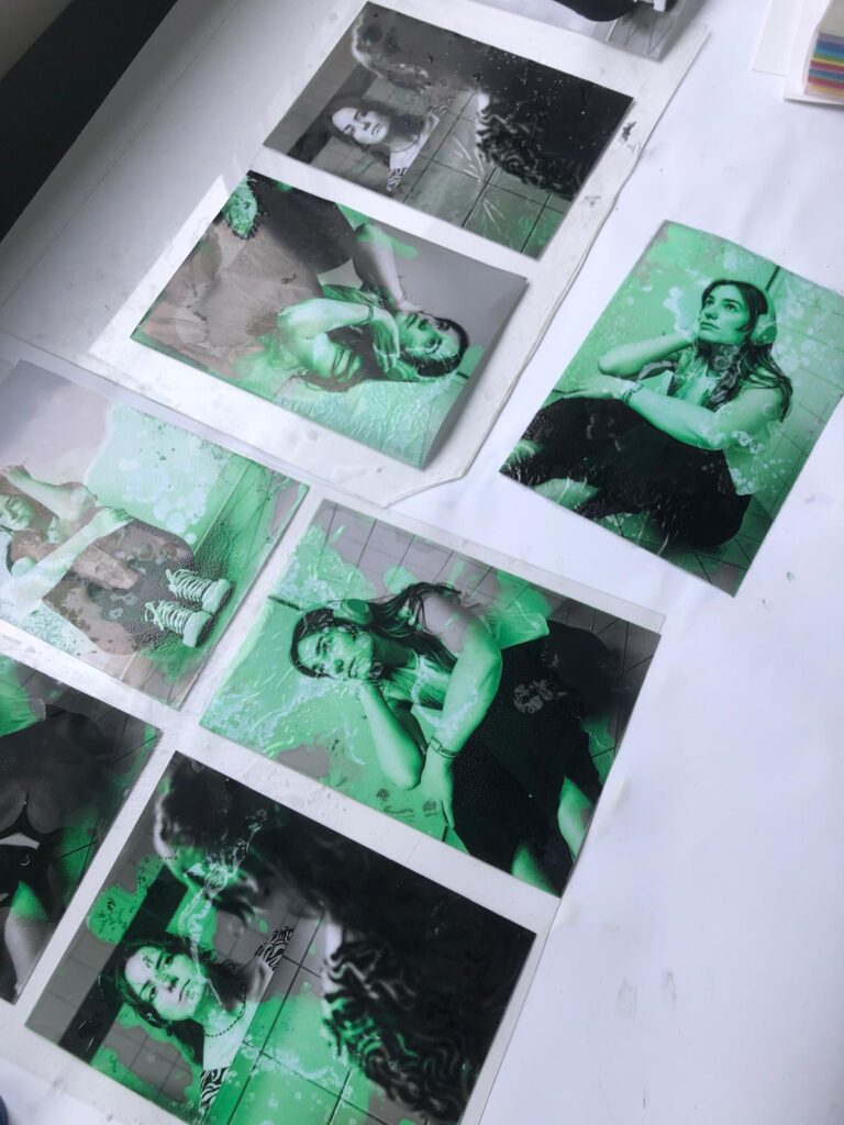
Next, I printed the photos using a plotter and treated them with the chemicals. The best results came from a mixture of acetone and bleach. The photos became partially discolored, etched away, or even dissolved creating images that tell stories of disruption and change.

Video as a Visual Extension

To capture the process, I filmed everything, sped up the footage, and then edited it in After Effects. There, I added typical digital glitch elements like error messages and loading circles, reinforcing the theme and linking the analog errors with a digital layer.

What the Project Means

The project deals with hard-to-define emotional and interpersonal states such as the search for meaning or the feeling of being too slow or left behind. These experiences are often vague and difficult to articulate. Technical error messages serve as a parallel: moments when connections are lost, responses fail, or processes get interrupted.

The visible alterations on the photographs (discolorations, etched-away areas) reflect ongoing change and disruption as natural parts of life. Errors and glitches are not exceptions but part of a continuous process.

My learning

This experiment was a lot of fun. I really enjoyed inviting unpredictability into my creative process. I’m very satisfied with the outcome, not only because it looks visually interesting but also because it carries a message I strongly identify with.

This combination of artistic process, personal reflection, and technical execution showed me how much expression and depth can be found in so-called “mistakes”  both analog and digital.

#5 Setting Type & Printing at Druckzeug

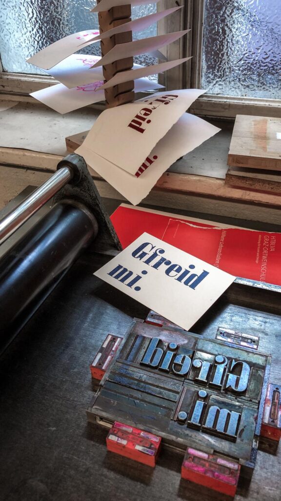
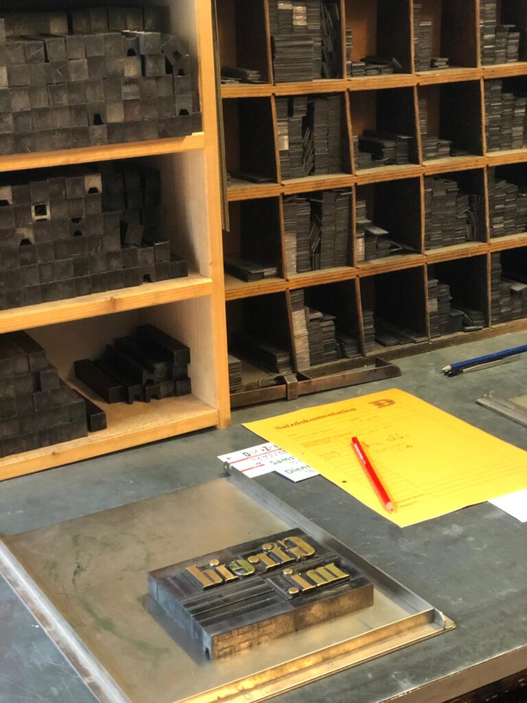
Recently, I had the chance to take part in an open studio session at Druckzeug in Graz (a space dedicated to analog print techniques – i guess everybody knows it). These open workshops take place roughly once a month, and I joined with two friends from Communication Design. Together, we tried something completely new (at least for me): setting metal type by hand and printing it using letterpress.

It was my very first time working with movable type, and I have to say: it was a fascinating, hands-on experience that felt like stepping into another era of design.

How Does Letterpress Actually Work?

With traditional letterpress printing, each individual letter (called a type or letterform) is selected from a collection of lead blocks and set mirror-inverted into a metal frame called a composing stick. You build your text letter by letter (kind of like heavy-duty Scrabble) to form words and lines.

But it’s not just about picking letters. Since they don’t hold themselves in place, you also have to fill all the empty spaces between words and around the layout using lead spacers and furniture blocks. Once the composition is complete and perfectly aligned, everything is tightly locked into place using a chase (metal frame) and quoins (tightening devices), so nothing moves during printing.

Then it’s time to ink the type and print  by placing it in a press, rolling on the ink, and pressing the paper onto the form. The result: a tactile print with real depth.

Let’s print

For my first try, I chose the Bavarian word “Gfreit mi”, which roughly means “I’m happy” or “That makes me glad.” Surprisingly, the process wasn’t as difficult as I’d expected but it was definitely very time-consuming. Every little gap needs to be filled carefully, and everything has to be placed just right. But that’s also what makes it so satisfying.

Working with the physical type, taking time to set each line, and finally seeing it printed, it gave me a whole new appreciation for the craft and history of printing.

Reflection

This experiment at Druckzeug was a beautiful experience, a dive into the world of analog typography and a nice break from our digital routines. It’s inspiring to see these old techniques still being taught and practiced, and how much joy and creativity they can bring.

“Gfreit mi” – that pretty much sums it up.

#4 Risograph Experiments

Over the past few weeks, I had the chance to explore the Risograph printer in more depth at our university’s FabLab.

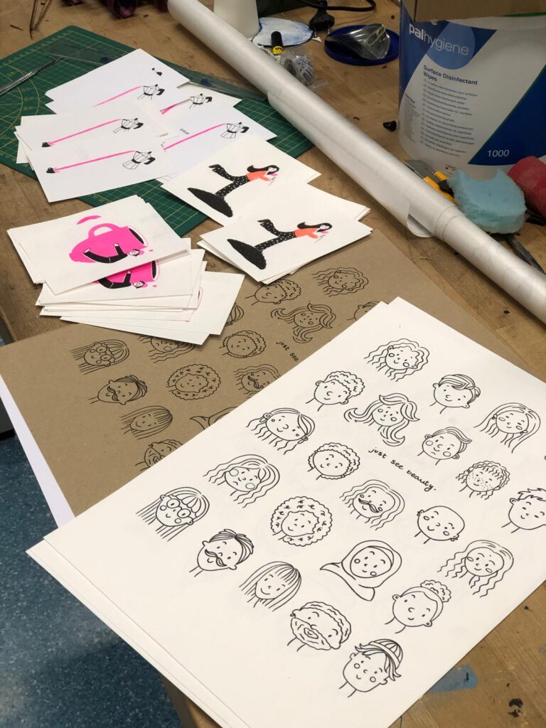
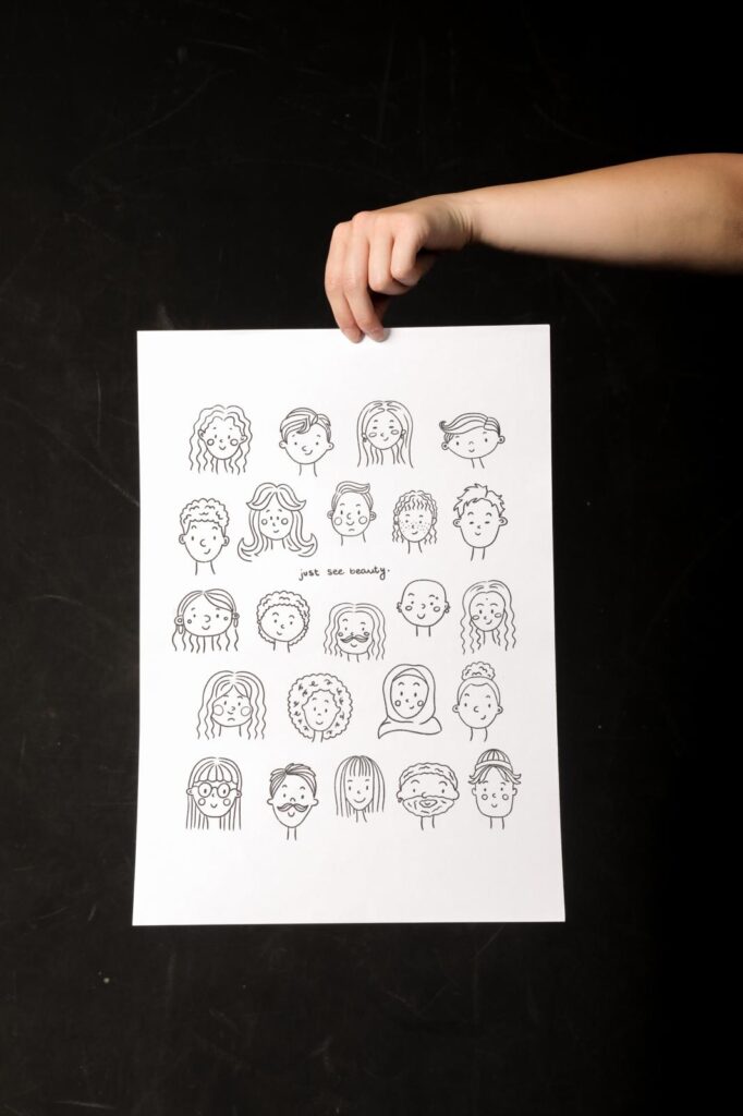
It all started with an illustration I had drawn some time ago. I digitized it using Procreate, added some text, and designed a layout for an A3 poster. After that, I prepared the file for Riso printing and printed it in black ink on various types of paper.

Paper Testing & Printing Experience

I wanted to find out how different types of paper would affect the final print, so I tested three options:

  • Coated paper (160 gsm)
  • Textured paper (160 gsm)
  • Textured cardboard (200 gsm)

The textured papers were my clear favorites. They give the print a special tactile quality and depth that fits the Risograph aesthetic really well.

Because I enjoyed the process so much, I went on to print a series of smaller A5 cards, again using illustrations I had already created. I also experimented with multi-color Riso prints, which can be a bit challenging at times, but very rewarding.

Learnings & Riso Charm

One important takeaway from this project: always include crop marks!

Since the Risograph tends to shift the layers slightly, which actually adds to its unique charm, it’s really important to plan for that from the beginning. Adding crop marks helps avoid a lot of frustration when trimming the prints later on. I also tested different papers for the A5 cards and was very happy with the results.

Hinterhof Flea Market at Druckzeug

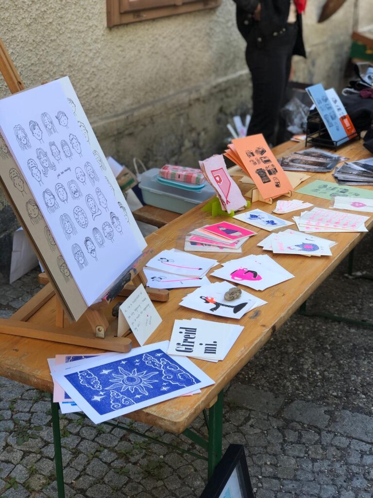
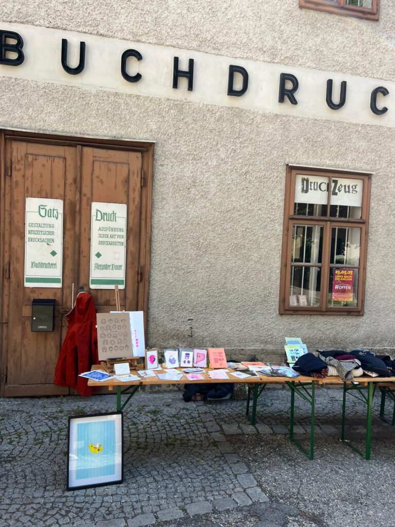
A really lovely part of this project was teaming up with Julia Steile together, we had the chance to sell our own prints and illustrations at the Druckzeug stand during the Hinterhof flea market.

To be honest, I didn’t expect much but I was completely surprised in the best way. The response was overwhelmingly positive. So many people were genuinely interested in our work, appreciated it, and bought something. I was especially happy that almost all of my posters were sold.

In addition to kind feedback, we also received generous support and had many meaningful conversations with fellow creatives and visitors.

This feedback really confirmed something for me: In an increasingly digital world, handmade work still matters. People value things that are tactile, imperfect, and personal, all qualities that the Risograph conveys beautifully.

As an aspiring illustrator, this project was not only a fun experiment, but also a huge motivation. It showed me that printmaking is alive and well and that it’s absolutely worth putting in the time, creativity, and love for detail.

#3 Words from an illustrator

Yuko Shimizu at OFFF Barcelona
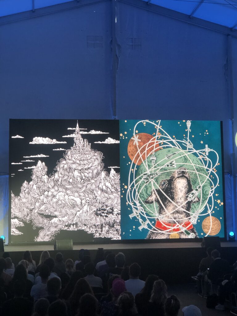
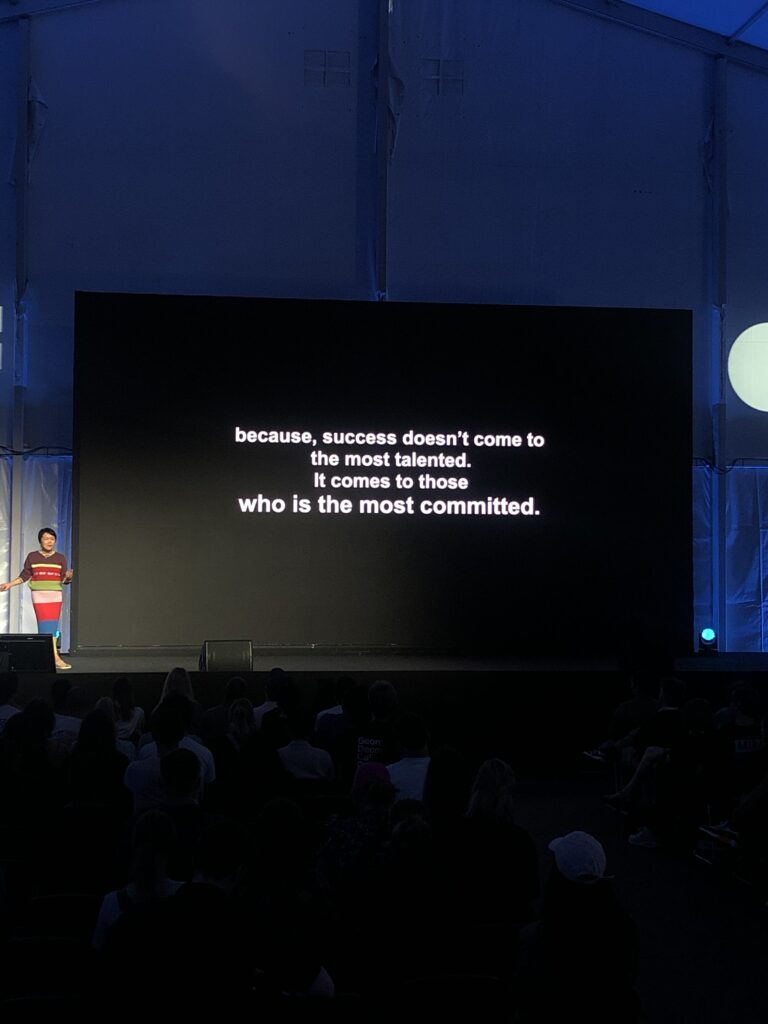
At the OFFF Festival in Barcelona, one talk in particular left a lasting impression on me: Yuko Shimizu’s. Her thoughts on artistic integrity, staying true to yourself, and finding your own path deeply inspired me. Since these are the same questions I explore in my blog, I wanted to summarize and reflect on her talk here.

Who is Yuko Shimizu?
Yuko Shimizu (not to be confused with the Hello Kitty designer of the same name) was born in Tokyo in 1965 and now lives in New York. She works for clients such as The New Yorker, TIME, and DC Comics. It wasn’t until her mid-thirties that she left a career in PR to study illustration at the School of Visual Arts in New York – a bold and life-changing decision. Her style is powerful and culturally layered, blending influences from traditional Japanese Ukiyo-e and Western comics.

The Talk: Honest, Motivating, and to the Point
Yuko’s talk wasn’t about putting on a show, it was an open, thoughtful conversation about doubt, decisions, and creative mindset.

“You don’t need to change how you draw – you need to learn to embrace it.”
Her message: accept your style instead of chasing trends.

Original or Pop Star?

“Don’t judge but decide who you want to be: original or pop star?”
Do you want commercial success, or do you want to follow your own unique path? Both are valid but the choice should be intentional. And when you say yes to a project, give it your all.

“Don’t create for imaginary clients.”
Yuko warns against designing based on imagined expectations. Often, we create with a voice in our head saying, “Would a client like this?” – which isn’t necessarily wrong, but it can limit creative freedom. Some of the most powerful work happens when there are no constraints, no brief, no paycheck, just pure artistic expression.

Focus Over Talent

“It doesn’t matter when you are not talented – clear focus matters.”
Talent isn’t everything. What matters more is clarity, perseverance, and passion. Doubt is normal. The important thing is to keep going.
“To say: ‘In the past I was so bad’ means that you got better.”
Looking back and seeing growth is a sign of progress and that’s a great feeling.

Why Illustration?

“Illustration comes when photos don’t work.”
Illustration can express what photography can’t – emotions, concepts, imagination. That’s why the medium matters. Even in a world full of new technologies, illustration has a future, because it’s honest, personal, and human.

My Conclusion
Yuko Shimizu reminded me what truly matters: finding and owning your unique style. Not working for likes or money, but for meaning. And the two most important things: never give up and it’s never too late to start over.

#2 Experiment: Studies

The following blog posts will focus on finding my own illustration style. Since I hope to work as an illustrator one day, I’m currently exploring ways to develop a personal and recognizable style. To do that, I’ll try out different methods and experiments to test new techniques and evaluate the results. I want to document this journey in my blog and share my experiences along the way.

To begin, I’m focusing on doing studies. Improving at drawing takes time, patience, and a lot of practice – mastery comes with repetition. That’s why I’ve decided to dedicate one week at a time to studying a specific subject, such as animals, objects, or body parts. Ideally, I’ll choose subjects I struggle with or want to improve in. During that week, I’ll dive deep into the topic.

The goal is to explore different ways of depicting the subject, try out new techniques, and find out which approaches feel most natural to me.
For the first week, I chose the raven – birds are especially difficult for me to draw. Over the course of the week, I plan to draw the raven in a variety of styles and techniques, from quick sketches to detailed studies and even abstract interpretations.

At the end of the week, I’ll reflect on the process with a short review:
• Which methods did I enjoy the most?
• Where did I learn the most?
• Which approaches do I want to continue using in future studies?

For me, the most important part isn’t a perfect final result, but what I learn during the process: understanding how I approach a subject, which techniques suit me, and where there’s still room to grow.

Reflection
Now that I’ve completed the first study, I’ve taken some time to reflect on the results. Overall, I really liked the approach and found it very helpful. After spending a full week focused on the raven, I can now draw it from memory, and understanding its proportions has become much easier.

I realized that you need to draw a subject at least once to really grasp how its proportions relate to one another, this became especially clear during the study. I also found the step-by-step approach, from rough sketch to detailed drawing, very effective and logical.

What I found least helpful was the geometric breakdown. It didn’t offer me any real insight, so I’ll skip it in the future. Instead, I’d like to add a color study next time to improve my understanding of light, shadow, and mood.

#1 Illustration and Animation

Animation with Procreate

This is the first post in a new blog series where I will share my experiments with illustration. The goal of this series is to find an idea for my master’s thesis, develop and discover my personal style, and learn more about different illustration methods. I might also include some writing. I’m especially interested in the combination of experimentel animation and editorial illustration – maybe I’ll find a way to connect both in future projects.

For my first experiment, I tried out the animation feature in Procreate. I already have experience using Procreate for digital illustration, but I had never used the animation tool before. To get used to the interface, I started with an old illustration I had already made – a magic potion bottle. I added small bubbles to it and made them move.

How does animation work in Procreate?
Procreate uses something called “Animation Assist.” You create a new frame for every movement. These frames appear in a timeline at the bottom of the screen. Each frame is like a new drawing layer. There’s also a helpful tool called “Onion Skin,” which shows you a faded version of the previous and next frames – this helps you see how your animation flows from one drawing to the next.

Animating the bubbles was a fun and simple way to begin. I learned how movement timing works, how fast or slow things feel, and how repeating frames can change the overall look. It gave me a first idea of how the animation process works.

Next, I created a brand new illustration and tried to make a more advanced animation. But I quickly noticed that animation in Procreate takes a lot of time. Since you have to draw each frame by hand, it’s very slow, especially if you want smooth motion or longer animations.

Conclusion:

My conclusion from this first try: Animation in Procreate is great for artistic, short animations. It works well for small projects or illustrations that need a little movement. But it’s not ideal for longer animations or complicated actions, because the interface isn’t super easy to use, and you have to draw everything frame by frame. Still, I learned a lot from this experiment. I now understand more about timing, movement, and how difficult frame-by-frame animation can be.