#11 Finding the research question

Conclusion

Over the course of the semester, I gained a comprehensive overview of the topic of ‘illustration’, which includes many areas within the design industry. Illustrations are essential today, not only in editorial design, but also in branding and brand development. Icons and symbols are also part of illustration, often in a simplified form. Flat design plays a particularly important role in web design and user experience.

The various techniques and tools, both digital and analogue, offer artists plenty of freedom to implement creative ideas. Illustration styles are diverse and are influenced by art movements and historical events. Illustrations vary in different countries and cultures because they are characterised by local influences and perceptions. Colours also have different meanings depending on the culture and influence the effect of illustrations.

I found it particularly fascinating how illustrations can represent the values of a brand and effectively appeal to the target audience. This understanding inspired me to focus my research question on this dynamic relationship between illustration, brand identity and audience engagement. Specifically, I want to investigate how illustrations can be designed to emphasise brand values while appealing to the desired target audience.

My research question will therefore tentatively be:

“How can illustrations in brand identity design be created to authentically communicate brand values and effectively engage the target audience?”

Why is this topic relevant for designers?

This topic is of great importance to designers, as illustrations are an essential tool for creating memorable and effective brand identities. When designers understand how illustrations can communicate brand values and appeal to the needs of the target audience, they can develop more effective solutions. Furthermore, in a globalised world, brands often target different audiences from different cultural backgrounds. Designers need to address these complexities in order to create illustrations that are universally understandable while still reflecting the brand’s own values. This approach not only increases brand recognition, but also fosters consumer trust and loyalty.

What challenges arise regarding this question?

  • Authenticity vs. general appeal: It can be a challenge to ensure that illustrations authentically represent a brand’s values while still appealing to a broad audience.
  • Cultural nuances: The meaning of colours, symbols and styles can differ from culture to culture, which can affect the perception of illustrations.
  • Avoiding stereotypes: Designers must strike a balance between cultural fit and avoiding clichés or stereotypes that may alienate or offend audiences.
  • Dynamic preferences: Audiences’ aesthetic preferences change over time, so brands need to stay relevant while maintaining consistency.
  • Brand strategy integration: Illustrations need to fit seamlessly into the overall brand strategy, including messaging, tonality and other design elements.

Example: A designer creates a set of playful and vibrant illustrations to convey a brand’s youthful and energetic values. However, without understanding the target audience’s preferences, the illustrations might fail to connect with them, potentially diminishing the effectiveness of the brand’s communication strategy.

What motivates me to pursue this topic?

Illustration is my personal focus in design, and I am passionate about exploring how visual elements can shape perception and drive engagement. I’m particularly interested in the intersection of creativity and strategy: how artistic expression can be used to convey powerful messages while achieving specific goals. This topic is particularly relevant for brands that want to build a strong connection with their audience through visual storytelling. Understanding the role of illustration in this process is not only intellectually inspiring, but also practically valuable for my future career as a designer.

What might the next steps be?

In the next phase of my research, I will:

  1. Look at examples of successful brand identities where illustrations play a key role.
  2. Find studies and theories about brand communication, visual storytelling, and audience engagement.
  3. Explore the work of illustrators and designers who focus on branding to see current trends and good practices.
  4. Develop simple guidelines for creating illustrations that reflect brand values and connect with audiences.
  5. Create a project, like a handbook or design example, to show how illustrations can be used to support brand identity and appeal to target groups.

By combining research and practical work, I hope to provide useful insights and tools for designers working in branding.

#10 The meaning of colors in diffrents cultures

Colours play a huge role in branding, marketing and illustration. They can convey feelings, create connections and influence the way we see things. It is important for artists, designers and companies to understand what colours mean in different cultures in order to convey the right message and create a lasting impact. A colour that signifies trust in one culture may symbolise danger in another. In advertising in particular, brands also differentiate their designs for different countries in order to be able to respond to cultural preferences and differences.

Red: Passion, Danger, and Luck

Western Cultures: In many Western cultures, red is associated with passion, love, and energy. It can also represent danger and anger. Red is used to grab attention, as seen in advertising or traffic signals.

Chinese Culture: In China, red is a symbol of luck, prosperity, and success. It is used in celebrations like weddings and Chinese New Year, often in the form of red envelopes with money to wish for good fortune.

Indian Culture: In India, red signifies fertility, prosperity, and marriage. Brides often wear red, as it is considered auspicious and brings blessings.

Blue: Calm, Spirituality, and Grief

Western Cultures: Blue is associated with calmness, peace, and trust. It symbolizes the sky and the sea, evoking a sense of freedom and tranquility.

Japanese Culture: In Japan, blue also represents spirituality and purity. It can be seen in traditional art forms like calligraphy and flower arrangements. It is also linked to mourning, though not as strongly as in Western cultures.

African-American Culture: In African-American culture, blue is tied to sadness and resilience.

Green: Nature, Renewal, and Misfortune

Western Cultures: Green symbolizes nature, growth, and renewal. It represents the spring season and is often linked to health and prosperity.

Islamic Culture: In Islam, green is a sacred color, representing paradise and closeness to God. The Prophet Muhammad often wore green, and it is a significant color in Islamic art and architecture.

Vietnamese Culture: In Vietnam, green can symbolize misfortune, as it is linked to spirits and darkness in certain contexts.

Yellow: Joy, Envy, and Risk

Western Cultures: Yellow is commonly associated with joy, sunshine, and optimism. It is a color of energy and is used in advertising to create a sense of happiness.

Indonesian Culture: In Indonesia, yellow is associated with envy and jealousy. It can have a negative connotation, especially in rituals or certain social contexts.

African Cultures: In many African cultures, yellow represents wealth, prosperity, and enlightenment. It is also seen as a color of positive change and progress.

Black: Power, Death, and Elegance

Western Cultures: Black is the color of mourning and death in Western cultures. It symbolizes the end, darkness, and grief. However, it is also associated with elegance and formality, particularly in fashion.

African Cultures: In many African cultures, black symbolizes power, respect, and authority. It is often worn by leaders or royalty to assert their position.

Chinese Culture: In China, black represents the concept of Yin (the feminine principle) and is linked to spiritual and philosophical meanings. It can also symbolize bad luck or disharmony in certain contexts.

Conclusion

Colours are more than just what we see; they are connected to culture, history and traditions. For branding and illustration, it is important to know what colours mean in different cultures. A colour that is seen as good in one culture may be negative in another. When companies and creatives understand this, they can better connect with people around the world and make sure their message is clear. By thinking about the cultural meaning of colour, brands can build a strong identity, trust and emotional connections with their audience.

Resources

cieden.com – book/sub-atomic/color/color-symbolism-and-meanings

summalinguae.com – language-culture/colours-across-cultures

toppandigital.com – translation-blog/colour-culture-similarities-differences

atmos.earth – over-the-rainbow-color-perception-science design4users.com – design-for-diversity-of-cultures-perception-of-colors

#9 Analogue vs digital illustration

Some illustrators constantly ask themselves the question: analogue or digital? Both approaches have their advantages and challenges, and the decision between them is often a question of context, preference and objective.

Analogue illustration

What is analogue illustration?

Analogue illustration includes all forms of hand-drawn artwork created with traditional tools such as pencils, watercolours, ink or acrylic. This approach has a long history dating back to the earliest forms of human art.

Advantages of analogue illustration:

  1. haptics: tactile qualities of brushes, pens or colours are difficult to imitate digitally, besides it is a different feeling to draw on real paper.
  2. uniqueness: every stroke is unique and cannot be easily reproduced.
  3. textures: Materials such as watercolour paper, canvas or charcoal create natural textures that are difficult to imitate in the digital world.

Disadvantages of analogue illustration:

  1. error correction: unlike in the digital world, there is no ‘undo’ button. A mistake can be difficult or impossible to correct.
  2. material costs: high-quality colours, papers and tools are often expensive and have to be replaced regularly.
  3. limited reproducibility: analogue works must first be photographed or scanned for digital use, which can be time-consuming and does not always deliver perfect results.

Digital illustration

What is digital illustration?

Digital illustration refers to artwork created with software and digital devices such as tablets, pencils or computers. Programmes such as Adobe Photoshop or Procreate offer artists a wide range of tools and effects.

Advantages of digital illustration:

  1. flexibility: the possibility to try out different tools, brushes and effects with one click makes the creative process diverse and customisable.
  2. error correction: functions such as ‘Undo’ or ‘Layers’ make it easy to correct mistakes or make changes.
  3. cost savings: After the first purchase of a tablet and the software, there are no additional material costs.
  4. reproducibility: digital works can be copied and passed on in perfect quality, making them ideal for commercial purposes.
  5. integration into work processes: Digital files can be seamlessly integrated into print processes, animations or web applications.

Disadvantages of digital illustration:

  1. time intensive: working with graphics software and digital tools requires time and patience.
  2. technical dependency: it is not possible to work without electricity, a functioning device or the right software.
  3. artificiality: digital art can sometimes appear less ‘alive’ or ‘authentic’ compared to analogue work.

For what purposes are analogue and digital illustration most frequently used?

Areas of application for analogue illustration:

  • Art and gallery work
  • Children’s book illustrations (often traditional techniques such as watercolour or coloured pencil)
  • Sketches and concepts
  • Handmade designs (posters, greeting cards or packaging)

Areas of application for digital illustration:

  • Entertainment (video games, film and animation)
  • advertising
  • Editorial content (magazines, blogs and newspapers)
  • Web design and UI/UX (icons, layouts and visual elements for apps and websites)

How can analogue and digital techniques be combined?

The combination of analogue and digital illustrations combines the advantages of both sides:

  • Analogue sketches as a basis: Analogue sketches can be digitised and then further processed using digital software.
  • Textures and patterns: Handmade textures such as brushstrokes, watercolour backgrounds or charcoal drawings can be used.
  • Hybrid works: Artists use both analogue and digital tools in the same project.
  • Collages: Digital collages can consist of scanned analogue elements, photographs and digital drawings.
  • Printing and post-processing: Digital works can be printed out and then further processed using analogue techniques such as paint or pens.

The artist and graphic designer Kevin Bergquist combines analogue and digital art by creating collages from his analogue drawings and then digitising and editing them (see image).

How is analogue illustration digitised?

Digitising analogue illustrations is an important step in making them usable for digital purposes. There are various methods and aspects that should be taken into account:

  1. high quality scanning: Scanner with high resolution (at least 300 dpi)
  2. photography: high-quality camera and even lighting 
  3. post-processing: adjust brightness, contrast and colours
  4. cropping: remove or adjust the background
  5. file format: lossless format such as TIFF or PNG, JPEG version optimised for web use
  6. calibrated devices: calibrated monitor to ensure colour accuracy

 Does analogue illustration have a future?

Despite the fast development of digital technologies, analogue illustration has not lost its relevance. In fact, it is making a comeback in certain areas. Artists and consumers appreciate the unique character and originality that only handmade works can offer. At the same time, analogue art is often seen as an opposite pole to the fast- moving digital world and is consciously used as a statement.

However, there is no doubt that digital illustration is leading the way in many commercial areas. Its efficiency, flexibility and integration into digital work processes make it the preferred choice for businesses and creative projects.

Ressources:

praxistipps.chip.de – zeichnungen-digitalisieren-so-gehts

pixus-punktus.de – digitales-zeichne-und-analoges-zeichnen-ein-vergleich

truegrittexturesupply.com – blogs/news/tutorial-get-analog-digital-with-kludge

diepresse.com – analoge-und-digitale-schnittstellen-in-der-kunst

xp-pen.de – blog/digital-vs-traditional-art

youtube.com – Digital Zeichnen vs analog Zeichnen: Was ist besser?

#8 Flat design

What is Flat design?

Flat design is a design approach that focuses on minimalistic design elements. This design stil avoids 3D effects, shadows and realistic textures and concentrates on flat, two-dimensional elements. Flat design is minimalistic and avoids decorative elements. The clear and plain aesthetic particularly popular  in web design. This approach promotes the universal comprehensibility and ensures that important content is in the front.

Key features of flat design

  • Simple shapes: Rectangles, circles and clear linies
  • Strong colours: Vibrant, often primary and secondary colours
  • Minimalistic typography: Clear, well-readable fonts without decorations
  • Icons and symbols: Universally understandable symbols often replace long texts
  • No effects: No shadows, gradients or overlays

The history of flat design

The roots of flat design go back to the 1940s and 1950s, particulary in the areas of graphic design and art. Movements such as Bauhaus and the Swiss school of graphic design laid the foundations on simplicity and funcionality. The Flat design was developed as a counter-movement to realistic and detiled styles such as skeuomorphism.

Skeumorphism is a design style in which digital elements imitate real objects and materials to make them more familiar and intuitiv. Examples are wood and leather textures in apps or a recycle bin icon for deleting files.

With the spread of smartphones and the need to enable clear and fast interactions on small screens, flat design began to gain popularity. Microsoft was one of the pioneers when they introduced a completly flat design concept with the release of Windows Phone 7 in 2010. In 2013, Apples followed with iOS 7 and mostly abandoned skeumorphism. This change marked the beginning of a broad trend that extended to websites, apps and software.

Why is flat design so popular?

The popularity of flat design is closely connected to the needs of modern users and technologies. Here are several reasons why flat design plays such a significant role in web design:

  1. Mobile First: Flat design is perfect for responsive web design, as it relies on simple elements and clear structure that can be easily scaled.
  2. Fast charging times: By avoiding complex graphics and effects, the amount of data that a website has to load is reduced.
  3. Contemporary aesthetics: Flat design conveys modernity and clarity.
  4. Ease of use: navigation elements are clearly recognisable and the user journey is made simple and more intuitive.
  5. Brand identity and recognition: by using clear colour palettes and minimalist shapes, brands can communicate their identity more clearly.

Use of flat design on websites:

Flat design is used particularly frequently on websites. There are a few aspects to bear in mind:

  1. Create a clear hierarchy: Through the specific use of sizes, colours and spacing rules, users can quickly identify the most important content. For example, bold colours can be used for call-to-actions such as ‘Buy now’ or ‘Learn more’.
  2. Use bold colour palettes: Colour choice plays a central role in flat design. Clear and vibrant colours should be used. Ideally, the colour palette should contain three to five colours.
  3. Icons: Icons replace complex graphics and offer a universal and visual language. A paper aeroplane, for example, can stand for the ‘send’ option.
  4. Use typography consciously: Without elaborate graphic elements, typography takes centre stage. A sans serif, simple and clearly legible font should be avoided.
  5. Emphasise interactive elements: Flat design can sometimes appear too plain. It is therefore important to clearly emphasise interactive elements such as buttons or links, for example with a hover effect. Animations can also be used to liven things up.

What is Semi-flat design?

Semi-flat design is a mix of flat design and some realistic details. It uses simple shapes and colors, similar to flat design, but adds subtle elements like shadows or layers to create depth. This combination makes the design look clean and minimal while still appearing slightly three-dimensional. It is popular because it is easy to use, visually appealing, and gives a modern feel.

Advantages and disadvantages of flat design

Like every design style, flat design also has its strengths and weaknesses.

Advantages:

  • Clarity: Content is in the foreground, which improves readability.
  • Scalability: Perfectly suited for responsive design.
  • Modernity: Looks contemporary and appealing.
  • Performance: Fast loading times thanks to reduced graphics.

Disadvantages:

  • Monotony: If implemented incorrectly, flat design can appear boring.
  • Comprehensibility: Without shadows or gradients, buttons and other interactive elements can appear less intuitive.
  • Limited creativity: Minimalism can present designers with challenges when it comes to presenting complex information in an appealing way.

Ressources:

99designs.de/blog/news-trends/flat-design-semi-flat-design/

medium.com/design-bootcamp/what-is-flat-design-27dc6e642099

www.canva.com/learn/flat-design/

#7 Retro Design Styles

Design is constantly changing, but retro illustrations remain popular. They capture the style of the past and continue to inspire today. Retro styles such as Art Deco or Pop Art show the colours, shapes and themes of their respective eras and evoke nostalgic feelings. Retro illustrations date from the early 20th century to the 1980s. They reflect the style and culture of those times. Each era has its own unique character and offers many ideas for today’s artists.

Diffrence between Retro and Vintage Design

The differnce between retro and vintage design is that vintage refers to real designs and objects from the past, while retro describes modern designs that imitate the stils of the past. In practice, these two terms are blurred and are partly used as synonyms.

Why are they timeless?

Retro illustrations remain relevant because they look familiar and bring back memories. Their charm and wide range of uses in advertising, fashion or social media make them interesting for designers. They combine old trends with modern ideas and therefore remain relevant. They are versatile and have a strong cultural relevance, as they visually pick up on current trends and social phenomena.

Timeless aesthetics: Retro designs appeal to generations with their bold colours and simple shapes and outlast trends.

Versatile uses: They can be used in various areas such as branding, packaging and social media, combining nostalgic elements with modern design.

Cultural relevance: Retro illustrations remain relevant through cyclical cultural trends such as vinyl or retro gaming and offer a visual reflection of social movements.

Retro design styles

Art Deco

Art Deco is an elegant and luxurious design style that reached its peak in the 1920s and 1930s. It is characterised by geometric shapes, clear lines, symmetrical patterns and opulent materials. Art Deco illustrations often use shiny surfaces such as gold, silver and chrome, as well as bold colours and contrasting combinations. The style combines classic elegance with modern, industrial influences and celebrates both the advances in technology and the luxury of the time. Advertising and posters in particular often feature stylised, almost futuristic depictions of figures and objects.

Art Noveau

Art Nouveau illustrations are characterised by their curved lines, floral patterns and strong orientation towards nature. This style, which was popular at the end of the 19th and beginning of the 20th century, broke with the straight lines and classical forms of earlier eras and instead focussed on organic, flowing movements that are often inspired by plants, flowers and curved shapes. Art Nouveau illustrations often feature female figures. The illustrations are characterised by attention to detail and decorative elements.

Mid-Century Modern

Mid-Century Modern is a design style that was popular in the 1940s to 1960s and is characterised by clear, simple lines and functional shapes. In illustration, this style is often characterised by minimalist designs, bright colours and geometric patterns. Figures and objects are often simplified and stylised, with the focus on clear shapes and a modern, often futuristic look. Illustrations in the Mid-Century Modern style are often uncomplicated and focus on the essentials, making the style timeless and easily accessible. Playfulness and a certain lightness are also typical.

Pop Art

Pop Art is an art style that became popular in the 1950s and 1960s and is strongly influenced by mass culture. In illustration, Pop Art uses bright colours, clear lines and often familiar symbols from advertising, comics or everyday objects. Things such as cans, celebrities or logos are often depicted in a playful, exaggerated way to emphasise the importance of popular culture. The illustrations are colourful, eye-catching and sometimes look like something from a comic or advertisement.

Psychedelic Art

This style that developed in the late 1960s and was strongly influenced by experiences with drugs and hippie culture. In illustration, this style manifests itself through vibrant, often exaggerated colours and crazy, distorted patterns that sometimes depict almost surreal or dreamlike scenes. The shapes seem to liquefy or shift, and there is often a focus on imaginative, psychedelic scenes.

Punk

Punk illustrations reflect the rebellious and anti-establishment spirit of the punk movement of the 1970s and 1980s. The illustrations often use rough, hand-painted designs, black colours and bold, unpolished lines that create a wild and chaotic atmosphere. The images are often provocative and show symbols such as skulls, safety pins or anarchist signs.

Ressources

#6 Japanese Art and Illustration

The illustration reflects the unique culture of each region or continent. Asia, with its rich history and traditions, has developed its own unique styles that are very different from those of the West.

Differences between Asian and Western illustration

Asian illustrations focus more on expression and atmosphere, while Western art often emphasises realism and perspective. The aim is often to capture the essence of an object rather than depicting it in detail. Colours are used sparely and the text is often seamlessly integrated into the artwork. Asian art is closely connected to nature and is characterised by minimalism and simplicity. Some styles have established themselves through philosophical ways of thinking, such as Zen-Buddhism, which particularly want to express the pursuit of harmony and balance.

Japanese art styles

Ukio-e

Ukiyo-e, which means ‘pictures of the flowing world’, is a Japanese art form of the Edo period (17th-19th century), which became known primarily through woodblock prints (Holzschnittdrucke). It depicts scenes from everyday life, nature and mythical themes. It is characterised by colours, clear lines and detailed patterns. Above all, the pictures show a lot of life, movement and colours. Famous artists such as Hokusai (‘The Great Wave off Kanagawa’) characterised this style, which later influenced Western artists such as Van Gogh, Monet and Klimt.

Sumi-e

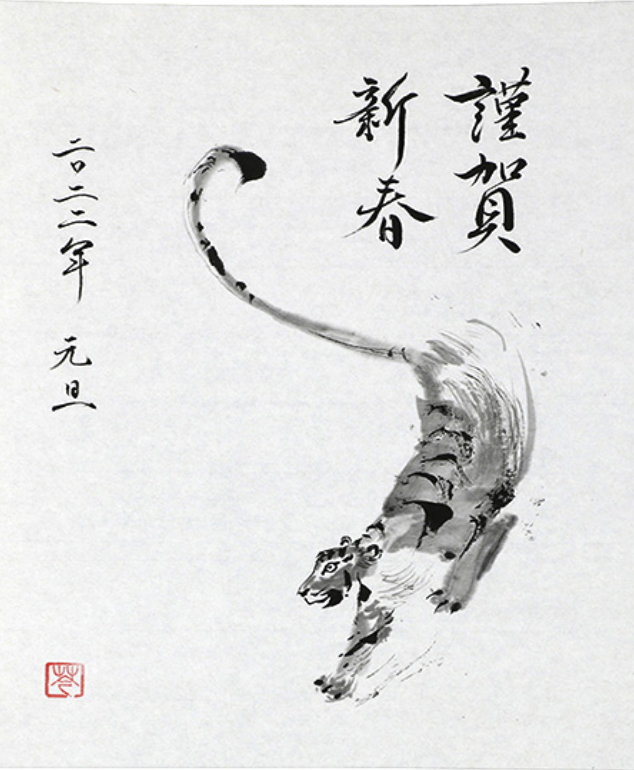
Sumi-e is a traditional Japanese art form that focuses on painting with black ink. It developed from Chinese ink painting and is closely linked to Zen Buddhism. The focus is less on realistic details and more on capturing the essence of a theme with minimal, expressive brushstrokes. Nature elements such as bamboo, mountains or birds are often depicted, with the use of empty spaces and shading playing an important role in creating harmony and depth.

Manga and Superflat

Manga is a Japanese comic and illustration art form that developed in the late 19th century, but has roots in traditional Japanese art forms such as ukiyo-e woodblock prints. After the Second World War, manga experienced a major boom thanks to artists such as Osamu Tezuka. Manga is characterised by lively image layouts, expressive facial features, large eyes and detailed backgrounds. The stories cover a wide range of genres, from adventure and romance to science fiction and horror, and are aimed at different age groups and interests. Manga has had a major influence on art, pop culture and media worldwide.

Kawaii

Kawaii is a Japanese art and illustration style known for its focus on cuteness. The term ‘kawaii’ means ‘cute’ or ‘adorable’ and is reflected in childlike, simplified figures with large eyes, round shapes and bright colours. Animals, food or figures are often depicted with over-the-top cute facial expressions. The style emerged in the 1970s and was popularised internationally by brands such as Sanrio (creator of Hello Kitty). Kawaii has strongly influenced Japanese pop culture and can now be found in fashion, advertising and entertainment worldwide.

Nihoga

Nihonga is a modern Japanese painting style that developed in the late 19th century and combines traditional Japanese painting techniques with influences from Western art. Artists use natural materials such as mineral colours, silk paper or gold leaf and often work on wood or paper. Subjects range from classical landscapes and nature scenes to contemporary interpretations. Nihonga keeps the aesthetics of Japanese art but integrates modern elements to create a bridge between tradition and innovation.

#5 Book Illustration

Book illustrations are more than just pictures that accompany the text. They are important tools that bring stories to life, make them easier to understand and convey emotions. From children’s books to novels for adults – illustrations characterise, inspire and enhance the reading experience in many ways.

Meaning and impact

Illustrations play an important role when it comes to enhancing the story of a book by visualising scenes and creating emotional connections that words alone often cannot. They are customised to the target audience, whether through child-friendly images or meaningful symbolism for adults. The variety of illustration styles, from traditional drawings to digital art, enriches the book’s message and complements the content in a unique way. Well-designed illustrations encourage reading interest, especially for younger readers, and help them understand the story more deeply. They also offer marketing benefits by increasing the recognisability of a book and making it stand out in the marketplace.

History

The history of book illustration goes back a long way. In the Middle Ages, manuscripts were beautifully decorated with miniatures and initials. One notable example from this period is the ‘Biblia Pauperum’ (‘Poor People’s Bible’). This work was used as an illustrated Bible in which woodcuts and pictures were used to make complex theological content understandable, especially for people who could not read. With the invention of book printing in the 15th century, in particular the woodcut technique, illustrations could be reproduced on a larger scale. Later, copperplate engravings and lithographs made even more detailed works possible. Classics such as the fairy tales of the Brothers Grimm became unforgettable.

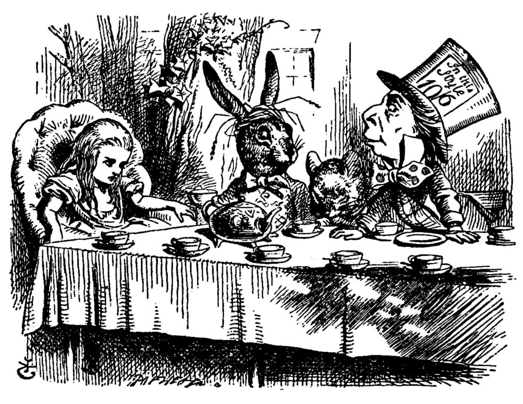
In the 19th century, the industrial revolution led to a dramatic increase in printed books. Thanks to improved printing techniques, colour illustrations became more affordable. This was particularly revolutionary for children’s books, as works such as ‘Alice in Wonderland’ with illustrations by John Tenniel.

In the 20th century, book illustrations became more artistically experimental. Illustrators such as Maurice Sendak (‘Where the Wild Things Are’) established themselves as independent artists. At the same time, the use of photography and digital techniques enabled new forms of expression. Today, book illustration remains a diverse medium that offers opportunities for both traditional and modern approaches.

Types of book illustrations

  • Cover design: Sometime we judge books by its covers. An appealing cover arouses the reader’s curiosity.
  • Chapter vignettes: Small illustrations that decorate the beginnings of chapters and create atmosphere.
  • Frontispiece: Illustration or decorative image that usually appears on the first page of a book or at the beginning of the first chapter and often visually represents the theme or atmosphere of the book.
  • Full-screen illustrations: Especially in children’s books, they often tell entire stories through images alone.
  • Typographic decorations: Decorative elements that visually enhance text pages.
  • Illustrators choose their styles based on target groups and book genres, from detailed realism to minimalist concepts. The dialogue between publisher, author and illustrator is crucial to create a unified vision.

Challenges and Trends

Illustrators have to master challenges such as time pressure, budget limitations and high demands on originality. At the same time, new technologies such as AI tools enable creative innovation. In addition, environmentally friendly materials and printing processes are becoming increasingly important, while retro styles, such as vintage illustrations, are making a comeback in modern book productions.

anniversary edition of “the never ending story” (2019)

illustrated edition of “harry potter and the chamber of secrets” (2016)

Ressources:

www.lithub.com – a-brief-history-of book illustration

#4 Editorial Illustration

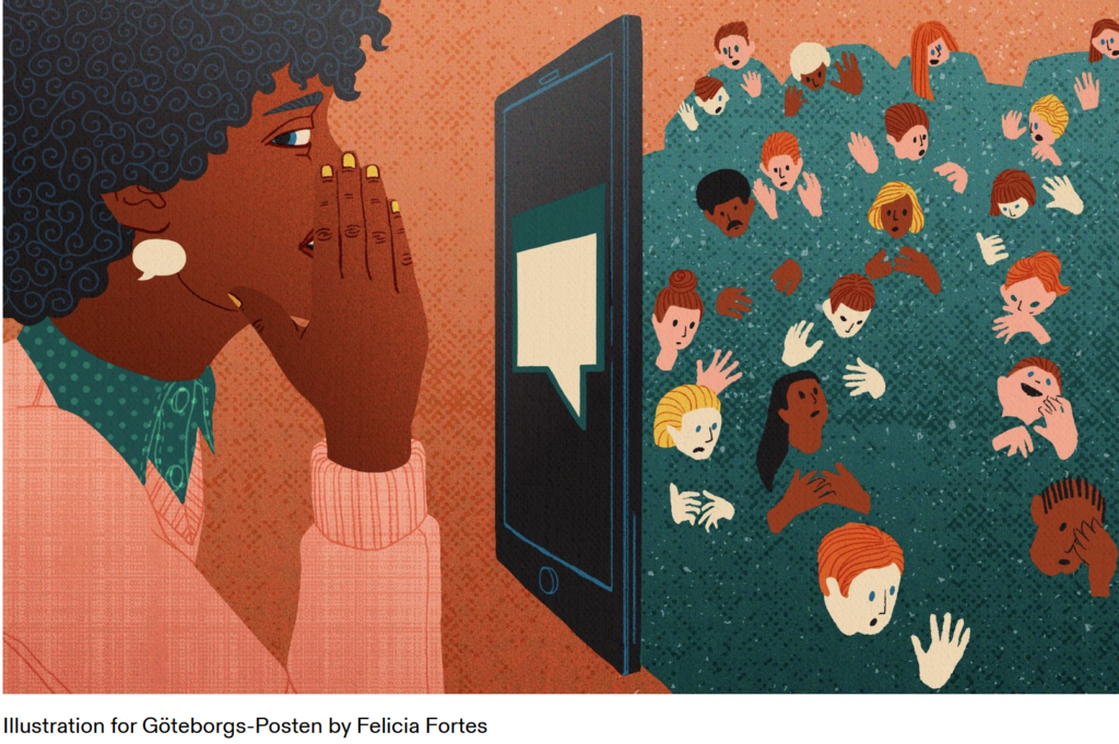
Editorial illustrations are creative and artistic images used in print and digital media such as magazines, books, newspapers, or even social media articles and blogs. These illustrations are meant to visually represent the content of the text or support a message.

Editorial illustrators have a responsibility, especially when dealing with sensitive topics like politics, society, race, or gender. The way they present these topics can significantly influence how readers perceive them. They need to be aware of the possible impact of their representations and ensure their work doesn’t reinforce stereotypes or prejudices. This ethical responsibility is an important part of editorial work.

Purpose

The main role of editorial illustrations is to make text easier to understand. They help to explain complex or abstract ideas more clearly and can evoke emotions that bring the reader closer to the topic. By highlighting certain aspects of the content, illustrations can emphasize key points or leave room for interpretation. In addition to engaging with the text, illustrations also help capture the reader’s attention and break up monotonous text.

Styles and Techniques

Editorial illustrations can use different styles depending on the message or mood that needs to be conveyed. These can range from traditional hand-drawn images to modern digital designs. Techniques like collage, infographics, or minimalist drawings are also common. The style often depends on the medium. For example, graphics in internet blogs may use simple, flat designs, while children’s books often feature more playful and detailed illustrations.

The creative process

The creative process in editorial illustration involves several steps. First, illustrators need to understand the themes and concepts of the article or story to create relevant and appealing visuals. They typically work closely with editors or art directors to make sure their illustrations support the main message of the text clearly and effectively. It’s also important for illustrators to work within the required deadlines for publication.

Resources

#3 Icons und Pictograms

Icons and pictograms are basic graphic symbols. Both are means of communication that aim to convey informations in a easy way. The two types differ mainly in their purpose and context.

Icon: Icons represent either a function, an application or a concept. In contrast to pictograms they are often more colorful and detailed. Icons are often adjusted to certain design system or brand or are used in a metaphorical context. They are particulary used in digital user interfaces such as on smartphoes or computers. They are used, for emaple, to enable easier navigation or the functionality of applications, including the diskette symbol, which stands for saving. Popular icons are the apple logo, the hamburger menu on websites or the heart symbol („Like“).
Pictogram: A pictogram is highly simplified and often monochrome. They are more minimalist and abstract than icons. They are often standaradised to avoid cultural misunderstandings. They convey informations or actions regardless of language. It is more important for pictograms to be universally and culturally understandable than for icons. It is especially aimed at clarity and universalty. Pictograms are mainly used in physical or spaces, such as traffic signs or emergency exit signs.

Sometimes, however, the graphic forms are not so easy to separate from each other and mixed forms are created. Well-known icons with pictogram character are, for example, the smiley or the peace sign.

The difference to brandmarks

The difference between pictograms and icons and brandmarks lies mainly in their function. Brandmarks represent a brand, their aim is not primarily to communicate complex information. They are used in branding and marketing. Their design is primarily focused on the brand identity.

History and development

Pictograms were one of the earliest forms of communication. Cave paintings were already pictograms, conveying information about hunting, rituals or everyday life. In ancient Egypt, hieroglyphs were used to communicate. With the invention of means of transport and the possibility of global travel, the need for universally understandable symbols increased. In the 1920s-1930s, simple symbols were developed for railway stations, airports and roads. In 1964, at the Olympic Games in Tokyo, internationally standardised pictograms were developed for the first time to visually represent sports. With the development of digital technology in the 1980s, icons became important in order to simplify usability. They also had to be easily recognisable on small screens.

Design

Pictograms and icons are often designed according to the so-called “flat design”. Particular attention is paid to simple lines and shapes, as well as vivid and high-contrast colours. Shading is used only minimally or completely removed. Flat design is intended to make the graphics user-friendly, simple and timeless. “flat design” is the modern design in contrast to the previous version of “skeuomorphism”. This style tries to design digital or modern objects in such a way that they look like physical objects. The aim was to increase user-friendliness through trust. Examples of this are the earlier app icons for the calendar or the notes app, which was designed to imitate a real block. The design of Apple iOS up to version 6, for example, closely followed this style. Realistic surface structures, plasticity and attention to detail were particularly important here.

Book tip

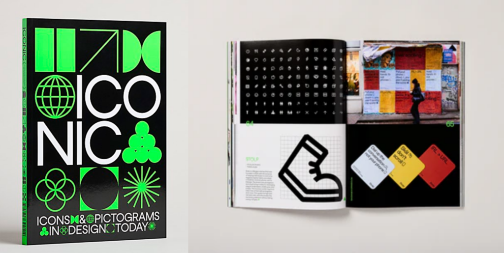
The book ‘Iconic’ examines the development and significance of pictograms and icons. It shows how graphics characterise modern designs, from branding to wayfinding, and how they function as a universal language and are used by designers worldwide.

Pictograms at the Red Dot Award

A few pictograms have already been honoured with the Red Dot Award for their effectiveness. Especially during the corona crisis, the symbols were essential for communicating safety rules. But pictograms also convey simple facts in other places such as digital interfaces. The ‘LG USP Pictogram’ programme system, for example, was developed to explain complicated functions in a simple way and won a Red Dot Award (2015).

Pictograms as an art form

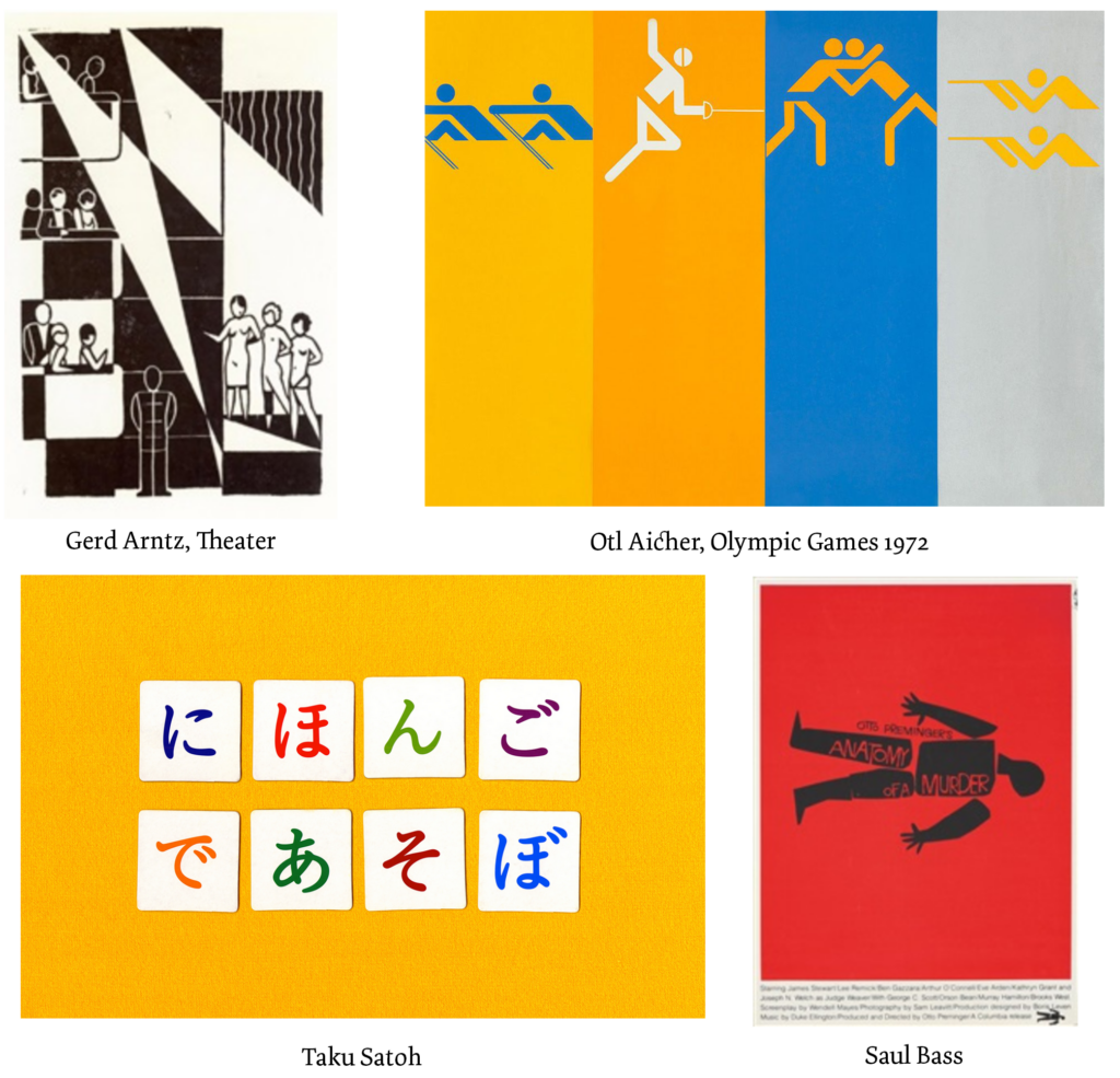
In addition to conveying information, the graphics are also used as an art form. Gerd Arntz was a German graphic artist and pictogram designer known for his minimalist illustrations of work processes and social issues. He worked on his art in the 1920s and developed pictogram systems. Otl Aicher was also a German designer who made a significant contribution to the development of modern pictograms. For example, he developed a standardised pictogram system for the 1972 Olympic Games in Munich. Saul Bass from the USA combined his film posters with pictograms and symbols of film themes. Taku Satoh is a Japanese graphic designer known for his minimalist and clear designs, which often include pictograms. He designs many logos and icons, presenting complex concepts in an easily understandable way.

Resources

www.studysmarter.de – Grafikdesign/Icon-design

ww.vial-agentur.de – Icon Design – Was hinter den Zeichen steckt, die uns im täglichen Leben begegnen; 2019

www.creativebloq.com – Logo vs icon vs symbol: all the logo terms you nedd to know

www.commarts.com – Iconic: Icons and Pictograms in Design Today book design

www.red-dot.org – The Power of Design: ausgezeichnete Piktogramme

www.artnet.de – Gerd Arntz

www.otlaicher.de – Die Regenbogen Spiele; M.Holt

www.artnet.de – Saul Bass

tokyotypedirectorsclub.org – Member Satoh Taku

#2 Illustrations and Brand Identity

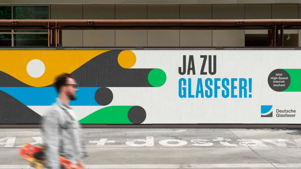
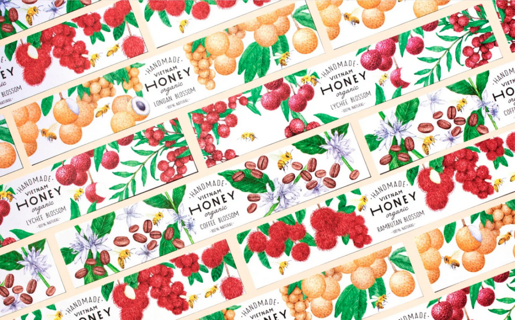
Illustrations are much more than simple drawings – they have become into an important design element that supports brands in countless ways. Wheater on packaging, in advertising, in web design or as part of a logo: Illustrations offer a wide range of creative possibilities They can be used either as stand-alone logos, as part of logos or as creative design elements such as symbols, pictograms or scenes. The key is to align the aesthetic and style with the brand to emphasise its idendtity. With illustrations, creativity knows no bounds.

Benefits of Illustrations as Brand Ambassadors:

Creating  attention:

Illustrations are visually appealing und more appealing than plain text, which is often perceived as intimidating. Infographics or other design elements can make complex content more accessible and quicker to communicate. At a time when attention spans are decreasing,it is crucial to use clear shaps and coulors that can be immediatly associated with a brand.

Evoking emotions:

Illustrations can be used to create strong emotions through targeted couloring and stylistic orientation. They are creativ, personal and can convey moods and feelings in an impressive way. Whether the aim is to bring characters to life or to create a certain atmosphere – illustrations connect on an emotional level that words alone often can´t achieve.

Conveying information:

Illustrationen sind hervorragend geeignet, komplexe Prozesse oder abstrakte Inhalte einfach darzustellen. Im Gegensatz zu Fotos, die in manchen Kontexten begrenzt sind, können Illustrationen Sachverhalte visuell auf den Punkt bringen. Besonders bei technischen oder abstrakten Themen helfen sie, Inhalte zugänglicher zu machen, Geschichten zu erzählen und Fantasie zu wecken. Zudem überbrücken sie kulturelle und sprachliche Barrieren, da sie universell verständlich sind.

Illustrations are ideal for representing complex processes or abstract content in a simple way. Unlike photos, which can be limiting in some contexts, illustrations can clarify facts visually. Particulary with technical or abstract topics, they help to make content more accessible, tell stories or awaken the imagination. Besides that they bridge cultre and linguistic barriers as they are universally understandable.

Individuality:

Custom-created for a brand, illustrations reflect its values and character. They can be easily adjusted to diffrent target groups or purposes and therefore are offer a high level of flexibility. In contrast to photos, which are often considered interchangeable, illustrations are standing out thorgh their idividuality. With the so-called “modular illustration system” (“Illustrations-Baukastensystem“), design elements can be easily customised and expanded. For example parts such as heads, hair, cloths or scenery objects are created, which can then be individually assembled.

Building recognition:

A consistent illustration style strengthens brand identity and makes it possible to recognize a brand by its visual elements alone. The use of brand-specific colours and design elements creates an individual recognition value that makes illustrations clearly superior to photos.

Application on different channels:

Illustrations can be flexibly adapted to different formats and media – whether online or offline. They can be customised for different channels and are therefore a multifunctional tool for strengthening brand visibility.

Resources

www.concrete-designs.deIllustrationen-im-Markendesign

www.factor.partners.deVisuelle-Markenkraft;  S.Stroth

www.wirdesign.de – Mit Illustrationen die Marke prägen; S.Conzatti; 2021

www.designstripe.com – How to use Illustrations for your-Brand; J.Pereira

Pictures

Products design illustration – www.concrete-designs.de

Informations graphic – www.designstripe.com

abstract illustration for technical brand – www.factor.partners.de