Impuls #4 Concept Art: Der Hobbit

Tolkien in Triest

I recently had the opportunity to visit the Tolkien exhibition in Trieste. The exhibition was dedicated to the life and work of J. R. R. Tolkien and showcased not only his literary world, but also the huge cultural impact his stories have had to this day. I was particularly impressed by three large walls that were completely covered with bookshelves. They contained numerous editions of The Lord of the Rings and The Hobbit from all over the world in a wide variety of formats and designs. (It would be interesting to look at the book covers from different countries and analyze the background and cultural influences on the illustrations.)

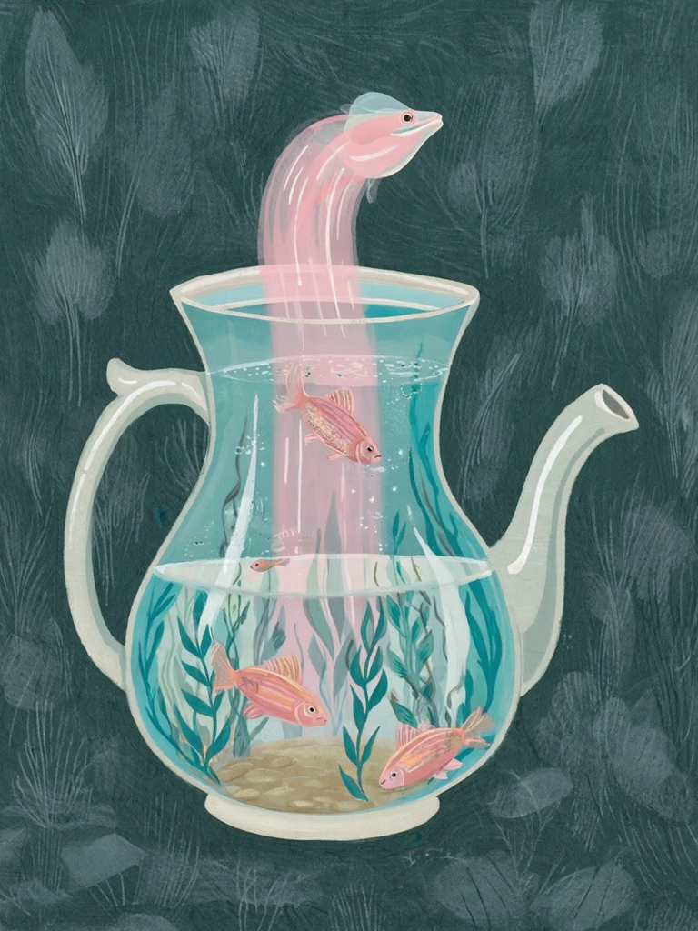
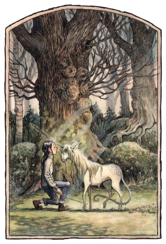
At the end of the exhibition, there were also many illustrations by artists and fans who were inspired by Tolkien’s stories. These works ranged from classic drawings to modern interpretations and impressively showed how differently the same world can be visualized.

And again Books

All of this reminded me of a bookshelf at my parents house. For years, it has held several illustrated books dealing with conceptual art and illustrations for the Lord of the Rings and Hobbit films (of course Harry Potter as well). Now, during the Christmas holidays, while I am back at my parents’ house, I went to this shelf and took another look at the books.

One book in particular caught my attention: “The Hobbit: The Desolation of Smaug Chronicles – Concept Art and Design,” published by Hobbit Press. The first edition was published in London in 2013. The main author is Daniel Falconer, supplemented by forewords and texts by other authors and contributors who were directly involved in the film production.

Concept Art at Middle-earth

Conceptual art plays a central role, especially in film adaptations of books. As already mentioned in the blog post about the Harry Potter exhibition in London, conceptual art forms the visual bridge between text and film and helps to translate abstract descriptions, moods, and places into specific images. This work is particularly sensitive and challenging when it comes to a literary source such as The Hobbit, which many readers already associate with their own inner images.

In the case of The Hobbit films, the screenwriters provided numerous ideas that were strongly based on the book. At the same time, The Lord of the Rings already provided existing locations, characters, and visual rules that had to be followed. This made it all the more important to develop the new locations that play a major role in The Hobbit for the first time including Mirkwood (Düsterwald), Esgaroth the lake-town (Seestadt), and Erebor, the Lonely Mountain.

Weta Workshop, which also co-published this book, played a central role in this process. Weta Workshop is a New Zealand special effects company founded in 1987 and based in Wellington. It provides services for film productions, including design drafts, makeup effects, props, creatures, puppets, miniatures, models, and large sculptures. The company also produces merchandising items. For The Hobbit trilogy, Weta Workshop was instrumental in the visual development of characters, costumes, environments, and fantastical creatures, working closely with the director, screenwriters, and other creative departments.

Back to the Book

The illustrated book is structured along the sections of the film and shows the concept art for specific scenes, locations, characters, costumes, and mythical creatures. At the time of publication, many of the artists involved had already been working on The Hobbit trilogy for four to five years. Every day brought new challenges, as concept designer Alan Lee describes in the book’s introduction.

“The book shows only a relatively small part of the enormous amount of work that went into the visualization and production of The Hobbit: The Desolation of Smaug,” says Lee.

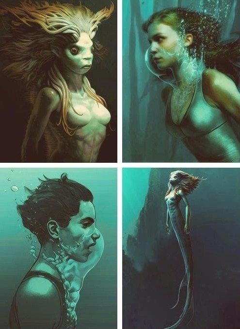
The creation of Beorn

The first section of the book is about Beorn’s house. Beorn is a man who can transform himself into a bear. According to the author, this character posed a particular challenge, as he had to be portrayed convincingly in both human and animal form, visually credible but at the same time consistent with Tolkien’s description and the existing imagery of Middle-earth.

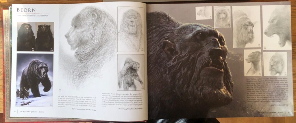
I am particulary interested in how artists create fantasy characters, especially those with an ambiguous or hard-to-define personality. Having read the book as well, I can imagine that Boern was one of the most difficult figures to design, because its never entirly clear wheater he is good or bad. His bear form in particular needed to appear frightening and monstrous.

The many pictures in the book are showing how difficult is was, and how many attempts they needed to finding a clear direction. I think its always really calming when you see that talanted artist like the one who contributed here in the films are also struggeling sometimes. Its interesting to see how it works on big sets like this. Many artists work on the same subject at once, each starting with a different vision, and then gradually discussing, refining, and combining these ideas.

John Howe mentoined that for two weeks he made a scribble of boern on his diary every evening. Each day he tried a new approach. Some of these drawings can be seen on the right side of the upper image. For me, this highlights how important it is to keep going, to think differently, and to have the courage to experiment and try things out.

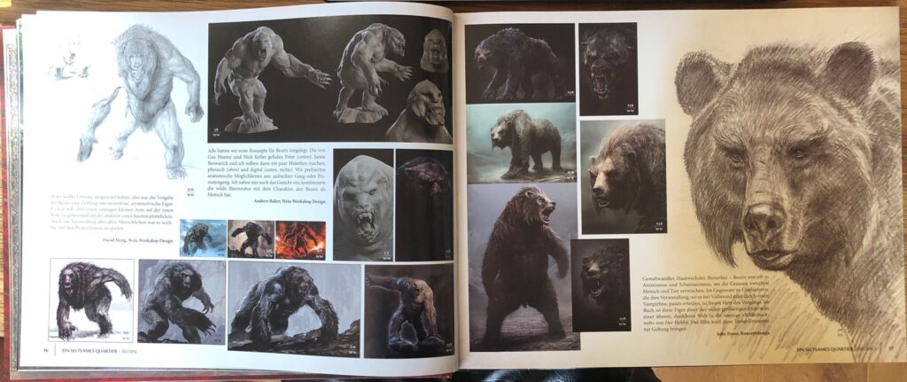
After large number of artworks had been created and presented to the Weta Workshop, the team began developing 3D Modells and exploring anatomical possibilities. Their aim was to push the design in a bit more brutal and extreme direction, which can be seen on the left page of the lower image. In the end, all these ideas come together, resulting in the creation of a truly unforgettable character.

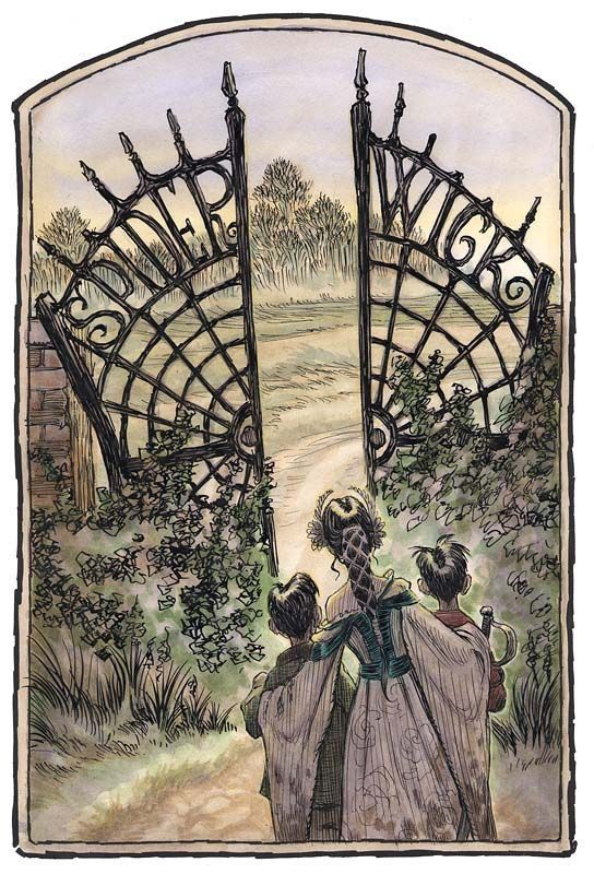
The Elevnking’s Hall

Besides character design, I can imagine designing settings almost as difficult, maybe even more so. Because, as mentioned in the book, you have to think about so many things like light setting, perspective and the story behind it. Across eleven pages, the book shows how the Elvenkings Hall and the Throne room were created. These are two of my favorite locations in the movie because they combine a sense of magic with a darker atmosphere. According to the Conceptartists, one one the Challanges was to continue the Mirkwood but in a more magic way. They wanted to build an entire cave system out of trees that looks very natural.

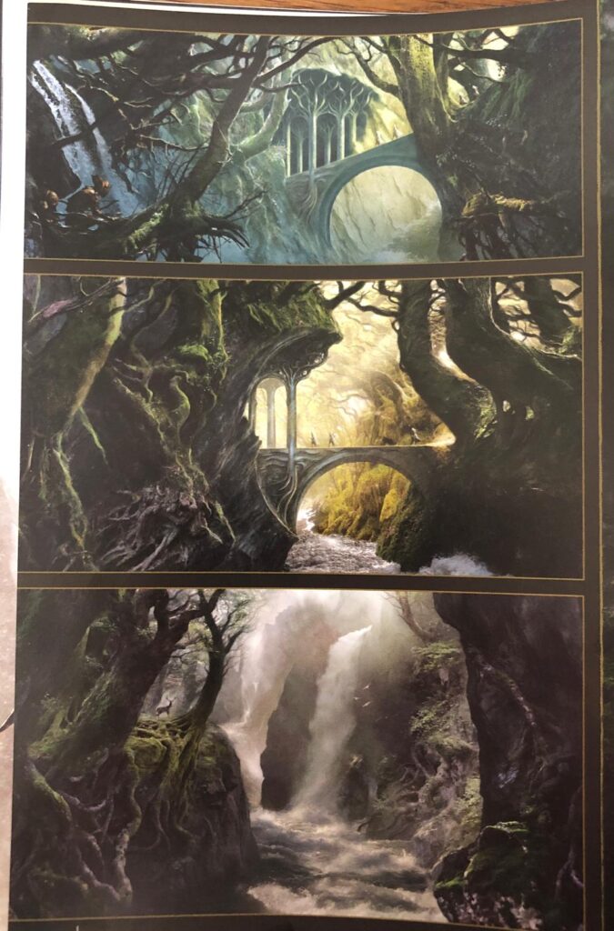
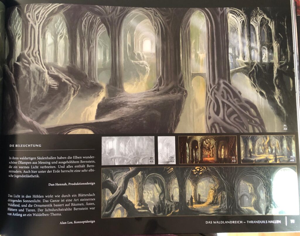
In the images above you can see a few of the artworks they did. Another important thing in the creation was the deepth the rooms should have. Gus Hunter, one of the designers at Weta Workshop, worked with many columns, trees, and roots to shape the space. When thinking about the lighting of the hall, he came up with the idea of using stalactites in which the elves could place oil lamps. In addition, he used water reflections to help illuminate the entire setting.

To come to an End

Overall, it is incredibly interesting to see how these different departments and artists work together to bring such complex worlds to life. What I have written about here is only a very small glimpse into the book, which itself is just one part of a much larger series documenting the creative process behind The Hobbit. Once again, it highlights how essential concept art and strong visual storytelling are for building believable and immersive worlds. This topic is especially important for my future academic work, as it directly connects to my interest in the visualization of storytelling and in creative development processes more broadly both of which I eventually plan to explore further in my master’s thesis.

Sources:

https://www.wetanz.com

Falconer, Daniel (Hrsg.): Der Hobbit: Smaugs Einöde – Chroniken. Kunst und Gestaltung. Hobbit Presse, London, 2013

#16 Creating an AI Video Illustration

AI is no longer limited to creating images. Today, it is also possible to animate illustrations. Short videos, subtle motion, and atmospheric loops can be generated from a image or prombt. Since I had never animated illustrations with AI before, I decided to try it out and see how it works in practice. i knew that its possible to create illustrateded animation videosfrom the scratch, but I am intrested in using already existing illustrations and animating them. I heared it works best for minimalistic, subtle animations. That’s why I chose my illustration, which I’ve used once before. I think it has the potential to be pretty good. This blog post is an exploration and an experiment with AI and based on the previous post.

Why I Wanted to Try AI Animation

As an illustrator, animation has always felt like a separate skill set. Traditional animation takes time, planning, and technical knowledge. AI promises a faster and more accessible way to bring illustrations to life, even without animation experience. Sometimes even small animations enhance an illustrations more, especially for soocial media.

Over all I was curious to find out:

  • how much control I actually have
  • how natural the movements look
  • whether AI animation feels like a useful tool or just a visual effect
  • which Generator is the best

How AI Animation Works (as a user)

Most AI animation tools work with an image-to-video approach. You upload a finished illustration and describe how it should move. The AI then creates a short animated clip based on your image and text prompt. Typical movements include flowing smoke, water, light, or subtle object motion. These animations are usually short and loopable, making them suitable for social media, websites, or mood visuals.

Let’s Start Animating

For my first tests, I decided to focus on tools that are commonly used (and free) for image-to-video animations. I let Chat GPT write the prombt for my imagined animation. Here how it turned out and the picture an want to use, which you may already know from my previous article:

Soft, slow animation. The pink smoke gently flows out of the teapot spout and moves upward in a smooth curve. The fish inside the smoke slowly swim forward. Calm, dreamy motion, no camera movement, subtle loop.

It was not easy to find Generators that are completly free. I just can just Firefly because I have an Adobe Subscription but there exclusive material as well. The good thing on Firefly is, that you can choose between a lof of diffrent models. Most websites require you to purchase credits, but there are some models where you have a few credits available in the free plan as Leonardo Ai or Stable Diffusion. However, I assume that you will achieve the best results with paid models.

  • Firefly Veo 2: You just can create 9:16 or 16:9 which is very limiting, just the fishes are moving, even though one of the fishi sis turning weird, I like the flowy and slow motions
  • Stable Diffusion: I tried Stable Diffusion for the first time and I have to admit I am very happy with this result, the movements of the fish are really realistic and I like how the smoke is slightly moving in the background, it looks very magical
  • Firefly Ray 3 HDR: I like how the smoke is slowly moving upwards and how the fish are floating around it, I dont get why the camera is mocing upwards cause there is no information about it in the prombt but I kinda like it, what’s really strange are the colors and how gray and dark they’ve become.
  • Firefly Pika 2.2: Really dont know whats going on there
  • Leonardo AI: I had high hopes on that generator but it turned out a bit weird, i like how the smoke is flowing, but everything is moving way too fast
Firefly Veo 2
Stable Diffusion
Firefly Ray 3 HDR
Firefly Pika 2.2
Leonardo AI

I think the best result so far came from Stable Diffusion. That’s why I wanted to refine the prompt and make it more precise, to see if I could achieve an even better result, even though I already really like how it turned out. Here’s what I got.

Unfortunately, I couldn’t manage to keep the fish inside the frame. Aside from that, I really like the movements inside the teapot, especially the gentle water motion and the way the small fish swim. If it were possible to combine these movements with the version shown above, that would be my ideal result.

Final Thoughts

Animating static illustrations with AI is something I find really interesting. Compared to fully creating illustrations with AI, I like this approach because it lets you add motion to existing artwork and create cool results very quickly. You don’t need any After Effects skills, and traditional animation usually takes a lot of time.

Especially for social media or small animated pieces, AI animation is a great option. You can get something moving without a complex workflow. It could also be interesting to animate individual layers separately and then combine them, which might lead to even better and more controlled results. Prompting is still challenging, especially when you have a very specific idea in mind, but overall it’s an exciting and accessible way to experiment with animation.

#15 Experiments with AI and Illustration

Artificial Intelligence is currently one of the most discussed and controversial topics in the creative industry. Especially for illustrators, AI raises many questions, fears, and also curiosity. Some see it as a threat, others as a useful tool. Instead of taking a clear position right away, I decided to test AI illustration tools myself and see what they can (and cannot) do. The goal of this article is to explore it through a practical experiment and see what models are the best for illustrations.

Between Fear and Opportunity

I have already written a blogpost on this topic. However, for the purpose of completeness, I would like to reiterate the most important points here. AI in illustration comes with many concerns, and these concerns are valid.

On the negative side, many AI tools are trained on artworks without the consent of the original artists, which raises ethical concerns. Many illustrators fear job loss or that their work will lose value. AI also tends to copy existing styles without truly understanding their meaning.

On the positive side, AI can be useful when used carefully. It allows fast idea generation, quick experiments, and can support inspiration and composition during the creative process.

This mix of risks and possibilities is why AI remains such a challenging topic in illustration.

The Experiment: Recreating My Illustration with AI

For this experiment, I used one of my own illustrations, which I created manually in Procreate. This illustration served as the reference and starting point. The idea was to see:

  • how close the AI results come to my original illustration
  • how well the style, colors, and mood are translated
  • where AI performs well and where it clearly fails

From my experiences using AI Genereators, its easier to let AI write the Prombt for the gererated picture instead of write it by myself. So I gave Chat GPT my Illustration and asked him to describe this illustration in form, color an style for an AI Generator Prombt.

This is how it turned out:

A surreal hand-drawn illustration of a ceramic teapot filled with water like a small aquarium. Inside the teapot, tiny fish and aquatic plants are floating gently. From the spout of the teapot, a soft pink stream flows into the air, and two larger pink fish are swimming within this flowing stream. Dark green textured background, soft pastel color palette with turquoise, pink, and muted grey tones. Whimsical, poetic atmosphere, clean linework, subtle grain texture, storybook illustration style, calm and dreamy mood.

Let’s start the AI Competition

For this experiment, I tested several popular AI image generator models mainly from Firefly. Here are the results and my opinion on it:

  • Firefly Image 4 Ultra: it dosen’t make sense at all, the style is quite mixed up (3d and 2d elements), don’t understand the stain in the backgorund, at least the teapot looks quite nice with the aquarium in it
  • Chat GPT Iamge 1.5: I think thats one of the best results when it comes to similarity, the style is illustrative and handmade, it actually make sense, but I don’t like the layout it seems kind of lost and random, the fishis are nice
  • Gemini 3 with Nano Banana Pro: This modell is usually one of my favorites, I like the artsy style, I think its the best result in gerneral which you could actually use for something (or work further on that), It’s all kind of random and not exactly like the prombt but the style fits pretty well
  • Flux 1.1 Ultra Raw: The only thing I like here is the bold and graphic style, without the fish in the air and the tiny smoke-thingy it could look nice
  • Runway Gen-4 Image: What the hell is happing here?! But to be honest if there were no weird eel-ghost there, I would choose that as the winner picture. I really like the style, it looks very editoral-ish and artsy, even though its the most diffrent compared to the original one
  • Leonardo AI: I tried this website for the first time as I read it should work well for illustrations, turns out: not really. I think its together with the Firefly Ultra its my least favorite, the style is kind of nice (maybe for posters) but it dosen’t make sense
Firefly Image 4 Ultra
Chat GPT Image 1.5
Gemini 3 with Nano Banana Pro
Flux 1.1 Ultra Raw
Runway Gen-4 Image
Leonardo AI

I thought this experimetn was really fun, but I am not completley happy with it at this point. So I decided to take my favorite model and work on the gererated picture until I am happy with the result. Since I really liked the Style of the Runway Gen-4 Image Generator I chose to go with that one, even though the compostions is hilarious. But I see the most potentiol here to get a nice and artsy result.

But after half an hour promting by myself and chat gpt, the picture below was the best result I could get. So I gave Runway up again and switch to my usual favorite Nano Banana again.

Runway
Nano Banana

I tried hard to create a nice result, but the one from Nano Banana was the best I could get. Its kinda nice, but the artsy and handdrawn style is totally missing. It always seems easier than it is to prombt something nice, but actually its pretty hard and time consuming. Probably I could get a better result than this, but I dont wanted to waste so much time (and of course energy) to create those images. And I think thats the whole point: It’s kind of fun to prombt something until it doesn’t work out the way we want or it dosen’t match our expectations. It was interesting and fun to create these images and see how differently each generator works, but it was not as enjoyable as painting the illustration myself. In the end all the created images are looking like AI images. I can’t say exactly why – maybe the too clean lines, the over perfectionsim or the plain textures – but you can see it in all of them. They have no soul and no personality. I don’t want to be an AI-hater, because I am sure that we all have to use it in the future, but with real art at least for me it can’t compete and won’t ever.

I am sure that for some tasks or areas, it makes sense, especially if it doesn’t matter much which illustrations are used. It can save a lot of time and produce beautiful results. Perhaps there are also ways to combine analog illustration and AI, which would certainly be interesting to test. But all in all, I believe and hope that human illustration and art will always remain an important and irreplaceable part of our lives.

Because Art without soul is like a book without words.

#14 Originality and AI

Following on from my thoughts in my previous blog post on “Sketchbook,” I looked into the topic of AI and illustration in more detail and came across Eileen Isagon Skyers’ TED Talk. I found her ideas very interesting and similar to my own, which is why I would like to share them here.

What does originality mean when machines can generate images?

That’s the question she is asking the audience. Eileen Isagon Skyers explores how AI is changing art and creativity. Her key points are:

  • Originality may now be collaborative, layered, and concept-driven rather than purely hand-drawn.
  • AI produces images that are both familiar and uncanny, blurring lines between human and machine creativity.
  • Artists working with AI often act as curators, shaping output by selecting, refining, and guiding the machine.
  • Questions arise around authorship, emotion, representation, and bias: who defines originality, and whose stories are told?

Why this matters for Illustrators

Originality in art is changing. It is not just about drawing perfectly but about showing your own voice, making choices, and putting intention into your work. Illustrators today often guide ideas and improve the results instead of creating every detail by hand. What really matters is emotion and story. AI can make pictures, but it cannot capture real experiences or true feelings. It is also very important to think about representation, to consider whose stories are shown, which visual traditions are included, and which are left out.

AI aka creative thief

When talking about the originality of AI artworks, one must of course also ask where AI gets its references from. That’s right – from all of us. Caught up in the AI and art bubble, I came across two more TED Talks that deal with precisely this topic. One by Ed Newton‑Rex on how AI “steals” creative work and another by Melody Liu on the ethics of AI art. Both show that AI can create impressive images, but it raises serious questions about originality, authorship, and fairness.

AI learns from existing artworks, often without permission. This means that styles, images, and ideas created by real human artists are used to train machines that can then produce new work. On one hand, this can inspire new creativity and speed up the illustration process. On the other, it risks taking away recognition, income, and the personal voice of artists.

Another issue is emotion and story. AI can combine shapes and colors perfectly, but it cannot capture lived experience, personal feelings, or the soul an artist puts into their work. Without that human element, art can feel empty. Finally, representation is also a concern: AI reflects the biases of its training data, so some voices and cultural traditions are left out, while others dominate.

How to protect your art

Ed Newton‑Rex also talks about how artists can protect their work from being used by AI without permission. One important step is to be aware of where and how you share your art online. Artists can use copyrights and licenses to make clear how their work can be used. Another idea is to add signatures or branding so people can see which work is original. Newton‑Rex says it’s important for artists to have a say in how their art is shared online, so they can protect both their voice and their income.

My take away

Of course, everyone knows by now that AI steals from real artists, but it’s easy to ignore and these talks really made me realize that I need to keep it in mind before posting anything online, especially on Instagram or Pinterest. My opinion on AI hasn’t really changed since my last blog post, it feels like most people talking about AI in a good way as “art” aren’t really illustrators or working artists. Still, I’m sure there are positive ways to use AI creatively without losing the soul of art, and I probably need to explore that side more. All three TED Talks I watched were really interesting and raised a lot of important questions. There are definitely many more talks out there on this topic for anyone who’s interested. I’m not sure if I want to explore this topic more deeply at this point, but maybe it could be part of a research.

#13 Color and and Form in Editorial Design

How Color and Form Shape Emotion in Editorial Illustration

Editorial illustrations are pictures that go with articles in magazines, books or online. They help people feel the story, not just read it. The way an illustrator uses colors and shapes can change how the viewer feels about the idea before they even read the words. As I want to do something with Editorial Illustration or Design in my Master Thesis, I decided to dive a bit deeper in this topic again.

Why Color Matters

Color is one of the first things we notice in an image. Colors can change our mood and make us feel something without thinking too hard. For example:

  • Red can make an illustration feel energetic, urgent, or strong.
  • Blue can feel calm, quiet, or thoughtful.
  • Yellow feels happy, bright, and full of energy.

This works because our brains connect colors with feelings, often without us planning it. A red element might make a viewer feel alert immediately, while a blue background can make a story feel peaceful. Illustrators use these color feelings on purpose. For example, an editorial illustration about climate change might use mostly blues and greens to make the reader feel calm and connected to nature. A political cartoon about protest might use bold reds and blacks to show intensity and movement. In this picture you see the typical color meanings. It significant to consider this while creaitng something for a certain information and emotion.

How Shapes and Forms Affect Mood

Color isn’t the whole story. The shapes and forms the illustrator uses also give the viewer emotional clues.

  • Soft, round shapes often feel friendly and gentle.
  • Sharp, pointed shapes feel tense or active.
  • Large open spaces can feel calm or lonely, while crowded shapes can feel busy or chaotic.

The way elements are arranged on the page (called composition) also matters. A centered figure can feel stable or important, while a tilted composition can create tension or movement.

Golden Cosmos: Colorful, Playful, and Thoughtful

One of the best real-world examples of how color and form influence emotion in editorial illustration is the Berlin-based duo Golden Cosmos (illustrators Doris Freigofas and Daniel Dolz). I saw their website and thougt they are doing really really nice work. They are working for major international publications like The New York Times, The New Yorker, Die Zeit, and Bloomberg. Their style is instantly recognizable because they use bright, contrasting spot colors, simple shapes, and a screen-print-like aesthetic that feels both bold and warm.

How Their Work Uses Color and Shape

  • Bold palettes: Golden Cosmos often limits their illustrations to a few strong colors which create a feeling of energy and focus. In editorial contexts, this helps draw readers in and gives a visual intensity that matches serious topics.
  • Simple but expressive forms: Their people and objects are usually drawn in flattened shapes with playful proportions. This makes spaces feel open and engaging, not heavy or literal, and lets readers connect emotionally before reading the text.
  • Narrative scenes: Instead of just illustrating a literal idea from the article, they often build scenes with small stories inside them which makes the illustrations feel like visual essays themselves.

In their picture book work (like Ludwig and the Rhinoceros) the duo gained awards for color and spatial design, showing that color and composition are central to their emotional storytelling whether in editorial work or book illustration. I thought comapred to usual childrenbooks, it is really diffrent in how they using colors and shapes.

Another Example: Kirsten Ulve

A second great example of emotional editorial illustration comes from Kirsten Ulve, an American graphic artist known for her vibrant editorial and caricature work. Ulve’s illustrations appear in publications such as The New York Times, Vogue Japan, Los Angeles Times and Entertainment Weekly.

What Makes Ulve’s Work Emotionally Effective

  • Expressive color: Ulve often chooses bold and saturated colors that draw attention and give a lively energy to the topics. For example, using strong reds and blues in political caricatures gives urgency and emotional punch to commentary about public figures.
  • Character and exaggeration: Her caricatures use shapes and proportions that exaggerate personality traits, making the emotional impact of the subject immediately clear. A reader can sense mood (whether satire, tension, or humour) before reading a word.
  • Collage and texture elements: In addition to flat color, Ulve sometimes combines visual textures and patterns that heighten emotional contrast, like rough patterns behind calm figures to show underlying conflict.

Ulve’s strong and confident use of form helps editorial stories about politics, culture, and society feel alive and very human, which keeps readers visually engaged and emotionally connected.

Why Color and Form Matter in Editorial Illustration

Whether it’s Golden Cosmos’ bright screen-print shapes or Kirsten Ulve’s expressive caricatures or editorial illustration uses visual language to communicate emotion. Here’s why it matters:

Color Sets the Mood

Color creates emotional cues instantly. Bright, high-contrast colors can feel urgent or joyful, while muted or limited palettes can feel calm, serious, or reflective. Color can signal the right emotional tone even before someone starts reading.

Shape and Composition Guide Understanding

Shapes and layout help guide the reader’s eye. Organic, flowing shapes can feel natural and warm. Straight lines or geometric forms can feel structured and formal. How space is organized around figures or objects shapes the viewer’s emotional response to the idea being illustrated.

Emotion First, Narrative Second

Illustrations that influence emotion don’t just show facts, they embody a feeling. This is especially effective in editorial contexts where the illustration sets the tone for the article and stays in the reader’s memory long after they’ve moved on.

Conclusion

Color and form are more than stylistic tools, they are emotional languages in illustration. When illustrators choose color palettes thoughtfully and shape forms with intentional emotional impact, they give editorial stories a deeper voice and connection. Golden Cosmos and Kirsten Ulve are great examples of how strong visual design can turn words into feeling. For me personally its very helpful and inpirational to compare such examples as Golden Cosmos or Kirsten Ulve and just look at their work.

Sources

https://www.golden-cosmos.com/

https://www.kirstenulve.com

https://www.itsnicethat.com/articles/golden-cosmos

https://www.numberanalytics.com/blog/the-power-of-color-theory-in-editorial-illustration

https://kreafolk.com/blogs/inspirations/art-of-editorial-illustration

Impulse #3 Harry Potter Exhibition London

While I wrote the Blogpost to the Spiderwick Books I got the idea to wrote about an other fantasy world. This Year in May I visited togehter with my sister the Warner Brothers Studio Tour in London. It’s an immersive, behind-the-scenes experience that lets you step inside the real sets, props, and artwork used to bring the Harry Potter films to life. Of course I’d love to see all the bog sets, costumes and requesites but there where also a lot of concept art and illustrations which is really intresting. That’s really interesting, and I want to record my memories in this blog article and gather further inspiration on this and, of course, share it.

A Deeper Dive at the Concept Art – My Take Away from the Tour

One of the most impressive parts of the Harry Potter Studio Tour is the huge amount of concept art and illustration work that was created for the films. Many visitors come for the big sets, but the real magic starts much earlier with the artists who imagined the world long before a single scene was filmed.

TAt the Harry Potter Studio Tour, you quickly realize that the art is not just decoration, it’s part of the story itself. The concept art, illustrations, and sketches helped the filmmakers decide how the story would look, feel, and even work emotionally.

Before a single scene was filmed, artists drew Hogwarts, Hogsmeade, the Burrow, and the Forbidden Forest. These drawings weren’t just ideas on paper they defined the tone of the story.

  • A dark, twisted sketch of the Forbidden Forest tells you it’s dangerous.
  • A cozy, warm illustration of the Burrow tells you it’s a safe, loving home.

By looking at the illustrations first, the filmmakers could see the story visually. It helped them decide where characters should go, how scenes should be lit, and what emotions each space should create. Concept Art is very often used to created and finally build architekture, rooms or sets. One really cool set is the tiny hogwarts castle at the end of the exhibition. Depend on when you are visiting the exhibition, there could be snow around it. What stuck in my mind is that this iconic Hogwarts castle model (1:24) was built by a team of 86 artists and crew and was used for wide exterior shots in many of the films. There were many bright windows, and I checked how many of them were installed. 2500. And thats a lot of tiny glass.

One design duo also stuck in my mind because I found their art very impressive. MinaLima designed an incredible number of props: from potion books to newspapers such as the Daily Prophet to candy wrappers. Over 40 different editions of the Daily Prophet were created, and to make it look old, it was dipped in coffee after printing. It’s nice to see that graphic designers also have a place in such a great film project (so maybe there’s still hope). If you intrested in such Art, looked at their work it’s so inspiring and fascinating.

Creature design tells personality and story

Concept art was especially important for magical creatures. Every sketch helped the filmmakers understand how a character behaves, thinks, and feels.

For example:

  • Dobby’s sketches show him scared, happy, or mischievous. Seeing these expressions on paper first helped the filmmakers bring him to life in a way that felt real.
  • Buckbeak’s designs explored strength, grace, and fear. Choosing the right look made the story believable the audience immediately understands who the creature is without explanation.

Illustrations like these are a storytelling tool. They guide how the audience experiences characters and the world.

Art helps tell emotion and atmosphere

Every painting, drawing, and sketch in the tour contributes to the story’s mood and atmosphere.

  • Shadows, colors, shapes, and textures show fear, joy, mystery, or wonder.
  • The smallest details, like a crooked sign in Diagon Alley or a book cover in the library, make the world feel real and lived-in.

This is why illustration isn’t just “pretty art” it’s essential storytelling. The world on paper tells the audience where the story lives and how it should feel, before a single line of dialogue or special effect exists.

Illustration bridges imagination and reality

The Harry Potter films started as books, which rely on imagination. Concept art translates those imaginative ideas into something tangible. It’s the bridge between the author’s words and the visual world on screen.

Without this art, Hogwarts might look different every time, creatures could feel inconsistent, and the story might lose its emotional clarity. The illustrations give the filmmakers a shared visual language that everyone on set can understand.

Conclusion

Illustration and concept art are the backbone of visual storytelling at the Harry Potter Studio Tour. They don’t just show what things look like they shape the story, define the characters, and set the emotional tone. For anyone interested in storytelling, art, or design, seeing these sketches and paintings is inspiring because it shows how much power art has in bringing a story to life. And, of course, it’s worth it for all the wizards among you to take a day trip there and experience the feeling of living history for a day.

Impulse #2 Spiderwick

One of my favorite book series in my childhood was the Spiderwick Chronicals. Its written by Holly Black and illustrated by one of my role model illustrators Tony DiTerlizzi. Ever since I read the books as a child, I have been fascinated by his art style and the way he draws, which seems so easy and joyful at the same time. I think his art in this book was one of the reasons why I started drawing as a child and why I still love to lose myself in imaginary worlds today. I recently reread the books and remembered how much I enjoyed them, especially the illustrative narrative style.

How the Illustrations Made the Spiderwick Books so Special

The Spiderwick series is one of those children’s book series you don’t forget easily. This is not only because of the exciting story about Jared, Simon, and Mallory Grace, but also because of the illustrations that make every book feel like a little adventure. The drawings by Tony DiTerlizzi are a big reason why the series became so successful.

Why the illustrations are so important

Many children’s books have a few small pictures here and there. Spiderwick is different: the illustrations are an important part of the story. They show the magical creatures the children discover and make the world feel more real.

DiTerlizzi’s style looks a bit like old scientific sketches: detailed, careful, sometimes beautiful, sometimes a bit spooky. Because of this, it feels almost as if these creatures were actually studied and recorded somewhere

Was this a new Way of Narrative Book at this Time

Of course, illustrated books have always existed. But for older children and young teens, it was unusual to have so many pictures in a novel especially pictures of such high quality.

Spiderwick sat right in the middle:

  • more illustrations than normal novels,
  • but more serious and atmospheric than a typical picture book.

This mix felt fresh and new at the time. Another illustrated book from my childhood I can remember pretty well was Alice in Wonderland. (Maybe I should study this book at some point as well, cause there are a lot of differnt versions of it. ) But this novel was not especially for children. It was more a new way to present the classic books.

Why Spiderwick became so successful

There are several reasons I found why the series was so popular that they even made a film out of it:

1. The pictures made the story feel real

The drawings looked like they came from a real field guide about fairies and goblins. Many children loved this “found notebook” feeling.

2. The books were quick and fun to read

Each book was short, fast-paced, and exciting. The illustrations helped set the mood right away.

3. The style was perfect for the age group

Many children don’t want “kids’ books” anymore, but big text-only books can feel too difficult. Spiderwick was exactly in between.

4. The magical world felt unique

Holly Black’s ideas and Tony DiTerlizzi’s artwork fit perfectly together. The fairy world felt new, interesting, and beautifully designed.

Tony DiTerlizzi – the artist behind the magic

Tony DiTerlizzi was already known as a fantasy illustrator before Spiderwick. He loves old fairy drawings and classic natural studies, and you can see that in his art. For Spiderwick, he didn’t draw “cute” creatures. Instead, he created beings that look like they could really be hiding in the woods or the garden. This mix of fantasy and realism attracted many readers.

My Take Away

Without the illustrations, Spiderwick would not be the same. The drawings give the series its special character and played a big part in its success. They make the world feel real and alive, and they helped the books stand out from many others.

Books like Spiderwick are also the reason why I enjoy illustrated books so much. I love it when the artwork has soul and personality, just like in this series. Looking at books like these inspires me for my own creative work. They help me understand what truly works, what feels meaningful, and what makes a story stay in someone’s mind.

Impulse #1 Sketchbook by Disney

I didn’t expect much when I turned on the Disney show “Sketchbook” but then I got completly hooked. Each episode follows a Disney artist who talks about their own story while showing how they draw a famous character. From Simba and Olaf to Mirabel from Encanto. But the best part isn’t really the drawing itself. It’s everything that happens in between the work. The stories, the emotions, the reflections on art, creativity and life of the artists.

What “Sketchbook” Is Really About

The Show isn’t like a “how to learn drawing” show or anything, its about the stories behind the drawings. You can watch how a few simple lines slowly turn into a living figure, and it becomes clear that every drawing carries a piece of the artist’s personal story.

For example, Gabrielle Salonga explains how she drew Mirabel and what it means to her to represent her Latina background at Disney. Eric Goldberg, the animator behind Genie from Aladdin, talks about how he brings humor to life through movement. It’s amazing to see how much personality and emotion are hidden in these drawings.

What Inspired Me the Most

What really touched me was how openly the artists talked about their insecurities. These are people who’ve worked on legendary films (which the most artsit can just dream of) and yet, they still admit to doubting themselves sometimes.

That hit home for me, because it reminded me on myself and the reason why I draw. Not to be perfect, but to express something real and a part of myself. To make visible what can’t be said in words or whats in my imagination. In a world of pressure and selfimprovment, you always have to remind yourself that you don’t have to be perfect. Art is not about being perfect but about the stories and personalities behind it. Most people quit because they think that they are not good enough, seeing millions and millions of perfectly beatiful drawings and artworks everyday. Especially pintrest or instagram hit me hard everytime I open the app, actually searching for inspiration but ending up in selfdoubt and an artistic crisis. In this digital and over-sharing world its hard to go back to old ways for just sit down and draw what you see or feel.

The Moment I Started Thinking About AI and Art

While watching “Sketchbook,” I suddenly became so aware of how deeply human art really is. Every line, every stroke carries emotion, intention, and soul. And to be honest, I got really sad about it. In a time where AI-generated art is everywhere – flawless, polished and absolutly perfect – this series reminded me of what AI can’t do: feel.

An algorithm can analyze, imitate and combine styles. Draw flawless, polished and absolutly perfect pictures about everything you can imagine. Of course at this point it is still making mistakes, but it will be improving in the next years and there wont be such mistakes anywhere anymore.
But this drawings can’t pour childhood memories into a line. It doesn’t know what it’s like to feel nervous before starting a new piece, or the rush of joy when a character or a imaginary place suddenly “comes to life.”

That’s what I find so sad, that with too much automation, art risks losing its emotions, its imperfections, its soul. Even when we use AI and its making a mistake, why we call it a mistake? How we can define mistake in art? Real artworks are living from this kind of mistakes. And with AI, art isn’t just losing there soul – it’s losing there imperfection. Thats what it makes them to artworks.

“Sketchbook” reminded me how much life can exist in a single pencil stroke – something no machine will ever truly replicate. And from this thought I am so inspired, that I am thinking about to use it for my masterthesis. Because the real question is: why you should draw a damn complex picture of a dragon or something else, when you just can create it within a minute and one click on the keyboard.

A New Approach Idea

I am really struggeling to find a proper Masterthesis Idea, because everything I want to do, is really hard in the implementation and in most cases don’t have a really new approach, espescially when it comes to the research. But thinking and writing about this AI topic makes me really emotinally and it’s easy to write about it. So perhaps I could use this as a new approach for my thesis. Usually I avoid every topic with AI most of all when it’s about creating illustrations with it. It makes me feel really sad and anxious. I am scared that we can’t get jobs or that art won’t be appriciated that much anymore. But (as with every problem in life) avoiding it won’t make it disappear. Maybe we as artist are in charge to find ways to live with it, perhaps even to work with it. I think I am not the only Illustrator who feels that way. And maybe right in these toughts are beginnings for new methods. How we can see AI not as threat but as allie, to make concepts more easy or use it as inspiration, basis or part of an artwork. I will think about this idea and how it maybe could be combined with my original topic.

Final Thoughts

However, back to where these thoughts are started – “Sketchbook” isn’t just a typical documentary and I can recommend it to everyone who is intresented in animation films, illustrating or the art business in general. It feels like a honest conversation between artists, full of inspiration, vulnerability and emotions.

My takeaway in one sentence:
“Sketchbook” reminded me that art is most beautiful when it has a soul and no algorithm will ever replace that.

#12 Vertigo

When I look back at Vertigo, the project that took place as part of the Klanglicht Festival in Graz, I don’t just remember the long working days and tight deadlines, but I remember the feeling of being part of something real. Together with a Elisabeth Seiler, I had the opportunity to develop the corporate identity for Vertigo, the sound and visual project by Media, Sound and Interactiondesign realized inside the St. Antonius Church.

Real project – real deadlines

The special thing at this project was, that it wasn’t a classroom simulation. It was part of Klanglicht, a real festival with real deadlines and an actual audience. And perfectly suited as portfolio work. We were responsible for everything related to visual communication like:

  • Branding and logo design
  • Posters, flyers, and stickers
  • Wayfinding banner for the exhibition space
  • Screen animations for digital displays (in collaboration)
  • and social media content to promote the event.

The scope was huge and challenging but also incredibly valuable. It was very imporant that the design not just look “good”, but also work: it had to be recognizable, consistent, and evoke the right atmosphere while fitting into the overall Klanglicht visual world.

Atmosphere and concept

The theme Vertigo – meaning dizziness, disorientation, the play with perception and space – was something we wanted to make tangible through our design. We tried to translate this feeling visually: through sharp forms, splinter effect, and imbalances in composition. The effect, as well as the bright colors used, should also visualize the students’ project.

When we finally saw the finished exhibition in the St. Antonius Church, it was fascinating to experience how sound, light, space, and design all came together. Each installation had its own language, yet everything was connected through the shared theme.

Our Work Phase

At the beginning, we actually started with a completely different concept than the one we eventually realized. Our first idea was to work with 3D particles, animate them, and use the resulting visuals as the basis for our posters. However, it quickly became clear that the time we had was far too short for that approach. Both technically and conceptually, we just weren’t making enough progress. Looking back, I’m actually glad we decided to let that idea go, because the concept that followed fit the project so much better and felt much more authentic to both of us.

We began experimenting with splinter effects in After Effects, testing out countless colors and shapes until we found a visual language that captured the feeling of Vertigo. From there, we created the brandmark using the same visual effect and animated it to form the foundation of our entire corporate design.

Once that core was established, we moved on to the layout for posters and flyers, which had top priority. In between, we had several feedback sessions, where we refined details and adjusted compositions. After receiving final approval, everything had to move fast – printing deadlines were approaching and we only had a few days left. At the same time, we worked on banners, wayfinding elements, and animated content for social media. Toward the end, we also designed the screen visuals, which were later animated by Roman.

Finally came the setup phase. We painted the poster stands ourselves, which turned out to be a lot more work than expected, and spent the day before the festival installing everything around the church. Seeing all the printed materials in place and how they transformed the space into an exhibition atmosphere was incredibly rewarding. It was the moment when all our work finally came to life.

What I took away from this project

Even though Vertigo isn’t directly related to my planned master’s thesis, this project was very important to me. Working on it showed me how crucial a well-thought-out concept is, one that is backed by a clear idea and attitude. Working on a real project was challenging, but also extremely educational. We had to react quickly, find solutions, and still remain consistent in our design. An experience that gave me a lot of confidence.

Since I probably want to use animations in my master’s thesis, Vertigo was particularly valuable in this regard. We worked intensively with After Effects, and I was able to learn a lot, technical know-how, but also a better understanding of how movement can enhance mood and meaning. This knowledge will be enormously helpful for my future project work.

This project was a step toward professional practice, and at the same time, a creative experience that helped me grow as a designer. The process was intense and sometimes stressful, as we had very little time and the communication channels were often quite spontaneous and unstructured. Nevertheless, it was an incredibly rewarding experience, and we’re genuinely proud of the final result.

#11 Digitale Illustration im Wandel – Betrachtung einer Masterarbeit

Titel: The Development of Digital Forms of Illustration and Their Impact on Print Publishing from 1990 to the Present, with Particular Reference to Children’s Books

Einführung

Lichiou Chens Masterarbeit untersucht die Entwicklung digitaler Illustrationsformen seit den 1990er-Jahren und deren Einfluss auf die Verlagsbranche, insbesondere im Bereich der Kinderbuchillustration. Die Autorin kombiniert Theorie mit einem praktischen Werkstück, das aus digital illustrierten Beispielen besteht. Die Arbeit ist in zwei Bände gegliedert: Der erste Band widmet sich der theoretischen und historischen Einordnung, während der zweite Band den praktischen Teil enthält. Die Aufteilung hilft, das Nachdenken über das Thema und die eigentliche Gestaltung klar zu trennen.

Bewertung nach CMS-Kriterien

1. Gestaltungshöhe – Qualität und Anspruch der Gesamtdarstellung

Die Autorin zeigt ein gutes Verständnis für die gestalterischen Möglichkeiten digitaler Illustration. Besonders überzeugend ist die Reflexion über Material und Textur im Digitalen. Die im zweiten Band präsentierten Arbeiten sind technisch gut ausgeführt, zeigen jedoch teilweise eine eher klassische Bildsprache, die an analoge Illustrationen erinnert. Der ästhetische Anspruch ist hoch, die stilistische Vielfalt hingegen etwas begrenzt.
Bewertung: 4/5

2. Innovationsgrad – Neuigkeitswert und Beitrag zum Forschungsfeld

Im Jahr 2008 war das Thema besonders aktuell, denn die Digitalisierung veränderte die Kinderbuchproduktion stark. Chen leistet dazu einen wichtigen Beitrag, indem sie den Übergang von traditionellen zu digitalen Techniken genau beschreibt. Allerdings bleibt ihr theoretischer Ansatz eher beschreibend als analytisch. Eine stärkere Auseinandersetzung mit methodischen Fragen, zum Beispiel zu etwa zu Produktionsbedingungen, hätte den wissenschaftlichen Wert noch erhöht.
Bewertung: 3/5

3. Selbstständigkeit – Eigenständige Leistung und Unabhängigkeit

Die Arbeit wirkt sehr sorgfältig und selbstständig durchgeführt. Die Autorin nutzt viele Praxisbeispiele und eigene Illustrationen, was ihre eigenständige künstlerische Auseinandersetzung mit dem Thema zeigt.
Bewertung: 5/5

4. Gliederung und Struktur – Logischer Aufbau und Nachvollziehbarkeit

Die Arbeit ist klar aufgebaut: Sie beginnt mit einer Einführung, behandelt technische Entwicklungen, zeigt Beispiele und beschreibt die praktische Umsetzung. Die Argumentation ist insgesamt verständlich, auch wenn es im theoretischen Teil manche Wiederholungen gibt.
Bewertung: 4/5

5. Kommunikationsgrad – Verständlichkeit, Ausdruck und Darstellungsweise

Die Autorin schreibt klar und gut verständlich. Fachbegriffe aus Illustration und Publishing erklärt sie, die Sprache bleibt trotzdem leicht zugänglich. Die Visualisierungen und Abbildungen sind sinnvoll eingebunden und beschrieben. Manchmal sind die Sätze etwas kompliziert und lang formuliert. Kürzere Texte hätten die Lesbarkeit verbessert.
Bewertung: 3/5

6. Umfang der Arbeit – Angemessenheit in Relation zum Thema

Die Masterarbeit besteht aus zwei umfangreichen Teilen und verbindet Theorie und Praxis gut miteinander. Der Umfang passt zum Thema und zeigt, dass die Arbeit ausreichend bearbeitet wurde.
Bewertung: 5/5

7. Orthographie sowie Sorgfalt und Genauigkeit – Sprachliche Korrektheit und formale Präzision

Die Arbeit wirkt durchgehend formal sehr sorgfältig erstellt. Quellenangaben, Zitation und Layout entsprechen den akademischen Standards.
Bewertung: 5/5

8. Literatur – Qualität, Relevanz und Vollständigkeit der herangezogenen Quellen

Chen nutzt eine gute Mischung aus Fachliteratur, Design-Publikationen und aktuellen Quellen. Es wird viel Sekundärliteratur genutzt. Eine kritischere Bewertung der Quellen hätte die theoretische Tiefe der Arbeit erhöht.
Bewertung: 3/5

Abschließende Bewertung

Lichiou Chens Masterarbeit ist eine gut recherchierte und gestalterisch überzeugende Untersuchung zur Veränderung der Illustration im digitalen Zeitalter. Die Kombination von Theorie und Praxis zeigt, wie viel man durch gestalterische Forschung lernen kann.

Stärken:

  • Illustrationen sind ansprechend und technisch gut umgesetzt
  • Arbeit ist klar strukturiert und gut verständlich
  • Thema ist relevant und praxisnah

Schwächen:

  • Theorie bleibt eher beschreibend, wenig neue Ansätze
  • Praktische Umsetzung zeigt wenig stilistische Abwechslung
  • Manche Inhalte im Text werden wiederholt

Gesamturteil:
Ich würde die Masterarbeit als eine gute und durchdachte Untersuchung zu dem Thema einstufen. Sie enthält besonders für 2008 wichitge Informationen und Beschreibungen über digitale Illustrationsformen, die zu dieser Zeit wichitg für die Buch Branche waren. Die gestalterische Umsetzung verbindet die Praxis mit der Theorie und enthält sehr gute Beispiel über die Ausarbeitung von digitalen Illustrationen.

Da sich meine Arbeit ebenfalls mit dem Thema „Illustrationen in Büchern“ beschäftigt, war es sehr interessant, mich mit dieser Masterarbeit auseinanderzusetzen und einen Einblick zu gewinnen. Besonders gelungen finde ich die Aufteilung in zwei Teile: Theorie und Praxis. Allerdings ist der theoretische Teil, da die Arbeit aus dem Jahr 2008 stammt, heute nicht mehr ganz aktuell. Er zeigt aber eindrücklich, wie wichtig der Wandel durch die Digitalisierung damals war, vergleichbar mit den heutigen Veränderungen durch KI.

Gesamtbewertung: 4/5