My one big experiment this semester was the event most of you have already heard me talking about a lot, the Silly Little Design Sprint. For this course I wanted to reflect on some of the challenges and the phases of development I went through to create this event, and what I learned from it. But first, some more theoretical insight since my topic has changed so much.
I came from the background of research I did last semester, about the differences of arts and crafts and design. And the things that stuck out to me the most was how arts and crafts felt social, almost communal while design felt solitary and sometimes lonely. Not necessarily only in the scenarios of creation, but also in its history, its heroes, its attitude to sharing information, resources and creating together.
While in crafts, skills and knowledge are passed on traditionally and in the process of passing on, practiced together, it often feels like (graphic) design is a field where everyone fights for themselves. While there are still places to find resources like books, blogs, and social media (e.g. sharing design tips and tricks), in student settings and as young designers, it sometimes feels like sharing knowledge is similar to giving up a secret that might have created an advantage in the future.
To involve myself in this topic, I thought a lot about how our institutions, especially FH do not necessarily promote communal or social creativity. While we work on a lot of group projects, that does not mean the creativity is enhanced or supported by this, because there is usually no groundwork laid for it. The basis for the concept of social creativity is that there is never a singular genius and a solitary idea, since creativity is influenced by everything and everyone around us, and our ideas stem from our experiences and things we have seen. While a lot of us rely on inspiration to create, there is not enough input on how to use these inspirations in a way that prevents us from copying or starting to do the same thing over and over again.
We get private about our ideas, reluctant to share, afraid of being copied.
Not even our rooms promote a social way of working, chairs and tables all oriented towards the front, for studies that don’t necessarily rely on frontal lecturing. I wanted to look into this idea of inspiration vs copying, of the singular genius or the
Nachdem die Dreharbeiten abgeschlossen und alle Takes gesichert waren, begann die nächste zentrale Etappe meines Projekts: das Sichten und Schneiden des Materials. Der Fokus lag dabei zunächst auf Team 2, das bereits während der Produktion die komplexeste und aufwändigste Choreografie geliefert hatte, sowohl inhaltlich als auch kameratechnisch. Genau deshalb war es mir ein Anliegen, mit diesem Material in den Schnittprozess einzusteigen.
Der erste Rohschnitt ist mittlerweile fertig und hier einsehbar:
Das erste Durchsehen des Materials war für mich, wie so gerne eine Mischung aus Vorfreude und Ernüchterung. Einerseits sah das Rohmaterial auf den ersten Blick teils sehr beeindruckend aus, die Schauspieler gaben ihr Bestes in Ihrer Choreografie und vollzogen diese mit technischer Perfektion.
Andererseits realisierte ich erst beim Sichten, wie viele Takes der eine oder andere komplexere Stunt tatsächlich benötigte und ich das im Eifer der Kameraarbeit kaum aktiv wahrgenommen habe, dazu gehörten das Ringen, der anschließende Wurf und das gegenseitige Entwaffnen. An dieser Stelle muss ich wieder großen Dank an Thomas Hofer aussprechen, der die Stuntkoordination und auch das Schreiben der Shotliste übernahm. Ebenso bemerkte ich im Schnittprozess kleinere Fehler, die bei meiner Kameraarbeit entstanden sind. So gibt es einzelne Shots, bei denen ich die Schauspieler zu langsam mitverfolgt habe und sie mir wortwörtlich aus dem Frame davon liefen oder ein Klingenaustausch außerhalb des sichtbaren Bereich passierte. Im Falle von Gruppe 2 passierte dies beispielsweise in dem Moment, wo Ben sich vom Wegstoßen aufrafft und erneut Simon attakiert (Sekunde 27 im Rohschnitt), hierbei schafft ich es leider bei keinem einzigen Take beide Kontrahenten ins Bild zu bekommen, weshalb ich mich im Feinschnitt dazu entschied, früher auf den darauffolgenden Shot zu wechseln, wodurch dieser zwar nun länger dauert, jedoch dieser Fehler zu Gänze umgangen werden konnte.
Was mir persönlich der größte Dorn im Auge ist, ist die Tatsache, dass ich sehr wenig qualitativ gute Aufnahmen in der (Halb) Totale der Gruppe habe und ich zugleich sehr viele Teile sehr nahe filmte. Von Amerikanischer bis Nahaufnahme habe ich alles sehr breit abgedeckt, jedoch mangelt es an Ausweichmöglichkeiten zu alternativen Long Shots. Ich habe zwar bei jeder Choreografie drei Sicherheitsaufnahmen aus unterschiedlichen Winkeln gemacht, diese sind jedoch statisch und im Gegensatz zum restlichen Footage sehr simpel gehalten. Im Rahmen des Feinschnitts werde ich dieses Thema nochmal beleuchten und einen genaueren Blick darauf werfen, ob und wo man einen Long Shot einbauen könnte.
Der erste Rohschnitt mit Team 2 zeigte mir sehr deutlich, dass der Aufwand, sowohl in der Vorbereitung als auch am Set, gerechtfertigt war und erste Früchte trägt. Die Choreografie ist anspruchsvoll und dennoch nachvollziehbar. Natürlich ist dies nur der erster Arbeitsschritt und viele weitere Schritte wie Sound, Feinschnitt und Color Correction stehen noch aus. Aber der Grundstein ist gelegt.
Fortsetzung folgt bald mit Team 1. Team 3 und Team 4, schaut daher während der Ferien gerne nochmal vorbei!
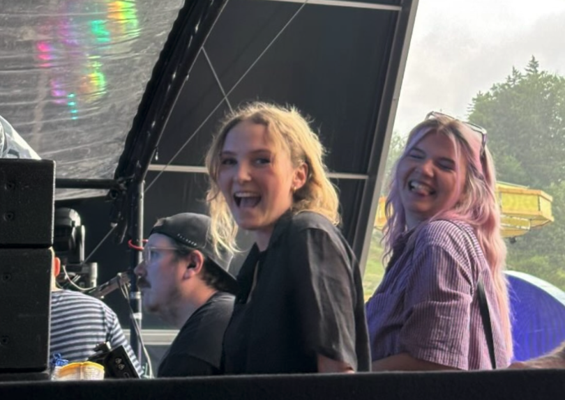
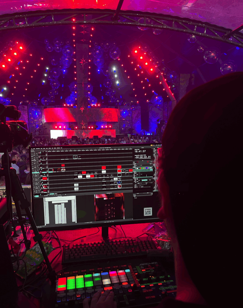
AAAAAAAAAAAAAH Auf Instagram habe ich die Story liebevoll mit “The one thing I will never shut up about” betitelt: Tanja Kobler und ich waren (quasi) VJs am Electric Love Festival in Salzburg und ich kann es immer noch nicht fassen.
Das WIE und WAS und alles bis zum Rendern haben wir im letzte Blogpost schon geklärt, aber wie ging’s weiter?
All unsere Visuals wurden als simple MP4s bzw DVX3 Files mit voller Renderqualität in die Cloud der Electric Love-VJs geladen. Und dann hieß es nervös abwarten: Hat das alles gepasst? Fehlt etwas? Files kaputt?
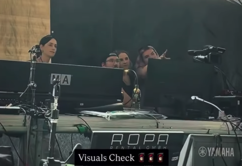
Mit einem Backup-USB-Stick bewaffnet sind wir am Donnerstag um 15:30Uhr dann am Gelände aufgetaucht (2 Stunden bevor Bonnie Callinis Set losging!) um für 15 Minuten unseren Slot zum Visuals-Testen auszunutzen. Während wir Bibiza und Co. beim Soundcheck zuschauen konnten (hihihi) haben wir uns nach den VJs aus den E-Mails erkundigt und sie in der netten, kleinen Box vor der Stage entdeckt. Jef (aus Belgien. Jef mit einem F) war also unser Mann des Tages! Gemeinsam mit Jef haben wir dann unsere Uploads durchforstet. Wir hatten alles fein säuberlich sortiert und wollten eigentlich nur ein paar wenige spezielle Visuals auf deren Anordnung überprüfen – passt genau für 15 Minuten – schlussendlich saßen wir aber satte 1,5 Stunden mit Jeff vorm PC. Was ist passiert? Alles schief gegangen? Keine Files da? Keine Ordnung?! Viel besser: Wir hatten einfach zu viele gute Visuals hihihihi.
We came with a vision (& Jef made it look even better than we imagined!)
Breites Grinsen beim Anblick unserer Visuals
Jef war schwer überrascht von unseren 35+ Video Snippets und auch von unserer ansteckenden Motivation! “Usually we don’t give people this much time, but you seem nice. And you put in a lot of work!” Also hat Jef uns, während er all unsere Videos in seine Resolum Arena Datei geladen hat, eine kleine Einführung in sein Setup gegeben. Wir fühlten uns vor dem Festival zwar gut vorbereitet, aber nachdem wir Jef’s mehr als komplexes Setup gesehen haben waren wir sehr froh über seine Expertise an unserer Seite (nach 15 Jahren im Business war er ja doch mehr als Profi). Er gab uns Zeit um alle Visuals durch zu gehen und nach unserer Vorstellung zu platzieren – und WOW – wir haben wirklich noch mehr rausholen können als gedacht!
Also, wie sah das alles aus: Wir konnten auf alle Led-Walls einzelnm, wie auch als Gruppe oder auch vollständig zugreifen. Unsere Videos konnten wir so präzise auf den relativ schmalen Streifen der Stage platzieren (naja, schmal ist relativ, es waren ja doch zwischen 1,5 und 12 Meter). Mit verschiedensten Einstellungen und Reglern ließen sich dann noch Beat-Reaktive Einstellungen, weitere Masken und Überblendungen hinzufügen.
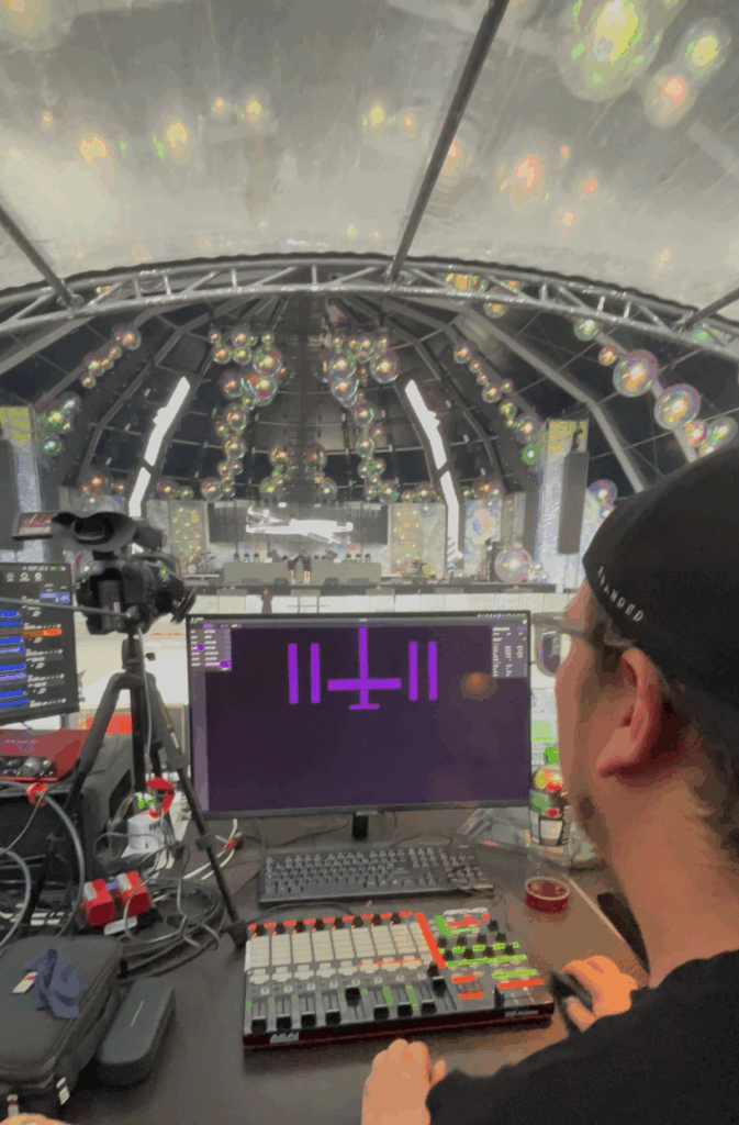
Für die Interessierten hier ein paar Einblicke in das Setup:
Ein kleiner Screen mit der Trackvorschau (gut zu wissen für’s nächste mal) + ein weiterer Screen für Resoulme und jedemenge Knöpfe, Midi-Boards und Tastaturen (Der Laptop hatte in dem Fall keinen aktiven Nutzen)
Die ClubCircus Stage, in der wir spiele durften 🙂 (Bei Regen, was sich als einzige Stage mit Dach durchaus als vorteilhaft herausgestellt hat)
Direkt vom Check sind wir dann in Bonnies Set gestartet, denn während die ersten DJs gar keine Visuals mitgebracht hatten, hat Jef die Zeit genutzt und weiter an unserem Set-up gefeilt. Wir konnten dann auch während dem Set weiter in der FOH Box bleiben, zwischen Matthias vom Licht und Jef mit den Visuals (ohne zu viel zu tanzen, weil alle Bildschirme gewackelt hätten). Wir gaben während Bonnies Set fleißig Anweisungen zu den geplanten Phasen und unseren Vorstellungen und Jef integrierte alles außnahmslos. UND ALLES SAH NOCH VIEL BESSER AUS ALS AM SCREEN. Die Videos werden der Dimension des ganzem auch nicht gerecht.
Wir haben natürlich auch einiges gelernt (und notiert!), aber dazu später mehr.
Einen Mini-Kleinen-1-Minute-Zusammenschnitt für die Instagram-Story kann ich hier als KURZFASSUNG anbieten:
Wenn’s mehr Zeit sein darf folgt hier eine breite Sammlung an Eindrücken:
Alles miteinander verblenden…
…und noch mehr Überblendungen
DJ-Perspektive…
und der Blick vom VJ währenddessen
Nah dran an den LED-Walls
Carefully placed visuals auf den Side-Strips
Jef’s Setup machte es auch super leicht, die Visuals an verschiedenen Achsen zu spiegeln, Dinge anders zu mappen oder auch weitere Flashes oder Bounces einzubauen. Auch sämtliche Arten von Overlays konnten wir uns näher anschauen.
Und meine persönlichen Lieblinge nochmal im Spotlight:
Das Key-Visual des Abends war bestimmt unsere tanzende Nika (in allen Shades von Rot über B/W bis zur Heatmap)
Was haben wir noch dazu gelernt? 1. Manche DJs senden ihre Visuals 5min vor Set-Beginn (das ist zu spät, aber Jef kriegt’s hin!) — NICHT WIR!
2. Led-Walls mögen keine Grauen Hintergründe – make it black, oder Transparent!
3. Immer gut: Ein paar Buttons mit Flash-Effekten, Blend Modes immer und überall; Zietverzerrungsregler, Strobe Effekte, …
4. Manche DJs senden keine oder nur … zwei… Videos >> Immer Visuals parat haben die für verschiedenste Stile passen(d gemacht werden können)
5. Man kann locker mindestens 2 Ebenen aktiv haben und mit den Transparenzen spielen (auf Beat und so)
6. Man kann Beats und Songs etc. auslesen – aber nicht immer, hängt vom Setup ab. Also gut wenn man trotzdem verschiedene Phasen definiert (wenn es die denn gibt) und dann eine Playlist erstellen (Textlich… auf Papier, vor Ort mitbringen – Ja, wir waren auch überrascht)
7. Loops und Videos immer kürzer als 40 Sekunden; Vorzugsweise immer DXV3, aber wenn’s versendet wird ist’s aufgrund der File-Size meistens MP4 und die VJs konvertieren es dann
8. Licht und VJ sind ein enges Team
9. VJing ist SUPER COOL, aber doch viel komplexer als man am Anfang glaubt + Arbeiten von 14-3 Uhr (jeden Tag, 4 Tage hintereinander) macht das ganze ziemlich anstrengend. Da helfen irgendwann auch die besten Ohropax/Loops/whatever nix mehr.
10. Wir wollen das auf jeden Fall wieder machen!
Super mega ultra großes Danke an Tanja, mit der ich das alles planen, machen und durchstehen durfte hihi – Wir sind ein super Team 💞
Auch ein super liebes ultra großes Danke an Bonnie Callini für die krasse Möglichkeit! (und an Nadja, für’s connecten <3)
UND auch an Jef Callens und Matthias Schöffmann, die sich als VJ und Lichttechniker mega ins Zeug gelegt haben und ultra bemüht darum waren, uns in unserer Vision zu unterstützen!
Und danke an Roman, der mich 10 Mal mein Thema wechseln lassen hat 😅
Now that this phase of my research is coming to an end, the question becomes: how can all of this lead to something more tangible?
The answer, for now, is: I don’t know yet.
What I do know is that I want to keep working with fragments, randomness, and the unnoticed. I want to turn my growing archive of textures, messages, and spontaneous compositions into something. A publication? A zine? A projection? Maybe even a spatial installation? Something that feels more like a collection of evidence than a portfolio.
One idea I’ve been returning to is the “Randomness Manifesto”, a visual and written experiment that acts as both critique and celebration. Critique of overdesigned culture. Celebration of accidents, layers, and non-linear thinking. It might combine screenshots, photography, found type, short texts, print experiments. A design that reflects how we actually experience the world: not as clean grids, but as overlapping, constantly shifting impressions.
Another direction might explore design as documentation. Not designing something but noticing, framing, and amplifying what’s already there. A form of communication design that starts with observing instead of inventing.
Whatever it becomes, I know I want to stay close to the questions that guided me: – What are we not noticing? – What are we designing for? – Can design help us reconnect not just with each other, but with what’s already in front of us?
Design doesn’t always need to answer. Sometimes it just needs to ask better questions. In a time when artificial intelligence can generate thousands of visuals in seconds, maybe the role of the designer is shifting. It’s no longer just about creating new things, it’s about curating, framing, and giving weight to what already exists. The designer becomes less of a maker, more of a connector. Someone who can read between the lines, trace meaning in chaos, and slow down the endless scroll of content to say: “Look closer, this matters.” In that sense, embracing the unfinished and the overlooked isn’t stepping away from design, it’s returning to its core purpose: helping people make sense of the world.
This semester wasn’t about following a straight path. It was about collecting fragments like ideas, images, words, impressions and trying to understand what they might be pointing toward.
When I started, I wasn’t even sure what I was looking for. I knew only that something felt off. Design felt tired. Too polished. Too predictable. Too disconnected from real life. So I started paying closer attention to the things that don’t scream to be noticed: a scribbled message on a wall, a broken tile, a flyer stapled over a hundred others. Somewhere in that visual noise, I found honesty.
Through writing, collecting, and reflecting, a theme kept returning: the value of the in-between. The things we pass by. The messy, random, imperfect traces that make spaces and media feel alive. I began to see randomness not as a lack of structure, but as a kind of truth-telling. The uncurated becomes a mirror and the overlooked becomes material.
I also began to look more critically at visual culture. Not just what we’re making, but why. Do we need more posters or do we need to read the ones that already exist more closely? Do we need to add to the noise or help people make sense of it?
This project became something of an experiment in slowing down. In resisting the pressure to produce finished, polished things and instead sit with the progress. Let randomness exist. Let fragments be fragments. Let the design be about presence, not performance.
Maybe what I’ve been doing all semester isn’t building a project, but developing a perspective. A way of seeing that values what doesn’t demand attention. And that might be the most valuable tool a designer can have.
Sources:
Certeau, Michel de. The Practice of Everyday Life. University of California Press, 1984.
Throughout this process, I’ve been circling the same question: What makes something feel meaningful, even when it’s messy, unfinished, or random? I’ve looked at the world through fragments like found textures, broken signage, screenshots of everyday oddities but now I want to take a step back and ask what this way of seeing actually is.
In her book On Longing, Susan Stewart writes about “the souvenir”, a small object torn from its original context that somehow holds emotional weight. I realize my photo archive functions in a similar way. These images aren’t “designed” but they become markers of time, place, and feeling. They’re emotionally charged, not because of their composition, but because of the act of noticing and collecting them.
This kind of collecting the quiet, emotional, inconsistent has nothing to do with curation in the classical sense. It’s not about matching colors or building a “perfect” grid. It’s about feeling something when you look at a corner of a torn sticker on a pole. Or a forgotten note in a public place. These fragments of everyday life don’t scream for attention, and maybe that’s exactly why they speak to me. They don’t try to be art, they just are.
I think this way of seeing is deeply tied to slowness and presence. Noticing is an act of resistance in a fast world. But it’s also creative, it’s not passive. When I collect and document these fragments, I am quietly shaping my own way of designing. Not starting from zero, but starting from what’s already around me.
It also made me wonder: what if this is the material? What if randomness and leftovers are not a starting point for inspiration, but the work itself? I don’t want to just use these images as references for more polished designs. I want to let them remain raw. To find a format where they can exist as they are, where I can add just enough to let them speak.
This process has changed how I think about authorship too. When I put together fragments I didn’t create, am I still the designer? Maybe I’m not designing in the traditional sense, maybe I’m just assembling or paying attention.
Sources:
Stewart, Susan. On Longing: Narratives of the Miniature, the Gigantic, the Souvenir, the Collection. Duke University Press, 1993.
Manzini, Ezio. Design, When Everybody Designs: An Introduction to Design for Social Innovation. MIT Press, 2015.
In my last blog entry, I asked: How do we make sense of all this noise without losing the character of the city? This question has followed me into the next phase of my research. Instead of trying to clean up the clutter, I started observing what it actually is, how we experience it, and what it might be trying to tell us.
My goal is not creating a polished design outcome, it is about building a process or a system, maybe even a mindset.
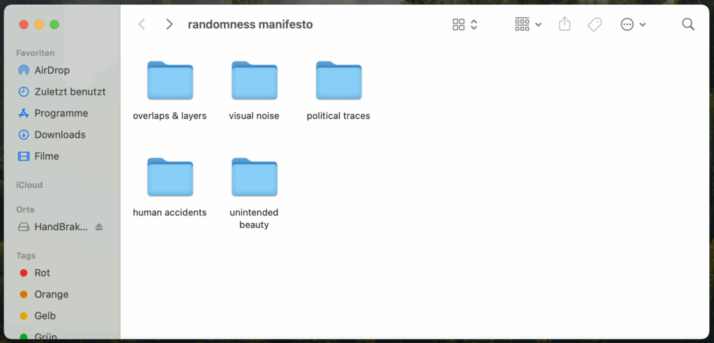
Step 1: Building an Archive
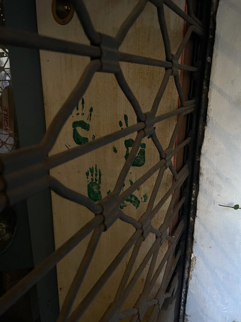
I began with what I already had in my camera roll. Years of random photos: broken signs, wall textures, forgotten objects, public scribbles, strange alignments, and accidental compositions.
I didn’t take these pictures intentionally for a project, they just happened. So I started categorizing them:
Overlaps & Layers
Visual Noise
Political Traces
Human Accidents
Unintended Beauty
I created a folder structure on my laptop that now serves as the base for a collection of real-world randomness.
Step 2: Researching the Vibe
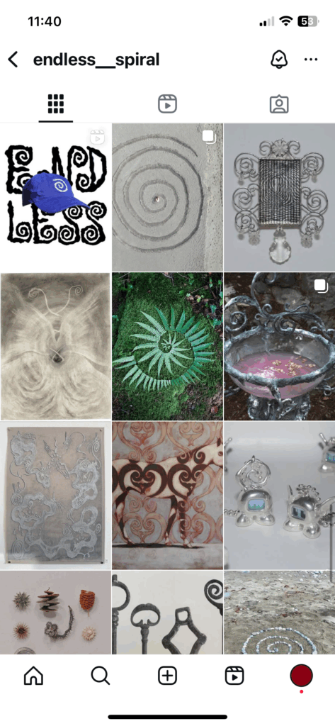
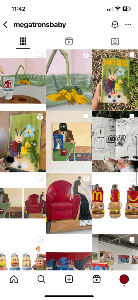
At first glance, all these things like paint spills, torn stickers, blurry text seem unrelated. But the more I looked at them, the more I realized: they feel connected. I began to study creators who lean into randomness. From zine-makers layering textures and clashing type to Instagram artists who post found objects without context, it all feels chaotic, but somehow intentional.
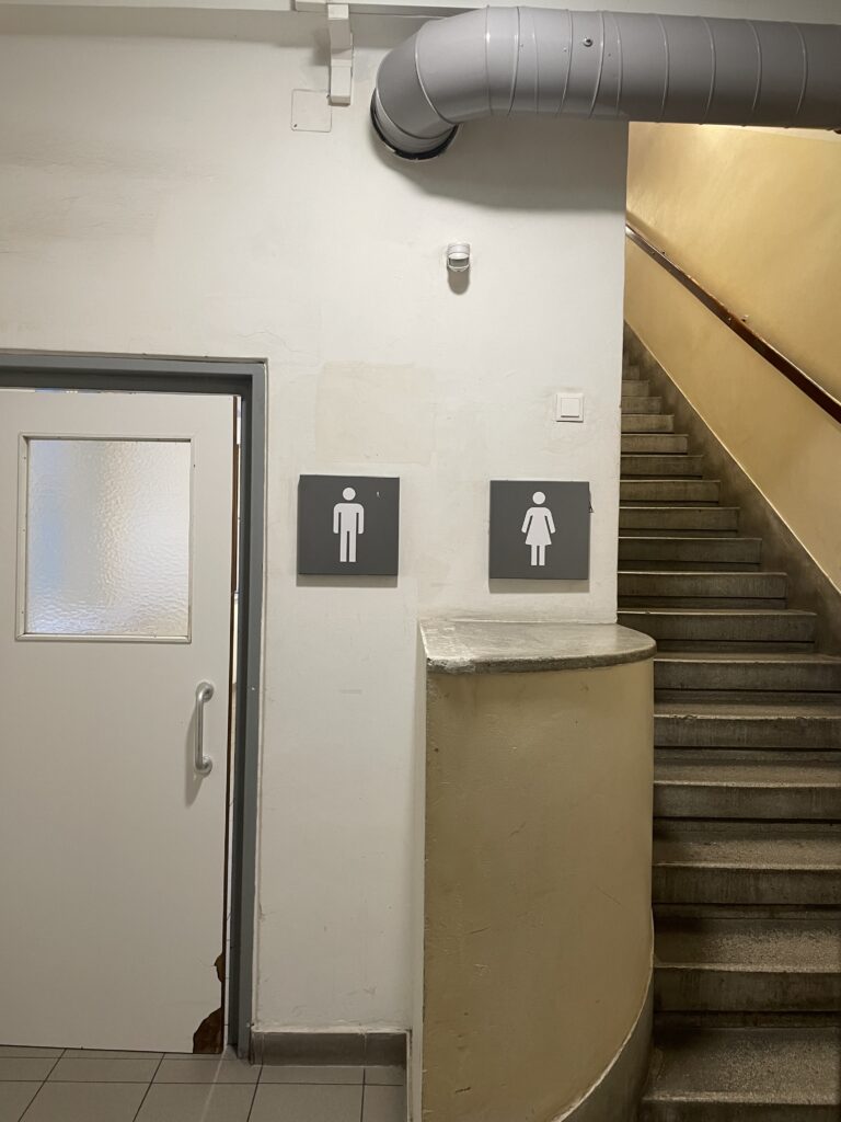
I think if you look at it closely, everything can be political. Not just billboards or protest posters, but even the unnoticed details in everyday spaces. A restroom that makes women take the stairs while men walk straight in is a powerful message in itself without even meaning to. Or a wall where “Free Palestine” was painted over, but still faintly shines through. These things are visual proofs of how systems speak through architecture, erasure, and layers of public expression. Sometimes the most powerful statements are the ones no one planned, but no one managed to fully silence either.
Step 3: Understanding “The Dump”
I also revisited photo dumps. Not just as a trend, but as a storytelling form. The randomness isn’t random at all—it’s about rhythm, contrast, atmosphere. A picture of a half-eaten sandwich next to a blurry selfie and a screenshot of a note. It tells you who someone is without saying anything directly. That’s the kind of narrative I’m interested in.
What’s exciting is that this also applies to design. Layouts that feel spontaneous. Posters that aren’t begging for attention but make you stop anyway. Formats that don’t tell you what to think, but make you feel like you’ve stumbled into something.
A Visual Protest in the Making
All of this is slowly leading toward my “Randomness Manifesto”, a zine or digital page that reads and feels like a visual protest against overdesigned perfection. It will be layered, broken, imperfect. It won’t follow a fixed structure. Maybe it will look like a poster that’s been weathered by the street. Or a desktop folder that became a publication.
Whatever it turns into, it taught me that the beauty isn’t in controlling the chaos, it’s in curating it.
This semester felt like a giant work-in-progress. Not just in terms of design outcomes, but also in how I thought about my topic, my process, and what kind of designer I want to be. Nothing about it was linear, but maybe that was the point.
In my research on how design and typography can support children in learning to read, I came across “Die Grundschrift”, a typeface specifically developed for use in German primary schools.
What is “Die Grundschrift”?
“Die Grundschrift” (translated: the basic script) is a simplified, clear typeface developed by the German Grundschulverband to help children learn to read and write with fewer obstacles.
Unlike traditional cursive scripts taught in schools, Grundschrift:
Is print-like and clear, making it easier for children to recognize and differentiate letters
Uses consistent, simple letter shapes that resemble printed text, reducing the confusion caused by complex letterforms
Encourages fluid writing movements without forcing strict connections between letters, allowing children to develop their own handwriting style gradually
Why is “Grundschrift” easier for beginners?
Clear Letterforms: Letters are designed to be visually distinct, helping children avoid common mix-ups (like b/d or p/q)
Transition-Friendly: Since Grundschrift looks similar to printed text in books, children can transfer their reading skills more easily to writing
Less Cognitive Load: Simplified forms reduce distractions, helping children focus on learning to decode and write simultaneously
Supports Individual Writing Style: By not enforcing strict cursive connections, children develop confidence in writing at their own pace
Why is this relevant?
It’s easy to assume playful or decorative fonts are “child-friendly,” but for learning to read, clarity and structure are more important than decoration.
Using Grundschrift in learning materials:
Supports readability for first readers.
Ensures consistency between what children read and write.
Builds confidence in reading and writing simultaneously.