Installing a PiHole (Homelabbing_3) – Impulse #6

In my last homelabbing post, I talked about getting my server set up with Docker and hosting my first applications. A logical next step on my list was to tackle network-wide ad-blocking. As I hinted before, the time finally came to set up a PiHole. I was excited to improve my own network but also to get my hands on a piece of open-source software that is widely loved.

For those unfamiliar, PiHole works differently than an add blocking browser extension. Instead of scanning websites for ad-like code, it operates as a DNS sinkhole. In simple terms, when any device on your network tries to contact a server known for serving ads, the PiHole intercepts that request and sends back an empty response, so the ad never even loads. The biggest advantage? It works for everything on your network, your laptop, your phone, and even your Smart TV, where ad-blockers are often non-existent.

The setup process itself was a great hands-on experience. I used a tiny Raspberry Pi Zero that I got from my brother for christmas, flashed the operating system to an SD card, enabled SSH for remote access, and plugged it into my router. From there, running the single install command and watching it work its magic was incredibly satisfying. A few configuration changes on my router to direct all DNS traffic through the Pi, and it was up and running, protecting me from ads. ;D

Impact for my Masters Thesis

This is where this little project became a huge impulse for my thesis. While exploring the PiHole’s web dashboard, I stumbled upon a perfect, real-world UX issue. To block a domain, you add it to a blocklist. To allow one, you add it to an “allow list.” On the dashboard, the button to add a domain to the allow list is green.

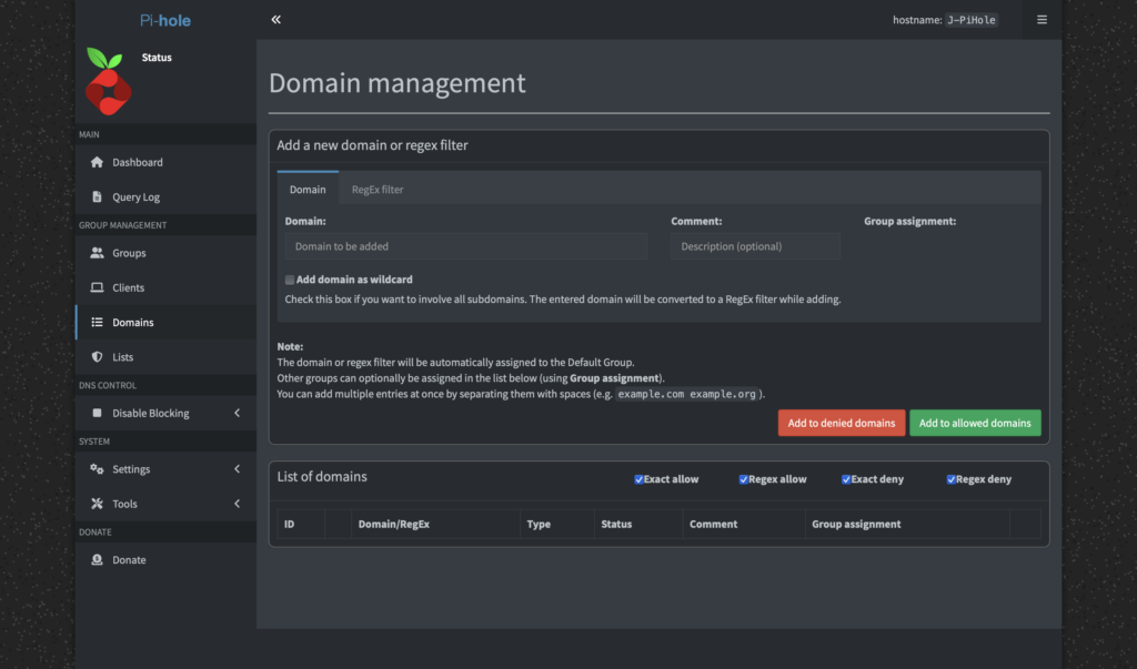
As a designer, green signifies a positive action, like adding something while red signals a negative action, like deleting something. More than once, I found myself accidentally clicking the green “Allow” button when my actual intention was to block a domain. It’s a classic UX problem where the visual signifier conflicts with the user’s intent. For a developer, a green button for “allow” might make perfect sense, it’s the “good” list. But for a user managing blocklists, it creates confusion.

This was a firsthand example of a barrier a designer could help lower. I immediately thought, “This is open source, I should be able to fix this!” I wanted to change the button color, maybe add an icon, or just improve the layout. But then I hit another wall: the documentation on how to change interface elements wasn’t straightforward for a non-developer. I literally had no idea, where to start.

This entire experience perfectly encapsulates the core of my thesis. It’s not just about finding UX issues, but about the entire process: identifying a problem, understanding the contribution workflow, and finding the right documentation. My simple home lab project has given me a tangible case study, a real problem to solve, and a clear path to explore for my “Designer’s Guide to Open Source.” It’s the first step in moving from theory to a real, practical contribution.

Accompanying Links

Pi-hole official website – https://pi-hole.net/

Raspberry Pi Zero – https://www.raspberrypi.com/products/raspberry-pi-zero/

Ai was used to formulate this blogpost (Gemini + WisprFlow)

“Working in Public” Book – Impulse #5

I recently read “Working in Public” by Nadia Eghbal (now Asparouhova). I discovered the book during my literature research for the “Proseminar Master Thesis” class with Ursula Lagger and got it through an interlibrary loan. As a former developer-relations researcher at GitHub who interviewed hundreds of developers, she offers a fresh, insightful look at the world of open source that I want to share.

Before diving in, it’s important to understand the difference between “free” and “open source” software. The “free software” movement, started by Richard Stallman, is about freedom, not price. The term “open source” was created later to be more business-friendly, focusing on the practical benefits of shared code rather than the ethics of user freedom.

Eghbal’s book focuses on a key distinction in open source projects today: the size of their audience. She describes two models: the “bazaar,” with many contributors (like Linux), and the “stadium,” with a few maintainers and a huge audience of users. Most projects today are stadiums, often run by a tiny group of 1 to 5 developers.

Many projects follow a similar lifecycle. They often start in private, and once they go public, the creators are looking for engagement and feedback. As a project gets adopted, the role of the maintainers shifts from doing the actual code work to managing the project, the community, and the influx of casual contributors.

This leads to a major challenge: how are these projects financed? For many, the answer is they aren’t. The book details the different ways funding works. There are two main types of funders: institutions (like universities and companies) and individuals. Institutions often care about the quality of the code and their influence on the project’s roadmap. For individuals, the reason for funding is often personal; they might use the project daily and simply want to ensure it continues to exist.

The funding target also matters. Is the money going to a project or an individual? Funding a project makes it easier to manage the money transparently. Funding an individual offers more flexibility, as a developer might work on multiple projects. Asparouhova notes that companies tend to sponsor projects, while individuals tend to fund developers directly through platforms like Patreon or GitHub Sponsors.

This brings me to what I think is the most important takeaway from Eghbal’s work: we need to rethink how we value the different kinds of labor in open source. We tend to celebrate the “creator” – the person who has the initial brilliant idea. But what about the “maintainer”? The person who shows up day after day to fix bugs, answer questions, and keep the project alive. Their work is often less glamorous, but it’s no less critical.

If open source is to be sustainable in the long term, we need to find ways to support the maintainers. This could mean more funding, better tools, or simply a cultural shift in how we think about our responsibilities as users of open source.

As I continue my research, I’m left with a question: How can we, as designers and users, better support the maintainers of the open-source tools we rely on every day? I don’t have the answer yet, but it’s a question I’ll be exploring in the weeks to come.

Ai was used to formulate this blogpost (Gemini + WisprFlow)

Impulse #2: Computer Vision in UI/UX

After diving into Picard’s vision of emotionally intelligent systems, I now found a more technical and practical perspective on how computer vision is already reshaping UI testing. The research paper Computer Vision for UI Testing: Leveraging Image Recognition and AI to Validate Elements and Layouts explores automated detection of UI problems using image recognition techniques, something highly relevant for improving UX/UI workflows today.

Img: Unveiling the Impat of Computer Vision on UI Testing. Pathak, Kapoor

Using Computer Vision to validate Visual UI Quality

The authors explain that traditional UI testing still relies heavily on manual inspection or DOM-based element identification, which can be slow, brittle and prone to human error. In contrast, computer vision can directly analyze rendered screens: detecting missing buttons, misaligned text, broken layouts, or unwanted shifts across different devices and screen sizes. This makes visual testing more reliable and scalable, especially for modern responsive interfaces where designs constantly change during development.

One key contribution from the paper is the use of deep learning models such as YOLO, Faster R-CNN, and MobileNet SSD for object detection of UI elements. These models not only recognize what is displayed on the screen but verify whether the UI looks as intended, something code-based tools often miss when designs shift or UI elements become temporarily hidden under overlays. By incorporating techniques like OCR for text validation and structural similarity (SSIM) for layout comparison, the testing process becomes more precise in catching subtle visual inconsistencies that affect the user experience.

Conclusion

This opens a potential master thesis direction where computer vision not only checks whether UI elements are visually correct but also evaluates user affect during interaction, identifying frustration, confusion, or cognitive overload as measurable usability friction. Such a thesis could bridge technical UI defect detection with affective UX evaluation, moving beyond “does the UI render correctly?” toward “does the UI emotionally support its users?”. By combining emotion recognition models with CV-based layout analysis, you could develop an adaptive UX testing system that highlights not only where usability issues occur but also why they matter to the user.

Source: https://www.techrxiv.org/users/898550/articles/1282199-computer-vision-for-ui-testing-leveraging-image-recognition-and-ai-to-validate-elements-and-layouts

Business Management x Customer Experience x Data Visualisation: 1st prototype

In the current digital era, Customer Experience has evolved with multichannel support, chatbots, self-care, and virtual assistants to reduce customer effort, driving the development of Customer Relationship Management tools. However, while significant investments have focused on empowering AI-assisted agents, the role of managers has been largely underserved.​

I’m designing a solution to empower the “Augmented Manager”, equipping leaders with advanced tools and analytics to optimize real-time-onsite–remote-team performances and deliver outstanding results in an increasingly complex, tech-driven customer experience ecosystem.

Beside.you is a Software As A Service (SaaS) solution, is developed to simplify decision-making and boost efficiency for managers.

By solving the biggest business challenges, with intuitive functionalities simplifying Steering, Performance management, and resources’ Growth, it is shaping a future whereall business tools work seamlessly together, unlocking unmatched operational excellence for organizations everywhere.

This small demo showcases some parts of the product experience that is offered beginning with Steering on its macro micro levels:

Testing & Iterating using Lean UX: ‘Macro’ Steering Dashboard

As part of my SaaS project, one of the user interfaces that had to be done is the Steering dashboard but it required a lot of back and fourth of feedback, iterations and meetings to finally come to a great enough version in terms of functionality and business but as a product designer and using Lean UX as a methodolgy , at some stage I had to do an iteration test.

Macro and Steering are the fundamentals of what consists this interface, they serve the business internally as much as they serve it externally with clients and prospects.

Macro: refers to the holistic overview of an insights dashboard and its part of the macro-micro dynamic that I’m using as a system thinking for the whole project.

Steering: provides a real-time view of every KPI needed to make better decisions and steer the business towards a better course.

This testing/iteration process shows the first level of a user interface that required little user interview, user feedback and zero iteration but it served as a good foundation and a stepping stone to a later version that will pave the way to the “final” iteration.

The first version was even called ‘Adherence Planning’ which was an innacurate term of what we are trying to achieve and also because it defined only one aspect of the whole dashboard.

It had the basic insights that we want to show without much output but it was limited, inefficient and not value driven on a business level.

So after much stakeholder’s feedback we iterated that version to a much effective version that visualised the data in a much more functional manner and I did that through designing the work force performance gauge chart, rearranging the cards to suit the data monitoring priority, tweaked the charts and their colors on a UI level for more effective anomaly identification, streamlied the data visualisation with proper alerts identification and finally made the 3 dots ‘kebab’ compartment the drawer where every additional setting is hidden, and here is where I arrived:

The Steering Dashboard is now much more structured and serves the decision making business goal on a decent level, every KPI can be checked and monitored in real time along with checking the business performance in terms of profit and loss through the “Work force performance” gauge.

What I learned

A disruptive data vizualisation product can never be done, but through proper UI UX design, testing, iterating and coming up with the optimal solutions, it can reach a certain level of efficient structure that will propel it to achieve some of the business goals that were far further in the roadmap of the product experience and all of the above can only be done through collaboration and proper communication within a team.

All and all, I’m just getting started and i’m thrilled to work more on the refinement of both my skills and everything that I get involved in

17 – Clickable Prototype v1

After all the sketches, user flows, and planning, I finally pulled everything into a quick clickable prototype (Figma is awesome for this, btw). It’s still an early version, but it gives a solid feel of how the app might look and behave. I wanted to see how the Home, Activity, and Settings tabs work together and how smooth the experience feels when clicking through it all.

Here’s a short walkthrough video showing the prototype in action:

Working on this helped me catch a few small details I hadn’t noticed before, like the pacing between steps and where extra feedback could better guide the user. Overall, seeing it come to life, even in a simple form, was a great way to confirm if the structure works.

Next, I’ll refine the flow, tidy up interactions, and start testing how others respond. It’s exciting to finally transition from an idea to something tangible you can click through.

16 – Pulling It All Together

After spending time designing each part of the app on its own, I knew the next step was to figure out how it all fits together. It’s one thing to have a solid Home tab, a clear Activity tab, and a flexible Settings area. But the real challenge is making the tool feel like one connected experience instead of just three separate features sitting side by side.

So I started mapping the full user journey, from the moment someone opens the app for the first time to the moment they take their first action. The goal was to make sure every screen, every tap, and every option felt like part of a bigger flow.

It starts with Home. This is where the user gets a quick update on their privacy status and can tap one button to begin scanning. Once the scan is done, they’re either shown a clean summary that says everything looks good, or they’re nudged to go check out their results in the Activity tab.

That handoff between Home and Activity became really important. It needed to feel natural, not like you’re being dropped into another part of the app. So I kept asking myself questions like, “What happens after a scan?” and “What does the user want to do next?” The answer is usually some version of “check what was found” or “see if anything needs action.”

Once they land in Activity, the results are organized clearly. Old scans are listed with summaries, and new findings are labeled in a way that stands out without being too loud. From there, users can open a scan, review the exposed data, and decide what to do. They might request a removal, ignore it, or save it for later.

Then there’s Settings, which sits quietly in the background but plays a big role in shaping how the app works. Before a user ever hits “Scan Now,” the tool has already been set up to know what data to look for and where to search. That part happens quietly but meaningfully. And at any point, the user can return to the Settings tab to update what they’re tracking or change how often they want to scan.

Full App Flow

The more I worked on this flow, the more I realized how important rhythm is. The app should never feel like it’s asking too much at once. It should guide, not demand. There’s a gentle back-and-forth between checking your privacy, understanding your exposure, and deciding what to do about it. That rhythm is what makes the whole thing feel usable.

At this point, the main structure is starting to come together. There are still things to work out, like onboarding, empty states, and what the app says when no data is found. But now that the core journey is mapped, I feel more confident about shaping the rest of the experience.

15 – Defining What Gets Scanned

After sketching out how users would scan their data and review the results, I knew it was time to focus on something deeper. If someone’s trusting this tool to find their personal data online, they should be able to control exactly what it’s looking for and how it behaves. That’s where the Settings tab comes in, specifically, the part that lets people manage the data points the app scans for.

This is more than just a list of preferences. It’s the part of the app that decides how useful the tool really is. If it can’t scan for the right things or look in the right places, then it doesn’t matter how nice the interface looks. So I started thinking through the user journey here. What does it feel like to set this up for the first time? How easy is it to update your info later? What happens when someone wants to remove or change something?

I broke it down into a few simple flows. When someone taps into this section, they see a list of data types like full names, email addresses, phone numbers, home addresses, usernames, and social media handles. Each one has a toggle, so they can decide which categories they want the app to track. Tapping into a category opens a list of actual data points. For example, under “email addresses,” you might see:

Users can add new entries, remove old ones, or give them a label like “Work” or “Personal” to keep things organized. It should feel simple, like updating a contacts list.

User flow of the entire settings tab
Zooming into the Scan Preferences

Another part of this section is where the app should scan. Some people might want full control, while others may prefer a more hands-off setup. So I imagined a second area where users can select the types of platforms the app should search, like:

  • Public data brokers
  • Social media sites
  • Search engines
  • Forums or blogs
  • Data breach records

By default, the app could suggest a recommended setup, but users who want to go deeper can switch things on or off based on what they care about.

I also wanted to give users a quick summary before they leave this section. Something that says, “You’re scanning for 6 data points across 4 categories.” Just a simple, reassuring message that confirms everything’s set up the way they want. From there, they can either save changes or jump straight into a new scan.

This part of the tool gives people full control over what they’re sharing with the app and what the app is doing for them. It also needs to feel like something they can come back to anytime. Maybe they changed their email or want to track a new phone number. It should be easy to update without starting from scratch.

14 – What the Activity Tab Unlocks

Once I felt like the Home tab had a solid direction, I shifted my focus to the Activity tab. This is the part of the app that lets users look back and understand what the tool has found over time. If the Home tab is about quick action, the Activity tab is about reflection and detail. It’s where things get a bit more layered.

I started by asking a few questions. After a scan is done, what would someone want to do next? What would they expect to see if they tapped into their past results? The obvious answer was, they’d want to understand where their data showed up, how serious it is, and what actions they can take. So that became my starting point for the user flow.

The journey into the Activity tab begins with a list of past scans. Each entry shows the date, how many exposures were found, and a quick status, like “3 removals in progress” or “Last checked 4 days ago.” This lets the user get a feel for their privacy over time. From there, tapping into any scan opens a detailed breakdown.

Inside that scan detail view, I imagined a set of cards or sections for each exposure. Each card would show where the data was found, maybe on a marketing site, a data broker list, or a forum. It would also show what kind of data was found, like a phone number or full name, and whether the app could help remove it. There would be a clear action button like “Request Removal” or “Ignore for Now,” giving the user simple choices without pressure.

User flow of the activity tab

Another part I thought about was how to show overall progress. Maybe there’s a visual indicator on the main Activity screen that shows how your privacy is improving over time. Something like a simple line graph or a color-coded “privacy score” that updates as you take action. I don’t want it to feel gamified, but it should feel encouraging. Like you’re making progress, not just looking at problems.

One small but important touch I sketched out was what happens when there are new exposures. Maybe we highlight them with a subtle label like “New since last scan” or bump them to the top of the list. This way the user’s attention naturally goes to the most important updates.

This part of the app is where people go to feel more in control. It’s not just a log of past activity. I wanted it to feel full of helpful options without overwhelming anyone.

13 – Home Tab, How should it work?

After figuring out the broader structure of the tool, the next step was to zoom in and really understand what should happen on the Home tab. This is where everything begins. It’s the screen someone sees the moment they open the app, so it needs to be clear, simple, and useful right away.

I started thinking through the experience from a user’s point of view. What would they be trying to do here? Most likely, they just want to know how exposed their personal data is and what they can do about it. They’re not coming in to explore every setting or dig through past reports. They want a quick answer to a big question: “Am I okay online?”

So I mapped out the user flow for this part. It starts with a clean welcome screen that gives a clear privacy status. This might say something like “You have 3 data exposures found” or “You’re all clear.” Just enough to give the user a sense of where things stand. From there, the most important action is the Scan Now button. This is the main thing the app offers, and it needs to be obvious and easy to tap.

Once the user hits that button, the app begins scanning for their data across different online sources. I imagined a simple progress indicator, maybe a friendly loading animation or a visual scan bar. No need for too many details yet. Just a sense that the app is working quietly in the background to find their information.

After the scan is complete, the user is taken to a short summary. This is where the tone really matters. It shouldn’t feel scary or overwhelming. It should feel clear and in control. Something like
“We found 4 pieces of your personal data online. Tap to review and take action.”

Home tab user flow
User flow to perform a scan

I also had to think about smaller touches. What if the user has never scanned before? Do we show an empty state with a short message that explains the tool? What about returning users? Should they see their last scan result or a prompt to scan again?

These are the kinds of small questions that start to stack up once you begin thinking through a full user journey. The challenge is to give people just the right amount of information without making things feel too heavy.

At this stage, I’m keeping things flexible. The layout will probably change as I move on, but the flow feels right. Welcome the user, show them where things stand, let them take action quickly, and offer a calm, clear summary when the scan is done.