Blog Post 3: A Shopper’s Journey: Tracing the Data Flow Step-by-Step

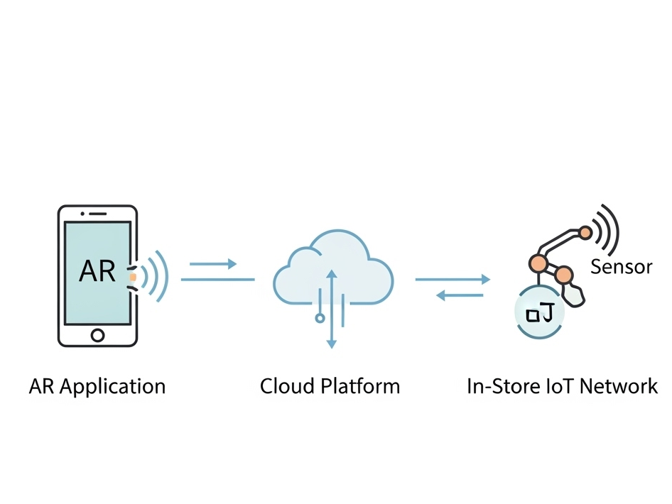
In my last post, I unveiled the blueprint for my smart retail system—the three core pillars of the AR Application, the Cloud Platform, and the In-Store IoT Network. Today, I’m putting that blueprint into motion. I’ll follow my case study shopper, Alex, through the IKEA store and analyze the precise sequence of data “handshakes” that make his journey possible. Additionally this blog post is super technical due to my personal interest and it’s help to be able to further develop the technology

While this experience is designed to be accessible on any modern smartphone, it is primarily envisioned for the next generation of consumer Smart AR Glasses. The goal is a truly heads-up, hands-free experience where digital information is seamlessly woven into the user’s field of view.

Let’s dive into the technical specifics that happen on Alex’s chosen AR device.

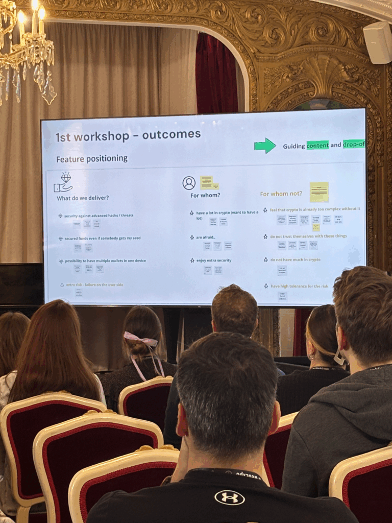
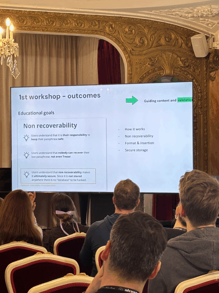
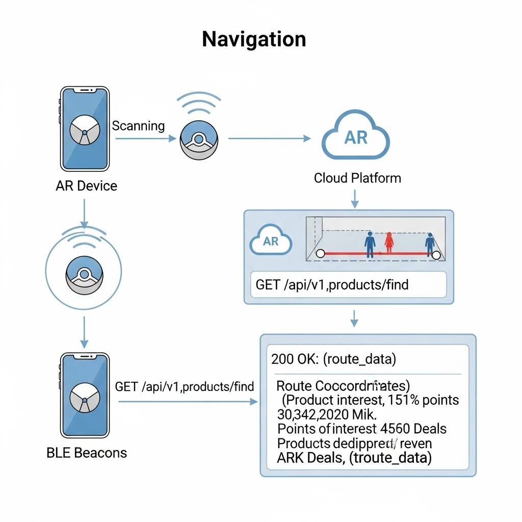
1. The Task: High-Precision In-Store Navigation

The Scenario: Alex arrives at the store, puts on his smart glasses, and wants to find the “BILLY bookshelf.” He needs a clear, stable AR path to appear in front of him.

The Data Flow: The immediate challenge is knowing Alex’s precise location, as GPS is notoriously unreliable indoors. To solve this, I’ve designed a hybrid indoor positioning system:

  • Bluetooth Low Energy (BLE) Beacons: These are placed throughout the store. The AR device detects the signal strength (RSSI) from multiple beacons to triangulate a coarse position—getting Alex into the correct aisle.
  • Visual Positioning System (VPS): This provides the critical high-precision lock. A pre-built 3D “feature map” of the store is hosted on my cloud platform. The software on the AR device matches what its camera sees in real-time against this map. By recognizing unique features—the corner of a shelf, a specific sign—it can determine its position and orientation with centimeter-level accuracy.

Here’s how they work together:

  1. The AR device uses BLE Beacons to get a general location.
  2. This coarse location is used to efficiently load the relevant section of the VPS feature map from the cloud.
  3. The device’s computer vision module then gets a high-precision coordinate from the VPS.
  4. Now, the application makes its API call: a GET request to /api/v1/products/find. The request payloadincludes the high-precision VPS data, like {"productName": "BILLY", "location": {"x": 22.4, "y": 45.1, "orientation": {...}}}.
  5. Backend calculates a route and returns a JSON response with the path coordinates.
  6. The application parses this response and, using the continuous stream of data from the VPS, anchors the AR navigation path firmly onto the real-world floor, making it appear as a stable hologram in Alex’s field of view.

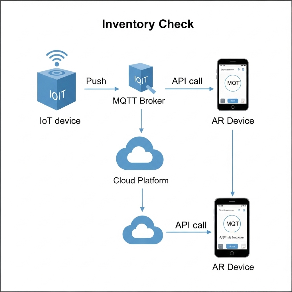
2. The Task: Real-Time Inventory Check

The Scenario: Alex arrives at the BILLY bookshelf. A subtle icon hovers over the shelf in his vision, indicating he can get more information.

The Data Flow:

  1. The IoT Push: A smart shelf maintains a persistent connection to my cloud’s MQTT broker. When stock changes, it publishes a data packet to an MQTT topic with a payload like {"stock": 2}.
  2. The App Pull: When Alex’s device confirms he is looking at the shelf (via VPS and object recognition), the app makes a GET request to /api/v1/inventory/shelf_B3.
  3. My Cloud backend retrieves the latest stock value from its Redis cache.
  4. The app receives the JSON response and displays “2 In Stock” as a clean, non-intrusive overlay in Alex’s glasses.

3. The Task: AR Product Visualization in Alex’s Room

The Scenario: Alex sees a POÄNG armchair he likes. With a simple gesture or voice command, he wants to see if it will fit in his living room at home.

The Data Flow:

  1. Alex looks at the armchair’s tag. The device recognizes the product ID and calls the GET /api/v1/products/poang_armchair endpoint.
  2. My Cloud Platform responds with metadata, including a URL to its 3D model hosted on a CDN (Content Delivery Network).
  3. The AR device asynchronously downloads the 3D model (.glb or .usdz format) and loads Alex’s saved 3D room scan.
  4. Using the device’s specialized hardware, the application renders the 3D armchair model as a stable, full-scale hologram in his physical space, allowing him to walk around it as if it were really there.

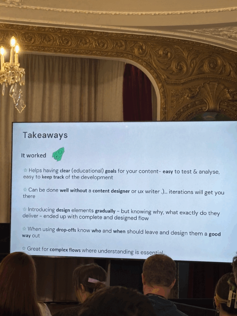
This intricate dance of data is what enables a truly seamless and futuristic retail experience.

In my next post, I will finally move from the backend blueprint to the user-facing design. I’ll explore the prototyping and UI/UX Design and the design process for the interface that Alex would see and interact with through his AR device.

#6 Experiment: Error 404

During the International Week, I took part in an exciting workshop on Glitch Art. It wasn’t just about digital errors or distortions, but also about analog glitches, artistic accidents that happen “by mistake” not on the computer, but manually and physically.

Research and Concept

Before starting, I did a lot of research on the topic. For my project, I wanted to deliberately create analog disturbances on photos without controlling the “destruction” itself. My idea was to aesthetically damage photos, while letting chance play its part.

To do this, I gathered plenty of inspiration and experimented with various chemicals like cleaners, bleach, nail polish remover, salt, and more.

The Creative Process

First, I took photos by myself, photographing my friends at university, and then edited them in black and white to create a thoughtful, unsettling mood. This fit well with the theme and the glitch aesthetic.

Next, I printed the photos using a plotter and treated them with the chemicals. The best results came from a mixture of acetone and bleach. The photos became partially discolored, etched away, or even dissolved creating images that tell stories of disruption and change.

Video as a Visual Extension

To capture the process, I filmed everything, sped up the footage, and then edited it in After Effects. There, I added typical digital glitch elements like error messages and loading circles, reinforcing the theme and linking the analog errors with a digital layer.

What the Project Means

The project deals with hard-to-define emotional and interpersonal states such as the search for meaning or the feeling of being too slow or left behind. These experiences are often vague and difficult to articulate. Technical error messages serve as a parallel: moments when connections are lost, responses fail, or processes get interrupted.

The visible alterations on the photographs (discolorations, etched-away areas) reflect ongoing change and disruption as natural parts of life. Errors and glitches are not exceptions but part of a continuous process.

My learning

This experiment was a lot of fun. I really enjoyed inviting unpredictability into my creative process. I’m very satisfied with the outcome, not only because it looks visually interesting but also because it carries a message I strongly identify with.

This combination of artistic process, personal reflection, and technical execution showed me how much expression and depth can be found in so-called “mistakes”  both analog and digital.

Measuring Creativity: Can We Quantify It?

An immediate big issue that presents itself when thinking about how boredom affects creativity is: “how do we measure creativity??”. After some research I can present you some approaches that seem sensible.

1. Divergent Thinking Tests

The most widely used creativity assessments are divergent thinking tasks.
Divergent thinking tasks are designed to push your brain beyond the obvious, encouraging you to come up with as many different ideas, uses, or solutions as possible. They’re the opposite of convergent thinking, which focuses on finding a single correct answer.

Torrance Test of Creative Thinking (TTCT)
In TTCT, participants might be asked to list uses for an ordinary object (fluency), switch categories (flexibility), come up with unusual ideas (originality), and flesh out details (elaboration). These scores have been shown to predict creative achievements decades later, with reliability ratings between .87 – .97 across diverse cultures.
Guildford’s Alternate Uses Task (AUT) is a classic measure which covers all these scores. Simply: given an everyday object, how many different uses can users think of? This one test scores on fluency, originality, flexibility and elaboration.

2. Convergent Thinking Tests

Creativity isn’t only about generating many ideas. It’s also about finding the right idea.
The Remote Associates Test (RAT) measures convergent thinking by asking participants to find a single word linking three unrelated cues (e.g. “Room-Blood-Salt” -> “Bath”). This captures associative and insight-based creativity.

3. Semantic-Distance & Novel AI Measures

Modern testing like the Divergent Association Task (DAT) and its AI-enhanced variant, S-DAT, ask for unrelated words or ideas and measure their semantic distance via algorithms. These tools offer scalability and objective measuring beyond manual scoring.

4. Process & Product Based Assessments

The Consensual Assessment Technique (CAT) involves expert judges evaluating creative products (stories, designs, etc.). Similarly domain specific tools like the Engineering Creativity Assessment Tool (ECAT) assess fluency, originality, flexibility, and technical depth in engineering contexts.

Useful Sources:
What do educators need to know about the Torrance Tests of Creative Thinking: A comprehensive review
Torrance Tests of Creative Thinking
The Convergent Validity of the Torrance Tests of Creative Thinking and Creativity Interest Inventories
What We Measure Matters

How Long to Be Bored? Timing & Incubation

Once we can measure creativity, we face more nuanced questions about practical timing:

  • How long should boredom last for optimal creative priming?
    Most lab studies (like Mann & Cadman from the previous blog post) used 15 minutes of boredom inducing tasks and find improved divergent output afterwards. Would shorter or longer periods produce stronger gains? We don’t know yet. It seems to be yet untested in real-world creative scenarios.
  • How long does the creativity boost last?
    I couldn’t find any good answers for this question. Controlled studies are still necessary to see how long ideation remains elevated after a boredom bout.
  • How frequently should boredom pauses occur in heavy ideation sessions?
    In the absence of precise guidelines, a plausible starting point is alternating focused ideation blocks (25-30min) with short boredom breaks (5-10min) where participants engage in minimal stimulation. A similar structure to a classic Pomodoro.

For the Reader

If you’re curious about how boredom might boost your creativity, here are a few small experiments that you can try at home:

  1. Schedule a Boredom Break
    Set aside 10-15 minutes during your workday to deliberately do nothing stimulating.
    No phone, no music, no reading, just stare out of the window, take a walk without headphones, or sit with a pen and blank paper. Then try a creative task (like brainstorming ideas or sketching concepts) and note any difference in how your ideas flow.
  2. Swap Scrollign fro Staring
    Next time you’re in a queue or on public transport and feel the urge to check your phone, resist it. Just be. Let your thoughts wander. You might be surprised what floats to the surface when you’re not trying to be entertained.
  3. Keep a Post-Boredom Journal
    After intentionally boring moments, note down how you felt and whether any interesting thoughts or ideas came to you. Over time, this could become a valuable creativity tracker and personal insight tool.
  4. Read something
    More specifically one of these:
    – The Upside of Downtime by Sandi Mann
    – Bored and Brilliant by Manoush Zomorodi

#12 DataVis Workshop

The workshop WS#6 Eva-Maria Heinrich / Bringing the Abstract to Life – Beyond Data Visualisation at the International Design Week was all about pushing my prototype beyond pixels and printouts. Instead of presenting Austria’s daily land consumption as another chart, I set out to build a physical prototype – a 1.13 m² “slice” of ground that stands in for every hectare consumed in a single day. Here’s a rundown of my process, why a hands-on prototype matters, and the production hurdles I encountered along the way.


Why Prototype Matters in Multi-Sensory Data Visualization

Many of my previous posts have explored the theory behind multi-sensory data visualization – how tactile textures, sounds, or spatial arrangements can make numbers resonate more deeply. This time, I wanted to prototype those ideas in a tangible form. By crafting a small landscape that viewers can actually touch, I could test whether the physicality adds insight that a static infographic simply can’t. In other words, this wasn’t a polished art piece – it was a work-in-progress prototype intended to reveal both the strengths and limitations of turning data into material.


Concept: A 1.13 m² “Plot” of Daily Land Use

At a scale of 1:10 000, 1 cm² on my board represents 1 hectare in the real world. To capture Austria’s daily land conversion, the board measures 1.13 m² total, divided into:

  • 52 % concrete (fully sealed surfaces like roads and buildings)
  • 12 % gravel (partially sealed areas such as construction zones)
  • 36 % grass (green spaces cut off from natural ecosystems)

When laid out side by side, these materials form a unified plane that still reveals stark textural differences up close. Walking viewers through each zone gets them thinking: “That gray slab isn’t just a shape – it’s every driveway and parking lot paved over today.”


From Sketch to First Prototype

Mapping Out the Layout

I began by sketching on paper, dividing a 1 m × 1.13 m rectangle into proportional zones. Once I had rough percentages, I exported the grid to Illustrator to generate precise outlines. Printing a full-scale template and taping it to plywood helped me trace clean boundaries for concrete, gravel, and grass sections.

Gathering & Testing Materials

  • Concrete mix: I bought a small bag of ready-to-mix putty. My first batch was too smooth, so I added extra pebbles I got on the street to add some texture.
  • Gravel: I grabbed some gravel from a construction site. Putting it basically one by one on the surface, I glued them down with normal glue.
  • Grass: I had a few ideas for grass but because of time constraint I settled on a doormat I found at the hardware store, knowing I could swap in live grass later.

Building the First Iteration

  1. Base Preparation: I glued two sheets of thin carton together (hoping for the best).
  2. Concrete Section: Mixing putty and gravel, I poured it cup by cup each time mixing it again and again.
  3. Gravel Section: I sprinkled gravel by hand, and gently pressed it in place.
  4. Grass Section: Cutting the doormat to form was very easy and I just glued it down.

What I learned in the process

Prototyping isn’t a linear path, and my first iteration had plenty of hiccups.

Mainly finding the right material and then finding good substitutes because of the time frame. Then of course finding the right mix for the putty and putting it on the surface.

By the end of the week, the prototype still had a few chips of gravel out of place and some cracks and color difference in the putty, but those imperfections felt authentic – almost like the real world, where land-use boundaries aren’t always neat and tidy.


Why This Prototype Matters

  • Tactile Immersion: Viewers can kneel down and feel the roughness of gravel next to the coldness of the putty. That sensorial contrast sparks a more intuitive understanding of how land is consumed.
  • Immediate Comparisons: Instead of reading “52 %” on a slide, people see the massive concrete patch in context – ranking it against gravel and grass sizes without needing numbers to guide their eyes.
  • Hands-On Research: As a prototype, it’s a learning tool more than a final exhibit. The bumps in production taught me about material properties – knowledge I’ll carry into my next prototype. Each mis-cut or adhesive spill revealed potential adjustments for future iterations.

Final Thoughts

Prototyping this 1.13 m² piece of ground forced me to embrace trial and error. Every spilled drop of glue and cracked chunk of putty helped me understand how to translate data into material form. The end result isn’t a museum-ready installation – it’s a functional prototype that still has rough edges. But those imperfections are part of its story: they remind me (and future viewers) that real-world data isn’t always clean, and neither is the crafting process that brings it to life. Already, this initial version has sparked new ideas for my thesis – especially around combining tactile and auditory layers.

Blog Post 2: The Blueprint: Architecting the Smart IKEA Experience

In my last post, I introduced the concept of transforming the retail journey using Augmented Reality and the Internet of Things. To move from a concept to a reality, however, we need more than just a good idea. We need a blueprint.

Remember Alex, our first-time homeowner navigating the vast IKEA maze? His journey from feeling overwhelmed to confidently furnishing his space is powered by a seamless blend of technologies. But for that “magic” to work, a robust and well-thought-out system must operate behind the scenes. Before we design a single button or write a line of code, we first have to design the architecture.

Think of it like building a house. You wouldn’t start laying bricks without a detailed blueprint. Our system architecture is exactly that: a master plan that defines all the moving parts and how they communicate with each other.

For our smart retail experience, the system is built on three core pillars:

1. The AR Application (The Guide)

This is the component Alex interacts with directly on his smartphone/Smart Glasses. It’s his window into this enhanced version of the store. It’s not just an app; it’s his personal guide, interior designer, and shopping assistant all in one.

Key Responsibilities:

  • Reading the QR code to understand the location and connect to correct server
  • Rendering the AR navigation path that guides Alex through the store.
  • Displaying interactive information cards for products.
  • Capturing the 3D scan of Alex’s room and allowing him to virtually place furniture.

2. The Cloud Platform (The Central Brain)

If the app is the guide, the cloud is the all-knowing brain that directs it. This powerful backend system is where all the critical information is stored, processed, and managed in real-time. It’s the single source of truth that ensures the information Alex sees is always accurate and up-to-date.

Key Responsibilities:

  • Storing the entire IKEA product catalog, including 3D models, dimensions, and prices.
  • Managing the digital map of the store.
  • Processing real-time inventory data and user account information (like Alex’s saved room scan).

3. The In-Store IoT Network (The Nervous System)

This is the network of smart devices embedded within the physical store. These devices act as the store’s nervous system, sensing the environment and sending crucial updates to the central brain. This is what connects the digital world of the app to the physical reality of the store.

Key Responsibilities:

  • Using smart shelves or sensors to monitor stock levels for products like the BILLY bookshelf.
  • Using beacons to help the app pinpoint Alex’s precise location for accurate navigation.
  • Triggering location-based offers or suggestions.

How It All Connects

So, how do these three pillars work together? They are in constant communication, passing information back and forth to create the seamless experience Alex enjoys. This diagram shows a high-level view of our architecture:

As you can see, the AR Application on Alex’s device is constantly talking to the Cloud Platform, requesting data like product locations and sending data like user requests. Simultaneously, the In-Store IoT Network is feeding live data to the Cloud, ensuring the entire system is synchronized with the real world.

With this blueprint in place, It creates a clear path forward for development.

2.7 The better OFFF – OMR Festival Hamburg

After reflecting on the visual absence of OFFF Barcelona, one event kept coming to mind—one that actually did everything right: OMR (Online Marketing Rockstars) in Hamburg.

I first visited OMR in 2019, and the scale of its presence was hard to miss. By the time I returned in 2022 and 2023 to work behind the scenes, I fully understood just how carefully everything had been planned. OMR wasn’t just an event — it was a full takeover of the city. There was pretty much no one across the town (or maybe even the country — and some say over the marketing scene) that had not heard about the event and also online (mostly LinkedIn & Instagram) everyone was talking about it. Over the time it had even become meme material, which is in my opinion one of the best ways for user generated content (“There is no such thing as bad publicity”, or something in that way, you get the point).

OMR did exactly what I expected to see at OFFF:

  • Marketing started early – long before the event itself, you could already spot teaser campaigns and announcements throughout the city.
  • Visual identity everywhere – not just in digital channels, but across all physical spaces in Hamburg.
  • Advertisements in public transport – Buses, S-Bahns, screens, stickers — OMR literally moved through the city.
  • Billboards around town – from large-scale prints to local neighborhood placements, the branding was omnipresent.
  • Flyers at “Spätis” – even at late-night kiosks and small shops, you’d find OMR materials.
  • Newspaper ads – traditional media wasn’t forgotten, either. There were full-page ads and features in major newspapers and magazines.
  • City-wide awareness – unlike OFFF, people in Hamburg knew what was going on. There was buzz, recognition, and visibility. Maybe not everyone liked it, but everyone knew it.
  • Marketing campaigns within the city — Sponsors and partners of the OMR also took part in promoting the event and contributed to increased awareness


Once you entered the venue, the experience was just bright. The signage, staff clothing, branded items, stages, and screens all followed a consistent and bold visual system. Some might say it was a sensory overload, but everything aligned with the campaign that had been building up in the city for weeks or even months.


In short:
OMR executed exactly the kind of conceptual, immersive, and recognizable identity that I hoped to see at OFFF. It proves that a strong event brand doesn’t stop at a good logo or cool poster—it extends into the urban space, builds anticipation, and creates a complete, memorable experience.

That is why for me, OMR stands as a prime example of how to do it right—and an important reference point for future executions.

Von der Skizze zum 3D-Modell: Ein kreativer Workflow mit KI und Trellis

In diesem Beitrag möchte ich einen kleinen Exkurs dokumentieren, der sich aus nächtlichen Experimenten, eigenständiger Recherche und einem Workshop während der Designwoche ergeben hat. Da dieser Eintrag nicht den Prototyp behandelt – müsste dieser als Blogpost 5/1/2 gesehen werden. Er versteht sich als methodischer Zwischenstand, aber auch als wichtige Erweiterung meiner gestalterischen Werkzeuge.

Ausgangspunkt war ein Workshop mit dem Workshopleiter Emilio Leonardo, der während der Designwoche ein spannendes Tool namens Trellis vorgestellt hat. Diese Plattform ermöglicht es, zweidimensionale Zeichnungen mithilfe künstlicher Intelligenz (KI) in 3D-Modelle zu überführen. Fasziniert von den Potenzialen dieses Tools begann ich, eigene Workflows zu testen und weiterzuentwickeln.

Einblick in das Toolset: Trellis und KI-gestützte Bildverarbeitung

Trellis ist eine browserbasierte Plattform, die mit Cloud-Unterstützung arbeitet und verschiedene Eingabemöglichkeiten bietet. In Kombination mit Stable Diffusion basierten Tools wie Stable Projectors oder Bildgeneratoren wie Perplexity, ergibt sich ein kreatives Ökosystem: Persönliche Skizzen oder abstrakte Zeichnungen können fotografiert, digital verarbeitet und schließlich in ein dreidimensionales Mesh überführt werden.

Dabei ergibt sich folgender Workflow:

  1. Handgezeichnete Skizze fotografieren oder scannen.
  2. Die Skizze in einem KI-Tool (z. B. Perplexity) hochladen und mit einem Prompt versehen, der eine stilistisch ähnliche, aber dreidimensional anmutende Version generieren lässt.
  3. Das resultierende Bild wird in Trellis hochgeladen – bevorzugt über die kostenfreie und werbefreie Plattform Hugging Face  (https://huggingface.co/spaces/crevelop/Trellis)
  4. Mittels der Funktion „Generate“ wird ein 3D-Modell (Mesh) erstellt, welches im .glb-Format exportiert werden kann.
  5. Anschließend kann dieses Modell in einem 3D-Programm wie C4D oder Blender verwendet werden. Eventuelle Artefakte oder Topologiefehler sind hier noch zu beheben.

Kreative und künstlerische Relevanz

Das Potenzial dieser Methode liegt vor allem in ihrer Niedrigschwelligkeit und Individualität: Selbst wenn man kein professioneller Illustrator ist, lassen sich persönliche, abstrakte oder emotionale Zeichnungen in digitale 3D-Welten transformieren. Die Ergebnisse sind nicht perfekt – kleinere Fehler oder Unvollständigkeiten im Mesh sind üblich – doch für Anwendungen im künstlerischen Bereich, insbesondere im Bereich Visuals, Social Media Content oder generativer Kunst, sind sie mehr als ausreichend.

Was mich besonders begeistert hat, ist die Möglichkeit, ein Stück eigener Handschrift zu digitalisieren und in den Raum zu bringen. Im Gegensatz zu generischer KI-Kunst bleibt hier der persönliche Ausdruck im Vordergrund, da die Zeichnung der Ausgangspunkt ist.

Anwendung im Kontext von Projektionen und Mapping

Diese Technik bietet auch neue Perspektiven für zukünftige Videomapping-Projekte – etwa in Kirchenräumen. Statt auf klassische 2D-Visuals zurückzugreifen, könnten historische Illustrationen, handschriftliche Fragmente oder sakrale Skizzen aus verschiedenen Epochen durch diesen Workflow zum Leben erweckt werden – kostengünstig, zeiteffizient und visuell eindrucksvoll.

Die Verschmelzung von analoger Zeichenkunst mit digitaler Raumwirkung könnte somit zu einer immersiveren, emotionaleren Visualisierung führen.

Fazit und Ausblick

Was zunächst als Spielerei begann, entpuppte sich als ein tragfähiger und inspirierender Workflow, der nicht nur kreative Entfaltung ermöglicht, sondern auch wissenschaftlich und gestalterisch anschlussfähig ist. Für die weitere Arbeit am Prototypen bleibt abzuwarten, ob und wie stark diese Technik dort Einzug halten wird. Denkbar ist eine subtilere, abstraktere Anwendung – doch allein die Möglichkeit, diesen Zugang zu haben, erweitert das Repertoire um eine wertvolle, persönliche Komponente.


Disclaimer zur Nutzung von Künstlicher Intelligenz (KI):

Dieser Blogbeitrag wurde unter Zuhilfenahme von Künstlicher Intelligenz (ChatGPT) erstellt. Die KI wurde zur Recherche, zur Korrektur von Texten, zur Inspiration und/oder zur Einholung von Verbesserungsvorschlägen verwendet. Alle Inhalte wurden anschließend eigenständig ausgewertet, überarbeitet und in den hier präsentierten Beitrag integriert.

Prototyping X: Image Extender – Image sonification tool for immersive perception of sounds from images and new creation possibilities

Researching Automated Mixing Strategies for Clarity and Real-Time Composition

As the Image Extender project continues to evolve from a tagging-to-sound pipeline into a dynamic, spatially aware audio compositing system, this phase focused on surveying and evaluating recent methods in automated sound mixing. My aim was to understand how existing research handles spectral masking, spatial distribution, and frequency-aware filtering—especially in scenarios where multiple unrelated sounds are combined without a human in the loop.

This blog post synthesizes findings from several key research papers and explores how their techniques may apply to our use case: a generative soundscape engine driven by object detection and Freesound API integration. The next development phase will evaluate which of these methods can be realistically adapted into the Python-based architecture.

Adaptive Filtering Through Time–Frequency Masking Detection

A compelling solution to masking was presented by Zhao and Pérez-Cota (2024), who proposed a method for adaptive equalization driven by masking analysis in both time and frequency. By calculating short-time Fourier transforms (STFT) for each track, their system identifies where overlap occurs and evaluates the masking directionality—determining whether a sound acts as a masker or a maskee over time.

These interactions are quantified into masking matrices that inform the design of parametric filters, tuned to reduce only the problematic frequency bands, while preserving the natural timbre and dynamics of the source sounds. The end result is a frequency-aware mixing approach that adapts to real masking events rather than applying static or arbitrary filtering.

Why this matters for Image Extender:
Generated mixes often feature overlapping midrange content (e.g., engine hums, rustling leaves, footsteps). By applying this masking-aware logic, the system can avoid blunt frequency cuts and instead respond intelligently to real-time spectral conflicts.

Implementation possibilities:

  • STFTs: librosa.stft
  • Masking matrices: pairwise multiplication and normalization (NumPy)
  • EQ curves: second-order IIR filters via scipy.signal.iirfilter

“This information is then systematically used to design and apply filters… improving the clarity of the mix.”
— Zhao and Pérez-Cota (2024)

Iterative Mixing Optimization Using Psychoacoustic Metrics

Another strong candidate emerged from Liu et al. (2024), who proposed an automatic mixing system based on iterative masking minimization. Their framework evaluates masking using a perceptual model derived from PEAQ (ITU-R BS.1387) and adjusts mixing parameters—equalization, dynamic range compression, and gain—through iterative optimization.

The system’s strength lies in its objective function: it not only minimizes total masking but also seeks to balance masking contributions across tracks, ensuring that no source is disproportionately buried. The optimization process runs until a minimum is reached, using a harmony search algorithm that continuously tunes each effect’s parameters for improved spectral separation.

Why this matters for Image Extender:
This kind of global optimization is well-suited for multi-object scenes, where several detected elements contribute sounds. It supports a wide range of source content and adapts mixing decisions to preserve intelligibility across diverse sonic elements.

Implementation path:

  • Masking metrics: critical band energy modeling on the Bark scale
  • Optimization: scipy.optimize.differential_evolution or other derivative-free methods
  • EQ and dynamics: Python wrappers (pydub, sox, or raw filter design via scipy.signal)

“Different audio effects… are applied via an iterative Harmony searching algorithm that aims to minimize the masking.”
— Liu et al. (2024)

Comparative Analysis

MethodCore ApproachIntegration PotentialImplementation Effort
Time–Frequency Masking (Zhao)Analyze masking via STFT; apply targeted EQHigh — per-event conflict resolutionMedium
Iterative Optimization (Liu)Minimize masking metric via parametric searchHigh — global mix clarityHigh

Both methods offer significant value. Zhao’s system is elegant in its directness—its per-pair analysis supports fine-grained filtering on demand, suitable for real-time or batch processes. Liu’s framework, while computationally heavier, offers a holistic solution that balances all tracks simultaneously, and may serve as a backend “refinement pass” after initial sound placement.

Looking Ahead

This research phase provided the theoretical and technical groundwork for the next evolution of Image Extender’s audio engine. The next development milestone will explore hybrid strategies that combine these insights:

  • Implementing a masking matrix engine to detect conflicts dynamically
  • Building filter generation pipelines based on frequency overlap intensity
  • Testing iterative mix refinement using masking as an objective metric
  • Measuring the perceived clarity improvements across varied image-driven scenes

References

Zhao, Wenhan, and Fernando Pérez-Cota. “Adaptive Filtering for Multi-Track Audio Based on Time–Frequency Masking Detection.” Signals 5, no. 4 (2024): 633–641. https://doi.org/10.3390/signals5040035:contentReference[oaicite:2]{index=2}

Liu, Xiaojing, Angeliki Mourgela, Hongwei Ai, and Joshua D. Reiss. “An Automatic Mixing Speech Enhancement System for Multi-Track Audio.” arXiv preprint arXiv:2404.17821 (2024). https://arxiv.org/abs/2404.17821:contentReference[oaicite:3]{index=3}

#5 Setting Type & Printing at Druckzeug

Recently, I had the chance to take part in an open studio session at Druckzeug in Graz (a space dedicated to analog print techniques – i guess everybody knows it). These open workshops take place roughly once a month, and I joined with two friends from Communication Design. Together, we tried something completely new (at least for me): setting metal type by hand and printing it using letterpress.

It was my very first time working with movable type, and I have to say: it was a fascinating, hands-on experience that felt like stepping into another era of design.

How Does Letterpress Actually Work?

With traditional letterpress printing, each individual letter (called a type or letterform) is selected from a collection of lead blocks and set mirror-inverted into a metal frame called a composing stick. You build your text letter by letter (kind of like heavy-duty Scrabble) to form words and lines.

But it’s not just about picking letters. Since they don’t hold themselves in place, you also have to fill all the empty spaces between words and around the layout using lead spacers and furniture blocks. Once the composition is complete and perfectly aligned, everything is tightly locked into place using a chase (metal frame) and quoins (tightening devices), so nothing moves during printing.

Then it’s time to ink the type and print  by placing it in a press, rolling on the ink, and pressing the paper onto the form. The result: a tactile print with real depth.

Let’s print

For my first try, I chose the Bavarian word “Gfreit mi”, which roughly means “I’m happy” or “That makes me glad.” Surprisingly, the process wasn’t as difficult as I’d expected but it was definitely very time-consuming. Every little gap needs to be filled carefully, and everything has to be placed just right. But that’s also what makes it so satisfying.

Working with the physical type, taking time to set each line, and finally seeing it printed, it gave me a whole new appreciation for the craft and history of printing.

Reflection

This experiment at Druckzeug was a beautiful experience, a dive into the world of analog typography and a nice break from our digital routines. It’s inspiring to see these old techniques still being taught and practiced, and how much joy and creativity they can bring.

“Gfreit mi” – that pretty much sums it up.

WebExpo Conference Day 2: Designing for Security in Crypto – Markéta’s Winning Formula

On Day 2, I listened to a really interesting session by Markéta Kaizlerová called “High Stakes Flows: Designing for Security and Crypto’s Unique Challenges.” The talk focused on how to help people protect their crypto using better onboarding, especially when it comes to something as important as setting up a passphrase.

Her team’s main idea was to build an onboarding process that teaches users how serious and important their passphrase is. They started by using clear content and simple words to explain why it matters, then added visuals later to make things feel smoother and more friendly.

While that approach helped them communicate the message, I personally think it could be a problem for users who have low vision or struggle with reading. Depending mostly on written content might leave some people behind, especially when visual support comes too late in the process.

Another thing they ran into was confusion around the terms they used. In the crypto space, a lot of words already sound complicated, and trying to explain them during onboarding made things even more confusing. It also didn’t help that the team was trying to do too many things at once. They had to simplify their goals and guide people step by step, like a wizard-style flow.

One lesson I found really useful was how they set clear educational goals. They knew exactly what they wanted users to learn at each stage, which made the whole process easier to test and improve. It also helped them stay focused during development. Kaizlerová even said that you don’t always need a dedicated content writer if you keep your goals simple and test your designs regularly.

She also talked about how not everyone will finish the onboarding flow. That’s totally normal, and instead of seeing it as a failure, they planned for it. They designed clear ways for people to exit the flow if they weren’t ready to go through with it. I liked that idea a lot because it shows respect for users and avoids pushing them too hard.

The biggest takeaway for me was how they tried to balance two important things: making the experience easy to use while still being secure. In crypto, that’s a real challenge. You want to teach users without overwhelming them, and you want to build trust without making it all feel too technical.