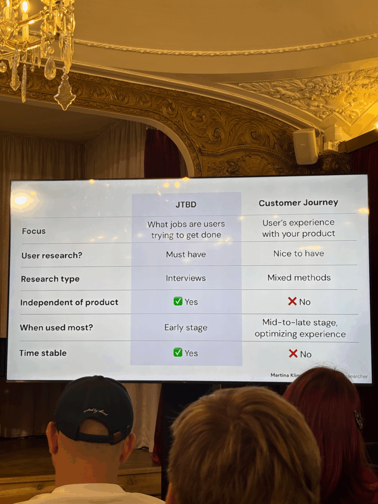
On Day 1 I attended the session by Martina Klimešová, and it focused on the Jobs to Be Done (JTBD) framework. This session was a solid introduction to a tool that helps designers and product teams understand what users are really trying to achieve when they use a product.
The key idea behind JTBD is pretty straightforward: people don’t care that much about the tool itself. What they care about is getting something done. In other words, people “hire” products to complete specific jobs in their lives. If the product does the job well, they keep using it. If it doesn’t, they “fire” it and move on to something else.
She walked us through the process of using JTBD in a real design workflow. It usually starts by defining a clear focus. After that, you conduct interviews with users to find out what jobs they’re trying to get done. From there, you analyze the interviews, cluster the insights, define the jobs clearly, and then create a final “Job Map.”
Job Maps were one of the most interesting parts of the talk for me. A Job Map shows all the steps a user goes through to complete a task. This helps designers figure out where features are actually needed, instead of guessing. It’s also a great way to build empathy with users because it shows you how they really think and feel while trying to get something done.
One thing she also pointed out was how Job Maps often work better than personas. She explained that personas are not always based on real people. Sometimes, teams spend time designing for a “user” that doesn’t actually exist. You can build a great product for a made-up person, but that doesn’t help real users. Job Maps avoid this problem by focusing on real tasks and real pain points.
Some other strengths of Job Maps she mentioned:
They are more flexible than personas.
They are based on real behavior, not guesses or stereotypes.
They don’t depend on specific tools or platforms.
They stay relevant over time, even if technology changes.
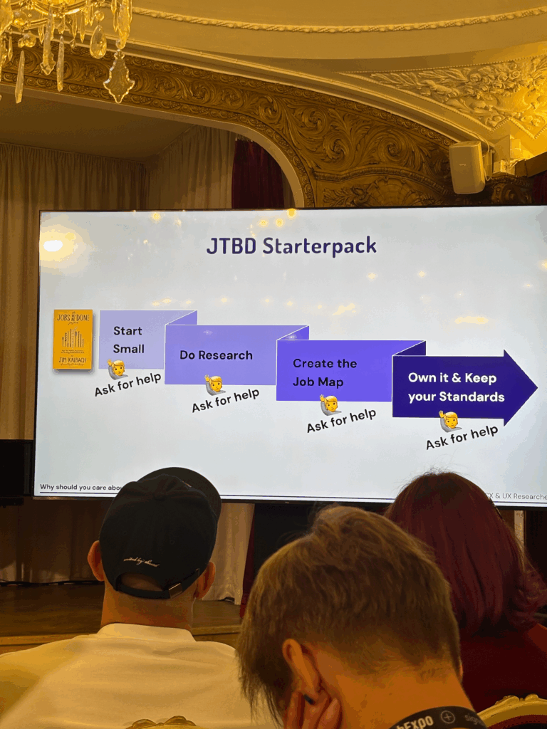
Overall, this talk gave me a better way to think about user needs. Instead of just asking who the user is, JTBD asks what the user is trying to achieve. That small shift in thinking can change everything — from the way we design features to how we test and prioritize them.
If you’re working on a product and want to make sure you’re solving real problems, not just designing for made-up characters, the Jobs to Be Done framework is a great place to start. This was a great session that reminded me why listening to users and focusing on their goals is always the right move.
At the current stage of the project, before engaging with real-time biofeedback sensors or integrating hardware systems, I deliberately chose to begin with a simulation-based exploration using publicly available physiological datasets. This decision was grounded in both practical and conceptual motivations. On one hand, working with curated datasets provides a stable, low-risk environment to test hypotheses, establish workflows, and identify relevant signal characteristics. On the other hand, it also offered an opportunity to engage critically with the structure, semantics, and limitations of real-world psychophysiological recordings—particularly in the context of trauma-related conditions.
My personal interest in trauma physiology, shaped by lived experience during the war in Ukraine, has influenced the conceptual direction of this work. I was particularly drawn to understanding how conditions such as post-traumatic stress disorder (PTSD) might leave measurable traces in the body—traces that could be explored not only scientifically, but also sonically and artistically. This interest was further informed by reading The Body Keeps the Score by Bessel van der Kolk, which inspired me to look for empirical signals that reflect internal states which often remain inaccessible through language alone.
With this perspective in mind, I selected a large dataset focused on stress-induced myocardial ischemia as a starting point. Although the dataset was not originally designed to study PTSD, it includes a diverse group of participants—among them individuals diagnosed with PTSD, as well as others with complex comorbidities such as coronary artery disease and anxiety-related disorders. The richness of this cohort, combined with the inclusion of multiple biosignals (ECG, respiration, blood pressure), makes it a promising foundation for exploratory analyses.
Rather than seeking definitive conclusions at this point, my aim is to uncover what is possible—to understand which physiological patterns may hold relevance for trauma detection, and how they might be interpreted or transformed into expressive modalities such as sound or movement. This stage of the project is therefore best described as investigative and generative: it is about opening up space for experimentation and reflection, rather than narrowing toward specific outcomes.
Data Preparation and Extraction of Clinical Metadata from JSON Records
To efficiently identify suitable subjects for simulation, I first downloaded a complete index of data file links provided by the repository. Using a regular expression-based filtering mechanism implemented in Python, I programmatically extracted only those links pointing to disease-related JSON records for individual subjects (i.e., files following the pattern sub_XXX_disease.json). This was performed using a custom script (see downloaded_disease_files.py) which reads the full list of URLs from a text file and downloads the filtered subset into a local directory. A total of 119 such JSON records were retrieved.
Following acquisition, a second Python script (summary.py) was used to parse each JSON file and consolidate its contents into a single structured table. Each JSON file contained binary and categorical information corresponding to specific diagnostic criteria, including presence of PTSD, angina, stress-induced ischemia, pharmacological responses, and psychological traits (e.g., anxiety and depression scale scores, Type D personality indicators).
The script extracted all available key-value pairs and added a subject_id field derived from the filename. These entries were stored in a pandas DataFrame and exported to a CSV file (patients_disease_table.csv). The resulting table forms the basis for all subsequent filtering and selection of patient profiles for simulation.
This pipeline enabled me to rapidly triage a heterogeneous dataset by transforming a decentralized JSON structure into a unified tabular format suitable for further querying, visualization, and real-time signal emulation.
Group Selection and Dataset Subsetting
In order to meaningfully simulate and compare physiological responses, I manually selected a subset of subjects from the larger dataset and organized them into four distinct groups based on diagnostic profiles derived from the structured disease table:
Healthy group: Subjects with no recorded psychological or cardiovascular abnormalities.
Mental health group: Subjects presenting only with psychological traits such as elevated anxiety, depressive symptoms, or Type D personality, but without ischemic or cardiac diagnoses.
PTSD group: Subjects with a verified PTSD diagnosis, often accompanied by anxiety traits and non-obstructive angina, but without broader comorbidities.
Clinically sick group: Subjects with extensive multi-morbidity, showing positive indicators across most of the diagnostic criteria including ischemia, psychological disorders, and cardiovascular dysfunctions.
This manual classification enabled targeted downloading of signal data for only those subjects who are of particular interest to the ongoing research.
A custom Python script was then used to selectively retrieve only the relevant signal files—namely, 500 Hz ECG recordings from three phases (rest, stress, recovery) and the corresponding clinical complaint JSON files. The script filters a list of raw download links by matching both the subject ID and filename patterns. Each file is downloaded into a separate folder named after its respective group, thereby preserving the classification structure for downstream analysis and simulation.
Preprocessing of Raw ECG Signal Files
Upon downloading the raw signal files for the selected subjects, several structural and formatting issues became immediately apparent. These challenges rendered the original data format unsuitable for direct use in real-time simulation or further analysis. Specifically:
Scientific Notation Format All signal values were encoded in scientific notation (e.g., 3.2641e+02), requiring transformation into standard integer format suitable for time-domain processing and sonification.
Flattened and Fragmented Data Each file contained a single long sequence of values with no clear delimiters or column headers. In some cases, the formatting introduced line breaks within numbers, further complicating parsing and extraction.
Twelve-Lead ECG in a Single File The signal for all 12 ECG leads was stored in a single continuous stream, without metadata or segmentation markers. The only known constraint was that the total length of the signal was always divisible by 12, implying equal-length segments per lead.
Separated Recording Phases Data for each subject was distributed across three files, each corresponding to one of the experimental phases: rest, stress, and recovery. For the purposes of this project—particularly real-time emulation and comparative analysis—I required a single, merged file per lead containing the full time course across all three conditions.
Solution: Custom Parsing and Lead Separation Script
To address these challenges, I developed a two-stage Python script to convert the raw .csv files into a structured and usable format:
Step 1: Parsing and Lead Extraction The script recursively traverses the directory tree to identify ECG files by filename patterns. For each file:
The ECG phase (rest, stress, or recover) is inferred from the filename.
The subject ID is extracted using regular expressions.
All scientific-notation numbers are matched and converted into integers. Unrealistically large values (above 10,000) are filtered out to prevent corruption.
The signal is split into 12 equally sized segments, corresponding to the 12 ECG leads. Each lead is saved as a separate .csv file inside a folder structure organized by subject and phase.
Step 2: Lead-Wise Concatenation Across Phases Once individual leads for each phase were saved, the script proceeds to merge the rest, stress, and recovery segments for each lead:
For every subject, it locates the three corresponding files for each lead.
These files are concatenated vertically (along the time axis) to form a continuous signal.
The resulting merged signals are saved in a dedicated combined folder per subject, with filenames that indicate the lead number and sampling rate.
This conversion pipeline transforms non-tabular raw data into standardized time series inputs suitable for further processing, visualization, or real-time simulation.
Manual Signal Inspection and Selection of Representative Subjects
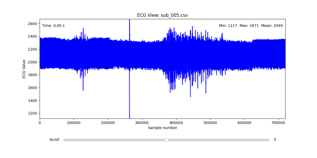
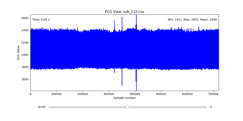
While the data transformation pipeline produced technically readable ECG signals, closer inspection revealed a range of physiological artifacts likely introduced during the original data acquisition process. These irregularities included signal clipping, baseline drift, and abrupt discontinuities. In many cases, such artifacts can be attributed not to software or conversion errors, but to common physiological and mechanical factors—such as subject movement, poor electrode contact, skin conductivity variation due to perspiration, or unstable placement of leads during the recording.
These artifacts are highly relevant from a performative and conceptual standpoint. Movement-induced noise and instability in bodily measurements reflect the lived, embodied realities of trauma, and they may eventually be used as expressive material within the performance itself. However, for the purpose of initial analysis and especially heart rate variability (HRV) extraction, such disruptions compromise signal clarity and algorithmic robustness.
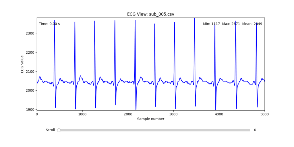
To navigate this complexity, I conducted a manual review of the ECG signals for all 16 selected subjects. Each of the 12 leads per subject was visually examined across the three experimental phases (rest, stress, and recovery). From this process, I identified one subject from each group (healthy, mental health, PTSD, and clinically sick) whose signals displayed the least amount of distortion and were most suitable for initial HRV-focused simulation.
Diagnostic Visualization Tool
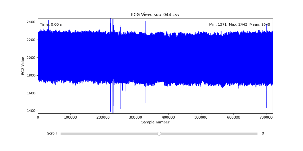
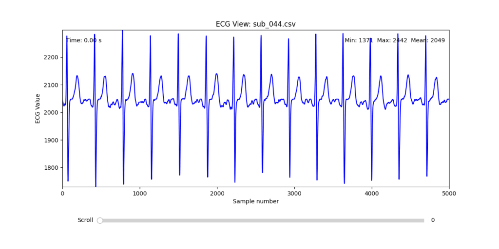
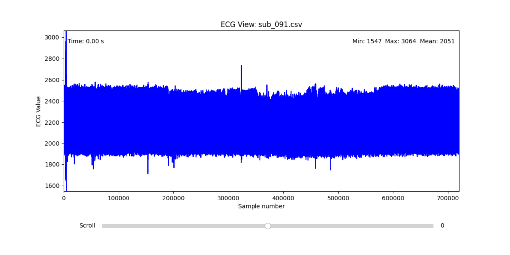
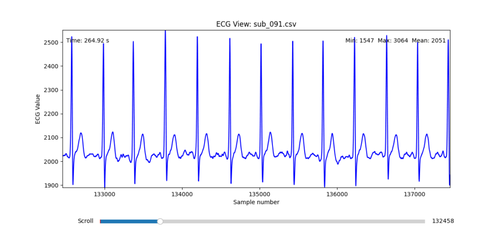
To facilitate and streamline this selection process, I implemented a simple interactive visualization tool in Python. This utility allows for scrollable navigation through long ECG recordings, with a resizable window and basic summary statistics (min, max, mean values). It was essential for rapidly identifying where signal corruption occurred and assessing lead quality in a non-automated but highly effective way.
This tool enabled both quantitative assessment and intuitive engagement with the data, providing a necessary bridge between raw measurement and informed experimental design.
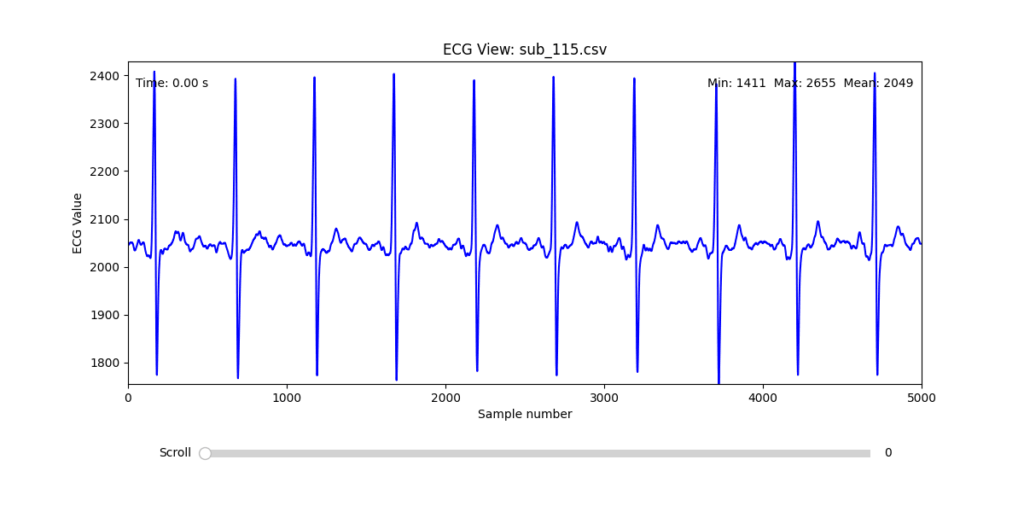
Selection of Final Subjects and Optimal ECG Leads
Following visual inspection of all 12 ECG leads across the 16 initially shortlisted subjects, I selected one representative from each diagnostic group whose recordings exhibited the highest signal quality and least interference. The selection was based on manual analysis using the custom-built scrollable ECG viewer, with particular attention given to the clarity and prominence of QRS complexes—a critical factor for accurate heart rate variability (HRV) analysis. The final subjects are: 005, 044, 091, 115:
These signals will serve as the primary input for all upcoming simulation and sonification stages. While artifacts remain an inherent part of physiological measurement—especially in ambulatory or emotionally charged conditions—this selection aims to provide a clean analytical baseline from which to explore more experimental, expressive interpretations in later phases.
References:
Van der Kolk, Bessel A. 2014. The Body Keeps the Score: Brain, Mind, and Body in the Healing of Trauma. New York: Viking.
In this talk the speaker made one thing clear: we’re all designing for users who never face loading screens, never make mistakes, and always have perfect internet. Meanwhile, actual humans struggle with our products in ways we did’t take in account
Something to keep in mind: if my design only works when everything goes right, it doesn’t really work at all.
The Loading Screen We imagine users navigatin through our interfaces, but truth is that sometimes the pages take time to load. The speaker showed how even a half-second delay needs to be considered.
It is better to add proper communication about what actually went wrong and what the user can realistically do about it.
When Content Misbehaves Designers design tidy cards that look good with short text like “Pizza.” Then real users come along with titles like “Martha’s Gluten-Free Artisanal Sourdough Breakfast Flatbread” and in that moment the layout is not working out anymore.
The solution? Design components that can stretch, shrink. Good design is about handling whatever users throw at it.
The Myth of the Mouse User Ofter designer design for people with fast internet and desktop computers. But many users navigate using only keyboards, rely on screen readers or use touchscreens where hover effects don’t work
Real design considers all these ways people interact, not just the one we’re used to. It’s about making sure everyone can actually use what we build
Adapt or Die Modern designs can now adjust to how people want to use them. Dark mode respects night owls eyes. Websites can remember content for when your signal drops.
Good design doesn’t force one experience, it adapts to each user’s needs.
The Hard Pill to Swallow In short, the speaker’s closing argument is that if you’re not designing these states, you’re not doing your job.
After this talk I can’t look at a design without seeing all the invisible failure points. Because in the end, what separates good design from great design it’s how it gets thorugh the chaos of real world use.
At a recent conference, I attended a fascinating talk on the use of game design elements in non-game contexts and how it can boost user engagement and satisfaction. The speaker opened with a compelling case: gamification isn’t just a trend, it’s a tool that taps into deep-seated cognitive biases to motivate behavior and enhance user experience.
The speaker opened with the example of one of the early brands in this field. Nike used gamification strategies to encourage people to run more. Their apps allowed users to track progress, set personal goals, and even compete with friends. This created a sense of achievement and motivation.
Supporting this, a study from the University of Colorado found that using gamification in educational or workplace settings can lead to a 48% increase in engagement and satisfaction. That’s a significant jump, and one that shows the potential of integrating these strategies into various systems.
A particularly interesting example mentioned in the talk was Bluepoint, a kind of virtual currency system where users receive points from their colleagues for being helpful or kind. This builds positive behavior but also a sense of community and recognition in the workplace.
And here’s where I have to be honest: some of it really made me raise an eyebrow. For example, the idea that getting a digital badge on an app can create genuine emotional attachment? That sounds ridiculous, a bit like rewarding yourself with a gold star for remembering to do the laundry. Even more unsettling is the concept of colleagues rating each other for kindness. I mean, really in a Black Mirror episode?
But surprisingly, psychology seems to back it up. The speaker explained that rewards and progress indicators are powerful tools. When users see that they’re getting closer to completing a task, it becomes psychologically harder to stop, this phenomenon is called the Zeigarnik effect.
Another key concept was the Endowment Effect, the idea that people place more value on things simply because they feel ownership over them. Apparently, even small things like digital badges can trigger this sense of emotional investment. Still sounds like a stretch to me, but I guess the science says otherwise.
Then there’s the IKEA effect, which suggests that when people build or customize something themselves, they tend to value it more. In gamification, this translates to letting users set daily goals or personalize their experience. When users feel like they’ve helped create something, they’re more likely to stick with it.
So while some parts of gamification still sound like nonsense to me and maybe even a little dystopian I can’t ignore the results. When used thoughtfully, these strategies clearly tap into human psychology in ways that drive engagement and motivation. Whether I like it or not its worth paying attention to it.
Not long ago I realized something that stuck with me: I am bored a lot more than I thought. Until recently I didn’t even register it as boredom. I thought I was unmotivated and innately resistant to getting things started. In these moments it was much easier to reach for my phone and fill this uncomfortable pause by checking instagram, watching some reels, or scroll through some reddit posts. Anything to not confront myself with that itch of restlessness. It occurred not only at home, but also when waiting for the bus, standing in line, or sitting through a dull section of a lecture.
This probably doesn’t sound groundbreaking to anyone reading this. We all do it and most of us have this reflex of reaching for our phones when we feel bored. But it wasn’t until i stumbled across a video by journalist Johnny Harris that I started questioning this habit more than I usually do. A video that I can highly recommend to anyone by the way: Why Everything is Making You Feel Bored.
In the video, Harris talks about the modern relationship between boredom and motivation. He mentioned that the constant drive to eliminate boredom can paradoxically erode our motivation and creative capacity. And that embracing boredom, sitting in it rather than avoiding it, can actually enrich our creative process.
Since then I’ve been looking into the topic and changing the way I think about attention, bordeom, and creativity.
Boredom and the Creative Process
The first piece of academic research I came across was a study by Sandi Mann and Rebekah Cadman, published by Consciousness and Cognition in 2014: Does being bored make us more creative?
Their experiment was quite simple: one group of participants were asked to copy numbers out of a phone book – a deliberately boring task. The control group did not perform any initial task. Afterwards both groups were asked to come up with as many uses for a pair of plastic cups as possible.
The result: participants who had been primed with boredom generated more creative and diverse ideas than the control group. Mann and Cadman’s explanation is that boredom encourages mind-wandering. A state in which our brain forms new associations and explores different mental territories.
Calibrating Boredom: A slightly unpleasant feeling, prompting thoughts about different activities
Searching Boredom: A ore intense desire to find engaging alternatives
Reactant Boredom: A highly unpleasant state, characterized by restlesness and a strong urge to escape the situation
Apathetic Boredom: A particularly unpleasant form, marked by low arousal and feelings akin to helplessness or depression
Understanding these nuances could be important. While certain types of boredom, like searching boredom, can stimulate creativity, others, like apathetic boredom, might hinder creativity.
Make the User Bored?
In addition to changing how we approach the creative process, boredom could also be an important emotion to instill in users. Instead of the conventional approach of minimizing user boredom at all costs perhaps we should consider how to harness its creative potential. Intentional pauses in digital experiences could on the one hand allow users for their minds to wander and encourage moments of reflection, but might also result in a lot of frustration for the users if they are not receptive for it. A specific ruleset could be interesting.
Developing a new Design Process
In most design processes today we tend to optimize for efficiency, flow, engagement, and constant stimulation. We pack brainstorming workshops, sprint cycles, and ideation sessions filled with activities and prompts. We check notifications while waiting for feedback and often leave little room for mental idleness.
But if boredom can foster creativity, as research suggests, maybe we should design boredom into the design process instead of avoiding it. Creating space for disengagement and intentionally embracing boredom could be a valid and valuable phase. For example, before an ideation session, designers could schedule a period of low stimulation, spending fifteen minutes on an undemanding and repetitive task such sorting materials, going for a short walk without media input, or simply looking out of a window. This would allow the mind to wander freely and tap into its associative processes.
Throughout longer creative phases, alternating between focused work sprints and unstructured, boring breaks could encourage the brain to process ideas in the background and make unexpected connections, which aligns with creativity research by Sio & Ormerod from 2009 that suggests that incubation periods can enhance problem-solving and originality.
The exact structure of a new design process and the utility of boredom in it still need to be thought about but the potential effects are fascinating and, to my knowledge, have never been considered in the context of a framework before.
Research to be done
At this point, much of the existing research on boredom and creativity focuses on correlations or experimental effects in controlled settings. Studies like those by Mann & Cadman (2014) and Bench & Lench (2013) suggest that inducing boredom can temporarily boost creative output. However we still lack a clear understanding of how structured boredom impacts real-world creative processes over time. Can boredom really improve creative output consistently in a corporate context?
There are still several open questions. How often and how long should boredom phases be integrated to yield great creative benefits? Are certain types of boredom more conducive to creativity than others? We know little about how boredom plays out on a team level. While boredom may foster divergent thinking in individuals, does it have the same or a similar effect in collaborative settings, or does it risk disengaging the entire group. There is a challenge in balancing boredom with professional constraints (tight deadlines, fat-paced workflows, client expectations, etc.) which remains an open and practical concern.
Why I think this matters
As design culture becomes increasingly optimized for speed, constant creativity, and measurable output, we risk losing one of the most human elements of the creative process: the minds ability to wander, reflect, and synthesize. Exploring a design process that makes space to slow down and embrace the feeling of boredom offers a way to reclaim this ability – ideally without reducing productivity and instead fostering deeper creativity.
What makes K-Pop packaging so unique is how it turns a music release into a collectible experience. Albums are not just containers for songs, they’re extensions of the group’s concept, often acting as physical embodiments of their visual and gender narrative.
Through my genre experiments, I began to notice just how tightly album design is tied to the styling and gender presentation of a comeback. In an Electronic concept, the packaging might feature glitch aesthetics, holographic materials, and minimal typography. In a Classical-inspired release, one might expect textured paper, serif fonts, gold foil, and portrait-style photography. These choices reinforce the persona and mood the group is performing.
K-Pop packaging uses everything, photobooks, postcards, posters, even the way the CD is tucked into the case to tell a visual story. And because styling plays such a central role in constructing gender identities, those same visual codes carry over into the packaging: softness versus structure, vulnerability versus power, natural versus artificial.
In essence, album packaging becomes an archive of a concept, preserving not just the sound but the gendered visual world that accompanied it. It’s branding, storytelling, and identity-making, all in one object.
In K-Pop, fashion and makeup are key tools for constructing gender narratives. These aren’t just surface-level aesthetics, they actively shape how idols are perceived, interpreted, and emotionally engaged with.
Throughout my research, I observed that K-Pop boy groups constantly move between traditionally “masculine” and “feminine” styling cues. One comeback might feature structured military jackets and leather, another soft pastels, lace, or glossy skin. Makeup plays a crucial role here, highlighting certain features (eyes, lips, jawlines) to either sharpen or soften a member’s look, depending on the concept.
This flexibility doesn’t dilute identity, it expands it. It invites fans to see masculinity as multi-faceted, emotional, and performative. In many ways, K-Pop creates space for gender as performance, much like drag or theatre, but within a mainstream pop format. Importantly, this kind of gender play is made digestible and aspirational through the high production quality of styling, visuals, and controlled group dynamics.
Each visual concept becomes a new lens through which to explore and project identity, not as fixed, but as curated and expressive. And fans engage deeply with this process, decoding meanings, reading emotions, and connecting with idols based on how their image evolves over time.
After experimenting with Electronic, Lofi, and Classical music genres, returning to K-Pop feels like coming back to a language I know, but now with a deeper understanding of what makes it so special. The genre-blending journey allowed me to momentarily remove K-Pop from its typical aesthetic environment and ask: what remains when we strip away the gloss and recontextualize it?
What stood out most is how visually versatile yet identity-focused K-Pop is. Unlike Lofi or Classical, where the aesthetic can overshadow the individual, K-Pop insists on keeping the idol at the center. This centrality enables gender identity to be fluid, stylized, and emotionally legible, especially through fashion and makeup.
Fashion in K-Pop is not just styling, it’s character-building. Masculinity can mean smoky eyeliner, cropped knits, or harnesses, femininity can exist within a boy group’s soft gaze, sheer fabrics, or flower-strewn visuals. The genre doesn’t collapse gender, it performs and stretches it, borrowing freely from both sides while always pushing aesthetic boundaries.
These experiments made me realize that K-Pop’s success lies in its hyper-design and intentional ambiguity. It allows for brief detours, like classical elegance or digital abstraction, but always returns to the idol as a canvas for complex identity-making.
In the classical genre, branding is steeped in tradition, prestige, and formality. It draws heavily from historical visual codes, ornate serif fonts, monochromatic palettes, formalwear, and references to Western art history or architecture. Classical branding emphasizes discipline, skill, and cultural authority.
Evaluation
The Classical genre experiment was by far the hardest to work with. Unlike the previous genres, which either aligned naturally with K-Pop’s visual playfulness or offered space for reinterpretation, Classical music belongs to a completely different aesthetic system. Translating that into a K-Pop context, where identity is bold, emotionally expressive, and fast-moving, was a challenge.
However, there was an unexpected point of cultural resonance: the fact that Korean pop culture is also deeply rooted in a society that is more conservative and hierarchical compared to many Western music industries. In that sense, Classical aesthetics, with their emphasis on discipline and tradition, felt slightly more at home than expected. There’s a cultural familiarity in the values it conveys: respect for elegance, and controlled emotion. This overlap added an interesting, if subtle, layer of fit.
Another difficulty was in the design language of classical music posters and album covers. They tend to be text-heavy, with a focus on composer names, titles, venues, and dates, rather than on visual branding or performer identity. This made it particularly hard to adapt the format to a K-Pop setting, where visuals usually speak louder than copy. Improvising around this structure was tricky, I had to either simplify the layout significantly or risk losing the clarity and energy expected of a K-Pop concept.
This experiment highlighted just how powerful cultural codes are in shaping genre identity, and how challenging it can be to bridge aesthetics built on fundamentally different assumptions.
There were several interesting talks on the second day of WebExpo, but I chose “Design Patterns for Search UX in 2025.” As a UX/UI designer, I often design websites across various fields, and most of them include a search function.
At the very beginning of my career, I used to carefully research the usability of each feature a website might offer, starting with search. But over time, I shifted focus to other components and gradually overlooked search. So I was pleasantly surprised when Vitaly brought attention back to this seemingly ordinary but incredibly important topic.
He began by showing the different types of search, and there are 22 of them, to be exact! Honestly, I didn’t even realize there were so many. Also he shared insights about reading behavior:
“A person can read 250 words per minute in their native language, but very few actually choose to do so online. On average, reading 150 words takes about 30 seconds. That’s a realistic time budget.”
According to Vitaly, the most effective approach on both mobile and desktop is to keep the search box visible on the main page, not hidden behind an icon. This alone can lead to a major boost in engagement. In fact, his team improved search usage by 40% simply by doing that. Impressive!
However, it’s not just about visuals. Preparing solid metadata is just as critical. Metadata should be clean, organized, and free from duplicates. If users spend too much time trying to find what they need, engagement drops and on top of that, every unnecessary search adds to digital carbon emissions, so making a bad search is harmful for climate
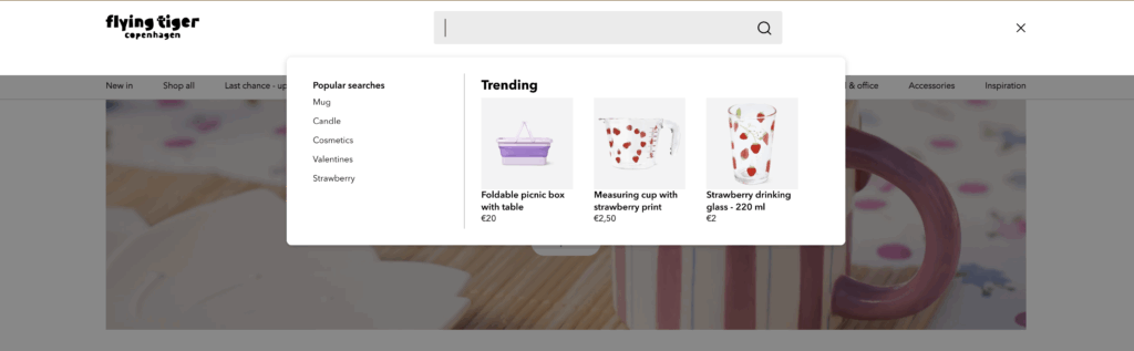
Another smart tip:show suggestions after a user clicks into the search bar, not while they’re still typing. Most people look at their keyboard when typing, so early suggestions often go unnoticed. A great example is Flying Tiger. Their search bar immediately displays popular searches and relevant products right after being clicked.
Galaxus is another strong example, they provide an extensive set of filters, from basic categories to specific product features like “Gaming capabilities.” Adding product reviews into suggestions is another enhancement worth considering.
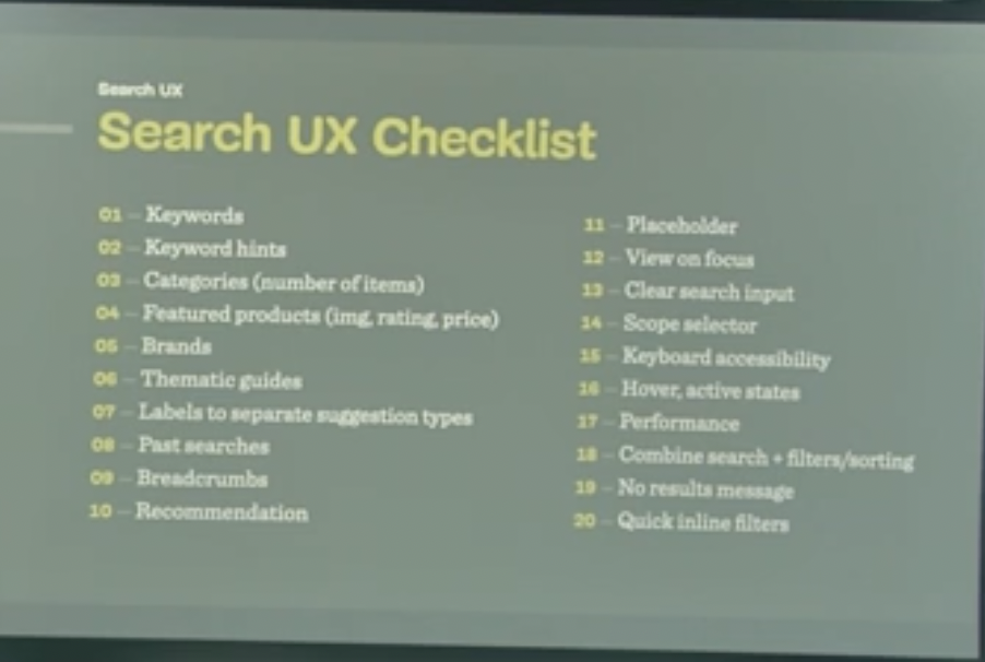
I found this topic so engaging that I looked up a video of Vitaly presenting the same theme two years ago. Much of the content was similar, but this time he wrapped up with a comprehensive Search UX Checklist with 20 things to keep in mind when designing search and a list of 75 questions (!) for UX designers to discuss with developers. I’m pretty sure developers won’t love that part, but I bet it will spark some much-needed conversations.
Overall, I was genuinely impressed by the depth and practicality of the information shared. I’ll definitely keep these principles in mind when designing the next search experience in my upcoming projects.