Proseminar Master’s Thesis – Benjamin Pohler

Sprachverständlichkeit im Broadcast:
Masterarbeit von Elias Thomas Weißenrieder (HdM Stuttgart, 2024)

Arbeit (https://curdt.home.hdm-stuttgart.de/PDF/Weissenrieder.pdf)

Theoretische Ausarbeitung eines Programmtools zur Sprachverständlichkeitsanalyse von Sprachsignal-Audiodateien aus dem Broadcastumfeld
Elias Thomas Weißenrieder, Master of Engineering, Hochschule der Medien Stuttgart, Studiengang: Audiovisuelle Medien.

Warum für mich interessant

Sprachverständlichkeit ist im TV-Broadcast eines der wichtigsten Forschungsfelder überhaupt. Die Arbeit entwickelt theoretisch, aber praxisnah ein Programmkonzept zur automatisierten Verständlichkeitsanalyse und prüft dafür etablierte Verfahren gegeneinander. Fokus: Was taugt im echten Broadcast-Use Case? Dazu gehören ein Versuch mit Hörtest und die Ableitung einer GUI/Workflow-Skizze für ein späteres Tool.

Abbildung: GUI Skizze

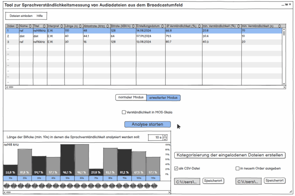
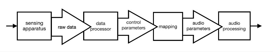
Abbildung: GUI Skizze vom entwickelten Tool

Werkstück/Dokumentation

Es gibt kein ausgeliefertes Tool, aber klar dokumentierte Bausteine: Auswahl und Implementierungswege (Python Code) für akustische Metriken der Sprachverständlichkeitsmessung STOI, PESQ und NISQA, ein Hörversuch zur Validierung, Skizzen der Oberfläche, Blockschaltbilder zweier Varianten (intrusiv mit Referenz vs. non-intrusiv), plus Nutzerinterview mit einem Broadcast-Toningenieur (13 Jahre Praxis).
Die Versuchsdaten sind typisch Broadcast: Kommentar Beyerdynamic DT797 PV über RIEDEL CCP-1116, Atmo mit SCHOEPS ORTF-3D (8 Kanäle). Aufzeichnung u. a. mit Reaper und RME MADIface USB, Routing „Direct Out“ aus LAWO; spätere Bearbeitung/Export u. a. in Nuendo 12, Loudness auf −23 LUFS normiert. Das “Werkstück” ist somit eine simulierte Stadionatmosphäre “in the Box” nachgestellt.

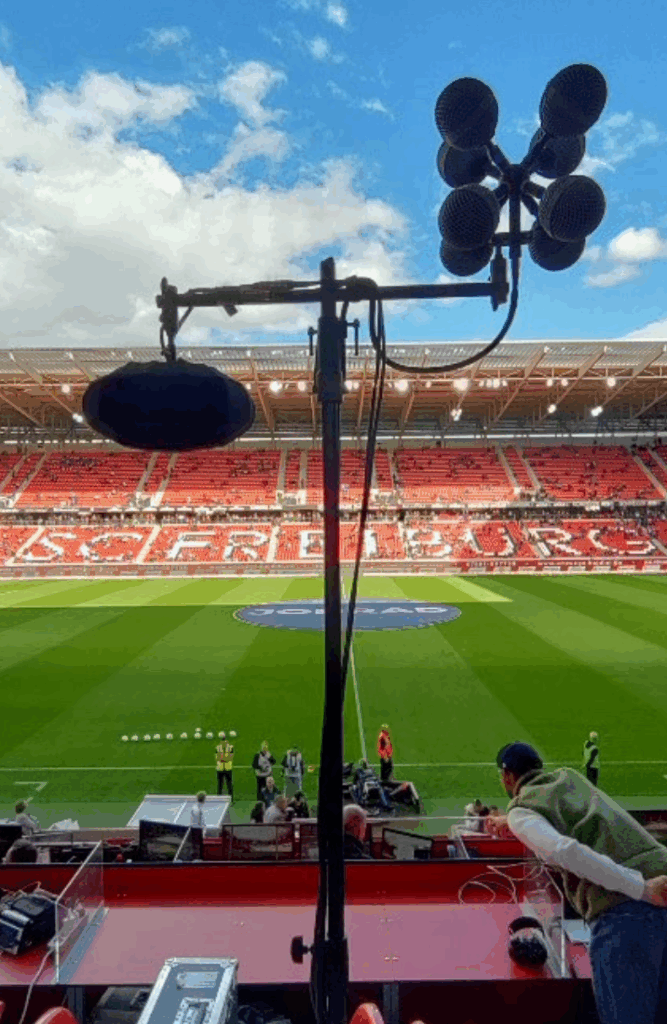
Abbildung: Aufbau eines ORTF 3D


1. Gestaltungshöhe

Die gestalterische Leistung liegt hier im Design eines belastbaren Mess-Workflows statt in Klangkunst. Sound Design Aspekte fanden hier dennoch seinen Platz für die Simulation für den Hörversuch. Positiv hervorzuheben ist: sauberer Use Case (Live-Kommentar im Stadion), realistische Testsignale, und eine Oberfläche, die Durchschnitts- und Worst-Block-Werte ausweist (für den schnellen Check und den gezielten Drill-down). Das ist genau der Blick, den man in der Sendezentrale braucht. Ein ästhetisches Sound-Narrativ schlüssig.

2. Innovationsgrad, Neuigkeitswert und Beitrag

Nicht neu ist, dass man die Metriken STOI/PESQ/NISQA kennt, neu ist die konsequente Einbettung in Broadcast-Praxis inkl. Hörtest-Abgleich und GUI-Konsequenzen für die Programmierung (Blockgrößen, Sortierung, Ergebnisdarstellung). Das ist ein relevanter, kleiner Schritt Richtung operationalisierbares Tool. In der Zukunft wäre eine offene Referenz-Datenbank (Audio + Ground Truth) nötig, aber für eine Masterarbeit ist der gewählte Umfang und Scope realistisch und umfangreich genug.

3. Selbstständigkeit und Eigenleistung

Die Arbeit zeigt eigenständige Entscheidungen: Versuchsdesign (auch wenn es hier Kritikpunkte von mir gibt, da ein ITU-genormtes Design nicht einghalten wurde), Auswahl und Implementierungspfade der Algorithmen, Norm-Lautheit, Testsignal-Kuratorik (z. B. keine Eigennamen, um Bias zu vermeiden). Auch das Nutzerinterview ist selbst erhoben und floss in die GUI-Anforderungen ein (z. B. einfache Tabellen-View, blockweise Detailansicht).

4. Gliederung und Struktur, Logik und Nachvollziehbarkeit

Wießenrieder hält sich klar: Grundlagen, Vergleich, Versuch, Tool-Konzept, Hypothesen-Check und alles mündet in einem Fazit mit Implementierungsvorschlag. Es kann schnell herausgefunden werden, was wo begründet ist. Für meinen Geschmack könnte der Methoden-Teil teils kompakter sein, dafür glänzen die Blockschaltbilder und die GUI-Skizzen als Orientierungsanker.

5. Kommunikationsgrad, Verständlichkeit, Ausdruck und Darstellungsweise

Die Sprache ist sachlich, gut lesbar. Wichtig für mich war Einordnung und Konsequenz, dies wird durchgezogen (z. B. MOS-Skala für Hörtest, Mapping der Verfahren). Was ich mir als Leser wünschen würde: Audio-Beispiele/QR-Links und 1-2 Plots (z. B. Block-STOI über Zeit), um die Argumente des Autors der Masterarbeit hör- und sichtbar zu machen.

6. Umfang und Angemessenheit

Umfang passt zum Ziel einer theoretische Ausarbeitung und Validierung auf einen Datensatz. Der Hörtest ist okay skaliert (MOS-Skala definiert aber abgewandelt, Setup beschrieben), Hörversuch hat zu wenig Teilnehmer, ist okay für eine Masterarbeit, limitiert aber die Generalisierbarkeit bzw. kann sich negativ auf die statistische Auswertung auswirken.

7. Orthographie, Sorgfalt & Genauigkeit, Formale Präzision

Formal sauber, konsistente Terminologie, klare Verweise. Die Lautheits-Normierung (-23dB LUFS), die Samplerate-Grenzen (PESQ-Limit bei 16 kHz) und der Export-Workflow sind präzise dokumentiert. Pluspunkt für Reproduzierbarkeit. Ein vollständiger Tech-Appendix (Kanal-Matrizen, Skript-Versionen, REAPER Session) wären vorteilhaft gewesen.

8. Literatur, Qualität, Relevanz, Vollständigkeit

Die Kernverfahren (STOI, PESQ, POLQA, NISQA, STI/SII, etc.) sind eingeführt und sinnvoll verortet. Für ein produktives Tool bräuchte es perspektivisch mehr Breite bei Non-Intrusive Methoden und Domain-Spezifika (z. B. codec-spezifische Fehlerbilder im TV-Chain). Für die gewählte Fragestellung reicht diese Auswahl aber mehr als genug aus. Alle die schonmal mit der Messung solcher akustischen Metriken arbeiteten wissen, wie aufwändig dies ist auszuwerten und zu einem Hörversuch zusammenzuschüren.

Ergebnisdiskussion und Kernresultate

Im direkten Abgleich mit dem Hörtest schneidet STOI am besten ab. PESQ liegt spürbar dahinter, NISQA weicht am stärksten ab. Unter anderem weil das Modell in diesem Setup sogar das Referenzsignal zu schlecht bewertet und dadurch die Skalierung kippt. Für Live-Kommentar und Stadion-Atmo ist STOI daher die naheliegende Wahl: Das Maß reagiert robust auf maskierende Umgebungsgeräusche; PESQ misst eher allgemeine Qualität als Verständlichkeit.

Für die Bedienung würde ich für meinen Geschmack und für die Übersichtlichkeit so aufziehen: Balkendiagramm für den schnellen Vergleich mehrerer Dateien, dazu eine Tabelle mit Gesamtwert und dem schwächsten Zeitfenster inkl. Position, für die Detailprüfung eine zeitliche Fensterung mit Wellenform. Das ist im Sendebetrieb schnell lesbar und spart Zeit.

Das Test-Setup spiegelt reale TV-Bedingungen (Headset, ORTF-3D-Atmo, -23dB LUFS, LAWO-Kette). Die Ergebnisse sind damit gut auf ähnliche Livesituationen übertragbar. Grenzen sehe ich bei anderen Störprofilen und immersiven Ausspielungen. Nächste Schritte wären für mich: nicht-intrusive Modelle gezielt mit Broadcast-Daten nachtrainieren und kanal/stem-getrennte Auswertungen prüfen, um Maskierung in komplexeren Mischungen besser zu sehen.


Stärken/Schwächen der Masterarbeit

Die Stärke von Weißenrieders Masterarbeit liegt in der praktischen Umsetzung: getestet wird mit echten Broadcast-Signalen (Kommentar gegen Stadion-Atmo), nicht mit Labor-Pink-Noise. Der Weg von Versuch zu Entscheidung ist stringent: Hörtest und Algorithmusvergleich führen nachvollziehbar zu STOI als Leitgröße, daraus folgen klare UI-/Prozess-Konsequenzen (Schnellübersicht, schwächstes Zeitfenster mit Positionsangabe, einfache Sortierung). Der Nutzerfokus wirkt echt und sendetauglich.

Schwachstellen gibt es trotzdem: Die Hörtest-Stichprobe ist offenbar klein, und das dominierende Szenario (Fußball + Kommentar) lässt offen, wie stabil die Befunde in ruhigeren Formaten wären. Die ITU Norm für den MOS Hörversuch wurde modifiziert, was die Auswertbarkeit so nicht schlüssig macht. Hörbeispiele oder Zeitverlaufs-Plots hätten die Argumente zusätzlich tragfähig gemacht.

Für meine Praxis nehme ich mit: STOI als Default, aber blockweise auswerten (nicht nur Mittelwerte). Ablauf zuerst denken: Tabelle mit Gesamt- und Minimumwert, Balkenvergleich über Files, dazu eine einfache Timeline mit Wellenform. Und Daten wie on-air kuratieren (-23dB LUFS, Headsets, reale Atmo). Perspektivisch lohnt sich der Blick auf Immersive/Stem-basierte Auswertung.
Fazit: eine fokussierte, praxistaugliche Arbeit mit echtem Mehrwert für den Sendebetrieb.

Critical Review: “Sound response to physicality – Artistic expressions of movement sonification” by Aleksandra Joanna Słyż (Royal College of Music, 2022)

by Verena Schneider, CMS24 Sound Design Master 

The master thesis “Sound Response to Physicality: Artistic Expressions of Movement Sonification” was written by Aleksandra Joanna Słyż in 2022 at the Royal College of Music in Stockholm (Kungliga Musikhögskolan; Stockholm, Sweden).

Introduction

I chose Aleksandra Słyż’s master thesis because her topic immediately resonated with my own research interests. In my master project I am working with the x-IMU3 motion sensor to track surf movements and transform them into sound for a surf documentary.
During my research process, the question of how to sonify movement data became central, and Słyż’s work gave me valuable insights into which parameters can be used and how the translation from sensor to sound can be conceptually designed.

Her thesis, Sound response to physicality, focuses on the artistic and perceptual dimensions of movement sonification. Through her work Hypercycle, she explores how body motion can control and generate sound in real time, using IMU sensors and multichannel sound design. I found many of her references—such as John McCarthy and Peter Wright’s Technology as Experience—highly relevant for my own thesis.

Gestaltungshöhe – Artistic Quality and Level of Presentation

Słyż’s thesis presents a high level of artistic and conceptual quality. The final piece, Hypercycle, is a technically complex and interdisciplinary installation that connects sound, body, and space. The artistic idea of turning the body into a musical instrument is powerful, and she reflects deeply on the relation between motion, perception, and emotion.

Visually, the documentation of her work is clear and professional, though I personally wished for a more detailed sonic description. The sound material she used is mainly synthesized tones—technically functional, but artistically minimal. As a sound designer, I would have enjoyed a stronger exploration of timbre and spatial movement as expressive parameters.

Innovationsgrad – Innovation and Contribution to the Field

Using motion sensors for artistic sonification is not entirely new, yet her combination of IMU data, embodied interaction, and multichannel audio gives the project a strong contemporary relevance. What I found innovative was how she conceptualized direct and indirect interaction—how spectators experience interactivity even when they don’t control the sound themselves.

However, from a technical point of view, the work could have been more transparent. I was missing a detailed explanation of how exactly she mapped sensor data to sound parameters. This part felt underdeveloped, and I see potential for future work to document such artistic systems more precisely.

Selbstständigkeit – Independence and Original Contribution

Her thesis clearly shows independence and artistic maturity. She worked across disciplines—combining psychology, music technology, and perception studies—and reflected on her process critically. I especially appreciated that she didn’t limit herself to the technical side but also integrated a psychological and experiential perspective.

As someone also working with sensor-based sound, I can see how much self-direction and experimentation this project required. The depth of reflection makes the work feel authentic and personal.

Gliederung und Struktur – Structure and Coherence

The structure of the thesis is logical and easy to follow. Each chapter begins with a quote that opens the topic in a poetic way, which I found very effective. She starts by explaining the theoretical background, then moves toward the technical discussion of IMU sensors, and finally connects everything to her artistic practice.

Her explanations are written in clear English, and she carefully defines all important terms such as sonificationproprioception, and biofeedback. Even readers with only basic sound design knowledge can follow her reasoning.

Kommunikationsgrad – Communication and Expression

The communication of her ideas is well-balanced between academic precision and personal reflection. I like that she uses a human-centered language, often describing how the performer or spectator might feel within the interactive system.

Still, the technical documentation of the sonification process could be more concrete. She briefly shows a Max/MSP patch, but I would have loved to understand more precisely how the data flow—from IMU to sound—was built. For future readers and practitioners, such details would be extremely valuable.

Umfang – Scope and Depth

The length of the thesis (around 50 pages) feels appropriate for the topic. She covers a wide range of areas: from sensor technology and perception theory to exhibition practice and performance philosophy.
At the same time, I had the impression that she decided to keep the technical parts lighter, focusing more on conceptual reflection. For me, this makes the thesis stronger as an artistic reflection, but weaker as a sound design manual.

Orthography, Accuracy, and Formal Care

The thesis is very carefully written and proofread. References are consistent, and the terminology is accurate. She integrates both scientific and artistic citations, which gives the text a professional academic tone.
The layout is clear, and the visual elements (diagrams, performance photos) are well placed.

Literature – Quality and Relevance

The literature selection is one of the strongest aspects of this work. She cites both technical and philosophical sources—from G. Kramer’s Sonification Report to McCarthy & Wright’s Technology as Experience and Tanaka & Donnarumma’s The Body as Musical Instrument.
For me personally, her bibliography became a guide for my own research. I found new readings that I will also include in my master thesis.

Final Assessment – Strengths, Weaknesses, and Personal Reflection

Overall, Sound response to physicality is a well-balanced, thoughtful, and inspiring thesis that connects technology, perception, and art.
Her biggest strength lies in how she translates complex sensor-based interactions into human experience and emotional resonance. The way she conceptualizes embodied interaction and indirect interactivity is meaningful and poetic.

The main weakness, in my opinion, is the lack of detailed technical documentation—especially regarding how the IMU data was mapped to sound and multichannel output. As someone building my own sonification system with the x-IMU3 and contact microphones, I would have loved to see the exact data chain from sensor to audio.

Despite that, her work inspired me profoundly. It reminded me that the psychological and experiential dimensions of sound are just as important as the data itself. In my own project, where I sonify the movement of a surfboard and the feeling of the ocean, I will carry this understanding forward: that sonification is not only about data translation but about shaping human experience through sound.

Final Prototype: An Interactive Projection Experience

I’m thrilled to share that I’ve completed my final prototype! The journey wasn’t without its challenges, especially when connecting my laptop to the projector, but I managed to get everything up and running in the end.

For this prototype, I utilized Zig Sim, Max and Resolume Arena to create an interactive layer. The key feature is that the projection changes color based on the movement of the projector. When you move the projector, the image shifts from full color to black and white, emphasizing the theme of perspective.

My aim was to not only enhances the visual experience but also invites viewers to interact with the projection in a unique way.

I won’t lie, I wasn’t sure if I could implement what I had created in my head. However I’m even more excited to see how this concept evolves.

Exploring Projection

I finally got a mini beamer and tested it for the first time. Until now, I had been working mainly with candlelight and flashlights to project my cut-out patterns, but having a proper projector opened up an entirely new range of possibilities.

The test went surprisingly well. The beamer worked smoothly, and I was able to project both my digital Illustrator pattern and the physical stencils I had created. What struck me immediately was how powerful the combination of the two approaches can be. The crispness of the digital projection layered with the soft, imperfect shadows from the cut-out patterns created a unique visual depth. At times the two aligned to reinforce one another, while in other moments they clashed, resulting in distortions and unexpected visual tensions.

Seeing the religious symbols I had cropped, resized, and transformed behave in this hybrid space was fascinating. Some appeared monumental when enlarged across the cube’s surface, while others dissolved almost completely into abstraction. This play between clarity and fragmentation ties directly back to my concept of questioning authority and representation in the visual language of the Church.

Overall, this first experiment confirmed that working with both analog and digital projection is a promising direction. The interaction of light, shadow, and symbol not only adds complexity but also reinforces the idea that meaning is never fixed—it shifts depending on context, scale, and perspective.

My next step will be to bring in ZIG SIM to explore the interactive dimension. By integrating sensor-based input, I want to see how projection can dynamically respond to movement or touch. The goal is to eventually merge all three elements—the beamer, the stencil projections, and interactivity—into one cohesive experiment.

Exploring Symbols: From Research to Projection

In my latest step, I started to look more closely at the symbols I associate with the Church and Christianity. I didn’t want to only rely on my personal impressions, so I also did some research on Christian iconography. Very quickly, I came across recurring motifs: the cross, a particular style of fish representation, the Alpha and Omega, the dove, and, of course, the candle. These are all powerful, recognizable elements that carry centuries of meaning and interpretation.

I decided to collect these symbols and transform them into a pattern in Illustrator. Instead of keeping them whole and perfectly visible, I chose to crop them in different ways. This meant that some parts of the pattern are cut off, others are enlarged, and some are reduced to fragments. My idea behind this was to create a visual language where not everything is always visible in its entirety. Sometimes the symbols appear distorted, sometimes they seem larger or smaller than expected. This connects to my concept of questioning clarity and authority in religious representation—how symbols are never neutral, but always shaped by context and perception.

While working with the pattern, I also experimented with its size. At first, the motifs were too large, which limited the effect I was aiming for. By reducing them, I was able to create a denser composition that worked better both visually and conceptually.

After finishing the pattern, I cut it out and began experimenting by projecting it onto my cardboard cube. I was curious to see how the cropped symbols would behave on a three-dimensional surface, and what kinds of distortions or new combinations would emerge as the light wrapped around the edges of the cube. Already, the results were interesting: the fragments became more abstract, sometimes unrecognizable, and at other times they gained a new intensity by being enlarged or stretched.

The next step will be to introduce another layer to this experiment. I decided to get a mini-beamer in order to project not just with candlelight or flashlight, but also digitally. This way, I can explore the combination of analog cut-out patterns with digital projections. For example, I could project the Illustrator pattern directly, or use an image, and layer that with the shadows created by the physical stencil. I am especially curious to see how the two techniques interact—whether they will reinforce each other or create unexpected contradictions.

Creating an effective & beautiful data visualisation from scratch

It is amazing to me personally that this talk was almost entirely about introducing one of the most underrated coding language in data viz, D3.js, which is a lang that should be a staple in every team that wants to create bespoke charts and design beautiful yet functional dashboards from scratch and proudly enough my master’s thesis main topic is about a SaaS that has a dashboard that was created entirely by the unpopular D3.js.
I was involved in designing all the components needed for the dashboard which is called “Steering” and also in the appropriate research to find out how to develop those components on a web app level which is was done later by a fellow full stack developer.

Design Patterns for Search UX in 2025

One of the main reflections that I took from this talk is the fact that search UX patterns are often overlooked and misused, even in very important websites like governmental
websites or e-commerce web shops you will struggle to find what you’re looking for and the speaker emphasized something that is really important in fixing this issue which is that searching, filtering and sorting should be treated as one UX pattern both on a design and development level.

Also the notion of selective scanning which is a mental behavior that users use intentially and unintentially to scan interfaces for information relevant to them which highlights the importance of using visual hierarchy along with real usability testing to determine the right UI patterns.

From Cathedral Walls to a Simple Cardboard Cube

Some of my family members are working at St. Stephen’s Cathedral in Vienna, and recently I had a conversation with my father about my thesis idea. We started imagining what could be possible if one were to use projection mapping inside such a monumental building. Almost immediately, he pointed out the practical challenges: projecting onto the walls would be extremely difficult because they are uneven, full of textures, and far from flat. The ceilings, on the other hand, are breathtakingly high — which makes them impressive but almost impossible to reach with simple projection tools. Even though I found the idea of using the walls fascinating, I had to admit that he was right.

That realization pushed me toward a different approach. I remembered projects by MOYA (Museum of Young Art), where very simple objects were transformed through projection. Inspired by this, I decided to scale things down drastically and experiment with something that was not monumental at all, but rather small and manageable: a cardboard cube. I built one myself, placed it on my desk, and tried projecting a cross onto it.

The first test with a candle surprised me. The edges of the projection were soft, and because of the natural flickering of the flame, the cross gained a kind of living quality. It felt fragile yet atmospheric, as if the symbol was breathing. When I tried the same experiment with a flashlight, the result was quite different. The contours were sharp, the cross was perfectly visible, and I could even project across multiple surfaces of the cube without losing clarity. By moving both the light and the stencil, I was able to create more dynamics and test how the projection shifted across the cube’s surfaces. This gave me a better sense of how light interacts with 3D forms, and how movement can add emotional depth to even the simplest projection. Both versions had their own charm, and I found it interesting how much the choice of light source influences the meaning and mood.

Feeling encouraged, I got a little overconfident. I thought: if it works this well, why not take it a step further and project a video with colors and movement onto the cube? So I tried it with my phone. What can I say… it was late in the evening, and I hadn’t really thought it through. Of course, the phone does not project in a focused, directional way but emits light in all directions. The result was disappointing: in the video you can vaguely see the cross, but only if you already know what to look for.

Still, even this “failed” attempt was an important step. It showed me that not every tool is suitable for creating clear and meaningful projections, and that precision matters a lot when working with light. The candle experiment reminded me of atmosphere and symbolism, while the flashlight proved how technical clarity can support the message. The phone experiment, on the other hand, reminded me that enthusiasm sometimes needs to be balanced with patience and planning.

For my next step, I need to think about what kind of projector or light source could give me more control, and how I can combine simplicity with clarity. Even though I started small, these first tests gave me valuable insights into the relationship between light, object, and symbol — the core elements of projection mapping.

A Shift in Focus: From Risk Communication to a Critical View on the Church

During the semester, I have been in many conversations with my colleagues about our projects and thesis ideas. These exchanges are always inspiring because they reveal how different our approaches are, and at the same time, they remind me that we all struggle with similar questions: Which topic really fascinates us? What feels relevant enough to dedicate months of research and experimentation to? And how do we make sure we do not just follow a trend but instead choose something that we personally connect with?

During one specific talk in the bitki cafe, we talked about churches. Not the institution but the building itself and how the atmosphere they create fascinates people no matter if they are religious or not. Whenever I enter a church building, I am struck by its dual nature. On the one hand, churches are impressive architectural masterpieces: the high ceilings, the stained-glass windows, the play of light and shadow. On the other hand, there is also something heavy and almost intimidating about them — a reminder of history, power, and traditions that do not always align with the values of today’s society.

This tension between admiration and critique made me rethink my thesis topic. I had initially focused on risk communication, a subject that is relevant and important, especially in the face of climate change and natural disasters. But at some point, I realized that while I find risk communication meaningful, it doesn’t excite me on a personal, creative level in the same way. Choosing a thesis topic is a long journey, and as one colleague reminded me: it has to be something you truly enjoy working on, because you will spend a lot of time with it. That advice helped me to accept that it was okay to let go of my old idea and embrace a new one that feels closer to my interests and creative practice.

So here I am now, beginning a new path: exploring the church and its role in contemporary society from a critical perspective. I want to ask questions like: Is the Catholic Church still a relevant institution? Why are so many people leaving it, especially in Europe? What does the symbolism of church spaces communicate, both intentionally and unintentionally? And how can design, especially projection mapping, help to visualize these tensions, contradictions, and maybe even open new ways of reflecting on the subject?

To approach this big and somewhat abstract topic, I decided to start small. My first prototype will be a very simple experiment with light and symbolism: placing an object in front of a candle and projecting onto it. I want to see how the interplay between shadow, light, and projection can change meaning. For example, I will experiment with different setups — using a small candle, a large candle, and two candles side by side. These small variations can already create very different moods. A single, small candle may evoke fragility or intimacy, while a large candle can symbolize power and authority. Two candles could suggest dialogue, duality, or conflict.

The candle is, of course, a strong religious symbol on its own. It carries connotations of prayer, remembrance, mourning, but also of hope and celebration. By using it as the basis of my prototype, I am starting with something that is minimal but at the same time culturally loaded with meaning. My goal is to explore how visual projection can either reinforce these traditional associations or disrupt them — for example, by projecting unexpected images or patterns onto the flame or the surrounding space.

The chosen random Object:

One small candle:

One bigger candle:

Two light sources:

Projection mapping can quickly become technically complex, involving software, 3D modeling, and large-scale surfaces. But I want to remind myself that the foundation is always the relationship between light, object, and viewer. With a candle and a wall, I already have a stage to experiment on, and from there I can gradually build toward more advanced prototypes.

I also see this as a metaphor for my thesis journey: starting small, with something personal and symbolic, and then slowly expanding it into a larger critical exploration. The candle experiment may not answer my big research questions yet, but it sets the tone for how I want to work — engaging with symbols, questioning traditions, and using projection mapping as a tool not just to decorate but to provoke thought.

Following this, I plan to continue developing this idea, possibly by testing projections on different surfaces or even architectural miniatures that resemble parts of a church.

For now I am happy to have found a new direction that excites me. Talking with my colleagues helped me realize that a thesis topic doesn’t just need to be “important” in an abstract sense — it needs to feel important to me. And for me, exploring the role of the church through the lens of projection mapping feels like the right path.

From Frustration to Reflection: Lessons from Prototyping

We had a speed dating event in class, where everyone had to quickly present their prototypes to others. The idea was to share concepts in short conversations, get immediate reactions, and see how our ideas land when explained to someone new. On paper, this format sounded exciting — a chance to practice communication, to sharpen my ideas, and to get outside perspectives. In reality, it turned out to be a bit of a wake-up call for me.

In my brainstorming-phase I came up with three different prototype ideas connected to the RiskLIM project:

  1. An Interactive Risk Map, developed as a very simple low-fidelity digital prototype, where users could theoretically click on different regions to see hazard levels.
  2. A Gamified Avalanche Simulation, which I imagined as a paper prototype or even a very basic web app. The idea here was to make avalanche scenarios more tangible and playful, so that people could experiment and learn.
  3. A Minimalist Data Visualization of an avalanche warning system, which I actually managed to realize. The concept was to strip the warning message down to its essentials and communicate information in the clearest, simplest possible form.

I decided to try make prototypes of the interactive map and the data visualization.

On the surface, these sound like solid starting points. But the truth is, I never really felt comfortable with them. Already while brainstorming, I was struggling. The ideas felt forced, as if I was trying to push myself into a framework that doesn’t quite fit me. When I finally built them, the process was just as frustrating. None of the prototypes felt natural, and I couldn’t shake the sense that I was circling around a topic that doesn’t fully resonate with me.

The speed dating format only amplified that feeling. Explaining my prototypes to someone else, I noticed how hesitant I was in my own words. My conversation partner — and this was the most telling part — also didn’t really understand the RiskLIM project. And at that moment, I realized: maybe I don’t understand it deeply enough either. If I can’t explain it in a clear, simple way through my prototypes, then maybe I’m missing the essence of what the project is really about.

That was a difficult realization. There’s a kind of despair that comes with working hard on something and still feeling like you’re not moving forward. After the event, I had to admit to myself that I’m back at the beginning again, standing at zero. That’s not an easy place to be, especially when you want to make progress and see results.

But after sitting with that frustration for a while, I started to think differently. Maybe being “back at zero” isn’t necessarily a failure. Maybe it’s an invitation to rethink. The fact that my prototypes didn’t quite land might just mean I need to dig deeper into the project, or maybe even allow myself to shift direction to something that connects more strongly with my own interests.

For now, what I take away from this exercise is that communication is just as important as the design itself. If I can’t explain what my prototype does, then maybe the design isn’t working — or maybe the foundation of my concept isn’t strong enough yet. Either way, the speed dating event forced me to confront that gap. And as uncomfortable as that was, it might be the most valuable lesson of all.

So yes, I feel like I’m starting from scratch again. But maybe that’s okay. Sometimes you need to break things down before you can build them up stronger.