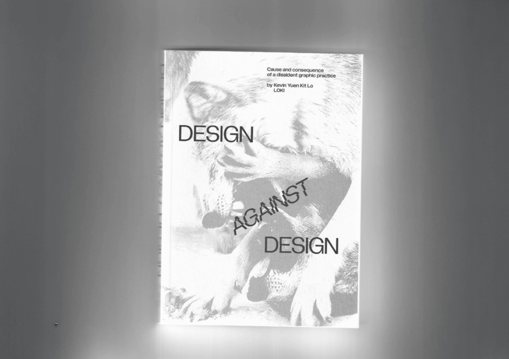
I recently read the book Design Against Design by Kevin Yuen Kit Lo. It was a really good read and I learned a lot about design and the power it holds. Tho a lot of points made are obvious, most of the time we Designers dont think about them that much. Its important to hear them again and again to remember what power design holds.
In the book, Lo writes about how graphic design often ends up reinforcing the very system it claims to critique. He writes about the tension between wanting to work in solidarity with social movements while operating within an industry built on commodification. The designer, he says, has to confront the reality that every aesthetic choice sits inside a political and economic structure. True resistance is less about producing “radical-looking” visuals and more about participating in relationships, communities, and struggles that exist outside of commercial design. For him, design becomes meaningful only when it serves collective goals rather than brand visibility or personal authorship.
After finishing the book and thinking about topics for my thesis I sat down again and tried to distill my key learnings from the book. Here are six points I found to be very helpful for myself.
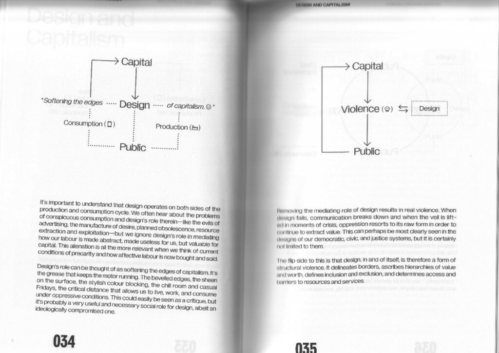
Design is never neutral
Lo insists that graphic design always takes a position because it mediates language, visibility, and voice, even when it claims to be “just” functional.
“Socially engaged” work is structurally constrained
The book shows how client relationships, funding models, and institutional contexts limit how radical a design practice can be, even when it works with progressive causes.
Dissident practice is about relationships, not just aesthetics
Lo frames dissident graphic practice as a way of working with movements over time: building trust, sharing risks, and recognizing the designer as one collaborator among many rather than a neutral expert.
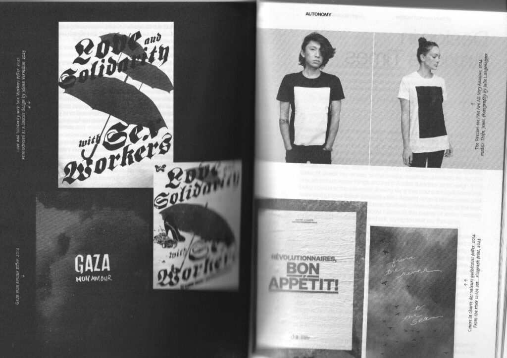
Materiality and production matter politically
The book links politics to the material conditions of design: how things are printed, circulated, and produced, and how those choices intersect with labor, scarcity, and access.
Autonomy is partial and negotiated
Lo is critical of romantic ideas of the fully autonomous radical designer; instead, he describes autonomy as something limited, negotiated inside real economic and institutional constraints.
Formal experimentation can be tied to struggle
The book connects typographic and layout experimentation to political and emotional conditions: dissonance, urgency, refusal, solidarity, and care.
Relation to web design practice
As Im very much into web design and as it looks right now – this will also be the outline topic for my thesis, I wanted to connect these learnings, coming mainly from a graphic design stand point, to web design.
Design Against Design encourages treating the website not just as an interface but as an arena where power, labor, and community are negotiated through form. It invites designers to question supposedly “standard” patterns—dark patterns, extractive tracking, engagement‑at‑all‑costs—and to explore dissident alternatives that foreground accessibility, mutual aid, and situated narratives, even when that means resisting established best practices or business metrics.
Lo, K.Y.K. (2024) Design against design: cause and consequence of a dissident graphic practice. Eindhoven: Set Margins.
AI was used to check spelling and grammar and better clarity.
Für meinen fünften Impuls, habe ich mir gedacht, gebe ich mir nochmal einen der geilsten Filme aller Zeiten und achte dabei speziell darauf wie er geleuchtet ist – und wie ihr dem Titel unschwer entnehmen könnt, ist das Fight Club. Bevor ich in die einzelne Analyse von – für mich – essenziellen Shots geht, möchte ich aber noch ein paar generelle Gedanken loswerden.
Überblick
Für mich war Fight Club immer schon einer der geilsten Filme aller Zeiten, auf Dinge wie Shotgrößen, Lichtsetzung oder Blocking hätte ich aber früher, wo ich den Film zum ersten Mal sah, nie geachtet. Umso überraschender fand ich deshalb, dass der Film in meinen Augen einen relativ simplen Eindruck gemacht hat – zumindest denke ich das – wohlwissend, dass in jeden dieser Frames stundenlange Überlegungen geflossen sind. Grundsätzlich finde ich nämlich, dass wirklich übertrieben plastisches Ausleuchten, das eine guten dreidimensionalen Effekt erschafft, nur sehr selten angwendet wurde. Gefühlt wurde 90 Prozent des Films mit einem einzigen Licht (ich rede jetzt von den Personen, nicht vom Hintergrund oder Practicals) geleuchtet und dabei eigentlich stets versucht diese eine Lichtquelle maximal im Frame zu motivieren. Denn auffällig ist: In jeder einzelnen Einstellung ist irgendwo ein Practical oder zumindest dessen Andeutung zu sehen, das für jeden Shot sofort definiert, woher das Licht natürlicherweise kommen muss. Mir ist schon klar, dass in das Suchen der genauen Einstellung und in das Platzieren des Practicals unfassbar viel Zeit geflossen ist, aber gefühlt ist genau darin die ganze Arbeit gelegen, weil man dann nur noch dieses Licht mit einer einzigen Lampe enhanced hat. Das hat mir auch gezeigt, dass es eigentlich nicht wichtig ist, jeden Shot nach Schema F zu leuchten, und zu versuchen in jeder Einstellung die maximale Tiefe rauszuholen. Wenns finster is, dann is halt einfach finster, und fertig. Dann gibt´s kein Fill, dann gibt´s kein Backlight, kein Hairlight, nichts. Weil in der Einstellung halt einfach nichts zu sehen ist, was irgendwie rechtfertigen würde, dass da jetzt von hinten Licht kommt. Das ist wahrscheinlich mein größtes Learning aus dieser Analyse. Nun aber zu einer Auswahl von Frames, die ich sehr spannend fand und warum. Außerdem werde ich versuchen mit meinem bisherigen Wissen ungefähr einzuschätzen wie sie das genau gemacht haben. Also viel Spaß.
Einzelne Frames
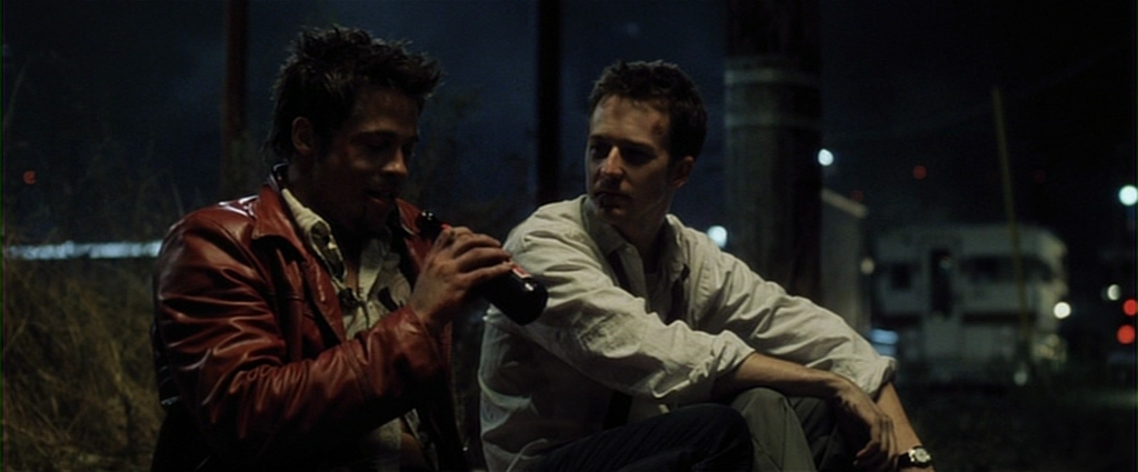
Die Bar Szene – ein klassisches Schema F Dreipunktlicht
Diese Szene ist für mich eine der wenigen, die wirklich ganz klar nach Schema F abläuft: Die beiden Charaktere sind sitzend gegenüber platziert, bewegen sich also nicht viel und laufen daher nicht Gefahr sich aus dem Licht zu bewegen. Außerdem bietet eine Bar mit all ihrer Umgebung genug Potenzial, damit theoretisch und logisch Licht aus allen Richtungen kommen kann, genau das wurde genutzt. Grundsätzlich wurde einmal klassisch die Fill Seite der Kamera zugewandt, um mehr Hell-Dunkel-Kontraste innerhalb des Gesichts zu ermöglichen. Dann hat man mit der fetten Lampe über dem Billard Tisch eine super Motivation für das Key light gegeben, und diese dann genutzt. Vom Winkel her würde ich sagen handelt es sich dabei um ein Side light, also in etwa im rechten Winkel zur Augenlinie des Schauspielers, da wirklich kaum Licht auf die dunkle Seite fällt. Das ist in sofern gut, weil das (denke ich) der maximale Winkel ist, unter dem die Motivation vom Practical dahinter noch glaubhaft ist. Würde wirklich das Practical leuchten, wäre ja maximal die Wange davon betroffen, nie aber die Nase. Hätte man das Key also klassisch im 40-50 Grad Winkel für ein Rembrandt Dreieck links im Gesicht aufgestellt, würde man es glaube ich nicht mehr abkaufen. Zusätzlich bleibt die dunkle Seite so natürlich noch dramatischer. Immerhin ist in der Szene kurz zuvor die Wohnung des Protagonisten explodiert und er ist obdachlos. Diesen Kontrast haben sie mit dem Fill light noch verstärkt, denn, soweit ich das beurteilen kann, gibt es keines. Ich würde sogar eher tippen, dass sie mit neg gearbeitet haben um die Seite wirklich so dunkel zu bekommen. Und um den Charakter noch maximal vom Hintergrund abzuheben und ihm eine weitere Abwechslung zwischen hell und dunkel zu geben, wurde dann natürlich noch die Chance genutzt ein Backlight/Hairlight einzubauen, das hauptsächlich seine Schulter trifft. Ich denke nicht, dass die Idee hier war, dass dieses vom roten Schild hinter ihm kommt, da dafür die Farbtemperatur zu anders ist, sondern dass sie einfach das grundsätzliche Setting in einer großen Bar genutzt haben, um es glaubwürdig erscheinen zu lassen. Immerhin sieht man den Bereich hinter ihm nie, und es könnte ja genauso gut sein, dass dort ein weiterer Billardtisch oder whatever steht.
Grundsätzlich finde ich diesen Frame also unglaublich und als einen der besten im Film, gerade weil die Kontrastserie auch im Hintergrund weitergeht. Links von ihm hat man das rote Neonlicht, das wieder eine Abwechslung zwischen hell und dunkel ist, rechts ein weiteres Schild, und einen recht kleinen Beam auf die linke blaue Tür, ich denke das soll ein Autoscheinwerfer oder ähnliches sein, ist aber auch scheißegal, es gibt mehr Kontrast und funktioniert daher.
Telefonzelle innen – auch Dreipunkt aber anders
Auch spannend fand ich diese Szene in der Telefonzelle. Grundsätzlich einmal zu ihm: Wie in einer Telefonzelle eben üblich, ist diese mit einer Lampe an der Decke erleuchtet. Auch wenn man die Lampe selbst nicht im Bild sieht, ist das finde ich die intuitivste und logischste Art, wo sich natürlicherweise eine Lampe in einer Telefonzelle befinden würde. Das wurde auch gleich genutzt um ein Toplight aus dieser Richtung zu installieren, gefühlt aber nicht direkt über ihm, sondern einen ticken hinter ihm, so dass sein vorgebeugter Kopf schon reicht um Schatten auf sein Gesicht zu werfen aber gleichzeitig die seitlichen Haare noch mitzunehmen. Dafür, dass das restliche Gesicht dann nicht einfach dunkel bleibt, gibt es grundsätzlich keinen Grund, da die Telefonzelle aber aus Glas ist spricht aber gleich wenig dagegen. Daher wurde für die rechte Hälfte wieder ein sehr seitlichen Key installiert, das ihm maximalen Kontrast und wie zuvor eine hohe ratio innerhalb des Gesichts gibt. Im Hintergrund wurden natürlich genialerweise genau diese Neonlampen oder was das sind, mitrein geframed, so dass sich auf natürliche Art und Weise unfassbar viele Kontrastbereiche ergeben, ohne dass es geleuchtet wirkt.
Der erste Kampf – weniger ist mehr
Um mit den einzelnen Frames jetzt auch endlich mal das zu beweisen, was ich im Vorspann angesprochen habe, möchte ich noch zwei Frames zeigen, die genau so minimalistisch geleuchtet sind. Den Anfang macht dieser erste Kampf, am Parkplatz hinter der Bar. Im Grunde ist schon die Straßenlampe im Hintergrund der einzige Grund warum das Bild nicht einfach komplett schwarz ist. Ob diese wirklich den Frame ausleuchtet traue ich mich irgendwie nicht zu sagen. Grundsätzlich heißt es ja, ein practical leuchtet mal sowieso nie wirklich, und dient immer nur der Motivation. Sieht man sich den Lichtkegel am Asphalt an, und dass ja auch die Windschutzscheibe der ersten Autos hinten getroffen wird, denke ich mir, dass die Softbox, die das ausleuchte könnte, eigentlich vom Winkel her im Frame zu sehen sein müsste, also muss es die Straßenlampe sein, gerade wenn man auf die Schatten der beiden schaut und wohin diese fallen. Auf der anderen Seite wiederum finde ich, macht es dann keinen Sinn, dass das Gebäude hinten mit der Garage von garkeinem Licht getroffen wird, vielleicht war der Kran mit dem Licht also wirklich nur Millimeter außerhalb des Frames. So oder so, fast die gesamte Szene wird im Grunde von diesem einen Licht geleuchtet, sei es nun die echte Straßenlampe oder nicht. Alles, außer die beiden Actors. Denn – ich nehme mal an – sonst wären die einfach zu finster und kaum zu erkennen gewesen. Deshalb – und das sieht man auf dem Stillframe nur ansatzweise, wird direkt links davon ein weiteres practical eingeführt, ich glaube es war ein Neonschild oder ein 24 Shop oder so irgendwas, aus dem eben Licht strömt. So bekommt die rote Jacke von Tyler Durden dann eben diese Kontur von links und auch das weiße Hemd poppt so aus der Hose. Gefühlt wurde diese Quelle aber nach unten hin geflagged, oder mit barn doors begrenzt, da erstens die Hosen viel weniger Konturen zeigen und ganz grundsätzlich auch keine Schatten aus dieser Richtung fallen, das Licht dürfte also relativ tief am Boden gewesen sein, und dann horizontal, oder vielleicht sogar etwas nach oben gerichtet, die beiden Schauspieler konturiert haben. Das wars dann aber auch schon, zwei Lichter, mehr nicht, und mehr kann auch nicht sein, immerhin ist es stockfinster. Im Hintergrund wird dann natürlich noch mit ein paar weiteren Lampen an Häusern versucht etwas mehr Kontrast zu erzeugen, das ist aber sehr basic würde ich sagen.
Heimweg von der Bar – weniger geht nicht
Und falls zwei Lichter noch immer als “eh aufwändig geleuchtet” durchgehen, möchte ich als letzten noch diesen Stillframe analysieren. In der Szene sind die beiden eben von ihrem Kampf nach Hause gegangen und setzen sich noch kurz unter einer Straßenlaterne hin – und genau diese motiviert auch das für mich einzig ersichtliche Licht in diesem Shot. Denn wenn ich nicht ganz blöd bin, ist das einfach ein C-Stand mit einer Lantern als Toplight über den beiden, die die Straßenlampe simulieren soll, und Abfahrt. Mehr kann ich eigentlich nicht erkennen. Die Lantern sitzt zwischen den beiden und gefühlt etwas vor ihren Körpern, sodass auch die Nase von Tyler noch im Radius ist und fertig. Noch ein paar Häuser mit anderen Lampen im Background und et voila. Am allerspannendsten find ich dabei eigentlich sogar die silberne Stange links hinter Tyler, die bedeutend mehr Licht reflektiert als der Rest und deshalb glaube ich absichtlich dort platziert worden ist, um der schwarzen Nacht im Hintergrund irgendwie logisch eine helle Abwechslung zu gönnen.
Fazit
Ich habe keine Ahnung wieviel von dem was ich da analysiert habe auch wirklich so gemacht wurde und falls ja, ob aus den von mir erwähnten Gründen. Das wird dann vermutlich die Praxis in Zukunft zeigen, wenn ich vielleicht irgendwann versuche gewisse Shots nachzubauen und dabei draufkomme, dass das was ich mir da überlegt habe, ja mal überhaupt nicht ausschaut wie im Film. So oder so, fand ich das Experiment aber exrem aufschlussreich und es wird definitiv noch mehrere davon in meinen Impulsen geben – dann auch von Horrorfilmen.
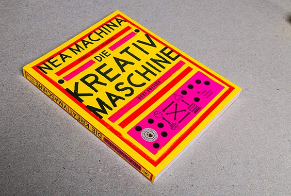
Two weeks ago, we had a class with Konrad Baumann where he brought some of his books. This big yellow book caught called “Nea Machina. Die Kreativmaschine” caught my attention. At this time, the idea for my Master’s Thesis slowly starting to grow, focusing on creativity. So, I was very curious about what the “Kreativmaschine” could be.
The book is a work of Thomas and Martin Poschauko, two multidisciplinary creative professionals whose work goes from fine art, design, creativity research and academic teaching. It is based on an experiment they did: They wanted to see how many different art pieces they could create within four months. The core constraint or template was that each art piece had to be a portrait with the title “Nea Machina”. In those four months they created 1000 different variants. The book showcases the results of the experiment. However, while working on the variations they started to analyze their work and also the process, which led them to their own creative methodology: Die Kreativmaschine. Therefore, the book not only displays their work, but also gives an insight into the theoretical essence and principles.
The core idea of the Kreativmaschine
The Kreativmaschine consists of four components: head, gut, hand and computer. Those four elements are further separated into two different levels:
The idea level represents the origin of an idea, which is essential for any creative work. It addresses the question: “From which inner drive does design emerge?” * The head refers to a planned, conceptual approach that relies on clear structures of thought. Logic plays an important role here. * The gut, by contrast, is emotional and non-rational. It involves intuitive action and is associated with playful, unsystematic, and not immediately logical approaches.
The tool level describes the technical realization of an idea. * The hand stands for all manual techniques, such as painting or constructing installations – anything that involves real, physical materials. * The computer, on the other hand, represents digital design carried out on the computer using graphic software.
The authors shared their observation: they realized that every time they created a variation on the computer, their next inspiring idea involved creating something by hand. They stated that the rotation of the four elements in both levels is what kept them going and gave them inspiration for the next variation that kept the whole experiment running.
While the Kreativmaschine is the central concept of the book, they also cover several other core topics: * Independence from the computer * Letting go of control leads to higher quality * Escape the everyday * Do first – think later * The good feeling as a creative force * Artist or designer * The special tool “hand” * Free perception
This book, and specially the concept of the Kreativmaschine provide a good theoretical framework for my Master’s Thesis on encouraging playful, low-pressure creativity as counter to productivity culture.
One thing that stuck with me was the core topic “Do first – think later”, because I feel like we are so used to the opposite. We think before we do, we want to plan everything before we start to be as efficient as possible when working on the project. I think it is generally a good approach in life, but maybe not always the best approach for creative projects. The authors said that sometimes the good ideas come from just starting and seeing where it leads you. So, starting with your gut instead of with your head. The book shows that spontaneous, non-rational and imperfection can be the key to breaking creative blocks and foster real inspiration.
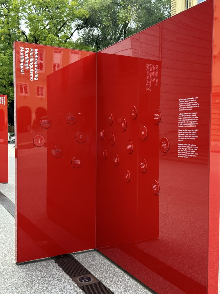
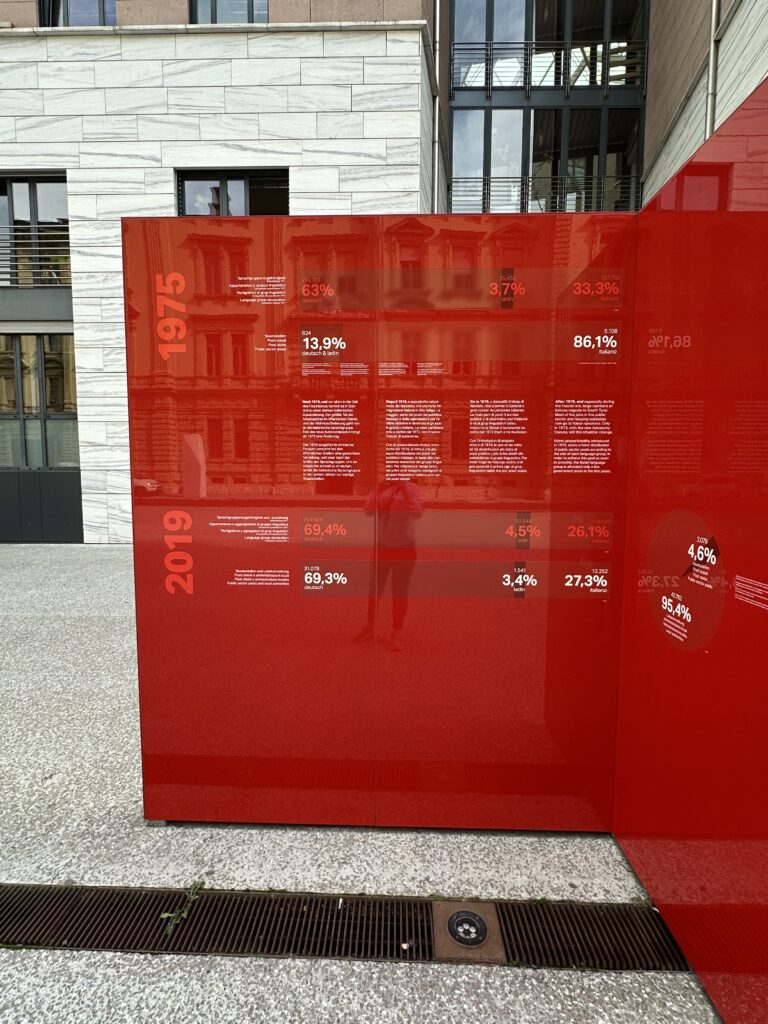
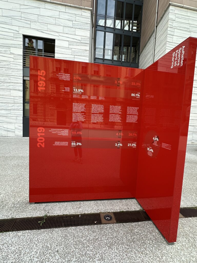
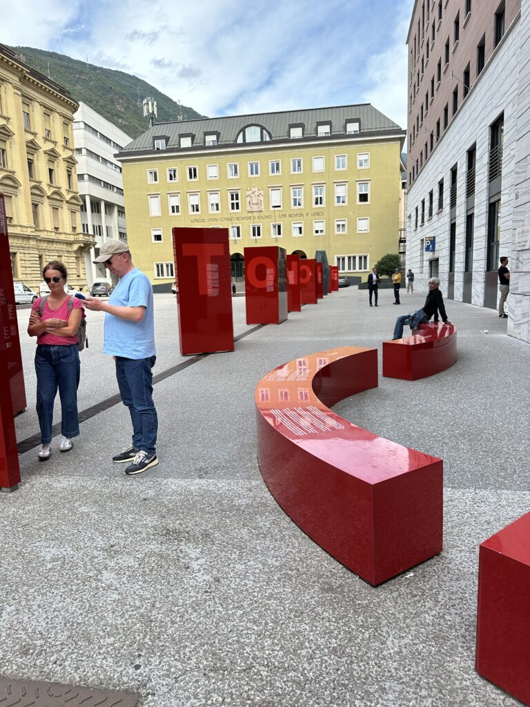
On a recent trip to Bolzano, I visited the permanent exhibition “Wir und die Autonomie” at Silvius-Magnago-Platz — an immersive public installation exploring the history, meaning, and everyday impact of autonomy in South Tyrol. What fascinated me most was not only the content, but how the entire exhibition was designed to be interactive, multisensory, and deeply human. It blended architecture, sound, reflection, and data visualization so naturally that the experience felt less like reading history, and more like stepping into a living narrative.
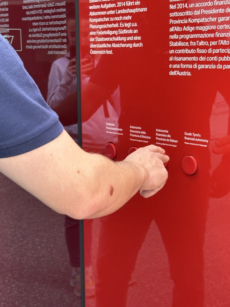
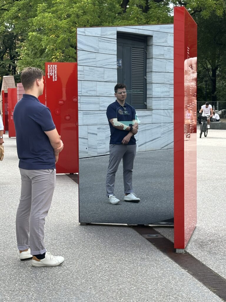
The exhibition is organized into a parcours of nine stations — each one representing a letter in the word “AUTONOMIE”. This clever structure immediately signals that autonomy is not a single concept, but a composition of many parts, each contributing to the region’s unique identity. As I moved from station to station, I could listen to different local dialects through audio installations, read statistics that were visualized through engaging and clear diagrams, and interact with mirrored screens that reflected both information and my own presence back at me.
The use of mirrored surfaces was particularly striking. They served as a reminder that autonomy is not just a political framework — it is personal. It involves human perspectives, lived experiences, and emotional connections. Standing in front of the screens, seeing myself within this historical and cultural context, I felt the exhibition quietly ask: What is your position within this story? What is your relationship to identity, language, and belonging?
South Tyrol’s autonomy is deeply intertwined with questions of cultural preservation, multilingualism, and political negotiation. The exhibition made clear how autonomy protects minority languages such as German and Ladin, while balancing coexistence with Italian-speaking communities. It also reflected on the struggles that led to today’s agreements and on how autonomy continues to evolve.
What impressed me was how the exhibition managed to translate these complex historical and political layers into forms that were easy to engage with: emotional storytelling, sound, spatial design, and accessible data. It is a reminder that design can make even heavy subjects feel approachable, that facts and feelings can co-exist without contradiction.
This experience influenced how I think about my own master’s thesis. My topic revolves around understanding why younger generations increasingly distance themselves from religion and the Church.
But I have been struggling with one part of my thesis: How can I translate this topic into interaction design?
I see fragments of possibilities: narrative spaces, reflective installations, projections, sound — but I still don’t have a fully developed concept. The connection between research and interactive output is not yet clear to me.
Visiting the autonomy exhibition helped me recognize what might be missing. It showed me how data, personal stories, emotion, and design can be merged into an interactive experience without becoming overwhelming or didactic. It demonstrated how abstract topics — identity, history, political agreements — can be made tangible through sensory engagement. And it reminded me that interactivity doesn’t always need to be loud or playful; it can also invite reflection, self-awareness, and dialogue.
Seeing how the exhibition translated complex themes into accessible formats gave me confidence that my own topic, too, can be transformed into an interactive installation. Perhaps not through literal symbols or religious imagery, but through emotions, perspectives, and the invisible distance people feel.
The “Wir und die Autonomie” exhibition started as a normal cultural visit, but ended to be a small design lesson for me. It showed me how identity, data, and personal experience can coexist in one space, and how interactivity can help visitors engage with delicate or complex topics. It also reminded me that good design doesn’t deliver answers; it opens space for questions.
This insight is something I will carry into my thesis process. Even though I’m still searching for the right interactive form, I now see more clearly how design can help make intangible issues visible — and how experiences can spark reflection where words alone sometimes fail.
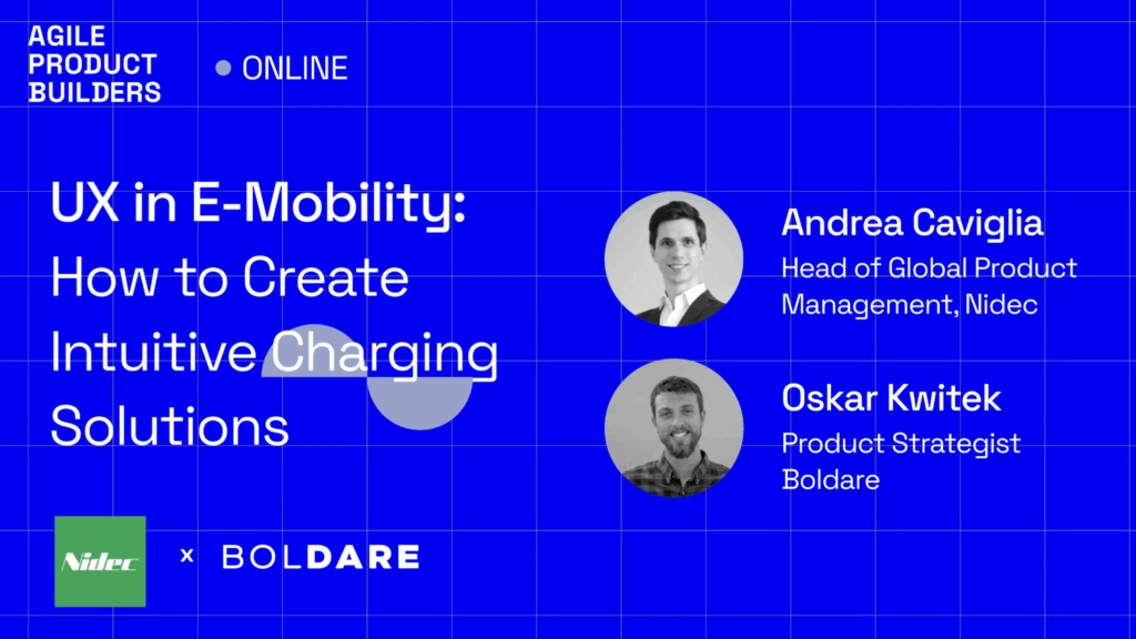
For my fourth impulse I focused on recent challenges in EV charging that question my initial research direction. I watched a podcast with Andrea Caviglia, Head of Global Product Management at Nidec, a major player in e-mobility charging solutions and brainstormed next research steps with the support of Perplexity. This reflection brings together my notes from the video and critical thoughts about my Master thesis after learning about Plug & Charge technology.
Andrea explained that many EV user experience challenges remain despite technical progress. The core problem is that charging is still a new technology creating friction, fear, and anxiety for users. Two main challenges he highlighted in video are “range anxiety” (thats the fear of not reaching the next charger) and the time users have to spend at chargers. This means the charging process must be fast and the waiting time should be used well. The interface (charger and app) should be intuitive and show clear real-time updates about charging status, kilowatts used, time remaining.
This confirms my thesis focus: user experience is central, but also complex and emotional, not just technical. Andrea mentioned multiple payment options are common in EV charging, with app subscriptions, RFID, credit cards, and even QR codes being used to make payments simple and flexible. This aligns with what I know, but also shows how the ecosystem is still diverse without a fully unified system.
The video also explained the fast-paced nature of the e-mobility market, constantly evolving with new charging standards like “mega charging” for buses and trucks. It showed that product design must carefully consider all touchpoints, ensuring hardware reliability, simplicity, and real-time communication within the IoT ecosystem. This means robust, user-friendly solutions are essential for customer satisfaction and reuse.
One highlight relevant for me is how Plug & Charge works. This new technology allows cars to register automatically and start charging on connection without manual steps to start or pay. This sounds like a great UX improvement but also challenges my thesis. If charging becomes nearly effortless for users, will detailed work on charging interfaces even be necessary?
I concluded that while Plug & Charge reduces friction at one stage, many other UX challenges remain:
Where and how do users find chargers?
How do they trust the charger and its status through app or physical signals?
How inclusive and accessible are stations for all users?
How can the waiting time be designed as valuable time?
How do users handle errors or machine failures?
So, Plug & Charge is part of the solution but not the whole picture. For my next research steps, I want expand my focus beyond “start and pay UX” to the full charging experience ecosystem, including location, trust, accessibility and also cognitive/emotional factors.
I also openly admit that after watching this and discussing with AI (Perplexity), I had to rethink and refine my thesis topic and methods. I realize that being flexible and critically examining assumptions is crucial in fast-moving tech fields.
Next steps I will pursue:
Refine my research questions to cover the broader user experience, not only payment and session start
Include qualitative interviews that explore user fears, waiting time use and trust in automated systems
Consider field visits to observe real user interactions with Plug & Charge and older systems
Study accessibility and inclusivity aspects from both tech and human factors
Follow the evolving standardization and AI integration in charging ecosystems
At the end i can really say that these impulse right now are really helpful for me to get my arse up and start doing something for the thesis because learning of these new technologies now is shifting my recent state of research to a really new approach. So this really deepened my understanding now and clarified that my thesis can add value by focusing on the unexplored parts beyond Plug & Charge’s convenience.
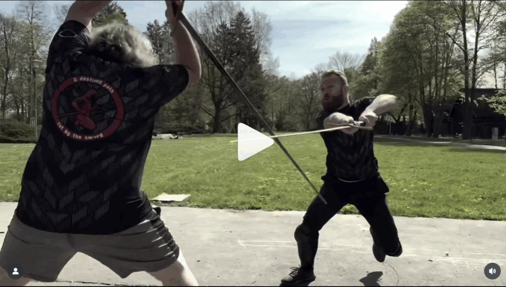
Ein wichtiger Teil meiner Recherche besteht aktuell darin, nach Beispielen zu suchen, die historisches Fechten und moderne Filmästhetik miteinander verbinden. Dabei bin ich auf mehrere Gruppen gestoßen, die nicht nur als HEMA Praktizierende aktiv sind, sondern auch als professionelle Stuntperformer und Choreografen arbeiten und deren Videos mir teilweise schon seit mehreren Jahren ein Begriff waren. Besonders Adorea Olomouc1 sowie die BladeBros Crew2 sind für mich dabei in den letzten Monaten zu Accounts geworden, die ich regelmäßig aufrufe, um sie nun, im Gegensatz zu früher, nicht als reiner Konsument, sondern von einer anderen Perspektive analysiere.
Diese Teams veröffentlichen regelmäßig Kurzfilme, Choreografien und Trainingssequenzen auf YouTube und Instagram,wobei die Bandbreite von historisch orientierten Zweikampfszenen bis hin zu kleinen Action Geschichten reicht. Dabei fällt sofort auf, dass hier nicht nur historisches Wissen, sondern auch filmisches Handwerk eingesetzt wird. Sie bedienen hierbei sowohl “längere” Videoformate auf YouTube als auch Social Media Reels, um ein breites Publikumsspektrum zu erreichen, wodurch sich ihr Content nicht nur an HEMA Enthusiasten, sondern ganz klar auch an ein breites online Publikum richtet.
Der Fokus liegt auf Action und Dynamik und Ästhetik, sowohl bei den Stunts als auch der Kameraführung, manchmal auch mit humorvollen Elementen bestückt.
In den Videos erkennt man deutlich das sportlich-professionelle Know How der Schauspieler. Technikfolgen werden meist so gesetzt, dass sie für den Zuseher sauber erkennbar sind und Kenner des Sportes auch leicht erkennen können, dass sehr viele der Techniken auf historischen Quellen basieren. Die Bewegungen orientieren sich zu sehr großen Teilen an dem, was aus Fechtbüchern und Fechttraining nachvollziehbar wäre. Genau dieser Hybrid ist es, der mein Interesse geweckt hat, sich tiefer mit der Darstellung ebenjener Choreografien zu beschäftigen, denn besonders in modernen Hollywoodfilmen ist die Anzahl an Schauspielern, die historisch-fechterisches Know-How besitzen, verschwindend gering.
Die Kurzfilme setzen bei den Actionszenen auf eine bewegte Kamera mit teilweise längeren Einstellungen, wie man sie vergleichsweise aus modernen Actionszenen kennt, die den Kampf als kontinuierlichen Ablauf zeigen und dadurch nachvollziehbarer wirken lassen. Die Choreografien basieren meist sichtbar auf historischen Techniken und bleiben dabei für das Publikum klar lesbar. Der Schnitt ist zurückhaltend und überlässt der Bewegung im Raum das Erzeugen von Rhythmus und Spannung. Sound unterstützt die räumliche Wahrnehmung und verstärkt die physische Präsenz der KämpferInnen. Insgesamt entsteht ein Hybrid aus historischer Glaubwürdigkeit und filmischer Dynamik, der sowohl HEMA Kenner als auch ein breiteres Publikum anspricht. In den Abonnenten und Kommentatoren findet man daher mitunter auch viele Film- und Videospielenthusiasten aus den Bereichen Fantasy und History.
Was die Reels von ihren klassischen Kurzfilmen unterscheidet, ist vor allem die Art der visuellen Erzählung. Ihre Reels setzen häufig auf eine durchlaufende Kamera ohne Schnitt zwischen den Aktionen. Das bedeutet: keine Montage von vielen kurzen Einstellungen, sondern eine Bewegte Kamera begleitet die FechterInnen von Aktion zu Aktion, oft mit rasanten Kamerafahrten und stetiger Bewegung im Bild. Die Aktionen bleiben durchgehend sichtbar und werden gelegentlich von Speedramps oder kurzen SloMo Passagen untermalt. Dadurch entsteht eine andere Dynamik, als zu den Kurzfilmen, wodurch dieser Content energiegeladener wirkt und beim Zuschauer das Gefühl von kampfkünstlerischen bzw. technischem Talent der Schauspieler verstärkt. Zusätzlich sind die Akteure zumeist in modernen Settings zu sehen, welches sich auch in der Art der Bewegung von den hostorisch angehauchten Videos unterscheidet.
Besonders für die Darstellung bewaffneter Duellszenen finde ich diesen Ansatz sehr interessant: Technik, Körperbewegung und Timing erscheinen nicht fragmentiert, sondern als ein lebendiger, konstanter Ablauf, welcher die Glaubwürdigkeit unterstützt und mehr als nur eine ästhetische Choreografie vermittelt. Zusätzlich ist diese Art von Content eine spannende Verschmelzung zweier Welten und ein nicht zu unterschätzenden Ansatz, um jüngeres Zielpublikum zu erreichen und um aufzuzeigen, wie beeindruckend technisch akkurates Fechten auf Film wirken kann und wie cool dieser Sport ist 🙂
Quite a while ago I found an old laptop at my parent’s place. A very old machine, I used back when I was like 15 years old. Not very flashy but at that time a good device to do what I needed to do, which was school work and playing Minecraft. At that time I was really into home automation, doing things myself, creating my own NAS (Network Attached Storage) or hosting other applications. So after getting my old Laptop, I started to test some stuff. The first thing, I noticed was that the laptop was very slow. I don’t know what 15 year old me did to that thing but it sure wasn’t the best for the hardware.
After doing a little research, on how to breathe life into an old laptop, I stumbled across Linux. For those who don’t know, Linux is a light weight open source, mostly free, operating system. Just like Windows or MacOS. And let me tell you, choosing the right Linux distribution to run on my machine was another rabbit hole, since there are so many. There are ones optimised for hacking, or to look like MacOS, or to be very light weight (ArchLinux). In the end I decided to use the most common Linux “Distro” (short for distribution): Ubuntu. Which is supposed to give me a similar experience to windows and is one of the most widely used Distros. (Which comes in handy, when trying to troubleshoot anything, since someone most likely already fixed that same problem.)
Next steps included, going through old data and clearing out old junk, erasing all data and installing a fresh installation of Ubuntu. And I got to say getting to this point too a while, but after the laptop booted into the home screen of Ubuntu it felt great! But what to do now? One of the “simplest” thing I could think of was trying to connect the laptops storage to my home network, so I could use the old guys storage capacity to exchange data from one device to another, without plugging in an USB stick, or saving backups of very important data. To accomplish this, I used Samba (another open source project), which let me expose a folder to my network. Setting this up took a lot of trail and error, as well as a lot of terminal commands. But now I can get data from my MacBook to my Windows PC without attaching and detaching anything.
Starting this project was a lot of fun. A bunch of new things to learn and new possibilities arise. After this first success I got a bunch of other ideas which I could now host on my own, a cloud service, a Minecraft server or a google photos like application to save and share pictures.
Impact for my Masters Thesis
But what does this have to do with my masters thesis? A lot of the software used when creating a home lab is free and open source. Additionally the freedom to host your own services for free, because someone created free software for you to use, is great! Nevertheless it is a fun project, to get into computers and hosting one’s own cloud service feels great and has a lot of advantages (and disadvantages).
All those possibilities got me thinking, why and how do people create software used by thousands and millions of users? What drives open source projects? How are they financed? So in short this was the start of my interest in open source and the reason, why I want to dive deeper into this topic in my masters thesis. I am sure, there is more to uncover, to try out and to learn.
Accompanying Links
If you start to build your home lab, there is a bunch of stuff you need to know about and Network Chuck provides an amazing overview of most relevant topics. From explaining Linux to n8n (an Ai automation software) to hosting your own NAS. The videos are easy to follow and beginner friendly, in other words the perfect start for newcomers. Here is a link top his YouTube channel: https://www.youtube.com/networkchuck
When trying to do anything on Linux you will need to use the terminal. Installing apps, bluetooth doesn’t work, advanced settings. open the terminal. As a beginner, I didn’t understand what I was writing in this text input. So I used this website: https://explainshell.com/# (another open source project), that explains every command that is put into the terminal.
The last link I want to share is the website of samba, the software I used to open up a folder to my home network. As they say on the website: “Samba is an important component to seamlessly integrate Linux/Unix Servers and Desktops into Active Directory environments.” https://www.samba.org
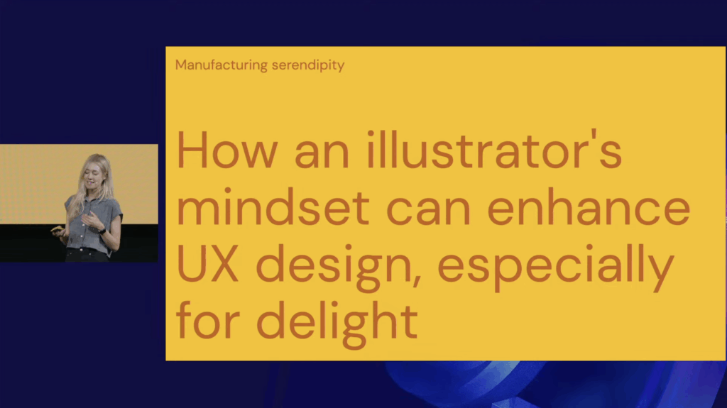
Even though I couldn’t attend the George UX Conference in Vienna on 5th of November, I watched the recorded talks afterward. One immediately stood out: “Manufacturing Serendipity: Designing Delight at Scale with a Little Help from AI” by Mick Champayne, an illustrator-designer from Google. The talk unexpectedly resonated with the direction my master’s thesis is slowly taking: multidisciplinary design identity, AI as a creative bridge, staying calm amidst many skills, and the psychology of being a generalist designer.
At first, I wasn’t excited about revisiting AI in my research. Lately, it has felt overwhelming, and I even thought: “Let’s move away from AI this semester.” But then… the talk reminded me: AI is the elephant in the room. You can’t escape it, and its presence has moved from novelty to ubiquity. Mick presented it not as a threat, but as a playful, human tool, a spark for creativity.
Mick shared how being both an illustrator and a UX designer initially felt like living in two worlds: order equals UX, chaos equals illustration. This resonated deeply with me because I’ve often felt split between multiple design selves: UI/UX, visual storytelling, graphic design, motion design, interaction design … Her experience reassured me that embracing these differences doesn’t dilute identity, it can strengthen it.
A particularly fascinating part was how she trained her own AI model using her illustration work. She fed the machine her best pieces as a data set, and the results at first were bizarre: strange proportions, odd humor. Instead of rejecting the accidents, she embraced them, now using AI mostly for first drafts. She redraws and reinterprets the outputs, extending her own style rather than replacing it. This combination of machine draft and human reinterpretation felt directly relevant to my thesis: AI can act as a bridge connecting skills, not a replacement.
Mick also described using AI as a “creative spark factory”, particularly for projects outside her expertise. For example, she helped design Google easter eggs for Swifties (Taylor Swift fans), creating a playful scavenger-hunt-like experience that blended illustration, pop culture, storytelling, and UX. Her principles for creativity, translating feelings, fostering curiosity, and looking for happy accidents, felt like rules for surviving and thriving as a generalist.
Another highlight was her process of “vibe coding” in Gemini, moving rapidly from idea to tiny playable prototype. Her team even holds DGIF: Delightful Generation of Ideas and Features every Friday. And her definition of delight, shifting something from “it works” to “I love it”, captured something essential about creating meaningful experiences. I also appreciated her humor: her illustrations are playful, sometimes chaotic, often feminine, incorporating absurdities like butts, boobs, and farts, showing how personality and joy can coexist in professional design.
Watching this talk sparked a personal realization: I want to start digital illustration. One of my “other design selves” seems ready to be explored. More importantly, it reassured me that exploring multiple creative paths isn’t a distraction, it’s central to my identity as a designer. For my thesis, it clarified something vital: it’s not about choosing a single design identity, but understanding how multiple identities can coexist and fuel creativity. Mick’s work demonstrates a real-world example of blending art, UX, and AI into a coherent practice, showing that curiosity, experimentation, and calm engagement with chaos can be a source of innovation.
Yesterday I had a big block trying to find an idea for my next assignment. Honestly, I felt quite lost. I was sitting at my desk, just staring at my laptop and got more frustrated every minute. My brain felt completely blank and I was starting to get angry at myself, because I felt I was wasting so much time especially since I had plans to meet a friend later. I could feel how the pressure of “I need to get an idea now” totally blocked all my creativity.
I almost canceled on my friend, but then I thought maybe it is a good idea to step back from the project for a while, since I was already frustrated anyway. I am happy I did it. At my friends’ place I told her about the struggles, and she asked me a bunch of questions about what project and what I need to do. This already helped me to start getting some initial ideas.
At some point of the conversation, she stood up and grabbed a graphic design book. I was a bit confused at the beginning because the book was mostly filled with posters and logos from throughout the years and this was not really my assignment topic. But she told me whenever she feels stuck with a project, she looks into the book to get some fresh inspiration.
She gave me a little challenge:
Pick a random page for the aesthetic.
Pick a random page for the theme/topic.
Pick a random page for the character or the main element.
It was really fun flipping through the book and finding inspiration in things where I wouldn’t normally look. I arrived at her place with zero ideas and two hours later I left with a brain filed with new ideas and inspiration. Just by talking to her and flipping through that book.
What I take away from this evening
It showed me once again, that when I want to work on a creative project, I can’t just sit in front of my laptop and wait for the perfect idea to just pop into my head. It just doesn’t work for me to force creativity on the spot especially while being in the same environment all the time.
In addition, I realized that I sometimes rely too much on inspiration from digital tools like Pinterest, but it only shows you things based on what you like, so honestly there is no new input that challenges your thinking.
Two reminders for my future creative blocks:
* Inspiration can be everywhere and sometimes it is better to close the laptop and to look for inspiration in the real world. Looking at a random book, observing the surroundings or just talking to someone who might give me a random starting point I need to get moving.
* Taking a break, especially if I am already frustrated, can be very helpful. Even if it’s just for an hour. It can help to get some new and fresh ideas.
So, don’t get stuck in front of the laptop. Change the environment and start with a random input to see where it leads you.
And shoutout to Stefi <3
AI was used to check spelling and grammar and better clarity.
Wenn man sich, so wie ich in den vergangenen zwei Semestern, sehr intensiv mit der filmischen Darstellung von bewaffneten Kämpfen bzw. Duellen beschäftigt, landet man früher oder später bei The Duelists (1977), Ridley Scotts Debütfilm, der mir mehrfach von Mitgliedern meines Fechtvereines empfohlen wurde. In meinem Fall war der vor kurzem stattgefundene Filmeabend, bei welchem wir uns diesen Film vorgenommen haben, ein für mich wertvoller Diskussionsanstoß und Meinungsaustausch zum oben genannten Thema und damit gleichzeitig ein interessanter Impuls für meine weitere Forschungsarbeit über Authentizität und Storytelling in filmischen Kampfszenen.
Zu dem spontanen Filmabend gesellten sich insgesamt vier weitere Vereinsmitglieder und gemeinsam beobachteten wir, wie die beiden Charaktere Armand d’Hubert und Gabriel Feraud über Jahrzehnte hinweg in Duelle verwickelt werden.
Die beiden Duelle mit dem Smallsword wurden von Ilja (unserem Rapieristen der Runde) durch zustimmendes Nicken doch mit viel Anerkennung begleitet. Die Körperhaltung, Beinarbeit und die Mensur (die Distanz zwischen zwei Fechtern) entspricht dem, was man in historischen Quellen findet, weshalb der Film in HEMA-Kreisen als ein gutes Beispiel für relativ akkurat inszenierte Smallsword-Gefechte gilt. Und trotzdem schmunzelte Ilja gelegentlich, wenn für ihn „offensichtliche Blößen“ in der Deckung waren und manch eine Aktion eine Prise zu ausladend gestartet wurde, war mir wieder vor Augen hielt, dass Personen mit Expertenkenntnisse ein anderes Auge für Darstellungen dieser Art haben. Trotz diesem „Makel“ waren die Duelle sehr realistisch und kurz gehalten, die Kontrahenten lauerten einander auf, warteten auf einen Fehler oder eine unbedachte Handlung, um ihre Aktion zu setzen und ihr Gegenüber zu treffen.
Besonders die beiden Säbelduelle wirken emotionaler, wilder und deutlich hektischer, was sich auch in Kamera und Schnitt wiederspiegelte. Jacob, einer der jüngsten in unserem Team, fragte gegen Ende der Szene verblüfft in die Runde: „Und das sollen gute Fechtdarstellungen sein?“ Ich stimmte zu, diese Szene wirkte eskalierend und soll den Start der Feindschaft zwischen Armand d’Hubert und Gabriel Feraud für die Zuschauer greifbar machen, worunter die Darstellung korrekter Säbeltechniken deutlich litt. Die Säbel werden in der Szene wild durch den Raum geschwungen und historisch technische Akkuratesse wurde genau zu Beginn, als die Duellanten ihre Waffen zogen, gezeigt.
Die Szene wirkte klar übertrieben, aber dennoch emotional wirkungsstark, wodurch ich mir durch den Film wiederholt die Frage stellte: Wie viel Realismus darf zugunsten von Storytelling verloren gehen?
Als Fechterin und „Filmschaffende“ sitze ich gefühlt immer zwischen zwei Welten:
HEMA will Präzision und Akkuratesse
Film will Emotion und Spannung
In realen Duellsituationen entscheidet (je nach Regelwerk) der erste Wirkungstreffer, im Film schwingt jedoch stets die Geschichte mit. Ein Gefecht, der nach wenigen Sekunden vorbei ist, mag realistisch sein, aber er wird weniger zu anderen Elementen der Geschichte eines Filmes beitragen.
The Duelists zeigt, wie viel Mühe und Bewusstsein in filmische Duelle fließen können. Er hat mich daran erinnert, dass Realismus nicht allein durch die dargestellten Technik entsteht, sondern durch Einfluss von Emotionen und Persönlichkeit der Darsteller.
Ebenso erinnerte ich mich wieder daran: Filme haben ihre eigene Realität. Sie dürfen die Realität biegen, solange es für die Geschichte sinnvoll ist.
Für mein Projekt heißt das: Ich möchte Wege finden, wie historische Authentizität und dramaturgische Spannung gleichzeitig funktionieren können. Kein „entweder… oder“, sondern den Versuch wagen, ein „sowohl als auch“ zu schaffen.
Und wenn dabei gelegentlich ein HEMA-Fechter schmunzelt, umso besser. Das bedeutet, dass sie im Training gut aufgepasst haben.