1. IMPULS: Klanglicht 2025

Zwischen Klang, Raum und Wahrnehmung

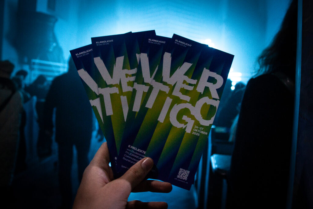
Das Klanglicht-Festival 2025 stellte für mich einen zentralen Erfahrungsraum dar, in dem sich theoretische Fragestellungen meines Studiums mit praktischen Anwendungen verbanden. Ich war auf mehreren Ebenen in das Festival eingebunden, wodurch ich ein umfassendes Verständnis für kuratorische, organisatorische und künstlerische Prozesse entwickeln konnte.

Im Rahmen meiner Tätigkeit bei den Bühnengrads betreute ich den Social-Media-Kanal des Festivals. Diese Aufgabe ermöglichte mir einen tiefen Einblick in die mediale Vermittlung von Kunst und deren Rezeption. Das Erstellen und Publizieren von Beiträgen über Künstler:innen und Installationen erforderte eine strategische Auseinandersetzung mit Fragen der visuellen Kommunikation, Narration und Öffentlichkeitsarbeit. Durch den direkten Austausch mit Kurator:innen und Produktionsmitarbeitenden konnte ich nachvollziehen, wie kommunikative Entscheidungen ästhetische Wahrnehmung und Besucher:innenführung beeinflussen (Instagram Klanglicht 2025).

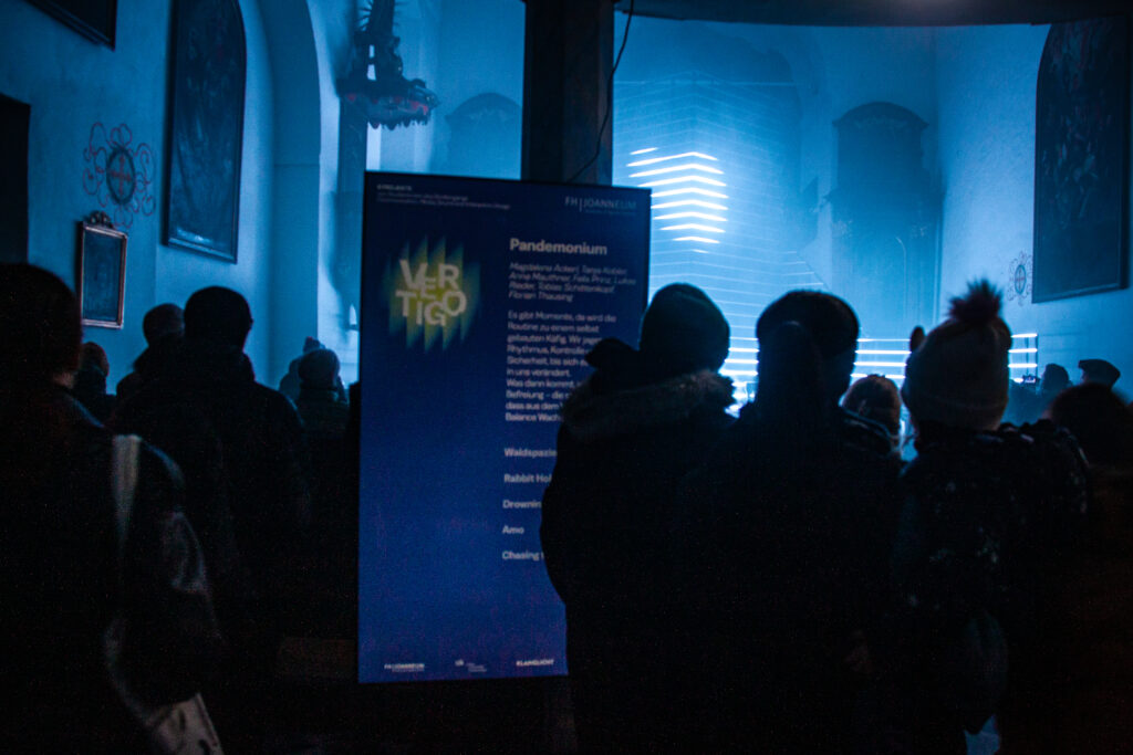
Parallel dazu war ich als Sound- und Mediendesigner an der Installation Amo in der Antoniuskirche beteiligt. Das Werk thematisierte rauschhafte Zustände und emotionale Grenzerfahrungen, die durch eine vielschichtige Klangarchitektur und visuelle Projektionen inszeniert wurden. Musikalisch oszillierte die Komposition zwischen atonalen Jazz-Fragmenten, elektronischen Rhythmen und Walzer-Elementen. Besonders relevant war für mich die Beobachtung, wie akustische Strukturen im sakralen Raum. Die kollaborative Arbeit stellte zugleich eine soziale Herausforderung dar, in der sich ästhetische Entscheidungen mit gruppendynamischen Prozessen verschränkten. (IDK FH Joanneum)

Ein weiterer Impuls ergab sich aus der Mitarbeit an Olafur Eliassons „Eye See You“, für die ich gemeinsam mit zwei Kolleg:innen an der akustischen Gestaltung beteiligt war. Diese Erfahrung verdeutlichte, in welchem Maße Raumwahrnehmung, Materialität und Klanggestaltung als zusammenhängendes System zu begreifen sind (Klanglicht.at).

Im Zentrum meiner persönlichen Entwicklung stand jedoch die Teilnahme am Young Masters-Programm mit meiner Installation The Dragon’s Cave im Schlossbergstollen. Das Werk verband Hologramm-Projektionen und Sounddesign zu einer audiovisuellen Erzählung über Transformation, Vergänglichkeit und Wiedergeburt. Ausgangspunkt war eine narrative Idee, inspiriert durch eine Geschichte, die ich meinem Neffen eines Tages erzählt hatte, die in der künstlerischen Umsetzung als Metapher für zyklische Prozesse in Natur und Leben diente. Durch organische Formen  (Pilzgeflechte, Wurzeln, Drachenfiguren) wurde die Verbindung zwischen Naturmythos und digitaler Ästhetik erfahrbar (Klanglicht YoungMasters 2025).

Eine wesentliche Erkenntnis, die ich aus dieser Arbeit gewonnen habe, betrifft die räumlich-proportionale Planung von Installationen. Im Nachhinein wurde mir bewusst, dass die Größe des projizierten Objekts, in meinem Fall des holographischen Netzes, in enger Beziehung zur Dimension des Ausstellungsraumes stehen muss. Das Netz meiner Dracheninstallation hätte deutlich größer sein können, um den gewünschten immersiven Effekt zu erzielen. Diese Einsicht bestätigte sich insbesondere beim Vergleich mit der Installation Mantra Modulation von MO:YA. Daraus resultierte für mich die zentrale Lehre, dass präzise räumliche Analyse und frühzeitige Tests (etwa durch provisorische Tuchhängungen) unabdingbar sind, um das Verhältnis von Projektion, Raumtiefe und Betrachterposition besser einzuschätzen. 

Das Festival wurde insgesamt zu einem Ort des Austauschs und der Netzwerkbildung. Die Begegnungen mit internationalen Künstler:innen, insbesondere dem Kollektiv Onionlab (Barcelona), gaben entscheidende Impulse für die zukünftige Ausrichtung meiner Arbeit. Im Hinblick auf meine Masterarbeit plane ich, diese Erfahrungen in einer eigenständigen Ausstellung weiterzuführen, in der verschiedene Projektionsformen, Hologramm, Videomapping und Nebelprojektion, miteinander kombiniert werden, um Fragen nach Raum, Wahrnehmung und Transzendenz zu untersuchen.

Insgesamt ermöglichte mir das Klanglicht-Festival 2025 eine tiefgehende Reflexion über das Verhältnis von Kunst, Technologie und Wahrnehmung. Es verdeutlichte, dass Medienkunst nicht nur als ästhetische Praxis, sondern auch als Forschungsprozess zu begreifen ist: ein Prozess, in dem Experiment, Zusammenarbeit und Beobachtung gleichwertige Erkenntnisquellen darstellen.


Literaturverzeichnis (Chicago Author–Date)

Eliasson, Olafur. 2025. Eye See You. Graz: Orangerie Graz.

Accessed November 2025. https://klanglicht.buehnen-graz.com/installation/8-eye-see-you/

FH Joanneum – Institut Design und Kommunikation (IDK). 2025. Vertigo.

Accessed November 2025. https://klanglicht.buehnen-graz.com/installation/4-vertigo/

Klanglicht Festival. 2025. Official Instagram Account.

Accessed November 2025. https://www.instagram.com/klanglichtgraz/

Klanglicht Festival. 2025. Young Masters Exhibition 2025.

Accessed November 2025. https://klanglicht.buehnen-graz.com/installation/16-young-masters-exhibition/


Hinweis zur Verwendung von KI-Tools

Zur sprachlichen Optimierung und für Verbesserungsvorschläge hinsichtlich Rechtschreibung, Grammatik und Ausdruck wurde ein KI-gestütztes Schreibwerkzeug (ChatGPT, OpenAI, 2025) verwendet.

Proseminar Master’s Thesis. Task III

Author: Nadina Husidic

Title: Immersive technology applications in the museum environment, Challenges and opportunities

Year of Publication: 2022

University: Halmstadt University
Degree: Master Thesis in Informatics, 30 credits

Overall presentation quality:

The thesis is well structured and readable: it contains a clear abstract, introduction of the field, literature review, methods, empirical findings, discussion and conclusion. Headings and flow are logical; methodology and analyses are presented in a conventional academic format. The writing is generally clear and scholarly.

Degree of innovation:

The thesis addresses a recognized gap: much prior research focuses on visitor experience, while this study centers strategic stakeholders’ perspectives (museum directors, curators, municipal/institutional reps) on immersive technology adoption. Framing the question from a stakeholder/organizational perspective is a meaningful contribution for practitioners and IS (information systems) researchers. The synthesis of challenges vs opportunities (innovation management, design value, organizational model; and operational efficiency, social sustainability, experience design) provides an original, practice-oriented thematization.

Independence:

The project demonstrates independent critical thinking: the author designed interview guides (informed by literature), carried out primary interviews (Mar–May 2022), coded and thematized results into conceptually meaningful clusters, and related findings back to literature. The work appears to be student-led with appropriate academic supervision.

Organization and structure:

The structure is logical and the document follows a coherent path from literature to methods to findings and discussion. Themes are explicitly described and supported with interview excerpts, and the discussion links themes back to theoretical sources. The RQ is clearly stated and the findings map directly to it.

Communication:

Language is generally precise and academic. Interview quotes are used effectively to illustrate themes (e.g., “You must make something more of an artifact with technology.” and concerns about complexity and resources). A couple of spots would benefit from tighter editing (minor language slips, occasional long paragraphs), but readability is high overall.

Scope:

For a 30-credit Master’s thesis the scope is appropriate: the literature review and the focused empirical interview study match the expected depth. The author makes sensible delimitations (stakeholder perspective, Swedish cultural heritage context). If anything, some areas (e.g., more systematic sampling detail or deeper methodological reflexivity) could be expanded, but this is within normal limits for this credit level.

Accuracy and attention to detail:

Citations are present, arguments are referenced to literature, and interview evidence is carefully quoted. There are few formal errors; referencing seems adequate. A more explicit account of coding procedures (how many coders, inter-coder reliability, coding software, or a codebook appendix) would strengthen methodological transparency.

Literature:

The literature review draws on appropriate, current sources across XR/immersive tech, museum studies, narratology and digital transformation. The author used Scopus and Google Scholar to identify relevant studies and anchored the thesis in contemporary debates (visitor experience vs organizational adoption). A systematic PRISMA-style search is not claimed; the literature appears curated rather than exhaustive — adequate for the study’s aims.

Overall assessment:

This is a solid Master’s thesis that meets academic standards for a 30-credit Informatics project. It is especially valuable for its practitioner-oriented thematization of strategic challenges and opportunities for immersive technologies in museums. The work demonstrates independent thinking, a clear structure, adequate literature integration, and credible empirical data collection and analysis.

The main limitation relative to some CMS expectations is the absence of a hands-on artifact, the thesis’s contribution is analytic and strategic rather than a demonstrable interactive prototype. If your assessment rubric gives heavy weight to produced artifacts, deduct accordingly; if the rubric prioritizes critical analysis and scholarly contribution, this thesis scores well.

Disclaimer: This blog post was written with the help of AI (ChatGPT) for better structure and phrasing.

Impulse #1 Designing for Neurodiversity: Alipe von Bernhaupt’s Talk at the Usability Congress in Graz

At the Usability Congress in Graz, I attended a talk by Alipe von Bernhaupt about accessible usability for neurodivergent people. It really changed the way I think about inclusion and design — not only as something nice to do, but as something essential for both people and business.

Understanding Neurodiversity

Up to one in five people is neurodivergent. That means about 20% of users experience the world and our designs in very different ways. If we don’t design with them in mind, we lose around 20% of potential users — and that’s a big part of the market.

Alipe also mentioned that at least half of adults are undiagnosed. So even if we think we’re not designing for neurodivergent people, we probably are — we just don’t know it. Another important point was how women with ADHD are treated worse than men. Men are often seen as just “energetic” or “a bit different,” while women are more likely to be judged or ignored.

What It Means for Design

Neurodivergence can look very different from person to person. Two people with ADHD, for example, can have completely different challenges. Neurodiversity is really about people whose brain structures work differently — there isn’t one single way to describe it.

The digital world can be especially hard for neurodivergent users. Changing layouts, flashing images, or strong colors can make using websites and apps stressful or confusing. And there’s another layer to this: energy. Many neurodivergent people experience very different energy levels from day to day. That means it’s harder to plan long-term or follow strict routines. When design expects constant focus and consistency, it can quickly become overwhelming.

What Really Stuck with Me

My biggest takeaway from the talk was a bit uncomfortable but very true: if we want companies and stakeholders to care, we have to speak their language. Talking about inclusion and empathy is important, but talking about losing 20% of market share gets their attention. Sometimes, it’s not the human argument that makes change happen — it’s the business one.

Conclusion

Designing for neurodiversity is not just about accessibility checklists. It’s about understanding that people experience the world differently — and that this difference is normal. When we include those needs in our design, we make better products for everyone. It’s not only the right thing to do, it’s also smart business.

03.02: Warum ich jetzt ganz was anderes machen möchte – und was das ist

Schon an meinem ersten Blogpost in diesem Semester, für den Kurs von Ursula Lagger, in dem ich die Masterarbeit “Horror Movie Aesthetics” bewertet habe, hätte der ein oder andere aufmerksame Leser dieses Weblogs erahnen können, dass von meiner ursprünglichen Idee, mich mit Datenvisualisierungen zu beschäftigen, nach den Sommerferien wohl nicht allzu viel übrig geblieben ist. Und hier steh ich nun ich armer Tor, denn ich bin tatsächlich so schlau wie ein Jahr zuvor, als ich das erste mal überhaupt die Ehre hatte einen dieser Blogposts zu verfassen. Doch seither ist viel passiert und vielleicht, aber wirklich nur vielleicht, habe ich jetzt das gefunden was mir wirklich Spaß macht. Was mich wirklich dazu bringen könnte, gern an meiner Masterarbeit zu arbeiten. Doch lest selbst.

In allerkritischster Selbstbetrachtung ist mir während der vorlesungsfreien Zeit (sorry für den Fachjargon) nämlich eines bewusst geworden. Ich habe nicht ein einziges Mal an Datenvisualisierungen gedacht. Wohl aber jeden Tag meine Kamera in Händen gehalten. Selbst wenn meine Synapsen nicht mehr derart schnell Verbindungen herstellen können, wie in der Zeit als ich noch keinen uneingeschränkten Zugang zu alkoholischen Getränken hatte, so hat sogar mir das eines gelehrt: Ich mach das falsche Thema.

Viel eher sollte ich filmen. Das machen was ich sowieso ständig mache. Das machen worüber ich mir sowieso ständig Tutorials anschaue. Das machen, wo ich mich sowieso ständig weiterbilden möchte. Und so ware eine Idee geboren: Warum nicht den Horrorfilm, den ich seit Beginn des Studiums unbedingt am Ende drehen will zu meiner Bachelorarbeit machen. Und einmal in den Kopf gesetzt ging diese Idee die letzten Monate auch nicht mehr raus, womit ich nun weiß, okay das wirds.

Aber was genau möchte ich analysieren, worüber möchte ich forschen, welche jahrtausende alten Fragen möchte ich mit meiner unnachahmlichen Recherche ein für alle mal beantworten? Im Grunde weiß ich das noch nicht so genau, aber ich hab eine Idee. Je mehr ich filme, desto mehr wird mir nämlich bewusst, dass nicht die Kamera, oder der Kameramann das Bild bestimmen, sondern das Licht. Dass auch eine Arri Alexa dir keinen Hollywood Streifen filmen kann, wenns finster ist. Deshalb möchte ich mich in meiner Masterarbeit mit Lichtkomposition auseinandersetzen. Genauer mit gezielter Lichtsetzung in Horrorfilmen. Eine mögliche Forschungsfrage, die ich mir dazu überlegt habe, ist wie sehr klassische Prinzipien in der Lichtsetzung (ich denke da gerne an Lighting Ratios, da ich den Ansatz unfassbar interessant finde) auf die Wahrnehmung von Charakteren in Horrorfilmen auswirken. In meinem eigenen Film könnte ich dann basierend auf dieser Theorie zum Beispiel alle Charaktere durchgehend individuell leuchten.

Um diesen Rechercheprozess nun aber gar nicht weiter hinauszuzögern und ins Tun zu kommen, habe ich die letzte Aufgabe von Ursula Lagger, in der es darum ging erstmals ein paar Quellen zu suchen gleich genutzt um eine etwas umfassendere Bibliographie zum Thema zu erstellen, die ich nun in den kommenden Blogposts abarbeiten kann. Da ich viele der Bücher erst bestellen muss (vielleicht lass ich sie mir auch unter den Christbaum legen, falls ich den Platz dort nicht für eine neue Linse frei halte), werde ich in den nächsten Blogposts erst einmal mit aktuellen Papers anfangen, in denen genau jene Wahrnehmung von Lichttechniken an Probanden erprobt wurden, um mir einen Überblick darüber zu verschaffen was ist state of the art knowledge und was wurde quasi schon erforscht. Erst dann werden wohl nach der Reihe die gebundenen Standardwerke bei mir eintrudeln, und ich kann mich mit diesen befassen.

Als Abschluss kopiere ich noch die gesamte Bibliographie hier rein, die quasi der Grundstein meiner Master Arbeit werden soll. Für Buchvorschläge oder andere Anregungen bin ich natürlich stets dankbar.

Bibliographie

Bücher und E-Books:

Hart, John: Lighting for Action. Professional Techniques for shooting Video and Film. New York: Amphoto Books 1992.

Brown, Blain: Motion Picture and Video Lighting. 4th Edition. New York: Routledge 2024.

Alton, John: Painting with Light. Berkely und Los Angeles: University of California Press 1995.

Mullen, Merritt David (Hrsg.) und Hummel, Rob (Hrsg.): American Cinematographer Manual. Eleventh Edition. Los Angeles: The ASC Press 2023.

Malkiewicz, Kris J.: Film Lighting: Talks with Hollywood´s Cinematographers and Gaffers. Second Edition. New York: Touchstone 2012.

Landau, David: Lighting for Cinematography: A Practical Guide to the Art and Craft of Lighting for the Moving Image. London: Bloomsbury Academic 2014 (= The CineTech Guides to the Film Crafts, Nummer 1).

Online-Quellen:

Pizzello, Stephen (30.10.2023): Terror Through Lighting. In: The ASC, https://theasc.com/articles/terror-through-lighting (zuletzt aufgerufen am 7.11.2025).

Studiobinder (13.06.2020): Lighting Ratios Explained – And Why They Matter. In: Studiobinder, https://www.studiobinder.com/blog/lighting-ratios/ (zuletzt aufgerufen am 7.11.2025).

Papers:

Huttunen, Sampsa: Faces in shadows: silhouette light, underlight and toplight elicit increased early posterior negativity. In: Frontiers in Neuroscience 2025, Volume 19, https://doi.org/10.3389/fnins.2025.1553977.

Wisessing, Pisut [et al.]: Enlighten Me: Importance of Brightness and Shadow for Character Emotion and Appeal. In: ACM Transactions on Graphics 2020, Volume 39, Issue 3, https://doi.org/10.1145/3383195.

Bhatii, Zubeda [et al.]: LIGHT MANIPULATION AND LENS CHOICES: INFLUENCE THE MOOD AND LOOK OF SCENES. In: Insights-Journal of Life and Social Sciences 2025, Volume 3, Issue 1, https://doi.org/10.71000/n4nvr719.

Niazi, Mahira [et al.]: Illuminating the Cinematic Palette: A Comparative Analysis of Lightning Techniques and their Emotional Impact in Horror Films. In: Human Nature Journal of Social Sciences 2024, Volume 5, Issue 4, https://doi.org/10.71016/hnjss/1td3wd35.

Ammer, Sawsan Mohammed Ezzat Ibrahim: Content Analysis of Lighting and Color in the Embodiment of Fear Concept in Horror Movies: A Semiotic Approach. In: Information Sciences Letters 2020, Volume 9, Issue 2, http://dx.doi.org/10.18576/isl/090210.

Task 3 – Evaluation Masters Thesis

Title: Angry?#METOO – An epistemological approach to harnessing the power of female rage

Author: Sigrid Wallaert

Ghent University

Studyprogramm: Master of Arts in Philosophy

Year: 2018 – 2019

General overview

This master’s thesis in the fields of feminist philosophy and epistemology offers a theoretical analysis of female anger in the context of feminism and the #MeToo movement. The work, which entails approximately 37,000 words and is purely theoretical and contains no artistic elements in itself.

Design quality

The overall design of this master’s thesis focuses on its linguistic and argumentative structure; hereby the visual design is not the main focus of this work. There is a uniform layout, but it is not a work of art itself. The work is therefore strong in its structure but is not focusing on its visual appeal.

Degree of innovation

The topic of ‘female rage’, which is related to the #MeToo movement, is still very relevant even though it was written in 2018/2019. It has combined feminist philosophy and pop culture and is very original when it comes to its attempt to understand anger as an epistemic tool, while still being heavily literature-based.

Independence

The author of this thesis demonstrates a high level of independence in both the topic selection and the overall structure of the thesis. She analyses critically well-known theorists such as Nussbaum and Ahmed, while still being able to connect to the contemporary feminist movement. Additionally, she also is able to reflect on her own position as a white woman.

Structure and Organization

The work itself has a clear structure and can be followed easily. Each chapter ends with a brief summary and conclusion that sums up the overall arguments that were stated. Some sections might benefit from a more visual approach or the inclusion of visual elements.

Communication

The writing style is very clear and precise and still maintains an academic tone that can be understood easily. The intended audience might be those who are interested in feminism or philosophers.

Scope

As the work has around 37,000 words, it has an appropriate length for a master thesis. It goes in depth with its chosen topic and has its main focus on literature analysis rather than empirical examples.

Accuracy and attention to detail

The citation style is consistent throughout the work and the sources are mentioned correctly. Some arguments are being repeated; however, the overall style is written in a sophisticated and fluid way.

Literature

The bibliography is very extensive and almost includes around 90 sources. It has a good combination of academic texts that include feminist works but also other theoretical works.

Overall, the work discusses a still very relevant topic with a clear argumentative structure. The writing is strong and understandable; however, the perspective is mostly from a Western side and shows little intersectional diversity. However, I did enjoy reading this thesis as the topic is very interesting for my upcoming master idea.

3.2 IMPULSE #2

This year, on 15th October, I attended the World Usability Congress in Graz and listened to a talk titled “How to accessible usability for neurodivergent people?” by Alide von Bornhaupt. Her presentation focused on how neurodivergent individuals are often overlooked or excluded when designing digital experiences. She shared 3 practical tips for creating more inclusive systems, but it wasn’t the tips that stayed with me. What stuck with me was the underlying idea: how important it is to include people the system was never designed for in the first place. That thought made me pause and reflect on who I could design for in my thesis.

At the beginning of her talk, Alide showed a slide called “Dimensions of Inclusion”, which grouped people based on different traits and abilities. Seeing it made me realize how easily design can fall into the trap of serving only an “average” user, even though such a person doesn’t really exist. It also made me consider neurodivergent individuals, or people who think, learn, and process the world differently, as a meaningful focus for my work. Although I’m not diagnosed as neurodivergent, I recognized parts of myself in what she described. That realization led me to look back on my own experiences and how they shaped my sense of comfort, participation, and expression.

Growing up, I often felt uneasy in social situations. Being surrounded by strangers, answering a question in class when I was the only one who hadn’t raised my hand, or even saying a simple hello to a cashier, all of it felt much bigger than it probably was. I remember watching others interact so easily and wondering why it didn’t come naturally to me. Over time, I noticed that I often withdrew before anyone could exclude me, almost as if I wanted to protect myself from doing something wrong. I wasn’t the loudest or most talkative person, but deep down I knew that this quiet version of me wasn’t all that I was. When I felt safe and comfortable, I could open up, be playful, and connect freely.

Thinking back on this made me more aware of how much our surroundings, whether physical, social, or digital, shape the way we take part in things. Sometimes all it takes is a small detail: the tone of a message, the layout of a space, or a word choice to make someone feel either welcome or invisible. Listening to Alide helped me see that by designing with neurodivergent people in mind, I could also create something that speaks to people like me, those who sometimes feel out of place or unsure how to belong. I want to design experiences where those feelings don’t become obstacles, where participation feels gentle, natural, and safe.

AI was used for corrections, better wording, and enhancements.

3.1 Reflection & IMPULSE #1

Reflection on the last two semesters
This semester, my focus in Design & Research will be on the pre-research phase of my master’s thesis. During the first semester, I identified the broader research area as the combination of analog and digital technologies. In the second semester, I explored microcontrollers and hands-on prototyping more deeply.

For this semester, I am still interested in the fusion of analog and digital elements, as well as prototyping with microcontrollers. However, there is still one key factor that is missing: a purpose. For this reason, I will roughly use the framework “5Ws and 1H” (What, Who, Why, Where, When, How) as a loose structure to help me define the direction of my thesis more precisely.

Some of the topics I want to explore include:

  • Play & Playfulness, sense of adventure,
  • Gamification, serious games, video games, board games, toys or toy-like
  • Education, learning, inclusivity
  • Memory, nostalgia, archiving, pop culture
  • Tangibility, systems, collections,
  • Microcontrollers, Building, Prototyping

For each impulse, I will use the 5Ws and 1H framework to organize my thoughts and clarify what kind of design direction or insight it offers.

So, for my first impulse, I watched 3 talks about Play, and here are my thoughts about them:

Talk #1: The Role of Play in the Development of Social and Emotional Competence by Peter Gray
In his talk, Peter Gray argues that free, self-directed play is essential for children’s emotional and social development. Drawing from research on hunter-gatherer societies, he shows how children in these communities were trusted and allowed to explore freely, learning vital skills such as empathy, cooperation, and self-regulation through play. In contrast, modern societies often limit children’s autonomy through structured activities and constant supervision, reducing opportunities for natural learning and independence.

My Reflection:
This makes me think about how I could use ideas from hunter-gatherer play, like freedom, choice, cooperation, and learning through challenge, in design. For example, when creating games, interactive experiences, or educational tools, one could consider how users can make their own choices, how activities can encourage working together instead of competing, and how challenges can help people learn and grow in a safe way. Rather than dictating a single path or outcome, the design could invite open-ended exploration where discovery happens naturally through action. That sense of self-direction becomes a key principle for how I want to design, shaping interactions that give users autonomy, space to experiment, and the freedom to define their own experiences, much like the unstructured play of hunter-gatherer communities.

Talk #2: Creating Inclusive Environments with Play by Gary Ware
In this talk, Gary Ware explores how play can build safe, authentic, and inclusive environments in workplaces and collaborative groups. He began his talk with a playful exercise, showing how shared experiences can quickly create connection and trust. Ware emphasized that people often divide their “home self” and “work self,” which prevents genuine belonging: trying to fit in is not the same as belonging. He highlighted how play encourages vulnerability, creativity, and collaboration, ultimately fostering psychological safety and empathy.

My Reflection:
This made me think about how play could inspire designs that foster inclusion and trust. Could an interactive system help people feel accepted and comfortable being themselves? Activities like improv, drawing, or dancing already create natural connections, and I wonder how technology might extend that same sense of shared joy and safety into everyday interactions.Thinking this way helps me see where playful design could have real impact: in shared spaces like classrooms, workplaces, or public areas. These could become places of playful connection, where design cultivates belonging through interaction.

Talk #3: The Power of Play to Heal and Connect by Amy Work
Amy Work explains that play is a child’s natural language, a way to express feelings before words are available. While adults communicate through conversation, children process their inner world through play. Quoting Gary Landreth, “Play is the language of children, and toys are their words,” she highlights how play helps children express emotions, face fears, and make sense of their experiences in a safe, symbolic way. Parents who join in that play build stronger emotional bonds and open lines of communication. Work encourages adults to observe and name emotions during play, helping children develop emotional literacy, while letting them lead and set the pace.

My Reflection:
This talk reminded me that play isn’t just about learning, but also a form of emotional communication. It made me wonder how interaction design might support non-verbal expression, how people could externalize feelings or memories through playful, tangible engagement. Seen this way, play becomes a bridge between inner and outer worlds. That perspective also hints at who my designs might serve: people who communicate or process emotions differently like children, neurodivergent users, or anyone drawn to expression beyond words.

AI was used for corrections, better wording, and enhancements.

Alexander’s Travel Guide for the Dead — A Journey Beyond Life

What happens after we die? It’s one of humanity’s oldest and most haunting questions. Phillipp Alexander’s “Reiseführer für Tote” (Travel Guide for the Dead) takes this universal fear and curiosity and turns it into something unexpected — a travel guide for the afterlife.

At first glance, the concept sounds absurdly fascinating: a Lonely Planet–style guide that helps you navigate heaven, hell, or reincarnation. But beneath the quirky premise lies a deeper intention — to make people reflect on death, religion, and what might await us after our final journey.

Exploring Death Through Design

Alexander’s goal is simple yet ambitious: to make people think more openly about the afterlife and perhaps ease the fear of dying. Rather than preaching or philosophizing, he invites readers to explore the topic — like travelers flipping through a guidebook before an adventure.

It’s an unusual approach, blending two very different worlds:

  • Religion, with its strict rules, moral frameworks, and promises of eternal destinations.
  • Travel guides, which celebrate freedom, curiosity, and self-directed discovery.

By merging these opposites, Alexander creates a tension that’s both intriguing and thought-provoking — though not without its flaws.

The project unfolds in two main parts:

  1. An overview of different religions and their interpretations of the afterlife — from heaven and hell to reincarnation and spiritual rebirth.
  2. A more subjective “expert analysis” of travel guides, where the author himself becomes the self-declared guide through these spiritual landscapes.

While the first section is well-researched and informative, the second feels more like a personal reflection than a structured analysis. There’s no clear conclusion — instead, it reads as an open-ended exploration rather than a destination reached.

Aesthetic and Presentation

If there’s one thing that immediately captivates, it’s the presentation. The work comes encased in a beautiful wooden box, filled with bone-white paper — an eerily fitting design choice for a guide to the afterlife. The craftsmanship feels intentional and authentic, setting the right tone from the moment you open it.

However, the physical design, while visually striking, makes it somewhat uncomfortable to handle and read. The box, though conceptually clever, turns into a clumsy reading experience — a reminder that sometimes, aesthetics and usability don’t always align.

Originality and Design Relevance

Conceptually, “Alexander’s Travel Guide for the Dead” is fun, unique, and original. It stands out as a playful yet critical commentary on how we think about death and belief.

That said, the connection to design as a discipline feels weak. The piece is more of a philosophical or cultural exploration than a true contribution to design research or methodology. It’s a creative idea, executed beautifully, but it doesn’t quite push the boundaries of design thinking.

Final Thoughts

Overall, I’d rate the project a 3 out of 5. It’s a professional, well-executed piece with strong visuals and a memorable concept. However, the topic itself feels relatively easy, and the design implications are limited.

The biggest issue? The metaphor doesn’t entirely hold up. A travel guide suggests freedom, options, and agency — things that the afterlife, especially through religious frameworks, doesn’t really offer. In that sense, the piece feels more like a “religion guide for the living” than a genuine travel guide for the dead.

Still, it’s a creative and thought-provoking exploration — one that might not give you answers, but will definitely make you think twice about what lies beyond.

#Task III: Masterarbeit Evaluation

Titel: Development and Evaluation of a User Interface Concept for an Industrial Wind Turbine Diagnosis Application
Studiengang: Software Engineering and Management, TU Graz
Umfang: ca. 145 Seiten + Anhang
Artefakt: Interaktiver UI/UX-Prototyp für ein modellbasiertes Diagnosesystem im Bereich Windturbinenwartung

1. Einleitung und Überblick

Die Masterarbeit befasst sich mit der Entwicklung und Evaluierung eines User-Interface-Konzepts für ein industrielles Diagnosesystem auf Basis modellbasierter Fehlererkennung. Die Arbeit vereint theoretische Grundlagen zu Model-Based Diagnosis (MBD) mit einem nutzerzentrierten Designprozess und abschließender Usability-Evaluation. Als Artefakt wurde ein klickbarer Prototyp erstellt, der in ein reales Industrieumfeld (Uptime Engineering GmbH) eingebettet ist.

Die Arbeit ist klar strukturiert, professionell gesetzt (offensichtlich in LaTeX erstellt), mit sauberem Inhaltsverzeichnis, aktiven PDF-Verlinkungen und formal korrekter Quellenangabe. Der Aufbau folgt einem nachvollziehbaren Schema (Theorie, Related Work, Methodik, Artefakt, Evaluation, Fazit).

2. Bewertung nach CMS-Kriterien

Overall Presentation Quality

Die Arbeit wirkt insgesamt sehr professionell aufbereitet: einheitliche Typografie, konsequente Kapitelstruktur, klare Tabellen- und Abbildungsbeschriftungen. Die grafische Qualität der eingebetteten Abbildungen ist jedoch uneinheitlich – einige Screenshots wirken unscharf oder ohne klares visuelles Raster. Stellenweise wirken Kapitel sehr textlastig, ohne grafische Auflockerung oder Zwischenfazits, was es etwas anstrengend zu Lesen macht.

Degree of Innovation

Das Thema ist solide gewählt, jedoch nicht mega innovativ. Die Forschungslücke („Usability im Kontext von MBD-Systemen“) wird erkannt und adressiert, allerdings basiert der Beitrag auf der Anwendung bekannter Methoden (Usability-Testing, Iterative UX-Designprozesse). Daraus schließe ich, dass man garnicht das Rad neu erfinden muss für ein Masterarbeit.

Independence

Die Arbeit zeigt erkennbar Eigenleistung, insbesondere im Bereich der Nutzerstudien, Prototypentwicklung und Ableitung von Anforderungen. Gleichzeitig ist jedoch die enge Bindung an den Industriepartner sichtbar. Teilweise wirkt der Text wie ein Projektbericht über ein Firmentool, weniger wie eine freie wissenschaftliche Untersuchung. Darauf schließe ich, dass die Masterarbeit im Rahmen eine Anstellung gemacht worden sein könnte.

Organization and Structure

Sehr klare Gliederung, logisch aufgebaut. Einige Kapitel sind jedoch krass umfangreich – z. B. enthält Related Work fast 30 Seiten, während Conclusions and Future Work vergleichsweise knapp ausfallen. Es wirkt als wäre Related Work für sehr ausgereizt worden, um den Gesamtumfang zu erweitern, weil es in meiner Ansicht einfacher ist über bestehendes zu schreiben als eigene innovative Gedanken für z.B. Conclusions zu finden.

Communication (Stil, Lesbarkeit, Sprache)

Der Schreibstil ist präzise und gut lesbar, ohne unnötige Komplexität. Fachbegriffe werden korrekt eingeführt. Allerdings enthält der Text einige wiederholende Passagen, die Inhalte aus früheren Kapiteln nochmals zusammenfassen. Auch wird an mehreren Stellen Grundlagenwissen ausführlicher erklärt als für eine Masterarbeit im Software-Engineering notwendig wäre – insbesondere im Abschnitt über AI-Methoden.

Scope

Der Umfang der Arbeit ist angemessen. Die praktische Komponente (der Prototyp) wird ausführlich beschrieben und evaluiert. Allerdings liegt der Schwerpunkt deutlich stärker auf UX als auf UI oder systemtechnischen Aspekten. Themen wie visuelle Gestaltung, Farbsysteme, Typografie oder Accessibility werden kaum wissenschaftlich reflektiert, obwohl sie für ein UI-Projekt relevant wären.

Accuracy and Attention to Detail

Formale Qualität ist hoch: ich konnte kein Tippfehler erkennen, konsistente Formatierung, umfangreiche Abbildungsbeschriftungen. Auffällig ist jedoch, dass methodische Details teilweise nur oberflächlich erläutert werden, etwa:

  • keine genaue Beschreibung des Usability-Test-Designs
  • Ergebnisse werden gut erzählt, aber kaum im Projekt ausgeführt.

Literature

Das Literaturverzeichnis ist umfangreich und wirkt für mich formal korrekt. Auffällig ist aber der hohe Anteil älterer Publikationen (>10 Jahre), besonders zu UX und UI, besonders weil diese Felder schnelllebig sind. Moderne Arbeiten zu Design Patterns, HCI-Guidelines oder aktuellen UI-Frameworks fehlen. Eine stärkere Einbindung aktueller Quellen (z. B. Nielsen-Norman, Material Design, usw) hätte die theoretische Basis gestärkt.

3. Bewertung des Artefakts

Der Prototyp erfüllt seinen funktionalen Zweck und ist nachvollziehbar dokumentiert. Die UX-Methodik ist klar beschrieben, der iterative Designprozess gut begründet und mit Usability-Evaluation abgesichert. Ich finde auch die klare Trennung von „General Interface“ und „Wind Turbine Interface“ ganz gut.

Kritisch fällt jedoch die visuelle und gestalterische Qualität des Prototyps auf:

Das Interface wirkt optisch veraltet und erfüllt moderne UI-Gestaltungsstandards (Typografie, visuelle Hierarchie, Farbkonzept) nur eingeschränkt – auch unter Berücksichtigung, dass die Arbeit 2018 publiziert wurde. Die Gestaltung erinnert eher an technische Tools der 2000er als an zeitgemäße Industrial UI/UX. Designentscheidungen werden funktional begründet, aber nicht gestalterisch reflektiert (keine Design Guidelines oder Style Systems). Ich finde zu einer runden Masterarbeit hätte UI schon auch noch dazu gehört.

4. Gesamtbewertung – Stärken & Schwächen

Stärken der Masterarbeit

  • Klare und logisch nachvollziehbare Struktur, wirkt professionell
  • Formal hochwertig gestaltet (LaTeX, sauber verlinkte Quellen, einheitliche Formatierung)
  • Solide methodische Vorgehensweise im UX-Prozess (iterativ, testbasiert, mit Stakeholder-Einbindung)
  • Reale Anwendungssituation mit Industriepartner, Praxisrelevanz
  • Gute und verständliche Sprache
  • Umfangreiche Literaturbasis, konsequent und formal zitiert
  • Detaillierte Dokumentation des Prototypings und der Usability-Evaluation
  • Nachvollziehbarer Forschungsbezug

Schwächen der Masterarbeit

  • Visuelles bzw. gestalterisches Niveau des UI-Artefakts eher schwach und nicht zeitgemäß
  • Nicht super innovativ: Keine neue Theorie oder Methode, eher Anwenden von UX Prinzipien 
  • Enge Bindung an Industriepartner, kann auch einschränkend wirken
  • Unbalancierter Textumfang: Related Work sehr lang, Conclusion vergleichsweise kurz
  • Teilweise Wiederholungen im Text und zu ausführliche Darstellung bekannter Grundlagen
  • Literaturquellen überwiegend älter, moderne UX/UI-Forschung kaum berücksichtigt

Fazit

Die Arbeit ist meiner Ansicht nach insgesamt eine gut strukturierte, wissenschaftlich sauber ausgeführte Masterarbeit mit hohem praktischem Anteil. Sie zeigt besonders im Bereich UX-Methodik und Usability-Evaluation ihre Stärke. Schwächen liegen vor allem in der gestalterischen Qualität des Artefakts sowie der fehlenden Auseinandersetzung mit Innovationen im UX/UI Bereich vor. Der wissenschaftliche Beitrag liegt weniger in einer theoretischen Neuerung, sondern in der systematischen Anwendung bestehender UX-Methoden. Ich hatte immer die Befürchtung, dass eine Masterarbeit eine super innovative Leistung sein muss. Eigentlich finde ich das sehr beruhigend.

Link: https://repository.tugraz.at/publications/9ybyz-xjd17

Vertigo

When I look back at Vertigo, the project that took place as part of the Klanglicht Festival in Graz, I don’t just remember the long working days and tight deadlines, but I remember the feeling of being part of something real. Together with a Elisabeth Seiler, I had the opportunity to develop the corporate identity for Vertigo, the sound and visual project by Media, Sound and Interactiondesign realized inside the St. Antonius Church.

Real project – real deadlines

The special thing at this project was, that it wasn’t a classroom simulation. It was part of Klanglicht, a real festival with real deadlines and an actual audience. And perfectly suited as portfolio work. We were responsible for everything related to visual communication like:

  • Branding and logo design
  • Posters, flyers, and stickers
  • Wayfinding banner for the exhibition space
  • Screen animations for digital displays (in collaboration)
  • and social media content to promote the event.

The scope was huge and challenging but also incredibly valuable. It was very imporant that the design not just look “good”, but also work: it had to be recognizable, consistent, and evoke the right atmosphere while fitting into the overall Klanglicht visual world.

Atmosphere and concept

The theme Vertigo – meaning dizziness, disorientation, the play with perception and space – was something we wanted to make tangible through our design. We tried to translate this feeling visually: through sharp forms, splinter effect, and imbalances in composition. The effect, as well as the bright colors used, should also visualize the students’ project.

When we finally saw the finished exhibition in the St. Antonius Church, it was fascinating to experience how sound, light, space, and design all came together. Each installation had its own language, yet everything was connected through the shared theme.

Our Work Phase

At the beginning, we actually started with a completely different concept than the one we eventually realized. Our first idea was to work with 3D particles, animate them, and use the resulting visuals as the basis for our posters. However, it quickly became clear that the time we had was far too short for that approach. Both technically and conceptually, we just weren’t making enough progress. Looking back, I’m actually glad we decided to let that idea go, because the concept that followed fit the project so much better and felt much more authentic to both of us.

We began experimenting with splinter effects in After Effects, testing out countless colors and shapes until we found a visual language that captured the feeling of Vertigo. From there, we created the brandmark using the same visual effect and animated it to form the foundation of our entire corporate design.

Once that core was established, we moved on to the layout for posters and flyers, which had top priority. In between, we had several feedback sessions, where we refined details and adjusted compositions. After receiving final approval, everything had to move fast – printing deadlines were approaching and we only had a few days left. At the same time, we worked on banners, wayfinding elements, and animated content for social media. Toward the end, we also designed the screen visuals, which were later animated by Roman.

Finally came the setup phase. We painted the poster stands ourselves, which turned out to be a lot more work than expected, and spent the day before the festival installing everything around the church. Seeing all the printed materials in place and how they transformed the space into an exhibition atmosphere was incredibly rewarding. It was the moment when all our work finally came to life.

What I took away from this project

Even though Vertigo isn’t directly related to my planned master’s thesis, this project was very important to me. Working on it showed me how crucial a well-thought-out concept is, one that is backed by a clear idea and attitude. Working on a real project was challenging, but also extremely educational. We had to react quickly, find solutions, and still remain consistent in our design. An experience that gave me a lot of confidence.

Since I probably want to use animations in my master’s thesis, Vertigo was particularly valuable in this regard. We worked intensively with After Effects, and I was able to learn a lot, technical know-how, but also a better understanding of how movement can enhance mood and meaning. This knowledge will be enormously helpful for my future project work.

This project was a step toward professional practice, and at the same time, a creative experience that helped me grow as a designer. The process was intense and sometimes stressful, as we had very little time and the communication channels were often quite spontaneous and unstructured. Nevertheless, it was an incredibly rewarding experience, and we’re genuinely proud of the final result.