LS #3  Let’s keep on Recapping

In the last blogpost, I cleared up a few definitions within the topic of feminism. But as this field is so broad, here are some more…

Different Types of Feminism

Feminism is not an undifferentiated movement but rather an umbrella term including various perspectives and ideologies. For example, liberal feminism focuses on achieving equality through legal and political reforms of the current social systems, by changing it with e.g. equal pay and reproductive rights rather than an overhaul of the systems (Guy-Evans, 2024). Radical feminism, on the other hand, empathizes on the patriarchal structures that perpetuate gender inequality, often critiquing traditional family roles and societal norms. Therefore, radical feminists are often sceptical if there can be an effect in changing the current systems and politics (Johnson Lewis, 2020).  Intersectional feminism emphasizes the overlapping systems of oppression that affect individuals, such as racism, sexism, and classism. It was coined recognizing that the experience of a Black woman differs significantly from that of a white woman (UN women, 2020). Other branches include socialist feminism, which critiques capitalism’s role in sustaining gender inequality and how patriarchy and capitalism are interconnected forms of oppression and exploitation of women (MasterClass, 2020); and ecofeminism, which connects the exploitation of women to the exploitation of nature and argue that women around the world are more affected by the consequences of climate change (Bamberg, 2023).

Intersectionality

Introduced by Kimberlé Crenshaw, intersectionality is an essential framework for understanding how different forms of oppression intersect and compound each other (Crenshaw, 1991). For example, a woman who is both Black and LGBTQ+ faces unique challenges that cannot be addressed only by focusing on sexism or racism in isolation. Intersectionality ensures that feminism is inclusive and accounts for the diverse experiences of all women. Without it, we risk ignoring people who face multiple types of unfair treatment, which goes against the inequalities feminism is trying to fix (Hawk & Sharkey, 2016).

Femicide

One of the gravest manifestations of gender inequality is femicide, the intentional killing of women because they are women. This extreme form of violence is often rooted in misogyny and is disturbingly common in many parts of the world. For example, a study by UN Women (2023) has revealed that in 2023, 140 femicides happened a day, which is a woman being killed by intimate partners or as a result of systemic violence every 10 minutes. Recognizing and addressing femicide is crucial in the fight for gender equality, as it underscores the deadly consequences of unchecked misogyny.

Misogyny & Misandry

Misogyny and misandry are terms that often come up in conversations about gender equality and I have also used them before, but their definitions and relevance within feminism deserve clarification. Misogyny refers to the hatred, dislike, or prejudice against women and often manifests in systemic oppression, gender-based violence, and societal norms that devalue women (Kendall, 2019). On the other hand, misandry describes the hatred or prejudice against men, often expressed through stereotyping or resentment (Oxford Dictionary, 2023). While both represent harmful attitudes, it’s important to note their contexts: misogyny is deeply ingrained in societal structures and has widespread, institutionalized consequences, whereas misandry typically arises in interpersonal or cultural settings and lacks the same systemic impact (Greene, 2022).

In the context of feminism, it’s crucial to address both misogyny and misandry, as the goal of feminism is not to reverse oppression or create new power imbalances. Instead, it’s about achieving equity and dismantling harmful systems that hurt everyone. Misandry, while sometimes a reaction to lived experiences of misogyny, does not align with feminist values. Feminism emphasizes accountability rather than blame, encouraging men and women alike to reject toxic gender norms. By confronting misogyny’s systemic roots and addressing the frustrations that sometimes lead to misandry, feminism creates space for mutual understanding and respect, ensuring that gender equality benefits everyone.

Why Do We (Still) Need Feminism?

After reading and knowing about the history of feminism, there is voices asking why feminism is even still necessary nowadays. Unfortunately, it is. But let’s start with the positive: Thanks to the movement, the recognition of the topic like gender-based violence, harassment and discrimination has greatly increased and movements like #metoo have given victims a voice and changed the way, society talks about consent and responsibility (Joshi, 2023).  

The need for feminism becomes clear when you look at both the obvious and the more hidden examples of gender inequality that still exist in our world.

Despite growing awareness of gender equality, there are still glaring issues that underline the necessity of feminism in 2024. Online harassment remains rampant, with women facing abuse, revenge porn, and deepfake violations that threaten their safety and privacy. Reproductive rights are under attack in many regions, limiting women’s autonomy over their bodies. Domestic violence and the rise of coercive control reveal how systemic issues continue to trap women in unsafe environments. In healthcare, medical gaslighting leads to misdiagnosis and neglect of women’s health concerns. Climate change exacerbates gender inequality, disproportionately affecting women in vulnerable communities. Workplace discrimination, including promotion bias and harassment, continues to hold women back, especially those from marginalized groups. Leadership positions remain dominated by men, with women underrepresented in politics and business. Finally, menstrual inequity persists, as stigma and lack of access to menstrual products continue to impact women worldwide. These pressing issues demonstrate why feminism remains vital today.

But it doesn’t stop there. Some forms of inequality are more subtle yet equally harmful. Society has conditioned women to be “the emotional caretakers,” making them seem naturally more empathetic and suited to caregiving roles. This isn’t inherent; it’s learned behavior, shaped by cultural expectations that prioritize others’ needs and feelings over their own. On the other hand, men are raised with the expectation to suppress their emotions, frequently told to “man up” or avoid vulnerability, leading to emotional repression. These patterns don’t arise in isolation; they are rooted in deeply ingrained social norms passed down through generations, starting from childhood. As a result, women often bear an unequal emotional burden while men are deprived of healthy outlets for their feelings, perpetuating cycles of inequality and harm.

These rigid gender roles harm everyone. Women are overburdened with societal expectations, while men are trapped in a framework that denies them emotional freedom. Addressing these ingrained norms is not just about fairness—it’s about creating a society where individuals are free to express themselves authentically without fear of judgment or limitation. This change must begin with the way we raise children, teaching them from the earliest stages that emotions and empathy are human qualities, not gendered traits. By challenging these stereotypes and fostering equity from the ground up, we can move closer to a more balanced and compassionate world.

And Why Do Men Too?

Feminism is not just for women—it is for men as well. Patriarchy imposes rigid expectations on men, such as the need to suppress emotions, adhere to traditional notions of masculinity, and prioritize dominance over vulnerability (Mohler, 2024). These stereotypes not only harm men’s mental health but also strain relationships and limit personal fulfilment. In countries that have a more gender-equal system and society, men are less likely to struggle with mental health, physical health and have a 40% reduced risk of a violent death (Werber, 2018). By embracing feminist principles, men can reject toxic masculinity, fostering healthier, more equitable interactions with others. Additionally, a more egalitarian society benefits everyone by promoting collaboration, empathy, and mutual respect.

Sources

Bamberg, O.-F.-U. (2023, May 4). Geschlechtersensible Forschung: Ecological Feminism (or Ecofeminism). Uni-Bamberg.de; Otto-Friedrich-Universität Bamberg. https://www.uni-bamberg.de/gbwiss/kunigunde-der-blog-der-gleichstellungsbeauftragten-wissenschaft/alle-artikel/artikel/geschlechtersensible-forschung-ecological-feminism/

Crenshaw, K. (1991). Mapping the Margins: Intersectionality, Identity Politics, and Violence Against Women of Color. Stanford Law Review, 43(6), 1241–1299. https://www.jstor.org/stable/1229039

Greene, M. (2022, September 14). Misogyny vs. Misandry: One Has Historically Defined the Structural, One Has Not. Medium. https://remakingmanhood.medium.com/misogyny-vs-misandry-one-has-historically-defined-the-structural-one-has-not-69abd2f0b9b8

Guy-Evans, O. (2024, February 13). Liberal Feminism: Definition, Theory & Examples. SimplyPsychology. https://www.simplypsychology.org/liberal-feminism.html

Hawk, T., & Sharkey, G. (2016, July 26). What is “Intersectional Feminism”? Denison University. https://denison.edu/academics/womens-gender-studies/feature/67969

Johnson Lewis, J. (2020, November 25). What Is Radical Feminism? ThoughtCo. https://www.thoughtco.com/what-is-radical-feminism-3528997

Joshi, V. (2023, September 30). Feminism in Today’s World. Bschool.dpu.edu.in. https://bschool.dpu.edu.in/blogs/feminism-in-todays-world

Kendall, E. (2019). Misogyny | sociology. In Encyclopædia Britannica. https://www.britannica.com/topic/misogyny

MasterClass. (2020). Socialist Feminism Explained: What Is Socialist Feminism – 2024 – MasterClass. MasterClass. https://www.masterclass.com/articles/socialist-feminism

Mohler, J. (2024, February 15). The biggest reason men should be feminists. Substack.com; Make Men Emotional Again. https://makemenemotionalagain.substack.com/p/the-biggest-reason-men-should-be

Oxford Dictionary. (2023). misandry, n. meanings, etymology and more | Oxford English Dictionary. Oed.com. https://doi.org/10.1093//OED//5787175758

UN Women. (2023, November 22). Femicides in 2023: Global estimates of intimate partner/family member femicides. UN Women – Headquarters. https://www.unwomen.org/en/digital-library/publications/2024/11/femicides-in-2023-global-estimates-of-intimate-partner-family-member-femicides

UN women. (2020, July 1). Intersectional feminism: what it means and why it matters right now. UN Women; United Nations. https://www.unwomen.org/en/news/stories/2020/6/explainer-intersectional-feminism-what-it-means-and-why-it-matters

Werber, C. (2018, September 17). Countries where men hold the power are really bad for men’s health. Quartz. https://qz.com/work/1392183/mens-health-is-worse-in-countries-with-less-gender-equality


The Ten Commandments for Neurodesign: A Guide for Graphic Designers

Who would’ve thought, but this is almost the last entry in this blogging journey! Drawing from months of exploring research and literature, this post offers the Ten Commandments for Neurodesign—guidelines based on cognitive science, visual perception, and usability research. These “commandments” provide actionable insights for designers seeking to create engaging, high-performing online content. In the fast-paced world of digital content creation, designers often face the challenge of capturing attention, holding interest, and guiding users to take specific actions. This blog post aims to synthesize my existing research on neurodesign and distill key principles that graphic designers could (should) follow when crafting online content. As we enter an era where web design isn’t just about aesthetics but also about optimizing user experience (UX) based on how our brains work, it’s essential to look at preexisting research to guide best practices. The insights shared in this post represent a draft framework for how graphic designers can approach creating online content that truly resonates with users on a cognitive level. In the age of information overload, web design is more than just aesthetics—it’s about understanding human psychology and crafting an experience that aligns with how our brains process, react, and decide. The digital landscape is crowded, and users are often just a click away from moving on to the next distraction. So, how can we capture attention and keep users engaged?


1. Thou Shalt Prioritize Simplicity and Clarity

The first rule of web design is one of the most important: don’t overwhelm your users. Our brains are wired to avoid confusion and unnecessary complexity. A site full of clutter doesn’t just look bad; it increases cognitive load and causes visitors to disengage. Remember Miller’s Law, which suggests the average person can hold only 7 (plus or minus 2) pieces of information in short-term memory. Simplify your layout, streamline your content, and use Gestalt principles to guide the eye. Less really is more. Our brains love simplicity because it requires less mental effort. Cognitive load theory suggests that when there are too many choices or visual distractions, our brains can become overwhelmed, leading to reduced decision-making efficiency. The use of Gestalt principles—like proximity, similarity, and closure—helps create a sense of order in design, making it easier for users to process information.

Future Outlook:
As we move into a world where augmented reality (AR) and virtual reality (VR) are more commonplace, the need for simplicity will only grow. Designers will need to create intuitive, minimal interfaces that allow for seamless transitions between the physical and digital worlds. Neurodesign will play an even more pivotal role in helping users process complex information without feeling overwhelmed, especially in these immersive environments. Expect the rise of spatial UI design, where clarity and simplicity will be paramount in user interactions.

2. Thou Shalt Create Urgency, But With Subtlety

Scarcity is a powerful psychological tool, but using it too aggressively can backfire. People are driven by the fear of missing out (FOMO), and this fear can be used to encourage quick action. Limited-time offers, countdowns, or highlighting low stock levels (e.g., “Only 3 left!”) create urgency. However, authenticity matters—overdoing it makes you look desperate. Use urgency to guide behavior, but avoid the trap of making every product feel scarce. This balance keeps the experience genuine while still motivating action. Urgency is rooted in our primal instincts—fear of missing out taps directly into our fight-or-flight response. The scarcity principle triggers the release of dopamine, creating excitement and motivating action. When used correctly, countdown timers or low stock indicators can create a feeling of limited opportunity, pushing users toward making quicker decision

Future Outlook:
In the future, artificial intelligence (AI) could take this to the next level. AI-driven systems may analyze a user’s browsing behavior and personalize urgency notifications based on their preferences and actions in real-time. Imagine a scenario where your site dynamically adjusts the urgency messaging depending on how much time a user has spent considering a product or how many similar items they’ve viewed elsewhere. The balance will lie in personalizing urgency without overloading the user with too much pressure, making it feel like an organic nudge rather than a forced action.

3. Thou Shalt Utilize Social Proof to Build Trust

Humans are social creatures, and our decisions are often influenced by the actions of others. This is where social proof comes in. Displaying testimonials, user reviews, or metrics like “500 people bought this today” taps into the herd mentality. Worchel, Lee, and Adewole (1975) demonstrated that when something is perceived as scarce, its value increases. This concept can be applied not just to products but also to information. If it’s popular, it must be valuable. So, don’t be shy—let your visitors see that others trust your brand or product. Social proof works because our brains are wired to trust the actions of others as indicators of quality. This behavior is driven by mirror neurons, which mimic the actions of others. Seeing others engage with your content or product activates these neurons, making users feel more comfortable and confident in their own decision-making. Worchel’s research shows that when we see something as rare or popular, it increases its perceived value.

Future Outlook:
With machine learning and data-driven personalization, social proof could become even more dynamic. Instead of generic testimonials, we might see personalized social proof in the form of user-generated content, like seeing what your friends or similar users are purchasing in real-time. This can enhance the feeling of connectedness and further validate choices. In the future, augmented reality could even let users “try on” or visualize products in their environment, where social proof elements could be overlaid to show how many people have made similar choices nearby.

4. Thou Shalt Focus on the User’s Journey, Not Just the Design


It’s easy to get caught up in making things look visually appealing, but web design isn’t just about aesthetics. It’s about creating a smooth user journey. Cognitive load theory tells us that the more mental effort a user needs to expend, the less likely they are to engage fully with content. Minimize distractions, optimize page speed, and ensure your layout flows logically from one section to the next. The fewer barriers you create, the more likely your visitors will complete their journey—whether it’s making a purchase, subscribing, or exploring more content. The user journey should feel seamless, almost invisible. Flow theory explains that people are most engaged when they’re fully immersed in an experience that matches their skill level and challenges them just enough. When users experience flow, their brains release feel-good chemicals like dopamine, keeping them motivated and engaged. Cognitive ease—the feeling that something is effortless—promotes this state, which is why minimizing obstacles in the user journey is so important.

Future Outlook:
In the coming years, voice interfaces and gesture controls will likely change how we navigate websites. Instead of relying on the standard point-and-click method, the user journey may be driven by voice commands or physical gestures, which will require a complete rethinking of intuitive design. Additionally, the integration of neurofeedback could allow websites to adjust in real-time based on users’ emotional states or cognitive load, ensuring that users stay in a state of flow without overexerting themselves.

5. Thou Shalt Use Contrast Wisely

In design, contrast is more than just making things look different—it’s about guiding the user’s focus. The concept of contrast comes into play when presenting choices, as we see in pricing models or options. When you show two products—one standard, the other premium—make the premium option stand out. The contrast principle suggests that scarcity can make something seem more valuable simply by positioning it against something less exclusive. By strategically highlighting features or price points, you create a sense of exclusivity and value.Contrast doesn’t just draw the eye; it also facilitates decision-making. The contrast principle creates a relative sense of value and importance. This works well with pricing, product options, and features. When we perceive something as scarce or premium, our brains assign it greater value. This is why the decoy effect works—when you add a high-priced option next to a mid-priced one, the mid-priced one suddenly looks more reasonable.

Future Outlook:
In the future, dynamic contrast could become more personalized. AI could adjust contrast and visual emphasis based on user behavior or even emotions. For example, if a user is hesitating between two options, a website could subtly emphasize one over the other to steer them toward a choice. With the rise of dark mode, designers may experiment with different contrast strategies, where the traditional visual cues of light-on-dark versus dark-on-light are reimagined to create a more personalized user experience.

6. Thou Shalt Be Transparent with Your Offers


Transparency is key in building trust. Iyengar and Lepper’s (2000) research on choice shows that when we’re given too many options, we feel overwhelmed and may walk away entirely. But when presented with a curated selection, we’re more likely to make a decision and stick with it. Offering a limited number of clear, straightforward choices on your site reduces decision fatigue. Ensure that pricing, features, and availability are crystal clear, without hidden fees or misleading terms. Transparency makes users feel more comfortable and confident in their decisions. Transparency builds trust, which is crucial in the decision-making process. When users feel that they are being presented with clear and honest information, it reduces their cognitive dissonance and aligns with our brain’s natural preference for predictability and certainty. The mere exposure effect suggests that the more familiar we are with something, the more we tend to like it, so transparency helps in building familiarity.

Future Outlook:
In the future, blockchain technology may be used to offer absolute transparency, especially in e-commerce. Blockchain could provide users with immutable proof of pricing history, product origin, and even customer feedback. This would further reduce skepticism and enhance decision-making by offering not just transparency but also verifiable authenticity in ways we can’t even imagine today. Additionally, AR might be used to overlay transparent pricing and feature comparisons directly onto products, creating an immersive transparency experience.

7. Thou Shalt Use Colors to Evoke Emotion

Color isn’t just for decoration—it plays a key role in shaping emotions and decisions. Research on color psychology has shown that colors can influence everything from trust (blue) to urgency (red) and calm (green). Choose your color palette wisely to evoke the right emotions at the right moments. A well-designed site leverages these associations subtly, guiding users to feel comfortable, excited, or ready to act without overwhelming them with too many bold or jarring colors. Color is one of the most powerful tools in neurodesign because it can trigger emotional responses that drive action. For example, red increases urgency, blue builds trust, and green suggests calmness. These responses are based on our evolutionary history and cultural associations. Color also impacts attention—bright colors can attract attention, while muted tones can calm it.

Future Outlook:
With the advent of emotion-sensing technology, designers could tailor color schemes to the individual user’s emotional state. If a user’s face or voice indicates frustration or confusion, the site could change the color scheme to one that induces calmness or clarity. Similarly, AI-driven color palettes could evolve to match the user’s aesthetic preferences and emotional responses in real-time, offering an even more personalized experience.

8. Thou Shalt Provide Clear Calls to Action (CTAs)

A call to action (CTA) is the ultimate goal of any web page—whether you want users to subscribe, buy, or learn more. But simply placing a CTA on a page isn’t enough; it needs to be compelling and easy to find. Fitts’s Law tells us that the closer and larger a target is, the easier it is to click. So, place your CTAs strategically in areas that make sense (think above the fold), and make sure they stand out with contrasting colors and action-oriented language like “Join Now” or “Get Started.” A clear call to action (CTA) triggers the brain’s decision-making system by creating a direct path for the user to follow. Fitts’s Law tells us that the easier it is to target and select a CTA, the more likely users are to act. The brain favors clarity and ease, so a CTA should be visually prominent and use action-oriented language that creates a sense of urgency or importance.

Future Outlook:
The future could bring interactive CTAs that evolve based on user actions or emotions. Imagine a CTA that changes dynamically as you approach it or that offers a personalized nudge based on user data. Voice-activated CTAs could also become more common, allowing users to make purchases or take actions simply by speaking their intent. These innovations will make CTAs even more intuitive and less intrusive, further enhancing the user experience.

9. Thou Shalt Limit Choices to Improve Decision-Making

One of the key insights from Iyengar and Lepper’s (2000) research is that too many choices can lead to decision paralysis. Shoppers faced with 24 jam options are less likely to purchase than those with only 6 choices. The same principle applies to web design—don’t overwhelm users with endless options. Instead, focus on a smaller, well-curated selection to guide decisions and ensure users are more likely to follow through. It’s not just about providing options—it’s about guiding them toward the best one for their needs.

Decision paralysis is real, and too many choices can overwhelm users. The paradox of choice shows that when we’re faced with too many options, our brains often shut down. By limiting options, you make the decision process easier and more satisfying. Cognitive ease helps users feel confident in their choice, and when the experience is too complex, users may simply leave without choosing anything.

Future Outlook:
In the future, AI-powered recommendation systems will likely become more accurate at predicting and limiting choices for users. Instead of presenting all available options, your website could analyze a user’s preferences and show a much smaller subset of options—those that have the highest likelihood of being chosen. Personalization will take this a step further by predicting what the user wants before they even realize it, leading to a more streamlined and intuitive experience.

10. Thou Shalt Keep the User in Flow
The experience of browsing your website should feel seamless. Users don’t want to be interrupted by slow load times, confusing navigation, or excessive pop-ups. Optimize your page speed, reduce unnecessary distractions, and ensure your site works across all devices. Neurodesign principles suggest that when users encounter smooth, frictionless experiences, they’re more likely to stay engaged and take the actions you want. A good user experience isn’t just nice to have—it’s essential for achieving your design goals.


Final Thoughts

Webdesign is not just about making things look pretty—it’s also about creating a psychological experience that makes users want to engage, stay, and act. By following these 10 commandments, you can craft websites that perform well in terms of user engagement and conversion. Designing with psychology in mind isn’t about manipulation—it’s about guiding users toward decisions that feel natural, satisfying, and rewarding. By following these Ten Commandments for Neurodesign, you could leverage the insights provided by cognitive science and visual perception research to create more engaging, effective online content. While design trends may evolve, these principles are rooted in timeless human psychology and provide a solid foundation for improving the user experience.


References

Hick, W. E., & Hyman, R. (1952). Response Times in Human Information Processing. Journal of Experimental Psychology.

Albers, J. (1963). Interaction of Color. New Haven: Yale University Press.

Bruce, V., & Young, A. (1998). In the Eye of the Beholder: The Science of Face Perception. Oxford: Oxford University Press.

Damasio, A. (1994). Descartes’ Error: Emotion, Reason, and the Human Brain. New York: Putnam.

Gibson, J. J. (1979). The Ecological Approach to Visual Perception. Boston: Houghton Mifflin.

Nielsen, J., & Pernice, K. (2006). Eyetracking Web Usability. Berkeley: New Riders.

Sweller, J., Ayres, P., & Kalyuga, S. (2011). Cognitive Load Theory. New York: Springer.

Tullis, T. (1983). The Effects of Presentation Format and White Space on Performance in a Complex Display Task. Proceedings of the Human Factors Society Annual Meeting, 27(2), 139–142.

Wertheimer, M. (1923). Laws of Organization in Perceptual Forms. In Ellis, W. (1938), A Sourcebook of Gestalt Psychology. London: Routledge.

Sustainability and Innovation in Graphic Design

Pushing Boundaries with Eco-Innovation

Sustainability in graphic design doesn’t just address environmental challenges, it opens doors to innovative approaches that redefine design itself. By combining eco-conscious principles with cutting-edge tools and creative strategies, designers can deliver impactful, sustainable solutions. This entry explores how sustainability fuels innovation.

Eco-Innovation in Action

  1. Biodegradable and Recycled Materials
    The development of innovative materials has significantly expanded sustainable options for graphic design. For instance, the use of biodegradable paper embedded with seeds allows packaging to transform into a plantable product, merging design with nature. Projects like these align with the principles of cradle-to-cradle design advocated by McDonough and Braungart (Cradle to Cradle, 2002), turning waste into opportunities.
  2. Generative Design for Resource Optimization
    Generative design uses algorithms to create multiple design variations, optimizing for specific sustainability metrics such as material use or energy consumption. This approach has been used to develop minimalistic packaging that reduces waste without compromising aesthetics or functionality.
  3. Interactive and Digital Innovations
    Transitioning from physical to digital mediums is another area of sustainable innovation. Interactive infographics, virtual product manuals, and augmented reality (AR) branding experiences reduce the need for printed materials while engaging audiences in new ways. Google’s lightweight design for digital platforms, as highlighted by Dougherty (Green Graphic Design, 2008), sets an example for energy-efficient digital solutions.
  4. 3D Printing for Packaging Design
    3D printing enables designers to prototype and produce packaging with minimal material waste. Brands have used this technology to create custom-fit designs that eliminate unnecessary components, showcasing how innovation and sustainability intersect.
3D printing

Key Drivers of Sustainability-Led Innovation

  1. Creative Problem-Solving
    Sustainability challenges require designers to think outside conventional frameworks. For example, designing reusable packaging or modular graphics encourages rethinking the product lifecycle.
  2. Collaboration Across Disciplines
    Working with scientists, engineers, and material experts fosters breakthroughs in design. Projects like Coca-Cola’s PlantBottle packaging demonstrate how interdisciplinary efforts can lead to scalable solutions (Packaging Sustainability, Jedlicka, 2011).
  3. Consumer Expectations
    With growing awareness of environmental issues, consumers demand more sustainable products. Meeting these expectations drives innovation as brands seek eco-friendly ways to maintain competitive advantages.

Challenges in Scaling Eco-Innovation

While the possibilities of eco-innovation are inspiring, challenges remain:

  • Access to Resources: Advanced technologies like 3D printing and generative design require specialized knowledge and tools.
  • Balancing Costs: Innovative materials and methods can be costly, especially in the early stages of development.
  • Regulatory Obstacles: Adhering to sustainability regulations while staying innovative can complicate workflows.

References

  • Dougherty, B. (2008). Green graphic design. Allworth Press.
  • Jedlicka, W. (2011). Packaging sustainability: Tools, systems, and strategies for innovative package design. Wiley.
  • McDonough, W., & Braungart, M. (2002). Cradle to cradle: Remaking the way we make things. North Point Press.

1. The Emotional and Cognitive Power of Audio-visuals in Interactive Environments

Audiovisual elements play a crucial yet often underestimated role in shaping user experiences in interactive environments such as art exhibitions, video mapping, and installations. While visual elements tend to dominate as the primary focus, audiovisual integration—combining both sound and visuals—enhances emotional engagement, guides attention, and fosters spatial awareness. In environments where users actively interact with the space, audiovisual components transcend mere accompaniment, becoming vital parts of the experience that strengthen the connection between the user and their surroundings. This study delves into the impact of audiovisual stimuli in these settings, particularly investigating how sound and visuals together influence user cognition, emotional responses, and overall engagement.

Example 1: teamLab Borderless – This immersive exhibit blends sound, visuals, and user interactions to create a cohesive environment where sound guides participants’ movement and adds emotional depth to the visual narrative.

Example 2: In the SoundScape installation at the Museum of Modern Art (MoMA), curated soundscapes synchronize with projections to create a rich sensory experience, showing how sound can manipulate emotions and guide attention.
Example 3: BLCK SUN performance by AMIANGELIKA is experienced in spatial audio and recorded in real-time using analog synthesizers, digital instruments, and visual programming networks that interact to create a time-sensitive, immersive audio-visual environment that enhances how the audience perceives the story.

RESEARCH QUESTIONS

The research focuses on how audiovisual environments, such as sound, visual projections, and other sensory stimuli, affect user interaction and engagement in interactive spaces.
As anticipated in the main title, the question which I will try to answer is “How do audiovisual elements in interactive environments influence cognitive and emotional responses in users?”. Hopeful that these will bring me to answer the main topic I will research on sub questions such as:

  • How do combinations of visuals and sound enhance emotional and cognitive engagement in interactive art?
  • How can users’ interaction with audiovisual stimuli alter their perception of an installation or exhibition?
  • How does interactivity in audiovisual environments shape user agency and immersion?

IS IT RELEVANT

Yes it is. understanding how audiovisual elements influence user engagement will allow designers to create more effective and emotionally engaging experiences. The findings will contribute to better user experience in interactive art installations, exhibitions and entertainments venues.

CHALLANGES EXPECTED

Some of the challenges that can be faced during the research are: finding the right balance of audiovisual stimuli without overwhelming or confusing the user. Different cultures and individuals may respond differently to audiovisual stimuli. Not all users will interact with the environment in the same way.

PERSONAL MOTIVATION

My interest in interactive environments has been deeply influenced by personal experiences in art exhibitions and installations, where the power of audiovisual elements was so overwhelming that it triggered physical discomfort to the point where I had to leave the space. This intense reaction made me realize the profound impact that sound, visuals, and their combination can have on a person’s emotional and cognitive state. This research is not only important for my academic journey but also for my future career, as it will allow me to learn how to direct user experiences more effectively. I am particularly interested in creating environments where users can not only experience but also manipulate the audiovisual elements, enabling them to have more control over their sensory interactions.

#6 Japanese Art and Illustration

The illustration reflects the unique culture of each region or continent. Asia, with its rich history and traditions, has developed its own unique styles that are very different from those of the West.

Differences between Asian and Western illustration

Asian illustrations focus more on expression and atmosphere, while Western art often emphasises realism and perspective. The aim is often to capture the essence of an object rather than depicting it in detail. Colours are used sparely and the text is often seamlessly integrated into the artwork. Asian art is closely connected to nature and is characterised by minimalism and simplicity. Some styles have established themselves through philosophical ways of thinking, such as Zen-Buddhism, which particularly want to express the pursuit of harmony and balance.

Japanese art styles

Ukio-e

Ukiyo-e, which means ‘pictures of the flowing world’, is a Japanese art form of the Edo period (17th-19th century), which became known primarily through woodblock prints (Holzschnittdrucke). It depicts scenes from everyday life, nature and mythical themes. It is characterised by colours, clear lines and detailed patterns. Above all, the pictures show a lot of life, movement and colours. Famous artists such as Hokusai (‘The Great Wave off Kanagawa’) characterised this style, which later influenced Western artists such as Van Gogh, Monet and Klimt.

Sumi-e

Sumi-e is a traditional Japanese art form that focuses on painting with black ink. It developed from Chinese ink painting and is closely linked to Zen Buddhism. The focus is less on realistic details and more on capturing the essence of a theme with minimal, expressive brushstrokes. Nature elements such as bamboo, mountains or birds are often depicted, with the use of empty spaces and shading playing an important role in creating harmony and depth.

Manga and Superflat

Manga is a Japanese comic and illustration art form that developed in the late 19th century, but has roots in traditional Japanese art forms such as ukiyo-e woodblock prints. After the Second World War, manga experienced a major boom thanks to artists such as Osamu Tezuka. Manga is characterised by lively image layouts, expressive facial features, large eyes and detailed backgrounds. The stories cover a wide range of genres, from adventure and romance to science fiction and horror, and are aimed at different age groups and interests. Manga has had a major influence on art, pop culture and media worldwide.

Kawaii

Kawaii is a Japanese art and illustration style known for its focus on cuteness. The term ‘kawaii’ means ‘cute’ or ‘adorable’ and is reflected in childlike, simplified figures with large eyes, round shapes and bright colours. Animals, food or figures are often depicted with over-the-top cute facial expressions. The style emerged in the 1970s and was popularised internationally by brands such as Sanrio (creator of Hello Kitty). Kawaii has strongly influenced Japanese pop culture and can now be found in fashion, advertising and entertainment worldwide.

Nihoga

Nihonga is a modern Japanese painting style that developed in the late 19th century and combines traditional Japanese painting techniques with influences from Western art. Artists use natural materials such as mineral colours, silk paper or gold leaf and often work on wood or paper. Subjects range from classical landscapes and nature scenes to contemporary interpretations. Nihonga keeps the aesthetics of Japanese art but integrates modern elements to create a bridge between tradition and innovation.

01. Incorporating Gamification in Preventive Medicine

Sudden deaths, particularly those caused by heart attacks, strokes, and injuries, remain a major global health challenge. These incidents often occur without warning and claim the lives of individuals who might have been saved with timely intervention or early detection. According to the World Health Organization, cardiovascular diseases alone account for nearly 32% of global deaths, many of which are preventable with improved public awareness and timely medical attention.

One of the key reasons behind these preventable deaths is the lack of knowledge regarding the early warning signs of life-threatening conditions. For instance, many heart attack and stroke victims do not recognize the symptoms early enough to seek urgent medical care. Studies have shown that the administration of first aid or CPR in the first few minutes of a heart attack or stroke can drastically improve survival rates. In fact, immediate intervention can double or even triple a person’s chances of survival

The intersection of design and healthcare presents a unique opportunity to address these challenges. Is this topic relevant in the tech industry? Absolutely—it’s a rapidly growing sector. The health tech market is thriving, offering immense potential for innovation.

According to Grand View Research, “The Global Digital Health Market was valued at $211 billion in 2022, with a projected compound annual growth rate (CAGR) of 18% until 2030.” This growth underscores the opportunity for UX design to enhance user interaction with healthcare services and platforms, bridging the gap between complex medical systems and user-friendly experiences.

Gamification is one such design approach being widely adopted across industries to improve user engagement. By leveraging elements of human psychology—such as the drive for achievement, competition, and recognition—gamification transforms routine or challenging tasks into enjoyable, engaging activities. For example:

  • Education: Apps like Duolingo use streaks and points to encourage consistent learning.
  • Fitness: MySugr gamifies diabetes management by providing users with engaging tasks.
  • Healthcare: HealthTap rewards users for engaging with health-related content, promoting health literacy.

In healthcare, gamification helps bridge the gap between knowledge and action, motivating users to adopt healthier lifestyles and sustain long-term behavior change.

My motivation to explore this topic stems from my close connections to the medical field, as many of my relatives work in healthcare. Their experiences have provided valuable insights into how ordinary people can take proactive steps to prevent various illnesses. While I initially aspired to become a doctor, I chose a different career path. However, my desire to contribute to improving public health remains unwavering.

Preventive healthcare holds immense potential, yet a significant portion of the population remains unaware of its importance. Measures such as early detection of diseases, vaccinations, and lifestyle adjustments can significantly reduce the risk of chronic illnesses. Despite the accessibility of this information, many individuals do not actively engage in preventive practices. This is often due to a lack of motivation, interest, or understanding of the long-term benefits.

To address these challenges, my master’s thesis focuses on developing an integrated medical platform designed for both patients and doctors. This platform aims to foster communication and decision-making by providing easy access to patients’ comprehensive health histories. Using this data, the system could recommend personalized risk assessments and recommend targeted preventive measures tailored to each individual.

A key feature of this platform would be the incorporation of gamification to boost user engagement. For example, patients could access interactive educational content based on their specific health risks, complete modules, and earn rewards such as discounts on vaccines or vouchers for supplements. These incentives would not only make preventive care more appealing but also encourage consistent participation.

By combining gamified elements with essential healthcare practices, this platform has the potential to address critical gaps in preventive medicine. It offers a more engaging, accessible, and personalized approach to health education, motivating individuals to take charge of their well-being. Ultimately, this innovative concept could lead to improved health outcomes and a significant reduction in preventable illnesses and deaths on a global scale.

My central research question is: 

  • What gamification strategies can be used to increase the popularity of preventive healthcare?

The sub-questions are:

  • How can gamified preventive healthcare platforms ensure user data security and privacy?
  • Which types of gamification are most effective for promoting preventive healthcare behaviors?
  • What are the potential benefits and challenges of creating a unified gamified system for healthcare providers and patients?

In the upcoming blog posts, I’ll take a comprehensive look at the platform concept by examining multiple perspectives. In the first posts, I’ll explore the gamification aspect and its potential for engaging users, and then I’ll also evaluate the platform from the healthcare system’s standpoint. This includes assessing scalability—how well the platform can accommodate diverse users and systems—and privacy concerns, particularly regarding the handling of sensitive medical data.
Ultimately, my goal is to determine whether this is a viable idea or if I should explore alternative directions.

Unlocking Creativity through Neurodesign and Playfulness – Jess Herrington, Deloitte Digital & ANU

DISCLAIMER: Like I’ve mentioned before in a few posts, it is hard to find actual practical examples on how neurodesign is actually implemented, hence why I want to persue this topic for another 2 years. The video on top is one of the first and sadly only practical examples of a designers perspective on how to use neurodesign. It may not be super creative or perfect but it gives us a good glimpse into the future how these methods could be used to strive for more connectivity.

Let’s talk about playfulness. Incorporating playful elements into web design may sound like a gimmick, but it’s one of the smartest moves you can make. Why? Because playful design taps into the brain’s reward systems. People love to be surprised and delighted—and more importantly, they love to feel in control while exploring something new. Adding interactive animations, micro-interactions (like a subtle bounce when you hover over a button), or gamified elements can make users not just browse but engage. Think about Duolingo, the language-learning app. It uses playful badges, sounds, and positive reinforcement to make users feel good about their progress. Your website could do the same. Jess Herrington delves into the intersection of neuroscience, design, and playfulness, exploring how these elements can be harnessed to foster creativity. She discusses the concept of neurodesign, which involves applying principles from neuroscience to design processes to enhance user engagement and innovation. Herrington emphasizes the importance of playfulness in the creative process, suggesting that incorporating playful elements can lead to more effective and enjoyable design outcomes. Throughout her presentation, Herrington identifies several challenges in integrating neurodesign and playfulness into creative projects:

Measuring Impact: Assessing the effectiveness of incorporating neurodesign and playfulness into projects can be challenging due to the subjective nature of creativity.

Balancing Structure and Flexibility: Designers often struggle to find the right balance between structured methodologies and the freedom required for creative exploration.

Overcoming Conventional Thinking: There is a tendency to adhere to traditional design practices, which can stifle innovation.

Engaging Diverse Audiences: Creating designs that resonate with a wide range of individuals requires understanding and incorporating diverse perspectives.

Take product websites as an example. Imagine you’re shopping for a new phone. If the website is just a catalog with rows of products, sure, you’ll browse—but if it’s playful, with 3D views, color options that shift in real-time, and smooth, interactive scroll effects, you’re not just browsing. You’re immersed. And when users are immersed, they stay longer—and more importantly, they’re more likely to convert into customers.


Building Simplicity Into Complexity

In online design, the goal is often to make complex systems feel simple. Users shouldn’t feel like they’re working hard when they’re using your site. Instead, the process should be intuitive, like the website already knows what they’re looking for. This is where neurodesign shines. By understanding how the brain processes visual hierarchies, spacing, and motion, designers can create layouts that guide users naturally from one point to the next.

For instance, Google’s homepage is a neurodesign masterclass. The blank white space isn’t just for aesthetics; it reduces cognitive load, allowing the user to focus on the search bar—because that’s what 99% of people came for. Simple. Direct. Perfect.

But simplicity doesn’t mean boring. With the right playful elements, you can maintain an engaging, enjoyable experience. Take Slack’s playful loading screens with quirky messages. They acknowledge the user’s wait but turn it into a playful, human moment. It’s a small touch, but it makes all the difference.


The Challenges: Knowing Your Audience

But here’s the catch: Playfulness and neurodesign aren’t a one-size-fits-all solution. One of the main challenges designers face is knowing how far to push the playfulness before it starts to feel gimmicky. What works for a gaming website might not work for an e-commerce platform selling luxury watches. Neurodesign also has to account for user demographics. Younger audiences may appreciate playful animations and interactions, while older users might prioritize simplicity and ease of use.

Additionally, while it’s tempting to use fun, engaging elements, they must serve a purpose. Users can tell when a website is trying too hard, and nothing kills engagement like a site that feels more like a toy than a tool. Designers need to balance playful elements with functionality, ensuring they support the user experience rather than distract from it.


A Final Word: Creativity, Science, and Play

Incorporating neurodesign and playfulness into online content creation isn’t just about keeping users happy; it’s about crafting an experience that’s rooted in science while allowing for creativity. By understanding how users think and feel, and adding elements that surprise and engage them, designers can craft online spaces that don’t just deliver information—they connect on a human level.

So the next time you sit down to design your website, think beyond the pixels. Think about how you can play with your user’s brain in all the right ways. And remember, whether it’s a quirky animation, a thoughtful interaction, or just the right amount of white space, it all adds up to an unforgettable user experience. Now go forth and design playfully—but with purpose.

From Herrington’s insights, we can glean several valuable lessons:

  • Embrace Playfulness: Incorporating elements of play can lead to more innovative and engaging designs.
  • Foster a Growth Mindset: Encouraging experimentation and viewing failures as learning opportunities can enhance creativity.
  • Prioritize User Experience: Designs should be user-centric, considering the diverse needs and preferences of the target audience.
  • Measure Success Holistically: Beyond traditional metrics, consider qualitative feedback and user satisfaction to assess the impact of creative initiatives.

In summary, Jess Herrington’s presentation offers a compelling exploration of how neurodesign and playfulness can be leveraged to unlock creativity in design processes. By addressing the identified challenges and embracing the lessons learned, designers can enhance their creative endeavors and produce more engaging and effective outcomes.

Scarcity, Psychology, and Web Design: The Art of Creating Urgency (Without Overdoing It)

Scarcity, in its simplest form, is the condition of being in limited supply. Think of the “last one in stock” sign at your favorite store. You see it, and a little voice inside your head says, “I better grab this NOW, or I’ll regret it for the rest of my life.” But why? It’s a basic human reaction: we crave what we can’t easily have. Economists call this the scarcity principle, and it’s the reason why people will sometimes pay absurd amounts of money for things that are limited or exclusive. The rarer something is, the more we think it’s valuable. Scarcity works-not just for products, but for information, too. We can read about trends in the computer industry online by searching for articles on Google. Or we can subscribe to a pricey series of reports that cost a lot of money and only a relatively few people get. Which source of information will we think is more accurate? More valuable? Which source will we use when it is time to take action? If we think that information is hard to come by, then we see that information as being more valuable.

Now, how does scarcity sneak its way into the digital world of web design? Well, let’s think about your website: You’re trying to catch the attention of your visitors and convert them into loyal customers or users. What better way to do this than to make some information hard to come by? We’re not talking about hiding the entire website behind a paywall (unless you’re feeling especially bold)—we’re talking about strategically creating a sense of urgency and exclusivity. This is where web design meets the brain, and it’s like using magic to trick your visitors into making decisions you want them to make. Using the principles of neuro design, you can tap into people’s subconscious to guide them toward certain actions (like clicking that sweet “Buy Now” button). The sense of neurodesign is not to trick the mind but to use it’s structure to your advantage, if you know it ofcourse. Three principles you can elaborate on when it comes to designing your website could be:

FOMO (Fear of Missing Out): Humans are wired to avoid loss. Scarcity creates a sense of urgency, and urgency triggers action. For example, a countdown timer showing “Only 3 hours left!” on a limited-time offer is like a red flag that says, “Do it now or regret it later.”

Social Proof: When visitors see that a product is scarce, they assume it must be in high demand. Your website could say something like, “500 people have viewed this offer in the last 24 hours.” This combines scarcity with social proof, making the offer even more irresistible.

Contrast: Let’s say you have two subscription plans. One is priced at $10, and the other at $100. The $100 plan offers access to an exclusive service, and it’s the rare one—scarcity kicks in. Suddenly, the $10 plan seems… meh, not as special. The high-priced, scarce option feels like a premium choice, which is exactly what you want your users to think. the task at hand, navigating smoothly through content without being interrupted by unnecessary delays. By optimizing page speed, designers can help users maintain their flow and reduce the cognitive strain caused by waiting.


WHICH COOKIES TASTE BEST?

Worchel, Lee and Adewole (1975) asked people to rate chocolate chip cookies. They put 10 cookies in one jar and two of the same cookies in another jar. The cookies from the two-cookie jar received higher ratings-even though the cookies were exactly the same! Not only that, but if there were a lot of cookies in the jar, and then a short time later most of the cookies were gone, the cookies that were left received an even higher rating than cookies that were in a jar where the number of cookies didn’t change Social validation and scarcity work together (Something we already clarified as: The Power of Social Validation). If we think lot of other people liked the cookies and that there aren’t many cookies left, it creates an even stronger pull to action. the task at hand, navigating smoothly through content without being interrupted by unnecessary delays. By optimizing page speed, designers can help users maintain their flow and reduce the cognitive strain caused by waiting.


ONLY A SELECT FEW KNOW THIS

Iyengar and Lepper (2000) tested the theory that if we’re provided with 100 many choices, we don’t choose at all. Experimenters set up booths at a busy upscale grocery store in California, and posed as store employees. They alternated the product selections on the table. Half of the time, there were six choices of fruit jam for shoppers to taste. Half of the time, there were 24 jars of jam to taste. Did it make a difference how many jars there were? Yes, it did. When there were 24 jars of jam on the table, 60 percent of shoppers passing the table stopped and tasted jam. When there were six jars of jam on the table, only 40 percent stopped to taste. So does that mean that more choices are a good thing? You would think that people would taste more varieties of jam when the table had 24 flavors. But they didn’t. People tasted one to two varieties, whether there were six or 24 choices available. And how did varying the selection influence purchases? Of the shoppers who stopped at the table with six jars, 30 percent actually purchased the brand of jam they had tried. Of those who stopped at the table with 24 jars, only three percent purchased jam.

So what do we learn from this? A bigger selection attracted a bigger crowd, but that crowd purchased fewer products than the group presented with fewer choices. the task at hand, navigating smoothly through content without being interrupted by unnecessary delays. By optimizing page speed, designers can help users maintain their flow and reduce the cognitive strain caused by waiting.


HOW TO RUIN YOUR RELATIONSHIP

Wilson and Kraft (1993) asked couples to analyze their relationships and write lists of why they liked the person they were involved with. Wilson then compared the longevity of the relationship in these couples to the longevity of relationships in a control group that was not asked to logically analyze their relationship. Analyzing the relationships resulted in the relationship ending sooner than the relationships where couples were not asked for an analysis.

Analyzing doesn’t just ruin relationships, but it also seems to ruin your satisfaction with the purchases you make. Wilson (1993) studied individuals buying art posters:

• Group A analyzed why they liked and didn’t like five art posters.

• Group A analyzed why they liked and didn’t like

• Group B did not do any analysis.

Each individual in each group then picked one poster to take home. Two weeks later, researchers contacted them to see how happy they were with their choices. Those in Group B, who didn’t analyze the art they took home, were happier with their choices than those in Group A (who had analyzed their art) Dijksterhuis and van Olden (2005) performed the study again, but they added a few twists. Participants were told the study focused on evaluating art. Everyone in the study was brought in to look at art posters, one at a time, for 15 seconds on a computer screen. Then, after looking at the posters, they were assigned to one of three conditions where they performed more tasks:

• In the Conscious Thought condition, participants looked at each poster one by one on the computer screen and were asked to analyze carefully whether they liked each poster and why or why not. They were given paper and pen to record their analyses. Then all the posters appeared on one screen, and they were asked to pick the one they liked the best.

• In the Unconscious Thought condition, participants engaged in a different task-they worked on anagrams-for the same amount of time. Then they were shown the posters again, all placed on a single screen, and asked which one they liked the best.

• In the Immediate Decision condition, participants were shown a single screen showing all the art posters and asked which poster they liked the most.

At the end of the experiment, the participants could choose a poster to take home. The researchers hypothesized that the Unconscious Thought participants (who worked on anagrams) had made their decisions unconsciously and would be most satisfied with their choices. They were correct. It seems that if we make our choice unconsciously, without conscious processing, then we stick with it over time. If we spend more time and logically analyze why we’re choosing what we’re choosing, we’re less satisfied over time with our choices.

When you strategically use the scarcity principle in webdesign, you’re not only adding value to your content or products, but you’re also tapping into deep-rooted psychological triggers that make visitors want to act fast. Now, before you run off to redesign your entire website with scarcity elements, don’t forget that the trick is to strike a balance. You don’t want to overdo it and turn your site into an endless series of fake urgency signs (looking at you, online stores that have one last item left… for the last three months). Keep it real, keep it genuine, and most importantly, make your visitors feel like they’re stepping into an exclusive club they don’t want to miss. the task at hand, navigating smoothly through content without being interrupted by unnecessary delays. By optimizing page speed, designers can help users maintain their flow and reduce the cognitive strain caused by waiting.


Books and Sources for Your Scarcity Journey:

“Don’t Make Me Think” by Steve Krug – A classic in webdesign, this book explains how to keep your website user-friendly while still using scarcity to drive conversions.

“Influence: The Psychology of Persuasion” by Robert B. Cialdini – This is the bible for understanding psychological principles like scarcity and how they affect decision-making.

“Hooked: How to Build Habit-Forming Products” by Nir Eyal – Learn how scarcity can be used to make your product irresistible. the task at hand, navigating smoothly through content without being interrupted by unnecessary delays. By optimizing page speed, designers can help users maintain their flow and reduce the cognitive strain caused by waiting.


Research Reference:

Cialdini, R. B. (2006). Influence: The psychology of persuasion. Harper Business.

Eyal, N. (2014). Hooked: How to build habit-forming products. Portfolio.

Krug, S. (2000). Don’t make me think: A common sense approach to web usability. New Riders.

Weinschenk, S. (2009). Neuro web design: What makes them click? New Riders.

Iyengar, S. S., & Lepper, M. R. (2000). When choice is demotivating: Can one desire too much of a good thing? Psychological Science, 11(6), 143-146. https://doi.org/10.1111/1467-9280.00208

Wilson, T. D., & Kraft, D. T. (1993). The influence of analysis on the satisfaction of choice. Journal of Personality and Social Psychology, 64(6), 1029-1044. https://doi.org/10.1037/0022-3514.64.6.1029

Dijksterhuis, A., & van Olden, L. (2005). The unconscious thought effect in consumer choice. Psychological Science, 16(3), 282-288. https://doi.org/10.1111/j.0956-7976.2005.01530.x

Worchel, S., Lee, J., & Adewole, B. (1975). The effect of scarcity on the valuation of an item. Journal of Personality and Social Psychology, 31(6), 1038-1043. https://doi.org/10.1037/h0077450

Exploration of Neuropsychology in Webdesign #2

4. Visual Hierarchy: Guiding the User’s Gaze

Another neuropsychological concept critical to web design is visual hierarchy, which refers to the arrangement of elements in order of importance. Humans are naturally inclined to scan a page in a specific pattern, seeking the most relevant information first. This hierarchy is influenced by several factors such as size, color, contrast, alignment, and position. Understanding how these elements guide user behavior allows designers to create pages that not only look good but also lead users seamlessly toward their intended goals.

Why Visual Hierarchy Works: Gibson’s Ecological Approach to Visual Perception

The foundation of visual hierarchy can be traced back to principles of visual perception. One of the key figures in this field is James J. Gibson, whose Ecological Approach to Visual Perception (1979) provided groundbreaking insights into how we perceive our environment. Gibson emphasized the idea that perception is directly shaped by the stimuli present in our surroundings and that humans seek out meaningful information (or affordances) in a dynamic way. Our brains instinctively focus on elements that stand out from their environment, prioritizing objects that seem relevant or important based on context.

In the context of web design, this principle is often employed by manipulating visual weight—essentially making certain elements more prominent by altering their size, using contrasting colors, or positioning them strategically within the page layout. When done effectively, visual weight encourages users to notice and interact with the most important elements first, whether it’s a call-to-action button, a key piece of information, or a navigation link.

Understanding the F-pattern: Jakob Nielsen’s Eye-Tracking Research

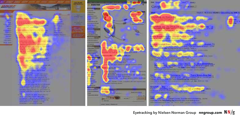
Jakob Nielsen and the Nielsen Norman Group are pioneers in studying how users interact with web pages, particularly through eye-tracking research. One of their most influential findings is the “F-pattern” of reading, which demonstrates how users typically scan web pages. In Western cultures, where reading occurs left-to-right, users often start by scanning horizontally across the top of a page, move down the left-hand side, and occasionally glance horizontally across shorter sections, forming a rough “F” shape.

Here’s how the F-pattern breaks down in practical terms:

  1. Top Horizontal Scan: Users begin by scanning the top part of the page (usually the header or navigation bar) to find high-level information or navigation options. This is why critical navigation links or branding elements should be placed here.
  2. Vertical Scan: As users move down the page, their eyes track along the left side. Designers should place important headings, subheadings, and key links along this vertical path to ensure visibility.
  3. Secondary Horizontal Scans: Occasionally, users will glance across horizontally to investigate shorter lines of content, like summaries or sidebars. Designers can take advantage of this behavior by placing key information in sidebars or using short, punchy blocks of text.

The takeaway for web designers is simple: if your page doesn’t align with the F-pattern, critical content might be missed. Headlines, CTAs (Calls to Action), and important visuals should be placed where users’ eyes naturally gravitate, ensuring that key information is seen quickly and easily. However, not all users follow the F-pattern rigidly—those seeking specific information may scan differently—so visual hierarchy should always prioritize clarity and simplicity.

The Gestalt Principles in Web Design: Grouping and Guiding Attention

Visual hierarchy doesn’t exist in isolation—it is also deeply connected to Gestalt principles, a set of psychological laws explaining how humans naturally perceive patterns and organize visual elements. Let’s delve into two critical Gestalt laws that every designer should have in their toolbox:

  1. The Law of Proximity: This law states that objects that are close to each other tend to be perceived as a group. In web design, proximity is often used to cluster related information, helping users quickly grasp how pieces of content are connected. For example, grouping related navigation links or placing text close to associated images helps users intuitively understand that these elements are connected.
    • Practical Application: Think of a product listing page. By grouping a product image with its description, price, and “Add to Cart” button, users don’t have to mentally connect these pieces of information themselves. Everything is presented as a logical, cohesive unit.
  2. The Law of Continuation: This principle suggests that the human eye prefers to follow a continuous path, particularly along lines or curves, rather than seeing disconnected elements. In web design, this can be used to lead the user’s eye from one section to another, guiding them through a smooth flow of information. For example, designers might use a diagonal line of images or a sequence of steps arranged in a curve to subtly direct attention to the next important point.
    • Practical Application: A common example is a step-by-step checkout process, where each stage (Cart, Shipping Info, Payment) is visually linked, making it clear where users are in the process and where they need to go next. This reduces confusion and cognitive load, increasing the likelihood of completing the transaction.

By leveraging these Gestalt principles, web designers can create clearer visual relationships and ensure that users can process information more efficiently. After all, one of the key goals in web design is to reduce cognitive friction—anything that makes a user stop and think “What am I supposed to do here?” should be avoided.

The Role of Contrast, Size, and Color in Visual Hierarchy

While proximity and continuation guide how elements are grouped, contrast, size, and color are essential tools for making elements stand out, thereby enhancing the visual hierarchy. Contrast can involve differences in brightness, color, shape, or texture, and it’s one of the most powerful ways to draw attention to an element.

Connecting Visual Hierarchy to Cognitive Load Theory

Finally, it’s important to note how visual hierarchy connects with Cognitive Load Theory (CLT), as we discussed in the previous posting. A well-constructed visual hierarchy helps reduce extraneous cognitive load—the mental effort that users expend when trying to figure out how to navigate or find information on a poorly organized page. By guiding users through a clear and intuitive hierarchy, designers can ensure that their mental energy is focused on the content itself, not on figuring out where to look next.

For example, consider a complex form with many fields. If the form is poorly designed (e.g., inconsistent spacing, lack of visual cues), users will expend unnecessary cognitive effort just trying to understand what to do. On the other hand, a well-designed form might use clear headings, grouped fields, and contrasting buttons to create a logical flow. This minimizes cognitive load and allows users to focus on completing the task.

In summary, visual hierarchy is one of the most powerful tools in a web designer’s arsenal. By applying principles from Gibson’s ecological approach, Gestalt laws, and research on visual perception, designers can guide users’ eyes effortlessly through a page, ensuring that the most important information is seen first. Coupled with contrast, size, and color, a well-thought-out visual hierarchy enhances usability, reduces cognitive load, and ultimately improves the user experience.


5. Speed Matters: The Impact of Load Times on Cognition and User Experience

Performance in web design isn’t just a technical issue; it’s a psychological one. Page load time has a significant effect on how users perceive a website, which in turn affects their emotional response and cognitive engagement. In neuroscientific terms, long load times trigger increased levels of cortisol, the stress hormone, which can lead to frustration and negative user experience.

A seminal study by Akamai Technologies and Gomez.com found that 47% of consumers expect a webpage to load in two seconds or less. When a page takes longer, users are not only more likely to abandon it, but they also form negative associations with the website’s brand.

From a cognitive perspective, long delays disrupt the user’s flow state, a concept introduced by psychologist Mihaly Csikszentmihalyi. In web usage, flow occurs when users are fully engaged in the task at hand, navigating smoothly through content without being interrupted by unnecessary delays. By optimizing page speed, designers can help users maintain their flow and reduce the cognitive strain caused by waiting.


Conclusion: Merging Science with Design

In conclusion, the neuropsychological principles that govern human behavior provide invaluable insights for web designers. From reducing cognitive load and optimizing color schemes to applying Fitts’s Law and visual hierarchy, each design decision can be informed by a deep understanding of how the brain processes information. By integrating these principles into the design process, web designers can create experiences that are not only visually appealing but also psychologically attuned to user needs.

Web design is no longer just about making things “look good” – it’s about making things work well with how people think, perceive, and interact. The best designs are those that invisibly guide users through a site, reducing mental friction and creating a seamless, intuitive experience.

the task at hand, navigating smoothly through content without being interrupted by unnecessary delays. By optimizing page speed, designers can help users maintain their flow and reduce the cognitive strain caused by waiting.


Research Reference:
Akamai Technologies. (2017). The State of Online Retail Performance.

Gibson, J. J. (1979). The Ecological Approach to Visual Perception. Boston: Houghton Mifflin.

Nielsen, J., & Pernice, K. (2006). Eyetracking Web Usability. Berkeley: New Riders.

Nielsen, J. (2000). Designing Web Usability: The Practice of Simplicity. Berkeley: New Riders Publishing.

Exploration of Neuropsychology in Webdesign #1

In a world where the average attention span rivals that of a goldfish (an often disproven myth, by the way, but we’ll save that for another time), it’s hardly surprising that web design has become one of the deciding factors in the success of a digital platform. What is often overlooked, however, are the neuropsychological mechanisms behind a functioning design. Welcome to a humorously academic journey into the art and science of web design – or, as we might call it: What does the brain actually think when it looks at a website?


1. Cognitive Load: The Foundation of Simplicity in Design

At the heart of effective web design lies a concept critical to the human brain’s processing power: cognitive load. This principle refers to the amount of mental effort required to absorb and process information. The cognitive load theory, popularized by psychologist John Sweller in the late 1980s, emphasizes that the brain has limited working memory, meaning that designs requiring excessive mental effort can overwhelm users and degrade their experience.

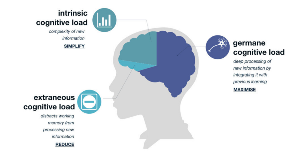
The theory revolves around a simple yet profound idea: our brains, despite all their brilliance, aren’t limitless processors capable of handling endless streams of information. Imagine your brain is a web browser with 50 tabs open—sure, it’s working, but it’s struggling. The more complex the information on each tab, the closer you are to a cognitive meltdown. Sweller proposed that learning, problem-solving, and interacting with any form of information all require cognitive resources, but those resources are finite. At its core, Sweller breaks the cognitive load into three types:

Germane Load – This is the good kind of cognitive load! It refers to the mental effort directed toward constructing useful knowledge and schema. Think of it as your brain’s attempt to make sense of new information by connecting it to what you already know, like remembering that the mitochondria are the powerhouse of the cell (yes, that fact will always stick with you).

Intrinsic Load – This is the unavoidable cognitive effort required by the task itself. If you’re trying to learn quantum physics or navigate a government website (often equally mind-boggling), your brain has no choice but to exert effort.

Extraneous Load – This is the cognitive load introduced by poorly designed instructional materials or distractions. It’s like trying to solve a math problem while someone plays “Baby Shark” on loop in the background. Extraneous load is unnecessary and should be minimized.

Sweller’s interest in cognitive load started with problem-solving research in education. He noticed something peculiar: complex problems often didn’t lead to better learning outcomes. In fact, sometimes the very act of problem-solving was so mentally draining that learners couldn’t retain much information afterward. It was as if their mental energy was entirely spent on juggling too many variables, leaving no capacity to actually understand or store what they’d learned.

Sweller’s work was heavily influenced by working memory research, particularly the famous “magical number seven” concept by George A. Miller.

Proposed by George A. Miller in 1956, this law suggests that the average person can hold about seven (plus or minus two) items in their working memory. This has profound implications for web design. Overly complex websites with too many navigation options, crowded layouts, or large blocks of text can quickly overwhelm users. A good web design reduces cognitive load by simplifying navigation, minimizing distractions, and organizing information into manageable chunks.

The principles of gestalt psychology also offer critical insights here. Gestalt theory, originally developed by psychologists such as Max Wertheimer, Kurt Koffka, and Wolfgang Köhler, focuses on how humans perceive visual stimuli as organized patterns rather than as isolated components. Gestalt laws, such as proximity, similarity, and closure, are essential to web design because they dictate how users naturally group and process information. When applied correctly, they reduce cognitive strain, making interfaces easier to navigate.

Research Reference:
Miller, G. A. (1956). The Magical Number Seven, Plus or Minus Two: Some Limits on Our Capacity for Processing Information. Psychological Review.


2. Color Theory: The Emotional and Cognitive Power of Color

Colors are not just decorative elements in web design; they are powerful psychological tools that evoke emotional and cognitive responses. Color psychology, a subfield of psychological research, explores how different colors affect mood, behavior, and decision-making. For instance, Angela Wright’s Color Affects System connects specific hues with predictable psychological responses. While the exact science of color perception is debated, certain broad patterns are generally accepted.

  • Blue is often associated with calm, trust, and security, which is why it is popular among banks and tech companies (e.g., PayPal, Facebook). It has been shown to enhance focus and is thus ideal for corporate or informational sites.
  • Red, on the other hand, is a color that evokes urgency, excitement, and even danger. It is often used to highlight critical elements like “Buy Now” buttons or warnings. However, red can also increase stress levels if overused.
  • Green is linked to growth, health, and peace. Its calming effect makes it an excellent choice for environmental, wellness, and financial websites.

In addition to individual color effects, complementary colors (those opposite each other on the color wheel) can create dynamic, visually stimulating designs. Analogous colors (those next to each other on the color wheel) provide harmony and can be used for smooth, aesthetically pleasing interfaces.

However, it’s important to note that color perception is also highly contextual and cultural. Eva Heller, a leading scholar in color theory, points out that while colors have universal psychological effects, their interpretation can vary across cultures. For example, white is often associated with purity in Western cultures but can symbolize mourning in some Eastern societies. Web designers should, therefore, consider both the universal and cultural meanings of colors when targeting global audiences.

Research Reference:
Wright, A. (1991). The Beginners Guide to Colour Psychology. Color Affects.


3. The Fitts’s Law: Making Interaction Easy and Intuitive

When it comes to interaction design, few principles are as foundational as Fitts’s Law, named after psychologist Paul Fitts, who formulated it in 1954. Fitts’s Law predicts the time required to move to and select a target, such as a button or link, based on its size and distance. The basic premise is that larger targets are easier and quicker to click, especially when they are positioned closer to the user’s cursor or touchpoint.

This principle is highly relevant for user interface (UI) design, particularly when it comes to call-to-action buttons and navigation links. Fitts’s Law advises designers to make clickable elements large and place them in easily accessible areas, such as the center of the screen or along the edges, where users naturally focus their attention.

  • Large buttons with clear labels are easier to click, reducing user frustration. This is especially critical on mobile devices, where smaller targets can lead to misclicks.
  • Important actions, such as submitting a form or finalizing a purchase, should have prominent buttons that are easy to find and click. Fitts’s Law would suggest making these elements more visible and larger than secondary actions like cancel buttons.

Furthermore, the concept aligns with the law of least effort, which states that users prefer paths of least resistance. By minimizing the effort needed to perform actions, web designers can create more satisfying and efficient user experiences.

Research Reference:
Fitts, P. M. (1954). The Information Capacity of the Human Motor System in Controlling the Amplitude of Movement. Journal of Experimental Psychology.