Characteristics: Bright neon colors, cluttered patterns, geometric shapes and 3D elements. The design was strongly influenced by pop culture, the Memphis design style and the onset of commercialization.
Examples: MTV VMA branding, posters with surreal compositions, sports logos with eye-catching shapes.
Influence on events: Logos became more colorful and eye-catching, e.g. at the 1984 Olympic Games in Los Angeles, which relied heavily on sponsorship and visual presence.
1990s: Minimalism and Digital Turnaround
Characteristics: Return to minimalist designs, focus on clean lines, vector graphics and early computer-generated designs. The rise of the internet had a significant influence on design.
Examples: Introduction of software such as Adobe Photoshop and Illustrator, simple websites with static designs.
Influence on events: Logos became simpler and cross-media applicable to work equally well in print and digital media. Examples include the simple designs of the FIFA World Cup and the increasing digital representation of COP logos.
2000s: Globalization and Brand Identity
Characteristics: Consistent branding becomes more important, designs become more flexible to adapt to global markets. Sustainability and user-friendliness come to the fore.
Examples: Flat design begins to establish itself, first adaptive logos, unified brand identities.
Influence on events: Global events such as the Olympic Games or the FIFA World Cup began to rely on uniform visual identities in order to create strong brand loyalty. Sustainability became a significant topic, especially at climate conferences.
2010s: Flat Design and Digital Mobility
Characteristics: Flat design becomes the standard, with simple, clear shapes, without shading or 3D effects. Designs become responsive and mobile-optimized.
Examples: Google Material Design, logos that can adapt to different media (responsive logos).
Influence on events: Designs were thought digital-first, flexible for social media and mobile devices. Examples are the variable logos of the Olympic Games or interactive displays at the World Expos.
2020s: Sustainability, Diversity and Dynamism
Characteristics: Focus on sustainability, diversity, wokeness and emotionally appealing designs. Organic shapes, natural colors and variable typography characterize the image.
Examples: Logos that adapt dynamically (e.g. animated logos), include everyone and focus on community.
Influence on events: Events such as the COP climate conferences and World Expos integrate environmental awareness or its visualisation directly into their visual identity. Modern logos reflect global diversity and flexibility. Formerly expressive logos are becoming calmer, more generic (MTV VMAs).
Summary as timeline topics:
1980s: Postmodernism and Abundance garish, eye-catching, geometric
1990s: Minimalism and Digital Pioneering Work clear lines, vector graphics
2000s: Brand Identity and Globalization uniform branding, sustainability
2010s: Flat Design and Digital Mobility minimalist, responsive, flexible
2020s: Sustainability and Diversity organic, dynamic, inclusive
Interactive installations can transform public spaces into hubs of creativity and connection. Yet, designing interactive installations that do more than capture attention — that genuinely engage people — requires more than just technical expertise. It takes a deep understanding of human behavior, user experience, and the dynamics of engagement. Designing for engagement means creating experiences that are intuitive, immersive, and meaningful; it means creating work that users will interact with and connect to on a deep level.
Only when people are truly engaged, can we as designers create an environment that allows for lasting memories to be made, shared with others, and revisited. As I’ve described in my previous blog posts, fostering engagement in public spaces can reduce social isolation and strengthen the sense of belonging. The goal is not just to capture attention but to transform fleeting moments into moments of connection.
User Experience in Interactive Installations
User experience is fundamental to the success of any interactive installation. It includes emotional, physical, intellectual, and social aspects, making each experience distinct and significant. UX is informed by various fields, as noted by several experts like Nathan Shedroff and Don Norman, who emphasize the need to design for emotions, enjoyment, and meaningful interactions. UX cannot be simplified to separate components; rather, it arises from the interaction among people, technologies, activities, and the broader social and cultural environments. 1
Understanding Engagement
Building on the foundation of a solid user experience, engagement takes it a step further by ensuring that users aren’t just interacting but becoming fully immersed in the experience. Engagement is not just participation – it is about ensuring that the interaction flows. Shedroff identifies five key features of engagement: identity, adaptivity, narrative, immersion and flow.
Identity: “Identity is needed for authenticity in the experience and expression of the self. The authenticity of an experience is about ensuring experiences are real, or realistic, and consistent.”
Adaptivity: “Adaptivity is to do with change and personalization and with changing levels of difficulty, pace and movement.”
Narrative: “Narrative is to do with telling a good story, with convincing characters, plot and suspense. Narrative is not just about fiction, however. […]”
Immersion: “Immersion is the feeling of being wholly involved within something, with being taken over and transported somewhere else. You can get immersed in all manner of things (such as reading a book) so immersion is not about the medium; it is a quality of the design.”
Flow: “[…] flow is the sense of smooth movement, the gradual change from one state to another.” 1
How to Design for Engagement
Know your Audience Knowing and understanding the target audience is crucial to creating engaging and interactive installations. It makes a big difference whether the audience consists of children, tech-savvy individuals, or a broad general public, as each group requires a specific and tailored approach. The better the installation is adapted to the needs and abilities of the audience; the more likely people are to actively engage with it.
Prioritize Intuitive Interactions It is important that interactive installations are designed to be intuitive and straightforward. Research on intuitive interactions in public spaces shows that overly complex and confusing interfaces and interactions can hinder user engagement. 3 Affordances play a crucial role here, as they define the relationship between the design of an installation and the user’s capabilities. According to Norman in “The Design of Everyday Things”, perceived affordances are particularly important — these are the action possibilities that are made obvious through design. 4When an installation’s affordances are clear and aligned with users’ expectations and abilities, it enhances ease of use and promotes more meaningful interaction, ultimately improving user engagement.
Accessibility and Inclusivity To truly engage diverse audiences, designers must ensure installations are accessible to everyone. This includes providing physical access, sensory accommodations, and possibly language-neutral designs. 5
Storytelling Good storytelling engages the user by creating an emotional connection and leaving lasting impressions. Through experiences that evoke strong emotions — such as awe, joy, sadness, or curiosity — strong engagement can be fostered. A compelling story, whether abstract or real, gives people the feeling of purpose and discovery. Through emotional resonance, the experience becomes not only memorable but also increases the likelihood that people will share it, thereby amplifying its impact. 6 7
Incorporating Multisensory Experiences Incorporating multisensory experiences into interactive installations enhances user engagement by appealing to multiple senses, such as sight, sound, touch, and even smell or taste. This approach creates more immersive and memorable experiences. 8
Personalization Personalization in interactive installations significantly enhances engagement by allowing participants to shape the experience through their actions. It could be visual feedback, sound, or even changing environmental elements. Customizing the experience empowers users, making them feel more connected and involved, as their choices directly influence the outcome. 9
Enjoyment Designers are increasingly focusing on integrating pleasure into their designs alongside usability, enhancing both emotional and hedonistic appeal. The focus is on creating enjoyable experiences by addressing physical, social, and psychological aspects in design. Don Norman also emphasizes these factors in improving user experience. Additionally, gamification principles explore how different types of fun — such as challenging, relaxing, meaningful, and social—drive engagement, enjoyment, and learning, highlighting the emotional impact of well-designed interactive experiences.1
Aesthetics Aesthetics is rooted in the appreciation of beauty, how things are sensed, felt and judged. It plays a significant role in interactive installations. Experiences can be divided into pragmatic attributes (effectiveness and efficiency) and hedonic attributes (emotion and enjoyment). Emotions are the core of experiences, as they are closely intertwined with cognition, motivation and action. 1
Social Interactions Social interactions play a crucial role in increasing engagement in interactive installations, particularly through collaboration. These social dynamics shape how participants connect with the installation and each other, enhancing their overall experience. Installations become more engaging when they allow people to share the experience, leading to deeper emotional connections. 10
As designers, our task is beyond creating eye-catching installations — we are shaping the future of public spaces. So, as we move forward, let’s ask ourselves: how can we continue to break barriers and design experiences that invite people to engage not just with the technology, but with each other, building a more connected and inclusive world?
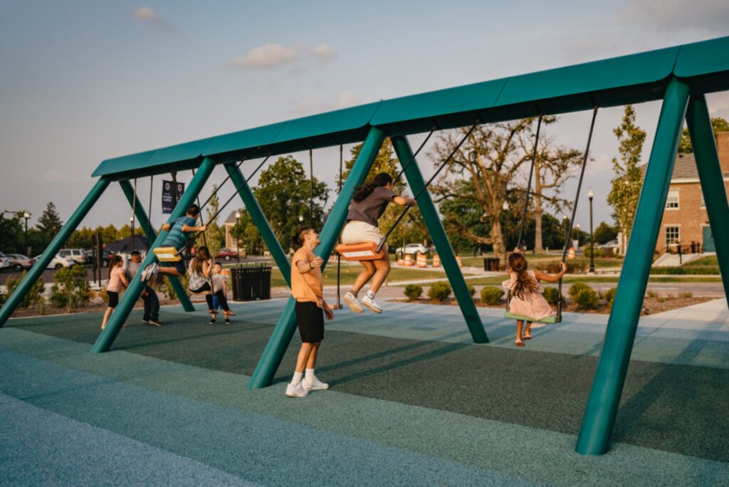
Inspired by the acclaimed 21 Balançoires (21 Swings) installation, The Swings: An Exercise in Musical Cooperation is a standalone, touring musical installation designed for international audiences. This interactive artwork features a series of musical swings that create harmonized melodies when used collectively. Certain musical patterns emerge only through cooperation, encouraging participants to synchronize their movements with others. It’s a playful experience that fosters connection and collaboration from the very first swing. With The Swings, participants engage their entire bodies to make music, fostering a sense of togetherness and shared ownership of public space. The result is a large-scale, collective instrument that unites people of all ages and backgrounds. Designed to transform urban environments, festivals, and special events, this installation offers a unique approach to communal music-making. Since its debut in 2011, the original 21 Swings installation has drawn millions of visitors to Montréal’s Quartier des Spectacles, where each swing moves an average of 8.500 times per day. 11
It draws the public in positive ways. It made our city feel like a genuine urban destination.
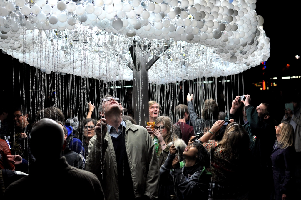
CLOUD is an interactive light sculpture, composed of 6.000 repurposed incandescent bulbs. Using pull-chain switches, participants work together to animate bursts of light, creating a shifting display reminiscent of lightning.
Blending playfulness with collaboration, CLOUD transforms viewers into performers, illustrating how individual actions contribute to a greater whole. The artwork offers both participation and contemplation, as those beneath the sculpture shape its movement while others observe the evolving patterns. Drawing on the universal imagery of rain clouds, CLOUD transcends cultural and language barriers, inviting shared wonder and connection. 12
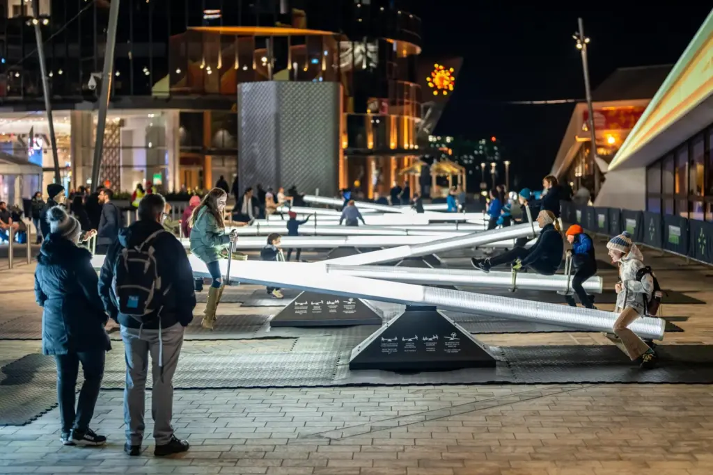
Impulse invites you into a playful, multisensory experience centered around a childhood classic: the seesaw. This interactive installation features a series of seesaws that respond to movement with shifting lights and sounds, transforming public space into an ever-evolving spectacle. More than just a playful ride, Impulse is designed with intentionality. Inspired by serialism — a structured musical composition technique — the installation creates dynamic zones of energy and tranquility, ensuring a harmonious blend of motion and sound.
Encouraging play, laughter, and connection, Impulse fosters a shared experience that brings people together, turning a simple act of movement into a joyful expression of community. 13
Sources
[1] D. Benyon, Spaces of Interaction, Places for Experience. 2014. doi: 10.2200/S00595ED1V01Y201409HCI022.
[2] N. Shedroff, Experience Design, a Manifesto for the Creation of Experiences. New Riders, 2009, pp. 9–10.
[3] L. Hespanhol and M. Tomitsch, “Strategies for intuitive interaction in public urban spaces,” Interacting with Computers, vol. 27, no. 3, pp. 311–326, May 2015, doi: 10.1093/iwc/iwu051.
[4] D. Norman, The Design of Everyday Things: Revised and Expanded Edition. Hachette UK, 2013.
[5] „What is inclusive design?“ https://www.inclusivedesigntoolkit.com/whatis/whatis.html
[6] „What is Storytelling?“, The Interaction Design Foundation, 30. November 2024. https://www.interaction-design.org/literature/topics/storytelling?srsltid=AfmBOooli8H26zn96VkuoNycaHkmn_oTQgdY-NcWh1BKTjmWxgABHoDz#how_storytelling_works_in_design-1
[7] M. L. H. M. Hanapiah und S. M. Nasir, „A Systematic Review towards Evolution of Interactive Storytelling and Audience Engagement in Films“, International Journal Of Creative Multimedia, Bd. 5, Nr. 1, S. 55–73, Apr. 2024, doi: 10.33093/ijcm.2024.5.1.4.
[8] L. Lin and L. Lu, “Research on the Design of Multisensory Interactive Experiences in Museums Based on Embodied Cognition,” in HCI International 2024 Posters, C. Stephanidis, M. Antona, S. Ntoa, and G. Salvendy, Eds., vol. 2119, Cham, Switzerland: Springer, 2024, pp. 1-10. [Online]. Available: https://doi.org/10.1007/978-3-031-61966-3_23.
[9] B. Moggridge, Designing Interactions. The MIT Press, 2006.
[10] J. Schell, The Art of Game Design. 2008. [Online]. Verfügbar unter: https://dx.doi.org/10.1201/9780080919171
What is the research topic / central research question?
Research Topic: The cultural and commercial significance of luxury brand collaborations in shaping design trends and consumer perceptions from the 1980s to today.
In the world of luxury, collaborations between major brands have become an essential strategy for stimulating innovation, broadening their customer base and raising their profile. These partnerships create a unique synergy, combining the prestige of different houses to offer exclusive products.
Central Research Question: How do brand collaborations influence design aesthetics, consumer behavior, and brand strategy, and how have these dynamics evolved?
Why is it relevant to designers / what are the ‘problems to solve’?
While the concept of the brand collaboration isn’t new, the pace at which both luxury and general consumer brands are rolling out collaborations is accelerating.
Synergy between luxury brands from disparate verticals offers a powerful solution to the challenge of capturing consumer engagement, particularly as the consumer attention span shrinks, market saturation is at an all-time high and instant gratification reigns supreme. In fact, today, collaborations aren’t just a trend; they are a strategic imperative in a competitive marketplace.
Collaborations are a requisite for any (luxury) brand looking to offer its existing customer base new moments of discovery, interest and intrigue while also strategically expanding into new audience verticals.
Relevance to Designers:
Cultural Impact of Design: Collaborations between luxury brands and unexpected partners (e.g., artists, mainstream brands, or celebrities) redefine what is considered “luxury” and expand the boundaries of design language.
Maintaining Brand Identity: Designers must find the balance between innovation and preserving a brand’s core identity. This is especially challenging when two distinct creative visions merge.
Accessibility vs. Exclusivity: How can brands create accessible, aspirational collections without diluting their luxury status? Designers play a crucial role in achieving this balance.
Sustainability: The rise of limited-edition collections raises questions about overproduction, fast fashion, and long-term cultural value.
Problems to Solve:
How can luxury brands stay relevant in a world increasingly driven by Gen Z and millennial values, such as inclusivity and sustainability?
What makes a collaboration successful both visually and commercially? Examples like Gucci x North Face succeed, while ventures like Target x Neiman Marcus fail.
How do cultural, technological, and generational shifts shape the nature of collaborations?
3. My motivation & interest
Luxury brand collaborations offer a fascinating lens to study the intersection of design, culture, and commerce. They often reflect the zeitgeist of a specific era—whether it’s the graffiti-inspired Louis Vuitton x Stephen Sprouse collection of the early 2000s or the contemporary blending of high fashion and streetwear. Personally, this topic resonates because it showcases how creativity can transcend traditional boundaries while posing new challenges for modern designers.
This research highlights the power of collaboration to reinvent iconic brands and define new cultural narratives. It’s also intriguing to explore how these collaborations influence design aesthetics across industries and inspire broader creative movements.
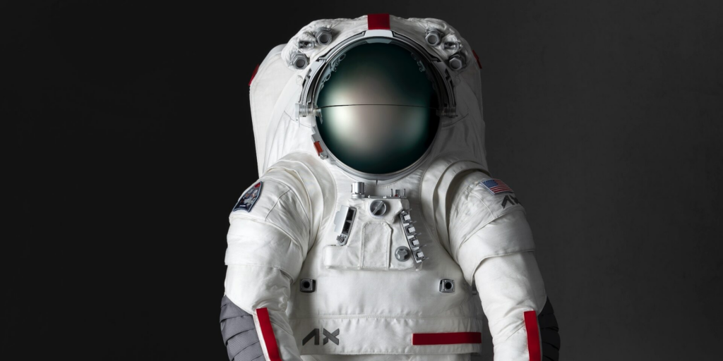
Axiom Space und Prada arbeiten gemeinsam an der Entwicklung neuer Raumanzüge für zukünftige Mondmissionen.Image courtesy of Prada / Axiom Space
Research Results
Design Evolution:
The 1980s: Luxury brands focused on exclusivity and craftsmanship, with less emphasis on collaborations. Design was largely driven by opulence and classicism.
Today: Luxury brands embrace collaborations to stay culturally relevant, often blending nostalgia with modernity to appeal to younger audiences.
Consumer Behavior:
Collaborations significantly impact purchasing decisions, particularly among Gen Z and millennials.
Authenticity and uniqueness are critical factors in determining the success of a collaboration.
Aesthetic Trends:
High-low collaborations (e.g., H&M x Karl Lagerfeld) have introduced luxury aesthetics to mainstream audiences.
Unexpected pairings (e.g., Dior x Technogym) challenge traditional notions of luxury while expanding brand narratives.
Commercial Value:
Successful collaborations drive significant revenue increases and long-term brand loyalty.
Research Methods: Comparative analysis of iconic collaborations
Best practice examples / state of the art
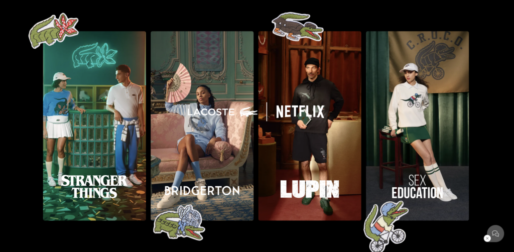
Lacoste x NetflixStranger things brand collaboration
Stranger things is an 80s inspired Netflix series, which is now available as merch from Lacoste. Combining nostalgia, luxury and mainstream media all in one campaign. And they did not stop there: Bridgerton, Sex Education, Lupin, Shadow and Bone, Elite, La Casa de Papel, The Witcher were all incorporated in collections of Lacoste.
1980s Collaborations:
Karl Lagerfeld x Chanel (1980s): Lagerfeld’s transformative influence on Chanel laid the foundation for modern luxury collaborations.
Modern Collaborations:
Luxury Brand x Luxury Brand:
Fendi x Versace (“Fendace”): A successful reinterpretation of each other’s aesthetics, showcasing how luxury brands can cross-pollinate.
Luxury Brand x Celebrity:
Louis Vuitton x Kanye West: A groundbreaking sneaker collaboration that combined luxury with streetwear.
Luxury Brand x Surprise Partner:
Gucci x North Face: A marriage of outdoor practicality and high fashion, appealing to the rising trend of luxury athleisure. A separate logo was designed for the joint collection, combining The North Face’s graphic logo, which is inspired by a mountain, with the green-red-green weave of the GUCCI house.
Collection designs modelled on original North Face items from the 70s
Vision & next steps
MyVision is to understand the cultural, aesthetic, and commercial dynamics of luxury collaborations. This could include conceptualizing and executing mockup collaborations, ensuring they resonate both visually and culturally. Or I aim to present my research as an own design merge, that inspires creatives and viewers to think differently about a given topic and put it into another context.
For this I would have to conduct consumer sentiment surveys and polls regarding collaboration campaigns.
Explore the Intersection of Nostalgia and Innovation:
Investigate how collaborations use nostalgia (e.g., 1980s influences) to attract modern audiences.
Examine how digital tools like AR and CGI expand the storytelling possibilities
Study the Role of Cultural Context:
Analyze how collaborations reflect societal values, such as inclusivity, sustainability, and technological innovation.
Case Study Development:
Conduct in-depth case studies of successful and failed collaborations to identify best practices and pitfalls.
Analysis of commercial performance metrics for high-profile collaborations.
Interviews with design and branding professionals.
Inclusivity vs. exclusivityLouis Vouitton x TimberlandsFail or success? What about target audiences?
Further research questions
Which industies or topics could I target? Interior, Cars, Digital Sector, Music, Games Politics, …?
Through this research into audiovisual interactivity and its impact on immersive environments, I have found foundational insights that are shaping the trajectory of my topic. These learnings span theoretical frameworks, practical applications, and the challenges of designing user-centered, multisensory experiences.
When properly integrated, audiovisual elements can enhance emotional responses, direct attention, and foster deeper immersion. Examples such as teamLab Borderless and the MoMA SoundScape installation illustrate how carefully synchronized soundscapes and visuals create environments where users feel emotionally and physically connected.
Drawing on Gibson’s and Norman’s theories, I’ve realized the importance of perceived affordances in designing interactive environments. Users need clear cueS, whether visual, auditory, or tactile, to understand how to interact with installations. Misaligned or ambiguous affordances risk creating frustration and disengagement, underscoring the importance of intuitive design.
From Your Brain on Music to the principles of ecological perception, I’ve learned how sensory stimuli influence emotional states and cognitive processes. For instance, the cerebellum’s role in movement and rhythm underscores how bodily interaction with immersive spaces can evoke joy or excitement, while the amygdala’s role in emotional memory highlights the potential of audiovisual design to create lasting impressions.
Different cultures interpret visual and auditory stimuli in distinct ways. Similarly, individuals’ personal experiences shape their responses to interactive environments. Designing for inclusivity and flexibility is essential to ensure that installations resonate universally while allowing space for personal meaning.
NEXT STEPS IN MY RESEARCH
The insights gained so far set the stage for deeper exploration into how audiovisual interactivity shapes user experiences in immersive environments. My next steps will focus on refining these learnings and addressing gaps to create actionable frameworks for designers.
I aim to design and test small-scale prototypes that integrate sound and visual elements with interactive affordances. These prototypes will allow me to study how users respond to specific audiovisual cues and identify design principles for creating intuitive and engaging experiences.
To validate my findings, I will conduct user studies in controlled settings. By observing how participants interact with audiovisual environments, I can gather data on emotional and cognitive responses, usability challenges, and cultural variations. This will provide valuable insights for refining design strategies.
Incorporating AI and real-time feedback systems is a priority. AI can analyze user behavior and dynamically adapt audiovisual elements to enhance engagement and personalization. This approach will also explore how real-time interactivity can deepen user immersion and foster a sense of agency.
Given the interdisciplinary nature of this field, I plan to collaborate with experts in interaction design, psychology, and cultural studies. These collaborations will provide diverse perspectives and strengthen the theoretical and practical dimensions of my research.
Ultimately, my goal is to create a comprehensive framework for designing audiovisual interactivity in immersive environments. This framework will provide guidelines for balancing sound and visuals, optimizing affordances, and tailoring experiences to diverse audiences.
CLOSING THOUGHTS
he journey so far has revealed the immense potential of audiovisual design to transform interactive environments into spaces of emotional and cognitive resonance. It has also highlighted the challenges, from managing sensory overload to designing for cultural inclusivity. As I move forward, I am excited to deepen this exploration, contribute meaningful insights to the field, and pave the way for innovative, user-centered experiences.
In the realm of design, hierarchy is more than an aesthetic choice—it’s a fundamental principle that dictates how information is consumed and understood. Whether in graphic design, web design, advertising, or user interface design, hierarchy ensures clarity, usability, and emotional resonance. Without it, even the most visually striking designs risk becoming chaotic and ineffective.
This comprehensive exploration of design hierarchy will unpack its importance, principles, applications, and practical tips, equipping designers with the tools to craft more impactful and engaging compositions.
What Is Hierarchy in Design?
Hierarchy in design refers to the deliberate arrangement of elements to establish a clear order of importance. It determines the visual flow—how the viewer’s eyes move across a composition and in what order they absorb information.
Think of a well-designed hierarchy as a road map. It tells users where to look first, what to focus on next, and how to navigate through the content seamlessly. Whether it’s a bold headline, an eye-catching image, or a strategically placed call-to-action button, hierarchy ensures that critical elements command attention.
Without hierarchy, designs can feel overwhelming, cluttered, or ambiguous, leaving viewers disengaged or confused.
Why Is Hierarchy Essential in Design?
Hierarchy’s importance stems from its ability to make communication efficient, engaging, and effective. Here’s why hierarchy is a non-negotiable aspect of design:
1. Focus and Direction
Hierarchy ensures that key messages stand out. For example, in an advertisement, the product name or tagline often dominates the visual space, followed by secondary details like pricing or contact information. Without this structured approach, viewers may miss the primary message altogether.
2. Improved User Experience
Clear hierarchy simplifies navigation, especially in digital contexts. Websites, apps, and software rely on hierarchical structures to guide users intuitively. For instance, navigation bars, headings, and dropdown menus are all organized to reduce cognitive load and enhance usability.
3. Enhanced Accessibility
Hierarchy accommodates diverse audiences, including those with limited attention spans, visual impairments, or varying literacy levels. Bold text, contrasting colors, and clear segmentation of content make designs universally understandable.
4. Emotional Resonance
By emphasizing certain elements, hierarchy can evoke emotions or create a narrative. A large, colorful banner might inspire excitement, while subdued tones and smaller fonts could convey seriousness or elegance.
5. Effective Storytelling
Design is a form of storytelling. A well-structured hierarchy leads viewers through a narrative, whether it’s explaining a product’s features, promoting an event, or guiding a user through a process.
Core Principles of Design Hierarchy
Effective hierarchy in design relies on principles that organize elements by importance. Size and scale draw attention to larger elements first, such as bold headlines. Color and contrast emphasize key components by creating visual differentiation, while typography establishes structure through varied font sizes and weights for headings and body text. White space prevents clutter, ensuring individual elements stand out, while alignment creates order and coherence. Positioning influences importance, with top or central placement attracting the most attention. Proximity groups related items together for clarity, and visual weight, created through bold colors or unique shapes, naturally guides the viewer’s eye to the most important components.
Applications of Hierarchy Across Design Disciplines
Hierarchy adapts to the needs of different design fields to organize and communicate effectively. In graphic design, it prioritizes key messages, such as bold event names on posters or advertisements. Web design depends on hierarchy to improve navigation, with prominent calls-to-action leading users through content seamlessly. Advertising highlights central messages, like showcasing a product image alongside supporting details. In UI/UX design, hierarchy ensures intuitive interactions through the strategic placement of buttons and menus. Editorial design leverages hierarchy to structure dense information, using headlines, subheadings, and imagery to maintain readability and engagement.
How to Create Effective Hierarchy
Building effective hierarchy starts by prioritizing critical information to highlight the most important elements. Visual cues like arrows or shadows guide attention, while simplicity avoids overwhelming viewers. Consistency in typography, colors, and alignment creates a cohesive design that supports the hierarchy. Testing with users through eye-tracking or feedback ensures the design functions as intended. A clear, uncluttered layout with intentional use of size, contrast, and spacing ensures the hierarchy effectively communicates the message and enhances usability.
Design hierarchy is the silent orchestrator of impactful communication. It transforms chaotic arrangements into structured narratives, guiding viewers effortlessly through content. By mastering the principles of hierarchy, designers can create work that is not only visually compelling but also functionally effective.
Hierarchy isn’t just about aesthetics—it’s about connecting with your audience, telling stories, and leaving lasting impressions. Mastering hierarchy isn’t just a skill—it’s a mindset that allows designers to communicate meaningfully, ensuring that every element serves its purpose and every message resonates.
As genderless design continues to gain attention across industries, there is still much to explore. While brands like Aesop have made strides toward more inclusive design, gaps remain in how gender is represented—or erased—through design choices. Looking ahead, my research could expand in several directions, uncovering new insights into how gender-neutral design evolves, how it is perceived, and how it can be applied more effectively.
1. Expanding the Cultural Lens
Most discussions on genderless design are rooted in Western perspectives, often shaped by modernist minimalism. But neutrality is not universal—different cultures perceive gender and aesthetics in unique ways. Future research could explore:
How non-Western brands approach gender-neutral design (e.g., typography in East Asian cultures, colors in Indigenous design).
The role of cultural expectations in shaping “neutral” aesthetics—what appears neutral in one context might be highly gendered in another.
Case studies of global brands and how they navigate gender inclusivity across different markets.
This research would highlight whether genderless design can be truly universal or if it must always be adapted to specific cultural contexts.
2. The Psychology of Gender-Neutral Aesthetics
We often assume that certain design elements (muted colors, minimalist layouts, sans-serif fonts) feel gender-neutral. But is that actually true?
How people subconsciously interpret different design choices—do users perceive “neutral” branding as more exclusive or more inclusive?
Whether a truly genderless aesthetic exists, or if every design carries some form of gender coding.
The impact of “neutral” design on user behavior and brand perception—does genderless branding actually widen audience reach, or do people still look for gender cues?
3. AI and Adaptive Genderless Design
AI-driven design tools are rapidly shaping how digital experiences are created and customized. Future research could examine:
How AI can create truly gender-inclusive digital spaces
The potential of AI-generated visual and written content—could AI create marketing campaigns that feel inclusive to all identities?
Ethical concerns around AI and gender neutrality—should AI ignore gender entirely, or should it allow for dynamic self-expression?
Looking Ahead: Why This Research Matters
Brands and designers are still experimenting with what works and what doesn’t. Future research has the potential to provide guidelines for designers and brands, challenge assumptions about what neutrality really means or generally explore how AI, psychology, and culture shape our perceptions of genderless design. As I continue to explore this field, my goal is to push beyond surface-level discussions and uncover how design can be more inclusive, not just in aesthetics, but in experience, accessibility, and intent.
Developing a successful gamified strength training app requires a structured and evidence-based approach. This blog post outlines the methodology and evaluation framework for my master thesis project, which focuses on creating a mascot-driven, gamified app that encourages users to progress in their strength training through engaging and emotionally resonant interactions.
Methodology
The methodology for this project is structured into four key phases: research, design, prototyping, and evaluation.
1. Research Phase The research phase involves understanding user needs, reviewing existing apps, and exploring psychological principles behind gamification and progressive overload. This phase sets the foundation for the app by addressing questions such as:
What motivates users to stay consistent in strength training?
How can a virtual character foster emotional engagement?
What gaps exist in the current landscape of gamified fitness apps?
Key research activities include:
User Surveys and Interviews: Collecting data on users’ training habits, goals, and pain points in current fitness apps.
Literature Review: Analyzing scientific studies on gamification, progressive overload, and behavior change in fitness.
Competitive Analysis: Identifying strengths and weaknesses of existing apps like Fitbod and Nerd Fitness Journey.
2. Design Phase The design phase focuses on creating a conceptual framework for the app. Core design components include:
Mascot Development: Designing a virtual character that reacts dynamically to user actions, providing encouragement and feedback.
Gamification Mechanics: Developing features like level-ups, challenges, and rewards tied to strength training progress.
Adaptive Training Algorithms: Implementing a system that adjusts weight and reps automatically based on user performance.
Wireframes and mockups will be created during this phase to visualize the user interface and user experience.
3. Prototyping Phase The prototyping phase involves building a functional prototype of the app using tools like Max 8 or Unity. This prototype will include:
A basic strength tracking system.
Interactive mascot animations.
Gamification elements such as progress bars, milestones, and rewards.
The prototype will be iteratively improved based on feedback from user testing.
4. Evaluation Phase The evaluation phase assesses the app’s effectiveness in terms of user engagement, emotional connection, and training outcomes.
Evaluation Framework
To evaluate the app, a mixed-methods approach will be employed, combining quantitative and qualitative data.
1. User Testing A group of participants will use the app for a specified period, such as four to six weeks. Key metrics to evaluate include:
Engagement: Measured by frequency and duration of app usage.
Consistency: Tracking how often users complete scheduled workouts.
Progress: Evaluating improvements in users’ strength training performance.
2. Surveys and Interviews Surveys and semi-structured interviews will gather qualitative feedback on:
The emotional bond with the mascot.
The perceived usefulness of gamification mechanics.
Overall satisfaction with the app.
3. Comparative Analysis The app will be compared to existing gamified fitness apps using the same metrics. This analysis will identify the unique strengths and areas for improvement of the thesis project.
4. Statistical Analysis Quantitative data will be analyzed using statistical methods to identify trends and correlations, such as whether frequent app users show greater strength progress or engagement compared to infrequent users.
Success Criteria
The success of the app will be determined based on the following criteria:
User Engagement: High levels of app usage and adherence to workouts.
Emotional Connection: Positive feedback on the mascot’s design and interactions.
Effectiveness: Observable progress in users’ strength training performance.
Differentiation: Clear advantages over existing apps in terms of engagement and usability.
Conclusion
The methodology and evaluation framework outlined above ensure that this thesis project is grounded in research, user-centered design, and rigorous evaluation. By leveraging a mascot-driven approach and gamification mechanics, the app aims to address gaps in current fitness solutions and create an engaging, effective tool for strength training.
This structured approach not only ensures the app’s success but also contributes valuable insights to the fields of interaction design, gamification, and fitness technology.
References
Reeves, B., & Read, J. L. (2009). Total Engagement: Using Games and Virtual Worlds to Change the Way People Work and Businesses Compete. Harvard Business Press.
Deci, E. L., & Ryan, R. M. (1985). Intrinsic Motivation and Self-Determination in Human Behavior. Springer Science & Business Media.
Rodrigues, F., Teixeira, D. S., Neiva, H. P., et al. (2021). “The bright and dark sides of motivation as predictors of enjoyment, intention, and exercise persistence.” Frontiers in Psychology, 12, 759987. https://doi.org/10.3389/fpsyg.2021.759987
In a world filled with endless distractions, attention has become a valuable currency, especially in digital design. Attention design is the intentional structuring of experiences to capture, guide, and maintain a user’s focus. For a gamified strength training app with a mascot-like virtual character, as envisioned in this master thesis, understanding and leveraging attention design principles is essential for creating an engaging and effective experience. This blog post delves into the science of attention design, explores its relevance to gamification and fitness, and discusses how these principles can enhance user engagement and retention.
The Science of Attention
Attention, from a cognitive perspective, refers to the allocation of mental resources to specific stimuli or tasks. According to Kahneman’s Capacity Model of Attention, individuals have a limited pool of cognitive resources that can be allocated to various tasks (Kahneman, 1973). The design of digital products must, therefore, compete for these resources, often in a crowded landscape.
Research also distinguishes between two types of attention:
Exogenous Attention (stimulus-driven): Captured by external stimuli, such as bright colors or unexpected movements.
Endogenous Attention (goal-driven): Focused and intentional, directed by the user’s internal motivations (Posner & Petersen, 1990).
An effective design incorporates both to attract and sustain user focus.
Applying Attention Design to Gamified Strength Training
Gamified apps must strike a balance between grabbing initial attention and sustaining long-term engagement. This balance is particularly relevant in fitness, where consistency is key but user drop-off rates are high. A virtual character-based app can leverage attention design in the following ways:
Dynamic Visuals and Animations Animated mascots or characters, particularly those that react to user input, trigger exogenous attention. Research has shown that motion and interactivity are effective in sustaining engagement (Sundar et al., 2014). For instance, a mascot that celebrates every milestone achieved by the user can create a sense of accomplishment, maintaining focus and reinforcing behavior.
Goal-Oriented Challenges Fitness apps can harness endogenous attention by aligning tasks with user goals. Progressive overload, for instance, could be gamified into challenges where the mascot motivates users to beat personal bests. Aligning in-app rewards with real-world fitness progress keeps the user intrinsically motivated.
Reduction of Cognitive Load Complex interfaces or unclear instructions can quickly overwhelm users. Sweller’s Cognitive Load Theory suggests that reducing unnecessary mental effort enhances attention and learning (Sweller, 1988). Designing a clear and intuitive user experience ensures users focus on the workout and engagement with the app, not on deciphering how it works.
Attention Design Challenges
While attention design has immense potential, it also comes with challenges. Overloading users with stimuli, such as excessive notifications or animations, can lead to attention fatigue, where users disengage entirely. Moreover, a lack of variety in content or repetitive tasks can lead to boredom, undermining long-term engagement.
A mascot-based app must, therefore, incorporate variability. Changing the mascot’s responses, introducing new challenges, or integrating personalized feedback based on user performance ensures that attention is sustained over time.
The Role of Emotional Engagement
Attention design extends beyond visuals and interactivity—it also involves emotional engagement. A study by Isbister (2016) highlights how empathetic character design can foster an emotional connection between users and digital products. For a fitness app, a mascot that displays concern when users miss workouts or celebrates their victories humanizes the experience, making users more likely to return. Emotional connection reinforces attention because users feel personally invested in the app and their progress.
Attention Design in Practice
Examples of successful attention design in digital fitness include:
Nike Training Club: Uses dynamic visuals and personalized progress updates to sustain user focus.
Duolingo: Gamifies learning with a mascot (Duo the owl) that reacts to user actions, driving emotional engagement and consistent use.
Zombies, Run!: Combines storytelling with fitness to capture both exogenous and endogenous attention, creating a compelling experience.
A mascot-driven strength training app can draw inspiration from these examples by integrating a narrative, dynamic interactivity, and progress-driven personalization.
Conclusion
Attention design is a cornerstone of effective digital experiences. By strategically balancing exogenous and endogenous attention, minimizing cognitive load, and fostering emotional engagement, a gamified strength training app can capture and sustain user focus. For this thesis project, the integration of attention design principles into the mascot-based app ensures it stands out in the competitive fitness market, offering a unique and impactful user experience.
References
Kahneman, D. (1973). Attention and Effort. Prentice Hall.
Posner, M. I., & Petersen, S. E. (1990). The attention system of the human brain. Annual Review of Neuroscience, 13(1), 25–42.
Sweller, J. (1988). Cognitive load during problem solving: Effects on learning. Cognitive Science, 12(2), 257–285.
Sundar, S. S., Bellur, S., Oh, J., Xu, Q., & Jia, H. (2014). Theoretical importance of modality interactivity in human-computer interaction. Communication Research, 41(8), 1081–1114.
Isbister, K. (2016). How Games Move Us: Emotion by Design. MIT Press.
The pandemic forced museums to pivot quickly to digital platforms to stay connected with audiences as physical visits became limited or impossible. Virtual tours, online exhibitions, and digital programming became essential tools to engage visitors during this time. However, while digital engagement helped sustain interest, it became clear that digital-only experiences could not replicate the richness and depth of physical interactions with artifacts. This is where the concept of “phygital” arises as the key to enhancing museum engagement.
What is Phygital?
The term “phygital” merges the physical and digital realms, transforming how museums engage with visitors. By integrating technology into tangible displays, museums create immersive, engaging experiences for diverse audiences. The “Phygital Museum Scale” offers a framework for blending digital and physical elements effectively [1], while emphasizing storytelling as a “sensitive activation” of cultural heritage [7]. This approach helps museums stay relevant as audience expectations and technology evolve.
Exploring Phygital Innovations
Phygital strategies are reshaping museums worldwide. For example, the Markiezenhof Museum in the Netherlands uses augmented reality to animate historical artifacts, enhancing visitor understanding [5]. The “Phygital Museum Scale” identifies five scenarios ranging from fully physical to fully digital experiences, helping museums tailor their strategies based on audience and goals [1]. Projects like ExhiBIT foster inclusivity through community-driven curation and digital tools [2]. Phygital spaces integrate technology seamlessly, turning visitors’ gestures into part of the storytelling process, which demonstrates the potential of merging physical artifacts with digital technologies [4], [7].
Why Phygital Matters
Phygital strategies cater to various learning styles, broadening accessibility [3]. Digital enhancements such as virtual tours and contextual overlays offer deeper insights beyond what physical artifacts alone can provide [6]. Purpose-driven design ensures that digital tools complement material culture, while sensory and immersive experiences amplify the emotional significance of objects [1], [7]. Analytics from digital tools allow museums to tailor exhibitions, enhancing visitor engagement [4].
A Vision for the Future
Phygital technologies, including virtual reality, interactive holograms, and AI-driven personalization, promise to transform museum experiences [4], [6]. These innovations shift spaces from contemplative to performative, allowing visitors to co-create their experiences through interaction and narrative involvement [7]. The “Phygital Museum Scale” guides museums toward a balanced integration of physical and digital elements, as seen in projects like Ravespace, which bridge the gap between the two realms [4].
Conclusion
Phygital approaches revolutionize museum experiences, offering a bridge between tradition and technology. By combining physical artifacts with digital tools, museums create interactive and memorable experiences that foster deeper connections with cultural heritage [3], [1]. As the boundaries between physical and digital continue to blur, phygital museums will lead to audience engagement and cultural preservation [5].
References
[1] S. Debono, “The Phygital Museum Scale: Measuring and Designing Phygital Museum Experiences,” CHAIN 2022 Proceedings, University of Catania, 2022, pp. 25-34.
[7] A. Miano, “Phygital Museum Experiences: The Situated and Invisible Dimension of Technology as Sensitive Activation of Cultural Heritage,” Conference Paper, University of Campania “Luigi Vanvitelli,” 2023.
Interaction in museums is a dynamic concept that reflects the ways in which visitors engage with exhibits, staff, and each other. Historically, museums were viewed as spaces for passive observation, where visitors simply looked at objects or artifacts. Over time, however, there has been a shift towards more engaging and participatory experiences, allowing visitors to interact with exhibits and immerse themselves in the museum environment. This shift has broadened the definition of interaction in museums, highlighting the importance of visitor engagement in learning and enjoyment.
Digital Interaction
The use of technology in museums has significantly enhanced visitor interaction. Digital tools such as interactive touchscreens, augmented reality (AR), and virtual tours allow visitors to engage with exhibits in innovative ways. These technologies create immersive environments that not only provide information but also encourage exploration and curiosity. For example, AR allows visitors to see historical reconstructions or interact with 3D models of artifacts, fostering a deeper understanding of the content [2]. The role of technology has revolutionized how visitors can engage with exhibits, turning a passive experience into a more active, personalized learning journey [1].
Tangible Interaction
While digital interactions are important, non-digital experiences are equally essential in enhancing visitor engagement. Tactile exhibits, live demonstrations, and hands-on workshops allow visitors to engage physically and intellectually with museum content. These types of interactions create a more personal connection with the exhibits, offering opportunities for multisensory learning that digital tools may not always provide. Museums with such interactive elements help visitors build deeper connections to the artifacts, enhancing their emotional and intellectual experience [3].
Social Interaction
In addition to individual engagement, museums also encourage social interaction. Group activities, collaborative workshops, and guided tours provide spaces for visitors to interact with one another. This social dimension fosters learning through shared experiences, where visitors exchange ideas, challenge one another’s viewpoints, and build collective understandings of the museum’s content. Social interaction within a museum can lead to a richer, more nuanced interpretation of the exhibits and deepen the visitor’s connection to the material [5]. Museums are increasingly designed to promote these interactions, fostering a sense of community and collaboration among visitors [4].
Learning Outcomes
One of the primary goals of interactive experiences in museums is to enhance learning outcomes. Research has consistently shown that visitors who engage more actively with exhibits tend to retain information better and develop a deeper understanding of the subject matter. Whether through the use of technology, tactile experiences, or social interaction, active participation helps to strengthen cognitive and emotional connections with the material. This engagement leads to a more profound learning experience and encourages visitors to critically engage with content rather than merely absorb it passively [2].
Conclusion
Defining interaction in museums extends far beyond the traditional passive viewing of objects. Interaction today encompasses a variety of methods—digital and non-digital—that invite visitors to engage more deeply with the museum experience. As museums continue to evolve, their role as active, participatory spaces will likely expand, offering richer, more meaningful experiences for future generations.
References
[1] G. E. Hein, Learning in the Museum, Routledge, 1998.
[2] J. H. Falk and L. D. Dierking, Learning from Museums: Visitor Experiences and the Making of Meaning, 2nd ed., AltaMira Press, 2013.
[3] E. Hooper-Greenhill, Museums and the Interpretation of Visual Culture, Routledge, 2000.
[4] S. Macdonald, A Companion to Museum Studies, Wiley-Blackwell, 2011.
[5] L. H. Silverman, The Social Work of Museums, Routledge, 2010.