8. IMPULS: LlumBCN – Part 2: Sant Martí im Zeichen der Lichtkunst

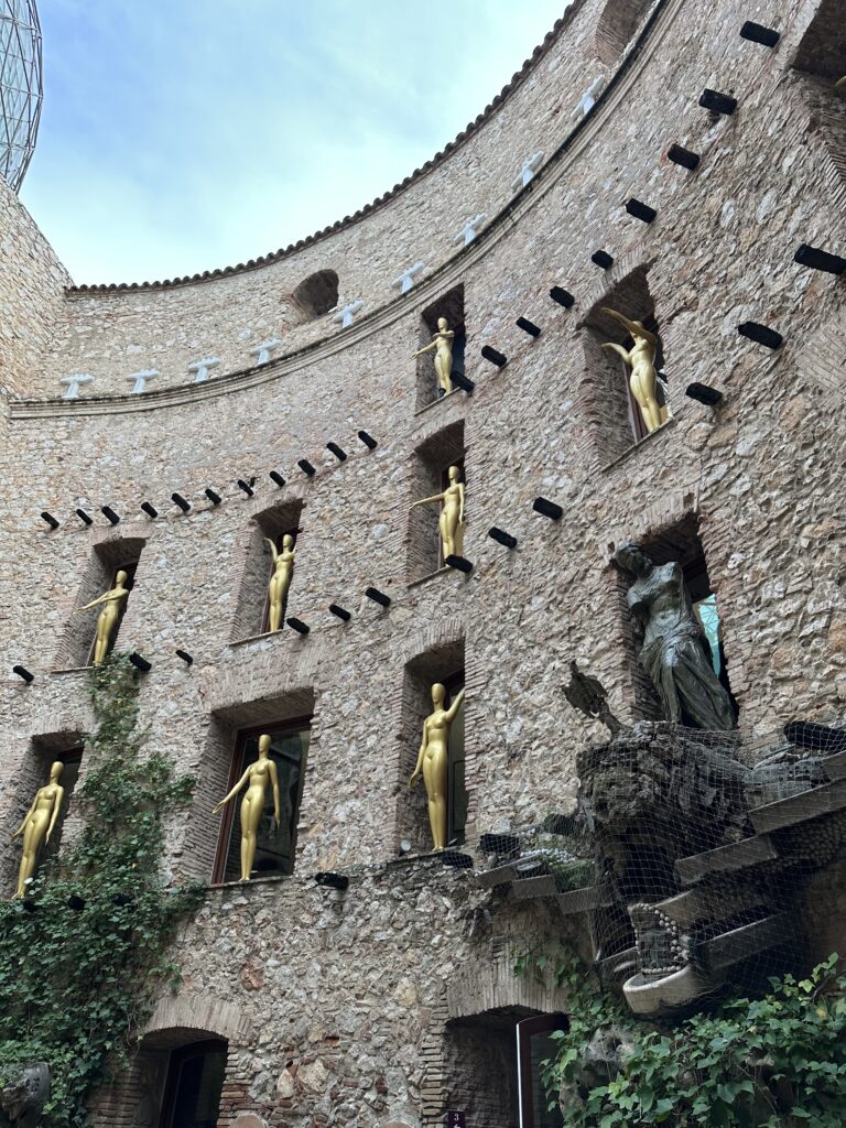
LlumBCN – Kontext und Dichte

Über das Festival verteilt wurden insgesamt zwölf professionelle Lichtinstallationen gezeigt, ergänzt durch 21 weitere Projekte von Schulen und Universitäten im Viertel Sant Martí.

Parks, Museen, Universitäten, Straßenkreuzungen, öffentliche Plätze und das Design Museum Barcelona fungierten dabei als temporäre Ausstellungsräume und verwandelten das Viertel in einen nächtlichen Ort für Licht.

Die Bandbreite der Arbeiten reichte von statischen Lichtskulpturen bis zu sehr unterschiedlichen Projektionen, etwa klassische Fassadenprojektionen, Projektionen auf Hologaze-Netze und Glasflächen sowie eine Laserinstallationen.

Gerade diese mediale Vielfalt macht LlumBCN für mich als Mediengestalterin inspirierend: Licht erscheint weniger als „Beleuchtung“, sondern als Material, das in unterschiedliche räumliche und atmosphärische Konstellationen eingebettet wird. Im direkten Vergleich zum Grazer Klanglicht fällt für mich dennoch eine qualitative Differenz auf. Während Klanglicht in seiner kuratorischen Auswahl und technischen Ausführung oft sehr präzise wirkt, hatte LlumBCN dieses Jahr stellenweise etwas Unebenes; nicht jede Installation schien denselben gestalterischen und dramaturgischen Tiefgang zu besitzen. Auch wirkten die vielen Lichter der Stadt von Barcelona wie eine zusätzliche Überlagerung, die den Fokus mancher Arbeiten etwas verschob.

Next Nature II – Wasser, Klang und Projektion

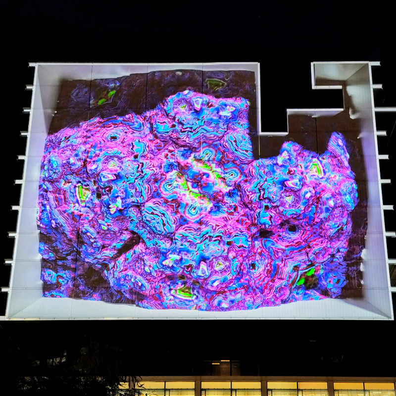
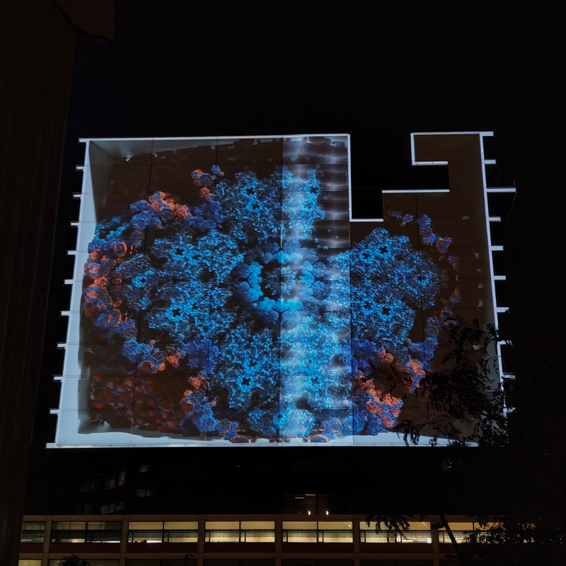
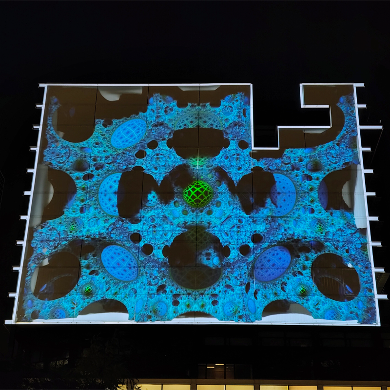
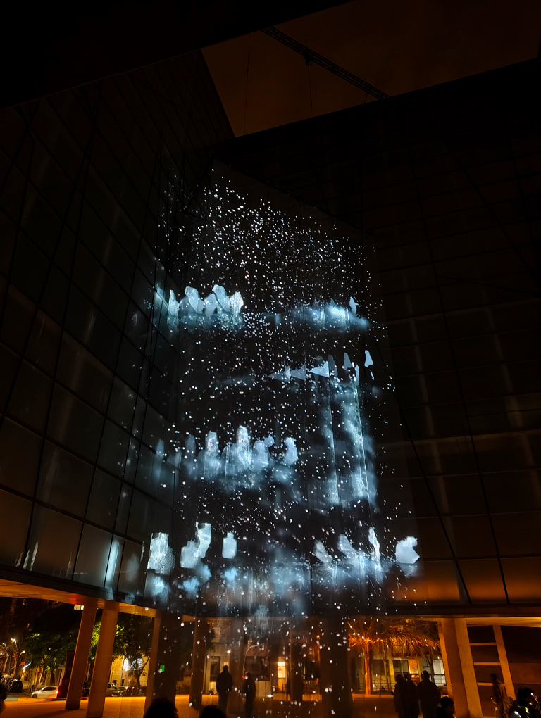
Besonders eindrücklich war für mich die Installation „Next Nature II“ von Rotor Studio (Ángeles Angulo, Román Torre), gezeigt an der Fassade von L’Auditori, Llanterna.

Die Arbeit präsentiert ein hybrides Ökosystem zwischen physischer und digitaler Sphäre, in dem Wasser und Sound eine vollständig sensorische Erfahrung formen.

Eine projizierte virtuelle Wasserfall-Landschaft lädt das Publikum ein, sich durch einen ruhigen, beinahe kontemplativen Raum zu bewegen.

Die Installation verknüpft die Bewegungen der Besucher mit Parametern des Ökosystems, sodass Körper, Technologie und Natur gleichsam in ein fragiles Gleichgewicht gebracht werden.

In der Beschreibung wird explizit von einem Raum der Ruhe und Reflexion gesprochen, in dem der urbane Kontext temporär in eine Zone der Gelassenheit transformiert wird.

Gestalterisch nähert sich Next Nature II meinen derzeitigen Arbeitsweisen an: Die schwarz‑weißen, abstrakten Visuals auf dem Holonetz erinnern an digitale Strukturen, die zugleich organisch wirken. Der Klang des Wassers wurde vor Ort durch zwei reale Wasserdurchläufe erzeugt, die links und rechts der Besuchenden platziert waren; dieses physische Wassergeräusch diente als akustische Folie für den virtuellen Wasserfall und verschränkte Projektion und Realität in einer gemeinsamen Wahrnehmungsschicht.

Für meine Masterarbeit ist diese Installation interessant, weil sie eine künstliche Lichtlandschaft schafft, die dennoch stark mit natürlichen Referenzen (Wasserfall, Ökosystem, Ruheort) arbeitet. Es verschiebt sich die Grenze zwischen natürlichem und künstlichem Licht.

Es zeigt, wie künstliches Licht, in Form von Projektion und Mapping, traditionelle Natur- und Lichtpraktiken transformiert. Ein kontrolliertes, künstliches Setting, in dem Licht zur Schnittstelle zwischen Körper, Architektur und digitalem Ökosystem wird.

Für meine eigene künstlerische Praxis im Bereich Video Mapping und audio-visueller Installationen nehme ich aus dieser Arbeit vor allem zwei Impulse mit: Erstens, wie stark der Einsatz von reduziertem, abstraktem Bildmaterial sein kann, wenn er mit einem klaren räumlichen Setting verbunden ist. Zweitens, wie effektiv echte physische Elemente, wie Wasser und dessen Klang, die Glaubwürdigkeit und Atmosphäre einer ansonsten komplett künstlichen Lichtumgebung steigern können.

Mein persönliches Highlight des Festivals war dennoch die Arbeit von MO:YA, auf die ich im vorherigen  Impulsblog detaillierter eingegangen bin.


Hinweis zur Verwendung von KI

Zur sprachlichen Optimierung und für Verbesserungsvorschläge hinsichtlich Rechtschreibung, Grammatik und Ausdruck wurde ein KI-gestütztes Schreibwerkzeug (Perplexity 2026) verwendet.

7. IMPULS: LlumBCN – Part 1: Fraktale Animationen

In diesem Impulsblog möchte ich meine Eindrücke und Erfahrungen vom LlumBCN Lichtfestival 2026 in Barcelona teilen.


Von diesem Festival erfuhr ich durch Birgit Lill-Schnabl, die Kuratorin des Klanglicht Festivals in Graz. Sie erzählte mir, dass das Festival vom 6. bis 8. Februar in Barcelona stattfinden würde und dass sie als Co-Kuratorin gemeinsam mit dem Künstlerkollektiv MO:YA daran beteiligt sei.
MO:YA präsentierten dort ihre fraktal-generative Animation “Mantra Intervention” , ein Projekt, das sie bereits in ähnlicher Form beim Klanglicht Festival im Schauspielhaus Graz gezeigt hatten. Für LlumBCN entwickelten sie die Arbeit weiter und brachten sie auf eine neue Bühne, die Fassade des RBA-Gebäudes in den Jardins de Ca l’Aranyó an der Roc Boronat 142.

Sie wurden als Art Headliner des Festivals ausgewählt. Ihre fraktalen Animationen passten nicht nur gut zu Gaudís organischer Formensprache, sondern auch zum Kontext, dass Barcelona 2026 zur „World Capital of Architecture“ erklärt wurde.
Die Installation erforschte das künstlerische Potenzial generativer audiovisueller Systeme im öffentlichen Raum. Besucher:innen wurden in ein immersives Umfeld aus Licht, Projektion und Klang eingeladen, in dem Bild und Musik in Echtzeit aus einem gemeinsamen Regelwerk, inspiriert von fraktaler Geometrie und architektonischen Strukturen, generiert wurden.

Für die Projektion kamen vier besonders lichtstarke Projektoren der Firma Barco zum Einsatz. Durch sogenanntes Stacking sollten sie ein großflächiges, hochauflösendes Bild in 4K erzeugen, das die gesamte Gebäudeoberfläche bespielte. Die Animation selbst bestand aus drei verschiedenen, in Unreal genereierten, Fraktalsequenzen, die sich in einem schwebenden weißen Raum entfalten und gegenseitig überlagern konnten. Über einen Touchscreen konnten die Besucher:innen aktiv mit der Projektion interagieren und verschiedene Parameter, etwa Form, Bewegung oder Farbintensität, beeinflussen.
Die Musik, ein Mix aus Downtempo, 4/3-Ambient und Drum’n’Bass, schuf eine hypnotische Klangkulisse, die die visuellen Elemente stimmungsvoll ergänzte. Diese Kombination aus rhythmischer Struktur und sphärischen Texturen versetzte die Besucher:innen in einen fast meditativen Zustand.
Technisch arbeiteten MO:YA mit der Unreal Engine und einer RTX 4090, ihre eigene Workstation hatten sie eigens im Handgepäck nach Barcelona mitgebracht.
Im Laufe des Festivals fiel einer der Projektoren aus. Schließlich entschied man sich, auch den dritten nicht zu verwenden und auf das ursprüngliche Stacking-Setup zu verzichten.


Hinweis zur Verwendung von KI

Zur sprachlichen Optimierung und für Verbesserungsvorschläge hinsichtlich Rechtschreibung, Grammatik und Ausdruck wurde ein KI-gestütztes Schreibwerkzeug (Perplexity 2026) verwendet.

Impuls #9 Gaudi Museum Figueres

During my trip through northern Spain (the same journey I already wrote about in my last two blog posts) I also stopped in Figueres. Before going there, I honestly didn’t know much about the city. But then I found out that it is the birthplace of Salvador Dalí. (Many people mix up the names, but Gaudí was actually from Reus, while Dalí was born in Figueres.) So of course, visiting the famous museum dedicated to him was a must.

About Salvador Dalí

Salvador Dalí was one of the most important artists of Surrealism. He was born in 1904 and became known for his dreamlike, sometimes bizarre paintings. One of his most famous works is The Persistence of Memory with the melting clocks (an image almost everyone has seen before).

Dalí had a very unique personality. He was not only an artist but also a master of self-promotion. He loved attention, dressed extravagantly, and was known for his dramatic mustache. Throughout his life, he worked not only as a painter but also as a sculptor, writer, filmmaker, and designer. He even collaborated with filmmakers like Walt Disney.

He often described himself as a genius (and truly believed it). His art was strongly influenced by dreams, psychology, religion, and science. Whether you admire him or not, he definitely left a strong mark on the art world.

The Dalí Museum in Figueres

The Teatre-Museu Dalí is probably one of the most unique (in which way ever) museums I have ever visited. It was actually designed by Dalí himself and opened in 1974. The building already looks surreal from the outside with giant eggs on the roof and unusual sculptures decorating the facade.

For Dali the egg stood for birth, creation, hope and new life. It represents something fragile on the outside but full of potential on the inside, often connected to themes of rebirth. Besides eggs, Dali frequently used other symbols in his work: melting clocks (time and relativity), ants (decay and death), crutches (human weakness), drawers in bodies (hidden thoughts and the subconscious), and elephants with long, thin legs (fragility and instability).

Inside, the museum feels like stepping directly into Dalí’s (weird) mind. The rooms are dramatic, playful, and sometimes confusing. There are large-scale paintings, installations, optical illusions, sculptures, and strange objects. Some artworks are impressive in size and technique, others feel intentionally provocative.

What I didn’t expect was that there were also works by other artists exhibited. One of them was Antoni Pitxot. Pitxot was a Catalan painter and a close friend of Dali. His works often show surreal, rocky landscapes made of human-like stone figures. He was inspired by the natural rock formations of the Costa Brava and transformed them into imaginative compositions. I really liked his paintings, they felt detailed, thoughtful, and somehow calmer than Dalis dramatic works.

My Personal Impression

To be honest, I expected more from the museum. Some parts felt a bit chaotic, and I sometimes missed deeper explanations or background information about certain works. I found some pieces very interesting and inspiring, but others felt overly theatrical or even a bit exaggerated.

I have never been Dalis biggest fan. While I respect his creativity and boldness, I often find his art very kitschy and pseudo-artsy. The building itself is very nice but the interior and what he used for his art was a bit low quality sometimes. Walking through the exhibition, I also had the impression that he must have been not a nice person, very self-centered, maybe even a bit delusional in how highly he thought of himself. Of course, that larger-than-life ego was also part of his artistic identity.

Still, I cannot say that I didn’t enjoy the visit. The museum is an experience. A few paintings inspired me. I also like his “just do it” attitude, his courage to create without worrying about rules or expectations. That mindset is something I find motivating as a creative person myself.

And surprisingly, I really liked the works of Antoni Pitxot. They added another layer to the visit and showed a different side of surrealism.

In the end, the Dalí Museum left me with mixed feelings: critical, curious, and inspired at the same time. But thats fine, because that’s exactly what art is supposed to do.

IMPULSE 7. Clarity Through Conversation: My Coaching Session with Mr. Horst Hörtner

As part of the final phase of our program, we had the opportunity to participate in individual intensive coaching sessions. I met with Mr. Horst Hörtner to discuss my master’s thesis direction, and the conversation turned out to be far more impactful than I expected.

First of all, he is an incredibly sharp and engaged person to talk to. From the beginning, he showed genuine interest in my topic, asked precise questions, and quickly understood the core of what I am trying to explore.

What mattered most to me, however, was the sense of validation I took away from the session.

Up to this point, I had been quite unsure about my topic. I knew it was personally important, but I kept questioning whether it was relevant enough, clear enough, or strong enough in a broader research context. Hearing an experienced expert from the field emphasize that the topic is both timely and necessary was honestly very motivating. It shifted something in my mindset, from hesitation toward commitment.

One of the key dilemmas I brought into the conversation was about audience.

My project deals with Buryat–Mongolian cultural context, but I am developing it within a Western academic and exhibition environment. I was struggling with how to make the installation understandable for two very different audiences:

  • Buryat–Mongolian visitors, who carry the cultural background
  • Western visitors, who may encounter this context for the first time

I was trying to design for both at once, and the more I tried, the more complicated the project felt.

Mr. Hörtner’s response was surprisingly direct and, in a way, liberating.

He advised me to stop designing primarily for the Western audience.

His point was clear: the people most affected by the cultural questions I am addressing are the primary audience. They are the ones who need to fully understand the message and context. Western audiences, he noted, can access background information if needed but they do not have to be the central design reference point.

This reframing removed a significant amount of pressure. Instead of diluting the work to make it universally digestible, I can focus on making it culturally grounded and precise.

Another moment that stayed with me was when he repeatedly thanked me for my bravery. I did not fully expect that reaction. But it served as an important reminder: working with cultural identity especially from a minority perspective is not something to minimize or soften.

If anything, it requires clarity, confidence, and visibility.

I left the session feeling more focused and, importantly, more permitted to stand firmly behind my topic. The conversation did not magically solve every design challenge ahead, but it gave me something equally valuable: direction and reassurance that the work I am doing has weight.

IMPULSE 6. Rethinking Expectations: Interactivity in the Buryat History Exhibition

As part of my ongoing master’s thesis research, I returned to the National Museum in Ulan‑Ude to explore another permanent exhibition, this time dedicated to the broader history of Buryatia. My focus remained the same: to observe how (and if) interactive elements are being used to support learning and engagement.

What I encountered quickly challenged my remaining doubts. This exhibition, larger in scale and historical scope, revealed a noticeably richer layer of interactivity than I expected and, importantly, much of it felt intentionally designed for younger audiences.

Because the historical scope was broader and the exhibition itself larger, the curators had clearly invested in multiple interactive touchpoints throughout the space. And importantly many of them were clearly designed with younger audiences in mind.

The Interactive Map: A Strong First Impression

Right at the entrance, visitors are greeted by a large interactive map of the republic created with projection mapping. It immediately draws attention, both visually and spatially, and works as an inviting gateway into the exhibition.

Visitors can press on different years or regions of the republic to reveal more information. This simple mechanic is extremely effective: it transforms what could have been a static geographic overview into an exploratory learning tool.

But the real cherry on top is the built-in game at the end of the interaction. Visitors can test their knowledge by trying to correctly locate all 22 regions of the republic on the map.

From a design perspective, this is a very strong move. It shifts the experience from passive consumption to active recall, one of the most powerful mechanisms for learning. It is informative, playful, and highly suitable for school-age visitors. I could immediately imagine groups of children gathered around it, competing and learning at the same time.

Distributed Interactivity Across the Hall

Further into the exhibition, the same interaction logic appears in other formats. There is a large interactive screen where visitors can tap on objects and locations to learn more about them.

While technically simpler than the VR experience from the Buddhist exhibition, this type of interface plays an important role. Not every educational moment needs full immersion. Sometimes clarity, accessibility, and speed of interaction are exactly what is needed especially in historically dense exhibitions.

The exhibition also integrates:

  • audio guide stations in selected areas
  • additional projection mapping moments
  • and other small interactive touchpoints

Together, these elements create a layered experience that supports different learning styles: visual, auditory, and tactile.

The Yurt: Learning Through Touch

One of the most engaging moments comes at the end of the exhibition: a full-scale traditional Buryat-Mongolian yurt that visitors can physically enter.

Inside, visitors are encouraged to touch and explore objects of the traditional household. This tactile permission is extremely important. After many museum experiences defined by “do not touch,” this moment creates a sense of openness and embodied learning.

For younger visitors especially, this is likely one of the most memorable parts of the exhibition. It transforms cultural knowledge from something distant into something physically relatable.

A Personal Reflection

I have to admit something honestly.

Before this visit, I carried a slightly arrogant assumption that museums in my hometown would lack contemporary interactive approaches, that they would feel outdated or purely static. This exhibition proved me wrong in the best possible way.

And it genuinely made me happy.

Not because everything was perfect, there is always room for growth but because the intention is clearly there. The museum is trying. It is experimenting. It is thinking about engagement, about younger audiences, about accessibility.

And perhaps most importantly: it shows that meaningful interactive design is not limited to large Western institutions. It is emerging thoughtfully and contextually, in Buryatia as well.

For my master’s research, this visit became an important checkpoint. It helped me better understand the current state of museum interactivity in my republic and positioned my own project within a real, evolving landscape rather than an imagined vacuum.

Sometimes field research does exactly what it should do: it challenges your assumptions and replaces them with something much more valuable, grounded optimism.

IMPULSE 5. Discovering Meaningful Interactivity at the National Museum of Buryatia

As part of my master’s thesis research, I recently visited the National Museum in my hometown of Ulan-Ude. My goal was simple but important: to observe the presence of interactive technology in museums in Buryatia and to reflect on whether interactivity can help local audiences, especially younger generations, better understand the culture, history, and religion of our region.

This question feels particularly urgent in the current political climate, where the connection of ethnic minorities in Russia to their cultural roots is often weakened or overlooked. Museums, in this context, carry a quiet but powerful responsibility. They are not just spaces of preservation but potential spaces of reconnection.

To be honest, and perhaps a bit shamefully, my expectations were quite low. I was prepared to see mostly traditional displays: objects behind glass with minimal explanation, limited contextualization, and little attempt to engage visitors beyond passive viewing.

And while some parts of the museum aligned with those expectations, one experience completely shifted my perspective.

I attended an exhibition about Buddhism in Buryatia that was, overall, very thoughtfully structured and informative. However, what truly stood out to me, and what I want to focus on in this impulse reflection, was the Kunrig Mantra VR project.

It felt like a breath of fresh air.

This project is one of the first VR experiences about Buddhism in Buryatia and among the early examples in Russia. It presents a carefully crafted 3D environment built in Unity, where visitors can slowly move through a virtual natural landscape of our nyutag – our true home. Above stretches a calm night sky. Around you stand sacred statues, each positioned with precise symbolic meaning according to Buddhist cosmology.

As you move from one figure to another, you can learn about who they are and why they are located exactly where they stand. This spatial storytelling is crucial: the mandala is not just visual decoration, it is a structured spiritual map.

Accompanying the visuals is the sound of the Kunrig mantra, softly read or chanted, which deepens the atmosphere and creates a meditative rhythm to the experience.

I want to be honest here: I am often skeptical about VR in museums. Too frequently it feels like technology used for the sake of spectacle, an additional layer that does not truly deepen understanding. But in this case, the VR environment genuinely expanded my perception of the subject. It did not distract from the content; it revealed the logic, depth, and emotional weight of the mandala in a way that static display simply could not.

Another personal detail surprised me. I usually experience strong motion sickness in VR environments. However, this project was executed with remarkable sensitivity. The calm pacing, stable movement, and atmospheric design created a comfortable experience where, for once, I did not develop my usual headache. Perhaps the quietness and grounded feeling of nyutag played a role in this.

After my visit, I read more about the project and was even more impressed. The designers worked very attentively with cultural and religious experts, including consultation with lamas, and continuously validated the accuracy of the environment during development. In projects dealing with sacred material, this level of respect is not just good practice; it is essential.

What I found particularly powerful is how the experience concludes. After immersing yourself in the virtual mandala and gaining contextual understanding, you return to the physical exhibition space where the original statues stand behind glass. But now they feel different. Familiar. Meaningful. You do not just observe them, you recognize them.

The knowledge gained through the interactive experience deepens appreciation of the physical artifacts.

For me, this project stands as a strong example of what meaningful interactivity in museums can be:

  • educational without being didactic
  • aesthetically sensitive
  • emotionally resonant
  • and genuinely engaging

It is also encouraging on a personal level. The project resonates closely with what I hope to achieve in my own master’s thesis artifactб creating experiences that do not simply display culture but help visitors feel oriented within it.

Impuls #8 Street Illustration in Spain

On my one-week trip through northern Spain, I discovered something I didn’t expect: I started looking for illustrations everywhere. What began as a small observation quickly turned into a little personal mission. In every city, every village, every tiny street, I kept my eyes open for art.

Our first stop was Barcelona (where we visited the Llum festival as well). It’s such a vibrant, creative city, and you can feel an artsy energy. I thought it would be really nice to search for random illustrations in the city and write about them here. I think it’s pretty cool to get inspirations from different countries. What really caught my attention were the illustrated posters and advertisements. Many of them used illustration instead of photography and I wanted to search for inspirations. The style was often very bold and graphic: strong colors, clear shapes, very eye-catching.

Another thing I loved: so many garage doors were painted or covered in graffiti. Even when the shops were closed, the streets still felt alive because the metal shutters became huge canvases. Some were wild and chaotic, others were detailed and carefully designed. It made simple streets feel like open-air galleries.

I found a few book covers, I also found really cute.

After Barcelona, we went hiking along the Costa Brava. Along the way, we passed through small coastal towns like Cadaqués. The Costa Brava is strongly connected to Salavador Dali, who was born in Figueres and spent a lot of time in Cadaqués. There’s even a famous painting where he captured the harbor of Cadaqués. You can really feel that artistic history in the town. Cadaqués is small, white, and full of charm and art is everywhere.

Many illustrations are inspired by the sea like fish, boats, waves, sunsets. Even small utility boxes and electrical cabinets are painted. Instead of being ugly grey objects, they become tiny artworks. I loved that so much. It shows how art can transform even the most ordinary things.

What I love most about these small street artworks is how they bring life into everyday spaces. They make you slow down and searching for them was really fun. It made me more aware of my surroundings. This kind of art make a simple walk or usually ugly street more interesting and inspired me.

Here are a few more artworks and illustrations I found randomly on my journey through Spain: