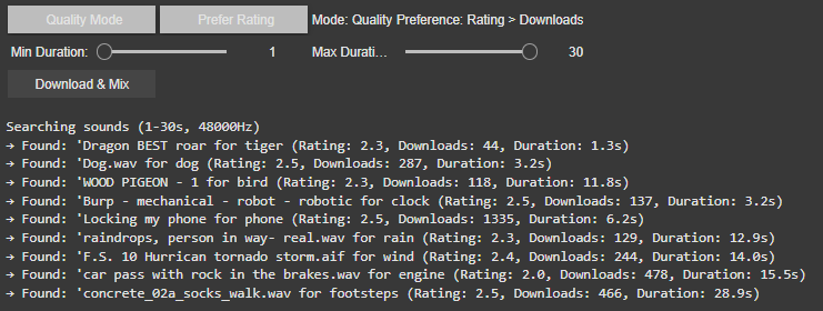
Best Result Mode (Quality-Focused) The system prioritizes sounds with the highest ratings and download counts, ensuring professional-grade audio quality. It progressively relaxes standards (e.g., from 4.0+ to 2.5+ ratings) if no perfect match is found, guaranteeing a usable sound for every tag.
Random Mode (Diverse Selection) In this mode, the tool ignores quality filters, returning the first valid sound for each tag. This is ideal for quick experiments or when unpredictability is desired or to be sure to achieve different results.
2. Filters: Rating vs. Downloads
Users can further refine searches with two filter preferences:
Rating > Downloads Favors sounds with the highest user ratings, even if they have fewer downloads. This prioritizes subjective quality (e.g., clean recordings, well-edited clips). Example: A rare, pristine “tiger growl” with a 4.8/5 rating might be chosen over a popular but noisy alternative.
Downloads > Rating Prioritizes widely downloaded sounds, which often indicate reliability or broad appeal. This is useful for finding “standard” effects (e.g., a typical phone ring). Example: A generic “clock tick” with 10,000 downloads might be selected over a niche, high-rated vintage clock sound.
If there would be no matching sound for the rating or download approach the system gets to the fallback and uses the hierarchy table privided to change for example maple into tree.
Intelligent Frequency Management
The audio engine now implements Bark Scale Filtering, which represents a significant improvement over the previous FFT peaks approach. By dividing the frequency spectrum into 25 critical bands spanning 20Hz to 20kHz, the system now precisely mirrors human hearing sensitivity. This psychoacoustic alignment enables more natural spectral adjustments that maintain perceptual balance while processing audio content.
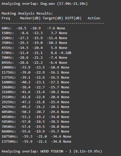
For dynamic equalization, the system features adaptive EQ Activation that intelligently engages only during actual sound clashes. For instance, when two sounds compete at 570Hz, the EQ applies a precise -4.7dB reduction exclusively during the overlapping period.
o preserve audio quality, the system employs Conservative Processing principles. Frequency band reductions are strictly limited to a maximum of -6dB, preventing artificial-sounding results. Additionally, the use of wide Q values (1.0) ensures that EQ adjustments maintain the natural timbral characteristics of each sound source while effectively resolving masking issues.
These core upgrades collectively transform Image Extender’s mixing capabilities, enabling professional-grade audio results while maintaining the system’s generative and adaptive nature. The improvements are particularly noticeable in complex soundscapes containing multiple overlapping elements with competing frequency content.
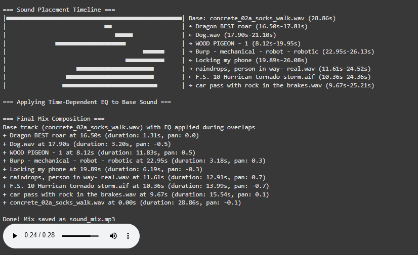
Visualization for a better overview
The newly implemented Timeline Visualization provides unprecedented insight into the mixing process through an intuitive graphical representation.
Before we can compare a “healthy” and a “clinical” heart, we first need a small tool-chain that does three things automatically:
detects each normal-to-normal (NN) beat in a raw ECG trace,
converts those beats into the core HRV metrics (HR, SDNN, RMSSD, VLF, LF, HF, LF/HF) and
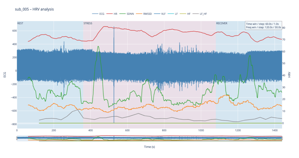
plots every curve on an interactive dashboard so that trends can be inspected side-by-side.
Because the long-term goal is a live installation (eventually driving MIDI or other real-time mappings), the script is written from the start in a sliding-window style: at every step it re-computes each metric over a moving chunk of data. Fast-changing variables such as heart-rate itself can use short windows and small hops; spectral indices need at least a five-minute span to remain physiologically trustworthy. Shortening that span may make the curves look “lively,” but it also distorts the underlying autonomic picture and breaks any attempt to compare one participant with another. The code therefore lets the user set an independent window length and step size for the time-domain group and for the frequency-domain group. Let’s take a closer look at the code. If you want to see the full, visit: https://github.com/ninaeba/EmbodiedResonance
1. Imports and global parameters
import argparse
import sys
from pathlib import Path

import numpy as np
import pandas as pd
import plotly.graph_objs as go
import scipy.signal as sg
import neurokit2 as nk
argparse – give the script a tiny command-line interface so we can point it at any raw ECG CSV.
NumPy / pandas – basic numeric work and table handling.
Butterworth 0.5–40 Hz is a widely used cardiology band-pass that suppresses baseline wander and high-frequency EMG, yet leaves the QRS complex untouched.
60s time-domain window strikes a balance: long enough to tame noise, short enough for semi-real-time trend tracking.
300s spectral window is deliberately longer; the literature shows that the lower bands (especially VLF) are unreliable below ~5 min.
FGRID – dense frequency grid (1 mHz spacing) for a smoother Lomb curve.
3. ECG helper class – load, (optionally) filter, detect R-peaks
load – reads the CSV into a flat float vector and sanity-checks that we have >10 s of data.
filt – if the --nofilt flag is absent, applies a 4-th-order zero-phase Butterworth band-pass (via filtfilt) so that the baseline drift of slow breathing (or cable motion) does not trick the peak detector.
r_peaks – delegates the hard work to neurokit2.ecg_process, which combines Pan-Tompkins-style amplitude heuristics with adaptive thresholds; returns index positions and their timing in seconds.
time_metrics converts every RR sub-series into three classic metrics – HR (beats/min), SDNN (overall beat-to-beat spread, ms), RMSSD (short-term jitter, ms).
Why Lomb–Scargle instead of Welch? The RR intervals are unevenly spaced by definition.
Welch needs evenly sampled tachograms or heavy interpolation → can distort the spectrum.
Lomb operates directly on irregular timestamps, preserving low-frequency content even if breathing or motion momentarily speeds up/slows down the heart.
lomb_bandpowers:
Runs scipy.signal.lombscargle on de-trended RR values.
Integrates power inside canonical VLF / LF / HF bands.
Computes LF/HF ratio, but guards against division by tiny HF values.
time_series / freq_series slide a window (120 s or 300 s) across the experiment, jump every 30 s, calculate metrics, and store the mid-window timestamp for plotting.
compute finally stitches time-domain and frequency-domain rows onto a 1-second master grid so that all curves overlay cleanly.
Left y-axis = filtered ECG trace for QC (do peaks line up?).
Right y-axis = every HRV curve.
Built-in range-slider lets you scrub the 24-minute protocol quickly.
Hover shows exact numeric values (handy when you are screening anomalies).
different backgrounds for phases
7. CLI wrapper
if __name__ == '__main__':
    main()
Inside main() we parse the file name and the --nofilt flag, run the whole pipeline, save the HRV table as a CSV sibling (same stem, suffix .hrv_lomb.csv) and open the Plotly window.
The four summary plots included below are therefore not an end-point but a launch-pad: they give us a quick visual fingerprint of each participant’s autonomic response, and will serve as the reference material for deeper statistical comparison, pattern-searching, and—ultimately—the data-to-sound (or other real-time) mappings we plan to build next.
Heart-rate variability, or HRV, is the tiny, natural wobble in the time gap from one heartbeat to the next. It exists because two automatic “pedals” are always tugging at the heart. One pedal is the sympathetic system, the same chemistry that makes your pulse race when you are startled. The other pedal is the vagus-driven parasympathetic system, the brake that slows the heart each time you breathe out or settle into a chair. The more freely these pedals can trade places, the more variable those beat-to-beat spacings become. HRV is therefore a quick, non-invasive way to listen to how relaxed, alert, or exhausted the body is.
When we measure HRV we usually pull out a few headline numbers.
SDNN is the overall statistical spread of beat intervals during a slice of time, for example one minute. A wide spread means the heart is flexible and ready to react. A very narrow spread means the system is locked in one gear, as happens in chronic stress or heart failure.
RMSSD zooms in on the jump from one beat to the very next, averages those jumps, and reflects how strongly the vagus brake is speaking. During slow, deep breathing RMSSD grows larger; during mental tension or sleep deprivation it falls.
Frequency-domain measures treat the heartbeat trace like a piece of music and ask how loud each note is. Very-low-frequency power, or VLF, comes from extremely slow body rhythms such as hormone cycles and temperature regulation. Low-frequency power, or LF, sits in the middle and rises when the sympathetic pedal is pressed, for example in the first minute of exercise or during mental arithmetic. High-frequency power, or HF, sits exactly at breathing speed and is almost pure vagus activity: it swells during calm, diaphragmatic breathing and shrinks when breathing is shallow or hurried. A simple way to summarise the tug-of-war is the LF-to-HF ratio. When the sympathetic pedal dominates the ratio climbs; when the vagus brake dominates the ratio slides downward.
In a healthy, rested adult who is quietly seated the heart rate is steady but not rigid. SDNN and RMSSD show a modest but clear jitter, HF power pulses in step with the breath, LF is similar in size to HF, and the LF/HF ratio hovers around one or two. If the same person begins brisk walking heart rate rises, HF power fades, LF power grows, and the LF/HF ratio can shoot above five. During slow breathing meditation RMSSD and HF surge while LF/HF drops below one. In someone with chronic anxiety or PTSD the resting pattern is different: SDNN and RMSSD are low, HF is thin, LF/HF is already high before any task, and it climbs even higher during mild stress. The pattern can be even flatter in advanced heart disease, where both pedals are weak and total HRV is minimal.
Put simply, HRV lets us watch the nervous system’s soundtrack: fast notes reflect breathing and relaxation, mid-notes reflect alertness, and the overall volume tells us how much capacity the system still has in reserve.
The raw material for every HRV metric is the NN-interval sequence: NNi is the time in seconds between two consecutive normal (sinus) beats.
SDNN is the standard deviation of that sequence.
SDNN = √[ Σ (NNi – NN̄)² / (N – 1) ] Units are milliseconds because the intervals are expressed in ms. A resting, healthy adult who sits quietly will usually show an SDNN between roughly 30 ms and 50 ms. Endurance athletes can sit in the 60–90 ms range, while chronically stressed or cardiac patients may drift below 20 ms.
RMSSD focuses on the beat-to-beat jump and is dominated by parasympathetic (vagal) tone.
RMSSD = √[ Σ ( NNi – NNi-1 )² / (N – 1) ] Again the unit is milliseconds. Typical resting values in a calm, healthy adult are about 25–40 ms. Slow breathing, a nap, or meditation can push it up toward 60 ms, whereas sustained mental effort, anxiety, sleep deprivation, or PTSD often pull it down below 15 ms.
Frequency-domain indices start from the same NN series but first convert it into a power-spectrum, most accurately with a Lomb–Scargle periodogram when the points are unevenly spaced:
P(f) = (1/2σ²) { [ Σ NNi cos ωi ]² / Σ cos² ωi + [ Σ NNi sin ωi ]² / Σ sin² ωi } where ω = 2πf and f is scanned from 0.003 Hz upward.
Power is then integrated over preset bands and reported in ms² because it represents variance of the interval series per hertz.
Very-low-frequency power VLF integrates P(f) from 0.003 Hz to 0.04 Hz. In a healthy resting adult VLF is often 500–1500 ms². Because the mechanisms behind VLF (thermoregulation, hormones, renin-angiotensin cycle) change only slowly, values can drift greatly between individuals and between days.
Low-frequency power LF integrates P(f) from 0.04 Hz to 0.15 Hz. A quiet, healthy adult usually sits near 300–1200 ms². LF rises when the sympathetic accelerator is pressed, for example during the first few minutes of exercise or a stressful mental task.
High-frequency power HF integrates P(f) from 0.15 Hz to 0.40 Hz, exactly the normal breathing range. Calm diaphragmatic breathing drives HF toward 400–1200 ms², whereas rapid or shallow breathing in anxiety or hard exercise cuts HF sharply, sometimes below 100 ms².
LF/HF is the simple ratio LF ÷ HF. At rest a ratio near 1–2 suggests a balanced tug-of-war. If the ratio soars above 5 the sympathetic branch is clearly on top; if it falls below 0.5 the vagus brake is dominating (seen in deep meditation or in some fainting-prone individuals).
All of these numbers rise and fall in real time as the two branches of the autonomic nervous system jostle for control, so plotting them across the exercise-rest protocol lets us see how quickly and how strongly each person’s physiology reacts and recovers.
Metric
Units
What It Reflects (plain-language)
Typical Resting Range in Healthy Adults*
When It Runs High (what that often means)
When It Runs Low (what that can signal)
Mean Heart Rate (HR)
beats per minute (bpm)
How fast the heart is beating on average
50 – 80 bpm
Physical effort, fever, anxiety, dehydration
Excellent cardiovascular fitness, medications that slow the heart
SDNN
milliseconds (ms)
Overall “spread” of beat-to-beat intervals—long-term autonomic flexibility
40 – 60 ms
Good recovery, calm alertness, athletic conditioning
Chronic stress, heart disease, PTSD, over-fatigue
RMSSD
ms
Very short-term vagal (rest-and-digest) shifts from one beat to the next
25 – 45 ms
Deep relaxed breathing, meditation, lying down
Sympathetic overdrive, poor sleep, depression
VLF Power
ms²
Very-slow oscillations (< 0.04 Hz) tied to long hormonal / thermoregulatory rhythms
600 – 2000 ms²
Possible inflammation, overtraining, sustained stress load
Researching Automated Mixing Strategies for Clarity and Real-Time Composition
As the Image Extender project continues to evolve from a tagging-to-sound pipeline into a dynamic, spatially aware audio compositing system, this phase focused on surveying and evaluating recent methods in automated sound mixing. My aim was to understand how existing research handles spectral masking, spatial distribution, and frequency-aware filtering—especially in scenarios where multiple unrelated sounds are combined without a human in the loop.
This blog post synthesizes findings from several key research papers and explores how their techniques may apply to our use case: a generative soundscape engine driven by object detection and Freesound API integration. The next development phase will evaluate which of these methods can be realistically adapted into the Python-based architecture.
Adaptive Filtering Through Time–Frequency Masking Detection
A compelling solution to masking was presented by Zhao and Pérez-Cota (2024), who proposed a method for adaptive equalization driven by masking analysis in both time and frequency. By calculating short-time Fourier transforms (STFT) for each track, their system identifies where overlap occurs and evaluates the masking directionality—determining whether a sound acts as a masker or a maskee over time.
These interactions are quantified into masking matrices that inform the design of parametric filters, tuned to reduce only the problematic frequency bands, while preserving the natural timbre and dynamics of the source sounds. The end result is a frequency-aware mixing approach that adapts to real masking events rather than applying static or arbitrary filtering.
Why this matters for Image Extender: Generated mixes often feature overlapping midrange content (e.g., engine hums, rustling leaves, footsteps). By applying this masking-aware logic, the system can avoid blunt frequency cuts and instead respond intelligently to real-time spectral conflicts.
Implementation possibilities:
STFTs: librosa.stft
Masking matrices: pairwise multiplication and normalization (NumPy)
EQ curves: second-order IIR filters via scipy.signal.iirfilter
“This information is then systematically used to design and apply filters… improving the clarity of the mix.” — Zhao and Pérez-Cota (2024)
Iterative Mixing Optimization Using Psychoacoustic Metrics
Another strong candidate emerged from Liu et al. (2024), who proposed an automatic mixing system based on iterative masking minimization. Their framework evaluates masking using a perceptual model derived from PEAQ (ITU-R BS.1387) and adjusts mixing parameters—equalization, dynamic range compression, and gain—through iterative optimization.
The system’s strength lies in its objective function: it not only minimizes total masking but also seeks to balance masking contributions across tracks, ensuring that no source is disproportionately buried. The optimization process runs until a minimum is reached, using a harmony search algorithm that continuously tunes each effect’s parameters for improved spectral separation.
Why this matters for Image Extender: This kind of global optimization is well-suited for multi-object scenes, where several detected elements contribute sounds. It supports a wide range of source content and adapts mixing decisions to preserve intelligibility across diverse sonic elements.
Implementation path:
Masking metrics: critical band energy modeling on the Bark scale
Optimization: scipy.optimize.differential_evolution or other derivative-free methods
EQ and dynamics: Python wrappers (pydub, sox, or raw filter design via scipy.signal)
“Different audio effects… are applied via an iterative Harmony searching algorithm that aims to minimize the masking.” — Liu et al. (2024)
Comparative Analysis
Method
Core Approach
Integration Potential
Implementation Effort
Time–Frequency Masking (Zhao)
Analyze masking via STFT; apply targeted EQ
High — per-event conflict resolution
Medium
Iterative Optimization (Liu)
Minimize masking metric via parametric search
High — global mix clarity
High
Both methods offer significant value. Zhao’s system is elegant in its directness—its per-pair analysis supports fine-grained filtering on demand, suitable for real-time or batch processes. Liu’s framework, while computationally heavier, offers a holistic solution that balances all tracks simultaneously, and may serve as a backend “refinement pass” after initial sound placement.
Looking Ahead
This research phase provided the theoretical and technical groundwork for the next evolution of Image Extender’s audio engine. The next development milestone will explore hybrid strategies that combine these insights:
Implementing a masking matrix engine to detect conflicts dynamically
Building filter generation pipelines based on frequency overlap intensity
Testing iterative mix refinement using masking as an objective metric
Measuring the perceived clarity improvements across varied image-driven scenes
At the current stage of the project, before engaging with real-time biofeedback sensors or integrating hardware systems, I deliberately chose to begin with a simulation-based exploration using publicly available physiological datasets. This decision was grounded in both practical and conceptual motivations. On one hand, working with curated datasets provides a stable, low-risk environment to test hypotheses, establish workflows, and identify relevant signal characteristics. On the other hand, it also offered an opportunity to engage critically with the structure, semantics, and limitations of real-world psychophysiological recordings—particularly in the context of trauma-related conditions.
My personal interest in trauma physiology, shaped by lived experience during the war in Ukraine, has influenced the conceptual direction of this work. I was particularly drawn to understanding how conditions such as post-traumatic stress disorder (PTSD) might leave measurable traces in the body—traces that could be explored not only scientifically, but also sonically and artistically. This interest was further informed by reading The Body Keeps the Score by Bessel van der Kolk, which inspired me to look for empirical signals that reflect internal states which often remain inaccessible through language alone.
With this perspective in mind, I selected a large dataset focused on stress-induced myocardial ischemia as a starting point. Although the dataset was not originally designed to study PTSD, it includes a diverse group of participants—among them individuals diagnosed with PTSD, as well as others with complex comorbidities such as coronary artery disease and anxiety-related disorders. The richness of this cohort, combined with the inclusion of multiple biosignals (ECG, respiration, blood pressure), makes it a promising foundation for exploratory analyses.
Rather than seeking definitive conclusions at this point, my aim is to uncover what is possible—to understand which physiological patterns may hold relevance for trauma detection, and how they might be interpreted or transformed into expressive modalities such as sound or movement. This stage of the project is therefore best described as investigative and generative: it is about opening up space for experimentation and reflection, rather than narrowing toward specific outcomes.
Data Preparation and Extraction of Clinical Metadata from JSON Records
To efficiently identify suitable subjects for simulation, I first downloaded a complete index of data file links provided by the repository. Using a regular expression-based filtering mechanism implemented in Python, I programmatically extracted only those links pointing to disease-related JSON records for individual subjects (i.e., files following the pattern sub_XXX_disease.json). This was performed using a custom script (see downloaded_disease_files.py) which reads the full list of URLs from a text file and downloads the filtered subset into a local directory. A total of 119 such JSON records were retrieved.
Following acquisition, a second Python script (summary.py) was used to parse each JSON file and consolidate its contents into a single structured table. Each JSON file contained binary and categorical information corresponding to specific diagnostic criteria, including presence of PTSD, angina, stress-induced ischemia, pharmacological responses, and psychological traits (e.g., anxiety and depression scale scores, Type D personality indicators).
The script extracted all available key-value pairs and added a subject_id field derived from the filename. These entries were stored in a pandas DataFrame and exported to a CSV file (patients_disease_table.csv). The resulting table forms the basis for all subsequent filtering and selection of patient profiles for simulation.
This pipeline enabled me to rapidly triage a heterogeneous dataset by transforming a decentralized JSON structure into a unified tabular format suitable for further querying, visualization, and real-time signal emulation.
Group Selection and Dataset Subsetting
In order to meaningfully simulate and compare physiological responses, I manually selected a subset of subjects from the larger dataset and organized them into four distinct groups based on diagnostic profiles derived from the structured disease table:
Healthy group: Subjects with no recorded psychological or cardiovascular abnormalities.
Mental health group: Subjects presenting only with psychological traits such as elevated anxiety, depressive symptoms, or Type D personality, but without ischemic or cardiac diagnoses.
PTSD group: Subjects with a verified PTSD diagnosis, often accompanied by anxiety traits and non-obstructive angina, but without broader comorbidities.
Clinically sick group: Subjects with extensive multi-morbidity, showing positive indicators across most of the diagnostic criteria including ischemia, psychological disorders, and cardiovascular dysfunctions.
This manual classification enabled targeted downloading of signal data for only those subjects who are of particular interest to the ongoing research.
A custom Python script was then used to selectively retrieve only the relevant signal files—namely, 500 Hz ECG recordings from three phases (rest, stress, recovery) and the corresponding clinical complaint JSON files. The script filters a list of raw download links by matching both the subject ID and filename patterns. Each file is downloaded into a separate folder named after its respective group, thereby preserving the classification structure for downstream analysis and simulation.
Preprocessing of Raw ECG Signal Files
Upon downloading the raw signal files for the selected subjects, several structural and formatting issues became immediately apparent. These challenges rendered the original data format unsuitable for direct use in real-time simulation or further analysis. Specifically:
Scientific Notation Format All signal values were encoded in scientific notation (e.g., 3.2641e+02), requiring transformation into standard integer format suitable for time-domain processing and sonification.
Flattened and Fragmented Data Each file contained a single long sequence of values with no clear delimiters or column headers. In some cases, the formatting introduced line breaks within numbers, further complicating parsing and extraction.
Twelve-Lead ECG in a Single File The signal for all 12 ECG leads was stored in a single continuous stream, without metadata or segmentation markers. The only known constraint was that the total length of the signal was always divisible by 12, implying equal-length segments per lead.
Separated Recording Phases Data for each subject was distributed across three files, each corresponding to one of the experimental phases: rest, stress, and recovery. For the purposes of this project—particularly real-time emulation and comparative analysis—I required a single, merged file per lead containing the full time course across all three conditions.
Solution: Custom Parsing and Lead Separation Script
To address these challenges, I developed a two-stage Python script to convert the raw .csv files into a structured and usable format:
Step 1: Parsing and Lead Extraction The script recursively traverses the directory tree to identify ECG files by filename patterns. For each file:
The ECG phase (rest, stress, or recover) is inferred from the filename.
The subject ID is extracted using regular expressions.
All scientific-notation numbers are matched and converted into integers. Unrealistically large values (above 10,000) are filtered out to prevent corruption.
The signal is split into 12 equally sized segments, corresponding to the 12 ECG leads. Each lead is saved as a separate .csv file inside a folder structure organized by subject and phase.
Step 2: Lead-Wise Concatenation Across Phases Once individual leads for each phase were saved, the script proceeds to merge the rest, stress, and recovery segments for each lead:
For every subject, it locates the three corresponding files for each lead.
These files are concatenated vertically (along the time axis) to form a continuous signal.
The resulting merged signals are saved in a dedicated combined folder per subject, with filenames that indicate the lead number and sampling rate.
This conversion pipeline transforms non-tabular raw data into standardized time series inputs suitable for further processing, visualization, or real-time simulation.
Manual Signal Inspection and Selection of Representative Subjects
While the data transformation pipeline produced technically readable ECG signals, closer inspection revealed a range of physiological artifacts likely introduced during the original data acquisition process. These irregularities included signal clipping, baseline drift, and abrupt discontinuities. In many cases, such artifacts can be attributed not to software or conversion errors, but to common physiological and mechanical factors—such as subject movement, poor electrode contact, skin conductivity variation due to perspiration, or unstable placement of leads during the recording.
These artifacts are highly relevant from a performative and conceptual standpoint. Movement-induced noise and instability in bodily measurements reflect the lived, embodied realities of trauma, and they may eventually be used as expressive material within the performance itself. However, for the purpose of initial analysis and especially heart rate variability (HRV) extraction, such disruptions compromise signal clarity and algorithmic robustness.
To navigate this complexity, I conducted a manual review of the ECG signals for all 16 selected subjects. Each of the 12 leads per subject was visually examined across the three experimental phases (rest, stress, and recovery). From this process, I identified one subject from each group (healthy, mental health, PTSD, and clinically sick) whose signals displayed the least amount of distortion and were most suitable for initial HRV-focused simulation.
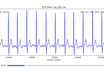
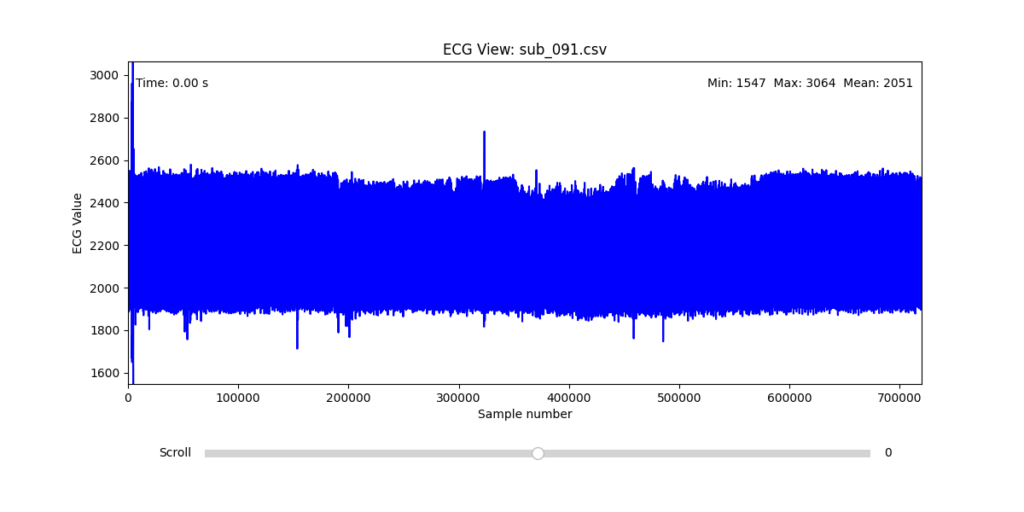
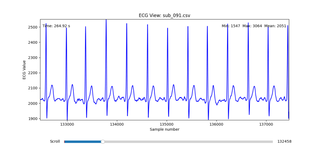
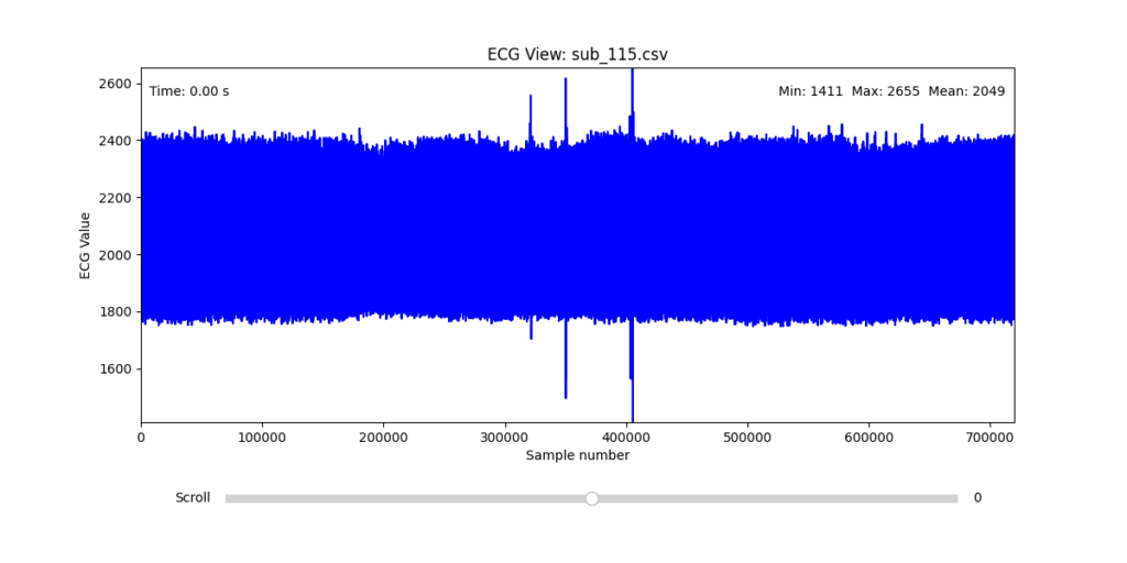
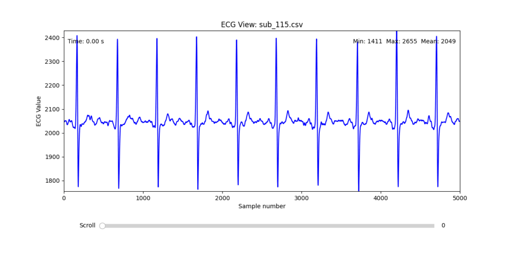
Diagnostic Visualization Tool
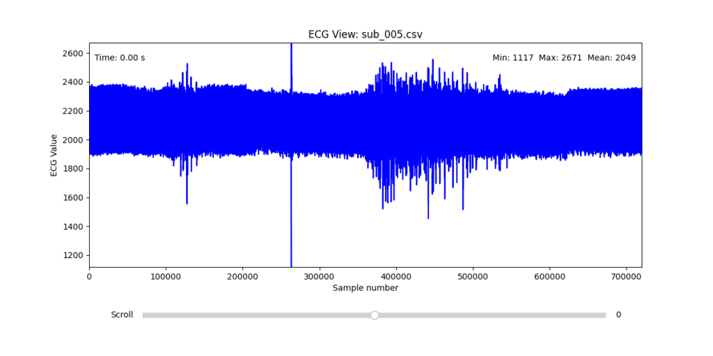
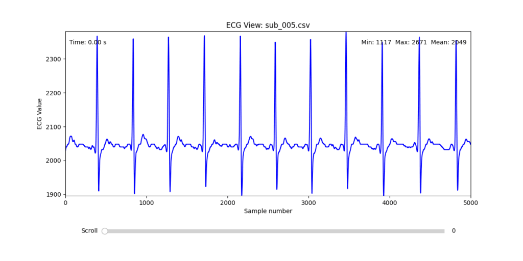
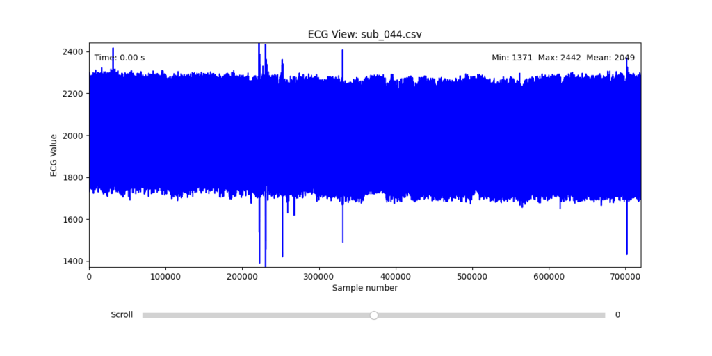
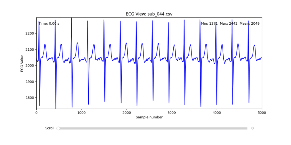
To facilitate and streamline this selection process, I implemented a simple interactive visualization tool in Python. This utility allows for scrollable navigation through long ECG recordings, with a resizable window and basic summary statistics (min, max, mean values). It was essential for rapidly identifying where signal corruption occurred and assessing lead quality in a non-automated but highly effective way.
This tool enabled both quantitative assessment and intuitive engagement with the data, providing a necessary bridge between raw measurement and informed experimental design.
Selection of Final Subjects and Optimal ECG Leads
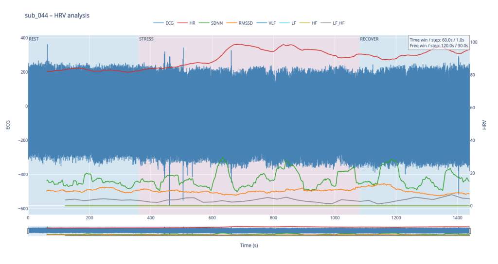
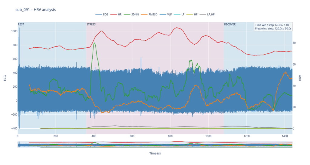
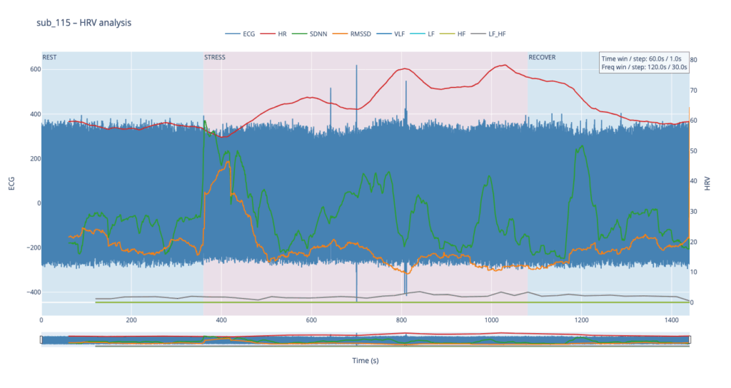
Following visual inspection of all 12 ECG leads across the 16 initially shortlisted subjects, I selected one representative from each diagnostic group whose recordings exhibited the highest signal quality and least interference. The selection was based on manual analysis using the custom-built scrollable ECG viewer, with particular attention given to the clarity and prominence of QRS complexes—a critical factor for accurate heart rate variability (HRV) analysis. The final subjects are: 005, 044, 091, 115:
These signals will serve as the primary input for all upcoming simulation and sonification stages. While artifacts remain an inherent part of physiological measurement—especially in ambulatory or emotionally charged conditions—this selection aims to provide a clean analytical baseline from which to explore more experimental, expressive interpretations in later phases.
References:
Van der Kolk, Bessel A. 2014. The Body Keeps the Score: Brain, Mind, and Body in the Healing of Trauma. New York: Viking.
In this talk the speaker made one thing clear: we’re all designing for users who never face loading screens, never make mistakes, and always have perfect internet. Meanwhile, actual humans struggle with our products in ways we did’t take in account
Something to keep in mind: if my design only works when everything goes right, it doesn’t really work at all.
The Loading Screen We imagine users navigatin through our interfaces, but truth is that sometimes the pages take time to load. The speaker showed how even a half-second delay needs to be considered.
It is better to add proper communication about what actually went wrong and what the user can realistically do about it.
When Content Misbehaves Designers design tidy cards that look good with short text like “Pizza.” Then real users come along with titles like “Martha’s Gluten-Free Artisanal Sourdough Breakfast Flatbread” and in that moment the layout is not working out anymore.
The solution? Design components that can stretch, shrink. Good design is about handling whatever users throw at it.
The Myth of the Mouse User Ofter designer design for people with fast internet and desktop computers. But many users navigate using only keyboards, rely on screen readers or use touchscreens where hover effects don’t work
Real design considers all these ways people interact, not just the one we’re used to. It’s about making sure everyone can actually use what we build
Adapt or Die Modern designs can now adjust to how people want to use them. Dark mode respects night owls eyes. Websites can remember content for when your signal drops.
Good design doesn’t force one experience, it adapts to each user’s needs.
The Hard Pill to Swallow In short, the speaker’s closing argument is that if you’re not designing these states, you’re not doing your job.
After this talk I can’t look at a design without seeing all the invisible failure points. Because in the end, what separates good design from great design it’s how it gets thorugh the chaos of real world use.
At a recent conference, I attended a fascinating talk on the use of game design elements in non-game contexts and how it can boost user engagement and satisfaction. The speaker opened with a compelling case: gamification isn’t just a trend, it’s a tool that taps into deep-seated cognitive biases to motivate behavior and enhance user experience.
The speaker opened with the example of one of the early brands in this field. Nike used gamification strategies to encourage people to run more. Their apps allowed users to track progress, set personal goals, and even compete with friends. This created a sense of achievement and motivation.
Supporting this, a study from the University of Colorado found that using gamification in educational or workplace settings can lead to a 48% increase in engagement and satisfaction. That’s a significant jump, and one that shows the potential of integrating these strategies into various systems.
A particularly interesting example mentioned in the talk was Bluepoint, a kind of virtual currency system where users receive points from their colleagues for being helpful or kind. This builds positive behavior but also a sense of community and recognition in the workplace.
And here’s where I have to be honest: some of it really made me raise an eyebrow. For example, the idea that getting a digital badge on an app can create genuine emotional attachment? That sounds ridiculous, a bit like rewarding yourself with a gold star for remembering to do the laundry. Even more unsettling is the concept of colleagues rating each other for kindness. I mean, really in a Black Mirror episode?
But surprisingly, psychology seems to back it up. The speaker explained that rewards and progress indicators are powerful tools. When users see that they’re getting closer to completing a task, it becomes psychologically harder to stop, this phenomenon is called the Zeigarnik effect.
Another key concept was the Endowment Effect, the idea that people place more value on things simply because they feel ownership over them. Apparently, even small things like digital badges can trigger this sense of emotional investment. Still sounds like a stretch to me, but I guess the science says otherwise.
Then there’s the IKEA effect, which suggests that when people build or customize something themselves, they tend to value it more. In gamification, this translates to letting users set daily goals or personalize their experience. When users feel like they’ve helped create something, they’re more likely to stick with it.
So while some parts of gamification still sound like nonsense to me and maybe even a little dystopian I can’t ignore the results. When used thoughtfully, these strategies clearly tap into human psychology in ways that drive engagement and motivation. Whether I like it or not its worth paying attention to it.
At this year’s WebExpo, Jan Řezáč delivered a compelling and structured talk titled “12 Core Design Skills” that reframed what it means to be a complete designer today. Drawing from real-world challenges in UX, CX, and product design, he warned against common traps and laid out a roadmap for how designers can escape it by growing beyond just creativity or aesthetics.
Here are the 12 essential skills he outlined, along with some key takeaways from each:
1. Design Process
Design is not art. It’s intentional problem-solving. Whether you’re improving conversion rates or building a new service, a structured and goal-oriented design process is critical.
2. Business Thinking
To be taken seriously, designers must speak the language of business. This means understanding value chains, profit models, and being fluent in spreadsheets, metrics, and strategic frameworks.
3. Workshop Facilitation
Good workshops don’t happen by accident. Designers need to know how to listen actively, manage group dynamics, and facilitate decision-making sessions that are productive—not just fun.
4. Customer Research
From interviews to analytics, understanding what people say vs. what they do is vital. Tactical empathy—listening well, reading nonverbal cues, and avoiding judgment—is just as important as choosing the right method.
5. Sense-making
It’s not enough to gather data—you must extract meaning from it. Tools like journey maps, affinity diagrams, or concept maps help designers (alone or in teams) make strategic sense of what they learn.
6. Strategy
Designers influence business outcomes. Strategic thinking involves more than goals—it’s about choosing the right battles and methods. Familiarity with tools like Wardley Maps or Cynefin helps designers navigate complexity.
7. Stakeholder Management
This is a social skill, not a soft skill. Designers must persuade, negotiate, and manage conflict—often while handling governance and aligning teams. The higher you go, the more this matters.
8. Ideation
Great designers generate many ideas. Juniors tend to fixate on the first; seniors create, oppose, remix, and improve. With AI in the mix, idea generation becomes a hybrid of human insight and computational creativity.
9. Rapid Prototyping
Prototypes aren’t just sketches—they’re experiments. From static screens to AI-driven tools, being fast and iterative is essential. Tools like Replit, Firebase Studio, and Glitch are part of the modern prototyper’s stack.
10. Testing Business Ideas
Borrowing from lean startup methods, this skill is about de-risking innovation. You don’t need to build to test—you need fake doors, landing pages, concierge tests, and more.
11. Design Operations
The backstage of design: automation, documentation, tooling, and workflows. Understanding APIs, JSON, prompt engineering, and how to use AI tools well is increasingly part of the designer’s toolkit.
12. Project Management
Designers who can’t manage time, people, and dependencies get stuck. As you grow, you must manage not only yourself, but also others—and your boss. That means mastering risks, gantt charts, and even meetings.
Final Thought: Avoid the Second Diamond Trap
One of the most resonant warnings from Řezáč was about the “Second Diamond Trap”—the tendency to over-invest in ideation and exploration without ever delivering results. To rise above that, designers must develop both creative and operational muscles.
If you’re a junior, mid-level, or senior designer, this list isn’t just a checklist—it’s a map. And in a world where 95% of new products fail, becoming fluent in these 12 areas might just make the difference between launching something forgettable… or something that lasts.
At WebExpo Prague, one standout talk compared the world of advertising to a jungle. A dangerous, chaotic, yet exciting terrain where only the smart and strategic make it out alive. The speakers laid out a vivid survival guide with 10 essential rules for brands trying to cut through the noise and thrive. Here’s what I took away.
1. Know What’s in Your Survival Kit Every successful campaign starts with knowing the basics: who you are, what you’re selling, and who you’re talking to. Your brand, product, and target audience form your survival gear. Without a clear identity and focus, you’re setting off without a map or a compass.
2. Enter with Courage Surviving the advertising jungle takes guts. You need the courage to invest, often heavily and the courage to be different. Playing it safe means blending in. True bravery lies in trying new approaches, breaking norms, and not fearing bold decisions.
3. Hunt One Animal Don’t try to chase everything at once. Focus your efforts on one clear objective and communicate one strong message. Klarna’s “smooth payments” campaign succeeded not because it was extraordinary, but because it was simple, focused, and consistent.
4. Stay on the Path Consistency and integration are what keep a campaign strong over time. An integrated campaign is 31% more effective, and consistent brands earn 28% more profit. That means sticking to your story, your values, and your visual language across every platform.
5. Take a Buddy Your buddy in the jungle could be a mascot or a recurring character, what’s called a fluent device. Most brands play it safe with friendly figures, but the bold ones dare to go rogue. Think of the chaotic Duolingo owl or the famously grumpy “Never Say No to Panda.” A strong character gives your brand a recognizable, repeatable voice.
6. Climb the Tree for Perspective Survival sometimes means stopping to get a better view. In creative terms, that means finding unusual angles, new interpretations, or breaking common patterns. Great ideas often come from looking at the ordinary in unexpected ways.
7. Follow the River Trends are like rivers: fast-moving, powerful, and unpredictable. Tapping into them can give your brand momentum. Think of Heineken’s “The Flipper” or the viral explosion of “Brat summer.” These cultural waves don’t last long, but when timed right, they carry you far.
8. Cooperate with the Indigenous People In the jungle, locals know the terrain. In advertising, that means working with credible people who already have trust and reach like influencers, actors, or community figures. But the influencer cannot be the idea itself. Calvin Klein’s campaign with Jeremy Allen White had cultural fit; Kendall Jenner’s Pepsi ad did not. Authenticity is key.
9. Turn Obstacles into Opportunities Barriers don’t have to stop you they can inspire creativity. When a brand faced “consumer blindness” to prices, it made the price tag the visual identity. When beer ads were banned from football kits, they got players to shave beer logos into their hair. Restrictions can become your creative fuel.
10. Celebrate at the End Surviving the jungle is no small feat. When the campaign ends, take time to reflect, share what you learned, and celebrate the journey. The best brands don’t just move on—they take their wins, analyze their failures, and build smarter strategies for next time.
Final Thought In the end, advertising isn’t about playing it safe. It’s about preparing wisely, taking risks, collaborating meaningfully, and adapting fast. The jungle is wild but with the right survival kit, your brand might not just survive. It might lead the way.
Advanced Automated Sound Mixing with Hierarchical Tag Handling and Spectral Awareness
The Image Extender project continues to evolve in scope and sophistication. What began as a relatively straightforward pipeline connecting object recognition to the Freesound.org API has now grown into a rich, semi-intelligent audio mixing system. This recent development phase focused on enhancing both the semantic accuracy and the acoustic quality of generated soundscapes, tackling two significant challenges: how to gracefully handle missing tag-to-sound matches, and how to intelligently mix overlapping sounds to avoid auditory clutter.
Sound Retrieval Meets Semantic Depth
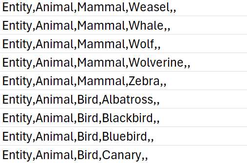
One of the core limitations of the original approach was its dependence on exact tag matches. If no sound was found for a detected object, that tag simply went silent. To address this, I introduced a multi-level fallback system based on a custom-built CSV ontology inspired by Google’s AudioSet.
This ontology now contains hundreds of entries, organized into logical hierarchies that progress from broad categories like “Entity” or “Animal” to highly specific leaf nodes like “White-tailed Deer,” “Pickup Truck,” or “Golden Eagle.” When a tag fails, the system automatically climbs upward through this tree, selecting a more general fallback—moving from “Tiger” to “Carnivore” to “Mammal,” and finally to “Animal” if necessary.
Implementation of temporal composition
Initial versions of Image Extender merely stacked sounds on top of each other by only using the spatial composition in the form of panning. Now, the mixing system behaves more like a simplified DAW (Digital Audio Workstation). Key improvements introduced in this iteration include:
Random temporal placement: Shorter sound files are distributed at randomized time positions across the duration of the mix, reducing sonic overcrowding and creating a more natural flow.
Automatic fade-ins and fade-outs: Each sound is treated with short fades to eliminate abrupt onsets and offsets, improving auditory smoothness.
Mix length based on longest sound: Instead of enforcing a fixed duration, the mix now adapts to the length of the longest inserted file, which is always placed at the beginning to anchor the composition.
These changes give each generated audio scene a sense of temporal structure and stereo space, making them more immersive and cinematic.
Frequency-Aware Mixing: Avoiding Spectral Masking
A standout feature developed during this phase was automatic spectral masking avoidance. When multiple sounds overlap in time and occupy similar frequency bands, they can mask each other, causing a loss of clarity. To mitigate this, the system performs the following steps:
Before placing a sound, the system extracts the portion of the mix it will overlap with.
Both the new sound and the overlapping mix segment are analyzed via FFT (Fast Fourier Transform) to determine their dominant frequency bands.
If the analysis detects significant overlap in frequency content, the system takes one of two corrective actions:
Attenuation: The new sound is reduced in volume (e.g., -6 dB).
EQ filtering: Depending on the nature of the conflict, a high-pass or low-pass filter is applied to the new sound to move it out of the way spectrally.
This spectral awareness doesn’t reach the complexity of advanced mixing, but it significantly reduces the most obvious masking effects in real-time-generated content—without user input.
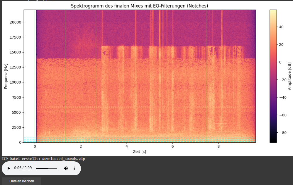
Spectrogram Visualization of the Final Mix
As part of this iteration, I also added a spectrogram visualization of the final mix. This visual feedback provides a frequency-time representation of the soundscape and highlights which parts of the spectrum have been affected by EQ filtering.
Vertical dashed lines indicate the insertion time of each new sound.
Horizontal lines mark the dominant frequencies of the added sound segments. These often coincide with spectral areas where notch filters have been applied to avoid collisions with the existing mix.
This visualization allows for easier debugging, improved understanding of frequency interactions, and serves as a useful tool when tuning mixing parameters or filter behaviors.
Looking Ahead
As the architecture matures, future milestones are already on the horizon. We aim to implement:
Visual feedback: A real-time timeline that shows audio placement, duration, and spectral content.
Advanced loudness control: Integration of dynamic range compression and LUFS-based normalization for output consistency.