The Power of Data Visualization: Turning Numbers into Insight

Thinking of my project and the first meeting, the main and big problem is how data must be visualized to help people understand it. It seems so simple but most of the data gets lost in the dark because people don’t know what to do with them. Data visualization is another form of visual art that grabs our interest and keeps our eyes on the message. It’s storytelling with a purpose.

Data visualization is the graphical representation of information and data. It uses visual elements like charts, graphs, and maps to provide an accessible way to see and understand trends, outliers, and patterns in data. By presenting data visually, it transforms complex datasets into a more digestible and meaningful format, allowing stakeholders to grasp key insights quickly. 

It’s important to visualize data accurately when you’re doing market research. This is because you can visualize both numerical and categorical data, which makes the insights more impactful and reduces the risk of analysis paralysis.

What is the Goal of Data Visualization? 

The primary goal of data visualization is to communicate data clearly and efficiently. It aims to make complex data more understandable, uncover hidden insights, and facilitate better decision-making. Visualization bridges the gap between raw data and actionable intelligence, helping users to process information faster and make data-driven decisions. 

Why is Data Visualization Important? 

In the world of Big Data, it’s really important to be able to see all that data in a way that makes sense in order of being able to make data-driven decisions. The primary goal of data visualization is to communicate data clearly and efficiently. It provides an accessible way to see and understand trends, outliers, and patterns in data and a way for experts in a specific field to present data to non-technical audiences without confusion.

In today’s data-rich environment, data visualization is crucial for several reasons. It enhances understanding by making complex datasets more accessible through visual representation. This improved clarity supports better decision-making, allowing for quicker and more informed choices by highlighting key data points and trends. Additionally, data visualization aids in communication, effectively conveying information to diverse audiences, including non-technical stakeholders. Lastly, it helps identify patterns and trends that might not be immediately apparent in raw data, enabling organizations to uncover valuable insights.

What Types of Data Visualization Are There? 

There are various types of data visualizations, each suited to different kinds of data and analysis goals: 

  • Chart: Displays information in a graphical form with data along two axes. Types include graphs, diagrams, and maps.
  • Table: Presents figures in rows and columns, useful for detailed data comparison.
  • Graph: A diagram showing relationships between variables, often along two axes.
  • Geospatial: Uses maps to show data relationships with specific locations, employing shapes and colors.
  • Infographic: Combines visuals and text to represent data, often with charts or diagrams.
  • Dashboards: A collection of visualizations for comprehensive data analysis and presentation in one place.
  • Area Map: Shows values over geographical locations, such as choropleths and isopleths.
  • Bar Chart: Uses bars to represent numerical values for easy comparison.

Choosing the Right Data Visualization

Choosing the right data visualization depends on the type of data and the story you want to tell. Factors to consider include the nature of your data (quantitative vs. qualitative), the relationship between data points, and the key message or insight you want to convey. Charts, graphs, and maps serve different purposes and cater to diverse analytical needs, from showing comparisons and trends to highlighting distributions and relationships.


So the bigger purpose of Data visualization is not just about making data look good; it’s about making data more accessible and actionable. By effectively employing various visualization techniques, professionals can transform how data is interpreted and utilized across industries. 

There are a lot of tools to that can help visualization Data like: Google Charts, Tableau, Grafana, Chartist, FusionCharts, Datawrapper, Infogram, and ChartBlocks. In the course of my work with the Risklim team, I will also have to deal with such tools to see how we can work better with the available data. 

Reference

https://www.tableau.com/visualization/what-is-data-visualization#:~:text=Data%20visualization%20is%20the%20graphical,outliers%2C%20and%20patterns%20in%20data. 12.01.25, 21:37

https://www.geeksforgeeks.org/data-visualization-and-its-importance 12.01.25, 21:24

https://www.atlassian.com/data/charts/how-to-choose-data-visualization 12.01.25, 21:57
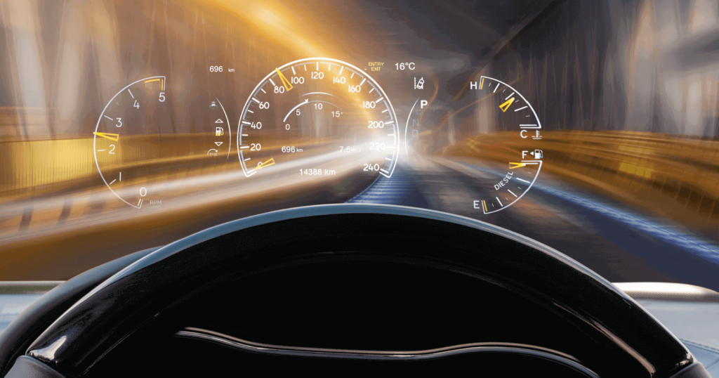
Optimising HUDs for Different Lighting Conditions

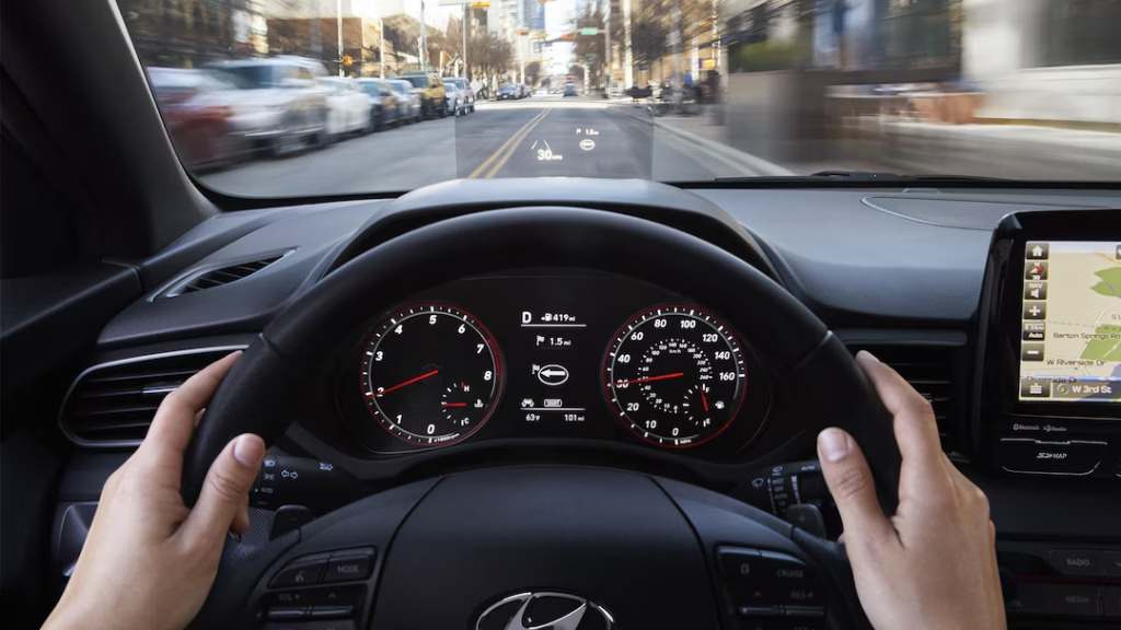
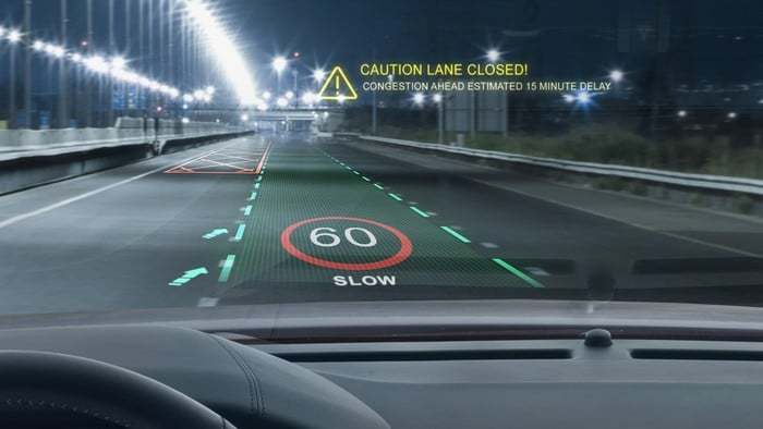
Head-Up Displays (HUDs) are becoming an essential tool in modern vehicles, providing essential driving information without requiring the driver to look away from the road. However, designing HUDs that work seamlessly in both bright daylight and dim nighttime conditions presents significant challenges. To ensure optimal visibility and usability, designers must consider adaptive brightness, contrast and colour schemes tailored to different lighting environments.

The challenges of lighting

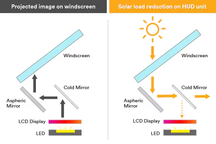
Driving environments can change dramatically between day and night, affecting how information is perceived on HUDs. In bright sunlight, glare and reflections can wash out display elements, making them difficult to read. Conversely, at night, overly bright HUD elements can cause eye strain and distract the driver from concentrating on the road.

(source: https://ackodrive.com/car-guide/head-up-displays/)

Adaptive brightness

An effective solution to lighting challenges is adaptive brightness. Using ambient light sensors, HUDs can automatically adjust their brightness levels to suit the environment. For example, during the day the display can increase in brightness to reduce glare from sunlight, while at night it can be lowered to reduce strain on the driver’s eyes.

(source: https://www.3m.com/3M/en_US/oem-tier-us/applications/human-machine-interface-solutions/head-up-display/jim-sax-hud-article/)

Contrast settings

High contrast between HUD elements and their backgrounds is critical for readability, especially in difficult lighting conditions. Designers can use bold, high-contrast text and symbols to ensure clarity. For example, white or light-coloured text on a dark background works well at night, while dark text on a lighter background improves visibility during the day.

(source:https://www.motortrend.com/features/head-up-display/)

Colour schemes

Appropriate colour schemes can improve readability and reduce cognitive load. During the day, bright colours such as green, blue or orange can help highlight important information, while at night, softer tones such as muted blues and greys prevent excessive brightness. Red should also be avoided at night, as it can impair night vision.

Real-world implementations

Automotive manufacturers are developing advanced HUD systems with lighting adaptability. For example, some systems use micro-mirror technology to dynamically adjust brightness based on ambient conditions, while others integrate multiple layers of colour and contrast to enhance visibility.

Designing HUDs that perform well in all lighting conditions is essential for safety and usability. By incorporating adaptive brightness, optimising contrast and carefully selecting colour schemes, designers can create HUDs that are effective and comfortable to use both day and night. As automotive technology continues to evolve, addressing these lighting challenges will remain a critical aspect of HUD design.

References:

https://caradas.com/understanding-adas-automotive-heads-up-display-hud/

https://www.researchgate.net/publication/364897281_Color_Visibility_Evaluation_of_In-Vehicle_AR-HUD_Under_Different_Illuminance

https://www.fic.com.tw/automotive/ar-hud/

https://www.fic.com.tw/safety-with-ar-hud/

#03 Multisensory Examples

NASA’s data sonification project converts astronomical observations into sound. By assigning different frequencies or instruments to distinct wavelengths of light (X-ray, optical, infrared), cosmic phenomena such as the Bullet Cluster, Crab Nebula, and Supernova 1987A can be “heard”. These audio interpretations highlight features like dark matter, spinning neutron stars, and supernova shockwaves, providing a new, immersive way to experience and understand the universe.


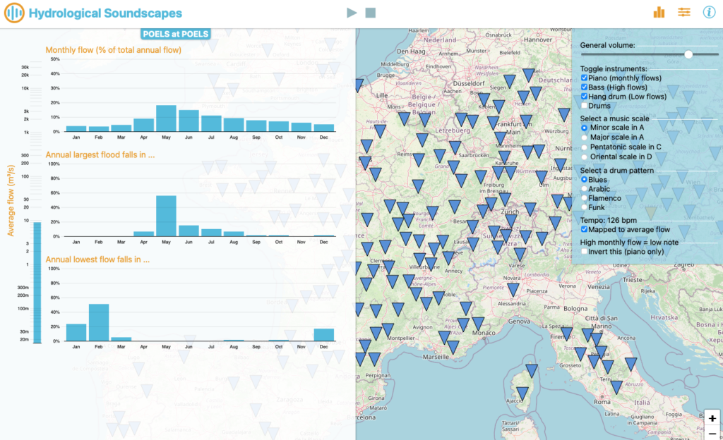
https://hydrologicalsoundscapes.github.io

Hydrological Soundscapes | Ivan Horner and Benjamin Renard (2023)

This app visualizes river hydrological data from thousands of global hydrometric stations in both bar charts and musical form. Each of four hydrological variables (average flow, monthly flows, monthly frequency of annual daily maxima, and monthly frequency of annual 30-day averaged minima) controls different musical elements, such as tempo, pitch, volume, and instrument choice. Users are encouraged to wear headphones for the best experience and can either follow a brief tutorial or start exploring immediately.

Reference

https://sonification.design


This passage describes a musical representation of library traffic patterns throughout the year. Each “row” of notes corresponds to a different time of day (weeks, mornings, afternoons/evenings, and nights) and is placed in a progressively higher pitch range. School breaks, weekends, and term times are reflected in gaps or surges in the music, illustrating how library hours and visitor numbers change across the summer, fall, winter, and spring quarters. Nights are only represented during school terms, highlighted by two-note arpeggios in the highest pitch range.

https://mlaetsc.hcommons.org/2023/01/18/data-sonification-for-beginners


Multisensory Data: Insights from “DATA AND DASEIN”

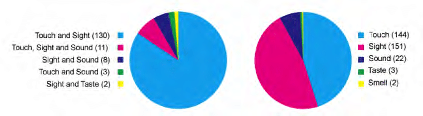
In the dissertation “DATA AND DASEIN – A Phenomenology of Human-Data Relations,” by T. Hogan a review of 154 data representations revealed that most rely on sight (151) and touch (144) to interpret data (Figure 1, B). A smaller subset (22) also incorporated sound, and even fewer tapped into taste or smell. Moreover, 139 examples combined both sight and touch, while only 11 used more than two sensory channels (Figure 1, A).

Figure 1: A: Pie chart (right): distribution of sensory modalities used in combination with other modalities. B: Pie chart (left): Combinations of sensory modalities.

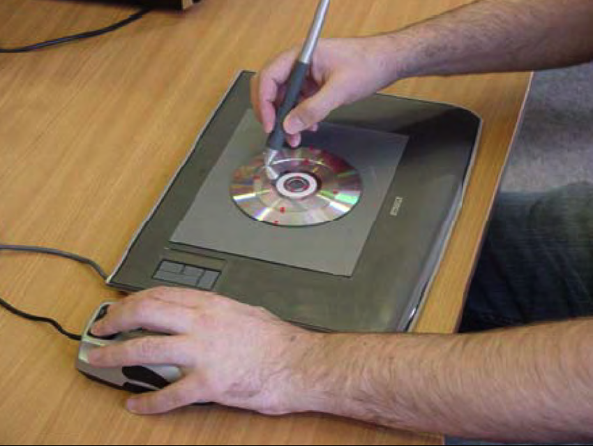
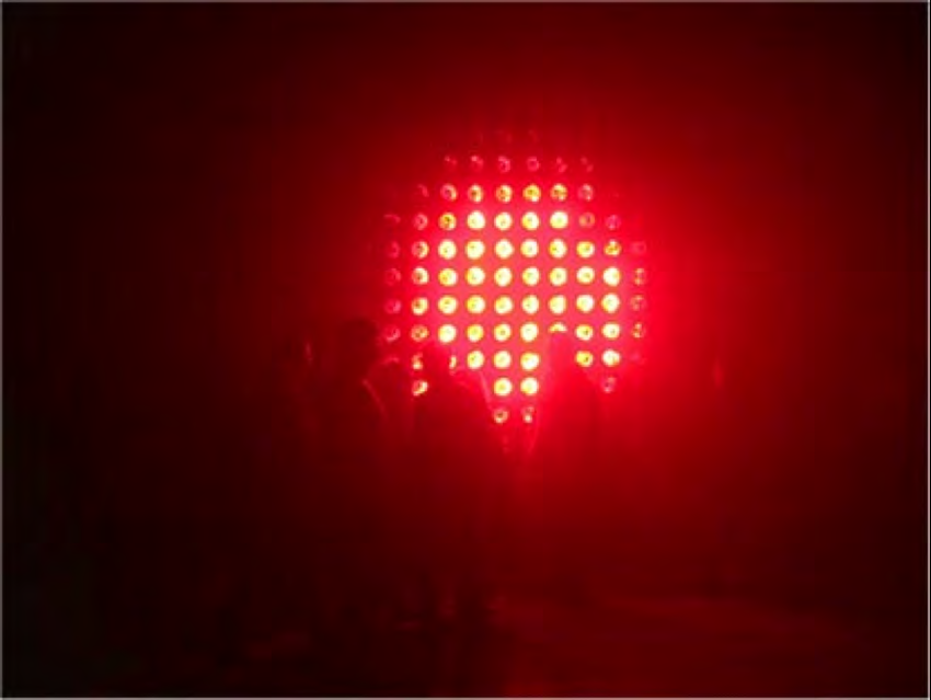
One standout example is Tac-tile (Figure 2), designed for visually impaired users. By combining tactile (via vibrotactile feedback through a stylus) and auditory (adjusting pitch through speakers) elements, Tac-tile highlights how multiple modalities can enable a richer, more inclusive data exploration. This concept extends beyond assistive technology: artist Ryoji Ikeda’s Data.anatomy[civic] [2] merges audio and dynamic graphics to immerse audiences in the intricate data driving Honda Civic car design. Meanwhile, Perpetual (Tropical) SUNSHINE [3] (Figure 3) uses infrared light bulbs to convey real-time temperature data from stations around the Tropic of Capricorn, translating environmental data directly into heat and light. And in more experimental territory, Data Cuisine by Moritz Stefaner [4] explores taste, smell, and sight to transform data into “edible diagrams.”

Figure 2: Tac-tile system. Graphics tablet augmented with a tangible pie chart relief, with dynamic tactile display [1]
Figure 3: Perpetual (Tropical) SUNSHINE by fabric

These examples underscore the creative possibilities of thinking beyond purely visual representations. When designers and researchers integrate multiple sensory channels, they can unlock new forms of engagement, accessibility, and emotional resonance.

Reference

T. Hogan, Data and Dasein – A Phenomenology of Human-Data Relations, Ph.D. dissertation, Bauhaus-Universität Weimar, Weimar, Germany, 2016, sect. 5.5.1.1 (Sensory Modalities).

[1] Steven A. Wall and Stephen A. Brewster. “Tac-tiles: Multimodal Pie Charts for Visually Impaired Users.” In: Proceedings of the 4th Nordic conference on Human-computer interaction changing roles – NordiCHI ’06. Association for Computing Machinery (ACM), 2006. doi: 10.1145/1182475.1182477. url: https://doi.org/10.1145%2F1182475.1182477.
[2] Ryoji Ikeda. data.anatomy.civic. website. 2012. url: http://dataanatomy.net/.
[3] fabric | ch. Perpetual (Tropical) SUNSHINE. (2006). website. 2012. url: http://www.fabric.ch/pts/.
[4] Moritz Stefaner. Data Cuisine. website. 2014. url: http://data-cuisine.net/.

Forschungsfokus: Diskriminierte Kunst

Motivation

Das Ziel meiner Arbeit liegt darin, die Geschichten von Personen zu beleuchten, die aufgrund von Diskriminierung – sei es durch Geschlecht, Herkunft, soziale Zugehörigkeit oder andere Vorurteile – nicht die Anerkennung in der Kunst erfahren haben, die ihnen zusteht. Indem ich diese Geschichten erzähle, möchte ich nicht nur ihre Beiträge zur Kunst sichtbar machen, sondern auch auf die strukturellen Ungerechtigkeiten hinweisen, die dazu führten, dass ihre Werke und ihr Wirken lange Zeit übersehen oder marginalisiert wurden. Es geht darum, diesen Menschen Gehör zu verschaffen und ihre Kunst in unsere heutige Zeit zu holen, um zu zeigen, wie wichtig sie ist. Gleichzeitig soll ihre Geschichte dazu anregen, darüber nachzudenken, wie die Kunstwelt in der Vergangenheit mit Vielfalt und Gleichberechtigung umgegangen ist.


Stichworte

Ich habe ein kleines Brainstorming gemacht, was genau ich repräsentieren will. Folgende Schlagwörter sind hier besonders prominent erschienen:

„Vergessene Künstlerinnen“, „Diskriminierte Kunst“, „Verbrechen in der Kunst“, „Unterrepräsentierte Kunstbewegungen“, „Kunst und Minderheiten“, „queere Kunstgeschichte“

Ursprünglich war mein Wunsch ein feministisches Projekt mit Fokus auf Frauen zu erarbeiten, aber hier gibt es schon sehr viel Aufarbeitung. Natürlich ist das Thema bis heute ein Problem, und man kann auch schwer sagen, dass es schon auserzählt ist, aber die queere Kunstgeschichte ist vielleicht eine Nische, die noch weniger Aufmerksamkeit bekommen hat. Oder vielleicht waren männliche homosexuelle Künstler doch weniger ein Tabu-Thema als meine Hypothese es vermuten lässt. Ich kann mir auch gut vorstellen, das queere Frauen extrem wenig bis keine Repräsentation in dieser Szene hatten. Hier ist aber auch die Schwierigkeit, überhaupt an wissenschaftliches Material zu kommen. Dazu recherchiere ich noch.

Experten Interviews

Ich habe von unserer Lektorin Stefanie Egger einen Kontakt zu einer Frau bekommen, die sich für die Digitalisierung von Kunst einsetzt und die sicherlich einen wertvollen Einblick hat, welche Gruppierung oder auch Hinweise auf Geschichten von Einzelpersonen, die noch unterrepräsentiert sind.

Außerdem werde ich auch meinen alten Kunstgeschichte Professor (der selber Künstler ist) dazu kontaktieren, dieser ist in der Kunstszene gut vernetzt und hat durch seinen Beruf und auch seiner Lebenserfahrung viel Informationen, die meine Arbeit vorantreiben könnte.

Bücher

  • Women Artists: The Linda Nochlin Reader
  • Hidden Histories: 20th Century Women Artists

Film: Big Eyes

Es gibt einen Film, den ich vor ca. 10 Jahren mal gesehen hab und der mich echt unglaublich mitgenommen bzw. auch inspiriert hat. Und zwar war das “Big Eyes” (2014), in Spielfilm der auf die wahre Begebenheit der unterdrückten Künstlerin Margaret Keane durch ihren Ehemann Walter basiert. Ihre Werke wurden nämlich zunächst nicht ihr, sondern ihrem Ehemann zugeschrieben. Walter, selbst ein erfolgloser Künstler, erkannte das kommerzielle Potenzial von Margarets Gemälden und vermarktete sie erfolgreich – jedoch unter seinem Namen. Margaret wurde dabei mehr und mehr in die Rolle seiner „Kunstsklavin“ gedrängt, die heimlich arbeitete, während er den Ruhm einheimste. Aufgrund der gesellschaftlichen Strukturen der Zeit hatte Margaret zunächst keine Möglichkeit, sich gegen diesen Betrug zu wehren. Margaret macht schließlich die Wahrheit öffentlich bekannt und zieht gegen Walter vor Gericht. In einem Prozess wird sie aufgefordert, live im Gerichtssaal ein Gemälde anzufertigen, um zu beweisen, dass sie die wahre Künstlerin ist – und wird damit befreit.

Da Margaret Keane heute eine der bekanntesten Künstlerinnen ihrer Zeit ist, eignet sich ein solcher Fall nicht optimal für meine Zwecke. Aber die Art des emotionalen Storytellings dieses Films und das ein einzelner Fall auch representativ für ein systematisches Problem viel aufzeigen kann finde ich besonders inspirierend auch für meine Arbeit.

Was mir jedoch im Zuge der Recherche zu dieser Story aufgefallen ist, ist, dass es extrem häufig vor kam, dass Frauen “im Schatten” von Männern standen und tatsächlich männliche Kollegen, Lehrer, Partner oder Familienangehörige deren Arbeiten im eigenen Namen vertrieben haben.

Podcast

Revisionist History
https://open.spotify.com/show/2LOJaYKijiwNefCvzczyib?si=81bbf2fa335d44a8


„Revisionist History“ ist ein Podcast, der von Malcolm Gladwell moderiert wird. „Revisionist History“ untersucht Themen, Ereignisse oder Personen, die in der Vergangenheit übersehen, missverstanden oder falsch interpretiert wurden. Gladwell betrachtet diese Geschichten aus neuen, oft überraschenden Blickwinkeln, um zu zeigen, wie kleine Details, kulturelle Verzerrungen oder historische Blindspots größere Konsequenzen haben können.

Datenbanken und Web-Projekte

Auf folgende Webseiten bin ich bei meiner Recherche bisher gestoßen.
Diese könnten auch bei weiterer Nachforschung interessant sein.

https://awarewomenartists.com

Begriffe

“Herstory” = Der Begriff “Herstory” ist ein Wortspiel, das sich aus dem englischen Wort “history” ableitet, jedoch mit dem Fokus auf Frauen und ihre Geschichten. Während history wörtlich “seine Geschichte” (aus his-story) suggerieren kann, betont herstory “ihre Geschichte” (her-story), um auf die oft übersehene oder unterrepräsentierte Rolle von Frauen in der Geschichte hinzuweisen.

Der Begriff wird häufig in feministischen Kontexten verwendet und zielt darauf ab, die traditionelle Geschichtsschreibung zu hinterfragen, die oft von männlichen Perspektiven dominiert ist. Herstory setzt sich dafür ein, vergessene oder marginalisierte Beiträge von Frauen sichtbar zu machen, sei es in der Politik, Wissenschaft, Kunst oder anderen Bereichen. Es geht darum, die Geschichte inklusiver zu gestalten und alternative Perspektiven zu beleuchten.

Quelle: https://en.wikipedia.org/wiki/Herstory

Interessante Persönlichkeit

Sophie Taeuber-Arp (1889–1943):
Eine Schweizer Künstlerin, deren Beiträge zur Dada-Bewegung oft ihrem Mann Hans Arp zugeschrieben wurden.
Ist anscheinend in der Schweiz bereits sehr bekannt. Cool daran ist, dass sie die Großtante von Silvia Boadella ist, und ein lebender Nachkomme würde vielleicht viel interessanten Input hinzugeben können.

Chronologisches Storytelling auf Web-Plattformen

Definition

Chronologisches Storytelling auf Web-Plattformen bedeutet, dass eine Geschichte oder Ereignisse auf einer Webseite in der Reihenfolge erzählt werden, in der sie tatsächlich passiert sind. Digitale Werkzeuge wie Bilder, Videos oder interaktive Elemente machen die Inhalte dabei lebendiger und spannender. Ein bekanntes Beispiel ist „Scrollytelling“. Hier wird der Inhalt so präsentiert, dass sich die Geschichte beim Scrollen nach und nach entfaltet. Das ist besonders bei längeren Artikeln oder Reportagen beliebt, weil es die Leser*innen stärker einbindet und den Text weniger statisch wirken lässt.
Quelle: https://www.vev.design/blog/scrollytelling-tools/

Zweck

In meiner Arbeit soll es um die Repräsentation von Minderheiten in der Kunst gehen. Darum wurde auch Chronologisches Storytelling gewählt, um mit einer öffentlich zugänglichen Methode auf kreative Weise einen emotionalen Zugang zu schaffen.

Ein gutes Buch zu diesem Thema ist „Digital Storytelling: Form and Content“, das erklärt, wie digitale Plattformen genutzt werden können, um spannende Geschichten zu erzählen.
Quelle: https://link.springer.com/book/10.1057/978-1-137-59152-4

Fallbeispiele

ÖBB History

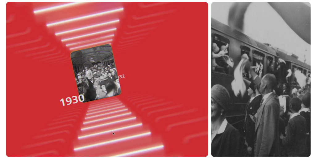
Als erstes fällt mir bei dem Thema direkt die ÖBB History page von der Agentur wild in Wien ein.

Die Website bietet eine interaktive Zeitreise durch die Geschichte und Zukunft der Österreichischen Bundesbahnen. Im Fokus stehen die wichtigsten Ereignisse der letzten 100 Jahre, bedeutende Errungenschaften sowie die weniger bekannten, dunkleren Kapitel ihrer Geschichte.

https://wild.as/work/oebb-history

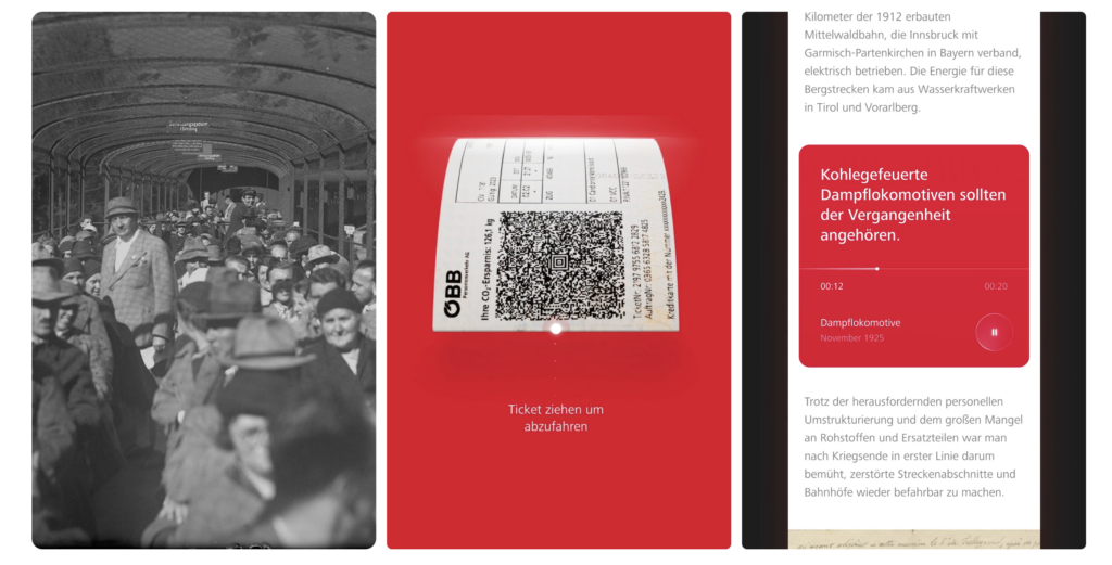
Interaktion erhält man zum Beispiel durch Scrolling in einer Timeline, es gibt aber noch zusätzlich unkonventionellere Aktionen wie z.B. ein Ticket ziehen oder Datepicker betätigen um in der Zeit zu springen und verschiedene Arten von Slider.

Es wurde aus meiner Sicht nicht zuuu viel an Effekten hinzugefügt, was die Website auch überladen kann, aber einzelne, sehr ausgeklügelte Animationen die super abgestimmt sind auf den Anwendungsfall gewählt. Meiner Meinung nacht ist das schon eine der coolsten kommerziellen Webseiten, die ich bisher gesehen habe.

Leider ist sie aktuell nicht mehr online: https://oebb-history.at/en.
Aus dem Grund hab ich dem Entwickler Team geschrieben, ob es die wieder geben wird oder ob ich anderwertig nochmal darauf zugreifen kann. Da ich schon einmal Kontakt mir der Agentur hatte, kann ich gegebenenfalls auch technisch Nachfragen, wie die Umsetzung genau gelaufen ist und wo es vielleicht Challenges bzw. Tipps für mich gab/gibt.

Ukrain War Non Profit

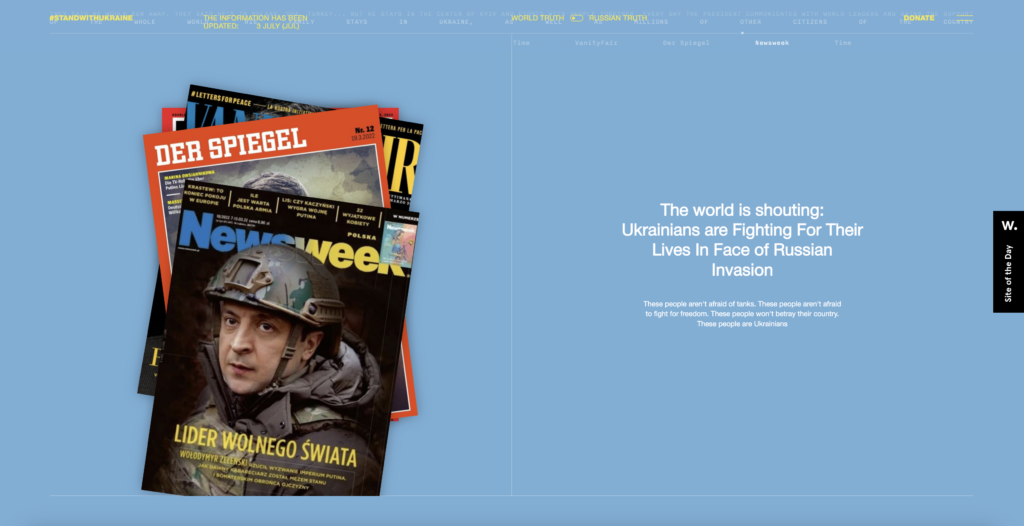
Diese Website ist ein non profit Projekt von “The First The Last” Agentur in USA. Sie macht das geschehen in der Ukraine auf eine weise erlebbar und sorgt somit auf eine emotionale Weise für Support durch User, die am Ende zur Hilfe aufgerufen werden.

https://theothersideoftruth.tftl.agency

Fachlich gesehen wird auch hier über verschiedene Interaktionsmöglichkeiten ein immersives Erlebnis geschaffen.

Besonders spannende Idee: über einen switch button kann man zwischen “World truth” und “russian truth” die Ansichten wechseln.

Mein take-away davon: Ich finde es besonders spannend, wenn Webseiten sich komplett in ihrer art der Interaktion und im Design auf den erlebbaren Content fokussieren. Auf diese Weise bekommt eine Webseite, mit deren Funktionen so vieles möglich gemacht werden kann, eine viel tiefere Bedeutung.

Level Up Your Gains: Automating Progressive Overload

Progressive overload, the principle of gradually increasing the stress placed on the body to build muscle and strength, is a cornerstone of effective fitness programs. Traditionally, it requires manual adjustments to weights, repetitions, or intensity based on performance. However, as fitness technology advances, automating this process through apps could revolutionize the way people train. This blog post explores how automated progressive overload could work in a fitness app, its benefits, and why this approach could make strength training more efficient and accessible.

What Is Progressive Overload and Why Does It Matter?

Progressive overload is essential for muscle growth and strength gains. Without progressively challenging the muscles, the body adapts to the current workload, leading to a plateau in progress. The process involves increasing weight, repetitions, or intensity over time. For example, if you performed three sets of squats at 100kg last week, adding an extra 2.5kg or an additional repetition in the following session ensures your muscles continue to adapt and grow.

The benefits of progressive overload include

  • Consistent Growth: It ensures that muscles are regularly challenged, leading to hypertrophy and strength gains.
  • Goal-Oriented Structure: Progressive overload provides clear markers of progress, keeping users motivated.
  • Adaptability: It works for all fitness levels, from beginners to advanced athletes.

However, manually tracking and adjusting these variables can be daunting, especially for beginners. This is where automation could come in handy.

How Would Automated Progressive Overload Work in an App?

An app designed to automate progressive overload would collect and analyze user data, such as:

  • Performance Metrics: Weight lifted, repetitions completed, and sets performed.
  • Feedback: User ratings on how difficult the workout felt (e.g., using the Rate of Perceived Exertion, or RPE).
  • Recovery Tracking: Information on rest, sleep quality, and fatigue levels.

Based on these inputs, the app would dynamically adjust training variables. Here’s how it might look:

  1. Data Collection: After a workout, the user logs performance metrics and recovery status.
  2. Analysis: The app uses algorithms to evaluate whether the user can safely increase weight, repetitions, or intensity.
  3. Adjustments: The app updates the training plan for the next session, ensuring the user progresses while avoiding overtraining.

For example, if a user completes three sets of 8 reps at 80kg on the bench press and rates the difficulty as moderate, the app might recommend increasing the weight to 82.5kg in the next session.

Benefits of Progressive Overload Automation

  1. Personalization
    Automated systems can tailor training programs to individual needs, making adjustments that account for performance, recovery, and fitness goals. This level of customization ensures optimal progress for each user.
  2. Consistency
    Manual tracking can lead to inconsistencies, especially for users new to strength training. An app eliminates guesswork, providing a reliable structure for progression.
  3. Efficiency
    By handling adjustments automatically, the app allows users to focus on executing their workouts rather than worrying about programming. This is particularly beneficial for those with limited time or knowledge.
  4. Motivation Through Metrics
    Seeing regular, data-driven improvements can boost motivation and adherence. Automated tracking highlights small victories, keeping users engaged in their fitness journey.
  5. Safety
    Automation can reduce the risk of overtraining by ensuring progression aligns with recovery status. Apps can recommend deload weeks or lighter sessions when necessary.

The Case for Automation: A “Set-It-and-Forget-It” Approach

For many users, especially beginners, automating progressive overload provides a stress-free way to train effectively. By trusting the app’s recommendations, users can focus entirely on performing their exercises. This approach democratizes access to effective programming, making it accessible even to those without prior fitness knowledge.

However, even with automation, user input remains vital. Feedback on difficulty and recovery ensures the system adapts accurately. Advanced users might also appreciate manual override options for added control.

Conclusion

Automating progressive overload in a fitness app bridges the gap between effective training and accessibility. By leveraging data and algorithms, such apps ensure consistent, personalized progress without the need for manual adjustments. The benefits are clear: efficiency, motivation, and safety, all while maintaining the fundamental principle of progressive overload.

As fitness technology continues to evolve, automated systems could become the norm, simplifying strength training and empowering more people to achieve their fitness goals. The future of strength training lies not just in lifting heavier weights, but in leveraging smarter tools to get there.

Sources:

1. Schoenfeld, B. J., & Grgic, J. (2019). Progressive overload revisited: principles for optimizing strength and hypertrophy. Journal of Strength and Conditioning Research.

2. Dr. Muscle. (n.d.). “How progressive overload works and how our app automates it.” Retrieved from dr-muscle.com.

3. StrengthLog. (n.d.). “What is progressive overload, and how can it help you build muscle?” Retrieved from strengthlog.com.

4. ACSM. (2021). Guidelines for resistance training and progression. American College of Sports Medicine.

1.3. DIY: A Hands-On Experience in the Museum

Museums have traditionally been spaces where visitors passively observe artifacts, but DIY elements are changing the game. By involving visitors in the creation process, museums foster a sense of ownership, creativity, and deeper engagement.

What is DIY (Do-It-Yourself)?

According to the Cambridge dictionary, DIY (Do-It-Yourself) is “the activity of decorating or repairing your home, or making things for your home yourself, rather than paying someone else to do it for you:” [1] This practice has grown from a niche activity into a significant cultural phenomenon, emphasizing accessibility, creativity, and self-empowerment. This is particularly evident in DIY spaces, such as laboratories, which are pivotal for grassroots innovation, fostering personal motivation and community-driven goals. [2]

Why DIY? The Science Behind Engagement

DIY fosters engagement and provides a hands-on approach to learning, encouraging curiosity and active participation. Studies show that tactile and interactive experiences stimulate deeper cognitive and emotional connections, making content more impactful for diverse audiences. This is particularly important in museums, which aim to educate while inspiring creativity and curiosity. [2] [6]

DIY Applications in Museums

In museums, DIY elements translate into interactive exhibits and workshops where visitors actively participate in creating or exploring concepts.

Examples include:

The Tech Interactive’s Biotinkering Lab, where visitors engage in hands-on biotech experiments. It is a creative space to explore biotechnology and biological sciences. Through engaging activities, the lab encourages participants to use biodesign and experiment with sustainable materials, genetics, and new technologies. Its primary focus is to make science accessible, fun, and inspiring for people of all ages. [3]

The Art of Tinkering Workshop is a three-day session at the Exploratorium designed for educators to explore tinkering as a teaching approach. Participants engage in hands-on activities, reflect on their experiences, and learn strategies to encourage creativity, problem-solving, and critical thinking in their classrooms. The workshop focuses on creating supportive environments, enhancing facilitation skills, and integrating tinkering into education. [4]

Challenges of DIY in Museums

Despite their benefits, DIY initiatives face challenges. Funding constraints often limit the scope of these programs, while scalability remains a concern for integrating DIY across broader audiences. Ethical considerations, especially in fields like biotechnology, add another layer of complexity. Museums must balance creativity with safety and accessibility, ensuring that DIY activities remain inclusive and impactful. [5] [6]

Looking Forward: DIY’s Potential

The future of do-it-yourself (DIY) activities in museums is about connecting these projects with wider educational and innovative goals. By building partnerships and engaging with communities, museums can offer more DIY programs that are affordable and can benefit society. It’s important to appreciate the unique value that DIY practices bring, as they can have a positive impact on education, businesses, and more. [2][5]

Sources

  1. Cambridge Dictionary, “DIY,” Cambridge Dictionary. [Online]. Available: https://dictionary.cambridge.org/dictionary/english/diy. 
  2. M. D. Dzandu and B. Pathak, “DIY Laboratories: Their Practices and Challenges – A Systematic Literature Review,” Technology Analysis & Strategic Management, vol. 33, no. 10, pp. 1242–1254, 2021. DOI: 10.1080/09537325.2021.1968373.
  3. The Tech Interactive. (n.d.). “The Biotinkering Lab.” [Online]. Available: https://www.thetech.org/explore/exhibits/the-biotinkering-lab/biotinkering-community-of-practice.
  4. Exploratorium. (n.d.). “Art Tinkering Workshop.” [Online]. Available: https://www.exploratorium.edu/tinkering/our-work/calendar/art-tinkering-workshop.
  5. W. You, W. Chen, M. Agyapong, and C. Mordi, “The Business Model of Do-It-Yourself (DIY) Laboratories – A Triple-Layered Perspective,” Technological Forecasting & Social Change, vol. 159, pp. 120205, 2020. DOI: 10.1016/j.techfore.2020.120205.
  6. H. Charman, “Designerly Learning: Workshops for Schools at the Design Museum,” Design and Technology Education: An International Journal, vol. 15, no. 3, pp. 28–40, 2010.

05 The Cognitive Bias Codex – Too much Information

Source: Wikipedia

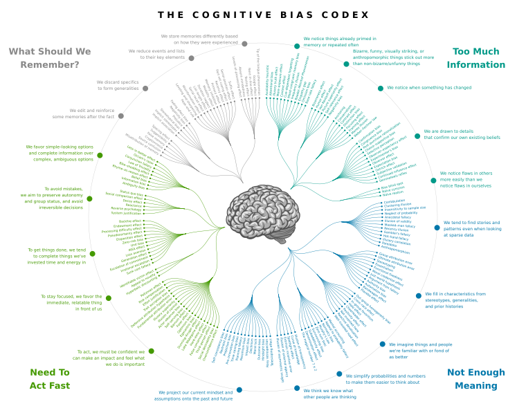
The Cognitive Bias Codex, by Buster Benson, is a visualization of over 200 cognitive biases, offering an overview of how our minds work. Inspired by his childhood, Benson developed the Codex to help others understand and mitigate the influence of biases. The Codex encourages critical thinking and greater self-awareness, empowering individuals to make more informed and balanced decisions. (cf. Emergent Thinkers) It separates all biases into 4 problem groups: Too much information, not enough meaning, need to act fast & “What should we remember?”. This and the following blogposts will explain one of the four categories, reflecting on the different biases within them and their impact on UX work.

Each category shows a broad problem definition, which is then split up into different behaviors we show or have. Below these there are effects or biases that explain why we have these behaviors, since they are a combination of all our biases and influences from our surroundings. To make this shorter and easier to read, I will not go into detail on every single bias and effect there is. (At least not in this blog post. ;D)

01 Information Processing

This category of the cognitive bias codex highlights how our brains handle the massive amounts of data we encounter daily. These biases influence how we collect, interpret, and remember information, often simplifying them to help us make decisions faster. While these mental shortcuts can be useful, they also shape our beliefs, judgments, and actions in ways we may not fully realize. Exploring this category helps to uncover hidden filters in our thinking, enabling us to better evaluate information, recognize distortions, and make decisions with more clarity. (cf. Gust de Backer)

01.1 Primed or Repeated Information

Our attention is drawn to information that aligns with what we already know. This makes certain details seem more important than others. The list of biases is very long, so here are the five biases I consider most important for UX Design.

  1. Availability Heuristic
    People judge the likelihood of events based on how easily examples come to their mind. This can lead to skewed decision-making, as recent experiences are more easily recalled and seem more common than they actually are. In UX design, using familiar examples or well-known patterns can help users make quicker decisions. (cf. Beyond UX Design C)
  2. Attentional Bias
    People tend to pay more attention to certain types of information while ignoring others, based on personal preferences, emotions, or past experiences. This means users are more likely to notice and engage with elements that are emotionally charged, eye-catching, or familiar. (cf. Beyond UX Design D)
  3. Mere-Exposure Effect
    People tend to develop a preference for things because they are exposed to them repeatedly. This effect can be used by consistently presenting certain features or brand elements, making users more comfortable and familiar with them. Over time, familiarity can lead to greater trust and engagement. (cf. Beyond UX Design F)

  4. Empathy Gap
    People fail to predict how emotions and mental states affect their behavior, leading to misunderstandings. For example, when not hungry, we might rationally predict we would choose a healthy snack, but in a hungry state, we’re more likely to pick something unhealthy. Understanding this gap helps in designing user experiences that anticipate emotional states and provide supportive features or messaging.
    (cf. The Decision Lab B)
  5. Omission Bias
    Harmful actions are perceived as worse than harmful inactions, even if the consequences are similar. For instance, people may feel less guilty about allowing negative outcomes than if they actively caused harm. Users might prefer passive features, like automatic settings, that avoid perceived responsibility or failure. Designers can use this by considering user preferences for default options or avoiding overwhelming users with too many choices. (cf. The Decision Lab C)

01.2 Attention-Grabbing Details

Unusual or emotional things captivate us, our brains are wired to notice things that are out of the ordinary. These biases make us prioritize spectacle over substance, they show us how we can make important information stand out and make our users remember it.

  1. Von Restorff Effect (The Isolation Effect)
    When multiple similar items are presented, the one that stands out is more likely to be remembered. This can be applied in UX design by making important elements or actions visually distinct. However, it’s crucial to avoid overwhelming users by overusing emphasis and to be mindful of accessibility issues, such as color vision deficiencies or motion sensitivity.
    (cf. Laws of UX)
  2. Picture Superiority Effect
    People tend to remember pictures better than words, visuals are processed in two ways as images and as associated words, while words are processed only as text. In UX design, using clear, literal images can improve memorability and comprehension. Effective placement of visuals, using unique images, and avoiding abstract visuals are key strategies to take advantage of this effect.
    (cf. NN Group B)
  3. Self-Relevance Effect
    People are more likely to remember information that they relate to themselves. This bias enhances memory retention when we connect new knowledge to personal experiences. In UX design, leveraging this effect could involve personalizing content, such as customized recommendations or user-centered messages, to improve engagement and retention. For example, presenting content that users can relate to personally, such as reminders tied to their preferences or past behaviors, can make the experience more memorable.
    (cf. The Behavioral Scientist D)

01.3 Novelty and Change

Elements that are new to us or in motion naturally capture our attention. However, this can make us overlook stable, ongoing factors that are equally significant.

  1. Anchoring
    This bias occurs where initial information, such as a suggested value, influences subsequent decisions. While anchoring can guide users to make decisions that align with desired outcomes, it can also unintentionally restrict creativity and objective thinking. (cf. Beyond UX Design B)
  2. Distinction bias
    This means, that we evaluate options differently when we asses them together or separately. This often leads to misjudgments, when viewing options side-by-side minor differences may seem disproportionately important. For example, comparing two similar products might exaggerate their distinctions. (cf. The Decision Lab A)
  3. Framing Effect
    People react differently depending on whether the same information is framed positively or negatively, influencing decisions. For example, a product described as “95% effective” might be more appealing than one described as “5% ineffective,” even though both mean the same. This bias underscores the power of context and language in shaping perceptions and choices.
    (cf. The Decision Lab B)
  4. Weber–Fechner Law
    The Weber–Fechner law is about how we sense changes, like light, sound, or weight. It says we notice small changes when something is light or quiet, but bigger changes are needed if something is already heavy or loud. For example, if you’re holding a tiny feather and add another, you’ll notice the difference. But if you’re carrying a heavy backpack, adding one feather won’t feel like much. Imagine having a website in a very clean look with very little visual clutter, little changes will be noticed easier, than on a website with a lot of flashing colors and pictures. (cf. The Behavioral Scientist C)

01.4 Confirm Believes

Confirmation bias leads us to favor information that supports what we already think or feel, reinforcing existing opinions and blinding us to contrary evidence. There are a lot of effects and biases listed in this category here are the ones that I consider most important for UX Work:

  1. Confirmation & Congruence Bias
    The confirmation bias describes the tendency to favor information that aligns with existing beliefs, leading to overlooking or dismissing contradictory views. The congruence bias is very similar, it describes the inclination to test hypotheses through direct confirmation, neglecting alternative possibilities, which can result in flawed conclusions. Especially during user testing this could hinder the advance of products. Since the goal is to find the flaws and shortcomings of a product, this could lead to them being overlooked. (cf. Beyond UX Design B, Philosophy Terms)
  2. Expectation Bias (Experimenter Bias)
    This describes the tendency for researchers to unintentionally (or intentionally) influence their study outcomes to align with their expectations, potentially skewing results. Since UX designers have to work with a lot of data, this could once again lead to missteps during the design process and the need to redesign the product later. (cf. The Behavioral Scientist A)
  3. Choice-Supportive Bias
    The tendency to remember past choices as better than they were, often by attributing positive features to selected options and negative ones to rejected alternatives. This could, on a small scale influence, how users give feedback to researchers after a testing session. Highlighting what went well and neglecting frustrating experiences, which could make a product seem better than it actually is. Paying attention to what people do is important to later compare this to what they said. (cf. The Behavioral Scientist B)
  4. Observer Effect
    A phenomenon one is very likely to come across while doing user research. Individuals tend to modify their behavior due to being observed, which can impact the authenticity of observed actions. Which is totally understandable, you wouldn’t want to be perceived as stupid or incapable in front of another person. (cf. NN Group A)

01.5 Spotting Flaws

It’s easier to spot mistakes or biases in other people than our own, making us more critical of others and less about our own behavior. The codex depicts three biases in this subcategory:

  1. Bias blind spot & Naive realism
    (I have already written a blog post about this bias ;D)
    We tend to think, that we see the world objectively (as it really is) and others don’t. We are convinced or information is correct and others who don’t share our views are misinformed or biased. Recognizing naïve realism helps us appreciate diverse perspectives and approach disagreements with empathy. Which is a key ability for UX designers in my book.(cf. Jakob Schnurrer)
  2. Naive cynicism
    We mistakenly believe others are more selfish than they actually are, often misinterpreting their intentions. This bias can strain relationships, create mistrust, and hinder collaboration, especially in team settings. Practices like active listening, open communication, and team-building help prevent misunderstandings and promote a more supportive environment.
    (cf. Beyond UX Design A)

Visual Hierarchy and Information Prioritisation in HUD Design

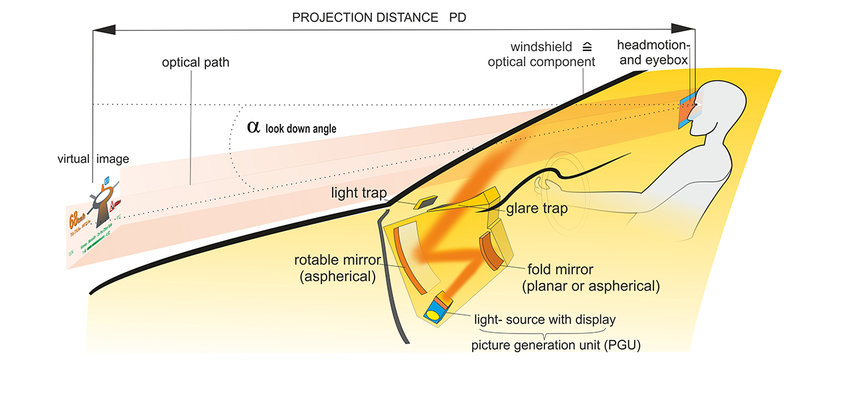
Head-Up Displays (HUDs) have revolutionised the way drivers access key information without taking their eyes off the road. However, with data such as speed, navigation and incoming calls competing for attention, ensuring clarity and usability is critical. The key to achieving this balance is to master the visual hierarchy and effectively prioritise information.

(source: https://www.researchgate.net/figure/How-a-Head-up-display-works_fig5_301776934)

Understanding visual hierarchy

Visual hierarchy refers to the arrangement and presentation of elements in a way that reflects their importance. In HUDs, critical information such as speed, navigation cues and safety alerts need to be immediately recognisable, while secondary details – such as media controls or environmental data – should remain accessible but less prominent.

Key strategies for creating visual hierarchy

  1. Size and placement: Larger and centrally placed elements attract attention first. For example, displaying speed prominently in the centre of the HUD ensures immediate visibility, while positioning navigation arrows slightly offset can direct the driver’s attention as needed.
  2. Contrast and colour: The use of bright or contrasting colours can highlight important information. For example, a red warning symbol will stand out against a neutral background and attract immediate attention.
  3. Grouping and spacing: Organising related data into clusters reduces cognitive load. Grouping metrics such as speed, fuel level and engine alerts together creates logical associations, making it easier for drivers to process information quickly.
  4. Typography: Choosing legible fonts and appropriate sizes ensures quick readability. Key metrics such as speed should be in bold, large type, while less critical details can use smaller, more subtle typography.

(source: https://magic-holo.com/en/all-about-head-up-display-hud/)

Balancing critical and supplemental data

A key challenge in HUD design is to present critical data without cluttering the display. Designers should limit the amount of information displayed at any one time and use progressive display to show additional data only when necessary. For example, navigation directions might only appear when a turn is approaching, reducing unnecessary distractions.

(source: https://www.nuvisionautoglass.com/guide/what-is-a-heads-up-display-in-a-car-windshield/)

Avoiding cognitive overload

To avoid overwhelming the driver, simplicity is key. Studies show that humans can only process a limited amount of information at one time. By focusing on key metrics and minimising distractions, HUDs can improve safety and usability.

Real world examples

Car manufacturers such as BMW have implemented an effective visual hierarchy in their HUDs. BMW’s augmented reality HUD integrates navigation cues directly onto the windscreen, allowing the driver to follow directions without shifting focus.

(source: https://www.becker-tiemann.de/faq/bmw-head-up-display/)

Blog Post 5: Creating a Unified Customer Experience: Integrating AR and IoT Solutions

While each technology offers its own benefits—AR for immersive, context-rich experiences, and IoT for real-time data capture and automation—their combined potential can yield a truly seamless retail journey. Imagine walking into a store where a digital overlay identifies in-stock products based on your past purchases, or scanning a piece of furniture with your phone to see its real-time availability across multiple locations. By unifying AR and IoT, retailers can craft an integrated, data-driven, and visually engaging customer experience.

1. Why Integrate AR and IoT?

Synergistic Benefits

• Real-Time Inventory Data Meets Dynamic AR Overlays

AR applications excel at providing context-specific information overlaid on the physical environment. Meanwhile, IoT sensors and systems continuously update inventory data, monitor product conditions, and track usage patterns. By combining these elements, retailers can surface up-to-the-minute stock levels and product availability in a shopper’s AR view.

• Personalized Shopping Journeys

IoT sensors (like beacons or RFID tags) can detect when a specific customer’s app or loyalty ID enters a store. This triggers an AR experience tailored to that person’s preferences, past purchases, or membership tier. Shoppers get relevant promotions or guided assistance, creating a delightful, one-of-a-kind experience that goes well beyond standard store interactions.

Potential Scenarios

• Smart Mirrors with AR: The mirror’s built-in sensors can automatically detect what items the customer has picked up (via RFID), then display alternative color options, sizes, or accessory suggestions as augmented overlays.

• Interactive Showroom: AR glasses or a smartphone’s camera detects IoT-enabled product tags, instantly superimposing product details, reviews, and price comparisons right on the item or shelf in the user’s field of view.

• Location-Based Promotions: As a shopper passes by a specific section of the store, IoT beacons trigger AR pop-ups with relevant deals, saving the customer from rummaging through a website or paper coupons.

2. Design Principles for AR/IoT Interactions

2.1 Consistency in Visual Design & Interaction Flow

When bridging two technologies, unified design is paramount:

• Color and Branding: Use a consistent palette and brand elements across both the physical and digital layers. If sensors trigger AR pop-ups, those overlays should visually match the store’s aesthetic and signage.

• Interaction Cues: Whether a user taps a smartphone screen or uses hand gestures to interact, the metaphors and visual signals should remain consistent. For instance, an AR overlay that highlights “Add to Cart” must have the same shape, iconography, and motion feedback across various store sections.

2.2 Minimizing Friction

• Touchless or Seamless Interactions

While some AR apps require taps or swipes, the growing prevalence of gesture-based interactions or voice commands can streamline the user experience—particularly if shoppers have their hands full.

• Clear Onboarding

If a customer steps into an IoT-driven store for the first time, they may need quick instructions on how to engage with the AR interface. Simple, step-by-step prompts (e.g., “Point your camera here to see more details”) help users adopt the technology smoothly.

2.3 Balancing Information Density

• Avoid Overload

AR overlays can become cluttered if sensors are feeding too much data simultaneously. Designers must judiciously prioritize what’s most relevant for the shopper’s decision-making process, layering additional info behind intuitive prompts or icons.

• Context Awareness

The system should intelligently show or hide details based on a shopper’s location and current shopping goal. If the shopper is in the electronics section, highlight device specs and stock levels rather than unrelated promotions.

3. Technical Considerations

3.1 Data Flow Between IoT Sensors and AR Applications

• Real-Time Data Pipelines

IoT sensors collect stock data, location info, or environmental conditions (like temperature for perishable goods). These metrics often flow through gateways (e.g., edge devices) to a central cloud platform. The AR application must then pull or subscribe to relevant data streams, ensuring updates occur promptly.

• APIs and Protocols

Standard RESTful APIs or WebSocket connections can facilitate two-way communication. For instance, a shopper’s AR query (e.g., “Show me product specs”) prompts the IoT backend to return up-to-date stock info and product details.

3.2 Ensuring Real-Time Synchronization

• Latency Minimization

AR experiences falter when data lags. Low-latency networks (5G, Wi-Fi 6) help ensure that when a product is scanned, the system displays correct inventory levels instantly.

• Edge Computing

For time-sensitive processes, local edge computing can handle tasks like object detection or sensor data aggregation in near real time, reducing the round-trip to a distant server.

3.3 Security and Privacy

• Data Encryption

Communication between IoT devices, AR applications, and the cloud must be secured via encryption (TLS/SSL) to prevent interception of sensitive data (e.g., shopper identity, purchase history).

• User Consent & Transparency

Always clarify what data is being collected and how it’s used. If AR overlays rely on location or historical purchase data, prompt shoppers to opt in for personalization.

Early Prototypes & User Flow

While I’m still refining my own AR/IoT integrations, here’s an overview of my initial wireframes and planned user testing strategy:

4.1 Proposed Wireframes / Storyboards

  1. Onboarding Screen

• A short tutorial guiding users to “Scan a product to see real-time availability and color options.”

• Visible instructions explaining AR gestures or minimal taps required.

  1. Main AR View

• When a user points their camera at a shelf, dynamic overlays appear. Each product has a small floating card with name, stock count, and an “Add to Cart” button.

• A color-coded system highlights products nearing low stock (e.g., tinted red) or special offers (e.g., tinted yellow).

  1. Detailed Product Overlay

• Tapping (or hovering over) a product card expands an overlay with extended specs, related items in stock, and a “See in My Room” AR preview if relevant (furniture, decor items).

• Integrates user’s loyalty info: “You have 50 reward points—apply now for 10% off?”

  1. Checkout / Collection Point

• If the user chooses “Add to Cart,” the system pings IoT-powered inventory to reserve the item.

• A final overlay directs them to a designated pick-up counter or prompts for home delivery.

4.2 Preliminary User Testing Plans

• Focus Group & Usability Tests

• Recruit participants with varying tech familiarity. Have them complete tasks such as scanning items, checking availability, and adding items to a virtual cart.

• Monitor how quickly they grasp AR controls and whether they find the data overlays intuitive.

• In-Store Simulation

• Create a small, mock retail environment with real shelves and products tagged with IoT sensors.

• Observe how quickly users locate items, and whether the AR overlays assist or distract them.

• Solicit feedback on clarity, latency issues, and overall satisfaction.

Key Metrics

• Task Completion Time: How long does it take a user to find and add an item to their cart?

• Error Rates: Do users accidentally scan the wrong product or struggle to see essential data?

• Overall Engagement: Are they delighted by the experience or do they revert to more familiar methods (like checking a shelf manually)?

Merging AR with IoT unlocks new possibilities in retail—from real-time availability overlays to deeply personalized promotions. However, designing a holistic, frictionless experience requires careful attention to UI consistency, latency reduction, and robust security. My early prototypes show promise: users can quickly scan shelves to see up-to-date product information, reserve items, and even enjoy loyalty perks in a single integrated interface.