Proto01 // Three Prototypes

Hello hello Blog! I’ve missed you <3
In today’s Blog post I will present the three quick and dirty prototypes I made for Birgit’s class a few weeks ago. The assignment was to focus on making something very fast (20 mins if I remember correctly) and bring one of the prototypes to class for a fun speed dating task where we could show each other our weird creations.

The Pomodoro Timer

I struggle A LOT with staying focused on tasks and shifting from task to task trying to do things simultaneously even though it does not work like that. Funnily enough I started writing this post while I was on the finishing line of a work project. Instead of just taking 10 more minutes on the work thing and being done with it I decided naaaah, I’ll start something new (while still thinking about the work thing stressing out about it). Aaaanyway I’ve tried many different focus methods but the one that works best for me is using a Pomodoro Timer.

The Pomodoro Timer is a time management technique where you break down all of your tasks into 25 minute blocks of focused time. Between each time block, there is a five minute break. It’s simple, effective and very easy to implement because you can literally just set a timer on your phone. Of course there are many different apps, youtube videos and physical timers to help with this method. Personally I love the Ultimate Focus app on my iPad next to me while I’m working.
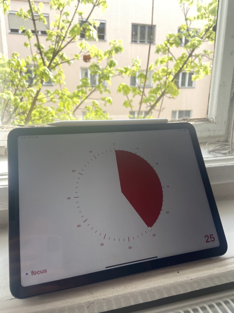
I really love seeing the time go down and how fun it is to drag the red part (= time) around. But I kind of hate that it’s on a screen and that I can’t input the task I’m trying to focus on in text on the screen.

I’ve started looking into physical timers (like the big one we have at FH) for my desk but of course I want it to look cute and I haven’t found one yet that I liked. Soooo I thought I could use it for my prototype. Wow that was a long introduction to this very simple concept. I promise the others will be shorter.

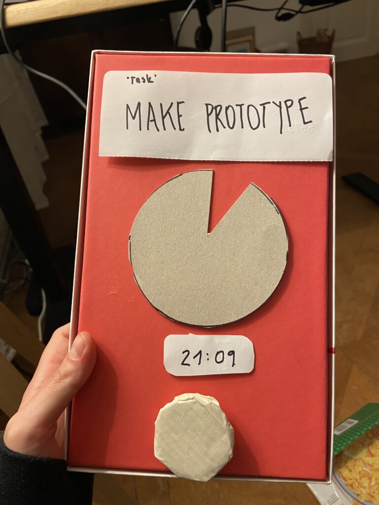
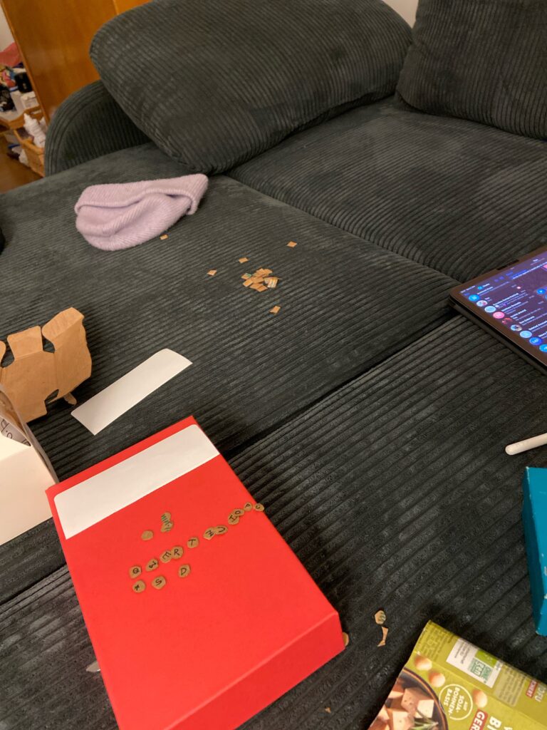
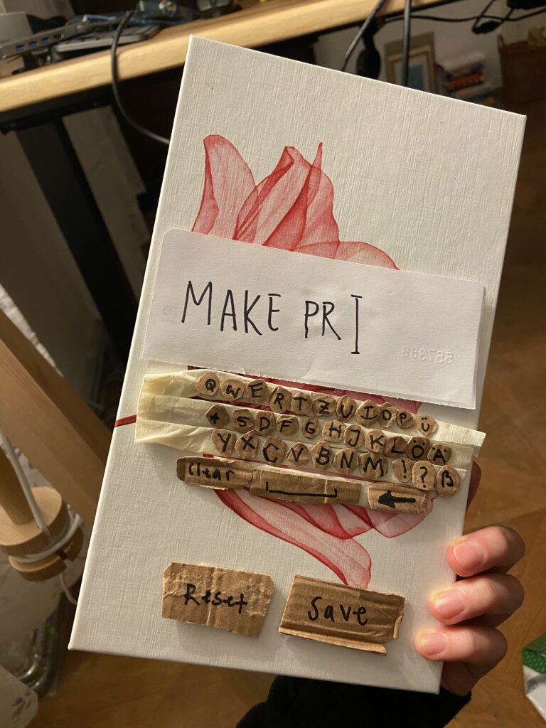
So this is what I came up with. I really would like my hypothetical timer to have chunky physical buttons so that is what I focused on to visualize in this first prototype.
The Tea Bar

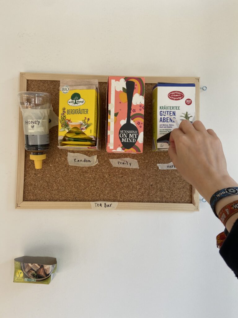
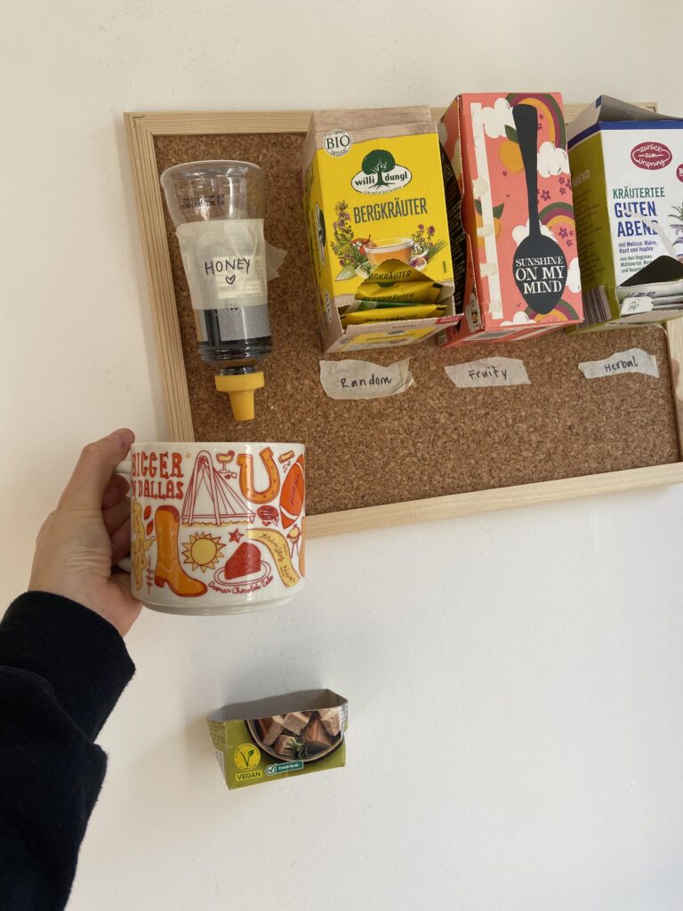
My roommates and I drink lots of Tea but I don’t really like how we are currently storing them. I would love to have them displayed on the wall and have easy access to them. Also, sometimes I can’t decide which tea I would like to drink so in my prototype I added one box for a random tea. I also added a honey dispenser and a drip tray to the tea bar.
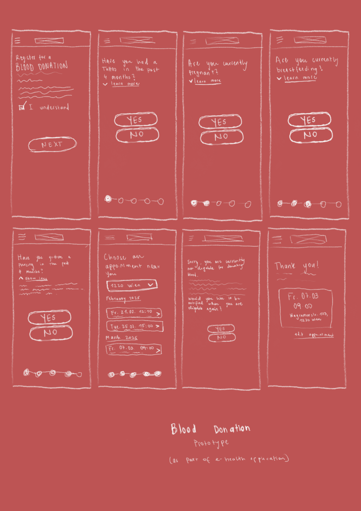
The Blood Donation Feature

For my master’s thesis I would like to create a concept for an e-health application. This prototype is a scribble of one possible feature of the application. A simple form to register for donating blood.
Review of a NIME paper

“Listening to the Climate” : A Reflection on ClimaSynth

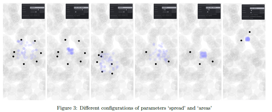
Climate change has become an overwhelming topic, often measured in numbers, graphs, and satellite images. But what if we could hear its effects instead? That’s the core question behind ClimaSynth, a web-based sonic interface developed by Eleni-Ira Panourgia, Bela Usabaev, and Angela Brennecke. Their paper, presented at NIME 2024, explores how environmental perception can be enhanced through real-time audio interaction, using granular synthesis to sonify future climate scenarios.

As someone researching the intersections of sound, interaction design, and environmental awareness, I found ClimaSynth to be both conceptually rich and technically compelling.

Link to a pdf: ClimaSynth: Enhancing Environmental Perception through Climate Change Sonic Interaction

Where ClimaSynth Shines

ClimaSynth isn’t just a tech demo, it’s a poetic instrument. Users interact with environmental recordings through a minimalistic web interface, manipulating sounds that morph depending on climate data and speculative futures. For instance, a serene “birds near water” recording can gradually transform into insect-heavy textures, mimicking a sonic shift tied to rising temperatures and drought. These transformations are not just aesthetic, they’re emotional cues for users to reflect on environmental degradation.

The choice to make ClimaSynth a web application is a smart one. It emphasizes accessibility, allowing anyone with a browser to engage with the experience, regardless of device or platform. This aligns beautifully with the ethos of broadening climate awareness beyond academia and into more public, participatory domains.

Another aspect I appreciated was how the team uses climate storytelling prompts in the interface. These small bits of narrative—like “trees readjusting their flexibility”—help ground the abstract sound manipulations in relatable ecological imagery. It’s a great example of how interface design can nudge user interpretation without being didactic.

Also worth highlighting is a thoughtful and often overlooked section: the ethical standards. The authors openly acknowledge the environmental cost of building web and cloud-based tools—specifically their energy demands and carbon footprint. It’s refreshing to see this kind of transparency and accountability in a digital art and research project. They even reflect on how publishing the app on GitHub (a platform supporting sustainable software practices) contributes to a more positive “handprint.” This attention to how the work is made—not just what it does—adds another layer of credibility and care to the project.

Where the Paper Left Me Wondering

While the system and concept are well-executed, I couldn’t help but feel a bit of a gap in understanding who exactly ClimaSynth is for. Is it a tool for public engagement? An artistic instrument? An educational platform? The authors mention “communicating climate change impacts,” but more clarity around the target audience or use-case scenarios could strengthen the work’s purpose.

Defining a user persona or community—whether that’s students, environmental activists, museum visitors, or musicians—might guide future iterations and also offer pathways for more impactful deployment. For example, if ClimaSynth is intended to foster awareness among high school students, it might benefit from a more guided interface or educational context. If it’s for artists, perhaps more export and remix functionality would be useful.

Similarly, I’m curious how ClimaSynth would perform in a collaborative or public setting. Could this be scaled into an installation? Could multiple users interact with it simultaneously? Could it be a live performance tool? These are all exciting possibilities that hint at ClimaSynth’s potential, but aren’t fully explored in this first prototype.

Final Thoughts

Overall, ClimaSynth is an inspiring step forward in the space where sonic interaction meets climate awareness. It reminds us that listening is a powerful way of knowing—and that sound can be both data and emotion, fact and feeling. In an age where climate anxiety often paralyzes, interactive tools like ClimaSynth offer a more intuitive, embodied way to reconnect with the world around us—and imagine what it might become.

As the project evolves, I’d love to see deeper engagement with users, clearer audience intentions, and expanded sonic possibilities. But as it stands, ClimaSynth is a meaningful addition to the growing field of eco-acoustic design.

First Lo-Fi Prototype

Prototyping Something I Actually Needed: A DIY Card Holder

Prototyping doesn’t always have to be about complex mechanisms or perfectly rendered 3D models. Sometimes, it’s about solving a real problem in a clever, quick, and personal way. That’s exactly what I did when I created my first low-fidelity prototype: a custom card holder made from an old makeup bag.

The Problem

Like many people living in student housing, I rely on an access card to enter my dorm. The problem? I kept forgetting it or misplacing it. I wanted something that made it easier to carry my card—something I could simply wear around my neck, so I’d always have it on me. And if it could look nice too, even better.

The Prototype

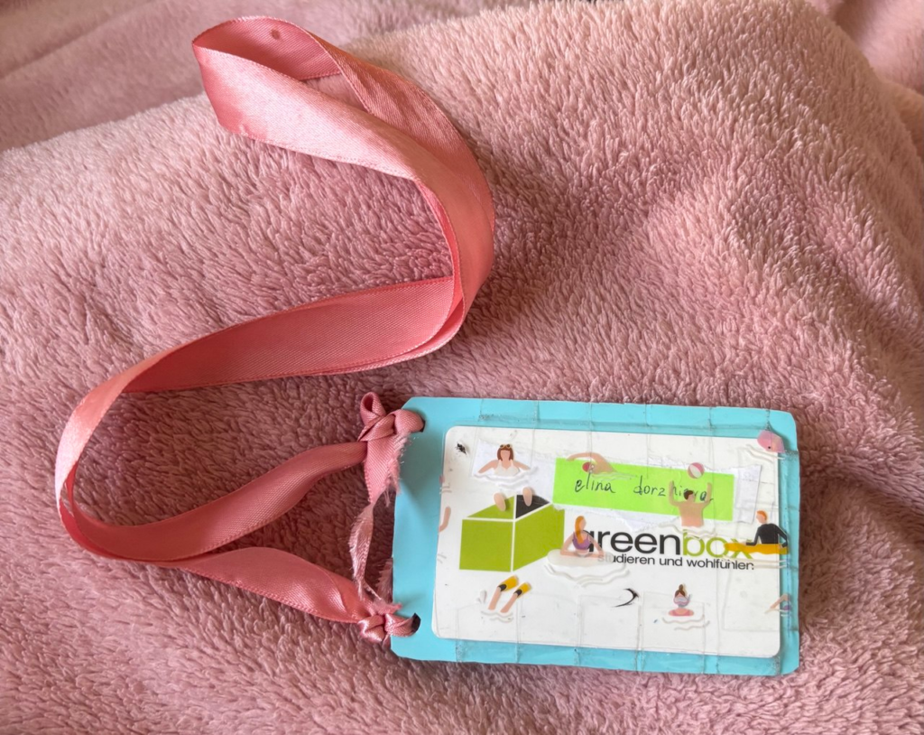
To create the card holder, I used what I had at home. The back piece is cut from a light blue plastic makeup bag—a resin-type material I chose specifically because it’s semi-rigid, waterproof, and still allows a card chip to be read through it.

For the front, I used the transparent part of the bag, which features small printed illustrations of people swimming. I loved how it looked—playful, bright, and just a little bit surreal. It added a fun visual layer to something that could easily be purely utilitarian.

To make the card holder wearable, I punched two holes and tied a pink ribbon I found among my accessories. It’s soft, slightly shiny, and gives the piece a gentle, decorative touch.

User Testing (aka Class Feedback)

We had a feedback session in class, and it was both helpful and encouraging. First of all, everyone immediately recognized what the prototype was and how it worked. That kind of clarity is important in prototyping—if people “get it” without explanation, you’re already off to a good start.

One important point that came up was the strap. While the ribbon looks nice, it’s a bit too short, making it awkward to reach the door reader. A longer or adjustable strap would make it more practical.

On the material side, my classmates liked that the card doesn’t need to be removed to be scanned. The plastic is durable, waterproof, and easy to clean. Someone even mentioned that it could be worn while swimming—imagine you’re staying in a hotel by the beach and don’t want to carry anything. You could just wear your room card like this around your neck. Surprisingly useful.

And then there was the design. People really appreciated the look—the little swimmers, the color combo, the ribbon. One person said it perfectly matched my vibe. That made me think: what if this card holder could be customizable? Different prints, colors, or strap styles for different personalities.

Final Thoughts

This was a super simple prototype, but it taught me a lot. It didn’t take long to make, it solved a small but real problem, and I’ve been using it every day since. I even hang it by the door now, so I never forget it again.

What started as a class assignment ended up becoming something personal, practical, and pretty stylish. That’s the kind of prototyping I love: solving real needs in a way that feels truly you.

11. Reflection of the Speed-Dating

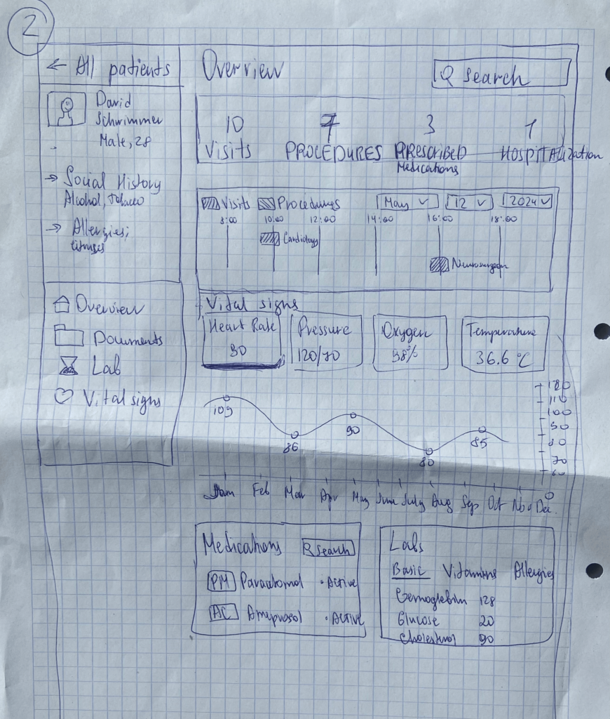
Since my Master’s thesis is connected to medicine, I’ve been exploring how to make traditionally “boring” content more engaging using gamification. In previous blog posts, I shared some early ideas, and now I’ve taken it a step further by sketching out what kind of information should be shown on the platform’s main page—for both patients and doctors.

It only took me about 10 minutes to create a rough sketch, but I focused on highlighting what I think are the most important data points: things like “Number of Procedures” “Number of Visits” “Medications Prescribed” “Appointment Calendar” and vital stats like “Heart Rate” “Blood Pressure” “Oxygen Levels” “Temperature” and etc.

User Feedback:

  • All participants understood the layout quickly and found the dashboard structure clear.
  • Everyone liked the overall concept and said they’d actually use it.
  • Some asked if the platform was just for doctors or also for patients—and if it would be available on Apple Watches in addition to phones and desktops.
  • One person even said the idea was TED Talk-worthy and suggested I reach out to medical startups to pitch it.

Final Thoughts & What’s Next:

This session was both fun and super productive. It really helped confirm that the idea has potential—especially from the patient’s perspective. The exciting news is, I already found a startup here in Graz that’s working on something very similar, and I’d love to explore the possibility of collaborating with them. Of course, that kind of process takes time.

In the meantime, I’ve decided to focus on another area of the project: making it easier for non-German speakers to book doctor appointments. In my next blog post, I’ll share more about this idea and how I plan to move forward with it.

Tapping into the Beat: Thoughts on the dB Drummer Bot (A project by Çağrı Erdem, and Carsten Griwodz)

This is a review on dB: A Web-based Drummer Bot for Finger-Tapping, a project done by Çağrı Erdem, and Carsten Griwodz. You can find more info about the project here and also, a link to the paper can be found here.

This paper introduces dB, a really cool web-based tool that lets you create drum grooves just by tapping on your computer keyboard. Think of it as a drummer bot powered by artificial intelligence that takes your simple finger taps and turns them into more complex rhythms. The idea is to make music creation more accessible to everyone, even if you don’t have a musical background.

What I find particularly interesting about dB is its focus on how our bodies are involved in music. The researchers recognize that music isn’t just in our heads; it’s something we feel and move to. By using finger-tapping as the main way to interact with the AI, they’re exploring this connection in a simple way. The paper also highlights the importance of “groove,” that irresistible urge to move with the music, and how dB tries to tap into that.

Another great aspect of this project is the effort put into understanding how people actually use and feel about the system. The researchers conducted a user study to see if people felt bored, happy, in control, or tired while using dB. They found that when the AI introduced more randomness and variation into the drum patterns, users tended to be more engaged and less bored. This suggests that a bit of surprise can make the music-making experience more fun. Plus, the fact that they’ve made the code and the music data they used publicly available is a big win for open research.

However, like any project, there are some areas that could be looked at more closely. One thing that stands out is the reliance on just finger-tapping on a computer keyboard. While this makes it very accessible, one participant in the study mentioned the lack of “high-resolution” in the interaction. You can imagine that tapping a spacebar might not give you the same nuanced control as playing actual drums or even a more specialized musical interface. The paper itself acknowledges this “bottleneck” and its potential impact on the feeling of control.

Also, the AI model was trained on a specific type of music: eight-note beats common in rock and heavy metal, in a 4/4 time signature. While this was a deliberate choice for the study, it might mean that dB is better at generating certain kinds of grooves than others. It would be interesting to see how it performs with different musical styles and time signatures.

The paper also mentions that there aren’t great ways to really measure how “good” the AI-generated music is in a way that humans perceive it. They used mathematical calculations to train the model, but understanding how these calculations relate to what sounds good to our ears is still a challenge in AI music research.

Finally, the study found that many users didn’t feel particularly “skillful” while using dB. This might point to a need to find a better balance between the AI’s surprises and the user’s sense of ownership and control over the musical output.

Overall, the dB project is a fascinating exploration into making music creation more accessible through AI and simple bodily interactions. The user study provides valuable insights into what makes these kinds of interfaces engaging. While there are limitations, particularly in the interaction method and the scope of musical styles, dB lays a solid foundation for future research in human-AI musical collaboration. It makes you think about how even simple actions can be transformed into something musically interesting with the help of intelligent systems.

Co-creating Music with the Magical Musical Mat (NIME Paper Review)

During the interaction design classes with Josef “Seppo” Gründler, we discovered different ways of creating sound. Put simply, we explored how interactions can shape sounds. As part of the course, we were tasked to deepen our knowledge in this domain and check out one NIME Project Paper plus write a review.

What’s NIME?

NIME (New Interfaces for Musical Expression) is a research community exploring innovative ways to create and interact with sound. It brings together artists, designers, engineers, and researchers who develop new musical instruments, interactive sound systems, and experimental performance tools. They blend technology, interaction design, and artistic expression, often incorporating DIY hardware, software, and unconventional interfaces to push the boundaries of musical experience. 

The Magical Music Mat (MMM)

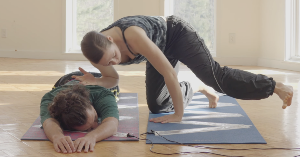
The paper I read was about the Magical Music Mat (MMM), a prototype of two yoga mats, lined with foil, that are connected to an Arduino, which sends MIDI signals to a laptop. The laptop then plays pre determined sound samples or generates sound waves. The idea is, to have two dancers perform on top of the mats, which generates sound, if they touch each other. This way unique performances, connecting sound creation and choreography together, can be created. (see picture below)

To make it easier to understand and comprehend, what the two dancers actually did using the MMM, check out the video below.

The two dancers were given complete freedom when “playing” with the mats and sound. They didn’t know each other nor the sound samples, that were played, beforehand. They made up everything on the spot, letting the sound influence their ideas on how to work with the sounds, they created them selves. The researchers highlighted four key themes:

  1. Choreographer as Composer – Dancers take on a compositional role, treating movement and sound as intertwined creative expressions.For example one dancer played the MMM while the another moved outside.
  2. Playfulness – Play becomes a tool for exploration, breaking rigid structures. The dancers engaged in playful activities like a thumb war or feigning surprise at static sounds, which allows them to discover new movement qualities.
  3. Finding Origins of Movement – Instead of seeking predetermined movements, dancers explore how movement emerges naturally from contact. One dancer positions another’s limbs by touching joints, while another example involves dancers shifting their bodies away from contact points.
  4. Partnering – Interaction and connection between dancers are key. Mirroring movements and communicating through touch (even with closed eyes) deepens their sense of collaboration.

If you want to learn more, her is the link to the Project.

Considerations

In the video it seems like the prototype of the MMM functions more like a button, basically stopping and starting the playback of different sound samples or playing a one shot sound effect. For a performance, that includes dancers influencing sound and being influenced by sound, this should be more “responsive”. Like different levels of sound depending where on the mat a performer stands or how many touch points there are. In the video you can see a performer brushing along the foil, which doesn’t seem to influence the sound that is being generated. Additionally the zig-zag pattern of foil on the mat lead to the performers stepping on a non conductive spot, not creating a sound. For further exploration, this would have to be addressed. Since this is a prototype after all, those “problems” can be surely be fixed.

Thinking about possible uses for this technology I consider this to be an excellent pice of tech to use during a dance performance. I could imagine a whole floor made from MMMs with different connections between performers make different sounds. This could even be used as a new form of instrument to create a new type of orchestra, that uses them selves as instruments. Also this could be incorporated into an acrobatic choreography, with multiple people creating a connection across a long distance, by stacking on top of each other. This could also enable people, who aren’t able to make music with their hands, to make music just using their feet.

#1 Prototyping Session

Der erste Versuch einen Prototypen für die Vorlesung Des Res 2 ist tatsächlich nicht über mein potentielles Masterprojekt, denn ich habe die Aufgabe mehr als eine rapid Prototyping Übung verstanden. Also habe ich ein Problem genommen, das meinen Alltag prägt (eine sogenannte Alltagsunwürdigkeit) und versucht dafür eine Lösung zu finden. 

Das besagte Problem hier zu sehen: 

Und zwar besitze ich in meiner kleinen 50m2 Wohnung keine Speisekammer oder ähnliches, um muss den Großteil meiner Lebensmittel, die nicht in den Kühlschrank gehören, in zwei sehr tiefe Laden stopfen. Fast täglich gibt es die Situation, dass ich auch von hinten in der Lade etwas brauche und beim Versuch dorthin zu gelangen, schmeiße ich an der vordersten Front alles um.  

Darum muss hier eine Lösung her. Und dabei dachte ich an eine Drehscheibe mit Vertiefungen für die Lebensmittel. 


Die Drehfunktion

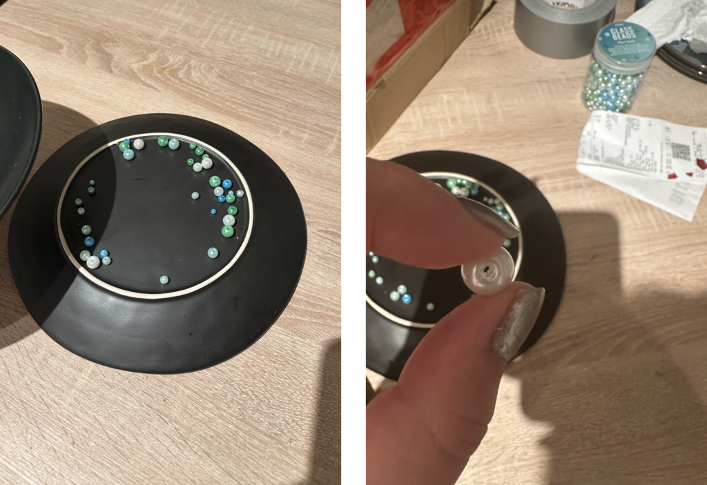
Im ersten Schritt wollte ich dazu zwei Teller nehmen und dazwischen Perlen, die ich bereits Zuhause habe. Quasi ein provisorisches Kugellager. Hat leider eher schlechter funktioniert und sich nicht wirklich gut gedreht. Wahrscheinlich waren die Perlen zu unrund oder nicht alle gleich groß.

Der Inhalt 

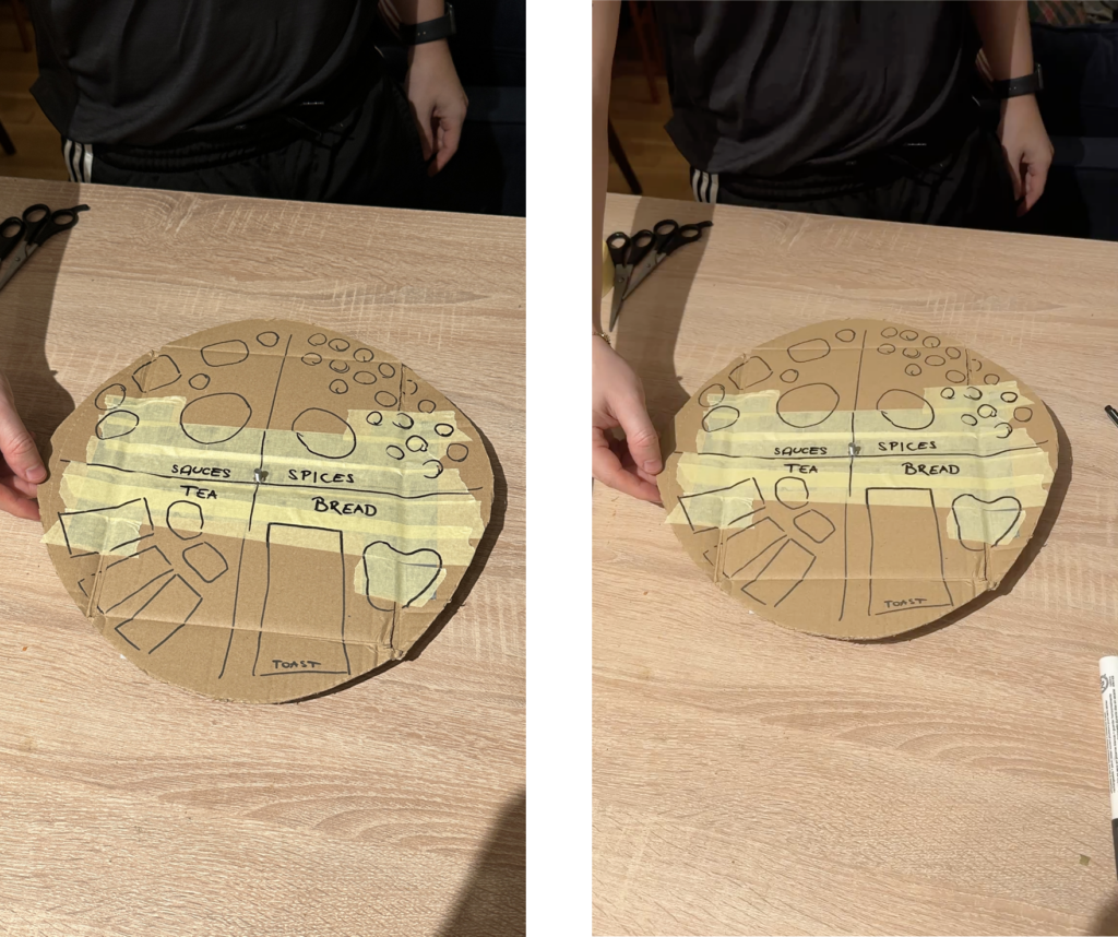
Als erstes wollte ich mich um die obere Lade kümmern. Dafür mussten die einzelnen Lebensmittel kategorisiert werden. Dabei ergaben sich diese 4 Kategorien:

  • Brot
  • Gewürze
  • Soßen
  • Tee

Diese 4 Kategorien nehmen ungefähr die selbe Menge an Platz ein.

Probleme

Während des Prototypings sind einige Probleme aufgetreten.
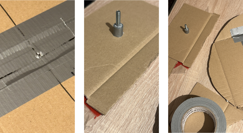
Zum Beispiel, dass der Marker nicht markiert auf dem Panzertape und dass es irgendwie ein Mittelding gebraucht hat, damit zwei Scheiben sich aufeinander drehen. Dafür wurde dann eine Schraube verwendet. Die erste war leider zu lange, mit der zweiten hat die Sache dann schon besser funktioniert.

„Finaler“ sehr Lofi Prototype

Im Endeffekt hatte ich dann eine ganz gut drehbare Scheibe mit Kennzeichnung der einzelnen Bereiche. Meine Kollegen hatten anhand der Beschriftung halbwegs erkannt, was das Objekt machen soll, der Kontext zu meinem Storage konnte aber ohne Erklärung (irgendwie auch logisch)  nicht erkannt werden. 

Fazit

Es hat sehr Spaß gemacht zu tüfteln und kontinuierlich kleine Probleme zu beseitigen. Auch das Speed-Dating war sehr cool. Bin mir nicht sicher, ob ich doch schon an meiner Masterarbeitsidee hätte arbeiten sollen, damit da etwas schneller weiter geht, aber es war auch befreiend, sich mit einem weniger „geladenen“ Thema zu beschäftigen. 

#11 Prototyping – Trial and Error

Prototyping Multisensory Data – From Spaghetti Mountains to Shadowed Insights

The task was to create three quick lo-fi prototypes related to our Master’s research—ideally 5–10 minutes each, with a maximum of 20. The goal was to sketch out ideas, test tangible concepts, and move away from screen-based representations. I managed to create two prototypes. Neither went exactly as planned—but both taught me something valuable.


Prototype #1 – The Spaghetti Schlossberg

For this prototype, I attempted to reconstruct the topography of Graz’s Schlossberg using spaghetti. I had a map with Höhenlinien (contour lines) and snapped pieces of spaghetti to match the elevation levels. The plan was to poke them through holes in a cardboard base to create a physical, touchable model of the hill.

The idea:

To offer a tactile experience of elevation, allowing users to feel the form of the mountain. My long-term vision included vibration feedback: depending on which level the user touches, the surface could respond with different intensities or patterns of vibration—giving sensory feedback about height, slope, or perhaps historical or environmental data.

What didn’t work:

  • The holes had to be the exact right size—too big, and the spaghetti would fall through; too small, and it would snap trying to insert it.
  • The spaghetti broke. A lot.
  • I only managed about half the model before deciding to stop.

What I learned:

  • Spaghetti is a fragile material—not ideal for tactile prototyping.
  • Still, the concept of a vibrotactile elevation model is worth pursuing, maybe with more durable materials like wires, foam, or layered acrylic.
  • There’s something powerful about physically feeling data—especially when it’s enhanced with feedback.

Prototype #2 – The Cardboard Box of Shadows

This idea was more experimental. I took a cardboard box, cut one side open, and inserted a slot for sliding a sheet of paper inside. I placed a light behind it, allowing shadows to appear on the back wall of the box.

The idea:

To explore how data can be made visible through shadows—revealing patterns not through direct representation, but through effect and contrast. Initially abstract, the idea grew into something more tactile and layered.

I then thought: what if you could slide two pieces of paper inside the box—each with different shapes, data patterns, or cutouts? Their overlapping shadows would form a dynamic visual, representing the interaction between two datasets.

What this could evolve into:

  • A lo-fi ambient display where the position and layering of paper affects the final output.
  • A metaphor for data complexity—how meaning emerges not from a single source, but from relationships, intersections, and light.

What I learned:

  • Sometimes we build without a clear purpose, and ideas emerge through doing.
  • Light and layering can be compelling tools in multisensory data design—especially when paired with motion, tactility, or time-based changes.

Reflections

These fast prototypes pushed me to translate data into form—without overthinking or refining too early. Both attempts reminded me that multisensory design is not about perfection—it’s about perception. What does data feel like? Sound like? Look like when it hides, flickers, or resists being seen?

Even though I didn’t finish all three, I left with two ideas I might revisit, refine, or completely rethink—successes in their own right.

Documentation & Reflection of the Speed-Dating/Sharing session

Lo-Fi Prototyping: A Hands-On Experiment with Everyday Materials

In one of our recent classes, we were given an interesting assignment:

Create three lo-fi prototypes of a project idea related to your Master’s research and bring one to class for testing. These prototypes could be iterations of previous work, early drafts of a new concept, or entirely different ideas. The key was to keep the process quick and experimental, spending no more than 20 minutes on each prototype.

Each student approached this task differently. Instead of focusing on my research from last semester, I decided to take a completely fresh perspective. My goal was to experiment with rapid prototyping using only materials readily available at home, creating something practical and functional.

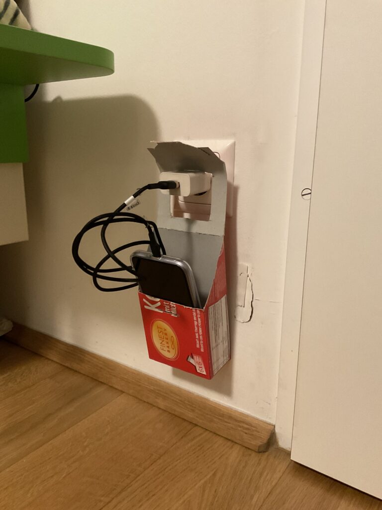
Prototype 1: The DIY Charger Holder

My first prototype was a cardboard charging holder, designed to serve as a portable phone and charger station. The idea came from a common inconvenience—when outlets are located far from tables or shelves, leaving devices on the floor while charging is not ideal. This prototype aimed to solve that issue, especially for travel or spaces with limited furniture.

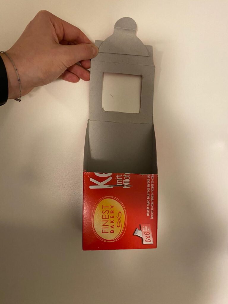
Using an empty cookie box, I cut out sections to create an opening where the phone and charger could be placed. The structure allowed the box to hang securely on a plugged-in charger, keeping the phone elevated and safe from potential damage.

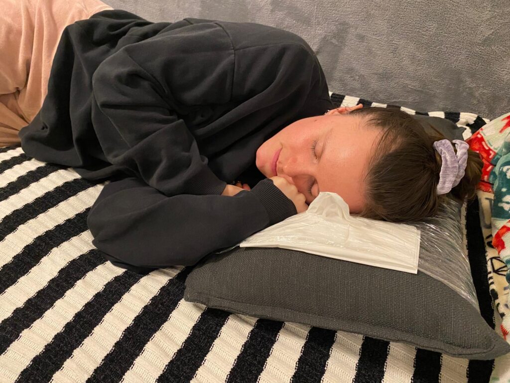
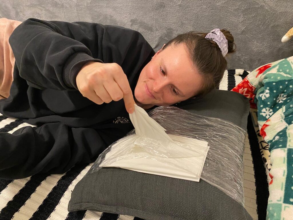
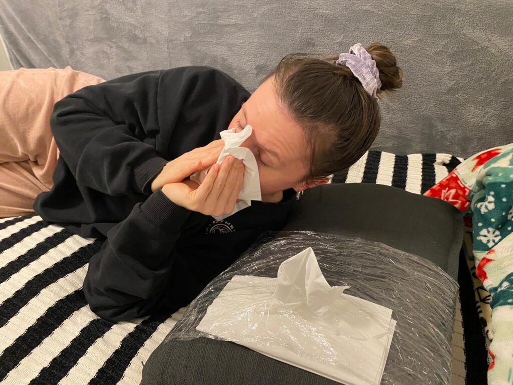
Prototype 2: The Allergy Pillowcase

The second prototype was a pillowcase designed for people with allergies or colds. The concept was simple: integrating a small pocket or compartment to store tissues. This would allow users to access tissues quickly during the night without having to get up or search for them in the dark. While the design was basic, the idea addressed a real pain point and could be refined further.

Observations from the Class Testing Session

For the testing session, I brought my first prototype—the cardboard charging holder—to class. What surprised me the most was how difficult it was for my classmates to identify its purpose. Since I had designed it with a clear function in mind, I assumed it would be immediately recognizable. However, when I asked my peers to guess what it was and how it worked, many had no idea.

Only after I provided a small hint—mentioning that it was related to phone chargers—did they start to piece it together. This experience highlighted an important lesson: as designers, we often assume our ideas are obvious because we are deeply familiar with them. However, what seems intuitive to us may not be clear to others.

Key Takeaways

This experiment reinforced a critical principle in design and product development:

  • Early user testing is crucial. By involving users from the beginning, we can uncover misunderstandings and refine our designs based on real feedback.
  • Imperfect prototypes are valuable. It’s better to test a rough, quick prototype than to wait until a product is ‘perfect.’ Iterative design allows for improvements based on actual user insights rather than assumptions.
  • Context matters. A design that seems simple and logical to its creator may not be immediately clear to others. Communicating ideas effectively is just as important as the functionality itself.

Through this rapid prototyping challenge, I realized that testing, even with basic materials, can lead to unexpected insights. Moving forward, I plan to integrate more user feedback earlier in my design process to ensure that my ideas are not only practical but also easily understandable.

This assignment proved that sometimes, the simplest ideas can spark the most meaningful discussions about usability and design thinking

Blog 1: Lo-Fi Prototyping & Speed-Dating Reflections: Designing an Elevator for a 1000-Story Building

Introduction: A Thought Experiment in UX Design

How would you design an elevator interface for a 1000-story building? While this scenario may seem surreal, it presents an exciting challenge in user experience design. Inspired by a Google interview question, I decided to explore this concept and create a lo-fi prototype. The goal was to think through the navigation experience in such an extreme case, considering how users would interact with the system efficiently and intuitively.

Defining the Context & Target Users

To make this concept work, I first established some basic assumptions:

  • The building serves both residential and office purposes, potentially housing thousands of people
  • Multiple elevators exist, but each one needs a way to direct users efficiently
  • The elevators operate using a restricted access system where only authorized individuals can reach specific floors

The target users would include:

  • Residents – People living in the building
  • Employees – People working in office spaces
  • Visitors – Guests visiting residents or businesses
  • Security Persons – Ensuring safety and restricted access where necessary

The Prototype: Navigating this big Skyscraper

My prototype focused on the elevator interface, aiming to make navigation simple despite the overwhelming number of floors. In that 20 Minute Prototype Session was included:

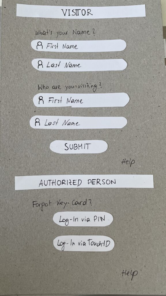
  1. Entry Screen – Users authenticate using an NFC card, PIN, or biometric login to verify access / Guests login via their name and the name of the host
  2. Floor Selection – A personalized interface displaying only authorized floors to reduce cognitive overload
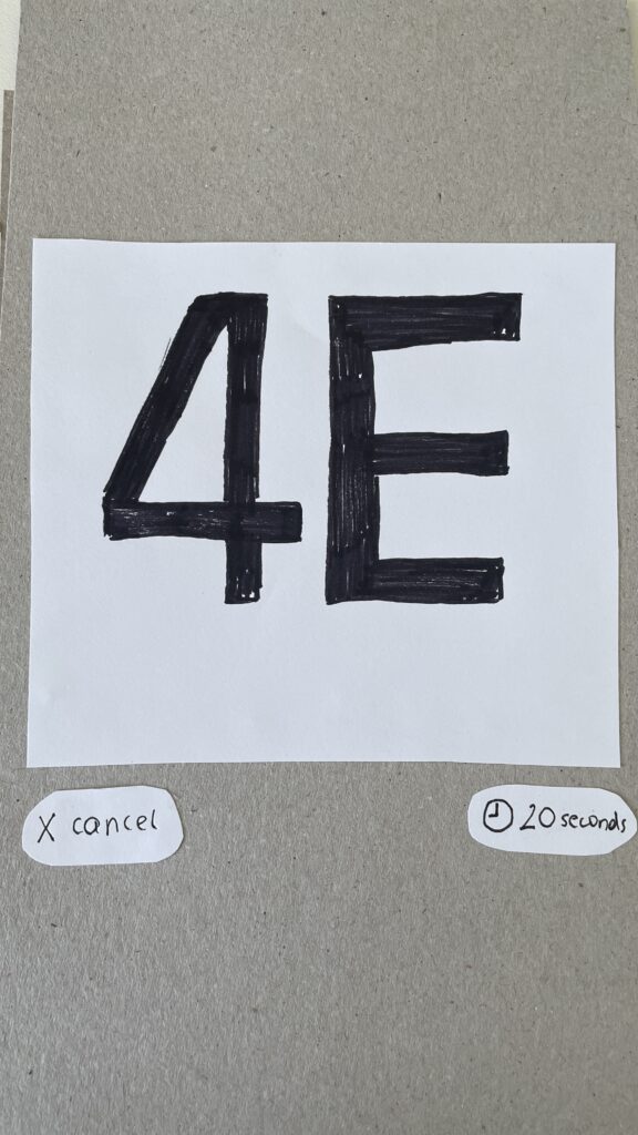
  3. Elevator Assignment – Users are directed to a specific elevator to optimize efficiency
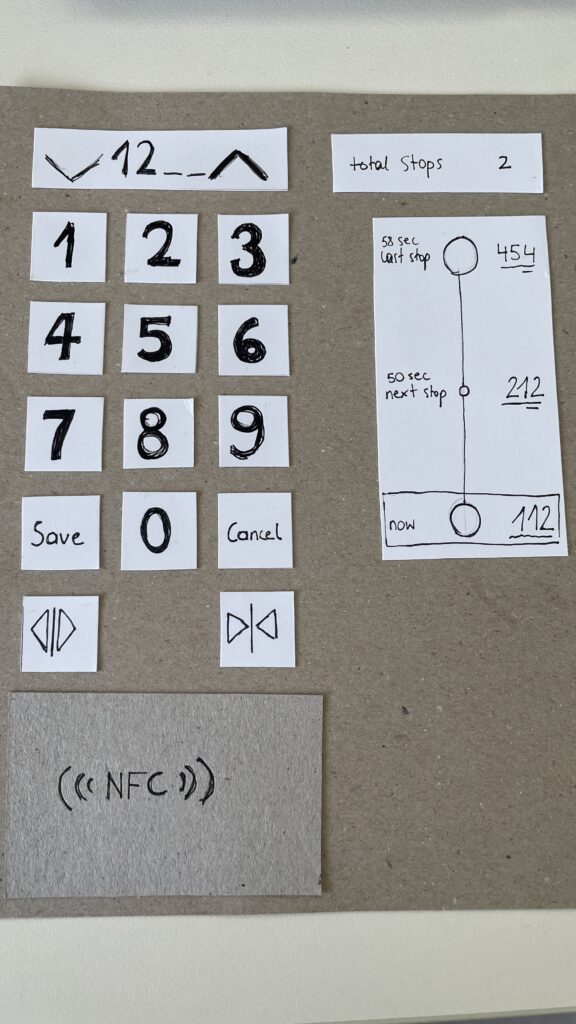
  4. In-Elevator Controls – A secondary screen inside the elevator allows floor changes or emergency actions, ensuring flexibility mid-ride
Entry Screen
Floor Selection
Elevator Assignment
In-Elevator Controlls

Speed-Dating Prototype Discussion: Key Takeaways

The Speed-Dating session provided invaluable feedback from different perspectives. Here are some key insights:

1. Initial Reactions – What Problem Am I Solving?

  • Many participants struggled to recognize the interface as an elevator control system
  • Some assumed it was a hotel check-in or a security login screen
  • The concept of restricted floor access confused some users

2. Feature Suggestions – What Would You Add?

  • Instead of buttons labeled Save and Cancel, participants suggested clearer icons like a checkmark and a [X]
  • Emergency contact options were missing and should be easily accessible
  • Accessibility concerns arose, suggesting the need for a tactile number pad and Braille support

3. If My Prototype Had a Dating Profile…

  • The elevator system would market itself as “Your fastest and most efficient ride to success” or “Seamless mobility, one floor at a time.”
  • While the system served everyday users, i think the real customers would be building developers looking to optimize user flow in high-rise buildings

4. Future Vision – What Would Make This TED-Worthy?

  • While no 1000-story buildings exist today, high-rise architecture continues to evolve
  • Future cities may require advanced wayfinding systems, making this prototype a glimpse into possible urban design challenges

5. Unexpected Feedback – What Surprised Me?

  • The first login screen was misleading, making users think they were logging into a website rather than an elevator
  • Participants felt that unauthorized users could bypass security by following someone into restricted floors
  • The experience was unusual since most people are accustomed to standard button-based elevator panels

Final Thoughts & Next Steps

Exploring this extreme scenario was a fun and thought-provoking design exercise. However, given its impracticality, I won’t continue developing this prototype. Instead, I want to shift my focus to real-world mobility and wayfinding challenges, potentially designing solutions for navigation in large public spaces like airports, malls, or grocery stores.

This experience has reinforced how UX design is about clarity, accessibility, and user expectations. Designing for mobility is not just about efficiency, it’s about making interactions intuitive and seamless.

In the next blog post, I will explore potential project directions that build upon the learnings from this prototype.