How Art Found Its Place in the Digital Space 

There was a time when the art world was confined to physical walls—museums, galleries, studios. Access was limited, gatekeepers held the keys, and artists needed a foot in the door before they could be heard, seen, or celebrated. But with the rise of the internet, all of that changed.

The digital space—the vast, decentralized network that makes up our online lives—has become more than just a tool. It has become a canvas, a stage, a studio, and even a marketplace. Over the last few decades, art has carved out its own corner of the web, evolving from early digital experiments to fully immersive experiences, reshaping how we create, consume, and interact with creative expression.

The Origins: Pixels and Possibilities 

The seeds of digital art were planted long before social media or online galleries. As early as the 1960s, artists began experimenting with computers, using algorithms and programming languages to generate shapes and forms. But it wasn’t until the internet became accessible in the 1990s that things truly started to shift.

Artists discovered that they could not only make work using digital tools, but also share it instantly, globally. Platforms like DeviantArt, Tumblr, and early web forums gave rise to new communities—DIY spaces where creators supported each other, collaborated across continents, and rejected traditional hierarchies.

From Niche to Movement

As the web matured, so did the digital art scene. New aesthetics emerged—glitch art, net art, and later, generative art driven by code. Artists began to question what it meant to “own” or “exhibit” a piece of work in a space where everything is infinitely reproducible. Some embraced the ephemeral nature of the internet; others used it to archive and immortalize their creations.

By the 2010s, platforms like Instagram turned art into scrollable experiences. Suddenly, visibility wasn’t dependent on geography or institutional support—it was algorithmic, viral, and sometimes wildly democratic. Meanwhile, digital tools evolved. With the rise of software like Processing, TouchDesigner, and later AI-powered platforms, artists found new ways to collaborate with technology itself. 

Claiming Space: Art in the Web3 Era

Fast-forward to today, and digital art is not just a fringe movement—it’s a legitimate, disruptive force. The emergence of NFTs and blockchain technology added a layer of value and ownership to digital files, shaking the foundations of the traditional art market. Virtual galleries, online auctions, and decentralized platforms now offer artists unprecedented control over their work and how it’s distributed.

But even beyond commerce, the internet has allowed art to exist in dialogue with its audience in real-time. It’s more interactive, more accessible, and often more experimental than ever before. The web is no longer just where art is posted—it’s where it’s born.

What’s Next?

In this series, we’ll explore the many faces of art in the digital age—from the rise of generative art and algorithmic aesthetics to the communities that shaped the early web’s creative underground. We’ll look at how artists are using new technologies, navigating online spaces, and redefining what it means to be a creator in a world where the gallery is the screen, and the studio is everywhere.

Welcome to the age of cloud-native creativity. Art isn’t just on the internet anymore—it is the internet.

Speed Dating: Prototyping

This post will be a quick recap of the speed dating session at the start of the semester. The goal was to create prototypes for a possible master’s thesis topic. In class we divided into two groups and talk about each others prototypes in a small amount of time. Due to my decision on swapping majors after the first semester, this task was a challenge for me. I had no clue what to do actually and just tried to connect my previous knowledge with the goal of this task. My love for typography always played a big role in my work and I tried to develop a playground to interact with letters and their movement.

The first concept was to have some kind of object that will is suppused to be thrown against a wall. It should invite people to let out their emotions. Imagine it like a rage room but the collision of the object and the wall is interactive. Depending on the speed of the object, the wall displays a collection of words as type.

The second prototype was a more relaxing way to interact with typography. Based on movement and impact on pressure plates, the wall shows different letters being formed by the people. My idea was to show their behavious in form of typography. Letters are always expression a kind of personality. In this case I want the people to connect with letters and get to know the power of expression through typography.

Class Feedback

It was interesting to see that noone acutally understood what I actually wanted to express. This also lead to a feedback saying the second concept could be offensive to some extent. As I mentioned in the first paragraph, it was hard to create something understandable as a lofi prototype, so I understood the reactions and i tried to reflect how I could make it more understandable. So I knew I had to get more experience to learn more about prototyping and interaction.

Prototyping a Data Visualisation Installation

In this second part of the IDW25 recap I want to talk about the prototype I created of my CO2 project. The goal for me was to build an installation to interact with the data visualisation. For this I chose makey makey and built a control mechanism with aluminium foil and a pressure plate. To send the data from processing to the projector I used Arena Resolume. My concept was based on the CO2 footprint. So you activated the animation with steping on the pressure plate. Here are first sketches of my idea.

I thought about making an interactive map where you step on different countries and realease fog in a glas container. But that was too much to create in one week so I reduced the concept to projecting the boundary I showed in my last blog post. I kept it simple and connected the makey makey to aluminum foil to control the time line with a finger tap. The processing output is being projected on the wall.

Conclusion

It was interesting to get to know the possibilities of the used technology to visualise data and therefore I had a lot of fun during production. I will definitly keep working on this project to see where it can go. Also expand the data set to compare more countries. In the first part of the blog post I mentioned that there are probably better programs to make more visually appealing animations for such a topic. But for a rough protoype this was completly fine.

Data Visulisation with Processing

The International Design Week 2025 is over and this first part of the blog will be a recap of my process. I joined the workshop #6—Beyond Data Visualisation with Eva-Maria Heinrich. The goal was to present a self chosen data set on a socio-political topic. I chose a data set on the Co2 emission worldwide per country (https://ourworldindata.org/co2-emissions). The process started with evaluating the data span I want to show and the method of visualisation. Because the task of the workshop was to present data in an abstract way and to step back from the conventional methods, to make the experience more memorable.

Cutting the Data with Python

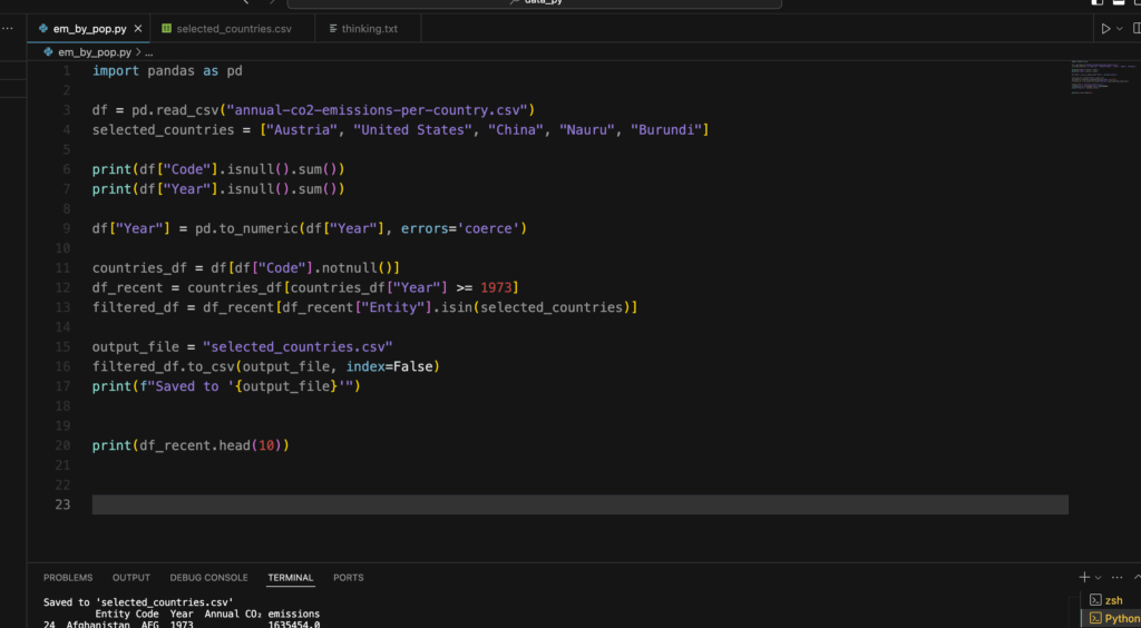
So to get a specific range of data to make a prototype i used python to cut the csv file to my liking. I used the pandas tool for python to manipulate the file. At first I wanted to compare three countries, but later in the process I realized that this goal was a bit too much for the given time, since I haven’t used python like this before. It was a nice way to get to know the first steps of data analysis with coding.

I created a new csv file with a selected country, in this case it was Austria in a time span from 1900—2023. Now it was time to visualise it.

Let’s get creative!

In my research on how CO2 was being visualised before I looked up some videos of NASA showing how the emission covers the world. I got inspired by this video.

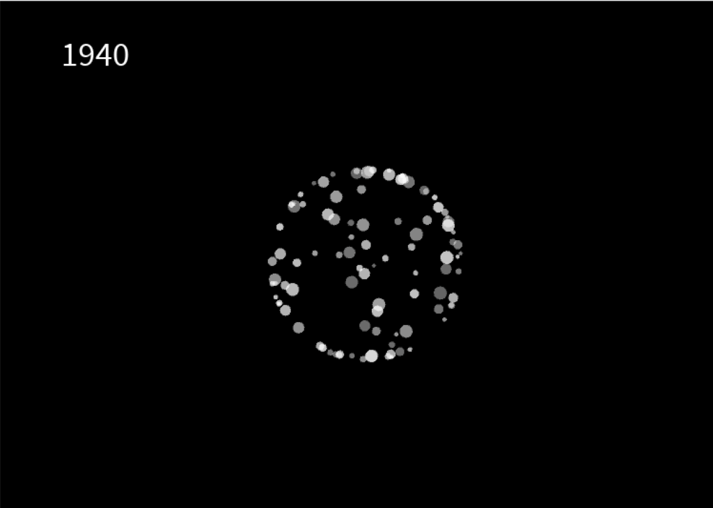
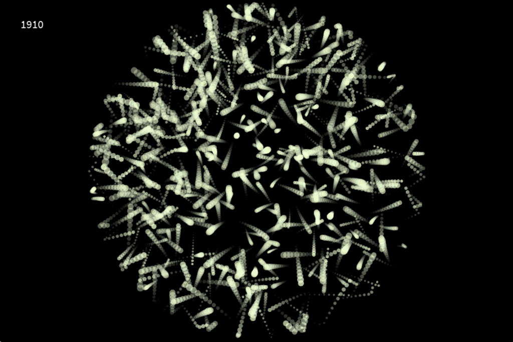
I chose processing to create my own interpretation of visualising emission. In hindsight, there are probably better tools to do that, but it was interesting to work with processing and code some visuals relative to a data set. I created a radial boundary which is invisible. Inside this shape, i let a particle system flow around which is relative to the CO2 emission in the specific year, shown in the top left corner. This visualisation works like a timeline. You can use your LEFT and RIGHT arrow keys to go back and forth in 10 years steps. The boundary expands or be reduced, which depends if the emission of that year is higher or less. The particle system also draws more or less circles, depending on the amount of CO2.

After the workshop was done I tried out other methods to make the particle system flow more and create a feeling of gas and air.

Conclusion

The whole week was a nice experience. I got to try out new techniques and tools and create something i never done have before. A problem I encountered was the time. It’s hard to estimate what you can do, if you try out something completly new. The presentation day at the end was really inspiring and emotional to see what the all the other students have created and talking about their process and results.

12. “Sprechen Sie Deutsch?” The Hidden Barrier to Booking Appointments

When I arrived in Austria as an international student, I expected that most of my challenges would come from my still-developing German skills (aber ich lerne es!). And ofc as it always happens after a few months of my arrival, I needed to see a doctor.

But to my surprise, the real problem wasn’t finding a doctor.It was booking the appointment.

Most clinics required a phone call. And most receptionists spoke only German. After four failed calls, I finally found a local doctor who could help and book an appointment. Lucky me!

But when I spoke to other international students, I realized this wasn’t just my problem:

“After a few calls, I gave up and asked my Austrian friend to call.” – Orlaith, 22, Ireland
“I accidentally booked a vaccination instead of a check-up.” – Younes, 23, Algeria
“Yes, I booked the appointment… but it took 40 minutes!” – Elske, 30, Netherlands

This process is frustrating for everyone involved: patients feel confused and helpless, and clinics lose time (and possibly clients) and money

So I started wondering:

  • What if booking an appointment didn’t require fluent German?
  • How could this process be simpler and less stressful?
  • Could we implement ideas from other countries’ systems?

Most websites in my country offer virtual assistance or a chatbot on messengers. So, what if I develop a chatbot that works in both German and English? It would guide international patients step by step, collect necessary details, and ease the burden on receptionists without requiring extra staff or app downloads.

More in the next post…

2.2 Exploring Analog Tools for Stress Relief and Focus

In my previous exploration, I developed the prototype for Breathing Circle: a tactile, screen-free tool designed to guide users toward calmness. Building upon this, I’ve delved into existing analog relaxation devices to understand how current innovations align with or diverge from the principles of intuitive, low-effort emotional regulation. This journey aims to highlight the value of physical, non-digital tools in promoting well-being.

Breathing and Mindfulness Aids

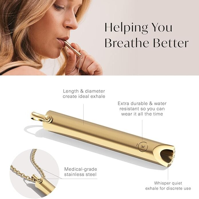
Komuso Breathing Necklace: a sleek pendant that slows exhalation when breathed through, promoting relaxation and reducing anxiety. Its discreet design makes it suitable for use in various settings.

Tibetan Singing Bowls: traditional instruments producing resonant tones that aid in meditation and stress relief. Their use underscores the enduring value of simple, auditory tools in promoting mental well-being.

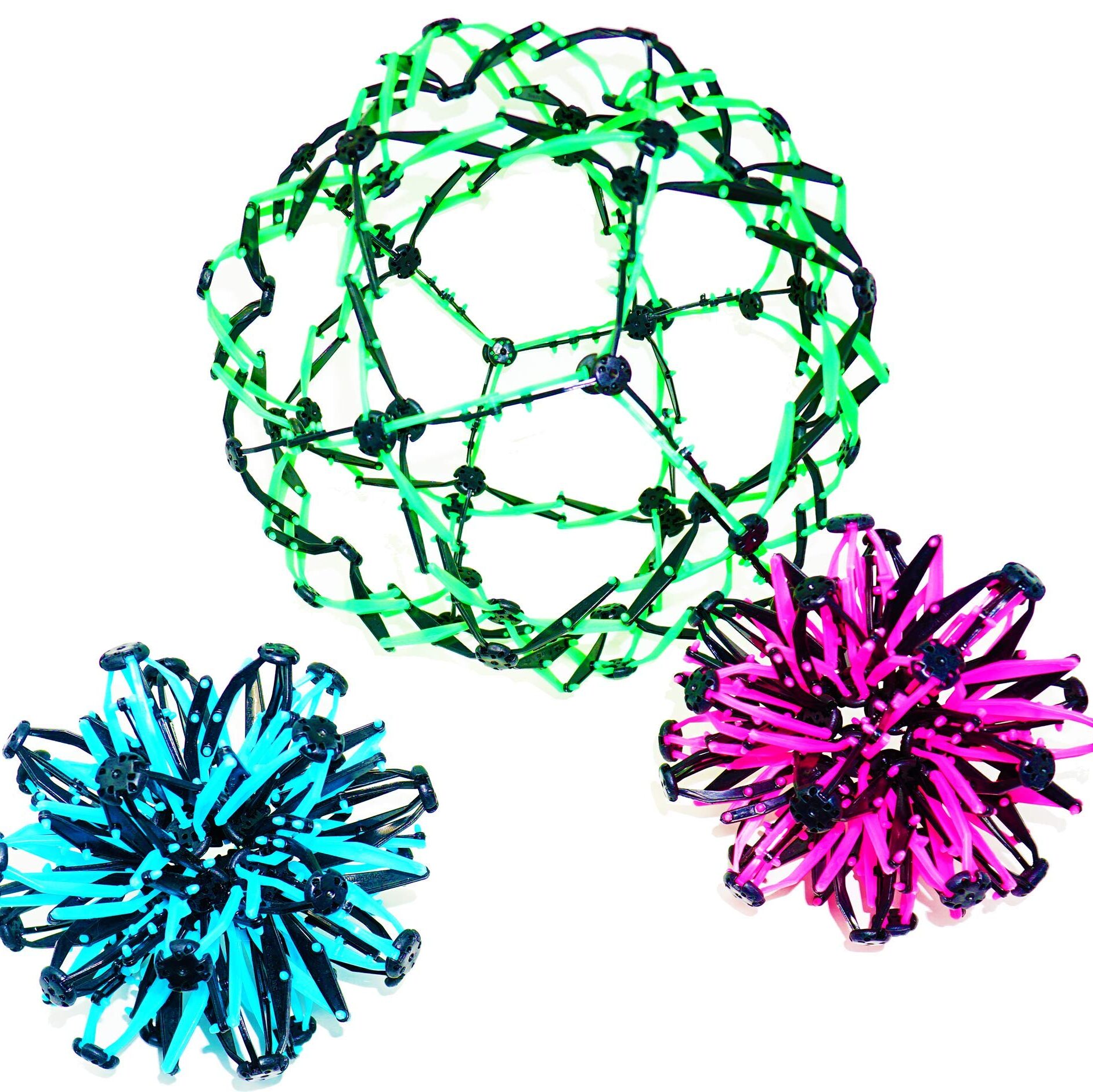
Expandable Breathing Ball: a colorful, collapsible sphere that expands and contracts, visually guiding deep breathing exercises. Its engaging design makes it a popular tool for both children and adults seeking mindfulness and stress relief.

Focus and Productivity Enhancers

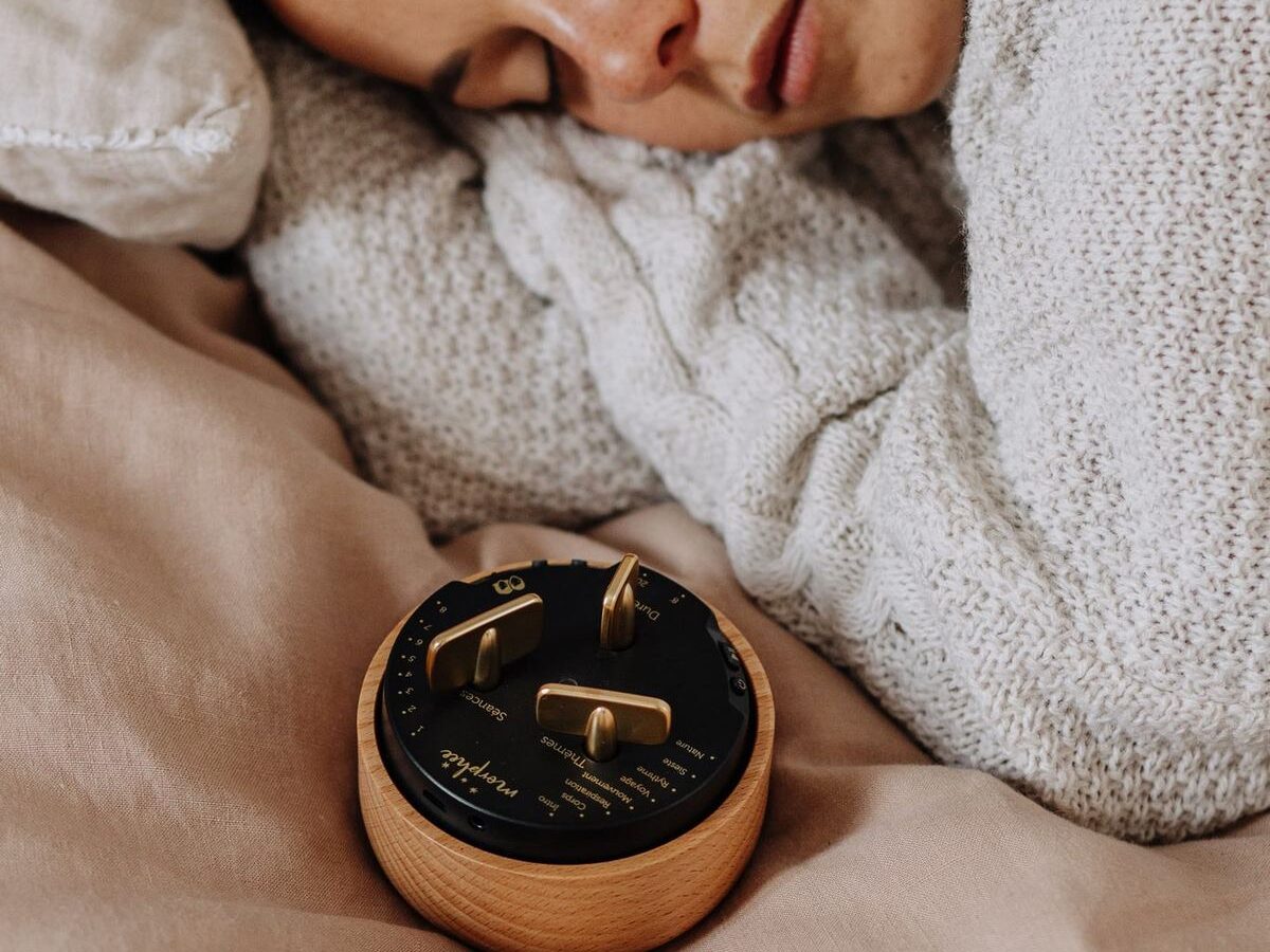
Morphée Meditation Box: a screen-free device offering guided meditation sessions through a tactile interface. Its design encourages users to engage in mindfulness without digital distractions.

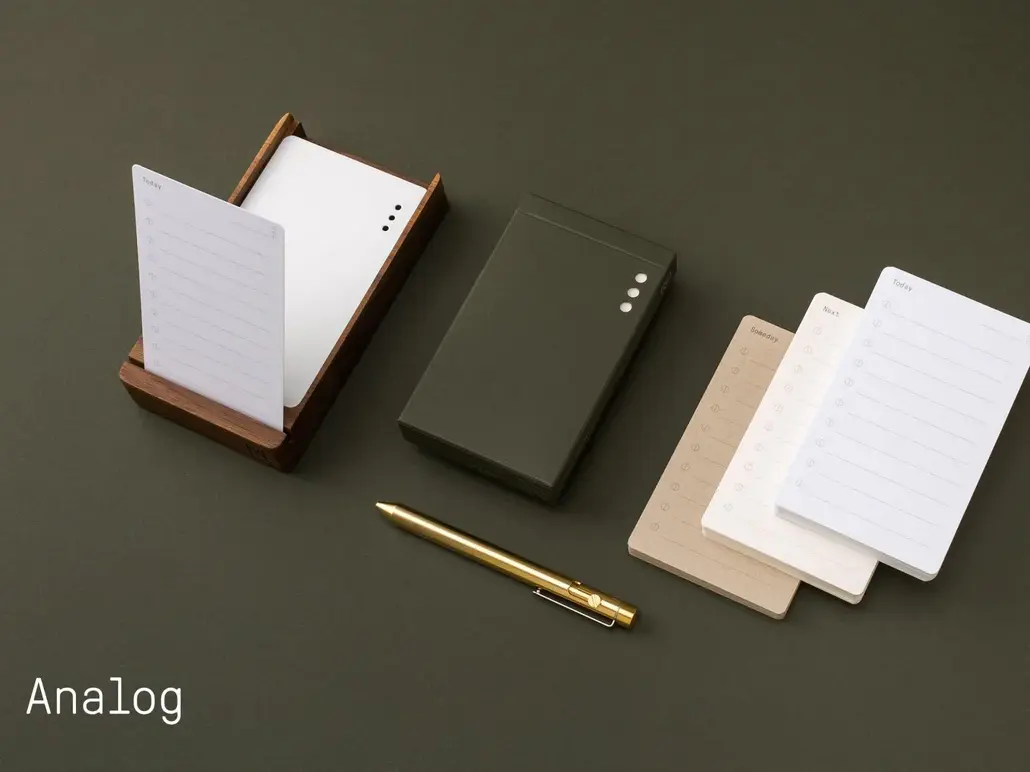
Analog Productivity System by Ugmonk: a physical task management system using cards to prioritize daily activities. It emphasizes focus and intentionality in task execution.

Tactile Stress Relievers

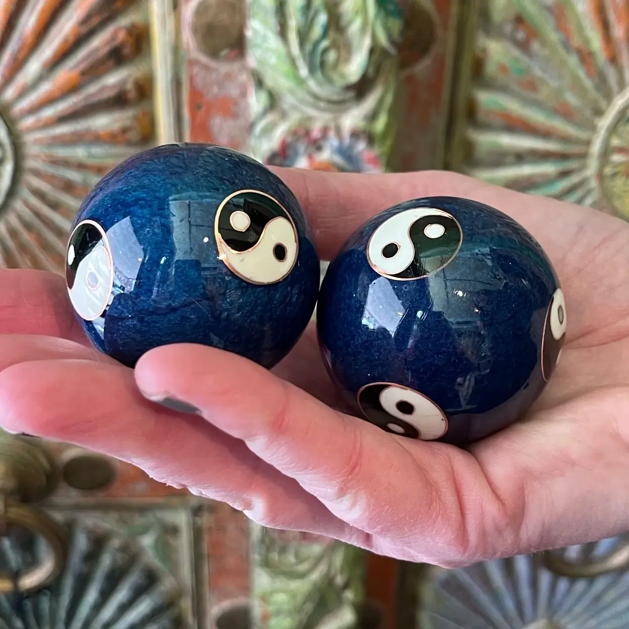
Baoding Balls: traditional Chinese stress-relief tools that promote relaxation and hand dexterity through rhythmic movement.

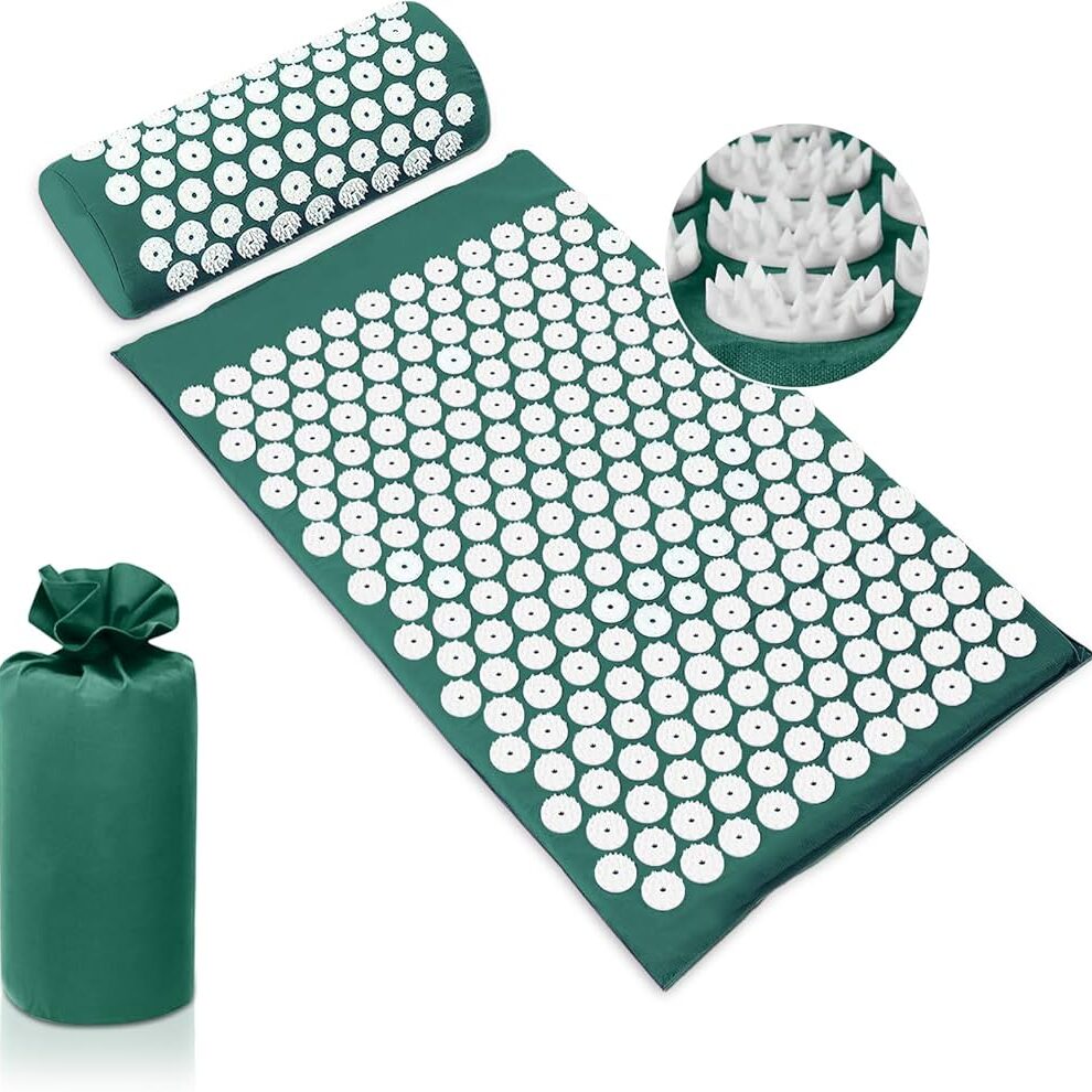
Acupressure Mats: mats embedded with spikes that stimulate pressure points, helping to relieve tension and improve circulation.

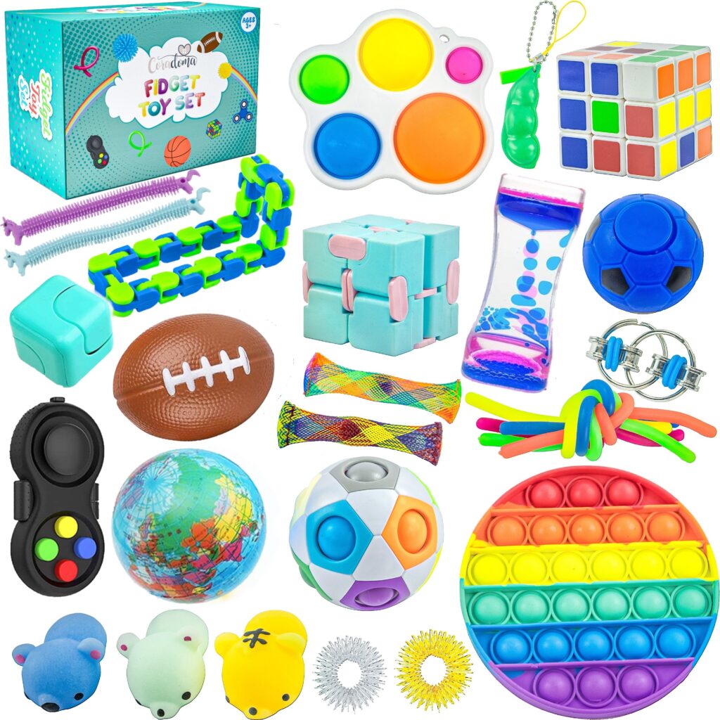
Fidget Cube: a compact, six-sided device featuring buttons, switches, and dials designed to keep hands engaged and minds focused. Each side offers a different tactile experience, catering to various sensory preferences.

Fidget Spinner: a small, ball-bearing device that spins between the fingers, providing a soothing sensory experience. Fidget spinners have been popularized as tools to aid focus and relieve stress, especially for individuals with ADHD or autism spectrum disorders. While scientific evidence is limited, many users find the repetitive motion calming and helpful in managing anxiety.

Additional Fidget Devices and Toys: beyond the Fidget Cube and Spinner, a variety of tactile tools offer sensory engagement and stress relief. Tangle toys consist of interconnected, twistable segments that can be manipulated into various shapes, providing continuous, quiet movement to aid concentration and reduce anxiety. Infinity Cubes are handheld devices made of smaller interconnected cubes that can be folded and unfolded endlessly, offering a repetitive motion that has a calming effect and helps maintain focus. Pop Its are silicone-based toys with bubble-like protrusions that can be pushed in and out, mimicking the sensation of popping bubble wrap; they offer tactile stimulation and are popular for stress relief. Stretchy Strings are elastic, colorful strings that can be stretched, twisted, and squeezed, providing sensory input useful for calming and focusing the mind. Wacky Tracks are interlocking, snap-together links that can be twisted and shaped into various forms, offering tactile feedback beneficial for fine motor skills and stress relief. Weighted Sensory Pillows are small, weighted pillows that provide deep pressure stimulation, promoting relaxation and reducing anxiety, often used in sensory integration therapy.

Reflections and Future Directions

The exploration of these analog devices reveals a shared commitment to facilitating emotional regulation through intuitive, tactile means. Their simplicity and portability make them accessible tools for individuals seeking screen-free methods to manage stress and anxiety.​ In the upcoming blog posts, I will focus on refining the Breathing Circle prototype. This will involve enhancing its design and functionality, followed by user testing to assess its effectiveness in promoting relaxation and emotional well-being. Through this process, I aim to gather insights that will inform further development and potential applications of the Breathing Circle.

12 First Steps with Arduino

It’s not knowing that drives you mad. ~ Jenny Valentine

I read this quote somewhere on the internet and thought, this would be a great start to a new blog post, since it describes my struggles to start doing prototypes. I had no idea, where I should start or what I should do. With no clear direction in mind, I just started doing something. Since the start of this semester I have gotten really interested in Arduino. After the Arduino was introduced to us during class, I took one home and I have been wanting to create/ do something with it.

Developing a first Idea

Being a scout for over a decade, I have encountered multiple ways of encoding a message, mainly as riddles though. So the first idea I had was to create a device, that lets you encode a message. And the easiest one I thought of was morse code. I started, by attaching Modulino modules, pre-built circuit components like sensors or displays, to an Arduino. I used a three button module and the “pixel”, a board housing eight LEDs, one at first.

The idea was simple, by pressing the first button, the Arduino would receive a dot. Pressing the last one would send a dash and the middle one would be used to stand a slash, which is used in written morse code to communicate a break between letters, words and sentences. The first part was very simple, I created a sketch, that wrote the received button pushes as symbols into a string. I created this very easy and very fast.

Since I could write messages now, I needed a way to actually send the message and clear the message, so people could send a new one. First I tested if the Arduino would recognise multiple buttons being pressed at the same time, but it doesn’t. So I came up with the idea of incorporating an end signal, in my case, sending four consecutive pauses would result in the message being “send” or for now displayed and cleared.

Next, I wanted to be able to also display the message, at first I tried to attach the pixel Modulino and use its LEDs to display the message. This would make it easy to decipher between dots, dashes and breaks since each sign could be displayed clearly. Sadly, I couldn’t figure out, how to make the LEDs light up in the way I wanted them to. During most of the tests, they wouldn’t turn on at all or all of them would show the same color, with no difference between dot and dash. So I turned to a different solution, the buzzer, a Modulino that makes buzzing sound, with varying frequencies. Using the buzzer to output the message was much easier and I didn’t have any problems implementing it.

Current State

This was a lot of text now, since I forgot to take pictures I could attach here, but to showcase the first prototype, her is a short video showing the functionality of the current model. The video is in german but I think it will help illustrate, what I did and what the prototype does.

What’s next?

Developing this simple concept further I would want to make use of the wifi capabilities that the Arduino board I am using provides. This way a wireless connection between two Arduinos could be used to send and receive message. As an extra the LED Matrix of the Arduino could display the received letters in clear text so the person receiving doesn’t even have to know morse code, to decipher it.

A setup like this could be used in an escape room, in which two teams of kids have to work together, to open the door, but their only way of communication is to use morse code and send it using the two Arduinos. That way they could share information and complete the next riddle.

Instructions

For this first version, you don’t need a lot, for hardware you would need:

  • an Arduino (capable of using Modulinos)
  • the three button Modulino
  • the buzzer Modulino

After attaching the Modulinos tho the Arduino, you would just have to plug it into a computer and upload this sketch:

#include <Modulino.h>

ModulinoButtons buttons;
ModulinoBuzzer buzzer;

int frequency = 1000;
int duration = 1000;

int countB = 0;

bool button_a = false;
bool button_b = false;
bool button_c = false;

String message = String("Saved Message:");

void setup() {
  Serial.begin(9600);
  Modulino.begin();
  buttons.begin();
  buzzer.begin();
  pinMode(LED_BUILTIN, OUTPUT);
}

void loop() {
  if (buttons.update()) {

    if (buttons.isPressed(0)) {
      message = String(message + ". ");
      Serial.println(message);
      countB = 0;
    } else if (buttons.isPressed(1)) {
      message = String(message + "/ ");
      Serial.println(message);
      countB++;
    } else if (buttons.isPressed(2)) {
      message = String(message + "- ");
      Serial.println(message);
      countB = 0;
    }
  }

  if (countB >= 4) {
    pushMessage();
    message = String("Saved Message:");
    countB = 0;
    Serial.println("Message cleared!");
  }
}

void pushMessage() {
  for (int i = 0; i < message.length(); i++) {
    if (message[i] == '.') {
      digitalWrite(LED_BUILTIN, HIGH);
      buzzer.tone(frequency, duration);
      delay(150);
      digitalWrite(LED_BUILTIN, LOW);
      buzzer.tone(0, duration);
      delay(250);
    } else if (message[i] == '-') {
      digitalWrite(LED_BUILTIN, HIGH);
      buzzer.tone(frequency, duration);
      delay(500);
      digitalWrite(LED_BUILTIN, LOW);
      buzzer.tone(0, duration);
      delay(250);
    } else if (message[i] == '/') {
      delay(1000);
    }
  }
}

Lastly, I wanted to share some takeaways from my first “prototype”. Just starting to do something, with no clear goal in mind at first really sparked my motivation, to develop other little projects using the Arduino. Furthermore, I made small “prototypes” of code, that I test before incorporating them into the real thing. Aiming to understand how something works first, before using it. Lastly, I really need to take more pictures, so future blogposts are more interesting. ;D

NIME Review – “Sound Kitchen”

The paper “Sound Kitchen: Designing a Chemically Controlled Musical Performance” presents a project in which chemical reactions were created and used to trigger different sounds. The reactions were sampled and mapped into a “sound recipe” and showcased as a live performance. Different chemical processes and substances were carefully selected based on certain criteria like availability, safety, controllability, and range. The creation of sound was the main focus; however, since it was meant to be a live performance, visual appeal was also considered (colorful liquids like red wine and orange juice were chosen over clear vinegar). Chemical reactions are used not just as metaphors (or visuals) in performance, but as literal sound generators. Through the manipulation of chemical properties—like electrolyte mixtures and their reactive behaviors—electrical signals are generated and fed into computer systems, where they are shaped and sonified.

The project was created as part of a course called “Human Computer Interaction Theory and Practice: Designing New Devices.” It is an interesting study of the process of creation—drawing parallels between the art of cooking and the art of music: creating a carefully crafted dish and composing a piece of music. Different ingredients and processes alter the final outcome, directed by a composer or chef who controls the composition and final product.

Personally, this new angle of looking at music and approaching composition in such a tangible way was very interesting. Especially as someone who doesn’t know a lot about music and sonification, but is very interested in cooking and baking, I found this experiment gave me a new perspective on the composition of music.

What’s especially interesting about this idea for me as an interaction designer are the implications for almost every interdisciplinary design field and place for interaction. It is a powerful reminder to look beyond the obvious tools. It encourages us to rethink the boundaries of materiality, data, and performance, and expands our definition of what can be an interface or generate usable data (or how something seemingly unrelated can be made usable). I am thinking especially about how this can reshape how we engage with technology, nature, and art. Invisible processes, for example (in nature, cooking, our surroundings, etc.), can be uncovered—not just (as usual) via visuals, but perhaps through sound. This is a channel I, and many other installations, projects, or products, often overlook. However, in terms of ambience or even accessibility, this should be considered and explored much more.

Another thought that is more closely related to artistic aspects of the project would be the visual components of the “instrument.” I feel like it has great potential, and while already considered in some parts, I see a lot of room for improvement, since chemical reactions offer a huge amount of visually appealing options to work with. Phenomena like synesthesia come to mind, and it would be very interesting to see a close relation between the visual reactions and the generated sounds. Moving away from performance art and more into immersive, interactive, and participatory projects, this could, for example, mean an entirely new dining experience that engages all senses in a new and enhanced way.

In conclusion, this paper serves as a strong starting point for rethinking how we design—by considering and combining different sensory experiences in innovative and unexpected ways to create new experiences.


Sound Kitchen: Designing a Chemically Controlled Musical Performance: https://www.nime.org/proceedings/2003/nime2003_083.pdf

NIME paper review

I read “Participatory Design of a Collaborative Accessible Digital Musical Interface with Children with Autism Spectrum Condition“ by Balázs Iványi, Truls Tjemsland, Lloyd May, Matt Robidoux, and Stefania Serafin and would like to state my opinions, thoughts, feedback and critique in the following paragraphs.

I really like the core idea of creating a tool specifically for children with autism. I’ve always found neurodiversity fascinating—how differently people on the spectrum perceive the world and react to interventions. The brain is such a powerful thing, and seeing projects that try to meet neurodivergent individuals on their level is super cool. Giving kids a medium to explore social skills through music feels like a thoughtful and interesting approach.

What I really appreciate is that this project doesn’t just design for children with ASC but instead designs with them. The participatory design (PD) process is such a respectful and inclusive way to work—especially with a population that’s often overlooked in design and research processes. It’s great to see the researchers really leaning into methods like fictional inquiry and narrative-based workshops to engage the children on their terms.

At the same time, one thing that left me a bit puzzled was how quickly the team settled on the idea of a “music box” app. While music can be therapeutic and collaborative, the paper doesn’t fully explain how this specific medium connects with the needs or strengths of autistic children. Why music over other sensory or communication-based tools? That connection could’ve been explored more deeply, especially since kids on the spectrum can have such different sensory profiles—some love sound, others might be overwhelmed by it.

Another interesting point for me was recognizing the iterative prototyping process—it was like a flashback to what we’ve learned in our own courses. Start with simple experiments (like trying sounds on the phone), move on to lo-fi prototypes (like a cardboard box), and finally develop a more polished product. It’s encouraging to see this familiar design thinking structure being applied in a real research context and to such a meaningful user group.

Still, I would’ve liked more details about the final version of the prototype—what exactly can it do now? How do kids use it? Will it be made publicly available or used long-term in schools? The evaluation section gave some hints, but it stayed pretty vague. I also wonder how they plan to address the issue of physical proximity being uncomfortable for some kids—especially when the app is meant to be collaborative and used by multiple users on a single iPad. Would separating controls or even offering individual interfaces be a better fit?

One suggestion might have been to involve a music therapist earlier in the design process. Some teachers mentioned this toward the end, and I think it could’ve really helped bridge the gap between musical expression and social skill development in a structured way. Also, while the aesthetic design choices were touched on (like using retro-futuristic visuals), I wonder how much user testing went into determining if those visuals were actually appealing or helpful for the kids.

Overall, I think the project has great intentions, a solid foundation in participatory research, and shows sensitivity to working with children with ASC. I just wish there had been more insight into the real-life impact of the final product—and how the kids actually felt using it in the long run. But as a student myself, I find it really encouraging to see how others apply the methods we’ve learned in such a creative and inclusive way.

#NIME 🦕 Dinosaur Choir: Designing for Scientific Exploration, Outreach, and Experimental Music

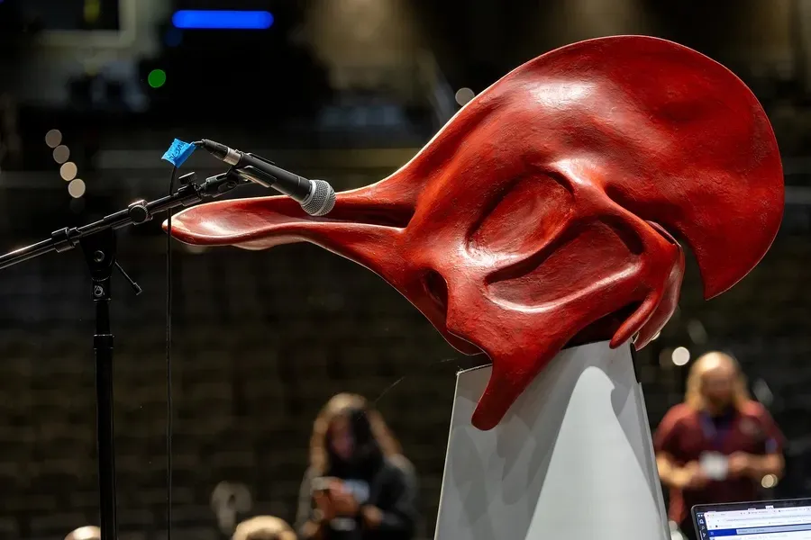
The Dinosaur Choir is a project that focuses on lambeosaurine hadrosaurs—duck-billed dinosaurs known for their distinctive hollow cranial crests, which likely functioned as resonating chambers for vocal communication. By utilizing CT scans of hadrosaur skulls and integrating paleontological research, the team reconstructs these crests and nasal passages with a 3D printer to emulate the sounds these dinosaurs might produced.

How it works: Users give voice to the dinosaur by blowing into a mouthpiece, exciting a larynx mechanism, and resonating the sound through the hadrosaur’s full-scale nasal cavities and skull. This action allows an embodied glimpse into an ancient past.

Firstly it was presented in 2011 by Courtney Brown:

However, concerns about hygiene, especially highlighted during the COVID-19 pandemic, prompted a redesign. The team transitioned to a computational model, allowing users to produce sounds by blowing into a microphone, with the system simulating the vocalizations digitally.

The latest prototype got 3rd place at the 2025 Guthman Musical Instrument Competition at Georgia Tech

There are a few limitations to consider in this research.

First, even with sophisticated modeling techniques, the simulations may simplify the way sound would have realistically traveled through and been shaped by a dinosaur’s skull. Second, expanding the project to include other species would be both time-consuming and costly, with each new model still relying on a significant degree of speculation.

I think the idea behind the project is amazing. I’ve always wondered how people came up with the sounds of dinosaurs in movies and cartoons—I wasn’t sure if any of them were based on real research or just made up. But producing sound from even one real dinosaur skull is really impressive. I like that they brought it to the public through museums and exhibitions because it gives people a chance to immerse themselves in the world of the distant past.