Key Takeaways:
- Abstraction is a tool to create distance and provoke curiosity.
- Pixelation transforms objects into texture, letting viewers reinterpret them.
- Playing with legibility can make a message more open, not less clear.
Key Takeaways:
Key Takeaways:
Color and illustration style carry strong cultural codes.
Visual softness can still communicate strength and intention.
It’s easy to challenge visual norms with very simple interventions.
Key Takeaways:
Barcelona came at the perfect time, we hopped on a plane to go look at design somewhere else and at some point things felt less blurry (at least for a little bit).
One of my highlights: our visit to the studio LoSiento. Before we went there I looked at their portfolio and admired their work, but seeing the whole analogue and experimental process behind it really shifted something in me. They approach design not just as something that lives on a screen or in a PDF, but as something physical. Printed, folded, cut, built, poured, glued, photographed. Everything they do starts with their hands. It reminded me that good ideas don’t have to start in Illustrator. They can start with scissors, weird materials, or just curiosity. That mindset of playful experimentation is something I want to bring more into my own process this semester. I sometimes get caught up in refining too early, but LoSiento made me want to loosen up and trust the process, quite literally.
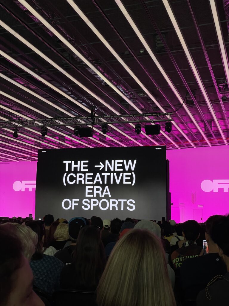
The next days at the OFFF Festival, the keynote that stuck with me the most came from DixonBaxi, the studio behind the rebranding of Formula 1 which launched this year. I’d seen the work before but hearing them explain their thinking hit differently. They spoke about how they wanted to design something that felt faster, more open, more future-oriented. It wasn’t about redesigning a logo, it was rather about reshaping a whole experience around the sport. As someone exploring motorsport through a design lens, that talk gave me a kind of permission to not treat some things as untouchable, and to think about what stories visuals are really telling. They mentioned “designing for emotion, not decoration” and I’ve been repeating that line in my head ever since. There was also a keynote from Lauren Heartstone about the redesign of sports graphics, again focussing on their work for the new Formula 1 Race Graphics. I also loved the approach of this new era in sports design.
So all in all I actually got quite some inspiration in Barcelona, which also leads me to want to further experiment with analogue printing whilst also looking more into (motor)sports design and a way to combine those things for my master project.
When I started brainstorming ideas for my master’s thesis, I initially focused on gender and design and how femininity is visualized, who defines it, and where its limits lie. But the deeper I went, the more I found myself circling back to something that has fascinated me for a long time: motorsports.
As genderless design continues to gain attention across industries, there is still much to explore. While brands like Aesop have made strides toward more inclusive design, gaps remain in how gender is represented—or erased—through design choices. Looking ahead, my research could expand in several directions, uncovering new insights into how gender-neutral design evolves, how it is perceived, and how it can be applied more effectively.
Most discussions on genderless design are rooted in Western perspectives, often shaped by modernist minimalism. But neutrality is not universal—different cultures perceive gender and aesthetics in unique ways. Future research could explore:
This research would highlight whether genderless design can be truly universal or if it must always be adapted to specific cultural contexts.
We often assume that certain design elements (muted colors, minimalist layouts, sans-serif fonts) feel gender-neutral. But is that actually true?
AI-driven design tools are rapidly shaping how digital experiences are created and customized. Future research could examine:
Brands and designers are still experimenting with what works and what doesn’t. Future research has the potential to provide guidelines for designers and brands, challenge assumptions about what neutrality really means or generally explore how AI, psychology, and culture shape our perceptions of genderless design. As I continue to explore this field, my goal is to push beyond surface-level discussions and uncover how design can be more inclusive, not just in aesthetics, but in experience, accessibility, and intent.
In an industry dominated by hyper-feminine and hyper-masculine branding, Aesop stands out as a benchmark for gender-neutral design. The luxury skincare brand has cultivated an aesthetic that feels both refined and universal, proving that effective design doesn’t need to rely on traditional gender cues. But what makes Aesop’s approach so successful? And what can other brands learn from it?
Many skincare brands lean heavily on gendered marketing—soft pastels and floral motifs for women, dark packaging and bold typography for men. Aesop rejects this binary entirely. Instead of relying on color-coding or stereotypical imagery, the brand embraces minimalism, neutral tones, and functional elegance.

By prioritizing simplicity and consistency, Aesop creates a design language that feels timeless, sophisticated, and non-exclusive.

Aesop’s gender-neutral approach extends beyond packaging—it’s embedded in the brand’s entire retail experience. Each store is uniquely designed to reflect its local surroundings, reinforcing the idea that Aesop is for everyone, everywhere.
This philosophy ensures that every customer feels equally considered and valued, regardless of gender identity.
Aesop’s success in gender-neutral design isn’t just about aesthetics—it’s about rethinking how brands communicate with their audiences. Here are key takeaways:
Aesop proves that gender-neutral design is not about being bland—it’s about being intentional. By stripping away unnecessary gendered cues and focusing on quality, functionality, and experience, the brand has built an identity that resonates across demographics.
As more industries move toward inclusivity, Aesop stands as a powerful example of how brands can create design-first, human-centered experiences that transcend gender norms.
As technology becomes an inseparable part of our daily lives, it plays a crucial role in shaping how we interact with the world—and each other. But how often do we stop to consider the gender biases embedded in our digital experiences? From voice assistants and algorithmic recommendations to UI/UX design, technology is far from neutral. In fact, it often reinforces binary gender norms, intentionally or not.
Genderless design in technology refers to the deliberate effort to remove unnecessary gender markers from digital products, services, and interfaces. It’s about creating experiences that don’t assume or reinforce traditional gender roles, allowing users to engage with technology on their own terms. But the challenge is that many of our current digital systems are built on deeply ingrained assumptions about gender.
One of the most well-documented areas of gender bias in technology is voice AI. Digital assistants like Siri, Alexa, and Google Assistant overwhelmingly use female voices, reflecting long-standing social expectations that women should be helpful, accommodating, and nurturing. Studies suggest that users perceive female voices as warmer and more approachable, whereas male voices are often associated with authority and expertise. But this creates an imbalance—when AI assistants are predominantly voiced by women, it perpetuates stereotypes about servitude and obedience. Conversely, when virtual assistants designed for finance or technical support use male voices, it reinforces the idea that men are more knowledgeable in those areas.
To counter this, projects like Q: The World’s First Genderless Voice aim to challenge binary assumptions. Q was developed through extensive research, blending the vocal characteristics of multiple speakers to create a tone that exists between traditional male and female registers. The goal is not just to provide an alternative but to provoke a discussion about why gendered voices are the default in the first place. (Source: Q Voice Project)
We can see the topic of Gender in visual communication in many design choices, from color palettes to iconography, again. For example, fintech apps targeting men often use dark themes, sharp typography, and high-contrast elements, signaling power and control. Meanwhile, apps marketed toward women may employ soft pastels, rounded typography, and nurturing language, reinforcing ideas of emotional sensitivity and caretaking. This is particularly evident in the health and wellness industry, where apps for period tracking, fertility, and general well-being overwhelmingly adopt a “feminine” aesthetic. While there is nothing wrong with this, it assumes that all users of these apps identify with traditional femininity. A more inclusive approach would involve providing customization options so users can shape the interface to fit their own preferences.
A great example of genderless UI is Google’s Material Design, which emphasizes functionality and adaptability over aesthetic assumptions. By focusing on clarity, accessibility, and modular components, Material Design enables brands to create interfaces that work across diverse user identities. (Source: Google Material Design)
Despite growing awareness, there are still barriers to achieving true gender neutrality in tech. One major challenge is bias in AI and machine learning. Many algorithms are trained on datasets that reflect historical gender disparities, meaning they inherit and amplify those biases. Facial recognition systems, for instance, have been criticized for being less accurate in identifying non-binary or gender-nonconforming individuals (Read more about this in the following Blog Post!).
Ultimately, genderless design in technology is about challenging default assumptions. Rather than asking, “How do we make this product appealing to men or women?” the question should be, “How do we make this product useful and welcoming for everyone?” Technology shapes the way we navigate the world, and by designing without unnecessary gender markers, we create experiences that empower individuals to engage with digital spaces on their own terms.
In a world where design choices shape our perceptions, the concept of neutrality is more complex than it seems. That’s why I asked myself what it means for a design to be “genderless”? Is true neutrality even possible, or does every design decision carry an implicit bias?
When we think of “neutral” design, what comes to mind? Minimalist aesthetics? Muted colors? Sans-serif fonts? While these elements are often marketed as universal, they carry their own cultural and historical baggage. For example, black, white, and gray are frequently used in gender-neutral branding. Yet, these choices are shaped by Western modernist design principles, which emerged from a specific cultural context. In other cultures, vibrant colors might symbolize balance and neutrality instead.
Similarly, clean, geometric typography is often seen as neutral, but this perception is influenced by the association of serif fonts with tradition and femininity, and sans-serifs with modernity and masculinity. Even something as simple as a rounded button versus a sharp-edged one can subtly communicate warmth (feminine-coded) versus efficiency (masculine-coded). Neutrality is not an absence of meaning; it is shaped by cultural norms and visual history.
Our brains are wired to categorize information quickly. Research in cognitive psychology shows that humans rely on schemas—mental shortcuts based on past experiences—to make sense of the world. Gender is one of the most deeply ingrained schemas we use. When we encounter a design, our brains subconsciously assess elements like color, shape, typography, and imagery to determine whether it aligns with our learned gender associations. Here are some examples I already explored:
Because we instinctively categorize designs, truly gender-neutral design must actively challenge these subconscious cues.
If neutrality is subjective, how can designers create products, brands, and experiences that don’t alienate or reinforce stereotypes? Here are key strategies:
Neutrality is a moving target—what feels inclusive today may evolve as cultural norms shift. Instead of aiming for a single, fixed idea of neutrality, designers should embrace adaptability and question their own biases. True genderless design is about offering choice, breaking defaults, and allowing people to engage with products and spaces in ways that feel authentic to them. Because in the end, the most inclusive design is not the one that erases differences, but the one that makes room for everyone.
Sources:
https://uxdesign.cc/designing-for-gender-neutrality-373f73f0832a
https://link.springer.com/article/10.1007/s12008-021-00751-7?
https://www.womentech.net/en-us/how-to/gender-neutral-design-principles?
In recent years, some brands have begun to challenge the traditional gender norms in advertising. One notable example is the online shop Zalando, launched a campaign titled “Zerotypes“, which prominently features individuals across a spectrum of ages, genders, and lifestyles, emphasizing inclusivity in regards to fashion, rather than segmentation.
As mentioned in a blog post before, traditional advertisements often rely on color codes, fonts, and images that are stereotypically associated with masculinity or femininity. For instance, bold fonts and dark tones are frequently used for “male” products, while soft pastels and cursive scripts are common for “female” items. Recent campaigns have embraced minimalist design with neutral color palettes and straightforward typography. This approach not only appeals to a wider audience but also allows the product itself to take center stage, rather than the gender of the user.
There exists a common misconception that gender stereotypes in advertising help boost sales, but this is largely the opposite of the truth. Gender stereotypes in advertisements generally have a negative impact on the product and company, but the evaluation of these stereotypes and advertisements by an individual is much more nuanced than any generalization can be. But most companies are aware of the sensitivity of the issue of gendering.
Another example is Bosch. Bosch has recognised that female users have different needs to men, with the former placing more value on aesthetics. Instead of designing special women’s products, which are rejected by many women for this reason alone, Bosch launched a cordless screwdriver 15 years ago, which is aimed at occasional DIY enthusiasts.
Genderless design is not just about neutrality; it’s about inclusion. By removing gendered assumptions, this approach allows people to engage with products and spaces without feeling excluded or stereotyped. This is particularly significant in branding, where inclusivity can directly impact a company’s reach and reputation.
A notable example is Lush Cosmetics, which has embraced gender-neutral branding. Their minimalist packaging and inclusive marketing campaigns appeal to a wide audience, regardless of gender identity. Similarly, the fashion brand Telfar has gained acclaim for its “Not for You—For Everyone” slogan, challenging the exclusivity of luxury fashion. Another great example is Ikea: “Alle dürfen sich wohlfühlen“. Furniture for the men, decoration for the women? Not at Ikea. The Swedish furniture store is constantly attracting attention with its inclusive campaigns – and has thus created a broad audience. It communicates a family feeling that is informal and outside the classic norms. Whether friends, a patchwork family or a queer couple: everyone wants a cosy home. With this feeling, the brand has succeeded in positioning itself for many target groups at the same time.
Data supports this shift. A study by Accenture found that 41% of consumers have shifted to brands that prioritize inclusivity in the past year. Genderless design fosters a sense of belonging, making it a powerful tool for brands aiming to connect with diverse audiences.
Despite these progressive shifts, not all efforts have been successful. Critics argue that some brands adopt gender inclusivity superficially, using it as a marketing gimmick rather than making meaningful changes. For instance, token representation in advertisements can feel performative if not backed by inclusive policies within the company itself.
Moreover, gender-inclusive advertising can face backlash from more conservative audiences. This was evident when a German department store faced criticism for introducing gender-neutral sections in their stores, sparking debates about whether these changes were necessary or overly “woke.”
https://www.brjght.com/markenjournal/warum-werbung-keine-geschlechterklischees-mehr-braucht
https://blog.hubspot.de/marketing/gender-marketing
https://trio.ch/de/stereotypen-andern-sich-sind-aber-in-der-werbung-immer-noch-prasent