The reinforcement of stereotypes: Gender in Advertising

Traditional marketing strategies often rely on, but also shape binary gender stereotypes, presenting products as either “for men” or “for women.” However, as societal perceptions of gender become more fluid, advertisers are starting to rethink these conventions. This shift not only reflects changing cultural values but also represents a strategic move to connect with broader, more diverse audiences.

The Historical Role of Gender in Advertising

Think of the clichés: rugged men enjoying a “Männerbier” or women cheerfully cleaning kitchens in detergent commercials. For decades, campaigns reinforced these archetypes. These ads relied on binary gender roles as a way to create targeted messaging—and, to some extent, they were effective.

However, these traditional strategies also perpetuated stereotypes, suggesting that certain products were only suitable for one gender. The result? A growing disconnect with younger generations who see gender as less rigid and who expect brands to align with their inclusive values.

The presentation of gender roles

Young children gain basic understanding by watching and copying what they see. Young girls are targeted by advertisements that provide a range of stimuli that shape and influence their internal gender constructions. The color pink is often used in ads aimed at young girls, and the subjects are usually depicted in tidy and serene settings, playing with dress-up dolls and toys that simulate everyday activities that women are expected to perform, such as cooking and cleaning.This persists throughout childhood and maturity in a variety of cases.

Advertising depictions of women weaken them in five ways, according to Goffman: relative size, feminine touch, function ranking ritualization of subordination, and sanctioned withdrawal. Advertisements from this era also enforced expectations that women should take care of their children, keep their surroundings clean, and serve their husbands.Female subjects are frequently depicted as dependent on men to carry out more mentally or physically taxing activities for them, and as helpless in any other area than what is expected of them. In the past, tech advertising has frequently portrayed women in conventional domestic or supportive roles, reflecting broader cultural expectations of women.

Men have historically been portrayed in advertisements as independent, breadwinners, tough, invulnerable, athletic, and generally more capable than their female counterparts. Men in advertisements are usually pictured as leaders in and out of the household, being able to accomplish extreme tasks with little effort or assistance. When shown in advertisements with women, men are typically seen in a dominant position both socially and physically. There were a few attempts to loosen up those gender roles in the advertisements in the 1980s by companies such as Apple, showing a gender norm deconstructing ad during the 1984 Super Bowl half time show.

Creating the “ideal” body image

Advertising often showcases idealized and heavily edited bodies, which can lead to significant psychological effects, particularly body dissatisfaction. Children are especially vulnerable, as consuming these images often results in self-objectification, where individuals view their bodies from an external, critical perspective. This can lead to body shame, appearance anxiety, and even eating disorders or disordered eating behaviors.

Advertising often depicts female bodies as objects of desire, reflecting the male gaze. Hyper-feminine, obedient, or sexually objectified representations of women are common, and phallic imagery is occasionally employed to imply sex. Women who compare themselves to idealized models and celebrities may experience anxiety, despair, and body dissatisfaction as a result. Older women are largely excluded from these narratives of sexuality, with media reinforcing the notion that maintaining femininity requires preserving youthful bodies. Advertising often profits from the sexualization of young women while ignoring the sexuality of aging women.

Male bodies in advertising are similarly idealized but in different ways. Men are typically portrayed as dominant, strong, and physically controlling, especially in imagery involving women. This dominance is often illustrated through firm physical holds or the male gaze directed at women, who remain passive subjects. The ideal male body is depicted as muscular and powerful, with aging men facing societal pressure to defy aging in order to retain their masculinity and societal power. Male body imagery is often used in advertising regardless of its relevance to the product, perpetuating unrealistic and narrow ideals of masculinity. Therefore, in both cases, the portrayal of bodies in advertising reinforces harmful stereotypes, contributes to body dissatisfaction, and perpetuates unattainable standards of beauty and worth.

Additional sources:

https://www.dw.com/de/rosa-oder-hellblau-wie-gender-marketing-die-geschlechter-trennt/a-46199183

https://www.emerald.com/insight/content/doi/10.1108/ejm-02-2019-0125/full/html
https://onlinelibrary.wiley.com/doi/abs/10.1002/mar.21675

Inclusive Design

Inclusivity means recognizing the diverse needs and perspectives of users and making intentional choices that reflect that diversity. That’s why it goes beyond aesthetics and ensures that products, experiences, and communication are accessible and meaningful to all people, regardless of gender, background, or ability.

When it comes to typography, iconography, and visual elements, inclusivity starts with challenging traditional norms. Avoiding gendered fonts and symbols can help create more neutral designs that appeal to a broader audience. For example, opting for clean, simple typography without overt associations to masculinity or femininity helps ensure that the message remains the focal point, not the stereotypes embedded in the design.

More than gender

Using universally recognized symbols, avoiding cultural biases, and designing for clarity and simplicity ensures that icons are easily understood by diverse groups. It’s important to consider how different symbols are interpreted across cultures, as the meaning of an icon can shift depending on context. For example, certain color choices or shapes may hold different connotations in various regions, so being mindful of this variability is essential for inclusivity. Incorporating accessibility and considering the needs of individuals with visual, auditory, cognitive, or physical disabilities through using high-contrast color schemes, ensuring that fonts are legible, providing alt text for images, and offering multiple ways of interaction are all part of creating a design that works for everyone. Testing designs with diverse user groups and iterating based on their feedback ensures that the design is truly inclusive, rather than assuming it works for everyone based on one perspective.

Challenges in Moving Beyond Gendered Design

Inclusive design presents several challenges, starting with balancing the diverse needs of users. Ensuring that designs work for people with different abilities, backgrounds, and preferences requires compromises between accessibility, usability, and aesthetics. Designers must navigate cultural differences, as color associations vary widely across regions. For instance, while white symbolizes purity in Western cultures, it is associated with mourning in many Asian countries. Balancing global relevance with local sensitivity is crucial in creating truly inclusive designs.

Resistance to change can be another barrier, especially in industries with traditional design approaches. Technological constraints, such as platform limitations or issues with responsive design, can also hinder accessibility. Additionally, some critics argue that removing all gendered elements risks creating designs that feel overly generic or lacking in personality. The challenge for designers lies in striking a balance between neutrality and distinctiveness.

Ultimately, inclusive design requires empathy, awareness, and a commitment to creating products and experiences that reflect the richness of human diversity. By consciously integrating these principles into design processes, we can build a more equitable and accessible world for all.

Gender in Typography and Iconography

While color plays a significant role, other visual elements like typography and iconography are equally important in creating gender-inclusive designs. Traditional advertising often employs serif fonts and ornate details to appeal to women, while sans-serif and bold fonts are associated with masculinity. However, modern brands are opting for clean, minimalist typography that avoids these stereotypes.

Masculine, Feminine, and Neutral: what’s new?

Fonts, whether consciously or not, are often perceived as “masculine,” “feminine,” or neutral based on their design characteristics. This perception is influenced by societal norms and the historical use of typography in various contexts. Fonts with bold, geometric, and angular forms—such as Futura or Roboto—are frequently associated with masculinity due to their structural rigidity and simplicity, which convey strength and functionality. Fonts with flowing curves, decorative details, or lighter weights—like Didot or Edwardian Script—are tied to femininity, evoking elegance, softness, and emotion. Neutral typefaces, such as Helvetica or Open Sans, aim to transcend these associations through balanced, minimal designs.

These associations matter because typography isn’t neutral; it subconsciously reinforces expectations and stereotypes. For instance, using a decorative, script font for a women’s brand aligns with traditional ideas of femininity but risks perpetuating outdated roles. Similarly, the dominance of bold, sans-serif fonts in tech design reflects a male-centric narrative within the industry. To challenge these norms, combining contrasting typefaces—such as pairing a strong sans-serif with a softer serif—can balance traditionally gendered traits. Ultimately, typography carries weight in shaping messages, and as designers, we have the responsibility to move beyond traditional binaries. By rethinking how fonts communicate gender, we can create more inclusive, innovative designs that reflect a diverse and evolving world.

Neutral Design Language

Abstract and geometric iconography also plays a role in transcending gender norms. For instance, the use of symbols like circles, triangles, and squares—rather than overtly gendered imagery—allows designs to feel neutral and universal. The emphasis shifts from targeting a specific demographic to fostering inclusivity and accessibility.

Sources:

https://www.sciencedirect.com/science/article/abs/pii/S0022103118305493#:~:text=Collectively%2C%20research%20from%20different%20fields,associated%20with%20the%20category%20male.

https://medium.com/nyc-design/what-you-need-to-know-about-gendered-design-496f736588d1

Blue for boys, pink for girls: Color theory & rethinking gender

Designers must navigate cultural differences, as color associations vary widely across regions. For instance, while white symbolizes purity in Western cultures, it is associated with mourning in many Asian countries. Color has also played a defining role in reinforcing gender norms in design. From the stereotypical “pink for girls” and “blue for boys” dichotomy to the subtle color cues used in advertising and branding, color theory has often been a tool for segmenting audiences along gender lines. However, as more and more people become aware of the fluidity of gender, we are beginning to challenge these conventions, seeking to create visuals that exploit these traditional norms and promote inclusivity.

The Origins of Gendered Color Associations

Let’s take a look at where the association with color and gender originates from, as it is more of a social construct rather than an inherent association. In the early 20th century, retailers and manufacturers began using color to market baby clothes and toys, with the pink/blue binary gaining prominence only in the mid-20th century. These marketing strategies reinforced cultural norms, embedding these associations into societal consciousness. But is blue really for boys and pink for girls?

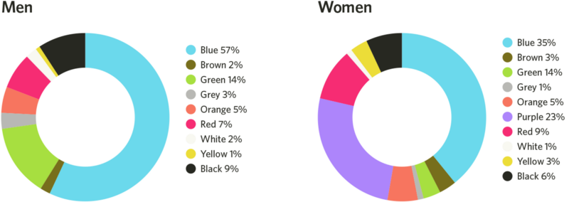
A study published in 2018 in Frontiers in Psychology examined global color preferences and found that while certain trends exist, individual preferences are shaped more by cultural and personal experiences than by gender. To add to that, blue is both men and women preferred primary color, as it’s associated with clean water, the sky, etc. This goes for a few different colors such as red and green. This challenges that specific colors are inherently masculine or feminine.

Shades or tints?

But it is also nut just the color itself, more than the tint or the shade: a study found, that women heavily prefer soft tints of colors (such as pink) whereas men prefer bright shades (such as ruby red). So although red is shown as a favorite color for both men and women, the subsets of reds they like are very different.

The genetics also play a role in this: women can see more colors than men, as the color vision depends on color cones in our eyes, which are carried on the X-chromosome. Men only inherit one X-chromosome instead of two. These cones tell our brains what color we are experiencing by interpreting wavelengths of light. Because men don’t inherit the same combinations of cones women do, men’s brains often require slightly longer wavelengths of light to experience the same colors. This may be the reason why men prefer colors with short wavelengths, like darker shades of blue and green, or they prefer shades without any wavelengths at all, like white, black, and gray.

The Solution: Gender-Inclusive Color Palettes

Many brands have moved away from rigid gendered color schemes in favor of more inclusive approaches. By doing so, they create a sense of openness and inclusivity that appeals to a broad audience. Gender-neutral color palettes in branding prioritize inclusivity and focus on balanced, universal tones such as greens, yellows, greys, or earth tones.By choosing colors that transcend traditional gender associations, brands can create more inclusive and appealing designs for diverse audiences, fostering a broader sense of belonging and engagement. This approach not only differentiates the brand but also conveys a sense of creativity and adaptability.

To implement gender-neutral color palettes, brands can focus on processes that prioritize diversity and inclusivity, like testing color combinations with diverse user groups to ensure they evoke a universal appeal. Neutral tones could be paired with complementary shades to maintain visual interest while avoiding stereotypical gender cues. But its important to also emphasize the cross-cultural and contextual meanings of colors to avoid reinforcing localized gender norms, thus creating designs that resonate globally.

Additional Sources:

https://link.springer.com/article/10.1057/s41262-020-00216-4

https://www.emerald.com/insight/content/doi/10.1108/ejm-11-2014-0723/full/html

https://www.designerinaction.de/design-wissen/genderneutrale-farben

https://core.ac.uk/download/pdf/236071469.pdf

https://www.psychologytoday.com/intl/blog/color-psychology/202410/beyond-pink-and-blue-how-gender-shapes-color-preferences

https://www.colormatters.com/color-symbolism/gender-differences

Design & Gender

The topic of gender and graphic design is complex and touches on various areas such as brand communication, advertising, product design and visual culture in general. The way in which gender is represented through design not only influences the target group and brand identity, but can also reinforce or challenge social stereotypes. The aim is therefore to examine how gender roles and identities are visually represented and what impact this has on the perception of the target group. Graphic design has a strong influence on social norms and expectations regarding gender, as it is often used in advertising, branding and social media. The points listed below are further topics to be investigated for my Design & Research project.