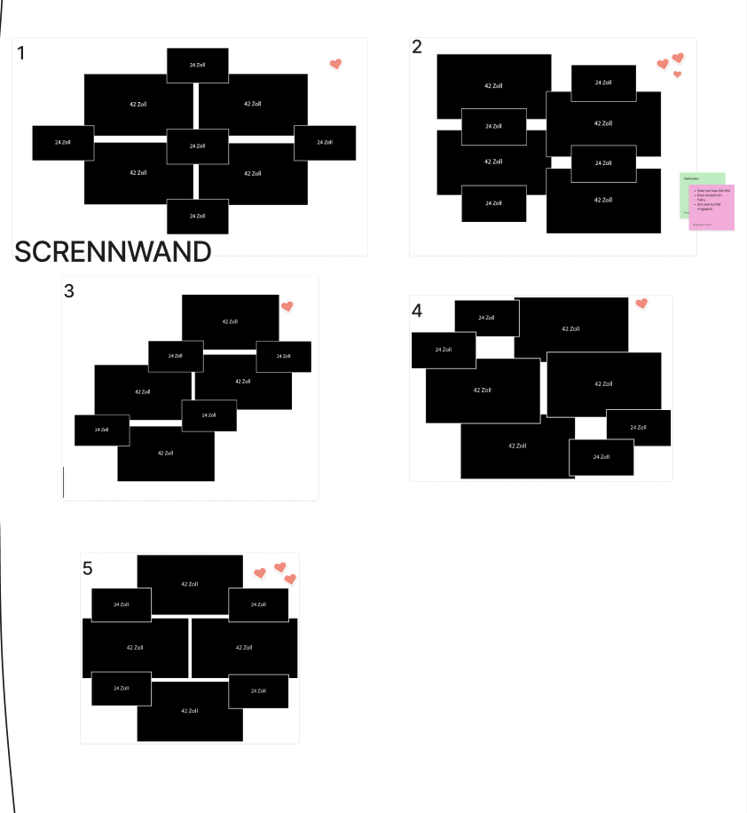
One of the most challenging parts of the Media Design contribution was the planning and realisation of the screen wall. From my perspective, this was also the most demanding task. It wasn’t just about how the screens should be arranged visually, but mainly about how they could be mounted and secured properly. The original plan was to build a screen wall consisting of four 43-inch screens and four 24-inch screens, ideally mounted on a wall. Alongside this, we also had to be very aware of what kind of equipment we needed and make sure to request everything on time from the media center. This required a lot of coordination and forward planning which was sometimes a bit of a struggle for me. Another difficulty was keeping everyone motivated to actively participate in the exhibition. For some people, the importance of the exhibition only really became clear in the final days before the opening, which added extra pressure towards the end.
Together with Valerie, I worked closely on the concept of the screen wall. Valerie also had to focuse on the construction and how the screens could physically hold together, while we jointly developed the visual concept. We decided on a very minimal and reduced style: mostly black and white visuals, clean lines, and slow, monotone movements. Since the screen wall showed individual projects, it was important to us that each project was clearly recognizable and properly credited. This also meant adapting animations and adjusting their lengths so they worked well together. At the beginning, it was difficult to find a smooth workflow. Everything still felt abstract, and even the construction of the screen wall was not fully defined yet, after several discussions and changes, we eventually had to scale down the original idea. In the end, the screen wall consisted of eight screens mounted on a truss, which simplified both the technical setup and the animation work at least a bit more. Even so, the animation process took longer than expected, new ideas, technical hurdles, and last-minute changes kept coming up. Surprisingly, one of the hardest parts was actually finding the right screens, as many were already booked through the media center, but to be fair there were 3 different exhbitions happening in the same week.
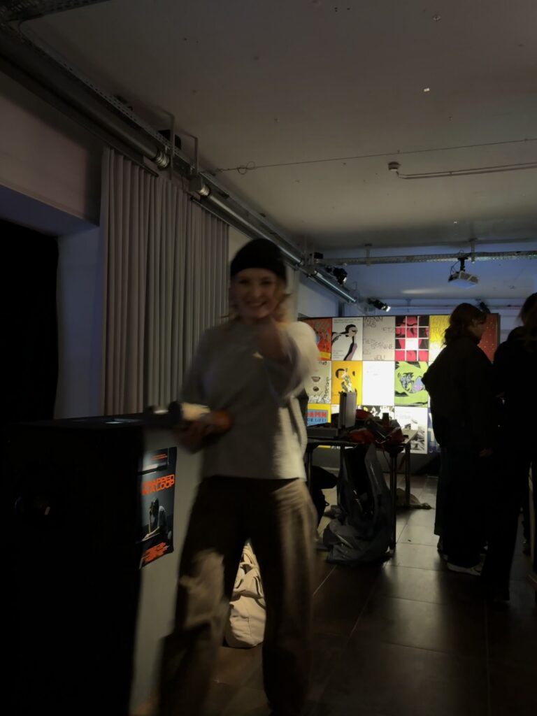
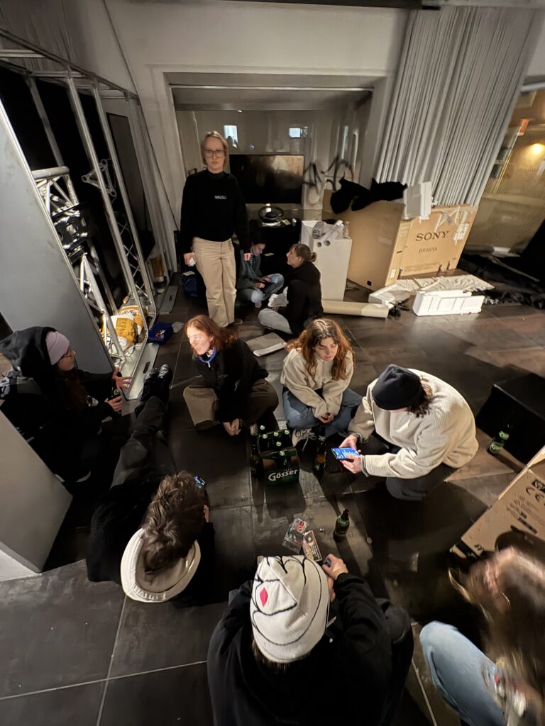
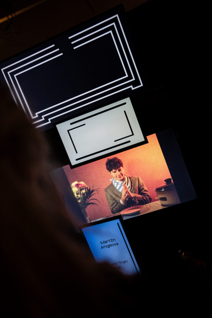
Looking back, one important realization was about workflow efficiency. At first, Valerie and I worked on the same screens together, making all decisions jointly. While this ensured consistency, it was also very slow. Once time pressure increased, we split the animations between us and worked independently. This turned out to be much faster and still worked very well visually.
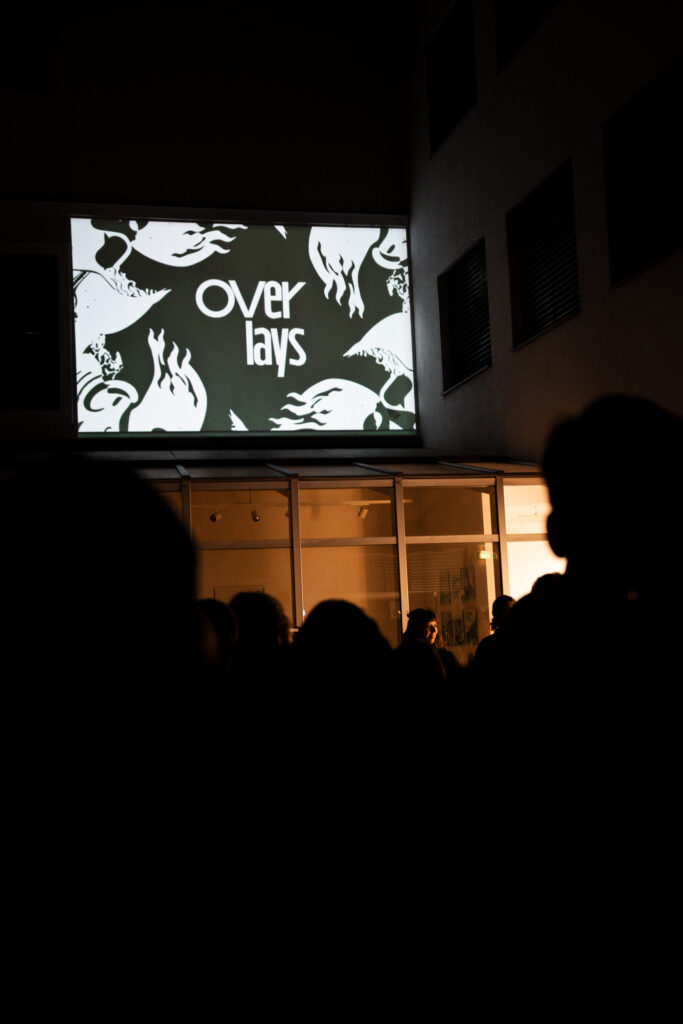
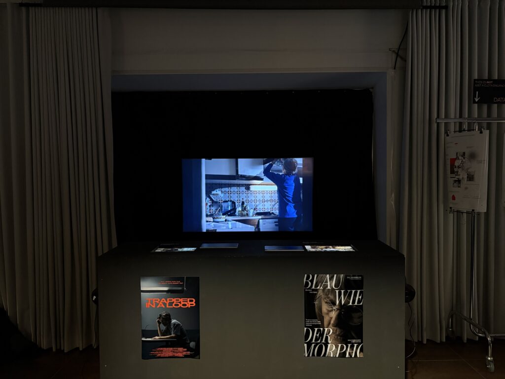
The final setup of the exhibition was successful overall. Of course, some things had to be adjusted on site, and a few minor issues appeared over the following days. Some projects required more active attention to maintain their intended interaction. Still, the overall planning helped a lot and made the setup process smoother and more efficient.The cinema area was another highlight. With the self-built benches, visitors could sit down, watch the short films, and at the same time see behind-the-scenes material. The screen wall also worked well overall, even if there were small delays or mistakes that probably only Valerie and I noticed (lets hope). In the end, this project taught me how time-consuming exhibition planning really is and how much attention to detail is needed to make something feel professional. I am very grateful that I was able to take on a management role together with Magda and contribute to the exhibition in this way. For future exhibitions, I will definitely take away the importance of even earlier planning and requesting equipment as soon as possible.