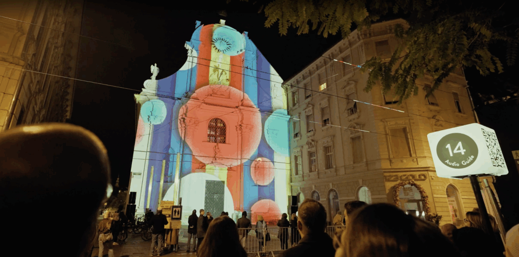
During Klanglicht, I didn’t only get inspiration from other installations that were spread around Graz, but especially from the one I was working on myself. Being part of the project “Vertigo” changed the way I experienced the festival, because I wasn’t only visiting the installations, but actively working on one of them. Our installation took place in a church, where we built a huge tower made out of LED panels. Visitors were invited to sit down and watch minute-long animated shows. Each group created a seamless animation combined with sound, guiding the visitors through a topic. Even though all animations were very different, they were connected through the same structure and space.
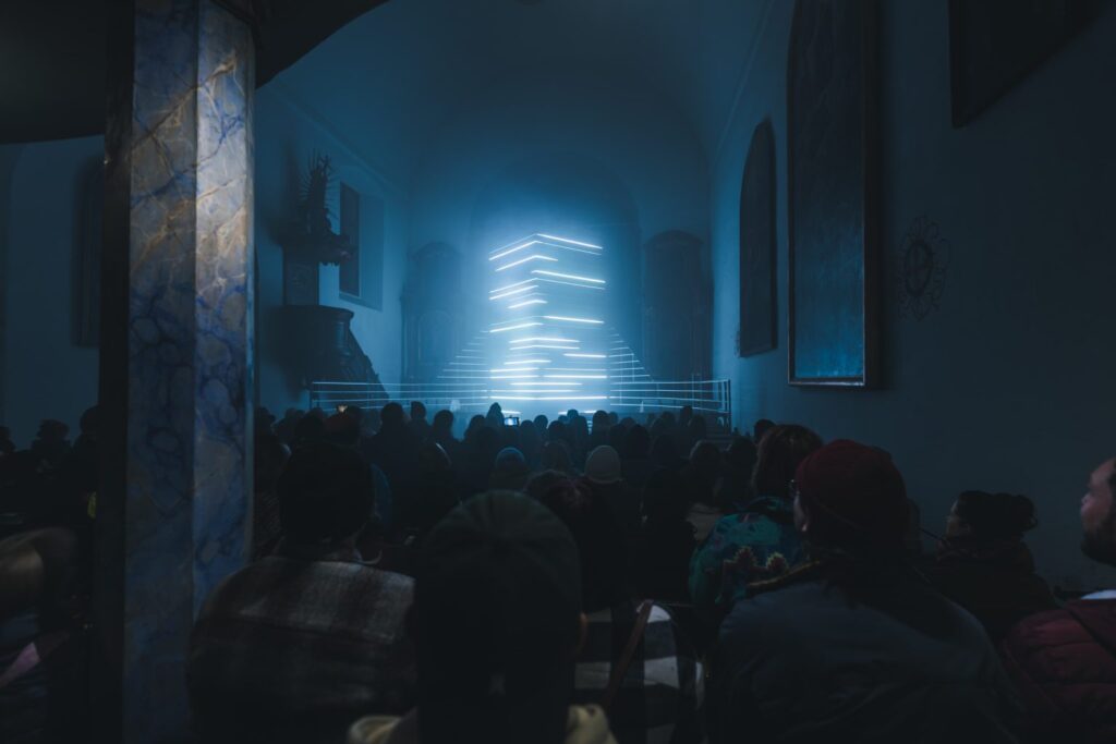
My role in the project was as a media student, so I was part of the animation team. I searched for different ways to show the storyline and to use sound together with visuals by working with shapes and videos. A big part of the process was trying things out, failing, and then testing everything again directly on the final installation. Timing was very relevant, because the sound and the animation only worked well together when they were perfectly aligned. Even small changes in rhythm could completely change the effect. Within my group, we focused on the topic of urbanisation. We wanted to show, not just with our visuals but also with the sound, that more and more urbanisation is taking away from nature and with that also from us. We worked a lot with colors and rhythm to show the different parts of our animation. The city was shown as cold, hard, and very bright, using colors that were almost neon. This was meant to represent a new, superficial world and was supported by loud construction sounds. Nature, on the other hand, was calmer and a bit warmer. This contrast helped to clearly distinguish between the two parts within our storyline.
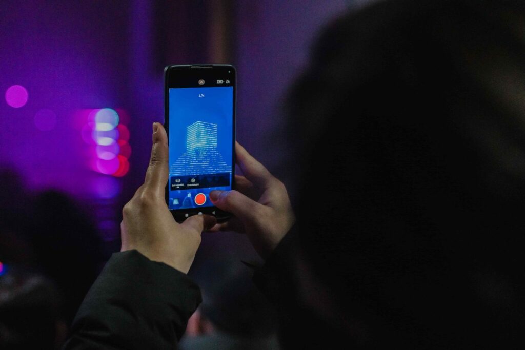
We also worked with building and destroying elements within the animation. At one point, a tower was built up and then destroyed again. The impact of this moment was made stronger through sound. Sometimes we also used black screens or short pauses, which helped to create an emotional impact and made the moment feel more intense. I also found it very inspiring to see what the other groups had done. One group showed the topic of love only by using colors and shapes that once moved in sync and then slowly left each other again. This project showed me what power simple shapes can have and how different the effect can be depending on movement, timing, and surface.
The installation would not have worked the same way on a normal screen. The LED panels, their vertical construction, and especially the space of the church had a big influence on how everything was perceived. The space also had a strong effect on the sound, making the whole installation feel more immersive. This project really inspired me and also influenced how I think about my master’s thesis. I loved that the work was abstract, but still very specific in the way it showed a storyline so clearly. It made me realize that it’s possible to tell a strong story without being literal, just by working with shapes, rhythm, color, sound, and timing.