Impulse #6 – Overlays Exhibition

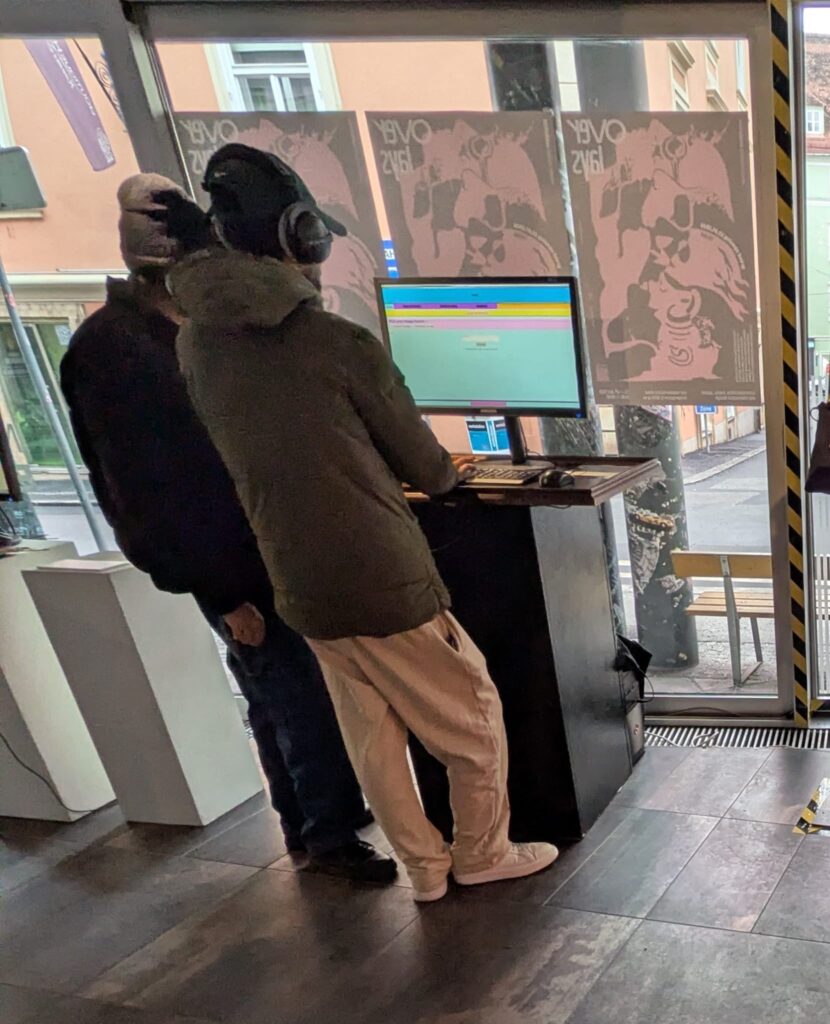
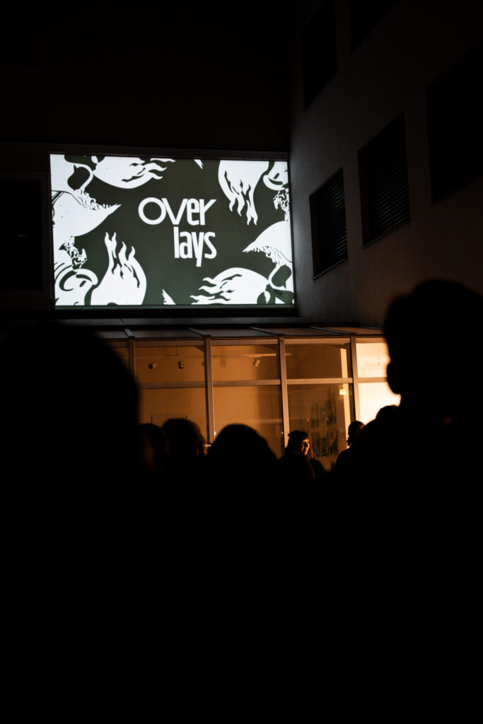
It’s crazy that our Overlays Exhibition has already been over since Tuesday, but since then I’ve had some time to review the whole process and the exhibition itself.

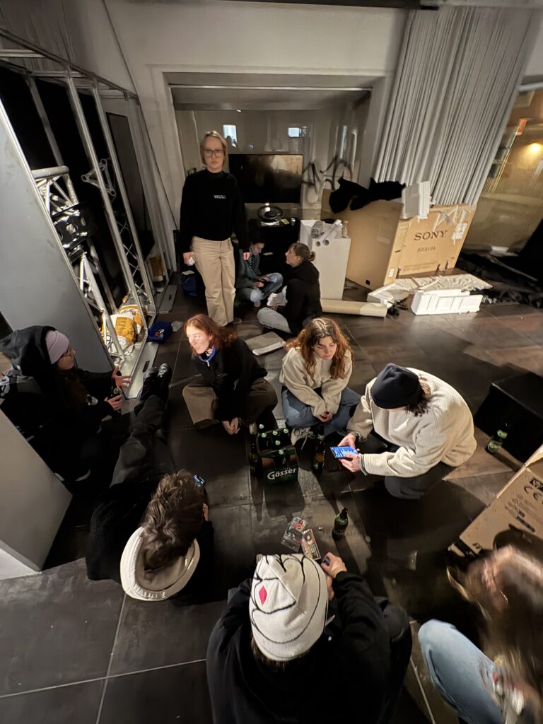
I was part of the speaker team, so in addition to planning and implementing my own projects that were exhibited as well as the Portfolio Machine, we also had to coordinate the entire exhibition itself and keep track of the organization. That was often not easy and involved a lot of stress and long nights. But I think the effort and stress paid off, because it was a successful exhibition with a lot of positive feedback. I learned so much about teamwork, project management and exhibition design, and I am sure this will help me in my future career. During this whole process I also realized that organizing exhibitions is something I really enjoy. However, most importunately this whole exhibition and its process gave me some new impulses and directions for what I want to do in my master’s thesis.

I was part of three projects that were exhibited: The Poisonous Twin (game), BÖRG (interactive projection mapping) and the Portfolio Machine. Looking back at these projects, I realized all of them had a strong haptic interface and where not just another only screen-based experience. And I think this is the main reason why I enjoyed working on them so much. I’m a crafty person and I like to work with my hands and that is exactly what we did in all of these three projects: from cutting, painting, building a mountain out of Styrofoam and then cover it with papier-mâché, building little mushrooms out of fimo, soldering, printing cd covers to 3D-printing our cd player for the Portfolio Machine. The combination of working analog and digital is what I enjoy the most, especially in a time where we are staring at our screens too much anyways. And I think not every idea needs to live exclusively on one.

My initial idea for my master’s thesis was to create a digital webspace/creative playground for low-pressure and non-goal-oriented creativity. However, after experiencing my projects in a physical exhibition, I realized that creating just another webspace/digital environment might not be exactly what I want to do. Or at least it should not be the only part of my workpiece. I am interested in finding a way to combine digital and analog elements for my project, because I think it is quite nice to hold something physical in your hands after working on a project for such long time.

Even though this might take me back few steps in my thesis process, it is important to me to rethink my workpiece and approach. Right now, I feel kind of unhappy and unsure about my idea and project. And I guess already starting with this feeling might not be the best starting point for my master’s thesis. My next step is a step back; to brainstorm again about the direction of my thesis. I think it is necessary now because I want to be excited and confident about my master’s thesis.

AI was used to check spelling and grammar.

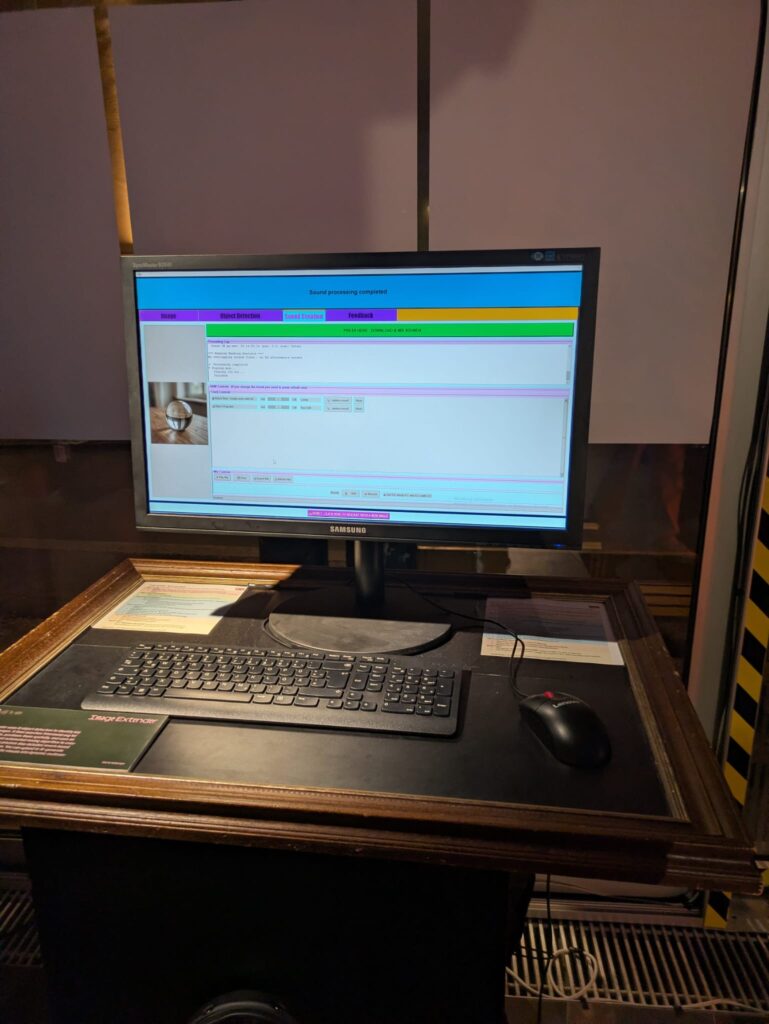
Product XI: Image Extender

From Notebook Prototype to Local, Exhibitable Software

This iteration was less about adding new conceptual capabilities and more about solidifying the system as an actual, deployable artifact. The core task was migrating the image extender from its experimental form into a standalone local application. What sounds like a technical refactor turned out to be a decisive shift in how the system is meant to exist, be used, and be encountered.

Until now, the notebook environment functioned as a kind of protected laboratory. It encouraged rapid iteration, verbose configuration, and exploratory branching. Moving out of that space meant confronting a different question: what does this system look like when it stops being a research sketch and starts behaving like software?

The transition from Colab-style execution to a locally running script forced a re-evaluation of assumptions that notebooks quietly hide:

  • Implicit state becomes explicit
  • Execution order must be deterministic
  • Errors can no longer be “scrolled past”
  • Configuration must be intentional, not convenient

Porting the logic meant flattening the notebook’s narrative structure into a single, readable execution flow. Cells that once assumed context had to be restructured into functions, initialization stages, and clearly defined entry points. This wasn’t just cleanup, it was an architectural clarification.

In the notebook, ambiguity is tolerated. In running software, it accumulates as friction.

Reduction as Design: Cutting Options to Increase Clarity

One of the more deliberate changes during this phase was a reduction in exposed settings. The notebook version allowed extensive tweaking, model switches, resolution variants, prompt behaviors, fallback paths, all useful during development, but overwhelming in a public-facing context.

For the exhibition version, optionality became noise.

Instead of presenting the system as a configurable toolkit, I reframed it as a guided instrument. Core behaviors remain intact, but the number of visible parameters was intentionally constrained. This aligns with a recurring principle in the project: flexibility should live inside the system, not on its surface.

Adapting for Exhibition: Y2K as Interface Language

Alongside the structural changes, the interface was visually adapted to match the exhibition context. The decision to lean into a Y2K-inspired color palette wasn’t purely aesthetic; it functioned as a form of contextual grounding.

The visual layer needed to communicate that this is not a neutral utility, but a situated artifact. The Y2K styling introduced:

  • High-contrast synthetic colors
  • Clear visual hierarchy
  • A subtle nod to early digital optimism and machinic playfulness

Rather than competing with the system’s conceptual weight, the styling makes its artificiality explicit.

Stability Over Novelty

Another quiet but important shift was prioritizing stability over feature expansion. The migration process exposed several edge cases that were easy to ignore in a notebook but unacceptable in a live context: silent failures, unclear loading states, brittle dependencies.

Addressing these didn’t add visible functionality, but they fundamentally changed how trustworthy the system feels. In an exhibition setting, reliability is part of the experience. A system that hesitates or crashes invites interpretation for the wrong reasons.

Here, robustness became a form of authorship.

Reframing the System’s Status

By the end of this iteration, the most significant change wasn’t technical, it was ontological. The system is no longer best described as “a notebook that does something interesting.” It is now a runnable, bounded piece of software, designed to be encountered without explanation.

This transition marks a subtle but important moment in the project’s lifecycle:

  • From private exploration to public behavior
  • From configurable experiment to opinionated instrument
  • From development environment to exhibited system

The constraints introduced in this phase don’t limit future growth, they define a stable core from which growth can happen meaningfully.

If earlier updates were about expanding the system’s conceptual reach, this one was about giving it a body.

IMPLUS 8 – From Concept to Construction

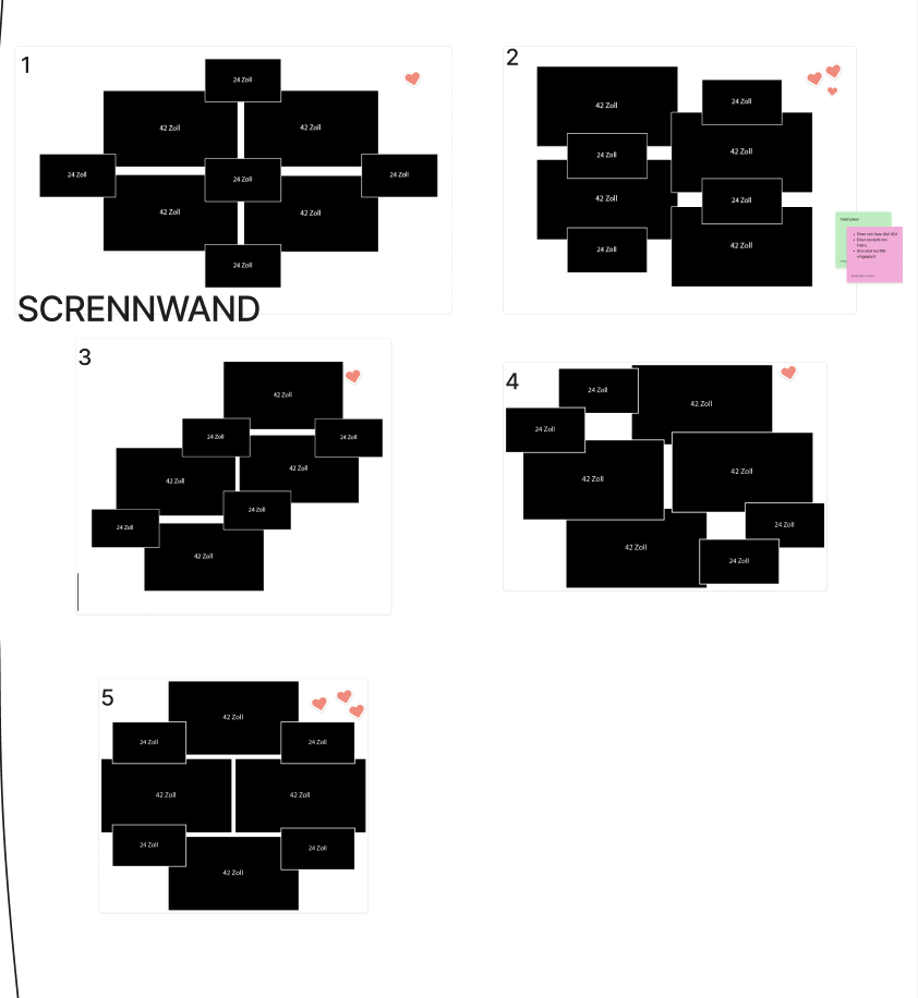
One of the most challenging parts of the Media Design contribution was the planning and realisation of the screen wall. From my perspective, this was also the most demanding task. It wasn’t just about how the screens should be arranged visually, but mainly about how they could be mounted and secured properly. The original plan was to build a screen wall consisting of four 43-inch screens and four 24-inch screens, ideally mounted on a wall. Alongside this, we also had to be very aware of what kind of equipment we needed and make sure to request everything on time from the media center. This required a lot of coordination and forward planning which was sometimes a bit of a struggle for me. Another difficulty was keeping everyone motivated to actively participate in the exhibition. For some people, the importance of the exhibition only really became clear in the final days before the opening, which added extra pressure towards the end.

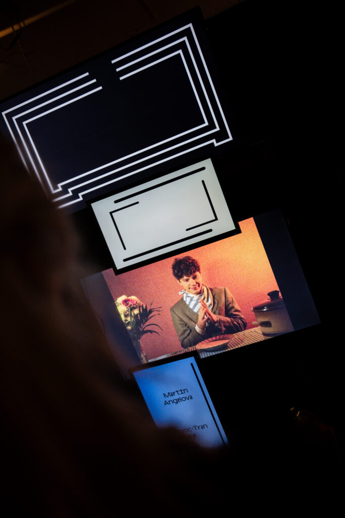
Together with Valerie, I worked closely on the concept of the screen wall. Valerie also had to focuse on the construction and how the screens could physically hold together, while we jointly developed the visual concept. We decided on a very minimal and reduced style: mostly black and white visuals, clean lines, and slow, monotone movements. Since the screen wall showed individual projects, it was important to us that each project was clearly recognizable and properly credited. This also meant adapting animations and adjusting their lengths so they worked well together. At the beginning, it was difficult to find a smooth workflow. Everything still felt abstract, and even the construction of the screen wall was not fully defined yet, after several discussions and changes, we eventually had to scale down the original idea. In the end, the screen wall consisted of eight screens mounted on a truss, which simplified both the technical setup and the animation work at least a bit more. Even so, the animation process took longer than expected, new ideas, technical hurdles, and last-minute changes kept coming up. Surprisingly, one of the hardest parts was actually finding the right screens, as many were already booked through the media center, but to be fair there were 3 different exhbitions happening in the same week. 

Looking back, one important realization was about workflow efficiency. At first, Valerie and I worked on the same screens together, making all decisions jointly. While this ensured consistency, it was also very slow. Once time pressure increased, we split the animations between us and worked independently. This turned out to be much faster and still worked very well visually.

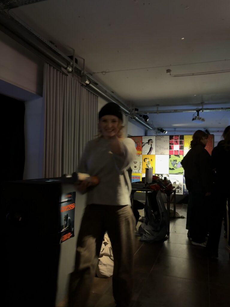
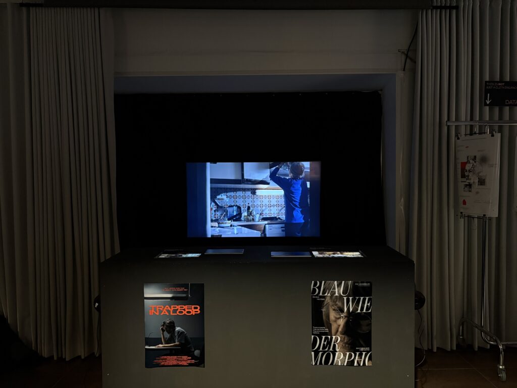
The final setup of the exhibition was successful overall. Of course, some things had to be adjusted on site, and a few minor issues appeared over the following days. Some projects required more active attention to maintain their intended interaction. Still, the overall planning helped a lot and made the setup process smoother and more efficient.The cinema area was another highlight. With the self-built benches, visitors could sit down, watch the short films, and at the same time see behind-the-scenes material. The screen wall also worked well overall, even if there were small delays or mistakes that probably only Valerie and I noticed (lets hope). In the end, this project taught me how time-consuming exhibition planning really is and how much attention to detail is needed to make something feel professional. I am very grateful that I was able to take on a management role together with Magda and contribute to the exhibition in this way. For future exhibitions, I will definitely take away the importance of even earlier planning and requesting equipment as soon as possible.

1.8. Types of Museums and Their Exhibitions

Museums come in a variety of types, each catering to unique audiences and subject matter. These differences are reflected in their exhibitions, which are carefully curated to align with their missions and appeal to their visitors.

An Overview of the Types

Science museums feature interactive exhibits to simplify complex scientific concepts through hands-on experiments and immersive simulations. Notable examples include the Exploratorium in San Francisco and the Deutsches Museum in Munich, which features an extensive range of scientific and technological innovations. These museums exemplify the mission to engage and educate through active participation.

image source: Deutsches Museum – Chemistry in everyday life

Art museums focus on visual and emotional impact, curating collections that foster deep connections through paintings, sculptures, and multimedia installations. Notable institutions like the Louvre in Paris and the Museum of Modern Art (MoMA) in New York, showcasing contemporary masterpieces, highlight how art museums create profound connections through their curated selections.

image source: Louvre

History museums use artifacts, dioramas, and multimedia to narrate historical events, making the past resonate with visitors. These techniques ensure that history resonates with diverse audiences. The Smithsonian National Museum of American History in Washington, D.C., and the British Museum in London, which showcases global historical artifacts, are prominent examples of this approach [1].

image source: British Museum

Natural history museums showcase life-size reconstructions and fossils, immersing visitors in Earth’s evolutionary history. Renowned institutions like the Natural History Museum in Vienna. These types of exhibitions highlight the rich diversity of the natural world and its evolutionary history.

image source: Natural History Museum in Vienna

Children’s museums promote learning through playful, sensory exhibits that stimulate creativity and critical thinking. Examples include the Children’s Museum of Indianapolis and KidZania, a global chain offering interactive role-play experiences. These museums create spaces where learning is synonymous with play.

Cultural heritage museums preserve traditions and identities by highlighting artifacts, photographs, and oral histories. For instance, the National Museum of the American Indian in Washington, D.C. and the Museum of New Zealand Te Papa Tongarewa reflect how museums can serve as guardians of heritage and culture.

Crafting the Content: How Exhibitions Are Designed

Exhibition design is a cornerstone of the museum experience, acting as the primary link between institutions and their audiences. Exhibitions are more than just displays; they are carefully crafted to inspire, inform, and entertain while encouraging engagement, spreading knowledge, and influencing perspectives. To achieve this, museums must thoughtfully adapt their design approaches to meet specific goals, balancing educational value with visitor engagement. Whether focused on objects or overarching concepts, well-designed exhibitions have the power to deepen understanding, foster appreciation, and create meaningful connections with audiences. [3][4] 

People Involved in Exhibition Development

Exhibition development is a collaborative process involving various professionals, tailored to each museum’s focus:

  • Science Museums: Scientists, educators, and designers work together to create hands-on experiments that simplify complex concepts.
  • Art Museums: Curators, designers, and artists collaborate to design immersive exhibits with emotional and intellectual appeal.
  • History Museums: Researchers and curators select artifacts and build cohesive narratives to engage visitors with history.
  • Natural History Museums: Experts create lifelike models and interactive displays based on fieldwork to showcase nature.
  • Children’s Museums: Child development specialists and designers create tactile, playful exhibits for young visitors.
  • Cultural Heritage Museums: Collaborating with communities, they ensure authentic representations of cultural traditions.

Across all types, feedback and revisions are key to balancing educational and visitor engagement goals.

Conclusion
By tailoring their exhibitions to their audiences and content, museums ensure that their spaces are not only informative but also memorable and meaningful. Their variety demonstrates the importance of curatorial intent in shaping visitor experiences.

References:
[1] “Museum Types and Categories,” WhichMuseum, Accessed: Jan. 2025. [Online]. Available: https://whichmuseum.com/our-category-system

[2] “What Are the Different Types of Art Exhibitions?,” Contemporary Art Issue, Accessed: Jan. 2025. [Online]. Available: https://www.contemporaryartissue.com/what-are-the-different-types-of-art-exhibitions/

[3] Kamaruddin, N., “An Empirical Understanding on Types of Museum Exhibition Design,” International Journal of Scientific and Research Publications, Oct. 2019. Available: https://www.ijsrp.org/research-paper-1019/ijsrp-p9567.pdf

[4] Kapukotuwa, A., & Anedo, O. A. A., “Museum Exhibition Techniques,” ResearchGate, July 2020.