Experiment VIII: Embodied Resonance – ecg_to_cc.py

After converting heart-rate data into drums and HRV energy into melodic tracks, I needed a tiny helper that outputs nothing but automation. The idea was to pull every physiologic stream—HR, SDNN, RMSSD, VLF, LF, HF plus the LF / HF ratio—and stamp each one into its own MIDI track as CC-1 so that in the DAW every signal can be mapped to a knob, filter or layer-blend. The script must first look at all CSV files in a session, find the global minimum and maximum for every column, and apply those bounds consistently. Timing stays on the same 75 BPM / 0.1 s grid we used for the drums and notes, making one CSV row equal one 1⁄32-note. With that in mind, the core design is just constants, a value-to-CC rescaler, a loop that writes control changes, and a batch driver that walks the folder.

If you want to see the full, visit: https://github.com/ninaeba/EmbodiedResonance

# ─── Default Configuration ───────────────────────────────────────────
DEF_BPM       = 75             # Default tempo
CSV_GRID      = 0.1            # Time between CSV samples (s) ≙ 1/32-note @75 BPM
SIGNATURE     = "8/8"          # Eight-cell bar; enough for pure CC data
CC_NUMBER     = 1              # We store everything on Mod Wheel
CC_TRACKS     = ["HR", "SDNN", "RMSSD", "VLF", "LF", "HF", "LF_HF"]
BEAT_PER_GRID = 1 / 32         # Grid resolution in beats

The first helper, map_to_cc, squeezes any value into the 0-127 range. It is the only place where scaling happens, so if you ever need logarithmic behaviour you change one line here and every track follows.

def map_to_cc(val: float, vmin: float, vmax: float) -> int:
norm = np.clip((val - vmin) / (vmax - vmin), 0, 1)
return int(round(norm * 127))

generate_cc_tracks loads a single CSV, back-fills gaps, creates one PrettyMIDI container and pins the bar length with a time-signature event. Then it iterates over CC_TRACKS; if the column exists it opens a fresh instrument named after the signal and sprinkles CC messages along the grid. Beat-to-second conversion is the same one-liner used elsewhere in the project.

for name in CC_TRACKS:
if name not in df.columns:
continue
vals = df[name].to_numpy()
vmin, vmax = minmax[name]
inst = pm.Instrument(program=0, is_drum=False, name=f"{name}_CC1")

for i in range(len(vals) - 1):
    beat = i * BEAT_PER_GRID * 4          # 1/32-note → quarter-note space
    t    = beat * 60.0 / bpm
    cc_val = map_to_cc(vals[i], vmin, vmax)
    inst.control_changes.append(
        pm.ControlChange(number=CC_NUMBER, value=cc_val, time=t)
    )

midi.instruments.append(inst)

The wrapper main is pure housekeeping: parse CLI flags, list every *.csv, compute global min-max per signal, and then hand each file to generate_cc_tracks. Consistent scaling is guaranteed because min-max is frozen before any writing starts.

minmax: dict[str, tuple[float, float]] = {}
for name in CC_TRACKS:
vals = []
for f in csv_files:
df = pd.read_csv(f, usecols=lambda c: c.upper() == name)
if name in df.columns:
vals.append(df[name].to_numpy())
if vals:
all_vals = np.concatenate(vals)
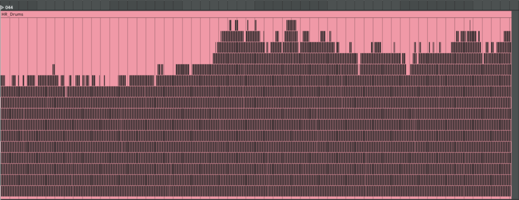
minmax[name] = (np.nanmin(all_vals), np.nanmax(all_vals))

Each CSV turns into *_cc_tracks.mid containing seven tracks—HR, SDNN, RMSSD, VLF, LF, HF, LF_HF—each packed with CC-1 data at 1⁄32-note resolution. Drop the file into Ableton, assign a synth or effect per track, map the Mod Wheel to whatever parameter makes sense, and the physiology animates the mix in real time.

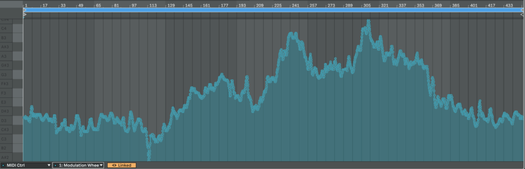
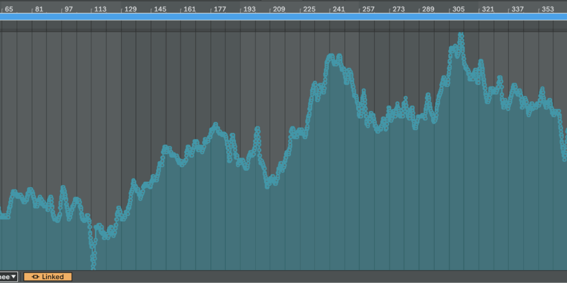
As a result, we get CC automation that we can easily map to something else or just copy automation somewhere else:

Here is an example of HR from patient 115 mapped from 0 to 127 in CC:

Experiment VII: Embodied Resonance – ecg_to_notes.py

The next step after the drum generator is a harmonic layer built from frequency-domain HRV metrics.
The script should do exactly what the drum code did for HR: scan all source files, find the global minima and maxima of every band, then map those values to pitches. Very-low-frequency (VLF) energy lives in the first octave, low-frequency (LF) in the second, high-frequency (HF) in the third. Each band is written to its own MIDI track so a different instrument can be assigned later, and every track also carries two automation curves: one CC lane for the band’s amplitude and one for the LF ⁄ HF ratio. In the synth that ratio will cross-fade between a sine and a saw: a large LF ⁄ HF—often a stress marker—makes the tone brighter and scratchier.

Instead of all twelve semitones, the script confines itself to the seven notes of C major or C minor. The mode flips in real time: if LF ⁄ HF drops below two the scale is major, above two it turns minor. Timing is flexible: each band can have its own step length and note duration so VLF moves more slowly than HF.

Below is a concise walk-through of ecg_to_notes.py. Key fragments of the code are shown inline for clarity. If you want to see the full, visit: https://github.com/ninaeba/EmbodiedResonance

# ----- core tempo & bar settings -----
DEF_BPM   = 75      # fixed song tempo
CSV_GRID  = 0.1     # raw data step in seconds
SIGNATURE = "8/8"   # eight cells per bar (fits VLF rhythms)

The script assigns a dedicated time grid, rhythmic value, and starting octave to each band.
Those values are grouped in three parallel constants so you can retune the behaviour by editing one block.

# ----- per-band timing & pitch roots -----
VLF_CELL_SEC = 0.8; VLF_STEP_BEAT = 1/4 ; VLF_NOTE_LEN = 1/4 ; VLF_ROOT = 36  # C2
LF_CELL_SEC  = 0.4; LF_STEP_BEAT  = 1/8 ; LF_NOTE_LEN  = 1/8 ; LF_ROOT  = 48  # C3
HF_CELL_SEC  = 0.2; HF_STEP_BEAT  = 1/16; HF_NOTE_LEN  = 1/16; HF_ROOT  = 60  # C4

Major and minor material is pre-baked as two simple interval lists. A helper translates any normalised value into a scale degree, then into an absolute MIDI pitch; another helper turns the same value into a velocity between 80 and 120 so you can hear amplitude without a compressor.

MAJOR_SCALE = [0, 2, 4, 5, 7, 9, 11]
MINOR_SCALE = [0, 2, 3, 5, 7, 10, 11]

def normalize_note(val, vmin, vmax, scale, root):
    norm  = np.clip((val - vmin) / (vmax - vmin), 0, 0.999)
    step  = scale[int(norm * len(scale))]
    return root + step

def map_velocity(val, vmin, vmax):
    norm = np.clip((val - vmin) / (vmax - vmin), 0, 1)
    return int(round(80 + norm * 40))

signals_to_midi opens one CSV, grabs the four relevant columns, and sets up three PrettyMIDI instruments—one per band. Inside a single loop the three arrays are processed identically, differing only in timing and octave. At each step the script decides whether we are in C major or C minor, converts the current value to a note and velocity, and appends the note to the respective instrument.

for name, vals, cell_sec, step_beat, note_len, root, vmin, vmax, inst in [
    ("VLF", vlf_vals, VLF_CELL_SEC, VLF_STEP_BEAT, VLF_NOTE_LEN, VLF_ROOT, vlf_min, vlf_max, inst_vlf),
    ("LF",  lf_vals,  LF_CELL_SEC,  LF_STEP_BEAT,  LF_NOTE_LEN,  LF_ROOT,  lf_min,  lf_max,  inst_lf),
    ("HF",  hf_vals,  HF_CELL_SEC,  HF_STEP_BEAT,  HF_NOTE_LEN,  HF_ROOT,  hf_min,  hf_max,  inst_hf)
]:
    for i, idx in enumerate(range(0, len(vals), int(cell_sec / CSV_GRID))):
        t        = idx * CSV_GRID
        scale    = MINOR_SCALE if lf_hf_vals[idx] > 2 else MAJOR_SCALE
        pitch    = normalize_note(vals[idx], vmin, vmax, scale, root)
        velocity = map_velocity   (vals[idx], vmin, vmax)
        duration = note_len * 60 / DEF_BPM
        inst.notes.append(pm.Note(velocity, pitch, t, t + duration))

Every note time-stamp is paired with two controller messages: the first transmits the band amplitude, the second the LF / HF stress proxy. Both are normalised to the full 0-127 range so they can drive filters, wavetable morphs, or anything else in the synth.

inst.control_changes.append(pm.ControlChange(CC_SIGNAL, int(round(norm_val  * 127)), t))
inst.control_changes.append(pm.ControlChange(CC_RATIO,  int(round(norm_lf_hf * 127)), t))

The main wrapper gathers all CSVs in the chosen folder, computes global min–max values so every file shares the same mapping, and calls signals_to_midi on each source. Output files are named *_signals_notes.mid, each holding three melodic tracks plus two CC lanes per track. Together with the drum generator this completes the biometric groove: pulse drives rhythm, spectral power drives harmony, and continuous controllers keep the sound evolving.

Here is what we get if we make one mappinf for all patients

An here is example of MIDI files we get if we make individual mapping for each patient separetly


Experiment VI: Embodied Resonance – ecg_to_drum.py

To generate heart-rate–driven drums I set out to write a script that builds a drum pattern whose density depends on HR intensity. I fixed the tempo at 75 BPM because the math is convenient: 0.1 s of data ≈ one 1/32-note at 75 BPM. I pictured a bar with 16 cells and designed a map that decides which cell gets filled next; the higher the HR, the more cells are activated. Before rendering, a helper scans the global HR minimum and maximum and slices that span into 16 equal zones (an 8-zone fallback is available) so the percussion always scales correctly. For extra flexibility, the script also writes SDNN and RMSSD into the MIDI file as two separate CC automation lanes. In Ableton, I can map those controllers to any parameter, making it easy to experiment with the track’s sonic texture.

Let’s take a closer look at the code. If you want to see the full, visit: https://github.com/ninaeba/EmbodiedResonance

This script converts raw heart-rate data into a drum track.
Every 0.1-second CSV sample lines up with a 1⁄32-note at the fixed tempo of 75 BPM, so medical time falls neatly onto a musical grid. The pulse controls how many cells inside each 16-step bar are filled, while SDNN and RMSSD are embedded as two CC lanes for later sound-design tricks.

Default configuration (all constants live in one block)
 STEP_BEAT = 1 / 32  # grid resolution in beats
 NOTE_LENGTH = 1 / 32  # each hit lasts a 32nd-note
 DEF_BPM = 75    # master tempo
 CSV_GRID = 0.1   # CSV step in seconds
 SEC_PER_CELL = 0.1   # duration of one pattern cell
 SIGNATURE = "16/16" # one bar = 16 cells
 CC_SDNN = 11    # long-term HRV
 CC_RMSSD = 1    # short-term HRV

The spatial order of hits is defined by a map that spreads layers across the bar, so extra drums feel balanced instead of bunching at the start

 CELL_MAP = [0, 8, 4, 12, 2, 10, 6, 14, 1, 9, 5, 13, 3, 11, 7, 15]

generate_rules slices the global HR span into sixteen equal zones and binds each zone to one cell-and-note pair; the last rule catches any pulse above the top threshold

 def generate_rules(hr_min, hr_max, cells):
  thresholds = np.linspace(hr_min, hr_max, cells + 1)[1:]
  rules = [(thr, CELL_MAP[i], 36 + i) for i, thr in enumerate(thresholds)]
  rules[-1] = (np.inf, rules[-1][1], rules[-1][2])
  return rules

Inside csv_to_midi the script first writes two continuous-controller streams—one for SDNN, one for RMSSD—normalised to 0-127 at every grid tick

 sdnn_norm = clip((sdnn − min) / (range), 0, 1)
 rmssd_norm = clip((rmssd − min) / (range), 0, 1)
 add CC 11 with value round(sdnn_norm × 127) at time t
 add CC 1 with value round(rmssd_norm × 127) at time t

A cumulative-pattern list is built so rhythmic density rises without ever muting earlier layers

 CUM_PATTERNS = []
 acc = []
 for (thr, cell, note) in rules:
  acc.append((cell, note)) # keep previous hits
  CUM_PATTERNS.append(list(acc)) # zone n holds n+1 hits

During rendering each bar/cell slot is visited, the current HR is interpolated onto that exact moment, its zone is looked up, velocity is set to the rounded pulse value, and only the cells active in that zone fire

 hr = interp(t_sample, times, hr_vals)
 zone = first i where hr ≤ rules[i].threshold
 vel = int(round(hr))

 for (z_cell, note) in CUM_PATTERNS[zone]:
  if z_cell ≠ cell: continue
  beat = (bar × cells + cell) × STEP_BEAT × 4
  t0 = beat × 60 / bpm
  write Note(pitch=note, velocity=vel, start=t0, end=t0 + NOTE_LENGTH in seconds)


Before any writing starts the entry-point scans the whole folder to gather global minima and maxima for HR, SDNN and RMSSD, guaranteeing identical zone limits and CC scaling across every file in the batch

 hr_min, hr_max = min/max of all HR values
 sdnn_min, sdnn_max = min/max of all SDNN values
 rmssd_min, rmssd_max = min/max of all RMSSD values
 rules = generate_rules(hr_min, hr_max, cells)

Run the converter like this:

 python ecg_to_drum.py path/to/csv_folder --tempo 75 --time-signature 16/16

Each CSV becomes a _drums.mid file that contains a single drum-kit track whose note density follows heart-rate zones and whose CC 11 and CC 1 envelopes mirror long- and short-term variability—ready to animate filters, reverbs or whatever you map them to in the DAW.

Here are examples of generated MIDI files with drums. On the left side, there are drums made with individual mapping for every patient separately, and on the right side, mapping is one for all patients. We can see they resemble our HR graphs.

Blog Post 6: Sketching an Inclusive EV Charger

Over the past week I dove into sketching my very first EV charging station interface, on paper, low-fi style. My goal? A clean, intuitive flow that anyone, whether standing or in a wheelchair, can use without a hitch.

1. First Sketches: Facing the Screen

I started by thinking about how the display sits in real life. Based on some research I’d gathered (https://www.sciencedirect.com/science/article/abs/pii/S0169814197000875), I initially tilted the screen at about 45° for comfortable reach and visibility. Drawing a single-column station with that slanted display felt natural…until I grabbed a ruler and realized wheelchair users would struggle to see or reach it. Back to the sketchbook.

2. Measuring for Everyone

Next, I looked up anthropometric data: average standing height (around 1.63 m for women) and wheelchair eye level (about 1.30 m). That research told me the top of the screen should sit at roughly 1.60 m, with the row of buttons falling around 1.20 m. Everyone’s arm and line-of-sight reach now fall squarely within easy range.

3. Second Sketches: Flat & Accessible

Armed with those new dimensions, I redrew the station. This time the screen is perfectly vertical, no tilt, so a seated user can see the full interface. On each side: charging cables loop neatly above the column. From past frustration I know that having the cable hang above the car inlet gives you full freedom of movement, if it came from below, you’d scrape against bumpers or crouch awkwardly. The cable’s plug snaps in and out with minimal force and a clear click, avoiding any wrestling match.

4. Interaction Storyboard

  1. Welcome Screen (140 cm high): A crisp display text and 4 sturdy physical buttons. Underneath, the payment pad glows green when it’s your turn to tap.
  2. Scan Step: Three payment methods—bank card tap, RFID charge card, or QR code scan. A left-arrow “Back” button stays red until you choose.
  3. Plug Step: You pull the cable from its cradle, align it to your car’s port, and push in. A simple animated diagram on screen guides you.
  4. Confirmation Lights: With each successful step—scan, plug, start—an LED ring pulses green. If something’s off, it flashes yellow for “check connection.”
  5. Charging Dashboard: Once juice is flowing, you see real-time kWh delivered, state-of-charge %, and an estimated “Time Remaining.” A big “End Session” button waits for you.


5. Beyond the Screen: Real-World Accessibility

A few extra thoughts, courtesy of accessibility best practices:

  • Pathway Design: The route from parking spot to station needs a gentle ramp or smooth, level surface (no hidden curbs)
  • Color & Contrast: Color-blind or low-vision users need high-contrast icons and optional haptic or audio cues. Long-press “Touch to Speech” could read aloud on-screen labels.
  • Height Considerations: Remember: 130 cm eye height for wheelchair users vs. 163 cm average standing height. Buttons and screens must accommodate both.
  • Future-Proofing: As self-driving cars roll in, drivers that are visually impaired should also be able to interact with the Charging Station

What’s next? I will turn my sketches from the last post into more mid-to-heigh-fidelity wireframes, then run two rounds of user tests. I’ll watch them scan, tap, and plug in. Their real-time reactions will guide the next iteration: adjusting button sizes, tweaking the cable loop, or even adding voice prompts.

Every scribble, every measurement, and every user test brings me closer to a charging experience that’s not just functional, but truly inclusive, so that plugging in your EV feels as natural as unlocking your phone. Stay tuned for my prototype reveal in the video and my reflection and learnings of this project.

Can Vibecoding Bring Web Art Back?

Years ago, websites were creative, strange, and full of personality. People built them with love, using simple tools and wild ideas. But over time, the internet became more professional. Web design followed rules, templates, and business goals. Today, many websites look clean — but also the same.

Now, some developers and artists are talking about vibecoding as a way to bring that creativity back.

But what is vibecoding, and is it really a good thing?

What Is Vibecoding?

Vibecoding means creating based on feeling — not rules, not performance goals, not best practices. You go with your instinct and design something that just feels right. It’s fast, personal, emotional, and often a bit messy.

Some people see this as the return of digital creativity. Others see it as the start of bad habits.

Let’s take a look at both sides.

The Pros: Vibecoding and the Return of Web Art

1. It brings freedom

You don’t have to follow every rule or design system. You can experiment and build something that’s totally your own. That opens the door for more creative, original websites.

2. It helps you build faster

Without spending hours on perfect structure or documentation, you can get your ideas online quickly — like sketching with code.

3. It supports digital art

Not every website needs to be practical or profitable. Some can simply express a feeling or mood. Vibecoding encourages this kind of artistic web expression.

4. It feels more human

When you stop worrying about pixel-perfection or clean CSS, your work might feel more personal. Imperfection can be charming.

The Cons: Where Vibecoding Can Go Wrong

1. Performance problems

Vibecoded websites can be slow, unoptimized, or hard to use on mobile. That creates a bad experience for users — especially those with poor internet or old devices.

2. Poor accessibility

Without thinking about screen readers, color contrast, or keyboard use, your site might not work for people with disabilities.

3. Hard to maintain

When you build something quickly, the code might be difficult to read or fix later. What feels fun today might turn into a headache tomorrow.

4. Encourages bad habits

Some developers use vibecoding as an excuse to skip learning good practices. That can lead to careless or even broken websites — especially if they grow in size or audience.

So… Is Vibecoding the Future or a Step Back?

Vibecoding is not perfect — but it’s also not useless. It can be a powerful tool when used in the right context:

  • Great for: personal websites, creative portfolios, digital art, quick ideas
  • Risky for: business websites, public apps, team projects, anything that grows

Maybe the best approach is a balance. Let vibecoding guide the emotion and mood, but also care about the structure, performance, and accessibility. You can be both an artist and a professional.

Final Thought

The web doesn’t have to be boring or broken. Vibecoding reminds us that it’s okay to feel, play, and create — not just optimize. But true creative power comes when we blend freedom with responsibility.

#2.03 Theoretical Frameworks

In this blogpost I want to explore the ideas, theories and frameworks which shape the concept behind my prototype. I am diving into psychology behind focused work, the design of calm interfaces, and how we might nudge behavior without enforcing strict rules.

The Flow State – The foundation of deep creative work

One of the central concepts driving this project is Flow, a term coined by psychologist Mihaly Csikszentmihalyi, who describes it as “a state in which people are so involved in an activity that nothing else seems to matter” [1] It’s the sweet spot where challenge meets skill, and our attention becomes fully aligned with the task at hand.

Csikszentmihalyi outlines eight components that typically make up these experiences:

  1. The task is something we believe we can complete
  2. We can fully concentrate on the task
  3. The task has a clear goal
  4. It provides immediate feedback
  5. There is a deep, but effortless involvement that blocks everyday worries and frustrations
  6. We feel in control of our actions
  7. Self-consciousness disappears, but paradoxically we feel more ourselves afterward
  8. Our sense of time shifts: hours feel like minutes and the other way round [2]

The interplay of these elements creates a type of enjoyment so fulfilling that people are willing to invest significant effort just to experience it. [2] However, the modern digital environment, especially smartphones, disrupt the conditions needed for flow. Every notification, every swipe, every quick scroll breaks our attention and concentration and makes it harder to return to a state of deep immersion. In his book, Csikszentmihalyi writes: “[…] attention is our most important tool in the task of improving the quality of experience.” [3]

This project is about protecting that attention, not by eliminating distractions entirely (which isn’t realistic), but about creating the right conditions for focus and flow to happen more easily.

Calm Technology – Supporting, Not Distracting

Another concept that influences the project is Calm Technology, which was introduced by Mark Weiser and John Seely Brown (1995) in their paper “Designing Calm Technology”.

It is a design philosophy focused on integrating technology more seamlessly into daily life by using peripheral awareness rather than demanding our full attention all the time.

Today, most digital tools overwhelm us by constantly competing for our focus and attention, creating a sense of stress and distraction. Calm Technology on the other hand is about designing for both our center and periphery of attention, allowing us to shift our focus naturally when needed.

The periphery are things we are aware of without actively focusing on them. For example, when driving, we might not actively think about the engine sound, but we notice if it suddenly changes. Calm technology uses this same principle: subtle, non-intrusive cues that live in the background and only surface when needed. This allows us to stay aware without feeling overwhelmed.

Eventually, they argue that designing for calmness is essential in a world of constant digital noise and distraction. It’s not about removing information but about designing it to fit better with how people naturally divide their attention. [4]

Persuasive Design – Nudging, Not Controlling

My approach is informed by persuasive design, which incorporates principles from psychology, like motivations and cognitive biases, and turns them into practical strategies for designing products.

“Persuasive design can help:

  • Users in decision making
  • Designers communicate more clearly
  • Nudge users in the right direction
  • Help users to develop skills
  • Drive users end or begin new habits” [5]

A key framework here is BJ Fogg’s Behavior Model (FBM) that helps designers and researchers understand how to change human behavior through technology. He sees three factors that need to be there at the same time for the behavior to happen:

Motivation + Ability + Triggers = Behavior

Fogg points out that the goal of persuasive design is not to manipulate or shame users into behaving a certain way. Instead, it’s about gently guiding behavior, ideally in line with what the user already wants to do, like staying focused or being more intentional with their time. [6]

Literature

[1] Mihaly Csikszentmihalyi, Flow: The Psychology of Optimal Experience (Harpercollins, 1990), 4.

[2] Mihaly Csikszentmihalyi, Flow: The Psychology of Optimal Experience (Harpercollins, 1990), 49.

[3] Mihaly Csikszentmihalyi, Flow: The Psychology of Optimal Experience (Harpercollins, 1990), 33.

[4] Mark Weiser, John Seely Brown und Xerox PARC, „Designing Calm technology“, 21. Dezember 1995, https://people.csail.mit.edu/rudolph/Teaching/weiser.pdf.

[5] Eddie Kim, “Persuasive Design: Nudging Users in the Right Direction,” Medium, December 6, 2021, https://uxdesign.cc/persuasive-design-nudging-users-in-the-right-direction-5af4a6f8c06f.

[6] B. J. Fogg, “A Behavior Model for Persuasive Design,” in Proceedings of the 4th International Conference on Persuasive Technology, (April 2009): 1–7.

A Room with Nothing: My Boring Prototype

As you can read from my previous blogposts, I have been super into finding out and researching how boredom impacts creativity. There are plenty of studies suggesting that the mind, when left unstimulated, starts to wander, associate, and imagine which in turn spurs creative thinking. Naturally I wanted to test it myself.

Designing the Prototype: A minimalistic Approach

My setup was intentionally simple:

  • A section in a quiet neutral room
  • A lined block of paper and a pen
  • Windows to look out of
  • A 15 minute timer

I held this test with a single participant who was instructed to remain in the room for 15 minutes with no access to digital devices or other forms of stimulation. Though instructed to try not to plan out all the things they needed to do, there were no explicit tasks. Just to “be with yourself or the materials in front of you”. They could draw, write, look out of the window, or nothing at all. The idea was to simulate a situation of controlled boredom. Low stimulation, low task demand, but enough autonomy to allow for spontaneous engagement.

This prototype was based on boredom induction methods used in studies like those by Mann and Cadman (2014), who asked participants to complete monotonous tasks before measuring their creativity through established assessments like the Alternative Uses Task.

The Method

The prototype consisted of two sessions held three days apart.

Session 1: Intentional Boredom
The participant was placed alone in a quiet, naturally lit room. No phone. No music. They were given no tasks except to be alone with their thoughts for 15 minutes.
Immediately afterwards they were given an Alternative Uses Task, a common test of divergent thinking that asks participants to name as many unconventional uses as possible for a common object. In this session the object was a brick.

Session 2: Digital Stimulation
Three days later the same participant was asked to play Block Blast, a mobile puzzle game, for 5 minutes. Right after this short period of digital stimulation, they again completed an Alternative Uses Task. This time the object was a plank of wood.

Each set of answers was then evaluated with the help of ChatGPT, which provided a standardized scoring of each AUT across four dimensions:

  • Fluency (number of ideas)
  • Flexibility (range of categories)
  • Originality (unusualness)
  • Elaboration (level of detail)

Results after 15 minutes of boredom

When asked to list alternative use cases for a brick the following responses were recorded:

  • Wall
  • Pavement
  • Stairs
  • Many different kinds of walls
  • Towering walls, scary and cartoony ones
  • Walls in a house, in an industrial one but also in an aesthetic farm house
  • Brick Bricks Bricks the song from Phineas and Ferb
  • A super red cartoon brick
  • You can hit someone
  • Break through a window with a note on it
  • Lay patterns
  • I wanna build my house with bricks partly
  • The saying “to be stupid as a brick”
  • I feel like a brick

Fluency (good overall)
14 answers in total. Even though some ideas revolve around similar themes (e.g. walls) we treat them as separate if they introduce different contexts, emotional tones, or conceptual shifts.

Flexibility (moderate)
The answers can be sorted into 4 distinct categories:

  • Structural Uses (Walls, Pavement, Lay patterns, Building a House)
  • Aesthetic/Cartoon Imagery (Towering/cartoonish walls, super red brick, phineas and ferb reference)
  • Violence/Action (Hitting someone, breaking a window)
  • Linguistic Metaphorical (I feel like a brick, “stupid as a brick”)

Originality (high)
ChatGPT marks 5-7 medium-highly original responses:

  • Towering cartoon wall (Adds mood and genre which is unusual)
  • Walls in house/factory/farmhouse (Nuanced thinking across domains)
  • “Bricks bricks bricks” song (Cultural reference and playful)
  • Super red cartoon brick (Specific and stylized)
  • Breaking a window with a note attached (Narratively imaginative)
  • “Stupid as a brick” (Linguistic/metaphorical use – clever)
  • “I feel like a brick” (Reflective and metaphorical – unusual)

Elaboration (good)
Several responses go beyond one-word answers and include:

  • Emotional tone (towering walls = scary and cartoony)
  • Specific stylistic categories (“aesthetic farmhouse”, “cartoony”, “super-red”)
  • Personal reflection (“I feel like a brick”)

Results after 5 Minutes of Block Blast

Alternative Use Cases for a Plank of Wood as stated by the participant:

  • A jumping thing
  • Pirates when they send people to jump
  • Hit someone
  • Cut it and make thin planks
  • Make a wall
  • Put hot water to make it flat again when it’s bent
  • Scratch yourself
  • Put a nail in it
  • Drill holes and put shot glasses in there
  • Hang pictures on it
  • Put it on my table

Fluency (solid)
11 answers in total.

Flexibility (good)
6 distinct categories could be noticed:

  • Play/Physical Interaction (Jumping thing, Pirates plank)
  • Violence/Defense (Hit someone)
  • Construction/Modification (Make thin planks, Make a wall, Put a nail in it, Drill holes)
  • Restoration/Repair (Flatten it with hot water)
  • Body related Use (Scratch yourself)
  • Home Decoration (Hang a picture, Use as part of table, shot glass tray)

Originality (average)
ChatGPT marked 3 medium-highly original replies:

  • Pirate plank (Fun, narrative-based, less common)
  • Flatten bent plank w/ hot water (Repair idea – unusual and clever)
  • Shot glass tray (Very original, social and visual)

Elaboration
Several responses include implied or explicit detail:

  • Pirate Plank (evokes a full narrative scene)
  • Flattening a bent wood (shows process awareness)
  • Shot glass tray (strong visual and functional specificity)
  • Table extension & picture hanger (clear spatial ideas)

Conclusion

Comparing the two Alternative Uses Tests reveals a clear shift in the participants creative output depending on their activity before. After 15 minutes of quiet stillness their responses were more associative, playful, and metaphorical, hinting at a more open, explorative state of mind. After just 5 minutes of playing Block Blast, the ideas were quicker, more functional and anchored in conventional uses.

This contrast supports the claim that creativity is positively stimulated by spaciousness, not stimulation. Boredom, when given structure and permission, acts like a mental rest. It opens doors to thoughts we don’t usually have time to notice. Designing for creativity might mean not giving people more to do but more space to let the mind breathe. More silence. More pause.

QnA

After the first session, which was preceded by 15 minutes of rest, I asked the participant several questions to understand their mental state during the rest. The answers and reflections were strikingly calm and therapeutic.

  • How easy or difficult did it feel to come up with ideas
    “Pretty easy. The thing is I kind of wanted to do the task right, so if I was hesitating it was because of that. But it felt quite easy.”
  • Did your thoughts wander to a specific topic?
    “I was thinking about the future… imagining a farm and imagining life whether I have a corporate job or not. And then I had to push away thoughts of what I need to do right now. But that was kind of easy.”
  • Do you feel more or less creative now than before?
    “Difficult to say about creativeness. But I do feel more relaxed. Less stressed. I’m eager to begin one of my tasks.”
  • Any surprising or enlightening thoughts?
    “Not really… but I got a sense of calmness. I’ve been stressing a lot about leaving. I got a moment to exhale.”
  • Did you fell bored?
    “I tried to think if I was bored. But I felt comfortable. Maybe I wasn’t bored. I was very content.”

Why you should kill your darling!

When working on a concept, it’s easy to become emotionally attached to your idea. This attachment, often called cognitive fixation, can block creativity and reduce problem-solving. Stepping back allows us to assess our ideas objectively, helping us decide whether our “darling” truly serves the brand and audience or if we’re just pushing out our ego.

Taking a break or gaining distance from the work can lead to better judgment. People often think more clearly when they engage in slow, reflective thinking . Letting go isn’t failure, it’s strategy.

Since I am still writing the concept for my Carhartt spec, I literally reached this exact point. I stepped away for a second, picked the project up later, and decided to change the feel of the video. In one of our brainstorming sessions, we asked whether the current idea was the best way to portray the vibe I want to transmit and the short answer was no.

It took some time to be okay with that, but now I love the new idea even more. And here comes the ego problem again: who wants to admit that their concept didn’t really work? Especially for directors, that’s kind of our whole identity. But just because you come up with a better idea during the process doesn’t mean you failed, it’s just part of the process.

At our excursion to OFF, big agencies talked about how they completely went back to the drawing board even though some concepts were already fully developed. Of course, it’s also a question of budget, time, and trust whether clearing everything and starting from scratch is even possible.

But how can you actually kill your darling?
Two things really help me:

  1. Reviews with team members who are not emotionally invested in the concept. Objective perspectives highlight blind spots and help test whether the idea really works. Constructive criticism often leads to stronger concepts but it really has to be constructive.
  2. Time and space. As already mentioned leaving the idea alone for some time helps detach emotions from your work. When you revisit it with fresh eyes, what once seemed perfect might now feel stale or you might discover a new twist.

The Payoff: Stronger Concepts
Killing your darling doesn’t mean abandoning your vision, it means strengthening it. By being open to change, you make space for innovation and authenticity. Commercials live or die based on relevance, clarity, and emotion. Those are hard to achieve when we are too close to our own ideas.

In short, letting go of your first concept can lead you to the right concept. It’s not easy. It takes time to do it without funny feelings. But in a world where attention spans are short and expectations are high, only the best ideas survive. And often, those best ideas come after you kill your darling.

I killed mine and went some steps back, changed the vibe but not the idea and now it’s time to adapt the Treatment and get the rest of the work done!

15. Setting up the chatbot: Final tweaks

After trying several tools and platforms for building a WhatsApp-based booking assistant, I decided to go with n8n, a powerful automation platform that gave me more flexibility and control over the workflow.

I started by uploading a simple website template from Framer.com, which allowed me to embed the chatbot directly into a webpage. This gave me a smooth front-end experience where I can test the interaction with the assistant as if it were part of a real business website.

Then, I configured ChatGPT within n8n to act like a helpful assistant. I trained it to ask and collect key pieces of information needed for scheduling an appointment:

  • Preferred date and time
  • Full name
  • Email address
  • Final confirmation

For now, the assistant is connected to my personal Google Calendar, which I’ve labeled with a mock clinic name. Eventually, I plan to replace it with a real calendar once I find a doctor or clinic to partner with.

One important technical note: this chatbot setup also works perfectly with Google Calendar, so appointments are created automatically without the need for manual input.

At this stage, everything is functioning smoothly. The next step is finding professionals who could benefit from this tool.

Initially, I was planning to pitch the idea to doctors, but I’ve realized the potential goes far beyond the healthcare field. This kind of chatbot could be incredibly useful for any entrepreneur or small business owner who books appointments manually, like:

  • Lawyers
  • Therapists
  • Beauty salons
  • Coaches
  • Freelancers
  • Small companies offering services

To test the waters, I recently showed the prototype to a beauty practitioner, and she’s already interested in buying it. She told me she spends a lot of time answering basic questions from clients, things like availability and pricing, which the chatbot could easily handle. She loved the idea of freeing up that time to focus on her actual work.

I’m excited about this pivot. Over the summer, I plan to stick with this idea, improve the product, and start selling it to service providers who need smarter scheduling tools.

Let’s see where this journey leads next.

2.9 What really matters in event design

After experiencing three very different types of events — OFFF Barcelona, OMR Hamburg, and UEFA EURO 2024—I’ve come to realize that good event branding isn’t about how much you do, but what you do, and how consistently you do it.

In an earlier blog post, I outlined my expectations for what a well-branded event should include. That list covered the basics—things like:

  • Logo usage
  • Color palette
  • Typography
  • Icons or pictograms
  • Wayfinding and signage
  • Presence across media: online, print, merchandise, outdoor
  • Marketing campaign with public visibility

Those expectations were shaped by design theory — but only through actual observation and comparison did I begin to understand what’s really essential.

What matters most ?

Here’s a list of what I now believe are the non-negotiables for consistent, meaningful event branding:


1. Visibility in Public Space

If the audience can’t see it, it doesn’t exist.
Whether it’s a creative festival or a football tournament — people need to know what is happening.
Public touchpoints like posters, digital ads, public transport branding or banners are essential for awareness and anticipation.


2. A Clear, Flexible Visual Identity

Consistency ≠ uniformity.
Events don’t need thousands of visual elements — they need a core set (logo, colors, type) that’s flexible enough to adapt across platforms and materials while remaining recognizably the same.


3. A Functional Signage System

Good design doesn’t just decorate — it leads (literally).
Signage is more than arrows and toilet signs: it’s how people feel welcomed, oriented, and included. Typography, iconography, and layout should work together to guide and not create confusion or worse: let people get lost.


4. Seamless Integration On- and Off-Site

The experience should start before the visitor enters the venue.
What you promise online should be fulfilled on site. The transition from digital to real-life branding should feel seamless — whether it’s from an Instagram ad to a welcome banner, or from a ticketing app to the venue’s entrance.


5. Emotional Identity

Branding should also make you feel something.
Beyond rules and systems, a strong event identity tells a story. OMR feels bold and energetic. EURO 2024 felt international and structured. OFFF should have felt playful and immersive — but it didn’t translate physically. Emotional tone is part of the branding.


6. Presence

A “perfect” appearance means nothing if it’s not visible.
It’s better to have a simple identity used everywhere than a stunning visual concept applied in just a few places. Presence and visibility weighs more than perfection.


Conclusion: Branding Is Experience

Event branding isn’t just a graphic design project. It’s about orchestrating experience. It connects people with space, builds anticipation, offers orientation, and shapes memory. Whether you have a big budget like UEFA or a small(er) target audience like OFFF — what matters is that you show out, stay consistent, and design with the purpose to be positively remembered.