Bei meiner Recherche nach Filmempfehlungen und neuen Ansätzen für die visuelle Gestaltung von Duellszenen stößt man unweigerlich auf das Phänomen der Überstilisierung. Als absoluten Gegenentwurf dazu fand ich vor wenigen Monaten den YouTube-Kanal von Dequitem, hinter dem der deutsche HEMA-Praktizierende Lennard Dewitz steht. Sein Motto, “You will fight the way you train, so train the way you want to fight”, überträgt er konsequent auf seine Kurzfilme. Im Kontext meiner Masterarbeit bietet sein Schaffen einen extrem interessanten Impuls, da er vollständig auf Choreografien verzichtet und stattdessen echte Sparringskämpfe in voller Rüstung, mit historischer Technik und maximaler Geschwindigkeit filmisch inszeniert.
Das Besondere an Kurzfilmen wie „Knight’s Honor“ oder „The Red Knight“ ist die fundamentale Abwesenheit eines Skripts für den eigentlichen Kampf. Die Kontrahenten versuchen hierbei, mit historisch belegten Techniken Wirkungstreffer zu erzielen und diese vor der Kamera so realitisch wie nur möglich wirken zu lassen und ohne die Person dahinter tatsächlich (schwer) zu verletzen. Für das Publikum hat das einen psychologischen Effekt, der sich sehr von Hollywood-Produktionen unterscheidet. Es entsteht eine authentische Spannung, weil die physische Erschöpfung, das echte Timing und die Wucht der Einschläge ungefiltert spürbar sind. Jede Parade und jeder Ausfall ist eine unmittelbare Reaktion in Echtzeit.
Diese Unvorhersehbarkeit stellt die Kameraarbeit vor extreme Herausforderungen, da Lennard Dewitz als Regisseur, Kameramann und Editor in Personalunion agiert. Bei der Analyse der Kurzfilme fällt auf, dass er oft mit einer dynamischen, leicht distanzierten Kameraführung arbeitet, um die Akteure ganzheitlich im Bild zu behalten. Die Einstellungsgrößen wechseln klug zwischen Halbtotalen, welche die Schrittarbeit und Raumaufteilung sichtbar machen, und schnellen Close-ups, die das Aufeinandertreffen der Waffen betonen. Die durchschnittliche Einstellungslänge ist im Vergleich zu typischen Actionszenen in Filmen, sehr lang gewählt, um die Kontinuität des realen Kampfes nicht durch hektische Schnitte zu verfälschen. Auf Effekte wie beispielsweise Speed-Ramps wird zur Gänze verzichtet.
Verletzungsrisiko und der Transfer in mein Werkstück
In einem seiner Videos gibt Lennard Dewitz Einblicke in seine Arbeit und geht dabei sehr offen auf die Produktionsbedingungen und das nicht zu unterschätzende Verletzungsrisiko ein. Wenn mit voller Kraft und ohne Absprache agiert wird, schützen selbst ein historischer Vollplattenharnisch und stumpfe Waffen nicht vor Prellungen oder technischem Materialversagen. Dieses Risiko schwingt in stets in den Filmen mit und verstärkt die Immersion des Zuschauers. Für mein eigenes Werkstück kann und werde ich dieses Konzept des ungeskripteten Kampfes natürlich aus Sicherheits- und Planungsgründen nicht übernehmen und meine Darstellenden werden mit einer festgelegten Choreografie arbeiten.
Der entscheidende Impuls für meine Arbeit liegt jedoch im Bereich des Editing-Rhythmus. Dequitems Arbeiten zeigen, dass “echte”, ungescriptete Kämpfe von plötzlichen Rhythmuswechseln, Momenten des Belauerns und explosiven Ausbrüchen geprägt sind. Hollywood neigt dazu, Kampfszenen durch eine künstlich hohe, gleichmäßige Schnittfrequenz zu rhythmisieren, was Einfluss auf die Immersion und den Realismus der Szene hat. Ich möchte für meinen Kurzfilm versuchen, diese visuelle Ehrlichkeit von Dequitems Schnitten zu adaptieren und in meine Arbeit einfließen lassen. Das bedeutet, dass ich in der Postproduktion längere Einstellungen stehen lassen werde, um die physische Leistung der Akteure und die genuine Dynamik des Duells für das Publikum lesbar zu machen, ohne dabei der Szene die Spannung zu nehmen.
Die Frage nach dem optimalen Verhältnis zwischen historischer Akkuratesse und visuellem Spektakel ist ein zentraler Pfeiler meiner Forschungsarbeit, der mich, je mehr ich mich mit der Thematik befasse, immer mehr in Detailfragen untergehen lässt, weshalb mir das Seminar für Bühnenfechten1 mit Peter Zillinger bei INDES Graz die Gelegenheit bot, die praktische Vermittlung von Kampfchoreografien genauer zu untersuchen und mehr darüber zu lernen. Da mein Werkstück bekanntlich eine Brücke zwischen Bewegungspraxis und Montage schlagen soll, ging ich mit spezifischen filmtheoretischen Fragestellungen in dieses Wochenende, in der Hoffnung weitere Antworten zu finden.
Der zweitägige Workshop erwies sich als eine spannende Erfahrung, die für den Fortgang meiner Masterarbeit jedoch eine andere Relevanz einnahm als ursprünglich angenommen. Durch meine beinahe zehnjährige Erfahrung im LARP-Bereich sowie meiner weit fortgeschrittenen Erfahrung im historischen Fechten, brachte ich bereits ein fundiertes Vorwissen in den Bereichen Schauspiel, Waffenkunde und Waffenhandhabung mit. Viele der grundlegenden Konzepte zur Körperbeherrschung und Distanzlehre waren mir daher bereits vertraut. Einzige Ausnahme stellte das korrekte Handling eines Smallswords dar, mit welchem ich bis zu dem Tag noch keinerlei Erfahrung hatte.
Ein wesentlicherer Punkt für die Einordnung des Gelernten war der starke Fokus auf das Theater und die klassische Bühne. Die Gesetzmäßigkeiten des Raumes unterscheiden sich hier fundamental vom Medium Film. Auf der Theaterbühne müssen Bewegungen permanent für das gesamte Publikum vergrößert werden, da es keine dynamische Kamera gibt, die den Bildausschnitt verändern kann. Für mein primäres Forschungsfeld, das visuelle Storytelling durch Kamera und Schnitt, boten die rein theaterfokussierten Übungen daher weniger brauchbare neue Erkenntnisse.
Trotz des Fokus auf das Theater bot das Seminar wertvolle methodische Ansätze. Peter Zillinger vermittelte ein Set an Übungen, das als strukturierter Werkzeugkasten für Personen verstanden werden kann, die noch keine Berührungspunkte mit dem historischen Fechten hatten. Es wurde unter anderem vermittelt, wie Stiche sicher für die Bühne praktiziert werden, Häue überzeugend dargestellt werden (sowohl die Aktion, als auch die Reaktion dessen) und wie ein kleines 3-minütiges Stück aufgebaut werden kann. Für Stuntchoreografen oder Trainer ist dieses Wissen bestimmt essenziell, um unerfahrenen Darstellenden innerhalb kurzer Zeit die nötige Glaubwürdigkeit ihrer Aktionen auf der Bühne zu verleihen.
Ein persönliches Highlight und direkter Gewinn für meine theoretische Arbeit war ein intensiver Austausch mit Peter Zillinger abseits der praktischen Übungen. Er gab mir die Filmempfehlung „Die drei Musketiere“ aus dem Jahr 1973 mit auf den Weg. Dieser Film legte einst den Grundstein für seine eigene Begeisterung für das Bühnenfechten. Für meine Masterarbeit ist dieser Hinweis ein wertvoller Fund und ich habe diesen Klassiker in meine Liste der potenziellen Fallbeispiele aufgenommen, um die dortigen Duellszenen meinen Shot-by-Shot-Analyse zu unterziehen. Die Fechtszenen dieses Films gelten als wegweisend für die damalige Zeit und bieten hervorragendes Material, um den historischen Wandel von Kamera- und Schnittmustern im Film zu untersuchen.
Zusammenfassend hat mir das Seminar nochmals mehr verdeutlicht, dass die Abstraktion für die Bühne eine anderen Aufbau verlangt als die Inszenierung für die Kamera und trotz der anfänglichen Ernüchterung während dieses Workshop-Wochenendes konnte ich doch Nutzen für meine Arbeit ziehen.
Der Kontrast zwischen historisch akkuraten Kampftechniken und der Notwendigkeit einer bühnenwirksamen Inszenierung begleitet mich seit dem Beginn meiner Recherche. Ein besonderer Glücksfall für meine Masterarbeit war daher der Vortrag auf dem Swordtrip Gatherings, bei dem die Stuntfrau und Fight Directorin Franzy Deutscher1 einen Vortrag zum Thema Gewaltdarstellung und Bühne2 hielt. Da sich ein Teil meiner Arbeit intensiv mit der visuellen Lesbarkeit von Duellszenen beschäftigt, bot dieser Vortrag eine perfekte Brücke zwischen der physischen Performance vor der Kamera und der anschließenden gestalterischen Verarbeitung im Schnitt.
Franzy Deutscher beleuchtete in ihrem Vortrag primär die Mechanismen, wie Gewalt auf der Bühne und im Film so transportiert werden kann, dass sie für das Publikum glaubwürdig wirkt, ohne die Sicherheit der Beteiligten zu gefährden. Für meine eigene Fragestellung war vor allem ein Aspekt relevant, nämlich die bewusste Vergrößerung und Verlangsamung von Bewegungen, um dem Auge des Zuschauers die Möglichkeit zur Orientierung zu geben. Im historischen Fechten sind die Bewegungen oftmals minimal, hocheffizient und für das ungeschulte Auge kaum wahrnehmbar. Auf der Leinwand würde diese Akkuratesse ohne visuelle Unterstützung jedoch schnell zu einer Überforderung des Publikums führen.
Die Referentin erklärte ebenso, dass eine Kampfhandlung im Film eine klare Geschichte erzählen muss. Jeder Hieb und jede Parade repräsentiert eine Entscheidung der Figur. Wenn die Kamera diese Details durch eine unruhige Führung oder eine zu hohe Schnittfrequenz fragmentiert, geht die erzählerische Funktion komplett verloren. Der Vortrag bestätigte meine Hypothese, dass die Verständlichkeit einer Szene maßgeblich von der Kooperation zwischen der Choreografie und den technischen Einstellungsgrößen abhängt. Eine weite Einstellung erlaubt es dem Publikum, die Beinarbeit und die Distanz der Kontrahenten zu erfassen, während das Close-up die emotionale Konsequenz im Gesicht der Figuren einfängt.
Abschließend konnte ich dank des Vortrages mein Literaturverzeichnis noch um einige Werke erweitern, die mir bei meiner bisherigen Recherche noch fehlten, aber eine wichtige Lücke meines Theorieteils damit gut füllen konnten.
Für das Werkstück meiner Masterarbeit, den geplanten Kurzfilm bzw. die geplante Duellszene, konnte ich aus dem Vortrag konkrete Leitlinien mitnehmen. Franzy Deutscher betonte, dass die physische Achse zwischen den Schauspielenden exakt auf die Kameraposition abgestimmt sein muss. Nur so lassen sich Trefferabsichten und optische Täuschungen, wie das Vorbeischlagen am Kopf, glaubwürdig abbilden.
Zusammenfassend hat mir der Vortrag gezeigt, dass die Zusammenarbeit zwischen Fight Direction und Kameraarbeit bereits in der Preproduction beginnen muss. Ein stimmiges Gesamtbild entsteht erst, wenn die gestalterischen Entscheidungen im Editing die physischen Gesetzmäßigkeiten des Bühnenkampfes respektieren und gezielt verstärken.
For this impulse I read the academic paper “A systematic literature review of the speculative design process and a proposed framework for speculative design” published in the Design Science Journal in 2025. The aim of the paper is a systematic literature review of 52 studies to clarify the methodological foundations of speculative design across various fields, including healthcare, AI, and urban planning.
ANOTHER DIAMOND!
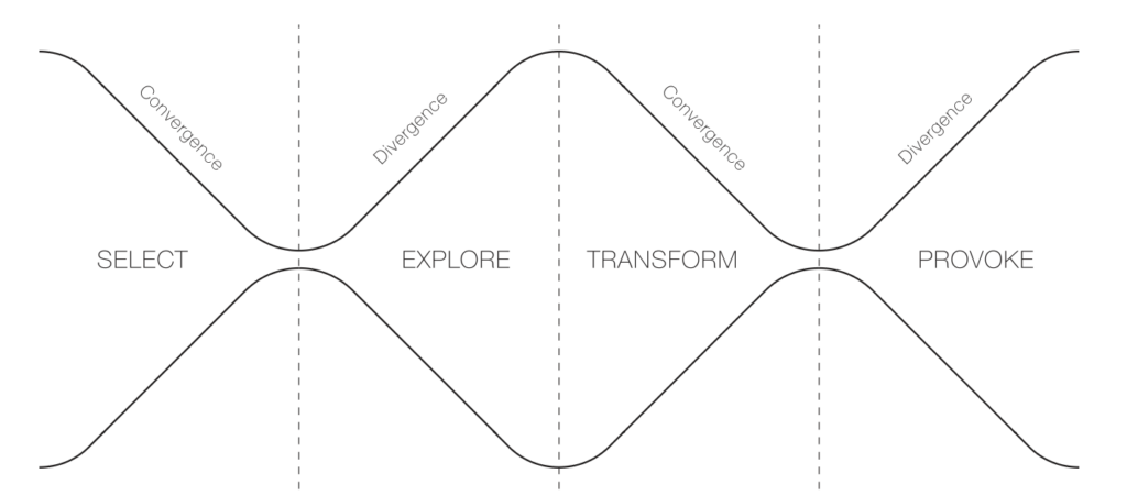
The authors identify a recurring four-phase process throughout the papers and propose an adapation of the oh-so-loved Double Diamond: the Inverted Double-Diamond Framework with the phases select, explore, transform, and provoke.
While the paper acknowledges that speculative design has been practiced for decades, it presents the Inverted Double-Diamond Framework as a new tool for “communicating the core of speculative design” and establishing a shared conceptual foundation for the field.
1. Select (Convergent Thinking)
The goal of this initial phase is selection for speculation: identifying and reframing complex, hidden, or emerging challenges. Designers focus on narrowing down broad topics of concern into a specific issue that will anchor the rest of the process. This may involve:
Projecting potential issues from existing systems if current values persist.
Understanding current issues through stakeholder discussions or data reviews.
Asking future-oriented “what if” questions about emerging technologies.
2. Explore (Divergent Thinking)
The speculative exploration phase involves the imaginative generation of reality-alternative scenarios. It encourages thinking beyond the constraints of the present to consider “what the future could be”. Common methods include:
Scenario-building techniques to situate abstract concepts in a plausible future world.
The “cone of possibilities” model, which categorises futures as probable, plausible, possible, or preferable.
Contrasting utopian and dystopian futures to reveal tensions between empowerment and control.
3. Transform (Convergent Thinking)
In the speculative transformation phase, abstract concepts from the exploration phase are translated into tangible representations. This phase focuses on selecting and refining ideas to create “probes” that bridge imagined realities with the present. Key outputs include:
Prototypes: These can range from low-fidelity models made of everyday materials to polished, high-fidelity physical artefacts.
Fictional Narratives: Stories, audiovisual formats (videos, audio), or printed materials (catalogues, posters) that provide social context and make the speculative world more relatable.
4. Provoke (Divergent Thinking)
The final phase, speculative provocation, uses the developed prototypes and narratives to stimulate critical dialogue, debate, and reflection. The goal is to challenge ingrained assumptions and encourage the audience to think about the ethical and societal implications of potential futures. Methods for provocation include:
Group discussions and debates structured around opposing viewpoints.
Individual reflection activities and qualitative interviews.
Public exhibitions where audiences engage with the artefacts not as products for consumption, but as prompts for active imagination
Healthcare and speculative design
By shifting the focus from commercial production to social and ethical implications, speculative design in healthcare allows researchers to bridge the gap between current medical realities and the consequences of future technological trajectories.
The paper identifies healthcare as one of the primary academic disciplines where speculative design is frequently applied to explore the complexities of contemporary challenges. Rather than focusing on immediate medical solutions, speculative design in this field is used to anticipate emerging needs, ethical dilemmas, and the social implications of future medical technologies.
The paper highlights several specific studies and prototypes that illustrate how speculative design functions within a healthcare context, for example a publication where Zolyomi and Snyder (2024) engaged neurodiverse dyads in a speculative design process to create an “emotion translator,” using low-fidelity prototypes to materialise their ideas.
Source Cardenas Cordova, D., Kelly, N., & Rezayan, L. (2025). A systematic literature review of the speculative design process and a proposed framework for speculative design. Design Science, 11, e38. doi:10.1017/dsj.2025.10030
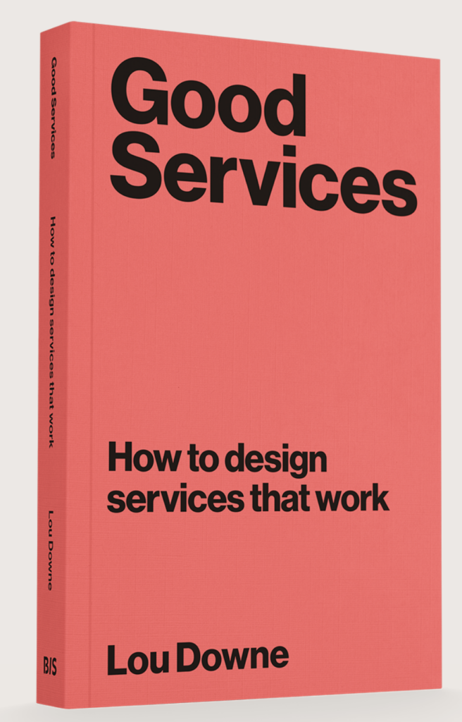
A couple of months ago I stumbled on the Book “Good Services – How to design Services that work” by Lou Downe (see Impulse.02). I finally came around to reading it!
In this Blog post I want to provide an excerpt of the 15 principles of good service design according to Downe. I chose 5 principles I learned the most from or thought were the most relevant for my research. Additionally, I add a paragraph of reflection on my Thesis to add personal context to the topic.
The 15 Principles
Disclaimer: Instead of repeating repeating “A good service” before every principle statement, this section will imitate the formulation of the book’s chapters.
3.1 Is easy to find
This chapter emphasizes that the name of a service is crucial for user accessibility, as it acts as the primary entry point. Providing a good service is ensuring that users can easily find it, which is often more challenging than it seems.
To improve service discoverability, organizations should prioritize user-friendly names that reflect what users are trying to achieve. This involves:
Understanding users’ goals.
Recognizing their knowledge level regarding available services.
Names should avoid legal or technical jargon and instead describe tasks in straightforward language. Ultimately, service names should bridge the gap between user intent and organizational terminology, facilitating easier access to necessary services.
While I appreciate the importance of making a service easily discoverable, I don’t see naming my e-health platform as my first priority. Since I intend for it to be a nationwide government initiative—similar to ELGA, (amusingly, is an acronym, a no-go according to the book) my focus will initially be on developing the platform itself. I do want the name to be catchy and perhaps even personal, like a first name, to create a sense of connection. However, my immediate priority will be on the platform’s functionality and user experience rather than on the name itself.
3.2 Enables a user to complete the outcome they set out to do
Designing services with the entire user journey in mind is essential. This approach not only enhances user experience but also improves service effectiveness and efficiency. If users understand what they need before reaching your service, they are more likely to succeed in their goals.
Failing to recognize and design for users’ true objectives can have severe consequences. The issue of homelessness illustrates this well; Malcolm Gladwell’s article “Million-Dollar Murray” showcases how inadequate responses to homelessness are often more costly than comprehensive solutions. It highlights the importance of addressing the full scope of user needs rather than piecemeal solutions.
Designing services within the context of a wider user journey can lead to more effective service delivery and reveal gaps in existing offerings. For example, using the wording “Get me home” in a navigation service instead of offering input fields to manually write your destination. When designing services, it’s crucial to ask whether you’re starting at the right point for users and if your service effectively helps them reach their goals.
This chapter is particularly interesting for my design process because the tasks my users should be able to do with my e-health application are very broad and highly dependent on the context the user is in. Ultimately the application should cover all things health related in one place. My plan right now is to have the user set up the front page of their application according to their needs during the onboarding process. This might help with creating a more custom experience while still keeping all possibilities open.
3.3 Clearly explains it’s purpose
To effectively manage user expectations when designing a service, it’s crucial to first understand what those expectations are. Users often base their expectations on past experiences with similar services, so their assumptions may not align with what your service actually provides. There are three types of expectations to consider:
Universal Expectations: These are fundamental service features that most users expect, such as the ability to withdraw money from an ATM at a bank. These expectations are widely recognized and should not need explicit explanation.
Assumed Expectations: These arise when users lack knowledge about a service, leading them to make assumptions that may not be accurate. For example, new users may assume they can open a bank account with minimal documentation. It’s essential to clarify these expectations upfront, either by simplifying the service or clearly communicating what users should expect.
Outlier Expectations: These are unique expectations based on individual users’ previous experiences. For instance, some users might expect instant notifications for transactions based on their experience with app-based banks. While you may not need to address these right away, it’s important to monitor them, as they can evolve into universal expectations over time.
Managing these expectations involves different strategies. Universal expectations should be met without explicit mention, while assumed expectations require clear communication. Outlier expectations should be observed for potential future relevance. A balanced approach that addresses all three types will ensure that your service remains valuable and user-friendly, preventing potential pitfalls from unmet expectations.
This chapter reinforced the importance of having a clear plan for what my users will want to accomplish within my application. To effectively manage expectations for my thesis, I aim to limit options and possibilities. Specifically, I plan to develop around five distinct scenarios and personas, which will allow me to measure how effectively users can complete their desired tasks.
3.4 Require no prior knowledge to use
To ensure a service is usable without prior knowledge, the following strategies should be considered:
Ensure the Service is Findable: Understand when and how users might seek support, along with the language they use during their search. Refer to Principle 1 for more details.
Clearly Define the Service’s Purpose: Users may not be familiar with your organization, but they likely know what they need. Your service should quickly convey what it does and how it can help them achieve their goals. More information can be found in Principle 2.
Avoid Making Assumptions About User Knowledge: Do not assume any prior knowledge or experience with your service or similar offerings. Conduct a thorough review to identify any assumptions within your service. Create a list of these assumptions and determine which ones need to be adjusted or clearly explained to users.
Utilize Familiar Methods: Some approaches are so common that deviating from them can cause confusion. To identify these methods, conduct user research with a diverse group to understand which ones are widely recognized. See Principle 5 for additional insights.
Design Independently of Organizational Structures: Navigating organizational frameworks can be challenging for users unfamiliar with your service. Ensure that your service is easy to use without requiring users to understand who is providing it.
I have given considerable thought to how my e-health application must be user-friendly for the broadest possible audience: essentially everyone in Austria over the age of 18. This diverse user group encompasses varying technological backgrounds, social differences, financial situations, health conditions, and age ranges. That’s why Point 3 of this chapter, “Avoid Making Assumptions About User Knowledge,” really resonated with me; I need to design with all potential users in mind. However, given the rapid pace of technological advancement and my intention to utilize speculative design methods, I will establish some foundational guidelines regarding users’ tech affinity.
Regarding Point 5, “Design Independently of Organizational Structures,” I recognize that the health sector often operates differently. People (at least nowadays) are very critical when it comes to “hiding” where information is coming from or with which part of the service they are currently in contact with. This is an area where I need to engage in deeper research to fully understand the differences in healthcare information.
3.5 Is agnostic of organizational structures
In 2016, British company Thriva was established to allow users to conduct health checks discreetly at home through at-home blood tests for various conditions like diabetes and hormone imbalances. While it has transformed health monitoring, Thriva’s true innovation lies in its integration of multiple components from various organizations, notably utilizing the nationwide network of NHS pathology labs. These labs operate under strict regulations, and Thriva has effectively incorporated these rules into its service.
This type of seamless service, involving collaboration across organizational boundaries, is not typical in many sectors. In today’s digital landscape, users seek services based on their needs rather than the limitations of individual organizations. The focus should be on helping users achieve their goals, even when those goals extend beyond what a single organization can provide.
Traditional services often struggle with fragmentation and siloed experiences due to outdated organizational structures designed for a slower-paced world. These rigid systems tend to specialize in specific tasks, making it challenging to provide cohesive user experiences.
Four key issues contribute to this fragmentation:
Separation of Data: User data is often not shared across organizations, requiring users to repeatedly provide the same information.
Incompatible Processes: Misalignment between the processes of different organizations can disrupt the user journey.
Incompatible Criteria of Use: Different rules across service components can create confusion for users.
Inconsistent Language: Variations in terminology can disorient users trying to navigate the service.
To address these issues, it’s important to understand the historical context of organizational silos. Melvin Conway’s theory suggests that an organization’s structure directly influences its service design. If teams within an organization are siloed, their services will likely be fragmented.
As organizations face increasing demands to integrate services, a new model of experience integration is emerging. This approach involves collaborating across multiple organizations to provide a cohesive user experience, often without altering the individual organizations involved.
However, fostering effective communication and collaboration is challenging. Organizations may have different objectives, paces, and incentives that can hinder cooperation. To support collaboration on shared services, consider these four strategies:
Permission: Create an environment that encourages collaboration beyond day-to-day roles.
Shared Standards: Establish common practices that facilitate teamwork without stifling creativity.
Shared Goals: Develop a unified vision that everyone can support and work towards.
Shared Incentives: Align financial incentives to ensure that collaboration is prioritized over individual agendas.
The most important takeaway here is to be able to recognize potential silos within an organization or with external partners, and if you can’t change the operating model, shift how you communicate and collaborate. Implementing shared standards, goals, and incentives can foster a more collaborative environment, ultimately enhancing the user experience.
I really enjoyed this chapter of the book because it used a healthcare service as an example, which helped me relate this principle even more to my thesis. Considering the insights on organizational silos, it’s clear that my thesis on a nationwide e-health application in Austria must address specific barriers that could hinder its effectiveness. Potential silos might exist between various healthcare providers, such as hospitals, general practitioners, and specialist clinics, all of which may have different systems for managing patient data. Additionally, there could be inconsistencies between public health organizations and private healthcare entities, complicating data sharing and collaboration.
Regulatory frameworks may also create silos, as differing compliance requirements could prevent seamless integration of services across platforms. Also, varying levels of technological adoption among healthcare professionals and patients could lead to fragmentation in user experience. By identifying and addressing these specific silos, I can design an e-health application that not only facilitates communication and data sharing among these diverse stakeholders but also ensures a cohesive and user-friendly experience for all Austrians seeking healthcare services.
The journey to Lapland as well as my filming of it has concluded a couple of days ago and I want to write a short conclusion of my experiences, struggles and learnings.
All in all I feel like filming worked out quite well, both technically and story-wise. I have been struggling a bit with the cold, but the main issue was mostly my hands and fingers and not the cameras which was good. The batteries have lasted me longer than I had expected and I made it through the whole journey without any battery struggles. I even managed to fly my drone twice, but there the low temperatures did significantly affect how long the battery lasted and I had to do two emergency landings. Nonetheless, I managed to get some nice footage of the snowy marshes and forests of Lapland with members of our group skiing and reindeer sledding. Other than the battery life, I was also a bit concerned with the safety of the camera’s LCD displays because I read online that they might break in really low temperatures. And while filming in minus 30 degrees celsius I noticed that the display moved slower and showed some artefacts. However, once I got the camera warmed up again, the display returned to normal and showed no sign of damage. The times where I was most afraid for the safety of the cameras was while taking Timelapse content of the northern lights where I had the camera out on a tripod in minus 34 degrees for 10 minutes. But even then, the cameras showed no sign of damage after I slowly warmed them back up, so I am positively surprised at the durability of the cameras in low temperatures.
One thing I realised fairly quickly during the filming process is, that most of the time I went with the flow of the journey and group instead of very strictly sticking to my shot list. This also worked out well with the travel group I was filming, because while they were all really good with being filmed during the journey and didn’t mind me recording them, they were quite opposed to “faking” anything. I got frequent comments about how unauthentic things were, even if I just quickly asked someone if they could repeat a movement or move slightly for a better camera angle. So I pivoted towards recording what was happening with almost no interference or commentary from my side, which however sometimes also made it pretty difficult to achieve certain shots I had imagined. Nonetheless, I believe that the footage I collected now really authentically represents the journey, the group and the experiences they had together. Now I just need to manage to create a film in the edit that accurately depicts these experiences while also conveying the story and message I had in mind during the planning phase. But what I mostly learned from this was that you cannot plan for everything that will happen and have to stay flexible and spontaneous enough to adapt to unexpected things that are happening while still keeping the message you want to convey to your viewers in mind to make sure you focus on the right action.
That was also one thing I was struggling with, to let go of the idea of documenting everything and instead focus on what I will actually need for my story. There were many interesting things happening, which, however, did not serve my story or would have just been too much to also fit into my film. While it was difficult to put my camera down at times, it was quite liberating to realise I did not need to film every little detail that was happening.
I really enjoyed the trip and the sense of community in our travel group even though I was technically there to work. This sense of belonging to the group and being part of the experience allowed me to really get a sense of how the journey felt to the participants. However, it also made it difficult at times to stay neutral and as an outsider of the story. What I also realised is, that the moments I most wanted to film because there was some struggle with having to catch a train or packing your bags quickly, I in fact also had to run for the train or pack my stuff, so I could not actually film all that I wanted to film.
All in all, I really enjoyed the experience and could also collect some footage I am quite happy with. Now it is just about refining that footage in the edit and telling the story I have in mind. I also provided photos for the travel group every day and got some really positive feedback from everyone, which, I think also helped with easing their scepticism about me being there and documenting them.
Looking back at the past weeks, I realise how much my thesis process has shifted. What began as a vague interest without clear direction has slowly turned into something more defined. At the same time, it still feels open. I am no longer at the very beginning, but I also don’t feel like I have fully arrived anywhere yet.
The only thing that currently creates pressure is the upcoming deadline. In less than ten days, I have to submit my final exposé. It feels strange, because I only recently reached a point where I feel fully engaged in my research. For a long time, I was circling around ideas without committing to them. Now that I am actively exploring and making connections, I wish I had more time to stay in this phase. But I also understand that exploration cannot continue indefinitely. At some point, it becomes necessary to define a direction. Otherwise, it is easy to get lost in the endless number of possibilities. There will always be more books to read, more conversations to have, and more perspectives to consider. The challenge is not only to explore, but also to decide.
My next step is to work with the feedback I received last week and begin formulating a clear research question. Until now, I have been collecting ideas, references, observations without forcing them into a fixed structure. Now, I need to translate these fragments into something more precise. This feels both exciting and challenging. It requires moving from intuition to articulation.
The part I currently struggle with the most is defining the artefact. I want to create something that genuinely excites me, something I can stay engaged with until the end of the project. Right now, many of the ideas I come up with feel logical in relation to my topic, but they don’t feel personally motivating. They make sense intellectually, but they don’t create a strong emotional response.
At the same time, I have realised that I deeply enjoy the theoretical and philosophical part of this process. Reading, writing, and thinking about abstract ideas has become something I look forward to. This surprised me, because I used to see theoretical work as something difficult. Now, it feels like a space with endless depth. There is always another idea to explore, another perspective to consider. As someone who often loses interest in things quickly, this feels significant. The fact that I remain curious and engaged gives me confidence that I am moving in a meaningful direction.
Moving forward, my focus will be on clarifying my research question and finding an artefact that connects to my interests in a more personal way. I want the outcome of this thesis to reflect not only the topic itself, but also my relationship to it. Right now, I am still in the process of defining what that will be.
Last Thursday, we had a tutorial day, which means each student signs up for a one-to-one feedback session with one of our lecturers. Since we have several lecturers teaching the course, we can choose who we want to speak to. I originally planned to talk to a professor I had spoken to before, but his schedule was completely full. I had to wait a long time, and while waiting, I noticed that another professor only had two students signed up.
I asked some of my classmates why that was the case. Almost all of them said the same thing: she was tough. They said she could be encouraging, but that she was also very direct and sometimes harsh with feedback. Some students said she had criticised their ideas strongly, which made them hesitant to speak to her again.
Hearing this made me sceptical, but also curious. I felt that maybe this was exactly the kind of feedback I needed. The previous tutorial I had attended had been open and supportive, but it hadn’t really pushed my thinking further or helped me clarify my direction. I realised that encouragement alone is not always enough. Sometimes you need confrontation, or someone who challenges your assumptions.
So I decided to sign up with her.
When I sat down and started explaining my thesis topic, I immediately noticed something different. Usually, when I explain my ideas, I feel like I’m not expressing them clearly. They make sense in my head, but once spoken out loud, they sound vague or unfinished. This time, however, I had the feeling that she understood exactly what I meant. She responded quickly and directly, without needing long explanations.
Her feedback was honest and very straightforward. At one point, she said that documenting and interviewing creative directors could be interesting, but that ultimately, the world would continue spinning without that work. At first, this sounded harsh. But instead of feeling discouraged, I appreciated the honesty. It felt like a necessary reality check. It made me realise how easy it is to get absorbed in design itself, without questioning its relevance. Designers often operate within their own bubble, focusing on internal conversations rather than external impact. Her comment forced me to think more critically about why my topic matters, and what it actually contributes beyond the design field.
She encouraged me to focus more specifically on chaos, especially in relation to information overload. She pointed out that chaos is not only an abstract concept, but something that has real consequences. Information overload affects mental health, contributes to burnout, and also has environmental consequences, such as the physical infrastructure required to store and process data. She also suggested expanding my perspective beyond creative directors. Instead of only interviewing people within design, I could also speak to scientists or researchers who study chaos from a scientific perspective. Chaos exists across multiple disciplines, not just in visual or creative contexts.
Another important point she made was that my thesis does not necessarily need to result in a traditional product. Instead, it could take the form of a system, a framework, or a set of tools. She mentioned the example of prompts, similar to the Oblique Strategies, which are designed to help people approach creative problems differently. This conversation shifted my thinking significantly. It helped me see my topic not just as something to observe, but as something that could be explored in a more structured and intentional way.
My next step will be to explore these inputs further. This includes researching chaos from scientific perspectives, reconsidering the role of creative direction within my thesis, and thinking about alternative formats beyond a single artefact. This tutorial reminded me that difficult feedback is often the most valuable.
The next months are going to be a bit intense, so I’m trying to get ahead of the chaos before it starts.
A big part of what makes this semester feel different is that I have two parallel realities to manage: my thesis work, and the fact that I’ll be in Valencia for a a few months. Which is exciting, but also slightly terrifying, because I know myself. Procrastination and thesis don’t go well with one another. So instead of pretending I will magically become a perfectly disciplined person, I’m trying to build a structure that is realistic. I have to have a plan now, so at least one thing is out of the way and I can directly start into the thesis.
My main goal for the next months is to keep moving forward in small steps. I don’t need huge breakthroughs every week. I need consistency. The thesis is not one big moment. It’s a chain of small decisions: collecting, selecting, writing, revising and polishing.
Right now my plan is to split my thesis work into three tracks that can run simultaneously:
The first track is research. This is where I read, collect sources and build the language around my topic. I already noticed that reading becomes easier once I have the right keywords and once I stop forcing my topic into one discipline. I want to keep doing this continuously, because it’s the part that will support everything else later when I start writing.
The second track is practical work. That means taking photographs, documenting everyday installations, and experimenting with reconstructions. The miniature idea especially feels like something I want to push further, because it connects the observational part of my thesis with a more designed outcome. I want to keep producing while I research, so I don’t end up with a thesis that is only theoretical.
The third track is final format planning. Even if I don’t decide the exact outcome yet, I want to start thinking in systems: how the archive will become a narrative, how an exhibition could work, how a book could work and what kind of structure makes sense for my material. This is also where Valencia might become interesting, because being in a different city could change what I notice and could expand my archive beyond one location.
To make this plan actually work, I’m also setting myself a few small rules. Routines that I can realistically keep:
I want at least 3 focused thesis sessions per week (even if they are short).
I want one day where I only do practical work (photography, collecting, building miniatures).
I want one day where I only work on writing (even if it’s messy writing).
I want to keep my archive clean while collecting, so I don’t have to sort everything later.
If I manage to stick to this structure, I think the thesis will stay manageable while living abroad.
The real challenge of this semester: not coming up with even more ideas but turning them into a finished thesis.
The more I archive my everyday installation photographs, the louder this question gets: what are the ethics of this whole project?
Because the truth is: I’m photographing situations that do not belong to me. These installations are anonymous, often accidental and usually created by someone who never planned for them to be seen as “art.” Sometimes they might even be functional: moving boxes, stored materials, temporary fixes, or objects left behind for a reason.
And the moment I photograph them, I shift their meaning. I turn them into an image. I turn them into something that can be shared, archived and potentially exhibited.
So I started setting a few rules for myself.
The first one is simple: I avoid photographing people. If someone is clearly visible, the image becomes street photography, and that’s not what my thesis is about. It also creates privacy issues that I don’t want to build my project on.
The second rule is about intervention: I never move objects. Even if an arrangement looks “almost perfect,” I don’t want to complete it. My role is observer, not curator of the street. Otherwise the work would become staging and I would lose the whole point of researching found installations.
The third rule is about sensitivity. Some installations feel open and neutral. Others feel personal. If an object includes names, private belongings or something that feels emotionally loaded, I might still document it for myself, but I probably wouldn’t include it in a public exhibition. Not everything that is visually interesting should automatically become content.
What I like about this ethical question is that it connects directly to the core of my thesis: framing. Because the ethical dilemma is basically proof that framing is powerful. An installation changes the moment it is documented. It changes again the moment it is shared. And it changes again if it enters a curated context like a book or exhibition.
So instead of ignoring the ethics, I want to include it as part of my research. It is not a side issue. It is a sign that meaning is not neutral, and that the act of noticing already carries responsibility.