When you go to a the F1 Race at the Red Bull Ring, you usually get a special version of the Red Bulletin —a booklet filled with all of the Red Bull Content, ads, (Red Bull) driver infos, and maybe some more information. And while Red Bull is generally doing a good job, it’s designed to be used for a few hours and then thrown in the bin.
I’ve also been looking at other publications like Magazine B or Victory Journal. These aren’t just magazines; they are coffee-table books. They use heavy paper, experimental grids, and long-form storytelling.

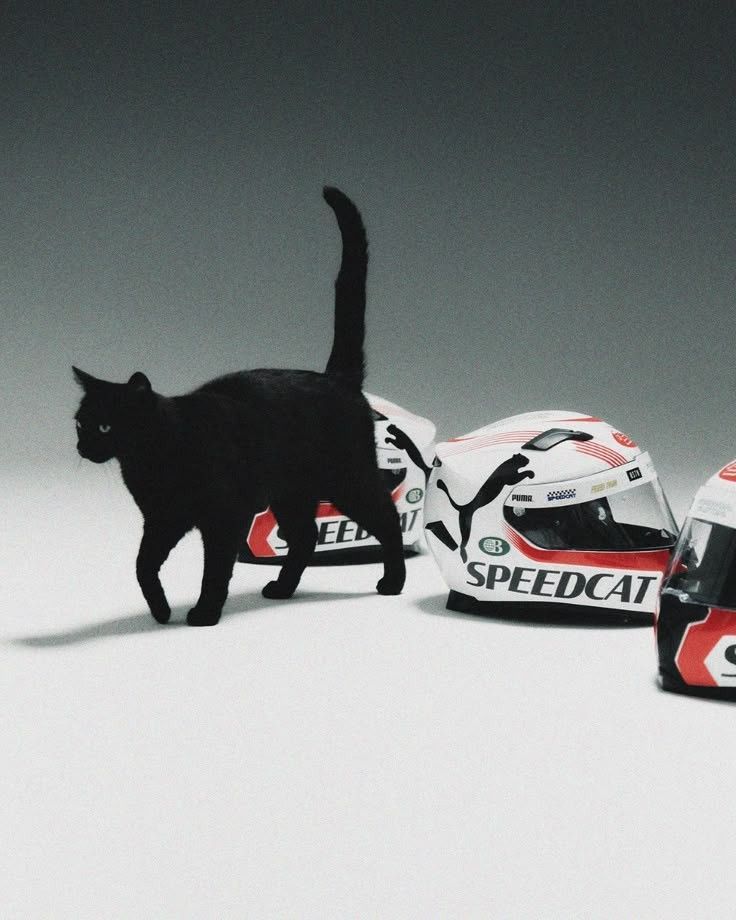
Why? Because a screen is fleeting, but a book has weight. If you want someone to believe a lifestyle, you have to give them something they want to keep on their shelf. I’m playing with “Spatial Dramaturgy”—which is a fancy way of saying I’m designing the layout like a journey. One page might be completely white with just a tiny screw in the center, shot like a diamond. The next might be a chaotic, full-bleed spread of data points from a high-speed crash.
It’s about rhythm. A race has slow moments and explosive ones; the editorial design should mirror that. By using high-end printing techniques. It’s the ultimate way to prove that engineering is a form of culture.
Disclaimer: This text was refined with the support of AI. The reflections and observations are based on my personal experience of attending the event.
