How AR Affects Time Perception in Retail Spaces

Why browsing feels faster, easier, and more intentional with augmented reality

Have you ever walked into a store thinking you’d “just stay for five minutes,” only to look at your phone and realize half an hour had passed? Or the opposite—you wanted to browse slowly, but the environment was so overwhelming that everything moved quickly? Time is an interesting thing in retail. It’s not just measured in minutest’s defined by how we feel during the experience. In other words, augmented reality is quietly changing your sense of time.

Why time perception matters in retail

Feeling like time is dragging can make customers bored or overwhelmed. Feeling rushed can push them into poor decisions. Both outcomes hurt the shopping experience.

Studies on customer engagement and AR/VR experiences show that immersive, supportive digital tools can reduce hesitation and improve decision quality. For example:

Time perception is deeply linked to those emotions — confidence, engagement, and clarity.

How AR changes the way we browse

AR affects time perception mainly because it changes how much effort we spend while shopping.
Here’s where the biggest difference happens:

1. AR makes the “first stage” of browsing much faster

AR changes this completely.

With AR, you can scroll through items digitally, preview them instantly, and remove 80% of the “search time.” Instead of checking 30–40 pieces physically, you preview them on a screen and quickly filter out what doesn’t fit your aesthetic.

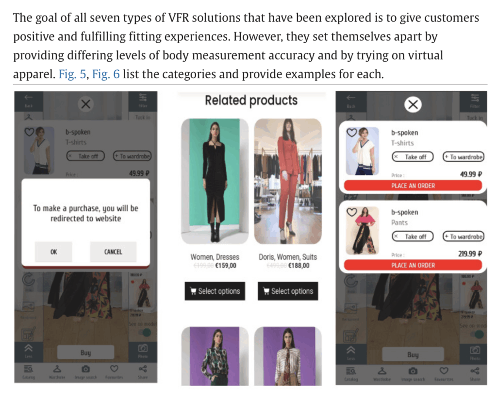
A systematic review on virtual try-on and visualisation supports this idea: visuals increase decision certainty and reduce browsing time before trying something physically.
https://www.sciencedirect.com/science/article/pii/S2543925123000347

2. AR supports better “flow” in the store

When an experience feels smooth and natural, time feels shorter.
AR can guide shoppers with soft nudges:

  • “Here are similar items”
  • “You might also like…”
  • “This is available in your size”

This creates a sense of direction — you spend less time wandering and more time evaluating things that are actually relevant to you.

3. AR speeds up decisions but still respects the need for real try-ons

We all know virtual try-ons can’t fully replicate how clothing feels, or how it behaves on your body.
But AR can narrow down the options dramatically.

Instead of carrying 12 items to the fitting room, AR helps you identify your favorites digitally.
Then, when you do call a staff member or go to the fitting room, you’re only trying on pieces you’re genuinely interested in.

This is where AR’s biggest time effect happens:

Fast digital preview → precise physical try-on → fewer wasted minutes

In academic tone: AR enhances time efficiency by enabling rapid filtering and previewing. After identifying preferred items digitally, shoppers can request them for live try-on — a crucial step, since virtual try-ons still cannot fully replicate texture, fit, or physical comfort.

Why AR makes shopping feel shorter

When a shopper feels:

  • less overwhelmed
  • more in control
  • guided rather than lost
  • confident in their choices

Fan’s 2025 study confirms that AR reduces cognitive load in the evaluation phase, helping consumers stay focused and calm.
https://www.mdpi.com/2071-1050/17/2/728

Less stress = smoother time = more enjoyable shopping.

What this means for the future of retail

AR won’t replace physical stores — it will reshape how we use them.

Instead of spending time searching, customers will spend time evaluating.
Instead of wandering, they will move with clarity.
Instead of feeling rushed, they will feel supported.

The goal is not to make shopping faster — the goal is to make shopping feel better.
If AR can help shoppers spend their time more intentionally, then the entire retail experience becomes more human-centered.

References

  1. Pandya, H. (2024). Effect of AR and VR Experiences on Customer Engagement in Retail Stores.
    https://www.researchgate.net/publication/382681273_Effect_of_Augmented_Reality_AR_and_Virtual_Reality_VR_experiences_on_customer_engagement_and_purchase_behavior_in_retail_stores
  2. Fan, X. (2025). The Role of AR and VR in Shaping Retail Experiences.
    https://www.mdpi.com/2071-1050/17/2/728
  3. Jeong, H. (2023). AR Virtual Try-On and Its Influence on Return Reduction and Consumer Certainty.
    https://www.sciencedirect.com/science/article/pii/S2543925123000347
ChatGPT was used as a supportive tool during the writing process.
How AR-Based Store Design Can Create Comfort and Reduce Anxiety for Introverts

A people-centered perspective

Shopping should be an enjoyable experience — a space for discovery, experimentation, and inspiration that creates positive emotions.
But for many people, especially shy or introverted customers, it’s not that simple.

During my thesis research, one idea kept coming back to me:
store environments are not emotionally neutral.

Some customers feel overstimulated by noise, crowds, bright lights, or the unexpected approach of an employee. Others feel awkward when browsing slowly, unsure how to find their size, or embarrassed when they feel like they’ve “been there too long.” Some people hesitate to ask too many questions, even though they know it’s the staff’s job to help.

These experiences are not rare — people just don’t talk about them.
Even I experience this personally: I love going to stores, but there have been moments where, after asking many questions, I felt uncomfortable for “wasting their time” when I didn’t buy anything. Because of that, I sometimes avoid asking questions at all just to prevent that situation. Another personal challenge is when clothes are folded — after unfolding and refolding 20 pieces, I get tired and feel uncomfortable messing everything up.

This is exactly why AR has such huge potential.
It’s not just a technological “bonus,” but a way to create emotional comfort, personal space, and autonomy in physical stores.

Why Introverted Consumers Feel Uncomfortable in Stores

For decades, consumer behavior studies have shown that the atmosphere of a store directly affects emotions. Overly intense environments — whether visually, socially, or through noise — tend to create stress rather than pleasure. Introverts, who naturally prefer lower levels of stimulation, are especially sensitive to these factors.

This directly affects shopping behavior: some people simply need more space, more time, and more privacy to feel comfortable.

Before AR, the only alternative was online shopping. While it removes social pressure, it also lacks the tactile, sensory, and spatial benefits of a physical store. No matter how convenient online shopping becomes, many people still need to see and try on items in person.
Even I — someone who orders a lot online — have certain categories of clothing that I cannot buy unless I see how they look on my body.

AR fills this gap in a unique and immediate way.  A relaxed atmosphere, for instance, can evoke positive emotions among consumers, fostering feelings of happiness and sparking the urge to make purchases (Kurniawan, 2013)

An empirical examination of perceived retail crowding, emotions and retail outcomes (Almeida C.P., 2019) — This study identifies how spatial crowding (high density of fixtures/space) in retail settings negatively affects positive emotions and satisfaction.  https://www.researchgate.net/publication/233041648_An_empirical_examination_of_perceived_retail_crowding_emotions_and_retail_outcomes

How AR Promotes Emotional Comfort

Many brands see AR as fun, interactive, or “cool,” but its real power is often emotional — and especially helpful for introverted or shy consumers.

1. AR lets customers browse at their own pace

Approaching a staff member or trying to decode chaotic racks can be stressful.
With AR, users can simply scan a QR code and instantly access:

  • product details
  • 3D or 2D visuals
  • color options
  • style recommendations
  • availability

This removes a major anxiety trigger:
“Are they watching me? Do I look like I don’t know what I’m doing?”

2. AR reduces uncertainty by visualizing the product clearly

Uncertainty is one of the biggest reasons anxious customers hesitate.
AR reduces this by showing the product in its real scale or in the real environment.
It helps people save time and preview items before looking at everything physically.

3. AR provides help without forced social interaction

Introverted customers often want assistance just not the kind they have to initiate.
AR replaces awkward questions with calm, digital guidance:

  • similar items
  • outfit suggestions
  • size and fit information
  • store navigation

This turns assistance into genuine support, not pressure.

4. AR places information inside a calmer environment

AR doesn’t need to be flashy or loud.
In fact, it can reduce sensory overload.

Instead of searching visually through rows of items, the information comes directly to the user. It turns browsing into a quieter, more focused moment.

What I’m Planning for My AR Prototype

For my thesis, I want to develop a simple AR prototype using QR codes, PNG clothing items, and Adobe Aero.
With this, users will be able to:

  • view items in AR
  • zoom in and out
  • compare pieces
  • explore freely at their own pace

Ideally, I want users to walk away thinking:

  • “I didn’t feel rushed.”
  • “I could make decisions on my own.”
  • “The store felt less stressful.”

Because ultimately,
AR is not just a technological addition — it’s an emotional support tool.

AR Design for Introverts — Key Principles

1. Keep the interface simple and predictable

Introverted users value clarity and calm interactions.

2. Reduce stimulation with AR, not increase it

Soft colors, slow animations, and minimalist UI improve comfort.

Why This Direction Matters

Modern retail loves to talk about “experience,” but often forgets that not all consumers enjoy the same kind of experience.

Michael Solomon, in Consumer Behavior, writes that reducing psychological discomfort increases satisfaction and confidence in decision-making:
https://www.pearson.com/en-us/subject-catalog/p/consumer-behavior/P200000003579/9780136747053

In short:
Emotionally comfortable customers stay longer, explore more, and feel better about their choices.

“ChatGPT was used as a support tool for translation and grammatical refinement.”

Blogpost 2 – Thema!

Neues Semester, neuer Ansatz! (Aber dieses Mal wirklich in Richtung Masterarbeit!)

Letztes Semester durfte ich mich im Rahmen dieses Blogs mit dem Thema Motion Identity beschäftigen, was durch glückliche Zufälle dazu geführt hat, dass der finale Blogpost mehr oder weniger auf der Electric-Love-Festival-Bühne vorgeführt wurde. (AAAAAAAaaaaaah!)

Doch das ist immer noch sehr weit von dem entfernt, was Masterarbeits-Recherche sein sollte. Deshalb ist die diesjährige Mission: Rechercheansätze, Themen erkunden, „schauen, was wird“ – aber unter der Klammer eines starken Themas!

Aber: „Was willst du denn zur Masterarbeit machen?“ ist eine schreckliche Frage, weshalb ich mich zunächst mit „Was willst du auf KEINEN FALL machen?“ beschäftigt habe:
– reine 3D-Projekte
– etwas Langweiliges
– irgendeinen halbstark animierten Film (siehe Bachelorarbeit), in dem im schlimmsten Fall noch ein 2D-Rig vorkommen muss

Und während ich gedanklich weiter zwischen „Was will ich?“ und „Was will ich nicht?“ hin- und hergeschwommen bin, fand die Creative Night Graz statt!
Und irgendwie fand dieser kleine Ick* beim Thema 2D-Character seinen Weg ins Gespräch mit einem Animationsstudio (siehe Impuls-Beitrag), und auf einmal war da eine Frage: „Warum muss denn überall so ein Character rein?“

(*Ein „Ick“ ist ein plötzliches Gefühl der Abneigung oder des Ekels gegenüber einer anderen Person oder einem Ding.)

Die Frage hat ihren Ursprung wohl darin gefunden, dass sich bei fast allen Erklärfilm-Aufträgen der Vergangenheit, in jedem Pitchdeck und jedem Kund:innen­gespräch zum Thema Animation ein 2D-Character einschleicht (und wenn auch nur für eine unnötige Sequenz – Hauptsache einmal FULL BODY von links nach rechts durchs Bild) – so auch bei den Kolleg:innen aus der Branche.

Und ich habe mich gefragt:
Muss das denn so sein?
Woher kommt die Besessenheit von Kund:innen mit den kleinen Figuren? Vor allem in der Animation?
Funktioniert es tatsächlich gut, oder liegt es vielmehr am fehlenden Vorstellungsvermögen für alternative Erzählstrukturen?
Wie kann ich es schaffen, meinen zukünftigen Kund:innen dahingehend die Augen zu öffnen?
Vielleicht … mit guten Praxisbeispielen?

Und so sind wir bei folgender erster, grober Themenstellung gelandet:


Arbeitstitel:

Beyond Characters: Alternative Narrative Strategien im Motion Design

„Character – Warum Marken- und Erklärvideos neue narrative Strategien brauchen“

Forschungsfokus: Ich möchte untersuchen, warum Figuren/Maskottchen im Motion Design so dominant wurden, aber heute oft nicht mehr die wirksamste erzählerische Lösung darstellen – besonders in Branding- und Erklärvideos.

Zentrale Recherche-Blöcke:

A. Analyse: Warum Charaktere im Motion Design so populär wurden

Eventuell folgende Themen recherchieren:

  • historische Entwicklung: von TV-Maschinenfiguren über Marketing-Maskottchen bis hin zu 2D/3D-Motion-Charactern
  • psychologische Grundlagen (Identifikation, Anthropomorphismus)
  • Marketing-Mechaniken: Wiedererkennung, Emotionalisierung
  • Plattform- und Content-Trends (YouTube-Erklärvideos, Social-Media-Mascots)

B. Analyse: Warum Charaktere heute oft als oberflächlich oder redundant empfunden werden
Eventuell folgende Themen recherchieren:

  • Markenästhetik wird vereinheitlicht
  • „Character Fatigue“
  • zu generische Character-Styles (Flat, 3D-Cute, Corporate Memphis)
  • Ablenkung vom Kerninhalt statt Klarheit
  • Expertenmeinungen (Interviews)
  • Tests: gleiche Botschaft einmal mit Charakter, einmal ohne – welche wirkt klarer?

C. Neue narrative Strategien ohne Charaktere
Eventuell folgende Themen recherchieren:

  • Wie kann man Geschichten über Form, Typografie, Rhythmus, Farbe, Timing und abstrakte Bildsprache erzählen?
  • „Motion Grammar“: Bewegung als Bedeutungsträger (Siehe DesRes Motion Identity Thema)
  • Visuelle Systeme, die Marken klarer ausdrücken als Figuren (Siehe DesRes Motion Identity Thema)
  • non-character communication im Branding 

Keywords

Motion Graphics, Animation, Character Animation, non-character communication, storytelling, motion language, emotion through form, design expression, motion grammar, mascots, form-based storytelling, abstract narrative

Projektidee

A) Eine Serie experimenteller Animationen, die dieselbe Botschaft jeweils ohne Figuren kommunizieren.

Experimente z. B.:

  • nur Typografie
  • nur Formen & Komposition
  • rein über Geschwindigkeit & Rhythmus
  • minimalistische visuelle Systeme
  • abstraktes Storytelling (keine Avatare, keine Hände, keine Augen)

B) Endprojekt dass man später als Tool nutzen kann um es z.B Kund:innen vorzulegen & damit Aufklärarbeit zum Thema Animation zu machen und sie von einer „Non-character“-Erzählstruktur zu überzeugen 

—————

Soweit so gut – es ist einmal ein Anfang!

Aber Wo hackt’s noch:
– Will ich wirklich SO VIEL über Character lernen und schreiben, nur um dann zu sagen „Genau – UND JETZT OHNE!“
Lässt sich der Fokus vielleicht noch mehr auf Recherche in die Richtung „Alternativen“ drehen?

– Das Thema Literatur 🙁

Was wird das Projekt: Ist das Praxisprojekt ein Video, dass eben keine Character nutzt und super funktioniert, oder sind es sogar mehrere? Gibt es das Gegenbeispiel mit Character? Oder sollte das Projekt vielleicht sogar schon eben jene Aufarbeitung sein die ich meinen zukünftigen Kund:innen zeige/sende um zu sagen „Klar Character können wir machen… aber So geht’s auch!“

Wie geht’s weiter:

Hoffentlich mit einem Beratungsgespräch mit Roman (danke!)
Und dann muss man – Wohl oder Übel – in die Bibliothek (oder das INTERNET) um mit der tatsächlichen Recherche loszulegen!

Bis dahin GaLiGrü

London Symphony Orchestra: Abstraction and Motion in Branding

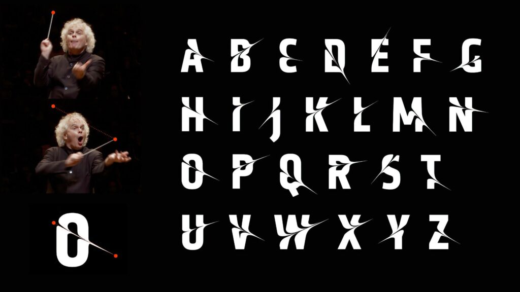
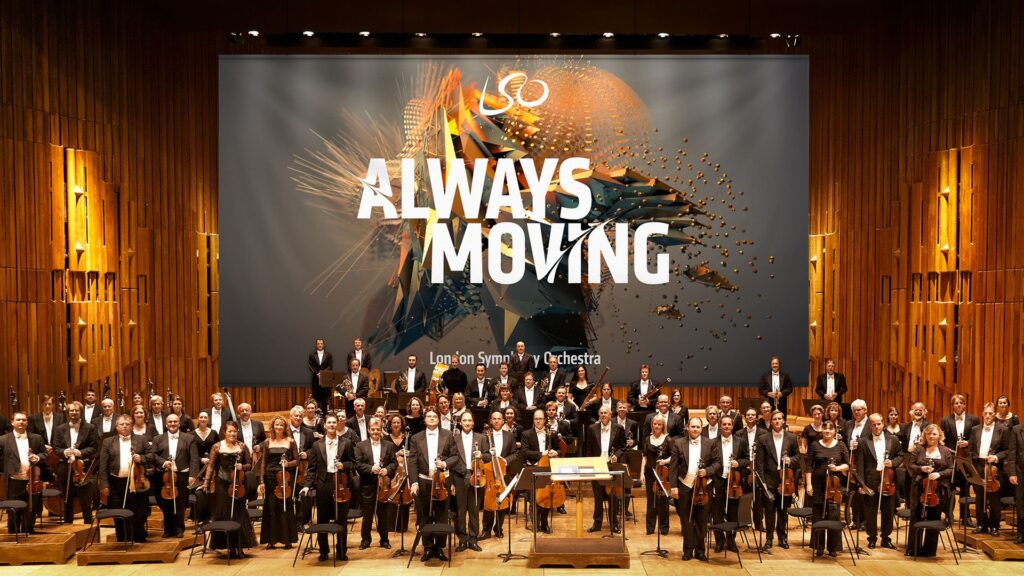
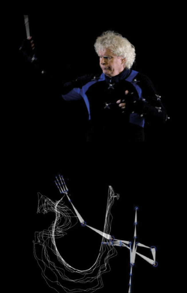
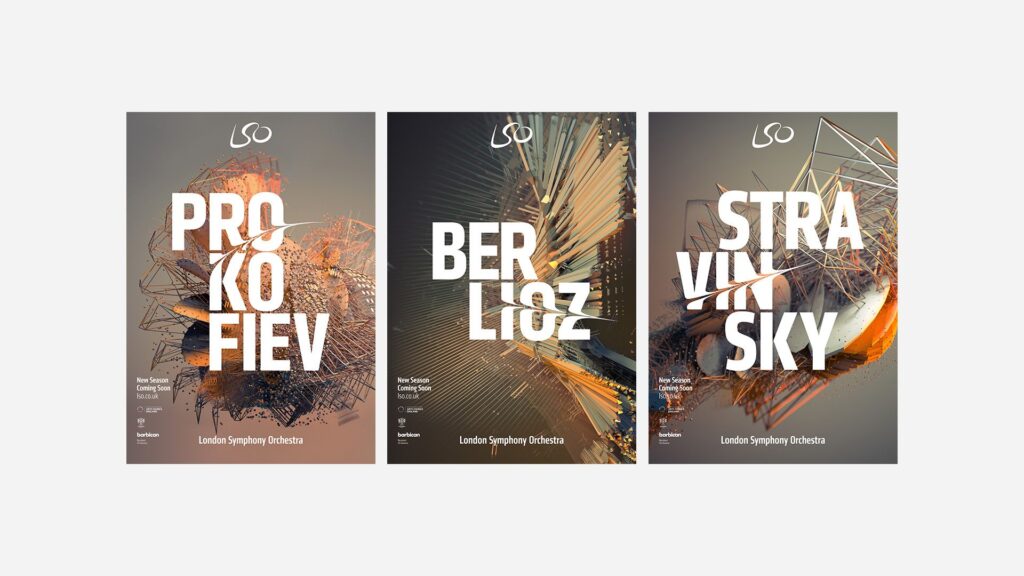
In 2017, the London Symphony Orchestra (LSO) introduced a new visual identity for its 2017/18 season. Instead of using typical images of musicians or instruments, they decided to do something much more experimental. The LSO turned to motion capture technology to create a visual language that reflects the energy, emotion, and dynamism of music itself. This collaboration, executed with the creative agency Design Bridge, used motion capture to turn music and conducting into abstract moving visuals. I found this project really interesting because it mixes classical music with digital art and motion design in. a way you don’t see very often or at least I haven’t. The whole idea was started by Sir Simon Rattle who was the LSO’s Music Director at that time. His conducting movements were recorded with twelve Vicon cameras at 120 frames per second. This helped to create a very detailed motion data that digital artist Tobias Gremmler later was able to transformed into abstract animations like abstract forms, which visually embodied the rhythm, intensity, and flow of the music. Form this data the team also created two typefaces. One of the looked more soft and flowing for a more gentle gesture approach. And the other was sharper and more angular for stronger movements. Both these typefaces worked together with the animations and the still images with this creating a full visual identity that was later on used everywhere. (The Partners Unveil Identity for LSO Formed by Tracking the Conductor’s Movement, 2017)

Abstract Forms and Motion

The abstract shapes generated from the motion capture are not random. Each shape is based on Sir Simon Rattle’s actual movements while conducting. However, the visualizations do not echo his motion. They turn his gestures into swirling vortex-like structures that suggest the textures and materials of an orchestra: wood, brass, smoke, and string. These organic, kinetic forms function as an “abstract score,” where lines, loops, and flowing wires communicate rhythm, energy, and dynamics in a visual language that parallels musical notation. Color and texture also play a big role. The animations use gradients, light flows, and semi-transparent textures to evoke elements of the orchestral soundscape. Air, vibration, resonance, and the interplay of instruments. Everything is always moving which reflects how music itself is never static. Here I really liked how the project manages to translate the feeling of music into a visual experience.

Impact and Significance

This approach positions the LSO as both a guardian of tradition and a forward-looking, innovative institution. By showing the conductors gestures in such an artistic way the visuals create a more emotional and personal connection to the music. In an industry where orchestral brands often remain conservative and predictable, the LSO’s identity stands out for its bold, kinetic abstraction. The combination of the custom typefaces and the abstract animations also helps with recognition. It shows that classical music can work with technology and contemporary design without losing its identity. 

Relevance to Motion Design

For motion design, this project is a great example of how movement can be turned into something abstract but still meaningful. It shows how motion graphics can build a whole brand identity and not just act as decoration. Because every visual element comes directly from the conductor’s movements and the music, the design feels very connected to the source. It proves that abstract shapes can still tell a story and carry emotion.

Even if the project is really strong, there are some challenges. The abstract visuals might not make sense to all viewers. People who don’t know much about design or conducting might think the shapes are just pretty graphics without understanding the idea behind them. Another issue is the budget. Motion capture is expensive and needs advanced equipment, which means smaller orchestras probably couldn’t do something similar. However I was still very fascinated by this approach and project itself and the way it was executed. 

Bibliography:

The Partners unveil identity for LSO formed by tracking the conductor’s movement. (2017, January 20). https://www.itsnicethat.com/news/the-partners-lso-identity-motion-capture-200117

Exploring my Options

I feel like, even though I have had a fairly clear overall direction for my topic from the very beginning, I always thought that the perfect idea for a more specific research question will come to me as I learn more about the topic. 

Well, that still has not happened and I’m beginning to stress out a bit. So, this blog post is my effort to sort through my own brain and figure out what I want to work on for the next 6 months. I know, this isn’t the type of scientific, perfectly cited content expected of these blogposts, but I promise, as soon as I have figured out what topic I want to write those perfectly researched texts about, I will put all my effort into it. 

I will use this blog post to create a comprehensive list of topic ideas I have had so far, a possible research question, an overview of the topic and what possible pros and cons would be.

Documentaries and Environment/Responsible Tourism

Possible Research Questions: How can documentary film function as a form of environmental communication in the context of sustainable tourism?
In what ways can documentary storytelling influence audience perceptions of responsible tourism?
To what extent can visual media foster behavioral change toward more sustainable travel?

Overview: I would explore the overall topic of environmental documentary films, how they are structured, which storytelling tools they use and how they can shape people’s views and behaviours. Maybe I could also talk about environmental communication and sustainable tourism in general and then do a deep dive on documentaries on the topic. 
With the second research question, my focus could also maybe be more on documentary storytelling in general, and then later applying it to the topic of responsible tourism.

Methods: I would first off look for literature on the topic, exploring the state of the art as well as past research and then analyse different enivronmental documentaries amongst other forms of media on how they aim to instill a desire for change in their viewers. A qualitative analysis on actual effects of these pieces of media would also be interesting, I am however not sure how I would approach this task. 

Pros: The theoretical part of my thesis would tie nicely into and prepare me for my practical project next semester, where I could apply what I learned about environmental documentaries to my own work. 

Cons: I have not yet been very successful in finding a lot of literature on the topic, which is why I am afraid I might not be able to amass enough knowledge on the topic in order to analyse and judge the pieces of media accurately. Moreover, I do not know if analysing different pieces of media alone would be enough of a scientific method for my master’s thesis.

Entschleunigung / Slow Media = Slow Travel?

Possible Research Question: How can media design interventions based on slow media principles encourage slower, more mindful, and sustainable forms of travel?

Overview: I was intrigued by the idea of connecting the slow media and the slow travel movements, exploring how travel content promoted via slow media might encourage slower and more conscious travel alongside a more conscious media consumption. 
In a world, where everything just gets faster and faster, many have recognized a need to slow down in their lives. This desire for a more conscious and more sustainable life is the most pressing on social media, where content just keeps getting faster and shorter, and in travel, where short and frequent holidays by plane, visiting every major sightseeing or insta spot are more popular than ever. 

Methods: I would again look into current research on the topic (if there is any) and explain the issues of our fast paced world, both on social media, in the fashion or food industry and in the travel sector. I would then talk about the slow media and slow travel movements and on what principles they operate, maybe finding some examples to analyse. I could also imagine creating a survey to see what the overall opinion on our fast-paced society looks like and whether the need for slower living truly exists.
In order to connect slow media to slow travel, I might be able to analyse examples or create different versions of media to compare in the survey. 

Pros: As far as I have seen, creating the connection between slow media and slow travel has not been done too often before, meaning the thesis might have some originality to it. I also feel like the documentary I want to create would tie well into the slow media idea, even if I would not be talking about documentaries specifically in my work. 

Cons: I have struggled a bit to find literature on the topic, or on slow media in general. Moreover, I am afraid that the term and the idea of “Slow Media” are not scientifically based enough to write a whole thesis on the topic. So, the whole thesis might become a bit too abstract, straying from clear-cut scientific writing too much.

Portraying Conflict in Documentaries

Possible Research Question: How do documentary filmmakers’ audiovisual and ethical decisions shape the representation of conflicting standpoints and influence viewers’ perceptions of fairness?

Overview: For this topic I would explore the topic of conflict in documentaries and how filmmakers can assure that their final work includes enough tension and conflict without harming any of the participants. Here, ethics would also come into play and would need to be talked about in depth. Portraying contrasting ideas and viewpoints is a common occurrence in documentary films and I would like to explore the different ways this task can be approached. In the case of my documentary this conflict would be between sustainable travel and the booming tourism industry, causing overtourism. Maybe conflicts could also arise between tourists and locals affected by them. 

Methods: As with the other topics, literature research would be at the start of my thesis, exploring how storytelling can work in documentaries, which role ethics play in planning and creating a documentary film and the different ways conflict can be addressed. I would also analyse different documentaries, looking at which conflicts appear and how they are treated. 

Pros: Doing a deep dive into how conflicts can be used to tell a story and dealt with in an ethical way can be good preparation for my own documentary project next semester. Also Daniel Bauer suggested this topic to me, so I feel a bit more secure about the fact that this would be an actually feasable topic people would want to read about.

Cons: Throughout the last week I have tried to find literature on the topic of conflict in documentaries and almost every search result that came up had something to do with political conflicts or war and documentaries about that, which is not really my aim for the thesis. Like with the other topics, I am kind of afraid that I won’t be able to find a lot of scientific literature on the topic. 

Conclusion

Some small part of me was hoping that, after writing all of this down and getting it out of my head and onto paper, I would see it clearly which topic is the right one. That is not quite the case, I’m still as indecisive as ever. Nonetheless, I feel like this blog post has given me some tangible bulletpoints to orient myself at and, maybe more importantly, it has shown me apects I am still unsure about with every topic, where I can ask targeted questions to my professors. So I am hopeful that by the next blog post I will have finally made a decision!

#1 How Cinematographic Techniques Shape the Emotional Experience of the Viewer

Meine Thema für die folgenden Blogposts ist das Zusammenspiel von Kameratechniken um Figuren oder Szenen im Film greifbarer und emotionaler zu gestalten.
Als erstes werfen wir einen Blich auf die Terminologie und anschließend was Kinematografie so ausmacht.

In der Filmwissenschaft treffen Praxis und Forschung oft aufeinander. Ein gutes Beispiel dafür ist die Frage, wie Kinematografie – also Lichtsetzung, Kamerabewegung, Bildkomposition und die Wahl der Optiken – unsere Wahrnehmung eines Films prägt. Viele Regeln stammen zwar aus jahrzehntelanger künstlerischer Praxis, lassen sich heute aber zunehmend durch Erkenntnisse aus Psychologie und Neurowissenschaften erklären.

Empathie: Wie Filme Gefühle auslösen

Die moderne Empathieforschung unterscheidet drei Ebenen des Mitfühlens:

  • Emotionales Mitfühlen (Embodied Simulation) – wir spüren, was Figuren fühlen.
  • Kognitives Mitfühlen (Theory of Mind) – wir verstehen ihre Perspektive.
  • Prosoziale Motivation – wir wollen ihnen helfen. (Zaki & Ochsner, 2012)

Studien zeigen, dass filmische Mittel, etwa Einstellungsgrößen, Nähe/Distanz oder Perspektivwechsel, beeinflussen, ob das Publikum eher emotional eintaucht oder intellektuell mitdenkt.

Kinematografie als Gestaltung von Raum

Ein zentrales Anliegen professioneller Kinematografie ist die Erzeugung von Tiefe und räumlicher Wahrnehmung. Denn obwohl Film eine dreidimensionale Welt auf eine zweidimensionale Fläche projiziert, entsteht im Kopf des Publikums dennoch ein überzeugendes Raumgefühl. Deshalb ist es wichtig die Dreidimensionalität zu bewahren und sogar noch zu verstärken.

Kameraleute versuchen dies seit über 100 Jahren. Gewisse Regeln werden von Generation zu Generation weitergegeben, ohne Erklärung warum diese Regeln entwicklet wurden oder warum diese existieren. Wenn man sich diese Regeln genauer ansieht, erkennt man dass diese aktiv daran beteiligt sind größere Tiefe in Bildern zu schaffen:

  • Vorder, -Mittel, Hintergrund: 3 dimensionales Bild durch Komposition
  • Chiaroscuro / Checkerboard Lighting: Hell-Dunkel-Kontraste verstärken Tiefenwirkung.
  • Gegenlicht und Konturenlicht: helfen dem Gehirn, Vorder- und Hintergrund zu trennen.
  • Pools of Light: Lichtinseln definieren unterschiedliche Raumebenen.
  • Lighting in Layers: Lichtschichten schaffen Orientierung im Bild.
  • Short Lighting / Far-Side Key: Erhöht die räumliche Präsenz.

Diese Methoden bedienen sogenannte monokulare Tiefenhinweise, also visuelle Signale, die unser Gehirn nutzt, um aus einem flachen Bild eine dreidimensionale Szene zu rekonstruieren.

Warum Tiefe so entscheidend ist

Kinematografie erzeugt nicht nur ästhetisch ansprechende Bilder – sie nutzt unbewusste Wahrnehmungsprozesse, um das Publikum im Raum einer Geschichte zu verankern. Tiefenwirkung schafft Orientierung, Glaubwürdigkeit und emotionale Bindung.

Deshalb hat sich die Erzeugung räumlicher Tiefe über Jahrzehnte hinweg fast zu einer eigenen Kunstform entwickelt und bleibt bis heute ein zentrales Werkzeug, um Zuschauer*innen in die Welt eines Films hineinzuziehen. Jetzt stellt sich die frage warum es zu einer Obsession geworden ist, Tiefe zu erzeugen?

Neuere neurowissenschaftliche Forschung weist darauf hin, dass die Wahrnehmung von Raum und die Entstehung emotionaler Empathie enger miteinander verbunden sein könnten, als bisher angenommen. Eine zentrale Rolle spielt dabei die Amygdala. Studien mit Menschen und Primaten zeigen, dass die Amygdala nicht nur emotionale Bedeutung bewertet, sondern diese Bedeutung auch mit räumlichen Informationen verknüpft. Dadurch reagiert das Gehirn schneller und intensiver auf räumlich klar verortete Reize, insbesondere wenn diese als emotional bedeutsam gelten.

Realer Raum besitzt Tiefe, und wir nehmen ihn wahr, indem wir alle verfügbaren Tiefenhinweise nutzen. Wenn Bewegtbilder diese Tiefe durch kinematografische Techniken verstärken und ein intensiviertes Gefühl von Räumlichkeit erzeugen, können sie wie ein supernormaler Stimulus wirken und die dargestellte Realität für die Zuschauerinnen und Zuschauer noch kraftvoller oder gesteigerter erscheinen lassen. (Ramachandran & Hirstein, 1999)

Literatur

Lotman, E. (2016). Exploring the ways cinematography affects viewers’ perceived empathy towards onscreen characters. Baltic Screen Media Review, 4(1). https://doi.org/10.1515/bsmr-2017-0005

Ramachandran, V. S., & Hirstein, W. (1999). The science of art: A neurological theory of aesthetic experience. Journal of Consciousness Studies, 6(6–7), 15–51.

Zaki, J., & Ochsner, K. N. (2012). The neuroscience of empathy: Progress, pitfalls and promise. Nature Neuroscience, 15(5), 675–680.

Understanding Aesthetic Variables

The paper “Abstract Shape Aesthetics: Contour, Complexity, Motion, and Individual Variability” (Soranzo et al., 2024) as mentioned in the previous blogpost, breaks aesthetics down into three key variables: contour, complexity, and movement. These variables help researchers understand how we respond to very simple, abstract shapes that carry no specific meaning for us. What I do like about this kind of approach is that there is a separation between aesthetics into its different parts. The focus will now lie on what these different variables mean but also how the study measured them and what these results say about the foundation of visual preference.

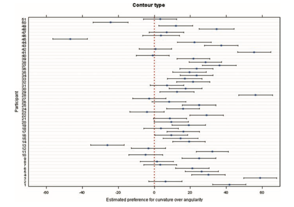
One of the first variables is contour. Where the shape edges, curved versus angular. In our daily life, we tend to already associate curved things with softness, smoothness, or safety, and angular things with sharpness or tension. The study confirms this pattern: participants preferred curved shapes over angular ones. This matches earlier research mentioned in the paper, which also found a strong preference for curved contours. The exact reason remains debated. Some theories suggest angular shapes trigger avoidance responses because they can signal danger. Others propose that curved shapes feel more natural to us, connecting to shapes we encounter in the environment.

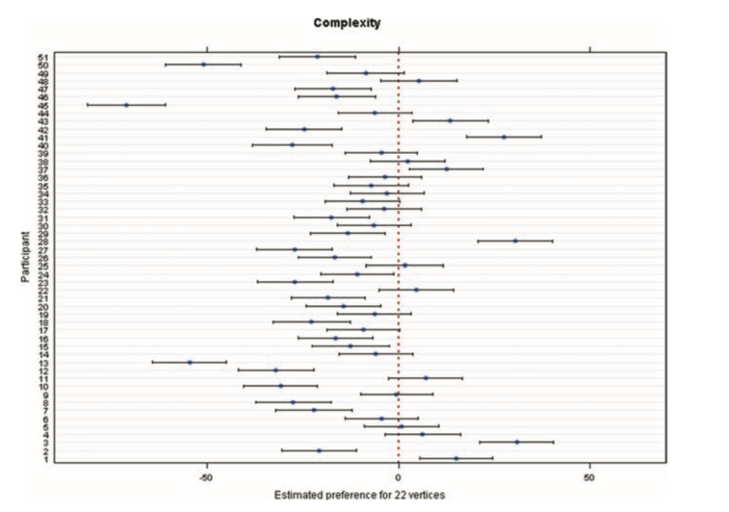
The second variable, complexity, turned out to be more surprising. The study defines complexity through the number of vertices: six for simple shapes, 22 for complex ones. Complexity is already a controversial topic in aesthetic research. Some theories argue that complexity increases interest, while others suggest simplicity is more appealing because it requires less cognitive effort. In this study, participants clearly preferred simpler shapes. The authors describe this as an effect of simplicity. However, they also acknowledge that previous studies have found more mixed or even opposite patterns, depending on how complexity was defined from the beginning. This suggests complexity is not a single variable but a cluster of different visual features. For example, the paper “Visual Complexity: A Review” (Donderi, 2006) highlights that visual complexity which has been studied across many domains. It looks at how judgments of complexity relate to multiple factors such as amount of detail, predictability, symmetry, and perceptual load. One of Donderi’s key points in his work is that our perception of complexity is very tightly linked to its predictability. Images or shapes that have a more clear and regular pattern, like symmetrical shapes, often feel less complex. On the other hand, unpredictable shapes or compositions feel more complex to us because our visual system cannot easily understand or “compress” them into simple rules. This claim is also supported by the idea that our brain constantly tries to reduce incoming information into simple structures. However, when that is not possible, we perceive it as complex.

The third variable, movement, examined whether rotation or expansion would change how people rated the shapes. The interesting part is that movement did not affect aesthetic ratings. There were also no individual differences. This stands in contrast to contour and complexity, where people varied a lot. But for movement, the participants agreed that it didn’t have a special effect on them. This might mean movement simply does not influence aesthetic judgments for this type of shape. Or it might mean that the study design removed all the expressive value that movement normally carries. My main takeaway is that movement is not a universal aesthetic enhancer. When a shape is abstract and meaningless, adding rotation or expansion does not automatically make it more beautiful. Aesthetic impact depends on context and on the meaning we attach to motion.

Overall the reseach shows that aesthetic judgment are shaped by basic visual features like contour, complexity and movement. Even if movement does not play such a major role for abstract shapes. Simplicity, predictability and visual structure do have a great influence on beauty more that it might have been expected. 

Bibliography

Donderi, D. C. (2006). Visual Complexity: A Review. Psychological Bulletin132(1), 73–97.

Soranzo, A., Bertacchini, F., & Bertamini, M. (2024). Abstract Shape Aesthetics: Contour, Complexity, Motion, and Individual Variability. Art & Perception12(3), 240–263. https://doi.org/10.1163/22134913-bja10057

What Abstract Shapes Teach Us

When we talk about aesthetics, most people immediately think of art, design, or familiar objects. Things that we recognize and know. Things that carry memories and meaning. That’s why it feels almost strange to learn that an entire field of research focuses on the opposite: abstract, meaningless shapes. No symbolism and. No cultural context. 

In Abstract Shape Aesthetics: Contour, Complexity, Motion, and Individual Variability (Soranzo et al., 2024), the authors highlight why such stripped-down stimuli are so powerful. They write that studying shapes “devoid of meaning or familiarity” helps us understand how visual perception can work and how we experience art on a basic level. To me, this hints at something fundamental, that we might not need cultural knowledge to experience beauty. Some aesthetic responses might be built into how our visual system works.

Abstract Shapes as a Window Into “Raw” Perception

Abstract shapes let researches look at how we react to visuals before meaning steps in. For example, the moment we recognize a face, an animal, or a symbol, our brains automatically activate memories, emotions, and cultural knowledge. That’s also why psychologists often try to remove context, to find out what features alone can trigger an aesthetic preference.

This study took that idea and looked at it more closely. The researchers used abstract, meaningless shapes presented on a computer screen, ensuring that nothing could be interpreted as a known object. This creates a laboratory-like condition: a clean space where only visual properties matter.

And even when shapes have no meaning they can still influence us: 

  • Curves often feel soft, friendly, or organic
  • Angles can feel sharp, dynamic, or even threatening
  • Simple shapes can feel calm or elegant
  • Complex shapes can feel chaotic or energetic
  • Motion — expansion, rotation — can feel looming, playful, or mechanical

We respond emotionally to form long before meaning steps in.

A Long Tradition: Fechner and the Quest to Measure Aesthetics

What I find fascinating is this very modern study can be connected to something very old. Already in 1876, Gustav Fechner believed that aesthetics could be studied scientifically and that the best way to do this was through neutral stimuli. Here the authors explicitly link their work to Fechner’s idea that studies of beauty should start with simple, context-free shapes.

This does leave me torn. On one hand, it’s exciting to think that beauty isn’t purely subjective. On the other hand, I love the messy, emotional, culturally shaped side of aesthetics. Beauty is not only “perception”; it’s also memory, narrative, and identity.

New Insights: Individual Differences Matter

One of the most interesting results becomes visible when looking at individuals instead of a whole group of averages. The overall trends were very clear: 

  • People preferred curved over angular shapes
  • Simple over complex shapes
  • And within this experiment movement didn’t create a strong preference 

But when researches looked at each individual the results changed. Especially when contour type and complexity interacted the preferences varied a lot from person to person. This reminds us that even the most basic perceptual preferences are not universal. Even before meaning enters the picture, humans differ.

The study shows that many of our aesthetic responses may be deeply rooted in the visual system itself. Abstract shapes make these foundations visible. But for me, abstract shapes standing alone are not fully satisfying. They reveal mechanisms, not emotions. Perception, not meaning. Preference, not experience. However what I can take away form this is that abstract shapes help us understand how we process beauty, but only context explains why something truly touches us.

Bibliography:

Soranzo, A., Bertacchini, F., & Bertamini, M. (2024). Abstract Shape Aesthetics: Contour, Complexity, Motion, and Individual Variability. Art & Perception12(3), 240–263. https://doi.org/10.1163/22134913-bja10057

Die Rolle des Lichts im Sakralraum

Gespräch mit D. Bauer

Im Rahmen des Kurses Design and Research 3 fand ein gemeinsames Reflexionsgespräch mit D. Bauer statt. Bauer verfügt über umfassende Erfahrung im Bereich medialer Gestaltung und Produktionsprozesse. Während einer intensiven halbstündigen Sitzung bot er uns die Gelegenheit, die eigenen Masterarbeitskonzepte kritisch zu beleuchten und inhaltliche Schwerpunkte zu präzisieren.

Für mich war dieses Gespräch besonders wertvoll, da ich mich bis dahin schwer tat, den theoretischen Kern meiner Masterarbeit klar zu fassen. Mein ursprünglicher Ansatz beschäftigte sich mit der Frage, wie der kulturelle oder religiöse Raum die Wahrnehmung eines Videomappings beeinflusst, insbesondere in Kirchen oder Kapellen. Obwohl mich das Thema von Beginn an faszinierte, war es in seiner formulierten Form noch relativ breit und theoretisch schwer greifbar.

Licht als zentrales Medium im sakralen Raum

D. Bauer reagierte positiv auf meinen Ansatz und riet mir, ihn nicht aufzugeben, sondern konzeptionell zu schärfen. Seine wichtigste Empfehlung bestand darin, das Thema stärker auf den Begriff Licht zu fokussieren. Dieser Hinweis eröffnete eine neue Perspektive:

  • Kirchen sind seit Jahrhunderten lichttheologisch und lichtarchitektonisch aufgeladen.
  • Licht besitzt in sakralen Kontexten eine symbolische, atmosphärische und spirituelle Funktion.
  • Architektur und Lichtführung sind in Kirchen untrennbar miteinander verbunden.
  • Videomapping ist letztlich geformtes und gelenktes Licht, das eine räumliche Bedeutung erzeugt.

Damit ergibt sich eine klarere Forschungsfrage:

Welche Rolle spielte und spielt Licht im sakralen Raum – und wie verhält sich künstliches Licht (Videomapping, Projektion) im Vergleich zu historischem, natürlichem oder spirituellem Licht?

Bauer betonte, dass diese Fragestellung sowohl kulturgeschichtlich anschlussfähig sei als auch eine solide Verbindung zum praktischen Teil meiner Arbeit ermögliche.

Überfrachtung vs. Reduktion

Im Gespräch schilderte ich Bauer eine persönliche Erfahrung: Bei einer Videomapping-Ausstellung in Wien empfand ich die Inszenierung in einer katholischen Kirche als ästhetisch überladen. Kirchen besitzen bereits eine sehr dichte visuelle Struktur – Skulpturen, Fresken, Altäre, Ornamente. Das Hinzufügen intensiver Farben und schnell wechselnder Bilder wirkte künstlich und störend.

Sakrale Räume sind keine neutralen Projektionsflächen. Vielmehr besitzen sie eine jahrhundertelange ikonografische und atmosphärische Tradition.

Daraus ergab sich für mich eine wichtige Erkenntnis:

Videomapping im sakralen Raum muss nicht laut und farbintensiv sein. Es kann auch als reduziertes Lichtmapping funktionieren – etwa mit weißem Licht, das architektonische Elemente subtil hervorhebt.

Damit wird Projektion zu einer Art zeitgenössischer Lichtliturgie, die bestehende Architektur kommentiert statt überlagert.

Die Andräkirche Graz – ein potenzieller Ausstellungsort

© dibk.at

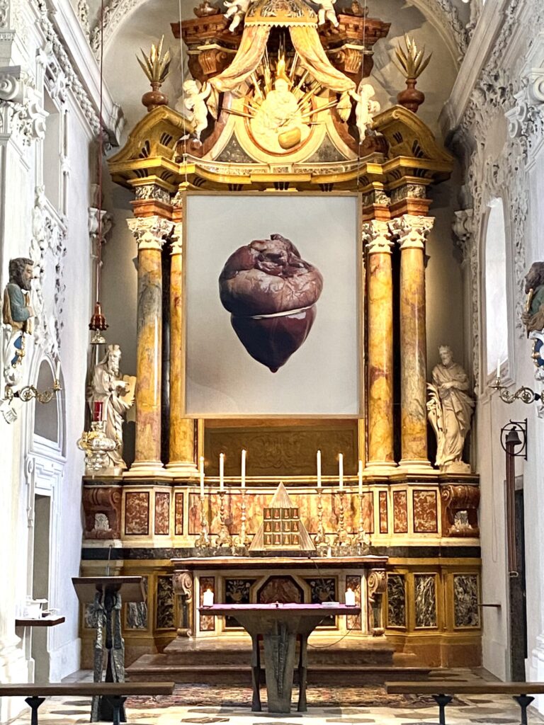
Besonders wichtig war Bauers Hinweis auf die Andräkirche in Graz. Diese Kirche ist bekannt für ihre experimentelle Offenheit gegenüber zeitgenössischer Kunst. Über Jahre hinweg war Hermann Glettler, heute Bischof von Tirol, dort tätig. Er prägte die Andräkirche maßgeblich, indem er sie ab 1999 zu einem Ort machte, an dem moderne Kunst, performative Formate, mediale Installationen und liturgischer Raum miteinander in Dialog treten.

Glettler vertritt die Auffassung, dass Kirchenräume nicht museal erstarren dürfen, sondern als lebendige kulturelle Räume fungieren sollen. Er öffnete St. Andrä bewusst für Projekte, die Grenzen verschieben – darunter Lichtkunst, politische Kunst, interdisziplinäre Performances und mediale Interventionen.

Für meine Masterarbeit eröffnet dies eine äußerst spannende Möglichkeit:

Warum die Andräkirche ideal wäre

  • Sie verbindet sakrale Tradition mit zeitgenössischer Experimentierfreude.
  • Sie ist architektonisch reich und atmosphärisch intensiv.
  • Es existiert dort eine bereits etablierte künstlerische Infrastruktur.
  • Der Raum ist kulturgeschichtlich bedeutungsvoll und zugleich medienkunstfreundlich.
  • Sie wäre ein realer Kontext, um die Rolle von künstlichem Licht im religiösen Raum zu untersuchen.

Die Andräkirche könnte damit ein Ort für meinen praktischen Masterarbeits-Teil werden.

Literaturrecherche und theoretische Grundlage

Seit dem Gespräch habe ich begonnen, systematisch Literatur zum Thema Licht im sakralen Kontext, Atmosphäre, architektonische Lichtführung und Wahrnehmung zu sammeln. Dabei sind mehrere Quellen besonders relevant für die theoretische Fundierung meiner Masterarbeit.

Folgende Bücher habe ich während meiner bisherigen Recherche gefunden und sie könnten einen wesentlichen Beitrag zum theoretischen Teil meiner Arbeit liefern:

Baukunst aus Raum und Licht: Sakrale Räume in der Architektur der Moderne (Zahner 2012).
Diese Publikation untersucht, wie moderne sakrale Architektur Licht als konstitutives Gestaltungselement einsetzt. Besonders relevant ist die Verbindung zwischen spiritueller Bedeutung und architektonischer Lichtdramaturgie.

Architektur und Atmosphäre von Gernot Böhme (2013).
Böhmes Konzept der Atmosphäre bietet eine theoretische Grundlage, um zu analysieren, wie Licht Stimmung, Raumwirkung und Wahrnehmung erzeugt. Für die Untersuchung sakraler Räume ist dieses Werk theoretisch zentral und methodisch richtungsweisend.

The Design of Lighting von Peter Tregenza und David Loe (1998).
Dieses Buch liefert einen technisch fundierten, gestalterischen und wahrnehmungspsychologischen Überblick über Lichtgestaltung. Besonders wertvoll ist seine praxisorientierte Herangehensweise, die sich gut auf Projektionstechnik, Videomapping und architektonische Lichtführung übertragen lässt.

Licht–Räume: Die Kunst architektonischer Beleuchtung (Zumtobel Staff 1998).
Diese Publikation analysiert Lichtführung anhand realer Architekturprojekte und verbindet technische Erkenntnisse mit ästhetischen Überlegungen. Gerade für die Frage nach der Funktion künstlichen Lichts im sakralen Raum ist sie von großer Bedeutung.

Farbe und Licht: Symbolik bei Aleksandr Blok von Johanne Peters (1981).
Obwohl literaturwissenschaftlich orientiert, bietet dieses Werk eine tiefgehende Analyse der symbolischen Bedeutung von Licht. Es eignet sich daher für theoretische Querverweise und unterstützt die Untersuchung von Licht als kulturellem Bedeutungsträger.

Diese Literatur bildet gemeinsam ein solides Fundament, um die Rolle des Lichts sowohl historisch, ästhetisch als auch atmosphärisch zu verstehen – und um künstliches Licht (Mapping, Projektion, Weißlichtintervention) differenziert in den Kontext sakraler Räume einzuordnen.

Bildnachweise (Chicago Style)

Bild 1 – Herz-Installation im Altarraum

Bildquelle: Kath.ch. 2023. „Bischof Glettler zu Herz im Altarraum: Im Lärm ging eigentliches Thema fast unter.“
© Kath.ch / Diözese Innsbruck / Fotograf: unbekannt.
Accessed February 2025.
https://www.kath.ch/newsd/bischof-glettler-zu-herz-im-altarraum-im-laerm-ging-eigentliches-thema-fast-unter/

Literaturverzeichnis (Chicago Author–Date)

Stadt Graz. 2020. Kirche St. Andrä – Kunst am Bau.
Accessed February 2025. https://www.graz.at/cms/beitrag/10271682/7776088

Kath.ch. 2023. „Bischof Glettler zu Herz im Altarraum: Im Lärm ging eigentliches Thema fast unter.“
Accessed February 2025.
https://www.kath.ch/newsd/bischof-glettler-zu-herz-im-altarraum-im-laerm-ging-eigentliches-thema-fast-unter/

Böhme, Gernot. 2013. Architektur und Atmosphäre. München: Fink.

Peters, Johanne. 1981. Farbe und Licht: Symbolik bei Aleksandr Blok. Frankfurt am Main: PH02.
https://directory.doabooks.org

Tregenza, Peter, und David Loe. 1998. The Design of Lighting. London: Spon Press.

Zahner, Walter, Hrsg. 2012. Baukunst aus Raum und Licht: Sakrale Räume in der Architektur der Moderne. Lindenberg: Kunstverlag Fink.Zumtobel Staff. 1998. Licht–Räume: Die Kunst architektonischer Beleuchtung. Dornbirn: Zumtobel Staff.


Hinweis zur Verwendung von KI-Tools

Zur sprachlichen Optimierung und für Verbesserungsvorschläge hinsichtlich Rechtschreibung, Grammatik und Ausdruck wurde ein KI-gestütztes Schreibwerkzeug (ChatGPT, OpenAI, 2025) verwendet.

Seeking Conflict Ethically

In this blog post, I will be analyzing the article Dramatic Conflict in Documentary How to Build it Safely? published in 2023 and written by Andrei Tache-Codreanu (Tache-Codreanu, 2023, pp. 473–478). The text talks about how in order for a documentary film to be compelling and catching, as all films and stories, it needs to have a conflict consisting of a protagonist and opposing antagonistic forces, working against the protagonist (Tache-Codreanu, 2023, p. 473).

In documentaries however, seeking this type of conflict might create ethical dilemmas as the subjects being filmed and observed are real-life people with real problems, for whom the experience of being put onto a screen might be (re-)traumatizing.
Tache-Codreanu describes how, many times, talking to a camera can lead participants to reveal far more than they had intended initially intended, making them very vulnerable. Documentary filmmakers need not lose sight of that when chasing their perfect story (Tache-Codreanu, 2023, pp. 474–475).

In chapter 2 of his article Tache-Codreanu describes the parallels documentaries bear to psychoanalysis in the way that patients or, in the case of a documentary, participants wish to have an opportunity to have their story heard by someone empathetic and respectful, who will ideally help them understand it better by having someone reflect the story back to them in a broken down and simplified way. The main difference between the two would be that documentary filmmakers do not have the participant’s healing process as their highest aim, it might just be a lucky side effect of their main goal: creating a captivating and interesting piece of media. This discrepancy between participants feeling like they will achieve some healing or closure by revealing some potentially traumatic information and the filmmaker possibly only aiming at getting an intriguing story, whatever it takes, might lead to an exploitation of the participant’s trauma when filmmakers push too hard. This is why Tache-Codreanu describes that, like in psychoanalysis, conversations in documentaries should be able to flow freely without being forced (Tache-Codreanu, 2023, p. 475).

Nonetheless, even when the interview situation itself is pleasant and freeing for the participants, Tache-Codreanu talks about how seeing themselves in the finished product can lead to anxiety if the participants do not recognize their doppelganger on the screen. This separation between their perceived self and what the editing process and style of the documentation have made of them can cause a great deal of pain and trauma for the film’s subjects. This is why Tache-Codreanu making participant’s also feel included in the rest of the creative process, giving them a certain amount of control over the version of themselves they are going to show the world. This collaborative approach can look like explaining the different steps of the filmmaking process, including the film team and equipment, making the participants feel as a part of the team, but can also go so far as to ask creative input from them for how they want the documentary to look and feel like. This inclusion would help people feel not as test subjects to be studied under a microscope, but as active participants and proud part of the production, thus aiding in making them feel more comfortable with the results, even if deeply traumatic topics are treated. One method by Rosenthal, which Tache-Codreanu described is having a sort of warm-up phase before the actual interview starts where he just talks to the participant, maybe having a cup of tea and introducing the crew as well as the equipment and process, before the actual interview begins (Tache-Codreanu, 2023, pp. 476–477).

Tache-Codreanu concludes that in order to create meaningful and ethical documentaries that still tell captivating stories about real people, it is never a good idea to force answers out of the participants or edit the footage in a way that makes it seem more enticing, but less real. He says that truly moving stories come from a collaboration between filmmaker and film subjects where there are mutual trust and openness. Creating a safe space is the best method for getting honest and raw stories and letting participants have a say in the finished product assures a harmonious and ethical collaboration. Documentary filmmakers are wholly dependent on the stories they are told, so it is of utmost importance to treat those who tell these stories with care and respect (Tache-Codreanu, 2023, pp. 477–478).

Source:

Tache-Codreanu, A. (2023). Dramatic Conflict in Documentary How to Build it Safely?