BLOG POST 2: BUILDING THE FOUNDATION (WEEK 2 – 30.10)

Title: “From Concept to Reality: The First Steps Toward a Sensor-Embedded Surfboard”

This week was all about laying the groundwork for the project. I spent hours researching sensors, microcontrollers, and data visualization tools. The goal is to create a surfboard that not only performs well in the water but also captures the essence of the surfing experience through sound and visuals.

SENSOR SELECTION:

After some research, I’ve decided to start with the MPU-6050 accelerometer and gyroscope. These sensors are affordable, widely available, and perfect for capturing motion data. I’m also considering adding a waterproof microphone (hydrophone) to capture the sounds of the water as the board moves through it.

PROTOTYPING:

I’ve started planning  to attach sensors to a skateboard to simulate the motion of a surfboard. This will allow me to test the sensors in a controlled environment before moving to the water. I will be using an Arduino to collect and transmit the data, which will later be processed using Pure Data for sound synthesis and TouchDesigner for visual effects.

COLLABORATIONS:

I reached out to a local surfboard shaper to discuss the possibility of embedding sensors into a board. He was intrigued by the idea and offered to help me with the design. This collaboration will be crucial in ensuring that the board remains functional and aesthetically pleasing.

CHALLENGES:

  • Waterproofing the sensors and electronics is a major concern.
  • I need to figure out how to power the system while it’s in the water.
  • The data needs to be transmitted in real-time, which requires a reliable wireless connection.

NEXT STEPS:

  • Finalizing the idea of the sensor setup and start collecting data from the skateboard.
  • Begin experimenting with Pure Data and TouchDesigner to map the data to sound and visuals.
  • Continue discussions with the surfboard 

BLOG POST 1: THE SPARK OF AN IDEA (WEEK 1 – 16.10)

Title: “The Sonic Wave: Where Surfing Meets Sound and Technology”

This week marked the beginning of an exciting journey. The idea of merging surfing, sound, and technology has been on my mind for some time, and now it’s time to bring it to life. The concept is simple yet profound: embed sensors into a surfboard to capture the motion, speed, and vibrations of the board as it rides the waves. Then, transform this data into sound and visuals, creating an immersive experience that highlights the rhythm and beauty of surfing.

RESEARCH AND INSPIRATION:

I started by exploring existing projects that combine sports and technology. The Surflogic GPS Tracker and TRACE were particularly inspiring. These tools track surfers’ performance metrics like speed and wave count, but they don’t delve into the artistic side of things. I want to go beyond performance tracking and explore how surfing can be experienced as a multisensory art form.

CHALLENGES AND QUESTIONS:

  • How do I integrate sensors into a surfboard without affecting its performance?
  • What kind of sensors will give me the most accurate and meaningful data?
  • How can I translate raw data into something that resonates emotionally with an audience?

NEXT STEPS:

  • Research sensor technology (accelerometers, gyroscopes, hydrophones).
  • Reach out to surfboard shapers and tech experts for advice.
  • Start sketching out a prototype design.

This project feels like a perfect blend of my passions—surfing, technology, and art. I’m eager to see where this journey takes me.

DesRes Nr. 2 – The Medium Is The Message 

Das Ziel des zweiten Design & Research Projekts im Masterstudiengang CMS24 besteht darin, einen Prototypen zu entwickeln, der im weiteren Verlauf auch für die Masterarbeit von Bedeutung sein wird. Dieser Prototyp dient als experimentelles Werkzeug zur Untersuchung der Rolle von Videomapping als künstlerische Technik zur Veränderung der architektonischen Wahrnehmung durch Licht und Bewegung.

Anpassung der Forschungsfrage

Zunächst möchte ich die zentrale Forschungsfrage anpassen, bzw. um einen neuen Gedankenimpuls erweitern. Anstatt nur den kulturellen Kontext des Gebäudes zu berücksichtigen, soll auch die Auswirkung der Projektion auf die Architektur untersucht werden: „Wie kann Videomapping als künstlerische Technik die Wahrnehmung von Architektur durch Licht und Bewegung verändern?“

Folgende Themenbereiche dienen als theoretische Grundlage:

  • Geschichte des Lichtdesigns in der Architektur
  • Wahrnehmungspsychologie von Lichtprojektionen
  • Interaktion von Licht, Farbe und Materialität

Prototypenentwicklung

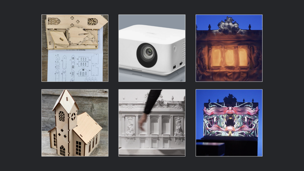
In meinem Projekt plane ich, ein Modell – voraussichtlich eine Miniaturkirche – entweder als fertigen Bausatz aus dem Internet zu bestellen und zusammenzubauen oder es als Laser-Cutter-Vorlage mit dem Lasercutter der Fachhochschule auszuschneiden.

Projektion & Videomapping

Nach der Fertigstellung des Modells soll dieses mithilfe eines Beamers projiziert und durch Videomapping visuell bespielt werden. Hierfür ist der Einsatz eines Kurzdistanzprojektors oder eines kleinen mobilen Beamers vorgesehen, um maximale Flexibilität bei der Aufstellung und Projektion zu gewährleisten. Ziel dieser Projektionen ist es, verschiedene Techniken, Farben, Texturen, Animationen und Visualisierungen auf die Miniaturkirche anzuwenden, um deren Wirkung auf die Oberflächenstruktur und die architektonische Gestaltung zu untersuchen. Besonders relevant ist hierbei die Frage, wie Licht auf Architektur wirkt und inwieweit Projektionen als erweiterte Gestaltungsebene dienen können.

Prototypenvarianten und Herausforderungen

Um ein möglichst authentisches 3D-Mapping zu erzielen, plane ich, die Miniaturkirche auch als digitales 3D-Modell zu erstellen. Dies würde die Flexibilität erhöhen und eventuell auch die Möglichkeit bieten, virtuelle Prototypen in VR oder AR zu testen. Ein potenzielles Problem bei der Projektion auf physische Modelle ist deren geringe Größe von etwa 20 bis 30 cm sowie die eingeschränkte Auflösung des Beamers. Es bleibt fraglich, ob feine Konturen und Linien des Modells präzise genug dargestellt werden können, um eine ästhetisch ansprechende und wirksame Projektion zu ermöglichen.

Software & Technik

Das Videomapping soll audio-reaktiv gestaltet werden, wobei ich derzeit überlege, ob ich dafür Cinema4D oder Blender verwenden soll. Optimalerweise würde ich eine Kombination der besten Features beider Programme nutzen. Blender bietet aufgrund seiner leistungsstarken Geometrie- und Simulations-Nodes deutlich mehr Optionen zur Erstellung sanfter, dynamischer Animationen, während Cinema4D in diesem Bereich bisher limitiert ist – jedoch in anderen audio-reaktiven Anwendungsbereichen deutlich intuitiver ist. Weitere Untersuchungen und Experimente dazu werden im nächsten Blogpost (BlogPost #2) dokumentiert.


Der Medientheoretiker Marshall McLuhan stellte einst fest: „Das Medium ist die Botschaft.“ Diese Aussage hat in unserer von digitalen Technologien geprägten Zeit eine besondere Relevanz und dient als Leitsatz für die Entwicklung dieses Prototyps.


🤖🧠Disclaimer zur Nutzung von Künstlicher Intelligenz (KI):

Dieser Blogbeitrag wurde unter Zuhilfenahme von Künstlicher Intelligenz (ChatGPT) erstellt. Die KI wurde zur Recherche, zur Korrektur von Texten, zur Inspiration und zur Einholung von Verbesserungsvorschlägen verwendet. Alle Inhalte wurden anschließend eigenständig ausgewertet, überarbeitet und in den hier präsentierten Beitrag integriert.

Enhancing User Experience: My Plan to A/B Test Color Schemes, CTAs, and Mobile Responsiveness for Optimal Cognitive Ease

In my testing I want to focus on color schemes, refining call-to-action buttons (CTA) as well as enhancing mobile responsiveness, in order to use the outcome of the testing to make sure what to focus on when it comes to my neurodesign approach. When choosing a color scheme for example, it is important to think about how all design elements interact. Are they making users squint or, worse, leave? In an A/B test, I want to test different color combinations that still align with the individual branding but are easier on the eyes. The dream result? A color palette that promotes clarity and comfort as well as making the user stay on the website longer.

CTAs are like road signs for your users. If your buttons are too small, poorly worded, or blend into the background, users may never “see” them. When it comes to testing I want to experiment with button color, size, and the text itself. Maybe wording like “Get Started” works better than “Submit,” or a bright, standout color for your button makes it easier to spot. A well-designed CTA can act like a neon arrow pointing the way to conversion. For me it is important to integrate the psychological aspect we explored in the previous semester, to enhance the design to a next level. Improving design not only through aesthetic, composition but also through a more humane approach.

One of the last parts of my testing would be the enhancing mobile responsiveness. With everyone glued to their phones, a website that doesn’t work well on mobile is practically a crime. Maybe you’ve seen those sites where you have to pinch and zoom to read anything. An A/B test where one version of your site is optimized for mobile (with bigger buttons, shorter text, and a cleaner layout) could show that mobile-first design improves engagement, session times, and overall satisfaction.

A/B testing is an ongoing journey of refinement and improvement. It’s not a one-time magic bullet. Once you’ve conducted a test and seen which version performs better, it’s crucial to act on that data. Iterating based on feedback is the next logical step for me. For example, if users showed a preference for a simplified navigation menu, it would be beneficial making that the default across the entire website.

Another thing to keep in mind is staying updated with trends. The digital world evolves quickly, and so do user preferences. Even if I’ve nailed cognitive ease for the current audience, the way people interact with websites may change. Testing new design elements regularly should help staying ahead of the curve.

Let’s break this down into actionable steps:

  1. Defining my hypothesis: Identifying a pain point in a website design. I will do the testing in combination with our Branding Exercise in this course as well, to use my testing in a more useful way. Here the focus on the hypothesis would be the rebranding of the webpage for “Oma’s Teekanne”.
  2. Creating my A/B versions: Designing two versions of the page. Version A is the control—the existing “bad” design, and Version B is my experiment with changes to navigation or layout, based on my hypothesis. In this case, Version B might feature a cleaner, simplified navigation bar.
  3. Splitting the audience: Using tools like Google Optimize to divide your audience. Half of the users will see Version A, and the other half will see Version B. These tools can automatically randomize the audience, ensuring that the test results are statistically sound.
  4. Track key metrics: Metrics are the bread and butter of A/B testing. For cognitive ease, I want to measure things like:
    • Bounce rate: Do fewer people leave immediately?
    • Session duration: Are users staying longer?
    • Click-through rate: Are people interacting with calls to action more?
    • Conversions: Are users completing desired actions like signing up or making a purchase?
  5. Analyze the results: After gathering enough data, it’s time to look at which version performed better. If Version B (the simplified design) results in users staying on the page longer, clicking more, and converting better, I’ve successfully enhanced the cognitive ease.
  6. Iterate and improve: A/B testing doesn’t end with one successful experiment. The goal would be using the results to inform future tests and continue optimizing for cognitive ease. Remembering, the goal is to reduce cognitive load for users, so looking for areas of friction and testing new ways to make the user experience as smooth as possible.
  7. Communicate findings: Once you have results, it’s important to share them with the costumer or stakeholders in a clear and actionable way. Visual aids like graphs or charts help convey how Version B improved metrics compared to Version A.

Status Quo – Unlocking the Secrets of Cognitive Ease: A/B Testing

When information flows so smoothly that your brain barely breaks a sweat, that’s the magic of cognitive ease. You can think of cognitive ease as your brain’s comfort zone. When information is easy to process, you’re more likely to engage with it, trust it, and stick around. On the other hand, when things are complicated or confusing, your brain throws up a big red flag and says, “Nope, not today, I’m out.”

So, how do we keep our users lounging in the comfort of cognitive ease? Here comes A/B testing into play, a very helpful tool of user experience design, I would like to further explore in the next few months. A/B testing is like a popularity contest for website elements. You create two versions (A and B) of a webpage or feature, show them to different user groups, and see which one performs better. My goal with this is pretty simple, first I want to test the previous established commandments and their actual functionality. Do they work on target groups? Is there an actual significant difference between the “conservative” (A) way of designing a website or does the “neuro” (B) way actually work better when it comes to our cognitive comprehension. By comparing variations of various design elements, I want to identify which versions make information processing a breeze. After researching a little further I came up with the following schedule of testing:

Hypothesis Formation: Guess which design tweaks might enhance cognitive ease. Maybe simplifying navigation or tweaking color schemes could do the trick.

Version Creation: Develop two versions of the webpage—Version A (the conservative design) and Version B (the new design with said proposed changes).

User Exposure: Randomly present these versions to users, ensuring each group experiences only one version. Also switching between several target groups.

Data Collection: Gather data on user interactions—click-through rates, time spent on the page, conversion rates, eye-tracking, you name it.

Analysis: Crunching the numbers to see which version led to smoother user experiences and better engagement.

A common issue many users face is getting lost or overwhelmed by a website’s menu. Imagine your website is a maze with too many twists and turns, and users are just looking for the exit. Simplifying the navigation bar is one way to prevent users from hitting that “Back” button out of frustration. In an A/B test, you could create a streamlined version of the navigation with fewer categories and clearer labels, and compare it with your existing complex menu. If users find what they’re looking for faster in the new version, congratulations—you’ve just made their experience more cognitively pleasing.

Let’s talk about optimizing content layout. No one likes staring at a wall of text—it’s a one-way ticket to mental exhaustion. A solution? Breaking up the content with bullet points, subheadings, and images, making sure to introduce any sort of hierarchy for the brain and eyes. To put this to the test, creating a version that’s broken up with more digestible chunks of information and visuals, and compare it to the original text-heavy layout. If the users engage more with your new format, you’ve made their cognitive load lighter. This ties into Information Processing Theory, developed by George A. Miller, which explains how our brains process and store information. The theory suggests that our minds work similarly to computers, where information is received, processed, and stored in stages. A key concept is “chunking,” where we group information into manageable units, allowing short-term memory to handle more. Additionally, the TOTE model—Test, Operate, Test, Exit—shows that behavior involves ongoing processes of testing and revising until a goal is reached. In the context of content layout, applying these principles means organizing information in a way that reduces cognitive load, making it easier for users to process and retain the material, ultimately increasing engagement.

Sources:

Hotjar. (n.d.). Heatmaps. Retrieved from https://www.hotjar.com/heatmaps/

Optimizely. (n.d.). A/B Testing. Retrieved from https://www.optimizely.com/

A/B Testing Tools. Retrieved from https://optimize.google.com/

Reggelin, Jonas. (2023). Neurowebdesign: Shaping the Future of Web Experiences with Neuroscience.

Miller, G. A. (1956). The magical number seven, plus or minus two: Some limits on our capacity for processing information. Psychological Review, 63(2), 81–97. https://doi.org/10.1037/h0043158

11 First Prototypes and Speed Dating

Th first new task I got this semester was to write six more blog posts and create (3) prototypes, of a possible project for my masters thesis. So naturally I asked myself, what could be a possible masters thesis and four different possible themes came to mind: 1. I could continue my bachelors thesis about digital mental health support programs. 2. I recently got into workshop facilitation & meeting facilitation, I thought the combination of being able to run workshops could be a great asset to every designer. 3. I could continue my research from last semester and deepen my knowledge in the understanding of biases. 4. Lastly I may get the opportunity to work together with a company to write about Design Systems.

Brainstorming

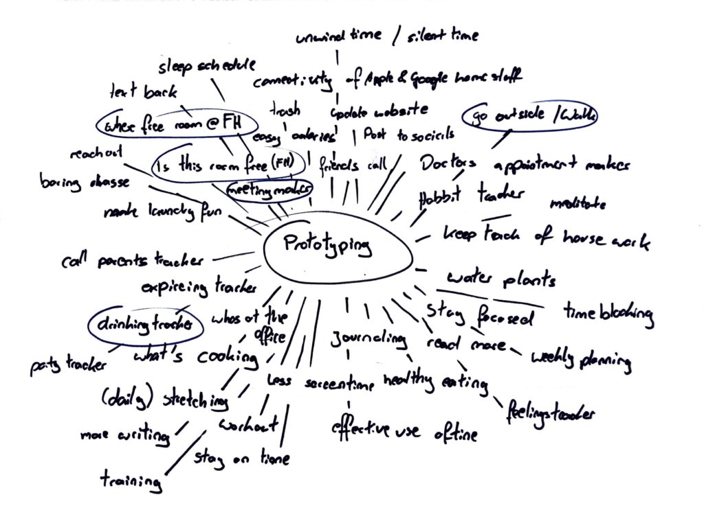
Naturally I couldn’t figure all of this out in one week, so I just started brainstorming, to figure out what problems I could solve with a quick prototype. On the picture below, you can see my ideas.

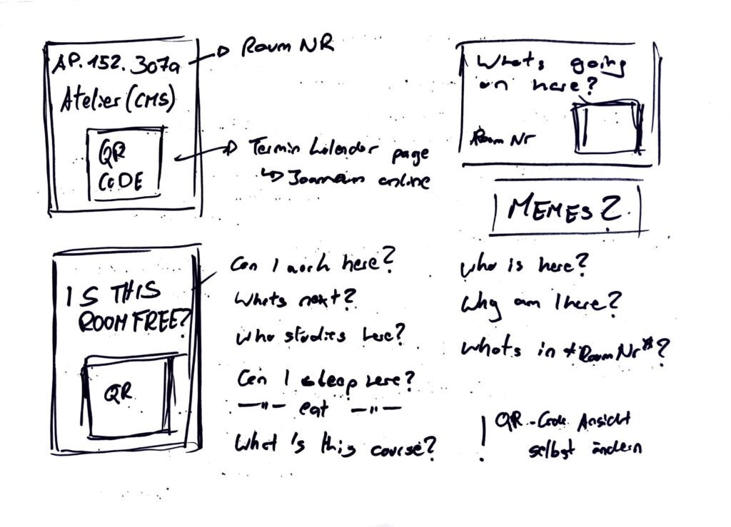
Four topics stuck with me: An app or similar digital solution that reminds you to go for a walk and motivate you to go outside. A drinking tracker, so you know how much you drank last night. A meeting maker, to help make meetings less confusing and draining. Lastly a solution for not finding a room at FH that is not occupied, to eat and work in.

Prototype 1

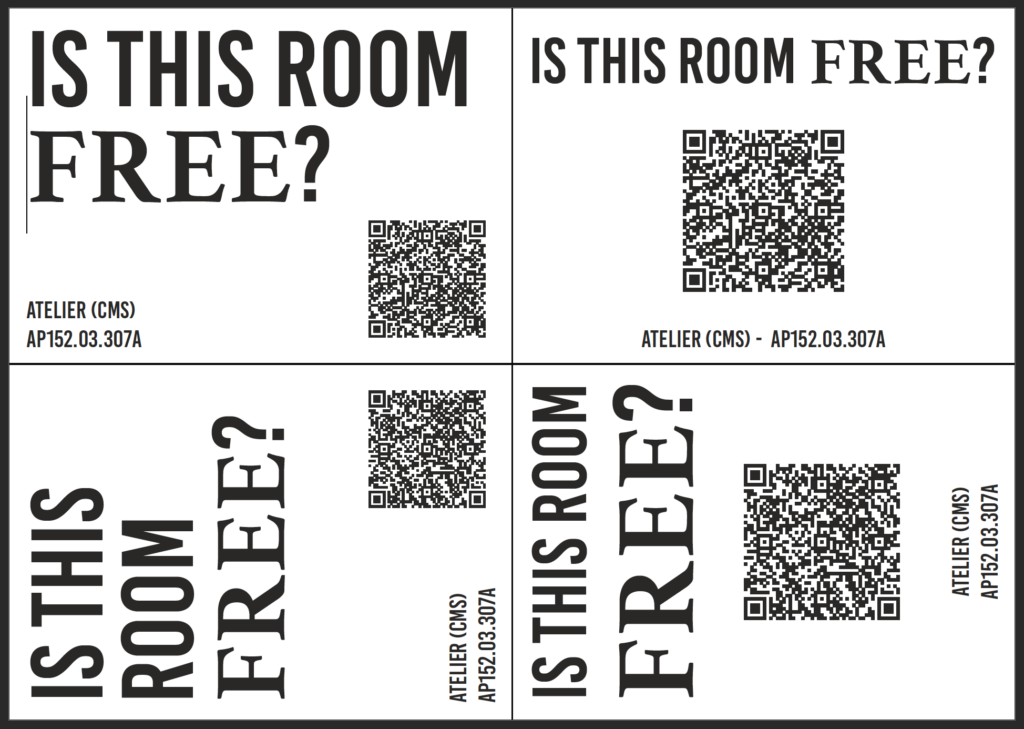
The last topic really stuck with me so I started a 20 minute timer and started sketching. After a quick research I found a way to see unoccupied rooms using Joanneum Online, but it’s confusing. So I tried a new approach, what if the process of checking a rooms schedule could be easier. My idea was to stick QR codes, next to every rooms sign, that lead to the rooms schedule. I started by sketching first ideas, of the signs and had just enough time to also create a first “mockup” of a sign. Later funny quotes or memes could be added to the signs, to make them more interesting.

Prototype 2

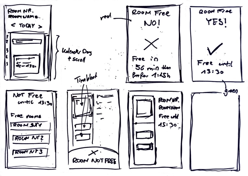
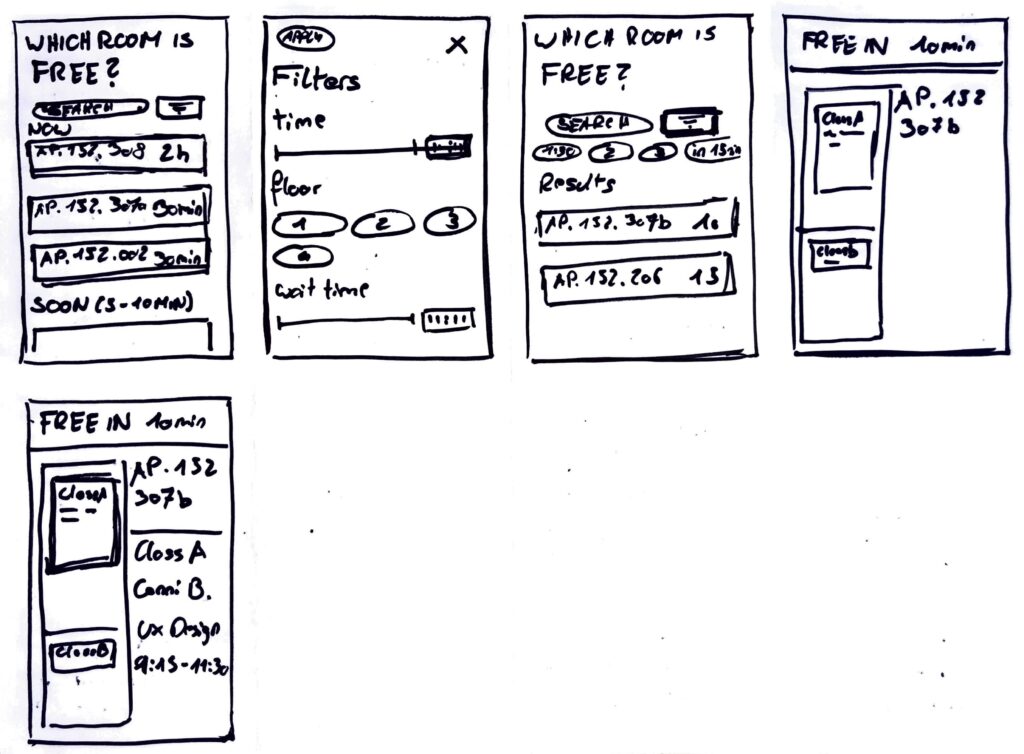
After creating the first prototype I got stuck on the idea of having an easy way to check for free rooms at our FH building. So continuing with the previous idea, I started another timer and started to generate first ideas for a website, that could display the desired information in a better way. Faster and easier to understand for the users. Since I love the crazy eight method, I used it to create this prototype

Prototype 3

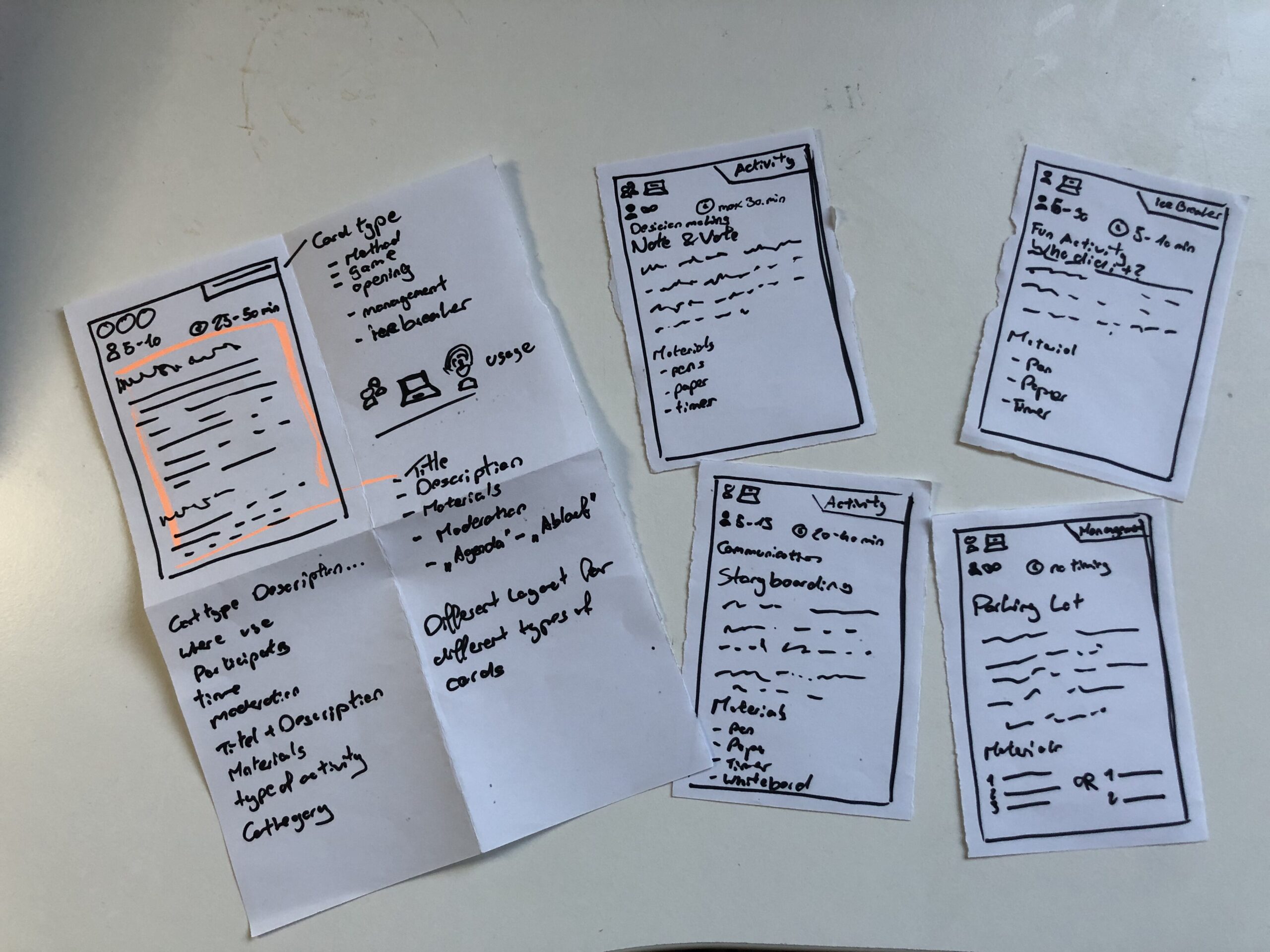
The last prototype went into a whole different direction, I still wanted to create something, that I could use for my masters thesis. So I just sat in my room thinking and then I had an idea. I could create a prototype for a card deck, that informs its owner about different work shop facilitation techniques. (Theoretically a card deck can be created for any topic, so I could also do one for biases and how to combat them) This is also the prototype I then brought to class, to discuss with my class mates.
The cards show what type of method you hold in your hands, if it can be used online or only live, how many people Ould participate, how long each activity takes, what you need to run it and of course the name and description of the method.

Speed Dating

So with my Prototype I headed to class, no clue, what was going to happen. In class we sat together, one on one and were given a task. Five rounds, each round with a new person and a new tasks. First we let the other person take a wild guess and describe the prototype to us. Next the partner had to give an idea for a new feature, without knowing the full potential of the prototype. This, was to create a dating profile for each prototype. Fourth, thinking big about the future and your prototype, maybe you are hosting a TED talk. Lastly we talked about the most unexpected feedback about our prototype. A very fun and insightful session, next I want to share my takeaways.

  1. Almost all of my “dates” mistook my playing cards, as wireframes for an app. Maybe, we all are a little biased towards digital solutions. But thinking about it makes something clear, my playing card prototype, doesn’t look like playing cards. Maybe it’s the size, the material or the way I drew on the paper.
  2. When I didn’t explain the prototype all of my partners needed the “instructions” to understand what the prototype was about and for what it could be used. This was also feedback I received, to add more and better instructions. ;D
  3. Additionally, most of them didn’t know, what to do with these flimsy pieces of paper. I figured, they didn’t want to break it.
  4. One “date” suggested to add QR codes to make the instructions on each card more accessible.
  5. I saved the best for last: When talking about the future of the prototype, I said I would have sold or given out a lot of decks and would be holding a TED Talk about a second version. Everything would be Creative Commons and open source, for everyone to use. The Interview partner then called me “the new Mark Zuckerberg, but with a conscious mind”.

Explore II: Image Extender – Image sonification tool for immersive perception of sounds from images and new creation possiblities

The Image Extender project bridges accessibility and creativity, offering an innovative way to perceive visual data through sound. With its dual-purpose approach, the tool has the potential to redefine auditory experiences for diverse audiences, pushing the boundaries of technology and human perception.

The project is designed as a dual-purpose tool for immersive perception and creative sound design. By leveraging AI-based image recognition and sonification algorithms, the tool will transform visual data into auditory experiences. This innovative approach is intended for:

1. Visually Impaired Individuals
2. Artists and Designers

The tool will focus on translating colors, textures, shapes, and spatial arrangements into structured soundscapes, ensuring clarity and creativity for diverse users.

  • Core Functionality: Translating image data into sound using sonification frameworks and AI algorithms.
  • Target Audiences: Visually impaired users and creative professionals.
  • Platforms: Initially desktop applications with planned mobile deployment for on-the-go accessibility.
  • User Experience: A customizable interface to balance complexity, accessibility, and creativity.

Working Hypotheses and Requirements

  • Hypotheses:
    1. Cross-modal sonification enhances understanding and creativity in visual-to-auditory transformations.
    2. Intuitive soundscapes improve accessibility for visually impaired users compared to traditional methods.
  • Requirements:
    • Develop an intuitive sonification framework adaptable to various images.
    • Integrate customizable settings to prevent sensory overload.
    • Ensure compatibility across platforms (desktop and mobile).

    Subtasks

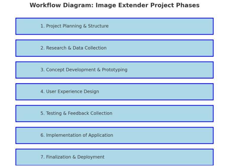
    1. Project Planning & Structure

    • Define Scope and Goals: Clarify key deliverables and objectives for both visually impaired users and artists/designers.
    • Research Methods: Identify research approaches (e.g., user interviews, surveys, literature review).
    • Project Timeline and Milestones: Establish a phased timeline including prototyping, testing, and final implementation.
    • Identify Dependencies: List libraries, frameworks, and tools needed (Python, Pure Data, Max/MSP, OSC, etc.).

    2. Research & Data Collection

    • Sonification Techniques: Research existing sonification methods and metaphors for cross-modal (sight-to-sound) mapping and research different other approaches that can also blend in the overall sonification strategy.
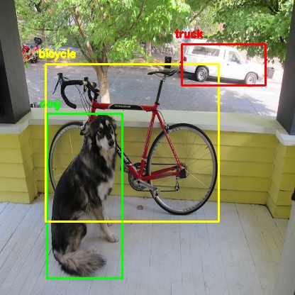
    • Image Recognition Algorithms: Investigate AI image recognition models (e.g., OpenCV, TensorFlow, PyTorch).
    • Psychoacoustics & Perceptual Mapping: Review how different sound frequencies, intensities, and spatialization affect perception.
    • Existing Tools & References: Study tools like Melobytes, VOSIS, and BeMyEyes to understand features, limitations, and user feedback.
    object detection from python yolo library

    3. Concept Development & Prototyping

    • Develop Sonification Mapping Framework: Define rules for mapping visual elements (color, shape, texture) to sound parameters (pitch, timbre, rhythm).
    • Simple Prototype: Create a basic prototype that integrates:
      • AI content recognition (Python + image processing libraries).
      • Sound generation (Pure Data or Max/MSP).
      • Communication via OSC (e.g., using Wekinator).
    • Create or collect Sample Soundscapes: Generate initial soundscapes for different types of images (e.g., landscapes, portraits, abstract visuals).
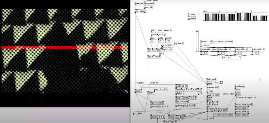
    example of puredata with rem library (image to sound in pure data by Artiom
    Constantinov)

    4. User Experience Design

    • UI/UX Design for Desktop:
      • Design intuitive interface for uploading images and adjusting sonification parameters.
      • Mock up controls for adjusting sound complexity, intensity, and spatialization.
    • Accessibility Features:
      • Ensure screen reader compatibility.
      • Develop customizable presets for different levels of user experience (basic vs. advanced).
    • Mobile Optimization Plan:
      • Plan for responsive design and functionality for smartphones.

    5. Testing & Feedback Collection

    • Create Testing Scenarios:
      • Develop a set of diverse images (varying in content, color, and complexity).
    • Usability Testing with Visually Impaired Users:
      • Gather feedback on the clarity, intuitiveness, and sensory experience of the sonifications.
      • Identify areas of overstimulation or confusion.
    • Feedback from Artists/Designers:
      • Assess the creative flexibility and utility of the tool for sound design.
    • Iterate Based on Feedback:
      • Refine sonification mappings and interface based on user input.

    6. Implementation of Standalone Application

    • Develop Core Application:
      • Integrate image recognition with sonification engine.
      • Implement adjustable parameters for sound generation.
    • Error Handling & Performance Optimization:
      • Ensure efficient processing for high-resolution images.
      • Handle edge cases for unexpected or low-quality inputs.
    • Cross-Platform Compatibility:
      • Ensure compatibility with Windows, macOS, and plan for future mobile deployment.

    7. Finalization & Deployment

    • Finalize Feature Set:
      • Balance between accessibility and creative flexibility.
      • Ensure the sonification language is both consistent and adaptable.
    • Documentation & Tutorials:
      • Create user guides for visually impaired users and artists.
      • Provide tutorials for customizing sonification settings.
    • Deployment:
      • Package as a standalone desktop application.
      • Plan for mobile release (potentially a future phase).

    Technological Basis Subtasks:

    1. Programming: Develop core image recognition and processing modules in Python.
    2. Sonification Engine: Create audio synthesis patches in Pure Data/Max/MSP.
    3. Integration: Implement OSC communication between Python and the sound engine.
    4. UI Development: Design and code the user interface for accessibility and usability.
    5. Testing Automation: Create scripts for automating image-sonification tests.

    Possible academic foundations for further research and work:

    Chatterjee, Oindrila, and Shantanu Chakrabartty. “Using Growth Transform Dynamical Systems for Spatio-Temporal Data Sonification.” arXiv preprint, 2021.

    Chion, Michel. Audio-Vision. New York: Columbia University Press, 1994.

    Görne, Tobias. Sound Design. Munich: Hanser, 2017.

    Hermann, Thomas, Andy Hunt, and John G. Neuhoff, eds. The Sonification Handbook. Berlin: Logos Publishing House, 2011.

    Schick, Adolf. Schallwirkung aus psychologischer Sicht. Stuttgart: Klett-Cotta, 1979.

    Sigal, Erich. “Akustik: Schall und seine Eigenschaften.” Accessed January 21, 2025. mu-sig.de.

    Spence, Charles. “Crossmodal Correspondences: A Tutorial Review.” Attention, Perception, Psychophysics, 2011.

    Ziemer, Tim. Psychoacoustic Music Sound Field Synthesis. Cham: Springer International Publishing, 2020.

    Ziemer, Tim, Nuttawut Nuchprayoon, and Holger Schultheis. “Psychoacoustic Sonification as User Interface for Human-Machine Interaction.” International Journal of Informatics Society, 2020.

    Ziemer, Tim, and Holger Schultheis. “Three Orthogonal Dimensions for Psychoacoustic Sonification.” Acta Acustica United with Acustica, 2020.

    Explore I: Image Extender – Image sonification tool for immersive perception of sounds from images and new creation possiblities

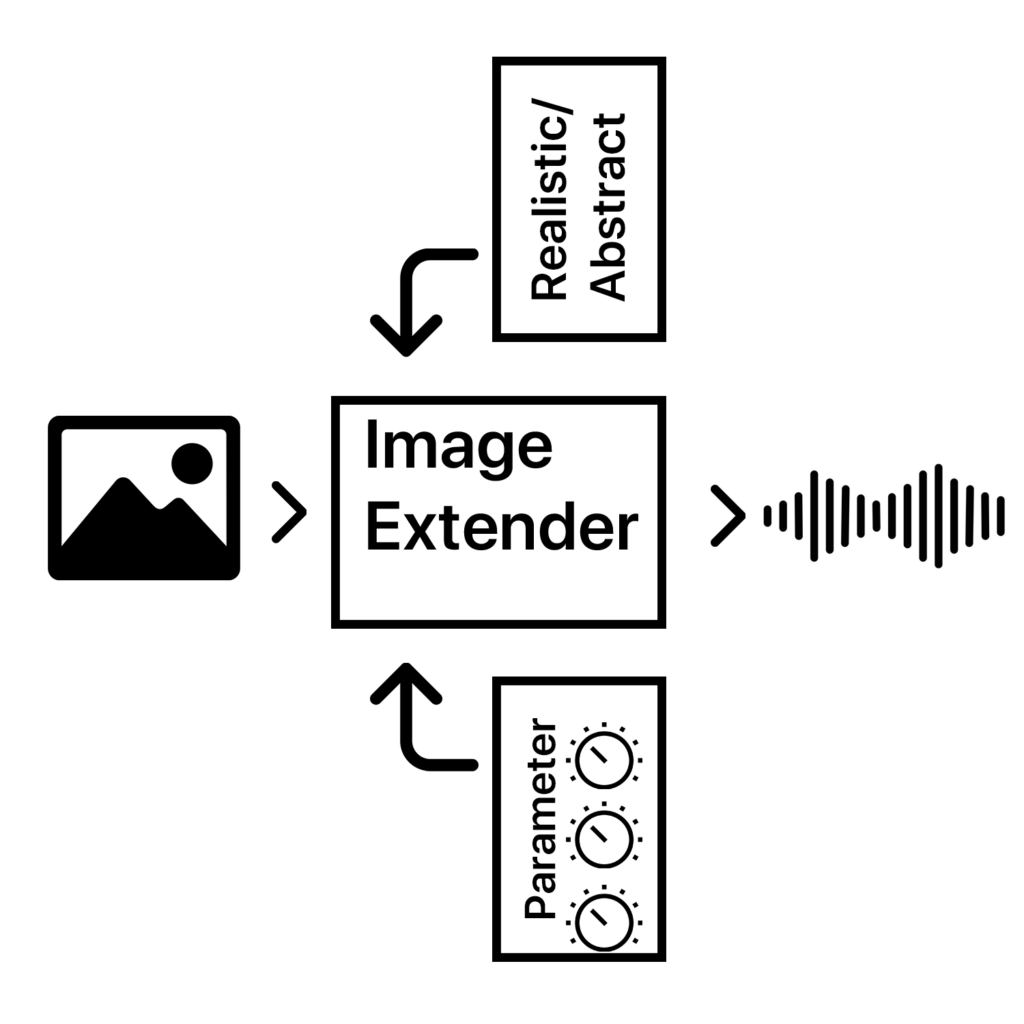
    The project would be a program that uses either AI-content recognition or a specific sonification algorithm by using equivalent of the perception of sight (cross-model metaphors).

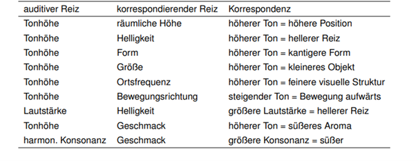
    examples of cross modal metaphors (Görne, 2017, S.53)

    This approach could serve two main audiences:

    1. Visually Impaired Individuals:
    The tool would provide an alternative to traditional audio descriptions, aiming instead to deliver a sonic experience that evokes the ambiance, spatial depth, or mood of an image. Instead of giving direct descriptive feedback, it would use non-verbal soundscapes to create an “impression” of the scene, engaging the listener’s perception intuitively. Therefore, the aspect of a strict sonification language might be a good approach. Maybe even better than just displaying the sounds of the images. Or maybe a mixture of both.

    2. Artists and Designers:
    The tool could generate unique audio samples for creative applications, such as sound design for interactive installations, brand audio identities, or cinematic soundscapes. By enabling the synthesis of sound based on visual data, the tool could become a versatile instrument for experimental media artists.

    Purpose

    The core purpose would be the mixture of both purposes before, a tool that supports and helps creating in the same suite.

    The dual purpose of accessibility and creativity is central to the project’s design philosophy, but balancing these objectives poses a challenge. While the tool should serve as a robust aid for visually impaired users, it also needs to function as a practical and flexible sound design instrument.

    The final product can then be used by people who benefit from the added perception they get of images and screens and for artists or designers as a tool.

    Primary Goal

    A primary goal is to establish a sonification language that is intuitive, consistent, and adaptable to a variety of images and scenes. This “language” would ideally be flexible enough for creative expression yet structured enough to provide clarity for visually impaired users. Using a dynamic, adaptable set of rules tied to image data, the tool would be able to translate colors, textures, shapes, and contrasts into specific sounds.

    To make the tool accessible and enjoyable, careful attention needs to be paid to the balance of sound complexity. Testing with visually impaired individuals will be essential for calibrating the audio to avoid overwhelming or confusing sensory experiences. Adjustable parameters could allow users to tailor sound intensity, frequency, and spatialization, giving them control while preserving the underlying sonification framework. It’s important to focus on realistic an achievable goal first.

    • planning on the methods (structure)
    • research and data collection
    • simple prototyping of key concept
    • testing phases
    • implementation in an standalone application
    • ui design and mobile optimization

    The prototype will evolve in stages, with usability testing playing a key role in refining functionality. Early feedback from visually impaired testers will be invaluable in shaping how soundscapes are structured and controlled. Incorporating adjustable settings will likely be necessary to allow users to customize their experience and avoid potential overstimulation. However, this customization could complicate the design if the aim is to develop a consistent sonification language. Testing will help to balance these needs

    Initial development will target desktop environments, with plans to expand to smartphones. A mobile-friendly interface would allow users to access sonification on the go, making it easier to engage with images and scenes from any device.

    In general, it could lead to a different perception of sound in connection with images or visuals.

    Needed components

    Technological Basis:

    Programming Language & IDE:
    The primary development of the image recognition could be done in Python, which offers strong libraries for image processing, machine learning, and integration with sound engines. Also wekinator could be a good start for the communication via OSC for example.

    Sonification Tools:
    Pure Data or Max/MSP are ideal choices for creating the audio processing and synthesis framework, as they enable fine-tuned audio manipulation. These platforms can map visual data inputs (like color or shape) to sound parameters (such as pitch, timbre, or rhythm).

    Testing Resources:
    A set of test images and videos will be required to refine the tool’s translations across various visual scenarios.

    Existing Inspirations and References:

    – Melobytes: Software that converts images to music, highlighting the potential for creative auditory representations of visuals.

    – VOSIS: A synthesizer that filters visual data based on grayscale values, demonstrating how sound synthesis can be based on visual texture.

    – image-sonification.vercel.app: A platform that creates audio loops from RGB values, showing how color data can be translated into sound.

    – BeMyEyes: An app that provides auditory descriptions for visually impaired users, emphasizing the importance of accessibility in technology design.

    Academic Foundations:

    Literature on sonification, psychoacoustics, and synthesis will support the development of the program. These fields will help inform how sound can effectively communicate complex information without overwhelming the listener.

    References / Source

    Görne, Tobias. Sound Design. Munich: Hanser, 2017.

    Diversity and Representation in Animation and Character Design Challenge Awards | Pixel Vienna 2023 

    The panel discussion that took place at Vienna Pixel had professionals of the animation field discuss the topic of diversity and representation in animation.

    The discussion starts off with the guests discussing their favorite childhood characters, pointing out the fact that these characters heavily influence people, following them into their adult lives even. 

    The question is posed as to how character design can made good when following „classic“ character design approaches, that have lots of rules and principles, have the potential to reinforce bad stereotypes. 

    One issue that needs to be addressed is the fact that the reinforcement of such types happens already in art school, for example in live drawing sessions, where the models are often white, think and straight, not sufficiently integrating other body types into the education of art students. The professionals then recommend to go outside, to sit on the bus, for instance, and look art people, to look at their body shapes and outfits and whatever else, as there is so much diversity in that. They point out that when it comes to character design, artists tend to see a lot online or in the production of big studios that they compare their own work to and then find ones line, narrowing down their way of finding inspiration elsewhere because they feel comfortable in that line of work and don’t have to take too many risks. 

    Another challenge for artists is their own subconscious prejudices, which means that it is important for people to talk to the groups they want to represent in order to do it correctly. Some studios even have diversity teams that ensure the representation of the characters is suitable as sometimes, even if there are no bad intentions, people can get it wrong if they don’t talk to the ones it actually concerns. 

    The classic school of animation works quite well in communicating intention, action and characteristics but sometimes they tend to be overdrawn, one of the artists mentions. They talk about how they discovered that representing someone through their actions rather than the look of the character can be very interesting, as you can’t tell from their look whether they are good or bad. 

    Larger productions have seen a lot of progress however there is still a long way to go. The professionals then move on to describing some experiences they have made concerning the topic of representation themselves.

    One example that is named is about one artist working on a project that featured trans-persons and there was a lot of discussion within the team as to how to show the respective sequences. However, the team consisted of CIS people only, so they called in some friends to talk with and get feedback from them to make sure the representation was authentic. Another example was a game with a story about a disabled person, where the team reached out to an agency for accessibility and a disabled basketball player, who even supported the work on the game design for the apartment to realistically depict how the character interacts with the world. 

    Representation requires thorough, self-critical research from the creators and it is really a responsibility that they share through all kinds of diversity, be it gender, disability, or race. They also stress that intersectional research is important, explaining how just talking to a person of color, for instance, isn’t enough to represent all of one entity. Social backgrounds, living circumstances, dreams and personal definition need to be considered.

    Often, higher positions in the industry are predominantly led by men, whereas women, queer people, or marginalized groups might have trouble to reach these positions. Still, the panel guests convey that it is an organic process and that being sensitive and open to listen and give people opportunities is important, so that spaces that, for example, support a persons specific requirements can be set up. Listening is one of the issues in the industry, and good leaders should take in the people around them. But, on a positive note, they also mention that they feel a big shift in awareness in the next generation coming on. 

    One thing that is still noticeable in many areas of the industry is even present in the education at universities and art schools – male-identifying students have shown up to collect feedback more than non-male identifying people, with more confidence/certainty, showing just how much it is still engraved in women’s minds how much more they have to prove themselves and that they are harder on themselves, often questioning their abilities. Therefore, mutual support and opening up towards each other is of great importance. 

    The panel concludes the talk with some questions from the audience, debating over topics like cultural consulting and as to why it is not a priority at big studios, for example.  The answer to this comes out pretty clearly states that after all, a company’s goal is still to make money and that in the end, the value of the content comes from and with the value of the people/end-consumer of the contents because this translates back into the company. Therefore, it can be hard to find initiatives or to get them right. Also, there is still a lot that is not known to many people, so some disabilities, for instance, might not be represented because too little people actually know about them. 

    The panel guest suggests to do anti-bias training, to really inform themselves and to do so actively in order to tell appropriate stories.

    They then move on to other questions, and one important topic mentioned is the issue of constantly feeling not educated enough even if they do research, talk to and bring in people to tell their stories – and yet, mistakes happen. Still, it is important to think about the intention behind that, and maybe being able to separate certain treats of a character from others. In the example, the representation of an asexual person who is a mean character is mentioned, as it left the community disappointed due to their portrayal, as asexual people are not often seeing representation in the media. But it is about the intention behind it – would the creators portray all asexuals as mean and manipulative or is this just a character that happens to be both of these things? 

    Overall, it matters how and why we create characters audiences can identify with, and there should be a way of creating them that connects to their story and on how they solve problems – and to then go from there, in order to discover their form and shape based on the character rather than its look.

    Also, characters should not be reduced to one identity in terms of what they can portray, such as in having an immigrant always tell their „immigrant story“ and taking away the rest of their identity. 

    Also, all of us have stereotypes inside of us and we also live clichés, and creating content that is expected is just less interesting, because people often expect what’s coming etc.

    To sum up: being aware and open-minded, talking to people, listening and educating oneself is a major part in the creating and portraying of character. There is much work yet to be done, but there also is a noticeable shift in the industry, sparking hope for the future!
    Summary of the Research in Major Events Across All Continents

    My research on major events across continents reveals a common pattern: many events maintain consistent corporate identities (CI) or logo designs, with only minor contextual changes over time.

    Traditional festivals and cultural events, such as the Lunar New Year in Asia, Diwali in India, Holi, or Lantern Festivals, as well as European events like the Oktoberfest, rely on timeless, culturally rooted visuals that rarely evolve, preserving their heritage and recognition. Similarly, iconic modern festivals like Coachella (USA) and Tomorrowland (Belgium) maintain consistent branding, occasionally tweaking color schemes or adding seasonal updates, while the core identity remains stable.

    In contrast, globally oriented or rotating events frequently embrace evolving designs to reflect their host cultures or respond to societal trends. Sporting events like the Olympics, FIFA World Cup, Asian Games, and African Cup of Nations redesign their logos and visual identities for each edition, incorporating local cultural elements and modern design trends.

    Similarly, political gatherings such as G7 Summits or Climate Conferences (COP) adapt their branding to highlight global priorities like sustainability, innovation, or collaboration, often influenced by the host nation’s identity.

    Overall, the balance between stability and adaptability varies across events. Traditional and brand-focused events prioritize continuity for global recognition, while international and rotating events use dynamic design languages to capture the diversity, values, and trends of their specific contexts. This duality reflects how events worldwide align with societal and cultural changes while maintaining their distinct identities.