1.5. Building Community Through Museums

How Can We Tie DIY and Interactive Technologies to Community Building?

Museums have long been seen as places of quiet reflection, where visitors admire static exhibits from a distance. However, a new wave of transformation is sweeping through these spaces, shifting the focus from passive observation to active participation. The power of DIY projects, interactive exhibits, and co-created spaces is reshaping how we experience culture, making museums more inclusive, dynamic, and community-driven than ever before.

The Shift from Passive Viewing to Active Participation

Hands-on activities

Modern museums have transformed from passive spaces into collaborative hubs where visitors actively shape their experiences. Through hands-on activities and DIY workshops, visitors become co-creators, contributing their voices to cultural narratives and fostering a deeper sense of belonging and inclusion [1]. These participatory initiatives provide platforms for self-expression and meaningful interaction, enabling diverse groups to share unique perspectives and cultivate shared ownership of museum spaces [3].

For marginalized groups, such efforts offer a powerful means of self-empowerment and storytelling, allowing individuals to showcase their creativity and lived experiences. By breaking down societal barriers, these activities foster inclusivity and encourage dialogue among people from varied backgrounds, enriching the cultural fabric of museums [3], [5].

Digital activities

Museums are increasingly using collaborative interactive activities to foster social connections among visitors. Tools like augmented reality, digital storytelling, and interactive displays encourage shared experiences that strengthen community bonds. For example, the Science Museum’s Disease Controller game in the Medicine and Communities gallery allows four players to collaboratively manage the spread of an epidemic in a city. Participants must make quick decisions, such as issuing public health campaigns or vaccinations, highlighting the challenges of urban health and the impact of infectious diseases [7]. These activities transform museums into vibrant spaces where visitors connect through shared exploration and learning.

Museums and Wellbeing

Museums are essential for promoting psychological and social well-being by providing restorative environments that encourage connections. Participatory activities like DIY projects and collaborative exhibits help foster identity, community and enhance self-esteem while reducing stress. Research shows that interactive and co-creative museum activities lead to personal growth, sense of accomplishment, and strengthen social bonds. [2], [4].

One great example is the Holburne Museum’s “Image – Peer Supported Museums Group” which is designed for individuals with lived experience of mental health challenges, providing a supportive environment to foster creativity and independence. The group engages in specialist artist-led workshops covering skills like bronze clay jewelry, acrylic painting, and printmaking, followed by independent development. Members aim to enhance creativity using museum collections, develop skills, exhibit their work, and promote inclusion and well-being through art. [6]

A Future of Collaborative Communities

Museums are evolving beyond their traditional role of showcasing artifacts, becoming spaces that foster collaboration and community engagement. By incorporating these participatory elements ensures that museums are not just institutions for knowledge but vibrant spaces for social connection and shared experiences [3]. These innovations allow museums to serve as community hubs, where shared experiences and social bonds are nurtured. The future of museums lies in their ability to empower visitors to actively shape the experience, fostering a sense of belonging and deeper understanding while building stronger, more connected communities.

References

[1] Moura, H., et al., “Collaborative Museums: An Approach to Co-Design,” ACM CSCW 2012, pp. 681–684, 2012.

[2] Šveb Dragija, M., and Jelinčić, D.A., “Can Museums Help Visitors Thrive?,” Behav. Sci., vol. 12, no. 458, pp. 1–17, 2022.

[3] Wallen, L., and Docherty-Hughes, J.R., “Caring Spaces: Individual and Social Wellbeing in Museum Community Engagement Experiences,” J. Museum Education, vol. 47, no. 1, pp. 93–102, 2022. 

[4] “Transforming Community Engagement in Unexpected Spaces,” MuseumNext. [Online]. Available: https://www.museumnext.com/article/transforming-community-engagement-in-unexpected-spaces/. 

[5] “Inclusive Museum Community,” Doubleknot. [Online]. Available: https://www.doubleknot.com/blog/inclusive-museum-community.

[6] “Image – Peer Supported Museums Group,” The Holburne Museum. [Online]. Available: https://holburne.org/learning-and-creativity/mental-health-and-creativity/pathways-to-wellbeing/peer-led-museums-group/. 

[7] Science Museum, “Medicine: The Wellcome Galleries,” Science Museum. [Online]. Available: https://www.sciencemuseum.org.uk/see-and-do/medicine-wellcome-galleries.


Mastering Design Principles: The Key to Compelling Creations 

Design principles serve as the backbone of any successful visual composition. They guide us designers in creating pieces that are not only aesthetically pleasing but also functionally effective. Whether crafting a website, designing a logo, or creating a product interface, understanding and applying these principles can elevate the work. Let’s delve into the core design principles and how they contribute to exceptional designs. 

Balance: The Foundation of Harmony 
Balance refers to the distribution of visual weight across a design. When balance is achieved, no single element feels heavier than the others, creating a sense of harmony. There are two main types of balance: 

  • Symmetrical Balance: This occurs when elements are evenly distributed on either side of an axis. Think of a butterfly’s wings – perfectly mirrored. 
  • Asymmetrical Balance: Here, balance is achieved through contrast. For instance, a small, dark object on one side of a composition can balance a large, light object on the other. 

Balance provides stability and structure, ensuring that the design feels cohesive and complete. 

Contrast: Highlighting Differences 
Contrast is all about juxtaposing elements to make them stand out. It can be achieved through differences in color, size, shape, texture, or even font style. A classic example is using a bold, dark font against a light background to emphasize text. 

Why is contrast so important? It: 

  • Draws attention to key areas. 
  • Enhances readability. 
  • Creates visual interest. 

Without contrast, designs risk feeling flat and uninspiring. 

Emphasis: Guiding the Viewer’s Eye 
Emphasis ensures that the audience knows where to look first. It’s about creating a focal point—a part of the design that grabs attention immediately. Techniques to achieve emphasis include: 

  • Using a pop of color in a monochromatic scheme. 
  • Increasing the size of a specific element. 
  • Positioning an object prominently within the composition. 

Think of emphasis as a spotlight in a theater, directing attention to the main act. 

Repetition: Building Unity and Consistency 
Repetition involves using the same elements throughout your design. This could be a recurring color palette, font, or shape. By repeating elements, you create a rhythm that ties the design together. 

Repetition is especially useful in branding. For example, consistent use of a company’s logo, colors, and typography builds familiarity and trust with audiences. It’s a subtle yet powerful tool for creating a cohesive identity. 

Proportion: Achieving Visual Balance 
Proportion relates to the size and scale of elements in relation to one another. It ensures that all parts of the design work together harmoniously. For instance, a human figure in an illustration should have arms and legs proportional to its body. 

Good proportion helps maintain visual order. When proportions are off, the design may feel awkward or jarring to the viewer. 

Movement: Creating a Visual Journey 
Movement guides the viewer’s eye through the design in a purposeful way. This principle helps create a sense of flow and narrative. Designers use lines, shapes, or strategic placement of elements to lead the audience from one point to another. 

Movement keeps viewers engaged and ensures they interact with your design as intended. 

White Space: The Power of Simplicity 

White space, also known as negative space, is the area around and between elements. Far from being “empty,” white space is a powerful tool that enhances readability, reduces clutter, and gives designs room to breathe. 

Key benefits of white space include: 

  • Highlighting key elements. 
  • Providing visual clarity. 
  • Creating an elegant, minimalist aesthetic. 

Think of white space as the silent pause in a song—essential for rhythm and impact. 

Alignment: Structuring Your Design 

Alignment ensures that elements are arranged in a visually pleasing way. Whether it’s left, right, center, or justified alignment, this principle organizes content and creates a polished look. 

Alignment is like the glue that holds a design together, giving it structure and professionalism. 

Unity: The Goal of Cohesion 

Unity is achieved when all elements in a design work together as a whole. It’s the culmination of applying other design principles effectively. A unified design feels intentional, complete, and aesthetically pleasing. 

Unity can be fostered through: 

  • Consistent use of colors, fonts, and styles. 
  • Repetition of patterns or motifs. 
  • Careful consideration of spacing and proportions. 

When unity is present, the design resonates with the viewer and communicates its message effectively. 

Conclusion 

Mastering design principles is essential for creating compositions that are both beautiful and functional. By focusing on balance, contrast, emphasis, repetition, proportion, movement, white space, alignment, and unity, you can elevate your designs to a professional level. These principles are not rigid rules but flexible guidelines that allow for creativity while ensuring that your designs remain effective. 

Whether you’re a seasoned designer or just starting out, revisiting these principles can provide valuable insights and fresh perspectives. Remember, great design isn’t just about what you add—it’s also about how you arrange, emphasize, and refine. 


Reference

https://www.linearity.io/blog/design-principles/ 18.01.25, 19:54

https://medium.com/@celestenorth/guiding-design-decisions-ecfefec92e50 19.01.25, 21:09

https://muz.li/blog/principles-driving-innovative-products/ 19.01.25, 21:15

https://jpamental.medium.com/guiding-principles-for-design-1ab90d190c11 18.01.25, 19:23

https://www.toptal.com/designers/gui/principles-of-design-infographic 19.01.25, 21:21

How Spatial Audio Can Transform the Perception Art

Art is often viewed as a visual medium, but there’s a growing recognition that engaging multiple senses can deepen and expand the impact of artwork. With more artists exploring sound, touch, and smell as tools for evoking responses, the blending of art and audio is an exciting space for both creators and audio professionals alike. New technologies are allowing immersive audio experiences that go beyond mere background noise, with sound becoming a vital and integral part of the art itself.

Sound as an Immersive Tool for Art

One of the remarkable things sound can do in a museum setting is to stop time and bring visitors into a present, deeply engaged state. The immersive power of sound offers a break from the constant bombardment of information and distractions in daily life. It creates a unique, curated journey that invites visitors to truly focus on the artwork and its surrounding atmosphere. Whether it’s a subtle hum of a distant conversation or a carefully designed soundscape that matches the theme of an exhibit, sound can enhance emotional responses and provide deeper context for understanding art.

Integrating Spatial Audio in Museum Experiences

Spatial audio, which positions sound within a 3D space, is revolutionizing how visitors experience art. A perfect example of this is the Japan Supernatural exhibit at the Art Gallery of New South Wales in Sydney. Through an innovative platform by Art Processors, visitors experienced a spatial soundscape that shifted based on their location. As they moved through the exhibit, they could choose whether to listen to a narrative voice or simply absorb the rich auditory atmosphere surrounding the artwork. This approach allowed visitors to control their experience, making the audio an active, responsive element that enhanced their understanding and enjoyment of the art.

This method of blending sound with visual elements is different from the traditional approach of background audio that merely accompanies an exhibit. Here, the sound is designed to be integral—responding to the visitor’s movements and choices, becoming as essential to the experience as the visual art itself.

Designing for Emotional and Cognitive Impact

Sound can connect directly with our emotions in ways that visuals alone cannot. In designing immersive spaces, curators and sound designers focus on creating a balance between emotional and cognitive experiences. Sound is often used to underscore or trigger specific emotional responses, guiding the viewer’s journey through the space. For instance, more intellectual or factual elements of an exhibit might be complemented with music or sounds that guide the visitor into an emotional moment, creating a dynamic narrative flow.

Accessibility in Audio Design

In the design of immersive audio experiences, accessibility is a central concern. Many museums and cultural institutions are now integrating accessible options for visitors with different needs, from closed captioning to sign language videos and sonified wayfinding for blind or low-vision individuals. These advancements are part of a broader effort to ensure that everyone, regardless of ability, can fully engage with the museum’s offerings.

The Future of Audio in Museums

The use of spatial audio is still evolving, but studies have shown its potential to significantly enhance the museum experience. In a study conducted in a Cognitive Immersive Room, participants showed a clear preference for soundscapes that were congruent with the exhibition’s theme. This approach was not only more immersive but also helped reduce distractions and increase focus. More than half of the participants preferred soundscapes that complemented the visual art, indicating that a well-designed auditory experience can deepen engagement with the art and the space.

References:

https://acoustics.org/enhancing-museum-experiences-the-impact-of-sounds-on-visitor-perception

https://www.aam-us.org/2022/08/26/transforming-museums-with-immersive-sound/

https://www.artprocessors.net/projects/art-gallery-new-south-wales-japan-supernatural

https://www.inavateonthenet.net/features/article/audio-technology-opens-a-new-frontier-in-the-art-market?

07 Designing for Vulnerable Populations: Privacy for Everyone

Introduction

Not all users interact with digital platforms in the same way. Vulnerable populations, such as children, the elderly, and those with limited technological literacy, often face unique challenges in managing their digital footprints. This post explores how privacy tools and frameworks can address these diverse needs, ensuring inclusivity and accessibility. These considerations will play a significant role in refining my thesis goals of creating possible solutions that works for everyone.

Why Vulnerable Populations Need Special Consideration

Certain groups are more susceptible to privacy risks due to limited understanding or access to tools:

  1. Children: Often unaware of data tracking, making them targets for ads or manipulative designs. Example: Gaming apps that collect location data without parental consent.
  2. Elderly Users: Many find privacy tools overwhelming or confusing, leaving them exposed to scams or data misuse.
  3. Low-Literacy or Non-Tech-Savvy Users: Struggle with complex settings or opaque terms of service, leading to accidental oversharing.
Certain groups are more susceptible to privacy risks due to limited understanding or access to tools

How can privacy tools and frameworks be designed to accommodate the unique needs of vulnerable populations?

  • What barriers prevent vulnerable groups from effectively managing their digital footprints?
  • How can accessibility principles improve privacy tool design?

Design Strategies for Inclusive Privacy Tools

  1. Simplified Interfaces: Prioritize clean layouts and clear labels. Example: A single dashboard with large buttons for enabling/disabling permissions (e.g., “Stop Location Sharing”).
  2. Parental Controls: Design features that empower parents to manage their children’s digital activity. Example: Tools that notify parents about apps collecting sensitive data.
  3. Educational Content: Embed tutorials or interactive guides that explain privacy concepts in simple terms. Example: A short video explaining what cookies are and how to manage them.
  4. Localization and Accessibility: Ensure tools are available in multiple languages and compatible with assistive technologies. Example: Text-to-speech options for visually impaired users.

These strategies will be incorporated into the possible solutions I will develop to ensure inclusivity is a core component.

Challenges in Addressing Vulnerable Populations’ Needs

  1. Diverse Requirements: Balancing simplicity with functionality to meet varied user needs.
  2. Awareness Gaps: Educating users about privacy risks without overwhelming them.
  3. Compliance with Laws: Adhering to regulations like COPPA (Children’s Online Privacy Protection Act) and ADA (Americans with Disabilities Act).

Relevance to My Thesis Goals

Inclusivity is central to my work. By addressing the needs of vulnerable users, I can ensure the solutions I propose are effective for a wider audience. These insights will help shape design guidelines that prioritize accessibility and equity, making privacy tools genuinely universal.

06 Transparency in Data Use: Building Trust Through Clear Communication

Introduction

Trust is the foundation of any user-platform relationship, and transparency is the key to earning it. Users need to know what data is being collected, why, and how it’s being used. In this post, I’ll explore how clear communication about data use can strengthen user trust and discuss practical design strategies for achieving transparency. These insights will inform my thesis objectives: creating a Privacy Framework for companies and prototyping a tool for managing personal data online.

Why Transparency Matters

Transparency transforms uncertainty into trust. When users understand how their data is used, they’re more likely to engage with a platform. Without it, users feel manipulated, leading to distrust and disengagement. Example: Many users became wary of Facebook after the Cambridge Analytica scandal because the platform failed to communicate how user data was being shared and exploited.

Key Elements of Transparent Data Use

  1. Clarity: Use plain language to explain data practices. Example: Replace “We may collect certain information to enhance services” with “We use your email to send weekly updates.”
  2. Visibility: Make privacy policies and settings easy to find. Example: A single-click link labeled “Your Data Settings” at the top of a webpage.
  3. Real-Time Feedback: Show users how their data is being used in real time. Example: A privacy dashboard that displays which apps or services are currently accessing your location.
Possible transparency settings that can be introduced by companies

Case Studies of Transparency in Action

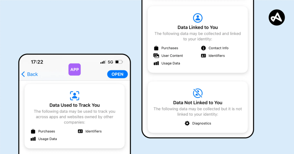
  1. Apple’s Privacy Nutrition Labels: These labels show, at a glance, what data an app collects and how it is used, simplifying complex privacy policies into digestible bits of information.
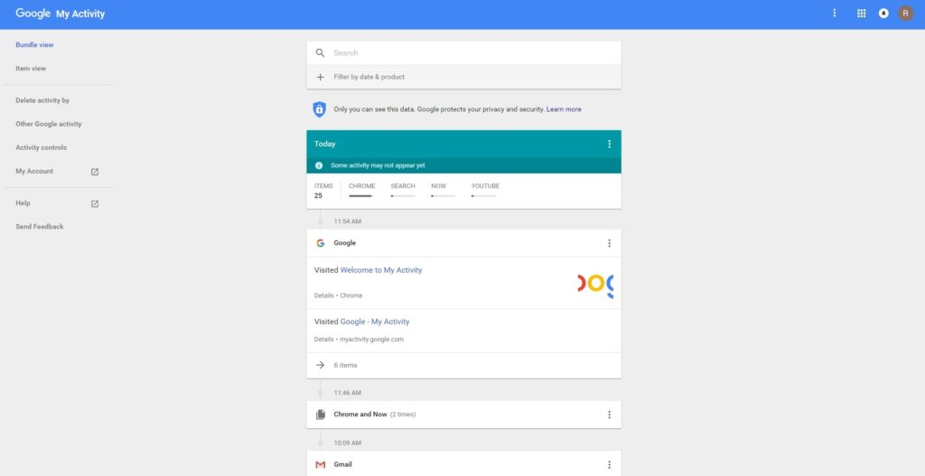
  2. Google’s My Activity Dashboard: Google allows users to view and manage their activity data, offering options to delete or limit collection.
  3. noyb.eu’s Advocacy Work: By challenging platforms that obscure their data use, noyb has pushed for greater clarity and compliance with GDPR.

These examples demonstrate how transparency fosters trust and aligns with ethical design principles.

Apple lets you know what data is being used.
image source: Adjust
Google has a “My Activity” section tyhat shows relevant info.

How can design effectively communicate data use to build trust and ensure transparency?

  • What visual and interactive elements improve users’ understanding of data use?
  • How can transparency features integrate seamlessly into existing platforms?

Designing for Transparency

To achieve transparency, platforms can:

  1. Integrate Visual Feedback: Use graphics, charts, or icons to explain data use. Example: A pie chart showing how much of your data is used for ads vs. analytics.
  2. Streamline Privacy Policies: Provide short, bulleted summaries of key data practices. Example: “We collect: your email for updates, your location for recommendations, and your browsing history for ads.”
  3. Offer Customization: Allow users to adjust permissions directly. Example: Toggles for enabling/disabling specific data categories like tracking or personalization.

These approaches will also inform the Privacy Framework I’m developing, ensuring it includes actionable guidelines for platforms to improve data transparency.

Challenges and Personal Motivation

Transparency isn’t always easy to achieve. Challenges include balancing clarity with detail, overcoming user distrust, and addressing corporate reluctance to reveal data practices. However, I’m motivated by the potential to create tools and frameworks that make transparency accessible and actionable for users and companies alike.

1.8 Gamification in Mental Health Apps: Engagement or Overload?

Gamification, the integration of game-like elements into non-gaming contexts, has emerged as a popular strategy in mental health apps to boost user engagement and foster positive behavioral changes. By using rewards, progress tracking, and interactive challenges, gamification helps users stay motivated and engaged in achieving their mental health goals. The concept leverages the human tendency to seek immediate gratification, making long-term health routines feel more enjoyable and rewarding. This approach transforms otherwise mundane or challenging tasks into engaging and rewarding experiences, encouraging users to adhere to their mental health practices over time.

The Framework of Gamification: Mechanics, Dynamics, and Aesthetics

Gamification in mental health apps often revolves around the Mechanics-Dynamics-Aesthetics (MDA) framework:

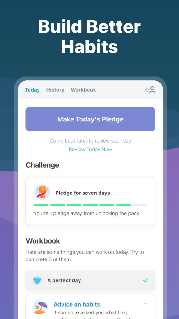
Mechanics are the visible, interactive elements that users directly engage with, such as progress bars, badges, leaderboards, and daily check-ins. Apps like SuperBetter allow users to adopt secret identities, complete challenges, and invite allies for support. Similarly, Finch lets users nurture a virtual bird as they complete self-care tasks, turning progress into a tangible reward.

Dynamics focus on processes like goal-setting, progress tracking, and feedback mechanisms that sustain user engagement. For example, I Am Sober allows users to track their sobriety, showing tangible benefits like money and calories saved over time, which reinforces their commitment. Apps like Happify use adaptive challenges to maintain motivation, rewarding users with points for completing in-app activities tailored to their goals.

Gamification in Finch, Image source: App Store
Gamification in I Am Sober, Image source: App Store

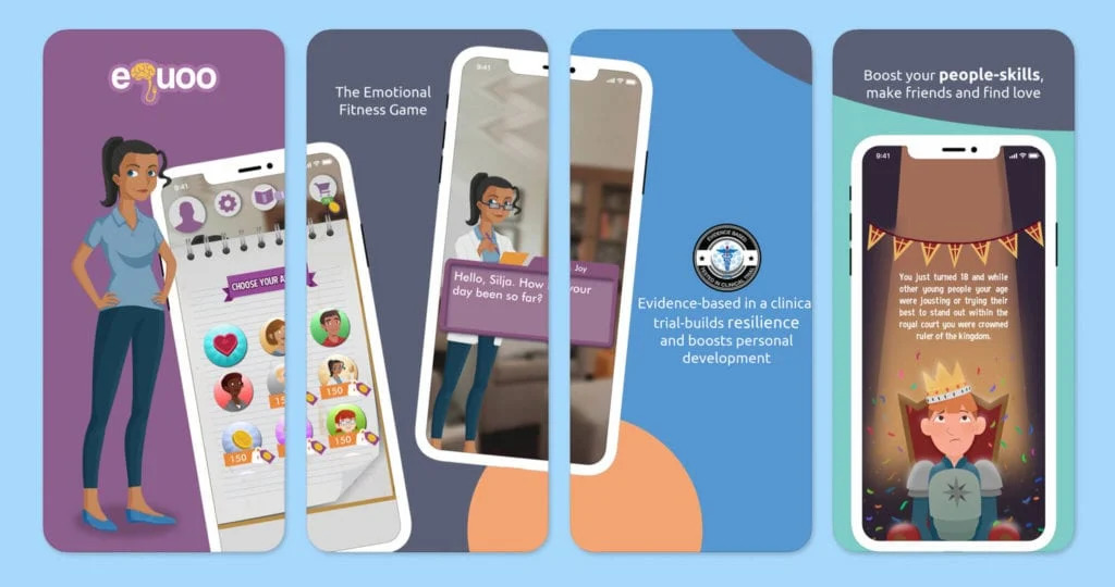
Aesthetics evoke emotions such as motivation and connection through design and storytelling. eQuoo, for instance, uses fantasy storytelling and interactive challenges to teach emotional resilience. Meanwhile, SuperBetter embraces bold visuals and empowering language to encourage users to tackle “bad guys” like self-criticism.

Storytelling in eQuoo, Image source: One Mind Psyber Guide

Benefits of Gamification

Enhanced Engagement

Gamification makes mental health routines more enjoyable and accessible. Features like badges, progress tracking, and leaderboards reward users for their efforts, fostering a sense of accomplishment. For instance, Happify uses positive psychology techniques to help users reduce anxiety and loneliness while promoting emotional well-being​​.

Encouraging Healthy Habits

Apps like Finch and Rootd help users form consistent routines by rewarding daily actions, such as journaling or practicing mindfulness. These small, gamified nudges support users in developing healthier habits over time​.

Gamification in Rootd, Image source: New Ventures BC

Challenges of Gamification

App Fatigue

Over-reliance on repetitive tasks and extrinsic motivators like badges can lead to disengagement. When users feel overwhelmed by excessive prompts or redundant activities, the risk of app fatigue increases​.

Balancing Game and Therapy

Adding too many game elements can dilute the therapeutic value of an app. Research shows that increasing gamified features doesn’t always enhance outcomes, underscoring the need for thoughtful design​​.

Ethical and Practical Considerations

Customization and Personalization

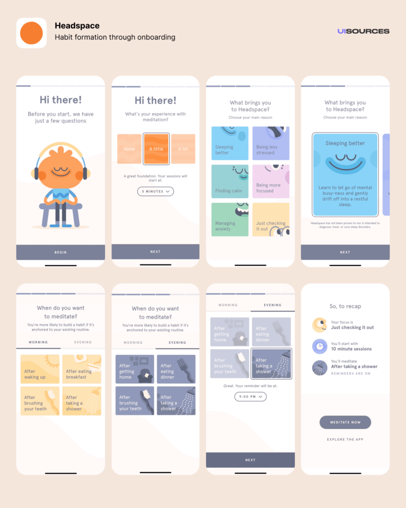
Personalized experiences are key to keeping users engaged. Apps like Headspace offer tailored meditation tracks based on user input, while Rootd adapts its activities to help users manage anxiety and panic attacks effectively.

Onboarding Screens in Headspace, Image Source: UI Sources

Meaningful Interactions

Apps should prioritize outcomes over screen time. For instance, Headspace ensures users benefit from its programs without feeling pressured to overuse the app. Its studies show that completing at least 10 meditation sessions in eight weeks significantly reduces symptoms of depression.

Conclusion

Gamification has great potential to make mental health apps more engaging and effective. By thoughtfully combining game elements with therapeutic goals, these apps can support users on their well-being journeys. However, careful design is crucial to ensure they remain meaningful, balanced, and beneficial.

Sources

  1. Cheng, V. W. S., Davenport, T., Johnson, D., Vella, K., & Hickie, I. B. (2019). Gamification in apps and technologies for improving mental health and well-being: Systematic review. JMIR Mental Health, 6(6), e13717. https://doi.org/10.2196/13717
  2. Hamdoun, S., Monteleone, R., Bookman, T., & Michael, K. (2023). AI-based and digital mental health apps: Balancing need and risk. IEEE Technology and Society Magazine, 42(1), 25–36. https://doi.org/10.1109/MTS.2023.3241309
  3. “How To (and Why You Should) Incorporate Gamification Into Your Mental Health Care App.” SF AppWorks. Accessed: Jan. 19, 2025. [Online.] Available: https://www.sfappworks.com/blogs/incorporating-gamification-into-your-mental-health-care-app
  4. Santoso, I. S., Ferdinansyah, A., Sensuse, D. I., Suryono, R. R., Kautsarina, & Hidayanto, A. N. (2021). Effectiveness of gamification in mHealth apps designed for mental illness. Proceedings of the 2nd International Conference on ICT for Rural Development (IC-ICTRuDev), Jogjakarta, Indonesia, 1–6. https://doi.org/10.1109/IC-ICTRuDev50538.2021.9655706
  5. “The Power of Gamification in Mental Health Apps – And how they benefit well-being.” MedPage Today. Accessed: Jan. 19, 2025. [Online.] Available: https://www.medpagetoday.com/opinion/kevinmd/106239
  6. Valentine, L., D’Alfonso, S., & Lederman, R. (2023). Recommender systems for mental health apps: Advantages and ethical challenges. AI & Society, 38(4), 1627–1638. https://doi.org/10.1007/s00146-021-01322-w

05 Designing Privacy-Centric User Experiences: Case Studies and Practical Insights

Introduction

Creating platforms that respect user privacy isn’t just a moral obligation; it’s a necessity in today’s data-driven world. In this post, I focus on designing privacy-centric user experiences, showcasing real-world case studies and exploring actionable design strategies. These insights will directly inform my thesis goals of developing a framework for companies and prototyping a simple privacy tool to empower users to manage their digital footprints more effectively.

What Makes a Privacy-Centric User Experience?

A privacy-centric experience ensures that users are informed, in control, and confident about their data. It prioritizes transparency, simplicity, and respect for user consent while avoiding deceptive practices. This means:

  1. Clarity: Clear communication about what data is collected and why.
  2. Control: Tools that allow users to customize their privacy preferences easily.
  3. Trust: Ethical practices that build long-term confidence.

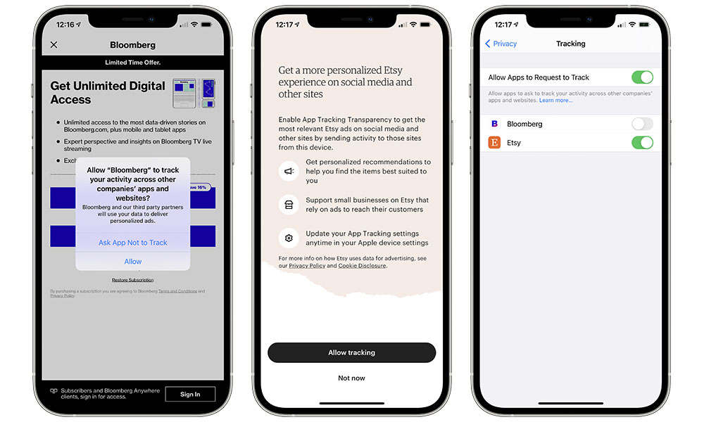
Example: Apple’s App Tracking Transparency feature asks users if they want to allow tracking, giving them a clear choice with simple language.

Case Studies of Privacy-Centric Platforms

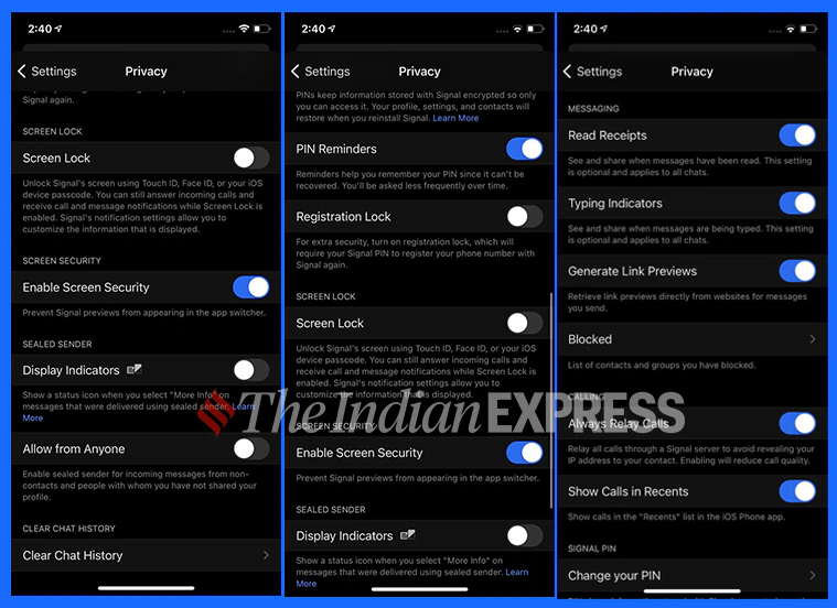
  1. Signal (Messaging App): Signal prioritizes privacy by offering end-to-end encryption and collecting minimal metadata. Users trust Signal because it’s transparent about its data collection policies—essentially none—and offers simple privacy controls.
  2. DuckDuckGo (Search Engine): Unlike Google, DuckDuckGo doesn’t track users or store personal information. Its clean interface and privacy-first branding make it a favorite for those seeking anonymity.
  3. Joindeleteme.com (Data Removal Tool): This tool simplifies the process of removing personal data from online platforms, offering a user-friendly experience with automated data removal requests.
image source: IndianExpress
Image source: iDrop

How Do These Examples Inform Design Practices?

These platforms succeed by embedding privacy into the user experience, demonstrating best practices for designers:

  1. Default Privacy: Assume users want to opt out of tracking. Signal doesn’t track by default, removing the burden of choice.
  2. Simplified Consent: Make choices clear and accessible. DuckDuckGo eliminates tracking entirely, so users don’t need to worry about settings.
  3. Automation: Joindeleteme.com automates repetitive tasks, minimizing user effort while maintaining control.

How can design principles from successful privacy-centric platforms be adapted into frameworks or tools for broader use?

  • What features of these platforms are most effective at fostering user trust?
  • How can automation and default settings simplify privacy management for users?

Designing a Framework for Companies

To guide companies in creating privacy-centric platforms, a framework should include:

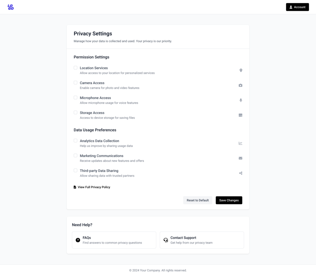
  1. Transparency Guidelines: Require clear communication about data collection. Example: Dashboards showing what data is collected in real time.
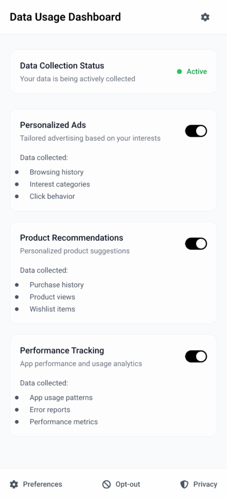
  2. User Empowerment: Include tools that allow users to opt out of tracking with a single click. Example: Privacy toggles for ads, location tracking, and analytics.
  3. Ethical Compliance Checks: Provide a checklist for meeting GDPR and other privacy laws. Example: Assessing whether consent dialogs meet “informed consent” criteria.
Possible permissions users can control if companies implement Privacy Transparency Guidelines

Designing a Prototype Privacy Tool

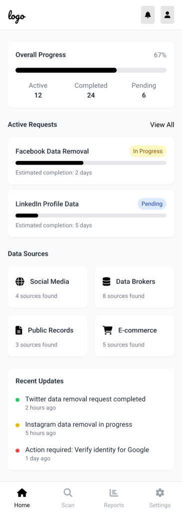
Inspired by joindeleteme.com, the proposed tool could:

  1. Identify Data Sources: Help users find where their personal information exists online.
  2. Simplify Requests: Automate data deletion requests based on privacy laws like GDPR.
  3. Track Progress: Provide real-time updates on data removal processes for transparency.
Mockup of a possible view of the tool

Challenges in Execution

  1. Data Mapping Complexity: Identifying all the platforms where a user’s data exists is a significant technical hurdle.
  2. User Trust: Convincing users to trust the tool with sensitive data requires a flawless UX and a proven ethical stance.
  3. Corporate Pushback: Companies reliant on data monetization may resist the widespread adoption of privacy frameworks.

My Personal Motivation

The more I explore privacy-first platforms, the more I realize how empowering ethical design can be. I’m motivated to create solutions that reduce friction for users while making privacy the norm rather than the exception.

Slack vs. Discord product innovation and UX strategy

What comes to your mind when you hear the word Slack?

I presume business and workplace communication. What comes to your mind when you hear the word, Discord? I guess games.

If I can bore you further with more rhetorical questions, is there a specific industry to which you can align WhatsApp, iMessage, or Facebook messenger? I supposed not. This brings up the question, what makes Discord and Slack different?

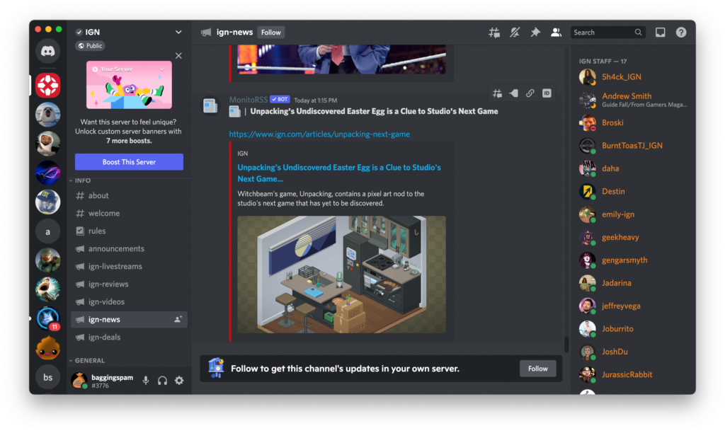
The scheme is simple – it’s the UI and UX design of the app. When you open Discord, you don’t need an additional clue to know this application is designed primarily for game enthusiasts. The app’s interface was designed with its target users, namely gamers, in mind, making it an innovation worth investing billions of dollars in. The same goes for Slack. The app’s features, interactions and user interface define the brand’s target audience, use cases and strategy to differentiate it from the competition.

When comparing Slack and Discord in terms of UI/UX design, the key difference lies in their target audiences, primary use cases, and design philosophies, which affect how the two platforms approach product differentiation and innovation.

1. Target Audience

  • Slack is primarily designed for business and professional communication. Its UX is optimized for productivity, with a focus on helping teams collaborate and manage projects.
  • Discord initially targeted gamers but has since expanded to a wider audience, including content creators, hobbyist groups, and communities. Its UX is designed to create a social, fun, and interactive environment with voice, video, and text chat functionalities.

2. Interface and Navigation

  • Slack:
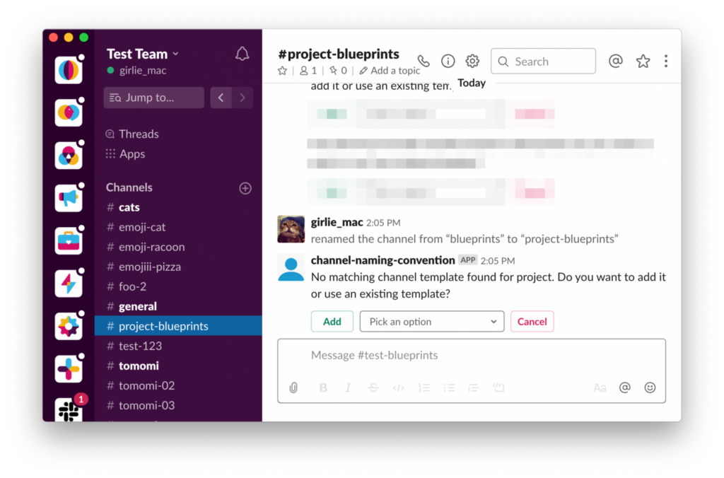
    • Organized Channels: Slack’s UI emphasizes structure, with channels and direct messages taking center stage. The sidebar navigation is key here, with well-organized folders and the option to pin or highlight important conversations.
    • Minimalist, Professional Aesthetic: The design prioritizes clarity and productivity. It features a simple, streamlined aesthetic, avoiding unnecessary distractions, which helps maintain focus on work.
    • Customization: While Slack offers some customization options, such as themes, the design is relatively restrained. The goal is consistency and ease of use, not heavy personalization.
  • Discord:
    • Fluid Social Interface: Discord’s UI is much more vibrant, with more customization options, including custom themes and the ability to change channel aesthetics. This plays into the casual, personal, and creative ethos of the platform.
    • Server-centric Design: Discord organizes communication around servers, which function as distinct communities. Within these servers, users can create various text and voice channels, making it easier for communities to have multiple ongoing conversations in parallel.
    • Customization and Personalization: Discord places a strong emphasis on personalization, with users able to customize their profiles, avatars, status, and more. The design is more visually engaging than Slack’s, allowing for a high level of user-driven interaction.

3. Focus on Collaboration vs. Socialization

  • Slack:
    • Work Collaboration: Slack’s design is built for productivity—tasks, project management, integrations with work tools (Google Drive, Asana, etc.), and communication are all tightly integrated. Slack’s UX emphasizes creating a unified workspace where everything is connected and easily accessible, with clear paths for team communication.
    • Threads and Mentions: Slack’s thread functionality is key for maintaining organized conversations, while @mentions and notifications are designed to streamline communication and reduce noise.
  • Discord:
    • Social Collaboration: While Discord has added some work-oriented features (like integrations with GitHub, Trello, and more), it remains heavily focused on social interaction. The UX design reflects this social-first approach with emphasis on easy, free-flowing conversations, voice chats, and a sense of community.
    • Voice & Video Chat: Discord’s standout feature is its robust voice and video communication, making it perfect for informal meetings or casual hangouts. The design for these features is very fluid, with easy-to-access buttons for voice channels, screen sharing, and video chats.

4. Innovation and Feature Set

  • Slack:
    • Workflow Builder: A key innovation for Slack has been its Workflow Builder, which enables users to automate routine tasks and streamline processes. This is a feature aimed at improving work efficiency and enhancing team productivity.
    • Advanced Search and Integration: Slack’s search functionality is highly robust, allowing users to find specific messages, files, and data across channels. Slack also stands out for its deep integrations with third-party work tools and apps, such as project management tools, CRM systems, and cloud storage.
    • Channel-specific Design: Slack’s innovation in organizing work around channels is a hallmark of its design. Channels can be highly customized to fit the needs of a specific team, project, or topic, creating tailored workspaces that increase focus.
  • Discord:
    • Custom Emoji and Bots: Discord has led innovation in enabling fun and personalization with custom emojis and bots that help automate server tasks or add fun features like games or interactive content.
    • Rich Media Sharing: Discord’s chat features allow seamless media sharing (images, video, links) and have a more immersive design for games, streamers, and content creators, with features such as screen sharing, live streaming, and in-game overlays.
    • Live Streaming and Video Integration: While Slack has video calling, Discord took things a step further by offering low-latency live streaming for server members and integrations that allow communities to watch games together or participate in live events.

5. Notifications and Alerts

  • Slack:
    • Professional, Focused Notifications: Slack’s notifications are designed to keep users on task without overwhelming them. There’s a granular level of control over notification preferences, such as muting specific channels, only getting alerts for direct mentions, or customizing how notifications appear across different devices.
  • Discord:
    • Engaging and Fun Notifications: Discord’s notifications, by contrast, are more dynamic and customizable. Users can be notified for mentions, new messages, or even activities like voice channel activity, giving users a more interactive experience.

6. Design Approach and Responsiveness

  • Slack:
    • Slack’s design is relatively consistent across platforms, including desktop and mobile. It focuses on ease of use and scalability for businesses and enterprises. The UX is clean and offers a high level of accessibility, supporting various assistive features (e.g., keyboard shortcuts, screen readers).
  • Discord:
    • Discord’s design is equally responsive across desktop and mobile but is more visually oriented. It adapts well to both casual users and communities, emphasizing user-driven design choices (custom emojis, themes) that allow for more individual expression.

Conclusion

  • Slack: Best for businesses and teams where communication is primarily task-oriented and needs to stay streamlined, professional, and integrated with various productivity tools. Slack’s UX design reflects its focus on work collaboration and task management with an emphasis on clean, minimalist interfaces and a strong focus on productivity.
  • Discord: Ideal for community-based or social communication, with a focus on casual interactions, community building, and content creation. Discord’s UX design is more vibrant, with interactive, customizable elements aimed at fostering communication and engagement in an informal environment.

In terms of innovation:

  • Slack innovates through its integrations, workflow automations, and focus on creating a professional, focused workspace.
  • Discord shines in its flexibility, personalization, and features aimed at fostering community engagement, such as live streaming, custom emojis, and interactive bots.

Ultimately, the UI/UX design of both platforms is tailored to their respective use cases—Slack emphasizes streamlined productivity, while Discord emphasizes social interaction and creative expression.

References

UI and UX Design for better product strategy by Dodonut

How UI and UX design drive digital product innovation

UI and UX design is designing and improving a user’s overall experience with a product or service. It involves understanding the needs and expectations of the users, as well as researching and testing various design solutions to create a functional and enjoyable product. Killer UX design considers a user’s entire experience with a product, including usability, accessibility, and overall satisfaction with the product.

User research

UX research is critical for understanding user needs, behaviors, and preferences to inform the design and creation of a product. It centers on testing the usability of a product with real users and potential customers to identify areas for improvement. It can ensure that product vision is on the right track. Based on validated user research, companies identify ways to improve their products, meaning simplify them, add new features, or birth an entirely new product.

Microsoft effected this through multiple observations, research, and testing and redesigned the expired Internet Explorer interface to create a better experience. The new Edge is zippy, loads websites faster, and uses less RAM than Chrome.

Customer segmentation

Customer segmentation divides a target market into smaller groups based on specific characteristics, behaviors, or preferences. It can be demographic, geographic, psychographic, or behavioral. The goal is to understand better the needs and behaviors of different customer groups to provide more targeted marketing and product strategies.

Businesses can leverage UI and UX design in customer segmentation to identify new growth opportunities, develop well-targeted marketing campaigns, and tailor product development and customer support to specific customer groups. This is why Google launched YouTube Kids, adjusting its features to create friendlier UI and UX for kids. The application has default tablet views and parent control settings. If you use the original YouTube application, YouTube disables miniplay, autoplay, and other features on content made for kids.

Competitive advantage

The UX design phase often brings innovation to the product and updates it by introducing new or improved features and customization. Companies can create a competitive advantage by updating their product design to meet customers’ demands. The ultimate secret of Apple’s immense success is not releasing the latest technology nor offering a lower price, but their good customer experience, embedded in tremendous designs.

User-centered design

Companies investing in UI and UX during product innovation often achieve excellent user-centered solutions. It is why Discord has Game icons for its users and Slack uses the name acronym. It is about understanding your users and tailoring your product design accordingly. A website targeted at senior citizens may have a larger text font than conventional fonts most websites use – the same goes for users with disabilities.

Enhanced user experience


User-centered design, also known as UCD, deals with designing products, services, or systems with the end-users needs, goals, and preferences in mind. UCD is a critical approach to ensure that every developed product and service is user-friendly and meets the target audience’s needs.

The UCD process typically starts with research and analysis. This stage involves researching the needs and preferences of the end users, understanding their behavior, and the context in which they will use the product. Elon Musk practicalized through a tweet where he asked users for their top requests for Twitter. “What are your top requests for Twitter features & bug fixes? We will prioritize by the number of likes times ease of implementation,” he tweeted.

#06 Designing for Connection: Prioritizing People in Public Space Design

Public spaces can foster social connections, promote inclusivity, and nurture a sense of community. In today’s fast-paced world, where technology often replaces face-to-face interaction and individuals retreat into private spaces, designing public areas that encourage connections has become more crucial than ever. Achieving this goal, however, requires a more human-centered approach — one that focuses not just on the physical environment, but also on how individuals experience and interact with the space. Eric Klinenberg’s concept of social infrastructure provides a compelling framework to understand why these spaces are vital for addressing inequality, polarization, and community resilience. 1 2

Social Infrastructure

Klinenberg believes that a healthy community is not only about shared values, but also about shared spaces so he defines social infrastructure as “the physical places and organizations that shape the way people interact.” As mentioned in the previous posts such places include libraries, playgrounds, parks, but also sidewalks or community gardens. Klinenberg states that the social infrastructure is as essential for society as the infrastructure for power or transportation. 1 2

Designing for people not just for purposes

People have diverse needs, given a wide range of demographics, abilities, and social backgrounds, yet surprisingly often, design decisions for public spaces are done either in favor of functionality or aesthetics alone. Designing public spaces needs to address this diversity by prioritizing accessibility, visibility and inclusivity. In the book “Life Between Buildings” Gehl highlights, that a human-centered approach to public spaces creates meaningful social interactions. 3

First life, then spaces, then buildings. The other way around never works. – Jan Gehl

Principles of Human-Centered Public Space Design

Designing public spaces with a focus on people, rather than just on aesthetic or functional objectives, is guided by human-centered principles. These principles aim to meet users’ physical needs while also addressing their emotional, social, and cultural well-being. These are some qualities of human-centered public urban spaces: 

Spatial qualities:

Accessible: Public spaces must be accessible to all individuals, regardless of socio-economic status, gender, ethnicity, or ability. Everyone should have equal opportunities to use and benefit from the space and its amenities.

Walkable: Neighborhoods designed with walkable pathways and well-connected bike lanes promote physical activity while decreasing dependence on cars. This is especially important in rural areas, where limited transportation options often make car travel the primary means of getting around.

Safe: Well-lit, open spaces without blind spots enhance safety and make public areas more inviting. Gehl highlights that poor visibility fosters fear and exclusion, while transparent, well-lit environments promote comfort, interaction, and community.

Delightful: Public spaces need to incorporate human-scale design, aesthetics and pleasant microclimate like greenery, clean streets and inviting storefront to turn these areas into destinations that foster social connections. 

Comfortable: A comfortable space for spending time and engaging in various activities like walking, standing, sitting, people-watching, and having conversations.

Socio-spatial qualities:

Liveable: Public spaces should be designed with areas for a variety of activities, from quiet reflection to lively social gatherings. This multifunctionality allows individuals to engage with the space in ways that suit their preferences and needs.

Inclusive: Inclusive and welcoming to all, free and open. Urban spaces that foster a diverse range of users and activities.

Sociable: Spaces should be designed to foster social engagement by encouraging natural gatherings. Key elements include thoughtfully arranged seating, pedestrian-friendly walkways, and dedicated areas for social interaction. 1 3 4 5 6

Participation in Urban Planning

While human-centered design provides a strong foundation, its true value lies in practical application that prioritizes community voices. A truly human-centric approach relies on understanding “what people want” by using qualitative tools that assess the social and emotional well-being of residents, including their perceptions, motivations, emotions, ways of living, and values, rather than focusing only on quantitative metrics like the number of blocks or units installed. Tools such as focus groups, workshops, and community-led design sessions help planners shape spaces that align with community needs and wishes while strengthening shared civic identities. However, often the easiest way to gain insights is by talking to the people who are affected by infrastructural proposals. 7

Meaningful public participation becomes increasingly important and is also identified as a core human need. This participation is vital for upholding the principles of participatory democracy, enhancing the effectiveness and quality of the planning process, and improving as well as validating political decision-making. In such a perspective, residents are empowered to have their say in decisions influencing their daily life, ensuring better community involvement. The goal of participatory planning is to incorporate public perspectives into the design of public spaces, recognizing residents not only as stakeholders but as active users, alongside organizations, experts, and professionals. 8


Sources:

[1] E. Klinenberg, Palaces for the People: How Social Infrastructure Can Help Fight Inequality, Polarization, and the Decline of Civic Life, New York, NY: Crown Publishing Group, 2018.

[2] Palaces for the People,” 99% Invisible, Spotify. [Online]. Available: https://open.spotify.com/episode/7fE5rzAYtoCyVMzJnuwf0H?si=b64OVUphRBaOdbErUuyFtg&t=2399. [Accessed: Jan. 13, 2025].

[3] J. Gehl, Life Between Buildings, New York: Van Nostrand-Reinhold, 1987.

[4] M. Almahmood, N. M. Gulsrud, O. Schulze, T. A. Carstensen und G. Jørgensen, „Human-centred public urban space: exploring how the ‘re-humanisation’ of cities as a universal concept has been adopted and is experienced within the socio-cultural context of Riyadh“, Urban Research & Practice, Bd. 15, Nr. 1, S. 1–24, Okt. 2018, doi: 10.1080/17535069.2018.1539512.

[5] “Human-centered design for inclusive urban environments: Building cities that embrace diversity and accessibility,” Buildings. [Online]. Available: https://www.buildings.com/architecture/article/55139034/human-centered-design-for-inclusive-urban-environments-building-cities-that-embrace-diversity-and-accessibility. [Accessed: Jan. 13, 2025].

[6] R. Oldenburg, The Great Good Place: Cafes, Coffee Shops, Bookstores, Bars, Hair Salons and Other Hangouts at the Heart of a Community, New York: Marlowe & Company, 1999.

[7] “Making Cities Human-Centric,” One Works. [Online]. Available: https://www.one-works.com/journal/relate/making-cities-human-centric/. [Accessed: Jan. 13, 2025].[8] E. J. Cilliers und W. Timmermans, „The Importance of Creative Participatory Planning in the Public Place-Making Process“, Environment And Planning B Planning And Design, Bd. 41, Nr. 3, S. 413–429, Apr. 2014, doi: 10.1068/b39098.