Net Art: jumping into the rabbit hole

Net art (also called net.art) is a type of art that exists only on the internet. It doesn’t just use the web to share images—it uses the web itself as the art. This kind of art started in the 1990s, and it is very different from what we usually see online today. It doesn’t try to sell anything or look perfect. Instead, it focuses on feeling, experience, and sometimes even confusion.

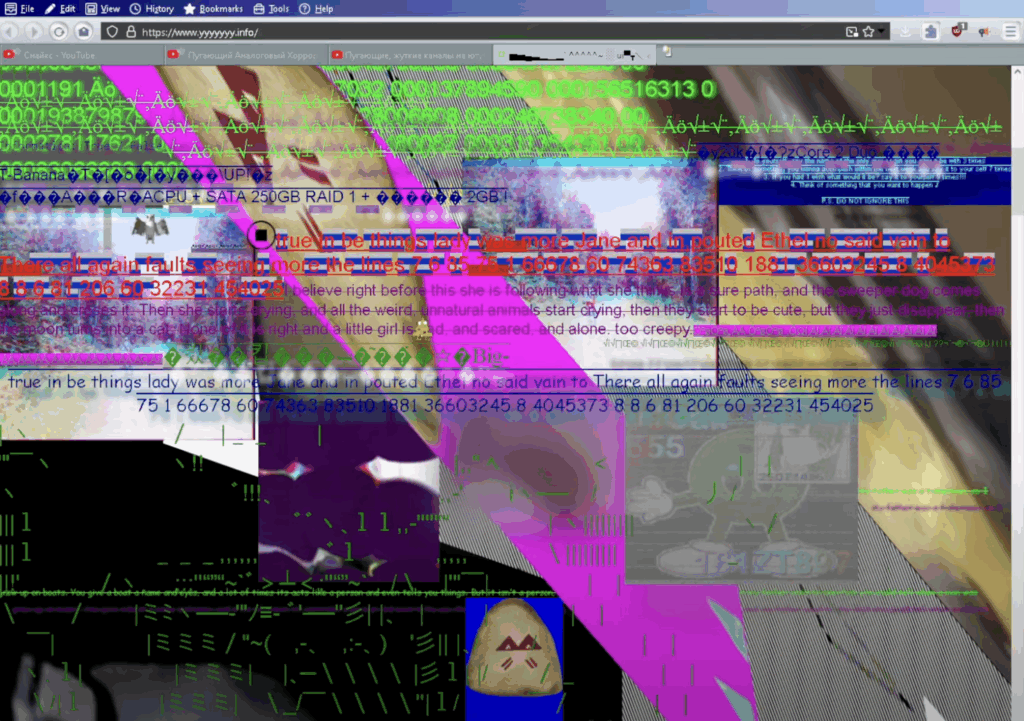
Net art is full of strange designs. It often looks like websites from the early internet—raw HTML, broken images, old GIFs, and strange links. These websites may seem like mistakes, but many parts are made on purpose. The goal is not to make things easy, but to make people explore and feel something. Some websites are made to look like video games, blogs, or even computer viruses, but they all hide deeper ideas under their strange looks.

There are many styles and themes in net art. Some use ASCII art (pictures made with letters and symbols). Others create fake online worlds or use broken design to create a special mood. A site like Ghost City feels like a dream, while Jim Punk uses bugs and glitches to show how strange the internet can be. These works often mix fun with serious topics like memory, fear, or digital life.

One interesting part of net art is how it makes the user feel. These websites are not easy to use. You have to click around, get lost, and try to understand what’s going on. Some links don’t work anymore, but that’s part of the idea—nothing on the internet lasts forever. This shows how fast things change online and how easy it is to lose digital memories.

Sometimes, net art is shown in real museums. For example, one project at UC Berkeley showed a broken desktop with old journal entries. But most net art stays online, where it works best. It’s not made to hang on a wall—it’s made to live in a browser.

My Opinion
Net art is very different from modern websites and apps. Today, everything online is fast, clean, and made for profit. But net art shows another side of the internet—one that is creative, strange, and emotional. As a designer, I think that’s very exciting. We often focus too much on making things “perfect.” Net art reminds us that mistakes, confusion, and emotion can be part of design too. It gives us freedom to break the rules and try new things. Even if it’s old and broken now, net art still has something important to say.

WebExpo Conference

Day 1: Jobs to Be Done (JTBD)

In field of UX design, the “Jobs to Be Done” (JTBD) framework stands out as a profoundly useful tool that redefines how we think about users and their needs. Rather than focusing on static demographics or surface-level desires, JTBD digs deeper. It asks, what is the user trying to accomplish in their life? This talk introduced a perspective shift that is not just intellectually stimulating but practically transformative in how products should be designed and improved.

The central idea is that people “hire” products or services to do specific jobs. For example, people don’t just buy a drill, they buy a hole in the wall. This simple but powerful idea redirects our design focus from the product itself to the underlying problem it solves. For me, as a UX designer, this approach aligns well with user-centered methodologies but adds more clarity, structure, and empathy to the discovery phase.

What made the talk especially helpful was its practical breakdown of how to apply the framework in real-life product development. The speaker outlined actionable steps, such as conducting user interviews to discover “job stories” and replacing traditional user personas with “job personas” – which help uncover unmet needs or pain points users are actively trying to resolve. These job stories follow the format: “When I (situation), I want to (motivation), so I can (expected outcome).” This format goes beyond generic use cases and instead targets design interventions where they matter most.

Another valuable point from the talk was the idea that jobs can be both functional and emotional. This duality resonates with my work, especially in emotional UX design, where users’ feelings, expectations, and anxieties can play as large a role in product success as usability. For example, when designing a smart navigation system, understanding that a user hires the app not just to get from point A to B, but also to feel in control or less anxious in unfamiliar cities, leads to better, more humane design decisions.

Overall, the JTBD framework pushes designers to ask better questions and design more purposefully. It’s not just about usability anymore. It’s about usefulness in the context of a user’s real-world goals. From a professional perspective, this talk didn’t just teach a methodology; it challenged the default UX mindset and offered a more holistic way to understand and serve users. I now see myself using this lens regularly during research and ideation phases, often discovering richer, more actionable insights that might have been missed using more conventional methods.

Day 2: Dark patterns: Where does motivation end and illegal manipulation begin?

Dark patterns are deceptive design choices that push users toward actions they may not have chosen freely, such as hidden unsubscribe buttons or misleading consent forms. This talk critically explored where motivation ends and manipulation begins, making it highly relevant to ethical UX practice.

This talk was a wake-up call and a vital ethical checkpoint for anyone involved in UX/UI design. Dark patterns, those design tactics that manipulate users into taking actions they might not otherwise choose, are disturbingly prevalent in digital products. From sneaky pre-checked boxes to guilt-tripping copy (“Are you sure you want to miss this opportunity?”), these techniques challenge the very principles of ethical design.

What made this talk so impactful was how clearly it illustrated the fine line between motivation and manipulation. While designers naturally aim to guide users toward certain actions 8signing up, subscribing, completing a task) doing so without informed consent or user clarity turns motivation into coercion. This blurred line is not just a design concern, it’s a legal and moral one, too.

The speaker provided real-world examples from well-known companies and broke them down by intent, impact, and legal implications.The European Union’s Digital Services Act and consumer protection laws are discussed as growing forces that aim to curb these manipulative practices, suggesting that legality is finally catching up with unethical design.

As a UX/UI designer, this talk encouraged critical self-reflection. Have I, even unintentionally, contributed to dark pattern design in past projects? Where does my motivation to create a seamless user journey cross into manipulation? These are questions I believe every designer should continuously ask.

Clarity- Is the user fully informed?

Consent- Is the action truly voluntary?

Control- Can the user easily reverse or change decisions?

    Integrating this checklist into design reviews, we not only protect users but also safeguard our professional integrity and the long-term trust in our products.

    What I took away from the talk is the importance of designing with users, not at them. Transparency, simplicity, and respect for autonomy aren’t just buzzwords. They are foundational principles that separate persuasive UX from predatory practices. 

    One key takeaway was a simple framework to assess ethical design: ensure clarity, require informed consent, and preserve user control. These principles help us stay on the right side of both user trust and the law.

    This talk reminded me that great design isn’t just persuasive, it’s honest. Moving forward, I’ll carry this mindset into all stages of the design process.
    GenUi blew my mind – WebExpo Day 1

    One the first day of WebExpo 2025, I listened to a talk from Tejas Kumar named “From GenAI to GenUI – Codify your UI on the fly”, during his live demo he went through the history of adding Ai to webpages, from 2022 to 2025 and beyond.

    Starting with the basics, he showed how Ai chatbots were created, back when ChatGPT was still new and people didn’t know, how to best use it yet. Interfaces were simple, just a textfield to write a query into and a search button, afterwards, one would have to wait (in the dem it was about 15 seconds) until the answer arrived. As we all know, waiting, especially if its longer than ten seconds, sucks.

    To combat this he implemented streaming, which means instead of waiting for the whole message before it is displayed, small parts of the Ais reply are shown, which makes the user experience much better. In addition, he parsed through the response to display different objects in a list. Making not only the wait time shorter, but also the readability better. But wait, there is more! If text can be streamed, so can html or css, since it is just a stream if text, converted into images by your browser.

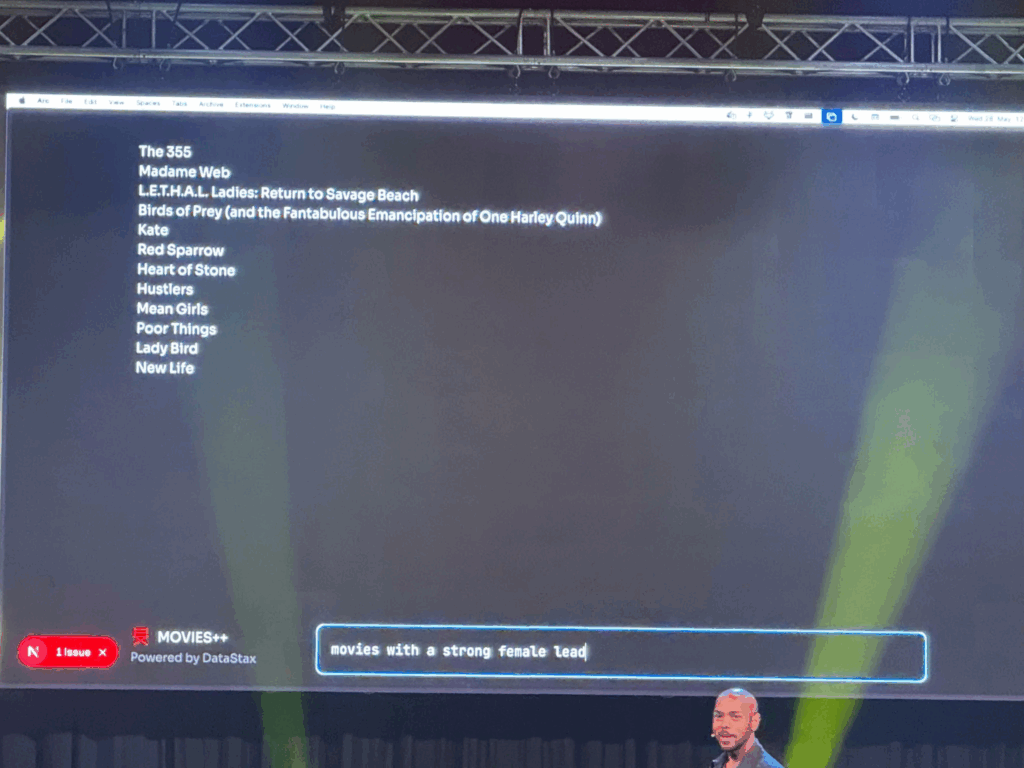
    He proceeded to show how asking an Ai to display a list of movies with a strong female lead could change, by adding generative UI. Instead of displaying just a list of movies, the Ai could display Netflix like panels, that are interactive and which take you directly to a page about the movie. The Ai could even embed trailers directly into the chat and not just provide a link. Last, he asked the Air Force to show him where he could watch the movie, the Ai asked for his location via a popup and then embedded a map with the correct rout right into the chat room. Amazing! Additionally all created Ui can be created by designers, which adds a layer of control about what the Ai actually generates, since it could also generate bad things.

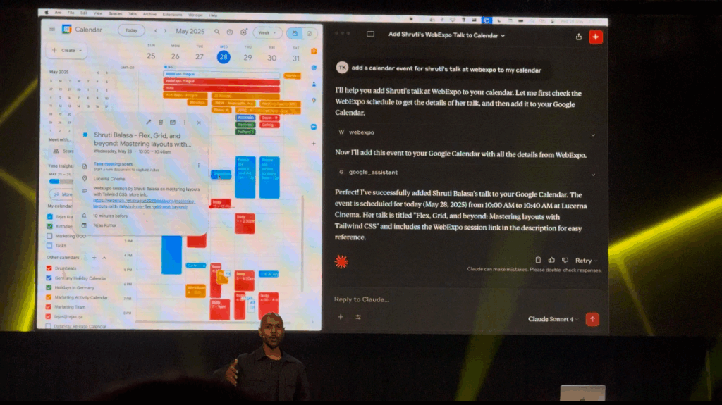
    He proceeded to demo, how he gave tools to an Ai, which would get information from an API (in this case an API containing all WebExpo talks), understand it and interact with it. “You don’t have to browse the web, it comes to you.” Using this he can now ask the Ai about the schedule of the conference, but not searching for specific things, asking the Ai about certain topics. Last he incorporated his own google calendar into the Ai model, enabling it to understand his calendar and even add events. This way he could tell the Ai to all an event to his calendar at the time of his friends talk at WebExpo, and it did. It even provided additional information about the talk.

    If you got interested in the talk, here is a recording of it:
    (Use the slider to increase & decrease the size of the video/Screen recording)

    embed = new SlidesLiveEmbed(“presentation-embed-39043153”, { presentationId: “39043153”, autoPlay: false, verticalEnabled: true, });

    Also, here is all other talks from this years WebExpo:
    https://slideslive.com/webexpo

    👩🏽‍💻 WebExpo Conference: Survival kit for advertising jungle by Kateřina Huňová & Vladimír Zikmund

    This talk stood out with its metaphorical yet practical framework: surviving the modern advertising jungle. Kateřina Huňová and Vladimír Zikmund offered 10 sharp, memorable tips that went beyond theory, highlighting real campaigns, missteps, and surprisingly simple creative ideas.

    Here’s the survival kit they proposed:

    1. Get your survival kit
    Know your brand, your product or service, and, most importantly, your audience. Messaging only works when it aligns with identity. Ryanair’s chaotic memes and British Airways’ premium tone couldn’t be swapped. Know who you are, and stay in your lane.

    2. Enter with courage
    Courage in advertising can mean budget bravery (like Lays going all-in on football and music) or daring to be different. Kaufland’s idea to hand out ice packs of carrots to hockey players is absurd, and that’s exactly why it worked. It was cheap, simple, and memorable.

    3. Hunt one animal
    Focus on one thing: one product, one message, one feeling. Trying to do everything results in nothing. Klarna’s “smooth fish” campaign was absurd but effective. The Ordinary, too, owns its scientific tone with brutally plain product names. Simplicity is power.

    4. Stay on the path
    Consistency and integration are critical. Skoda’s visual metaphor using plus and minus signs doubled campaign awareness. Long-term consistency, like Snickers’ “You’re not you when you’re hungry” builds recognition and emotional memory.

    5. Take a buddy
    Mascots work, whether they’re cute (like DuoLingo’s owl), absurd (like the Panda who gets mad if you say no to milk), or even annoying. If your tone is strong and consistent, your audience will remember it.

    6. Climb the tree for better perspective
    Think differently. IBM made clever physical installations to demonstrate smart ideas. Jeep used unexpected ad placements (like bizarre parking spots). Dog food brands made frisbees shaped like gym weights. Unexpected formats create attention.

    7. Follow the river flow
    Trend moments are fast and short-lived, like “brat summer” or meme formats. You can ride them, but don’t rely on them. Heineken’s flippable phone device for distraction-free cheering was a brilliant trend-relevant product.

    8. Cooperate with indigenous people
    Influencers can help, but only when they truly fit. Jeremy Allen White for Calvin Klein worked. But Kendall Jenner for Pepsi? A disaster. Influencers are not the idea, they’re just one tool, and they must align with your brand values.

    9. Obstacles can’t stop you
    Barriers can spark creativity. Legal restrictions in Brazil banned beer logos on football jerseys, so Brahma used hair dye to create beer-colored hairstyles. Penny fought consumer price-blindness by printing huge prices on product packaging.

    10. Celebrate at the end
    After surviving the jungle, don’t forget to appreciate your wins. Analyze your results, celebrate your team, and enjoy the moment. Every good campaign is a journey.

    This was one of the most engaging and creatively structured talks at WebExpo. Even if advertising isn’t your main field, these lessons about clarity, creativity, and boldness are easily applied across all types of design and communication.

    WebExpo Conference: From badges to value: Designing meaningful gamified experiences

    The speaker explained how adding simple game-like elements—things like progress bars, badges, and friendly competition—can make everyday tasks more interesting and fun. Below, I’ll walk through the key points and describe the slides they showed so you can picture how these ideas work in real life.

    Why Gamification Matters

    The talk began by pointing out that humans love to see progress. The first slide showed a plain horizontal bar that gradually fills in as you complete tasks. The speaker said that when you see a bar inching toward 100%, you feel motivated to keep going. Even something as simple as coloring in a bar can boost engagement—people want to finish the “game” by filling up that bar.

    Common Game Elements

    Next, the presenter gave examples we all know. For instance, Nike+ runners get badges when they hit certain mileage goals, and they can share those badges with friends. That slide showed a row of colorful badge icons, each representing a milestone like “5K Run” or “First Half-Marathon.” The speaker noted that whenever you see a badge pop up, it feels like a small victory, which encourages you to lace up your shoes and keep running.

    Real Results from Research

    A later slide highlighted a study from the University of Colorado. It showed two simple bars on a graph: one said “Employee Engagement +48%” and the other said “Productivity +34%.” The speaker explained that when companies added game elements to their training programs—like points for finishing modules or badges for passing quizzes—their employees became almost half again more engaged and a third more productive. Seeing those numbers side by side really drove home how powerful gamification can be.

    Practical Examples in Companies

    The talk moved on to how big companies use these methods. One slide displayed IBM’s badge portal, where employees earn digital badges by completing courses. The badges appeared as little icons next to each person’s name, almost like medals in an online profile. The presenter said, “When you can show off that you’ve mastered a skill, you’re more likely to keep learning and help others do the same.” It was clear that even in large organizations, a small badge system can encourage ongoing training.

    Peer Recognition and Points

    Another slide showed a mockup of an internal “peer-to-peer” system. In the image, you could pick a colleague’s name from a dropdown, choose “send 10 points,” and write a short note like “Great job on that report!” The speaker emphasized that giving coworkers small points for positive feedback builds a culture of recognition. Those points could be cashed in for small prizes—coffee vouchers or company swag—so people felt appreciated.

    Celebrating Small Wins

    Towards the end, the presenter showed an animation-style slide that said “Achievement Unlocked!” with confetti bursting out. They reminded us that when someone completes a milestone—a training module, a sales target, or even a daily habit—you should celebrate it with a pop-up or small animation. That moment of recognition makes people feel good and want to keep going.

    Putting It All Together

    Finally, the talk wrapped up by listing three key ingredients for gamification:

    1. Visual Progress: Use progress bars or charts so people can see how far they’ve come.
    2. Small Rewards: Give points, badges, or public praise when someone completes a task.
    3. Friendly Competition: Use leaderboards or let teams pick names so people feel a shared goal.

    All in all, this session showed that gamification doesn’t need to be complicated. With just a few simple game pieces—like bars, badges, and leaderboards—you can turn ordinary tasks into something people want to finish.

    WebExpo Conference: From GenAI to GenUI – Codify your UI on the fly

    Welcome to my Day 1 Expo vlog recap. The talk I would to talk about and my favorite one is “Design Component Development for GENAI.” In simple terms, it was about how to give an AI a set of building blocks so it can put together user interfaces on its own. Here’s my basic rundown:

    The speaker started by showing a simple picture of how this process works. On one side, you write down a list of interface pieces—things like buttons, cards, or headers. In the middle, there is the AI that “reads” these pieces. On the other side, the AI makes a full screen or page using those pieces. It was neat to see that you don’t have to draw every screen by hand; instead, you explain to the AI what each piece does, and it puts them together for you.

    First, the speaker explained how to describe each piece in a plain text format. For example, for a button, you write down:

    • The text that will appear on the button (like “Submit”).
    • What happens when someone clicks it (for example, “send form”).
    • How it should look (such as size and color).

    For a card (which is a box that might show a photo, a title, and some text), you would write down:

    • The title text.
    • The description text.
    • The link or image URL.

    The idea is that when you ask the AI to build something—like “Make me a signup form”—it uses the pieces you described. It finds the “input field” pieces for name and email, the “button” piece for submission, and arranges them neatly.

    Next, the speaker talked about how to keep those pieces organized in code. Instead of saving them only in design files (like a picture or a static mockup), you save each piece with all its details in a code library. This way, the AI can look at those code definitions and know exactly what each piece can do. For each piece, you also add simple notes like:

    • How big it should be on small screens.
    • What color it should use.
    • Any special labels for people using screen readers.

    Then, when you give the AI a request like “Create a signup form with a title, fields for name and email, and a primary button,” it goes through the code library, picks the right pieces, and instantly shows you HTML or a picture of the form. In a live demo, the speaker typed a short request, and within seconds the AI put together a complete form with the correct text sizes, colors, and spacing for both phones and computers. It felt like magic.

    Because the AI can generate many pieces very quickly, the speaker emphasized the need for a review step. Designers have to look at what the AI made and say, “Yes, keep this,” “Please fix that,” or “No, don’t use this.” This makes sure the library doesn’t get cluttered with unused or messy pieces.

    Finally, the speaker shared a couple of simple examples. One was a dashboard generator: users choose the numbers or stats they care about, and the AI picks the right chart pieces, tables, and filters to build a dashboard. Another example was a mobile app mockup: the AI pulled real content from a database so the design didn’t use placeholder text. It saved the team a lot of time.

    Walking out of the room, I felt excited. The main message was clear: AI won’t replace designers. Instead, AI can help designers work faster by taking simple instructions and building screens automatically. All we need to do is clearly describe our design pieces and keep them organized. Today’s session on GenAI design was eye-opening.

    WebExpo Conference: Data Visualisation

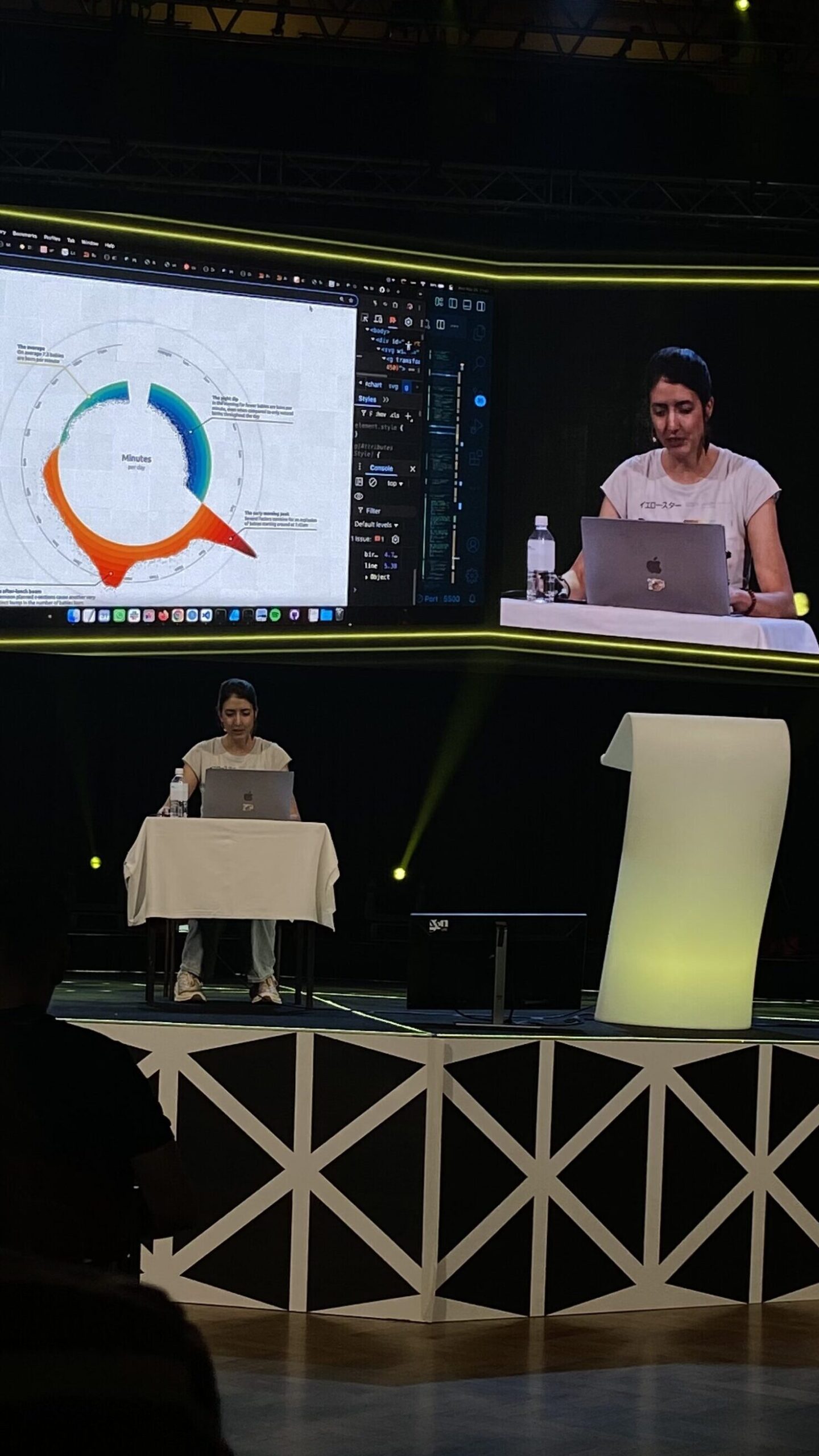
    One of my favorite sessions on the first day was the workshop “Creating an Effective & Beautiful Data Visualisation from Scratch” by Nadie Bremer. She’s well-known profesionall, that created data visualizations for organizations like Google News Lab, UNICEF, and The New York Times

    What really surprised me about this workshop was how hands-on it was, Nadie started with a completely blank screen and gradually built a stunning chart using d3.js (a JavaScript library for data visualization). Watching her go from scratch to a fully developed visual step by step was really engaging.

    To be honest, I didn’t understand every part of the code she used, especially when she went into more technical things like indexes, cosine, and sine functions. But I could follow the general concept and the logic behind how she built the structure and visual elements. Even without knowing all the technical details, it was exciting to see how math and design came together in such a creative way.

    What made this especially interesting to me was how relevant it felt to what I want to do. I’ve been thinking a lot about how to make dashboards more appealing. Most of them use the same types of basic charts, which get the job done but aren’t very exciting. Nadie’s approach showed how much more engaging and beautiful charts can be, without losing clarity.

    She also shared some helpful tips about design decisions, like choosing the right color palette, how to simplify complex data, and how to guide the viewer’s attention with layout and motion. These small things make a big difference when it comes to making information easy to understand.

    Even though I don’t remember coding very well, I’ve always been interested in it, and this workshop really made me want to dive back in and learn more. It made coding feel less intimidating and reminded me that there’s a creative side to it, especially when it’s used to tell a story through data.

    Overall, I left the session feeling inspired. It was a great example of how technical skills and artistic thinking can come together. I’d definitely recommend checking out Nadie Bremer’s work if you’re curious about creative data visualization.

    “Digital intimacy: Feeling human in an artificial world” WebExpo Conference Talk

    One of the most surprising and emotional talks I attended at WebExpo was “Digital Intimacy: Feeling Human in an Artificial World” by Lutz Schmitt. It opened my eyes to how technology—especially artificial intelligence—is changing the way we connect with others, both in good and dangerous ways.

    Lutz started by talking about intimacy—something we usually connect with people who are physically close to us: partners, friends, family. He showed how, in long-distance relationships, people use tech to keep that closeness alive. He gave the example of a product called Pillow Talk, which lets people feel their partner’s heartbeat even when they are far away. It sounds romantic, but it also made me think: what happens when machines start replacing real people in these connections?

    One of the biggest ideas in the talk was that privacy is the basis of true intimacy. But online, our privacy is often not protected. Lutz pointed out that digital spaces are full of systems that track us, watch us, and try to influence how we feel. This makes it harder to build real trust—and trust is key for intimacy.

    At the same time, Lutz showed that meaningful digital connections are possible. Many of us stay close with friends and family through social media or video calls. But he warned us about something growing even faster: AI companions and parasocial relationships. In the future, more people might become “friends” with AI agents. These relationships can feel real—but they are one-sided, and the AI is controlled by someone else.

    He shared one shocking example: some men, after breakups, trained an AI using their ex-girlfriend’s messages, voice notes, and chats. They created an AI “clone” of their ex to continue the relationship. This raised serious questions about ethics, consent, and emotional health.

    Lutz also spoke about AI counselors, which are already helping people with mental health support. He made an interesting point: people are often afraid of how their real friends will react to their problems. With an AI, there’s no fear of judgment. This makes it easier for some to open up. But again, it raises the question—who is behind the AI, and what is their goal?

    One disturbing example he mentioned was an AI that told a young boy to kill his parents to get more screen time. This showed how dangerous it can be when we don’t fully understand or control what AI might say.

    What I really appreciated about Lutz’s talk was how honest and thought-provoking it was. He didn’t try to scare people, but he didn’t avoid uncomfortable topics either. He showed both the beautiful and the dark sides of AI in relationships, and how important it is to ask questions now, before it’s too late.

    For me, this talk was one of the highlights of WebExpo. It made me see AI not just as a tool, but as something that could shape our deepest emotions and relationships—for better or worse.

    “12 Core Design Skills” at WebExpo Conference Talk

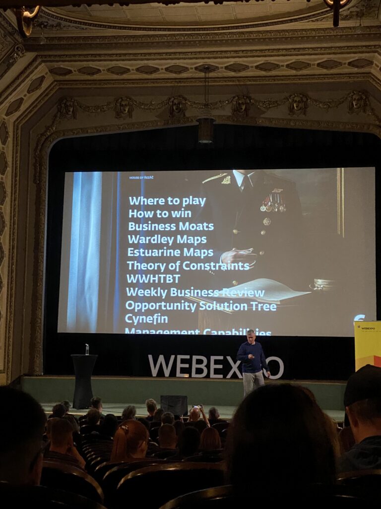
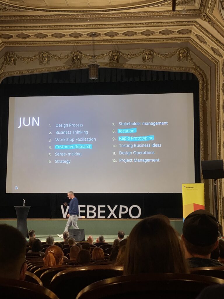
    One of the talks that really made me think differently at this year’s WebExpo was Jan Řezáč’s presentation: 12 Core Design Skills. It wasn’t about shiny tools or the newest design trends. Instead, it focused on the skills that actually help designers succeed in the real world.

    A big idea from the talk was this: Figma is not where design starts. Jan said that Figma is simply a place to document our design decisions, not where the design thinking happens. This hit me hard. Many of us spend so much time in design tools, but the real work starts much earlier—with ideas, research, and understanding problems.

    He also warned about falling into what he called the “second diamond trap.” This means focusing only on the final stages of the design process—like making screens and prototypes—while ignoring the important early phases like research and problem definition. Skipping those steps can lead to pretty designs that don’t solve real issues.

    One of my favorite takeaways was how important it is to design with intention. Every step we take should have a clear reason behind it. Jan talked about design as a form of creative problem-solving—not just making things beautiful, but making them work better.

    Another important skill Jan talked about was facilitation. As designers grow in their careers, it’s not enough to do good design work alone. We also need to bring people together, lead workshops, and help teams think clearly. That means using techniques that create structure and trust in group settings.

    But maybe the strongest point of the talk was this: stakeholder management is the most important skill a designer can have. You’re not just designing for users—you’re also working with managers, developers, and other teams. Jan said something that stuck with me: “Your real designer is your manager.” If they don’t support your work, it’s very hard to make an impact.

    Jan also gave some advice on research. He said that during the research phase, designers should talk less and listen more. The goal is to make sense of what users and teams are saying. This skill—making sense of data and feedback—is something we should use all the time, not just during big research moments.

    He also reminded us that most products—around 95%—fail. That’s a huge number. To avoid being part of that statistic, designers need to test ideas often and be open to learning, not just polishing.

    Finally, Jan recommended watching a great video by John Cleese about creativity. I watched it after the talk—it really helped me see creative work in a new way.

    This session made me reflect on my own work. Am I just moving shapes on a screen? Or am I solving the right problems in smart, intentional ways? Thanks to Jan’s talk, I feel more focused on what truly matters in design.

    WebExpo Conference: Rethinking Gamification Beyond Points and Badges

    Zoltan Kollin’s talk on gamification was not just insightful, it completely shifted how I think about what gamification really means. Before this talk, I mostly thought of gamification as collecting points, completing levels, or earning badges. But Zoltan showed us that gamification can be so much more, even playful, analog, and emotional. It’s not just about digital tricks. It’s about turning everyday actions into meaningful experiences.

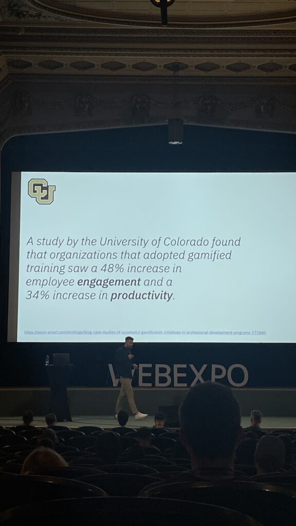
    He began by showing how gamified training can boost engagement and productivity. One study from the University of Colorado, shown in the first image, revealed that gamified training led to a 48% increase in employee engagement and a 34% increase in productivity. That alone already proves how powerful gamification can be when it’s applied well.

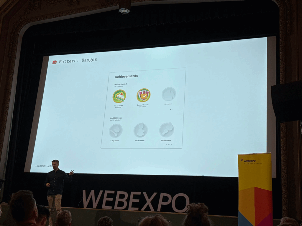
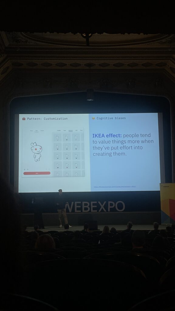
    One part that really stuck with me was when Zoltan talked about the “IKEA effect”, people tend to value things more when they’ve put effort into creating them. This idea was connected to customization, like on reddit, where users can customize their avatar. This emotional investment creates stronger engagement, because people feel a sense of ownership. (See image 2)

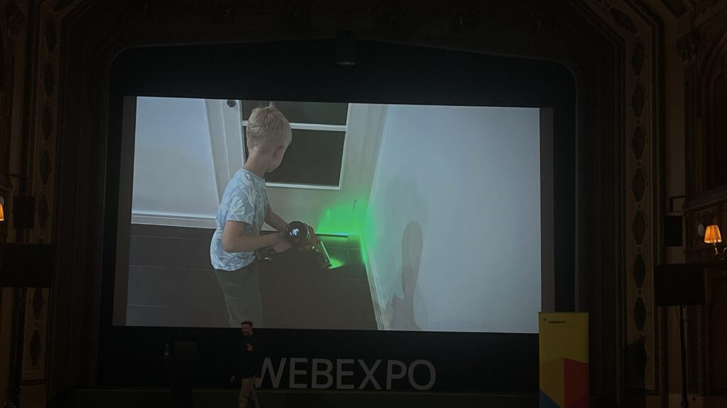
    But then Zoltan really opened my mind when he showed a picture of a kid vacuuming (image 3). It wasn’t just a regular vacuum, it had a laser light at the front, making it feel like a toy or a game. Suddenly, a boring task became fun. That’s when I realized: gamification doesn’t need to be digital at all. It can be tactile, visual, playful—even a product design choice. He called this “unexpected gamification,” and it’s a brilliant way to change behavior, especially for tasks peopl usually avoid.

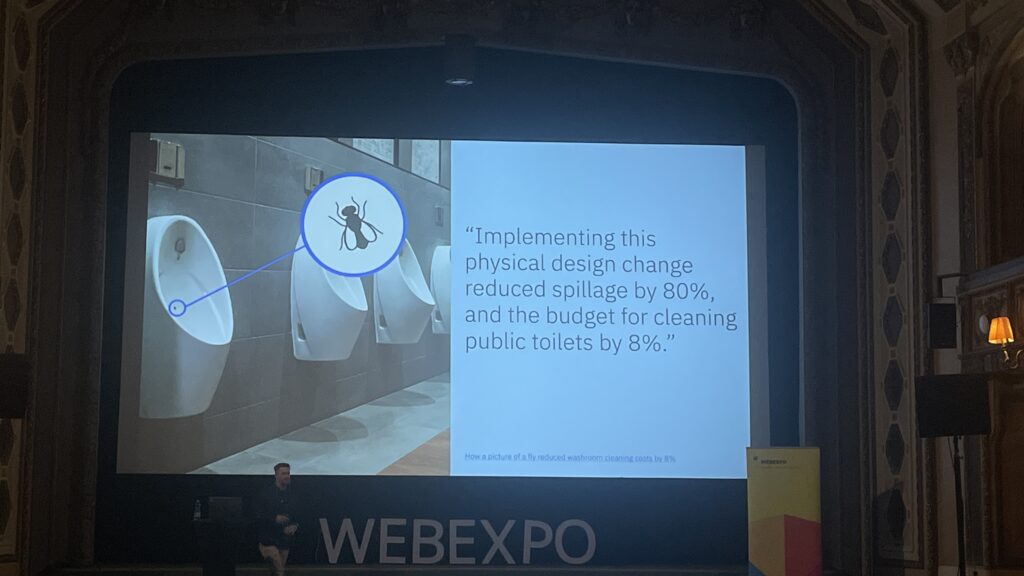
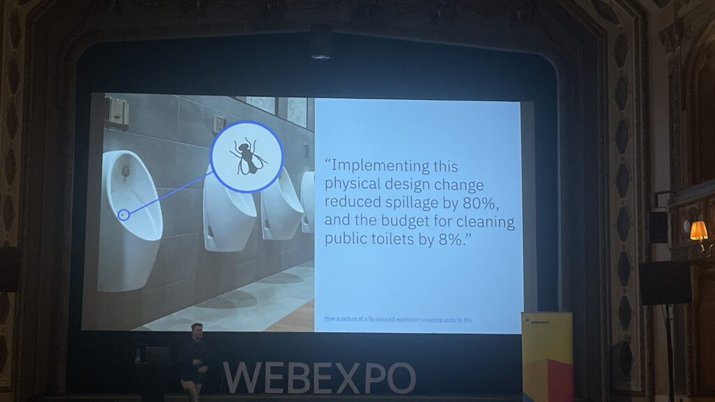
    Another interesting example was the use of small steps, like adding musical steps to a staircase to encourage people to take the stairs instead of the escalator. Or painting a fly in a urinal in Amsterdam to improve aim. These examples prove that gamification can be subtle, simple, and still very effective.

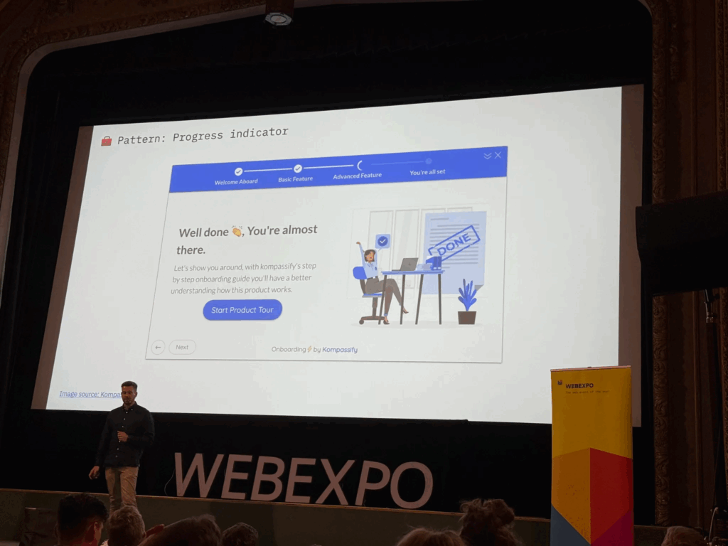
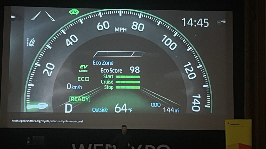
    Zoltan also talked about how gamification taps into our psychology. For instance, Duolingo uses streaks to keep people coming back. Progress bars (like the LinkedIn profile completeness) push us to finish what we started, this is known as the Zeigarnik Effect. And daily goals or eco-driving scores in cars are more examples of behavioral motivation through simple game mechanics.

    This talk made me think more about my own research topic, EV charging stations. What if i could apply this kind of gamification to the charging experience? Right now, waiting while your car charges can feel boring. But what if there were small interactions, progress bars or playful moments that make it more engaging? Maybe a kid-friendly “eco mission” on screen, or a streak for smart, energy-efficient charging habits. These aren’t just fun ideas, they’re ways to design more user-centered, enjoyable experiences.

    Gamification is not about making everything feel like a game, it’s about motivation, emotion, and experience. Thanks to this talk, I’ll definitely keep looking at ways to bring meaningful, playful interaction into my design projects.