If you’ve been on TikTok or Instagram lately, you’ve probably seen “Blokecore” (even if you didn’t actively notice). It started with kids wearing vintage 90s football jerseys to the pub, but it has evolved into a massive obsession with vintage sportswear, and specifically the racing jacket.
Category: Communication Design
Research #3 Cultural Branding: Wie was wieso?
In my early design days, I was taught that a brand is a logo, a color palette, and maybe a catchy slogan. But as I’ve dived deeper, I’ve realized that’s just the surface. Somewhere along the line, I came across the term Cultural Branding.
Impuls #8 Street Illustration in Spain
On my one-week trip through northern Spain, I discovered something I didn’t expect: I started looking for illustrations everywhere. What began as a small observation quickly turned into a little personal mission. In every city, every village, every tiny street, I kept my eyes open for art.
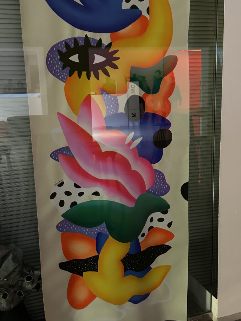
Our first stop was Barcelona (where we visited the Llum festival as well). It’s such a vibrant, creative city, and you can feel an artsy energy. I thought it would be really nice to search for random illustrations in the city and write about them here. I think it’s pretty cool to get inspirations from different countries. What really caught my attention were the illustrated posters and advertisements. Many of them used illustration instead of photography and I wanted to search for inspirations. The style was often very bold and graphic: strong colors, clear shapes, very eye-catching.
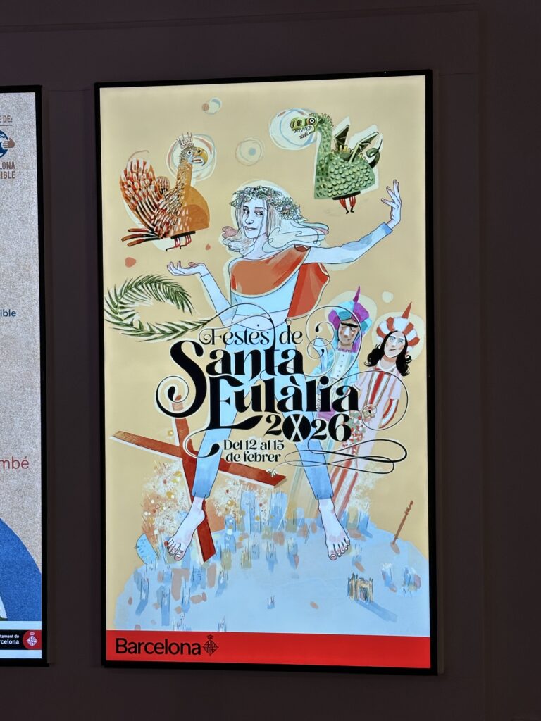
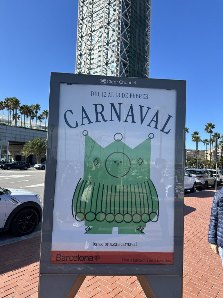
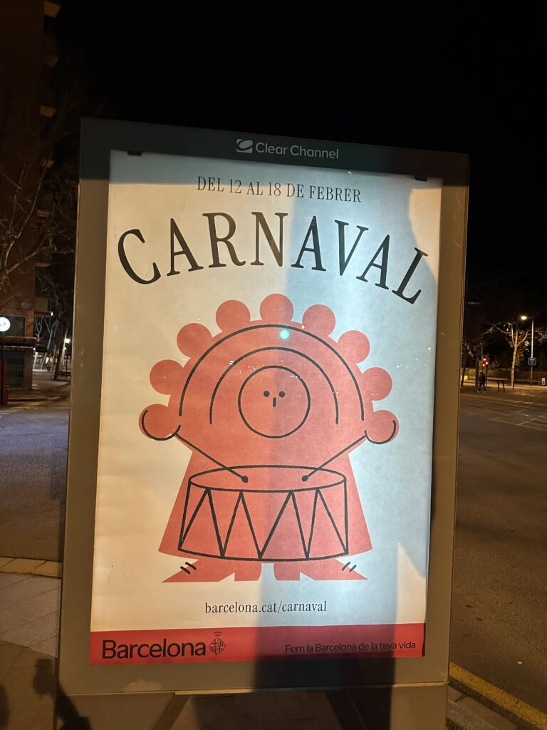
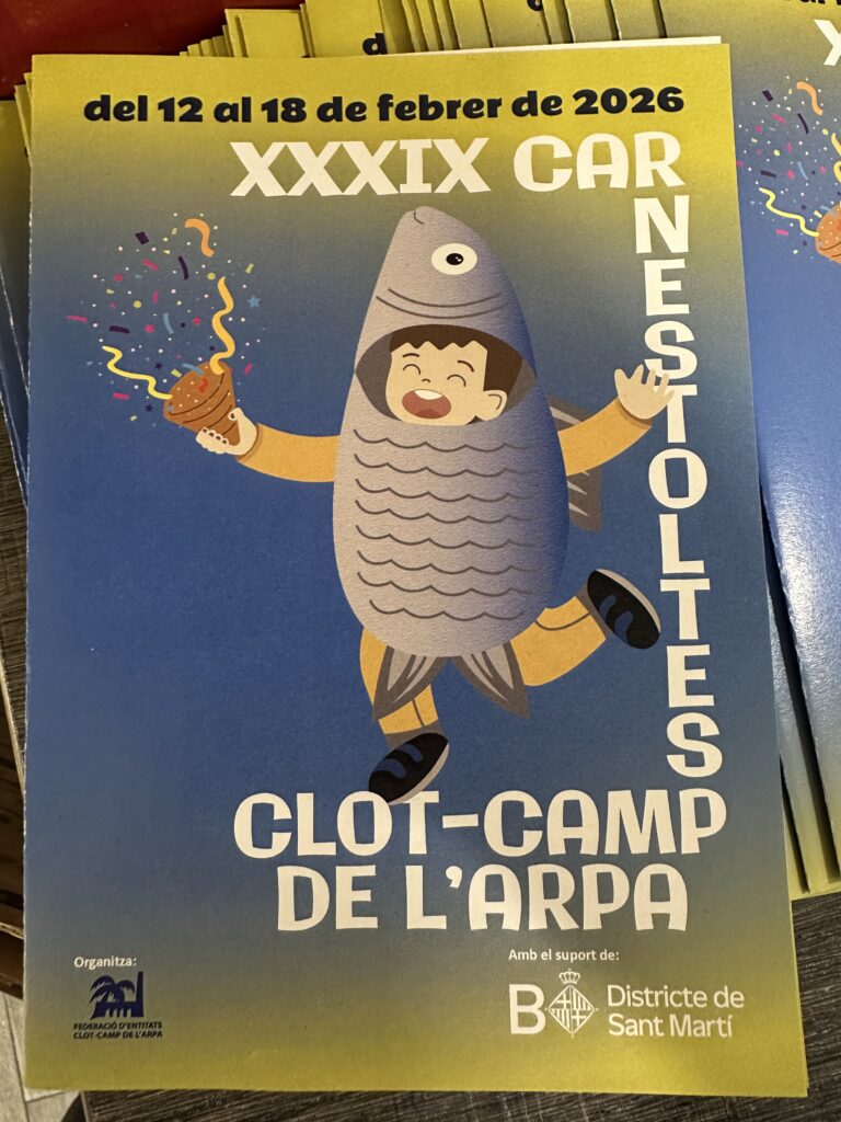
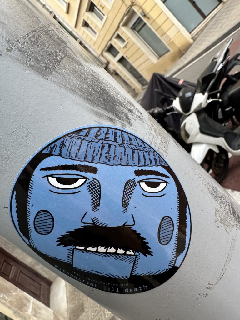
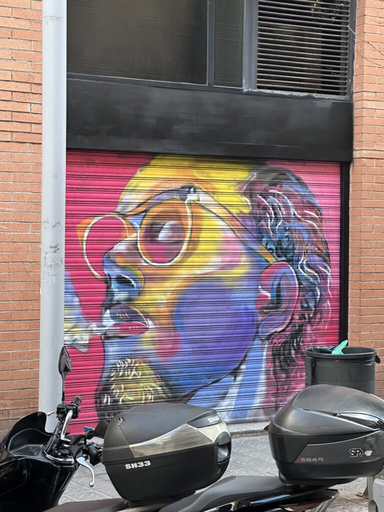
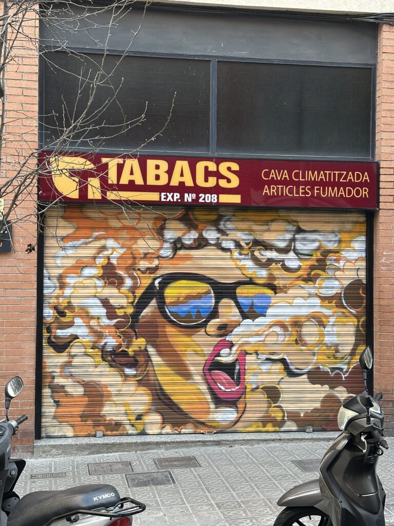
Another thing I loved: so many garage doors were painted or covered in graffiti. Even when the shops were closed, the streets still felt alive because the metal shutters became huge canvases. Some were wild and chaotic, others were detailed and carefully designed. It made simple streets feel like open-air galleries.
I found a few book covers, I also found really cute.
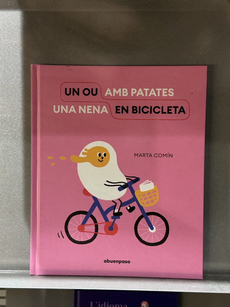
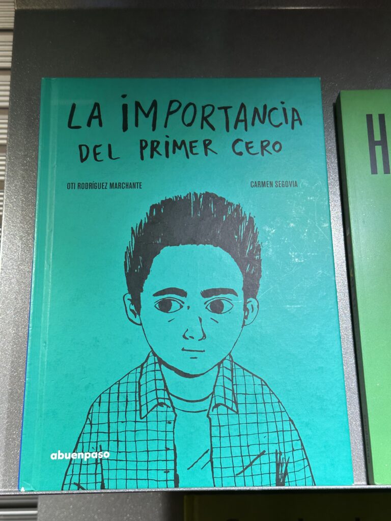
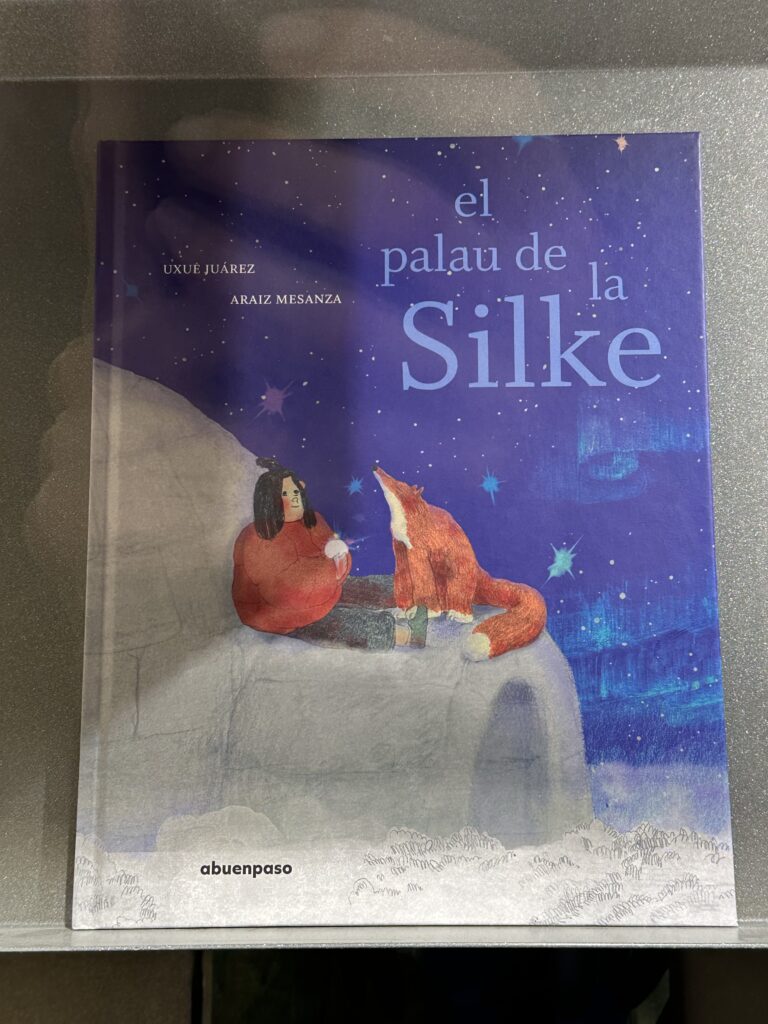
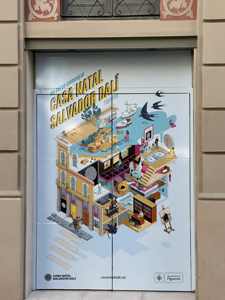
After Barcelona, we went hiking along the Costa Brava. Along the way, we passed through small coastal towns like Cadaqués. The Costa Brava is strongly connected to Salavador Dali, who was born in Figueres and spent a lot of time in Cadaqués. There’s even a famous painting where he captured the harbor of Cadaqués. You can really feel that artistic history in the town. Cadaqués is small, white, and full of charm and art is everywhere.
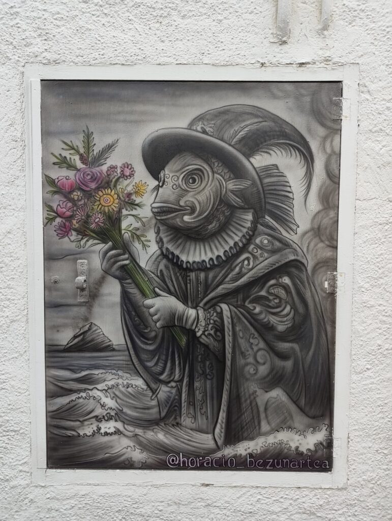
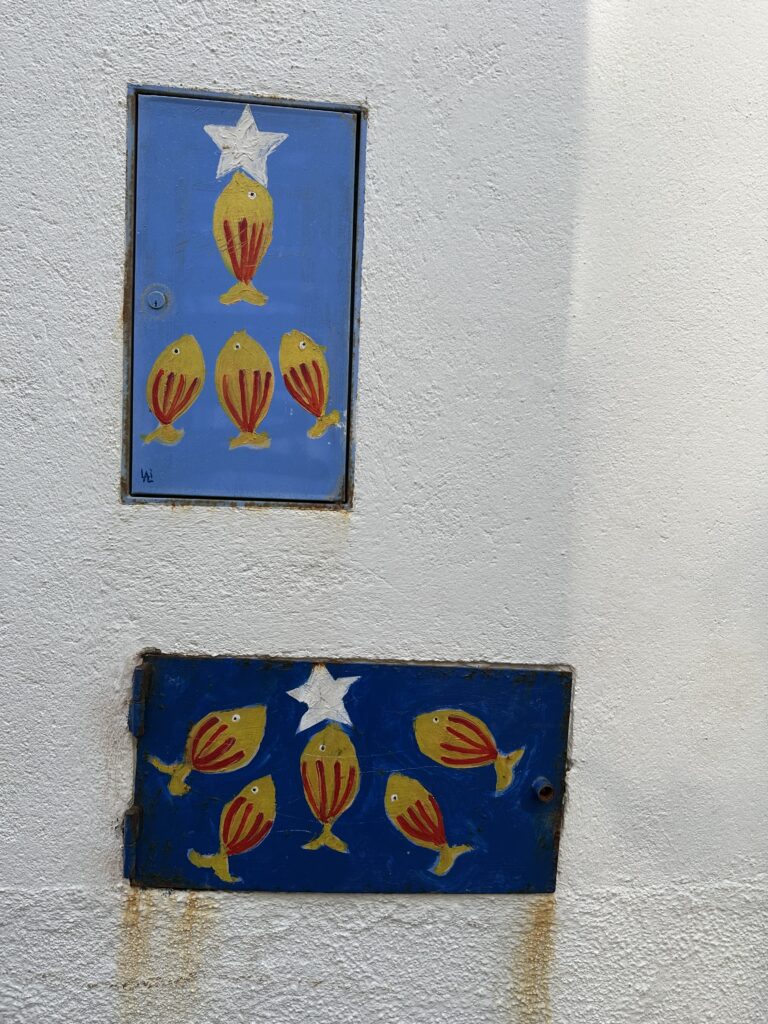
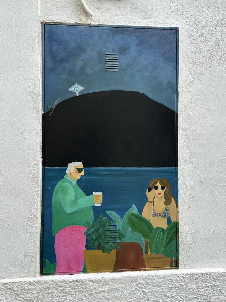
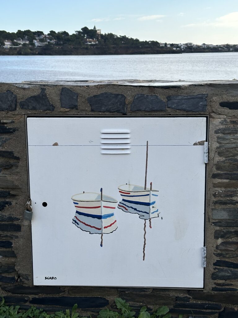
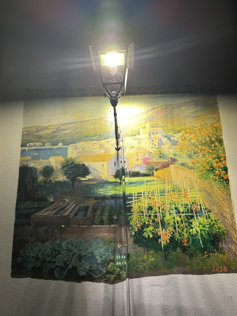
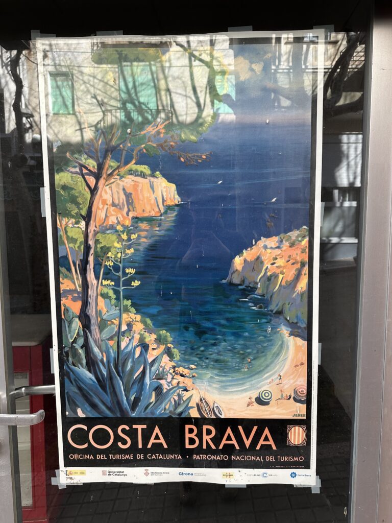
Many illustrations are inspired by the sea like fish, boats, waves, sunsets. Even small utility boxes and electrical cabinets are painted. Instead of being ugly grey objects, they become tiny artworks. I loved that so much. It shows how art can transform even the most ordinary things.
What I love most about these small street artworks is how they bring life into everyday spaces. They make you slow down and searching for them was really fun. It made me more aware of my surroundings. This kind of art make a simple walk or usually ugly street more interesting and inspired me.
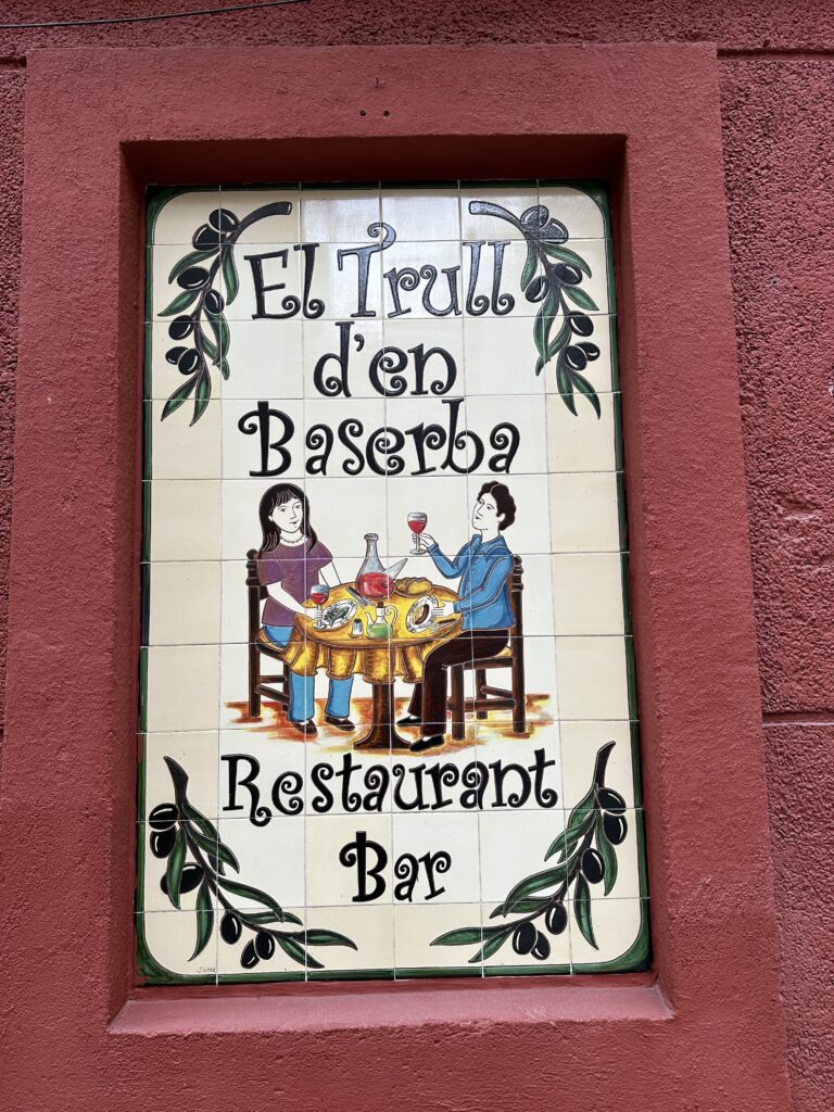
Here are a few more artworks and illustrations I found randomly on my journey through Spain:
Impulse #6 National Gallery London
Kicking off the new year, I visited the National Gallery during my visit to London. The museum visit was a deliberate contrast to my otherwise strongly contemporary design projects.
IMPULSE #8
Doing silkscreen workshops during the exhibition here has been one of the most grounding experiences of my Erasmus in Graz.
Because silkscreen is slow.
And messy.
And completely unforgiving in the most beautiful way.
As graphic designers, we live in digital overlays. Photoshop layers. Blend modes. Opacity sliders. You can undo everything. You can experiment endlessly without consequence.
Silkscreen doesn’t let you undo.
Every layer matters. Every misalignment becomes part of the composition. Every color interacts physically with the one beneath it.
And that’s where overlays become magical.
When you print one transparent layer over another, something unpredictable happens. Colors mix. Shapes merge. New forms appear. It’s not just addition — it’s transformation.
I became obsessed with transparency.
Printing in layers feels almost philosophical. You have to think ahead. Which color goes first? Which one dominates? What happens when ink overlaps? You’re designing not just shapes, but interactions.
During the exhibition, watching people engage with the prints made me realize something else: physical layers create depth that screens struggle to replicate.
You can see where the ink is thicker. You can feel texture. There’s slight imperfection at the edges. It breathes.
As someone who spends so much time designing digitally, this felt like reconnecting with materiality.
Overlay in silkscreen is not just a visual technique — it’s a metaphor.
We are layers too. Erasmus feels like a layer. Graz is a layer over my home identity. Each city adds color. Each experience shifts tone. Sometimes transparent. Sometimes opaque.
And in exhibition space, printing live or displaying layered prints adds another dimension. The process becomes visible. The audience sees the construction.
In digital design, the process is hidden. In silkscreen, it’s embedded in the final piece.
There’s something humbling about pulling the screen down, pressing ink through mesh, lifting it, and not knowing 100% what you’ll get.
It forces you to let go of control.
And maybe that’s the biggest lesson.
Layering isn’t just aesthetic. It’s about trust — trusting that what overlaps will create something richer, not chaotic.
Since these workshops, I’ve started thinking differently about my digital work too. Instead of flattening everything, I’m embracing translucency, grain, texture, imperfection.
Maybe good design isn’t about perfect alignment.
Maybe it’s about tension between layers.
IMPULSE #7
I read The Alchemist again while here.
And yes, I know. Some people think it’s cliché. Some people think it’s overrated. But reading it as again hits differently.
The whole book is basically about following your “Personal Legend.” Which sounds dramatic. But when you’re living in another country, slightly unstable, slightly unsure about your future, it feels very real.
Desert landscapes. The sun. Alchemy symbols. Wind. Gold. It reads almost like a storyboard. Every scene feels like it could be translated into a poster or a visual identity system.
The idea of transformation — turning metal into gold — is such a powerful metaphor for creative work. We take raw ideas, messy sketches, doubts, and somehow refine them into something valuable.
But the book also talks about fear. Fear of failure. Fear of success. Fear of leaving comfort behind.
Erasmus feels like that too. You leave your known environment. You step into uncertainty. And you trust that something meaningful will come from it.
From a design perspective, I love how simple the narrative is. It’s almost minimal. No excessive complexity. And yet it resonates globally. That’s a lesson: clarity doesn’t mean superficial.
Sometimes the most powerful concepts are archetypal and universal.
Reading it here in Graz, sitting in cafés with my sketchbook, I felt strangely aligned with Santiago wandering the desert. Not literally — Austria is very green — but metaphorically.
Being an artist is a bit like being an alchemist. You chase invisible things. You trust intuition. You turn experience into form.
And maybe that’s the real gold.

Book info: https://paulocoelho.com/the-alchemist
IMPULSE #6
One thing Erasmus is teaching me is that culture is not just exhibitions in white cubes. It’s spaces. Physical spaces that breathe.
Elefsina (Eleusis) in Greece becoming European Capital of Culture 2023 was already fascinating because it’s not the “obvious” cultural capital. It’s industrial. Raw. Layered with mythology and heavy history.
Then projects like Culterra and collaborations with Toestand add another layer: reclaiming industrial or abandoned spaces and turning them into living cultural ecosystems.
As a graphic designer, I’m obsessed with how space shapes identity.
A cultural space is like a brand — but organic. It has texture. History. Community. Improvised posters on walls. Stickers on doors. Layers of typography built over time.
Toestand (https://www.toestand.be) works with temporary use of empty buildings, transforming them into social-cultural hubs. That concept alone is design poetry. It’s adaptive reuse, but for community energy.
Elefsina info: https://eleusis2023.eu
What inspires me is the visual language that grows from these places. It’s not corporate branding. It’s messy, collaborative, alive. Hand-painted signs next to professionally designed posters. Multiple languages layered over each other.
Being in Graz and visiting different cultural spaces here makes me more aware of how important physical environments are for creativity. A city shapes your output. A building shapes your mood. A community shapes your aesthetic.
Design isn’t just what hangs on the wall. It’s how the wall itself feels.
Elefsina and similar projects show that culture doesn’t need to be polished to be powerful. Sometimes industrial dust and community energy are stronger than any luxury gallery.
As an artist, that’s comforting. It means space for experimentation still exists.
IMPULSE #5
Okay. I need to admit something.
I didn’t start watching Supernatural thinking it would influence my visual language as a graphic designer. I thought it would just be comfort binge material while I’m on Erasmus in Graz, avoiding my deadlines.
But somehow, between demons, salt circles, and emotionally damaged brothers, it completely shifted how I think about atmosphere in design.
Supernatural isn’t just about monsters. It’s about mood.
The lighting is always slightly off. Warm but shadow-heavy. Dark forests. Empty highways. Flickering motel lights. The visual identity of the show is consistent in a way that feels almost like branding.
And that’s what hit me.
Every episode feels cohesive because of atmosphere, not just storyline. The color palette leans into deep browns, muted blues, golden headlights cutting through darkness. Even the typography in the intro — that burning, cracking effect — sets a tone before the narrative even begins.
As a graphic designer, I think a lot about visual systems. Logos. Type hierarchies. Consistency. But Supernatural reminds me that mood is also a system.
The recurring symbols — devil’s traps, sigils, angel blades, pentagrams — function like graphic elements. They’re instantly recognizable. They carry meaning. They repeat. They evolve. It’s basically a mythological design language.
And the layering of folklore? That’s where it gets even better.
The show pulls from urban legends, Christianity, pagan myths, apocalyptic narratives — and reinterprets them visually. It’s collage storytelling. It’s remix culture before TikTok made that a daily habit.
Living in Graz, walking through old streets at night, I started noticing how environment shapes imagination. Supernatural thrives in liminal spaces — abandoned houses, forests, highways. And being in a foreign city kind of feels liminal too. You’re not fully grounded. Everything feels slightly cinematic.
As an artist, I’m drawn to that “in-between” feeling.
What Supernatural does brilliantly is contrast intimacy with scale. One moment it’s two brothers talking in a car. The next, it’s cosmic-level angels and demons. Visually, that translates into tight framing versus vast landscapes.
In graphic design, we often forget scale as an emotional tool. What happens when typography feels small and isolated? What happens when imagery overwhelms the frame?
Also — and this might be controversial — the show is camp sometimes. And camp is powerful. It doesn’t always take itself too seriously, even when dealing with apocalypse-level drama. That balance between darkness and irony is something I want more of in my own work.
Design doesn’t always have to be polished and intellectual. It can be dramatic. Gothic. Slightly theatrical.
Maybe that’s why I’m currently obsessed with darker palettes, textured overlays, and symbolic graphics. Blame the Winchester brothers.
Or maybe it’s just that good storytelling — even in a 15-season supernatural soap opera — teaches you more about visual identity than a branding workshop ever could.
IMPULSE #4
Being on Erasmus in Graz has this unexpected side effect: Vienna suddenly feels like your extended studio. It’s close enough to go for a day, intense enough to completely reset your brain, and aesthetically overwhelming in the best way.
So of course I had to go see Marina Abramović at the Albertina.
And honestly? I didn’t just see it. I felt slightly attacked by it. In a good way.
Marina doesn’t “perform” in the traditional sense. She endures. She waits. She stares. She pushes her body until the audience becomes uncomfortable. And as a graphic designer, I kept thinking about something very simple:
What does it mean to hold attention without decoration?
We are trained — especially in design — to add. Add color. Add texture. Add typography. Add hierarchy. Marina removes. She reduces everything to presence.
One of the most striking things about her work is how minimal it looks visually, but how maximal it feels emotionally. A body in a space. A chair. Silence. And suddenly the entire room is charged.
As someone who works with composition daily, I couldn’t stop noticing how carefully controlled everything is. The framing of her body. The stillness. The gaze. It’s basically radical minimalism with psychological impact.
And seeing this at the Albertina in Vienna — a city that breathes classical art history — made it even more powerful. Marina’s work feels like a confrontation inside institutions that are used to oil paintings and decorative frames.
As an artist, I’m obsessed with how she uses time as material. In graphic design, time is rarely part of the equation. It’s static. Print. Screen. Instant consumption. But Marina stretches time until it becomes uncomfortable.
It made me rethink pacing in my own work. What if a design doesn’t scream? What if it waits?
Also, being on Erasmus changes how you experience art. You’re already displaced. You’re already questioning your identity a bit. Seeing Marina’s work — which is so much about vulnerability, endurance, and self-exposure — hits differently when you’re living between countries.
If you’re in Austria, go. Even if you think performance art is “not your thing.” It’s less about liking it and more about confronting it.
More info:
Albertina Museum: https://www.albertina.at
Marina Abramović Institute: https://mai.art
Impulse #5 Materiality as a communication tool
I designed and produced goodies (giveaways) for our exhibition (again, together with my partner in crime (@Karre)). This process initially seemed like an organizational task and more about decision making, but it developed into an quite interesting research impulse.